
Statistics
We looked inside some of the posts by numbers-have-feelings-too and here's what we found interesting.
Average Info
Notes Per Post
452K
Likes Per Post
255K
Reblog Per Post
197K
Reply Per Post
351
Time Between Posts
16 days
Number of Posts By Type
Text
17
Last Seen Tumblr Blogs


Fun Fact
Tumblr has 411 employees.
Text
made some desk job affirmations to get me through the day


6K notes
·
View notes
Text
What a chart! More of that hopeful data stuff.
I have been thinking a lot about what a cancer diagnosis used to mean. How in the ‘80s and ‘90s, when someone was diagnosed, my parents would gently prepare me for their death. That chemo and radiation and surgery just bought time, and over the age of fifty people would sometimes just. Skip it. For cost reasons, and for quality of life reasons. My grandmother was diagnosed in her early seventies and went directly into hospice for just under a year — palliative care only. And often, after diagnosis people and their families would go away — they’d cash out retirement or sell the house and go live on a beach for six months. Or they’d pay a charlatan all their savings to buy hope. People would get diagnosed, get very sick, leave, and then we’d hear that they died.
And then, at some point, the people who left started coming back.
It was the children first. The March of Dimes and Saint Jude set up programs and my town would do spaghetti fundraisers and raffles and meal trains to support the family and send the child and one parent to a hospital in the city — and the children came home. Their hair grew back. They went back to school. We were all trained to think of them as the angelic lost and they were turning into asshole teens right in front of our eyes. What a miracle, what a gift, how lucky we are that the odds for several children are in our favor!
Adults started leaving for a specific program to treat their specific cancer at a specific hospital or a specific research group. They’d stay in that city for 6-12 months and then they’d come home. We fully expected that they were still dying — or they’d gotten one of the good cancers. What a gift this year is for them, we’d think. How lucky they are to be strong enough to ski and swim and run. And then they didn’t stop — two decades later they haven’t stopped. Not all of them, but most of them.
We bought those extra hours and months and years. We paid for time with our taxes. Scientists found ways for treatment to be less terrible, less poisonous, and a thousand times more effective.
And now, when a friend was diagnosed, the five year survival odds were 95%. My friend is alive, nearly five years later. Those kids who miraculously survived are alive. The adults who beat the odds are still alive. I grew up in a place small enough that you can see the losses. And now, the hospital in my tiny hometown can effectively treat many cancers. Most people don’t have to go away for treatment. They said we could never cure cancer, as it were, but we can cure a lot of cancers. We can diagnose a lot of cancers early enough to treat them with minor interventions. We can prevent a lot of cancers.
We could keep doing that. We could continue to fund research into other heartbreaks — into Long Covid and MCAS and psych meds with fewer side effects and dementia treatments. We could buy months and years, alleviate the suffering of our neighbors. That is what funding health research buys: time and ease.
Anyway, I’m preaching to the choir here. But it is a quiet miracle what’s happened in my lifetime.
54K notes
·
View notes
Text
So I get a bit obsessed with the idea of desire paths as natural data visualizations. Thinking about them in that way taps into lots of the things I'm interested in, and that makes it hard to know where to start.
Let's start with what they are. 'Desire path' is the name given to that thing where there's a trace left on the landscape from lots of people all behaving the same way. The classic example is a path worn diagonally across a lawn because it's the quickest way across.
They've become a bit of a meme: Tumblr loves them, and so does Reddit, and there have been articles and podcasts all about them.
In the design world, desire paths are often treated as a metaphor for a way to approach design: look at what people are already doing, and then do something to formalise and solidify it. Architects have done this in the literal sense, by letting people wear their own paths across lawns and concreting over them afterwards.
But the term 'desire path' also end up getting generalised to other, less useful things, like the ones in this post. Dips worn in stone steps by decades or centuries of feet. Paintwork eaten away by the acid touch of thousands of hands. Spending any time looking at traces like these makes it impossible to keep feeling unique or alone.
I had an experience like this in the first Covid lockdown. I had a path that I'd take on my regular walk up on an artificial hill at the edge of my local park, through some long grass and some trees and away from the slightly more crowded lawns below. I thought I was the only one doing it, but within a week or two a little path had appeared in front of me, and I didn't know how to feel about it. Was I wearing a desire path all by myself? Or were there other people doing the same walk as me, and I was being less original than I thought?
Is it comforting to know other people are sharing your experience, or discouraging to know that even your morning walk isn't uniquely yours?
I'll tell you what else: it's very hard to ignore a desire path, once you've seen one. Nobody cuts across the grass slightly to the left of an already-worn path just because they can; everyone's feet just sort of fall in line with the easier route, where others have gone before. We're communal animals, and we trust that the wisdom of crowds will get us there.
I don't think this feeling is limited to these kinds of physical, incidental records of what everyone else is doing. In a world of infinite data collection and production, we're constantly bombarded with images of what everyone else is doing. We're aware of what 'average' is and whether we're above our below it; we know how we rank against everyone else in our fitness apps and our music apps; we're constantly told exactly how many other people share our opinions and identities and voting habits.
And, genuinely, that isn't always a bad thing: it can generate a sense of community and not-alone-ness, even with people we don't know and can't see. It can also feel alienating, or push us towards conformity. How it lands depends on who you are, and where you're trying to get to.
Anyway. That's some of the thoughts I have about desire paths.


Things worn down by people.
74K notes
·
View notes
Text
They're having dataviz fun, over on Bluesky, with a graphic that starts like this and - well, better to just go and have a look.

2 notes
·
View notes
Text
I'm going to call this a data visualization of a kind, because it tells you what this colourblind person experiences. It's amusing,* but the kind of amusement that comes with learning something you hadn't thought of before. For this person, colourblindness is not just about not being able to distinguish red and green, but also other colours that have elements of red and green in them. It generates empathy, makes you literally see through someone else's eyes,** so I'm saying it fits on this blog.
*To people who aren't colourblind.
*Unless you're also red/green colourblind, in which case this whole post probably just feels like an inside joke you don't get. Sorry. In case it's not obvious from the context: the individual lego bricks making up the different stripes in the Pride flag are not perfectly colour-matched.
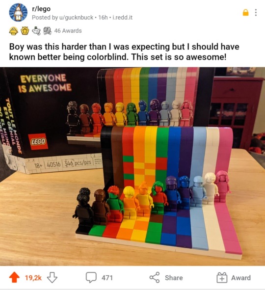
colorblind pride flag just dropped
203K notes
·
View notes
Text

from The Memory Palace, by Nate DiMeo
41K notes
·
View notes
Text
Things worn down by people.
#data visualization#sort of#evidence of life#desire paths and things that are like desire paths#I feel a post about desire paths coming on
74K notes
·
View notes
Text
Hans Rosling's hopeful bubbles
I've been writing about how data visualization can be an expression of hope, recently. And it'd be silly to keep on doing that without talking about Hans Rosling.
Hans Rosling is now one of those guys that it's embarrassing not to have heard of if you're a certain type of data person. He first became well known for his 2006 TED talk, The Best Stats You've Ever Seen, and quickly became synonymous with a certain type of evidence-based optimism. Here's the talk:
youtube
Rosling is a charismatic speaker, but the real star is his bubble chart - a style of animated chart that was everywhere for at least a decade afterwards.
In this video, every circle on the chart is a country, scaled to its population size and plotted by life expectancy.
Rosling is explaining that people have an outdated idea of what global health looks like. His chart shows how things stood in the mid-20th century, a picture that dominates people's perceptions even now.
But time is everything, and that's the extra dimension on his chart. He presses a button and time starts to tick forward, and suddently he's a racing announcer, keeping up a fast-paced commentary as the bubbles float upwards, life expectancy gets longer, and the world gets, broadly speaking, better. By the end, the audience is cheering.
Rosling spent the rest of his career making variations on the same point: that the world is often doing better than we assume it is, and we can find that out if we actually look at the data.
That talk was nearly twenty years ago, incredibly. Since then, it's often been very hard to think of the world as a place that's good and getting better.
Rosling was often accused of being too optimistic, and ignoring real problems in favour of his argument. His response was that he didn't see himself as an optimist, but a "possiblist" - a term of his own which he defined as someone willing to understand how things have improved so far, and take that as evidence that it's possible to go further.
The sentiment has been put more pithily by the founder of Our World In Data, a similar project which documents all kinds of global trends: "The world is awful. The world is much better. The world can be much better. All three statements are true at the same time."
It's a hopeful outlook, but a specific - and annoying - kind of hope. It's annoying because there's nothing in this data that shows that we can relax, that things automatically get better by themselves. It only shows that things can get better if we put in the work.
I've said before that people expect every chart to contain bad news, these days. But to expect bad news is to assume you already know the answers, and it's dangerously close to assuming that there's nothing you can do.
Our World In Data have a graphic on life expectancy, by the way, as they do for everything. And the answer to the question of whether it's improved further since Rosling addressed that crowd is - well, it would be nice if it was an uncomplicated yes, wouldn't it?
The real answer is: yes, dramatically in some places; less dramatically in others, where life expectancy is already high; but Covid deaths put a substantial dent in progress in some places.* Things don't automatically get better by themselves. Hope is, it turns out, complicated.
* By the way, a point that's not explained often enough is that "Covid-19 causing a fall in life expectancy" doesn't mean "the existence of Covid-19 means everyone will live shorter lives, forever". The measure of life expectancy that charts like these use are really just a way of expressing how many people died at different ages in a given year. That's why it can change over time, as circumstances (hopefully) improve and deaths (hopefully) happen later in life.
3 notes
·
View notes
Text
There was something extra I wanted to add to this in January and, well, now it’s February. Oops. That’s the nature of this time of year.
But speaking of hope in midwinter: another fun place to spend time in the cruddiest part of the year is on Reddit, eyeing up other people’s bullet journals.
I’m not a bullet journaller myself, and even if I was I’d never start one in January. I’m at my lowest ebb, and it isn’t the time for new habits. But I admire people that do, and I admire the hope and optimism that goes into it.
My understanding is the “original” approach to bullet journaling was really just about having an efficient system for keeping track of your time and tasks. But shiny social media bullet journals are often much more than that – making a visually pleasing journal with all sorts of extras becomes a hobby in itself.
And one of the things people have added to the tradition is drawing themselves beautiful templates to track everything – their alcohol consumption, their weight loss, their reading, their mood.
Let’s not dwell on the question of how many of these templates actually get completed. For now, it’s enough to celebrate a hopeful way of approaching the world: day by day, coloured square by coloured square, leveraging the buzz of completing one day as a way of getting through the next.
Hoping for daylight
It’s late January, one of the worst parts of winter. I always find this stretch the hardest: midwinter is technically behind us but there’s still a long, long way to go before spring.
At this time of year I start fixating on how much daylight we get in a day, because it’s the one thing that’s reliably getting better. It’s a habit I got into in the bleakest, dullest parts of the winter Covid lockdown. Nothing felt in my control, or even really in humanity’s control. So it was comforting to remember that neither I nor a virus can screw anything up so much that the Earth changes its trajectory around the sun. Lighter days are something to rely on.
This year, it feels like more people online are posting about exactly what point we’ve got to. We’ve reached the solstice, we’ve done the shortest six weeks of the year, the shortest ten weeks, keep going, keep going. One thing that’s reliably getting better.
There’s something about our fixation on the progress of the sun that feels prehistoric. Like the chamber at Newgrange, a neolithic monument in Ireland, that is aligned to illuminate perfectly on the winter solstice:
youtube
Well. I haven’t seen anyone build anything quite that good, lately. But people do still seem to like to make things that help us keep track and know where we’re going.
For starters, I highly recommend clicking around on good old timeanddate.com, where you can find a sun graph for your location, showing you exactly what trajectory you’re on to reach brighter days:

There are plenty of original charts going around, as well. On Bluesky, I’ve enjoyed browsing the work of Neil Kaye. Did you know, for example, that the days don’t all get brighter at the same rate? There’s a stagnant period in December and January where the length of the days don’t change that much – and man, doesn’t it feel like it? – then as we enter February, the change speeds up.

If you can understand this one you’re smarter than me, but still. I think it’s worth paying attention whenever you see one of these graphics, or some commentary on how much lighter the days are getting, or whatever. The message always seems to boil down to one thing: it won’t always be like this.
2 notes
·
View notes
Text
Hoping for daylight
It’s late January, one of the worst parts of winter. I always find this stretch the hardest: midwinter is technically behind us but there’s still a long, long way to go before spring.
At this time of year I start fixating on how much daylight we get in a day, because it’s the one thing that’s reliably getting better. It’s a habit I got into in the bleakest, dullest parts of the winter Covid lockdown. Nothing felt in my control, or even really in humanity’s control. So it was comforting to remember that neither I nor a virus can screw anything up so much that the Earth changes its trajectory around the sun. Lighter days are something to rely on.
This year, it feels like more people online are posting about exactly what point we’ve got to. We’ve reached the solstice, we’ve done the shortest six weeks of the year, the shortest ten weeks, keep going, keep going. One thing that’s reliably getting better.
There’s something about our fixation on the progress of the sun that feels prehistoric. Like the chamber at Newgrange, a neolithic monument in Ireland, that is aligned to illuminate perfectly on the winter solstice:
youtube
Well. I haven’t seen anyone build anything quite that good, lately. But people do still seem to like to make things that help us keep track and know where we’re going.
For starters, I highly recommend clicking around on good old timeanddate.com, where you can find a sun graph for your location, showing you exactly what trajectory you’re on to reach brighter days:
There are plenty of original charts going around, as well. On Bluesky, I’ve enjoyed browsing the work of Neil Kaye. Did you know, for example, that the days don’t all get brighter at the same rate? There’s a stagnant period in December and January where the length of the days don’t change that much – and man, doesn’t it feel like it? – then as we enter February, the change speeds up.
If you can understand this one you’re smarter than me, but still. I think it’s worth paying attention whenever you see one of these graphics, or some commentary on how much lighter the days are getting, or whatever. The message always seems to boil down to one thing: it won’t always be like this.
2 notes
·
View notes
Text
This comic from the Verge is a pretty incredible exploration of how much data new parents can choose to collect on their babies, and what it feels like and means to do that: whether it's about joy, control, proof of love, a barrier against fear, etc.
0 notes
Text
I'm reblogging this here because I always think of this kind of self-making art as a weird cousin to data visualization.
There are lots of other artworks that this reminds me of: Olafur Eliason has melted glacier ice on circles of ink, and Charles' Ross Solar Burn works track the sun's progress across the sky by scorching a piece of wood with focused light.
Like data visualization, these works are visual records that capture something that's happened in the real world. The 'something' that happens - in this case, the progress of water through rope and dye and paper, and the minute individual variations in those things that create a distinct image - is more complex and multidimensional than the representation you're left with.
But works like this are arguably far more faithful to the thing they're recording than most data visualizations are. There's no designer in the middle, picking and choosing and simplifying. The end product here tells you no more and no less than exactly what happened when this particular dye on this particular page got wet on this particular day. It's up to you how much effort you put into reading it.
Anyway, "frustrating" is a good word for this kind of work! Living in a world with so much information available can make us feel like we're entitled to know everything about everything, instantly. And we're used to treating records and representations as if they give us a comprehensive account of reality.
Slow visualizations can challenge both those things. A pattern emerges on its own schedule, without explaining itself, and we're made to admit we're not as much in control as we thought we were.


I made another sculpture! This one is kind of hard to document well, because I don't have access to a super clean white gallery space so apologies that the images aren't amazing. But I think it's a cool piece.
WICK is, in some ways, a clock. Slowly, invisibly, the water travels through the cotton fiber rope out of the glass vessel and down. Eventually, when it touches the paper, it will react with the small pile of powdered dye that's there, and create an image.
Here's what it looks like when that happens (sped up 12x):
I wanted to make something that engaged with ideas of motion, stillness and scale. At first glance, the piece is static. But what you cannot see with the naked eye is that there is quite a lot of motion happening — water being pulled, molecule by molecule, up and through the wick. It's simply happening at a scale that we can't easily see or engage with.
In a way, Wick is a time piece. Each image created is a portrait of a day — many hours of seeming stillness suddenly made visible on the page. The water travels through the wick at a set rate (about .1 inch per minute) and so you could conceivably use it as a stopwatch, or a timer. And yet, doing so seems absurd, because we want things to be precise, visible and immediate. Wick is none of those things.
In our class critique, one of my fellow students called the piece "frustrating," which I actually really appreciate, because to me that is one way to describe trying to wrap your mind around time and scale and motion — it forces us to be a little bit uncomfortable. To wait, and to look closely, and to wonder whether or not the scale and speed we operate at is the only one worth trying.

17 notes
·
View notes
Text
So I’ve been writing about people who mess with their survey responses for fun, and I think one of the reasons that sort of thing feels fun to do is because people think of statistics and data as very, very serious.
That’s not surprising. If you see a statistic in a news article or a post, it’s almost always telling you about bad news.
Covid made it worse (Covid made everything worse). We started bracing ourselves for every new data point, almost every day. And that flinching instinct is always there, whenever it’s time to hear more about climate change or inflation or any of the other quantifiably awful things happening in the world.
People who have stories to sell know this, and they work with it. If you want someone to take a problem seriously, you make sure you present them with a serious-looking chart.
And that means that serious-looking charts have their own visual language. We all know what they look like, and when we see them we switch off out of self-preservation.
But! Data visualization doesn’t have to be like that! There are innovative, joyful approaches to presenting data.
Maybe you’ve seen the work of Neal Agarwal, a guy who makes things online that are just fun.
Here are some things you can do on Neal’s website:
Spend Bill Gates’ money. Your choice whether you spend it on Big Macs, Apache Helicopters, or the Mona Lisa, but you’ll come out of it with a stronger sense of what a billion dollars is.
Take an elevator into space. Learn along the way about what goes on at various altitudes, and enjoy delightful touches like elevator music and a choice of scarf to keep warm.

Get the stats on exactly what’s happened in your lifetime, from inflation to the number of rotations of the moon around the Earth.
This is sort playful creativity is vital for coaxing people back into reality.
Because there’s nothing inherently miserable about finding out about the world through data. I’m not saying that it’s all good news. But that little burst of joy when you start playing with something like ‘space elevator’ is a starting point, a tiny pitch for the merits of paying attention.
Maybe after that point, after your attention was engaged, you started to feel other things in response to Neal’s games: wonder, or anger, or hope or sadness. But the point is, it was much easier to feel those things because your defences weren’t up already.
1 note
·
View note
Text
Still, there’s always the risk that naïve and trusting researchers will read too much into these sorts of joke responses.
Teenagers are a particular problem for this, because they love not taking tasks assigned to them seriously and academics are somehow perpetually at risk of forgetting this.
Say you’re a teen and you’ve been given a serious and important survey about your life outcomes, to help serious and important people make serious and important policies. You do your best to mine the comic potential in this situation, so you say that you’re seven feet tall and have eight siblings and are regularly taking Each and Every Drug.
You also say you’re gay, even though you’re not. It’s not that surprising that you do this. Being different is terrifying and, as a consequence, quite funny. You’ll hopefully grow out of it.
Joke responses aren’t actually that widespread, so they usually won’t make much difference to the basic results. The trouble starts when a researcher decides to look at a small minority, like students who are LGBT+, or disabled, or adopted. Suddenly a bigger chunk of the responses will be from pranksters – because by definition, minorities will have fewer real people to balance out the fakes.
This can cause estimates of harmful outcomes, like drug addiction, to be inflated relative to what’s really happening. And if that happens, there are other, more serious risks. If you’re a minority student, you might find that stereotypes about you are being bolstered with another layer of faulty evidence; maybe you find yourself targeted by programmes to address problems that people like you aren’t particularly at risk of.
Does this actually happen? Researchers have found evidence that joke responses really do skew the findings for certain groups, although tracing the impact of this is much harder to do.
One 2006 study looked at the responses to a large-scale survey of teenagers carried out in the US in the nineties. There were 250-odd artificial limb users in the written survey, of whom 99% changed their minds at interview. And those fakers were unreliable on things like ethnicity and gender, too – so keeping them in the study would mean getting inaccurate data about this particular group of disabled people.
A more recent paper advocates developing a sort of ‘screener’, using questions that are vulnerable to pranking but unrelated to your research topic. Some researchers have added in questions purely to serve as bait. There are surveys with fake drugs and fake video games; one study, somewhat adorably, classes anyone whose favourite ice-cream is rum and raisin as an obvious serial liar.
The idea is that if a response to a question is uncommon, then that response will automatically be tempting for a mischievous responder to choose. If that’s true then all the researchers have to do is find the respondents who have a lot of statistically unlikely answers.
They’re imagining their pranksters the way I did to start with, unfailingly tickled by the idea of being weird. I think there’s more to teenage humour than that, though – whether it’s something you don’t understand, or are afraid of, or think is icky, some things end up getting processed through humour more readily than others.
Sometimes, people mess with the census as a protest because the government is denying them human rights, sure. But an unavoidable problem in survey design is that people will also sometimes tell you complete untruths just because they think it’s funny.
Census Jedis are your classic example. In 2001, censuses in the UK, Australia and New Zealand asked about religion for the first time. 2001 was also the early days of widespread internet, and so a meme began to circulate in chain emails.
People were urged to put ‘Jedi’ as their religion on the census, partly for fun and also (they were told, though this isn’t actually true) because it would force their government to recognise it as an official religion.
People did. In England and Wales, 390,000 people did, outnumbering several minority religions.
And why? Some people framed it as a protest against asking about religion on the census, or against the census in general. And sure, there’s an anti-establishment sort of feeling behind it.
But for my money, people mostly did it because it amused them. Because surveys are boring, and people get very serious about the census in particular. Phrases like ‘civic duty’ get thrown around. And there’s a form with all sorts of serious boxes to tick, but also a free space to write whatever you want, and, well, it would be funny, wouldn’t it? It just would.
There are consequences to these sorts of shenanigans. Questions were asked about the quality of census data. Atheist and Humanist organisations begged non-religious people to stop doing it, so as not to artificially inflate the count of religious people. Sociologists have written papers.
But all of that just makes it funnier, doesn’t it?
Look, I’m not encouraging doing this. Nobody who works with this sort of data in real life can afford to – we’re all terrified that the rest of you will decide something else is funny next, and muck up a carefully-calibrated data series we’ve been using for years.
I’m just reminding everyone to beware. There’s no power on Earth that will keep people from being silly, including within your datasets. Sometimes you just have to work with it.
3 notes
·
View notes
Text
Similarly: data from the 2021 census says that 34 residents of England and Wales were born in Antarctica.
There have only been 11 recorded births in Antarctica in human history*, so. Huge if true, but probably not true.
*I couldn't actually find a very robust source here, just Wikipedia and this. But I did learn that the 11 births were seemingly all part of a bizarre competition between Argentina and Chile to bolster their claims to territory there.
Sometimes, people mess with the census as a protest because the government is denying them human rights, sure. But an unavoidable problem in survey design is that people will also sometimes tell you complete untruths just because they think it’s funny.
Census Jedis are your classic example. In 2001, censuses in the UK, Australia and New Zealand asked about religion for the first time. 2001 was also the early days of widespread internet, and so a meme began to circulate in chain emails.
People were urged to put ‘Jedi’ as their religion on the census, partly for fun and also (they were told, though this isn’t actually true) because it would force their government to recognise it as an official religion.
People did. In England and Wales, 390,000 people did, outnumbering several minority religions.
And why? Some people framed it as a protest against asking about religion on the census, or against the census in general. And sure, there’s an anti-establishment sort of feeling behind it.
But for my money, people mostly did it because it amused them. Because surveys are boring, and people get very serious about the census in particular. Phrases like ‘civic duty’ get thrown around. And there’s a form with all sorts of serious boxes to tick, but also a free space to write whatever you want, and, well, it would be funny, wouldn’t it? It just would.
There are consequences to these sorts of shenanigans. Questions were asked about the quality of census data. Atheist and Humanist organisations begged non-religious people to stop doing it, so as not to artificially inflate the count of religious people. Sociologists have written papers.
But all of that just makes it funnier, doesn’t it?
Look, I’m not encouraging doing this. Nobody who works with this sort of data in real life can afford to – we’re all terrified that the rest of you will decide something else is funny next, and muck up a carefully-calibrated data series we’ve been using for years.
I’m just reminding everyone to beware. There’s no power on Earth that will keep people from being silly, including within your datasets. Sometimes you just have to work with it.
3 notes
·
View notes
Text

This is a return from the 1911 census in England and Wales. At the time it took place, the movement for women’s suffrage was well underway, and this was the result of an organised campaign to use the census as a vehicle for protest.
In many ways it was ideal as a form of passive resistance. A census is supposed to collect data on everybody. The government was spending huge amounts of money and effort to get the details and whereabouts of every single household on one night in April. Why not use the opportunity to voice your anger about the status quo, instead?
So that’s what the Women’s Freedom League did. They encouraged women all over the country to evade the census entirely, or return their forms with slogans like “No vote, no census”.
Some had a lot of fun doing it: there was an all-night party at an ice rink in London, with attendees circulating between there and a nearby restaurant “to baffle the enumerators”.
Others had to put up with enraging condescention from within their own household. Like Eleonora Maund, married to a no doubt delightful man 31 years her senior. He wrote down her details; she crossed them out. He wrote her details down again in red ink, and lodged a protest against her protest: “My wife … attempted by a silly subterfuge to defeat the object of the Census. To which as ‘Head’ of the family, I object”.
I made this blog to talk about how people's feelings will get into your data collection, whether you want them to or not. This is a prime example. The British government in 1911 felt it had the right to ask all its citizens for information about themselves, for the worthy project of compiling statistics that would help it make good policy. But the suffragettes felt differently. They were angry, and they didn’t see why they should co-operate with the work of a state that refused to give them a democratic voice.
So they didn’t. Because at the end of the day, a census form is a blank piece of paper. And if you give someone a piece of paper, what’s to stop them from telling you what they want you to hear?
1 note
·
View note