Don't wanna be here? Send us removal request.
Text
Portfolio, Documentation and Pitch (Aryan Raj Adhikari)
Stylized Works #5
Released in 2023, Ruthless Blade is a strikingly stylized short animated film that blends traditional Chinese animation with cutting edge 3D techniques. Directed by Bo Zhang and produced by Bilbili, Ruthless Blade immerses audience in a high-octane, action-packed worked where honor and survival collide in the battle between two formidable warriors.

Figure 1 (Ruthless Blade, (Tribeca, n.d.))
It makes use of a unique blend of 3D animation with 2D textures, creating a very fluid hybrid style that feels both modern and reminiscent of traditional animation. The characters, particularly the white tiger protagonist are built in 3D while the backgrounds and certain visual elements retain a 2D painted look. The color palette is very rich using bold contrasts that convey both the fierce nature of the characters and the dangerous world they inhabit.
Deep blues and fiery oranges create a visceral, high-stakes atmosphere throughout with a sense of roughness and rawness in the visuals. The characters expressions are heightened and exaggerated referencing classic animation styles that amplify the emotional impact of every fight and interaction.

Figure 2 (A still of Ruthless Blade, (FilmFreeway, n.d.))
The main character, Eleven, a white tiger swordsman is intricately modeled in 3D with exaggerated proportions that give him a stylized presence. It incorporates elements of clean, bold lines and sharp silhouettes making the characters stand out against the more textured, organic backgrounds. The combination of 3D and 2D textures is meticulously crafted, with the 3D characters featuring detailed fur and armor. The lighting is dramatic with sharp contrasts between light and shadow that highlight the action. There is also a strategical use of backlighting to create silhouettes to further enhance the cinematic nature of the film.

Figure 3 (Lighting and Mood of Ruthless Blade, (FilmFreeway, n.d.))
Lighting is really low-key, with heavy shadows accentuating the sharp lines of characters and backgrounds. The lighting heightens the emotional stakes making each moment really dramatic.
While there's a realistic undertone to the lighting, the color palette itself takes liberties for creative artistic expression. The fiery oranges, deep reds and the vibrant greens often dominate the scene signaling battle, danger or supernatural forces.
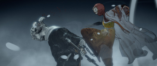
Figure 4 (Level Design of Ruthless Blade, (FilmFreeway, n.d.))
The environments are stylized and really sparse, yet very immersive. The backgrounds are layered with 2D textures, creating depth using the gradients and painted details. There is not much visual clutter.
The setting is also crafted to support the action-driven narrative. Large, open spaces are juxtaposed with narrow alleys or rugged cliffs to reflect the inner turmoil of the characters. These levels were designed to make the fights feel expansive yet claustrophobic, playing on the high tension and vulnerability of the entire film.
Ruthless Blade is a powerful example of how stylized 3D animation can seamlessly merge with 2D elements to create a narrative that's as visually captivating as it is emotionally charged. By choosing both styles, the film creates an artistic world that feels grounded in tradition while exploring innovation.
REFERENCES
Tribeca, n.d. Tribeca. [Online] Available at: https://www.tribecafilm.com/films/ruthless-blade-2024 [Accessed 27 April 2025].
FilmFreeway, n.d. FilmFreeway. [Online] Available at: https://filmfreeway.com/RuthlessBlade [Accessed 27 April 2025].
0 notes
Text
Portfolio, Documentation and Pitch (Aryan Raj Adhikari)
Stylized Works #4
From DreamWorks Animation, Dog Man is a gloriously chaotic, heartwarming adaptation of Dav Pilkey's best-selling graphic novel series. It tells the story of a half-dog, half-human police officer that is stitched together to defend his city from criminal activities.
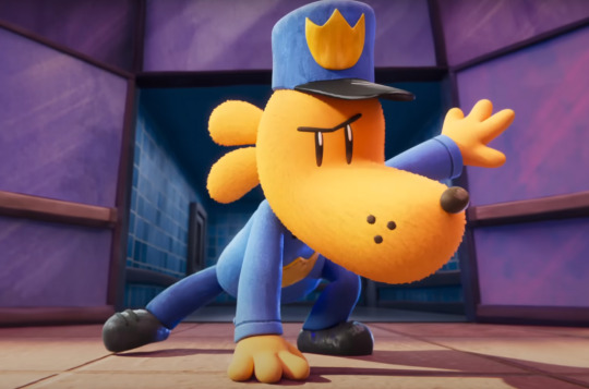
Figure 1 (Dog Man, (Iasimone, 2025))
Dog Man protects its 2D comic book roots, translating them into a high-end handmade 3D style. It's not a slick, polished world but intentionally textured, whimsical and child-like that echoes the original drawings by Dav Pilkey.
The world looks almost crafted by hand and mimics the paper cardboard-ish feel and the crayon scribbly effect rather than polished metals or plastics. It is a very stunning hybrid between CG precision and the imperfection of a child's imagination.

Figure 2 (Stylization of Dog Man, (Virgona, 2025))
The PBR materials are carefully tweaked to emulate the physical textures like papery roughness, fuzziness and the fabric weave patterns. The shaders feature intentional noise, like brush strokes and grain to break up otherwise clean surfaces. Edges are softly outlined but not in a harsh cel-shaded way. The forms are intentionally bulky and "imprecise" that resemble the way a child might draw a car, a house or a person.
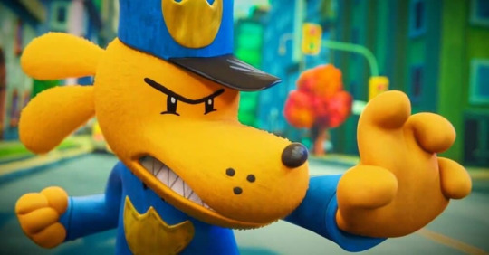
Figure 3 (Level design in Dog Man, (Kojder, 2025))
The streets, houses, schools and the police stations are built like themed stage sets. The backgrounds are often deliberately flat or repetitive, reinforcing the "drawn" and "crafted" look of the universe. Some of the minor props like open books, messy pencil pots and funny signs are a constant reminder that you are inside a child's dream world. Many scenes are framed as a form of a tabletop dioramas with slightly unrealistic physics and simple layouts that favor quick visual reads.
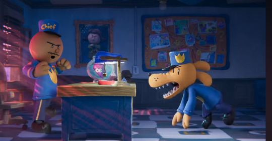
Figure 4 (Lighting in Dog Man, (Ysabel, 2025))
The soft diffused lighting dominates the overall mood of the movie and harsh shadows are avoided, making it approachable and friendly. The color schemes stick closely to bright primary and pastel colors, that reflect crayon-box nostalgia.
In an era where hyperrealism often dominates, DreamWorks dares to embrace the messy, heartfelt aesthetic of a child's imagination and in doing so, crafts something far more original.
REFERENCES
Iasimone, A., 2025. Billboard. [Online] Available at: https://www.billboard.com/lists/dog-man-movie-2025-grammys-watch-family-activities-this-week/ [Accessed 27 April 2025].
Virgona, A., 2025. Collider. [Online] Available at: https://collider.com/dog-man-cast-characters/ [Accessed 27 April 2025].
Kojder, R., 2025. Flickering Myth. [Online] Available at: https://www.flickeringmyth.com/movie-review-dog-man-2025/ [Accessed 27 April 2025].
Ysabel, J., 2025. Dog Man 13 2025. [Online] Available at: https://marcihjkkorney.pages.dev/chbnfjq-dog-man-13-2025-photos-ywohztg/ [Accessed 27 April 2025].
3 notes
·
View notes
Text
Portfolio, Documentation and Pitch (Aryan Raj Adhikari)
Stylized Works #3
Hi-Fi RUSH is a rhythm-action game developed by Tango Gameworks and released in early 2023. It follows Chai, a wannabe rockstar turned accidental hero, as he battles through a corporate dystopia where everything- enemies, environment, even boss battles- moves perfectly to the beat. The game boasts an energetic, highly stylized 3D art style, mixing cel-shading with real-time dynamic animation, all tied meticulously to musical rhythm.

Figure 1 (Hi-Fi RUSH, (Wood, 2024))
Hi-Fi RUSH uses a strong cel-shaded pipeline that include bold outlines, sharp color separation, limited shading gradients all in real-time 3D. The aesthetic of the game feels pulled straight from a Saturday morning cartoon or a graphic novel, but rendered seamlessly in motion. The game includes bright, saturated colors that dominate the screen, making characters and enemies instantly readable even during frenetic action sequences.

Figure 2 (Textures in Hi-Fi RUSH, (Mansoor, 2023))
The models use PBR materials under the hood but they are tuned for non-photorealistic rendering to fake depth and glossiness in a very stylized manner. The combat, idle animations and even some of the environmental elements are hand-keyed to match the BPM (beats per minute) of the soundtrack. The camera subtly punches in and out on musical cues, maintaining kinetic energy without inducing motion sickness.
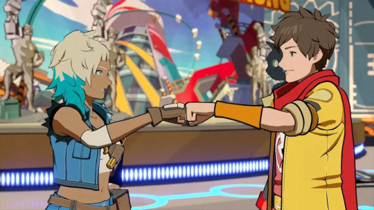
Figure 3 (Animation in Hi-Fi RUSH, (Day, 2023))
Chai and the enemies use big, readable poses with minimal in-between smearing which is one of the classic animation principles adapted into 3D, mostly in stylized aesthetics. The character models prioritizes clean edges and big readable shapes over excessive tiny details which is perfect for stylized real-time rendering.
Details like fabric folds, scratches and mechanical parts are baked into normals or simplified with hand-painted flair with subtle gradient details baked into the diffuse map to avoid flatness, while still maintaining the clean cel-shaded aesthetic.
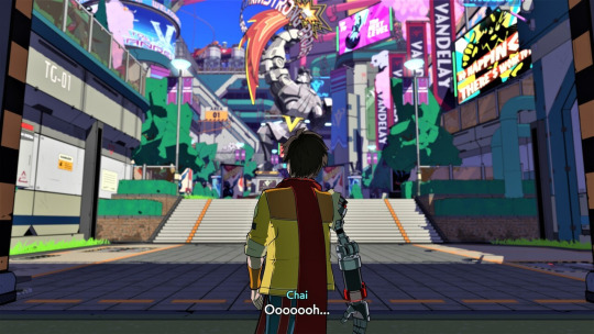
Figure 4 (Environmental design in Hi-Fi RUSH, (Gilbert, 2023))
The environment has sharp, readable geometry with no unnecessary bevels or edge loops. The surfaces are broad and clean and optimized for quick comprehension during fast movement and combat. Metals, plastics and concrete are rendered with exaggerated color separation. Tiny scratches, dust and grime are painted in to imply wear without too much visual clutter and the specular and roughness maps are tweaked subtly to maintain a cel-shaded look without flatness.
Hi-Fi RUSH is a rare beast of a game that feels handcrafted in every corner- from characters to combat arenas- yet seamlessly energetic in motion and symbolizes how stylized 3D art can be playful, technical and emotionally resonant all at once.
REFERENCES
Wood, D., 2024. TechRadar. [Online] Available at: https://www.techradar.com/gaming/hi-fi-rush-review [Accessed 27 April 2025].
Mansoor, A., 2023. Exputer. [Online] Available at: https://exputer.com/hi-fi-rush-tv-show/ [Accessed 27 April 2025].
Day, J., 2023. Geekwave. [Online] Available at: https://thegeekwave.com/2023/02/review-hi-fi-rush/ [Accessed 27 April 2025].
Gilbert, F., 2023. PureXbox. [Online] Available at: https://www.purexbox.com/news/2023/01/hi-fi-rush-has-a-special-upgrade-offer-for-xbox-game-pass-members [Accessed 27 April 2025].
0 notes
Text
Portfolio, Documentation and Pitch (Aryan Raj Adhikari)
Stylized Works #2
The First Berserker: Khazan is a stylized action RPG developed by Neople released very recently in 2025 and follows the tragic downfall of Khazan, a once-heroic figure framed for treason, now battling through a grim, war-torn world seeking revenge. It's a darker, bloodier cousin to titles like Marvel Rivals with bold character design and a serious, battle-worn flavor.

Figure 1 (The First Berserker: Khazan, (Orselli, 2024))
Khazan is not painterly bright like Marvel RIvals as it is more grittier and darker but holds heavy stylization in its character designs and environmental storytelling. The characters themselves retain heroic exaggeration with broad shoulders, flowing capes and weapons larger than common sense dictates. It can be classified as realism filtered through a hyper-stylized lens- not quite realism and not quite cartoon as well.
The surfaces of armor, swords, and architecture are very sharply modeled with clean, defined edges and the materials while rugged, are still stylized- not full photoreal, but textured enough to give weight.

Figure 2 (Stylized shader in Khazan, (Jacob, 2023))
Khazan uses PBR shading, but textures are selectively exaggerated to main a larger-than-life aesthetic. For example, metals glint with sharp specular highlights, skin shaders are tweaked for a slighty "unreal" vibrancy and the blood and cloth have stylized splatter/tearing effect which is not photoreal horror.
Heavy work of ZBrush sculpting is evident, especially in ornate designs on armor and weapons. They also avaoid procedural over-noise as every scratch feels deliberately places, not just "grunge for grunge's sake".

Figure 3 (Dynamics in Khazan, (xMufL, 2024))
The movement in Khazan is slow but heavy and the users can feel the mass behind each sword swing. This also affects how the 3D models are rigged with extra care on secondary motion, weight transfer and weapon interactions. There's subtle dynamic simulation on cloaks and hair though it is stylized to snap into poses, not floppy and ultra-realistic like AAA open-world RPGs.

Figure 4 (Environment in Khazan, (Duckworth, 2024))
The environment art is really similar to the Souls genre but slightly dipped into anime dramatic flair. The 3D assets are modular and designed to blend "playable spaces" with "hero shots" in mind. It has a stylized high-contrast lighting which enables characters to pop against darker backgrounds that help with visual clarity during intense fights.
Khazan is an excellent study for those who wish to master stylized sculpting, material polish and emotional character design and will refine your sense of weight, detail and form.
REFERENCES
Orselli, B., 2024. Niche Gamer. [Online] Available at: https://nichegamer.com/the-first-berserker-khazan-release-2025/ [Accessed 27 April 2025].
Jacob, 2023. Game News 24. [Online] Available at: https://game-news24.com/2023/12/07/brutal-combat-cel-shaded-visuals-and-more-are-some-of-the-features-in-the-first-berrker-khazan-debut-trailer/ [Accessed 27 April 2025].
xMufL, 2024. XDynasty. [Online] Available at: https://www.xboxdynasty.de/news/the-first-berserker-khazan/exclusive-spielszenen-aus-dem-hardcore-action-rpg/ [Accessed 27 April 2025].
Duckworth, J., 2024. Gamerant. [Online] Available at: https://gamerant.com/first-berserker-khazan-gameplay-preview/ [Accessed 27 April 2025].
0 notes
Text
Portfolio, Documentation and Pitch (Aryan Raj Adhikari)
Stylized Works #1
The world of technology is ever growing with lots of new software and hardware being utilized, especially in the field of Games Art. As an art practitioner, it is very vital that I stay on my tippy toes and research more into my field and see what's new out there. Since, I am specializing in stylized 3d artworks, it is of essence that I am well informed and researched on the new workflows and the technology associated within my field so that I can adapt well and become more versatile.

Figure 1 (Marvel Rivals, (NewsPlus, 2024))
Marvel Rivals is NetEase's take on the hero shooter genre, infused with the recognizable charm of the Marvel Universe. Unlike most of the gritty realism superhero games, this title steers towards a more painterly-stylized aesthetic-bright, dynamic and accessible.
The characters and the environments retain strong painted influences, especially in texturing that can observed in edges of armors and costumers. However, the materials themselves behave in accordance to realistic PBR logic where metal shines and fabric diffuses light. It is a very well balanced interaction between cartoonish vibrancy and material believability.
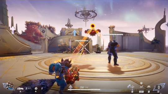
Figure 2 (PBR logic in Marvel Rivals, (Sabarwal, 2024))
Marvel Rivals employs a soft toon outline shader around the characters, not the same as hard cell-shading like mainstream anime games, but just subtle and gentle enough to give a crisp silhouette without harsh black borders. It is very much like Overwatch but even more softer.
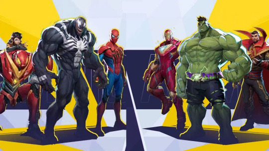
Figure 3 (Heroes in Marvel Rivals, (Co, 2024))
Exaggerated anatomy is the key of the game here with broader chests, slightly larger heads and powerful limbs. They maintain Marvel's "iconic posture" designs while adapting them into chunkier game-readable forms. Costumes are also designed modularly with how skins and visual customizations swap easily. Smart UV mapping and re-targetable rigs ensure swift asset swapping without breaking animations of the heroes.
A clean mid-poly topology is used- high enough for smooth animations and deformation during action-heavy gameplay but also well optimized to keep framerates high in chaotic team fights.

Figure 4 (Environment in Marvel Rivals, (Banerjee, 2024))
The backgrounds are highly contrasted, painted broad shapes with very simplified geometry while the playable areas use more rich details. This can also be seen as a deliberate way to avoid visual clutter while still keeping levels photogenic. Each map present in Marvel Rivals is color-coded- cool hues for defensive zones, warm hues for contested zones using 3D lighting and surface colors to subconsciously guide player movement.
Some maps also have destructible elements that use modular destructible meshes combined with stylized debris effects, ensuring that performance remains stable without compromising visual chaos.
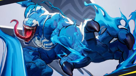
Figure 5 (Animation in Marvel Rivals, (Madsen, 2024))
Though not exaggerated as Looney Tunes, there's a lot of subtle dynamic deformation especially during attacks and dodges. Meshes flex organically rather than being stiff, adding life without distracting from gameplay. The particle effects are also tightly knitted to the 3D models, socketed dynamically to bones and animation cues that provide a more richer, more visceral connection.
Marvel Rivals really nails that difficult "Stylized but AAA Polish" line. It is super readable and charming to attract casual players and technically impressive to us 3D artists. It is a masterclass in how to build a stylized world without sacrificing modern response, optimization or gameplay readability.
REFERENCES
NewsPlus, 2024. NewsPlus. [Online] Available at: https://pinayconfessionsph.blogspot.com/2024/03/marvel-rivals-is-new-superhero-team.html [Accessed 27 April 2025].
Sabarwal, R., 2024. Dexerto. [Online] Available at: https://www.dexerto.com/gaming/marvel-rivals-devs-reveal-team-up-abilities-will-drastically-change-between-seasons-2874002/ [Accessed 27 April 2025].
Co, A., 2024. MP1ST. [Online] Available at: https://mp1st.com/news/marvel-rivals-to-feature-31-split-between-greatest-hits-heroes-and-lesser-known-characters-team-ups-to-be-rotational [Accessed 27 April 2025].
Banerjee, R., 2024. Dot Esports. [Online] Available at: https://dotesports.com/marvel/news/how-does-environmental-destruction-work-in-marvel-rivals-answered [Accessed 27 April 2025].
Madsen, H., 2024. Inverse. [Online] Available at: https://www.inverse.com/gaming/marvel-rivals-full-roster-all-characters-december-2024 [Accessed 27 April 2025].
0 notes
Text
Portfolio, Documentation and Pitch (Aryan Raj Adhikari)
Reviews and Conclusion
Like I have said, never practice alone as sometimes as your only embed it deeper. This is very true especially in the field of computers and technology and more so, in Games Art.
As with my earlier projects, I decided to get my pre-production documentation reviewed by a professional so that I keep doing what is clearly wrong and improve upon it. I sent my work to Eden Anthony once again and he was fairly impressed with my work.

Figure 1 (Reviews #1 by Eden)
While he praised my documentation, he also said that the different color tones for the text bodies do not make it uniform and as such, he advised me to change the text to the same color so that it matches the rest of the text throughout the documentation.
He also said that the descriptions for my images were written beautifully but advised to simplify it into shorter sentences that describe features for said assets, initially trimming the information to what is necessary.

Figure 2 (Reviews #2 by Eden)
I had some doubts regarding the collection of references for my pre-production documentation. While there are a lot of references available online for what I am going to accomplish, there were very few examples of said assets in stylized themes that matched or were similar to the ones present in the concept artwork.
For that reason, I inquired Eden about if including resources that are of different artstyles would be okay and he said it would be okay as the more references you gather, the better it is.

Figure 3 (Reviews #3 by Eden)
As I have gathered a fairly huge list of references for my pre-production documentation, I was worried that it might mess the uniformity of the documentation with the final few pages just dedicated to the list of references of the images used.
I ran that through with Eden and he said that instead of creating a separate word file that would include the list of references used, I'd be better off just adding them to the end of the pre-production documentation as it would be more efficient and easy.
At this point, I believe I have created a pre-production documentation well deserving of praise with all of the assets present in the concept art heavily researched. I would like to thank Eden once again for his continued support and advice and would like to thank Neil once again for this opportunity. After the pitch for the final project is approved, I will start working exclusively on the project.
0 notes
Text
Portfolio, Documentation and Pitch (Aryan Raj Adhikari)
Development Tests #1
Since, I have finished with the compilation of all of the possible references to help assist me in my final project journey, I start carrying a couple of tests to make sure that I am well equipped when I start the production phase.
The first thing I did was to analyze the concept art and break it down into different elements.
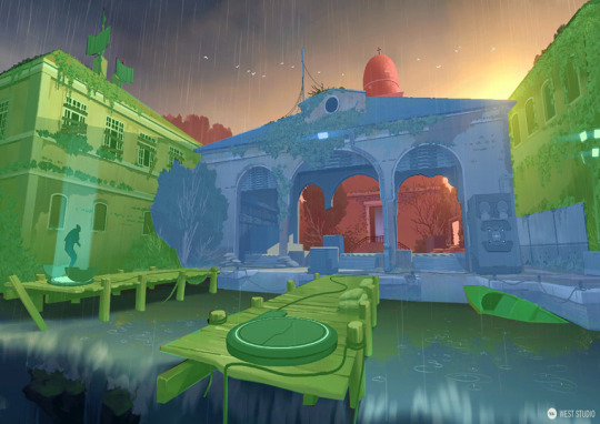
Figure 1 (Concept art breakdown)
The concept art has been broken down into 3 elements; foreground elements in green tone, midground elements in blue tone and the background elements in the red tone.
The foreground elements include the bridge, the portal contraption, the cables, the boat, the floodlights and the two buildings on either side. The building however could also be classified under the midground elements but I placed it in the foreground elements. The midground elements include the main archway building, the platform, crates, the sandbags and the main tree actor in the left corner. The background elements include the dome structure, the distant background building and the foliage and assets that are present in the vicinity.
The architectural assets include the two buildings on either side, the the archway structure and the background dome. The foliage include variations of trees, ivy plants, moss and water pads. The modular assets in the art are mostly the wooden panel and the beams that make up the pier bridge while the small assets include the boat, crates, cables, the teleporter, the floodlights, panels and the sandbags.

Figure 2 (Rough blockout inside UE5)
I went ahead and created a simple blockout inside Unreal Engine 5 to figure out the general layout composition and the shape language of the overall level. I used simple primitives like cubes, spheres and cylinders for a faster and efficient blockout.
Resizing and duplicating the assets as necessary, I then set a camera with the proper focal and zoom settings to match the perspective and locked it so I can work on that view exclusively while tweaking it later on.
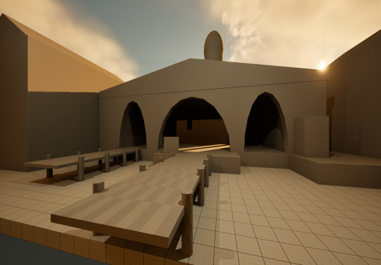
Figure 3 (Rough lighting pass inside UE5)
A simple lighting pass was set to match the general lighting mood for the scene, making it more similar to the concept artwork. I added a directional light to replicate the lightness of a sun and used a similar color tint to try and mimic the color composition of the concept artwork. I changed the position of the sun to get the similar sun glare in the corner and locked the manual exposure settings of the entire composition.

Figure 4 (Rough cloud cards)
I created a simple rough blockout for the cloud cards in Photoshop. This doesn't reflect the final cloud cards. I painted over the blockout in a new layer with an absolute white color using a wet brush. While working on the color, I also tweak the edges of the cloud using the eraser brush and the move selection brush. I started with a soft blue highlight tint for the silhouettes and a saturated blue highlight for stronger shadow emphasis. Finally, I manipulated the color of the hue/saturation to match the concept art composition which can also be done later inside Unreal Engine.

Figure 5 (Cloud FX test)
I modeled the cloud cards inside Blender and imported it to Unreal Engine. I created a material for the cards using its color and opacity masks. The material for the cloud cards utilizes the material functions and a master material with an instance material to control the parameters of the clouds.
It includes parameters like brightness, desaturation, hue shift and tint color to control the cloud cards. It also includes parameters like distortion speed and distortion strength to control the distortion flow of the clouds.
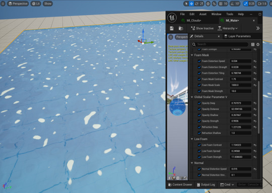
Figure 6 (Water FX test)
I created a water shader inside the Unreal Engine 5 entirely. The instance material of the water controls the parameters of the water shader. It includes a lot of parameters for the water FX that includes foam masks, normal, the low foam masks, the refraction settings and slots to change the opacity and the color map.
It also includes slots for noise maps that can be plugged to change the foam and normal masks which control the flow behavior of the water shader.
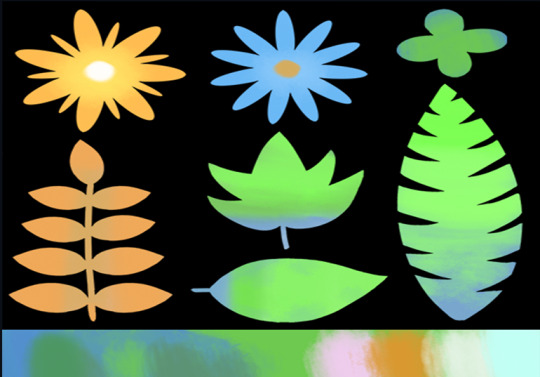
Figure 7 (Rough foliage cards)
I also decided to tackle the foliage as it could prove to be a bit difficult. However, it was really easier than what I had anticipated. Just like with the cloud cards, I created a rough foliage card with different leaf and flower variations and colored it with a wet brush. I then exported a color map and an opacity map which was used inside Blender with the help of a particle system to create flowers and bush. It was then imported inside Unreal Engine where I created a foliage material that can be referenced for any variation.

Figure 8 (Foliage material test)
The materials for the foliage was created inside Unreal Engine 5. It contains a plethora of parameters like billboard properties, color control, a PBR map and shadows which can be tweaked as necessary. I also included parameters for subsurface that help control the tint in the foliage for a subtle gradient silhouette. This material also creates a simple wind parameter to control the flow of the foliage.

Figure 9 (Rough tree test)
I also went ahead and experimented with the trees based on the concept artwork. I decided to use TreeIT, a free alternative to SpeedTree. Although a lot less versatile than SpeedTree, it met the requirements I had to create a nice tree and I have decided to use TreeIT moving forward.
I used one of the rough foliage card as a test for the leaf billboards for the tree. Inside TreeIt, I can control a lot of different parameters for branches, branchlets, barks, leaves and its overall scale and deformation. It proved to be a very viable alternative to SpeedTree while experimenting with it. I will require 2-3 different variations of a small tree to populate my scene later on.
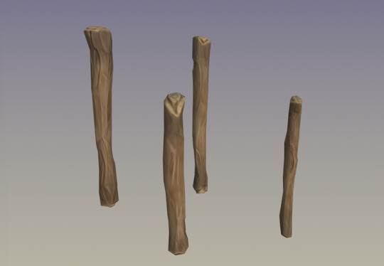
Figure 10 (Modular kit and shader test)
I created rough wooden logs as a modularity test to see if I could use these and build upon some of the scenes. I created 4 different variations of wooden logs. Sculpting it for stylization details and then importing it into Substance Painter for a shader test, it was a really rewarding and a fun process. I tried to mimic the shader of the logs as much as possible to that of the concept art. It is done with a simple procedural setup and utilizes black masks to add grunge maps as overlay details on top of the logs. Adobe recently released a 'Stylization' filter for Painter which allows you to replicate a stylized look based on presets which you can further tweak. The 'Handpainted' effect really allowed for a brushed touchup with grain noises being eliminated. This still requires much work but this test proved to be very useful.
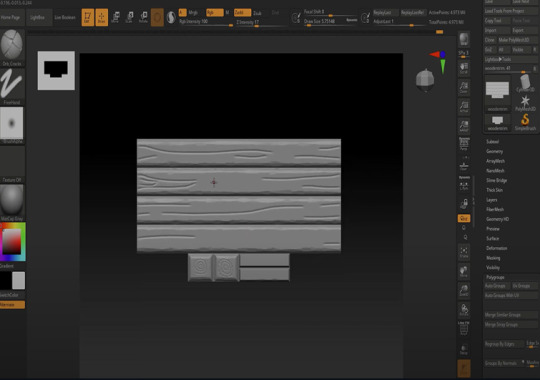
Figure 11 (Trimsheet test)
Instead of creating multiple different variations of wooden planks from scratch, I decided to undergo a trimsheet test to see if its viable for this project. I created a rough trimsheet in Blender and imported it to ZBrush where I sculpted wooden details onto it.
However, due to time constraint, I couldn't go further past this phase but I am confident that this approach would work for a lot of assets present in the concept art and I will employ this approach.
Having carried out these tests, I am happy to say that I am well equipped to tackle the final project head on. Still a bit more needed for testing which will be done in due time but for the meanwhile, I am really satisfied with this result.
0 notes
Text
Portfolio, Documentation and Pitch (Aryan Raj Adhikari)
VALORANT
It is very integral to research the works created by artists who worked on a particular game if you are trying to replicate the artstyle of said game. That being said, with my main inspiration for the artstyle being Valorant's, I decided to research on some of the works created by the artists who worked on Valorant.

Figure 1 (Still render of the Lotus map, (H, 2023))
This is a still render of the Lotus map in Valorant environment. Josh H worked on this environment alongside other artists from 2021 to early 2023.
His main role was to take basic primitive blockout from the level designers and create environments with very little to no deviation from the original layout. He was responsible for the Defender spawn point, a number of connector squares and the general art blockout of the map. This was modeled in Blender, imported to Unreal Engine 4 and then textured with pre-existing materials.

Figure 2 (Still render of the Split map, (Durante, 2020))
This is a still render of the Split map in Valorant environment. Eric Durante was responsible for lighting the environments and world building throughout all of the Valorant maps.
Lots of finer sculpted details are baked to low poly assets that are present in the worldbuilding. Small lights are baked for silhouette shadow details and similar assets are again rearranged as background cards in the distant with atmospheric fog. A very uniform color palette overall, noise details with tile blending and modular asset kits, this map is a really good demonstration of stylized shading.

Figure 3 (Still render of the Training map, (Productions, 2025))
This is a still render of the Training map in Valorant environment. Kudos Productions collaborated with Riot Games to create this beautiful map.
Lots of common assets that will be created for the concept artwork is present in this map, namely boats, sandbags, wooden planks and similar architecture. Vertex painting is used heavily to blend various tile textures in the architecture and a mix of procedural texturing and hand painting is used for the assets. I will be using this map heavily for reference.
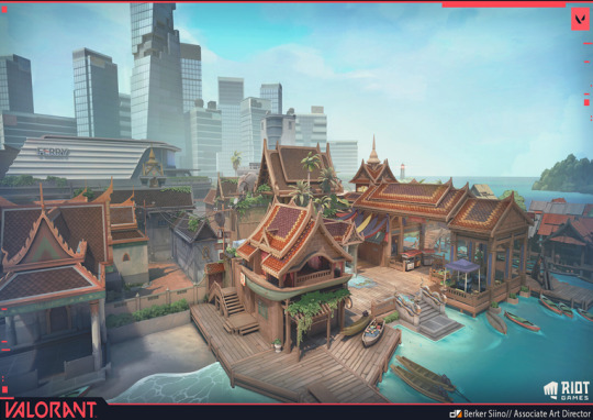
Figure 4 (Still render of the Drift map, (Siino, 2024))
This is a still render of the deathmatch map Drift in Valorant environment. Berker Siino with Riot games collaborated with Kudos Productions to create this vibrant coastal map.
Berker was responsible for the Art Direction, Mentoring and Team Management during the creation of this map. Some of the assets like boat and the wooden panels present in the concept artwork are present in the concept art and the water shader present for this map is similar to the one in concept art. I will also prioritize this map during the creation of the concept art level into a 3D design.
REFERENCES
H, J., 2023. ArtStation. [Online] Available at: https://www.artstation.com/artwork/PX6BZL [Accessed 23 April 2025].
Durante, E., 2020. ArtStation. [Online] Available at: https://www.artstation.com/artwork/3ddavJ [Accessed 23 April 2025].
Productions, K., 2025. ArtStation. [Online] Available at: https://www.artstation.com/artwork/gRyXKQ [Accessed 23 April 2025].
Siino, B., 2024. ArtStation. [Online] Available at: https://www.artstation.com/artwork/Ezqxw2 [Accessed 23 April 2025].
1 note
·
View note
Text
Portfolio, Documentation and Pitch (Aryan Raj Adhikari)
3D References #2
After completion of the researches for the references for architecture and foliage, I move on to the small assets present in the concept art. Quite a lot of them but research is really important after all.
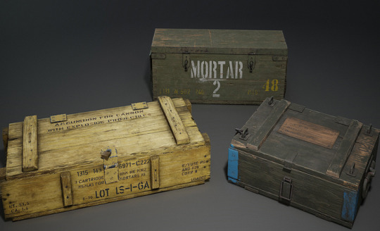
Figure 1 (Wooden crate reference, (Bona, 2020))
This is the artwork reference for the different variations of military crates and wooden boxes from Mario Dalla Bona. It employs realistic texture shading with very dense polygroups. The finer sculpt details seem to baked onto the lower poly assets that are well optimized that allows for beautiful silhouettes on the cracks and crevices. A lot of different grunge masks and noise filters are used to amplify the visual fidelity of the crates and sparing use of weathered decals allow for interesting variations of a single asset.
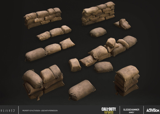
Figure 2 (Sandbag reference, (Varela, 2020))
This is the artwork reference for the different variations of sandbags from Miguel Varela created for 'Call of Duty WWII'. It has realistic shading with proper cloth simulation for the fold details. However, cloth simulation is not necessary for the stylized counterpart as sculpting the details in would be more appropriate for this workflow.
The folds and wrinkles can be sculpted into the high poly variation which can later be baked into the lower poly version. The dirty grunge details can then be added during the texture phase of the assets.

Figure 3 (Radar dish, (Djian, 2021))
This is the artwork reference for the futuristic sci-fi satellite radar dish with antennas and metallic barrels created by Samuel Djian. It employs semi-realistic shading with stylized color palettes with no bleeding. The shape of the radar dish is circular which is different to the rectangular shape in the concept art, but the color scheme is really identical. The color palettes are very distinct with little grunge details and can be achieved with a low poly asset and low levels of sculpt details.
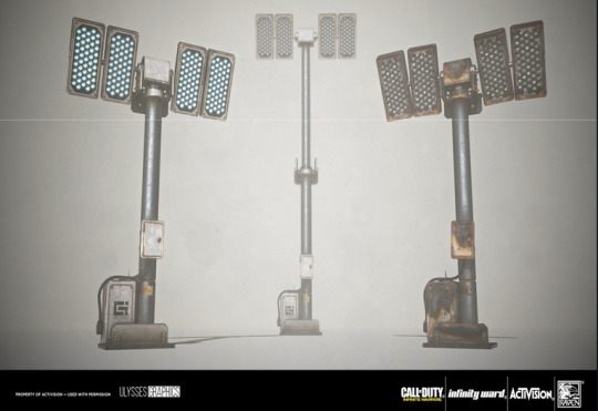
Figure 4 (Floodlight reference, (Barre, 2018))
This is the artwork reference for the industrial floodlight created for 'Call of Duty: Infinite Warfare' by Nick Barre. Its shaded in heavy realism with minimal color palettes and while the reference is more complex, it will be heavily stylized down to integrate it well into the stylized environment. Not much heavy sculpt details required as the asset will be scaled down a lot in terms of its complexity and the stylized shaders with the emissive light will be doing most of the heavy lifting.
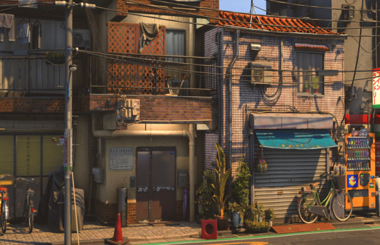
Figure 5 (Cable reference, (Löffler, 2021))
This is the artwork reference for the cables created by William Löffler as a part of the recreation of a street from Shinjuku, Tokyo. The scene is semi-stylized with simple cables that extend from the light poles to house and electrical units. The cables can be achieved using simple spline tool inside Unreal Engine for an organic deformation when creating it for the floor connection to the metallic boxes with simple grunge mask details.

Figure 6 (Boat reference, (Prokofiev, 2024))
This is the artwork reference of a canoe created by Dmitry Prokofiev for the game 'Farm Folks'. Its heavily stylized with really moody color palettes and it is very similar to the color scheme of the canoe in the concept art. Heavily detailed with paddles, board rests, anchors and ropes, I will scale down the complexity of the canoe by a lot to match the style. The model will be heavily sculpted and then textured with a couple of hand painted passes.
With this, I can happily say I have finished the research for all of the assets present in the concept art and move on to research for some of the artworks created by artists that worked in Valorant.
REFERENCES
Bona, M. D., 2020. ArtStation. [Online] Available at: https://www.artstation.com/artwork/3oNrRJ [Accessed 23 April 2025].
Varela, M., 2020. ArtStation. [Online] Available at: https://www.artstation.com/artwork/8lYe0n [Accessed 27 April 2025].
Djian, S., 2021. ArtStation. [Online] Available at: https://www.artstation.com/artwork/Vgq125 [Accessed 23 April 2025].
Barre, N., 2018. ArtStation. [Online] Available at: https://www.artstation.com/artwork/bQgvG [Accessed 23 April 2025].
Löffler, J. W., 2021. ArtStation. [Online] Available at: https://www.artstation.com/artwork/68obP6 [Accessed 23 April 2025].
Prokofiev, D., 2024. ArtStation. [Online] Available at: https://www.artstation.com/artwork/XJawR3 [Accessed 27 April 2025].
0 notes
Text
Portfolio, Documentation and Pitch (Aryan Raj Adhikari)
3D References #1
After researching on the real life counterparts for the assets present in the concept artwork and analyzing its color palette and stylization techniques employed, I move on to the 3D references for the assets present. It's really important to get both real life and similar 3D references for the assets you are going to create and I wanted to be well equipped before undertaking this huge solo project.

Figure 1 (Archway reference, (Queiroz, 2022))
This is an artwork reference for the arches created by Edinho Queiroz. Beautiful demonstration of stylized textures with soft, exaggerated color palettes and subtle edge highlights that avoid realism. The pond consists of lilies, fishes and reeds adding life and calm with well rendered reflections that provide clarity and depth to the water. Overall, it is a very well balanced artwork with nicely integrated foliage with bounce lighting, minimal noise and crisp shadows.

Figure 2 (Dome reference, (Maruško, 2022))
This is an artwork reference for the dome architecture created by Miha Maruško. This artwork is beautifully created with dressing of dome architectures all around with high fidelity realism and painterly flair. The central blue-and-gold palette of the main dome structure captures immediate attention as it is heavily ornated, feels and looks regal. Rich greens and the earthly muted stone tones with turquoise dome and magenta blooms scream exotic and intoxicating.

Figure 3 (Italianate reference, (Phillip, 2018))
This is an artwork reference for the Italianate architecture that sport those long windows from Martin Phillip. It is a really beautiful diorama that emits the ever so classic Italian air. This borders on stylized realism with clean and warm tones. The long windows present in the architecture is very similar to the ones present in the concept artwork. The warm directional sunlight with soft shadows is perfectly manipulated to evoke vibes of a late afternoon.

Figure 4 (Boxy building reference, (Bowie, 2023))
This is an artwork reference from Lanaea Bowie created by Naughty Dog Studios for 'The Last of Us Part I'. The distant buildings in the background and the small architecture in the midground sport the boxy architecture present in the concept artwork and will prove to be a great reference during the production phase. This artwork is hyper realistic and there are perfect decal details on the architecture with overgrown foliage that depicts a post-apocalyptic scenario, similar to what I am going for. Very moody lighting with little to no bloom which helps dramatize the urgency of this word.

Figure 5 (Wooden pier reference, (Meltser, 2017))
This is an artwork reference for the rickety wooden floor panels by Tomer Meltser that shows a beautiful modular kit for the entire pier with different variations. This is based in a stylized realism shader with excellent utilization of lighting and vibrant color palette that make the environment pop out even more. The grunge details present are very accurate to its real life counterparts but can be stylized even further for my own project. This is also a perfect artwork to use as reference for when creating a trimsheet and modular kit.
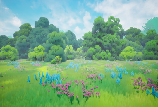
Figure 6 (Foliage reference, (Zavhorodnia, 2023))
This is an artwork reference for the variations of foliage by Viktoriia Zavhorodnia. It depicts a heavy stylized foliage with trees with lots of fluffy grasses and flowers with noise masks for different shading of the landscape. This can be achieved using a Runtime Virtual Textures system to create the property of inheritance for the grass assets on the landscape. The trees have proper specular shading to demonstrate different tone highlights with dense billboards.
I have completed the research of the main architectural and foliage 3D references that look similar to the ones present in the concept artwork and now I move towards 3D references for assets.
REFERENCES
Queiroz, E., 2022. ArtStation. [Online] Available at: https://www.artstation.com/artwork/qQvzPN [Accessed 23 April 2025].
Maruško, M., 2022. ArtStation. [Online] Available at: https://www.artstation.com/artwork/KOrmAB [Accessed 23 April 2025].
Phillip, M., 2018. ArtStation. [Online] Available at: https://www.artstation.com/artwork/dd1Rw [Accessed 23 April 2025].
Bowie, L., 2023. ArtStation. [Online] Available at: https://www.artstation.com/artwork/14vvrq [Accessed 23 April 2025].
Meltser, T., 2017. ArtStation. [Online] Available at: https://www.artstation.com/artwork/kWeny [Accessed 23 April 2025].
Zavhorodnia, V., 2023. ArtStation. [Online] Available at: https://www.artstation.com/artwork/VynVDR [Accessed 23 April 2025].
1 note
·
View note
Text
Portfolio, Documentation and Pitch (Aryan Raj Adhikari)
Lighting Palette and Stylization Techniques
The concept artwork plays masterfully with the contrast of the temperatures of the overall scene, not through saturation but through lighting and materials. There are two zones I can pinpoint on the concept artwork.

Figure 1 (Concept artwork by West Studio, (West Studio, n.d.))
The cool zones for the concept artwork include the shadows, water, the distant structures in the background elements and an overcast sky that sit in a blue-grey tint spectrum.
The warm zones for the concept artwork include the lights, wood textures and the elements like crates and tarps that have soft amber and rustic tones. The warmth isn't really bright, its muted and dirty and feels aged.
This gentle warm-cool interplay adds depth and separation, guiding the eye without needing strong value contrast or outlines in the concept.
After I have broken down the lighting palette for this concept artwork, I move on to the stylization techniques used in the Valorant. These are some of the stills from the game Valorant that help breakdown the stylization better.

Figure 2 (Haven map in Valorant, (Joson, 2022))
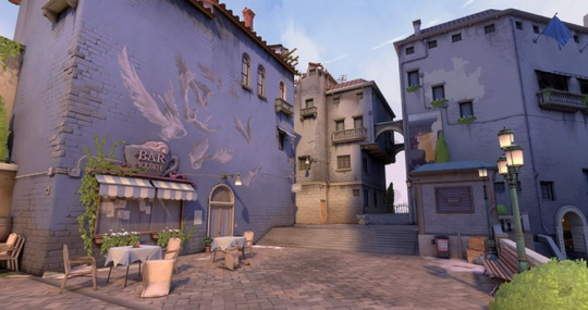
Figure 3 (Ascent map in Valorant, (Joson, 2022))
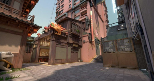
Figure 4 (Split map in Valorant, (Joson, 2022))
The structures are built using broad, blocky primitives with softened edges. Some of the industrial props like pipes, silos and generators lean into stylized realism - detailed but clean and never noisy.
Every assets like crates, rooftops and trees are sculpted to read instantly in gameplay silhouettes. They avoid noisy realism as even rust, grime or dirt is often stylized and often hand-painted or layered via masks in Substance Painter.
There is no harsh bloom or spillage of global illumination where shadows are really crisp and controlled. Each of the different maps present has a mood-setting palette that supports visual clarity with controlled saturation and no photorealistic albedos. The foliage vegetation avoid noisy leaf cards and instead favor blobby readable forms.
These are the common elements found shared between all of the maps present in Valorant and I believe I have broken down all the vital aspects of what makes the stylization technique of Valorant so distinct and unique compared to other games like Overwatch or Palia.
REFERENCES
West Studio, n.d. West Studio. [Online] Available at: https://www.weststudio.com/project/valorant [Accessed 27 April 2025].
Joson, J., 2022. Arch Daily. [Online] Available at: https://www.archdaily.com/979934/map-design-and-built-environments-in-video-games-exploring-the-world-of-valorant [Accessed 27 April 2025].
0 notes
Text
Portfolio, Documentation and Pitch (Aryan Raj Adhikari)
Color Palette
I start researching about the color palette of the concept artwork. This is an interesting piece with a lot of variety while keeping neutrality down.

Figure 1 (Concept artwork by West Studio, (West Studio, n.d.))
The image is vibrant in a really grounded way, with colors which are rich but then seem to be tempered by the rain and soft lighting. Colors are alive but softened by overcast lighting.
There is bloom present but it is used with surgical restraint. It's not really loud as a sci-fi artwork but more of a subtle atmospheric haze around key light sources and reflective surfaces.
The foliage and water pop with vibrancy that contrast the neutral tone of the architecture. Warm muted colors are used in rooftops and walls as they allow for warmth without visual noise.
The artwork also consists of subtle golden glows and blue bounces that help the objects stand out without feeling too gamey.
The most dominant hues I can spot in this artwork are cool greys and blues for the emotional base, mossy green for the foliage and water details that demonstrate organic, creeping and slightly oppressive and muted brown and beiges in woods, sacks and architectural weathering, grounding the scene in decay and age.
The accent colors I can spot are rusty reds found subtly in brickwork and some of the crates to prevent visual monotony and soft yellows and off whites used in light sources used to guide the human eye.
There are still some more color palettes I need to go into heavy research for, but for the initial research phase, I believe I have captured almost all of the scene.
REFERENCES
West Studio, n.d. West Studio. [Online] Available at: https://www.weststudio.com/project/valorant [Accessed 27 April 2025].
1 note
·
View note
Text
Portfolio, Documentation and Pitch (Aryan Raj Adhikari)
Asset References
Today, I start working on the real life references that are similar to the ones present in the concept artwork. A bit brutal as there is a lot to cover but I believe I can get it done by this session.
One of the main common references found in the concept are crates. They range from both military to wooden crates and which it was easier to find a wooden crate reference, it was a bit difficult to research and find a military crate that looks similar.
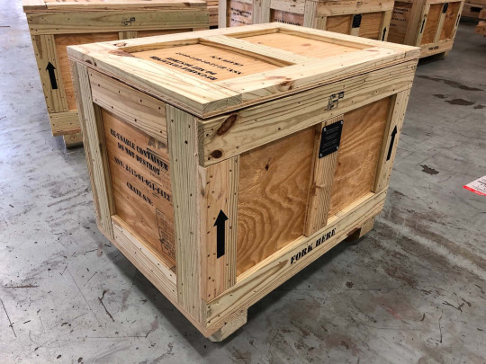
Figure 1 (Wooden crate, (PackIQ, n.d.))
The wooden storage boxes have really simplified edges and there are no hard bevels which amplify the readability of the asset as a whole.
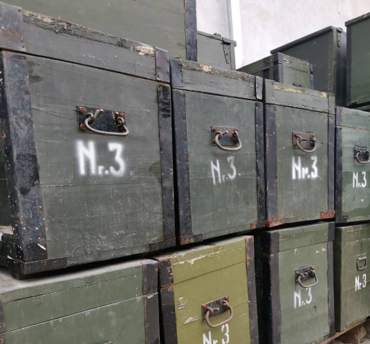
Figure 2 (Military crate, (Military Surplus Crates, n.d.))
Those military boxes present in the artwork look industrial and could possibly be a military or a utility crate with cords or cables attached to it, most likely for game interaction element.
The main foreground element present in the concept artwork are the two bridges with rickety wooden panels and deformed wooden logs. Those look very similar to European fishing docks or even Amazonian walkways that are built from reclaimed decaying wood.
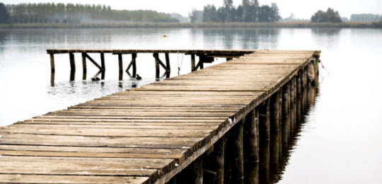
Figure 3 (Fishing docks, (Rogers, n.d.))
Like crates, one thing I can clearly spot in the concept artwork is that there are a lot of sandbags present. These are very common in industrial zones and even farming areas. They are stacked in groups with soft edges that suggest fabric simulation.

Figure 4 (Sandbags, (Sino Concept, n.d.))
Around the upper left side of the concept artwork, there are a couple of satellite dishes present above the leftmost architecture. Those look like futuristic radar dishes or possibly a stylized version of WiFi transmitters and it reinforces the narrative of repurposed ruins. It was a bit difficult trying to find a rectangular satellite dish so I went with a circular dish.

Figure 5 (Radar dish, (Leap Installs, 2018))
At the very right side of the concept artwork, there are a bunch of lights present in the scene. There is 1 more at the central face of the midground archway architecture and I believe these lights are floodlights, particularly industrial zone floodlights. They will act as glowing props for guiding the player's eye. It creates focal contrast and leads player to lighted region in the center.

Figure 6 (Industrial floodlights, (Magik Lighting, 2022))
Lastly, one of the main assets I have spotted in the concept artwork is the canoe in the foreground water plane. This canoe is actually inside some of the maps in Valorant and this will be a very easily to replicate asset when working on the project later on. Looks like it is inspired by coastal zones or even Amazonian fishing canoes.
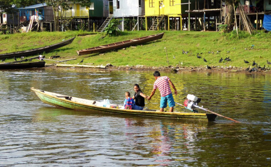
Figure 7 (Canoe, (bogotapost, 2018))
I believe with this, I have completed all of the references for the assets present in the concept artwork and I move onto the next research phase.
REFERENCES
PackIQ, n.d. PackIQ. [Online] Available at: https://www.packiq.com/reusable-packaging/wood-crates [Accessed 26 April 2025].
Military Surplus Crates, n.d. Military Surplus Crates. [Online] Available at: https://animalia-life.club/qa/pictures/military-surplus-crates [Accessed 26 April 2025].
Rogers, S., n.d. theBassFishingLife. [Online] Available at: https://www.thebassfishinglife.com/10-tips-for-fishing-docks-for-bass/ [Accessed 26 April 2025].
Sino Concept, n.d. Sino Concept. [Online] Available at: https://www.sinoconcept.co.uk/traffic-control-equipment/sand-bags/make-a-sand-bag/a-bag-of-sand-weight/ [Accessed 26 April 2025].
Leap Installs, 2018. DS Satellite. [Online] Available at: https://leapinstalls.com/2018/12/27/satellite-dish-installation/ [Accessed 26 April 2025].
Magik Lighting, 2022. Magik Lighting. [Online] Available at: https://www.magiklights.com/blog/all-you-need-to-know-about-led-flood-lights/blog-2-2/ [Accessed 26 April 2025].
bogotapost, 2018. The Bogota Post. [Online] Available at: https://thebogotapost.com/diving-into-amazon/27449/ [Accessed 26 April 2025].
0 notes
Text
Portfolio, Documentation and Pitch (Aryan Raj Adhikari)
Foliage References
After completion of the architectural references, I moved on to the foliage references. This was more difficult as it was hard to discern what foliage is exactly present in the concept artwork. Thus, I had to go with the nearest similar foliage.
The main ivy foliage for the entire concept artwork was similar to English Ivy, normally found in old architecture that are fast growing and cling to walls. It is native to Europe, Western Asian and Northern Africa.

Figure 1 (English Ivy, (Khan, 2024))
Another ivy foliage that looks really similar to the the English Ivy and could potentially be a match for the ones present in the concept artwork is the Boston Ivy, which possesses a similar clinging behavior but grows in warmer climates. It is native to Eastern Asia, including China, Korea and Japan.
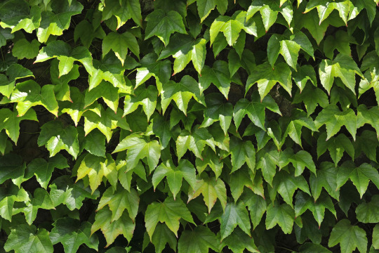
Figure 2 (Boston Ivy, (Beaulieu, 2024))
A similar foliage that could be heavily stylized and used as creeping foliage for the valorant scene is Virginia Creeper. It's chaotic nature of growth and ability to cover wide surfaces do match the visual theme. It is native to Midwestern and Eastern half of the United States, Northern Mexico and Southeastern Canada.
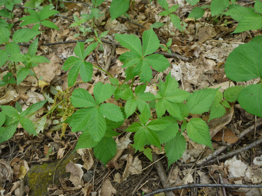
Figure 3 (Virginia Creeper, (Angelyn, 2012))
For the small bushes and hedges in the concept artwork, I believe that Privet is the best choice to base as reference. Commonly found in old courtyards and institutional gardens, it grows well in riparian forests found throughout the Southeaster United States.
The small trees present in the concept artwork look similar to two different types of trees. One of them is a fig tree that is often found in Mediterranean ruins and it grows in a variety of different climates.

Figure 4 (Fig tree, (Sicut Locutus Est, 2016))
The second tree is an olive tree which possesses twisted trunks and are stubbornly resilient. They are native to the Mediterranean region but can also be found growing in many different parts of the world with a warm dry climate.
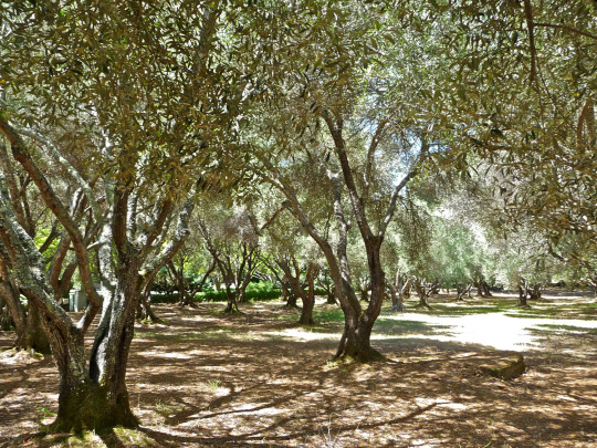
Figure 5 (Olive tree, (Poskanzer, 2009))
The mossy paddy foliage on the water could either be water lillies or duckweed as the floating green specks in the concept artwork suggest mentioned as they subtly enrich the scene's calm and overgrown atmosphere. Water lilies are native to temperate tropical parts of the world growing in Americas, Europes, Asia, Africa and Australia whereas duckweed is native to North and Central America, Asia, Africa and Europe.

Figure 6 (Water lily pads, (bliss103, n.d.))
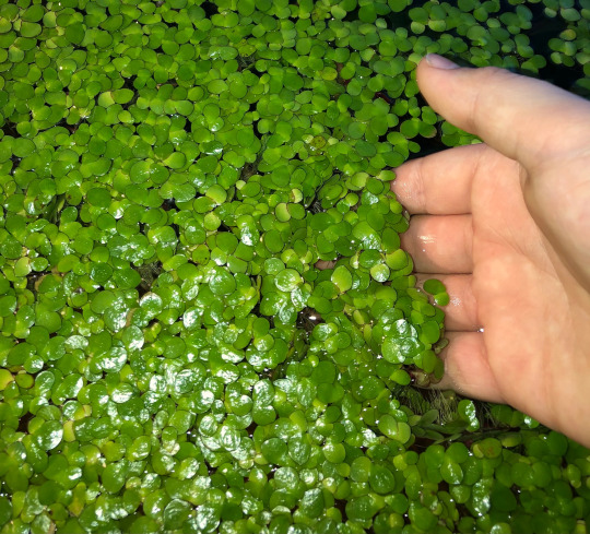
Figure 7 (Duckweed, (Tarik, n.d.))
After finishing compiling the references for the foliage, I move on the asset references that are used to dress up the concept artwork.
REFERENCES
Khan, N. A. A., 2024. Plants in the Room. [Online] Available at: https://plantsintheroom.com/english-ivy-care/ [Accessed 25 April 2025].
Beaulieu, D., 2024. the spruce. [Online] Available at: https://www.thespruce.com/growing-and-planting-boston-ivy-2132892 [Accessed 25 April 2025].
Angelyn, 2012. Identify That Plant. [Online] Available at: https://identifythatplant.com/virginia-creeper-and-ginseng/virginia-creeper-11/ [Accessed 25 April 2025].
Sicut Locutus Est, 2016. Sicut Locutus Est. [Online] Available at: https://sicutlocutusest.com/fig-tree/ [Accessed 25 April 2025].
Poskanzer, A., 2009. Wikimedia Commons. [Online] Available at: https://commons.wikimedia.org/wiki/File:Olive_trees.jpg [Accessed 25 April 2025].
bliss103, n.d. FreeImages. [Online] Available at: https://www.freeimages.com/photo/water-lily-pads-1396119 [Accessed 25 April 2025].
Available at: https://www.etsy.com/uk/listing/923113209/40-giant-duckweed-spirodela-polyrhiza [Accessed 25 April 2025].
0 notes
Text
Portfolio, Documentation and Pitch (Aryan Raj Adhikari)
Architectural References
The architecture present in the concept art is really interesting as it draws upon influences of various cultures and seamlessly integrates into one beautiful artwork. I had to put on my research goggles on to carefully analyze each of the architectural pieces present as they would further help my 3D recreation.
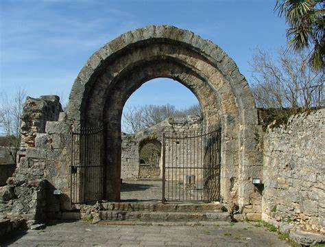
Figure 1 (Archways, (tarotwoman2013, 2017))
The archways in the concept art is so reminiscent of historical Spanish or Italian cloisters, one that is typically attached to monasteries. However, there are countless architecture that boast an archway and is not unique to said locations.

Figure 2 (Dome roof, (Albarran, n.d.))
There is a very distinct dome structure in the background of the concept art behind the clusters of archways in the midground. I researched and found a lot of different architectures that have dome roofs but the closest reference I could find had Moorish influence, however stripped down for stylization. You could also find similar dome structures in Southern Europe and even Latin American architecture.

Figure 3 (Italianate windows, (Barr, n.d.))
The tall windows with broken panes and overgrown vines surrounding it is so identical to the 19th century Italianate villas that's been abandoned. Quite elegant and noble, those windows can be seen in a lot of Italian architecture and I can use similar reference images for my project.
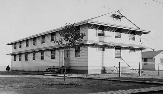
Figure 4 (Boxy building design, (Pilot, 2009))
The boxy designed buildings in the concept art suggest post war military buildings and/or public buildings that are really common across Europe and Latin America. Since, those buildings in the concept also have satellite dishes, it could imply a repurposed facility that was once a governmental structure.

Figure 5 (Venice piers, (Pier Fishing in California, 2020))
The piers found in Venice or Naples are really identical to the small bridge section in the foreground element of the concept artwork. The rickety wooden boards that form the pier can be easily created as a modular kit and even coupled with a specialized trimsheet to replicate the bridge found in concept art.
As I have finished researching and collecting references for the architecture that can be found in the concept artwork, I move on the foliage references.
REFERENCES
tarotwoman2013, 2017. Pxhere. [Online] Available at: https://pxhere.com/en/photo/1418399 [Accessed 21 April 2025].
Albarran, A., n.d. Pinterest. [Online] Available at: https://www.pinterest.com/pin/748582769290090562/ [Accessed 22 April 2025].
Barr, P., n.d. Adrian Architecture. [Online] Available at: https://www.adrianarchitecture.org/italianate/ [Accessed 22 April 2025].
Pilot, W. W. I., 2009. World War II Pilot. [Online] Available at: https://worldwar2pilot.blogspot.com/2009/07/basic-flight-training-2-enid-oklahoma.html [Accessed 22 April 2025].
Pier Fishing in California, 2020. Pier Fishing in California. [Online] Available at: https://www.pierfishing.com/venice-fishing-pier/ [Accessed 22 April 2025].
0 notes
Text
Portfolio, Documentation and Pitch (Aryan Raj Adhikari)
Map Genesis
Genesis is a cinematic reimagining of an early Valorant concept, brought to life using Unreal Engine 5. The name "Genesis" symbolizes both a beginning and a rediscovery—reviving a forgotten vision and transforming it into something tangible. This project takes the original 2D artwork and reconstructs it as a fully realized 3D environment, leveraging UE5’s advanced rendering features such as Lumen for dynamic lighting and Nanite for high-detail geometry.

Figure 1 (Concept Art by West Studio)
More than just a technical exercise, Genesis represents the fusion of past and present, breathing life into an abandoned stronghold caught between decay and renewal. By crafting this space as a cinematic sequence rather than a playable level, the focus shifts to storytelling—capturing the mood, history, and atmosphere of a world that once was, and perhaps, one that could have been.
As part of our the pre-production, I started heavily researching this particular artwork and started taking some in-game screenshots of Valorant's training ground which is potentially the successor of this initial concept.
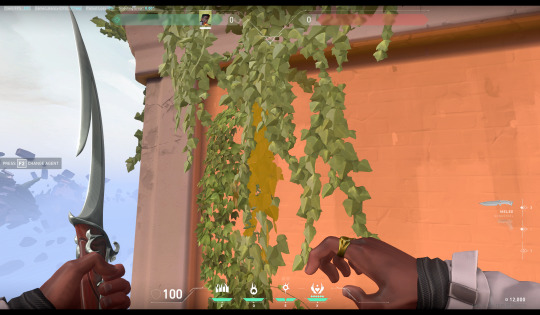
Figure 2 (Valorant screengrab #1)
A couple of foliage present in the concept art is realized inside the game's current map. I found a couple of lush vine cards in the training area that matched one of the foliage of the concept.

Figure 3 (Valorant screengrab #2)
The stylized model of the canoe inside the game's map is entirely identical to the one present in the concept art that I chose. The color scheme and the style of the boat is the same and will be really helpful for me in later stages when running a couple of tests on its textures and model density.

Figure 4 (Valorant screengrab #3)
I found a similar design of a computerized metal crate with cables sticking out of it. This would serve as a great reference when attempting to recreate those similar models present in the concept art.
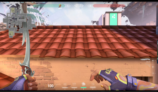
Figure 5 (Valorant screengrab #4)
The way they create roof tiles for the Valorant maps is honestly quite surprising and really clever. Most of the region of the tiles is just flat roof tile with only the edges of the roof plant possessing actual models of the roof tiles to add silhouette and depth.
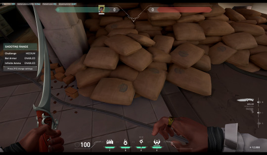
Figure 6 (Valorant screengrab #5)
There are a couple of sandbags or sacks in the concept art with neutral color palette to dress up the scene. Inside the training map of Valorant, there are a ton of sacks lying around which will be really helpful for attempting to replicate said model.
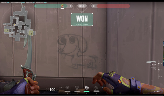
Figure 7 (Valorant screengrab #6)
A ton of decals can be seen inside any of the maps in Valorant. Since, I am trying to replicate their art stylization, I would love to copy that concept and apply to my own project later on.
I believe I have had some really concrete screengrabs which I could use as reference images for when I start building my project later on. Low poly, properly stylized with beautiful color palette, I aim to replicate the same.
0 notes
Text
Portfolio, Documentation and Pitch (Aryan Raj Adhikari)
Pre-Production Documentation
I now start on the second part of the main brief assignment. It is for us students to start creating a pre-production documentation on what we are likely going to create for our final project. This will be geared more towards the specialism the students prefer to work in the future.
Since I want to focus on becoming a stylized environment artist, I decided that I would be creating a stylized environment artwork for my final project. I was more torn up between two really good concept arts I came across my research in ArtStation. One concept was to create a stylized ghibliesque environment in Unreal Engine and another was trying to reproduce a fan extension for an environment following a game's artstyle.
I found this really good initial concept artwork by West Studio who has hugely collaborated with the infamous shooter 'Valorant'. Valorant is a 2020 first person tactical shooter video game developed and published by Riot Games. It has a really distinctive color palette and art stylization and I would try to replicate it for my final project.
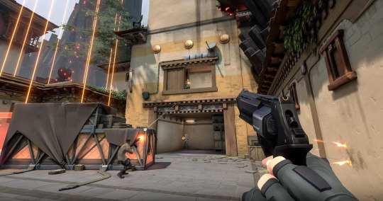
Figure 1 (Valorant, (Rutledge, 2020))
This is the initial concept artwork created by West Studio but during my initial research, I failed to find the existence of said artwork present inside the game world, save for a couple of assets they used.
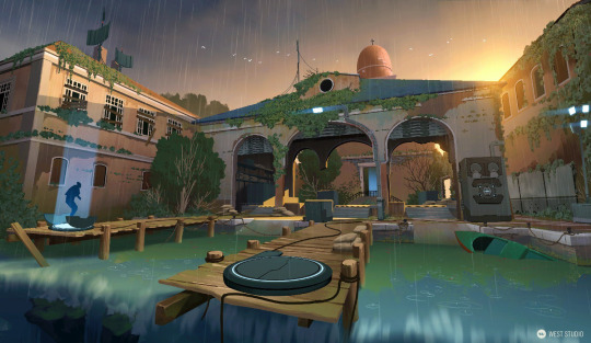
Figure 2 (Concept artwork by West Studio, (Studio, 2020))
This is a really beautiful concept with perfect mix of architecture, foliage, lighting and stylization that really meshes with each other perfectly. I have never undertaken a project this big and as such, I want to be able to replicate this concept.
I will be carrying out my research on the concept above and also work on a couple of tests to make sure I have everything I need and I am well equipped to face this head on. The tests would include on variety of assets that would help my understanding on foliage, architecture, modeling, texturing, sculpting, lighting and even visual effects.
REFERENCES
Rutledge, C., 2020. The Gamer. [Online] Available at: https://www.thegamer.com/valorant-episode-ii-regional-leaderboards-competitive-rank-disparity-restrictions-update/ [Accessed 21 April 2025].
Studio, W., 2020. West Studio. [Online] Available at: https://www.weststudio.com/project/valorant [Accessed 21 April 2025].
0 notes