Statistics
We looked inside some of the posts by processart and here's what we found interesting.
Average Info
Notes Per Post
56
Likes Per Post
49
Reblog Per Post
7
Reply Per Post
0
Time Between Posts
3 months
Number of Posts By Type
Text
3
Photo
11
Video
3
Last Seen Tumblr Blogs


Fun Fact
Celebrities use Tumblr as well.
Text
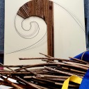
215: Compilation of Word List
what3words is the easiest way to describe any precise location. It has divided the world into 3 meter squares and given each one a unique identifier made from three words. -what3words I am currently using a copy and paste methodology to compile a list of words that are identifiers of Cloondroon Lake. As seen in the image below, the Lake covers a fair amount of surface area made up of the 3m…

View On WordPress
#art as design#book design#book project#contemporary book design#creative process#creativity#design as art#Experimental Image Making#experimental typography#graphic design#image making#typography
0 notes
Text
Artist Statement
Biophilia
Summary
My response to the project ‘Biophilia’ is by looking at patterns, layers, and textures within the natural world. Through the exploration of various processes, I have seen a metamorphosis of the visuals, similar to that which occurs in nature.
4 notes
·
View notes
Photo


seeing the patterns of merging events; Carrying on from the idea of layering five different images from the charcoal making process.
With the help of a technician to produce the stand (drawings: top right), I was able to place five sheets of acetate in the gaps created especially to house them. Looking at them directly creates the transparency to guide the eye through the layers.
Originally, each sheet was going to represent just one of the five stages. However, due to a yet to be realised reason, the images printed correctly on the top and bottom of each slide but left the middle very faint. I made the decision to print each slide with the five images; wooden pallet, burning fire, burnt tin, charcoal dust, and charcoal painting. This made for a unique, interesting pattern. I felt that it created a ‘dusty’ looking texture on the acetate.
4 notes
·
View notes
Photo


intaglio print; Ink not getting in every gap but creating texture nicely.
Having a stone-like texture with the carborundom. The plate embossed well and the ink got into most crevasses, eventually (top left). The plate itself is not completely flat and therefore the sides did not print well in the press. I am very happy with the textured look of the print (top right).
1 note
·
View note
Photo


risograph workshop 07.12.2020; Using two layers to create a finished print - 2D combined with digital medium.
Oil based inks to create each layer - one in red, scanned in, the other in yellow, scanned in. After the scanning process we produced two proofs before printing onto the special risograph paper which is oil absorbent. The printed images have a slight glossy sheen to them.
In preparation, I used two sheets of A3 tracing paper to make each layer; One to be printed in red, the other in yellow. The burnt tin can from earlier in the project was the primary research I was working from here. Choosing the darker elements from the image I was working from to be in red. Although, (bottom right) the inverted colours made a varied texture print too. Using pencil and a fine illustrator pen I was able to recreate the scratchy marks inside the tin. Using a washed down Indian ink as the rest of the tin. I also used graphite pen, oil pastels to create the writing, a thick permanent marker and string to experiment with texture.
Using risograph again I would choose an image more suitable to the process. An image with more defined, graphic outlines from which I could distinguish the tones better. This kind of print is more suited to images with an illustrative quality. With spending more time with the image I chose here, I could have maybe broken it down better into a two coloured image.
#risograph#risograph trials#experiments with risograph#tracing paper#risograph illustrations#experimental printing
0 notes
Photo


(unsuccessful) image transfer onto fabric; Laser printed image, plain t-shirt, lavender oil, online tutorial
Here, I tried to image transfer a laser printed image onto some fabric following an online tutorial. This seemed so simple, I had to give it a go. Using oil as the ‘transfer agent’ did not work for me this time. I used two different images from my work that I thought would look great as a t-shirt design.
2 notes
·
View notes
Photo


putting the pieces together; Enhancing the mistakes
Using charred wood from earlier in the project, that didn’t burn properly enough to be blended into charcoal dust. Firstly varnishing each piece before sticking to the panel with wood adhesive. This has transformed the failed image transfer piece to something I really like. The piece is pictured here standing on it’s own.
3 notes
·
View notes
Photo


image transfers; What is needed? PVA glue, a laser printed image, wood panels, water and a soft cloth
In preparation for this I sanded down two small wood panels. The images (top left) are the printed images of what I intend to be transferred. This process involves putting a thin layer of PVA on the wood surface before laying the image face down and leaving it to dry for a few hours, making sure to squeeze out any air bubbles between the two layers. When fully dry take a soft damp cloth and CAREFULLY start to rub the back to remove the paper.
On the first attempt, the layer of glue was too thick and I didn’t allow it long enough to fully dry. When taking off the paper, I ended up taking off the whole lot because there were too many gaps in the image. So I started again on both. This time I reduced the amount of glue I used and I left the panels for a day to dry out. I used my fingers first to gently remove the back but I was getting a similar result. I changed to using a soft damp cloth and this produced a better result for me. The image on the second panel (bottom image) was a little faint. The other panel showed the patterns of the direction of the wood grain. I varnished both panels with a clear gloss.
In doing this again I would prime the wood with gesso or a wood primer after sanding down.
5 notes
·
View notes
Photo


dramatic changes; Using fire as a drawing tool
ARTIST INSPIRED
Using Cornelia Parker’s ‘Red Hot Poker Drawing’ as inspiration (top right). Parker has folded up a piece of paper and singed along the edges o create this drawing.
Originally my plan was to ‘white-out’ the plaster, and some of the printed image in the style of Tacida Deans ‘Majesty’. However, after doing this on one side of the boards I did not like the starkness of the pure white. After considering how to develop the work in a more interesting way I decided to use a lighter to singe the edges. This led to a full-on overhaul of the three pieces (on one side). The reverse side has singed edges and some burn marks. The concept follows on from the way in which the stand they are propped in has been prepared - charcoal dusting.
14 notes
·
View notes
Photo


showing stages of the process; Layering images on sheets of acetate
The top image is a blend of the five images below it, representing five stages of the process used during the charcoal making process: pallets, fire, tin, charcoal dust, and application.
Using image manipulation in Photoshop to create layers within three of the images (pallets, fire, and tin) to create a pattern-like form. These five images will be printed onto transparent A4 sheets and will be propped up vertically a stand. When looked at/ through, the image seen should be a blend of all the processes and maybe resemble something like the top image we see here.
I used the colour range selection tool to delete parts of each image, as well as decreasing the opacities to help see through each image onto the next. I also saved each image as a PNG file with a transparent background to ensure transparency when printed.
3 notes
·
View notes
Video
youtube
ARTIST RESEARCH: SUSAN PHILIPSZ
This artist places her sound installations at specific sites for which they have been designed. She uses the space combined with the sound to evoke feelings of emotion in the audience/ listener.
The lowlands work has a feeling of timeless nostalgia about it. She uses her own voice here. There are multiple recordings layered up to create an echoed sound. I can imagine this would be enhanced in the setting for where it is intended to be; using the curved architecture as sound boards. There is also a kind of slow rhythmic pattern to the sound, something which I have tried to create in my own sound recordings.
3 notes
·
View notes
Video
tumblr
‘the texture of sound’; Using short recorded audio and digital video clips to compile a brief film in Premiere Pro.
Using audio I collected I finally realised how to best apply them in my project. Combining them with some digital visual recordings where I was taking most of my inspiration from i.e. my home and the local fishing lake was the ideal way to show this.
In this short clip I introduce the environments around me with both visuals and audio. Shortly in, I dull down the visuals to a black screen and now all we have is audio. The viewer can decide what they are hearing based on the textures that are conveyed via the audio channels. From what we hear, we can use our imaginations to visualise the surfaces that are being explored via the medium of sound. The visuals are brought back at the very end. The layering aspect of the work, track on track, is also relative in my response to Biophilia.
While making this video I learnt how to use the opacity tool quite well with both the video and audio tracks. I exported the video as a H.264 encoded file which was a much better quality than other settings I had previously tried. The visuals fit to screen as well as the text being of a clearer, vector quality.
5 notes
·
View notes
Photo


textured surfaces; Tile grout and carborundom/ silicon carbide
In preparation for inking up the two plates, I sanded them down by hand (bottom left), front and back. The ‘texture’/crevasses left during the grout application can now be more emphasized by the relief printing process. I gathered graphite rubbings from each plate (bottom right) to see how they may turn out as prints.
There is a lot of ‘texture’ on the plates compared to the actual slate that inspired the work (bottom center). Using a fine grain carborundom (from sanding stone) I used a small baking sieve to flour on the carborundom on one side of each plate, leaving the reverse as is. The grain fell onto a thin layer of PVA on the plates. Days later I varnished the layers of carborundom with a thin layer of clear gloss. Now, hopefully the prints will have a grainy texture. I also hope to print the plain grout reverse sides, and compare results.
#texture#textured surfaces#texture art#biophilia#stone sand#carborundum#silicon carbide#slate surface
3 notes
·
View notes
Photo


mixed media; Suspending the structures and creating a ‘layer’ in front with wire
Spray-painting the inside of the cardboard before suspending the structures. It being a very dense spray (’stone’ textured spray-paint), it took a while to dry. Using white spray-paint on the structures to enhance the contrast against the darker background.
Top image: Starting to place the wire in a grid-like structure in front of the hanging pieces. The wires will need to be tweaked and straightened before I will be happy with the result. This may take more time than anticipated.
I was curious to use spray-paint in this project seeing the results it was producing for fellow classmates. However, I would not plan to use spray-paint again unless I thought it was absolutely necessary. I found that a single can ran out very quickly and the smell was still very potent despite wearing a facemask.
1 note
·
View note
Text
tumblr workshop 30.11.2020; Making the most of an online portfolio
I found this workshop extremely helpful to help extract from what I have already done, what I need to develop before the Christmas break. During a tutor-led group discussion, each student helped identify the concept in each other’s work to make for a more clear, concise and articulated working statement. Suggestions for blog improvements and overall design of the student’s page to help with meeting assessment criteria was also discussed.
From this workshop, I was much clearer on how to use artists reference in my online portfolio. I have now updated my ‘artist research’ posts and made sure to comment on how the work I have seen is relative, or could be relative to my own work. I felt this was an area that was lacking in my Tumblr account. I joined this work shop in the nick of time and I am very grateful for it. I was relatively happy with how I was posting, but always knew it could be better.
Below, is a quick sketch from the workshop to help guide my work development over the next few days.

2 notes
·
View notes
Video
tumblr

flattening the structures; Driving the project forward
I eventually decided that I could use the sheets as separate panels that join to make a single piece. Using a cardboard box as the supporting structure I PVA glued the individual sheets on. I tried to seamlessly merge the sheets as if they were one but I had too much of a glue layer that created extra creases. I plan to:
1) Hang the flattened structures with fishing wire from the top of the cardboard, and
2) Use wire to create a mesh grid ‘barrier’ to place in front.
ARTIST INSPIRED
Deciding to flatten the plaster bandaged structures was something inspired by Cornelia Parker’s work where she has flattened 3D objects such as wind instruments and silverware into 2D. I decided to use the weight of a car to compress the structures. I was interested on how they would transform during this process, having an almighty urge to destabilize them anyways. I enjoyed doing this and from it I was able to continue using them in the project as you see above.
Previously I had also come across a work by Robert Rauschenberg where he marked a car tire in ink and subsequently drove across 20 sheets of typewriter paper. The work was also considered a performance piece because of the manor in which the process was executed. I since was wanting to use this method (or something similar - I did not ink up my car tire) as part of my project and this was the perfect opportunity to do it.
2 notes
·
View notes
Photo


ARTIST RESEARCH: SUSANNA CASTLEDEN
Here is a selection of rubbings by the artist Susanna Castleden; Collected prints off various parts of an airplane. For this work Susanna was located in the Arizona desert where planes were being stored and dismantled. Some of her prints span over numerous pages to make one image. This seemingly effortless style of image documentation takes time, consistency, and patience.
4 notes
·
View notes