
New art blog! It’s been a while since I used tumblr, I’m learning lolAny pronouns
Don't wanna be here? Send us removal request.
Statistics
We looked inside some of the posts by r0sie-bun and here's what we found interesting.
Average Info
Notes Per Post
4K
Likes Per Post
3K
Reblog Per Post
811
Reply Per Post
14
Time Between Posts
7 hours
Number of Posts By Type
Text
15
Note
2
Last Seen Tumblr Blogs


Fun Fact
The Tumblr office adopted Tommy, an 11-year-old Pomeranian.
Text
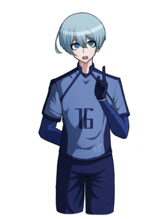
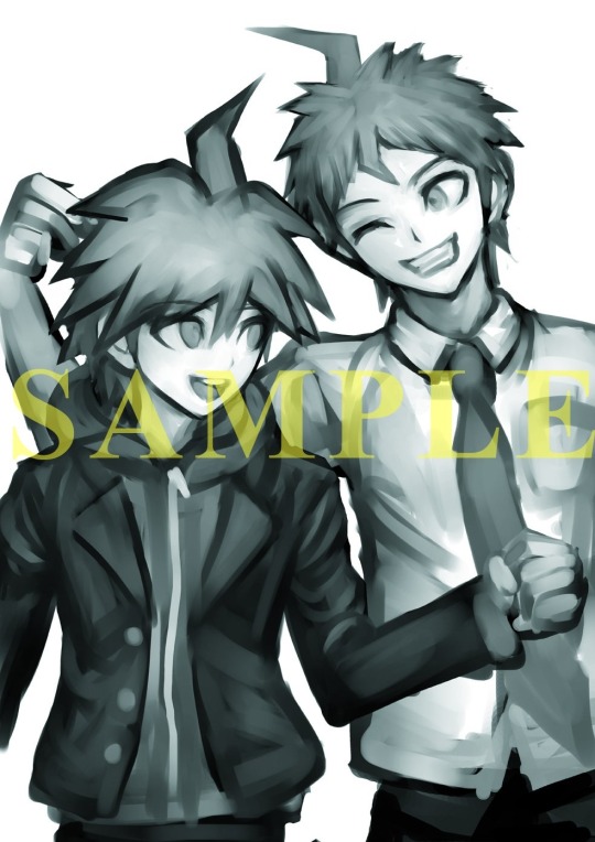
Hiori got danganronpafied
sorry not sorry
395 notes
·
View notes
Text
Would, uh, would y’all be chill with Katanagatari ocs? All….five of us in the fandom?
2 notes
·
View notes
Text

Yesterday (the 25th) marked the Katanagatari anime's 15th anniversary, while the LNs had their 18th anniversary on the 10th!
Both originally released once a month, leading up to 12 books/episodes, representing the full journey and the 12 Deviant Blades

If you want to celebrate Katanagatari's anniversary you could watch or read one a month yourself!
The English translation was released as 4 omnibus volumes, each has 3 of the original light novels, so if you're interested in reading one a month, it's even easier now!

The Katanagatari anime is special to me for many reasons, but especially for the fact that it was the first time we got to see Take's designs in action, and this year feels special in that regard because we get to see even more of that with Take's designs in Gundam GQuuuuuuX!


A little fun fact about the Katanagatari series:
NISIOISIN wrote in fighting game inputs for character moves at the end of each novel in hopes that Capcom would want to make a fighting game out of it, but they never contacted him about it

63 notes
·
View notes
Note
Extra Resources!
how do you imitate the danganronpa style so well?? it's always so good!!
Great Question!
First, having a somewhat decent grasp on anatomy (which is something I still need to practice lol) or “the basics” of character art is always a must imo. Having a good understanding of forms is our starting grounds for further stylization. Think of it as the “skeleton” of any style. Moreover, the Danganronpa style comes in various forms, all with different characteristics/visual characteristics.
However, and I think this is a very important distinction, I try to study Rui Komatsuzaki’s overall style as opposed to just Danganronpa. In other words, Rui Komatsuzaki, like any other creative, has his own personal stylization and artistic evolution throughout his career as an illustrator.
In DR1, Komatsuzaki’s style included much thinner lineart, bigger heads, and more gradients with the softer shading. The vibe is very much more “grounded” compared to later titles. (Example: Toko!)

In contrast, DR2 has slightly modified proportions (like bigger hands), simplified shading, and much more vibrant color palettes. The line art during this time was also streamlined with less lines and thicker pen pressure. It makes the sprites pop out a bunch! (Example: Mahiru!)
Of course, with UDG, we see these two styles somewhat overlap, resembling his later stylization. Here we see the modified proportions and color preferences from DR2 with the thinner linework and detail of DR1. (See Toko Again!)

Finally, we see this similar style philosophy continued in V3, only with even more contrasting colors, reflecting the hyper bright/attention grabbing palettes of serialized work. The shading is much darker than previous titles, and somewhat colder too. (See Miu this time.)
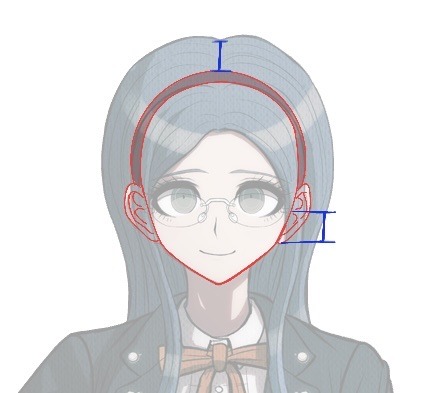
Of course, with all of this in mind, taking notes is imperative! Especially if you want to replicated a specific entry’s stylization. You can draw over some of the dr sprites just to get a general feel of the proportions. I can probably post more latter down the line, but this was the most recent thing I’ve done. See below! (I was trying to get a sense of how “high” the hair sits on top of dr)
Now, for his splash art work, Komatsuzaki’s began his process by blocking out his pieces in bluish hues before the polishing phase. he most likely applied a mix of “color”, “multiply”, or “color dodge” once we finishes rendering for finalizing colors. (As depicted below.)

You can also see how Komatsuzaki simplifies clothing and the like. He very much uses thicker brush work for these types of illustrations as opposed to the lines of his 2D work during this point in his career. Future points show how he plans his stuff with more thin line work. From here he most likely did the same thing. Focusing on the forms before getting to the hues and values
Sorry for going on a bit of a tangent, I have A LOT of thoughts on DR and Komatsuzaki’s artwork in general. I really love seeing his process, so I hope this brief overview can provide as a decent introduction! If more people want me to go over specific aspects of the style, I’d be more than happy to share my own thoughts! Thank you for reading!
43 notes
·
View notes

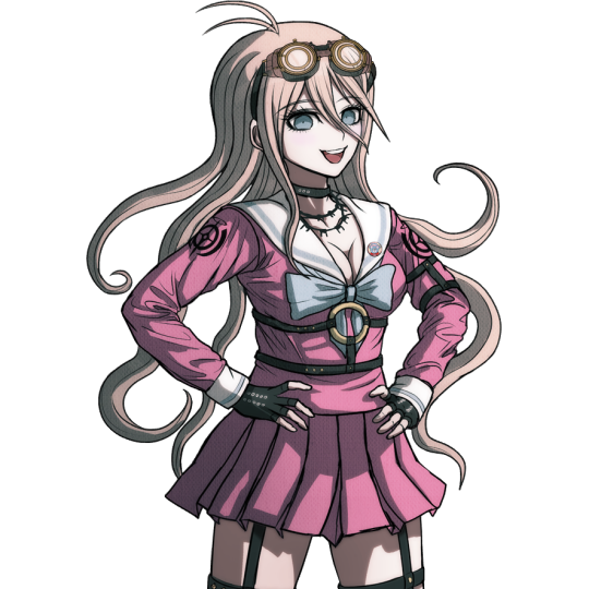
Text

I'm going to upload every new Darumi image from the new trailers as I love her so much.

She's looking at something.

Pointing!

SHE LOOKS SO PRETTY AHHH!!!!


LOOK AT ALL THESE NEW SPRITES. THEY LOOK SO GOOD.
I love the smugness of the second one!


YES YES YESSSSS HER SPECUIAL ATTACK POSE!!!!!!!!!!!!!!!!!!!
I'M SO SO HAPPY!!!!!!!!!!!!

THIS IS HER PRE ORDER PRINT. IT'S SO AHHHHHH. I WISH HUGGED ME THAT.
49 notes
·
View notes


Text

Jack-O' Doodle
I really love her color scheme from Xrd, it's really fun to work with in compositions
1K notes
·
View notes
Note
HELLO ur ocs are so neat and cool :33 im super impressed by ur style and how well u do the danganronpa style lol
Awwww thank you! I’m really happy to hear that! ❤️❤️❤️
3 notes
·
View notes
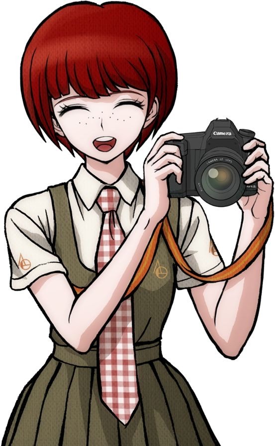
Text


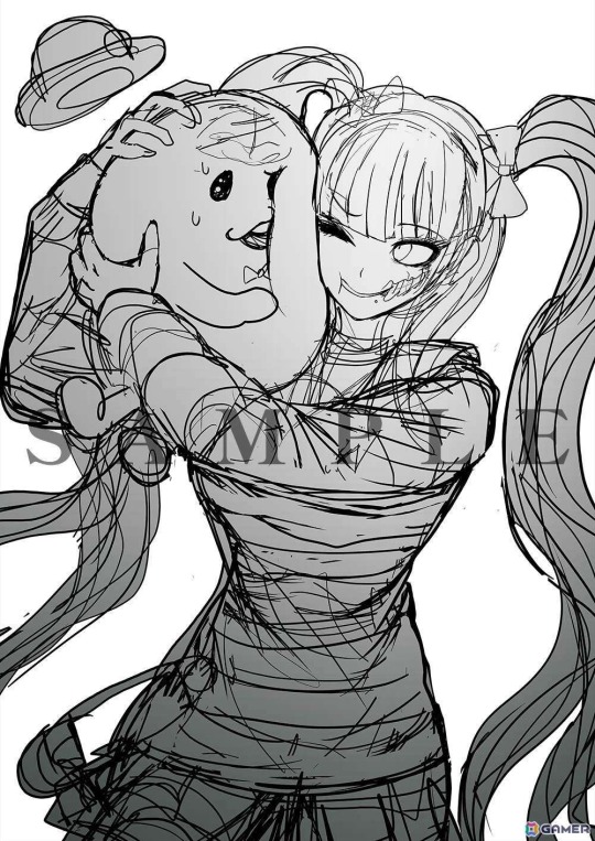
Doodles
#my art <3#rosie bun art#doodle#artists on tumblr#sketch#danganronpa#Danganronpa oc#oc#original character
27 notes
·
View notes
Text
Btw! If you ever wanna go ahead and ask me something, feel free to do so! I’m more than happy to talk about dr or any other of my hyperfixations lol
4 notes
·
View notes
Text


God I love her expressions so much. She has so much personality in each pose.
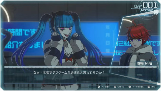
Here's all the text poorly translated with google.

Welcome back Genocide Jack.
27 notes
·
View notes

Text


I love whenever someone posts close-up pictures of these stands. You can see the brush strokes in here, it's so cool!
Source below:

32 notes
·
View notes
Text


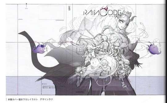
I will be there no matter what
205 notes
·
View notes
