
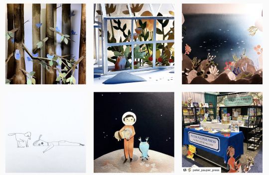
rc8illustrate
How I Illustrate Stories for Children
145 posts
Don't wanna be here? Send us removal request.
Last Seen Blogs
digitalbeth
beth

io
• • •

experimental-communism
Just looking for something I left behind...
hournites
Chuck Is Hournite’s #1 Stan✨
william-ba
BA Industries
Text
Update
Hello again.
It has been a while since I have updated on here what I've been doing of late, this simply is because time has been taken up with working in another job and life happens in-between, therefore not leaving much creative time.
Albeit, I have still put pen to paper when given the chance along side finding time to finalise my last book. It has all been a slow process these last few months which I'm not best pleased about if I'm honest but I understand why it has had to be this way for a bit. So, here I am... due to the current situation out doors, I am indoors making up for lost time and hopefully move forward.
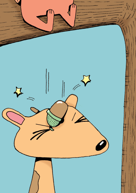
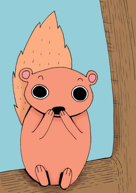
So, early this year, I was looking at creating very basic and simplistic animal characters in rough to try to get ideas together for new characters and new styles. But I just wasn't feeling this at all. My frame of mind at this time was not at its norm so it obviously reflected on paper. I soon scrapped this idea!
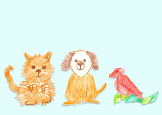
I kind of continued with the idea of simplistic characters by randomly drawing up some strange shaped characters instead. Ok, they were better once grouped together and the vibrant colours were added, so I wanted then to view them using Illustrator to help me decide about pursuing them further.
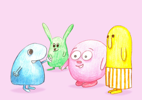
Still unsure at this point so on the back burner they go for now!
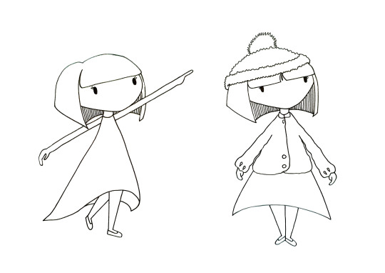
Thinking about character designs for possible stories and wanting to return to my usual way of working and creating, I decided to base a character on a little girl. So ideas were now being thrown around to find a style or a particular look for her.
Looking at a possible colour palette, my favourite are pastel colours. I feel that working on a basis of 3 colours helps to manage them well without confusion.
Sort of feeling ok with how this character is developing but still needs work. I want to soften up the look. Feeling that she is looking a little sharp. I need to look at the hair style and consider a more softer, fuller approach.
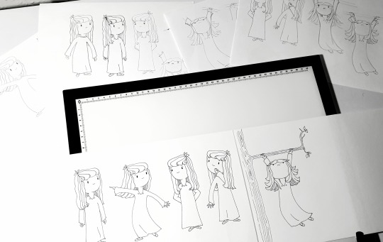
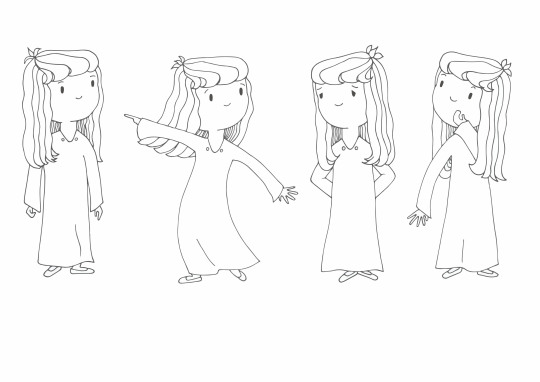
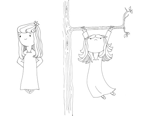
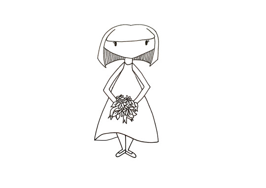
Now I am comfortable with my new character. I am looking at briefly building up a storyboard.
Also keeping in mind the colour for this style. I question myself... do I want to be adding colour digitally? Do I attempt another way?
I began looking at other illustrators and one in particular stood out for me which I thought may be good for the style for this design.
Shoo Rayner.
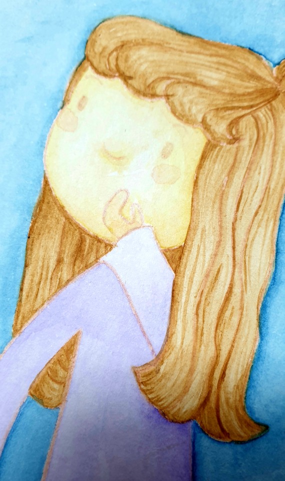
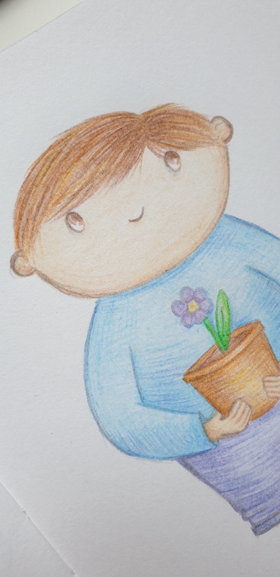
Shoo Rayner is a Children's author and illustrator who also makes videos for how to draw. Pandoras box was a story he created which had caught my attention for the style of his characters. Looking at how he added colour using water colour inspired me to give it a try for my new character as I once enjoyed water colour painting a long time ago. I wonder now if I can pick it up again where it could help me create the soft look to my designs?


Images by Shoo Rayner found:
https://www.shoorayner.com/shoos-books/Pandora-Signed-book-and-Free-Poster-p126767556
So now its my turn to get the painting started.
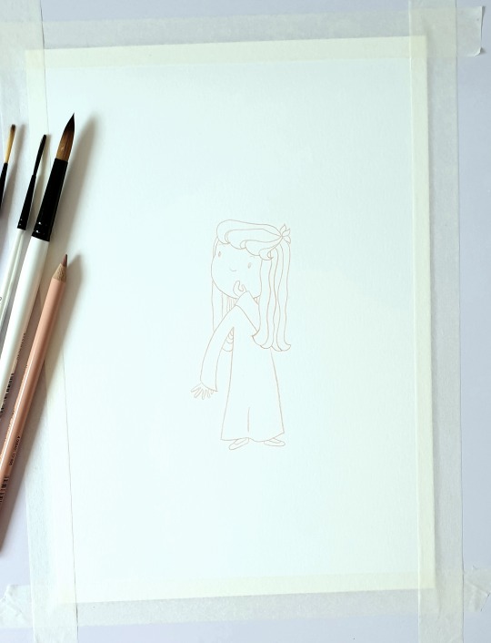
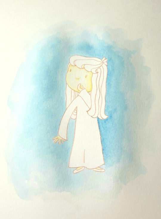
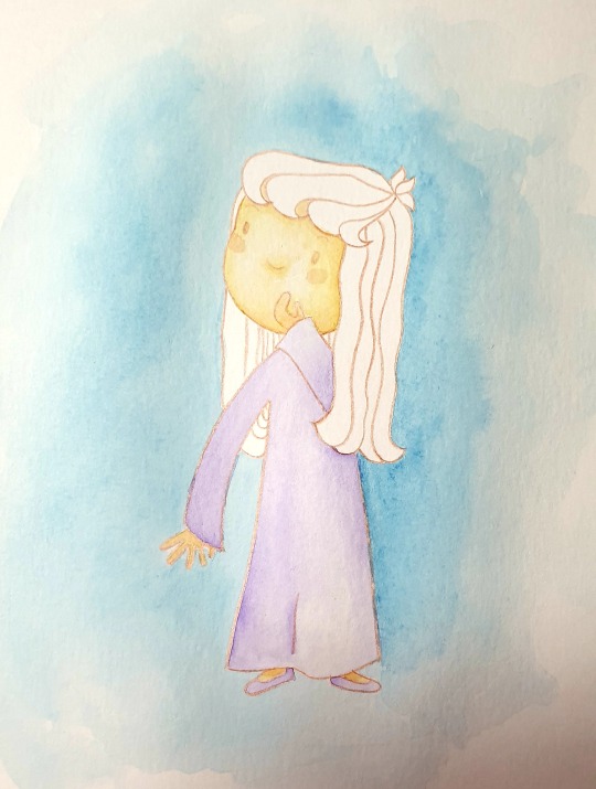
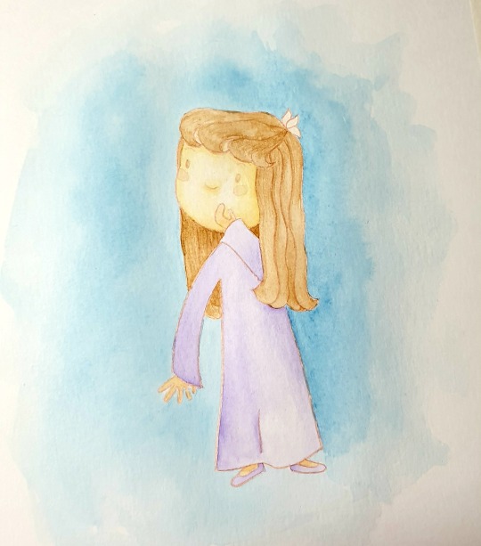
I will continue with this for now and once this one is finished I will then make my decision about continuing to paint the rest of my drawings in the same way.
0 notes
Text

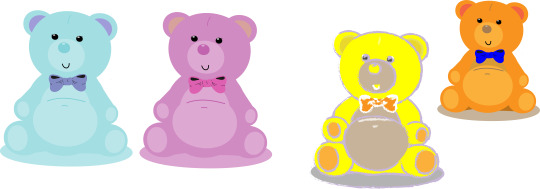
Before applying colour, I planned a set colour palette to work from. My aim was to work with pastel colours.
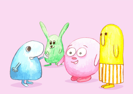
I placed colour to images via photoshop. But as am wanting to work things out and get better with my illustrator skills, I placed my images into Adobe Illustrator to image trace so that I could have vector images. I wanted to see how the changes effected the original designs. On this occasion I chose to trace in low fidelity which gave a cartoonish style to the images with cleaner lines.
I noticed that some of the shading that I had applied has reduced and some shading has disappeared completely. Perhaps with future trials I will apply a stronger shade to try.
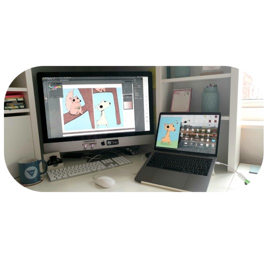
I like to work on both of my screens to get a better idea of a final outcome and when my Big Mac chooses to go slow, my Mac book is a whiz! I find it easy to transfer work between the two and have the freedom to take my work outside.

My designs so far do not have a written story to support them, this is something I maybe considering. A short story aimed at the younger children’s age group.


Using Adobe Indesign, thinking about how the layout of a book would look if I did introduce a story to my illustrations. This maybe my chance to get creative with font as previously my stories have been quite heavily text based and I had not been able to explore this area.
2 notes
·
View notes
Text
Old work brought back
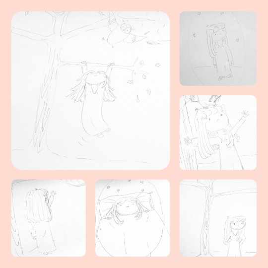
As I continue to work towards new characters and expanding on my skills, I came across some simple drawings I had done around two years ago. At the time, they didn’t really have any meaning behind creating them. Now, I can look back at them as they are ideal to develop on for my experiments on Adobe Illustrator to apply some colour and keep them as simple as possible.
These drawings are primarily rough doodles and I found it amusing to put selected characters into a storyboard.
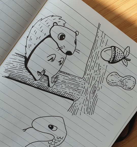
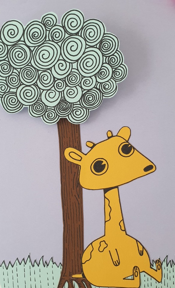
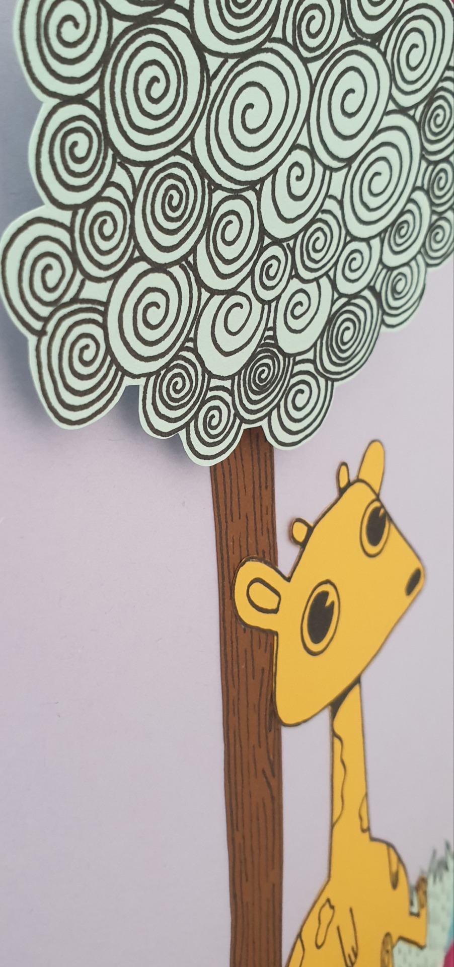
I decided to Draw the characters on better paper to enable me to scan them in to continue to work with in digital format. Along side thinking this, I tried making a paper version just to try new ways of colour application. The colour I want needs to be plain without texture or too much detail at this stage.
1 note
·
View note
Text
Refresh
Currently playing around on Adobe Illustrator to refresh on some skills by going back to basics, shape and colour applications.
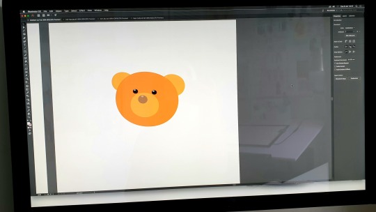
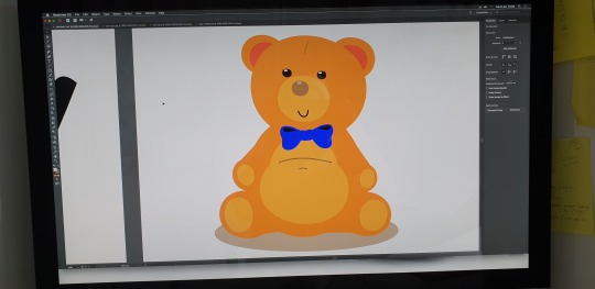
Then I chose to revisit some previous project characters and see how I can tweak them in vector images.
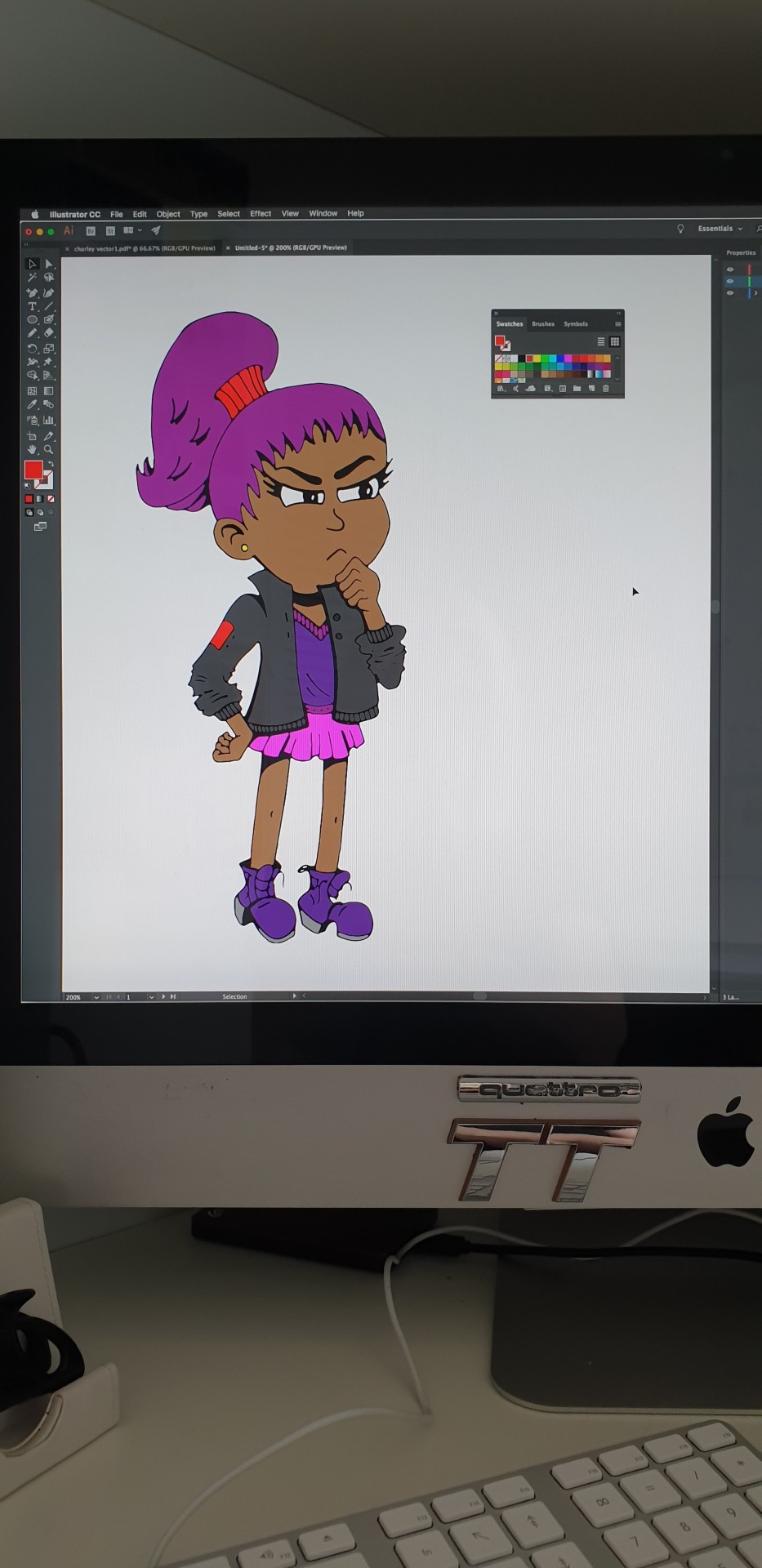
Some changes are only slight, but more noticeable when zoomed in.
0 notes

Text
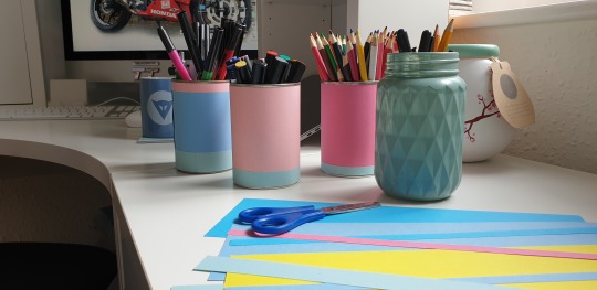
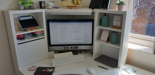
Time for my home studio space
After the celebrations of getting my fantastic grade of a first for my degree, I felt the need to make some tweaks in my creative room. Wanting to clear some space and detoxing the mind ready for my next chapter, I decided to cheer up a few pen pots. I got a little creative with coloured paper and painted some glass jars to give my space a splash of colour.
With having a little head space now, I am thinking about writing a few children’s stories. My passion is to illustrate books but as I want to continue working towards my goals while I am currently putting my work forward to selected agencies, I want to continue with my creations and ambition to move forward.
I often create new characters even if they are not relevant to any particular story or theme, I just like to make a good collection so that I can return to them at a later date for when a story fits.
It does me good to keep my hand in as it is very easy to become lazy towards new ideas and too long of a break makes it hard to get back.
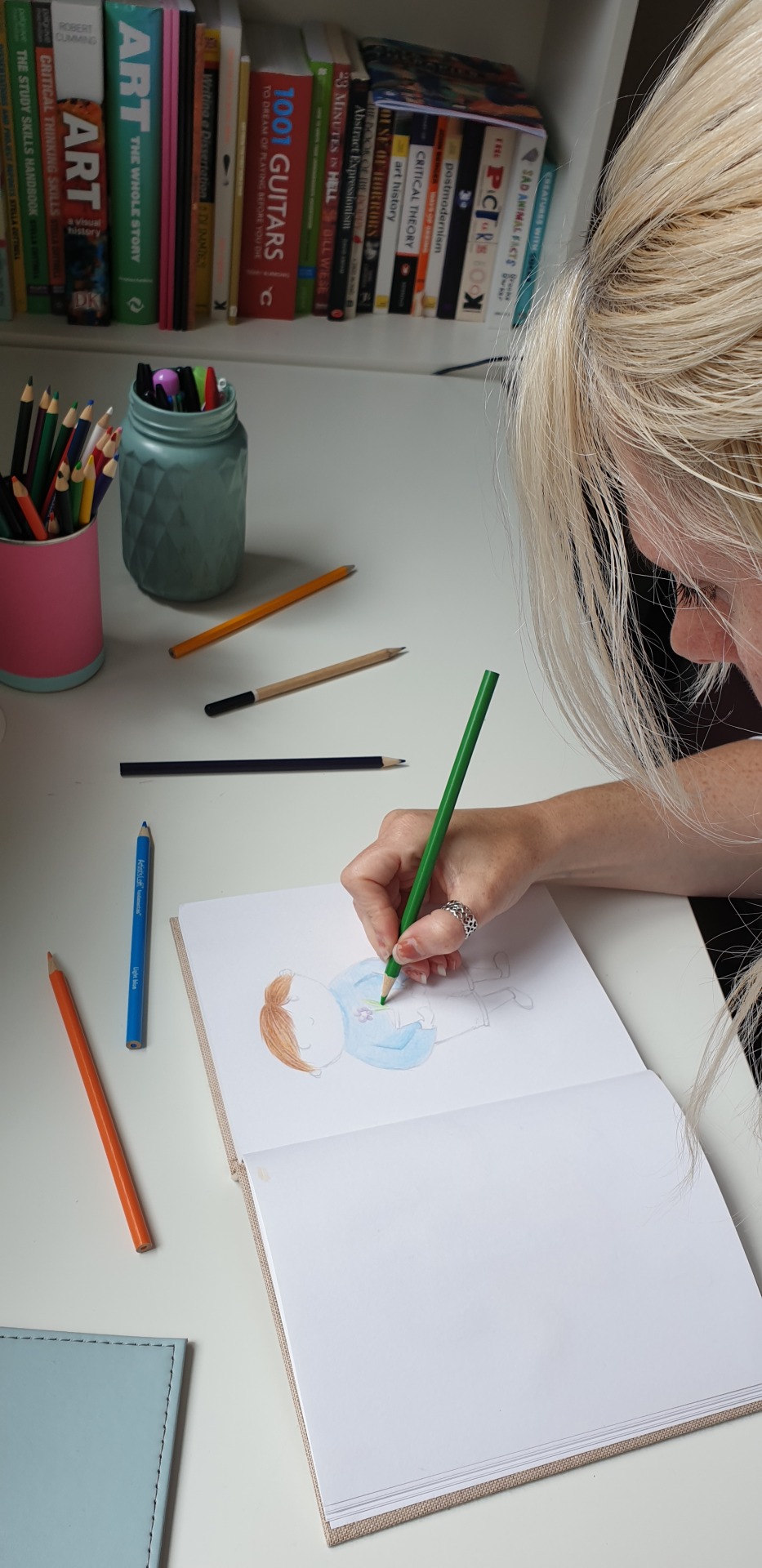
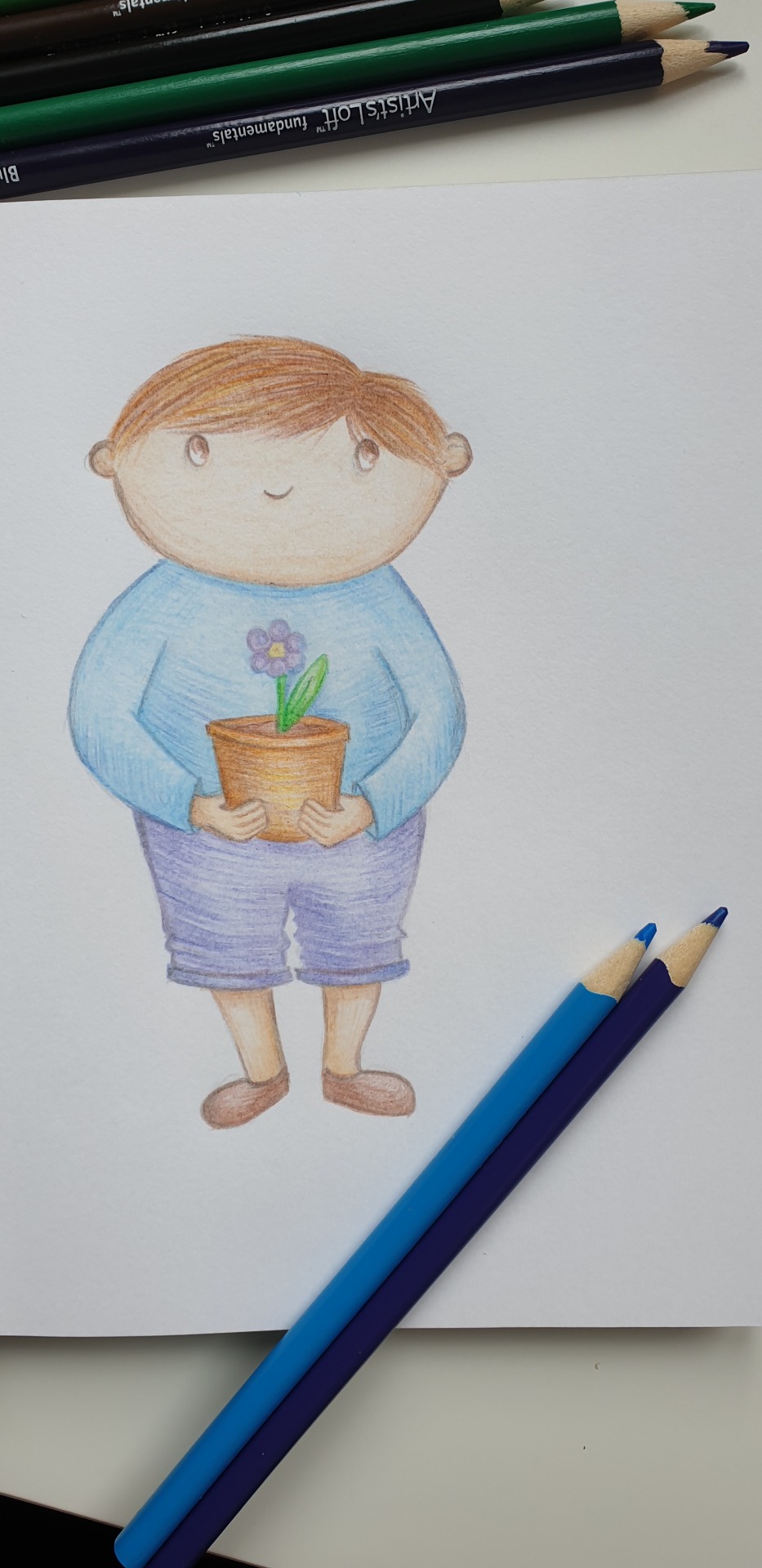
I am choosing to apply colour with pencil at the moment as more often, I will apply colour digitally. Sometimes I find new textures with pencil and it is a little more relaxing and not so heavy on the eyes!
2 notes
·
View notes
Text
Degree Show
My work went down quite well at my degree show in Manchester a couple of weeks ago. In fact, it went far better than I imagined it would.
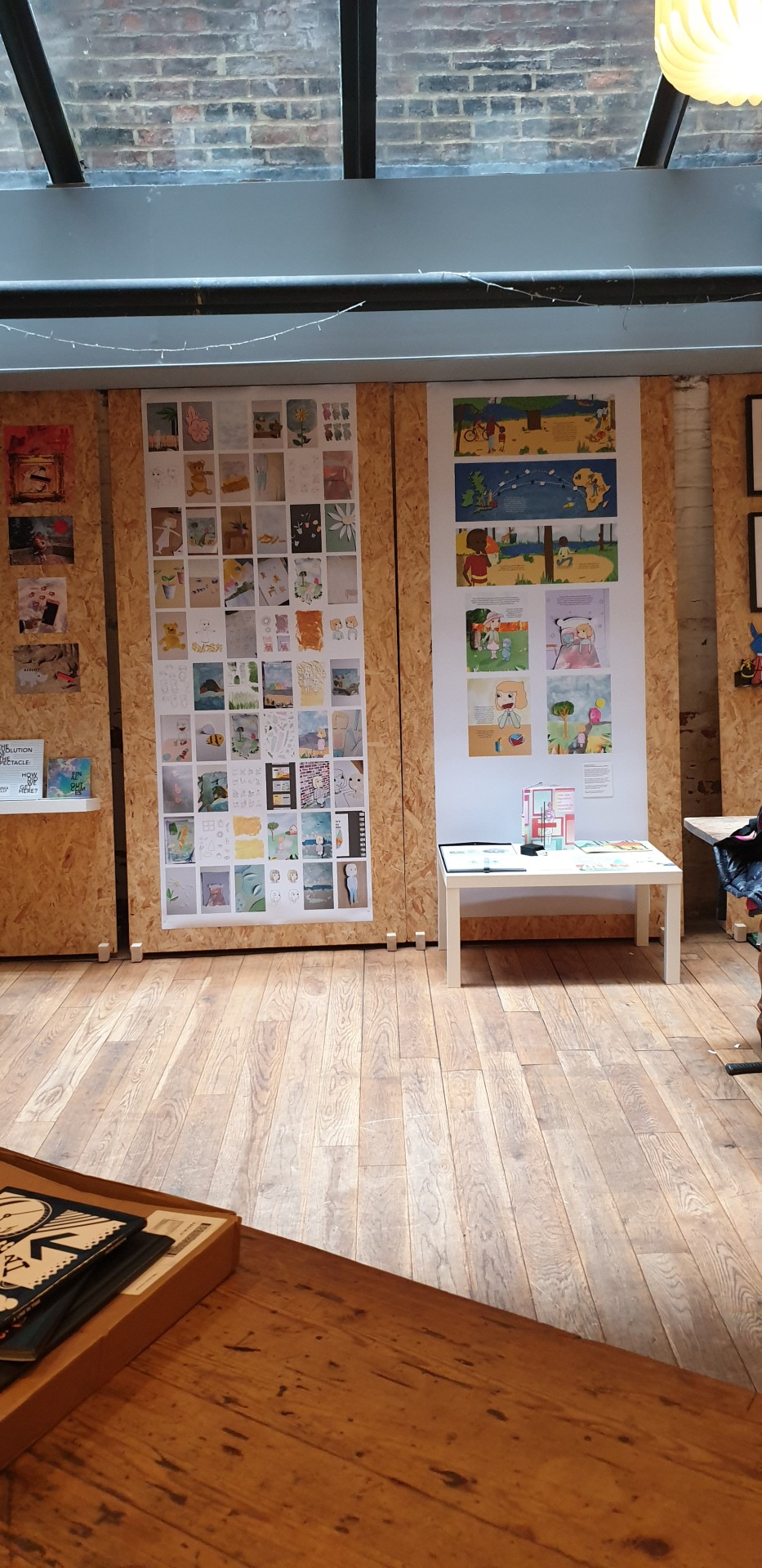
Lots of visitors viewed my books and gave some great positive feedback which was very encouraging.
I was surprised on the night when my work was commended with great recognition where I was awarded Ambassador for the HUGS charity.
0 notes
Text
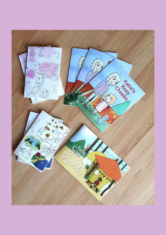
Re-visit
I have been a little bit busy recently making a couple of future plans and attempting to put the feelers out there for my next project.
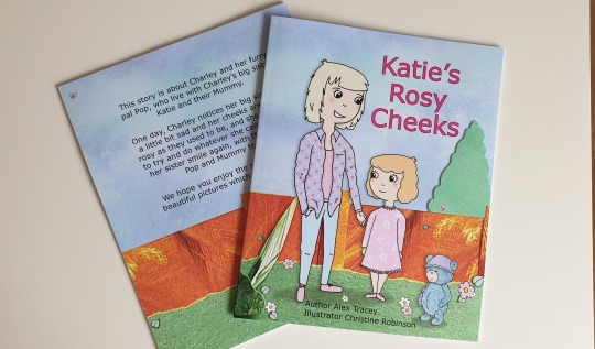
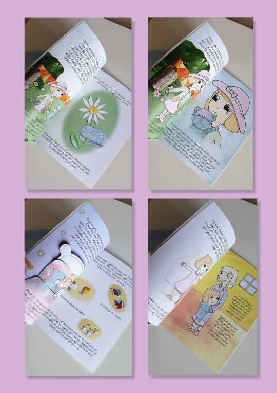
But before this I re-visited my book, Katie's rosy cheeks, as I needed to make a few minor tweaks with the text. Tweaks for the title font style and a slight resizing of the story text.

Every now and then little improvements like this have to be addressed and all for the better. The learning never stops.

The story text has been reduced by 2 sizes and slightly rearranged to fit nicely with the images. It has been given a sans as this makes it easier to read.
0 notes
Text
PDP Portfolio Website
www.christinerobinsonillustration.co.uk
The work that I have been busy with including projects, printed books and sketchbook work can be viewed on my website.


0 notes
Text
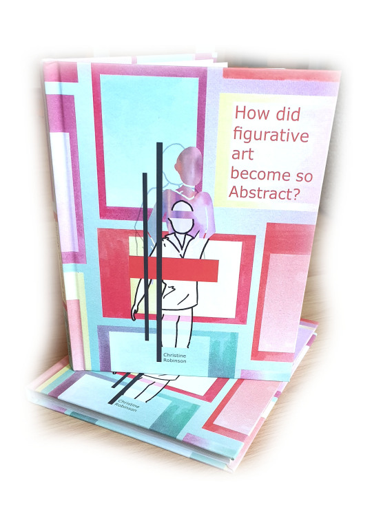
Dissertation Book
Illustrations
My dissertation is titled ‘How did figurative art become so abstract?’ I show the journey of how portraits from the renaissance period had changed so much over the years to the point where the figures became unrecognisable to their audience. Figures were created through expression and by the use of colour, shape and bold lines becoming an emotion of colour.
I chose to illustrate my book with a theme of expressive paint marks to show a consistency of abstraction and traditional methods.
Other illustrations where based around figurative images which relate to work within my own practice such as simplistic styles referring to figures with abstracted detail and no reference to particular people.
As part of the design aspect of my book theme, I chosen to dramatise some quotes using large type with a clean overall view of black on white. Illustrations of well known artists work have been demonstrated throughout the book as I refer to paintings within my writing as examples of the journey spoken.


0 notes
Text
PDP PORTFOLIO REVIEW 2
CHRIS MADDEN
Event, Alumni, Stockport.
Guest speakers include photographer’s, app designers, former students, illustrators etc.
I found the work by illustrator Chris Madden most interesting simply because his work relates more to mine than the work by others there although I fully respected that the work was of a professional basis and also very interesting. They were clearly committed to their line of work whilst enjoying what they do keeping themselves extremely busy which is encouraging to here at this stage of my own journey.
Chris Madden is an Editorial & Lifestyle illustrator. He made work via digital methods comprising of illustrations relating to a brief here and there and since graduating from Stockport College with a 1st Class BA honours degree in Design & Visual arts, Chris has worked with many reputable clients and his illustrations have appeared in magazines and newspapers, in the UK. Whilst he also explained that life happens, such as family life, the ways of making work still goes on, but being organised with time is key!

Chris Madden
Mental Health Awareness
A series of images based around the subject of mental health
http://www.maddenillustration.co.uk
I was keen to hear what his thoughts would be for my portfolio.
As I approached Chris, I introduced myself and immediately felt at ease talking with him and showing him through my work as I explained how I can relate to his work with his birds. The way he decided to create the birds and how they expanded to further designs then eventually becoming the illustration on a book cover was inspiring to hear. I talked with Chris about this and I explained how I went through a similar process with my latest story book, my collage creations and turning the designs into a fully illustrated book, it became my main theme throughout. At first, he was a little unsure about my infusion of collage and digital illustrations, but as he continued through my designs and could see how they unfolded and viewing the final book in print, he said he was very impressed with how well it worked out.

Chris Madden
Birds of Britain
A self-initiated project celebrating the birds found in Britain
http://www.maddenillustration.co.uk/#/birds/
Chris looked at all of my work properly which is what I wanted, I was ready for a critical overview ready to make any improvements that were necessary but as it stands, my review was very positive and I don’t feel I need to make any alterations at this time. I took on board the things that were said from my review from Emma Reynolds and it would appear that they have paid off.
Chris made a few pointers which were to be positive about my work and believe in myself. He said that my portfolio sums me up as an illustrator “you are an illustrator” and that is very clear that I have strong images and ways of creating. It is good to have more than one way of creating such as digital and paper illustrations as this broadens employability and shows my commitment for designing and shows my interest levels. Keep making time to create even if what I am creating it not linked to a brief, do it for myself and see where it leads.
Chris looked at my printed books including my sketchbook copies and his words were,
“ Yes,… this is great… this is really good stuff.” Then he viewed my business cards and they got his approval too which was good for me.
0 notes
Text
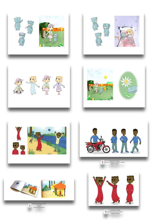
Printed book
Printed by Blurb
Happy to have my book finally as a book instead of on a screen! The quality is really good. Colours are as they should be. I am sending a copy to Alex as she has only seen the developments on screen too.
I made sketch books to go along side the final two book which show the makings of the ideas and a few drawings that changed throughout the entire process. It will be good to reflect on for my future works also.
0 notes
Text
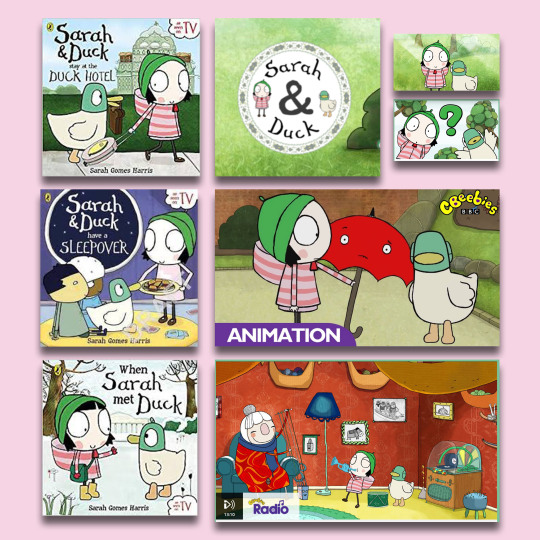
L👀Kin’ 🤓
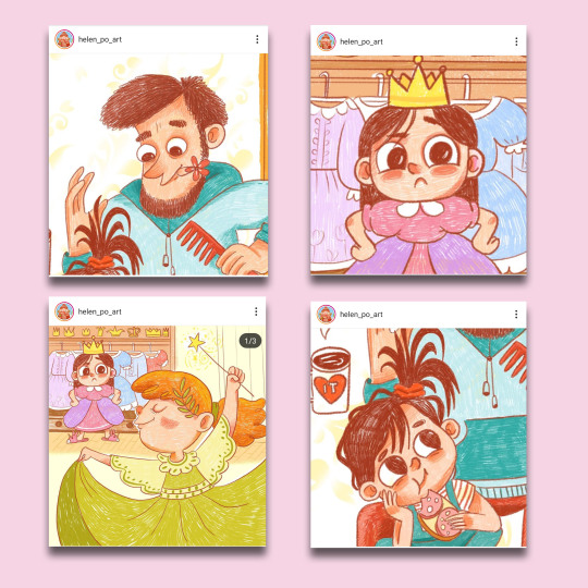
(above) helen_po_art found on Instagram.
Looking at Style ideas and methods of creating such as colour application and line drawing.
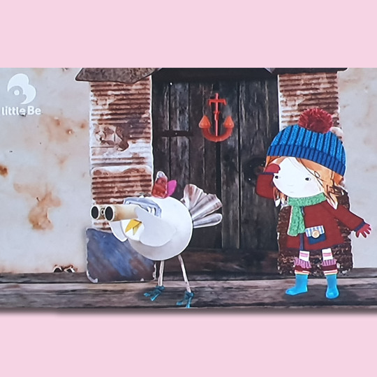
(below) Lily’s driftwood bay, tv series.
Collage characters brought to life by animation.
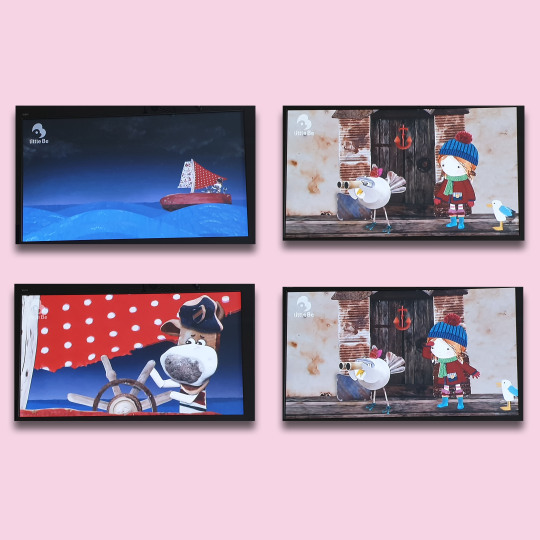
Sarah & Duck is a British animated children's television series created by Sarah Gomes Harris and Tim O'Sullivan (aka "Duck"), and produced by Karrot Animation for the British Broadcasting Corporation (BBC).
Sarah character reminds me of my Liittle Red Riding Hood’ character that I created last year which I am due to re-visit.
vimeo
0 notes
Text
Interested!
In reflection of my portfolio review, I am looking at ways of character designing by other artists. I am thinking about ways of challenging my own methods ready for after graduation when I can concentrate on developing my methods more so to what it is I ‘want’ to be drawing and creating. This is something that Emma had pointed out so now this is where my mind is at.
I found this person on Instagram...
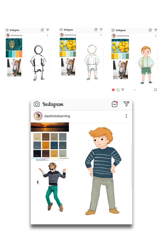
I need to do more if this, drawing from life. I usually do look at colour palette early on in my creations but I am going to work more towards the character styling in a similar way of drawing like shown here ^. This is a Nice way of putting ideas together per character.
0 notes
Text
PDP: PORTFOLIO REVIEW 1
Portfolio review 1 by Emma Reynolds
Emma Reynolds has kindly responded to my email. As she is very busy at the moment, a meeting may not be possible, but she has kindly given me the option to send over my work via email so that she can have a look through it to give me some advice, answer some questions and review my portfolio.
I took her up on this offer so that I can continue working on my portfolio, depending on the advice given, in time for my final deadline.
Hi Christine,
Apologies I've not had time to reply yet, things are very busy!
More likely I will have some time in May - or you're welcome to email me your work (low rez) and I can look at it that way and give advice when I get a chance?
Thank you,
Emma
Thank you Emma, yes I understand that you must be very busy I appreciate that. Thank you for your reply also. My final deadline is May 8th so it is probably best that I email you my work instead. I will put together my portfolio ready to send along with some questions that you may be able to help me with and I will have these sent over to you within the next couple of days.
Any advice and information will go a long way.
Thank you
Christine
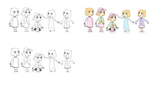
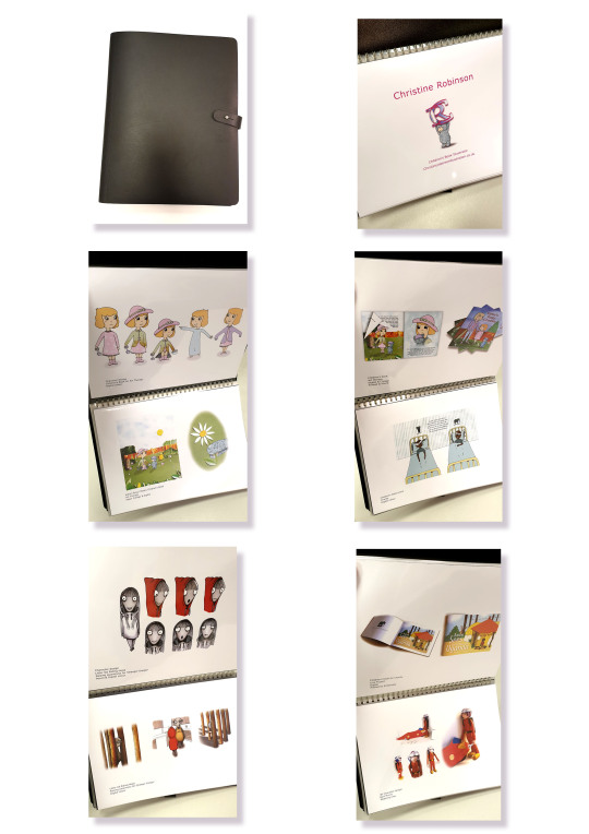
I sent over a PDF low rez file consisting of 16 images that I thought were what was required for a portfolio to show the work style that I do, work I like to do and what supports my field of work.
Some images I wasn’t sure about including, but did anyway. This was to give me an idea of what works and what doesn’t. ie, if I receive feedback on particular images that could answer my fears of the image etc.
Some images I held back on sending completely as I thought they may not be relevant or may confuse my style.
Hi Emma,
I have attached my PDF portfolio, low res, for you to have a look at when you can, I understand that your busy so please don’t feel pressured to respond immediately.
I also have a couple of questions based around what to do after I graduate to be successful in children’s book illustration, so if you have any key tips and general information, I’d love to hear them!
Portfolio Review;
Would you mind letting me know your thoughts please in terms of my portfolio content & layout.
I have heard on the grape vine that illustrators of children’s books are sometimes required to produce two separate portfolios, one for character designs and one focusing on scenes. I’ve also heard that just one portfolio is adequate providing the character is shown within a scene in action. What are your thoughts on this?
Do you suggest any alterations within my images?
Have I put in enough or too much work?
Should I apply my logo to each page?
I have considered creating a concertina style portfolio to present, do you think that this idea would work for my style?
After Graduation;
To continue producing work and keeping my portfolio up to date, I intend re-visiting a previous project, (a children’s book regarding stranger danger) where I feel my skills have improved and I would like to improve the project. How did you continue to produce work after graduation?
Do you have any advice on how to go about getting an agent such as where to go and what may be required etc? (Any information in this area will be much appreciated)
Thanks again for your time.
Christine.
Hi Christine,
Thank you for your email!
I'm gradually putting some advice together.
Can I ask who your favourite artists are?
Which artist's whose work you think 'I love that technique!?
What is your favourite thing to draw? (The thing that gives you genuine joy, not the thing that you feel you -should- be drawing for kids)
What do you find difficult to draw? What don't you enjoy drawing as much?
What process brings you the most joy?
Thank you!
These questions will help me advise you.
Emma
Hi Emma,
That’s great, thank you!
The illustrator’s that are my favourite are Holly Hatam, Clover Robin and Natalie Merheb.
The work I most admire are possibly from Holly Hatam as the textures of backgrounds display great detail. I was inspired by Holly to try paper collage for my previous book which I enjoyed combining with my digital characters.
I have recently been inspired by helen_po_art found on Instagram for her latest few images consisting of brown outlines for her character designs.
I particularly enjoy drawing children, expressions and various outfits. There is something quite satisfying with bringing the emotions and excitement out in a child within a story. I like to draw animals, but the cute talking type, not so much the realistic animal drawing. I also enjoy drawing leaves, flowers, houses, furniture and household objects.
I think what I dislike drawing the most is cars and other vehicles, towns and city scape. I much prefer a colourful, and relaxed scene to draw and read about than a busy town.
I guess I find hands difficult to draw, it usually takes a lot of mistakes before I allow an image to be completed and even then, I’m never really 100% happy with it.
The process I enjoy most is line drawing characters with digital colour application where I can apply a pattern or texture, such as a print on a dress. I also like to combine media with paper even if it is only small parts to make up the completed image which creates natural shadow.
Hope this helps.
Christine.
So there have been emails sent between Emma and I which have helped gain a bigger picture of the way I work and where I require advice to improve.
Emma sent me a very informative email which contained my portfolio review in depth along with some helpful links for other artists in the children’s book field all of which are completely relevant to me.
Here are some of the critiques for my portfolio:
I like your little girl (floppy hat) character, she has a nice face! It would be nice to see her from different angles though and with some different facial expressions though - expressing how a character is feeling and their reactions is really important. I would re-visit the sitting down pose, her legs look a bit disconnected! Look up some ref pics of children sitting down and see what you can do. Same with hands and feet - They are hard! But try not to avoid them or miss off fingers or toes. You can feet more easily (just draw shoes!) but you can't have characters hiding their hands in gloves or sleeves, so just do some hand drawing exercises (there's loads online a quick google away or on YouTube) and get practising :) Your other characters are expressing more which is great to see.
Have you seen Lauren Child's work, she made the 'Charlie and Lola' books.
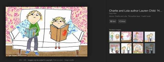
https://images.app.goo.gl/2BgVfBzB5r2AX2U86
I think she'd be a useful artist for you to look at. Her colours are 'flat', but she uses pattern and collage. And she uses outlines on the characters, but she also carries those outlines across into the background too, which makes the piece more cohesive as a whole, rather than - collaged background, and then outlined characters on top in a very different style. I think trying to have a more cohesive feel in your work would be good. Either making your characters also out of collage, or adding some line details also onto the background like Lauren Child does. You've done this on the bin which works well. Just make sure that the colours of the collage aren't taking over the character and vice versa, it just helps to work as a whole.
Other artists to check out -

Kelly Pousette - https://www.instagram.com/kpousetteillustration/?hl=en

Kate Slater - http://www.kateslaterillustration.com/
The email was quite big, so I won’t add it all, Emma had answered all of my questions really well which is quite helpful to me and has put my mind at ease with a lot.
Heres some;
Should I apply my logo to each page?
No, I don't this it's necessary. And to honest, showing your physicaly portfolio is very rare these days. It's mostly all done online with some low rez jpegs attached and a link to your website in the covering email for the rest :)
Also - I would maybe consider that you don't need a logo as an illustrator necessarily. Perhaps just a 'Cover image' for your portfolio front page instead, perhaps the girl with the floppy hat standing up holding the spade.
I have considered creating a concertina style portfolio to present, do you think that this idea would work for my style?
Keep it simple, A4 or A3 portfolio prints in a clean portfolio is fine. And as I say, degree shows place importance on physical portfolios, but it is very rare that I ever show my work in person printed out nowadays. Your website, and having a social media presence, is the most important thing. (don't have to have loads of followers! Just accounts with sensible usernames (avoid underscores))
How did you continue to produce work after graduation?
You keep going!I worked part time while I built up my work. There are briefs you can do that can give you a focus, such as book illustration competitions like ones you might have done in University.
Keep going, keep learning and keep believing in yourself :)
Since then I have thanked Emma for her time for such a detailed review and I will return to this information again as I find my feet after graduation.
“Thank you Emma”!
0 notes
Text
PDP PORTFOLIO
RE: Natalie Merheb & Emma Reynolds
As part of my PDP I have to create a portfolio to industry standard and have it reviewed by professionals in the relative practice. I have made a start on my portfolio where I have pretty much started it again as I am trying to target a particular theme due to wanting to pursue in Children’s books.

I have been reading around some guide lines for building my portfolio as I want to get the best out of it and really want it to work for me in terms of making it stand out and targeting my working methods.

I have come across illustrator Natalie Merheb, who says ‘your portfolio is only as strong as the weakest piece’. ‘The big question: WHAT TO PUT IN YOUR CHILDREN’S PICTURE BOOK ILLUSTRATION PORTFOLIO? What are art agents and publishers really looking for?’
Natalie talks about ways of creating your portfolio as it is a little bit different for Children’s book illustrator’s, we have other things to consider, such as not needing to show many different artistic styles, and that it’s important to put things in your portfolio that represent the type of projects you would love to work on in the future etc. She has put together a check list of things to put in your portfolio...
Animals: Not just cats and dogs!
Kids: Children, toddlers, and babies
Gender: Boys and Girls
Interiors: Bedroom, living room, kitchen, classroom, cafe, etc.
Exteriors/Nature: Cityscapes, streets, buildings, mountains, beach, fields, forests, jungles, etc.
Seasons: Winter, spring, summer, autumn
Times of Day: Sunrise/sunset, day and night
Racial diversity: Caucasian, African, Hispanic, Asian, etc.
Objects and Still-life
Weather: Sunny, rainy, cloudy, stormy, snowstorm, etc.
Historical Periods
Black and White (only if you are good at this)
Age: Older people that children would be familiar with like a sibling, parent, grandparent, teacher, nurse, mailman, etc.
Character-driven cover designs
Illustration types (spot, vignette, and full-bleed illustrations)
Hand-Lettering (only if you are good at this)
Emotions: Happy, sad, angry, shy, impatient, scared, shocked, shouting, crying, etc.
http://nataliemerheb.com/illustration-101/childrens-book-illustration-portfolio-checklist/
Whilst working on my portfolio, I have been in touch with Emma Reynolds who is a freelance illustrator and character designer.

https://emmareynoldsillustration.com

I sent Emma an email to ask if she could spare a little bit of time to have a meeting with me and to see if she would review my portfolio and perhaps share some advice for when I graduate. I am waiting for a response so I will continue to work towards my portfolio. I do hope that Emma can meet with me soon.
0 notes
Text
.
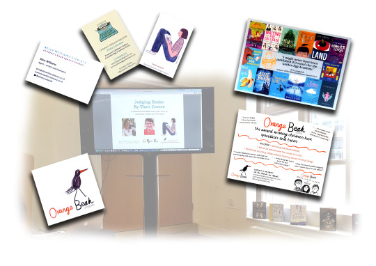
PDP Judging Books by Their Covers
REFLECTIVE BP (6)
ORANGE BEAK STUDIO CHILDREN’S BOOK EVENT
Last Saturday I went to Manchester to the Central Library to attend a Children’s book event. On arrival, I was welcomed by Editor Tilda Johnson, Literary agent Alice Williams and Ness Wood, book designer and co-founder of Orange Beak Studio.
The discussion was all things children’s books from picture books to illustrated fiction and book covers.
The audience was filled with illustrators and writers with a passion for children’s stories.
Lots of advice was given on how to go about getting an agent right through to creating a good book jacket. Example children’s books were passed around for us all to have a look at which I found delightful and very inspiring.
One Example..
Here are some of the useful tips and sound advice that I noted down from the talk referring to agency and general information.
~Before sending work anywhere, identify what you want to do - be clear! (picture books or fiction).
~Email the agency with lots of information and include a portfolio.
~When choosing character design, show character designs in different positions and show that you can draw faces.
~Look at the agencies list of who they have and who they are looking for.
~Be professional (who likes my work and why am I doing it?)
Q.How long does it take to sign up with an agent?
A.With a good portfolio and a dummy book along with the agents requirements, it could be within 1 - 2 weeks with a possible meeting.
Q.How do we know that our work is ready to submit to an agent?
A.Make sure it’s complete and to the best of your ability. Don’t send anything out otherwise. Take time over it or come back to the work before submitting it.
~Read todays children’s books and don’t just hang on to the stories that we all know and have loved as a child.
~Keep drawing and being creative.
~Observational drawing is important, even when your thoughts are to turn it into your own style.
~Leave the book jacket till last, how it looks could change the feel of the whole story.
~Innovate, not imitate
~Show a varied option of book cover ideas before publishing.
~Create something that will stand out when it’s shown on a small scale such as a webpage.
~Re-visit work and keep reworking ideas.
~Keep it intriguing to keep your readers interested.
~Mix gender such as using pink type for a story that has a little boy as the main character.
~Aim for 300 - 600 for a picture book.
Thank you for the chance to come along and to hear all this great information and to meet with professionals already in the business of creating children’s books. I will be keeping an eye out for further events.
2 notes
·
View notes