
Statistics
We looked inside some of the posts by samantha-skelly-blog and here's what we found interesting.
Average Info
Notes Per Post
3
Likes Per Post
3
Reblog Per Post
0
Reply Per Post
0
Time Between Posts
12 hours
Number of Posts By Type
Link
2
Photo
12
Text
3
Last Seen Tumblr Blogs


Fun Fact
In 2020, 27% of US Tumblr users had an annual household income of over $100,000.
Link
Colour grading tutorial.
3 notes
·
View notes
Photo


Testing some black and white colour grading on photoshop earlier. Techniques used from imagin class.
0 notes
Link
Tutorial on colour grading
0 notes

Photo


In order this is my full documents from my work experience analysis-half typed half handwritten.
For my work experience I emailed a bunch of studios and Caroline Anne Photography in Paisley was kind enough to allow me to work with her and her team for a month to see the in’s and outs of a live photography studio. I got to meet alot of successful people in the industry and work with them on jobs like family/ social studio shooting sessions, editing, mounting, framing, shipping, organising, and other activities. This has taught me alot and will be a great month of important experience for me.
(Total of ten pages)
0 notes
Photo

My guest speaker report for Kirsty Mackay
0 notes
Text
HndY2 Exhibition Review
Theatre Royal
Samantha Skelly hnd2c

How does the flyer/poster advertise the Exhibition?
This was an image that we all decided would be a good representation of the standard of work that we as a year produce. The image is a very clean bold high standard fashion portrait- fashion has been a leading element in our Hnd throughout both years. The details of the poster is clear and clean to read and very straight forward.
What is the suitability of gallery space? How is the exhibition laid out?
Spread out over two floors of the theatre royal it provides a lot of space and it allows people to not be overwhelmed by everyone’s work at once but it now can be split in two sections- portrait on bottom and landscapes up top, this also helps the symmetrical visual look too.
How has the work been mounted? Is this appropriate for the work?
The final look when you walk around the exhibition has a sense of unity- showing everyone’s work at a united group that are proud to be apart of one year, this may be good for some but not for others as some work could look better if they were presented in a similar fashion to the style of their photographer. I know that some of my work I would have preferred to be much larger and have no frame reflecting off it. But this is a group exhibition reflecting a college year as one. Deadly digital printed all work on mounted a3 canvas then framed them all in the same thick black frames then these were hung up on plane white boards.
Who made the work?
The hnd year 2 students shot and edited all work. The hnd lectures mounted them onto canvases and deadly digital printed and framed.
Who did they make it for, who is the audience?
The work is personal project to each photographer made their projects because they wanted to they are for everyone to see who goes to their exhibition of who can see the photographers work online. At the exhibition there will be a range of highly regarded photographers and other people who could possibly buy your work. So your work is to be shown off to everyone but it is mainly made for you.
How does it make you feel?
To see my own work up amounts my classmates incredible stuff makes me proud. The standard is very high over the last two years we have all grown so much and to see everyone’s work up in a unified way in an iconic location definitely gives me a sense of accomplishment. It makes me excited to see where we can all develop going forward.
If the work has a title does it make you think about the images differently?
The work does not have individual titles, I would say that it would have been better if they were as I know from experience that not all images are obvious as to their meaning from the surface- sometimes the story or the title can deepen your reaction to an image. One of my exhibition images is from my series called ‘What Remains’ which depicts the leftovers from the Clydebank shipyards showing the scraps that once held a building together that held a town together. So I know that when people see my work with no context they might just see a fine art sculpture print when I know there is so much more to the story. So a title could make people think twice about an image and I would have liked that for my own work. The exhibition name is hnd year 2 which is obviously showing that it will showcase students work so this will help people see that it’s an end of year class exhibition.
How would you describe it to someone later?
Completely varied excellent work from students of hnd- no work is the same or even similar everyone has put so much effort and passion into a personal series
Is the photograph valuable? How do you know? Is the work for sale and who might buy it?
Yes the work is for sale- anyone is able to buy the work each framed image is on sale for £120 and the print itself is £90. The guest list is filled with people who are possibilities for buying work.
What information is available about the artists?
We have a rota of people who should try and cover the exhibition after opening night to keep the visitors informed of the work and the people but this is on a voluntary basis and we all have busy lives. Besides from that each persons name is on their frame and there was business cards on opening night that can allow customers to look out for a specific photographer they like the work of.
Who organised the exhibition and selected the work?
We were helped by the lectures to select the right two images for exhibition- you usually go through a few of them to get different opinions so you have a good idea what is most popular.
We were separated into teams for organising the exhibition to make sure everyone did their part which never worked out so only some teams did the work for setting up the theatre and organising drinks or invites and poster design was given to students to do as jobs but helped by lectures.
0 notes
Photo


Contact sheets from the two test shoots I did for the folio 1 project ‘The Face’
0 notes
Photo

Guest speaker Report
Guest speaker James Deadly digital spoke to us about using his printing services in partick, he brought with him about a dozen of different paper types to show us in person the effect each paper finish has on images- he showed us this by having two very different Andy Buchanan images to express which paper looks best on the bold sharp colourful image or the paper that suits the more soft strong blacks and colourless images. I have always used deadly digital for my folio prints and my paper type has varied throughout the years, commonly I now use metallic but after this session I decided to use brilliant matte plus paper finish on my graded unit and once I seen the final result I couldn't be happier so I was very glad to have this workshop from James to help me make the right choice for the best paper finish.
0 notes
Photo


Wrong images I found from a while back- forgot to upload these, basically the project was to do with shooting images that didn't fit the typical right way to shoot composition, framing, exposure, focus, and also that were lacking of any techniques, subject matter or meaning behind the images.
0 notes
Photo


One day a while back when we did a workshop on showing us a variety of ways to shoot portraits with a bunch of different sets in the studio for ‘the face’ This workshop gave us the opportunity to use some equipment I had never used or seen before- one being the soft box wall for backlighting subjects- this is the one I used for my final image.
0 notes
Photo


The Face Resubmission
The images on the left were what my original submission for the face looked like, as you can see I overdid the skin retouching by using the blur tool on the skin and masking over her key features- this was a technique I had previously learned in nc but looking back on this work now It desperately needs updated to a more natural untouched look. I had even volumize her hair in the left images with the stamp tool which was another technique from NC, considering that her skin and hair is practically perfect anyway this editing look is very much overdone and horrible. So I went back and found some old raw images from this shoot and edited them how I would now after Im at the end of the hnd course- the results are the images on the right. Not alot has been done as the image is basically just out of camera but you can see that I have sorted any overdone edits from before.
It also helps when shooting clean white or high key images you usually dont need much editing on background or facial features.
0 notes
Photo


RESUBMISSION- for Wait For It
Image Left: this was my first submission for Wait for it- Its amazing how much I see looking back on my images from the beginning of the year that I never seen then, for example this submission was nicely shot for composition and would have mad a good image for some kind of architecture or urban briefs but for wait for it as a task they wanted to show focus on human behaviour or expression they also wanted to see that you have took time to shoot the image you submit and for no staging to be involved. When I first submitted this image I thought because I waited for this character to walk down the entire street and I captured him when he was just hitting the light so that he has now become silhouetted out that this would fit the brief- I still think that could have been a nice idea for an image but the silhouetted man is not the subject of this image and i am loosing all human elements from this shot.
Image Right: This is my new submission for Wait For It- As you can see the human presence is strong in this image I waited in winter at the doors of each train that pulled into the station in the hopes of capturing someone looking out through the door window or someone stepping off the train looking miserable but instead I caught a little group of commuters having a chat and one man solo standing looking fed up as he should in the winter on a train. I wanted this to be shot using the trains ambient light source to reflect down on them creating a dark mucky tone- the image is made by the expression of nothingness from this man in the front and the people in back both holding on to the rain symmetrically, The colours worked well with similar jackets of bold blues and greens- I would have liked to frame the shot a little better to get the woman out of shot in the frame as she had a red similar jacket on that could have tied in nice to the group. I am hoping this resubmission suits the wait for it brief more than my last image.
0 notes
Photo


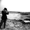
A little background into my high key social studio Yoga shoot- When i knew I was shooting a yoga instructor I researched some positions and moves she would do so that I could decide what kind of lighting and background would best suit. in the end I decided that her outline of the body-shape and the mat were very important to show off so a simplified high key background completely clean of any distractions would be the best was to shot her positions so that the’d be easy to follow. I told my model to only wear black or dark tones so that her outline would be strong. For setup I used the classic clean white setup I have learned over the years of college, as i wanted this to be high key I had my background lights two stops over my frontal lighting- 4 lights in total, two white sided foam boards, soft boxes and strip soft boxes for hoods and the cleanest white paper background I could find.
0 notes
Photo


Resubmission area- Fashion Front Cover.
As apart of my folio 1 grading I passed fashion front cover but was asked to reconsider my use of skin retouching. I let some time pass before looking back onto what I had submitted for my Hitchcock inspired front cover image but once I finally did I was shocked by the amount of nasty editing I had done to my lovely models face- its so overdone and I was embarrassed that I had ever submitted a portrait that looked more like a painting unintentionally. I have most definitely learned from my mistakes and have resubmitted my fashion front cover from the top image... to one of the bottom two. Not only did I over-edit my original image but I choose an image that had very little to do with my research on how hitchcock uses colour, shadows and light. In this research I discussed the harsh ‘figure like’ shadows that creep behind some of his actors in shots, and I spoke about his films having a running theme of blue and red tones per film that often is shown in his movie posters. Thankfully I can change my image to either one at the bottom as these show more how my research was developed into my shoot.
0 notes
Photo


Some images from my press event throughout the day, shooting ted x Glasgow 2018

0 notes
Text
Press event
For my press event I had been given the opportunity to shoot Ted x Glasgow this year. This event was presented to me very last minute but once I found out what it was i jumped at the chance as the event has been something I myself has wanted to attend for a while. I was asked to shoot the entire event from 7am-6pm at the armadillo and the SECC in Glasgow, there would be many different talks and debates going on all day in different zones throughout the two buildings that were organised by Ted x so I was to follow a schedule to be in certain rooms at precise times to shoot- the entire day was organised very well by the lead photographer Pete and by the volunteers behind this even. I was emailed a booklet with all the important times and information from the organisers regarding the main team of peoples names and contact info, and a layout of the locations the events and the rest of the day. Basically Ted x is famous worldwide event for speakers, public figures or just people with an inspirational story gather in a day with four sessions of ‘talks’ these guest speakers come onstage for about 15minutes to speak and the audience usually gets alot out of it. on the day there was about 20 speakers split into 4 sessions, in-between each session people could leave and wander around the rest of the event to see smaller discussions in different places or visit a convention in the secc that was ted x organised, these were all things i had to photograph. My brief was to capture the essence of the day in mostly action shots of guests interacting with the volunteers and with the activities on offer, and to photograph the sessions with all the speakers from every angle of the auditorium. By the end of the day i had shot nearly 2,000 images of the event and I handed my work over to the lead photographer and I was done.
0 notes