
home of cromulent projects reblogs will live over on @portablecity learn more at portablecity.net
Don't wanna be here? Send us removal request.
Statistics
We looked inside some of the posts by shelandsorcery and here's what we found interesting.
Average Info
Notes Per Post
449
Likes Per Post
277
Reblog Per Post
152
Reply Per Post
20
Time Between Posts
1 day
Number of Posts By Type
Photo
3
Text
14
Last Seen Tumblr Blogs


Fun Fact
The KCSC sent more than 20K requests to delete posts related to prostitution and porn to Tumblr from January to June 2017.
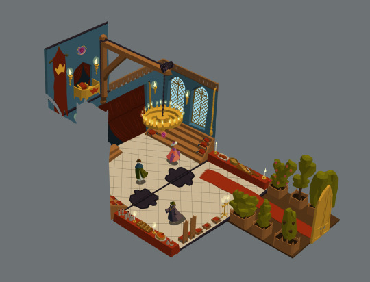
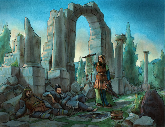
Photo
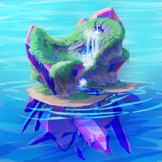
Crystal island for Dragon Care Tarot
I created this environment concept for Pillow Fight games' in-progress game Dragon Care Tarot.
8 notes
·
View notes
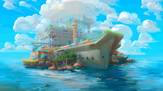
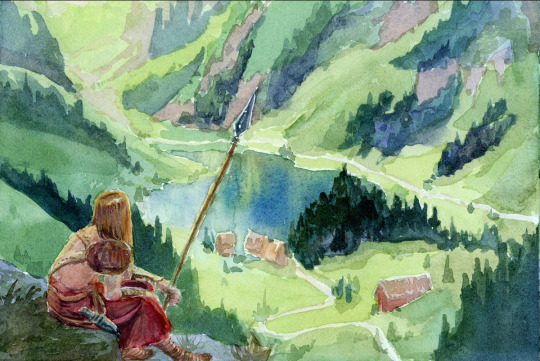
Photo
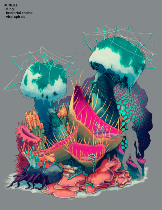
Jungle environment concept
Scifi environment designed for Cam Banks' Pillar of Fire project!
18 notes
·
View notes
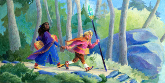
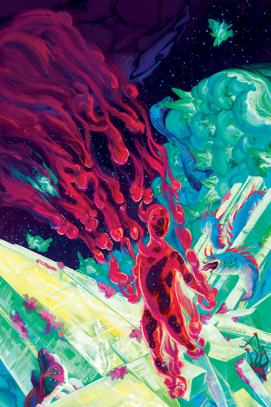
Photo
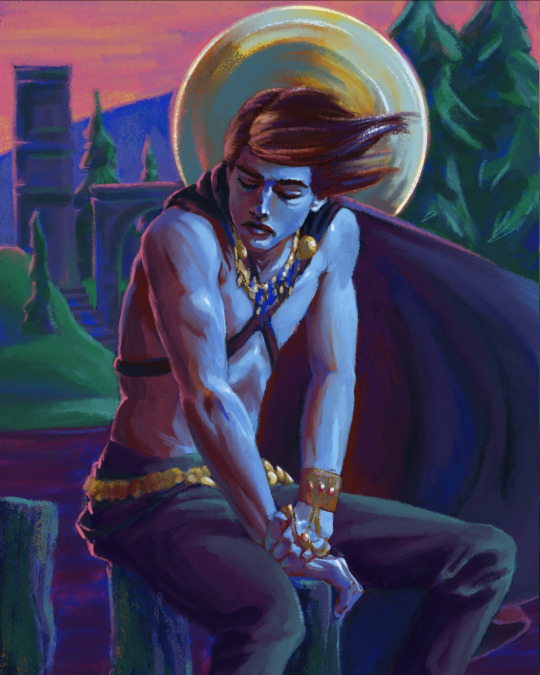
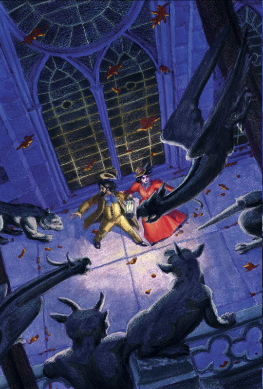
The Temple of the King
I painted this with a Rainbow song in mind, but mostly as a test of using a fixed colour palette in procreate! The MaxPacks pastel and gouache brushes made it really, really fun.
11 notes
·
View notes
Text
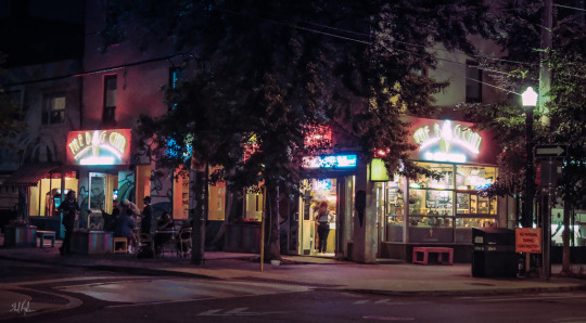
moody night shots are becoming a new favourite
15 notes
·
View notes
Text

Goldfinches are so fast! I have rarely managed to snap more than a shot of their retreating tailfeathers. This one, however, sat still for a good two, three seconds.
8 notes
·
View notes
Text

another moon shot? Absolutely. No regrets. Look at her, she's beautiful.
6 notes
·
View notes
Text
love to get footage of a little guy just doing his thing
2 notes
·
View notes
Text
happy portfolio day once more!
Hi folks! I'm Shel Kahn, a canadian art director/vis dev/illustrator who's worked in games and comics and fiction for over a decade.
I've worked on Disney properties, Glorantha, Call of Cthulhu, and a little of everything in between, and I'd love to hear if you've got something coming up that could use my special blend of weird, magical and fun!
You can hit up my full portfolio at https://www.portablecity.net/shel-kahns-portfolio/ - but here's a sampler to whet your palate:


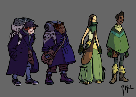


okay so that IS a lot of art, but I'm very very proud of all that and I'd love to work with you to make more art in future!
Ping me at shel (at) portablecity.net if you're looking for colourful, magical, surprising art for your next project!
52 notes
·
View notes
Text
happy portfolio day once more!
Hi folks! I'm Shel Kahn, a canadian art director/vis dev/illustrator who's worked in games and comics and fiction for over a decade.
I've worked on Disney properties, Glorantha, Call of Cthulhu, and a little of everything in between, and I'd love to hear if you've got something coming up that could use my special blend of weird, magical and fun!
You can hit up my full portfolio at https://www.portablecity.net/shel-kahns-portfolio/ - but here's a sampler to whet your palate:
okay so that IS a lot of art, but I'm very very proud of all that and I'd love to work with you to make more art in future!
Ping me at shel (at) portablecity.net if you're looking for colourful, magical, surprising art for your next project!
#portfolio day#portfolioday#concept art#art on tumblr#vis dev#art director#videogame art#fantasy art#etc
52 notes
·
View notes
Text
Anyone have five minutes to look over my portfolio layout and let me know how it looks? I'm especially curious to hear if it's broken or confusing or such.
I've already found one menu bug on mobile i need to wrangle, so I'm sure there's more lurking!
https://www.portablecity.net/art-direction/
https://www.portablecity.net/visual-development-portfolio/
https://www.portablecity.net/illustration/
9 notes
·
View notes
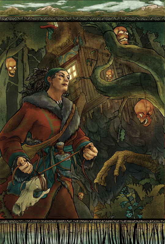
Text
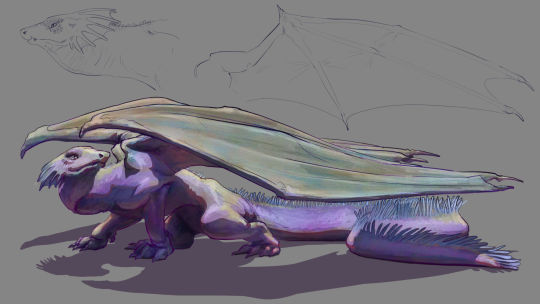
okay, the lead keeps changing but for a split second it was merfolk, so here's a frogfish mermaid from the sketchbook:
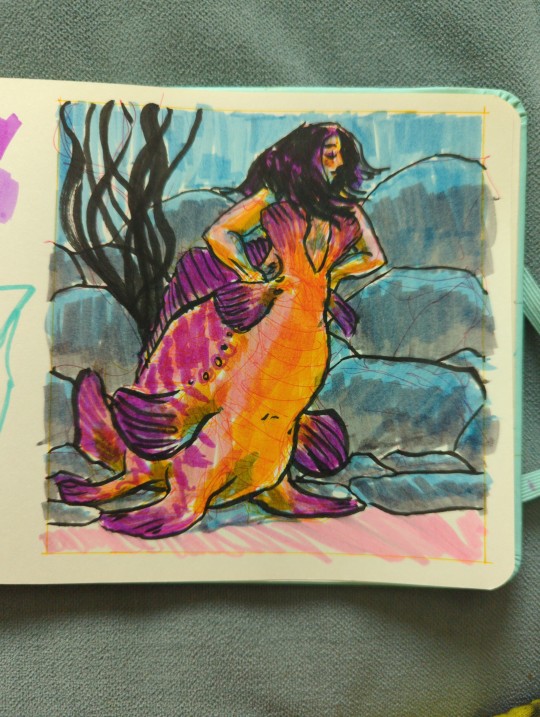
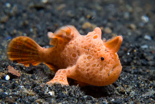
a frogfish for those who aren't familiar with these delights:
did this sketch with some ballpoint pens, Crayola markers and a brush pen i snagged from muji.
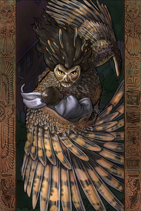
Going through my portfolio, one thing i love drawing and don't have nearly enough shareable examples of is animals, creatures and monsters. Gonna try and do a few portfolio pieces this fall to fill the gap - and i thought, maybe i could take some suggestions or requests!
I'll do my best to get to a few of these in the sketchbook asap! and then see what i can take further to a full piece from there.
12 notes
·
View notes
Text
Anyone have five minutes to look over my portfolio layout and let me know how it looks? I'm especially curious to hear if it's broken or confusing or such.
I've already found one menu bug on mobile i need to wrangle, so I'm sure there's more lurking!
https://www.portablecity.net/art-direction/
https://www.portablecity.net/visual-development-portfolio/
https://www.portablecity.net/illustration/
9 notes
·
View notes
Text

I had a question about what gouache I use over on cohost, so I'm crossposting the answer here for anyone who's curious:
So I've tried a few different types of gouache, including the very affordable jelly gouache sets they have on aliexpress/amazon, and I've settled on forking over for the good stuff as the best way to get the results I want with minimum fuss. So here's the lineup of my collection of tubes right now!
The bulk of my paints are from Winsor & Newton - this was the brand we bought our starter kids from at art school, and if you notice any doubles in that lineup, it's because friends gave me their half-used tubes after graduation when they vowed to never gouache again. Some of those tubes are VERY old, but as long as they aren't fully solid, they're still good to go, so I keep them around. Also if they ARE fully solid, it's never a bad idea to try cutting the paint brick out of the tube and using it like a pan gouache. It usually works.
Through the pandemic tho I've been watching a lot of other gouache painters all over the world on youtube, and it did indeed get me hungry to try other brands! So the rest of my paints are from M. Graham (honey based gouache, dark colours aren't as opaque but holy heck they are pigmented) and from Holbein (really creamy consistency overall), including a bunch on the right there that I bought as one-offs from their fancy seasonal Irodori sets (some of my favourite pastels oh my gosh).
These are all traditional gouache, not acryl/acrylic gouache (though my partner @goshdarnheck has a solid collection of those), so these will rehydrate from dry - some faster, some slower, but it means I can often work with them dried out in pans instead of squeezing out fresh paint every time I sit down. This does take the sting off the price tag a bit - and makes plein air a lot less stressful and messy.
The other nice thing these days is that most art stores now sell online and ship worldwide (or nearly) and it's possible to track down some decently affordable paints that way. If you're also in or around Toronto, fyi, you can find W&N and Holbein gouache tubes at Gwartzman's art supplies for very good prices, and that's where I was able to get my single irodori paints as well. They do one day delivery in the city limits, it's amazing.
If you have any questions about my palettes, or particular colours, definitely drop them in the replies or my asks and I'll be happy to go into more depth!
51 notes
·
View notes

Text
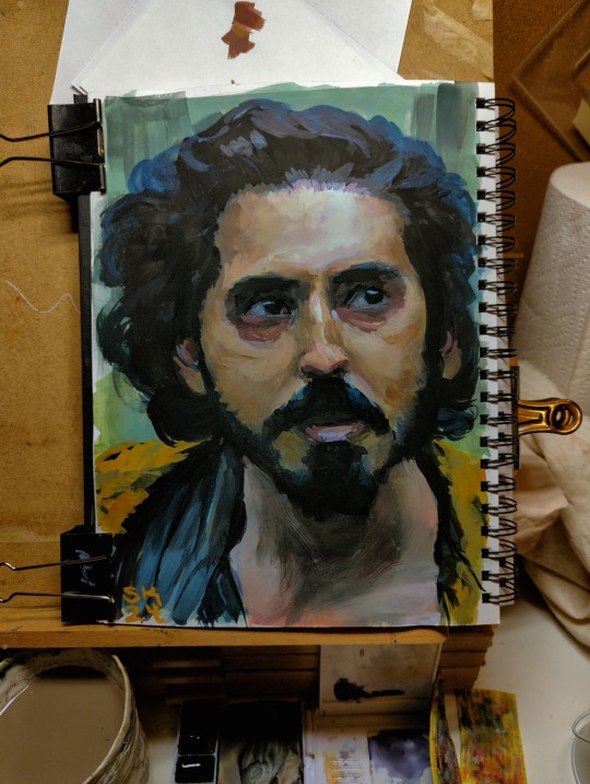
painted a study from The Green Knight! took so, so many passes to get this much of a likeness.
earlier WIP:
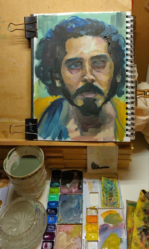
75 notes
·
View notes