The official creative blog of graphic designer Luke Pearson.
Don't wanna be here? Send us removal request.
Statistics
We looked inside some of the posts by sonofthepear and here's what we found interesting.
Average Info
Notes Per Post
13
Likes Per Post
12
Reblog Per Post
1
Reply Per Post
0
Time Between Posts
1 month
Number of Posts By Type
Text
17
Last Seen Tumblr Blogs


Fun Fact
Tumblr’s website traffic is steadily declining.
Text


A big thank you to everyone at Wilko, Homebase and The Range. It's been a pleasure working with you all for the past 7/8 months.
Supporting the creative team by creating promotional materials for new campaigns, social media assets and customer emails, whilst maintaining each brands values and creative style.
#graphicdesign#graphicdesigner#freelance#freelancedesigner#graphic#design#graphicdesigndaily#visualidentity#branding#brandidentity#artworking
1 note
·
View note
Text


Liverpool FC
The 24/25 football season has been a special one for Liverpool FC, who have become English champions. As most of their supporters have enjoyed watching their team, I, as a neutral, have enjoyed what their creative department has produced.
Liverpool have got their whole club identity spot on this season. Using their own custom typeface, which is complemented by bold and vibrant imagery. Their whole visual identity this year has evolved around using photography in the best way possible. To celebrate a player's stats, they make the player the focal point and the text is secondary, no need for cutouts or lighting treatments or any other brand assets.
Their contract renewal graphics for Mo Salah and Virgil van Dijk were exquisite. A simple line of text sealing the deal. The hints of Liverpool red for the carpet for Salah and the throne for the "Egyptian King" add a subtle nod to his chant. For van Dijk, the sense of royalty with gold-framed pictures of the captain in action, with the consistency of players sitting down, or should we say taking their seats ready for the show. This has been a regular appearance throughout the season for matchday graphics as well. A really well-thought-out campaign by the creative team at the club and all involved.
6 notes
·
View notes
Text
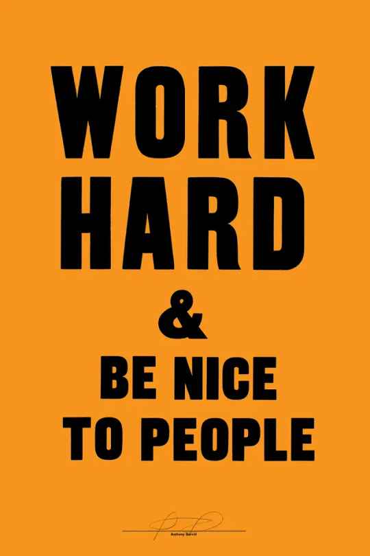

Anthony Burrill
Going back to talk about one of my favourite pieces of work, which even inspired a university project of mine. Anthony Burrill's 'Work Hard & Be Nice To People'. A piece that has stood the test of time and is some simple but effective advice.
It's funny to think that this piece of work was the first Burrill produced from a letterpress print works he stumbled across in East Sussex. The same workshop that he used to produce so many of his works. For me, I loved the print side of working, making something using screen printing or a letterpress has a different feeling compared to creating using a computer. A physical piece always gives you that feeling of "I've made this" and a sense of pride over it.


Burrill's work inspired my final project, where I recorded random conversations on public transport and created typographical posters from them. Using screen printing rather than letterpress and experimenting with photography over the top, as well as bright colours similar to Burrill. I've always loved clean typographic work, and this is where it started.
Source: anthonyburrill.com, Instagram: @anthonyburrill
0 notes
Text


Guinness
A couple of weeks ago I got to visit Dublin and the Guinness Storehouse. An absolute must in my opinion for anyone visiting Dublin.
Whilst I was there, I was in my element checking out all of the old advertisements and marketing material used. The way they have used the iconic white and black look of the drink has produced some of their best campaigns. However, one campaign I loved seeing was something very different, the work of John Gilroy.
Gilroy's first campaign showed people completing impressive accomplishments, such as carrying a girder and was complemented by text saying "Guinness for strength". The inspiration for Gilroy's designs was that he understood the audience. An audience that was in a rush and didn't have time to stop and take in a lot of visual information. Getting to the point with bright and bold colours was the way forward for Gilroy, and it worked.
The next big campaign was "My Goodness, My Guinness", where Gilroy depicted exotic zoo animals in unusual situations. A sea lion with a Guinness on the end of its nose, a group of toucans flying through the air with pints on their beaks. Again, bright colours and unusual to grab the audience and tell them, "It's a lovely day for a Guinness" or "Guinness for strength". Sometimes it really is as simple as what it says, and planting that idea in the audience's mind so they agree it is a lovely day for a Guinness, so they'll get one. A great campaign that still stands the test of time.
0 notes
Text


Milton Keynes Dons FC
MK Dons are one of the most controversial football clubs in the world. The club was "formed" in 2004 after Wimbledon FC was relocated to the town, despite widespread criticism from the football world. Since then, the club has used a variation of the same logo until now.
After undergoing new ownership, the club decided to refresh their club identity. As an identity, I think it fits into the new norm of football design. With the rise of circular logos, it's not a surprise they have gone down this route. The reasoning, however, being down to Milton Keynes' "iconic roundabouts" seems a little tongue in cheek though. I like the way this has been put together, a very clean design and including the red dot and MK chalice is a good nod to their old logo, and can work well as good assets throughout the branding.
A good design but I think it would've been nice to have seen something different and break the mould of continuous circular logos. For a club that has been heavily accused of stealing an entire clubs identity and history, it feels like they could've done more to show they are their own club. Instead it feels very copycat but change the colours when you look at other clubs badges such as; Stevenage, Harrogate Town, Brentford and Bristol City.
0 notes
Text


Robin Yayla
Incredible work from Illustrator Robin Yayla. I've seen a lot of work before using buildings and real-life scenes mixed with other bits of media to create something vastly unique. However, Robin's illustrations add a new dynamic to the mixed-media world. Bringing humour to the unlikely of places such as, the Burj Khalifa acting as Sylvester Stallone's machine gun.
A personal favourite of mine is the surfer on the side of a building curved in the shape of a wave. I guess it's more like surfs up thank stocks up. I love the creativity around these and the illustration aspect of comic books, cartoon animation style works for these as well to hit home the comedic style and mixed media avenue.
Instagram: robinyayla
2 notes
·
View notes
Text


Heinz
I've spoken about Heinz before and here I am talking about them again. They have one of my favourite marketing departments, and they just make their advertising work.
Their appeal to the masses through relatability to everyday life is just great to see and helps create that customer connection. Being the go-to brand for many food products, through the years they've worked hard to perfect their "It has to be Heinz" slogan. In the past when someone wanted tomato ketchup or one of their ranges of soup, they would say "It has to be Heinz." which has been a great advertisement for the company.
Meanwhile, with their new campaign, Heinz has taken a bold step to not even say their name anymore. Instead using the same logic but replace Heinz with foods that go perfectly well with their products. Using fries, toast and bread to partner close-up photography of ketchup, beans and soup. Turning the tables to the opposite and it still has the strong impact it's having. Relating popular food pairings together and connecting once again with their core audience. I love this so much, it's clean and straight to the point as well as being instantly recognisable with the brand. Wieden+Kennedy London have really smashed this brief with their collaboration with Heinz and it works a treat. It's making me hungry now, so I'm off to make some beans on toast!
1 note
·
View note
Text
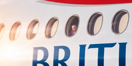

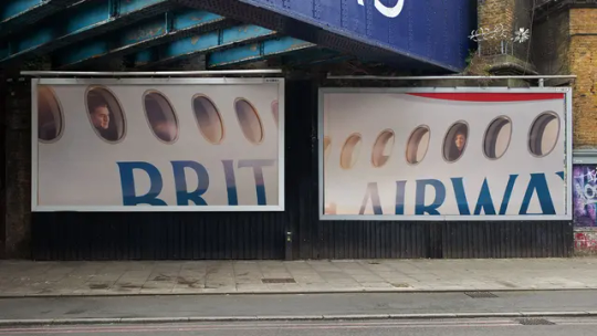
British Airways
We've all been on a plane and taken a photo of the clouds or our destination from above. Well, British Airways with their latest OOH campaign has flipped the perspective. Using photography from the outside looking in at the reactions of passengers. Capturing the emotion on the faces of people relates to everyone and is a reminder of the feeling you get when you travel. A great piece of marketing using photography to tell the story and tug on the emotions of people who can relate.
0 notes
Text

Adidas by Ad Professor
I came across this advertisement created for Adidas on LinkedIn by Ad Professor. This was a quick coffee break project but the way it has been made is great for a brand like Adidas. The famous logo of the 3 stripes as obstacles alongside the most common excuses made by people when it comes to exercising. The tagline heading brings the whole thing together, "Climb over any obstacle" emphasising excuses as obstacles. I love how creativity comes from anywhere even a coffee break can spur the creative juices.
Sources: LinkedIn
0 notes
Text


Mert Cobanov
I've managed to resist the hypnotic nature of these pieces by Mert to be able to appreciate how wonderful this work is. Being able to create a piece of work that looks like a checkerboard or spiral using elements part of the image is something next level. Satisfying to look at and with the clean edges whilst nothing being out of place as well. Some great work from Mert who was inspired by work created by MrUgleh.
Sources: @mertcobanov @MrUgleh
0 notes
Text


Amazon Prime
Interesting pun-related out-of-home adverts from Amazon Prime. Informing that Amazon has a vast range of products available to choose from. Using the link to their logo where the arrow smile goes from A to Z, they have expanded this to actual products. Splitting postcard and popstar up and using imagery to relate to the split words. Post Malone for post, and playing cards for card, whilst popcorn is used to reference pop and Dua Lipa for star. All of this with an accompanying tagline reiterating the difference in products they offer.
1 note
·
View note
Text
youtube
Hyundai Motorsport
Stunning work from the Hyundai Motorsport media team with this one, with their recreation of the anticipated Grand Theft Auto 6 trailer. Matching the trailer in a very similar way using footage of their factory, drivers, crews and live rally action. A great idea to jump on the back of something as big as the long-awaited video game. Including cameos from their team principal, Cyril Abiteboul and drivers headed by Ott Tänak. Such a great concept and a great execution. I wouldn't be surprised if we see more of this from others.
#hyundai#motorsport#wrc#rally#gta 6#grand theft auto 6#cyril abiteboul#ott tanak#video#motion#design#marketing#media#Youtube
0 notes
Text
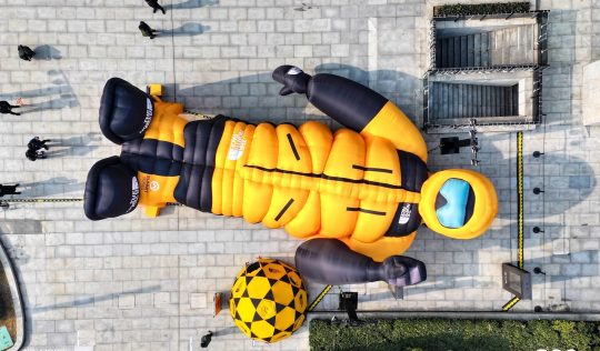

The North Face
This is a great bit of marketing from The North Face in China. Creating a pop-up store in the shape of an explorer dressed in products from The North Face. This is not only disruptive to the public which makes it more intriguing for customers to explore inside, where they would be met by The North Face products. Statements like these often cause curiosity and can lead to potential new customers after seeing what the brand can offer.
0 notes
Text
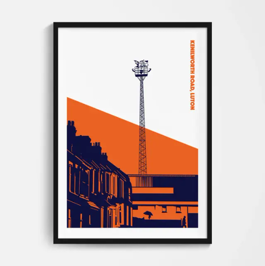


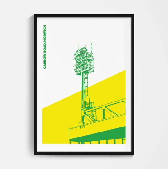
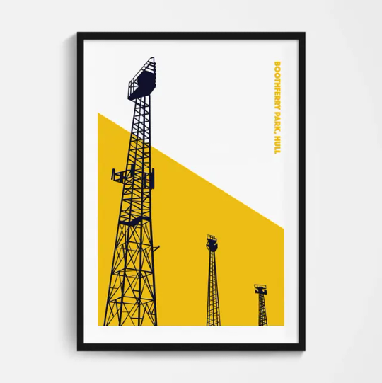
Football Devotion
I love this floodlight series from Football Devotion. The minimalistic designs of floodlights from football grounds around the country are very unique. Personalised to each clubs fan base to be able to recognise the imagery and the colours from just a small part of their ground. I love football and anything that's design and football I take a real interest in, and these are some of my favourite print designs I've seen.
Source: footballdevotion.com
0 notes
Text
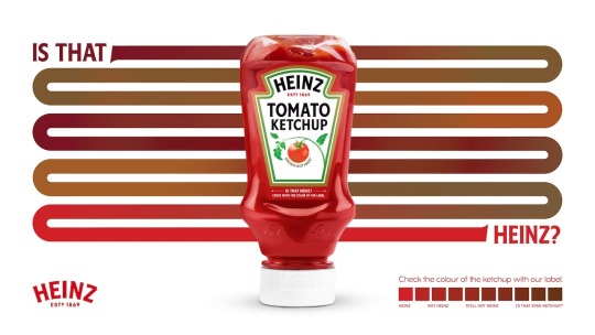

Heinz
Great piece of advertising for Heinz Turkey. Communicating with their consumers that Heinz has a distinctive colour Pantone. They also highlight the fact that some local businesses will try and trick their customers into believing they serve Heinz when it will be a cheap version of the product. A great way to show people how to distinguish the quality of Heinz and anything, not Heinz.
1 note
·
View note
Text
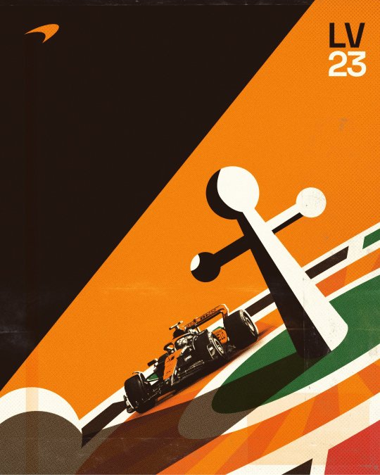
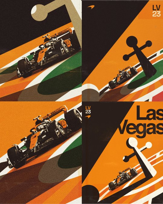
Neil Jamieson
I've spoken before about Neil's work which just gets better with each project. One of his most recent projects has been for McLaren and their Formula 1 team. Promoting the Las Vegas Grand Prix, Neil has taken inspiration from the Vegas culture of Gambling and Casinos. Love how he shared his creative process across different versions and being able to use the car like it's going around the flat roulette wheel is a great addition.
Sources: njamieson.com
0 notes
Text
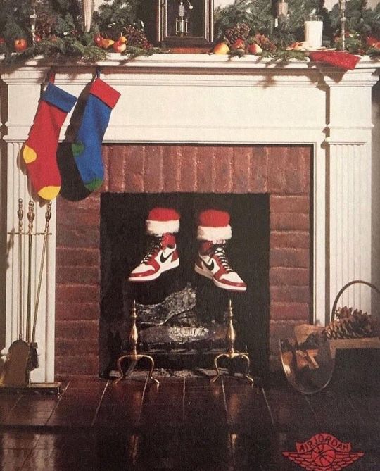
Nike
Because it's Christmas I thought why not roll back the years to 1985 and one of Nike's best adverts in my opinion. To promote the Air Jordans, Nike knew that the Christmas period would create a large demand for Air Jordans. Kids wanting to be like Michael Jordan and adults wanting to emulate him too. So by using the biggest name over Christmas, they made the impression that Santa Claus wore Air Jordans. Showcasing that they're the best shoes to own cause even Santa wears them. I like how simple it is but just shows a Christmas fireplace and two feet showing. The story tells itself.
1 note
·
View note