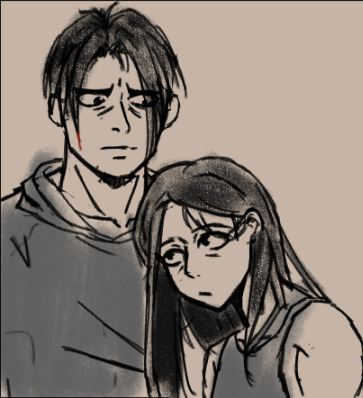
#+ I was testing a new coloring workflow for the first time that I applied to all of them so to turn out this good on the first test WOW
Text

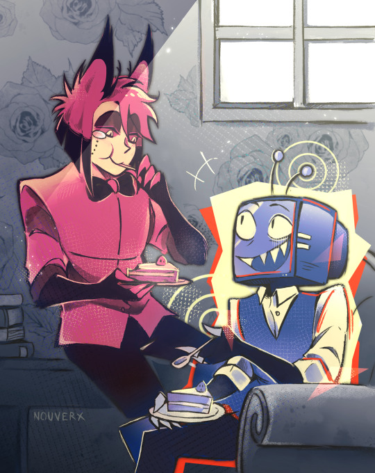
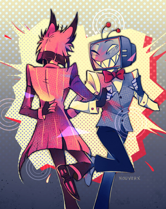

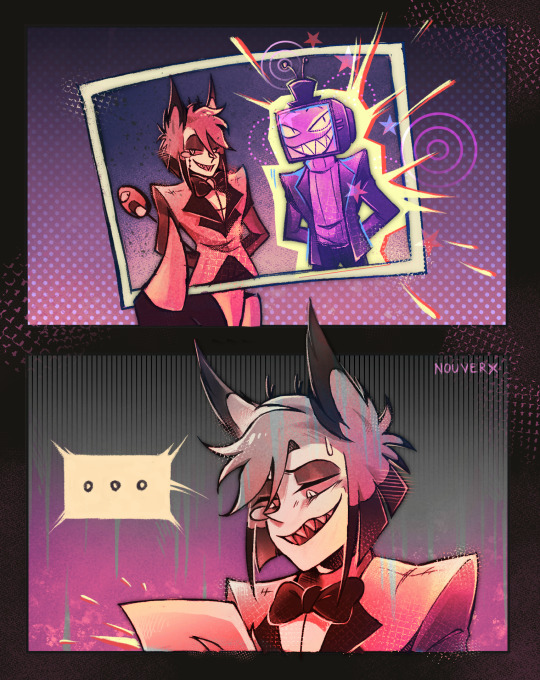
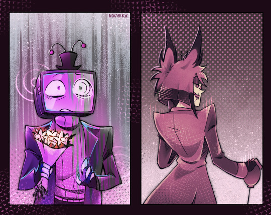
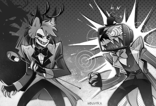
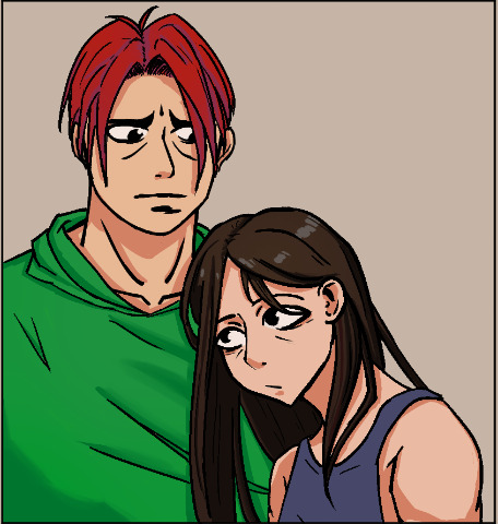
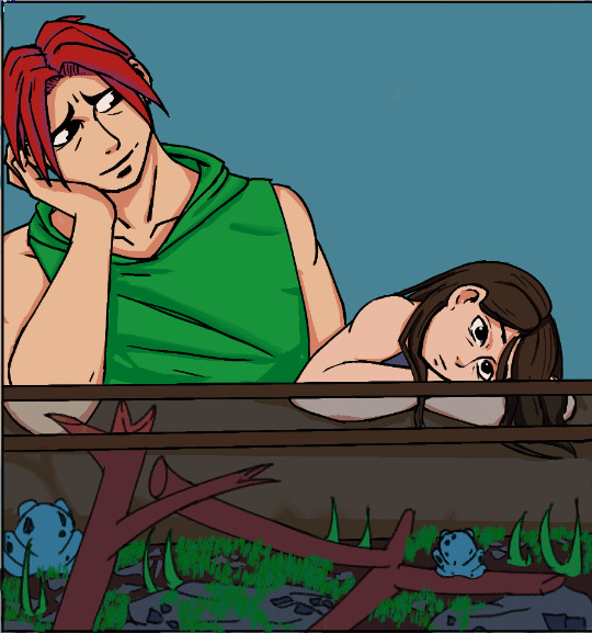
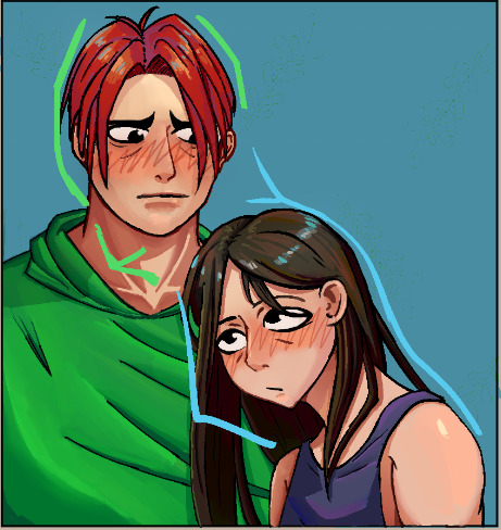
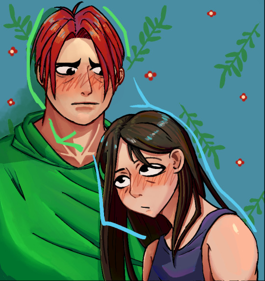
Radiostatic week 2024 illustrations compiled in a single post because I like how they look all together
#hazbin hotel#hazbin hotel fanart#hazbin vox#hazbin alastor#radiostatic#one sided radiostatic#radiostatic week#radiostaticweek#radiostatic week 2024#digital art#my art#clip studio paint#I will never be tired of showing them I love them so much#again I am so proud of this project and so happy with how it turned out#+ I was testing a new coloring workflow for the first time that I applied to all of them so to turn out this good on the first test WOW#sorry if I dont post new stuff for a while after this I need to rest
2K notes
·
View notes
Text
#12: Done with all commissions.
I'm finally done with all. I'll discuss the process during it (As far as I can remember at least) and what I'll be doing next this week.
Look I even made a small gif at the end. It looks incredibly cute and the commissioner loved it.
------------------------------------------------------------------------------
The commission started after I made his santa gift. He asked if I was taking commission and I said yes, I was. It was my first time doing commission and, thank to gods, was so incredibly patient and understanding for me. Asking what kind of commissions I was most comfortable taking. Didn't even knew what kind of commission he wanted, he just wanted a one.
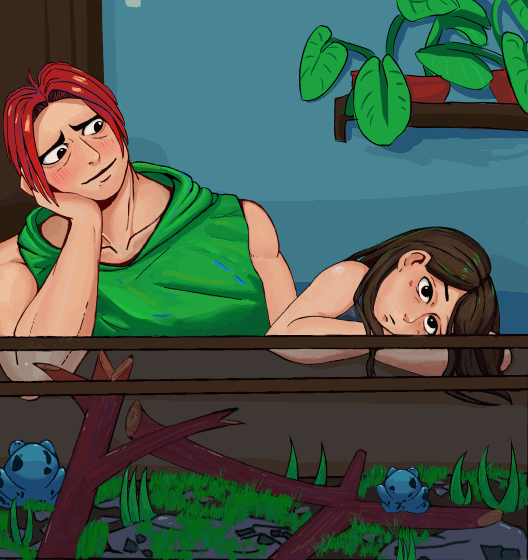
My commission process started with sending 4 simple thumbnails to the client with their idea and 50% of the agreed price for insurance. I suggested, "why not about them showing affection to each other in their own way."


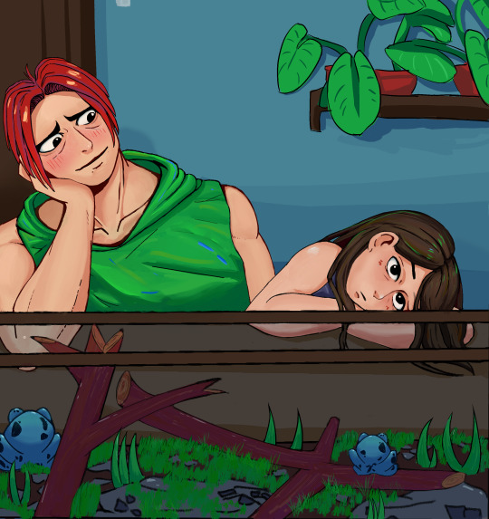
Based on that description, I made these thumbnails.
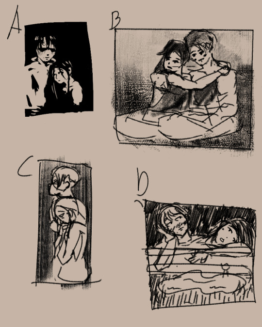
The idea I had going to this was something quite casual. They both like each other but the other doesn't know it so I imagined that they like hanging out a lot, no matter the activities as long the other one one there. But no touching since they don't want the other person to think that they are annoying. A, C, D explores the idea of them just hanging out, just with A being more about showing them off to the viewer. I wanted a bit more variation so I made B where they are more comfortable in showing they're affections with each other.
The client loved them.

They like it so much that they decided to commission me for both A and D.
Which I eventually translated to sketch ,line and finally color.
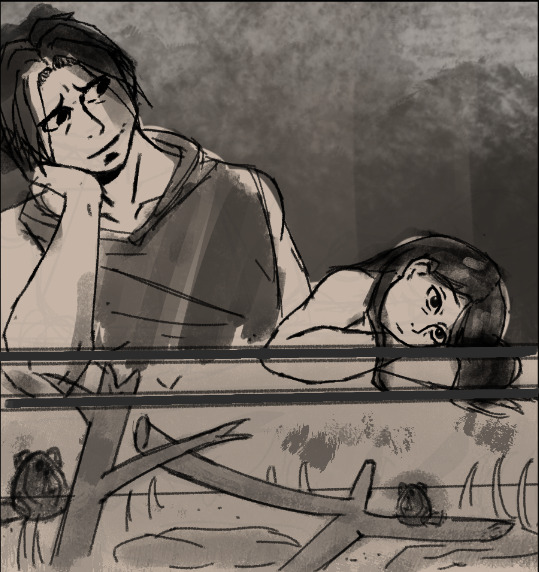
Each step of the way I showed these stages for approval if the current design looks okay. At this point I ask for the remaining 50% percent before I start rendering. They paid I got to work to make these.
During the rendering phase, I experimented a bit.

Doing color streaks. I like it a lot as it gives a lot of color punch to the picture. I came to it thinking, as long you can tell what is the supposed color is, you can add random streaks of color as stylization. The colors used are other colors in the pic as well so that it can feel more "together". And in the end, it looks amazing.
Made a quick background so it isn't so boring. Look at the difference below on with and with BG here. And during this, also tested the workflow of just doing 2 layers of line and color only. It feels better and I think Imma experiment this more in the future.

I even made the short gif you see at the top as gratitude for being patient me. The whole commission took me like 2 months to complete. Mostly due to work taking most of my time but I was able to power through and it's over now so I can now actually focus more on art now.
------------------------------------------------------------------------------
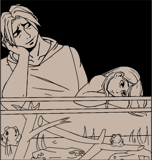
What's next?
Probably finish that zelink wip that I did. some stuff already. Even applying some stuff I experimented during the commission like drawing a sketch first, make new layer for all the color first then the clean lines in another laye. So mainly 3 layers during the work. It actually allows me to work faster and it matched my tempo.
Here ye wip of it. With this new technique, perhaps I could get this wip done next week. Or atleast this frame ready.
2 notes
·
View notes
Note
hiiii! i just wanna say, i adore your art. second, im teaching myself to draw and while i can draw simple basics (mouths and sometimes eyes if im lucky), im still a beginner. ive watched many art videos and im still a bit confused on wtf im doing. so i just came here to ask if you had any words of wisdom for beginners? could be anything from what tablets to buy to simple mistakes to avoid. ive read some of the other posts here and have found it all extremely helpful so far! Thx for all you do!!
Hey there! Thank you so much!
I would put a read more but tumblr is broken. I’m trying to cover a lot of varied thoughts in little points, so if there’s anything you would like me to elaborate on or otherwise have questions on, feel free to shoot me an ask or dm me!
General
I think the biggest thing to remember is not to compare yourself extensively to others. A little bit of comparison is healthy... But too much will destroy your confidence, motivation, and take the fun out of art. Particularly if you are comparing yourself to someone older than you (life experience and coordination come into play here) or that has been drawing much longer (practice).
Additionally... If you’re not having fun (and you’re not getting paid to do it), don’t force yourself. If you find yourself being frustrated or bored with art, don’t force yourself to do it. That’s how you burn out and get art block! This applies to parts of a peice, too! If you don’t feel like drawing a face or a hand today? don’t force yourself to finish it. Come back to it later when you aren’t as frustrated or are getting better results. Even if its a week or a month from now. Honestly, at any given time I have probably ten headless bodies in my drafts. That’s okay! I just come back to them when I’m ready to do the face. And don’t be afraid to abandon something if it doesn’t feel right!
Something that also doesn’t get said enough.... take care of your body! I never knew when I started art, but artists are supposed to do warmup sketches and stretches and muscle exercises! I didn’t do any of this, and i went through a period of a few months where I was drawing for 5ish hours every single day. I developed carpal tunnel from it! So remember to take care of yourself. Take breaks, stretch, remember to eat.
Practice
Practice!!!! Even if its just for fifteen minutes every day. Or twice a week. But if art is something you really want to get good at, you have to put in the time and effort!! You can’t expect to draw an hour per month and be on the same level as someone who draws an hour a day!
I know I say this a lot but I think the biggest thing is just reference! If you don’t know what something looks like, look at a picture of it when you draw it! To go hand in hand with that, though, don’t just copy what you see! Learn from it and apply it! So take, for example, a shoe! pay attention to the way the heel is shaped, the location of the eyelets for the laces... how large the toe is, how steep the top! While you’re at it, look at other styles of shoes as well, and compare them! See what makes it look like a boot versus a trainer! And then the next time you draw it, hopefully you’ll remember all the things you learned the first time around!
I do lots of studies that serve no purpose other than to teach me things! I use referencing/studies to learn about color theory, shapes, and anatomy in a real environment. For example, hands or fabric folds! Oftentimes I’ll do them timed (20 or 45 minutes) so that I don’t fixate on perfecting things, just on the process itself and what I can learn from it. This also helps with getting better acclimated to your software and more coordinated with what you’re doing. Repetitive learning, like with playing sports.
I’ve realized a lot of people don’t quite understand what a study is? Basically you just look at a photo and try to replicate it so that you can learn about lighting or color theory or textures or anatomy or whatnot. So here’s an example of a timed study.
Additionally, don’t avoid!! We, as humans, have a tendency to avoid things that make us uncomfortable or are difficult. But it will make you a better artist in then end. When I first started, I absolutely hated doing fabric. I felt like I wasn’t good at it. So instead of avoiding drawing clothing, I sat down and did studies and sketches of different kinds of fabric. By the end of this learning period, I became comfortable with it and grew to enjoy it. These days, I adore sketching clothes, and it’s why my pants and shirts and things tend to be detailed instead of stylized in line art. If you don’t like drawing hands because you feel like you aren’t good at it? Sit down, look at a bunch of pictures of different hands, and practice it. By the end, you’ll be more comfortable, you’ll have learned something. Even if you feel like the drawings you ended up with aren’t good, you’ll still have learned, and that’s what matters!
Style
I worked on basics before I tried to develop a style. I made sure to start with a very realistic method at first, so that I could be sure I understood how fabric folds, anatomy, and realistic expressions worked before I tried to stylize them. I think in the long run this approach really paid off for me. It also allowed me to be conscientious of what elements I was absorbing into my artwork. I hear from so many artists that they started drawing when they were younger and into anime or cartoons or things like that, and tried to emulate it. Because those styles became so ingrained into their artistic skillset, it becomes near impossible to iron out those influences and get rid of them later. So starting with realism is a way to ingrain proper anatomy and other good practice into your artwork.
One way to develop style is to take a look at the artwork of someone you admire, and try to list out the things you like form their style - perhaps the thickness of their lines, or the way they do eyes. Do this with several artists, take all those little details you like and try them out! See if you enjoy using them in your own drawing process! Think of it like a grab bag or a pick-n-mix, sprinkling in the elements you like here and there to create something new and your own - not just copying another artists style word for word.
Don’t worry too much about it though; don’t allow yourself to become anxious or fixated on “achieving a style”. Its a natural ever evolving process that comes with time and practice. I know a lot of people get hung up on style, but just take it one day at a time!
Also try to keep in mind what style you’re going for as you begin drawing. And I don’t mean that like sailor moon vs. ghibli. I mean that as in, is this piece going to be a painting, a lineart, a lined painting, cell shading...? It will help you in the longrun if you narrow down the broad kind of style you use, and refine from there.
Workflow
My workflow for paintings is very different from my workflow for lineart and cell shading. A full tutorial on how I do paintings can be found here! A process video for how I cell shade can be found here!
Everyone is going to have a different method that works for them! You just have to experiment and find out how you like to draw! For me, personally, I use color blocking for painting (see the tutorial above) and a spine method for lineart. How the spine method works is that I will draw lines that represent the legs, arms, back, etc. so that I can determine the placement, length, and composition. From there, I’ll add a dark outline that actually shows the shapes of the body. Then, I’ll use thinner lines to add details. This is the method I’ve found that works for me. Another commonly used method that I’m sure you’ve seen is representing body parts with cylinders and cubes. There are lots of good tutorials out there on breaking down bodies into shapes like this!
Something that I do is if I’m not quite happy with a part of a drawing, I don’t just erase it. I duplicate the layer so that I always have the original copy, and then I make changes from there. Sometimes I can end up with five or six different versions of the same arm or face that i’ve made minor changes to. And then I compare and pick the one I like best, or condense all the parts I like from each version to make a “best” version.
Tools
Currently I use Procreate and the standard Ipad with Apple Pencil. Prior to March I was using a Wacom Bamboo Touch and Photoshop Elements 2008. I find its harder for me to do full paintings in procreate, but its made my life a million times easier for lineart and cell shading. The pen pressure is phenomenal, and I also adore that its wireless / active screen instead of plug in like the wacom. The programme itself is intuitive and easy to get the hang of; it simply lacks a lot of the neat tricks that photoshop has, like rendering (lens flares, for example), gradients, and gradient maps. Try testing out different trials of programmes... firealpaca, photoshop, autodesk, whatever it may be! What works for me may not work for you!
287 notes
·
View notes
Text
Rauland Responder 4000 User Guide

Responder 4000 User Guide
Rauland Responder 4000 User Manual
Rauland Responder Iv User Manual

Rauland Responder 4000 Installation Manual - Get Files For Free Rauland Responder 4000 Installation Manual, Signal And System By Sanjay Sharma Pdf Free Ra Responder 4000 - Ra Borg Cer Connection - Logon: 4.42MB PDF Document: www.ra.com More ways Ra Responder 4000 can enhance overall resident care. Rauland 4000 Manual DOWNLOAD With Rauland Australia, providers gain a single trusted technology partner, providing them with the suite of solutions to succeed. Our Nurse Call solution is a powerful consolidation and collaboration tool, bringing leading technologies and teams together. Rauland Responder 4000 Installation Manual taftaf de.
One moment please...
Not A Member?Sign Up
Videos
News
DESCRIPTION
Responder 4000 User Guide

Optimizes Staff Communications
Seemless integration from the Responder IV nurse call system to the Responder 5 nurse call system enables Responder IV users to benefit from the advanced features of Responder 5. A single interface to SIP wireless phones provides instant voice communication between patients and caregivers on both Responder systems. The easy to use Responder 5 software interface allows caregivers to be assigned to Responder IV and Responder 5 rooms as well as to have one interface for viewing patient census, patient call activity, and nurse call reports. Centralized code blue is simply achieved with a Responder 5 console ablie to display and answer calls from both systems. Save both time and money while enjoying new capabilities by uniting Responder 5 with existing Responder IV systems.
With Responder's automatic call routing and forwarding, staff can receive calls on their wireless devices, quickly, coming directly from their patients. When the direct caregiver cannot take the call - the call is forwarded to backup caregivers until the call is answered. The result: the fastest possible delivery of patient care. With inherent network capabilities, such as centralized code blue reporting and patient call transfer to any nurse console, Responder IV provides communications solutions for the entire hospital. With the largest installed base of high-end nurse call systems, Responder IV has earned the right to be called the best nurse call system on the market.
Responder's flexibility can easily accommodate shift changes and patient-to-staff reassignments. This easily expandable, modular system grows with your facility and patients' needs. Simplified wiring and system design allows for easy installation and service. Responder IV is versatile enough to support your entire facility - throughout numerous departments, to further extend your workflow capabilities.
FORUMSView All (8)
Ask a New Question
1
Reply
-vanwert
18 days ago18 days agocall light
the call light keeps going off on its own. nonstop. it is bothering everyone we have switched out controllers nothing helps Reply-RMoffat
2 months ago2 months agoPARTS WANTED
Does anyone know where I get parts for this nurse call station Rauland Borg Model #R4K4020 Need rubber membrane buttons. Reply
0Replies
-Christine Reid
2 months ago2 months agoOperations
Can you call back into the room to ensure someone has seen to the patient? How do you do that?Reply
DOCUMENTS / MANUALSView All
FEATURES
Captialize with an Integration to Responder 5
Flexibility Built For Healthcare's Changing Needs
Optimize Your Staff-to-Staff and Staff-To-Patient Communications
Rauland Responder 4000 Master Station (R4K4020)

Nurse Call Components
We repair your Rauland Borg Responder 4000 Master Station (R4K4020).
All components are tested 100% in house on original fixtures or simulators to meet manufacturer’s requirements. We are using only the original parts for component level repair to meet or exceed the original manufacturer’s parameters in functionality.
We offer free pickup within GTA, and 1 day rush service.
First item repair service is free of charge and will cost you just one way shipping to us. Multiple item discount will apply on 1000$ and up purchase orders. You are just one call away to find how much you can save using our repair service.
Rauland Responder 4000 User Manual
About Us
Total Medtech does component level repairs for a large variety of electronic boards. No matter what we have around us in 21st century contains an electronic pc-board controlling that.We focus our effort towards medical and industrial equipment. Starting from a hospital bed and a patient lift and ending with advanced controls for industrial automation we can provide a fast and quick turnaround for all your repair needs. You are just a phone call away to find out if we are the right people to help.Technology might be challenging when multiple choices are on the table. Just give us a chance to prove we can help you, it cost nothing to try us and first service is complimentary.There is no hidden cost associated with our consultancy service and we only get payed if your needs are accomplished. No service contracts, is the best scenario and in our vision it can happen no matter if you are a small or a big operation.Just give us the insight and we go from there to help you regain control over the essential services.We have R&D resources to reverse engineer obsolete components of your systems and software extension options to integrate your existent with latest technology.
Total Medtech provides maintenance and facility managers cost saving solutions to bring back to life the broken equipment,OEM Service contracts are expensive and not always on time to get the problems fixed. Don’t forget, every service call and the parts are billed on top of the annual fee and the OEM components may take days or weeks to arrive. We repair boards contained in all major brand beds and nurse call systems used in North American healthcare facilities.(Rauland 4, Rauland 3, Hill-Rom, Maxivox, Westcall, Symplex, Dukane, Intego, Zettler) Beds -Hill-Rom – TotalCare, VersaCare, Advance, Affinity, 8500-Stryker-S2, S3 (Scale PCB 25-0593, Main board 3002-407-950 and 3006-307-900)-Carroll – Spirit, Spirit Plus, Basic Care-Amsco – 3080/3085-KCI – Scale PCB, motor control PCB.-Arjo- Patient lifts main board ( Skymax, V4-V3 – KWIKtrak ) Facility– Milnor washers/dryers, Besam door controllers, Boulay pump controllers, Weil-McLain boiler controllers, Pro-Lite color graphic display’s,Hospital Grade TV’s– Elf, PDI, HCI, Telehealt, LG , K10,Biomed– Patient monitors Philips IntelliVue MP30, MX2, Welch Allyn.
Our technical expertise can reduce the unnecessary operating cost and save you from getting stuck with an end life technologyAre you in a dilemma choosing the right service provider or the best technology for your facility?Vendors are pushing what you don’t really need to keep the facility up to operating requirements?If you are close to sign a term service contract with no way out, the surprise will come when you realize how much it takes from the operating budget.A good idea is to get an independent advice before is not too late.
We can help in implementing the most cost efficient solution.Old system, obsolete components and no longer supported?Your PBX (telephone system) is coming to its end life and the provider wants to upgrade it?The big surprise will come when the perfectly working Nurse Call System and your actual wireless handsets for nursing are not compatible anymore with new technologies. The result will be a huge cost for replacing almost everything including the computer network infrastructure. If this sounds like your situation, we can help in implementing the most cost efficient solution.'
Contact us
Rauland Responder Iv User Manual
Related Ads
0 notes
Text
Adobe Audition Portable 64 Bit

Students and teachers are eligible for over 60% discount on Adobe Creative Cloud. Get access to Photoshop, Illustrator, InDesign, Premiere Pro and more. Using Adobe Premier Portable, you may face many issues complicating your activities. So, if you plan to use this program illegally, be ready to take all the consequences. I have prepared the info about the disadvantages this software brings and will also explain why the ideal variant is a licensed version. Officially supported operating systems include Windows 10 (64-bit), Windows 8 (64-bit) and Windows 7 (64-bit). What versions of Adobe Audition are available? The current version of Adobe Audition is CC 2021 14.1 and is the latest version since we last checked. This is the full offline installer setup file for PC.
Adobe Audition Portable 64-bit
Adobe 64 Bit Windows 10
Adobe Illustrator CS6 Full Version is a program specifically designed to handle vector graphics. Created and developed by Adobe Company, now this software is becoming more complete and powerful. At first, this application was made to meet market needs for graphic design. Like designing magazines, illustration images and many more. But along with developments, now this program managed to include 3D (three-dimensional) capabilities. This feature allows us to see what is drawn in 3-dimensional art. Really cool right?
The CS6 version was released in 2011, with the latest features and tools. In this sixth generation, the world began to recognize the existence of illustrators as one of the most sophisticated vector applications. Gradually it can compete with its greatest competitors, Corel Draw. This software still prioritizes the ease of the user interface. So that anyone can learn and use these apps professionally. Do you want to try this software?
Adobe Illustrator Creative Suite 6 Latest Features :
Efficient, flexible interface:
Dockable hidden tools
Adjustable UI brightness
Color panel enhancements
Type panel improvements
Transform panel enhancements
Transparency panel improvements
Control panel enhancements
Image Trace
Pattern creation
Mercury Performance System
Gaussian Blur enhancement
Gradients on strokes
Adobe Illustrator CS6 Download 64 bit
Adobe Illustrator CS6 System Requirements
Operating SystemWindows 7 UltimateWindows 10 ProfessionalProcessorIntel Dual Core 2Ghz Dual-CoreIntel Core i3 Processor 3Ghz+Memory2GB DDR34GB DDR4Hard Drive10 GB – 7200 RPM HDD20 GB – Solid State DiskGraphics CardNvidia Graphic Cards 1GBNvidia Gefore GTX SeriesScreen Resolution1366×7681920×1080
How to Install Adobe Illustrator CS6 Full Version :
Download Adobe Illustrator CS6
Extract with the latest Winrar v5.6 application
Turn off your internet connection and your antivirus
Run the installation, Illustrator_16_LS16.exe
Select the trial version
When finished, run the application then close again
Now open the crack folder
Copy the file amtlib.dll and illustrator.exe
Paste in the installation folder
C:Program FilesAdobeAdobe Illustrator CS6Support FilesContentsWindows
Enjoy!
Also Download :Adobe Illustrator CC 2018 Windows
Adobe Illustrator CS6 Full Version 64 Bit


Adobe Illustrator CS6 | MegaNZ | FileUpload
Download Crack Only | MegaNZ | ZippyShare
Filesize : 1.9 GB | Password : www.yasir252.com
Adobe SoundboothDeveloper(s)Adobe SystemsStable release
CS5 v.3.0 / April 12, 2010; 11 years ago
Operating systemMac OS X v10.4.9, Windows XP SP2, Windows Vista and Windows 7Platformx86, x86-64TypeDigital audio editorLicenseProprietaryWebsiteAdobe Soundbooth Homepage
Soundbooth is a discontinued digital audio editor by Adobe Systems Incorporated for Windows XP, Windows Vista, 7 and Mac OS X. Adobe has described it as being 'in the spirit of SoundEdit 16 and Cool Edit 2000'. Adobe also has a more powerful program called Adobe Audition, which replaced Soundbooth as of Adobe Creative Suite 5.5 Production Premium. Soundbooth, discontinued in 2011, was aimed at creative professionals who do not specialize in audio or people who need a simple editing program and do not require the full features of Adobe Audition. Due to Intel-specific code, Adobe stated that the Mac OS X version would only be available for machines using Intel processors. Soundbooth CS4 was the first version to support 64-bit officially.
Key features(edit)
Adobe Audition Portable 64-bit
Creation of the Adobe Sound Document allows Adobe Flash to create multi-track audio projects in Soundbooth.(1) Soundbooth also features dynamic linking that allows video sequences from Adobe After Effects and Adobe Premiere Pro to be played in Soundbooth without having to first be rendered, a feature that is expected to save users time.(1)Writing life story examples.
Comparing Soundbooth to Audition(edit)
The major difference between the programs is that Soundbooth uses a task-based interface and Adobe Audition uses a tool-based interface.(2) Another difference is that Soundbooth uses royalty-free scores and sound effects whereas Adobe Audition uses music loops and allows for low latency multi-track recording.(2)
Adobe 64 Bit Windows 10
Criticism(edit)
Many users have commented on the lack of simple features that were found in programs like Sound Edit 16 and Cool Edit Pro; for example, the ability to create a new file or to 'reverse' a sound.(citation needed)Laurie lee memoir book.
Lack of simple batch processing makes it a chore when needing to simply speed up, clean up (pops or crackles), or apply a pitch change to all of the files in a project. Each chapter, track, or MP3 file must be opened, applied, and saved independently; contrary to customer expectations of features that freeware has provided for many years.
In response, Durin Gleaves (of Adobe) in a post dated 31 March 2007 said, 'I agree that Reverse would be an obvious feature, but I'm afraid it's not going to make it into version 1.0 (CS3). I assure you that several of us are pushing to see it in 2.0 (CS4).'(3)
Creating a new file was added in CS4. While the feature to 'reverse' a sound was never implemented after its discontinuation.(4)
Discontinuation(edit)
Adobe stated on its website that: 'Sales of Adobe Soundbooth audio software ended on April 24, 2011. Adobe Audition CS5.5 is replacing Soundbooth in Adobe Creative Suite 5.5 Production Premium software, based on customer requests for a professional audio toolset that integrates with the Adobe workflow. This decision brings the best features from the Adobe family of audio solutions into a single cross-platform package, focusing on the need for high-performance audio in post-production workflows. By combining the power and precise control Adobe Audition users have long appreciated with the more modern interface and streamlined workflow Soundbooth users value, Adobe Audition CS5.5 offers the flexibility and quality of a full-featured audio tool designed for speed and efficiency on both Mac OS and Windows.'(This quote needs a citation)
Selenium is an open-source web automation library. It supports many browsers like Chrome, Firefox, Edge etc and many languages – python, java, C#, javascript etc. Here we will get to know How you can use selenium with C# in Visual studio code. Visual Studio New Project. Click the test project and name it Selenium WebDev Testing (see. Step 1: Open the VS Code and Install the Nuget Package Manager using the VS code extension (Ctrl+Shift+X) Step 2: Then go to the Command Pallette of VS Code(Ctrl+Shift+P), Search for Nuget Package Manager: Add Package and then Search for Selenium.Webdriver. Selenium visual studio code.
References(edit)
^ abLawson, 'Announcing Soundbooth CS4: Now in Web Premium and Production Premium CS4.' Inside Sound 23 September 2008 8 October 2008Archived 24 October 2008 at the Wayback Machine
^ ab'Free audio recording, editing software - Download free Adobe Audition CC trial'. adobe.com. Retrieved 25 February 2017.
^'Untitled Document'. Adobe.com. Retrieved 25 February 2017.
^'reverse a sound in Sb CS4? -Adobe Community'. Adobe.com. Retrieved 25 February 2017.
External links(edit)
Retrieved from 'https://en.wikipedia.org/w/index.php?title=Adobe_Soundbooth&oldid=996761009'
0 notes
Text
Pixelmator Photo

The Pixelmator Pro image editing engine is seriously sophisticated and incredibly powerful. It’s designed exclusively to take advantage of the full power of Mac computers, using advanced Mac graphics technologies like Metal and Core Image. Pixelmator Photo for iPad is here!In this live session I'll show you everything you need to know to get the very best out of this amazing iPad app.
The timeline for many a photographer — at least, this was the case for me — can be outlined somewhat as per the graph below:
Here, photography gear and kit starts out as the ultimate source of inspiration. This inspiration declines steadily over time, but rears its ugly head on occasion.
The inspiration derived from other photographers takes essentially an inverse effect as gear and kit do. When gear and kit delusions subside, the drive to emulate your favorite photographers rises.
And finally, your own skill set not only grows over time, it also becomes the main source of your own inspiration over time.
I’ve developed a bit of a list for the second step — photographers like Kate Holstein, Sam Nute, Finn Beales, Dan Tom, and more are stunningly skilled and worthy of emulation. Their compositions are great — often, near perfect — and their colors are their own.
I think the prevailing advice to improve your abilities as a photographer is to focus on composition. Work with prime lenses, learn to position your body and camera in the right spot, and ensure all the pieces of the puzzle fit into your photograph beautifully.
Color is just the icing on top of the composition cake, and everyone likes different brands of icing, right?
It is the largest aircraft in the Embraer E-Jet family. It is an extended version of the Embraer E-190 aircraft. X-Crafts‘ goal from the beginning was to create a great high quality add-on that would be very interesting for both, the hardcore simmers as well as new flightsim users out there! Check Out the Embraer E 170 by SSG avaiable on the X Plane Forum!!!Check it out at:http://forums.x-plane.org/index.php?/files/file/34117-embraer-e-170-e-jet. X plane erj. FS2004 Aeromexico Connect Embraer 190. Model by VirtualCol. Texture by Carlos Daniel Gonzalez. Author Diego Israel Correa Vazquez. Traffic Global for X-Plane 11 adds high quality AI aircraft in authentic liveries and will full 3D sound and lighting and effects. It comes with 65 aircraft types and over 860 liveries and is simple to use. Embraer E175 and E195 v2 package by X-Crafts. Embraer E-175 v2.4. EMB190YTxp11 for X-Plane 11 Part of the message is hidden for the guests. Please log in or register to see it. Please Log in or Create an account to join the conversation.
Pixelmator Photo’s latest update brought the power of Pixelmator Pro’s ML Match Colors from the Mac to the iPad, promising the ability to match the color palettes between sets of photos. ML Match Colors is wonderfully implemented, quickly performed, and easy to use. It promises to use all the powers of the iPad.
But does it promise the power of stealing your favorite photographers’ color palettes? Will it make your photos look as good as your favorite photographers’ photos?
Of course not!
As is always the case in photography, there are a multitude of variables at play. ML Match Colors handles one specific variable: color.
Using ML Match Colors to Match Your Own Photos
This is the method that I expect the Pixelmator team both wants and expects customers to implement when using ML Match Colors. At first blush, ML Match Colors seems best designed for applying a relatively close color palette to all of your photos in a set.
Rock Bookends OUR Freedom and Liberty solid rocks sandblasted for permanent gifts, like our great country GRoG1791 5 out of 5 stars (11) $ 70.00. Add to Favorites Liberty Bell Bookends - cast iron DecoDavesDen 5 out of 5 stars (1) $ 65.00 FREE shipping Add to Favorites. Rock Bookends OUR Freedom and Liberty solid rocks sandblasted for permanent gifts, like our great country GRoG1791. 5 out of 5 stars (9) $ 70.00. Favorite Add to Vintage Wood and Cast Iron Eagle Bookends/Vintage Eagle Bookends/Patriotic Bookends/Vintage Home Decor AimlessAntiques. https://huntergator65.tumblr.com/post/654191096322228224/freedom-bookends. Product description Organized Living freedomRail Book Ends prevent books and other belongings from sliding off shelf ends without taking up valuable space. Book Ends work perfectly in a home office. Cast Metal Liberty Bell Pair of Bookends - Patriotic Brass Tone Heavy Bookends - Liberty Bell Freedom Bookends - American Patriot Home Decor GlitteringDragonfly 5 out of 5 stars (1,287) $ 34.99. Add to Favorites Pair of Cast Metal Goldtone Liberty Bell Bicentennial Bookends - Federal Style - 1776 - Law Office - Colonial - Federal Style.
The original photo on the left and my personal edits on the right. Clearly, these two photos are very, very different.
To test the power of ML Match Colors, I used a single photo of my own from a few years ago. Evidently, I’ve heavily edited this photo, so I exported a copy of the original photo and a copy of the edited photo from Lightroom to my camera roll.
From there, I opened the original raw photo in Pixelmator Photo, dragged an instance of Photos into Split View, and dragged my edited into Pixelmator Photo to match the color palettes.
In general, if an app can or can’t deliver on a promise, it’s usually due to improper expectations. And since I originally came into this thinking ML Match Colors would also match saturation, hue, intensity, and exposure all at once, well, I was originally disappointed. Here’s the result:
But upon further inspection, Pixelmator Photo actually performed great work in matching the colors in these two photos. In retrospect, it’s obvious: the colors are properly matched. However, to get to my original end result, I had to jump into the color tools in Pixelmator Photo to dial back intensity, hue, and saturation of individual colors. After maybe a minute or two of experimentation, I came to this end result:
Not bad, actually! Not bad at all.
As I mentioned above, ML Match Colors is explicitly designed to match colors — matching any other elements of exposure, saturation, hue, and more either has to be done manually or through other forms of Pixelmator Photo’s machine learning features.
Using ML Match Colors to Match Someone Else’s Photos
This whole section likely gets dicey, so I want to ensure I give credit where credit is due, and I want to ensure that the end result of “stealing” someone’s color does not actually happen. I fully believe, after you’ve read through this section, you’ll agree that a photographer’s stylistic brand and color choices are not in jeopardy thanks to ML Match Colors.
So, Finn Beales is one of the professional photographers I mentioned above who I have a ton of professional respect for. Beales has one of my favorite photography blogs on the planet, shoots some of the best travel and brand photography in the world right now, and has provided a wealth of photographic knowledge in his photography course at Strohl Works. Tableau jira connector. If you want to get a behind-the-scenes look at how Beales works and how he achieves some of his results, that course was some of the best money I’ve spent in the last two years.
Finn Beales’s tremendous travel photography — known as “72 Hrs In…” — is showcased on his personal site. There are a wealth of photos to digest in that section of his blog. One of my favorites is his commissioned work for Travel Alberta, a province and location here in Canada I had the opportunity to travel to myself.
So, with that backstory out of the way, you can likely understand where I’m going with this. Here’s Finn Beales’ photo of a man at Lake Louise in Banff National Park, Alberta, Canada:
Photo by Finn Beales, used solely for color reference and nothing more.
And here’s my photo of that exact same location, albeit with slightly different composition:
It’s very hard to say whether Beales and I shot the photo at the same time of day or in the same kind of weather, among other variables. We were at Lake Louise in the earliest part of the morning, so the orange glows on the mountaintop peaks are about as close as I could get to the oranges in Beales’ photo.
And here’s the result after dragging and dropping Beales’ photo into Pixelmator Photo:
Did my photo change at all? You’d be hard-pressed to tell. I believe many of the colors indeed match those in Beales’ photo, but again, hue, saturation, luminosity, brightness, and other variables play a major role in keeping Beales’ stylistic color choices his own.
This is good news, in nearly every facet of the story. The learning lessons I’m taking away from this:
Composition remains the most important element of photography. If you don’t have good composition, the amount of beautiful color you add or take away from a photograph won’t magically transform it into a mystical work of art.
Understanding “color” involves much, much more than simply dragging and dropping one photo onto the other. To achieve a certain look, a full understanding of the color wheel, color and light curves, and color tools is still required.
For all the work professionals have put in to create their own style, brand, and “look”, they can be rest assured that other photographers like myself won’t be able to replicate that same look with a simple feature in an iPad app.
Other Updates in Pixelmator Photo 1.2
Despite the title ML Match Colors feature debuting in Pixelmator Photo 1.2, the 1.2 app update housed plenty of powerful features for photographers looking to utilize the iPad more and more in their workflows.
Notice the trackpad cursor right in the middle of the photo on the left and the re-shaped cursor in the top right in the right photo. Cursor support is very nicely baked into the latest Pixelmator Photo update.
Trackpad Support: iPadOS 13.4’s new trackpad and cursor support has taken the platform by rage. Any app designed with many custom elements has struggled to organically adopt cursor support out of the gate, so updates have been needed to have all apps feel at home in iPadOS 13.4. Pixelmator Photo 1.2 brings full-blown trackpad support to the app, allowing you to whiz around with a mouse or trackpad much like you would on a Mac.
Split View: We chose Adobe Lightroom CC as the best photo editing app for the iPad because of its ecosystem, and we chose Darkroom as the runner-up because of Darkroom’s adoption of iOS technologies. With Pixelmator Photo 1.2, you can throw another app into the runner-up column. Pixelmator Photo may now have the best iPadOS technology support of any photo editing app available. The app now supports Split View, which is very powerful in how ML Match Colors is used. The app adeptly uses the iOS photo library rather than maintaining its own photo library housed within the app. And all the machine learning features built into the app make it one of, if not the, most powerful iOS photo editor available for the iPad.
Adjustment Intensity and Recent Adjustments: Pixelmator Photo 1.2 now allows you to fine-tune the intensity of color adjustments and presets. As described above, these tools are fundamental to achieving a desired look after ML Match Colors has done its job.
You’re also able to quickly reference and copy the adjustments from your most recently edited photos in Pixelmator Photo 1.2. Legal audio transcription. This, combined with ML Match Colors, make for a quick and easy workflow to edit a batch of photos with the same colors and settings.
Wrap Up
ML Match Colors debuted as a powerful machine learning feature in Pixelmator Pro for the Mac. The feature alone almost had me download Pixelmator Pro. However, I held off, knowing my workflow was going to increasingly move to the iPad. I admit, I didn’t expect ML Match Colors to come to the iPad so quickly.
I’m glad I waited. Because I’m positive I would have been initially disappointed with the ML Match Colors feature on the Mac.
Now that I’ve had a chance to try the feature, I’m more likely to purchase Pixelmator Pro for the Mac, simply because of the feature.
Pixelmator Photo App
So much of the iPhone and iPad’s being is wrapped up in simplicity. The devices themselves are fairly simply to use and can somehow house multiple generations of people into their user bases. This air of simplicity, applied to photography, almost makes it feel like you should be able to take a boring photo of the tree in your backyard and turn it into a masterpiece worthy of the Louvre.
The machine learning features in Pixelmator Photo are a taste of this simplicity, but don’t let your imagination run wild. Machine learning features in Pixelmator Photo take advantage of the deepest iOS technologies, eliminate a plethora of difficult and complicated tasks, and make editing photos easier than ever. They aren’t a perfect, one-tap-done editing tool.
ML Match Colors may be the very best machine learning tool available inside Pixelmator Photo. Drag and drop your favorite photos — or perhaps you can create and use your own color templates — to match the colors, then tweak everything else inside Pixelmator Photo’s vast array of editing tools. If you really want to make it easy, enable all the ML toggles in the tool array, hit export, and you’re done.
We named Pixelmator Photo as the photo editing app with the most potential in our big review. This 1.2 update really, really builds out some of that potential. And if this is just the start, Pixelmator Photo may move its way up the ladder of the best photo editing iPad apps.
Must-Have, Most-Used Photography Apps
Pixelmator Photo Mask
We spend an inordinate amount of time sorting through hundreds of apps to find the very best. Our team here at The Sweet Setup put together a short list of our must-have, most-used apps for taking and editing photos on iPhone and iPad.
0 notes
Text
Premiere Pro Cs4 Download

Adobe Premiere Pro is part of these download collections: Video Editors, Edit MP4, Edit 3GP, Edit MPEG. Adobe Premiere Pro was reviewed by Elena Opris. If you purchased from the web, you will also be given a download link specifically for the Adobe After Effects and Premiere Pro CS4 installer. Download those files to a folder on your computer and double click on the.exe. The files will self-extract and the installer will launch automatically.
Dec 26, 2017 - Adobe Premiere Pro Cs4 32 Bit Free Download With Crack And Keygen. Adobe Premiere Pro is a feature-packed video editing software that.
Download gratis Adobe Premiere Pro CS4 & After Effect Pro CS4 Full+Crack. Adobe Premiere pro & After Effect pro CS4 full. For 32-bit Windows XP and.

Jul 28, 2017 تحميل وتثبيت ادوبي بريمير how to download adobe premiere pro 32 bit - Duration: 9:06. قناة خبير للمعلوميات 30,725 views 9:06.
With the release of macOS 10.13 High Sierra, you’re probably wondering whether your Adobe software will work in the new Mac operating system.
With every macOS upgrade, full information about compatibility is typically not available on the day the new system is released or even shortly after. More information emerges over time, especially as Apple, Adobe, and other software developers test with the final public release and produce updates with fixes. I’ll update this article as new information comes out.
If you use your Mac to run a business or another activity where you can’t afford to lose productivity, do not upgrade to High Sierra until you’ve made plans to fully recover your previous configuration if things don’t work out. (That applies to any operating system upgrade on any device.) Wait until you are confident that all of your software and hardware is compatible, then back up everything, then upgrade.
To make the best use of my time and yours, I focus on verified reports or reports acknowledged by Adobe, and generally avoid repeating random anecdotes. But I do mention my own experiences.
The next section is about recent Creative Cloud versions. If you’re looking for information about older versions, jump to:
Official statements and verified reports
Note: On October 18, 2017, Adobe announced the 2018 release of Creative Cloud applications and made them available for download. These are the most compatible with High Sierra.
Adobe typically publishes compatibility information after they have had a chance to test with the version actually released to the public, so expect this section to be updated over time. Here is what’s known so far:
High Sierra compatibility FAQ
Adobe has posted a document covering High Sierra compatibility with Adobe Creative Cloud applications in general (macOS High Sierra (10.13) compatibility FAQ Creative Cloud). It links to a number of application-specific documents which I’ve also linked to below.
Adobe Photoshop
The Photoshop team posted the document Photoshop and High Sierra macOS 10.13 listing the issues they’re aware of.
If the High Sierra upgrade converted your boot volume’s file system to the new APFS file system, in Photoshop CC 2017 or earlier you won’t be able to assign your boot volume as a scratch disk in the Scratch Disks section of the Preferences dialog box. This is fixed in the 2018 release of Photoshop CC.
For Photoshop CC 2017 or earlier, if you have an HFS+ volume mounted, such as a partition or external drive, you can still assign that. Just keep in mind that a scratch disk should be both large and fast. Even though the list of scratch drives is blank in Preferences, Photoshop doesn’t display an error, and continues to work. There’s also a Scratch Disk settings dialog box you can pop up by pressing the Command and Option keys as Photoshop starts up; that does list an APFS boot drive (as Startup, not as its volume name) and appears to allow it there. This may mean Photoshop is able to use the APFS boot drive anyway, but isn’t reporting it properly in the Scratch Disks section of the Preferences dialog box. It is unlikely that this will be fixed for versions of Photoshop earlier than CC 2018.
Adobe Lightroom Classic CC
The Lightroom team has posted a compatibility document (Lightroom and High Sierra macOS v10.13). However, it lists only one issue; to see other issues discovered and being discussed visit the official Lightroom Classic CC Feedback page. If you are running Lightroom 1–5, you may also want to review the Adobe compatibility document for macOS Sierra (Lightroom and Sierra macOS 10.12), because older versions of Lightroom have several known compatibility problems with macOS 10.12 Sierra and later.
Victoria Bampton (the “Lightroom Queen”) also has information (Lightroom and macOS High Sierra Compatibility), about current and older versions of Lightroom. Some of the issues may be fixed in Lightroom Classic CC.
Some Lightroom presets may fail to sort in alphabetical order in High Sierra; Adobe has acknowledged this issue at feedback.photoshop.com. This is at least partially fixed in Lightroom 6.13 and in Lightroom Classic CC (7).
For a few users (not all), Lightroom 6/CC 2015 crashes on launch in High Sierra. Some have been able to resolve this by adjusting permissions on the Lightroom application folder.
The panel and filmstrip areas may black out at times. This is apparently related to macOS graphics issues. macOS 10.13.2 should fix most of the occurrences, and for other versions the Lightroom team has attempted to work around the problem as much as possible. To best avoid the problem, Adobe says:
…make sure your macOS is updated to at least macOS Sierra 10.12 and at least Lightroom Classic 7.0 or Lightroom 6.13. The best combo to avoid this issue is being on macOS High Sierra 10.13 and Lightroom Classic 7.1 or Lightroom 6.13. The team has worked pretty hard with Apple to get this issue to stop appearing with macOS Sierra 10.12 and macOS High Sierra 10.13. Improvements were made in 10.12 and iterated upon for 10.13.
Adobe Illustrator CC 2017
The Illustrator team posted a compatibility document (Illustrator and High Sierra). It lists issues with APFS, color management default settings, and GPU rendering. Some of those problems are fixed in the 2018 release of Adobe Illustrator CC.
Adobe InDesign CC 2017
The InDesign team has posted a compatibility document (InDesign and High Sierra compatibility).
There was a widely reported visual problem with the mouse pointer in Adobe InDesign on High Sierra. Investigation by Adobe and Apple revealed this to be an Apple bug. It’s fixed in the macOS 10.13 Supplemental Update which became available on October 5, 2017. Install it from the Mac App Store, Updates tab; or from the link above.
Adobe Premiere Pro
While there’s no published document about High Sierra compatibility that I know of, an Adobe representative said, in a post on the Adobe Forums:
I talked to product management. You should be good to go with macOS High Sierra right now. As an editor, I would not change the OS if I was in the middle of an important project, however.
While not specific to High Sierra, one issue that may affect Mac users is that in Premiere Pro CC 12.1 or later, Adobe no longer supports Apple QuickTime 7 era codecs that were deprecated by Apple back in 2013. However, those codecs still turn up in a lot of places so people (like me) are finding problems with those clips may no longer work properly in Premiere Pro. The only workaround at this time is to use the Creative Cloud desktop application to uninstall Premiere Pro CC 12.1 and reinstall version 12.0.1.
Adobe After Effects
The After Effects team has posted a compatibility document (Known issues in After Effects CC (15.1)).
Older versions of Adobe software (CS3–CS6)

Adobe software older than the Creative Cloud (CC) versions are not officially supported on macOS 10.13 High Sierra. That doesn’t necessarily mean they won’t work; it just means that if those old versions have any new issues related to macOS 10.13 High Sierra, there won’t be any updates to address them (in other words, the only version with the High Sierra fixes will be the current version).
I have upgraded my test Mac to the release version of High Sierra. Based on some quick tests I did, Adobe applications before CS6 do not run as smoothly as they did in earlier versions of macOS/OS X. The CS3–CS5 applications seem particularly risky to me.
Adobe Premiere Pro Cs4 32
There are more hoops to jump through to get the installers to work (see below), and I’m having trouble getting some installers to accept serial numbers they accepted in Sierra. While I can install and run Photoshop CS3 and CS4, some of the older CS3/CS4 applications like Illustrator and InDesign aren’t starting up properly for me. CS5 applications run better, but some were crashing after I quit normally. High Sierra is the first macOS version where I really think it’s time for CS3–CS5 users to move on; the code in CS3 is a decade old at this point.
Photoshop CS3 can at least install and start up in macOS 10.13 High Sierra.
Adobe doesn’t test older (pre-Creative Cloud) software for compatibility because covering all of the features for multiple older versions would require extensive testing, and I also don’t have time to verify everything from importing to editing to printing. If you still depend on those old versions for serious production or need information about a specific feature (especially “does it work with my printer/tablet/scanner etc.”), you need to set up a test system to verify your workflow on High Sierra before upgrading your production system (see How to test macOS 10.13 High Sierra yourself below). And if your tests determine that your programs won’t run well under High Sierra but you want to upgrade, consider maintaining a system on a spare hard drive or partition just to run an older version of macOS for those applications.
Many older applications have problems in High Sierra simply because over the years, Apple has changed so much of the code in OS X/macOS. Even Apple’s own professional software is affected; older versions of Apple Final Cut Pro, Motion, Compressor, Logic Pro, and MainStage won’t run in High Sierra (see About Apple Pro Apps and macOS High Sierra).
With that in mind, here are some notes about getting older Adobe software to run in High Sierra.
Installing and activating older Adobe software on High Sierra
As in Sierra and earlier, older Adobe applications are able to launch only after you run the Apple installer for Java for OS X 2015-001. If you see the alert below, clicking More Info takes you directly to the Apple download page for that software. Java for OS X 2015-001 isn’t the most current version of Java for Mac, so be aware that installing it may introduce incompatibilities or security vulnerabilities.
Be prepared to uninstall and reinstall if needed. Adobe applications were already installed when I upgraded my test Mac to High Sierra. After the upgrade, some older Adobe applications had licensing errors. I was able to fix these by uninstalling and reinstalling those applications, and the lesson here is to always make sure you have all of the information you need (such as license keys or registration numbers) to reinstall any of your key software. You may also need to reset Adobe licensing files on your Mac (see Registration servers, update servers, and activation servers below).
If you can’t find your old Adobe installers, you may be able to download them from a page on the Adobe web site (Adobe software and other downloads) which has links to many older versions of Adobe Creative Suite applications such as Photoshop and Illustrator, along with Lightroom and more.
macOS Gatekeeper may prevent older Adobe installers or software from starting: Gatekeeper is an Apple security feature (added in Mountain Lion) that helps prevent malicious applications from running. If you run Adobe installers or software released before Gatekeeper, you should know what to do if Gatekeeper prevents Adobe software from starting. Adobe covers that in this tech note: Error “has not been signed by a recognized distributor” Launch Adobe applications Mac OS. The short answer is to bypass the error by right-clicking the application icon, then choose Open from the context menu. Depending on the Mac you use, instead of right-clicking you can also Control-click, or if you have a trackpad set up for two-finger secondary click you can do it that way instead.
“Installer Failed to Initialize” error, or installer failing to run. Some Adobe installers may fail to launch silently, or with the error “We’ve encountered the following issue. Installer failed to initialize. This could be due to a missing file. Please download Adobe Support Advisor to detect the problem.”
Unfortunately, Adobe Support Advisor no longer exists, but there is an immediate workaround that should get the installer going:
Right-click (or Control-click) the installer and choose Show Package Contents.
In the Install window that opens in the Finder, go to the Contents/MacOS folder, and in there, double-click Install. That will open the Terminal application, some lines of code will automatically run, and the actual Installer should successfully launch.
Make a note of this workaround, because any pre-CC installers are unlikely to be updated.
The error message is documented in an Adobe help page:Installing Creative Suite on macOS 10.12 (Sierra). But I found that the same workaround helped when the Photoshop CS3 installer silently failed after I double-clicked it.
Registration servers, update servers, and activation servers. If you get a message saying that a registration or update server is not available in an old Adobe application, that won’t stop the application itself from working so it’s not much of a concern. However, being unable to reach an activation server may keep an application in a trial period with an expiration date. If you’re trying to install a CS3 application, you will probably need to get a new serial number that doesn’t require activation, because Adobe retired the activation server. You can get that at this Adobe page: Activation or connection error CS3, Acrobat 8. For help with Adobe licensing and activation problems, see the Adobe help pages Activation and deactivation troubleshooting and Troubleshoot activation limit reached or sign-in failed errors.
Adobe Creative Suite 2 (CS2) compatibility
There is no way to run Adobe CS2 software on macOS 10.13 High Sierra. The only option is to use a newer version of the software.
The question of CS2 compatibility comes up during every recent Mac system upgrade. Some users moving up from older Macs running 10.6.8 or earlier to new Macs with the latest OS version may still be using the Creative Suite 2 (CS2) version of Adobe software, such as Adobe Photoshop CS2. As with the last several major Mac system upgrades, macOS 10.13 High Sierra requires that software be written for the Intel processors that have been running Macs for over 10 years. But CS2 applications were written for the PowerPC processors that ran older Macs. The last version of Mac OS X to run PowerPC software was OS X 10.6.8 Snow Leopard.
Other ways High Sierra may affect Adobe software
A few more changes in High Sierra have potential implications for Adobe users.
APFS (Apple File System)
The file system is the part of the OS that keeps track of all your files. This is such a fundamental function that when that changes, there is great potential for big problems if the transition isn’t handled 100% properly. High Sierra is built on top of the new Apple File System (APFS), which is designed around security, reliability, and the ability to work across macOS, iOS, tvOS and watchOS. APFS will eventually replace the decades-old HFS+, but for now, High Sierra can work with APFS or HFS+.
If your Mac’s system volume is on a solid-state drive (SSD), the High Sierra installer converts its file system to APFS; this is not optional. At this time, upgrading to High Sierra will not convert system volumes based on hard drives or Fusion drives, but that’s expected to happen in a later release.
I haven’t had obvious problems installing or using older Adobe software on the APFS volume that’s created by default, but some of the random glitches I’ve seen in CS3–CS5 applications may be related to APFS. Some Adobe features that involve a folder or drive location (such as the scratch disk feature of Photoshop) may not work properly with APFS. Also, the Illustrator CC tech note linked above notes errors you may encounter related to APFS.
When APFS was originally made available to developers for testing, it was case-sensitive. This raised concerns about Adobe application compatibility because most Adobe installers do not work on case-sensitive file systems. But during the beta period, Apple developed a case-insensitive version of APFS, and that is the version that the final installer for High Sierra uses when it converts a boot volume to APFS. Maybe that’s why many old and current Adobe installers still work in High Sierra.
If you have trouble using a feature that interacts with the file system, it could be related to an incompatibility with APFS.
HEIF (High Efficiency Image Format)
Apple added support for the HEIF format in High Sierra. One reason is because it uses less space to save photos at the same quality level as JPEG. Because HEIF is a container format, it can use a single document to store image-related data such as the burst sequences captured by smartphones for animations, focus stacking, and exposure stacking, as well as extra channels and metadata — in other words, it’s a great way to store Live Photos, HDR images, and the depth map from an iPhone camera.
The 2018 release of Photoshop CC adds support for HEIF; this requires macOS 10.13 High Sierra. Specifically, you can load an HEIF depth map into the Lens Blur filter. Lightroom Classic CC 7.4 also adds HEIF support.
HEVC (High Efficiency Video Coding) and H.265
HEVC/H.265 provides more efficient encoding of high resolution video than today’s H.264 standard, especially for 4K resolution and up. HEVC can cut video file size by half without losing perceptible quality. My understanding is that Adobe Premiere Pro, Adobe Media Encoder, and other Adobe video applications already have support for HEVC/H.265.
Even if you have the software to encode/decode HEVC/H.265, you also need fast enough hardware because it’s very processor-intensive. Older Macs can’t handle it, but the processors in newer Macs and iOS devices have hardware acceleration for HEVC/H.265 and HEIF.
Adobe Premiere Pro Cs4 Download
External GPU support
Adobe Premiere Pro Cs4 32-bit Free Download
In macOS 10.13.4, Apple added support for external graphics processing units, called external GPUs or eGPUs. The idea is that you put a powerful graphics card inside a box and connect it to your Mac using Thunderbolt, and that upgrades the graphics capabilities of your Mac.
Some applications may not support an eGPU automatically, so if there is an application that you’re especially interested in accelerating with an eGPU, contact the developer to see if their application fully supports an eGPU. At this time, there is no official word from Adobe on which applications work with an eGPU or when compatibility updates will be available. Also, be aware that some eGPU solutions can accelerate only an external display.
eGPU support should help address a big complaint about Macs: You can’t upgrade the graphics hardware of any Mac, unless it’s a Mac Pro. But with an eGPU, you can. The reason eGPUs are practical now is because of the data capacity and throughput that’s finally possible with Thunderbolt 3. It’s enough to smoothly drive a large display at a high resolution.
While Apple was probably driven to add eGPU support to address the needs of augmented reality/virtual reality (AR/VR) developers, eGPUs should open up more graphics acceleration options for photographers, designers, and video editors. For example, instead of having to buy a 15-inch MacBook Pro just to get discrete graphics, you should be able to carry a thin, light 13-inch MacBook Pro around town, and then back at the office plug it into an external GPU that gives it a graphics card more powerful than anything found on a laptop.
Phasing out support for 32-bit applications
Quickbooks 2005 crack serial keygen download. Apple has said that High Sierra is the last version of macOS that will run 32-bit applications “without compromise.” (They may still run in macOS 10.14 Mojave, which Apple has confirmed as the last version of macOS that will run 32-bit applications at all, but Apple won’t promise an optimal experience with them.) Most Mac applications have been written for 64-bit processing for some time now, so if your applications are up to date you may not have any issues here. But if you’ve been holding on to some old 32-bit applications for as long as possible, you won’t be able to run them in the macOS upgrade that comes after High Sierra.
How do you know if you’re running 32-bit applications? Click the Apple menu, choose About This Mac, and click System Report. Now, in the System Information window that opens, click the Applications category, and then (after a slight delay on some systems) look for the 64-Bit (Intel) column. On smaller displays you might need to scroll the list to the right.
Download Adobe Premiere Crack
To find out if all your software is 64-bit compatible, check the Applications section in System Information.
How to test macOS 10.13 High Sierra yourself
64-bit
While online compatibility lists are useful, the advice of others can only go so far because it may not reveal problems related to the specific combination of applications and hardware you use. A better way is to test the new macOS upgrade yourself. But be careful: You want to test the new OS without compromising your current working production system, and you have to pay attention to licensing and activation issues. To understand how to do that, read another article I’ve written: How to test a macOS upgrade with your Adobe software
Wondering what High Sierra is all about?
For the most in-depth review you’ll probably find anywhere, read the macOS 10.13 High Sierra review at Ars Technica. As with every major release of the Mac operating system, the Ars Technica review not only evaluates the visible features that Apple promotes, but goes under the surface to explain changes to some of the underlying technologies in macOS and how they affect your Mac experience.
As usual, I will probably wait a few months to upgrade my production Mac to High Sierra. That will give Apple, Adobe, and other developers to release any necessary updates needed to make everything work smoothly together.
This article was originally posted on September 25, 2017 but continues to be updated as new information emerges.
Adobe Premiere Pro CS4 Download Free Latest Version for Windows. It is full offline installer standalone setup of Adobe Premiere Pro CS4 Download for 32/64.
Adobe Premiere Pro CS4 Overview
Adobe Premiere Pro is an imposing video editing application which can be used for enhancing the videos professionally. Adobe Premiere Pro has got a very illustrious history when it comes to video editing. This impressive video editing application is used by the broadcasting giants like CNN and BBC etc. Adobe Premiere Pro has come up in many versions since its 1st release and the one we are reviewing today is Adobe Premiere Pro CS4. You can also download Adobe Premiere Pro CS5.
Adobe Premiere Pro CS4 has got many worth-mentioning innovations and the most important one of them is that it supports AVHCD files and it has also radically changed the way it outputs. It has got a Speech Recognition feature and it has also got Transcribe button located at the bottom of the user interface. By pressing the Transcribe button the audio tracks will be analyzed and will be converted into text. Various different effects can be applied on multiple clips present in your timeline. All in all Adobe Premiere Pro CS4 is an imposing application which can eb used for editing your videos efficiently. You can also download Adobe After Effects CS5.
Features of Adobe Premiere Pro CS4
Below are some noticeable features which you’ll experience after Adobe Premiere Pro CS4 free download.
Impressive video editing application which can be used for enhancing the videos.
Used by the broadcasting giants CNN and BBC etc.
Supports AHVCD files and changed the way it outputs.
Got a Speech Recognition feature.
Got Transcribe button located at the bottom of the interface.
Can analyze the audio tracks and convert them into text.
Adobe Premiere Pro CS4 Technical Setup Details
Software Full Name: Adobe Premiere Pro CS4 Download Free
Setup File Name: Adobe_Premiere_Pro_CS4_Final.zip
Full Setup Size: 1.2 GB
Setup Type: Offline Installer / Full Standalone Setup
Compatibility Architecture: 32 Bit (x86) / 64 Bit (x64)
Latest Version Release Added On: 10th Dec 2017
Developers: Adobe
System Requirements For Adobe Premiere Pro CS4
Before you start Adobe Premiere Pro CS4 free download, make sure your PC meets minimum system requirements.
Operating System: Windows XP/Vista/7/8/8.1/10
Memory (RAM): 2 GB of RAM required.
Hard Disk Space: 2 GB of free space required.
Processor: 2 GHz Intel Pentium processor or later.
Adobe Premiere Pro CS4 Download Free
Photoshop Premiere Pro Free Download
Click on below button to start Adobe Premiere Pro CS4 Download Free. This is complete offline installer and standalone setup for Adobe Premiere Pro CS4. This would be compatible with both 32 bit and 64 bit windows.
Related Softwares
0 notes
Text
The Never-Ending Job of Selling Design Systems
I’m willing to bet that you probably didn’t start your web career because you wanted to be a politician or a salesperson. But here’s the cold, hard truth, friend: if you want to work on design systems, you don’t have a choice. Someone has to pay for your time, and that means someone has to sell what you do to an audience that speaks value in an entirely different language.
It’s not exactly easy to connect the benefits of a design system directly to revenue. With an ecomm site, you can add a feature and measure the impact. With other conversion-based digital experiences, if your work is good, your customers will convert more. But because a design system is (usually) an internal tool, it’s just harder to connect those dots.
This article boils down the methods I’ve put into practice convincing executives not just to fund the initial push of design system work, but to keep funding it. I’ll share how I’ve adjusted the language I use to describe common design system benefits, allowing me to more clearly communicate with decision makers.
Know your audience
In my experience, design systems can be owned by information technology teams, marketing and communications departments, or (best case scenario) cross-disciplinary teams that bring many specialists together. The first thing you need to do is determine where the system lives, as in which department owns and cares for it.
If it’s part of IT, for example, you need to think like a CIO or an IT Director and speak to their objectives and values. These leaders are typically more internally focused; they’ll filter the value of the design system in terms of the employees of the company. In contrast, if the system belongs to Marketing, put on your CMO or Marketing Director hat. Marketing teams are often externally focused; they think in terms of B2B audiences and end users.
The way organizations structure the ownership of a design system can be more complex, but let’s use these two paths (internal vs external) as frameworks for building a persuasive case for those owners.
Internal-orientation motivators
Based on the research we’ve done since 2018, there are three very specific internal motivators for having a design system:
Efficiency
Onboarding
Scale.
Efficiency benefit
Design systems allow for the rapid prototyping of new ideas using existing, production-ready components. They allow teams to reuse design and code, and they allow individuals to focus their creative energy on new problems instead of wasting it on old ones. Executives and decision-makers may abstractly understand all that, but you need to be able to tell them what it will take to realize the efficiency benefit.
There’s a theoretical maximum to how productive a team can be. When you talk about a design system creating more efficiency in your processes, you’re really talking about raising the ceiling on that max. As happens with so many things in life, though, that comes with a trade-off. Early on, while a team is actually building the system, they won’t be as productive on the rest of their work.
The efficiency curve looks like this:

Figure 1. With Productivity on the y-axis and Time on the x-axis, the Design System Efficiency Curve dips down at the start as the team ramps up on the system, but eventually surpasses standard productivity once the system is in place.
If you’re talking to an executive, it’s important to acknowledge this dip in productivity.
Spend some time working out these specific calculations for your organization. For example, you might need four team members for three months to reach a point where the system will save everyone on the team approximately two hours per week. You’re candidly acknowledging the necessary investment while demonstrating the eventual benefits. And make sure to mention that the productivity benefits will continue indefinitely! The math will almost always end up on your side.
Another critical point to raise is that simply having a design system has a cumulative effect on the efficiency of your teams. Since the system is an internal tool that can be used 1) across multiple products or experiences, 2) by many teams throughout the organization, and 3) in many phases of the product design and development process, you are gaining efficiencies on many levels.
The team working on in-store kiosks can build their interface with a well-tested set of components. Your UX people can use the system to prototype and test with production-ready code. The people responsible for grooming the backlog know there is a stable pattern library upon which they are building new features or fixing old ones. Anyone looking for answers to what, why, or how your organization designs and builds products will find those answers in the living system.
The efficiency at each of these (and many other) decision points is how we can raise the ceiling on our total possible efficiency. How this plays out is very different in each organization. I’m here to tell you that part of the work is thinking about how a design system will impact every part of your process—not just design or development.
What to measure
Action: Measure the cost of productivity with and without a design system.
If you aren’t already, start measuring how productive your team is now. The easiest way to do this is to break your team’s work down into measurable cycles. Once you have a rough idea of how much you can get done in a cycle of work, you’ll be able to compare your efficiency before the system was in place with your efficiency after. This kind of measurable benefit will speak volumes to your executive team.
Onboarding benefits
Growth is expensive. When you hire a new team member, you don’t just supply a salary and benefits. You need a computer, a desk, a chair, accounts to all the software/services…the list goes on. And all these expenses hit before your new employee is a fully contributing member of the team. You won’t start to recoup your investment for a few months, at least.
Design systems can reduce the time it takes your new hire to become a productive contributor. Once you have a healthy design system in place, you’re able to provide an employee with a clearly-defined and effective toolset that is well-documented and can be applied across multiple initiatives. More specifically, assigning new hires to start out working on the design system team will allow them to quickly learn how your organization designs and builds digital products.
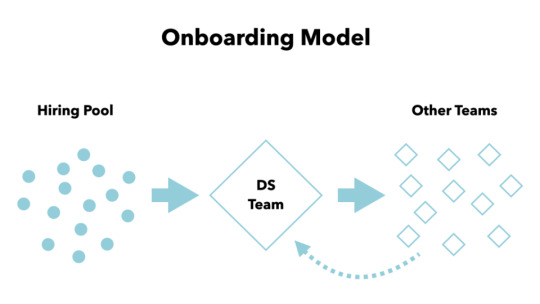
Figure 2. A Model for Onboarding. As you bring people into your organization from your hiring pool, consider having them start on your design system team and then rotate out onto other teams. As you grow, folks who haven’t had a turn on the system team can rotate in as well.
On the left in Fig. 2, you have a pool of potential employees. As you hire individuals, you can bring them into the design system team, where they’ll gain a deep understanding of how your organization builds digital products. Once they’re up to speed, you can seamlessly move them to another product, discipline, or feature-based team where they’ll take this knowledge and hit the ground running. Additionally, your organization can benefit from having all team members (even those who have been around for a while) periodically work a rotation with the design system team. This continuously spreads the design system expertise around the organization and makes it part of the fabric of how you work.
And don’t think this approach is only valuable for designers or developers. A healthy design system team comprises people from many disciplines. In addition to team member rotation, building in time to mentor folks from many different disciplines can prove tremendously valuable in the long run. A highly functional design system team can serve as an ideal model of workflow and can educate many team members dispersed throughout the organization about how to approach their work.
Believe me, executives’ eyes will light up when you share how a design system can ensure high productivity in record time. As a caution, though, rotating people in and out of any team too often can leave them feeling exhausted and can make it hard for them to be productive. Remember, you have the flexibility to scale this to a level that makes sense for your team. Be smart and use this approach as it works in your context.
What to measure
Action: Measure the time it takes for teams to become productive.
As new people are added, a team typically returns to the “forming” stage of Tuckman’s stages of group development. This is part of the reason that growth is expensive. But with a design system in place and a healthy culture, you can reduce the time it takes the team to get back to “performing.”
Scale benefits
Traditionally, you have to hire more people to scale productivity. A design system enables a team to accomplish more with less. Reusability is a major reason teams choose to work in a more systematic way. Small teams with an effective system can design, build, and maintain hundreds of sites each year. They’d never come close without a design system to work with.
UX Pin has a design system guide that starts by acknowledging something that most of us ignore.
Scaling design through hiring, without putting standards in place, is a myth. With every new hire, new ideas for color palettes, typography and patterns appear in the product, growing the inconsistency and increasing the maintenance cost. Every new hire increases the design entropy.
A well-executed system allows a team to scale while keeping design entropy at bay.
What to measure
Action: Compare the amount of people on your team to the amount of work they are accomplishing.
Adding people to a team doesn’t necessarily mean they’ll get more work done faster. This is well-documented in historical software books like Fred Brooks’ The Mythical Man-Month. Eventually, you will have to investigate changing other factors (besides just adding more people) to increase productivity. A good design system can be one of these factors that increases the productivity of the team members you already have. It’s this change in productivity over scale that you need to measure and compare in order to prove value for this benefit.
External-orientation motivators
Let’s shift to thinking about the benefits that a design system offers to end-users. The four primary external motivators are:
Consistency
Trust
Accessibility
Usability.
Consistency and Trust benefits
Consistency is widely assumed to be the primary benefit of a design system. We identify dozens of button designs, color variations, and inconsistent typefaces in hopes of convincing higher-ups to allow us to build a system to bring it all in line. After working on design systems for the last five or six years, I can say with confidence that a design system will not make your product more consistent.
You see, us web designers and developers are very scrappy. We can create the most inconsistent experiences within even the most rigid systems. It’s not the system itself that creates consistency, it’s the culture of an organization. It’s all of the unspoken expectations—the filters through which we make decisions—that give us the confidence to pause and ask if the work we’re doing fits culturally with the product we’re building. A good CMO knows this, and they won’t buy the oversimplified idea that a design system will solve the rampant inconsistencies in our work.
Because of this, these executives often have a different (and easier to measure) question: “Does it convert?” This perspective and line of conversation is not an ideal approach. Believe me, we can create experiences that convert but are not good for our users or our brands. Given this, a conversation with your CMO might go better if you shift the language to talk about trust instead.
With inconsistent experiences, your users subconsciously lose trust in your brand. They’ve been conditioned to expect a certain kind of user experience, and that’s what they should be given, even across multiple websites or products. Vanessa Mitchell wrote about why brand trust is more vital to survival now than it’s ever been:
“Brand trust as an ‘“insurance policy”’ against future issues is not a new concept. Most organizations know trust bestowed by the consumer can not only make or break a business, it can also ensure you survive a problem in the future. But few achieve brand trust adequately, preferring to pay lip service rather than delve into what it really means: Authentically caring about customers and their needs.”
When your customer is using your product to accomplish a very specific task, that one task is the only thing that matters to them. Creating a consistent experience that works for everyone and allows them to accomplish their goals is building trust. CMOs need to understand how design systems empower trusted relationships so those relationships contribute to your bottom line.
What to measure
Action: Measure the engagement of your customers.
Customer engagement can be measured with web analytics platforms. What you’re looking for will vary depending on the context for your organization, but trends in things like time on site, visit frequency, subscription rates, and bounce rates will give you meaningful data to work with. It’s also very common to track customer engagement with metrics like Net Promoter Score (NPS) by asking simple questions of customers repeatedly over time. There are so many ways to structure tests of the usability of your work, so I’d encourage you to loop in the UX team to help you find tests that will demonstrate the user engagement success of the design system effort.
Accessibility benefits
Accessibility can be a tremendous benefit of a design system. Do the work properly the first time, then allow that beautifully accessible component to serve your customers each time it is used. Certainly, it’s not a fail-safe measure—there is still integration-level testing to ensure component accessibility translates to the larger experience—but ensuring the accessibility of individual components will result in more accessible experiences. And integrating good accessibility practices into your system means more folks within your organization are aligned with this important work.
You might find at first that marketers aren’t all that interested in accessibility, but they should be. Did you know that there were 814 web accessibility related lawsuits (just in the US!) in 2017? Did you know that there were almost 2,300 in 2018? That’s a 181% increase. This must be a priority. First, because it’s the right thing to do. Second, because it’s important to the sustainability of the business. A design system can help you address this issue, and it can help you maintain compliance as you grow. This is the kind of message that resonates with leadership.
What to Measure
Action: Measure your compliance to accessibility guidelines over time.
Many organizations have a regular cadence of accessibility audits across their digital properties. While some of this can be automated, there’s always a manual aspect needed to truly evaluate the accessibility of a site or application. Tracking how often regressions occur in the properties served by your design system can be a great way to demonstrate the value that system is bringing to the organization.
Usability benefits
As with so many aspects of a design system, usability benefits come from repetition. Design system pros often hope to focus energy on solving a usability challenge only once before moving on to the next problem. This absolutely is a benefit of a well-constructed system. It’s also very true that “familiarity breeds usability.” Your customers will learn to use your products and begin to subconsciously rely on that familiarity with the experience to lower their cognitive load. This should be just as important to our executive leadership as it is to those of us who are practitioners.
You can also reframe this benefit in the context of conversion. Helping our users accomplish their goals is helping them convert. They are there to use your product. So make it easy to do, and they’ll do it more. This is what businesses need and what executives want to see—improving the business by helping customers. As mentioned above, we want to make sure we’re doing this in healthy ways for both our users and our brands.
What to Measure
Action: This might be the easiest one—measure conversion!
Running usability studies will help to validate and measure the success of your work with the system, which many organizations are already doing. Your goal should be to validate that components are usable, which will allow you to build a culture of user-centered design. Setting the bar for what it takes to evolve the system—such as requiring that changes are tested with real users—introduces this idea into the core of all your processes, where it should be.
Sell investment, not cost
Knowing how and which internal and external motivators to touch on during conversations is significant, but there’s one last thing I’d like to mention, and it has to do with your way of thinking. A major factor in many of these conversations lies simply in how we frame things: move the conversation about the cost of building a design system into a conversation about the present and residual benefits of the investment you’re making. It’s easy to view the time and effort required to build a system as an investment in ultimately delivering high-quality digital products. But leadership will be more willing to consider realistic budgets and timelines if you talk about it like a long-term investment that has benefits on multiple levels throughout the business. This also leaves you with the ability to regularly remind them that this product will never be done—it will require ongoing funding and support.
A design system project will not succeed if you don’t convince others that it’s the right thing to do. Successful, sustainable design systems start with the people, so you have to begin by building consensus. Building a design system means you’re asking everyone to change how they work—everyone has to be on board.
This concept of collaboration is so core to the work of design systems that it led all of us here at Sparkbox to look for opportunities to better understand how teams around the world are designing, building, and using a more systematic approach to digital product design. For the last three years, we’ve been gathering and sharing data in the form of the Design Systems Survey and the Design System Calendar. If you are considering a design system for your organization, or if you work with a design system team, the survey and calendar may be helpful in your quest to build better products.
The Never-Ending Job of Selling Design Systems published first on https://deskbysnafu.tumblr.com/
0 notes
Text
The JG Maker Artist-D: An IDEX Printer for $389?
JGMaker Artist D
7.00 / 10
Read Reviews
Read More Reviews
Read More Reviews
Read More Reviews
Read More Reviews
Read More Reviews
Read More Reviews
Read More Reviews
Read More Reviews
Read More Reviews
Read More Reviews
Read More Reviews
Read More Reviews


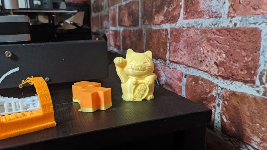
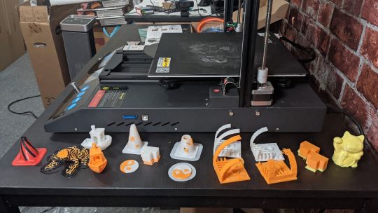


Shop Now
The JGMaker Artist-D is a fully-fledged IDEX printer at less than half the price you'd usually pay for one. Unfortunately, some design issues prevent it from greatness.
Specifications
Brand: JGMaker
Build Volume: 12.2 x 12.2 x 13.8 inches (310 x 310 x 350 mm)
Connectivity: SD Card
Heated Build Plate: Yes
Feed Type: Direct (Dual)
Dimensions: 22 x 25.2 x 24.8 inches (560 x 640 x 630 mm)
Weight: 30lbs. (13.5kg)
Dual-Color Printing: Yes, independent nozzles
Pros
IDEX at this price is incredible
Simple but effective workflow
Cons
Quick-release nozzles cause more problems than they solve
Buy This Product
JGMaker Artist D other
Shop
// Bottom var galleryThumbs1 = new Swiper('.gallery-thumbs-1', { spaceBetween: 10, slidesPerView: 10, freeMode: true, watchSlidesVisibility: true, watchSlidesProgress: true, centerInsufficientSlides: true, allowTouchMove: false, preventClicks: false, breakpoints: { 1024: { slidesPerView: 6, } }, }); // Top var galleryTop1 = new Swiper('.gallery-top-1', { spaceBetween: 10, allowTouchMove: false, loop: true, preventClicks: false, breakpoints: { 1024: { allowTouchMove: true, } }, navigation: { nextEl: '.swiper-button-next', prevEl: '.swiper-button-prev', }, thumbs: { swiper: galleryThumbs1 } });
Budget 3D printers have flooded the market in recent years. Some provide cheap alternatives to mainstream brands. Others put their own spin on the technology.
The JGMaker Artist-D falls into the second camp. It is an Independent Dual Extruder (IDEX) printer capable of large dual color prints and dual printing—simultaneously printing two models.
Launched initially on Kickstarter, the Artist D can currently be ordered directly from JGMaker for just less than $600. Be prepared for a wait though as the first backers still haven't received their units at the time of writing.
With so many underwhelming 3D printers appearing via Kickstarter these days, what does the Artist-D do to stand out?
It turns out, quite a bit.
The JGMaker Artist-D in Brief
The general frame of the Artist-D is similar to most other printers, except for the X-axis belt. Since this is an IDEX printer, two separate belts work independently, moving the direct-drive extruders along linear rails. The Z-axis features dual screws giving a claimed movement accuracy of 0.001mm.
The build area is a generous 310 x 310 x 350 mm, and the composite build plate is removable, attached to the hotbed via magnets in the base. Each extruder/nozzle combination has its own home location with wire cleaning brushes to automatically clear filament from the nozzles, which runs straight from the spools to the extruders via a runout sensor – no clogged Bowden tubes here!
The single-color backlit LCD is controlled via a rotary encoder and uses Marlin Firmware version bugfix 2.0.x. During the Kickstarter, JGMaker revealed a "pro" edition of the Artist-D featuring a color touch screen along with a few upgrades, none of which were present for this review.
The Artist-D can print various materials, including PLA, TPU, PETG, and ABS, along with composites and PVA for soluble support structures.
Extruder system: Direct drive
Print head: Dual Single nozzle
Nozzle size: 0.4 mm
Max. hot end temperature: 245 °C
Max. heated bed temperature: 90 °C
Print bed material: FA platform
Bed leveling: Manual
Connectivity: SD card
Filament sensor: Yes
Filament diameter: 1.75 mm
Third-party filament: Yes
Filament materials: Consumer materials (PLA, ABS, PETG, TPU)
Recommended slicer: Cura
Operating system: Windows 7/10/XP
File types: STL, OBJ, G-code
What Makes IDEX Printers So Special?
Before moving on, a quick primer on the pros and cons of IDEX printing. In short, IDEX printers can give true dual-color printing, with sharp differences between the two colors and no need for the separate tower that dual extruder single nozzle printers need to avoid color blending. On the other hand, color gradient printing is not possible with IDEX printers.
While the two extruders on an IDEX printer are technically independent, this only means independence along the X-axis in most printers. This still allows for some interesting use cases, though. Dual heads can print two identical models simultaneously. If you load both filament spools with the same color, you can print models up to 111 mm wide in batches of two.
Perhaps more exciting to hobby roboticists will be the mirror function. When you are manufacturing symmetrical parts, the ability to load a single model to an SD card and receive two mirrored prints saves time at almost every step.
Artist-D Initial Setup
The setup for the Artist-D is relatively simple. It comes mostly assembled, requiring only the top arch to be attached to the base via four screws. It's a little fiddly to do alone, but even taking my time, the printer was fully assembled within half an hour.
Wiring up the Artist-D is also very easy thanks to the full-color manual and numbered cables/sockets. The flex cables are fairly robust and designed to not get in the way no matter what the printer is doing. Both extruders come with nozzles pre-fitted, but one of the Artist-D's key features is the smart system for fitting and replacing nozzles via a push-button on the side of each hot end housing.
JGMaker provides all the tools required to build and use the Artist-D, and the quality of these tools appears to be a little higher than the average. The wood-handled bed-scraper is a nice touch. The Artist-D also comes with a replacement nozzle and two full small filament rolls, more than the usual "just enough for the test print" amount you get with many other printers.
The print bed has four spring-mounted hand screws for leveling, which uses the primary extruder head nozzle as a reference point. A menu option cycles the nozzle between the center and all four corners for easy leveling – a feature of the Marlin firmware more than anything specific to this printer.
After setting up and leveling, you are ready to start your first print. Feeding in the filament is very simple, after using the Preheat PLA menu setting, feed the filament through the hole in the extruder until it comes out of the nozzle.
Test Prints and Print Modes
JGMaker provides a number of test prints as STLs, along with an Ultimaker Cura installer. The version provided with the Artist-D is a little out of date but functionally identical to recent Cura builds. After following a brief setup (as given in the user manual), you are ready to print.
The way the Artist-D approaches different types of print is quite intuitive. All single and dual-color prints work much as normal within Cura. Whether you are using a single color and extruder or merging two parts of a model and assigning to each extruder, the printer works using its Auto Park feature. This behavior is much like any other 3D printer.
For mirrored and duplicated prints, the manual instructs to simply move the print -80 mm in the X-axis and select the appropriate print type on the printer. Depending on your viewpoint, this could be seen as a good thing, a simple way to allow less computer-savvy people to use these features. Others might miss the ability to specify these things in software and communicate with the printer without relying on an SD card.
My initial test prints went well, with the "money-cat" model coming out perfectly. As with all 3D printers, there was a mixed bag here, and some problems are generic problems that anyone using a 3D printer will be familiar with. Unfortunately, there were some issues that were a little more severe, but we'll come on to those later.
JGMaker also provides a stacked block model for dual-color calibration. After an initial print, you can take manual measurements of the output and use a menu to offset the second extruder.
It seems a primitive way of calibrating something so precise, but then how else can you ensure nothing has slipped during shipping?
Familiar Problems, New Sources
Unfortunately, this is where the problems began. Single color printing worked fine, but duplication and mirror printing mostly didn't come out properly. After a lot of tweaking, it turned out that there was a fundamental height difference between the two nozzles.
This could be fixed by adding a thicker base to whatever model you wanted to duplicate, but then you need to choose between either one nozzle starting touching the build plate or one so high it might not adhere. This wouldn't be an issue if you could manually change the nozzle height, but you can't. The software offset only applies to Auto Park mode, and the clever 'quick release' nozzle system prevents precise height adjustment.
The easy to replace nozzles are a nice idea, though in practice, they are more trouble than they are worth. Early in testing the printer, I decided to swap the nozzles. The media for the Artist-D shows someone simply pressing the button and retrieving the nozzle with their fingers. In reality, it is not so simple.
Quick-Switch Nozzles: Convenience or Liability?
Removing the nozzle first requires freeing it of filament, therefore heating the hot end. You really do not want to try to remove a hot nozzle with your fingers! After clearing the filament, you can press the button and carefully remove the nozzle with pliers.
While still hot, you'll want to clean the extruder area fully, as any leftover filament can stop the nozzle seating properly. There's no tactile feedback when the nozzle is fully in - which is what caused the height discrepancy most likely.
After much testing and cleaning, and several extra nozzles, the main extruder clogged completely while in normal running.
Filament clogging problems are not unique to this printer, but in this case, it seems the cause of them is to do with the combination of directly feeding filament into the nozzle attachment. The clog pushed back from the nozzle right over the top of the hot end casing – something I've never seen happen before.
Build Plate Woes
The build plate itself is a composite material that grips prints very well and can be easily removed. It's flexible too, allowing you to bend it under prints to help loosen them. In fact, most prints ended up leaving residue on the plate, which needed scraping off with the provided scraper. This isn't necessarily a negative, though – I'd rather a too grippy build plate than too smooth.
Both the metal heated plate and the composite cover seem to be of excellent quality, so I was somewhat taken aback when I found it impossible to level the bed properly. The center of the print bed was several millimeters higher than the corners.
Warped print beds are common on cheap 3D printers, and there are various workarounds, but given the perceived quality of most other parts of this printer, it was a disappointment.
JGMaker Artist-D: Almost Great
The JGMaker Artist-D has so much potential. IDEX FDM printers with large build areas represent the best of both worlds – aesthetically pleasing multicolor prints and functional, fast part prototyping.
I don't want to be harsh on the Artist-D, there's clearly a lot of thought that has gone into this printer, and it offers a lot for less than half the cost of similarly specced printers. Unfortunately, the issues it exhibits seem to go beyond the normal quirks and headaches that all 3D printers share, into problems caused specifically by the well-meaning yet poorly implemented nozzle setup.
I'm sure workarounds will come, and this printer will eventually be good, but in its current iteration, the Artist-D is a tough printer to work with.
The JG Maker Artist-D: An IDEX Printer for $389? published first on http://droneseco.tumblr.com/
0 notes
Text
The Beginner’s Guide to Usability Testing [+ Sample Questions]
New Post has been published on https://tiptopreview.com/the-beginners-guide-to-usability-testing-sample-questions/
The Beginner’s Guide to Usability Testing [+ Sample Questions]

My favorite part of the writing process is when my editor reviews my work. By the time I’ve submitted the first draft of most of my blog posts, I’ve invested so much time and effort into my piece that I’m too emotionally attached to it. I need to distance myself from it.
My editor also has fresh editing eyes, so she can discover any overlooked errors and new creative opportunities to sharpen my piece. After I address her edits, my piece always looks more polished.
Asking other people to evaluate your work applies to almost every discipline, especially user experience and design. It’s not smart to rely on yourself when evaluating your own product or website design. You’re partial towards it, and that can skew your perception of reality. Learning directly from the people that your work is actually for — your users — is what enables you to craft the best user experience possible.

UX and design professionals leverage usability testing to get user feedback on their product or website’s user experience all the time. So we interviewed some of HubSpot’s Senior UX Researchers and Designers to teach you what exactly usability testing is, its benefits, and how to effectively conduct your own study.
What is Usability Testing?
Usability testing is a method of evaluating a product or website’s user experience. By testing the usability of their product or website with a representative group of their users or customers, UX researchers can determine if their actual users can easily and intuitively use their product or website.
UX researchers will usually conduct usability studies on each iteration of their product from its early development to its release. This allows UX researchers to uncover any problems with their product’s user experience, decide how to fix these problems, and ultimately determine if the product is usable enough.
Identifying and fixing these early issues saves the company both time and money: developers don’t have to overhaul the code of a poorly designed product that’s already built, and the product team is more likely to release it on schedule.
During a usability study, the moderator asks participants in their individual user session to complete a series of tasks while the rest of the team observes and takes notes. By watching their actual users navigate their product or website and listening to their praises and concerns about it, they can see when the participants can quickly and successfully complete tasks and where they’re enjoying the user experience, encountering problems, and experiencing confusion.
After conducting their study, they’ll analyze the results and report any interesting insights to the project lead.
Benefits of Usability Testing
Usability testing has five major advantages over the other methods of examining a product’s user experience, like a questionnaire:
Usability testing provides an unbiased, accurate, and direct examination of your product or website’s user experience. By testing its usability on a sample of actual users who are detached from the amount of emotional investment your team has put into creating and designing the product or website, their feedback can resolve most of your team’s internal debates.
Usability testing is convenient. To conduct your study, all you have to do is find a quiet room and bring in portable recording equipment. If you don’t have recording equipment, someone on your team can just take notes.
Usability testing can tell you what your users do on your site or product and why they take these actions.
Usability testing lets you address your product’s or website’s issues before you spend a ton of money creating something that ends up having a poor design.
For your business, intuitive design boosts customer usage and their results, driving demand for your product.
Examples of What Usability Testing Can Do
Usability testing sounds great in theory, but what value does it provide in practice? Here’s what it can do to actually make a difference for your product (with examples):
1. Identify points of friction in the usability of your product.
As Brian Halligan said at INBOUND 2019, “Dollars flow where friction is low.” This just as true in UX as it is in sales or customer service. The more friction your product has, the more reason your users will have to find something that’s easier to use.
Usability testing can uncover points of friction from customer feedback.
For example: “My process begins in Google Drive. I keep switching between windows and making multiple clicks just to copy and paste from Drive into this interface.”
Even though the product team may have had that task in mind when they created the tool, seeing it in action and hearing the user’s frustration uncovered a use case that the tool didn’t compensate for. It might lead the team to solve for this problem by creating an easy import feature or way to access Drive within the interface to reduce the number of clicks the user needs to make to accomplish their task.
2. Stress test across many environments and use cases.
Our products don’t exist in a vacuum, and sometimes development environments are unable to compensate for all the variables. Getting the product out and tested by users can uncover bugs that you may not have noticed while testing internally.
For example: “The check boxes disappear when I click on them.”
Let’s say that the team investigates why this might be, and they discover that the user is on a browser that’s not commonly used (or a browser version that’s outdated).
If the developers only tested across the browsers used in-house, they may have missed this bug, and it could have resulted in customer frustration.
3. Provide diverse perspectives from your user base.
While individuals in our customer bases have a lot in common (in particular, the things that led them to need and use our products), each individual is unique and brings a different perspective to the table. These perspectives are invaluable in uncovering issues that may not have occurred to your team.
For example: “I can’t find where I’m supposed to click.”
Upon further investigation, it’s possible that this feedback came from a user who is color blind, leading your team to realize that the color choices did not create enough contrast for this user to navigate properly.
Insights from diverse perspectives can lead to design, architectural, copy, and accessibility improvements.
4. Give you clear insights into your product’s strengths and weaknesses.
You likely have competitors in your industry whose products are better than yours in some areas and worse than yours in others. These variations in the market lead to competitive differences and opportunities. User feedback can help you close the gap on critical issues and identify what positioning is working.
For example: “This interface is so much easier to use and more attractive than [competitor product]. I just wish that I could also do [task] with it.”
Two scenarios are possible based on that feedback:
Your product can already accomplish the task the user wants. You just have to make it clear that the feature exists by improving copy or navigation.
You have a really good opportunity to incorporate such a feature in future iterations of the product.
5. Inspire you with potential future additions or enhancements.
Speaking of future iterations, that comes to the next example of how usability testing can make a difference for your product: The feedback that you gather can inspire future improvements to your tool.
It’s not just about rooting out issues but also envisioning where you can go next that will make the most difference for your customers. And who best to ask but your prospective and current customers themselves?
The 9 Phases of a Usability Study
1. Decide which part of your product or website you want to test.
Do you have any pressing questions about how your users will interact with certain parts of your design, like a particular interaction or workflow? Or are you wondering what users will do first when they land on your product page? Gather your thoughts about your product or website’s pros, cons, and areas of improvement, so you can create a solid hypothesis for your study.
2. Pick your study’s tasks.
Your participants’ tasks should be your user’s most common goals when they interact with your product or website, like making a purchase.
3. Set a standard for success.
Once you know what to test and how to test it, make sure to set clear criteria to determine success for each task. For instance, when I was in a usability study for HubSpot’s Content Strategy tool, I had to add a blog post to a cluster and report exactly what I did. Setting a threshold of success and failure for each task lets you determine if your product’s user experience is intuitive enough or not.
4. Write a study plan and script.
At the beginning of your script, you should include the purpose of the study, if you’ll be recording, some background on the product or website, questions to learn about the participants’ current knowledge of the product or website, and, finally, their tasks. To make your study consistent, unbiased, and scientific, moderators should follow the same script in each user session.
5. Delegate roles.
During your usability study, the moderator has to remain neutral, carefully guiding the participants through the tasks while strictly following the script. Whoever on your team is best at staying neutral, not giving into social pressure, and making participants feel comfortable while pushing them to complete the tasks should be your moderator
Note-taking during the study is also just as important. If there’s no recorded data, you can’t extract any insights that’ll prove or disprove your hypothesis. Your team’s most attentive listener should be your note-taker during the study.
6. Find your participants
Screening and recruiting the right participants is the hardest part of usability testing. Most usability experts suggest you should only test five participants during each study, but your participants should also closely resemble your actual user base. With such a small sample size, it’s hard to replicate your actual user base in your study.
To recruit the ideal participants for your study, create the most detailed and specific persona as you possibly can and incentivize them to participate with a gift card or another monetary reward.
Recruiting colleagues from other departments who would potentially use your product is also another option. But you don’t want any of your team members to know the participants because their personal relationship can create bias — since they want to be nice to each other, the researcher might help a user complete a task or the user might not want to constructively criticize the researcher’s product design.
7. Conduct the study.
During the actual study, you should ask your participants to complete one task at a time, without your help or guidance. If the participant asks you how to do something, don’t say anything. You want to see how long it takes users to figure out your interface.
Asking participants to “think out loud” is also an effective tactic — you’ll know what’s going through a user’s head when they interact with your product or website.
After they complete each task, ask for their feedback, like if they expected to see what they just saw, if they would’ve completed the task if it wasn’t a test, if they would recommend your product to a friend, and what they would change about it. This qualitative data can pinpoint more pros and cons of your design.
8. Analyze your data.
You’ll collect a ton of qualitative data after your study. Analyzing it will help you discover patterns of problems, gauge the severity of each usability issue, and provide design recommendations to the engineering team.
When you analyze your data, make sure to pay attention to both the users’ performance and their feelings about the product. It’s not unusual for a participant to quickly and successfully achieve your goal but still feel negatively about the product experience.
9. Report your findings.
After extracting insights from your data, report the main takeaways and lay out the next steps for improving your product or website’s design and the enhancements you expect to see during the next round of testing.
The 3 Most Common Types of Usability Tests
1. Hallway/Guerilla Usability Testing
This is where you set up your study somewhere with a lot of foot traffic. It allows you to ask randomly-selected people who have most likely never even heard of your product or website — like passers-by — to evaluate its user-experience.
2. Remote/Unmoderated Usability Testing
Remote/unmoderated usability testing has two main advantages: it uses third-party software to recruit target participants for your study, so you can spend less time recruiting and more time researching. It also allows your participants to interact with your interface by themselves and in their natural environment — the software can record video and audio of your user completing tasks.
Letting participants interact with your design in their natural environment with no one breathing down their neck can give you more realistic, objective feedback. When you’re in the same room as your participants, it can prompt them to put more effort into completing your tasks since they don’t want to seem incompetent around an expert. Your perceived expertise can also lead to them to please you instead of being honest when you ask for their opinion, skewing your user experience’s reactions and feedback.
3. Moderated Usability Testing
Moderated usability testing also has two main advantages: interacting with participants in person or through a video a call lets you ask them to elaborate on their comments if you don’t understand them, which is impossible to do in an unmoderated usability study. You’ll also be able to help your users understand the task and keep them on track if your instructions don’t initially register with them.
Usability Testing Script & Questions
Following one script or even a template of questions for every one of your usability studies wouldn’t make any sense — each study’s subject matter is different. You’ll need to tailor your questions to the things you want to learn, but most importantly, you’ll need to know how to ask good questions.
1. When you [action], what’s the first thing you do to [goal]?
Questions such as this one give insight into how users are inclined to interact with the tool and what their natural behavior is.
Julie Fischer, one of HubSpot’s Senior UX researchers, gives this advice: “Don’t ask leading questions that insert your own bias or opinion into the participants’ mind. They’ll end up doing what you want them to do instead of what they would do by themselves.”
For example, “Find [x]” is a better than “Are you able to easily find [x]?” The latter inserts connotation that may affect how they use the product or answer the question.
2. How satisfied are you with the [attribute] of [feature]?
Avoid leading the participants by asking questions like “Is this feature too complicated?” Instead, gauge their satisfaction on a Likert scale that provides a number range from highly unsatisfied to highly satisfied. This will provide a less biased result than leading them to a negative answer they may not otherwise have had.
3. How do you use [feature]?
There may be multiple ways to achieve the same goal or utilize the same feature. This question will help uncover how users interact with a specific aspect of the product and what they find valuable.
4. What parts of [the product] do you use the most? Why?
This question is meant to help you understand the strengths of the product and what about it creates raving fans. This will indicate what you should absolutely keep and perhaps even lead to insights into what you can improve for other features.
5. What parts of [the product] do you use the least? Why?
This question is meant to uncover the weaknesses of the product or the friction in its use. That way, you can rectify any issues or plan future improvements to close the gap between user expectations and reality.
6. If you could change one thing about [feature] what would it be?
Because it’s so similar to #5, you may get some of the same answers. However, you’d be surprised about the aspirational things that your users might say here.
7. What do you expect [action/feature] to do?
Here’s another tip from Julie Fischer:
“When participants ask ‘What will this do?’ it’s best to reply with the question ‘What do you expect it do?’ rather than telling them the answer.”
Doing this can uncover user expectation as well as clarity issues with the copy.
Your Work Could Always Use a Fresh Perspective
Letting another person review and possibly criticize your work takes courage — no one wants a bruised ego. But most of the time, when you allow people to constructively criticize or even rip apart your article or product design, especially when your work is intended to help these people, your final result will be better than you could’ve ever imagined.

Editor’s note: This post was originally published in August 2018 and has been updated for comprehensiveness.
Source link
0 notes
Photo


Building Information Modeling (BIM) is a common acronym among architects, engineers and construction professionals migrating or planning to shift to the system, demonstrating the physical & functional façades of a building, integrating several information about all components present in a home remodeling and residential home renovation project.
Applications of BIM to New Building & Home Renovation
Through Building Information Modeling for home remodeling, it is likely to digitally create an accurate virtual model of a residential home renovation, providing better cost control and efficacy. Further, itis possible to simulate the building, understanding its behavior before the onset of the construction process and supporting the project through its phases, including after construction, dismantling or demolition.
BIM methodology is developed and applied to new building projects and for home renovations. If you consider the societal needs for enhancing the quality and performance of an existing building stock, especially concerning energy consumption, Building Information Modeling for home renovation service contributes to make retrofits and renovations efficient, intelligent and sustainable.
To attain improved control of the project stages for residential home remodeling, numerous governments, companies and owners are requesting the planning of projects in BIM, allowing improved detail in budget and planning of preventive project maintenance.
Use of BIM for Home Renovation Services
Building Information Modeling for home renovation service in DC is used to predict errors in the generation of designs for various project areas, and also for checking the impact of design decisions and identifying inconsistencies between systems. A construction home remodeling project undertaken by renovation company services that has started on a BIM platform has a fairly different methodology than CAD, representing the visual geometry, components as well as the elements influencing design build solutions.
It’s true that working with home renovations & home remodel services are a bit risky compared to starting a work from the scratch. There could be pleasant as well as unpleasant surprises in the process that entail quick and accurate resolutions for avoiding wastage of time and resources. To minimize the chances of accidents, the first step encompasses research and digital representation of the building environment. And for this, all things from building document sets are considered valuable for building model creation. In case of an old building, there is a possibility that all documents will be on paper, necessitating further scanning of work. Some BIM companies in USA emphasize on surveys, and methods that can digitally capture the environment through laser scanning point cloud data or photogrammetry, using drones.
As soon as the geometry is captured, there is a difficult task of presenting data about installations (be it through piping, HVAC, or electricity). This is more valuable through a well-built BIM model absolutely fitted for the building to be remodeled. The building information modeling database of top BIM Service Provider in USA is updated throughout the building life cycle to subsequent schedule maintenance. Most significantly, a BIM model facilitates in comprehending and assessing the way the project will be executed and how it will perform with several issues like thermal, visual, and acoustic. Further, the model can be registered and can have greater control over the material origin, the techniques, and the apt target in the event of disassembly.
For instance, a 3D BIM model of BIM Service Company in USA helps to simulate the usage of natural lighting, shielding components, and also the possibility for harnessing photovoltaic energy at a specified place. If the BIM model is complete for encompassing hydraulic & air conditioning installations, it is likely to test and recommend specific or essential amendments to improve system efficacy. Of course, the noteworthy thing is to have the likelihood for comparing previous calculations and determining whether the investment will be rational or not. Designers can make a 5D BIM cost estimate about the actual energy performance by substituting a specific facade covering for another with an advanced level of insulation, or simply by examining another color. Even a carbon credit report on the building, and inspection of all materials & processes for later certification, is possible.
Further, BIM facilitates greater cooperation amongst numerous consultants and project participants for improved management of time & workflow, supporting clash detection and resolving inconsistencies common to renovation and retrofitting. With the vast inventory of existing buildings, together with the concerns of natural resource conservation and sustainability, it’s important to focus on developing smart, sustainable & efficient rehabilitation projects. BIM contributes a lot in this regard.
Opt for the best Home Renovation Services in USA
To get home renovation service in areas in the USA, consult the expert BIM Modelers of Tejjy Inc.– a top architectural, engineering, BIM, construction management, permit expediting, home remodeling and renovation company services in USAat 202-465-4830 or [email protected].
#bim#buildinginformationmodeling#bimmodelers#5dbimservices#cost estimation#bimcompaniesinusa#bimmodelingservicesinUSA#bimmodelingcompaniesinconnecticut#homerenovation#clashdetection#3d bim modeling#bestbimcompany#tejjyinc
0 notes
Photo

10 Projects to Get You to Your First Dev Job in 2020
For those of you looking to break into the world of web development with your first dev job, the amount of things you are expected to know can be overwhelming: HTML, CSS, JavaScript, version control, build tools, frameworks, the command line. The list goes on …
But never fear! In this post I'd like to offer you a little guidance by outlining ten skills that will help you land your first dev job in 2020. For each skill, I’ll suggest a hands-on project to get you started and point you to appropriate resources on SitePoint Premium for further reading.
Let's dive in.
1. Get to Know Your Code Editor
As a coder, you're going to be spending a lot of time in your editor of choice. That's why you should make the effort to learn what it can do and how to configure it properly. The subject of which editor to use can quickly become controversial, but if you’re just starting out, I would encourage you to check out VS Code (or VSCodium if you care about privacy).
VS Code ships with a lot of cool features, such as Emmet abbreviations, intellisense, various keyboard shortcuts and Git integration. There are also hundreds (if not thousands) of extensions that you can install to customize your workflow.
Project Idea
Install VS Code on your machine and commit to using it. Spend some time researching popular extensions for your language of choice and install at least three of these. You should also install Prettier and configure it to format your code on save, as well as ESLint, which will display JavaScript linting errors in VS Code's console. For bonus points, you can print out the keyboard shortcut reference sheet for your platform and attempt to memorize two or three shortcuts per week.
Further Reading
By way of a reference, I would recommend Visual Studio Code: End-to-End Editing and Debugging Tools for Web Developers. This up-to-date guide covers all of the essential VS Code components, including the editing features of the workspace, advanced functionality such as code refactoring and key binding, and integration with Grunt, Gulp, npm, and other external tools. Chapter Two, which introduces you to the user interface, and Chapter Nine, on working with extensions, should be of particular interest.
2. Build a Contact Form
If you’re building a web application, it's only a matter of time until you encounter HTML forms. They’re a big part of the web experience, and they can be complicated. For example, you need to make them accessible, and you need to make sure they render well on different browsers and on smaller screens. It can also be a challenge to style them consistently without breaking their usability.
Forms are a critical part of a visitor's journey on your site. Even if your visitor is sold on what you have to offer, a broken or even a badly laid out form could be enough for them to abandon ship. That means you lose the conversion.
Project Idea
Build and style a contact form. Concentrate on the alignment of the form fields, a prominent CTA, and make sure the form previews well across browsers and devices. Try to include various form controls, such as <select> elements and check boxes, while keeping the layout simple and elegant.
You might also like to upload your finished form to CodePen, an online community for testing and showcasing user-created HTML, CSS and JavaScript code snippets. When applying for a job, a well-curated CodePen account could potentially serve as a mini portfolio.
Further Reading
Form Design Patterns offers ten recipes for different kinds of forms — registration forms, booking forms, login forms and more. Learn from the pros and find out how to make your forms both engaging and accessible to all. If you're looking for a quick start with this project, I recommend reading the first part of the first chapter, which covers things such as labels, placeholders, styling and input types.
3. Become Acquainted with Client-side Validation
You won't get far as a web developer in 2020 without knowing JavaScript: it's one of the most popular programming languages in the world and, frankly, a must-have skill.
On the front end it's used for a wide variety of tasks, such as making interactive elements for web pages (sliders, maps, charts, menus, chat widgets, etc.) and generally enhancing the user experience. One rather nice feature of the language is that it can manipulate the DOM, so as to offer users instant feedback on an action without needing to reload the page. This makes web pages feel snappier and more responsive.
Project Idea
In this project, you should take the contact form you built in step two and augment it with client-side validation.
Using the correct input types will get you a lot of the way there, but also try to add some custom validation. You should display error messages in an intuitive way and avoid using alert boxes. And if all that sounds a bit too easy, why not add a field which asks a question to ensure that the user isn’t a bot.
Further Reading
If you’re new to the world of JavaScript programming, or would just like a quick and easy desk reference, then check out JavaScript: Novice to Ninja, 2nd Edition. This step-by-step introduction to coding in JavaScript will show you how to to solve real-world problems and develop richer web applications. You'll want to pay particular attention to Chapter Eight, which shows you how to use JavaScript to interact with an HTML form.
4. Make a Currency Converter Using the Fixer API
In the past, JavaScript had a reputation as being a toy language — good for menus and animations, but not a lot else. And while that might have been the case in the early 2000s, in 2020 nothing could be further from the truth.
Nowadays, entire apps are written in JavaScript. New tools and frameworks are introduced and developed at a rapid rate, and the language itself has undergone big changes since the arrival of ES2015 (aka ES6). It's important you stay abreast of these changes, and have a good idea of what JavaScript is capable of and where it fits into the web development picture as a whole.
Project Idea
Make an app that allows users to convert one currency to another. Users should enter an amount, select the actual currency, select the desired currency and then the app should fetch the exchange rate from the Fixer API. The user interface should be updated dynamically without any kind of page refresh.
Use modern JavaScript features where you can. Complete the project using either vanilla JavaScript, or a library like React to handle the UI updates.
Further Reading
JavaScript: Best Practice is a collection of articles which take a look at modern JavaScript and how the language has evolved to allow you to write clean, maintainable, and reusable code. I would recommend reading the “Anatomy of a Modern JavaScript Application”, “Using Modern JavaScript Syntax” and “Flow Control in Modern JavaScript”.
5. Design Your Own Portfolio Website
In your career as a web developer, you’ll likely find yourself working alongside a designer on the same project. And while design and development can be considered separate disciplines, having a firm grasp of the design process will ease that relationship and stand you in good stead with your colleagues.
Or perhaps you want to go it alone as a freelancer, taking projects from design to deployment. In this case, a generic-looking website won't cut it. You'll need to offer the client an eye-catching but also highly functional design that helps them achieve their business goals.
Project Idea
Design your own portfolio website — your place on the internet to present yourself and showcase your skills. Spend some time researching what makes a good portfolio design, then mock up a design of your own either with pencil and paper, or using a wireframing tool of your choice.
Design-wise, pay attention to the layout, the colors you’ll use, and the typography. Content-wise, consider which pages you’ll need (hint: you could include a contact form) and how to present both yourself and your work. There are lots of sites around the Internet that will give you tips on what to include.
Further Reading
Ok, I get it. Design is hard. But it doesn't need to be …
The Principles of Beautiful Web Design is a fantastic book if you’re struggling with the design process. It will walk you through an example design, from concept to completion, teaching you a host of practical skills along the way.
Start in Chapter One by reading about what makes good design and take it from there. Personally, I read the book from cover to cover in the course of a week, but you could also dip into the other chapters and learn about layout, color, texture, typography and imagery at your leisure.
The post 10 Projects to Get You to Your First Dev Job in 2020 appeared first on SitePoint.
by James Hibbard via SitePoint https://ift.tt/2UdAVVD
0 notes
Text
The Full Interview
Michael Roulier and Philippe Lhomme, directors of foodfilm Interview:
1. Could you introduce the work experience of both of you? When did you two begin to form the team to work together on creativity?
We both have quite a long advertising background, and one thing we have in common is that when we started we did not take advertisement very seriously, at least at first, being more interested into art creation.
In the nineties, if you aspired to exhibit artwork in galleries, it had to stay "secret". So both of us entered the advertising world almost "by accident". After finishing his studies at Penninghen art school, Philippe started painting and installed his atelier in Mesnilmontant district in Paris with no heating. Living and breathing only for his art. Still today he is the one who draws all our scripts, and it is important for us to keep it that way since it is the very first contact we have with clients to seduce them with our stories.
I take care of the writing. I started as a photographer hesitating between photo- journalism and fine arts after having passed a master in Philosophy, but absolutely passionate by all forms of photography. We where both introduced to the advertisement world almost by chance. We did not know each other at that time. It was a golden age for advertisers.Ten years later Philippe was a Creative Director at DDB mainly in charge of an iconic French award winning food brand that French people loved because of the quality of communication and visuals.
On my side I had become a studio still life photographer working mainly for luxury brands and cosmetics subjects. One day Philippe called me and asked if I was interested to do some "food tests" for the brand, and I must admit I was not too excited about it.
Food was not really glamorous in those days...it was called "alimentary photography". Restaurant Chefs where not considered like the Rock Stars they are today, and I cared more about my personal research considering advertisement like a lovely job, but not like a finality, even though I was lucky enough to work for beautiful brands like Hermes, Gallery Lafayette etc... In the end it was a revelation. I discovered a completely new world into which I had a total creative freedom, which was not at all the case for others kind of advertised subjects. Usually Art directors had no clue about what to do with food, and it was very much 'comedy' orientated as they felt more confortable doing that. It was not the case of Philippe who already believed that there was a lot do in this field and really tried to bring the visuals to a very artistic level. We inspired a lot of other food brands with our images, and the brand became a real visual reference for food. Finally we ended up becoming food specialists, but it had never been our initial projects. We collaborated together for 15 years always trying to focus as much as possible on textures. Food can be naturally ugly and somehow you need quite a lot of experience to master it. We noticed at that time that the food film industry was still surfing on a quite archaic imagery, where the heroes where definitely not the food. In parallel amazing cook books where being printed as editors understood there was a huge market in selling this very artistic food approach. I did 36 books and had the chance to meet these amazing Michelin star chefs who where all desiring to do their proper "food manifesto". It was part of their "business plan" to do such books. A necessity for them that made photographers very happy.
The brand we where working for was only doing print, but one day they asked us to film some recipes for viral videos. They where short on budget but we where given "carte blanche". We just loved doing them, and applied our print workflow to this new experience. We where both passionate about films in our personal life. I was interested in doing experimental research around cinematic experiences inspired by people like Stan Brakhage or Maya Deren. Philippe was spending a lot of time in contemporary art galleries watching artists using video as a medium. Strangely the brand hardly used these film recipes we did for them, and it stayed completely confidential until we decided to post them all in one batch on Vimeo. It became like a tsunami: phones started ringing all the time, and many production companies scouting on Vimeo made us tons of propositions. It all went really quickly, and a year later, Philippe naturally quit his job as creative director at DDB, and on my side I switched from still-life photography to film directing.
2. Which clients do you serve currently?
Our website is built like a simple blog, so the very first page represents our actuality and the clients we lately served.
We have a lot of different clients, and we have enlarged our "film perspective" in exploring other field like the cosmetic world.
Usually cosmetic brands would hire purely still life directors specialized in jewelry, watches, or shooting very "static" items. They had a very "contemplative" approach. Almost robotic. We brought "life" and action, avoiding the 3d representations mainly used at that time. Agencies where seduced by our food background and tried to apply this "spirit" to selling cosmetics...they where seduced by our organic approach.
We love also working for cosmetic brands (L'Oréal, Garnier, Yves Rocher, Décleor, Neutrogena) because the visual grammar has to be very metaphoric, so there is a lot of creativity involved in the process, and they are really expecting this from us: "unseen ideas" to illustrate the benefit of the products....
As far as food it stays our main subjects. Our clients are very eclectic. When you shoot food films you have to collaborate with the big agri-food groups like Neslté, Lactalis, Mondelez etc...and the creative validation process tends to be quite heavy. We can vigorously defend our ideas until a certain point, but at one stage "the big machine" can easily "laminate" your creativity. We are used to that. So what's really remains is the quality of the CRAFT. Our background in print photography really helped us here. I have always been passionate by the digital world and started working early with computers. We try to control in-house as much as we can: compositing, post production and coloring. Our workflow is very direct and since we don't have "a complex post-production pipeline" our approach is very "boutique" in a way. We do hire some digital artists, but they come to work in our studio under our supervision before the film presentation.
We do a lot of this post production job directly on the set: we have great people around us helping us to achieve "live" what is usually done a few weeks later, which is quite an unusual workflow, and spend the nights coloring the clips to be able to show them the next day.
2bis. What’s your core concept of making creativity for clients?
What inspires us most is graphics, architecture, contemporary art, constructivism, Bauhaus, Melies (a French director of the beginning of the century creating illusion) and I am forgetting a lot of other things. Being two "brains" enlarges the perspectives and the approaches. We don't use any DOP, so it's really a duo work.
Philippe and I have very different personalities and skills, and strangely it works really well. But what really unifies us is a desire for elegance and fluidity. A lot of food studios sometimes lack this little something related to external input. Our respective personal passions in life keep enriching our professional work.To resume, it's about "good taste" as we say in France.
We have been too much categorized as "graphic" directors, and that saddens us a bit because we are very much about filming "sensuality". This is probably due to our long collaboration for Marks & Spencer, and to the number of films we did for them.
Our camera angles are usually very simple, frontal and direct. We do have an in-house Kuka robot, but actually don't use it so much, considering that the most important part of our job is composition, more than just a robotic technical achievement.
The editing is the other part into which we have put a lot of energy. The rhythm is not only achieved by the editing skills, but also by the use of visual patterns within the individual clips. We don't "contemplate" too much with long travellings, our work is all about action and the smart ways we have to find in order to animate our textures. And finally the transitions within clips are to our eyes as important as the clips themselves, and we always look for little tricks in order to help the editor's work.
3. Why do you want to be specialized in food films and why began? What’s the benefits of working in this specialized area? How is this area special among creative films?
Food was up to quite recently an unexplored territory. This is what makes it fascinating for us. We are artists using food as our playground. Being French also means that we have a cultural respect for it. Colors, shape, complexity of textures, infinite visual associations and concatenation, and in a certain way "porn".
Pornfood meaning that we can induce by the visuals the viewer to "drool" when we film organoleptic textures that provoque desire and satisfaction.
The other challenge was to totally erase human beings. It's more a philosophical and artistic choice than a necessity for us, and every time we are asked to shoot actors we are happy to do it. But to be able to captivate audience without the acting support is a really an interesting direction. The concept of no-hands-films has led us those last years, but we are in constant evolution, and I am sure it will change.
Being specialized in food give us more freedom than working for other subjects. Everybody has to say something about fashion, cloths, talent acting etc...but very few can have a clear vision about how to stage food, and it gives us a real license for creativity. It's a niche, and that's what's great about it.
4. What kind of experience can you share about food films making? What is the critical thing when making them? Could you explain with 1-2 examples?
One of the critical point is always Time management. When you work with textures you are always surprised by the fact that you cannot really know in advance what shots are going to take more time than others. When you have a long shooting on multiple days your can "deal" with a certain time-elasticity, much better than a single day shoot, when you know that in the same day, whatever happens, you have to "deliver".
We have to obtain the "visual miracle" in a very short time and sometimes it just does not happens, and you can feel the production team and clients become stressed. We learned how to deal with that quite well. Experience will help of course, but sometimes a simple action like just filling a glass of wine in front of the camera can become a nightmare. Of course one could rely on robotics to do that, but then you might lose all the beautiful accidents that can make the quality of the shot. So it's all about making the right choices at the right time.
The same critical point goes when writing the scripts. We have to constantly evaluate the "is-this-going-to-be-possible?". It's great to have ideas, but they have to be somehow realistic and credible, and sometimes we are not really sure of way the texture will behave. There is a lot of randomness that we don't control. We often start over and over again to get the right movement or action. We do work with some great SFX teams that we constantly challenge with our crazy ideas, as we took an ideological posture with Philippe not use 3D, and to always film everything for real. Many people think we use 3D, but I can assure that we don't. We do composite a lot though.
5. Why do you think your work is attractive to the audience and help the brand grow? Can you share one of your favorite works?
I think that what attracts people to our work is that we are often "on the edge of credibility".
We play a lot with illusion, like a magician who will suddenly speed up a gesture to hide the tricks. The rhythm will help us to create this magic. For example we also very often defy gravity, or normality, in order to give a sense of quirkiness. Make it a bit "weird" to get more appeal or unexpectedness. We also try to show details that people usually don't really see, emphasizing a certain playfulness with our camera. The slow motion Phantom camera really helps the observation of the unseen.
The other attractive thing is that our scenes are always "in action". The common question for us is "how are we going to activate this image". No time to contemplate, the textures are always animated in order to keep the tension of the viewer.
6. How’s film creativity different from the general creativity making?
To accept to work as a team with other people. Even more, to admit the power of a team, like a football player.
It is much easier for Philippe who is an ex Creative Director used to commission other artists. I am a bit of "a control freak" and that makes me makes me suffer more than him, and probably others too. This is where we are really complementary.
Nevertheless our team is much smaller than a conventional cinema team, and we try to keep this "boutique" home-made atmosphere. The idea is to never lose the "primal vision" of the film, and keep an eye on everything. We always work with the same team, and we all know each other really well, and that gives a lot of fluidity to our relations. When there is a difficulty, we naturally team up all together to find solutions. It's very democratic!
A good team is like a good wine and it's years of maturation. We where lucky to achieve this.
7. How do you usually allocate work between you two and collaborate with other members in your company? How’s your creativity making process usually?
We both do everything, it's democracy again. We try to put our ego's on the side of our relation.
We do fight a lot though to defend our personal vision of the film, but this is what makes our treatments so rich.
We usually take two days to write a script. The first day is only dedicated to brainstorming, and we throw as much as ideas as we can. Phillipe does quick drawings as we
speak to keep it as a memo. The next day he does the drawings, always in black and white. I love the simplicity of his style, and he really has a camera in the eyes. His drawing treatment is very different of what would provide a rough-man or illustrator . I take care of the writing, and I am extremely precise in our explanations. It's the main secret to win bids. We also try to control as much as we can the art direction of the treatment, and exchange a lot with the creative team doing the lay-outs in the production house. Same goes for the mood boards.
8. Could you tell me an unforgettable thing during you two’s collaboration?
Sometimes the shape of an object, a texture or anything else can slowly become sexually evocative. We remember this time when breaking a poached egg was really reminding a close up of a "very different" scene that could have been extracted from an X-rated movie. Nobody was saying anything, but everybody was thinking the same thing. It was at the same time really evident, and somehow quite understated. At one point the producer "played" his job, and said it, which meant that we had to reshoot the whole scene. It was a good laugh for everybody. It's foodporn after all !
We have hundred of anecdotes with our job, but that's another interview.
9. How will Foodfilm or you personally partner with Stink? What do you think you will bring to Stink’s team through this partnership?
We are very excited with this new partnership, and as we are quite easygoing, it should work really well.
Being represented by Stink is a caution of creativity, so we might have to fight less to defend bold ideas. I don't really know if Stink represents a lot of other table top directors in their international "spiderweb"? I think that the food film market is really huge, and still
growing. So if we can fill this gap for them it's really a great win-win association. Let's talk again about it in a year time!
0 notes
Video
undefined
tumblr
Analysis of Final piece.
Within the first semester, there were a total of three major assignments to hand-in and among them all I was most stumbled with the Motion-graphic module task. The reason behind this varies but it’s mostly due to the fact that I was previously inactive in terms of learning digital techniques in creating art and worried my inexperience may hinder my ability. This Analysis will criticise my final produced work for the Introduction to Motion graphics module which was to create a 30 second motion-graphic sequence which visually explains a Science themed Ted talk with no restriction of choice. Whilst demonstrating an aptitude of understanding of techniques given awareness during lectures. In addition, it was key to make a motion graphic which interprets the Ted Talk’s information from a non-literal stance. This Analysis will critically judge the following aspects of the Motion-graphic sequence based on the Ted-Talk “Your Fingerprints reveal more than you think” by Simona Francese - The artistic inspirations, its reproduction of the storyboard, and the overall technicality demonstration, followed by ending with a reflection for possible improvements given a chance to repeat the process.
Firstly, with our final pieces there was a suggestion to research possible artists in order to derive upon them influence for our piece of work. Among, the many artists, a few that captured my attention were some youtubers and Illustrators for example, Jorge Alderete, Christoph Nieman, Daniel Bueno and the art production team behind the youtube channel- Crash Course. In addition, I was captivated by title sequences from the movie Juno and Dr Strangelove. All of those artists culminated were to have some hints of influence in my work. However, when making a final evaluation of my work in connection to the artists I have not been able to replicate the textures of Daniel Bueno and have any detailed life form like Jorge Alderete. In addition, I have not managed to inhabit the conjoining of both live footage and animation like Christoph Nieman. However, I contest that I followed the philosophies of Daniel Bueno’s art which is to “deform a initially redundant element” seen evidently in my piece with the use of the question marks as living characters. Although, there is a mishap in terms of aligning Crash course influence to my work, I believe to have used a simple color palette and retain a comical look with the simple blocked out color scheme.
Secondly, the purpose of a storyboard is for structure and avoiding hindrance from either plot, style, or timing. When overlooking the final piece with my storyboard there is occasional incongruencies with the techniques and methods which were initially casted to deliver the message. For example, the section of the piece whereby Simona states - “And I'm not just talking about the twisted parting of lines that make our fingerprint unique.” (Francese S., Analyst, 2017) within this part originally it was to have line partitions on the hand asset and have it flowing with a opacity being brighter than the hand opacity. However, this did not happen on the final piece due to the fact I was interested in using the simulations that After effects offers. Therefore, it could be concluded that Digitization and technology can be a leeway to something new. In part also, I was technically incompetent to remember using the wave motion.
Lastly, from a technical standpoint the techniques that were applied from the tutorials taught during classes were mostly using the transforming,scaling, positioning and rotating the assets, using the pen tool and using linear interpolation and application of the Fx’s like cc sphere, and other available effects in disposal of After-effects many effect collection. However, there is a few regrets as I wished to have used the blend modes for the question mark on the finger when the video starts but instead I used opacity changes which didn’t disarray too much but if I were to practice the technique applying it would have made the question seem more seamless as if embedded in the finger which was the striving point.
In conclusion, the Introduction to Motion-Graphics module has tested me to produce artwork adjacent with non-literal presentation of the meanings. In addition, it has challenged me to use multiple new softwares like After-effects, In-design, and Illustrator which has enhanced my capabilities in visual communicating ideas. The process, has also taught me to rely on a structure and planning and I came to realisation that the artistic process is not always spontaneous but arduous hardwork in sticking to one idea. Overall, when viewing the final work I am pleased but with a few regrets mentioned earlier like using alternative methods and techniques that are more precise to handle the task. Thus, if to do the task again I would pay more attention in studying a plethora of techniques that may be easier and more effective which would reduce the static animation of the sequence. In conclusion, this analysis has critically judged the following aspects of the Motion-graphic sequence based on the Ted-Talk “Your Fingerprints reveal more than you think” by Simona Francese - the artistic inspirations, its reproduction of the storyboard, and the overall technicality demonstration.
Citations
"Towards the integration of matrix assisted laser desorption ionisation mass spectrometry imaging into the current fingermark examination workflow", Bradshaw R., Bleay S., Wolstenholme R., Clench M.R., Francese S., Forensic Science International, 2013
"Implementation of MALDI MS profiling and imaging methods for the analysis of real crime scene fingermarks", Bradshaw R., Denison N., Francese S., Analyst, 2017
0 notes
Last Seen Blogs

brentmanners-blog
Brent Manners


changetomakechange-blog
eyes wide and reaching
changetomakechange-blog
eyes wide and reaching

jadana69
Untitled