#...Think a lot of my art for this is gonna be generally sketchy stuff tho too
Text
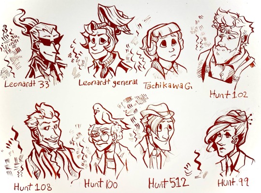
I’ve been drawing with dip pens lately so I did a nib study using my ghost trick redesigns.
for anyone that’s interested here’s some notes on the nibs under the cut.
Leonardt 33 - Easily the one of the most flexible pen nibs I have. Technically this is designed for calligraphy, specifically spencerian, so the sideways movement isn’t great and there’s little control when doing hatching. Really dramatic swoops with high pressure that aren’t entirely appropriate for character portraits but I kinda dig what it did to Sissel’s hair. Will probably use it for special effects like fire and smoke and stuff.
Leondardt 33 - This one is actually intended for drawing so naturally it has a fairly consistent line weight with a low flex. The hatching marks are kinda scratchy but not in a bad way. Would probably work really well for continuous contour and styles of lineart that are more sketchy, loose, and dynamic than my normal character art style. Would prob use for larger pieces or figures closer to the camera cause the line weight is generally a bit too thick for the usual size I work with.
Tachikawa G - This is a nib made for drawing manga specifically and it’s really easy to use for drawing. Some of the calligraphy nibs really take some thought and careful motor control to look good but this one was forgiving. I see myself using this a lot for really casual art. It was kinda hard to do hatching or filling with this one tho, which was kinda surprising. Very gentle line variance, makes really clear shapes. You can see in the other characters than too high flexibility can make it hard for the brain to turn lines into form so this really mellows it out. Prob best to use this nib to block out the lineart then hatch/fill/detail with others.
Hunt 102 - this is a speedball job made for mapping and oh my god do I love this nib. It’s just so 👌👌👌 on the details??? the line variance perfectly matches the brushes I use on photoshop and it’s just. mwah. it holds onto literally so much ink despite being so tiny. interestingly hatching is unstable but two or three lines together seem to be just fine. Kinda sad that jowd’s hair is a little hard to focus on cause of the variance but with a little practice I can prob find ways around that cause I already know I’m gonna love using this nib for heads and faces. Filling is a bit patchy but otherwise I think this is gonna be my go-to detail nib. (also no jowd isn’t in overalls that’s supposed to be an art apron but with only like the top portion showing it’s hard to tell.)
Hunt 108 - ok this is Supposed to be a drawing nib as well as a calligraphy nib and it does mimic brush strokes but I’m pretty heavy handed so it’s hard Not to make those super thick lines. Not bad with details and has enough control to make thickening up the outline super easy, but really easy to mess up. This nib did Cabanela dirty by flexing a bit too much when I was doing his mouth so I had to correct it with a white pen. Spreads the ink too thin in areas for solid filling. I can see this working really well with mixed media, like with watercolor, and once I get some more colored ink I’ll use it for coloring.
Hunt 100 - idiot stupid rat bastard of a pen nib. ok the art looks fine right? can’t be that bad, right? it took me so long to make that because the ink just. wouldn’t come out. so this nib is another mapping nib and it’s super delicate so it breaks really easily. I broke my first one bc I’m heavy handed, so I ordered another like ‘ok I’ll be more careful with this one’. it broke again. I don’t even know how. Ideally I’d use it for small spaces or reeeally fine details but I can’t even get it to work long enough to try. speedball can meet me in the pits.
Hunt 512 - A calligraphy nib that’s actually really easygoing to draw with. There’s not much line variance, so the hairlines have a lot of control. Makes for really good hatching. Also does really great long, thin lines. Sideways movement is kinda meh but it does the job. Definitely the cleanest looking of all them, tho the lack of variance makes it a bit boring to look at. Gonna use this one for shading and textures or for drawing on really rough paper.
Hunt 99 - like the first nib this one is really dramatic, and it’s supposed to be a calligraphy nib, but it has a lot more weight control than the hunt 108. Also the fine lines are easier to control. A lot of ink comes out so it might not be great on paper with risk of bleeding, and it takes a while to dry compared to others, but it would be good for filling since it can cover a large opaque space while having good control over the shape and points. Could also use for different warping/texture techniques.
Other notes:
I used smooth illustration Bristol for the paper, since ink looks more vibrant and swooshy on it and also some of these nibs can Only be used on smooth paper.
Also used terracotta India ink, which is kinda on the thick end but still looks good. matches with the colored lineart in Ghost Trick lol
got all of my pen nibs from Paper & Ink Arts cause u can order a nib for like less than a dollar fifty each. You can also get paper, nib holders, and ink for a good price too.
if u wanna start with dip pens PLEASE prepare your nibs before drawing. stick them in a potato for like 10 minutes. please trust me on this you will have a bad time otherwise.
ok thanks for reading through my Very Indulgent experiment.
#ghost trick#my art#idk maybe this is a bit unconventional for fanart#but I think a lot of ppl only ever post super polished art and not the experimental stuff#which gives ppl who want to start drawing the idea that every drawing has to be a finished one#and that everything you post has to get likes#sometimes art is about the journey#. . . ok my cat just died so maybe I’m being all maudlin and philosophical to cope but still#this is also here cause I could find jack shit useful reviews for pen nibs#so Hopefully this can help ppl that want to try dip pens but don’t know how#feel free to reblog if you want to reference or share the info on nibs lol#character design#traditional art#nib review
64 notes
·
View notes
Note
sorry it took me ages to get around to this (shakes fist at life in general) but here i am with some trademarks of your art!! obviously i think of your extremely feral scrunkly lady noire as a trademark but you already know how much i love her heeheehee!!
i think what makes her feel so scrunkly though is the way you use lines - your lineart is both clean and sketchy at the same time, like every line feels deliberate and as though it's been put down very carefully to create a specific effect, but it's also full of energy and a life of its own! like the lines have just jumped from pen to page and it's so impressive that you can make your lineart feel carefully crafted, effortless, and wayward all at the same time!!
however having just rambled about lines you also do amazing lineless work!!! i really love your style when you use blocks of colours but because you choose the tones so carefully and place them so precisely it doesn't feel blocky! it feels smooth and natural and effortlessly minimalist despite requiring a lot of talent!! hmm...maybe your trademark is how effortless your art feels despite using complex techniques and obviously requiring a lot of careful thought? because that's definitely something i notice regardless of style!!
another big characteristic of your art for me is Fashion - not only are you able to put incredible looks together, but your art style really reminds me of the sketches fashion designers make!! (i think i mentioned this before and you said you wanted to be a fashion designer as a kid so it makes sense!!)
also in terms of specific features - a mask that looks like two parts that *just* meet in the middle is definitely one of your trademarks!! also girls with 50s pin up vibes!! oh and That Outfit with the stripey shirt and trousers/skirt with a patch (with big stitches...kind of like your lady noire!! was it inspiration??)
i feel like i could babble on about your art trademarks for a long time because you use lots of different styles and they're all unique to you and have their own individual trademarks!! your art is just very special imo!! *cradles it protectively in my hands*
omg hi cory!!!!! teehee im so happy that so many ppl assosiate lady noire with my art!! (also, do not apologize!!!! *joins you shaking your fist at life*)
AAAAAAA THANK!!!!! lineart is something ive definetely struggled with in the past, so im SO SO SO SO INCREDIBLE HAPPY that it comes over as sketchy but also clean!!! gah cory. you are gonna kill me with all these compliments!!!!! and i love how you describe it as having a life of its own- i usually like using my lineart as more of a ''guide'' as to where im gonna put the colours, then like. a template to fill in i guess??? NOT SURE HOW TO EXPLAIN IT LMAO BUT IM GLAD YOU LIKE IT
AND THANK YOU!!!!!! omg i feel like such an imposter rn lol, i always eyeball stuff HOWEVER it is definetely a Struggle to have stuff not look blocky if you for exampe have two similar in value/darkness colours next to each other so im rlly happy that my art feels smooth and nice!!!! thank you!!!! and !!! AAAA that means a lot!!! its definetely not something that id be able to put my finger on myself but you described it perfectly!! not sure about the careful thought part tho, my brain while drawing is half somewhere entirely else and half like. ah yes. Vibes. No no not like That. YES. hmm. lines. no., Hmmmmmm.. !! you give me too much credit lol <3 but im glad that ive succesfully created the illusion that i in fact do Think about what im drawing
EEEEEeEEEE ty!!! FASHION!!!! fashion has definetely had a huge influence on how and what i draw so it makes sense that thats reflected in my art!! and haha ty, im glad you like all the fits i put together!! :D
and teehee YES i LOVE drawing masks that way!!! and That Outfit!! now that you mention it, YEAH it IS kinda like lady noire!! it wasnt inspo tho! (at least not consciously)! also, its rlly interesting that you said that you get 50's pinup girl vibes from my art!! i dont rlly see it, but it does kinda make sense bc i always loved the vibrant colours and vibes from them!!
WAH THANK YOU!!!!!! cory im cradling YOU gently in my hands
Whats my art trademark?? (ask game!)
#i think its v funny how im putting that copied super normal sounding ask link right after 5 full paragraphs of me saying Stuff as if im don#e and back to normal again#(im not)#anywyas. tags.#ask#ask me anything!#ask game
8 notes
·
View notes
Text

Decided to jump on the bandwagon and try out a challenge as something to do aside from preparing for NaNoWriMo next month, so here’s my start to OCtober, the prompt list and creator found HERE on Twitter!
Day one was ‘First OC’, and for me that was a tossup between Sera or Mako - And since I’m pretty sure I had Sera already when I met @velveteenlop, it had to be the sakura blossom herself. <3 Sera may not be my first, but she’s the oldest I can remember, and one I actually still write; I’ll never not love my sweet and kind flower and her gentle nature, even i she has come a really long way since her creation. <3
For day two, the prompt’s ‘Latest OC’, and if we wanna get technical, the last OC I made from the ground up would be Kasumi! Kiku and Takeru’s daughter, Sumi’s a soft and sweet, quiet girl who has a reason for being as quiet as she is, but refuses to talk about it simply because she doesn’t want to drag anyone down, or for anyone to feel bad. Nicknamed Firefly, she really a gentle girl who wants to see everyone around her smile as bright as they can. <3
#Pom Draws#Sketches#OC_tober20#The Hashtag the prompt list's creator was using on Twitter so#Gonna use it myself too <3#Sera#Sumi#YGO OC#Concepts#Because Sumi's look as a teen - and in general really - is stll a concept being worked on by Kasa and I#...Think a lot of my art for this is gonna be generally sketchy stuff tho too#Partly because I love the pencils I've been usng#*using#And partly because I don't have a functioning inking pen I don't think XD
0 notes
Note
the way you draw muscles and anatomy in general is just incredible, so flowy and beautiful. i'd love to be able to do anatomy like you one day, do you do specific studies for it? do you have any advice for drawing muscles (like that naked skydancer for example)?
Hearing this makes me so happy, I love drawing anatomy and hope that usually comes through in my work! Thank you.
To be honest, 90% of the time I’m flying by the seat of my pants when it comes to drawing it ‘correctly’ [that is, as it’d look in real life]. I do studies then and now, but nothing in-debth, though I’ve been tryin’ to correct that lately. That SD in particular was drawn very quickly and is rife with mistakes, hahah. Most of it is style I’ve built up over the past few years, just by drawing werid-lookin’ monsters. The best advice is to just keep at it, but you already know that so…
I can’t teach you how to draw specifically like I do since that’s developed over time and a lot of it is shorthand, but I can tell you what I do & keep in mind when drawing and doing more serious anatomy studies.
1. Having confidence in your lines is one of the most important things and something I stress every time someone asks me for advice. You can’t be unsure in your lines or they’ll let you down. Do a lot of line exercises and build up that muscle memory. Even the most sketchy drawings done in like 5 minutes can look intentional and slick if you’ve got confidence in this area, so just become an expert bluffer.
[personally I love swooshing lines so I zoom out as much as I can w/out losing clarity and just. Swoosh. Swoosh as much as you can. Do as much as you can with a single line.]
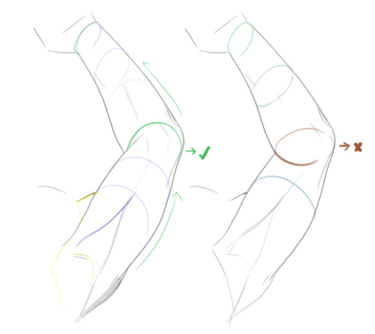
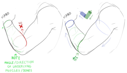
2. In the end it’s all about learning how to stylize the form and deciding how much detail you want to go into. Sometimes I use just a single line to convey muscles, sometimes I go wild with the hatching. Having a strong foundation is important but don’t focus too much on rigidity. Once you’ve got a good idea of what a limb looks like, play around with it’s shape a little, stretch it, squash it, make it look like a twizzler if ya want, and see what looks good to you. A part of what makes my figures look the way they do is that I add some lines that aren’t actually there in real life, but I just think look good. Play around w/ it.
3. A worthwhile thing to practice is basic forms first, just cylinders at various angles. Try to visualize how they’d look in 3D, how your lines would curve around them, think ‘bout how the muscle and skin might curve and wrap around a limb. This post on volume and keeping things in perspective literally changed my life lol. I usually check my forms with some circles these days. The coil technique follows a similar tactic but personally too many circles make my head spin.
4. Save as many reference photos as you can, from as many angles as you can find. What I usually do when studying these is to do an eyeballed drawing of the picture, then do a traced version, compare both to see where I’m lacking and then eyeball it again using what I’ve learned from the trace. Sometimes I hide the reference on the third try just to see what I’ve memorized. Do this as many times as you need until you feel you’ve got it down [but make sure to check yourself or get someone to check for you every once in a while so you don’t keep repeating a mistake]! Don’t ever rely on tracing as a crutch tho, just a note.

5. When studying, use different colors [or colored lines] to isolate the various muscles/parts of the body. I do this on both pictures and my art and it really helps some stuff ‘click’ into place for me. It might also help you memorize the shapes quicker. Anatomy4Sculptors has a lot of good small refs like that [just… not on their official website, everything there is locked behind membership. Use google images or tumblr to find some].
6. Be aware of how limbs overlap. I’m just gonna now its an example here ‘cause I’m bad at explaining lol. It might seem pretty intuitive and easy at more extreme angles but it’s a good thing to keep in mind nonetheless. Keep them cylinders in mind and consider how they’d overlap in simplified forms.
7. When referencing, take note of where each body part is in relation to another [say, how the elbow might be at level with the ear when he arm is raised/angled a certain way].
And. That’s about most of the stuff i try to keep in mind while drawing! I hope it was at least a little bit coherent/helpful, hahah. If you’ve got any more questions abt anything specific I can try to clarify further. [Also just to note, never use other’s art as anatomical reference, even the lil studies I’ve done here, because you’ll just end up copying their mistakes.] You’re welcome to do some private studies of my art style, though, if you want to get the hang of how I place down lines & how I stylize.
#i hope this is what you had in mind! sometimes it's hard to translate my thoughts into words [english especially] :-(#long post#koshkaah speaks#text
103 notes
·
View notes
Last Seen Blogs

bitcoinbenito
Untitled

pawshe
The Most Fabulous

cornodaluvoltaoutravez
CORNO DA LU

likeame
Hotwife Lifestyle

handwelrystuff
Handmade Items For sale