#2. Colour correction
Explore tagged Tumblr posts
Visit Tumblr Blog
Explore Tumblr blogs with no restrictions, modern design and the best experience.
Last Seen Tumblr Blogs


Fun Fact
12.7% of mobile users access Tumblr.
Text
Wedding photo editing and correction in adobe Lightroom.
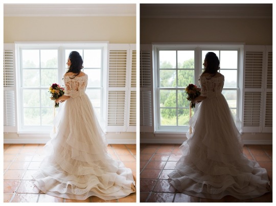
#Color correction presets in Lightroom are a great resource for resolving color issues. The glair was seen in the pictures below. It produced#💌 Get in touch with us and DM me.#Are we the finest? Well#the jury is still out. Provide us with two pictures for trial period is completely free. for Free at [email protected]#1. Crop/Resize photo#2. Colour correction#3. Lighting/Contrast adjustment#4. Detail adjustment#5. Noise reduction#6. Sharpening#7. Create custom filter/effect/preset#photoretouching#photoretouchingservice#photoretouchingservices#ᴘʜᴏᴛᴏʀᴇᴛᴏᴜᴄʜɪɴɢ#photoretouchingserviceavailable#photoretouchingartist#photoretouchingagency#photoretouchinga#photoretouchingacademy#photoretouchingâ#photoretouchingbeautyphotography#photoretouchingbyme#photoretouchingbycourtney#photoretouchingbyjames#photoretouchingbeauty#photoretouchingchallenge#photoretouchingcompany#photoretouchingcourse#photoretouchingclass
0 notes
Text

Commission for @ozzgin :D
#kakuzu#kakuzu fanart#after I've done the lineart I was so scared it'd get messed up :“”)#after scanning it I had to do some colour corrections and my ps kept on chrashing#every 2 min kid you not
520 notes
·
View notes
Text

tell me what possessed me into making this
#I THOUGHT#I THOUGHT HA HA TEE HEE SILLY DOODLE LMAO#BUT NOOO I JUST HAD TO COLOUR IT IN AND GIVE IT A BACKGROUND AND DO SOME LIGHTING AND#THIS ACTUALLY BROKE ME WHY DO I DO THIS TO MYSELF#also i was asking my friend what i should put hajime in and they said 'lol put him in a v-neck'#so i did it out of shits and giggles and IM SO ANGRY THAT IT LOOKS...CORRECT#FUCK HAJIME IMMEDIATELY BECAME THE WORST DR PROTAGONIST#V-NECKS SUCK#(im kidding hajime's currently my favorite protagonist im just mad that he has the actual worst design out of the protags)#this is what we could've had if junko didntSSRKCKCKSVXJZHSJSCK#aiden.png#danganronpa 2#danganronpa: goodbye despair#danganronpa nagito#nagito komaeda#danganronpa hajime#hajime hinata#danganronpa chiaki#chiaki nanami
1K notes
·
View notes
Text
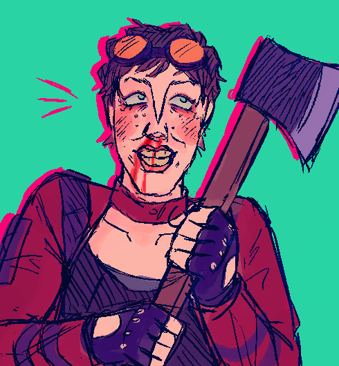
i just think shes neat
#id in alt#ignore the axe please and thank you this was not meant to be good. moreso as a 'lots of feelings' doodle#ive been making a lot of art recently#correction. ive been more nromal about posting my art#also just making coloured stuff#ANYWAYS i like her a lot#patricia tannis#borderlands#borderlands 2#my art
90 notes
·
View notes
Text
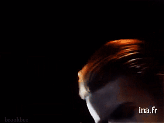
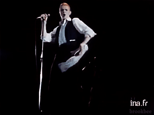

David Bowie performing "TVC15" in 1976
#the colour correcting process on this was kind of wild#the og film seemed to have a cooler colour gamut or at least a bias toward blue#so i did my best to make them look closer to life#but its the best footage of the thin white duke that ive seen i had to make gifs#i made too many tbh considering its only about 1 or 2 mins of footage lol (also thank u danny for helping me choose the best of them!)#station to station#tvc15#isolar i#david bowie#thin white duke#bowieposting#my gifs
413 notes
·
View notes
Text
i think people dont rly like rc2 animated recap animation and ye some of it is p janky but honestly one of my fave canon beau designs
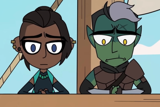
[images: 5 screenshots of Beau in the animated critical role recap.]
#so cute and also shes just so epic .#and i rly like the skin and hair and eye colour that was used#like that is her. thats her nose. thats her messy old eyeliner#its correct 2 me#kiddo say#the pumat sol design is also nice#just watched up to ep95 today while cleaning and walking and im now a beau stan first and a person second .
84 notes
·
View notes
Text


out of context Twitch City (2x05)
#this is surprisingly well-lit. after 2 months (jesus) of giffing discovery i almost cried at how easy this was to edit into a decent look#and this is like. giffed from a very low quality source. i have a personal grudge towards whoever does colour correction these days#and i mean due south can be hella dark but it's still much easier to do than disco was. ditto for HCL and x files and whatnot#so it's not about brightness it's about the weirdass fucking colour and contrast#tf are those people trying to achieve#twitch city#callum keith rennie#c6d#fwgifs
58 notes
·
View notes
Text


changmin & jaejoong, 070922
#jaejoong#changmin#2007#Inspiration for my next project... still wip hehehe#the 2 dreamy princes of dbsk#all of these pics have been edited/colour corrected differently help#soulfighters#minjae
20 notes
·
View notes
Note
Feel like another reason your 4 wouldn't like arsenic is because arsenic would probably go "SCOTTLAND FOREVER" every time she saw your 4

// ough me and Four both- nothing kills me more than hearing a terrible scottish accent- it just sends me lol
#i have no idea if i got arsenics colours correct- i kinda just winged it sorry lol#ask the agents#ask#agent 4#splatoon#splatoon 2#splatoon 3#art
22 notes
·
View notes
Text
I forgot to mention it in the previous post actually but one of the things I’m hyped about for my Kris cosplay is I’ll finally get to wear my prescription dealmakers again.
I really hate going to cons without glasses but I also hate wearing glasses when I’m cosplaying a character who doesn’t wear them, so in 2022 when I cosplayed Spamton I went to one of those cheap online glasses stores & bought 2 pairs of sunglasses in my prescription, one yellow and one pink, then removed and swapped the lenses around so they’d be like Spamton’s. It’s one of the coolest things I own and I never get to use them bc they are a wildly impractical item for everyday wear
#I technically do have 2 pairs of them but idk where the spare is anymore#and of course only one of them could have the colours on the correct sides so the spare is also not perfectly accurate
7 notes
·
View notes
Text
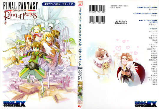
Final Fantasy Crystal Chronicles: Ring of Fates - 4koma Anthology Comic, Volume 2 (Bros. Comics EX/Enterbrain)
Scanned at 600dpi, edited for colour clarity and resized for upload High resolution scans coming in the future
Volume 1 dust cover scans coming soon, colour correcting it has proven difficult as it's printed on textured paper that has yellowed over the years
#final fantasy crystal chronicles#crystal chronicles#ring of fates#sissel's scans#genuinely can not believe enterbrain printed vol 1 on textured paper and then went with gloss for vol 2#the inconsistency is driving me mad#if i can't figure out how to colour correct it properly i might just upload it as-is :v#in other news: i plan on getting my hands on the doremi score book when i have money [Soon (TM)]#i'm also still trying to hunt down the yamaha score book too; i skipped out on the one listed for 80$ a while back :/
12 notes
·
View notes
Text

Some human ducks with a few pride headcannon!
#ducktales#humanized#pride#demonlucy#demonlucy draw#webbie#huey dewey and louie#i did my best to give them 3 flags each#i messed up with 2 of them i was gonna have dewey bi and huey gay but i'd already coloured deweys shirt without thinking#traditional art is so hard to correct and i didnt wanna XD#ducktales 2017#huey duck#dewey duck#louie duck
22 notes
·
View notes
Text
If all the Future Paradox Pokémon “should be Steel/Electric” then all the Past Paradox Pokémon “should be Fighting/Dragon” (they said it themselves when they made all higher BST Past Paradoxes part Dragon and all Past Paradoxes with a direct Future Paradox counterpart (based on the same Pokémon) part Fighting)
#nothing set me off on this I just had a thought#well I guess what set me off on this#was seeing someone say they liked Treads and Crown for a reason that wasn’t “they’re the only ones with the “correct” typing”#paradox pokémon#pokémon#disclaimer: I think they’re all perfect with the typings they have and I love how my favourite Pokémon is a Grass/Psychic robot deer#I also love that it gives me a way to fight back when people say that the Future Paradox Pokémon are less creative#your favourite set is more addicted to the same two types than my favourite set is#(well they do have three Electric-types but they also have more Psychic-types (3) than Steel-types (2))#also I phrase this like I still don’t like the Past Paradoxes I love both sets I just prefer the Future Paradox Pokémon#there’s something fun about glowy robots whose lights come in the colours of the rainbow#but there’s something funner about a trio of psychic robots who (I decided) are in love with a trio of dragon dinosaurs (and vice versa)
2 notes
·
View notes
Text
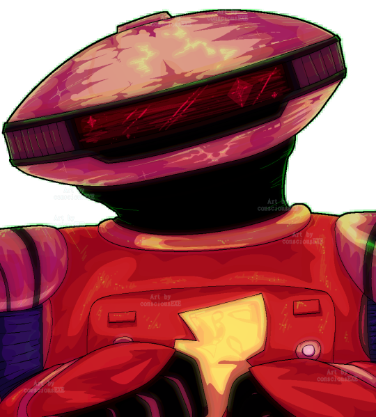
Alpha 5 shaded like how Lethal Company procedurally generates its game shaders!!!
#so how Lethal Company generates its shaders*: 860x520 game res*> realistic shaded layer>dupe of that layer w/ posterisation>light layer>#dupe layer w/ posterisation(bloom w/ lowish opacity)>edge detection to outline objects and folds at close range(5-7ft radius?)>#low opacity fog layer(?)>radial fog layer>weather effects>model layer*>colour correction>game res correction to 1920x1080#*1 this is all from memory from a video Acerola made on the graphics(go check it out pleaase)#*2 this is how the game looks so low quality; it is low quality#*2a its not faked w/ a filter; adds warp to the screen which adds to the vibe somehow#*3 the camera view is actually in the helmet so thats how that works. thats how the cracks on the glass have shading when you move#I love alpha 5#heart emoji#best boy ever#my baby boy#he is so cute look at him#his little head tilts are always going to make me giggle#i love him#pixelart#pixelartist#alpha 5#power rangers#fanart#show fanart#bustshot#shaded#experimental shading style#lethal company mention#consciousexeart
12 notes
·
View notes
Note
This kinda relate to tf2 but may you draw a tc2 character sense i think it would be fun. If you want tf2 request you can draw AdminSniper on a date or something- (:>
I assume you meant typical colours 2? Never played it but I like the agent:>

#art#ask#roger's art#fanart#tc2#typical colours 2#tc2 fanart#agent#tc2 agent#correct me if I’m wrong I don’t know anything about it lol
45 notes
·
View notes
Text
process

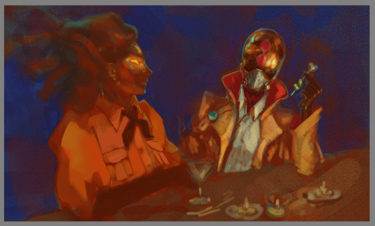

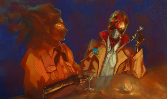
also u may ask me for nuances
#work ain't progress tbh#maybe it would be interesting for someone#yes i use combination of noise layers with gradient map for initial colour correction instead of tweaking colour balance switches#usually it gives a much better and painterly result#sometimes i use a layer with texture for the same purpose#2 perlin noise layers combination sometimes is just mwah
6 notes
·
View notes