#sometimes i use a layer with texture for the same purpose
Explore tagged Tumblr posts
Visit Tumblr Blog
Explore Tumblr blogs with no restrictions, modern design and the best experience.
Last Seen Tumblr Blogs


Fun Fact
Tumblr has 16.74 million mobile monthly users in the US.
Text
process


also u may ask me for nuances
#work ain't progress tbh#maybe it would be interesting for someone#yes i use combination of noise layers with gradient map for initial colour correction instead of tweaking colour balance switches#usually it gives a much better and painterly result#sometimes i use a layer with texture for the same purpose#2 perlin noise layers combination sometimes is just mwah
6 notes
·
View notes
Note
Hello hi I just found out you're the artist of my favorite pic of Jamil from all time 🥹 I absolutely LOVE LOVE LOVE LOVE LOVE LOVE LOVE LOVE LOVE LOVEEEEEEEEEEEEE SO MUUUUCH his bday art from 2020!! It's my favorite one from every art and he looks so pretty and hot and cool and like he's in a music clip and about to drop a fire verse!! I LOVE your painting style so much, as a baby artist, would you one day show us how you color? I'm sure you put so much blood, sweat and tears into your hard work and it would great to get a little bit of that wisdom. Please keep drawing, keep doing what you love because it makes the world a better place to live!
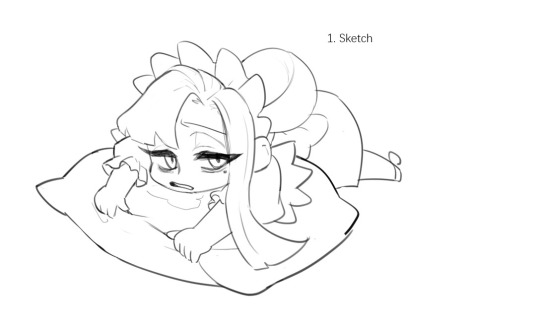
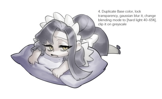
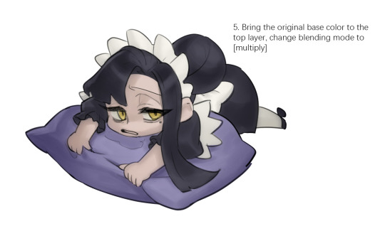
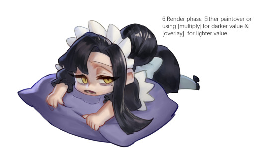

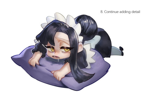
Sketched my sleepy and tired oc to do a very quick demonstration but it covers how I color when i render things:
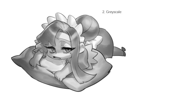
Start with rough greyscale first, it's a good start to roughly decide light direction and value of your overall work. Especially if you have no idea on your shading.
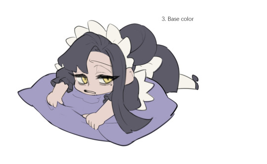
Next, apply base color to greyscale. I'll use gradient map if I want to keep the details of my greyscale. But if not, I'll just start with a flat base color, and try whatever I can to apply color.
Rendering phase. Add layers and just paint on top to refine it. Merge all layers if it's too messy. Then add layers again. My rendering really depends on how much time taken because it's just a loop of paint over and refining. Thats why i do more simple fanart cuz I sometimes get bored of rendering Also at this stage when doing lineless style, I merge lineart with layers and cover up the lines.
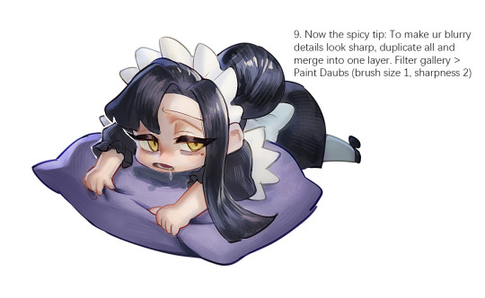
Final touch. Merge all layers and use [filter gallery > paint daubs (brush size 1, sharpness 2)]. It will sharpen your work and look detailed. Or add some very fine noise texture, it will look detailed too.
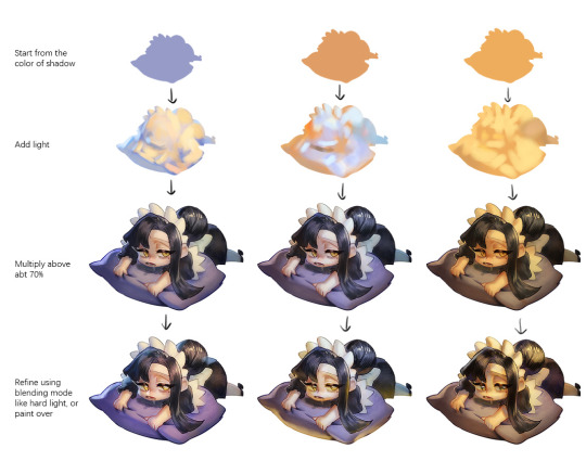
Another very rough demonstration on how i apply color mood. This will be after step 2. And same will be more refining and even paint over to ensure the colors look ok.
Other tips:
Add warm and cool colors especially on skin.
Use pinterest. Always find more than one reference for a subject if you want to draw better than yesterday. Pure ref is a nice tool to gather reference on your pc. When i draw a single hand I had a lot of ref. (pose, color temperature, lighting, photos, artwork, all diff ref)
Color theory is so important I still struggle a lot. I highly recommend beginners start from practicing Marco Bucci's ball practice. After that slowly change to adding character into movie scene and photographs, the purpose is to adapt different color moods and learn the lighting from the image. Learn more from famous movie and cinematic. They did their best to nail the colors.
Anyway,
this is a long answer about how I color. My previous job influenced me so much on coloring so there's a lot of thinking and struggle on my colors.
So, I suggest you be more experimental and try new ways, at the end what remains is what fits you.
148 notes
·
View notes
Text
Welcome back to "Icon Making With Killian: An Intro to the 'Lost' Art of LiveJournal Icons"
aka, you didn't think I was one and done, right?
This tutorial was written in Photoshop 2020, but you can probably recreate it in as far back as CS2-ish (since I still use the same sort of techniques I've been using since then, lmao). It also assumes basic understanding of the software, though I've tried to be as clear as possible throughout.
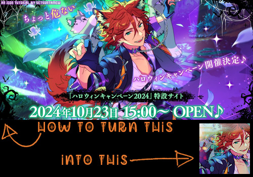
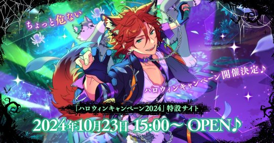
I was possessed with a need to both make an icon of Madara's new event card and then write a tutorial, so let's all be proud that I busted it out before Halloween 💪
I started with the bloomed art of Madara from The Howling Forest★Lupine Halloween event (image from the Halloween 2024 campaign announcement, because the event hasn't started yet).
Since there's a lot of extra text & etc on this, I knew I'd be cropping it pretty close. I started with a blank 100x100 canvas, pasted the original image in, and then resized + rotated it until I liked the composition/crop.

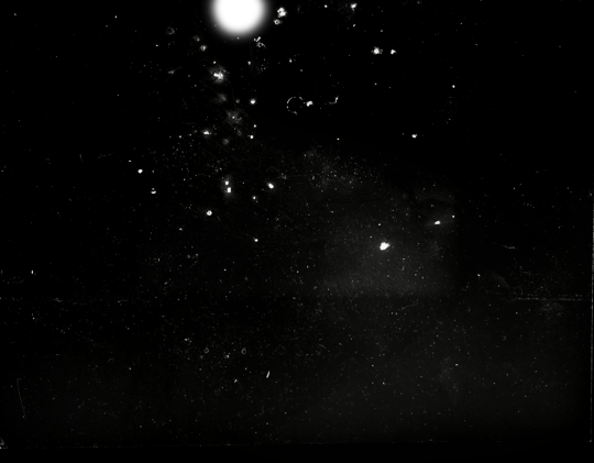
First up, I wanted to get some cobwebs in here (for Halloween!), but didn't want them to overwhelm the whole icon. I used a texture from lookslikerain, set to Lighten, and rotated it a bit before erasing anything covering his face.

Next, I used another texture from lookslikerain and set it to Darken. There's a lot of green in the images for this event and I wanna pull some of that back into the icon, since it most got cropped out.

Time for light textures!!! I used a bunch in this icon~ I started with one from lookslikerain (can you tell I love their resources?), rotated it, and set the layer to Lighten, before deciding that it was too harsh. I used a small, soft brush set to 30% Opacity to erase most of the texture from his face, as well as softening the edges of the light.

The next few light textures are kinda subtle, but overall add to the icon. I'd say sometimes less is more, but I'm a maximalist at heart XD For the next few steps, just assume that the light textures were rotated/resized/moved/etc as I saw fit. I used yet another texture from lookslikerain, set to Lighten, and tucked in the bottom right corner.

This light texture from Sanami276 is also set to Screen. I moved it around to get just a bit of orange in the top left corner- gotta keep those Halloween colors in there!! :D

I wanted some more depth/texture in the upper left corner, so I decided to use part of a texture from Sanami276.
However, it's way to harsh to just throw in there like that...at least not for my purposes. I decided to invert the colors and recolor the black parts orange. My go-to method is with a Gradient Map adjustment layer. The easiest place to find it is in the Adjustments window.
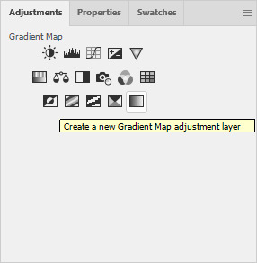
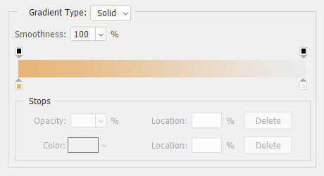
I then used these colors for the gradient itself: #e7b676 at 0% and #ececec at 100%.
And it left the texture looking appropriately orange! I then pasted it into the actual icon, moved it so the rectangles were in the upper left corner, and set the layer to Darken.

Now for more light textures!! I used a couple from ianthinae, set them to Lighten, and went to town. I cut them up, moved them around, rotated them...just about anything to make them fit where I wanted. I love playing with light textures in general, and I find that even when I use similar ones a lot, they can look very different depending on how they're place.

Finally, I used part of a large grunge-y texture that I've unfortunately lost the source to D: I inverted it and set the layer to Multiply, before moving it around a bunch until I found a spot that looked good.
And with that, it's done! You've now got some new skills to make icons with~
If you have any questions, please feel free to ask, and I'll answer as best I can- as long as it's not about making icons in other software D: I only know Photoshop (and Paint Shop Pro, but I don't think anyone uses that anymore). If there are any other icons of mine you're interested in seeing tutorials for - or even just specific techniques! - just lemme know. I love helping :D
Also, I'm happy to share where I get icon resources from. I have a whole post dedicated to that on my DW graphics journal, though tbh that's the best place to talk to me about making graphics in general. But I will absolutely answer asks/replies/etc about icons here on tumblr, don't worry!!!!
#livejournal#icons#tutorials#graphics#icon tutorial#graphic tutorial#photoshop#LJ icons#100x100#100x100 icons#tutorial#reference#halloween#madara mikejima#enstars#ensemble stars
13 notes
·
View notes
Text
game dev/design tips you didn't ask for, at random:
don't start by designing your game around the engine; come up with/refine/design/test your core mechanics INDEPENDENT of an engine and then FIND AN ENGINE that suits your game's purpose! (aka the Reverse Dragon Age Inquisition)
Fun Fact: The devs of Mass Effect said that, roughly, even though there's an equal amount of Paragon/Renegade (aka "good"/"evil") content in ME, 90% of players just chose all the Paragon options every time. Take this shit to heart!! Design choices that go beyond "good" or "bad". Design choices that are interesting and would make an "all good" or "all bad" etc player actually HAVE to choose between more than one option that's VIABLE for the character they're roleplaying! Like, in BG3 terms, no "tiefling village vs goblin camp" choices. I wanna make you choose between keeping Lae'zel and Shadowheart in your party permanently. Don't be afraid to cut off content that players can't all access in one playthrough, but DO hint that the other content is ABLE TO BE ACCESSED if you make different choices!
Don't forget about sound design, especially UI/UX feedback. That shit makes or breaks an environment. Never QA test with your sound off, I can feel my old boss breathing down my neck RIGHT NOW
Organize your production pipeline, no matter how small of a project! I use Trello for producer shit and Jira for my bug list. Familiarizing yourself with how to properly log your own bugs by component and priority is key, especially with more than one team member! (I might actually make a QA megapost sometime ahdjks)
When you do something in the game that you wanna reward your player for (e.g.: selecting a dialogue choice that an NPC approves of! succeeding a skill check! new DM from your crush! you just looted 1 goblin bong! etc), remember to include JUICY FEEDBACK! This is a very unfortunate industry term wherein the JUICY refers to the actual crunchiness of the feedback: A textural response from the player that Feels Good. Like, Candy Crush has the juiciest feedback. Remember: Feedback should include UI/UX/a visual element, sound, be a clear result of a player action, and give a sense of WHAT you just accomplished at the correct SCALE (bigger bang feedback for, like, killing a world boss vs opening a lockpick chest). (You can Pavlov's Dog players into getting hype at repeated sounds by ensuring your feedback retains notes of the same sound or foley, or even just using the same sound fx across different progression points. Like layering in the same chimes with a level-up noise AND when you do something that gets you closer to leveling up, like earning XP)
When designing elements, remember: What does like LOOK like? What does this SOUND like? What does this DO to the world state of the game? What else does this AFFECT? Be cognizant of how stuff can chain affect the tone of the rest of your game!! QA often!!
Achieving a balance between HIDING all the numbers/systems/guts of your game vs having the player be aware of the systems and how they work can be a tightrope to walk! I personally err on the side of Hiding Too Much, but checking in with your testers or players to see if they can "feel" how the game works, or if it makes them get too minmaxy, can be super helpful! Remember to keep your design choices in line with your "x statement" (aka one-sentence directive about what you want YOUR game to be/feel like).
Save a fucking backup zip file of your dev environment RIGHT NOW and put in a separate place from your main PC. Like right the fuck now
#source: i have been doing this since 2008. someone put me in a Hole.#game dev#indie games#oh man this was fun. i am. supposed to be on vacation. take that vacation#I COULD TALK ABOUT THIS ALL DAY. hm. maybe i'll start a game dev blog??#would it annoy you if I talked about this stuff on here??#slasher u
19 notes
·
View notes
Note
Hi, could you tell me how you make your art look textured, like with the white spots and stuff? I'm a novice at art, so I wouldn't know how to look that up, sorry.
It's actually really simple. There's no magic to it. I use the perlin noise filter in Clip Studio Paint to add textures to my figures. Sometimes, I do it as a whole, sometimes I just do it on just the characters.
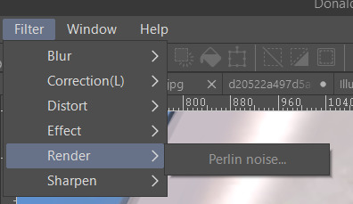
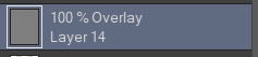
Put it on a layer with the overlay setting.
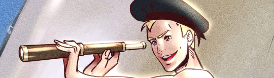
So that it will allow you a certain level of transparency and it wouldn't just look like white noise. So, here's a sample of my work without the effect. On its own it actually looks alright. But I want it get that grainy painting look but if say I was working on a comic? This look is just fine. But, we're not here for that.

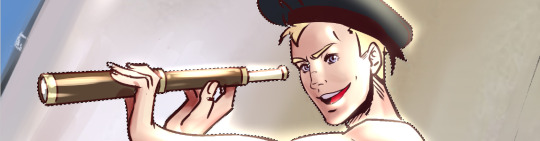
Now, here it is after putting on the perlin noise after some adjustments.
It's got a grittier look.
Take note that when you just apply this to the image, it will cover the whole canvas. If you want it textured on only a certain part of your work, like characters, just a part of the body or maybe the background, there are two ways you can go about this. You can either make a selection.
Or if your figure is one layer, you can duplicate that layer, turn that layer into overlay and then click on this.
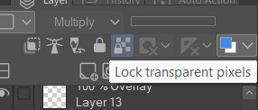
For this, I'll use the selection method. So, let's see how that turns out.
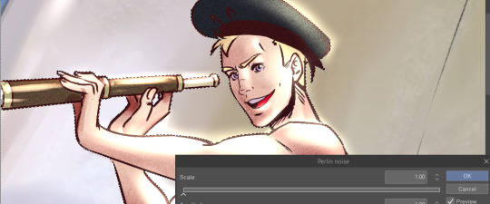
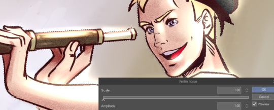
You can do reverse, where it's just the background.

Please do not the follow the values on the boxes here. There is no one single fit and this is just for demonstration purposes. If you don't have this option, you can try adding effects through looking up gritty textures online and applying the same method on your work by putting it on either an overlay layer or multiply layer then playing with the opacity. Don't be afraid of experimenting on your digital canvas. There's so much you can do to add dimension to your work just as there are many ways to tackle an illustration problem! I hope this helped! :)
18 notes
·
View notes
Note
May I ask how you did the edit of Nightcrawler in Uncanny Spider-Man #1?
I liked it a lot
Sure, I've talked about how I do edits before but I can't find that post right now so here's a bit of a quick guide below the cut:
Launch Photoshop or Photopea or possibly GIMP.
Copy/screen grab the panels you want to use and paste them into en empty document. If you're smart you just grab the panels you know you're going to use. I don't.
Remove the background. I use a variety of tools for this, including the polygonal lasso tool, the magic wand and the eraser. How hard this is will depend a lot on the original art. I also sometimes paint over speech bubbles or other stuff like that at this stage. You should end up with something like this (the green is a separate background layer):
4. Create a new document with a width of 540 px (native size for tumblr, divide by half or a third if you're doing several pictures next to each other) and a height of whatever but not too tall, IIRC the recommended max height for one image is 810 px. Create multiple documents if your images are going to be different heights.
5. Paste the picture you want to use into the new document, resize to taste. It should look like this:
Now, from this step forward my process depends a lot on what edit I'm doing and the effect I'm going for, so I'll describe what I did with this edit in particular. I have a bunch of free for non-commercial use textures and assets I use for this purpose, which I've accumulated through the years from sites like Creativemarket.
6. I added a gradient layer to the background, in this case using colours picked from the middle image. I sometimes use online colour scheme generators or just pick something I like too, it depends on the edit.
7. I added a black and white texture image as a new layer. I then added a gradient map to that layer using the same colours as the background gradient, set the layer opacity to 47% and set the layer blending mode to overlay.

8. I added a new texture image with raster dots (you can also make these in PS but I'm lazy so) and set that layer's blending mode to soft light.


And there you have it! I did more or less the same thing for every image in that edit, rotating, resizing and swapping out assets as needed.
8 notes
·
View notes
Note
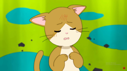
Hello, I really love reading your analyzes of Amane 💓 and I would be very interested to know your opinion about one very interesting moment in Magic. Why do you think not all but the key moments in the video look like a paper cartoon? Moments at the beginning and end where Amane is on the clouds with everyone else; the moment where she treats the cat; her punishments and subsequent transformation. this seems important but I just can't figure it out yet
Oh thanks for the ask! I have an idea for Why their like that but I'm not super sure.
So those parts are depicted like children's storybooks. For a while I've been trying to figure out What Specifically they reminded me of (as the texture used for those scenes seemed felt-like) but then I remembered that when I was younger I had this felt storybook that looked actually pretty similar.
Uh I don't remember what it was called but google gives me this image that looks vaguely like it.


The felt thing might just be me though as this does also look like a papercut illustration...
What this does is lend an additional layer of separation between the real events.
and fiction.
A lot of people didn't realize Amane was Actually Electrocuted for a while and I think that was on purpose. The sheer trauma and Horribleness of the situation being depicted as something unreal and imaginary, abstracted and cartoonified.
This is not the first time Magic does this In The MV see:
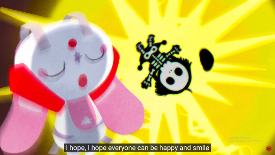
This cat which is both The Cat and Amane Momose.
Or the whole premise of the MV, where it's events are portrayed as a TV Show that Amane is Watching.
Now that explains the later scenes but then we still have the first few scenes to question and to be honest I'm not super sure.
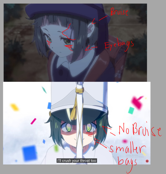
However, Milgram also uses texture/filter to highlight when there is something inaccurate/distorted that the Prisoner Themselves knows is inaccurate/distorted.
We have...a lot of reason to believe Amane is not nearly as good of a girl as she says she is. And if were going off the idea that filters are used to hint at a prisoner's own awareness of an inaccurate depiction of reality then it would make a ton of sense that these shots are done in this style.

With the first half being comfortably placed in the idea that Amane Momose is a very good girl (who just needs to learn sometimes!) and the second half trying it's hardest to distance itself from the Horrible Horrible things that happen during it.
We know Amane is Aware to some extent of the hopelessness of the whole game.

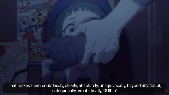
After you cry, repent, and kneel, it’s now your turn to say that hopeless “I’m sorry”
And we know that she isn't fully willing to accept the Bad Stuff that Has Happened to Her.
(...Ive used this Same Diagram three different times but in my defense it works)
Even though we know she is Aware to some extent that it was Bad Stuff.
Amane: Okay! I’m kind, so I shall forgive you. That’s nice, isn’t it? If my parents were in my place, you would have been lectured for another hour.
(I bring up this line so much but in my defense again I love Amane subtly calling her parents mean...I hope she straight up calls them mean and horrible one day)
So it would fit Pretty Well into this pattern Milgram established.
Plus...that first scene also just works Really Well as a children's show opening.
7 notes
·
View notes
Text
Graphic Design Trends (2021–2025) – The Era of Bold, Digital Expression

Welcome to the roaring (digital) twenties! The design landscape between 2021 and 2025 was shaped by a world rebuilding after a global pandemic, a tech boom that refuses to slow down, and the relentless scroll of social media. Designers adapted, rebelled, and redefined beauty, all while juggling Figma tabs.
Let’s break it down.
🔮 1. Maximalism Takes the Stage
Forget “less is more.” In the early '20s, the pendulum swung hard toward maximalism. Loud colors, clashing patterns, excessive layering—if it looked like visual chaos, you were probably on-trend.
Why? After lockdown minimalism and clean lines, people craved energy, personality, and joy in visual form. Brands wanted to stand out in crowded feeds, not blend in.
🧠 Common traits:
Bright neons and saturated palettes
Busy compositions with purpose
Mixed typography (sometimes 4 fonts in one poster—yes, really)
Design as visual rebellion
🌐 2. 3D & CGI Integration
With tools like Blender, Cinema 4D, and even browser-based engines like Spline, 3D went mainstream. Designers embraced realistic textures, fluid morphing animations, and 3D characters that blurred the line between illustration and sculpture.
These assets weren't just eye candy—they brought depth, playfulness, and next-gen branding to websites and digital campaigns.
🛠️ Pro tip: Even Canva added 3D assets. That’s when you know it’s real.
📺 3. Y2K Aesthetic Revival
The early 2000s called—and we definitely picked up. Chrome gradients, glossy UI buttons, pixel art, and glitchy visuals were reborn with a digital twist. This Y2K revival hit Gen Z right in the nostalgia (even if they weren’t born yet in 2000).
📼 Expect to see:
Lens flares and liquid metal text
Checkerboard backgrounds
Cyber-dystopian meets Barbie-core
Notable example: Spotify’s genre art and album covers, especially for hyperpop.
🌈 4. Inclusive, Purpose-Driven Visuals
Social movements translated into visual design. Brands didn’t just want to be seen—they wanted to be seen doing good. Diversity, accessibility, and authenticity became essential—not optional.
👥 This meant:
Diverse skin tones in illustrations
Gender-neutral icons and avatars
Subtitles and text contrast for accessibility
Ethical stock photography and custom character designs
Design had to feel real, not staged.
🎨 5. Flat 2.0 / Semi-Flat Design
Flat design made a comeback, but this time, it had shadows, gradients, and a touch of depth. Called Flat 2.0, it merged the cleanliness of flat design with a touch of realism—perfect for responsive UI and UX design.
Think: Google’s Material Design meets Gen Z TikTok energy.
📱 6. Social-First Design Thinking
Designers started treating Instagram carousels and TikTok covers like gallery walls. Motion graphics, thumb-stopping thumbnails, and infographics reigned supreme. Tools like Figma, Canva, and Adobe Express made social storytelling design more accessible than ever.
🎯 Everything had to pop on a 6.1-inch screen… or be scroll-fodder.
🧬 7. AI-Assisted Design
AI tools like DALL·E, Midjourney, and ChatGPT started influencing the design process—not replacing creativity, but accelerating it. Designers used AI for:
Moodboarding
Generating mockup concepts
Writing UX microcopy
Color palette generation
Cue the existential questions: Am I still a designer if I prompt instead of draw? (Yes, friend. You’re just evolving.)
📡 8. Dynamic Brand Systems
Brands started ditching static logos and embracing dynamic identities. Spotify’s logo? Always the same. But the surrounding graphic language? Always shifting to match mood, genre, or audience.
This approach allowed for flexibility across platforms, especially when brands needed to adapt globally and contextually.
🤯 Unique Fact of the Day
In 2023, Adobe reported that motion design demand rose 78% in just one year. Why? Social platforms prioritized video content, and brands wanted thumb-stopping animations—even for logos. This was the era of "If it moves, it wins."
🧪 Creative Challenge
Pick any two trends above and design a visual that blends them. Example: Y2K color palettes with dynamic brand identity. Or flat 2.0 + 3D mashup. The goal? Make something uncomfortably bold.
Post it. Be loud. Get weird.
https://letterhanna.com/graphic-design-trends-2021-2025-the-era-of-bold-digital-expression/
0 notes
Text
Maximalist vs. Minimalist Fashion: Which Side of the Closet Are You On?
Let me start with a confession: I once wore neon yellow pants with a fur-trimmed denim jacket to a job interview. Did I get the job? Absolutely not. But did I feel fabulous? You bet. That’s the thing with fashion—it’s not always about fitting in. Sometimes, it’s about standing out, or even blending in intentionally.
In this wild world of style, there’s a loud, dazzling debate happening: Maximalist vs. Minimalist fashion. It’s not just about clothes. It’s about identity, attitude, and how we see the world—and ourselves.
So, are you team color explosion or the queen of clean lines? Let’s walk through both wardrobes together.
What Even Is Maximalist Fashion?
If fashion were a personality test, maximalism would be the extrovert who talks with their hands, wears three rings on each finger, and somehow pulls off polka dots and zebra stripes—in the same outfit. It’s big energy.
Where Did It Come From?
It didn’t pop out of nowhere. Maximalist style has deep roots in historical opulence—think Marie Antoinette, Victorian embroidery, or the glam-rock ‘70s. Basically, anytime people had a little extra coin and wanted to flaunt it, maximalism was there.
The Vibe: Loud, Proud, and Layered
Maximalist fashion doesn’t whisper. It struts into a room like it owns the place.
Colors? Saturated and unapologetic.
Prints? Mixed like cocktails.
Accessories? More. Always more.
Texture? Velvet, tulle, sequins—pile them on.
It’s not chaos. It’s organized chaos. Like a jazz solo, it’s got its own rhythm.
Minimalist Fashion: The Art of Saying More with Less
Now flip the switch. Minimalism is the crisp white shirt with a perfect cut. The tailored black trousers that make you look like you have your life together, even when you’re spiraling on the inside.
It’s not boring—it’s intentional.
So Where Did This Simplicity Start?
The modern minimalist wave began bubbling in the '90s. Designers like Calvin Klein and Jil Sander gave us clean cuts, neutrals, and clothes that felt like exhaling. But go back even further—Japanese and Scandinavian fashion have long embraced minimalism as a way of life.
The Aesthetic: Clean, Crisp, Controlled
Here’s what it often looks like:
Monochrome or muted colors (think beige, black, white, maybe olive if we're feeling wild)
One standout piece per outfit
High-quality, long-lasting fabrics
Simple silhouettes that let the person shine through
Maximalist vs. Minimalist Fashion: Two Different Frequencies
These two styles couldn’t be more different, but that’s what makes this fashion face-off so magnetic. One says, “Look at me!” The other whispers, “I’m good with just being.”
Different Philosophies, Same Passion
Maximalists often use clothes to express mood, creativity, or even rebellion. Their outfit is their personal billboard.
Minimalists dress with purpose and restraint. Their clothes serve their lives, not the other way around.
It’s like art—some people love a wild Jackson Pollock. Others prefer a calm Rothko canvas.
So...Why Choose Maximalism?
Because You Want the World to See You
Maximalist fashion is a form of joyful resistance. In a society constantly telling us to tone it down, to be digestible, it shouts back, “No thanks.” You wear what you want, and you own it.
It’s Fun. Straight Up.
You get to play every day. Mix metals. Clash prints. Stack bangles. Who cares? You’re not dressing for rules—you’re dressing for fun.
Why Minimalism Might Be Your Vibe Instead
Because You’re Busy, and You Need Your Clothes to Keep Up
Minimalism doesn’t waste time. You know your go-to pants. You’ve got two great coats. Life’s already complicated—your closet doesn’t have to be.
It’s About Longevity and Mindfulness
Minimalist fashion is often slower, more sustainable. You invest in timeless pieces that won’t go out of style next season. It’s about intention, not impulse.
Not Sure Where You Belong? Here’s How to Find Out
Look in your closet. No, really—go peek.
Is it a riot of color, pattern, and texture? You’re likely a maximalist.
Are your hangers full of structured neutrals and nothing clashes? Minimalist is probably your home.
But maybe you’re both. Maybe you wear head-to-toe black on Monday and floral everything on Friday. That’s cool, too. Fashion’s not prison—it’s play.
Tips for Maximalist Dressing (Without Looking Like a Walking Thrift Store)
Pick a Base Color: Start with one grounding color to anchor the look.
Layer Intentionally: Go wild, but know when to stop. Layer textures, not just patterns.
Statement Pieces Are Your Friends: One bold item can carry an entire look.
Confidence Is Key: If you act like you belong in that neon leopard jumpsuit, you do.
Tips for Nailing Minimalist Fashion (Without Looking Boring)
Mix Fabrics: Cotton with leather, linen with wool—it adds dimension.
Tailoring Is Everything: Fit is what separates chic from sloppy.
Play with Shape, Not Color: Go for dramatic silhouettes in neutral tones.
Less Accessories, More Impact: One sleek necklace beats five random ones.
Can You Be Both? Yes, You Beautiful Paradox
You don’t have to pledge loyalty to one side forever. You can be minimalist at work and maximalist at parties. Or mix them in the same outfit—sleek blazer with a wild scarf? Perfection.
2025’s Hybrid Style Moment
Fashion in 2025 is all about blending. Soft maximalism (bold, but balanced) and bold minimalism (simple shapes, loud colors) are huge right now. You don’t have to choose. You just have to vibe.
Where You Live Might Influence Your Style
In New York? Likely minimalist, tailored, dark. In Seoul? You’ll see layered, experimental maximalism everywhere. In Paris? A little of both—effortless and expressive.
Culture and geography shape what feels "normal" or "daring."
2025 Fashion Forecast: Here’s Where Things Are Going
As individuality reigns, we’re seeing less about “trends” and more about “tribes.” People aren’t trying to follow anymore—they’re trying to express. That’s why Maximalist vs. Minimalist fashion is more relevant than ever.
Expect:
Even more customization
More “fashion personalities” online
A deeper focus on sustainability (even among maximalists)
The Internet Changed Everything
Instagram made maximalism pop. TikTok made minimalism aesthetic. Pinterest lets you curate either world at 3 a.m. The digital space is your mood board now.
And suddenly, we’re all dressing for an imaginary audience—even if it’s just ourselves.
So, Maximalist or Minimalist? Final Thoughts.
Here’s the truth: You don’t have to pick a team forever.
Maybe you feel like a disco ball today and a cloud tomorrow. That’s fine. That’s fashion. The goal isn’t to choose between Maximalist vs. Minimalist fashion—it’s to figure out what lights you up, and wear it unapologetically.
Because at the end of the day, it’s not about what you wear. It’s about how you feel wearing it.
FAQs
Q1: Can I combine Maximalist and Minimalist fashion? Totally. Think of it like sweet and salty—some of the best outfits come from contrast.
Q2: Is Minimalism cheaper to maintain? Not always. While you buy less, you often invest more per item. Quality matters.
Q3: What’s the easiest way to try Maximalism without going full peacock? Start with accessories—chunky earrings, bold shoes, colorful bags.
Q4: Is one better than the other professionally? Depends on the industry. Minimalism often wins in corporate settings, but creative fields embrace maximalism.
Q5: How can I build a minimalist wardrobe from scratch? Start with five basics: a black blazer, neutral trousers, crisp white shirt, good jeans, and one versatile coat.
for more visit jerry&ann
0 notes
Text
35 ways to feel the festive and cheerful mood

Think and decide how I would like to celebrate the holiday.
Understand how you feel and what you want at the same time. It is important to allow yourself to relax and just enjoy life and current affairs without having to fuss and worry like the rest. Let this holiday become for you a time of rest from duties and imposed values. Well, if you still need a festive mood, then we proceed to the following points.
Understand the need for holidays, and their meaning, or put your own into them. It is we who highlight for ourselves how this day may differ from all the others and why it should become special for us.
Holiday home
Music. Music is able to charge the mood in its brightest colors. Evenings seem much cozier, and things get done faster and more fun, acquiring a slight hint of magic and miracle.

Make or buy new toys. This may turn out to be a pleasant family tradition, and each toy will eventually be associated with special memories. Christmas tree. Dress her up in a traditional way, and remember her childhood. Come up with something out of the ordinary and build the most unusual and original Christmas tree. Elegant house. The decoration of an apartment or house does not necessarily have to include sequins and tinsel in all available places. These can be elegant blankets and pillows or individual items of a particular color scheme or color combinations. Rooms can be dressed up quite restrainedly, but simultaneously create incredible comfort and a sense of magic.
Snow. You can cover Christmas decorations with a layer of artificial snow from a spray can. Or use small foam balls for these purposes, scattering them on the windowsill or in a New Year's composition. And for this purpose, snowflakes pasted on glass or painted are perfect.
Candles. Create a festive composition, light candles in the room, turn off the lights and immerse yourself in the atmosphere of warmth and night lights.
Sweets and drinks
Try a chocolate Santa Claus or a rabbit. And do not think that such entertainment is exclusively for children. This taste always returns to childhood. Chocolate patterns always attract. Hot chocolate. A cozy, warm, delicious drink that helps fight a bad mood. A proven method.

Tea with cinnamon. From time to time replaces chocolate and so gives gingerbread! The taste of comfort and winter evenings. Mulled wine. Warms and relaxes. It smells like a really frosty winter and has a festive atmosphere. Gingerbread cookies. They cannot be replaced by any other sweetness. This is a special New Year's treat.
Think over the festive menu by finding new easy and interesting recipes. Take care of the original festive table setting and various small cute things-decorations that can make the New Year's dinner the most memorable. Tableware. All kinds of mugs and plates with festive patterns, textures, and reliefs. New Year's treats. Why not allow yourself to eat whatever your heart desires at this wonderful time?
Cute entertainment
Books. It would be nice to reinforce the winter atmosphere with novels, short stories, or stories about New Year's or Christmas night. Skillful metaphors and epithets are able to convey the mood sometimes even better than our own imagination. Films. Arrange an atmospheric family viewing or immerse yourself in an interesting movie alone. Try various festive goodies, which can be no less enjoyable. City. Take a stroll through the evening city, enjoying the illumination and fantasy city scenery.
Share your inspiration with others. And in the process of expressing and embodying your inspiration in material things, you will suddenly find that you already have a festive mood.
The necessary things
Make a lot of new photos of everything magical and unusual that catches your eye. Add wonder and goodness to our world by doing good deeds day after day. Forgive everyone. After all, this burden on the soul is heavy only for us. And from forgiveness, respectively, first of all, it will become easier and easier for us to live.
Write a letter to Santa Claus. On the most beautiful paper, list all your most cherished wishes and thanks for the past year. Make yourself a gift without fail. After all, who can please us more than ourselves? Learn to dream. In this fertile time for composing desires, it's time to deal with what is really important and necessary. What I would like to think about before going to bed, is what goals to set, and what to strive for in the end.

To carry out a long-planned. At least a minor victory or a load thrown off your shoulders can energize you for several days.
New desktop wallpapers. Another pre-holiday tradition. And no one bothers to do it at least every day. Make a wonderful snowman. If, of course, the weather allows. Get a Christmas wreath. And it is much more pleasant to create it ourselves from everything that only comes into our hands and what our imagination is capable of. Attend a New Year's event. The right company can give you the right mood. Create a Christmas collage and hang it in a prominent place to delight yourself every day.
Great mood
More cuddling. With family, loved ones, and friends. They say that during this process, a decent proportion of endorphins and oxytocin are produced, which give us joy, harmony, tenderness, and tranquility.
Clothing and accessories. All kinds of sweaters with reindeer and Scandinavian patterns, earrings, rings, and pendants in the form of gifts, Christmas sweets, Christmas trees, etc. It's time to get all this out of home storage or get new products at least on the eve of the holidays. Collect photos of Christmas trees. I know that some people have such a tradition: to photograph elegant Christmas trees on the streets of the city, in shops, and shopping centers, or just to collect images of the original and most unusual New Year trees.
Try to create a mood for others. If you don't have it yourself, don't despair. Try to give a feeling of magic to family and friends, friends, or just strangers. To create a feeling of happiness and warmth that will fill the soul with such pleasant sensations that you yourself will not need anything else for joy and a festive mood.
https://elenasunshinemagazine.com/mental-health/35-ways-to-feel-the-festive-and-cheerful-mood/
0 notes
Text


ขนมชั้น (pronounced 'Khanom Chan') is a Thai "layered dessert" that can be described as a coconut jelly with a silky and chewy texture. Khanom Chan is prepared by mixing three types of flour (rice, tapioca, and arrowroot) with coconut cream, coconut milk, and sugar. The already white mixture can be divided and then dyed green by using pandan juice. It is made to have nine layers (alternating between colors, starting and ending with green) since the number nine holds auspicious value as being representative of luck, happiness, and prosperity. The dessert is often cut into green and white squares, but more modern varieties can come in various colors and shapes.

Let's highlight a few scenes...


Once again, there was bit of a mistranslation here between the Thai and the English subtitles. Pin says to Anil, "You've gotten into the habit of surprising people just like Westerners do, do you know that?" Anil responds, "Not only the habit of surprising everyone, my way of expressing love is also like that of Westerners."
Why is this culturally relevant? Long courtships are valued in traditional Thai relationships, and even more so when dealing with arranged marriages between Thai royalty/nobility. Women are not usually so forward with their advances and affection.
I, also, want to talk about public displays of affection (even though Anil and Pin were in private 😜😜😜). We're talking specific to TLP's time period: In 50's Thailand, it was common for couples to link arms or hold hands while out in public. However, kissing (and sometimes even hugging) would be frowned upon as 'improper/impolite' behavior... most especially unacceptable between same-sex couples. (Unfortunately, some of these outlooks have carried over to modern times, as well... depending on the setting.)


The sequence of having these two conversations back-to-back was brilliant storytelling... again, if only to solidify the very different dynamics between each pair based on the core of their characters.
It has been established by now that Prince Anan was the one who, essentially, raised Anil. He is extremely protective of her and often pampers her. When Anil expresses her intention to never be married, he meets her with realistic sympathy and then proceeds to change the subject when he sees her unhappy. Princess Patt, on the other hand, always reminds Pin of her 'duty' and pushes her to follow marriage traditions... regardless of Pin's objections.

Anil is clever in the way she detracts herself from her potential suitors. To avoid being outright and socially rude, she holds herself in a manner that can be seen as unbecoming/unladylike in order to dissuade their pursuance. It's still a very bold move, but not one that any lower ranking suitor would call out for fear of insulting a princess.


I'm including this scene for sociocultural purposes... I SWEAR!!!
Really, though... it's important to note that Pin is very much at the whims of her social circumstances and the series has reminded us of this at every turn. She is reserved and always adherent to social class rules (it's why she never speaks out of turn with Kuea). BUT... this is one of the first instances in which we see her take control. And Anil allows her to. It's a glimpse of a Pin who isn't afraid to go after what she wants. It's also representative of the strong and intimate trust shared between Anil and Pin, in spite of their backgrounds.
👏🏾👏🏾👏🏾 Who ever said love scenes can't hold narrative importance...
#the loyal pin#thai culture#anilpin#koda watches gl#talk thai to me#koda's royal records#(i realized the lotus tidbit from my last post was actually from this 8th episode)#oh well...#it's been a while hehe#the episodes are all jumbled in my brain
94 notes
·
View notes
Text
about a week of stuff I worked on (very long post probably)
We started off the week implementing displacement for our landscape material so our terrain could utilize built-in 3D textures. To do this we had to enable the experimental displacement plugin for Unreal Engine 5. After this we had to enable and build the landscape as a "Nanite Landscape" that could utilize these new textures properly. After this we had to go into the scripting for our landscape material, and as well as plugging in the textures we had to input new parameters to control the displacement.
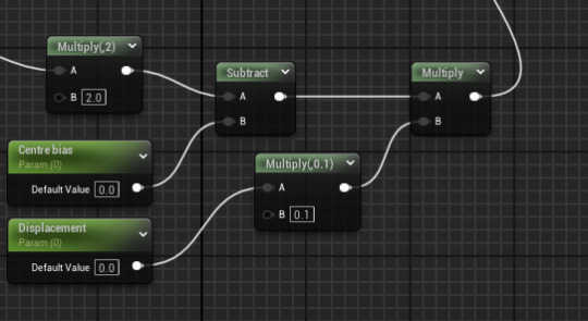
The displacement parameter controls the intensity of the displacement, and the centre bias parameter controls how far up and down from the centre of the landscape the texture is, which needs to be adjusted on a texture by texture basis. after a little while, our tests came out correctly!
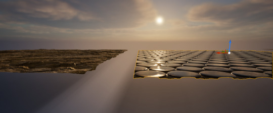
Once this was done we had to individually implement it into every texture of our landscape material.

After this, we began implementing a Landscape Grass Type to populate certain layers of our landscape with grass. To do this we had to create an LGT actor and edit in in this menu.

after adding a few variants and adjusting their density and placement, we attached it into our landscape material through the script which finally got the grass into our world.
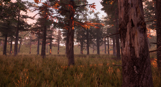
overall the grass looks pretty good in most places, but it does have lighting issues sometimes and looks bad on steep hills, but I'd call this a success. After briefly fixing a lighting problem where foliage trees weren't casting shadows properly (there was just a box we hadn't ticked) we moved on to this week's proper project: a house interior with lighting. First we made a new blank world and added in all the basic lighting and exterior features like the sky and volumetric clouds. After that we installed and atmospheric house kit and began snapping pieces together. This pack was pretty advanced and many of the basic building pieces included variants with different windows or doorframes, which was very helpful.
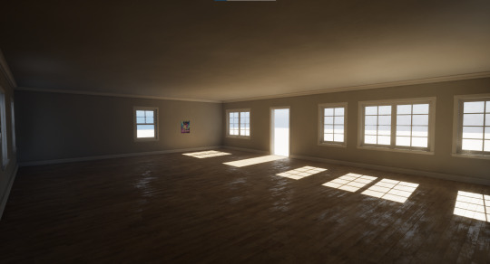
after this we began adding interior detailing touches and interior walls to give the house some interest.

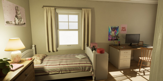
after creating some post processing effects that changed the intensity and quality of the interior and exterior lighting (gotta love God rays) this we began playing around with the blueprints of some of the light assets we'd added, like the table lamp in the dresser shown above, with the purpose of improving their functionality and making their light more customizable, which we did through more scripts.
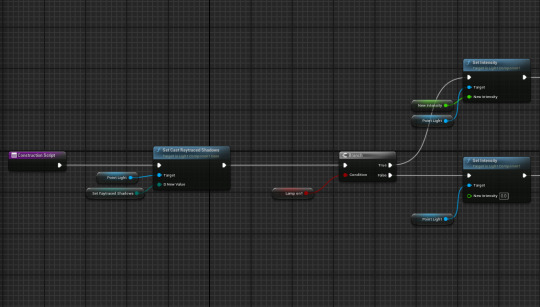
these adjustments allowed us to toggle raytraced lighting on an individual basis which we had implemented that same day, and directly control the lights intensity. After this we created an emissive texture, which resulted in an object emitting a glowing light.
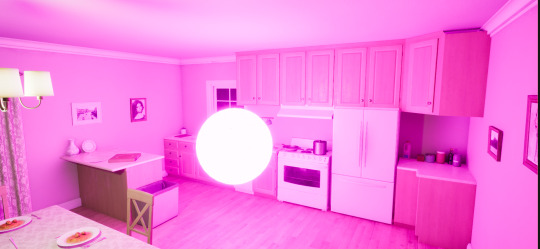
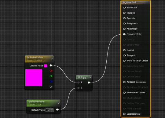
this works pretty much on the same system as other materials except we added extra parameters to control the intensity of the glow. After adding this we removed it from the level and continued on. At this point we experimented with creating a custom decal in Adobe Photoshop and importing it into Unreal Engine. After a few hiccups with file types and figuring out what sort of mask it needed, we were able to add our custom decal onto the wall of our house.
Finally, this morning, after fully furnishing the house, I gathered it all up and and pasted it into my forest along with the interior post processing volume, and it was a great success!
Next we we begin the independent project for this unit!
0 notes
Text
DIY Floral Mobile

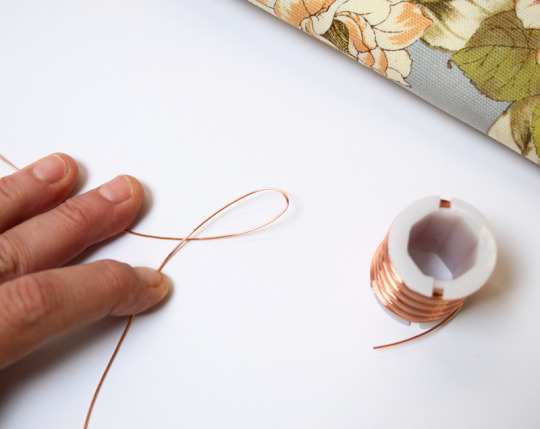
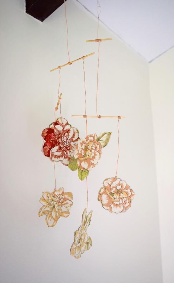
Project by Caitlin Kelch:
In a world of watercolory wisps and geometric forms, I’m counting down the days until this trend gives way to thick, textured paint streaks, crusty from layer upon layer of heavy oils and acrylics. While I love a good color wash, I’m anxious to see a heavier approach as the season changes — and maybe even a move towards more structured patterns and traditional florals. While I’m not much of a painter, I’m pretty handy with fabric and glue, so I thought I’d try to merge some modern materials (copper) with some more conventional florals in a purely decorative, minimalist form. For me, DIYs are all about exploration, seeing what can be made with everyday materials and refashioning motifs that have been absent for a while. I thought to myself, “What would it look like if I mixed wood and copper with traditional florals and an abstract bespoke design?” And so my hanging mobile was born!
I love the fact that it is “reversible” and shows two very different decorative approaches depending on the gauge of wire you use and random movement. It’s exactly the type of subtle movement that I need to gaze at when I need a quick meditation break during the day and I’m not able to get outside. Making this tied in really well with the exercises in my Beauty of Self Care lessons on Patience and Purpose. It’s really challenging to actually sit down with materials and not be frustrated by “mistakes” or disappointed with the finished product — but it’s so worth it. While my mobile may not show up on the pages of a glossy magazine, I love that I took the time to experiment, explore and enjoy the finished product!
If you’re looking to practice a little patience and to let go of expectations, I’d love for you to make this sometime soon. It is a wonderful way to take a timeout to appreciate something that you made in a proud, meditative way. See my full instructions after the jump! –Caitlin
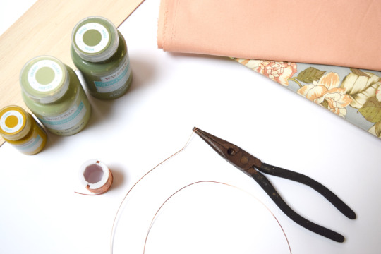
Supplies
Balsa wood panel or sheet
Thin wooden dowel (Chop sticks or twigs can work too!)
Copper jewelry wire (26 gauge is easy to use even without pliers.)
Assorted paints
Floral fabric
Glue
Scissors or an X-Acto knife
Instructions
Step 1: If you’re using a floral fabric, cut out 3-5 flowers from the pattern, cover the back of the fabric pieces with glue and place on the balsa wood. Smooth them so they are flat on the wood. Let dry.
Step 2: While the glue is drying, take out your paints and brushes and mix colors that will either pair with or contrast with the flower or fabric that you’ve glued onto the wood. Once you have a few shades that you like, and the glue is dry, cut out your shapes from the wood with scissors using small snips or with a straight edge.
Step 3: Flip your shapes over and paint the reverse side with your colors. You can also leave the wood unpainted. This looks lovely with the copper wire, too. Let dry. You can embellish this side more if you’d like. I used my balsa wood scraps to make an abstract leaf design by gluing them on top of the paint.
Step 4: Once the shapes are dry, play around with the placement of them to see how they will look when they are hanging. When you have an arrangement you like, snip your dowel in several pieces so you can attach your shapes to them with the copper wire. Lay the dowels down on a flat surface well enough above the shapes that you can use a length of wire to vary the distance of each shape from the dowel. You don’t want all of the wires to be the same length, otherwise your shapes will all be clustered together.

Step 5: Now that you have your shapes arranged on a flat surface and your dowels in place (which they will hang from), cut lengths of the copper wire for each shape you’re attaching. Be sure to add an additional 3″ of wire on each end for wrapping the wire to the dowel and to the shape!
Step 6: Pierce a small hole at least a 1/4″ from the edge of each shape. Insert one end of the copper wire through the fabric side of the shape, creating a small loop on the painted side that will prevent the wire from slipping out of the hole.


Step 7: Wrap the other end of the wire around the dowel. Repeat with each shape. Feel free to hold up the mobile to see how your flat arrangement is working. You can add new tiers and dowels as you see fit. Don’t worry if your shapes are not hanging straight. You can straighten them when you’re finished, before you hang it.
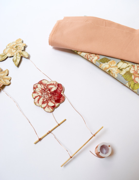
Step 8: Once all of your shapes and dowels are connected and hanging from one dowel at the top, cut a long length of wire the appropriate size for where you will hang the mobile. If you don’t have a spot yet, 18″ is a good length to start with. You can always add or take away length. Make a “rabbit ear” loop, leaving 2″ at the tail so you can wrap it around the loop to secure it. This will be your hanger. Now you’re done! Hang your mobile and straighten any copper wire so it hangs straight. Enjoy!


1 note
·
View note
Note
Rendering tutorial if possible please I need it
urm ive never been asked for a tutorial in my life so im gonna try my best here
um possibly long post?
i start out with base colours

for my shading it depends heavily on the work itself, the colours im using, the atmosphere and all that stuff but i tend to shade with one colour (usually bright pinks and purples or deep reds and blues) and then setting that layer to muliply and fiddling with opacity. for this marina piece i used a deep purpley red for the shadows.
try to get into the habit of drawing where you want your light source of your drawing to be so you can place you shadows accordingly (its guide but doesnt have to be a rule because sometimes i will purposely ignore it if i think the outcome will look cooler.


going in with the same colour i used before i will make darker shadows once again on a multiply layer with a higher opacity than the previous layer.

when it comes to high lighting i do both harsh and soft high lights.
I highlight the the edges of the face and skin. put little lights in the eyes and high light the hair. i didn’t use any layer modes for highlights on the left i just colour picked whats was underneath and adjusted to what i needed.
The right i did use a layer mode, i picked a soft textured brush and picked a light pink colour and splashed colour where ever i thought looked best before setting the layer to add and playing with the settings.


and thats how i render! sometimes i don’t do all of this it all depends on the drawing and my mood but when i do fully render i do it like this :)
1 note
·
View note
Text
29/09/23-making a mark
I decided to utilise the newspaper prints I prepared earlier this week. I have gone against instructions to create pieces of work using mediums I am not accustomed to using. I thoroughly enjoy painting so this will be my starting point just so that I can at least loosen up and get back into the swing of things.
For this painting exercise I decided to create another iteration of previous piece of work I created a few years ago that I had revisited at the beginning of the summer. The below link goes into more detail on the process and my thoughts relating to those works.
Painting exercise…
I found some empty washing up liquid bottles lying around the studio and decided to fill them up with cheap poster paints and water. My plan is to create another vultures/carcass painting by dripping and splashing the paints onto the newspapers.
This isn’t something I have done before but it would allow me to have less control of my paint application. I also don’t know if the paper can handle the amount of paint either because I added quite a bit of water.

I really struggled with getting the placement right, I had very little control over the paint. I had to make a few adjustments such as adding more paint and sometimes diluting it to get the desired consistency to allow me to get better control of the application.
The first mark I made spluttered out and left a lot of blobs where the paint was too thick, despite this I love the effect and the marks made are dynamic and depict movement.

I accidentally shifted the painting so I lost some detail in the left hand section. I intend to try and rectify this once it has dried and probably go in with some emulsion paint; again using the same dripping technique.

Reference photo- accessed 29/09/2023
Summary
Enjoyed the process and not having control
Intrigued to see what this will look like once dry
Happy I’m working on a larger scale, mentioned previously that I struggled to depict the scene on a smaller surface because I felt restricted
Although I am using paint I haven’t used it in this way before, this is the first time painting with household paints. The drying time was much longer than anticipated
I really like the texture of the floor being imprinted onto the paper, it has added another layer.
Purposely limited my palette as I am only interested in mark making
Painting the vultures using the same dripping technique will be challenging
1 note
·
View note
Text
It's an interesting idea, and among your friends it might be fun the same way Holiday Crackers are fun, but I suspect you are missing a couple of elements, one from the scene, and one from the social expectation that make this compromise as unsatisfying as Data's behavior.
In the scene, Data suddenly ripping the paper despite that being pointless is comedic timing. It's intended to make us laugh because it's still not matching the cultural norm, and it's a sudden change in behavior. It's silly and startling, and thus it's funny.
In the (presumably neurotypical) social pattern, the tearing of the gift wrap is a sign of enthusiasm. The wrapping to thoroughly hide is a sign you took time to make sure it would be a surprise. (This is also why there's a whole thing about whether or not to shake the box.)
You did identify the surprise aspect, but not per se why.
People who are upset that a gift is only in a bag are upset the care was not taken to make the surprise exciting.
People who are upset when we (yes, I do this too) open the gift slowly think we're not excited enough about what we're receiving.
In both cases, it's about demonstrating how much we care via the specific rituals of gift giving - and frequently, for people like us, the push back is about missing alternate signals of care. The latter is obvious, and the former we can conclude from that context - but that doesn't make it obvious why what they wanted instead was supposed to demonstrate said care.
For most neurotypical people, as far as I can tell, it's not primarily about the sensory experience of getting to destroy something. That exists in its own right separate from the context, and sometimes people add that layer on purpose as a way of making the overall experience even more exciting, but it's usually a layer of humor when that's added, not an expectation of the gift giving ritual itself.
Of course, there's just people who are super impatient when something doesn't match the pattern in their own head, but I suspect those folks are themselves not adhering to neurotypical social expectations either. Not all neurodivergence matches, after all.
With a certain amount of wry humor over the years, my own family has learned I am as enamored of the gift wrap elements as I am of the gifts - to the point where now it's common that I will be offered the extra paper and trimmings from everyone else's gifts when it's a multi-gift occasion. Nobody who actually knows me is surprised or upset anymore when I am careful to keep as much of the paper reusable as possible.
But I also am not so careful that I try to avoid ripping at all, as I recognize that sufficient care as to avoid any rips at all really does take longer than most people are comfortable waiting for the reveal of the gift, but most folks will wait through you breaking the tape etc. at the edges rather than ripping willy-nilly from the center.
That said, I do not have your aversions to ripping paper in general, as the craft override has been there since I was quite young, and it's clear to my hindbrain from texture that a book is not the same thing as wrapping paper, newsprint, construction paper, etc.
Really, the compromise is that if you receive the gift, it's yours to open as you see fit, and if you give the gift, if there's special instructions for opening, provide them up front, but unless the recipient is opting for a method that is damaging to the gift itself in a way they couldn't know in advance, let them do their thing.
No real compromise is needed, because the goal of ripping the paper off the gift is not for onlookers to have visceral satisfaction that something was torn apart, but rather that the recipient express sufficient excitement and gratitude for the gift.
I stumbled across a .gif today (I've seen it before but had new thoughts so you get to hear them) (For some reason it's not showing up in tumblr .gif search for proper embedding but here's a link if you want to watch it https://tenor.com/view/star-trek-tng-data-present-wrapping-gif-22331742)
It's a scene from Star Trek: TNG where Data is opening a gift. He and five other crew members stand around a table on which there are several other gifts, all still wrapped in shiny silver paper.
He is opening the gift in his hands gently and carefully, without ripping the paper. (This is the way I open presents.)
After an awkward moment of waiting, Wes informs Data that he is "supposed to rip the wrapping off". (This is the criticism I always receive when opening presents.)
Data explains that "with the application of a little care" it is possible to open it without tearing, allowing for reuse of the paper. At this point he has concluded the wrapping removal and places the gift under his arm to leave his hands free to fold the paper neatly. The others look either exasperated or amused.
Wes says he is missing the point. Data looks at him and tears the paper in two, down the middle.
Now. This is supposed to be a scene highlighting the inhuman-ness of Data and the arbitrary-ness of the human social rules and expectations. Obviously there is a clear parallel to neurodivergence here, as I'm sure we all are or know someone who does this.
And yet I still have trouble with the tearing at the end. I couldn't let that go. Yes, it's a waste of all that effort we just went to, and ruining a perfectly functional item, but there was something else bugging me and I couldn't (metaphorically) put my finger on it until just now. And I started thinking about solutions.
Data tears it because he has been informed that there is some arbitrary social rule he was unaware of, and that the others in the room desired the paper's destruction. Even though that seemed illogical, it must be a human thing and ripping it now should make everyone happy, I guess? But it's not satisfying. It doesn't hit the same notes as tearing paper off the gift itself. The process was already completed. The tearing was a second event, not part of the original unveiling.
And I realised that part of my personal issue with tearing the paper, aside from the aforementioned logical reasons, is that it's a sensory issue. I don't like the sound in my ears, I don't like feeling the sensation in my fingers, and as a kid who read thousands of library books, there is a near-moral aversion to the tearing of paper of any kind, because it feels like destroying a book, which is of course unforgivable.
I've done paper-distressing for art projects and such. Distressing [action - synonym "weathering"] is distressing [feeling - synonym "anxiety-causing"]. I can get over it in that context because it's earmarked (oh, yeah, also earmarking aaaaaaaaaaah) for destruction. Post-apocalyptic costuming is supposed to look weathered and torn. Repaired, at the very least. The scroll sitting in a damp cave for years is gonna have rotted edges and funny spots, if it's even still intact enough to call a scroll. They're supposed to be that way. If they were pretty and nice and perfect it wouldn't be right.
The distressing [action] principle doesn't apply to gifts. Gifts are supposed to be nice. When someone gives you a present, it's in nice paper, it's supposed to be pretty. People look down on gifts wrapped "poorly" or in the 'wrong' substance. (This should also be changed btw. Presents you got in a plastic bag are just as good as presents in gold foil. Crumply brown paper with awkward tape or string has revealed some of my very favorite gifts. Thoughtful homemade stuff is awesome. Things received without wrapping at all are still gifts. I'm ranting but you get the idea.) [Also some cultures like wrapping gifts in, say, a useful cloth, such that it's actually two gifts in one. So you get an awesome handkerchief or scarf or whatever too, and that's fantastic, I love that. This post is just talking about the paper ones]
So.
I have physical and mental aversions to tearing paper. When I get a gift, I want to open it gently and carefully and have the wrapping set aside in one piece. (or however many it started with). This takes time, but gives a pleasing result. That is satisfying to me.
Other people, when they get a gift, want to tear up the outside to get to the inside. I theorize that this is some sort of latent hunting instinct, but I digress. It's fast, it doesn't require careful thought, and there must be some level of catharsis in socially-acceptable destruction, maybe even in seeing the pile of shredded remains afterwards? (let me know if you're in this group, what you find pleasing about it! I'm really curious!) Destroying the covering is satisfying to them. The latter group tends to get annoyed at how long it takes for me to unwrap things, and feel unsatisfied with the result, whether or not the present inside was cool or not. Sometimes a person has even taken the present away from me, torn off the wrapping, and then handed it back. Which, Um. I did want to open my own present actually. That was really rude. It's not yours. Especially since they didn't ask first. I've even heard people complain about gift bags (the common response in these situations, as gift bags are not destroyed in the process of revealing their contents, are usually reusable so long as the tag is swapped out, etc.) for being "too easy" or "boring".
Is there a good compromise?
Today, I thought: What if it was a two-part opening? Like, a gift bag with something rip-able to play with, or a wrapped gift with a concealing sleeve or hiding it under the table from myself or something?
So I could unwrap the gift itself, in a way that's satisfying to me, perhaps a little ahead of time so people don't get bored. And then I would hand someone else the rip-able thing and plug my ears. Everyone who wants to, gets to experience the shredding event, and then we do the big reveal! I can open the concealing sleeve or pull it out from under the table or whatever, and everyone gets to have the fun surprise of the actual present all at once!
This way, I would get to have my ritual, and protect myself from the distressing bit. Others would get the catharsis of destruction. All of us would get the exciting surprise at the end.
Do you think this would be fun? Would it hit all the fun/satisfying points for you?
Have you or someone you know done a setup like this before? How did it go? Were there any unexpected problems that came up, or surprising benefits?
Did I say something here that you never realised before that now you have to think about or do something different?
#thoughts#because you asked#ember rants#sort of#wrapping paper#Star Trek TNG (mentioned)#neurodivergence#social conventions
12 notes
·
View notes