#ColorContrast
Explore tagged Tumblr posts
Visit Tumblr Blog
Explore Tumblr blogs with no restrictions, modern design and the best experience.
Last Seen Tumblr Blogs


Fun Fact
Tumblr has 16.74 million mobile monthly users in the US.
Text

A blue sign on a pink-lilac wall contrasts modern urban elements with nostalgic texture, symbolizing infrastructure's role in rebuilding community ties.
#urbanart#colour#photography#publicspace#community#pink#urban#mood#texture#blue#streetphotography#colorcontrast#station#transport
13 notes
·
View notes
Text
🎨 Add Color to Your Life! 🌟
I’m so excited to share my vibrant art with you! From posters to clothing and unique accessories, each design is full of color, personality, and energy – perfect for home décor, gifts, or simply to brighten your day. 💛
🛍 Check out my shop on Redbubble: 👉 Ituria Redbubble Shop
💖 Want more behind-the-scenes content and exclusive art previews? Follow me on Instagram! 📸 Instagram: @klaudiarutkowska
✨ Let art inspire your world – discover something new today! 🎨
#art #redbubble #shoplocal #homeart #uniqueart #colorfuldesign #supportartists #vibrantart #giftideas #homedecor #instaart
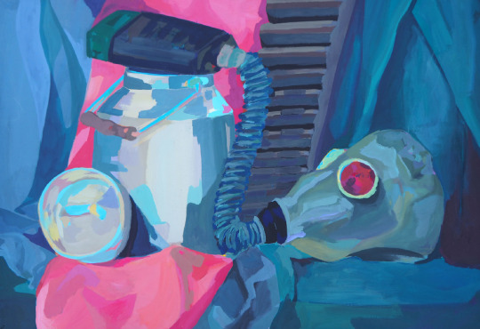
#art process#artoftheday#creativeprocess#instaart#artisticexpression#artinprogress#artistatwork#polishartist#artcommunity#muralart#still life#stimblr#still live#colorcontrast#colors#gas mask#pink#blog
2 notes
·
View notes
Text
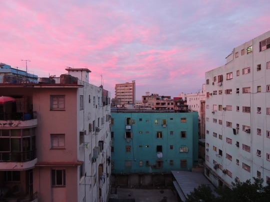
#Photography#UrbanScenes#OldHouses#RedSky#VintageVibes#Architecture#SunsetCapture#Nostalgic#Cityscapes#ColorContrast
8 notes
·
View notes
Text

🚨 Day 7 of 100 Days, 100 Innovations!
Introducing Atikin CodeGalaxy – a sleek, web-based tool crafted for modern developers 🌌
Today’s innovation brings you the Color Contrast Checker, designed to help you build more accessible and inclusive digital experiences in seconds. No downloads. No fuss. Just fast, reliable contrast validation.
🧪 Perfect for UI/UX designers, frontend devs, and accessibility champions. Let your designs shine for everyone! 🌈
#AtikinVerse#atikinextensions#100Days100Innovations#WebDevTools#ColorContrast#AccessibleDesign#AtikinTools
0 notes
Text
"Contours of Light"

This portrait captures the figure of a bald man, where the facial features, particularly the eyes, are subtly defined, allowing the shadows to dominate the expression. Strong, contrasting shadows play across his face: a deep brown tones the cheeks, while cooler blue hues mark the temple area. The use of color-coded shadows emphasizes the planes of the face and creates a dramatic tension between warmth and coldness. This study explores how selective detail and color variation in shadows can shape form, suggest mood, and guide the viewer's focus.
#PortraitStudy#ColorShadows#ExpressiveShadows#MinimalDetail#BaldFigure#WarmAndCoolTones#ColorContrast#EmotionalPortrait#LightAndShadow#ArtisticExploration#ColorTheoryInArt#AtmosphericPortrait#PaintingExpression
1 note
·
View note
Text
Avoiding Common Pitfalls in Mobile App Icon Design
Icon Design Mistakes: Common Queries Answered
1. What are the most common pitfalls to avoid when designing icons for mobile applications?
Common pitfalls to avoid when designing icons for mobile apps include using overly complex designs that are hard to recognize at small sizes, poor contrast that affects visibility, lack of consistency with platform guidelines, ignoring user familiarity with established icons, and failing to consider the app's overall branding. Simplicity, clarity, and context are key for effective icon design.
2. How can poor scalability affect the usability of icons in different contexts or screen sizes?
Poor scalability can lead to icons becoming too small or too large on different screens, making them difficult to see or interpret. This inconsistency affects usability, as users may struggle to recognize icons or understand their functions. Icons that don’t adapt well can lead to a frustrating experience, reducing the overall effectiveness of the interface.
3. What role does color contrast play in icon design, and what mistakes should designers watch out for?
Color contrast is crucial in icon design as it enhances visibility, accessibility, and recognition. High contrast helps icons stand out, making them easier to identify. Designers should avoid low contrast, which can make icons blend into backgrounds, and overly vibrant color combinations that may be visually overwhelming. Additionally, consider color blindness by incorporating patterns or shapes alongside color.
4. In what ways can overly complex icon designs hinder user understanding and interaction?
Overly complex icon designs can confuse users, making it difficult to instantly recognize their purpose. This can lead to misunderstandings about functionality, slowing down interaction and increasing frustration. Complex icons may also detract from a clean interface, overwhelming users with visual noise and hindering effective navigation, ultimately impacting the overall user experience negatively.
5. How important is consistency in icon design, and what are the consequences of failing to maintain it across a user interface?
Consistency in icon design is crucial for user interface effectiveness. It enhances usability by allowing users to quickly understand functions and navigate seamlessly. Inconsistent icons can lead to confusion, misinterpretation, and frustration, ultimately diminishing the user experience. Users may struggle to recognize similar functions or features, increasing the learning curve and reducing efficiency. Consequently, maintaining a cohesive visual language fosters familiarity and trust, promoting user engagement and satisfaction. In summary, consistent icon design is essential for intuitive interaction and overall usability in any digital product.
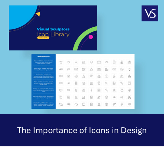
Visit: VS Website See: VS Portfolio
0 notes
Text
Contemporary Living Room with Elegant TV Unit Design
This modern living room blends style and functionality with a stunning TV unit setup. The navy blue textured accent wall adds depth, complemented by a sleek wooden and white floating TV console. Thoughtfully placed open and closed storage shelves enhance aesthetics while maintaining practicality. A chic chandelier with exposed bulbs illuminates the space, adding a warm ambiance. The plush navy blue sofa contrasts beautifully with the vibrant yellow armchair, creating a bold yet balanced color palette. Floor-length sheer curtains filter natural light, enhancing the room’s airy feel. This living space is a perfect example of contemporary elegance with a cozy touch.

#ModernLivingRoom#TVUnitDesign#InteriorDesign#ContemporaryDecor#LuxuryLiving#HomeStyling#LivingRoomGoals#MinimalistInteriors#ElegantSpaces#CozyHome#HomeDecor#FurnitureDesign#AccentWall#LightingDesign#ColorContrast#WudbellInteriors
1 note
·
View note
Text
Снимок, украшающий страницы модного издания, показывает длинные ноги модели с точки зрения зрителя на уровне его глаз. Это произведение в стиле рисованной туши, где сочетание ярких цветов одежды выгодно отличается на фоне мягкой пастели. Модель застыла в изящной позе, словно готовая к движению, украшенная нежными аксессуарами, играющими блеском под светом. Сцена снята в элегантном студийном пространстве с драматическим освещением и загадочными тенями, отсылающими к работам Рихарда Аведона, и призвана восславлять совершенство человеческой фигуры через объектив совре��енной моды…https://forum.yesai.su/gallery/image/27402-elegantnost-v-dvizhenii-modnyy-portret-s-izyaschnymi-aksessuarami-generaciya-iz-neyroseti-midjourney/
0 notes
Text

Geometric Harmony 🌸
.
.
Immerse yourself in the intricate beauty of "Geometric Harmony," a stunning artwork that captures the essence of balance and symmetry. This design features complex web-like patterns that radiate from a vibrant center, creating a mesmerizing effect. Perfect for adding a touch of modern elegance to any space, this piece reflects the harmony and order found in geometric shapes. Ideal for art lovers, design enthusiasts, and anyone looking to enhance their decor with a unique and captivating piece.
Created By EsmArt!
#GeometricArt#Symmetry#MandalaDesign#ArtLovers#ModernArt#AbstractArt#IntricateDesign#Balance#VisualHarmony#DecorativeArt#PatternArt#ContemporaryArt#HomeDecor#WallArt#DesignInspiration#ColorContrast#ArtisticExpression#CreativeDesign#ArtAndDesign#VisualArt#newyork#losangeles#chicago#usa#digital art#artwork#art print#spirograph#artists on tumblr#dreamy
0 notes
Text

🌟 OBEY Season 10: Artistry Meets Athleticism - The Top 9 Unveiled! 🌟
Gentlemen, welcome to one of OBEY's most celebrated challenges ever, "Artsy Athleticism"! 🎨💪 In this spectacular showcase, our nine remaining contestants have transcended the boundaries of creativity to deliver a breathtaking fusion of athleticism and artistry. Abstract forms, intricate portraits, and mind-bending optical illusions have taken center stage in #OBEYseason10, making it a season to remember!
But how does your voice influence the outcome, you ask? It's simple. On Instagram, Tumblr, and Twitter (X), your likes, shares, saves, and comments are your votes. And for the first time ever, we've introduced Instagram Stories voting, where 'Yes' clicks contribute to positive votes, while positive Story votes are adjusted based on the number of negative 'No' votes. Your participation is key to determining the victor! 🗳️📱🌟
Now, let's turn our attention to Marek from Poland, who has harnessed the power of strong, contrasting masculine colors to create a representation that is uniquely powerful and captivating. His artistic vision and athletic talent are on full display in this season of #OBEY, and he's making a bold statement with his exceptional work.
Stay tuned as we delve deeper into the world of artistic brilliance, athletic prowess, and fierce competition. The race for the ultimate OBEY crown is heating up, and each contestant is leaving no stone unturned in their quest for glory! 🌐🔥
#OBEYseason10 #ArtsyAthleticism #VoteNow #MeetTheContenders #ColorContrast 🎨🏋️♂️💫
20 notes
·
View notes
Text

Red and Blue – a study in contrast and expression
These two paintings explore the dynamic contrast between red and blue, capturing emotion through bold color blocks and shadowed forms. I wanted to create a sense of depth and intrigue by simplifying shapes yet keeping the intensity of expression alive. This series pushes the boundaries of color and form. Let me know which one speaks to you more – the cool depth of blue or the fiery boldness of red?
For more of my work and process, follow me on new Instagram @klaudiarutkowska
#abstract art#ColorContrast#red and blue#art series#boldart#ExpressionThroughColor#ArtisticExperiment#contemporary art#art process#PainterOnTumblr#TumblrArtCommunity#KlaudiaRutkowska#canvas art#modern art#artexploration#FollowMyArt#ArtInspiration#CreativeExpression#MinimalistArt#PolishArtist
6 notes
·
View notes
Text
"Bold Elegance, Timeless Style"
Embrace a bold yet refined look with striking color contrasts and tailored fits. This sleek ensemble ensures confidence and versatility, perfect for day-to-night transitions.
#EffortlessChic #BoldElegance #TailoredLook #ColorContrast #ModernSophistication #DayToNightStyle #ConfidenceInFashion #ChicOutfits #RefinedFashion #VersatileWardrobe

0 notes
Text
October 9, Day 282/283
Day 282 2015

Such a beautiful and calming fall sunset tonight
#fall #sunset #sunflowers #wildflowers #beautiful #nature #outdoors #color #picoftheday #project365 #day282
Day 283 2016

All snuggled in
#flannel #fall #cool #purple #green #orange #shadesofspooky #october ##picoftheday #project365 #day283
Day 282 2017

The dog was too close to her.
#notamused #kitty #cat #fishy #catsofinstagram #catober #october #picoftheday #project365 #day282
I have that same look when a man gets too close. haha
Day 282 2018

Today was the perfect day to stay cozy with a good book! 📚❤️
#book #read #perfectdayforreading #favauthor #kenfollett #winteroftheworld #historicalfiction #enjoy #popart #inspiration #wildwarhol #october #picoftheday #project365 #day282
Day 282 2019

Wearing my curves
#beads #beadednecklace #colorcontrast #colors #curves #nationalcurvesday #keepingmycurvestomyself #october #october9 #2019 #nationalday #nationaldaycalendar #picoftheday #project365 #day282
Day 283 2020

Reminiscing about cool, moonlit wintery nights.
#backwhenitwascool #imisswinter #outdoors #nature #fullmoon #tree #sky #silhouette #bright #brick #wall #brickwall #breakthrough #theotherside #october #october9 #2020 #picoftheday #project365 #day283
This was taken at my grandparent's place. I love the moon through the tree limbs.
Day 282 2021

Just being kids remembering when it was cool to pretend to smoke and drink.
#justbeingkids #family #fun #pretend #beforePC #candycigarettes #butterscotchrootbeer #travatostreet #october #october9 #2021 #picoftheday #project365 #day282
Day 282 2022

Decided to play a little 🔮🌅🧜🏻♀️
#galveston #beach #sunset #crystalball #splash #water #shore #nature #october #october9 #2022 #picoftheday #project365 #day282
Day 282 2023

Another beautiful morning being enjoyed
#onespot #seawall #beach #ocean #water #sun #clouds #october #october9 #2023 #picoftheday #project365 #day282
Day 283 2024

Mom’s queen card.
#queen #dailytheme #art #create #color #october #october9 #2024 #picoftheday #project365 #day283
0 notes
Text
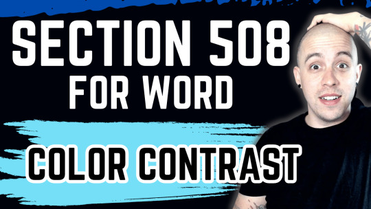
Ensuring Color Contrast Compliance in Microsoft Word | Section 508 for Word
Comply with correct color contrast ratios in Microsoft Word for Section 508 compliance. #Accessibility, #MicrosoftWord, #ColorContrast, #Section508, #DocumentCompliance, #InclusiveDesign, #AccessibleContent, #WCAG, #VisualImpairment, #TechAccessibility
Creating accessible documents involves adhering to modern content standards like Section 508 of the Rehabilitation Act. This post centers on achieving the necessary color contrast in Microsoft Word documents. Not only does this ensure compliance, but it also broadens the content’s reach to a more diverse audience. Video Guide Get accessible documents now Color Contrast in Microsoft…
View On WordPress
#Accessibility#accessibility tools#Color Contrast#Color Testing#Document Compliance#microsoft word#section 508#Visual Impairment#WCAG
0 notes


