#DCTL
Text
Well, Bendy fandom is reacting to Sammy Lawrence's reveal in the new DCTL graphic novel about as well as I imagined

#i'm having the time of my life on twitter rn#it's so hilarious#sammy lawrence#for the record: yeah it's from dream's face reveal#dreams come to life#batim#bendy and the ink machine#dctl#batim dctl#mell speaks
343 notes
·
View notes
Text
Everyone, unanimously, in the batim fandom seeing Norman Polk's (unofficial) design in Dreams Come To Life-
#ever since i saw that book cover I knew it was gonna be awful#batim#bendy and the ink machine#batdr#bendy and the dark revival#norman polk#dreams come to life#batim books#dctl
526 notes
·
View notes
Text

I have nothing else to say
#you can all see what I saw too#batim#batdr#batim kin#bendy and the dark revival#bendy and the ink machine#bendy#dreams come to life#bendy dctl#batim dctl#dctl#sammy lawrence#sammy batim#feels wrong to tag those but apparently this is him (no)
292 notes
·
View notes
Text


SORRY FOR THE INACTIVITY LOL
Here's some graphic novel redraws to make up for it :]
#batim#bendy and the ink machine#bendy and the dark revival#batim au#ask blog#batim art#batim fanart#bendy au#dreams come to life#dctl graphic novel#dctl#batim dctl#batim sammy lawrence#sammy lawrence#batim tom#batim thomas#batim thomas connor#thomas connor#redraw#ink inmersion#batim ink inmersion#batim ink inmersion au#tw: scars
157 notes
·
View notes
Text

oh?
OH?
OH???
AWESOME COOL GREAT,, SO NOW WE HAVE A WHOPPING DING DING, UH, Z E R O CANON BLACK/POC CHARACTERS!!
CAUSE ACCORDING TO MIKE D. HERE, BOOKS AREN'T CANON! JACOB, OUR ONLY CONFIRMED POC, NEVER SHOWED IN BATIM OR BATDR!!!
I feel fucking hysteric right now, you can NOT be serious! You have to be joking!! You HAVE TO BE JOKING.
Real cute that he's using the excuse of him voicing Thomas. Like yes, there's a conversation to be had about white VAs taking roles for POC characters. BUT REALLY??? THAT'S YOUR EXCUSE?? YOU VOICING A CHARACTER WHEN YOU HAD A LIMITED TEAM AND CAST, THAT'S YOUR EXCUSE????????
I'm going. to take this moment to let people educate themselves. I made a post about this before but now's a good time I think.


Educate yourselves, watch these when you can.
Understand that this behavior, while probably some of the worst yet, is not particularly surprising coming from the devs. Particurly Mike.
and please, don't buy that fucking novel. Go read the original or the other two in the series. Adrienne Kress is an amazing author and it's terrible that her talent is wasted on an IP that has creators who do shit like THIS.
#Batim#Dreams come to life#DCTL#dctl graphic novel#bendy dctl#batim dctl#Bendy and the ink machine#bendy and the dark revival#Bendy lone wolf#batds#boris and the dark survival#Roddy Rambles
180 notes
·
View notes
Text
I don’t know how many people this is going to reach but the dctl graphic novel designs are NOT canon please don’t go spreading them like they are.
I know some people don’t have twitter so I’ll just show this

Note that mike’s account is currently deactivated but. This was taken when still active.
When asked about the designs, they’re not canon, just like the rest of the books. Not to mention this book is even inaccurate to original dctl, only keeping the worst parts, such as the god awful Ink Demon characterisation. In the og and in the illusion of living, Sammy is said to be younger than Joey. But here he’s portrayed as older. The books are not only inconsistent with the games but they’re inconsistent with themselves, another reason they’re not canon.
Not my business if you like the book, do what you want, but don’t say these are canon cause they really aren’t.
#batim#bendy and the ink machine#bendy and the dark revival#sammy lawrence#ink demon#ink bendy#batdr#batim dctl#bendy dctl#dctl graphic novel#dctl#dreams come to life#batim dreams come to life
80 notes
·
View notes
Text
I absolutely love the hate on sammys graphic novel design cause I fully agree
But like I DO HAVE A REASON FOR NOT LIKING IT
Personally I just think it's stupid how little it aligns with the hints we're given about his appearance. It hardly even aligns with his description in the book they're adapting him from. He's described as pointy with his nose eyebrows and chin. He's so rounded it's CRAZY and another thing is he's said to have longer hair, that's the reason fan designs have it and nope he's got basic old man hair.
This isn't me saying I don't wanna see him look like an old man cause I do but like not like THAT yk. It just,, doesn't feel like its the same character.
It just like,, feels like they just designed a random old man and went 'yep that works!' With no thought gone into it
Idk though, maybe I'm just being nit picky
Anyway it's real bad but here's my attempt at a redesign based off of canon descriptors

#sammy lawrence#batim sammy#sammy batim#batdr sammy#sammy batdr#bendy and the ink machine#bendy and the dark revival#dreams come to life#dctl#dreams come to life graphic novel#dctl gn
71 notes
·
View notes
Text
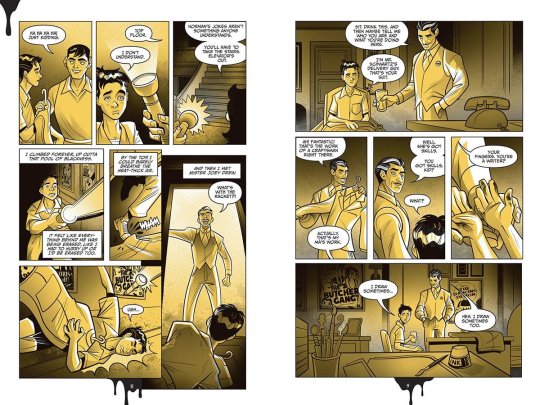
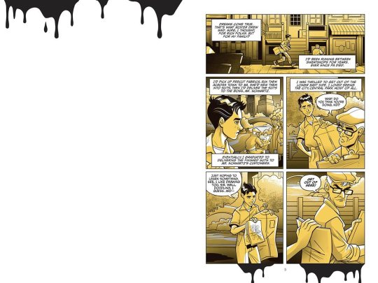
The reason for the broken elevators and Tom's fear
#bendy and the ink machine#bendy and the dark revival#batim dctl#batim#batdr#bendy dctl#bendy memes#dreams come to life#thomas connor#dctl
62 notes
·
View notes
Text
I don't like the dctl graphic novel designs.
So I decided I rather draw my own ones

Behold, Buddy!
Look I kno I'm a bit late to this- but Ill just state my opinion. Buddy's design is alright. It's not ban, just not what I expected. And in some panels he looks much younger or shorter than he is described.. tho wished the design was close to what the fandom had interpreted.
I'm not bashing on the artist , I like his style and work that he had the chance to put effort into- but the art style doesn't fit batim's theme...the piss yellow - I get why they chose it, but I feel like doing it in grey scale or like those old comics with washed out color's here and there-anything but piss yellow plz.
Anywho - I'll probably draw and rant about other designs. Don't get me started on SAMMY -
#i was actually excited about#the graphic novels#now im just disappointed#batim#bendy and the ink machine#bendy#batim dctl#batim graphic novel#dctl graphic novel#dctl#buddy#Daniel buddy lewke#rambles
78 notes
·
View notes
Text

#dctl graphic novel isn't going so well huh#changing thomas (a confirmed black man) to a white man just bc mike voices him#gotta be the stupidest shit ever#literally he's been for years why is it a problem suddenly????#batim#bendy and the ink machine#batdr#bendy and the dark revival#dctl#dreams come to life#dctl graphic novel
86 notes
·
View notes
Text

“Play your part and say your lines, but the director is always in control.”
Because their relationship lives in my head rent free.
Day eight: Line.
54 notes
·
View notes
Text
DCTL Graphic novel is.. not worth it.
Okay so I know we’ve all seen some leaked spoilers of the graphic novel and some people have been receiving them early and let me tell you.. it’s not worth it. I myself haven’t gotten it yet cause it’s still being shipped but atp after I’ve seen what people have told me about it and the spoilers I wish I never preordered it. I’m telling you all please please don’t get it it’s not worth it and please just go and buy the original novel like is accurate and has 10/10 writting.
I know I shouldn’t judge even if I haven’t read it all but I’ve seen enough spoilers to see how poorly done it is, you can already see that the artist have ignored so many of the important stuff there and features on some of the characters it’s crazy. Let’s take Sammy as an HUGE example, buddy described him as very pointy. Like he has a pointy chin, pointy nose and even pointy eyebrows and it was very clearly described in the book but the artist just ignores it. Also Sammy is like 70 or something in the book no no no that’s definitely wrong, cause canonically he was 30 something in dctl. And also that the artist gave sammy an HUGE mask is just living proof that the artist haven’t even seen the games. Like I can’t defend this book no more im sorry😭
I also heard that it didn’t follow the lore exactly but im not sure about it since I haven’t got it yet but still. I’m very upset about it all and especially upset how the game devs just choose an artist who has literally no idea what the games are and literally haven’t even been paying attention while reading.
It crushes hardcore bendy fans who were excited from the very beginning for the comic and now it’s just disappointment.
If theres any bendy fan considering to buy the comic DONT
Buy the original Dreams Come To Life Novel by
Adrienne Kress.
I’m telling you, you will have much more fun and feel more excited to read the original novel with accurate characters instead of whatever dirt bag the graphic novel is‼️
Oh yeah one last thing, I think that were all allowed to ignore the characters in the comic if the artist are gonna ignore the features in the book, I think we all can just make up our own/continue using the designs we already have in our head/drawn instead of having to suck up the inaccurate designs whatever the artist has done for us.
#batim#bendy#bendy and the ink machine#batdr#bendy and the dark revival#dreams come to life#DCTL#bendy dctl#dctl graphic novel#dreams come to life graphic novel#sammy lawrence
46 notes
·
View notes
Text


Still can't get over the fact they whitewashed the only black man in the novel in later pages like. This isn't even lighting man they just made him white.
#batim#bendy and the ink machine#batdr#bendy and the dark revival#bendy#bendy jacob#dctl#dctl graphic novel
179 notes
·
View notes
Note
Do you have human designs for employees?
I do! But only some.
Henry:


His design is still a little fluid but mostly when I draw him I think “rectangle”
Norman:


I like him
Sammy:


I don’t know what to say about him other than he’s a little pointy
Here’s also some of the cast from “Dreams Come to Life”:

And then, of course, Joey:

#ootim#out of the ink machine#bendy and the ink machine#batim au#bendy au#tw cigarettes#cigarette#cw smoking#smoking#tw smoking#cw cigarettes#henry stein#sammy lawrence#norman polk#buddy lewek#abby lambert#batim dot#dctl dot#dctl#joey drew#image description#image described#image description included#image desc in alt text
54 notes
·
View notes
Text
OH GREAT HEAVENS...
ohhh this comic is gonna be the DEATH of me (DCTL COMIC SPOILERS UNDER THE CUT BUT ITS WHATS BEEN LEAKED IG)

CHAT ..... WHAT HAVE THEY DONE TO NORMAN .......
#WHAT HAVE THEY DONE PLEEEASEEE#buddy lewek#daniel lewek#joey drew#batim dctl#dctl#bendy dctl#dreams come to life#dctl graphic novel#dctl comic#dctl buddy#norman polk#norm dont look#wallys warbles#batim#bendy#bendy and the ink machine#bendy and the dark revival
59 notes
·
View notes
Text
I'm flabbergasted, I'm shocked, I'm disappointed, and frankly? I'm indignant.
In a series with so, so very little in terms of representation in canon, a series that had what I THOUGHT was 2-3 confirmed POC (we'll get to that 2-3 bit btw), 1 Jewish man, a handful of women who's writing is hit-or-miss, and no queer characters because according to one of the creators "their identities don't matter"... (Tell that to the straight characters like Henry, Thomas, Allison, Susie, Linda who's not even a character and didn't need to exist in the first place-)
Preview for that graphic novel dropped! Spoilers!!
Norman Polk is white.
I'm. astonished.
For the record, because I know someone will likely bring it up, I am aware that there was never a point in the series where it was ever actually confirmed that Norman was a black man. But it was very much the consensus for most people that he was coded to be POC. To see this is just.. it's disheartening.
Dreams Come to Life seemingly (egg on my face for thinking Norman was black ig???) had 3 POC characters; Norman, Thomas, and Jacob. This was... maybe changed to 2 later on, as JDS went back on coding Thomas as a black man (an announcement they made in a Discord server of all things?? Never publically???) which they may have gone back on again later since the wiki (not official, for the record) recognizes him as black.
3 characters, and we're now down to possibly one; I say possibly because it depends on how Thomas is represented in this book. If he's black, we've got 2. If he's white?
One. One character who's never made an appearance in the games; only in spinoff material in a book. One.
In the simplest way I can put it, I'm upset. There's lots more I can talk about here; how I think this opening is a disservice and bastardization of the original writing for cutting so much out, how while it can look worse (I've read a good handful of fnaf books I KNOW it can look worse) I can't say it really looks any good, how Buddy looks like he's 12, how the yellows are garish and piss-looking.
But what has me the most upset is Norman, because he was 1 of 2-3 POC characters, out of a cast of dozens upon dozens. And sure, there could be more. But we only had 3 confirmed. Maybe 2.
And now we may be down to one.
I actually spoke with my partner a few nights ago about how nervous I was about the graphic novel. Because of how the cover looked, I wasn't expecting anything great. But I knew there was a chance they'd double down and be like 'Nope, actually Thomas is white, always was' I was anticipating that, and I still am.
And I looked at them and told them something roughly along the lines of- "I can live with them making Thomas white, cause of them trying to back-peddle once, I wouldn't be surprised, but I don't know how I'd handle them whitewashing Norman."
I still don't know how to handle it. To say I'm disappointed is an understatement. People have done amazing designs of Norman for AUs and personal headcanons. Hell, all the staff really. And a majority of them, you'll find, are black. Almost everyone thought he was black. Not this pale Afton knock-off (seriously his hair looks greasy as hell, I know it's a stylization of the lighting but it looks gross)
I'm just throwing my thoughts out here for anyone who cares. Maybe most people won't mind, and fine. Again, it wasn't stated, it was seemingly coding, but clearly, we were wrong because he's paler than the fucking moon.
But this is upsetting. This is genuinely upsetting to see. We have so little rep in this series, and the number is somehow dwindling.
What. the Fuck.
#Norman Polk#Batim#Dreams come to life#Bendy and the ink machine#bendy and the dark revival#boris and the dark survival#bendy dctl#dctl#bendy the cage#bendy: the cage#Bendy: lone wolf#Bendy lone wolf#sure we'll add those too#I'm. god I don't even know what more I can say#words can't express the disappointment#Roddy rambles
78 notes
·
View notes
Last Seen Blogs

humansandnatureworld
World Earth Day in andvance of climate change
oceanbeachbulletin-blog
Ocean Beach Bulletin
thememedaddy
memes to show your therapist

tsic-tata
Untitled

stormcoloredrose
yee yee