#DesignReflection
Explore tagged Tumblr posts
Visit Tumblr Blog
Explore Tumblr blogs with no restrictions, modern design and the best experience.
Last Seen Tumblr Blogs


Fun Fact
Mobile Tumblr US users spend an average of 4.04 minutes per session on the app.
Text
WOll Compulsory: In Summary
Looking back at this module, I realise it has become one of the most important parts of my creative journey. World of Ideas and Imagination didn’t just offer theory — it shifted the way I think, observe, and design. It built the mental foundation that now supports everything I do in Studio, Craft, and even Digital Skills
To me, this course felt like climbing a staircase. Each week was a step — sometimes small, sometimes challenging — but each one brought me to a clearer way of seeing. I didn’t fully notice how much I had changed until I looked back and realised: I no longer design just for appearance. I design to express something — with purpose, intention, and meaning (IDEO, 2025).
As I reflected on the 12 weeks, I noticed a rhythm in how the course progressed. I visualised the module in three phases:


picture 1
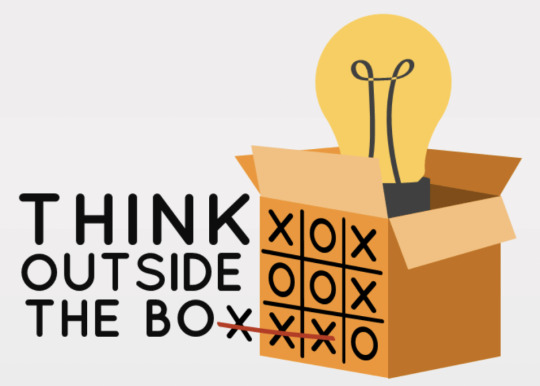
This course helped me move away from designing for appearance, and toward designing for meaning (picture 1). It made me realise that every artistic or design choice is layered with intention, culture, and context — even when we don’t realise it. I began to see design not just as visual problem-solving, but as a way of thinking and communicating.

(picture 2 )Rather than following fixed rules or styles, I now feel freer to think critically, challenge conventions, and embrace complexity. This shift is not limited to one module — it affects how I respond in Studio, how I reflect in Critical Thinking, how I observe in REAL LIFE, and how I approach aesthetics.(picture 2)
Now I feel more confident analyzing artworks, breaking down their composition, color choices, and underlying concepts. This course trained me to notice the subtle choices behind every design — a skill that Elliot Eisner describes as a key goal of arts education. He explains that art helps us notice what might otherwise go unseen, and interpret meaning in subtle forms (Eisner, 2002).
I’ve learned to ask why something was designed a certain way, and what kind of message or feeling it’s trying to communicate.

For example, during the Week 12 Art Ecosystem exhibition, I saw a project about a counseling app that caught my attention. The UX/UI layout was well done and the concept was meaningful—but the color choice felt off. The designer used an intense red to highlight the urgency of mental health support, especially the SOS button. While I understood the intention, I felt the blood-red tone was too aggressive and could unintentionally worsen emotional stress for users who are already in a vulnerable state. It made me realize that even meaningful designs can fail if they don’t fully consider the user’s mental state and emotional response.
(285 words)
Eisner, Elliot W. The Educational Imagination: On the Design and Evaluation of School Programs. 3rd ed., Merrill Prentice Hall, 2002, http://www.daneshnamehicsa.ir/userfiles/files/1/10-%20The%20educational%20imagination%20by%20Eisner,%20Elliot%20W.pdf.
IDEO. “What Is Design Thinking?” IDEO, https://designthinking.ideo.com/. Accessed 13 Apr. 2025.
#communication design#critical thinking#DesignReflection#DesignWithPurpose#GrowthAsADesigner#ThinkingThroughArt
0 notes
Text

Drawing the Unbuilt: A Reflection on Architectural Vision and Contemporary Relevance
In the late 1980s, I was a student in London, working at Skidmore Owings and Merrill, engaged in the design of open public spaces for the water courts of Canary Wharf. At the time, London was in the midst of an architectural transformation, one that would symbolize its global financial ambitions. The project was marked by collaboration with Gabriel Smith and Merritt Bucholz, and beneath the polished exterior of corporate architecture lay a deep undercurrent of political manoeuvrings, ambition, and creative tension.
The drawing I produced, now seen here, was never merely a technical document. It was a narrative, an expression of a vision that was as fluid and dynamic as the space it sought to represent—a market structure with opening roofs and sides, designed to create a flexible, permeable boundary between the interior and the city beyond. It was a conceptual structure, one whose design was as much about politics as it was about function, navigating the expectations of the Reimann brothers of Olympia & York, who sought a new, modern city within a city.
While the building itself was never constructed, the drawing lived on. Combining plan, section, and elevation into one composition, it became more than just a proposal—it was an argument for the role of architectural imagination in the public realm. The project manager, Jeff McCarthy, saw something in it worth displaying in his office. The piece transcended its utilitarian purpose and took on a life of its own, a visual essay that encapsulated a moment in London's architectural history.
Fast-forward to today, and the context in which architecture operates has shifted dramatically. The fluidity and openness imagined in that drawing now resonate in new ways. Contemporary architecture often finds itself caught between the demands of efficiency, sustainability, and rapid urbanization, with the creative process constrained by regulations, market forces, and an obsession with digital precision. The human hand, once the primary tool for interpreting space, has been partially replaced by algorithms and 3D modelling, distancing us from the tactile intimacy that pen and ink once afforded.
Yet, the drawing itself remains timeless—a reminder of architecture's potential to reimagine public space as a living entity, adaptable and responsive. In a world increasingly defined by smart cities and hyper-automation, the ethos behind that market structure—its flexibility, its engagement with the public, its openness—feels more relevant than ever.
Architectural discourse today is at a crossroads. We wrestle with the challenges of climate change, housing crises, and digital dominance. But perhaps the answer lies not just in future technology, but in revisiting the past, in recalling moments like this one, where the hand and the heart guided design. The market structure, though never built, stands as a symbol of architecture’s deeper responsibility: to imagine spaces that serve not just our functional needs, but our human aspirations.
We live in a time when the physical boundaries of architecture are blurring—when buildings are not just structures but platforms for interaction, collaboration, and exchange. That market, in its ideal form, was a precursor to this dialogue, and its spirit lives on in the designs we craft today. In reawakening this drawing, we are reminded that architecture’s greatest strength lies in its capacity to evoke, inspire, and ultimately, to adapt.
The real legacy of that drawing is not in the ink or paper, but in the ideas it fostered, and the possibility it represents for today’s architects—to challenge, to provoke, and to create spaces that transcend the physical, offering instead an invitation to engage with the city in new and unexpected ways.
#ArchitecturalJourney#UnbuiltArchitecture#DesignReflection#CanaryWharf#UrbanSpaces#ArchitecturalVision#ContemporaryArchitecture#DrawingToBuild#SOMLondon#PublicSpaceDesign#ArchitectureAndPolitics#ArchitecturalNarrative#DesignLegacy#architecture#berlin#area#london#acme#chicago#puzzle#edwin lutyens#oma#massimoscolari
0 notes
Text
WOII Compulsory: Week 5 & 6 - Design Analysis and Field Trip
Week 5 (170 words) In today’s session, we focused on the significance of materiality and craftsmanship in design. I brought three personal items: my stainless steel necklace, my fan, and my water bottle. The necklace, worn daily for over three years, has become a part of my identity, representing durability and resilience. Similarly, my fan, customized with a Hachiware sticker, is highly functional, providing strong airflow, while my water bottle, adorned with a lucky charm from Osaka, reflects my personal belief system. These objects highlight the importance of materials and craftsmanship, elevating the functionality of each item. Applying the “How Design Means” framework, I observed that these objects communicate more than just their utilitarian purpose, they reflect aspects of my identity, echoing class discussions on how design can be both practical and emotionally significant (Chandler 87). This reinforces how objects in our daily lives can transcend utility, serving as personal symbols of memory and connection.
Week 6 (160 words) During the Kampong Gelam field trip, I documented various works of design that embody the theme of cultural transformation through materiality and identity. I observed three works that blend tradition with modernity: traditional painted bowls and plates, a mural depicting old Kampong Gelam, and graffiti tags on a nearby wall. Despite their contrasting styles, these works form an interesting grouping under the theme of “Memory and Transformation.” The painted bowls and plates, with their intricate designs, are steeped in cultural tradition, representing continuity and heritage. The mural, showcasing a nostalgic image of Kampong Gelam, reflects the transformation of the district, acting as a collective memory. In contrast, the graffiti tags, often rebellious and transient, symbolize change, voicing the new generation’s sentiments. This juxtaposition of past and present highlights the evolving identity of Kampong Gelam, illustrating how design encapsulates memory, protest, and transformation (Berger 102; Barthes 65). These objects serve as powerful symbols of the district’s social and historical context.
Total Word Count: 330 Words


------------------------------------------------------------------------------
Works Cited
Barthes, Roland. Image Music Text. Fontana Press, 1977.
Berger, John. Ways of Seeing. Penguin Books, 1972.
Chandler, Daniel. Semiotics: The Basics. Routledge, 2002.
------------------------------------------------------------------------------

The Children of Dijon, 1986

"No Man's Land" (2005)

"Personnes" (2010)
#TransformationInDesign#MemoryInArt#DesignAndMemory#KampongGelam#CulturalIdentity#MaterialityInDesign#MemoryThroughMaterial#HistoryAndDesign#ContemporaryArt#DesignEvolution#HeritageAndModernity#ArtAndCraftsmanship#DesignAsStorytelling#MemoryAndPlace#CulturalTransformation#SocialHistoryInArt#CulturalNarratives#PersonalIdentityInDesign#DesignReflections#DesignForChange#MemoryInUrbanSpaces#KampongGelamDistrict#ArtAsProtest#CraftAndTradition#TransformationThroughArt#NostalgiaInDesign#ArtAndPlace#DesigningThePast#DesignInContext#SocialContextInDesign
0 notes
Photo

Contour line drawing and wire work to me require similar kinds of focus to execute: to make every curve count in order to express what you intend to represent on a page or create as a 3D frame of something you imagine. Unlike my work in CNC Milling or even 3D printing to some extent, the absolute minimal amount of material can be used when thin lines are all you work with. As soon as one's pen leaves the page or the jaws of pliers close on the wire, the piece is complete, before you move onto the next flowing form. . . . #wire #wirework #contourlines #reflectiononmaking #wire #whywire #designreflection #minimalmood #simplicity #whitespace #whitewire #maker #making #todayimade #wirecraft #wirecrafting #shortreflections #pliers #wip #workinprogress #materiality #igdaily #instadaily #vsco #minimalismdesign
#whywire#wire#whitespace#shortreflections#workinprogress#vsco#reflectiononmaking#minimalmood#maker#wirecraft#whitewire#materiality#contourlines#minimalismdesign#making#todayimade#instadaily#pliers#wip#designreflection#wirework#simplicity#wirecrafting#igdaily
0 notes
Text
Honestly I’m not sure what I’m doing for this documentation assignment. The examples of observation-->finished product is making me worry that I whatever I find I’ll need to merge into something new in a week, so I keep trying to plan ahead and be super conscious of what’s “worth” recording (ie do I already have ideas for what ____ could become). I think it might be skewing my sense of whether something’s interesting. At least it makes it easier to sort through what I do have.
Some groupings of things I’ve accumulated. Reference photos coming later:
inanimate things that look like faces or people (possibly including car grilles? some of them seem pretty emoticon/animal-like)
ironic pairings of things
textures, surfaces, patterns- I’ll need flimsier paper than the ones in my sketchbook to get some of those rubbings
surprising diversity of manhole covers. not all of them are branded, I wonder whether the texture is a code of some sort
0 notes