#HDR post-processing
Explore tagged Tumblr posts
Visit Tumblr Blog
Explore Tumblr blogs with no restrictions, modern design and the best experience.
Last Seen Tumblr Blogs


Fun Fact
Forty percent of Tumblr users are between the ages of 18 to 25.
Text

Charles goes surfing in Melbourne | AusGP 2024 🇦🇺🌊 via ariannaoioli on tiktok
#charles leclerc#f1#*#**#australian gp 2024#idk if the girlie would want to be gif'ed so this is cropped and very up close and personal lol#thanks for the link emma and thank you beautiful stranger who posted this 💗#you would not believe the trouble i went through for this lol#this was an hdr video so photoshop couldn't process it like standard ones#and there is also no conversion between hdr and sdr videos you have to actually look into how the original one was encoded and go from ther#it was fun tho <3 your girl learned a new trick
1K notes
·
View notes
Text
youtube
Learn HDR photography
#hdr#hdrphotography#high dynamic range#photography#software#post production#post processing#pictures#youtube#social media#digital illustration#art
0 notes
Text
yo @humans (@cyle maybe) asking this out of curiosity based on some behavior i just observed (and im on phone so i cant really investigate this myself) does tumblr preserve video colorspace/dynamic range when processing video uploads?
cause i think i just saw a HDR video on tumblr, based on my low brightness phone screen significantly lighting up specifically in the area where said video was playing and nowhere else (with even darker tones being brighter than regular white in other media posts). would be cool if tumblr did indeed preserve color space (be it on purpose or not :p), but i was just surprised by this observation!
606 notes
·
View notes
Note
hi i'm sorry to bother you but do you have any tips on giffing dark indoor scenes? yours always look so good!
hi there! not a bother at all :) i can definitely try to explain the steps i usually take under the cut!
this tutorial will assume that you already know the basic steps of gif-making — if you don't, there are lots of great tutorials floating around on this site that can help you out! :)
here's the gif i'll work with to explain my steps, the bottom being the original and the top being the coloured/brightened version.
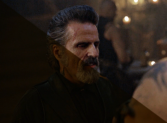
before we start, a general tip i recommend keeping in mind: if you want to brighten a dark scene, you'll want to get your hands on the highest quality download you can find. 1080p is decent, but if your laptop can handle 2160p 4k hdr files* without sounding like it's about to explode, that'll get you even better results!
(*colouring hdr 4k files requires a different set of steps — the scene will appear washed-out on photoshop, so you need to make sure that you don't end up whitewashing anyone if you do choose to work with this type of file.)
since most of my downloads are 1080p, i'll use this type of file in this tutorial.
the first step of my gifmaking process with 1080p files is almost always the same no matter what scene i'm giffing. i make a brightness/contrast layer and set the blending mode to screen:
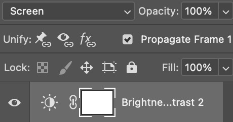
now my gif looks like this:
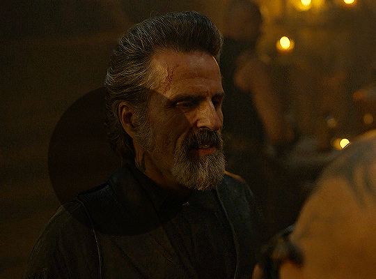
depending on the scene and how washed out it looks after this layer, i'll play around with the opacity. for this gif, i didn't touch the opacity at all. use your best judgement for this, because every scene is different!
i find that dark indoor scenes are usually tinted in yellow or green. one of my first goals is to try to fix the undertone of this scene before focusing on brightening it any further. i go to colour balance for this, and play around with the midtones, shadows, and highlights.
again, every scene is different, so the amount to which you use colour balance will differ, but for this specific scene, my goal was to neutralize the yellow. i focused particularly on the midtones and shadows of the colour balance layer, moving the scales to the opposite of the reds.
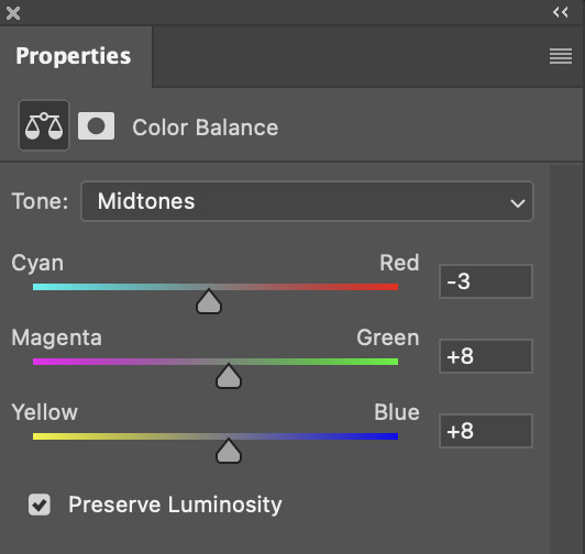
doing so will help with neutralizing the yellow. the only reason i moved the scales towards magenta and blue (therefore making it a bit more red than less) rather than green and yellow in shadows was because i wanted a darker contrast in the blacks. moving them to green and yellow made the overall scene more yellow since there were so many dark spots that shadows affected. (you'll see what i mean when you start experimenting with your own gif — this part of the process really just depends on your preferences!)
our gif might not look that much better yet, but it will soon! our best friend channel mixer is gonna help us out. for an in-depth post about how to use this adjustment layer, i recommend checking out this tutorial.
i'm someone who prefers to make more than one layer for the same adjustment layer for a reason i can't even explain (i just find that it helps me stay more organized). so don't think of this process like i can only use this layer once so i MUST fix it NOW. you can create multiple layers of the same adjustment layer, because every layer on top will affect the ones underneath it.
since my priority is getting rid of the yellow tint, i went to the Blue section of the channel mixer and increased it in all of the scales:
this step alone has helped us out so much, because look at our gif now!
not only does the background look less yellow, but so does izzy's skintone.
now i'm going to focus on trying to brighten the scene even more without destroying the quality. the levels layer can actually help out a lot with this.
the amount to which i move each toggle differs per scene, and i think experimenting depending on your gif works best for this layer.
side note: i prefer not to use the ink droppers on the side because the contrast in the result usually ends up feeling too strong for my preferences, but if you find that this works better for you, then go for it! basically, the first dropper with the black ink should be clicked before you select the darkest part of the scene that you can find, and vice versa for the third dropper with the white ink — click it, and then select the brightest part of your scene.
curves is the next layer that does fantastic work! unlike the levels layer, i do actually use the ink droppers for this. it's the same concept, with the first dropper being used on the darkest part of the scene, and the third dropper on the brightest.
try to think of curves as something that not only further brightens your scene, but also helps with the colour neutralizing process.
i grab the first dropper, then click the darkest parts of the gif that i can see. depending on the undertone of the blacks that you're clicking on, the tint of your gif might actually change significantly. this is why i prefer to click once, then undo the action if i don't like what it gives me. izzy's leather jacket was the sweet spot for this gif.
when i'm satisfied, i make another curves layer and use the third dropper to click the bright/white parts of the scene. for this gif in particular, the lights in the background were a good fit because they carried a yellow undertone — this meant that my curves layer actually helped to further neutralize the yellows in the scene as a whole!
(i manually dragged the curves graph upwards for the third dropper to make it brighter. i don't need to do this if the dropper does this for me automatically, but since the lights were pretty bright, it only changed the tone of the scene and didn't increase the brightness — hence the manual step.)
pat yourself on the back, because this is what our gif looks like now!
this is good, but it's not great — there's still just a bit too much yellow in the scene for my liking (sorry, i'm picky! :P)
i created another channel mixer layer and played with the toggles until i was satisfied:
ta-da! the gif as a whole is much less red/yellow now:
this is when i start fixing the colouring now — namely, his skin tone. selective colour will be your best friend here. i wanted to make his face just a tad brighter and less of a yellow-ish magenta shade, so i focused on the reds and yellows.
then, out of habit, i created another selective colour layer and took out more of the "yellow" in the whites to make them whiter, and increased the black (just by +1, since the contrast is pretty good enough already).
note: i switched to "absolute" for these two colours. basically, relative = less vibrant colour manipulation, and absolute = more vibrant/stronger colour manipulation. i prefer to stick to "relative" for fixing skin-tone since "absolute" can be a bit too strong for that.
our gif looks like this now!

his face looks brighter and much less yellow, so i'm satisfied!
this next step is not mandatory at all — again, i'm just picky and despise yellow-tinted scenes. i personally believe that indoor scenes that are yellow/green tinted make them look more dark than they actually are, so i do my best to get rid of these colours.
i also don't always do this, but for this gif, i just simply went to hue/saturation, selected the yellows from the drop-down menu and decreased its saturation.
be careful not to do this too much. depending on the quality of your download, this can significantly decrease your gif quality. i tend to worry less about this when i'm working with 2160p files, but again, those files require an entirely different set of steps when it comes to brightening/colouring.
since this was a 1080p file download (and one that was actually less than 1GB, oops, don't do that), i played it safe and decreased it by -39 only.
note: you also want to be cautious of colour-washing skintone when it comes to this step. i find that another selective colour layer can help perfect the skintone in case the yellow drains out of it too much, but skip the hue/saturation step if it's too difficult to work with — better to be safe than sorry.
anyway, this is the final gif!
that's usually what i do when it comes to colouring dark indoor scenes! i hope this tutorial makes sense, and if you have any further questions, don't hesitate to reach out! :)
#tutorial#gif tutorial#resources#completeresources#coloring tutorial#allresources#dailyresources#userraffa#userdean#uservivaldi#alielook#usercats#usermoonchild#usernaureen#userbarrow#userabs#useraish#useralison#userisaiah#*mytutorials#i am so sorry if this is incoherent#it’s so hard to explain things coherently 😫
755 notes
·
View notes
Text
How I Scan Negatives
I've been doing film photography for 3 whole weeks so of course I am now an expert and you should toooooootally listen to me for my expert opinion on this matter.
But in seriousness, this post isn't meant to be a how-to guide, but if you can glean some useful information from it, that's really neat and I'm glad.
Part 1: The Scanner
There are a couple different ways to scan negatives. The simplest is known as camera scanning, and that just means you use some kind of backlight and take a close-up picture of a negative with a digital camera of some kind.
I've done a couple of scans like this but since it ideally relies on a macro lens, something which costs about $300 at a bare minimum, and more if you want one that's actually, yknow, good. Also, camera scanning inherently limits you to one picture at a time.
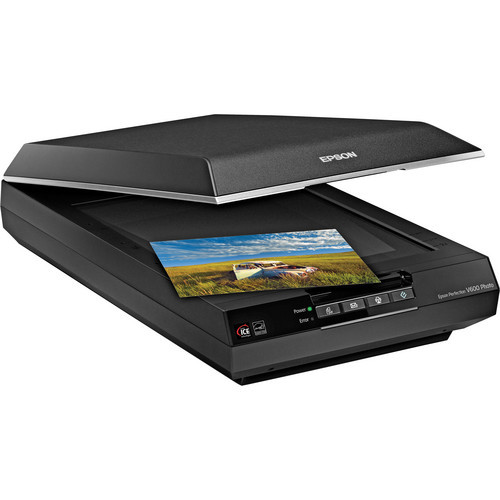
So my scanner is a flatbed Epson "Perfection" V600. I purchased this scanner because it is the least expensive flatbed scanner you can find that also does transparencies. It can scan 12 35mm negatives or two 6x9cm 120 negatives at a time. The Perfection V850 can do a full 36 exposure roll of 35mm but costs 4.33x as much.
So this thing is fine.
The first step is to cut my negatives up. This isn't as horrifying as it sounds. I have binder pages that hold 6 6-exposure strips, so a full roll of 35mm (which i will from here on out refer to with the slightly antiquated but slightly faster to type "135") takes up a single page.
Next, I mount them in the handy negative mounting frame that Epson provides, and put it in the scanner.


Now we can move on to the actual scanning.
Part 2: Scanning Software
This is, without a shadow of a doubt, the most irritating part of the whole ordeal. There's lots of decent scanning software out there, but there's fewer options for really good scanning software. Most of the "automatic" stuff sucks at being automatic so I end up doing most of it manually.
The scanner comes with the inventively named "Epson Scan," which is a very competent program if you want to scan and don't care about dust and scratches on your film. That is because I have yet to figure out what combination of options actually gets it to properly remove dust and scratches. This is mandatory, because I do not have $10,000 to spend on an industrial-grade negative pressure ventilation system for my bathroom/processing lab. Dust is avoidable, but ultimately inescapable.
The ins and outs of dust and scratch removal are interesting but not interesting enough for me to do a deep dive on them. The very short version is that the scanner scans every frame twice, once with visible light and once with infrared, and overlays the information from these to get rid of dust and scratches.
So instead of using the admittedly competent pack-in software, I opted to purchase SilverFast 9 SE. I paid $49 USD for this because I could not find a cracked version of the full-featured "HDR Suite" version and, frankly, i haven't missed the additional features.
SilverFast has a wizard option (Do they still call it that?) that walks you through the various steps of scanning. I haven't used it since my first roll.
The first step is to do a "pre-scan", which just scans the whole thing at a low resolution so you can pick the frames out of the lineup.

This is my screen at this point. The first step is to draw around the individual frames. This takes about 5-10 minutes depending on how anal i'm being about framing and overscan.

Now that i've let the computer pick the frames to save time for demonstration purposes manually picked my frames its time to boost the scan resolution from a postage-stamp 300 pixels per inch to an actually-usable 3200. You'll also note that i'm scanning these as "positives" rather than negatives. The "negative" scan option adds something called "Negafix" that i cannot turn off and that tries to color-correct for the negative stock's film base color. It is monumentally bad at this unless your stock is pre-loaded in its database which, as far as I can tell, hasn't been updated since 2005. We'll deal with that later though.

Now that we have the basic setting defined we go over to the "frame" menu seen above and copy these settings to all frames. I could set them manually, but copying settings over is the one thing this software is good at doing automatically. This may have something to do with the fact that it is essentially copy-and-paste, which you may recognize as a basic feature of every computer since 1987.

Occasionally, and unpredictably, the scanning software will turn on "Unsharp Masking." The wikipedia page on this option will explain it. I will not, because my contempt for the option rivals my contempt for the Republican Party, The Catholic Church, and Portland's insistence on driving 5 below the limit on the highway. I turn it off and if I could i would find whoever invented this option and eat their dog.

Once that is turned off we get to turn on the most beautiful option that SilverFast 9 SE has to offer, iSRD. iSRD is the previously-mentioned scratch-and-dust removal.

I have found that, in this one instance, the automatic settings are completely acceptable to me. They eliminate most of the really problematic dust in high-detail areas. The hairs and dust that gets left behind is usually easy to deal with via clone stamp later.
Now that the boring stuff is out of the way we get to the tedious, yet, to me at least, fun part. Histogram adjustment!


What you're seeing here is a histogram, its a graphical representation of the brightness of an image. Our goal with this is to maximize the dynamic range of the image. All that blank space to the right of the "mountains" (and some of the "lowlands" on the left) need to be eliminated so that the file can use as much of the bandwidth they have for actual useful image file stuff. This is pretty simple. We just slide those little arrows until they bound the mountains better.

Once we do this we can check the output histogram and see how it's mapped all the image data to the full bandwidth.

This has to be done individually per-frame, since each frame is slightly different.
Now that's done we can actually scan. I use the "Batch Scan" function, which scans everything one-after-the-other. I'm not going to show the dialog windows because 1.) its boring and 2.) I don't want to reconfigure the save path the way I did for the above images. It's a privacy thing.
After we've scanned everything its time to move on to...
Part 3: Color Grading
This is the part you've never heard about before. It's the most involved, and the most important, and it's worth getting into why.
Computers are amazing at storing information, at sorting information, at rearranging and processing information, but they are fundementally incapable of the most important part of dealing with information, assigning meaning.
I'm sure a lot of folks are going to be very very angry at me for saying that, but I actually don't care, and what's more, I'm confident the computer scientists I know will agree with me.
Film is better at storing images than computers. Period, this is a physical fact. The amount of dynamic range and resolution contained in film exceeds the ability of computers to contain it completely. So scanning is always going to be about compromises. You're trying to maximize the amount of useful information you can see by eliminating as much of the un-useful information as you can. But the computer doesn't actually know what is and isn't useful, so we have to tell it.
In order to do this, we use image editing software. I know a lot of photographers who swear by Photoshop, but fuck Adobe, and I know a lot of photographers who love GIMP, but GIMP's user interface is so convoluted as to be detrimental to my purposes. So I use Paint.NET, which is Windows-only, a fact which is sure to get me hate mail from several users including one of my best friends. (Sorry, Murder*.)

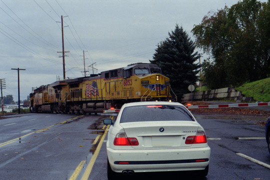
Here we have an unaltered** negative. There's a bit of overscan you can see on the left side of the image, and obviously its currently in portrait orientation. Before we go any further, I'm going to fix both of these things.
I like to crop my negatives in a 3:2 ratio. This is the natural aspect ratio of 135 film, and i like that similitude. Paint.NET lets me set a fixed aspect ratio for selections, which is nice


Now that the overscan has been cropped out and the picture is rotated properly, we can invert the image to a positive, and here is where it will become apparent to you exactly why color grading is important, and why there's no such thing as an "pure scan".

Wow! That's very...blue? Well, yes, it is. Color negative film mostly has an orange base. This helps compensate for shortcomings in the dyes used, and those shortcomings are why we have to color grade. The next step I take is to open the "levels" controls, where you'll see our old friend, the histogram!


This histogram looks different, but it's the same basic concept, with the difference that this program lets me adjust red, green, and blue individually. You'll also note that the individual RGB histograms broadly look similar, just out of sync. This is because of the orange base. They won't always look that similar, and in this case it's largely because the sky was overcast that day and there's a large amount of gray in the entire image.
We're going to adjust the input histogram first. Here, our goal is to map the maximum amount of dynamic range possible to the final image. Color balance is not yet important. So we slide the little arrows up and down from the top and bottom so that as much of them fill the output histogram as possible without clipping.
What is clipping? Clipping is when the black or white levels "blow out". Some clipping is acceptable in some images. A bright, sunny day will invariably have some clipping, and if you go out of your way to avoid it the image will look weird and flat. But in a picture like this where everything is muted and gray, we want to avoid it.

Clipping, by the way, looks like this, and is why i don't let the computer automatically adjust the level balance. Some people like this look with the deep black shadows, I do not.
But, onto doing it the Proper*** way

You can see the image is looking a lot better, but it still has a notably off color cast to the image. Its kind of green. Now we can move on to adjusting the output histogram. There's two ways to deal with this. We can adjust the input red, but this will result in highlight clipping. I actually don't mind highlight clipping as much, and in this case we have several red lights in the image both on the BMW and the crossing gate, so we're going to adjust that input histogram.
Truthfully, I should have thought of this before picking this image to do a demonstration on, but at this point its too late to turn back, and like I keep saying, this isn't a "how-to" guide.

So we still have a bit of a color cast, but its (mostly) in the midtones. Now it's time to bring out our secret weapon: gray balance, also known as neutral point or gray point.

That middle slider can be adjusted for red, green, and blue independently, and that's exactly what we're going to do.

This looks, for the most part, very good. I'll probably go back and tweak the gray points in the red and green a bit more, and i often go through these steps 2-3 times, repeating with finer adjustments before finally confirming the changes.
Truthfully, I don't remember if the BMW was pure white or eggshell white, so i'm going to err on the side of "eggshell" because the rest of the image looks weirder if i adjust for that white to be "pure".
And now, Voila! A fully color-graded image.
Does it look exactly like it did IRL? No, not quite, but again, scanning is all about compromise. I'm sure someone with more experience could do a better job than me, but the point here isn't to show you how to make things perfect, it's to show how I, Ivy Michaels do this.
If you made it through this far, congratulations! I love you! I hope you found this interesting. Thanks for reading <3
*Murder is e's actual name.
** i have censored the license plate of the 25-year-old BMW in my shot out of privacy concerns. It is not my car, and i do not know the owner. The negative has not been cropped, rotated, inverted, or graded in any way. Only the license plate has been removed by select-and-stretch. *** Despite my repeated slides into "we/us" language, this is not a how-to and is not intended to be a statement of objective correctness. It is "correct" in the sense of "correct to my personal workflow"
56 notes
·
View notes
Video

flickr
HDR Cars 2013, Lady in a Hat by Gregory Urbano Via Flickr: 2013 was a breakout year for my photography. I was shooting a lot of car shows and post processing in HDR. This photograph I titled "Lady in a Hat" for obvious reasons. It was taken at a Veterans benifit car show held at the Bay Pines VA in Pinellas County Florida. Shot with a Nikon D5100.
21 notes
·
View notes
Text

A new blog post from BioWare in which they talk about the PC experience for Dragon Age: The Veilguard. The blog covers display features, graphics settings and controls. "We're PC players ourselves and have a dedicated team focused on PC."
"Journal #4 PC Features for Dragon Age: The Veilguard A look into the PC Experience in Dragon Age: The Veilguard Hello everyone, Today, we want to specifically touch on the PC experience for Dragon Age: The Veilguard. The Dragon Age franchise started out on PC, and we wanted to make sure PC is a great place to play our game. Many of us at BioWare are PC players ourselves, and when testing, PCs made up 40% of our platform testing effort, with over 200,000 hours of performance and compatibility testing. Getting the PC experience just right was crucial to us and we created a dedicated team to focus on PC. We can’t wait for you to experience it for yourselves! Let’s talk about inputs first. We wanted to ensure the controls and UI are a good experience for both KBM and controllers; so we did close to 10,000 hours of user research testing to make sure of it. Dragon Age: The Veilguard will feature native support for PS5 DualSense controllers with haptics support in addition to the standard of Xbox controllers & keyboard + mouse. Additionally, you can seamlessly transition between controllers or keyboard + mouse while playing or in menus. There are many different ways to play our game; so, in order to allow you to find the most comfortable set-up, we’ve added the ability to customize class-specific keybinds that you can easily switch between. This means that your Rogue Rook can use a different set of keybinds than your Warrior Rook, if you’d like! Along with the standard resolution options, we also have full support for 21:9 Ultrawide monitors. Don’t worry; we didn’t forget the cinematics, either - just disable the option titled “Cinematic Aspect Ratio.” This will remove the enforced black bars; so you can watch the cinematics in full ultra widescreen glory. No matter what size monitor you’re rocking, you can adjust your FOV with an FOV slider in the Settings. There will be an option for uncapped framerate, as well. We’re also launching with full HDR support. Most changes to Graphics and Display Settings are reflected in real time, and you can see the impacts of those changes through the cutout in the UI. This will help you make informed decisions as you tweak your game to look exactly how you want. For a full list of Settings, check the rest of the blog below! We know a lot of you play on Steam, and we wanted to meet you where you are. We’re happy to be completely Steam Native for Dragon Age: The Veilguard! We’re already Steam Deck Verified; and with Cloud Save on Steam supported, you can seamlessly switch back and forth between your PC and your Steam Deck as much as you want, with no interruption to your progress. We also have Remote Play enabled if you’d rather play on your TV! If you’d like to utilize it, there will be a completely optional linking process to your EA Account."
"If you want to hear about a few advanced settings and options for the PC community, let’s go over that now. We support a suite of Ray Tracing features, as well as an “Ultra RT” mode for extremely high end rigs. We have several types of upscaling available: NVIDIA DLSS 3, FSR 2.2 which has been heavily modified, specifically for the game, and XeSS. We also support DLSS 3 with frame generation and NVIDIA Reflex. As we have more PC features to share, we’ll circle back on those before launch. We’re inching closer to our release date of October 31, 2024! We still have more information coming on Combat, the Companions, Exploration, and more; so keep your eyes peeled on our socials. We are eager to see your battle stations running Dragon Age: The Veilguard and the resulting screenshots. Chat soon! — The Dragon Age Community Team"
"To summarize the above, check out an overview of the PC specs and features we’re ready to unveil now: DISPLAY FEATURES - Full Support for 21:9 Ultra Wide Resolutions - Ability to Uncap Frame Rate - VSync, including fractional rate VSync - HDR Support - Optional Upscaling (DLSS 3, FSR 2.2, XeSS) - NVIDIA Reflex - DLSS 3 Frame Generation - Optional Dynamic Resolution Scaling - Cinematic Aspect Ratio (Disable this option for cinematic 21:9 ratio) GRAPHICS SETTINGS - Presets Available (Low, Medium, High, Ultra) Texture settings: - Texture Quality, Texture Filtering Light & Shadow Settings: - Lighting Quality, Contact Shadow, Ambient Occlusion, Screen Space Reflections, Volumetric Lighting, Sky Quality Ray Traced Settings*: - Ray-Traced Reflections, Ray-Traced Ambient Occlusion, Ultra Ray Tracing Geometry Settings: - Level of Detail, Strand Hair, Terrain Quality, Terrain Decoration Quality, Visual Effects Quality Camera Effects: - Depth of Filed, Vignette, Motion Blur, Post Processing Quality, Field of View Controls: - Class-specific Keybinds, Keyboard + Controller Bindings * Ray Tracing can be “ON” or turned to “Selective”. Selective Mode enables Ray Tracing features in specific areas that can best take advantage of the feature."
[source] <- at the source link there is also some new screenshots/clips
#dragon age: the veilguard#dragon age the veilguard spoilers#dragon age: dreadwolf#dragon age 4#the dread wolf rises#da4#dragon age#bioware#video games#long post#longpost
91 notes
·
View notes
Text
Thoughts and opinion on Switch 2
Before I start, do know I really like tech and generally, I like interesting implemtations of it, so I do have a bias towards handheld consoles in general because they have much more interesting limitations to start with. I'll get all my thoughts, up and down, on the switch 2.
I know the bigger screen does mean more internal area to work with, but how the hell did they manage to keep the thickness nearly identical to the switch 1? Actually impressive, I desperately want to see inside if it is all just because of smaller chip size.
Ok, so where do I properly begin excluding the shock that they pulled off the same thickness? Oh, the screen!
This screen is just a welcome addition overall. 1080p, better brightness and better panel tech that allows for HDR (Microsoft fix your god damn hdr implementation even nintendo has it) while being 120hz and VRR (Nvidia confirmed that it's using their implementation of g-sync via a blog post, here: https://blogs.nvidia.com/blog/nintendo-switch-2-leveled-up-with-nvidia-ai-powered-dlss-and-4k-gaming/). It now matches and slightly exceeds a lot of displays on handhelds now, which funnily enough makes puts it in a similar position as the og switch screen back in 2017, but at least the baseline is much higher so I think this will make the eventual OLED either be more meh, or more better in comparison. It may be closer to the meh side, at least with the first impressions I'm seeing on youtube and seen through my 2013 gaming monitor with clear faded pixels which is it's own issue if I do end up deciding to get a switch 2. Still +$100 I'm calling it. However, the fact it's 120hz natively means that you can now run games at 40fps without screen tearing because it's a clean divisable number of 120, with it looking noticably better then 30fps but not as draining as 60fps or above, which is going to help with more title's battery life. Speaking of Nvidia, let's talk a bit about that blog post.
I do not know how much people like this or not (See recent RTX 40xx and 50xx launches to see how happy people are with Nvidia), but I think they are very much the ideal partners in crime with Nintendo this time around. As long as the Tensor hardware is power efficient enough as they claim, this will just be a boon for handheld gaming times, even if they're stuck at the same 2-6.5 hours as the launch model og switch. It also means it can be updated with time to improve games potentially, so if developers decide to take advantage of it and nvidia/nintendo makes it easy to just update the codebase of a game to get to a never version, we may actually have a case of games becoming more performant and/or better looking with time, assuming they are not running at native 4k already. That's neglecting the processing offloading for stuff like that goofy camera, microphone quality and other stuff

(seriously, if you got a recent enough Nvidia GPU try the Nvidia Broadcast app, it's does basically all the audio/video stuff nintendo showed recently, but now with a focused platform I think this is going to become excellent)
oh ya, it is odd that the stream from friend's framerate is like 12 fps, best guess there is because it uses the on board video encoder and decoded to handle it, and if each is a seperate channel, along with one for background recording/screenshots, plus whatever the games may need for their own dedicated use, I am not too surprised it got the cut on such a slim package. Suck though.
That leads into the dock.
I think the dock is fine. Does the job, has USB ports on the side to connect controllers and charge them (USB 2 tho, so I guess the camera attachement had to go to the top USB C port CORRECTION, I just saw MKBHD's recent switch 2 impression video, it can actually be attached elsewhere maybe. That's interesting, Photo attached below). I think it's as inoffensive as the Switch Oled dock, which does all it needed to do too plus ethernet. It's fine.
I guess while I'm here, let's touch upon the Microsd Express card slot.
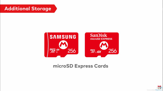
Let me preface this by saying, I knew that the standard was compatible with SD cards of prior so I found it odd they didn't make it clear if it could be used to at least get video/screenshots off, but they did!

Talking about the microSD express cards themselves, I may be in the minority here, but I am very very happy to see this get adopted. For those who are not in the know, it's basically much faster flash (that can be made for slightly more then an normal SD card) that runs off of the reader's PCIe Gen 4, allowing up to 2gb/s of read/write. Which is Crazy, and if they're mandating it to be required for games, that means the current 800mb/s read ones on the market right now is what the console will be using and games will finally load up so much faster. And, unlike the original SD cards, higher capacities like a terabyte already exist AND are not insanely more expensive over base sd cards.(I mean $20-25 for 256gb sd cards to $60 for same but microsd express is still a jump, but do you guys remember how fucking much 256gb sd cards costed originally? It was like $150, and I think 256gb storage will get further milage then the original 32gb storage the og switch had. And 1tb already cost $200 for when it comes out with the switch 2. Those prices will drop unless, uh... not within the scope of what I want to talk about)
Since we're on storage, 256gb of UFS storage? Like on phones, that can go multiple gigabytes per second read/write? Hell ya, we bout to get load times not much worse then other modern consoles.
Let's touch upon the joycons now.
I like them, but as more in a sense of improvment over og switch joycons. Which, honestly, that's all they needed to do. The standout weird feature is the mouse on both, but I only see this as a plus. I want more of my PC games on portable systems, and as much as I want the steamdeck too, the switch form factor is still more portable. Just... please let the bigger joysticks be actually good and resistant to stick drift, I do not want to open them up just to replace the sticks with hall effect ones again. As a plus, I can't wait to see what insanity warioware is going to become now.
Oh ya, chat.
Surprised it took them 2 decades to finally do it, but they seem to have a lot of restraint there still, with extensive parent controls to help metigate any issues, so I'll only give them slightly less shit. Slightly. I'm going to call it though, there is going to be controversy about what eventually will occur over the gamechat. Can't wait!
Switch online services

I mean, it was inevitable. This, with the Wii games that's almost absolutely coming later, is going to be good. I suspect a pricebump is going to occur with the NSO that's going to make it cost almost a full game per year, but at least the retro selection is going to start going from crazy to insane, making it probably worth it. I just hope that the voucher program (shown below) gets expanded to more third parties, because as much as I like nintendo games for $50 a piece with this program, it needs to be way more expansive to make the $20 cost at this time to be online, let alone get the 2 vouchers for $100, worth it. If they do that, and keep on adding new actually fun (looking at you Zelda Notes... what the fuck are you) and nice to have to the service, I think it could become worth it in the near future.
I ALMOST FORGOT ONLINE DOWNLOAD PLAY, seriously that alone may be worth it because with both local and online, it means you do not have to force your friends to buy games they may otherwise never touch outside of playing with you. This is straight up a good, pro-consumer thing if others don't ignore it 24/7. I just hope the streaming quality will not be dogshit ahhaha....

(Shout out to nintendo actuallly using this a part to prevent scalpers, I don't like it much because I didn't pay for NSO on the og switch but at least this is a verifiable way to prevent scalpers. I just wish acconts from the Wii U/3ds era got special treatment :^) )

Since we're getting more into software, shout out to how sad the UI is still.
Nintendo, the literal bare minimun here is not just black and white customizable themes. You haven't done that for a generation. I would have much rather had the UI present from the DSi/Wii to Wii U/3ds era then this bland nothing soup. God. Now, onto the most devicive one, and the one that makes or breaks it for me. The games, and their prices.
Let's get a few things clear, the $90 physical switch 2 game thing (which I had fallen for too) is in europe. If you're a suffering US citizen, the price is $80 for what seems to be big, high budget nintendo games, with everything else being $70, at least from the list of prices I've seen online.

About Game key cards, ya it's just the 'download play' games on the switch, but instead of a piece of paper that's one time, it's a re-usable cartridge that allows multiple downloads on other switches and acts like a physical one otherwise. This, in my opinion, is objectively better, and is not the default option. Other games will be on the Cartidge like og switch, see Cyberpunk 2077 on a 64gb one (seriously how the fuck they did that).
This switch 2 edition is on a case by case basis, so if it is just an fps/resolution bump, it is likely to be free. If it has a bit more, like some added extras and they know people would pay for the fps/resolution, see botw and totk will be $10, and if the content has basically DLC + all of the above, it's $20. Also, lol at welcome tour.
Seeing all of that, I'm iffy. I'm worried that the panic and reactions from everyone will lock the prices for everyone else at $80 since the publishers will take any chance to push prices up further, but if $70 stays I would reluctantly accept it. Unlike some people on the other platforms may say, in the past before $60 standardization, we had other options to play games like with rental stores, actually being around friends, and frequent discounts and bundles to get inventory moving. That does mean nowadays, especially with no sale nintendo, this price is here to stay, and if this is the cost to actually keep games good and not need astronomical sales to make back development costs, so be it. I am just not happy knowing that a lot of publishers will be using machine created/generated stuff each year for that price or $80 and expect no issues with it. The only thing I am very curious about is the capabilities of the switch 2 being somewhere between a PS4 and PS5, but able to handle PS5 ports, potentially making it the best way to play a lot of newer games on the go until valve decides in 2030 to make the steam deck 2.
Now everyone's favorite issues, price. I think it's reasonable, sucks a bit but reasonable. We're now dealing in a world where Nvidia has their focus on AI stuff, and knows that Nintendo wants backward compat + better stuff, so Nvidia likely is changing way more on parts. This world also includes inflation (seriously, $300 in 2017 is now closer to $400, and now there's all the extra nicer stuff slapped on top to justify a next gen). This world also includes ungodly uncertienty because of a a group in the wrong place in the wrong time. Considering all of this, honestly, $450 is fine. It sucks, I know it has pushed a few friends out from buying it w/o someone assisting them in the purchase, but it's fine. It's going to be a great refinement, which is all a sequel console had to be. The thing you have to know, nintendo is doing the thing again with previous controllers being compatible with the current system, so in reality (especially with me and my hall-effect modded controllers) the price to play with others will not be much more. I touched upon this already, but the game prices are iffy for me, and it's absolutely going to prevent me from buying as many games as I had for the og switch, but it's an dampener.
I will need more time to simmer (and see how my finacial situation is going to be), but I am currently leaning to I will try to get it. I'm on the fence, and I have a good chance of flipping to waiting later, or just not getting.
I may add more thoughts as I think them and remember I can use tumblr like this, but I think this is everything I wanted to get out that has been simmering in my head for a bit. Oh ya I almost forgot the most important thing, Homebrew. I love homebrew, it has given me extra life and enjoyment out of my og switch. If there is another launch edition vuln that allows homebrew, I want in.
16 notes
·
View notes
Text
You know what? Today I wake up to yap about my smg4 fanfics, about the process and stuff, so get ready guys, prepare to read a lot.
SMG4 Fanfics made by Lilac_Heart, aka, me but with a different username
Disclaimer. They’re 8 fics at moment, but only gonna talk about 6, mostly because there is nothing special to say about the first one and the new gen fic is still uploading, so it’s not finished.

I care about you (BoMG1)
The idea came out when I was brainstorming comics ideas, but I only got this funny drawing:

Then I got an idea: “a comic where Bob got badly injured and One heal his scars, that’s sound like an amazing idea”.
Buuuut, I was brainstorming the ideas of how the comic should go A particular idea made me realize this work better as a fic, I say: “fuck the comic, let’s make a fanfic”.
Can’t remember if the idea that Bob could get badly injured in one of his business was based in Guns Don’t Scare Me from @briandraws, but I do know I have a few bomg1 fics from him as reference for descriptions and other stuff once I did the english translation.
Bob bring back the nickname of “pretty eyes” to One, is a reference to Glowing Eyes.
Scrap content that I found in the spanish draft!
Instead of Smg2 going by himself to find some pills for Bob, originally it was Smg1 who sent him.
A lot of scenes were extended: Bob and Smg2 conversation about the blades; the “confession” of smg1, which was thanks to Two; Two constantly teasing the couple; the ending.
An actual conversation about if the date would happen, which was between Two and Bob.
Human touch (Marware)
Marware but they just start their relationship. Also, Puzzles touch starved.
Original title from the spanish draft: “Besos para ti” translated into “Kisses for you”, which the original idea was Mario kissing Puzzles.
Just because I really need more fanfics where they are just being soft, and when Mario kisses Puzzles and hugs him ough… So that was the main idea, but I need a “how?” And “why?” Then boom, touch-starved Puzzles.
Obviously I made this fic way before we know about Puzzles family, so let’s pretend when Puzzles have affection of his dad was when he was very young, alright?
The idea of Puzzles not having a hug or any kind of affection since long time ago was based on a prompt I found on Pinterest, and I have a bunch of tabs of how to write a touch-starved person.

Desiring to become a human, so I can kiss you properly (Marware)
Before anyone ask. Yes, me putting the HDR Trio was necessary for many plot reasons as you can see in the fic.
Also, first time I straight went to doing the english version instead of doing a spanish version to then translate it. Huge thanks to my uncle who give a huge boost of confidence when he told I managed english perfectly hehehe.
This fic was a pure excuse just to finally write them making out, so imagine my surprise when people love it and one of my favorite artists made fanart and I swear to god every time I remember it, it feels like this:
Also hi @lizaluvsthis
The illusion disks are from fnaf and I had to look up for any info that could explain to me how they work, just understand the basics and then I did whatever I want because I couldn’t understand it correctly.
Also, I don’t if it’s just me, but I feel the fight was forced for some reason, is either that or I just feel like this every time I reread the fic:

The Dilemma (BadgeHunter)
The biggest one at the moment, and this one have a lot to unpack here.
Original idea from @ominus-potato, which I expand and change a few things:

List of the headcanons that were used for the story:
Mirror headcanon, come from this post. Huge thanks for @izbiz12 for coming with this one.
Hal Jr. having a body comes from the idea of @blu193, which was the high inspiration to him give him a body.
Hal overworking himself is a common thing I found out scrolling in both Blu and Bear profiles, bring by IzBiz.
With “fresh scars” I really wanna implied that Shroomy already have some previous scars, another call back to Blu because she was the one who have the idea of Shroomy having scars for the bear encounter.
Junior being in scouts is actually an idea from Potato, which cool idea.
In the scene when Shroomy and Hal went to the office of the police officer, there was meant to be a scene where Shroomy looked at the picture frame that was on the desk, which was a family picture of Hal, his wife, and Junior. Cut off for unknown reasons.
Shroomy, Hal, Karen, Swag, and Chris being friends is a personal headcanon of mine. Also, Hal leaving Junior to Karen to take care of him is my favorite headcanon, and Brian and I share the same brain cell lmao.
Cozy and soft (BoMG1)
Purely made this because I was craving for BoMG1 content, thanks to this drawing I got inspiration as well, Brian marware fic which has the same concept.
It’s the shortest fic I made after a while, which was the main idea, didn’t want to do something long.
A few references to Glowing Eyes (again):
One got scared by Bob eyes.
Bob getting a copy of the apartment keys.
The mention of a broken window.
Nightmare and Comfort (BadgeHunter)
Idea that I got when I wake up at 7 am. Which the general idea was Hal comforting Shroomy about a nightmare/memory from his past.
This is time I used @bear-boi-5 headcanon about how the aftermath of the bite was. Nothing like Shroomy told in Mario Babies, of course.
I decided that Anti would have control of the body, mostly because he was the most affected of the accident for obvious reasons, also I love Anti, so I would used this opportunity.
I have to avoid mentioning any alcoholic drinks name, because I drink but I have zero idea what are they, soooo… yeah only beer was mentioned because is the one with less alcohol by volume, at least what this post say.
Anti laughing when he gets drunk, is actually based in one of the effects that happened to me.
The dynamic between Anti and Hal is quite complicated, considering the personality of Anti. They tolerate each other and they have to resolved their differences because of Shroomy and Hal hanging out more.
Important to say that after this, Anti would start having feeling for Hal after he understand what Shroomy see on him. Would this cause problems? Not sure, but until further notice, probably yes :)
— — — — —
Hahaha I just love yap about my fics and all the process behind them, is super fun and I actually wanna share this with all of you because you guys are cool and also there is a inspiration behind those stories.
Now, if you excuse I have to get back to do some stuff :]
#smg4#heart talks#sorry for the tagging. but I really need to give proper credit hehehe#another thing. can’t say if all the stories are connected. but something they would reference at each other if the occasion is need it
39 notes
·
View notes
Text

GEARS OF WAR: RELOADED • Aug 26th 2025
4K resolution
60 FPS in Campaign
120 FPS in Multiplayer
High Dynamic Range (HDR)
Dolby Vision & 7.1.4 Dolby Atmos
7.1.4 3D Spatial Audio
Variable Refresh Rate (VRR)
4K assets and remastered textures
Enhanced post-processing visual effects
Improved shadows and reflections
Super resolution with improved anti-aliasing
Zero loading screens during Campaign
Cross-play and cross-progression across all platforms
$39.99 SRP on Xbox Series X|S, Xbox PC, Xbox Cloud Gaming, PlayStation 5 and Steam
#gowedit#gearsedit#gamingedit#gearsofwaredit#gears of war#gears#gears of war 1#gears of war: reloaded#marcus fenix#dom santiago#damon baird#augustus cole#delta squad#apocalypsekid#mikaeled#thelvadams.gifs#this is how you doing a remaster
15 notes
·
View notes
Text
Can someone knowledgable about photography (and specifically white balance and color adjusting) help me out here? I'm going a bit crazy.
@etirabys posts pictures of her completed paintings (which you should go check out if you don't already) that she takes with her 3-year-old iPhone, and I figured it would help them sell if the images on her website were taken with my Fuji XT-5 instead. But I've fiddled with a bunch of settings, and the iPhone image is better in every way. The Fuji flattens all the colors, even when shooting in HDR mode. I'm convinced it's sharper as well.
Attached are a bunch of shots I took of this painting, in various lighting conditions, HDR settings, and Fuji color modes. They all suck.

cc @drethelin and @curse-that-wren-tern-skyline as the main photographers I know here. I know Apple's computational post-processing is really good, but surely I do can do at least as good and with four times the megapixels.
46 notes
·
View notes
Text

A Great Blue Heron eyes it's prey in the water below it's basking spot.
This heron has been living at this stream it's whole life. I had the privilege two years ago to watch it lose it's downy feathers on it's first year. I'm so happy to see it thriving and growing larger each year!
This was my first ever attempt at an bracketed stack on a bird to capture HDR. Luckily Herons stay very still, allowing me to snap a good stack of 5 images at different shutter speeds to combine in post processing.
#photography#bird photography#birding#birds#nature#wildlife#wildlife photography#birder#my photos#nature photography#Heron#Great Blue Heron#wetlands
23 notes
·
View notes
Text
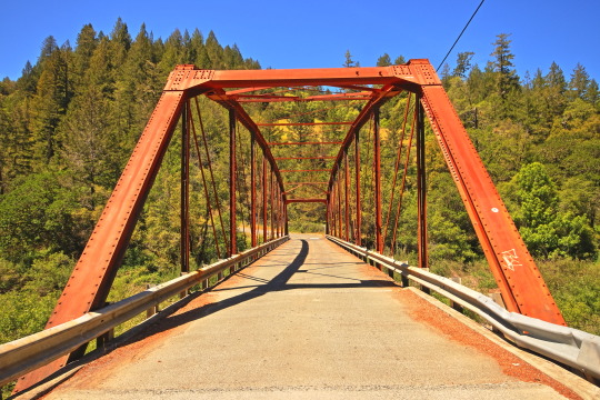
Historic Annapolis Road Bridge over the Gualala River. Deep in the redwood heart of remote NW Sonoma County. HDR photo: Canon SL3, 16mm, f/9, ISO-100; 1/60s, 1/160s, 1/400s. Canon DPP4.18.10 used for post processing. Cheers!
23 notes
·
View notes
Text
Hi pals!
I’ll still be travelling when you’re seeing this and haven’t watched the finale, so I don’t have any new content to share, but last week (maybe longer? I don’t know— rainforest brain lol) I posted a poll asking if anyone was interested in seeing a snippet of my editing process, so here it is feat. possibly one of my favourite Wrecker moments.
I use a myriad of different software depending on: my mood, what computer/tablet I’m using, what the image looks like, and how much energy I’m willing to put into it lol In this video, I’m using Lightroom on my iPad.
The three main factors I look mostly closely at when I’m editing shots are 1. lighting, 2. noise, and 3. resolution (read: clarity).
This image required pretty minimal work so it’s probably not the best example, but ah well. The process in the above video is as follows, and please note the video had been sped up to 2x for file size reasons lol
The first thing I’ll do is see what the auto edit function defaults to. Often times it overexposes the image, resulting in significant colour noise, but it gives me a decent idea of what I should expect in terms of colour corrections and exposure mapping. The auto edit function wasn’t terrible in this case, but did produce some colour noise, mainly on Wrecker’s chest plate, his sleeves, and the officers hat. Once I’m done the initial scope out, I’ll exposure the image as high as possible to crop it— usually with the subject being as centered as possible.
This software lets the user tweak the bones of the image individually in three ways, all of them very quickly demonstrated here. The first is the curve method which I despise and NEVER use— because it alters multiple aspects at once, I don’t feel like I have the same degree of control as the other methods. Next is HDR setting (the default upon import) using the sliders on the right. This is effective for images that are already pretty well lit, and does give me a little more control, but most of the time because the screenshots are so dark, I’m editing in SDR mode.
Once I’m satisfied with the exposure/lighting, I’ll move on to correcting colour distortion and saturating the image. This software also provides three methods for colour alternation and I’ll typically use all three in conjunction with each other. Colour mixing is extremely crucial when it comes to reducing odour noise and distortion. Because this software lets me isolate certain colours to adjust their hue, saturation, and luminance, I can typically reduce most of or all of the colour noise. However, it does have its limitations. In this particular post, desaturating the colour noise in Crosshair’s rifle coincided with blanching his skin tone, because this software does not let me isolate certain areas of an image. It was also important to me to emphasize the warm tones from the sunset in the background for the overall mood of the shot, so I opted to remove what colour noise I could and leave the rest. (You can’t win em all… especially when the starting image is near-black lol)
Correcting the colour distortion in this image was not particularly difficult, desaturating all purple tones removed the noise from his chest plate, and shifting green tones to something near a yellow instead removed the noise from his sleeve. I didn’t notice the colour noise on the officers hat until a little later, but that was pretty easily corrected too.
Once I’ve fixed the colour noise, I’ll shift to toning the overall image. Wrecker particularly looks good in cool tones, but It’s nice to contrast a cool tone background with the warmth of his skin.
Once the toning is done, I’ll move on the image clarity. I don’t have the means to alter the actual resolution of the image, but I’m particularly picky with balancing texture and clarity. Wrecker always looks the best with texture and clarity increased, because it brings out the scarring on his face and further humanizes him, but overdoing the texture can also emphasize pixelation. Once that’s done, I’ll reduce the overall noise only slightly (doing too much makes them look airbrushed and unnatural), and whatever is left of the colour noise (too much of this setting makes them look like ghouls LOL)
This software also offers a series of preset alterations/filters briefly shown in this video… but I’m not the biggest fan of any of them. I’m a bit of a control freak and would rather tweak each aspect individually to the degree that I like, instead blanketing the image with present modifications and then undoing certain aspects.
Before exporting the image I’ll do another once over and make sure I’m happy! In this case, I opted to go back in and add some darker tones back into the image. I don’t do this often, particularly when they start so damn dark, but I wanted to keep the focus centrally on Wrecker’s radiance lol
That’s about it. If I’m working on multiple edits in a set, this software lets me just copy and paste the settings, so the following images only require extremely light tweaks and take almost no time. And that, I’ll export, autograph, and upload!
Thank you for attending this unprofessional Ted Talk.
#starqueensrambles#things no one asked for but are getting anyways#Jedi queue-doo#starqueensedits#ungatekeeped lol#thats not a word#well… it is now
14 notes
·
View notes
Text
Gears of War: Reloaded Comes to Xbox Series X|S, Xbox PC, Xbox Cloud Gaming, PlayStation 5 and Steam in Summer 2025

Summary
The original Gears of War returns, faithfully remastered and natively optimized for more platforms than ever before as Gears of War: Reloaded.
Gears of War: Reloaded launches August 26, 2025, for $39.99 SRP on Xbox Series X|S, Xbox PC, Xbox Cloud Gaming, PlayStation 5 and Steam, and arrives day one with Game Pass Ultimate or PC Game Pass.
Play on Xbox Series X|S, Xbox PC and Xbox Cloud Gaming with Xbox Play Anywhere.
Gears of War: Reloaded supports cross-play and cross-progression across all platforms.
Xbox fans who own the digital version of Gears of War: Ultimate Edition receive a free upgrade to Gears of War: Reloaded.
Wishlist now for Xbox Series X|S and Xbox PC, Steam, and PlayStation 5.
Gears of War: Reloaded is a celebration of one of gaming’s most iconic franchises. Featuring 4K resolution, 120 FPS support, and the ultimate multiplayer experience with cross-progression and cross-play, across all platforms, this is the definitive way to experience the game that started it all.
As we approach the 20th anniversary of Gears of War in 2026, we’re reflecting on what this franchise means. It’s about the stories we’ve told, the friendships we’ve built, and the unforgettable moments we’ve shared together. With Gears of War: Reloaded, we’re opening that door to more players than ever.

A Modern Classic Goes Multiplatform
Originally released in 2006, Gears of War: Reloaded brings the full experience forward once again — enhanced for the latest hardware across multiple platforms, introducing the Gears of War franchise to a new generation of players.
Developed by The Coalition in partnership with Sumo Interactive and Disbelief, Gears of War: Reloaded launches August 26, 2025, for $39.99 SRP on Xbox Series X|S, Xbox PC, Xbox Cloud Gaming, PlayStation 5, and Steam, and arrives on day one with Game Pass Ultimate or PC Game Pass. Play on Xbox Series X|S and Xbox PC with Xbox Play Anywhere.
Gears of War: Reloaded includes the full breadth of content from the Gears of War: Ultimate Edition, delivering the most complete version of the original game to date. Players will gain immediate access to all post-launch downloadable content at no additional cost — this includes the bonus Campaign act, all multiplayer maps and modes, and a full roster of classic characters and cosmetics unlockable through progression.

Built for Brotherhood
Gears of War: Reloaded is built for shared play — whether you’re teaming up in split-screen or jumping online. The Campaign supports two-player co-op, and Versus Multiplayer allows up to 8 players. With cross-play across all platforms, you and your friends can squad up no matter where you play — no Microsoft account required.
However, signing in with a Microsoft account unlocks full cross-platform functionality. It enables cross-progression, so your Campaign and multiplayer progress carries across devices. It also allows you to send invites and play with friends across platforms — like Xbox to PlayStation or Steam to Xbox.

Precision Performance on Every Platform
No matter where you play, Gears of War: Reloaded has been re-engineered to look and feel incredible. Players can expect:
4K resolution
60 FPS in Campaign
120 FPS in Multiplayer
High Dynamic Range (HDR)
Dolby Vision & 7.1.4 Dolby Atmos
7.1.4 3D Spatial Audio
Variable Refresh Rate (VRR)
4K assets and remastered textures
Enhanced post-processing visual effects
Improved shadows and reflections
Super resolution with improved anti-aliasing
Zero loading screens during Campaign
From faster frame rates to deeper visual fidelity, every detail has been tuned to bring the original game into the present with clarity, smoothness, and immersion that matches the power of today’s hardware.
And wherever you play, we’re meeting you there with the best version possible. Gears of War: Reloaded includes platform-specific features that make the most of the hardware you already own to deliver a world-class Gears of War experience — faithful to the original, optimized for today, and made for everyone.
For Xbox Fans, A Thank You
As a token of our gratitude to longtime fans, Gears of War: Reloaded will be a free upgrade for players who purchased the digital version of Gears of War: Ultimate Edition prior to today’s announcement. (Must have purchased a digital version of Gears of War: Ultimate Edition prior to 16:00 UTC on May 5, 2025. A code for Gears of War: Reloaded will be delivered prior to launch of the game via a direct message to eligible Xbox accounts.)
And for Game Pass Ultimate and PC Game Pass members, Gears of War: Reloaded will be available as part of the Game Pass library at launch.


#gears of war#gears of war reloaded#microsoft#xbox#playstation#playstation 5#ps5#pc#pc gaming#xbox series x#xbox series s#video games#gaming#gaming news#screenshots#news
2 notes
·
View notes
Text
Yvette Heiser - Phone Photography Essentials without Formal Education
In today's digital world, the art of photography has become more accessible than ever. You no longer need a formal education or expensive camera equipment to create stunning images. With advancements in smartphone technology, your phone can be a powerful tool for capturing professional-quality photos. Here’s everything you need to know to excel in phone photography without a formal education.

Understanding Your Phone’s Camera
Before diving into photography, it’s essential to understand the capabilities of your phone’s camera. Modern smartphones are equipped with high-resolution sensors, multiple lenses, and advanced image processing software. Take some time to familiarize yourself with the various settings and features available on your phone's camera, including HDR, portrait mode, night mode, and manual controls for ISO, shutter speed, and white balance. For more detailed insights, consider exploring resources like Yvette Heiser Texas – All You Need to Know about Phone Photography.
Mastering the Basics of Photography
Even without formal education, you can learn the fundamental principles of photography. Start with the basics:
Composition: The rule of thirds, leading lines, and framing are essential techniques that can help you create balanced and visually appealing photos.
Lighting: Excellent lighting is essential for taking outstanding photos. Natural light is your greatest ally, so it's important to learn how to use it effectively. Understand the differences between soft and hard lighting and how to leverage shadows and highlights to enhance your images.
Focus and Exposure: Ensure your subject is in sharp focus. Most smartphones allow you to tap the screen to set the focus point. Adjusting exposure can help you manage the brightness and contrast of your photos.
Leveraging Photography Apps
One of the advantages of phone photography is the plethora of apps available to enhance your images. Here are a few must-have apps:
Editing Apps: Tools like Adobe Lightroom, Snapseed, and VSCO provide robust features for tweaking exposure, contrast, saturation, and other elements. They also come with presets and filters that can add unique and creative touches to your photos.
Camera Apps: Apps like ProCamera and Camera+ offer advanced manual controls, allowing you to fine-tune settings like ISO, shutter speed, and white balance.
Special Effects: Apps such as Lens Distortions and Afterlight can add unique effects and overlays to your photos, helping them stand out.
Building a Strong Portfolio
Your portfolio is your introduction in the photography world. Create a diverse collection of your best work to showcase your skills and style. Include different subjects such as landscapes, portraits, and macro shots. Regularly refresh your portfolio with updated and enhanced photographs. Sharing your portfolio on social media platforms like Instagram, Facebook, and Pinterest can help you reach a wider audience and attract potential clients.
Networking and Marketing
Building a successful photography career requires more than just taking great photos. Networking and marketing are essential components:
Networking: Join online photography communities, attend local meetups, and participate in photography challenges. Networking with other photographers can lead to collaborations, referrals, and learning opportunities.
Social Media Marketing: Use social media to market your photography services. Regularly post your work, engage with your audience, and share behind-the-scenes content. Consider creating a website to establish an online presence and make it easy for clients to find and contact you.
Continuous Learning and Experimentation
Photography is an ever-evolving field, and staying updated with the latest trends and techniques is crucial. Follow industry leaders, read photography blogs, and watch tutorial videos. Don’t be afraid to experiment with new styles and subjects. Continuous learning and experimentation will help you grow as a photographer and keep your work fresh and innovative.
Conclusion
Excelling in phone photography without formal education is entirely achievable with dedication and practice. By understanding your phone’s camera, mastering photography basics, leveraging apps, building a strong portfolio, networking, and continuously learning, you can create stunning images and establish a successful photography career. Yvette Heiser- Is it possible to start a career in photography without formal education? Embrace the journey, and let your creativity shine through your lens!
#wedding#moments#camera#pictures#photographer#photography#childphotography#yvette heiser#photographytips#events
8 notes
·
View notes