#I also get that math is more than just equations algorithms and graphs
Explore tagged Tumblr posts
Visit Tumblr Blog
Explore Tumblr blogs with no restrictions, modern design and the best experience.
Last Seen Tumblr Blogs


Fun Fact
Kazakhstan’s Minister of Communications and Informatics has blocked the Tumblr site because it contained 60 sites of terrorism, extremism, and pornography in 2015.
Text
Rambling Thoughts on Math Ed
The school I teach at started up a robotics program and is looking to provide more engineering-based classes. This has led to discussion of how these programs can be used in tandem with traditional content and in relation to ‘applications’ of material traditionally found in classrooms. And whenever I listen to people talking about math education, it almost always gets around to “we need to be teaching applications, not just algorithms”. I get it, I too think there needs to be more emphasis on applications, but I also firmly believe that students need to be able to work with the pure and theoretical math as much as apply it. It would be super cool to have a class that revolves around the applications of calculus, but if the focus is just on applications then there’s little value in it if students don’t understand how to take a limit, derivative, or an integral or let alone not understanding when or why they would want to do so. Applications can be used purposefully, but math class is a place to learn math; and math is more than just applications.
Really I think more advanced science and technology classes are the place to emphasize applications. Physics, for example, is literally just applied math in tandem with conceptual explanations. In physics, it’s expected that students understand quadratic equations and basic right-triangle trigonometry, but the class does not teach those concepts. The same is true for any science class that applies any kind of mathematics: it is expected of students to know the math and be able to apply it. Chemistry utilizes quite a bit of math, physics is basically all math, astronomy as well, and an understanding of mathematics and logic is crucial to anything related to programming or engineering.
Yet because classes such as chemistry, physics, and engineering are all ‘science’ classes, it is acceptable to some people to sweep the math under the rug. It doesn’t matter that students don’t apply math when working out problems in chemistry because they still understand the periodic table and basic reactions. It doesn’t matter that students don’t apply math when working out problems in physics because they understand Newton’s laws of motion and the basic principles and relationships of motion, heat, and energy. Students can still describe general ideas and relationships, they get the ‘science’, so there’s no point applying math; it’s just more complicated detail. I understand that some classes and some teachers take this approach, but I think it’s a disservice.
I mean, the way most of the robotics coaches have led this year seems to be a philosophy of ‘build first, then test, then fix’, emphasizing the scientific method, with no regard to the idea of prototyping or planning. If one of the goals of the program is to demonstrate the value and importance of math, then they’ve failed in that goal as they’ve done no actual math.
It just seems to me that there are plenty of places that ought to naturally allow for intense mathematical applications that do not take advantage of them. Then people turn around and ask why math class isn’t like this: a place where students get to see applications in action, to give lip service to math while not actually doing any. It seems to me, in my admitted cynicism here, that people would rather remove math from the math classroom just as it has been removed in science and engineering. All in the guise of “making math mean something”, “preparing students for the workforce” (don’t get me started on that bs), and “applications”.
#I also get that math is more than just equations algorithms and graphs#and that simply thinking critically and approaching problems with something like Polya's or the scientific method is still a math exercise#but there doesn't seem to be a conscious effort to highlight these methods and steps (esp. with robotics)#there isn't anyone stepping in and saying this can be done much more efficiently with such-and-such math concept#and then again it's a matter of expecting students to know what 'such-and-such' is without fully explaining it#which would be where a math class comes in#but no one seems to be able to see the forest for the trees#but maybe I'm just being cynical on a Sunday afternoon#regardless this is here as a reminder to not get sucked into the trap of 'teach only applications'#math education#also don't get me wrong I love the robotics program and all of the technology stuff being added
1 note
·
View note
Text
We’ll Be Home For Christmas 4.5

Title: We’ll be home for Christmas
Day Four – Five Billionaires and No Wives – Part 5 Prologue | 1.1 | 1.2 | 2.1 | 2.2 | 2.3 | 3.1 | 3.2 | 3.3 | 3.4 | 3.5 | 4.1 | 4.2 | 4.3 | 4.4 | 4.5
Author: Gumnut
29 Apr - 11 May 2020
Fandom: Thunderbirds Are Go 2015/ Thunderbirds TOS
Rating: Teen
Summary: The boys can’t fly home for Christmas, so they have to find another way.
Word count: 4259
Spoilers & warnings: language and so, so much fluff. Science!Gordon. Artist!Virgil, Minor various ships, mostly background. A little angst in this one.
Timeline: Christmas Season 3, I have also kinda ignored the main storyline of Season 3. The boys needed a break, so I gave them one. Post season 3B, before Season 3C cos I started this fic before we saw it.
Author’s note: For @scattergraph. This is my 2019 TAG Secret Santa fic :D
I’ve been staring at this too long and it is late. I hope I don’t regret posting this. Especially as Alan misbehaved and threw an unplanned scene at me.
Many thanks to @i-am-chidorixblossom @scribbles97 and @onereyofstarlight for reading through various bits, fielding my many wibblies, and for all their wonderful support.
Disclaimer: Mine? You’ve got to be kidding. Money? Don’t have any, don’t bother.
-o-o-o-
He didn’t sleep long.
Virgil was woken so they could drag him onto A Little Lightning. Scott marshalled him out of his wet clothes, into a shower and quietly redressed his healing incisions. Lunch was demanded and a sandwich shoved into his hand. Coffee was denied him and orange juice substituted.
He found himself dozing at the table.
Mel and Sam were invited for lunch aboard the boat. Gordon was busy being host, but never quite seemed to be very far from Virgil.
Sam mentioned the whales several times, but Gordon shut him down and at no point did he have a chance to corner Virgil.
Virgil felt sorry for the cetacean biologist. He must remember to talk to him at a later time. Once he had finished processing today himself.
The whole experience was otherworldly. He didn’t quite know how to express it. It was as if the music had shape and form, his mind’s eye producing a kaleidoscope of imagery sculpted by sound.
And it meant something.
He knew it meant something, but he couldn’t decipher most of it. Bits were missing, the shapes fragmented, but he did feel the emotion that travelled with it. Multidimensional, the song communicated in a way he wasn’t capable of fully comprehending.
“Virgil, you should go to bed.”
Scott again.
“Mmm-hmm.”
“C’mon.” A hand landed gently on his shoulder.
“Mmm...” Musical shapes danced in his mind and he realised there was colour. Greens, violets and yellows. Patches torn from an unseen spectrum. It was frustrating to not be able to pull it all into focus and understanding.
“Virgil?”
It would be interesting to try and paint. Yes, maybe that would be a way to understand it better. He visualised forming those shapes with pencil and brush. Three dimensions...no four. They shifted according to time.
Hell. So confusing.
But he could try.
“Virgil? You with me?”
Huh? He blinked and looked up at concerned blue eyes.
A sigh. “Just thinking.”
“I can see that. You need rest.”
He did, yes, but he also needed to think, to doodle, to work it all out. He caught Scott’s eyes. “Sit with me?”
A blink. “Of course.”
There followed farewells, Virgil pre-occupied throughout. At some point Mel kissed him on the cheek, but he barely registered it. Sam said something but was interrupted by Gordon. Virgil felt completely spaced and somewhere at the back of his thoughts he was embarrassed at his lack of response and manners.
Scott didn’t leave his side.
Gordon made excuses and apologies.
John was speaking to Eos...which meant their guests must have left. Man, he was out of it. Brain overload.
Alan had concerned blue eyes so much like their eldest brother.
The yacht’s engine starting up scared the living shit out of him. It shattered his mindscape with aural static, those careful shapes disintegrating.
“Hey, hey, Virgil. It’s okay.” Scott had his hand on his arm again.
Virgil’s heart was thudding in his chest. A blink. A calming breath. A moment. He forced calm. “I’m good.”
He was, really. He just had a lot to think about.
“You sure you don’t want to sleep?”
“I’m sure.” But there was something he did want to do. “Come up front with me?”
Scott frowned at him.
“I just want to feel the sun on my face, the wind in my hair.” And get as far away from the engine as possible.
“Sure.” A pause. “But you’re sitting down.”
“Sure.” Virgil pushed himself to his feet.
They found a niche on the bow, enough to sit comfortably with some back support. They could see Gordon frowning at them from the cockpit.
Virgil caught the thought and had to stop himself from laughing out loud. Apparently, he was as much a flyboy as his big brother.
The boat was moving at a reasonable speed, Gordon, no doubt, wanting to get home fast due to the day’s events. That and now they were behind schedule and had quite a long, final stretch to make it before sunset.
Raoul was little more than a smudge on the horizon already. Virgil stared at it a moment before turning and facing the wide ocean ahead of them that ultimately would contain their island. Wind streamed through his hair.
“It will be good to be home.”
Scott didn’t hesitate. “Definitely.”
Virgil snorted. “Missing your ‘bird?”
“Missing land.”
“You spent last night on land.”
“Not the right land.”
Virgil raised an eyebrow at that. “You seemed quite happy with at least one of the inhabitants.”
That prompted a smile on his big brother’s face. “Fishing for details?”
“Some. Not too much.”
Scott turned to him and shrugged. “It was fun. Mel is an interesting woman.”
Half a smile. “I’ll give her that much.” A curious eyebrow. “See it going any further?”
Scott’s expression was thoughtful. “Maybe.”
“Invite her over for Christmas.”
“Tomorrow?”
“Why not?”
“Late notice.”
“You have a Thunderbird.”
That thoughtfulness increased and a slight smile curved his brother’s lips.
“Invite Sam and Liam while you’re at it. We owe them cake. Alan ate theirs.” And Virgil owed Sam an explanation.
That frown returned. “You sure?”
“Sure. The more the merrier.” A snort. “Hell, have them over for a few days. It will give Melissa the chance to check out our ecosystem, she’ll be ecstatic.” A pause and then quietly. “It will give me a chance to speak to Sam about...” A fractured image came to mind and he realised it meant whale. An indrawn breath. Oh god. One concept. He understood something. He could not reproduce it. It wasn’t just sound. It was something else. A combination of visual and auditory. How? His throat froze up. Hell.
“Virgil?”
“I...” The concept tantalised him. His fingers itched for his pencils, his paints and his piano all at once. How?
How?
He swallowed and realised his heart rate was up again. “I...need my tablet...and stylus.”
Scott stared at him a moment before standing up and making his way aft.
It was a sign of how preoccupied Virgil was that his tablet appeared almost immediately in his hands.
He didn’t hesitate. His fingers pulled up his drawing app, his stylus connected with the surface and lines appeared.
Lines. Curves.
Shapes.
Interwoven.
No.
Not right.
The stylus squeaked across the screen.
More lines. More shapes.
The screen became black with them, so he added colour. It splashed and bled across the lines.
“Virgil.”
It still wasn’t right.
Frustration stirred and he groaned at the image.
A blink.
Sound.
He scratched more lines, but the moment of inspiration faded.
He couldn’t do it.
“Virgil.”
It wasn’t a single dimension. It was many. Visual, sound and...and...
Emotion.
How?
It all came back to that question.
He let the tablet and stylus drop, clenching his eyes shut and rubbing his face with his hands.
How the hell could he communicate emotion?
-o-o-o-
John squirrelled himself away. Eos had contacted him to give her report, but there was something in her tone that told him not to take it on an open line.
So, he waited until Gordon got the boat moving and Scott had corralled Virgil before retreating to his cabin for some privacy.
“Did you receive a clear enough signal?”
“Affirmative, John. The upgrade to Virgil’s comms worked perfectly. I am confident I received the full spectrum of the whale’s emissions.”
“Any conclusions?”
“Tentative. And at least an explanation why Virgil is so relaxed in their presence.”
John frowned. “Show me.” The tablet in his hand, the same waterproof device he had clung to as they were tossed from the boat, lit up and a hologram hung above it.
It was a series of graphs mapping sound waves, several equations scrolled down one side. The frown on John’s face deepened. That was some seriously complex math. “Talk to me, Eos.”
“Multiple carrier waves interact synergistically to create other waves which also carry data. This is truly a multidimensional sound.” The waves on several of the graphs split up to show their originating structures.
“Can you decipher a language?”
“Not a simple language, no. Initial assessment leads me to believe this is at least partially a graphical language. The mathematics reveal vector information is part of the transmission.”
John’s eyes widened. “Any interpretation?”
The graphs disappeared to reveal fragmented moving lines and clouded shape. “These images are calculated using a section of song the mother whale was singing to Virgil.”
“Can you see a pattern?”
“Not presently, however, I am still analysing. One aspect to be considered is this...”
A second grouping of graphics appeared beside the main display. This was smaller and lacked colour, the lines far more fragmented and the whole composition was fogged with what appeared to be static. “What?”
“That is Virgil’s vocalisation while he was in contact with the whale, if it is run through the same mathematical algorithm.” The two graphics were suddenly overlaid together. Virgil’s section fit like a piece of a puzzle into the larger composition, as if it was an unfinished section awaiting colour.
“How? Why is Virgil picking this up, but the rest of us are not?”
The graphs returned along with one new one. “I retrieved Virgil’s EEG readings from his last head injury.” Lines lit up in red on several of the graphs. “Several of the carrier waves create a binaural beat. The result is that at least part of the whale’s communication is nestled in frequencies that resonate with human brainwave activity. Virgil’s, in particular, appear to align well. I hypothesise that this facilitates his receptivity.”
John stared at the lines denoting Virgil’s delta wave production. A flick of his fingers and the graph overlaid that section of the whale’s vocal output. Delta waves were well known for their calming effect and their influence on sleep. It would definitely explain his brother’s thrall and lethargy during each encounter.
The red lines glared at him.
An exhaled breath. “So, no chance of a translation?”
“Not any time soon. The transmission is extremely complex and I have yet to reveal all of the carrier signals, much less decipher the entire data stream.”
Eos fell silent a moment and John stared at the graphs, watching them move in rhythm with each other. “Why hasn’t this been discovered before?”
“Recording equipment. Of the recordings I have examined, only three have managed to record enough detail to even hint at the complexity. Today’s samples are of the highest resolution ever taken. Further clarity would be achieved with multiple recordings.”
Which meant more encounters. The sight of Virgil singing on the whale was eerie and unsettling. He may have held back Scott from going to Virgil’s assistance, but the truth was he had to hold himself back just as much.
“Is it causing Virgil any harm?”
Eos didn’t answer immediately and it gave John the chance to ramp up his concern just a notch.
“I cannot locate any medical effects beyond a tendency towards inducing sleep due to some of the frequencies involved. I would recommend further monitoring, however.”
“I agree.” An indrawn breath. “Thank you, Eos.” He blinked and realised exactly what his daughter had just done. His eyes widened just a little. “Continue analysis. This is an important scientific discovery and you have done some excellent work.”
“Really?” Her voice was ever so hopeful, ever so young.
“Of course. I’m looking forward to working on this with you.” There was definitely work to be done and soon.
“Thank you, John.”
“No, Eos, thank you.”
Her giggle bounced across comms. Sometimes so old, yet always ever so young. Her youth was always surprising as was her need for guidance. “Could you please send me Virgil’s vitals, both during the encounter and now?”
“Yes, John.” More numbers appeared above his tablet. Fortunately, they were all healthy numbers, though Virgil’s heart rate was up somewhat. A flick of his fingers and Scott’s vitals appeared beside Virgil’s. Both brothers’ heart rates echoed each other.
John would have felt like he was spying on his family, but he did it so often for reassurance on Five that it now barely registered. Another flick of his fingers and he directed Five to focus on A Little Lightning. He found his eldest brothers on the bow of the yacht. Virgil appeared to be drawing on his tablet.
“He is well, John. I can see no after effects from his encounter.”
John wondered if he could coerce his brother into an EEG exam when they made it home. Roping Scott in would probably manage it, but the stress on both of them would be considerable and he hesitated to aggravate either of them.
Perhaps further down the track, or if Virgil gave him any reason for concern.
God, he hoped not.
A sigh. He had probably jinxed himself last night acknowledging the vacation they were on. Since he woke up to Virgil’s snoring early that morning, things had changed. Sure, surfing with Gordon had been fun, but seeing Scott stressing over Virgil on the beach and the events that followed right up until they returned to A Little Lightning had been anything but relaxing.
One of Virgil’s piano sonatas started playing over his tablet ever so softly.
Despite himself, he smiled. “I’m fine, Eos.”
“You’re worrying again. This is not good for your hair production.”
He blinked. “What?”
“Several sources state that stress can disable the pigment production in human hair follicles, resulting in white, often termed ‘grey’, hairs. I believe this is a negatively viewed characteristic and I have noted that your elder brothers have encountered this issue already. It causes distress, therefore it should be prevented.”
Another blink. “Both of my older brothers have dark hair. Grey becomes very apparent in contrast.”
“It will turn your hair pink.”
“What?” This conversation was ridiculous. “It is a natural ageing process. There is very little that can be done about it.” A breath. “I’m not vain, Eos.”
She didn’t answer immediately. “But your brothers are?”
“My brothers are my brothers, Eos.”
“Well, that makes little sense.”
“Just accept them as they are.”
“Is it possible to accept them any other way?”
“No, not really.”
“Then that statement is redundant.”
“Eos.”
“Yes?”
Frivolous distraction, Eos-style. She had become quite adept at it. Moving his thoughts off worrying topics. A sigh. “Thank you, Eos.”
She didn’t answer immediately, but then...
“Did you know Virgil dyes his hair?”
-o-o-o-
Scott watched his brother draw somewhat manically on his tablet. The resultant art was far from what the artist usually produced. This was all sharp lines and angles followed by random blob shapes. At first it was all in pencil, but then Virgil started adding colours. There was no pattern, it was all haphazard and, worse, it appeared to be aggravating him.
“Virgil.”
His brother groaned in frustration, his eyebrows creasing his face in half and swallowing the scar on his forehead.
“Virgil.”
But he suddenly stopped, realisation on his face morphing into disappointment and more frustration.
The tablet and stylus slipped from Virgil’s hands and Scott was hard pressed to catch them.
But he did.
Virgil’s eyes were scrunched shut and he rubbed his face with his hands.
Scott glanced at the mess on the tablet and shoved it to one side, turning to his brother. “Virgil, talk to me.”
“I can’t.” It was small and hoarse.
“Can’t what?”
“Can’t...express, explain...trying to understand...it’s a mess...”
Okay, this was well outside his realm, but he knew Virgil. He slipped off his seat and knelt in front him. Gently he pulled those hands away from his brother’s face to reveal worried brown eyes. “Stop. Take a breath.”
Virgil stared at him a moment before the soft command was obeyed and he drew in air. Those eyes closed briefly and his brother’s shoulders dropped. “Sorry.”
“Nothing to be sorry about.”
“I ruined it again. I’ve stressed you out.”
“This time, I don’t think you had much say in it. Mamma Whale was very determined to say hello.” A small smile. “I think you have a music fan.”
Virgil snorted softly and Scott knew he’d broken through even if just a little. “She definitely wanted to talk. I just wish I knew what she wanted to say.”
“You picked up something, though, didn’t you?”
A quiet sigh. “She was happy and surprised.” Virgil looked up and stared out into the ocean, but Scott could tell he wasn’t seeing the waves.
He wondered what he was thinking.
“How could you tell?”
The frown returned. “I don’t know.” A pause caught in thought. “The sound makes me feel? The sound is...everything.”
Virgil stopped speaking, lost again to whatever was in his head.
Scott swallowed and tried a different tactic. “I think you made a mistake.”
Brown eyes snapped to him immediately. “What?”
“You should have asked Mel out. Lost opportunity, bro.”
Virgil stared at him. “What?”
“She had the hots for you, Virg, and you ignored her.”
“Last time Raoul erupted? She tried to climb me like a tree. Kay had to drag her out of the cockpit.”
It was Scott’s turn to stare. “Really?”
“She was very exuberant in her thanks.”
Scott smiled. “She knows what she likes.” And yes, admittedly, she was very good at climbing, after all Scott was taller. His smile widened.
Virgil’s stare intensified until plain, straight human communication got the message across and his brother groaned. “God, Scott, TMI.”
Total innocence. “I didn’t say anything.”
“You didn’t have to. The image is radiating off your skin.”
Scott sniggered.
Distraction achieved.
“Well, I did say you lost an opportunity.”
“That’s fine, Jungle Jim, she’s all yours.”
Scott shrugged. He could always hope. She certainly knew how to press all his buttons. “Still think we should have her over for Christmas?”
“Yeah, Gordon will love it.”
“What about you?”
“I need to speak to Sam.”
“You don’t have to.”
“I want to.”
“Okay.” A breath. “Just take it easy.”
His brother nodded and returned to staring out at the ocean. “It will be good to get home.”
Scott stood up slowly and sat back down beside his brother. “Yeah, it will.”
So good.
-o-o-o-
“Are we there yet?” Alan’s voice was particularly whiny, no doubt, specifically designed to irritate.
Gordon turned away from the helm to look at him. “Do you see an island in front of us?”
Alan shoved his hands in his pockets. “Nope.”
“There’s your answer.”
It had been quiet on the bridge for the last few hours. Gordon was grateful for the time to think. A Little Lightning cut through the water ever so smoothly. It was satisfying to see the swell pass by knowing that they were one wave closer to home.
Gordon loved being out on the ocean. It was his native element. But at the moment he longed for the safety of Tracy Island. That last encounter with the whales had its own sense of wonder, but until he understood exactly what the effect was on his older brother, he wasn’t entirely comfortable.
It was weird and unnerving.
And it worried him.
“They been out there long?” Alan was staring at the two men sitting on the bow of the boat.
“Yeah, couple of hours at least.”
“Do you think Virgil is okay?”
No. “Yeah, he’ll be fine.”
Alan eyed him. “I’m not a kid anymore. I don’t need protecting. Since when have you become one of them?” He pointed at his eldest brothers.
Gordon sighed. “I’m not. It’s just...I don’t know, okay? It was weird and amazing and I need to talk to him and he was spaced out and his singing was...”
“Weird?”
“Yeah.”
There was silence for a moment, but Gordon knew it wouldn’t be long.
Sure enough.
“Do you think Virg can talk to whales?”
“I don’t know, Alan.” It was said on one long exhale.
“He communicated something, didn’t he?”
“I don’t know, okay?” And that was the problem. There was so much they didn’t know. Gordon was itching to get into the in-depth literature, to find out more and fill the gaps in his knowledge so he could help his brother. He would be speaking to Sam as soon as possible, but for the moment, the priority was getting Virgil home.
“Some vacation.” It was said with a pout.
Gordon sighed and shoved on the autopilot before turning to his younger brother. “Alan, out with it.”
“What?”
“What’s bugging you.”
“I thought that was obvious. Virgil going zombie and singing to a whale is enough, don’t you think? As if appendicitis wasn’t dramatic already.”
Gordon stared at Alan. “He is going to be okay.”
“You don’t know that. You just said so!”
“He sang to a whale, Alan. They are one of the gentlest creatures on the planet. If he was going to choose a weird conversation partner, he chose well.”
“But you don’t know what it did to him!”
“It didn’t do anything to him.”
“You don’t know that!”
“Alan-“
“Don’t lie to me!” The words shot across the bridge and slapped Gordon in the face.
Voice calm and quiet and not a little hurt. “I have never lied to you, Alan.”
Blue fire glared at him. “You haven’t? Not even to protect the littlest one? Scared I might burst into tears.”
Gordon stared at his little brother. “What is it?”
“Have you?!”
“No! I’ve always told you the truth. You know that!” He let out an aggravated breath. “What is wrong, Allie?”
“What do you think? First you, then Virgil, and now this!”
“What?!” Him? Virgil? Oh...shit. “Virgil is okay. Hell, I’m okay. Allie, we are all fine.”
“That’s what he keeps saying!” Alan shoved a finger in Virgil’s direction. “He’s always fine, even when he’s not. You’re all the same. Big tough guys, nothing is ever wrong. You could be bleeding to death and you’d ‘be fine’. What is wrong with admitting you’re hurt? What is so wrong with being hurt that you have to hide it?”
Gordon opened his mouth, but nothing came out.
“Well, you know what? I’m scared and I’m sick of hiding it. Virgil nearly fell out of the damned sky with his infected appendix. It could have killed him. And now he’s scaring everyone with this whale thing.” A harshly indrawn breath. “Don’t tell me Scott’s not worried. I’m not stupid.”
Two steps and Gordon was in front of his brother, his hands landing on shoulders that were just that touch higher than his own and tighter strung than Virgil’s piano. “Allie, he’s going to be okay.”
“You keep saying that.”
“Because it is true.”
Something unintelligible and Alan was wrapped around him like a limpet. Gordon held his little brother. It was unusual and alarming. Alan usually went to Scott for comfort. Gordon was for pranks and cohorting. “It’s okay to be upset. It’s okay to be worried. You can cry if you need to.”
“I’m not going to cry!” Alan pulled away and glared up at Gordon.
“What?”
“Now you think I’m the baby that needs to bawl on your shoulder?”
“What?!” The hell was going on? Some conscious part of his brain was aware of the yacht’s engine, the high speed they were travelling and the fact autopilot on water was vastly different from the sky and he really should be paying attention. But Alan needed...something. “Allie, you’ve lost me. What do you want?!”
“I want Virgil to be okay. I want you to be okay.”
“We are okay!”
“Then stop scaring me!”
“I didn’t scare you!”
“You....you terrified me, Gordon. You terrified all of us.”
“I didn’t do it on purpose.”
“Still hurt.”
“Aww, Allie...” What could he do?
“And now, here you are ‘okay’, and it could happen again, and...” A shaky swallow. “I’m scared, okay? You’re fine. Virgil’s fine. But you’re not, and...I’m not okay...okay?”
This time it was Gordon wrapping his arms around his not so little brother. “I’m sorry, Allie.”
Muffled into Gordon’s shoulder. “Not your fault.”
“No.” But he should have realised it was still messing with his little brother. Alan was the least experienced of them all. Gordon had seen things, done things, things that hopefully Alan would never have to experience. Quietly. “I think Virgil is a little freaked out. I don’t think he understands what happened much more than we do. But we are going to find out. I’m going to speak to Sam. We’re going to do some research and we will find out why the song affected Virgil the way it did. But he is okay, Alan. Tracy’s honour. A little shaken up. A little worried. But he is okay. We’ll work through this like we always do.”
His brother’s arms tightened around him just that little bit more, but Alan didn’t say anything.
A rustle of fabric and Gordon looked up to see John standing in the doorway staring at them with a hint of worry in his eyes.
“John?”
Alan startled and pulled away immediately. Turquoise followed his every move.
A slow blink and John stepped onto the bridge. “Eos is deciphering the song. We have a good idea as to why Virgil reacted the way he did.” It was said calmly and factually for such a great discovery.
“You do?” Alan found his voice first.
Those eyes latched onto Gordon’s. “We do.”
The helm beeped.
A blink and Gordon was back at the wheel, scanning their position. A mass of volcanic rock and tropical reef appeared on navigational sensors.
A familiar chunk of rock and reef.
Tracy Island.
Home.
-o-o-o-
End Day Four, Part Five.
#thunderbirds are go#thunderbirds fanfiction#thunderbirds#Virgil Tracy#Scott Tracy#John Tracy#Gordon Tracy#Alan Tracy#kermadec fic
40 notes
·
View notes
Text
Recently we have been reorganizing our LThMath Book Club. The whole idea behind it is to read and discuss books with other people. We are happy that the Goodreads Club grew to 278 people. We have created a Facebook Group with the same idea as the Goodreads one. After the first months we have reached 377 members in the group and we have some really great book recommendations. Hope you all enjoy the idea.
Due to this change, we cannot do just a Goodreads poll for the bi-monthly book. Therefor, we decided to do a survey (created using Google forms). In this way more people can vote for the book. If you want to vote, you need to do it HERE.
“A Beautiful Mind” by Sylvia Nasar*
Economist and journalist Sylvia Nasar has written a biography of Nash that looks at all sides of his life. She gives an intelligent, understandable exposition of his mathematical ideas and a picture of schizophrenia that is evocative but decidedly unromantic. Her story of the machinations behind Nash’s Nobel is fascinating and one of very few such accounts available in print.
We are very interested in this book due to the movie “A Beautiful Mind”*. It is an incredible, emotional and interesting movie about the life of John Nash. If this book was chosen, we believe it would be a great idea to watch the movie after we read the book. What do you think?
“Things to Make and Do in the Fourth Dimension: A Mathematician’s Journey Through Narcissistic Numbers, Optimal Dating Algorithms, at Least Two Kinds of Infinity, and More” by Matt Parker*
In the absorbing and exhilarating Things to Make and Do in the Fourth Dimension, Parker sets out to convince his readers to revisit the very math that put them off the subject as fourteen-year-olds. Starting with the foundations of math familiar from school (numbers, geometry, and algebra), he takes us on a grand tour, from four dimensional shapes, knot theory, the mysteries of prime numbers, optimization algorithms, and the math behind barcodes and iPhone screens to the different kinds of infinity―and slightly beyond. Both playful and sophisticated, Things to Make and Do in the Fourth Dimension is filled with captivating games and puzzles, a buffet of optional hands-on activities that entice us to take pleasure in mathematics at all levels. Parker invites us to relearn much of what baffled us in school and, this time, to be utterly enthralled by it.
“Lost in Math: How Beauty Leards Physics Astray” by Sabine Hossenfelder*
Whether pondering black holes or predicting discoveries at CERN, physicists believe the best theories are beautiful, natural, and elegant, and this standard separates popular theories from disposable ones. This is why, Sabine Hossenfelder argues, we have not seen a major breakthrough in the foundations of physics for more than four decades. The belief in beauty has become so dogmatic that it now conflicts with scientific objectivity: observation has been unable to confirm mindboggling theories, like supersymmetry or grand unification, invented by physicists based on aesthetic criteria. Worse, these “too good to not be true” theories are actually untestable and they have left the field in a cul-de-sac. To escape, physicists must rethink their methods. Only by embracing reality as it is can science discover the truth.
Looking at the general description, this sounds more like a book about physics but we are still interested to see how the author deals with the bondary between mathematics and physics. Also, this book was released in 2018.
“The Indisputable Existence of Santa Claus: The Mathematics of Christmas” by Hannah Fry and Thomas Oléron Evans*
How do you apply game theory to select who should be on your Christmas shopping list? Can you predict Her Majesty’s Christmas Message? Will calculations show Santa is getting steadily thinner – shimmying up and down chimneys for a whole night – or fatter – as he tucks into a mince pie and a glass of sherry in billions of houses across the world?
Full of diagrams, sketches and graphs, beautiful equations, Markov chains and matrices, Proof That Santa Exists brightens up the bleak midwinter with stockingfuls of mathematiccal marvels. And proves once and for all that maths isn’t just for old men with white hair and beards who associate with elves.
“The Music of the Primes: Why an unsolved problem in mathematics matters” by Marcus du Sautoy*
Prime numbers are the very atoms of arithmetic. They also embody one of the most tantalising enigmas in the pursuit of human knowledge. How can one predict when the next prime number will occur? Is there a formula which could generate primes? These apparently simple questions have confounded mathematicians ever since the Ancient Greeks.
In this breathtaking book, mathematician Marcus du Sautoy tells the story of the eccentric and brilliant men who have struggled to solve one of the biggest mysteries in science. It is a story of strange journeys, last-minute escapes from death and the unquenchable thirst for knowledge. Above all, it is a moving and awe-inspiring evocation of the mathematician’s world and the beauties and mysteries it contains.
“A Brief History of Infinity” by Brian Clegg*
Infinity is a concept that fascinates everyone from a seven-year-old child to a maths professor. An exploration of the most mind-boggling feature of maths and physics, this work examines amazing paradoxes and looks at many features of this fascinating concept.
“Gamma: Exploring Euler’s Constant” by Julian Havil*
Among the many constants that appear in mathematics, π, e, and i are the most familiar. Following closely behind is y, or gamma, a constant that arises in many mathematical areas yet maintains a profound sense of mystery.
In a tantalizing blend of history and mathematics, Julian Havil takes the reader on a journey through logarithms and the harmonic series, the two defining elements of gamma, toward the first account of gamma’s place in mathematics. Sure to be popular with not only students and instructors but all math aficionados, Gamma takes us through countries, centuries, lives, and works, unfolding along the way the stories of some remarkable mathematics from some remarkable mathematicians.
“Proofiness: The Dark Arts of Mathematical Deception” by Charles Seife*
“Proofiness,” as Charles Seife explains in this eye-opening book, is the art of using pure mathematics for impure ends, and he reminds readers that bad mathematics has a dark side. It is used to bring down beloved government officials and to appoint undeserving ones (both Democratic and Republican), to convict the innocent and acquit the guilty, to ruin our economy, and to fix the outcomes of future elections. This penetrating look at the intersection of math and society will appeal to readers of Freakonomics and the books of Malcolm Gladwell.
“Tales of Impossibility: The 2000-year quest to solve the mathematical problems of Antiquity” by David S. Richeson*
Tales of Impossibility recounts the intriguing story of the renowned problems of antiquity, four of the most famous and studied questions in the history of mathematics. First posed by the ancient Greeks, these compass and straightedge problems–squaring the circle, trisecting an angle, doubling the cube, and inscribing regular polygons in a circle–have served as ever-present muses for mathematicians for more than two millennia. David Richeson follows the trail of these problems to show that ultimately their proofs–demonstrating the impossibility of solving them using only a compass and straightedge–depended on and resulted in the growth of mathematics.
We hope this helped you decide what book you would like to read in August – September with us. Hope you liked this post. Have a great day. You can find us on Facebook, Tumblr, Twitter and Instagram. We will try to post there as often as possible.
Lots of love and don’t forget that maths is everywhere! Enjoy!
*This post contains affiliate links and I will be compensated if you make a purchase after clicking on my links.
December – January Book Choice Recently we have been reorganizing our LThMath Book Club. The whole idea behind it is to read and discuss books with other people.
#biography#book#book club#book review#Books#math book#mathematical concepts#mathematical physics#mathematicians#mathematics
14 notes
·
View notes
Text
Project Update - Machine Learning Basics
So far, my project really has had nothing to do with security, I’m just posting these updates so I can prove I can manage to crank out blogposts (and hence manage time) ^_______^ in spite of 3 exams and 2 assignments and work. Hopefully, I’ll have actual code next week.
Components of Machine Learning in Image Classification Problems:
¥
Data
:
◦ Extraction of particular features (referred to henceforth as class labels) in our images such as brightness, position of objects/shapes etc. as well as the corresponding data associated to these features
¥
Scoring
:
◦ Given said data, the algorithm should process it and map the data to a particular classification. If we were classifying images of dogs, then a correct scoring function would map those images as dogs
¥ Loss function:
◦ Quantifies how well predictions agree with the ACTUAL labels, given those actual labels.
¥ Weighting and Bias:
◦ Certain labels may be more common and certain features may add more information to our classifier (higher entropy gain). We bias those labels to emphasise their commonality with the bias vector, and we weight those features using a weight matrix.
◦ Since features are consisted of lists/vectors of numbers corresponding to pixel values, the bias weights must also be in vector form.
In the process of image classification, we must flatten the images out into a list of all their pixel intensities and their respective rgb values. So a 32 * 32 * 3 image would be turned into a 3,072 * 1 vector.
The weight matrix considers the importance of all this data pertaining to each class label so it will be a 3,072 * 3 vector if there are 3 class labels. Bias vector would be 3 * 1.
We then plug these values into an equation to obtain the scoring function. With a linear classifier:
¥ we simply dot product the weight matrix W with the flattened image vector x, and add the bias vector to obtain a scoring function.
When we are training our algorithm, we are simply making it optimised to learn the weight matrix and the bias. It does this through gradient descent.
Sidenote: Useful trick
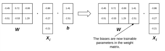
The left visualisation below is the linear classification function. X is the data point/image vector, w is the weight, b the bias. We can incorporate b into w using a math trick involving vector multiplication and shit.
Loss Functions We'll need these to optimise our model using gradient descent so it'll be useful to discuss them now:
What are they??? Functions that calculate scores that pertain to the error between the correct result/label and the calculated label that the scoring function tried to find. Hinge Loss: • Super basic loss function that just sums the scores of all the incorrect classes that the scoring function scored for. • Recall that the scoring function took the flattened image vectors and scored them using different bias vectors and weight matrices for each one. • Bad
Cross-Entropy Loss Yada yada yada lots of math to get:

Within the log function is the denominator. It refers to e^(Score of the correct class). The bottom is sum of e^(Score of the wrong classes). Of course, this is just the loss score for each image vector/datapoint we're passing in. We just take the average to get the cross-entropy loss over the entire dataset.
Stochastic Gradient Descent
The bread and butter of machine learning algorithms.
But first Vanilla Gradient Descent: Since I've go a bit of a bg in machine learning, I'm quite familiar with this algorithm. I'll quickly give a high level overview.

This is a super simplified 2D graph of a simple loss function. Most loss functions will be multi-dimensional due to the sheer sizes of the vectors we're using. What gradient descent attempts to do, is minimise the loss given a bunch of weights and obtain the weights at the global minimum, which will be the weights with the least error. Recall that our weights were used to score the image vectors we passed in. Why don't we just jump to the global minimum if we know the mathematical function? Imagine you're blind, deaf, have no sense of orientation, no sense of touch and you just got yeeted off a plane into a mountain range and your only sense allows you to compute your coordinates and the corresponding altitude you're at and you're trying to get to as low an altitude as you can because there's your ride home. What do you do? You blindly try to head downward by following the downward slope. That's basically what gradient descent tries to do, except the mountain range is the loss function. It drops us into the 'loss landscape' (literally what people refer to it as) and takes a step at a time. If the step is upward i.e. the previous loss score was lower, it changes direction and if downward it keeps walking in that direction. Stochastic Gradient Descent Recall that computing gradient requires your score and thus loss/error to be calculated. Also recall that we said you need to average the loss of your entire dataset to get your loss at the particular weight. Well we don't do that with stochastic gradient descent: we take a small random sample and obtain the loss with that sample at a particular and while it may lead to higher error with regards to loss at a particular weight, it also lets us take more steps along the loss function landscape and the trade-off is more than worth it. Gradient Descent Optimisations Momentum: Recall our previous example of the mountain range and the blind guy. In that example, we assumed each step the guy took was the same size but realistically, the steeper the mountain, the larger or faster the steps he would take as gravity would drag him along. Same deal with gradient descent. The steeper the gradient, which would be calculated by the size of the change in loss from the previous 'step', the larger the 'step' we take. This speeds up our descent to the bottom by a lot. However, this may have the issue of 'overstepping' the minimal point we're trying to reach when our momentum builds up too much because our steps are discrete in nature and we can't see the local minima. Nesterov Acceleration: This fixes that. Basically, we make a test step before momentum is added to our step, save the results of the test step, make the momentum added step and then compare the results. If the test step is smaller, we know we've overstepped the minima. Regularisation: A lot of the time, our weights are TOO tuned for a specific dataset due to a variety of reasons. E.g. In classifying cat and dog pics, maybe most of the pictures of cats consistently had a watermark in it. Now if we got a new dataset with dogs in it, and some of those dog pictures had that same watermark, we obviously don't want to classify pictures of dogs with that same watermark in it as cats, just because of they have that watermark and our model was fit to that earlier dataset and thought that the watermark meant cat. This issue is called overfitting. We reduce this problem by reducing the weight that the scoring function places on that watermark for cats and there a number of techniques that do this. I probably won't go into the details since I don't have that much time this week.
1 note
·
View note
Text
A little something about morality. Enough of my life has been spent working with mathematical structures and other theoretical constructs that the patterns of thought trained for those modes have bled through to other parts of my life. Morality is a core facet of life and its been shaped by the math just as much as the rest.
Generating complete mathematical proofs taught me more about skepticism than any other experience in my life. So often on the road to proving a theorem you will encounter the thought "it would be really convenient for this logical structure if fact X held". You can see how all the pieces fall in to place given the solidity of X and X probably has a certain internal plausibility and if X just held in truth then you could move on from this proof to something more relaxing (you may or may not have an unhealthy amount of animosity toward the proof built up at this point). It's tempting to write your first line "it's trivial to show X holds", sketch out the rest, and hope you've kicked up enough dust to pass - I've encountered my fair share of "proofs" using that structure. The sticking point is, it is mathematical maturity not to take the easy route of hope and instead to demonstrate the rigour required to generate a complete sound answer. And there's a reason for this. Your intuition in this area is untrained and often you discover (forging ahead) that you cannot prove X. After a lot of sweat and a pinch of luck you discover the counterexample or contradiction inherent in X that renders it false - the true proof proceeds along other lines.
This general lesson is useful. Convenience or wishing will not make a thing true and intuition should remain tempered with humility. This was actually one of the nails in the coffin for my religious inclinations. So many doubts and questions are answered if religion X is correct in its foundational claims but that has no bearing on whether X is true (only that its comforting). If you're honest with yourself then you cannot use that reasoning from most convenient world.
The next lesson comes from complexity theory. Sure complexity theory is an offshoot of the study of algorithms and so carries the faint stigma of applied mathematician to the theoretician but, stigma aside, it is a deep field full of interesting structure. Far more than I can render here so let's focus on one part. Complexity theory separates problems into an infinite leveled hierarchy depending on how hard the problem is to solve. In general, a problem is on level n+1 of the hierarchy if you can solve it when given access to a magic box that instantly solves any problem on level n. This simple picture is somewhat complicated by the fact that we don't know yet whether there are truly infinite levels or whether the structure collapses to some finite number of sets. This uncertainty is a source of some unease within the community.
Personally, I hold that the hierarchy is infinite because I believe that any universe where this is not true is simply not perverse enough to resemble our own. If my faction is correct then it is a point of mathematical correctness that there problems where its strictly easier to recognize a solution than it is to generate one (that one might also generalize, good writing and good editing are parallel skills but the first seems strictly harder than the second). By way of canonical example, its easier to verify given variable assignments to any random boolean equation than it is to generate those boolean assignments from scratch (verily, humans must earn their truth assignments by the sweat of their brow). This is the lesson I want you to learn from this section: when you see someone present an argument or a position and you compare it to your world view in a away that makes the argument seem both completely revolutionary and completely obvious, you have to step back and give them credit for locating that idea in the first place. This is a non-trivial amount of work. Conversely, when you recognize a particular solution to a general problem, give yourself a pat on the back because you've done something real.
An aside here, I realize that the spirit of the second part clashes somewhat with the lesson of the first part. All I'll say is that it all rounds down to humility and a conviction that issues we don't already recognize as easy almost certainly reduce to something intractable.
Let's talk about solvable. Wait, first a second aside - this is the true power of quantum algorithms. There are methods to use the uncertain nature of quantum bits to to quickly search the entire space of possible solutions and with high probability locate the exact solution to a given problem. It feels like magic and will revolutionize our world when engineering catches up to theory.
Let's talk about solvable. In particular, what do you do when the problem you wish to solve lies in one of the higher levels of the hierarchy, the levels we can't reach? Unless you're prepared to spend ungodly amounts of time on it or you get insanely lucky then you don't get to know an exact answer to the particulars of the problem. You *must* reframe it in a way that allows for an approximate answer, in effect transforming the question into a cousin living lower on the hierarchy. You're being forced to compromise, the universe is built to make you use heuristics. This is important - it's not about heuristics being quicker, it's about exact methods not being able to give you answers at all. Integer programming looks a lot like linear programming but it is in fact significantly more difficult in the general case. The structure of the universe means you must think in probabilities and in error bars and ponder trade-offs, in short the judgment no one asks of an oracle.
An event occurs in front of two of us. I know what I witnessed. And I'm almost certain that you didn't blink. And it's highly probable that you know I witnessed it. And its pretty likely that you think I think you witnessed it. And so on, with a little bit more uncertainty creeping in at each moment of recursion. This sad state of affairs is fine for the most part because usually the stakes are so low. But ask yourself how much more you'd care about common knowledge if your life depending on my having witnessed precisely the same event as you. We hear about that failure mode in the context of criminal trials all the time. Building shared knowledge requires enough work that it's used in the bureaucratic filter for asylum seekers and green card applicants. When you see one person able to get a group to agree on one particular interpretation of facts, remember that you just witnessed something hard. True common knowledge is infinite levels of recursion in the stack and it is impossible. For every situation, there's a point where the probability on the next level is too low for confidence, it's just a question of whether you calculate that far. And the probabilities deteriorate faster the more people you add.
We started with some fairly basic math truisms and moved through some hand-wavy logic constructions, let's end with something obscure. Communication is not free. If I want to learn about something that's happening far away or coordinate some communal action, I have to rely on messages that take multiple hops to reach their destination. We still have not mastered error correcting codes for common speech, much less methods for achieving better clarity in communication (case in point, how nonsensical most of this post reads), so your messages are going to get altered en-route. Beyond that, you're still the victim of the network. The effort/uncertainty of message sending defines a finite limit in the number of hops that we can use and still feel confident in the response. There are certain pathological graphs in which the vast majority of nodes believe thing one but when polling only their k-distant neighbors will come to believe that thing two is actually the majority belief. This is beyond government censorship or Overton windows, this is about never being able to know whether your mental image of society is accurate or if you've just been deceived by the structure of your communication.
It's the end and you're feeling cheated because I didn't say much about morals despite promises in my very first sentence. Morality as we understand it today is a bunch of ad hoc, best effort responses to a set of questions that were poorly defined in their original contexts and which haven't altered to match the multiple ways our social world has changed. If you've read the above then you realize solutions are hard and solutions to problems with many parts are harder. Social solutions addressing problems involving many people are worse and pro-social solutions are monumental. Answers are always going to rely on guesswork, methods need to be able to be executed under uncertainty, and if you think a general code of behavior is easy then you're wrong. You must cultivate judgment because the universe is not built to let you offload your thinking to some perfect algorithm.
7 notes
·
View notes
Text
Challenge Creator & the Desmos Classroom
Briefly
At Desmos, we're now asking ourselves one question about everything we make: "Will this help teachers develop social and creative classrooms?" We've chosen those adjectives because they're simultaneously qualities of effective learning and also interesting technology.
We've upgraded three activities (and many more to come) with our new Challenge Creator feature: Parabola Slalom, Laser Challenge, and Point Collector: Lines. Previously, students would only complete challenges we created. Now they'll create challenges for each other.
The results from numerous classroom tests have been – I am not kidding you here – breathtaking. Near unanimous engagement. Interactions between students around mathematical ideas we haven't seen in our activities before.
Read More One question in edtech bothers us more than nearly any other:
Why are students so engaged by their tablets, phones, and laptops outside of class and so bored by them inside of class?
It's the same device. But in one context, students are generally enthusiastic and focused. In the other, they're often apathetic and distracted. At Desmos, we notice that, outside of class, students use their devices in ways that are social and creative. They create all kinds of media – text messages, videos, photos, etc. – and they share that media with their peers via social networks. You might think that comparison is unfair – that school could never stack up next to Instagram or Snapchat – but before we write it off, let's ask ourselves, "How social and creative is math edtech?" What do students create and whom do they share those creations with? In typical math edtech, students create number responses and multiple choice answers. And they typically share those creations with an algorithm, a few lines of code. In rarer cases, their teacher will see those creations, but more often the teacher will only see the grade the algorithm gave them. For those reasons, we think that math edtech is generally anti-social and uncreative, which explains some of the apathy and distraction we see when students use technology inside of class. Rather than write off the comparison to Instagram and Snapchat as unreasonable, it has motivated us to ask two more questions:
How can we help students create mathematically in more diverse ways?
So we invite students to create parking lots, scale giants, mathematical arguments, tilings, sketches of relationships, laser configurations, drawings of polygons, tables, stacks of cards, Marbleslides, informal descriptions of mathematical abstractions, sequences of transformations, graphs of the world around them, and many more.
How can we help teachers and students interact socially around those creations?
So we collect all of those creations on a teacher dashboard and we give teachers a toolkit and strategies to help them create conversations around those creations. It's easier to ask your students, "How are these two sketches the same? How are they different?" when both sketches are right in front of you and you're able to pause your class to direct their focus to that conversation. Today, we're releasing a new tool to help teachers develop social and creative math classrooms. Challenge Creator Previously in our activities, students would only complete challenges we created and answer questions we asked. With Challenge Creator, they create challenges for each other and ask each other questions. We tried this in one of our first activities, Waterline, where, first, we asked students to create a graph based on three vases we gave them. And then we asked them to create a vase themselves. If they could successfully graph the vase, it went into a gallery where other students would try to graph it also. We began to see reports online of students' impressive creativity and perseverance on that particular challenge. We started to suspect the following: that students care somewhat when they share their creations with an algorithm, and care somewhat more when they share their creations with their teacher. But they care enormously when they share their creations with each other. So we've added "Challenge Creators" to three more activities, and we now have the ability to add them to any activity in a matter of hours where it first took us a month. In Parabola Slalom, we ask students to find equations of parabolas that slip in between the gates on a slalom course. And now we invite them to create slalom courses for each other. Those challenges can be as difficult as the authors want, but unless they can solve it, no one else will see it. In Laser Challenge, we ask students to solve reflection challenges that we created. And now we invite them to create reflection challenges for each other. In Point Collector, we ask students to use linear inequalities to capture blue points in the middle of a field of points. And now we invite them to create a field of points for each other. We've tested each of these extensively with students. In those tests we saw:
Students calling out their successes to each other from across the room. "Javi, I got a perfect score on yours!"
Students calling out their frustrations to each other from across the room. "Cassie, how do you even do that?"
Students introducing themselves to each other through their challenges. "Who is Oscar?"
Students differentiating their work. "Let's find an easy one. Oo – Jared's."
Students looking at solutions to challenges they'd already completed, and learning new mathematical techniques. "You can do that?!"
Students marveling at each others' ingenuity. "Damn, Oscar. You hella smart."
Proud creation. One student said, "We're going to make our challenge as hard as possible," to which his partner responded, "But we have to be able to solve it!"
Screams and high fives so enthusiastic you'd think we were paying them.
At the end of one test of Point Collector, we asked students, "What was your favorite part of the activity?" 25 out of 27 students said some version of "Solving other people's challenges." I'm not saying what we saw was on the same level of enthusiasm and focus as Instagram or Snapchat. But it wasn't that far off, either. Questions We Can Answer How much does it cost? As with everything else we make that's free for you to use now, we will never charge you for it. Will we be able to create our own Challenge Creators? Eventually, yes. Currently, the Triple C (Challenge Creator Creator, obv.) has too many rough edges to release widely. Once those edges are sanded down, we'll release it. We don't have a timeline for that work, but just as we think student work is at its best when it's social and creative, we think teacher work is at its best under those exact same conditions. We want to give teachers the best toolkit possible and enable them to share their creations with each other. Questions We Can't Answer What effect does asking a student to create a challenge have on her learning and her interest in learning? What sorts of challenges are most effective? Is this approach just as effective for arithmetic expressions as laser challenges? Does posing your own problem help you understand the limits of a concept better than if you only complete someone else's problems? Researchers, grad students, or any other parties interested in those same questions: please get in touch.
1 note
·
View note
Text
Google's May 2020 Core Update: Winners, Winnerers, Winlosers, and Why It's All Probably Crap
Posted by Dr-Pete On May 4, Google announced that they were rolling out a new Core Update. By May 7, it appeared that the dust had mostly settled. Here’s an 11-day view from MozCast: We measured relatively high volatility from May 4-6, with a peak of 112.6° on May 5. Note that the 30-day average temperature prior to May 4 was historically very high (89.3°). How does this compare to previous Core Updates? With the caveat that recent temperatures have been well above historical averages, the May 2020 Core Update was our second-hottest Core Update so far, coming in just below the August 2018 “Medic” update.
Who “won” the May Core Update?
It’s common to report winners and losers after a major update (and I’ve done it myself), but for a while now I’ve been concerned that these analyses only capture a small window of time. Whenever we compare two fixed points in time, we’re ignoring the natural volatility of search rankings and the inherent differences between keywords. This time around, I’d like to take a hard look at the pitfalls. I’m going to focus on winners. The table below shows the 1-day winners (May 5) by total rankings in the 10,000-keyword MozCast tracking set. I’ve only included subdomains with at least 25 rankings on May 4: Putting aside the usual statistical suspects (small sample sizes for some keywords, the unique pros and cons of our data set, etc.), what’s the problem with this analysis? Sure, there are different ways to report the “% Gain” (such as absolute change vs. relative percentage), but I’ve reported the absolute numbers honestly and the relative change is accurate. The problem is that, in rushing to run the numbers after one day, we’ve ignored the reality that most core updates are multi-day (a trend that seemed to continue for the May Core Update, as evidenced by our initial graph). We’ve also failed to account for domains whose rankings might be historically volatile (but more on that in a bit). What if we compare the 1-day and 2-day data?
Which story do we tell?
The table below adds in the 2-day relative percentage gained. I’ve kept the same 25 subdomains and will continue to sort them by the 1-day percentage gained, for consistency: Even just comparing the first two days of the roll-out, we can see that the story is shifting considerably. The problem is: Which story do we tell? Often, we’re not even looking at lists, but anecdotes based on our own clients or cherry-picking data. Consider this story: If this was our only view of the data, we would probably conclude that the update intensified over the two days, with day two rewarding sites even more. We could even start to craft a story about how demand for apps was growing, or certain news sites were being rewarded. These stories might have a grain of truth, but the fact is that we have no idea from this data alone. Now, let’s pick three different data points (all of these are from the top 20): From this limited view, we could conclude that Google decided that the Core Update went wrong and reversed it on day two. We could even conclude that certain news sites were being penalized for some reason. This tells a wildly different story than the first set of anecdotes. There’s an even weirder story buried in the May 2020 data. Consider this: LinkedIn showed a minor bump (one we’d generally ignore) on day one and then lost 100% of its rankings on day two. Wow, that May Core Update really packs a punch! It turns out that LinkedIn may have accidentally de-indexed their site — they recovered the next day, and it appears this massive change had nothing to do with the Core Update. The simple truth is that these numbers tell us very little about why a site gained or lost rankings.
How do we define “normal”?
Let’s take a deeper look at the MarketWatch data. Marketwatch gained 19% in the 1-day stats, but lost 2% in the 2-day numbers. The problem here is that we don’t know from these numbers what MarketWatch’s normal SERP flux looks like. Here’s a graph of seven days before and after May 4 (the start of the Core Update): Looking at even a small bit of historical data, we can see that MarketWatch, like most news sites, experiences significant volatility. The “gains” on May 5 are only because of losses on May 4. It turns out that the 7-day mean after May 4 (45.7) is only a slight increase over the 7-day mean before May 4 (44.3), with MarketWatch measuring a modest relative gain of +3.2%. Now let’s look at Google Play, which appeared to be a clear winner after two days: You don’t even need to do the math to spot the difference here. Comparing the 7-day mean before May 4 (232.9) to the 7-day mean after (448.7), Google Play experienced a dramatic +93% relative change after the May Core Update. How does this 7-day before/after comparison work with the LinkedIn incident? Here’s a graph of the before/after with dotted lines added for the two means: While this approach certainly helps offset the single-day anomaly, we’re still showing a before/after change of -16%, which isn’t really in line with reality. You can see that six of the seven days after the May Core Update were above the 7-day average. Note that LinkedIn also has relatively low volatility over the short-range history. Why am I rotten-cherry-picking an extreme example where my new metric falls short? I want it to be perfectly clear that no one metric can ever tell the whole story. Even if we accounted for the variance and did statistical testing, we’re still missing a lot of information. A clear before/after difference doesn’t tell us what actually happened, only that there was a change correlated with the timing of the Core Update. That’s useful information, but it still begs further investigation before we jump to sweeping conclusions. Overall, though, the approach is certainly better than single-day slices. Using the 7-day before-vs-after mean comparison accounts for both historical data and a full seven days after the update. What if we expanded this comparison of 7-day periods to the larger data set? Here’s our original “winners” list with the new numbers: Obviously, this is a lot to digest in one table, but we can start to see where the before-and-after metric (the relative difference between 7-day means) shows a different picture, in some cases, than either the 1-day or 2-day view. Let’s go ahead and re-build the top 20 based on the before-and-after percentage change: Some of the big players are the same, but we’ve also got some newcomers — including sites that looked like they lost visibility on day one, but have stacked up 2-day and 7-day gains. Let’s take a quick look at Parents.com, our original big winner (winnerer? winnerest?). Day one showed a massive +100% gain (doubling visibility), but day-two numbers were more modest, and before-and-after gains came in at just under half the day-one gain. Here are the seven days before and after: It’s easy to see here that the day-one jump was a short-term anomaly, based in part on a dip on May 4. Comparing the 7-day averages seems to get much closer to the truth. This is a warning not just to algo trackers like myself, but to SEOs who might see that +100% and rush to tell their boss or client. Don’t let good news turn into a promise that you can’t keep.
Why do we keep doing this?
If it seems like I’m calling out the industry, note that I’m squarely in my own crosshairs here. There’s tremendous pressure to publish analyses early, not just because it equates to traffic and links (frankly, it does), but because site owners and SEOs genuinely want answers. As I wrote recently, I think there’s tremendous danger in overinterpreting short-term losses and fixing the wrong things. However, I think there’s also real danger in overstating short-term wins and having the expectation that those gains are permanent. That can lead to equally risky decisions. Is it all crap? No, I don’t think so, but I think it’s very easy to step off the sidewalk and into the muck after a storm, and at the very least we need to wait for the ground to dry. That’s not easy in a world of Twitter and 24-hour news cycles, but it’s essential to get a multi-day view, especially since so many large algorithm updates roll out over extended periods of time. Which numbers should we believe? In a sense, all of them, or at least all of the ones we can adequately verify. No single metric is ever going to paint the entire picture, and before you rush off to celebrate being on a winners list, it’s important to take that next step and really understand the historical trends and the context of any victory.
Who wants some free data?
Given the scope of the analysis, I didn’t cover the May 2020 Core Update losers in this post or go past the Top 20, but you can download the raw data here. If you’d like to edit it, please make a copy first. Winners and losers are on separate tabs, and this covers all domains with at least 25 rankings in our MozCast 10K data set on May 4 (just over 400 domains). Sign up for The Moz Top 10, a semimonthly mailer updating you on the top ten hottest pieces of SEO news, tips, and rad links uncovered by the Moz team. Think of it as your exclusive digest of stuff you don't have time to hunt down but want to read!
https://www.businesscreatorplus.com/googles-may-2020-core-update-winners-winnerers-winlosers-and-why-its-all-probably-crap/
0 notes
Text
Google's May 2020 Core Update: Winners, Winnerers, Winlosers, and Why It's All Probably Crap
Posted by Dr-Pete
On May 4, Google announced that they were rolling out a new Core Update. By May 7, it appeared that the dust had mostly settled. Here’s an 11-day view from MozCast:
We measured relatively high volatility from May 4-6, with a peak of 112.6° on May 5. Note that the 30-day average temperature prior to May 4 was historically very high (89.3°).
How does this compare to previous Core Updates? With the caveat that recent temperatures have been well above historical averages, the May 2020 Core Update was our second-hottest Core Update so far, coming in just below the August 2018 “Medic” update.
Who “won” the May Core Update?
It’s common to report winners and losers after a major update (and I’ve done it myself), but for a while now I’ve been concerned that these analyses only capture a small window of time. Whenever we compare two fixed points in time, we’re ignoring the natural volatility of search rankings and the inherent differences between keywords.
This time around, I’d like to take a hard look at the pitfalls. I’m going to focus on winners. The table below shows the 1-day winners (May 5) by total rankings in the 10,000-keyword MozCast tracking set. I’ve only included subdomains with at least 25 rankings on May 4:
Putting aside the usual statistical suspects (small sample sizes for some keywords, the unique pros and cons of our data set, etc.), what’s the problem with this analysis? Sure, there are different ways to report the “% Gain” (such as absolute change vs. relative percentage), but I’ve reported the absolute numbers honestly and the relative change is accurate.
The problem is that, in rushing to run the numbers after one day, we’ve ignored the reality that most core updates are multi-day (a trend that seemed to continue for the May Core Update, as evidenced by our initial graph). We’ve also failed to account for domains whose rankings might be historically volatile (but more on that in a bit). What if we compare the 1-day and 2-day data?
Which story do we tell?
The table below adds in the 2-day relative percentage gained. I’ve kept the same 25 subdomains and will continue to sort them by the 1-day percentage gained, for consistency:
Even just comparing the first two days of the roll-out, we can see that the story is shifting considerably. The problem is: Which story do we tell? Often, we’re not even looking at lists, but anecdotes based on our own clients or cherry-picking data. Consider this story:
If this was our only view of the data, we would probably conclude that the update intensified over the two days, with day two rewarding sites even more. We could even start to craft a story about how demand for apps was growing, or certain news sites were being rewarded. These stories might have a grain of truth, but the fact is that we have no idea from this data alone.
Now, let’s pick three different data points (all of these are from the top 20):
From this limited view, we could conclude that Google decided that the Core Update went wrong and reversed it on day two. We could even conclude that certain news sites were being penalized for some reason. This tells a wildly different story than the first set of anecdotes.
There’s an even weirder story buried in the May 2020 data. Consider this:
LinkedIn showed a minor bump (one we’d generally ignore) on day one and then lost 100% of its rankings on day two. Wow, that May Core Update really packs a punch! It turns out that LinkedIn may have accidentally de-indexed their site — they recovered the next day, and it appears this massive change had nothing to do with the Core Update. The simple truth is that these numbers tell us very little about why a site gained or lost rankings.
How do we define “normal”?
Let’s take a deeper look at the MarketWatch data. Marketwatch gained 19% in the 1-day stats, but lost 2% in the 2-day numbers. The problem here is that we don’t know from these numbers what MarketWatch’s normal SERP flux looks like. Here’s a graph of seven days before and after May 4 (the start of the Core Update):
Looking at even a small bit of historical data, we can see that MarketWatch, like most news sites, experiences significant volatility. The “gains” on May 5 are only because of losses on May 4. It turns out that the 7-day mean after May 4 (45.7) is only a slight increase over the 7-day mean before May 4 (44.3), with MarketWatch measuring a modest relative gain of +3.2%.
Now let’s look at Google Play, which appeared to be a clear winner after two days:
You don’t even need to do the math to spot the difference here. Comparing the 7-day mean before May 4 (232.9) to the 7-day mean after (448.7), Google Play experienced a dramatic +93% relative change after the May Core Update.
How does this 7-day before/after comparison work with the LinkedIn incident? Here’s a graph of the before/after with dotted lines added for the two means:
While this approach certainly helps offset the single-day anomaly, we’re still showing a before/after change of -16%, which isn’t really in line with reality. You can see that six of the seven days after the May Core Update were above the 7-day average. Note that LinkedIn also has relatively low volatility over the short-range history.
Why am I rotten-cherry-picking an extreme example where my new metric falls short? I want it to be perfectly clear that no one metric can ever tell the whole story. Even if we accounted for the variance and did statistical testing, we’re still missing a lot of information. A clear before/after difference doesn’t tell us what actually happened, only that there was a change correlated with the timing of the Core Update. That’s useful information, but it still begs further investigation before we jump to sweeping conclusions.
Overall, though, the approach is certainly better than single-day slices. Using the 7-day before-vs-after mean comparison accounts for both historical data and a full seven days after the update. What if we expanded this comparison of 7-day periods to the larger data set? Here’s our original “winners” list with the new numbers:
Obviously, this is a lot to digest in one table, but we can start to see where the before-and-after metric (the relative difference between 7-day means) shows a different picture, in some cases, than either the 1-day or 2-day view. Let’s go ahead and re-build the top 20 based on the before-and-after percentage change:
Some of the big players are the same, but we’ve also got some newcomers — including sites that looked like they lost visibility on day one, but have stacked up 2-day and 7-day gains.
Let’s take a quick look at Parents.com, our original big winner (winnerer? winnerest?). Day one showed a massive +100% gain (doubling visibility), but day-two numbers were more modest, and before-and-after gains came in at just under half the day-one gain. Here are the seven days before and after:
It’s easy to see here that the day-one jump was a short-term anomaly, based in part on a dip on May 4. Comparing the 7-day averages seems to get much closer to the truth. This is a warning not just to algo trackers like myself, but to SEOs who might see that +100% and rush to tell their boss or client. Don’t let good news turn into a promise that you can’t keep.
Why do we keep doing this?
If it seems like I’m calling out the industry, note that I’m squarely in my own crosshairs here. There’s tremendous pressure to publish analyses early, not just because it equates to traffic and links (frankly, it does), but because site owners and SEOs genuinely want answers. As I wrote recently, I think there’s tremendous danger in overinterpreting short-term losses and fixing the wrong things. However, I think there’s also real danger in overstating short-term wins and having the expectation that those gains are permanent. That can lead to equally risky decisions.
Is it all crap? No, I don’t think so, but I think it’s very easy to step off the sidewalk and into the muck after a storm, and at the very least we need to wait for the ground to dry. That’s not easy in a world of Twitter and 24-hour news cycles, but it’s essential to get a multi-day view, especially since so many large algorithm updates roll out over extended periods of time.
Which numbers should we believe? In a sense, all of them, or at least all of the ones we can adequately verify. No single metric is ever going to paint the entire picture, and before you rush off to celebrate being on a winners list, it’s important to take that next step and really understand the historical trends and the context of any victory.
Who wants some free data?
Given the scope of the analysis, I didn’t cover the May 2020 Core Update losers in this post or go past the Top 20, but you can download the raw data here. If you’d like to edit it, please make a copy first. Winners and losers are on separate tabs, and this covers all domains with at least 25 rankings in our MozCast 10K data set on May 4 (just over 400 domains).
Sign up for The Moz Top 10, a semimonthly mailer updating you on the top ten hottest pieces of SEO news, tips, and rad links uncovered by the Moz team. Think of it as your exclusive digest of stuff you don't have time to hunt down but want to read!
via Blogger https://ift.tt/2WsXYgc #blogger #bloggingtips #bloggerlife #bloggersgetsocial #ontheblog #writersofinstagram #writingprompt #instapoetry #writerscommunity #writersofig #writersblock #writerlife #writtenword #instawriters #spilledink #wordgasm #creativewriting #poetsofinstagram #blackoutpoetry #poetsofig
0 notes
Text
Google's May 2020 Core Update: Winners, Winnerers, Winlosers, and Why It's All Probably Crap
Posted by Dr-Pete
On May 4, Google announced that they were rolling out a new Core Update. By May 7, it appeared that the dust had mostly settled. Here’s an 11-day view from MozCast:
We measured relatively high volatility from May 4-6, with a peak of 112.6° on May 5. Note that the 30-day average temperature prior to May 4 was historically very high (89.3°).
How does this compare to previous Core Updates? With the caveat that recent temperatures have been well above historical averages, the May 2020 Core Update was our second-hottest Core Update so far, coming in just below the August 2018 “Medic” update.
Who “won” the May Core Update?
It’s common to report winners and losers after a major update (and I’ve done it myself), but for a while now I’ve been concerned that these analyses only capture a small window of time. Whenever we compare two fixed points in time, we’re ignoring the natural volatility of search rankings and the inherent differences between keywords.
This time around, I’d like to take a hard look at the pitfalls. I’m going to focus on winners. The table below shows the 1-day winners (May 5) by total rankings in the 10,000-keyword MozCast tracking set. I’ve only included subdomains with at least 25 rankings on May 4:
Putting aside the usual statistical suspects (small sample sizes for some keywords, the unique pros and cons of our data set, etc.), what’s the problem with this analysis? Sure, there are different ways to report the “% Gain” (such as absolute change vs. relative percentage), but I’ve reported the absolute numbers honestly and the relative change is accurate.
The problem is that, in rushing to run the numbers after one day, we’ve ignored the reality that most core updates are multi-day (a trend that seemed to continue for the May Core Update, as evidenced by our initial graph). We’ve also failed to account for domains whose rankings might be historically volatile (but more on that in a bit). What if we compare the 1-day and 2-day data?
Which story do we tell?
The table below adds in the 2-day relative percentage gained. I’ve kept the same 25 subdomains and will continue to sort them by the 1-day percentage gained, for consistency:
Even just comparing the first two days of the roll-out, we can see that the story is shifting considerably. The problem is: Which story do we tell? Often, we’re not even looking at lists, but anecdotes based on our own clients or cherry-picking data. Consider this story:
If this was our only view of the data, we would probably conclude that the update intensified over the two days, with day two rewarding sites even more. We could even start to craft a story about how demand for apps was growing, or certain news sites were being rewarded. These stories might have a grain of truth, but the fact is that we have no idea from this data alone.
Now, let’s pick three different data points (all of these are from the top 20):
From this limited view, we could conclude that Google decided that the Core Update went wrong and reversed it on day two. We could even conclude that certain news sites were being penalized for some reason. This tells a wildly different story than the first set of anecdotes.
There’s an even weirder story buried in the May 2020 data. Consider this:
LinkedIn showed a minor bump (one we’d generally ignore) on day one and then lost 100% of its rankings on day two. Wow, that May Core Update really packs a punch! It turns out that LinkedIn may have accidentally de-indexed their site — they recovered the next day, and it appears this massive change had nothing to do with the Core Update. The simple truth is that these numbers tell us very little about why a site gained or lost rankings.
How do we define “normal”?
Let’s take a deeper look at the MarketWatch data. Marketwatch gained 19% in the 1-day stats, but lost 2% in the 2-day numbers. The problem here is that we don’t know from these numbers what MarketWatch’s normal SERP flux looks like. Here’s a graph of seven days before and after May 4 (the start of the Core Update):
Looking at even a small bit of historical data, we can see that MarketWatch, like most news sites, experiences significant volatility. The “gains” on May 5 are only because of losses on May 4. It turns out that the 7-day mean after May 4 (45.7) is only a slight increase over the 7-day mean before May 4 (44.3), with MarketWatch measuring a modest relative gain of +3.2%.
Now let’s look at Google Play, which appeared to be a clear winner after two days:
You don’t even need to do the math to spot the difference here. Comparing the 7-day mean before May 4 (232.9) to the 7-day mean after (448.7), Google Play experienced a dramatic +93% relative change after the May Core Update.
How does this 7-day before/after comparison work with the LinkedIn incident? Here’s a graph of the before/after with dotted lines added for the two means:
While this approach certainly helps offset the single-day anomaly, we’re still showing a before/after change of -16%, which isn’t really in line with reality. You can see that six of the seven days after the May Core Update were above the 7-day average. Note that LinkedIn also has relatively low volatility over the short-range history.
Why am I rotten-cherry-picking an extreme example where my new metric falls short? I want it to be perfectly clear that no one metric can ever tell the whole story. Even if we accounted for the variance and did statistical testing, we’re still missing a lot of information. A clear before/after difference doesn’t tell us what actually happened, only that there was a change correlated with the timing of the Core Update. That’s useful information, but it still begs further investigation before we jump to sweeping conclusions.
Overall, though, the approach is certainly better than single-day slices. Using the 7-day before-vs-after mean comparison accounts for both historical data and a full seven days after the update. What if we expanded this comparison of 7-day periods to the larger data set? Here’s our original “winners” list with the new numbers:
Obviously, this is a lot to digest in one table, but we can start to see where the before-and-after metric (the relative difference between 7-day means) shows a different picture, in some cases, than either the 1-day or 2-day view. Let’s go ahead and re-build the top 20 based on the before-and-after percentage change:
Some of the big players are the same, but we’ve also got some newcomers — including sites that looked like they lost visibility on day one, but have stacked up 2-day and 7-day gains.
Let’s take a quick look at Parents.com, our original big winner (winnerer? winnerest?). Day one showed a massive +100% gain (doubling visibility), but day-two numbers were more modest, and before-and-after gains came in at just under half the day-one gain. Here are the seven days before and after:
It’s easy to see here that the day-one jump was a short-term anomaly, based in part on a dip on May 4. Comparing the 7-day averages seems to get much closer to the truth. This is a warning not just to algo trackers like myself, but to SEOs who might see that +100% and rush to tell their boss or client. Don’t let good news turn into a promise that you can’t keep.
Why do we keep doing this?
If it seems like I’m calling out the industry, note that I’m squarely in my own crosshairs here. There’s tremendous pressure to publish analyses early, not just because it equates to traffic and links (frankly, it does), but because site owners and SEOs genuinely want answers. As I wrote recently, I think there’s tremendous danger in overinterpreting short-term losses and fixing the wrong things. However, I think there’s also real danger in overstating short-term wins and having the expectation that those gains are permanent. That can lead to equally risky decisions.
Is it all crap? No, I don’t think so, but I think it’s very easy to step off the sidewalk and into the muck after a storm, and at the very least we need to wait for the ground to dry. That’s not easy in a world of Twitter and 24-hour news cycles, but it’s essential to get a multi-day view, especially since so many large algorithm updates roll out over extended periods of time.
Which numbers should we believe? In a sense, all of them, or at least all of the ones we can adequately verify. No single metric is ever going to paint the entire picture, and before you rush off to celebrate being on a winners list, it’s important to take that next step and really understand the historical trends and the context of any victory.
Who wants some free data?
Given the scope of the analysis, I didn’t cover the May 2020 Core Update losers in this post or go past the Top 20, but you can download the raw data here. If you’d like to edit it, please make a copy first. Winners and losers are on separate tabs, and this covers all domains with at least 25 rankings in our MozCast 10K data set on May 4 (just over 400 domains).
Sign up for The Moz Top 10, a semimonthly mailer updating you on the top ten hottest pieces of SEO news, tips, and rad links uncovered by the Moz team. Think of it as your exclusive digest of stuff you don't have time to hunt down but want to read!
https://ift.tt/2AjddzJ
0 notes
Text
Google's May 2020 Core Update: Winners, Winnerers, Winlosers, and Why It's All Probably Crap
Posted by Dr-Pete
On May 4, Google announced that they were rolling out a new Core Update. By May 7, it appeared that the dust had mostly settled. Here’s an 11-day view from MozCast:
We measured relatively high volatility from May 4-6, with a peak of 112.6° on May 5. Note that the 30-day average temperature prior to May 4 was historically very high (89.3°).
How does this compare to previous Core Updates? With the caveat that recent temperatures have been well above historical averages, the May 2020 Core Update was our second-hottest Core Update so far, coming in just below the August 2018 “Medic” update.
Who “won” the May Core Update?
It’s common to report winners and losers after a major update (and I’ve done it myself), but for a while now I’ve been concerned that these analyses only capture a small window of time. Whenever we compare two fixed points in time, we’re ignoring the natural volatility of search rankings and the inherent differences between keywords.
This time around, I’d like to take a hard look at the pitfalls. I’m going to focus on winners. The table below shows the 1-day winners (May 5) by total rankings in the 10,000-keyword MozCast tracking set. I’ve only included subdomains with at least 25 rankings on May 4:
Putting aside the usual statistical suspects (small sample sizes for some keywords, the unique pros and cons of our data set, etc.), what’s the problem with this analysis? Sure, there are different ways to report the “% Gain” (such as absolute change vs. relative percentage), but I’ve reported the absolute numbers honestly and the relative change is accurate.
The problem is that, in rushing to run the numbers after one day, we’ve ignored the reality that most core updates are multi-day (a trend that seemed to continue for the May Core Update, as evidenced by our initial graph). We’ve also failed to account for domains whose rankings might be historically volatile (but more on that in a bit). What if we compare the 1-day and 2-day data?
Which story do we tell?
The table below adds in the 2-day relative percentage gained. I’ve kept the same 25 subdomains and will continue to sort them by the 1-day percentage gained, for consistency:
Even just comparing the first two days of the roll-out, we can see that the story is shifting considerably. The problem is: Which story do we tell? Often, we’re not even looking at lists, but anecdotes based on our own clients or cherry-picking data. Consider this story:
If this was our only view of the data, we would probably conclude that the update intensified over the two days, with day two rewarding sites even more. We could even start to craft a story about how demand for apps was growing, or certain news sites were being rewarded. These stories might have a grain of truth, but the fact is that we have no idea from this data alone.
Now, let’s pick three different data points (all of these are from the top 20):
From this limited view, we could conclude that Google decided that the Core Update went wrong and reversed it on day two. We could even conclude that certain news sites were being penalized for some reason. This tells a wildly different story than the first set of anecdotes.
There’s an even weirder story buried in the May 2020 data. Consider this:
LinkedIn showed a minor bump (one we’d generally ignore) on day one and then lost 100% of its rankings on day two. Wow, that May Core Update really packs a punch! It turns out that LinkedIn may have accidentally de-indexed their site — they recovered the next day, and it appears this massive change had nothing to do with the Core Update. The simple truth is that these numbers tell us very little about why a site gained or lost rankings.
How do we define “normal”?
Let’s take a deeper look at the MarketWatch data. Marketwatch gained 19% in the 1-day stats, but lost 2% in the 2-day numbers. The problem here is that we don’t know from these numbers what MarketWatch’s normal SERP flux looks like. Here’s a graph of seven days before and after May 4 (the start of the Core Update):
Looking at even a small bit of historical data, we can see that MarketWatch, like most news sites, experiences significant volatility. The “gains” on May 5 are only because of losses on May 4. It turns out that the 7-day mean after May 4 (45.7) is only a slight increase over the 7-day mean before May 4 (44.3), with MarketWatch measuring a modest relative gain of +3.2%.
Now let’s look at Google Play, which appeared to be a clear winner after two days:
You don’t even need to do the math to spot the difference here. Comparing the 7-day mean before May 4 (232.9) to the 7-day mean after (448.7), Google Play experienced a dramatic +93% relative change after the May Core Update.
How does this 7-day before/after comparison work with the LinkedIn incident? Here’s a graph of the before/after with dotted lines added for the two means:
While this approach certainly helps offset the single-day anomaly, we’re still showing a before/after change of -16%, which isn’t really in line with reality. You can see that six of the seven days after the May Core Update were above the 7-day average. Note that LinkedIn also has relatively low volatility over the short-range history.
Why am I rotten-cherry-picking an extreme example where my new metric falls short? I want it to be perfectly clear that no one metric can ever tell the whole story. Even if we accounted for the variance and did statistical testing, we’re still missing a lot of information. A clear before/after difference doesn’t tell us what actually happened, only that there was a change correlated with the timing of the Core Update. That’s useful information, but it still begs further investigation before we jump to sweeping conclusions.
Overall, though, the approach is certainly better than single-day slices. Using the 7-day before-vs-after mean comparison accounts for both historical data and a full seven days after the update. What if we expanded this comparison of 7-day periods to the larger data set? Here’s our original “winners” list with the new numbers:
Obviously, this is a lot to digest in one table, but we can start to see where the before-and-after metric (the relative difference between 7-day means) shows a different picture, in some cases, than either the 1-day or 2-day view. Let’s go ahead and re-build the top 20 based on the before-and-after percentage change:
Some of the big players are the same, but we’ve also got some newcomers — including sites that looked like they lost visibility on day one, but have stacked up 2-day and 7-day gains.
Let’s take a quick look at Parents.com, our original big winner (winnerer? winnerest?). Day one showed a massive +100% gain (doubling visibility), but day-two numbers were more modest, and before-and-after gains came in at just under half the day-one gain. Here are the seven days before and after:
It’s easy to see here that the day-one jump was a short-term anomaly, based in part on a dip on May 4. Comparing the 7-day averages seems to get much closer to the truth. This is a warning not just to algo trackers like myself, but to SEOs who might see that +100% and rush to tell their boss or client. Don’t let good news turn into a promise that you can’t keep.
Why do we keep doing this?
If it seems like I’m calling out the industry, note that I’m squarely in my own crosshairs here. There’s tremendous pressure to publish analyses early, not just because it equates to traffic and links (frankly, it does), but because site owners and SEOs genuinely want answers. As I wrote recently, I think there’s tremendous danger in overinterpreting short-term losses and fixing the wrong things. However, I think there’s also real danger in overstating short-term wins and having the expectation that those gains are permanent. That can lead to equally risky decisions.
Is it all crap? No, I don’t think so, but I think it’s very easy to step off the sidewalk and into the muck after a storm, and at the very least we need to wait for the ground to dry. That’s not easy in a world of Twitter and 24-hour news cycles, but it’s essential to get a multi-day view, especially since so many large algorithm updates roll out over extended periods of time.
Which numbers should we believe? In a sense, all of them, or at least all of the ones we can adequately verify. No single metric is ever going to paint the entire picture, and before you rush off to celebrate being on a winners list, it’s important to take that next step and really understand the historical trends and the context of any victory.
Who wants some free data?
Given the scope of the analysis, I didn’t cover the May 2020 Core Update losers in this post or go past the Top 20, but you can download the raw data here. If you’d like to edit it, please make a copy first. Winners and losers are on separate tabs, and this covers all domains with at least 25 rankings in our MozCast 10K data set on May 4 (just over 400 domains).
Sign up for The Moz Top 10, a semimonthly mailer updating you on the top ten hottest pieces of SEO news, tips, and rad links uncovered by the Moz team. Think of it as your exclusive digest of stuff you don't have time to hunt down but want to read!
0 notes