#I am not very good with abstract shapes in art so this was a cool study I guess I need to find more paintings to draw with my silly guys
Text
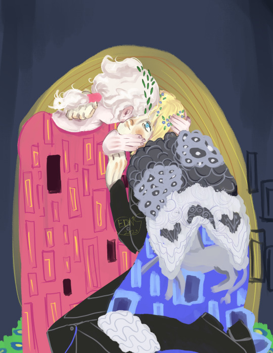
Got inspired by tumblr user ginwilliamsart (pls check out her fan art it's great) to redraw The Kiss by Klimt with these two... All I can say is an attempt was made
#fe3h#fire emblem three houses#fe3h fanart#dimitri alexandre blaiddyd#fe風花雪月#dimitri fire emblem#fe3h dimitri#fe3h oc#dimitri x oc#You thought I was done with this sorry I am not the brainworms are alive and thriving#I am not very good with abstract shapes in art so this was a cool study I guess I need to find more paintings to draw with my silly guys#oc cyrus bartholomew lenz#trypophobia tw#Juuust incase
71 notes
·
View notes
Note
Neopet review: the Zafara! Last in the alphabet of neopets, but certainly not last on how cool they are!
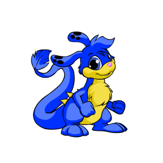
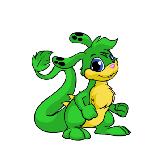
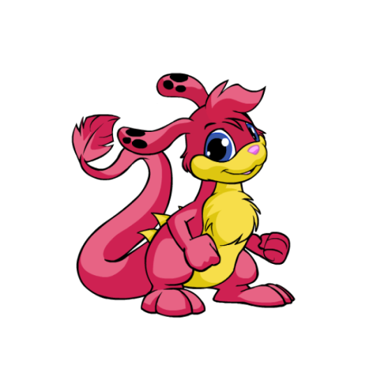
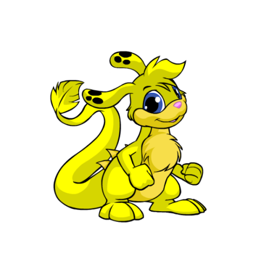
I always enjoy a good abstract creature that's still a believable animal, so unsurprisingly, I like Zafaras a lot. They've got a really unique body shape amongst Neopets that's vaguely like a kangaroo, but that's where the similarities stop. I really like the feathery structure to their tails, their long ears, and that random set of spines they have along their back.
Visually, my only nitpick is that I'm not a big fan of the base color's palettes—most PB colors fix this, but the base colors have a weird mix of beige, pink, blue and black going on with their accents and none of it goes together. I feel like the back spines should've been black along with the nose, or the spots should've been beige instead or black, etc etc.
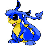
I'd argue Zafaras mostly benefited from customization as their old art was getting very dated by the time the conversion happened, and they likely would've received a redraw even if customization didn't become a thing. Plus a lot of the updates look really good, such as the tail tip shape being improved, fluff being added to the chest so they don't have a weird shape jutting out there, the feet being lengthened, etc. The only downgrade are the fists, and that's just a standard thing for customization.

My only other minor nitpick is that old Zafara eyes were almost pitch black and it gave them what I can best describe as a sopping wet meow meow vibe that gets lost nowadays. Even when they had color in their eyes, it was more of a crescent shape and overall cuter. Granted, though, the new eyes are more in line with other Neopets, so I get the change.
Favorite Colours:
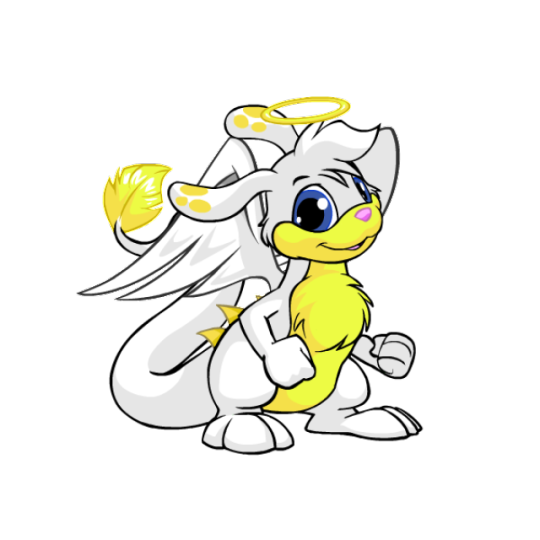
Christmas: While most Christmas pets are just the standard reds and greens, the Christmas Zafara goes in a completely different direction by being an angel with a very pretty white and yellow color palette and a nice get of wings. It's super simple but very pretty. I also like how they fixed the color balancing that I mentioned above by changing the ear spots to yellow and making the tail tip match. (I do kind of wish the nose were black or something, but that's an extreme nitpick.)

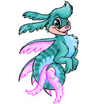
Maraquan: I am 100% cheating by including this one because I usually try to stick to only pet colors you can obtain in the present day, but with UC styles becoming a thing I'm hopeful we'll be getting the old design back one day.
Because yeah, I absolutely love the pre-customization design; making it a sort of sea horse/leafy seadragon cross works perfectly with the Zafara's body shape, the pose is lively, and I love the bright pink fin accents to contrast with the teal body striping.
(The converted is... okay, but the concept was completely lost by changing the pose, the striping was reduced too much, and the body has this bizzaro lumpy shape instead of being a smooth curve like it should be.)

Water: Technically speaking this isn't too fancy, but I just think they did such a nice job with this one. There's so much gorgeous detail in the shading along the head and tail splashes, and the artist really did a good job at capturing that watery look. The choice to make the head tuft and tail splashes in the first place was a great choice, and I especially love how the ear spots are water bubbles. Super pretty all around.
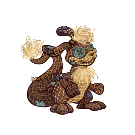
BONUS: I really like burlap pets and think it's an underrated color, so I figured I should give the burlap Zafara a shoutout for being one of the best burlaps out there. The colors are kept muted, the uncanny valley vibe is present, the way they handled the fur tufts looks great, and I like the various slate blue patches on the body, which match with the back spines, spots, and eyes.
40 notes
·
View notes
Text
UNUSUAL OC ASSOCIATIONS
tagged by @camelliagwerm thank you! god i am so sorry i completely forgot to post this, it was rotting in my drafts😭 i’ll do ven and ollie.
VEN
Seasoning: hm. my gut says curry powder for some reason
Weather: typical april weather
Colour: pink, grey and violet
Magic Power: conjuring her kinetic fire?
House Plant: cactus. one of those small, round ones with flowers on top
Weapon: she doesn’t normally use weapons, but i think she’d have fun with a sling.
Subject: drama. yes she’s a fucking theater kid
Social Media: don’t think she’d use a specific site, she’d be an annoying troll on everything
Make-up Product: she has a collection of lipsticks that are all wildly different in colour. so that, i guess.
Candy: center shock! does anyone else know these. they’re like sour gum with tons of wild flavours
Fear: having emotions; accepting that she is an actual person and not some puppet
Ice cube shape: dinosaurs! other cool creatures! she’d use those trays you can put the water in all the time
Method of long distance travel: getting carried by regongar
Art style: abstract + surrealism
Mythological creature: imp
Piece of stationary: one of those multi-colour pens
3 emojis: 🎭🃏🤡
Celestial body: comet
OLEANDER
Seasoning: herbs
Weather: eerie, dark rainy day in the countryside
Colour: dark green and a reddish brown
Sky: cloudy
Magic Power: shapeshifting, making people rot from the inside with a touch of his hand (charming fellow!)
House Plant: trick question! all of them!
Weapon: again, mostly does not use weapons but instead gores people on his shambling mound shape branches. does that count? if it doesn’t, he’s also able to use bows pretty efficiently.
Subject: Biology + Philosophy
Social Media: obscure wildlife/nature forum, one of those ppl who has the best and most informative posts but it’s very obvious to everyone reading that he has issues when he briefly mentions his personal life in one of them (“uhh why is apocynaceae43 talking about the mother of beasts in his latest gardening tutorial??”)
Make-up Products: blood and guts :)
Candy: blueberries, all berries are good though
Fear: failing
Ice cube shape: cubes
Method of long distance travel: transforming into a vulture and flying
Art style: Romantic
Mythological creature: witches (almost was one before i went with druid)
Piece of stationary: old handmade journal for his poetry
3 emojis: 🥀🌳🙏
Celestial body: hm. black hole maybe?
11 notes
·
View notes
Text
3/11/23
I finished the stone pieces today. The last one. It... had plenty of flaws. And I'm just sorta letting it have them. I don't like the feeling of... lowering my standards at the end of a series or piece vs. the beginning... but it's not the end of the world. Not something I feel the need to go back in and rework. The set looks great.
I started to set my sights on the next project ahead - the goat skull. I've been doing research on ancient magical symbols for the past few days, from an archaeologist who really seems to know her shit. Through her, I came across this whole library full of magical gems. Apparently it was a big thing. Or maybe it was just... the material that most commonly endured the millennea? And by full of engraved gems, talismans, amulets... I mean... thousands. Like over 5000, a whole online archive. And this researcher I found is very competent as far as symbology goes. I found it really ironic that I found this gallery right as I was finishing my last one in a seven-piece series that was basically symbolizing this time-honored tradition, but in a more... conceptual and abstract form. I had no idea carved/engraved gems were such an important and prevalent thing, you don't really see them anymore.
The idea of carving inscriptions on the stones is a very enticing prospect, assuming I can get my hands on a good tool for that. That's where... today comes in.
As I finished the last stone, and prepped for the skull... I started thinking... "I need a better carving knife." I have these cheap japanese woodcarving knives that have been getting the job done, but I wanted something a bit more serious for this piece. And I had an idea. You know, since I've been sanding pure quartz for the past week... I remembered that I had a quartz shard I had been saving that I was hoping I could fashion into... a blade. It seems pretty well suited for the task, it's just... a bit fractured. I worry about that in the future, especially when I go to sharpen it and then the entire blade just snaps in half. But the shaping process actually went quicker and easier than I expected and it looks pretty promising. I have plenty of hemp to use for a binding, I just need something to fashion a grip for it. Then I have my own custom made quartz knife to carve with. How cool is that?
It might be a bit ambitious, and something I've clearly never taken on before, but I like the idea.
That led me, eventually, to streaming tonight. Session again. And the same two people came by again - the teenager and the middle-aged backseater. It's still good to have someone show some interest in what I'm doing, even if it's just me being background noise. What does suck... is when I share everything above. Start talking about my projects, that I'm really excited about, that I put a lot of effort and thought and passion into. And to ask a lot of direct questions of my audience. And to get fucking crickets as a response. Nothing at all. Like... come on. I am asking them, directly, several times... "would you want to watch an art stream where I'm sanding stones? Would that be entertaining? Would the sound be annoying? Would that be visually boring to you? Give me literally any feedback please." Because, honestly, it kinda feels like it's not going to be visually interesting. I mean, it's like... a process of expedited erosion...
So here's the thing. If the focus is not on visual... like an illustration would be... then the focus would have to be on auditory. Which is really loud. So if I do push-to-talk, I can keep the sanding sound off-mic and just pause while I talk. But then... the primary focus of the stream will be whatever accompanying audio is playing. Which is just asking for a corpo copyright strike. UGH. So... it's tricky. Plus, when I'm wet-sanding with stone slurry all over my hands, the last thing I want to do is touch my mouse or keyboard to unmute my mic. So... if I'm doing stone/bone work streams... they're just gonna get audio. Tough shit. And if it's too much, well... tough shit?
See... the fun thing about streaming by yourself? You don't get a sound check. And you rely on the ears of any random that pops into your chat, which is... unreliable, at best. It sucks. And adding in a loud work sound like that. It's just messy. That's a big part of why I haven't been streaming this project. That and the fact that I like to work on the floor sometimes.
So... I just don't know what to do there. Honest. And it really sucked to have people actually show up, but then say like 2-3 things and then afk for the rest of the 2 hour stream. But I guess it's better than nothing. And I got a 2 person raid from a Session streamer, so that was cool. They didn't even talk to me, but whatever. Ugh, this whole streaming thing is so close to being fun, yet so far away. All because I just... don't have any friends.
Lame.
So yeah, that's kinda where I'm at. But on the flip side, Session is really inspiring me to skate more. And I'm excited to go visit the indoor park near me soon. I can buy a new complete there and just ride as long as I want, then take the bus home or something. And maybe people I meet there would want to hang out for Session streams. Who knows.
I also think I might work on my hoodie more. That seems very stream-friendly. I've been trying to think of things that I'm inspired to do that aren't like... abrasive. The noise of stone carving/polishing, and the concept of bone carving might be off-putting for people. But painting wooden beads and drawing mandalas on my hoodie? That seems pretty universally palatable.
Or maybe I'm just overthinking all of this, and the people who don't like the noise or get weirded out by an animal skull can just fuck off.
I'm really out of it and distracted tonight. I didn't sleep well again, the neighbor's dog was freaking out a bit this morning, after like 4 hours of sleep. I felt bad, I kept planning this note in my head I was going to leave under their door saying "it sounded like your pup had a rough day today. It's not really a bother to me, I'm a former dog owner so it's kinda nostalgic. I'd love to offer my help to like... check in on or watch your dog for you when you're both away or whatever, whatever I can do to help. Sincerely, your really quiet neighbor twice your age who you've never met." I didn't do the note, obviously. I just slept in the comfy chair.
This whole system of sleep a few hours, do yoga, eat some food, then sleep another few hours has actually been working alright. It's not ideal, of course, and I lose all of my daylight. But... yeah. It beats not sleeping.
Since I'm so flighty and antsy, I think I'm just gonna go. But really stoked on the stone set being done. That was a long time in the making, and it's always such a good feeling to complete a long-term project. I just wish literally anyone cared. -_-
0 notes
Note
okay this has no relevance to anything but im fixating on it right now: how the HELL does any artist do clothing folds and creases. do they just put those things wherever they feel like and hope it looks right? do clothes crinkle in a consistent pattern i have yet to notice? this has baffled me for years
well as with a lot of art things the Correct answer is ‘observe, practice, do photo studies’ but you know full well i don’t do that. i am consequently not The Greatest at clothing folds, but i HAVE spent a greater than average proportion of my life thinking about how cloth moves, so i have some thoughts and can elaborate a bit. however my most useful advice probably boils down to ‘if you get stumped try to find an artist that did something similar to what you’re going for and try to emulate their style’
again, i’m not claiming to be an expert here, but speaking for myself the short answer to your question is ‘i mentally simulate the material i’m drawing and approximate the effect of the movement i’m imagining on the folds of the cloth’. the cool thing is that different types of fabric move differently, and you need to account for that when drawing it. i can already tell i’m not going to be able to put this into words very well, so i’ll include a bunch of examples like i did with the shoe tutorial
obviously stretchy, tight clothes are the easiest (think leggings, superhero costumes, etc) but second place probably goes to well-fitted button-ups and slacks with little to no stretch in them. with this cloth it’s just a matter of figuring out points of tension and moving out from there
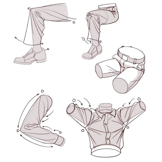
these types of clothes are basically just 2 dimensional planes cut into specific shapes and manipulated through the third dimension. all you have to account for in figuring out how they fold is gravity and the position of the person wearing them, and you don’t really have to conceptualize them with any thickness or stretch.
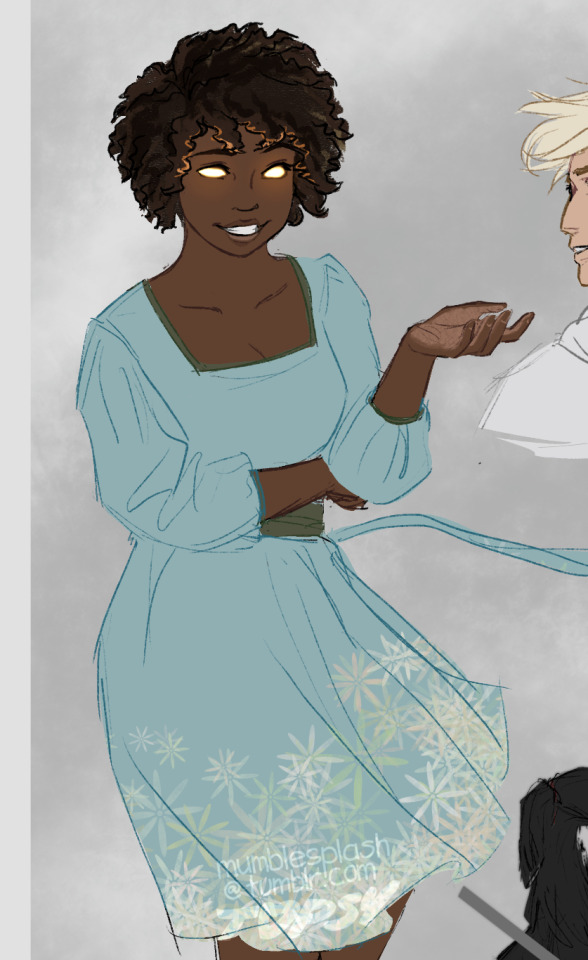
looser fitting things like tunics and dresses are harder, but you still don’t have to account for stretch or thickness most of the time. zoe’s dress here, for example: it’s structured and folds almost geometrically when she moves, with lots of thin straight lines. (also you can see here how i really am sorta making things up, all the lines i’ve made are just suggesting folds and movement, nothing too exact)
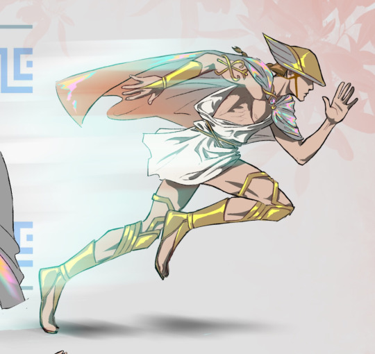
because you now have more environmental factors to account for flowier cloth can be tricky, but if you get good instincts for how it moves it’s really good for communicating dynamic action, like how here the wind is plastering his tunic to the front of him and billowing it out behind him:
this drawing is actually a pretty good example of several different types of clothes. jason’s shirt is form-fitting and has stretch, it barely folds at all. his pants aren’t as tight, the fabric in those folds according to the way he moves, but the fabric still doesn’t have much thickness to it. his jacket has no significant stretch to it, but it’s both thick and soft, so on someone with a frame too small to properly fit it bunches up with a lot of softer shapes and almost ‘loops’ at joints, and the little girl’s dress has a lot of fabric to it but is just draping, because she’s not really moving much here
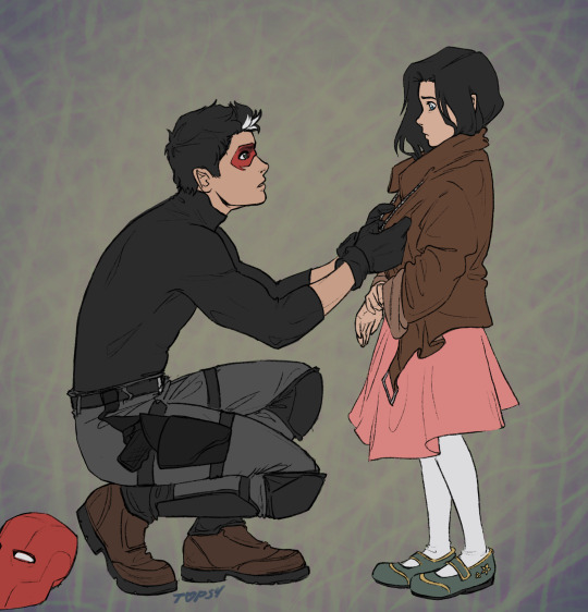
the same leather jacket on jason has a lot less drape to it and is honestly way easier to draw lmao
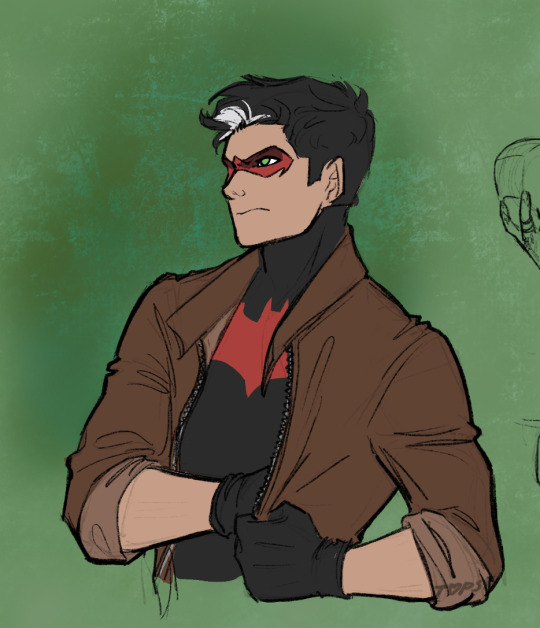
a good thing to remember with this is if you have a more abstract/cartoonish art style like mine its usually better to aim for ‘doesn’t look wrong’ than ‘technically correct’, which i myself could stand to keep in mind more if i’m being honest. people don’t tend to really Look at things unless they look wrong
…and as usual when i try to explain how i draw things i can’t tell if any of this is even the slightest bit useful, but hopefully getting some insight into how i think about stuff is at least kinda interesting. if anyone has specific follow up questions feel free to hmu
#given that i’ve been into superheroes recently i’ve been getting kind of a break from having to put much critical thought into clothing fold#s in exchange for suddenly needing to get much better at anatomy#splashasks#laudofthedeep#long post#mumbling#someone remind me later to make a tutorial tag
145 notes
·
View notes
Text
A personal update + my next game
OK, time to do this. I’ve been meaning to do a big DAVID WEHLE™ update for a while now and explain why I haven’t released a new game yet, but you know how life gets in the way. Especially when life is a quarantine hellscape, you have three beautiful, amazing, exhausting kids to raise, a spouse’s job you support, a viral YouTube channel that turns your brain to mush, a thousand emails waiting in your inbox since your game is free on the Epic Games Store (with an impressive number of redemptions too! … meaning lots of emails and customer support issues), etc., etc. What also contributes to my lack of updates is because… I just don’t really like posting online. Fascinating correlation, I know!
Don’t worry, this isn’t going to be a venting/ranting blog post (well, maybe a bit), because my life is seriously AMAZING and INSANELY BLESSED and LUCKY. I can’t believe how many dreams keep coming true, so much so that I feel I don’t deserve it and I really pulled the wool over everyone’s eyes… but I did want to at least be honest, because I owe that to myself.
Wow, where do I even begin? Well, how about we start with the reason I’m even a full-time indie game dev now: The First Tree. This small hobby project I worked on at night morphed into this gargantuan beast (or fox) that took over my life the past 5 years. Which is great! I’m living the dream! And yet, I really didn’t expect it to do as well as it did. At its core, my game is a slow-paced, sad walking simulator (ahem, I prefer the term “exploration game,” but you know what I mean) that somehow seemed to launch at the right time to the right audience. It resonated deeply with some of you, and for that I’m eternally grateful. I still get emails almost daily how my game changed their lives in some formative way. I’m beyond honored.
However, with that spotlight came criticism and demands from the ever-present, insatiable internet. I would randomly be surfing the gamedev subreddit trying to decompress, and I would see a comment by some rando saying how much I didn’t deserve my success, and how it was all one huge lucky fluke. And I believed them!
And to add to it, some devs considered me an indie marketing “guru”, which I was uncomfortable with. I worked hard to market my game every week, and after my GDC talk, people assumed marketing was my passion; the reason I got up every morning. Just to clarify… NO, I don’t like marketing, and I hate being the center of attention. I don’t like asking people for money and wishlists. But I did what was necessary because I was passionate about telling stories, and I wanted to give my story a fighting chance to be seen on the crowded pages of Steam.
So now, you’re probably wondering “well then David, why did you make fancy YouTube videos showing off your success? Not very modest if you ask me.” This honestly could be a long blog post all on its own, because my experience of putting myself in the spotlight and becoming a “content creator” is… complicated. It was an unusual step for me, especially since I never even showed my face online (as a game developer) until my GDC talk.
First off, I always wanted to teach and start a YouTube channel. I love video editing, especially since I’ve been doing it longer than making games! It’s a huge passion of mine. And teaching people who didn’t know they could make and finish games was a huge motivator (and it’s been so rewarding already). But the second reason is, I was scared. I was self-employed, and I was riding the success of a “huge lucky fluke” that would probably not happen again. I wanted to make sure I could provide for my amazing family, and give them food and health insurance and security in these tumultuous times. I was turning my lifelong passions and hobbies into a business, and it wasn’t as simple of a mental transition as I thought.
So, I went all in on YouTube and the accompanying online course called Game Dev Unlocked. I spent years editing the scripts and videos, and polishing them to a shine. At first, no one watched my videos, no one was buying… and in the blink of an eye, the YouTube algorithm picked up my main autobiographical video (“How Making Indie Games Changed My Life”), and I started getting 5,000 subscribers a day. Right now, I’m at 150,000 subs, which is still hard for me to believe. I always had a dream of earning 100k subs on YouTube, so I was pretty happy with the whole thing. Sales were OK, but mostly people didn’t want to buy the course. Then the emails came in…
Something you should know about me: I am a textbook “people pleaser,” and if someone asks for my help, I take it very seriously. If someone is mad at me, even if I didn’t do anything wrong, it’s all I can think about, and it ruins my day. So, taking an onslaught of people begging for help and multiplying that by an impossible amount of people for my brain to truly comprehend thanks to the internet… and let’s just say it wasn’t a healthy mix.
I received thousands of emails from people who were begging me for some kind of reassurance that everything would be OK. That their dreams would come true too. And I wanted to help every single one of them. I went from a nobody working on a game for fun to becoming a spokesperson for the indie game dream. I couldn’t even get a shake from the Chick-Fil-A drive-thru without someone recognizing me and asking for game dev advice. And it didn’t stop there… I would get emails from suicidal kids asking for help, teenagers from Afghanistan asking me to get them out of their country, and on one occasion I received an email from a hopeful game developer in a war-torn country who had just experienced a bomb blowing up their neighboring village. His friends were dead, and he was hoping he could finish a game before he died too, and he needed my help. How do you say no to something like that? Didn’t I owe it to everyone because I was lucky with my hit game and I needed to “pay it forward”? (Something people constantly reminded me of)
And then to top it off, after you’ve given everything you’ve got to other people in need… you get hate mail in your inbox. You spend the whole day serving your children and strangers on the internet, then when the kids are finally asleep, you hit the bed to relax and take a look at your phone to decompress, and you randomly come across an angry gamer in your Twitter mentions telling you your game they got for free sucks, and that you took away a potentially great game from them and that your apology isn’t good enough.
Long story short, I went to a mental therapist for the first time in my life. I was broken trying to care for two toddlers and a new baby in a pandemic (which is very, very hard), taking care of my course students who gave me their hard-earned money and demanded results, and the countless people begging for help on the internet. I was this introverted, internet-lurker trying to take on the weight of the world. I was so tired and hurt that no one cared about me and my needs… only what I could do for them.
Quitting my day job and making this hobby my full-time job has stirred up… mixed emotions. This statement may disturb some of you, but I was definitely 100% happier when I had a full-time job and I was working on my game at night. I missed working with the amazing team at The VOID, working on Star Wars… back when the success of my game was this abstract thing I could only daydream about. Mostly, I was making my game for me with no outside expectations to pay the bills or satisfy the ever-demanding internet, and that brought me a lot of joy.
It’s not all doom and gloom though! I’m actually very happy now and in the best shape I’ve been since the pandemic started. I’ve had to confront my weaknesses and personality quirks, but I’m a better person for it (and I’m sure these issues would’ve come out eventually). I hired an awesome community manager for Game Dev Unlocked who is helping SO MUCH with the emails, I can’t even tell you the mental burden it alleviates. I even leased a co-working office to help separate work from my home, and that’s been a huge help too. I’ve decided to work with my old friends from The VOID on a cool, new VR experience. It will take me away from my projects a bit, but I’m ecstatic to work with a great team again (and not manage anything, whew).
These are all things I would’ve never guessed I needed, because I thought I knew myself pretty well… turns out I didn’t.
The reality is: running a business is HARD. Running it solo is even harder. You have to remember, I was burnt out on The First Tree well into the Steam release in 2017, but I kept working on it for 4 more years due to my fears of failing again and not earning enough money for my family.
So, I was wrestling with the age-old concept of commercialism and art. There was this dichotomy of doing whatever I wanted and being true to my vision (what most people assume the indie dev dream is like), and doing only what customers wanted to buy. This is something that has killed me with YouTube… in one specific instance, I was super excited to make the exact video I wanted to make. I loved every part of its creation, and I thought it had a message that would inspire everyone. I lovingly edited it over several weeks, posted it, and excitedly waited for the stats… and it was by far my worst performing video.
This is not a new problem. Even the Sistine Chapel by Michelangelo was a commission forced upon him by the very violent Pope Julius II. My wife and I regularly talk about the fine balance between artistic integrity and commercialism, a problem she is very familiar with as an artist who constantly needs to balance what she wants to make with what the customer wants to hang up in their home.
For The First Tree, I was lucky. It was pretty much what I wanted to make (I had to compromise a lot of things of course), and it turned out millions of people wanted it too. Recently, I thought the safe business decision would be to do it all over again, so I started work on a spiritual successor to The First Tree (an idea that I may revisit one day since I do love the story idea). But that isn’t happening anytime soon. Trust me when I say I am now currently burnt out on animal exploration games.
So that realization left me with a question: what do I do next?
I’ve decided I need to make a game that I want to make, for me. It will be a bit different and I’m almost certain most fans of The First Tree will not love it… but it’s an idea that gets me super excited. It’s an idea that could help me fall in love with game development again.
A few more details: this game will be story-driven, first-person, and will use the Unreal Engine. That means development is gonna be slow going, because I have to learn a whole new tool. The “smart business” decision would be to make something quickly in Unity which I’m already familiar with… but I want to do this for me, and UE5 looks like a lot of fun. I’m also shooting for an early-ish release date so I avoid burn out and I keep the game short: I want to release it in Fall 2022, but knowing game development, it will probably take longer.
With the help of my therapist, I’ve also concluded that I’ve been too accessible on the internet and that my self-worth isn’t determined by the amount of people I try to help online. Of course, I love helping people and seeing them succeed, but I need to step back and focus on my family and myself. I will delete my social media apps on my phone (I will still post big updates occasionally) and stop responding to most emails, tweets, DMs, etc. It’s not that I’m ungrateful… in fact, if I don’t say thank you or at least acknowledge the incredibly nice people who share a sweet message about my game or want to tell me how I inspire them (still hard for me to believe, lol), I feel a ton of guilt… but I need to let that go. Please know I’m extremely grateful to all the fans who follow my work, so even if I don’t thank you directly, I truly mean it: thank you.
I will still post and stream occasionally on YouTube when I want to (and I still do live Q&A’s for my GDU students). The online course sales will help support my family as I work on a potentially risky game idea (and my new job will help alleviate the risk too). I’m gonna try one more marketing experiment and sell a mini-course soon (and add an Unreal section), and after that I’m done working on it. A gigantic thank you to the people who bought my course and are part of the amazing community, it has helped me and my family tremendously, and it’s inspiring seeing the games you make!
I’m a bit worried about the whole thing since this new game idea could flop, which could definitely affect my family. But a sappy, high-school yearbook quote is coming to mind… I think it applies here: “A ship in harbor is safe—but that is not what ships are built for.”
Thanks for reading,
David
59 notes
·
View notes
Text
The Assorted Magic Touch
By Maledollmaker

Kalvin was best known as Kal by his friends if he had friends. People knew him and called him Kal. He didn’t have friends, but he didn’t care. Most people stayed away from him because of the vicious rumors about him. Kal was a very handsome man, not only good-looking but charming as well. Kal had deep cheekbones that could cut through any material. He had intense hazel eyes, dark brunette hair (with had a mix of browns), an elegant aquiline nose, and pouty lips. Kal looked like a bad boy you wouldn’t take home to your mom. The vicious rumor was that people that would get close to him would disappear suddenly. Kal lived in Manhattan, which many people started rumors and gossip about people all over the city. The advantage of living in a big city was you could hide in plain site and there was a lot of people, so you could always meet new people. Some rumors was that Kal was a vampire. Another rumor was that he was a wizard of some kind. Kal was an art acquisitioner, who apparently was a sculptor himself. He had a great deal of money and was a successful businessman. He was at the most lavish of parties and took pictures with various celebrities and movers and shakers.
One night at a party in the art gallery, there were many people at the roof party. There was even a pool on the roof. Lots of attractive young men and women in the party. Some shirtless men by the pool. Kal was an equal-opportunity lover, he identified as pansexual. The men were getting his attention this night. Evan, his agent approached him. Kal was mixing drinks for himself at the wet bar. “Kal, I have the perfect acquisition for you,” Evan said. “You got my attention, Evan,” Kal said. Kal put down his drink. Evan showed Kal a man with a swimmer’s build, bedroom eyes, jet black hair, and marvelous looks. “He is Japanese-Brazilian,” Evan whispered in Kal’s ears. Evan signaled the young man with broad shoulders towards them. The man toweled off and smiled, shaking hands with Kal. “Vincent, this is Kal.” “Nice to meet you sir.” Vincent was surprised to find motorcycle gloves on Kal’s hands. They shook hands. “I am a moto boy,” Kal explained. Vincent shrugged. “Sounds cool, I would want to have a ride one day,” Vincent said. “I might take you up on that offer,” Kal said with a smile. He winked at his agent Evan and nodded at him. Evan nodded and walked away, knowing his cue.
Vincent and Kal were left alone. Kal asked Vincent, “Have you ever modeled?” “Quite a few times actually,” Vincent said with the towel wrapped around his waist. He looked very fetching with wat drops around his body: Vincent flashed a smile at Kal. Kal signaled him towards the gallery, which was abandoned. It was seemingly empty and dark, with some lighting over some art. Some of the lighting came from the floor and some above. The individual light colors were purple, pink, blue and white.
The majority of the artwork in the gallery are statues. The Statues made of various materials. The statues were all made of humans, no animals and no abstract shapes. All of them were full figures and not just body Parts. Some were male and some were female, it was hard to say the gender ratio were even because he didn’t have his entire collection present in the gallery. As the two men walked through the statues, Vincent was admiring what he thought was artwork.
Vincent saw one stone statue of a man with outstretched arms. The right arm had his biceps curled. His face portrayed anger and fear. The man had a huge upper body, big thighs and big calves. Vincent put his hand on the curled bicep. “You do great work. I love the definition in this one,” Vincent said. Cal blushed and said, “Thanks.” The stone texture was a bit rocky, it was a light grey color.
As Vincent looked at Cal, his vision went to a female statue. “I like this one as well,” Vincent said. Cal sighed and kept looking at Vincent he kept staring at his muscly tan back. He could see the veins underneath his skin tense. The curves of his biceps. Cal looked down at his own hands which still had the biker gloves. Cal asked, “do you want go start?” Vincent asked, “Right now? Really?” “Sure, why not? Are you busy?” “Sure but doesn’t it take hours. I would like to work out before to look my best.” Cal thought it over. “Okay, it’s fine. How about tomorrow?” “Tomorrow sounds good,” Vincent said with a smile. They shook on it. Cal couldn’t wait for tomorrow. Cal watched Vincent walk away and he saw his nice ass walk away.
The next day, Vincent indeed got his workout done and his veins did pop out more. He came in with a grey tank top and tight black jeans. He came to Cal’s private studio. Vincent noticed that Cal still had the motorcycle gloves on. It was full of clay, carving tools and props. There were a three male statues randomly placed in the studio. There were large windows facing west. “Do you want me to undress here?” “Sure, if you want.” “Well, your statues are nude,” Vincent said. It was true, all the statues were nude. One looked to be made of gold, in a bodybuilding pose with his head down and his penis was not erect. Another statue was fully erect, very erotic looking, long hair on his head and made of a shiny black metal. The third statue was made of marble and nude, with a crooked erect uncut penis. He was bald or clean shaven and had big upper body.
“Well, if you don’t mind. Some statues I’ve done have had clothes but with your body, it would be a waste,” Cal said. Vincent blushed. “Thanks,” he said. He started taking off his tabletop. Cal couldn’t help but stare at him. Vincent revealed his strong upper body and washboard abs that looked like a 8 pack. Vincent then went to unbuckle his belt and took down his black jeans to reveal his grey boxer briefs. His boxer briefs showed off his big bulge. He took the pants down to his ankles to reveal his carved calves. He lifted one leg and took off one of his boots. He then took off one pant leg. He put down one leg and put up another leg to remove the rest of the jeans.
Vincent took off his other boot. He threw his jeans. He was clad in only grey boxer briefs. He turned around to show his butt in the briefs. He took down his briefs, aware Cal was still staring at him. He figured he was doing it as an artist. Vincent took down his briefs to reveal his round ass and his semi-erect dick. He liked the attention. He asked Cal, “Do you like what you see?” Cal did indeed. “You are a looker and you know it.” Cal went up to Vincent and Vincent leaned down to Cal. Vincent didn’t tower much over a cal as Vincent was 6’2” and Cal was 5’11”.
Vincent kissed Cal. They started making out. Cal slipped Vincent the tongue. Cal put his hands in Vincent’s Jaír and wished he could pull it. They passionately kissed. They continued without break. Eventually they had to go up for a breath and rehydrate with water. “Want a drink of water?” Cal went and returned with water. Cal gulped down his water. After they refreshed, Cal had Vincent to pose. Vincent had his right elbow vent and moving up. His forearm bent up and his right hand open and motioning upwards.
Vincent’s left arm was slightly behind his butt and in a balled up fist. His left leg was behind his right leg. His right leg was moving forward and knee slightly bent. His left leg was lifted a bit off the ground. He felt in an instant, he stopped all movement. Vincent couldn’t move at all. He tried to move but he couldn’t. He didn’t know how this was possible. He wanted to speak up to Cal but he couldn’t move his lips. He couldn’t make a sound. He was able to let out a faint whisper of a whimper. He wanted to look up but he couldn’t. Suddenly he felt heat from his chest. A glow came from his chest. He could see his erect penis, his abs and thighs.
They started gaining a golden color. It was shiny and bright. The gold texture started emanating from his chest down to his abs and down his groin. Once it hit his erect penis, it started to get even bigger. His soft scrotum became a golden clump. The gold from his chest went up his shoulders and down his arms. The golden texture that was on his crotch ran down his Adonis belt, thighs, knees and calves. The gold went down his ankles to cover his feet. His goes we’re all merged together like a socked foot. He was panicking.
He could barely feel his heart beat anymore, the best got slower and slower. His breaths were very shallow. He gulped his last gulp as the golden went up his neck. His heart was completely made of gold and his lungs were almost engulfed in gold. Soon enough, his heart was completely gold and no longer beat. He was still alive and he was amazed. His lungs stopped pumping air. His vocal cords were completely gold and he couldn’t make a sound. The gold ran up his lips, nose. Soon enough his face became a mask. The gold ran over his eyes, making them golden orbs. Finally it reached his Jaír and he became a complete gold statue. Rather, it was a statue of Vincent.
Vincent noticed Cal walking up towards him. “You look stunning,” Cal said. He got a handheld mirror and shower Vincent. He couldn’t believe that instead of his face, he saw a gold mask of his face. He couldn’t believe it. He then looked down at Cal’s hand and saw his hands were bare and not with gloves. Cal ran his hands over the statue. Vincent felt the touch and instantly felt pleasure. Vincent couldn’t believe it, he never felt pleasure like this before.
“I knew you’d make a beautiful statue. Now you will be young forever. I can sell you to the highest bidder. You really think I sculpted these statues? I only have three here because these are my personal love statues. I could never part with them.” If Vincent could gulp, he would. Cal ran his finger over Vincent’s lips. Cal then put his gloves on.
A few weeks later, Cal went to a fashion show in Long Island to scout for his best shake: He tried not getting more than one or two victims from the same location or even the same area to evade suspicion. The fashion show was full of women and men but Cal was still targeting men. Men in formal wear went down the runway. After that, men in casual wear and then in bathing suits. Some men in board shorts and some men in speedos. Cal of course was intrigued by the speedos. There was a couple of guys that caught his eyes. One was blonde, had Norwegian good looks and swimmers build. Another had Raven black hair, olive skin and broad shoulders. He was a bit shorter than himself.
After the fashion show, Cal went backstage. He was allowed as he was a local celebrity as an artist. Some people who heard the rumors about Cal kept whispering. Cal asked to speak with the blonde model. His name was Brett. Cal told him he was an artist and was looking for models. Brett was intrigued. Brett was only twenty one and looked very young. Cal was k. His mid thirties and Brett was intrigued about him. Brett was enthralled by Cal. Just then, the olive skinned man came up to Cal.
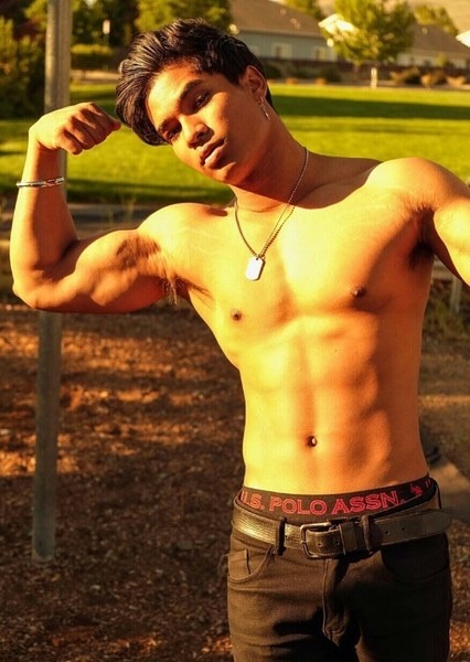
He introduced himself as Ravi. Ravi was open to any opportunity. Ravi had stylish curly black hair. When he heard Cal was a famous local artist, he jumped at his chance to see him. Ravi shook Cal’s gloves hand. “I like hour gloves,” he said. Cal thanked him. Brett got a little jealous and tried to endear himself towards Cal. Cal found it funny that two men were fighting over him. Soon enough after some drinks, Cal was able to take both men to his studio.
In the studio, Ravi and Brett saw the same three statues that Vincent had seen earlier. The gold one, the marble one and the metal one. Brett as a lightweight and after three vodka martinis he was passed out on Cal’s bed. Ravi kept posing for Cal and he shrugged and figured he would get it over with. Ravi was Indian, had black hair like the darkest sky, onyx black eyes, broad shoulders, hairy chest and dark chocolate nipples. He had a modest washboard abs. Brett started waking up when Cal removed his gloves. Ravi asked “what are you doing? Where is your chisel and clay?” “This is all I need,” Brett said pointing upward with his right index finger. “Wha—“ before Ravi could finish his sentence, Cal pressed his finger onto his chest.
Brett quietly watched as a black spot emerged from Ravi’s chest where Cal touched him. The black coloring quickly moved upward sand downwards, infecting Ravi’s skin. The black texture almost looked like stone. It moved down to be abs and up to his shoulders. The black material ran down his arms down to his fingertips. It encapsulated his big biceps and well defined arms. It captured the fine hairs on his forearms and the veins. His heartbeats slowed down. His lungs became petrified like Vincent did. Ravi slowly stopped breathing. He ceased all movement. He had a face of fear and betrayal. He could no longer move a muscle. His eyes did dart back and forth in panic. The black went down his abs to his waist and down his black briefs he had on. He quickly pinched a tent and his uncut penis also became stone underneath the briefs.
Cal walked over with scissors and Ravi panicked. Brett kept observing from the bed. Cal cut off the briefs, a small amount of fabric and Ravi was instantly naked. His penis had great girth, the fire skin became crystal black stone. The texture was clearly onyx. The black onyx stone ran down his thighs and down to his feet. The transformation went up his neck and permanently petrified his lips. They looked like they were carved from stone. The black texture went up his head covering his nose and eyes, making them crystal black orbs. It finally ran through his hair, making his curls into small rock tendrils.
Soon the black onyx statue of Ravi was completed. Brett didn’t want to make a noise but he did. Cal instantly turned around. “Please don’t kill me,” Brett quickly said. Cal went over to Brett and said, “I’m not going to kill you and he is not dead. I converted him into stone. He is still aware. All my statues are aware. They can see, hear, smell and feel. They just can’t speak or move anymore.” “But they are not Alive. Alive to speak and move and make life choices. Like Ravi, he can’t kiss anyone he wants anymore. He can’t taste his favorite food anymore. He said he loved biryani. He can’t eat that anymore.”
“Sure but now he won’t age anymore. He will be immortalized forever. Everyone can enjoy his beauty now. He won’t have to worry to work or make payments anymore. I did him a favor. I did the world a favor,” Cal rationalized. Brett noticed Cal still had his gloves off. He realized he turned men into statues with his hands. Brett asked, “how long have you had this power?” “Hmm, nice question. Most people refer to it as a curse. I have never heard anyone call it a “power” before.” “You haven’t?” “Well, i have called it a power. I guess I was born with it. It didn’t really manifest itself until I was fourteen. I never wished for it, it just happened. I touched my dog. Spot, he became volcanic ash.”
“How horrible.” “Indeed, it was horrible. He was my best friend. I didn’t mean to. After that, I always wore gloves. I figured out how to use my powers and control what I turned people to. I found out I could only turn living things into stone, metal, mineral or other materials. I couldn’t turn a gold bar into anything else. I could turn a plant to stone but not stone into anything else,” Cal explained. “Fascinating,” Brett said. Cal then put on some silk white gloves on his hands. Brett sighed a sigh of relief. He thought he would be next.
“What? You thought I would turn you to stone? No, i have other plans for you,” Cal said. Brett asked coyly, “you do?” They flirted for a bit as Cal got undressed and into his bed. Brett was already in blue briefs, showing off his right six pack abs, bouncy chest and pointy nipples. He had a swimmers build but had slightly big pecs. He had Norwegian background and blonde so he looked like a Norse god. Cal was about to kiss him when he hesitated. “But you can’t turn anyone with your lips?” Cal shook his head. “Not even my penis, only my hands.” Brett and cal both laughed.
Cal kissed Brett deeply. Brett put his hand on the back of Cal’s head and Cal returned the favor. They put their tongues in their mouths and French kissed. They continued making out and exploring each other’s bodies as the statue of Ravi looked on. Ravi was in a state of ecstasy, longing for release. He felt trapped but felt extreme pleasure tenfold. Brett and Cal paid Ravi no mind as he was now an object. Just like any other object in the studio. Ravi was no longer a person but now just like any other non living object. He was a possession.
Brett laid on his back and held his legs in the air as he removed his briefs. Cal had lubed up and slowly entered Brett. Brett winced in pain and then moaned in pleasure as Cal slowly rocked back and forth. Cal continued to pleasure Brett until they both came. They laid there in pleasure. The next morning Cal woke up and sighed. He was groggy and opened his eyes. To his own astonishment, he didn’t have his glove on his right hand. He made an audible gasp. He felt around next to him to find something hard. He was afraid to look. He didn’t mean to turn Brett to stone. Well, he wanted to make love to him a few more times before he did.
He slowly turned to look at Brett when he found a figure of amazing colors. There were swirls of dark pink, periwinkle and eggshell. The texture was like marble but also like ivory and a variety of stone. It indeed was Brett and he was sound asleep. He was in a curled up pose of slumber with a smile on his face. His eyes were closed. He looked like a soap dish, all curled up and full of colors. The texture indeed was dull like jade and full of swirls of colors. His face was mostly white with thin swirl lines of other colors, mostly pink and blue. He touched his head. He knocked on his head and he was solid stone. It seemed as if Cal couldn’t decide what material he would be so he was a mix of a variety of minerals. He sighed and decided to turn Brett over. He was the same on the other side, nude, curled over in slumber and full of colors. At least he wasn’t flat on the other side or merged with something else, it had happened to Cal by mistake before. Cal sighed and said, “at least he was happy. well back to the drawing board.”
23 notes
·
View notes
Photo
Name: Picross 3D Host
Debut: WarioWare: Snapped! (no not really. It is Picross 3D)
Hello! I feel like we have not had Funky Friday in kind of a while. But that doesn’t matter because here’s one right now! I feel obligated to announce when it is Funky Friday so we don’t have another incident where someone unfollows us because we posted about Pico Pets.
I love Picross a lot! It is great. It is fun and satisfying and leads to wacky discoveries like GRAND GOOMBAS, and pretty much ALWAYS has a Mola mola puzzle somewhere! And that is in fact what made me interested in Picross 3D!

When I learned that THIS was in Picross 3D, I just had to play it. It did not matter if I was overwhelmed at the implications of Picross in a whole new dimension. I was ready to brave anything for my dear Mola!
And when I started playing... I was met with a new, never-before-seen dear!

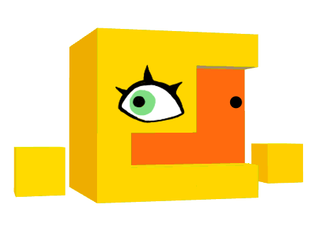
This little creacher, on the top screen! What a creacher this is! A common response when seeing it is for the brain to jump to the conclusion of “duck”. We see an eye on a yellow shape, and a connected orange shape, with a “nostril” on it. That's Duck! However... it is not! This is no duck whatsoever! First and foremost, it is a cuboid creature, with floating cube hands, and what appears to be a bill is actually a depression in the face itself, the bottom surface sometimes emoting like a mouth! And finally, that’s no nostril, it’s a second, mismatched eye! This creature is a beautiful, absolutely splendid piece of abstract art, and I have even better news... it is our gracious host!
I’ve seen this creature referred to as the “mascot”, but I don’t think that’s right. The mascot is the blocky puppy on the game’s cover and cartridge. THIS creature greets us, invites us into the world of Picross 3D, teaches us how everything works, constantly supervises us, and tells us fun facts about the puzzles we complete. This is no mere mascot, but a kind, smart, and capable host!
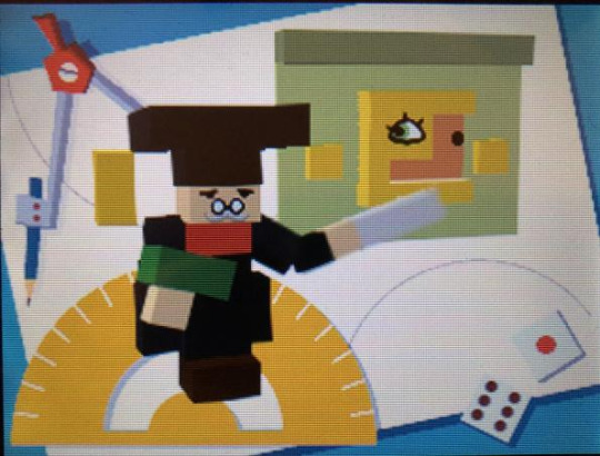
I have already said a good deal about it, but I am just getting started, for I have thoroughly analyzed everything I absolutely could about this very creature. I have learned about its anatomy, its abilities, its personality, its likes, its dislikes, its fears, and its favored palindromes. And I will share some of my favorite points from the long list of things I have learned!

Firstly, we shall discuss its anatomy. Despite its sharp and blocky appearance, our host is quite soft and flexible, able to contort and twist in all sorts of ways! It can even transform into forms such as a mermaid and a wrapped present- in which form it even changes color! Could it perhaps be the very essence of blocks given life, allowing it to become any part of this block-based world?
Whatever the case, it is most certainly MADE of blocks! Maybe that is obvious, but I feel I should mention it anyway. When it is hit in a certain manner, individual blocks may fly out, able to be played with and shoved back in! This seems painless and purely recreational, but what may NOT be painless is when a puzzle is failed and the host “dies”, collapsing into an inert pile of blocks! Perhaps, however, this is all an act, adding to the spectacle of the game. What a good host!
Next we analyze: the floaty hands! THESE floaty hands are particularly versatile. They can roll like wheels, propelling the creature at higher speeds, and they can spin around, allowing it to fly! Unlockable animations even give insight into the nature of such limbs, showing that they can in fact be separated from the main body if the creature is caught off guard!
Even with such an innovative body plan, though, our host doesn’t quite have it all. It muses about wanting a tail when explaining how versatile a fox’s is, and it can’t lift twice its own body weight. Also, it has blood! It is quite scared of bloodsucking bats, evidently because it has something they want. Blood!
And now, we move from a biological to a psychological analysis! The menus and descriptions are all given in first person with our darling creature in the corner of the text box, and that clearly indicates that it is meant to be the one speaking. So what have I discovered? That it is pretty much a perfect being! The Host is kind and nurturing, values creativity and positive thinking, and cares deeply about the environment. It thinks squirrels are cute, sea stars are amazing, and waterwheels are quaint. Above all else, it loves to rest and relax. And to think some players call it creepy!
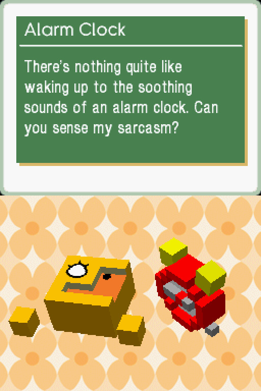
That’s not all there is to this creature, though. That would be unrealistic. Did you really think the character dancing on the top screen of this puzzle game would be just a one-dimensional goody two shoes? Well, it’s THREE dimensional! Capable of sarcasm and cheekiness and that sort of stuff! For example, it’ll reveal an incredibly obscure term, only to follow up with “I can’t believe you knew that!”, or “but you already knew that, right? (wink)”.
Our host also has some rather particular thoughts on what is and isn’t cool, so if you want to impress it, you’d best listen closely here! It thinks that the act of riding a unicycle looks quite cool, but that snorkel goggles do NOT look cool. As such, we can assume that someone riding a unicycle while wearing snorkel goggles appears as average as average can be!
There is still so much to talk about with the delightful host of Picross 3D, but this post must end at some point, so it will here. I hope you have a newfound appreciation for this fascinating creature you likely had never seen in your life! But one last thing...
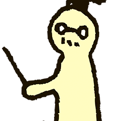
Much more well known than our host is Dr. Lobe, of Big Brain Academy! I mention him because not only is he also wonderful, but they have quite a lot in common! Both their games are part of the Touch! Generations label, and with all the fun facts the Picross 3D host provides, it’s clearly an intellectual. These two should be friends! They probably already are!
130 notes
·
View notes
Photo
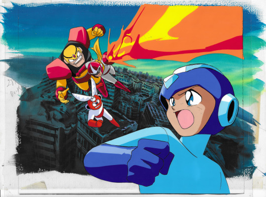



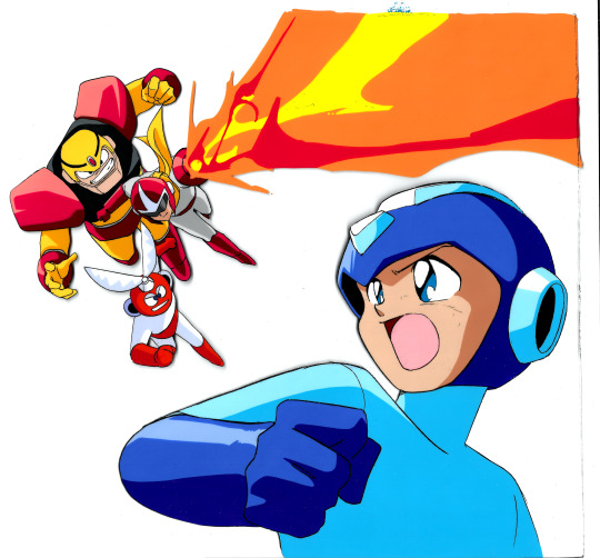
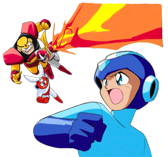
For those of you who haven’t been following the news of the past month or so, animation cels from a cancelled Rockman anime, which was in development by Ashi Productions back in 1992, were recently put up for sale. With the help of many of you in the Megaman community, max6464646464, Protodude, myself, and another donor were able to put together the right amount to be able procure these cels, once lost to time.
The 3 pieces are now divided up between three of us, and the cel now in my care is this one. This is one of the cels confirmed to be created by director/character designer Nobuyoshi Habara. Very reminiscent of Ruby Spears, with Proto Man shooting a fiery blast towards Mega Man, as Guts Man and Cut Man join in the attack above a decimated city. As the most action-styled of the three pieces, it totally was my favorite of the batch, and I am both grateful and thrilled to add it to my collection!
Max scanned all of the cels when they first arrived, which you can see linked in Protodude’s article here. But me being me, of course I had to scan this piece for myself as well, when it arrived yesterday. And I am bringing you a few additional scans, on top of the complete piece. These are versions you didn’t get to see when this was first shown off about 11 days ago.
So, first up, let’s talk about the background. This background is actually comprised of 2 separate layers which are taped together. You can see them together in the 2nd image of this photoset.
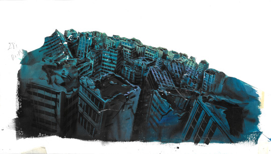
The back layer is a hand-painted sky with a few abstract buildings in the distance. Very simple shapes and lines to give that appearance of tall skyscrapers. You can see that in image #3. By itself, maybe not that cool to some. But when paired with the next layer, you can see how well it gives off that sense of depth and distance of the buildings.
On top of that layer is a thicker, cutout piece that contains more detailed buildings that have sustained some pretty heavy damage. Wily’s robots certainly did a number on this city. I am not sure what the notation ‘281 Book’ is all about, but that is written on this piece. You can see this in image #4.
On the back of the sky background board, there are actually Xerox copy remnants of one of the other cels in this batch. Dr. Light is the most clear, but you can still make out a lot of Roll, Mega Man, Wily’s nose and moustache, and Proto Man’s mouth. Sadly, I can’t adjust the levels or brightness on this scan without washing out some of the lines, so it is not the whitest background for this scan. This is seen in image #5.
Next up, I’m sure many of you wanted to see the cel without the background behind it. So I also took the time to get a good scan of that, too, in image #6.
But, there is quite a bit of wear to the paint after all these years. Paint has chipped off in spots, there are smudges and lines on their faces and bodies, the flame blast, etc. I wouldn’t take the time to deface this revered relic by digitally repainting over all those areas that had paint loss and artifacts, would I...?
...I might have given it a little touchup...
It’s not perfect, but you can see the cleanest attempt I made at digitally restoring this cel in the final image of the set, #7.
Of course, tumblr resizing doesn’t help show these off in their full glory. So if you would like to view or save them at full 600 DPI resolution, you can check them out in their own album in my Google Photos gallery HERE.
Scanned from: My Production Art Stash
#Rockman#Megaman#Mega Man#Ashi Productions#Nobuyoshi Habara#Animation Cels#Production Art#Miyabi Scans Stuff#Miyabi's Merchandise and Memorabilia
65 notes
·
View notes
Text
I haven’t had chemistry since like 2008, and I’m also an idiot who likes to make my friends upset, so I rated the periodic table in order to tilt my friends:
Hydrogen - this is like your childhood friend who has always been with you more or less and always will be down to get a drink and chill even tho you haven’t spoken in years. Solid bro imo 7.5/10
Helium - always down for a good time, even if probably created Alvin and the Chipmunks which in some places is considered a war crime. 4/10
Lithium - Gives me bitchy vibes and is flammable as fuck if I remember. Skinny bitch with an attitude 3/10
Beryllium - idk this sounds like a sailor moon villain lol for that it can have a 6/10
Boron - more like BORONG amirite ha ha wait no seriously I have no idea lol 5/10 clean neutral rating
Carbon - *screaming* 2/10 I will not be taking questions
Nitrogen - cool cool cool tight tight tight 9/10 Nitrogen just is the cool hot chick you wish you were
Oxygen - kid who takes up all the glory for the group project even tho you did all the work, 4/10 for natural charisma
Fluorine - lol what are you knockoff chlorine lmfao bitch 3/10 reminds me of the dentist
Neon - I can vibe with this boy for his contributions to signs which cause my eyes to scream 8/10 modernized Art Deco thanks you
Sodium - 10/10 this is me and I won’t be taking questions next element
Magnesium - magnesium is a close relative of magnificent and therefore I think the case is closed folks 9/10
Aluminum - 10/10 for providing a home to my Diet Coke addiction I’d be dead without you
Silicon - 6.9/10 :smirk:
Phosphorous - This has a very soundly name and it’s welcome to do that but idk, not a fan, seems like he’d be smelly, 2/10
Sulfur - 1/10 pretty sure that dog farts are purely comprised of this and as such if I was leaving negative ratings I would
Chlorine - 7.8/10 for being in pools so we could swim without brain eating amoeba in the south you a champ
Argon - he seems like a nerd jk this guy has a good color 9/10 for just being himself
Potassium - I hate bananas and this word gives me the physical sensation of biting into one but only by thinking of abstract letters and making them into something which we can nutrientise from bananas and to me that shit is bananas, b a n a n a s — 3/10 for making me sing hollaback girl thru adhd word association
Calcium - hm my brain went to mega milk so you get a 2/10 today bud I don’t make the rules
Scandium - pretty sure this is fake lol what’s next faxdium, e-Mailite and copinium? 5/10
Titanium - this song’s a banger and also is the only thing that lets me wear earrings 10/10
Vanadium - if your erection lasts for longer than like idk it’s supposed to then don’t take vanadium wait what do you mean it’s not an ED treatment 4/10
Chromium - decent bloke shame the browser eats all your memory 5/10
Manganese - if a weeb tries to tell me how to pronounce mayonnaise one more time... 1/10
Iron - excellent tool against the fey, in your blood, what a bro, 10/10 this bitch slaps
Cobalt - has a powerful energy; I respect him. 8/10
Nickel - if I had a nickel for every time someone made this joke lol 5/10 he’s doing his best
Copper - taste bad 3/10
Zinc - isn’t that the dude in the green tunic and white tights who saves premcess Lelda or something lol 7/10 those games are good
Gallium - seems like a prick 4/10
Germanium - sounds like a child pronouncing geraniums which are superior 3/10
Arsenic - bad vibes coach 1/10
Selenium - isn’t this just sailor moon lol 10/10 love this bitch
Bromine - farmine wherever you aremine - 9/10 I love a good bro
Krypton - he’s okay I guess 5/10
Rubidium - yet another Steven universe villain who will be redeemed I imagine 4/10 seems a bit dull
Strontium - I feel nothing when I see this lad’s name and that seems like a shame 1/10 I don’t like it
Yttrium - this is an atrium in Yharnam, or something 8/10 would love to sit in one and make contact with higher beings
Zirconium - oh wait THIS is the sailor moon villain from the dead moon circus! 9/10 I enjoyed that arc
Niobium - seems sassy, I like that in an element 7/10
Molybdenum - I hate this one, rancid. 1/10 for making me have flashbacks to difficult Ancient Greek vocabulary there is no fucking way that sound combination is anything but Beta and Delta borking and then Latin being like oh imma steal that
Technetium - 6/10 decent name but seems a bit forced
Ruthenium - 5/10 kindly old lady element I guess lol
Rhodium - 10/10 this ain’t my first rhodium babee this lad has good vibes what a name what a king
Palladium - 10/10 for making me think of paladins
Silver - 12/10 I’m breaking the rules for this silver is the best it is so cool and also it is the other best tool for dealing with supernatural creatures when iron has failed you highly suggest Even if I am extremely allergic to it going into my ears...wait hold on
Cadmium - 2/10 sounds like a total douche
Indium - 8/10, i just think it’s independent and neat
Tin - 10/10 good ear sounds when involving rain and roof shapes and automatically reminds me of Nora Jones’s come away with me album which is also 10/10
Antimony - 7/10 decent protagonist good name all around seems rad
Tellurium - tell ur mom what? That’s so early 2010s league of legends humor bro 2.5/10
Iodine - strikes fear in my soul from having it poured on my wounds but this is why I have more pain tolerance than god 5.3/10
Xenon - I think this is a declension of Xena warrior princess which is a win in my eyes, 8/10
Caesium - kind of has a cunty Latin name, 4.5/10
Barium - yeah boss, bury’im! 7.5/10 I love a good mobster gag
Lanthanum - A bit pretentious on the Tolkien spectrum sorry bud 3/10 sounds like you’d be the dickwad elf everyone hates
Cerium - 6.5/10 I like this one, gives me a clean vibe
Praseodymium - the fuck who sneezed all their alphabet soup onto the paperwork and called it an element Christ we can’t keep doing this 1.5/10
Neodymium - oh my god what did I just say 1/10
Promethium - thank Christ we’re back to greek 9/10 Prometheus was a Chad I could get behind
Samarium - 5/10 gives me boring wizard vibes
Europium - 4.5/10 don’t rename opium chrissake can’t take these nerds anywhere
Gadolinium - 5/10 it’s a starship knockoff but it’s trying to be bold with the G sound
Terbium - 2/10 I don’t vibe with this one
Dysprosium - sounds like an antidepressant that has a lot of shitty side effects 3/10
Holmium - sounds like someone anxious asking their beloved to hold them 8/10 I like hurt/comfort fics
Erbium - you can’t just describe something as herby you daft bastard 2/10
Thulium - sounds like a spell I like it 8.5/10
Ytterbium - macguffin in a shite sci-fi show that gets highly overrated because BBC produced it and superwholock stans emerge and go utterly feral 1/10
Lutetium - bards are an element I agree 10/10
Hafnium - sounds like a river (my dog) sound and has a cute vibe, I’d offer it head pats 7/10
Tantalum - noooo you can’t be sad yuor so sexe haha 6.9/10 tantalizing
Tungsten - 10/10 this is a lad with history
Rhenium - 5.5/10 it’s ok
Osmium - 4/10 I wasn’t a big wizard of oz fan
Iridium - 9/10 sounds like iridescent and that’s in my top 10 favorite words and concepts
Platinum - 10/10 best Pokémon game
Gold - 7.9/10 all that glitters and all but it’s still pretty on some people, silver is better tho
Mercury - yikes 8/10 so it doesn’t kill me
Thallium - sounds like the brother character in a ps4 exclusive western rpg that oddly falls under the radar in terms of reviews and gets shafted at awards for no reason 7/10 I’ll support you tho
Lead - 2/10 that’s gonna be a no from me dawg pretty sure I still have lead in my hands from stabbing myself with my mechanical pencils
Bismuth - 6/10 sounds good in mouth and reminds me of biscuits for some reason, I’ll take it
Polonium - to thine own self be true so stop trying to act like the arts don’t influence science jk pretty sure this is named for Poland but hey that’s where we get the Witcher so you get a pass 6/10
Astatine - 1/10 I don’t even know what you are
Radon - 7/10 this motherfucker knows his shit and how to party, rad is right
Francium - I bring you francium...and I bring you myrdurdium... 7/10 for a good vine
Radium - killed the video star probably 9/10 I can get behind her
Actinium - as opposed to passtinium I prefer actinium in the voice of writing 8/10
Thorium - overrated Norse god 5/10 because lightning is still cool
Protactinum - sounds like some pretentious condom brand 4/10 wouldn’t do it with a dude who bought these
Uranium - I always thought she was a hot sailor scout 10/10
Neptunium - same for her I knew they weren’t cousins you couldn’t lie to me 4kids 10/10
Plutonium - sounds like a macguffin unfortunately 5/10
Americium - I read this with a pivotal letter missing and nearly died, 7/10 for the laugh
Curium - 10/10 gives me Curie vibes and also reminds me of curiosity which reminds me of—[old yellered before the association could set in]
Berkelium - what I shout when I want Burke (fam dog) to slaughter innocents and raze territories 2/10 world was not meant to know his commands
Californium - 1/10 California is cool with geography but probs could stand to chill with the ego sorry to my friends in Cali
Einsteinium - 6/10 it’s alright but we’re really running out of ideas huh
Fermium - 3/10 this one is porny
Mendelevium - 1/10 my brain didn’t like parsing this and I stand by my earlier statement of running out of good names
Nobelium - 0/10 you didn’t name any noble gases this cowards this gas can’t be a noble oh wait it’s NOBEL I take it back 5/10 seems an alright chap
Lawrencium - fear the old blood my sorry dead hunter’s ass I’ll never get back my life from the hours I spent trying to beat this lava shitting bastard 2/10 for being a boss who eats Taco Bell specifically before being challenged to have fresh lava shit with which to punish you for having the audacity to exist in his space
Rutherfordium - my god what a snob 4.2/10 I respect him a little but only because he sounds like a right lad
Dubnium - DROP THE BASS 10/10
Seoborgium - not sure about this one but it can have a 7/10
Bohrium - as an American English speaker this sound combination makes my pathetic throat become a black hole as I try to properly create the sound of it 10/10 I love when my body becomes a massive void in the universe
Hassium - lazy 2/10
Elements 109-118 can go fuck themselves I hate them all, collective 6.66/10 for their general demonic vibe
33 notes
·
View notes
Text
I’m going to do a quick analysis on the pieces I felt I learned the most from during Artfight2020. I made 20 character illustrations over the course of a little over a month, got to draw a lot of different characters and environments, and would like to catalog what I feel I gained from it in terms of technique and process. A little Post-Mortem, if you will. Normally I would draw a little cartoon or something as a header but I’m tired lol. These are not really in any order. I am going to include the username of the characters’ owners but am not going to “@” them as not to annoy anyone, these are just kind of my personal thoughts about my process.

Burn Forever - Character owned by @/evilbeards. Really love the colors in this one, it makes it look very regal, while also reminding me of medieval antiquity. This is the best fire I’ve done in awhile because it has both pleasing shapes, and a variance in hues within the flame. I made a point to remember this when I did “The Last Candle Burns”. I also really went all in with uplit lighting that clung to every crag in Tel’s face and think it paid off, it made me more confident that I could pull off more scenes with dramatic lighting in the future. Also, knocking the top of the throne of branches out of black and into dark blue gives an effective illusion of distance.

Bloodline - Characters owned by @/SaltiestGoat (twitter). A solution to characters presented primarily in black and white was to make the colors more symbolic than naturalistic - the story these two characters (who are father and daughter) were presented with was extremely vivid, and so it wasn’t hard to distill it into motifs that could be represented with color - power and violence as red, which is both compounded and spread via war/material wealth (gold), a cyclical relationship that is bright and searing against a cold, grey world. And white as something strange/supernatural and unearthly (eyes and teeth). Something I like when viewing art on a digital screen as opposed to a print or an original is the way that the brightest value of white feels like a stabbing pinprick, it really feels like it shines and elevates it a bit. But, anyway, using so much black was kind of a leap of faith, but it allowed for me to capture the sort of dreamlike atmosphere I was going for.

Dern It- Character owned by @/slabmangrave. Another one of those leaps of faith in using a lot of black, this time to create an illusion of depth implying that perhaps Hogarth here has been wandering around in an endless, stabbing field of cactuses, injecting a little humor, but also the vastness of the landscape. I found it a fun challenge to try and muster up a desert scene in a setting that effectively has no sun (relying on cool colors). The purple was a last minute addition that I ended up really liking, as I think it did better to silhouette The Teeth. I also used very minimal “line coloring” on this - something I really like about the source material is the textural mark making, and I feel like the starkness of black makes things have a little more of a tactile quality, in this case. I also think I might be on to something, representing specks of floating bits as small, short lines.

It’s Coming For You Through The Trees - Character owned by @/peg-head. One, I think this is my favorite set of teeth. I think the uneven quality of the two front teeth really sells it I also found it a fun challenge to change the camera up and have it be looking from a little ways below - I don’t think I entirely sold the concept of the character handing an object down to the viewer, but I think it’s a lot closer than my other attempts. I also liked using what was mostly a limited color palette, and getting to have a more desaturated, naturalistic range of colors. And like I said before, I love that small, stabbing pinprick of white light on a computer screen, and I think it works really well here.
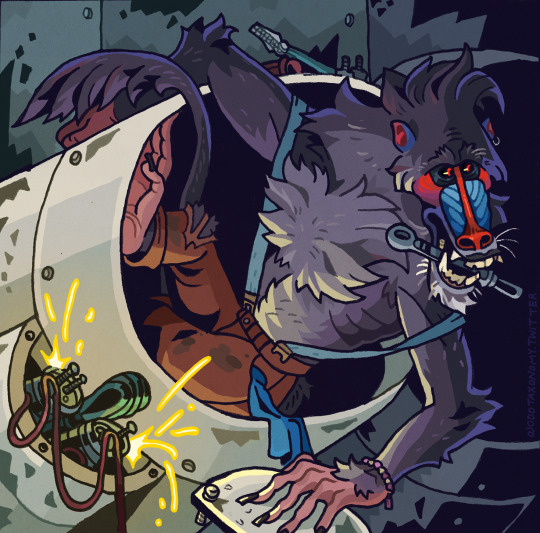
Grease Monkey: Character owned by @/night-margie. This one may have been the most extreme test of my abilities, as I usually try to stay away from background elements that are inorganic, if I can help it. But I’m in the throughs of working on my own sci-fi setting right now and figured I should challenge myself. Not quite limited colors per say, but I think the division of gold and violet light works to separate the different areas of the piece (I tried it first just with blue but found it to be way too homogenous). Not entirely successful in regards to making a character look like they are seated beyond the lip of an object, but I think the pleasing shapes the character creates make up for it…but just barely, lol. I think this has a good balance of black negative space to grimy such-and-such, and am pretty pleased with the stylization of electrical sparks. I’ll have to experiment with it further.

Cryptid Sighting: Character owned by @/gnarliegnasties (twitter). First of all I think the thing this encouraged me to do the most was invest in more abstract, stylized background elements to create the illusion of depth, and I really gotta keep that in my comic-ing back pocket . Typically, I don’t tint my blacks entirely - I usually just color objects and edges that I feel are of special interest, or need to look more cohesive (as is usually the case with seams in clothing or armor, or a character’s fingernails). But In this case, I felt tinting them violet would make the environment feel more lush, and would also attractively frame the warmer blue of the character. This is a color scheme I haven’t tried (teal, purple, blue-green and a light orange-red) and I really enjoy it.

Summersong: Character owned by @/satourni. I really love the colors on this one - but, this is one of those pieces where I feel like I could do it better if I tried again! I definitely learned a lot from - I don’t think the underwater effect around the character is quite convincing, and would have been better served with the surface being visible in the gap between Kester and the camera. I’d also say the small, beadlike drops of water are more effective than the really big, heavy ones. I’d love to do more underwater scenes - makes me homesick!

Hail To The King - Character owned by @/ petarvee (twitter). This is the one that I think I put the most time in that yielded the least satisfaction for me - I definitely feel like I overworked it. Snakes and creatures with likewise long necks are hard to draw, they need to taper in a way that feels natural, and I don’t think I really sold their feeling of mass - and the way it squishes and stretches - to my preference. I also stepped out of my comfort zone with the brighter, more saturated colors, and though I like the hoodoos, I think the rest of it is a little too discordant, despite my efforts. Should’ve had a stronger light source, or focused less on spectacle and more on portraying the character. I bit off a little more than I could chew with the hydra. I admit, I really like this artist’s work and was anxious about doing something for him - so, I ended up trying a little too hard to make something flashy. But, better to have rose to a challenge and failed doing something ambitious than to do something boring, I suppose.
In summation:
-Let shapes made out of solid colors or black create illusion of distance or more objects.
-More limited color palettes seem to yield the best results for one-off illustrations, I’m still a little new at coloring compared to other people and need to remember that. I need to “grind” a little more.
-A painted-in highlight accentuating an edge can both imply a stronger light source, and be a way to separate shapes too similar in value. But don’t overdo it or it becomes a little obnoxious.
-Knock back an object with color to make them feel further away - you know, atmospheric something or another.
-Balance black negative space with textured surfaces - it shouldn’t be a clean 50/50.
- Those little hash marks do a pretty good job at varying texture and particle effects. Use em more.
33 notes
·
View notes
Note
9, 10, 11, 32, 36
Hello friend! Ask and you shall receive.
9. Favorite class out of everything you’ve ever taken and why?
This is tough because I’ve loved so many of my classes. Easier for Math: Math Bio & Math Modeling. Bc the profs were fantastic, the projects were really exciting (one time we wrote code to mimic the style of abstract paintings), and I realized that I enjoyed applied math more than pure math. For Lit... I could pick any one of about half the courses I’ve had? To name one, my second English class in college, on Shakespeare Text and Performance, was huge because it finally tipped me over into trying to major in English. The prof was great, and funny, and taught me close reading, and I love Twelfth Night and Henry V so much to this day bc of it. (But really - I could make the case for half a dozen more at least)
10. Least favorite class ever and why?
It’d have to be geoscience freshman fall. I don’t know why I thought I’d enjoy geoscience, but I think what I discovered was that even though it’s very cute how into it the profs and the TA were, there’s only so much excitement you can scrounge up over rocks unless you’ve got that innate love for rocks in the first place. I fell asleep in class in front of the profs, and it was my lowest grade in college. BUT it’s also the reason I’m friends with one of my very good friends atm, so I actually can’t regret taking it.
11. Current favorite class and why?
As it happens I love all my classes atm! (I am very bad at these questions huh) Maybe my favorite is the art history class I’m taking, on the Image in Antiquity. The professor is Very Cool, and hugely impressive, but -- can you believe it -- genuinely nice as well? And the readings are challenging me to think in ways I haven’t much before. I know very little about the topic, and the class is mostly Art History grad students, so I’m learning lots, and people are very on top of the discussion, so it flows wonderfully.
32. Describe your favorite teacher/professor and why you like them.
Again, I definitely have more than one. But maybe I’ll talk about E, bc she’s sort of who @double-book-ed and I would both like to be when we grow up. She’s super smart, and interdisciplinary, and has a way of making people do their best work in discussion. She’s also really helpful outside of class, and very frank with how academia & academic life work these days. She ran a reading group when we were in undergrad that’s shaped my thinking ever since. She cares about her students. I also think she’s very disciplined, and knows how to get things done. Plus she’s got a cute dog and makes a mean cup of tea xD
36. Best feedback you’ve ever gotten on something academic?
Now’s when I’d like to be able to turn to my undergrad essays and sort through them, but they’re tragically an ocean away. Thankfully, sometimes I have photos, which is how I can say that E once left a comment on one of my essays that began ‘Not quite perfect, but there are moments, of perfection. Or at least moments that I wished I had written!’ and ended ‘And the prose is just gorgeous, especially the show-stopping ends of paragraphs. Beautiful work,’ which has got to be one of the nicest things anyone’s ever said to me. On a less exciting but more recent note, I was quite pleased that some feedback I got last year noted my ‘excellent engagement with the detail of the OId French, accompanied by an intelligent and accurate nuancing of the [...] translation,’ because it was my first time working with Old French, and I wasn’t at all confident about it.
ask me studyblr things
#ok finding that comment again legit cheered me up#i low key can't believe she said that to me#did i peak sophomore spring#ask game#abigaylhobbs
4 notes
·
View notes
Text
Essay about Wood block printing
It was my first time to do lino cut prints last year at NQ creative course. Since then, I got really interested in carving.
It’s reminded me that I did a couple of wood carving and wood block print at my primary school which I had great time.
I like doing lino cut prints however, my interest goes to wood block print more than that at the moment. For me, it’s quite difficult to choose the right type of wood boards and materials just now because I have just started but I hope the experience will give me an answer for this later on.
I like the smell of woods and their natural warm texture compare with manmade lino.
Woods are much harder to carve and takes longer time but I am quite patient person so, I even really enjoy these difficulties as well.
Wood block print was invented in China around 700AD.
Since then, this carving wood block method had been the most common in East Asia printing method for printing books, texts and pictures. In fact, now I understand why I am quite familiar with wood block print. As I said earlier, I did a wood block print when I was a child and still used Japanese traditional wood curving tools and baren for the art classes ( It`s a disk like hard tool with a flat bottom and a knotted handle used in Japanese wood block printing. It is used to burnish the back of a sheet of paper lifting ink from the block.)
Woodblock prints are a typical type of relief print. It is called woodcut or xylograph because it uses wood as the original plate.
Ukiyo-e prints are well known all over the world. Ukiyo-e prints are not made by one artist. They are basically and traditionally made by three specialists.
A drawing or painting artist who provided the design image, a wood carve technician and a printer.
I think this fact is really interesting because usually one artist does all these works to create artworks in European countries.
Japanese traditional woodblock printing materials are very unique as well.
For example, we have been using a prunus serrulata (cherry species) wood board as the best quality printing block. Recently, we use plywoods because they are much cheaper.
Traditionally, we use a waterbase paint/shuhi-enogu (mud-pigment)and adding a glue as paints. There are also monochrome printing using only black sumie ink.
Washi paper (traditional Japanese paper) has been used for printing. One especially has a strong quality for rubbing method, this paper is called Ko-zo paper (mulberry paper).Also, before we print on this, it’s very important to damp the paper to get a beautiful result then, put special paint on the board by using a special brush not a roller.
Usually we don't use more than one color on a board. To make one multicolor print, the printer has to print between 5 to 30 times using different boards for the colors.
ARTIST RESEARCH
Kiyoshi Saito (1907-1997)
He was a woodblock printing artist from 20th century in Japan.
Mt.Fuji (1980)
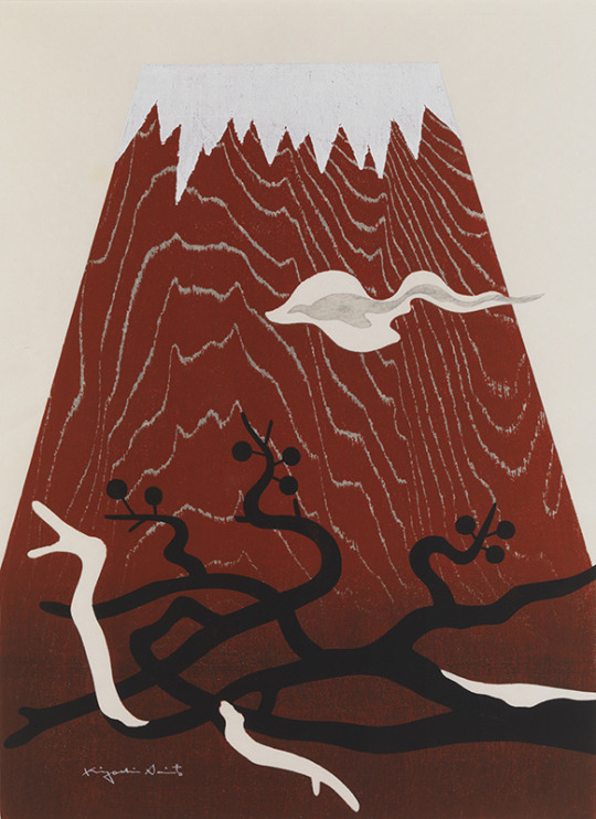
Mt. Fuji has long been respected as a mountain of gods in Japan. Therefore, showing it in artwork must be very respetful and formal for Japanese people.
Normally, Mt.Fuji is shown in blue to express it, but because this one was used red, I think he draw Mt. Fuji as seen in the evening. As the expression aka-fuji in Japanese is used, it depicts Mt. Fuji in a particularly beautiful appearance. Belive or not, you can see this red color Mt.Fuji in real life! Also, this red is not vivid color and uses a very warm natural color.
What is interesting is the color of the sky. It is slightly pink compared to the white snow on the top of the mountain. From that, I think this pale color was intentionally used to make Mt. Fuji, which I admire, stand out. The shape of the clouds looks like a dragon is flying. Even in Japan, it feels like a combination of the myth of a dragon. It's a very proud and elegant movement and in the middle of the cloud, there is a gray blackish line in it. This means this cloud has got a soul in it as well.
Looking at the lower part, a black plum tree that has not yet bloomed is drawn. From this, it can be estimated that the season is between the end of winter to the beginning of spring. Do the white branches represent the snow that has fallen? It looks like it's still in cold weather. Also, the black color is smudged on the bottom parts which means the real world is a dark and terrible place to live but the mountain parts are pure and sacred. It could be meaning of mythology in Japan as well.
The most interesting parts of this work is texture.
He used wooden natural organic woodgrain patterns for the body of mountain. I have never seen a print like this before. It is almost saying this artwork belong to nature world. I think this method will be very useful for my next project.
Clare Leighton (1898-1989)
She was an English-American artist best known for her wood engravings.
Watcher Of The Sky (1955)
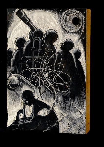
This work is a mixture of realistic and idealised.
Some people are included and I think they are all professional scientists who try to investigate new facts of the sky.
The mysterious shape in the middle and right hand side shows the science of the sky was so mysterious at that time and these scientists are trying very hard to find out the fact or truth. Also, the swirl shape shows confusion inside their head or the hope for a different world.
The color is black and white so it shows the night time and the white color around people look like showing the furure hope to the people.
The bottom right zig zag lines may explain their excitement feelings and cause waves of their heart to pump or could be the sign of universal movements or vibrations.
I found that this is quite scary because not so detailed about people and they are all looking the same direction. Especially, all faces are the same shape and clothes are the same, kinds of very creepy. Maybe wanted show the scientist does not have feeling and they are only interested in the fact. It looks like all people are men. It shows the time of this era, men had more power and access to the education than women. It is very sad and not fair but it was the truth.
They are quite a lot of abstract shapes in this. It is all belong to the scientic world.
Textures are all over the place so there are no plain bit at all on this work makes me a bit breathless and give me emotional pressure.
I think so clever to show the serious and mysterious emotions at the same time on this.
Even thought this is a woodblock print, shows details a lot. Some lines are really straight and the microscope looks real. She is very good at describing the shapes and works are so neat.
Also, I can see the lots of depth in the work almost like an illusion especially on the spiral.
Jed Henry
He is a woodblock print illustrator.
Pocketing a Wager

The most interesting power which he has got is he can change almost all world famous animations or TV programs scenes to Ukiyoe style illustrations. I have never seen before such cool illustrations before. I can not explain well but something old and new are combined together makes really beautiful attractive artworks.
This artwork is about Pokemon and Sumo wrestling.
I can recognize some of characters from Pokemon. All animals look very different from the show but he turn in to them to real Japanese yokai (monster) looking very well. Also he uses Kanji (Japanese character) it makes this piece like it belong to Japanese traditional culture.
I can see the audience in the background but they are not colored just line drawings. It makes the battle scene more powerful and outstanding.
He uses the Japanese traditional paint colors as well. He must study hard to get to know original Ukiyoe very much otherwise it would not work well.
There are no modern items at all in this work. All clothes are kimono, hats and other accessories are also old style.
There is only one bit I can see the modern is the Pikachu`s thunder lines. It is almost like abstract art there which never seen in original Ukiyoe arts. Because of using white lines it is very pale and not overpowering the rest of work.
He did a signature using the alphabet and also used Japanese stamp and the red color really stands out. (we only use red color for this kinds of stamp) It looks very old style but a lot of Japanese people still using this kinds of stamps. ( I have one as well)
So, it makes me want to use my Japanese stamp as signature in the future it would be very unique.
There is not religion a message on this but definitely showing the Japanese traditional culture.
References
www.takezasa.co.jp. (n.d.). 木版印刷による版画制作工程 -摺師の仕事・役割- | 木版印刷・伝統木版画工房 竹笹堂. [online] Available at: https://www.takezasa.co.jp/mokuhan/mokuhan01_3.html [Accessed 8 Mar. 2021].
Wikipedia Contributors (2019). Woodcut. [online] Wikipedia. Available at: https://en.wikipedia.org/wiki/Woodcut. [Accessed 8 Mar. 2021]
武蔵野美術大学 造形ファイル. (n.d.). 武蔵野美術大学 造形ファイル|武蔵野美術大学による、美術とデザインの「素材・道具・技法」に関する情報提供サイト. [online] Available at: http://zokeifile.musabi.ac.jp/. [Accessed 9 Mar. 2021]
ukiyoeheroes.com. (n.d.). Ukiyo-e Heroes | Our Story. [online] Available at: https://ukiyoeheroes.com/about-us.php. [Accessed 10 Mar.2021]
www.clareleighton.com. (n.d.). Clare Leighton. [online] Available at: https://www.clareleighton.com/ [Accessed 10 Mar. 2021].
やないづ町立 斎藤清美術館. (n.d.). ギャラリー. [online] Available at: https://www.town.yanaizu.fukushima.jp/bijutsu/gallery/ [Accessed 10 Mar. 2021].
2 notes
·
View notes
Text
Comfortable Country Review!

Comfortable Country: Peaceful Homes Inspired by the Country
Author: Enrica Stabile
Photographer: Christopher Drake
Publisher: Ryland Peters & Small, Inc., 2001
ISBN: 978 1 84597 361 2
*All quotes are from the book.
“Country is not simply an area you can find on a map, it is a place of the spirit.”
Comfortable Country strongly establishes the mood of country-inspired interior decoration. Aspirational homes are showcased on nearly every page, depicting pretty examples of design elements in a country home. The book’s text and images together create a thorough list of what you need to furnish your dream home, more idealistic than practical. Though lyrical and dreamy, Comfortable Country receives a rating of three darling geese out of a possible six, ultimately unable to rise to the standard of being a book about actual design in an accessible way.

“...home should be a haven of renewal...”
Stabile is verbosely lyrical, describing tangible elements in great detail and providing abstract words to key readers into the decor style’s gentle tone. Repeated again and again, almost ad nauseum, are: comfortable and comforting, simple, inviting, relaxed, peaceful, cozy, casual, informal, tranquil, natural, soothing, unassuming, unpretentious, generous, soft, and restful. The painted picture is very clear; a real #mood #vibe is conjured in Stabile’s detailed imagery. But it’s the same thing on every other page: faded linens, white paint, terracotta pots. All of those elements are fabulous, but we got it the first time!

“Elements like these remind us of the pleasure we derive from the integrity of natural materials and living with things shaped by human hands from nature’s bounty.”
The book got redundant very quickly. The first section focuses on influences to consider: changing seasons, peacefulness, nostalgia, utility, and natural materials. Each is integral to country decor and living, in which you can “indulge your senses and promote your wellbeing.” The second half distributes these characteristics in various rooms of the home, applications of the notes from the first section. This call and response format works to really show readers how the fantasy works... and again... and again… The photography is so beautiful and rich; so many words weren’t needed. Or, if Stabile wanted her specific voice to come through, detail away but limit the book to carefully selected images that flatter the writing-- more of a style diary.
Comfortable Country is a thorough lookbook, a selection of excellent examples curated to present a fresh take (in 2001) on country style. I wonder which elements contributed to that fresh take: wildflowers in chipped vintage enamelware? Embroidered cloth napkins? Homemade ceramic mugs? Delft tiles or Victorian plates? Undoubtedly very pretty, I have a meticulous guide book of items to buy or find and visual examples of ways to place them in my own personal home. However, Stabile’s narrative on lifestyle has a shallow relationship to the material decor of the style, shying away from being a true design book. This brings me to how Stabile grounded, or didn’t ground, the book in any context whatsoever.

“All you need is time to enjoy it.”
Stabile is repeatedly very encouraging of a slower, quieter lifestyle. Chosen items should center rest, enjoyment, and ease. This is all very clear and, I think, very good! I personally would absolutely love to just start over in a sweet cottage, having enough money and time to gather precious pieces and make all my food from scratch. So many of us follow #cottagecore, but there is something inherently imaginary about the vibe, it’s attractive because it’s unattainable. I am still curious as to where her vision resides in a more practical reality, one likely inhabited by her readers. She gets so close!: encouraging me to decorate to my own personal interpretation, to have an “individual reaction to individual things.” However, simply buying these items cannot suddenly allow me to lead a more peaceful, country-inspired life.
“...recapture the unassuming style of a contented era not so long ago.”
This vision is certainly not unimportant, especially in our capitalist society in which we are overworked and undernourished. But Stabile only skirts around this issue, I wish she dove in more! Instead, she longs for a lost era, a time when… The recurring nostalgia is vague, reductionist, and admittedly, kinda sexist. We are asked to “recall a time when all appeared safe and ordered” and I ask: safe for whom? Stabile encourages us to “copy country housewives of times gone by…” to which I would reply, “No thanks.”

“The practical essentials of life need not be unattractive simply because they are useful.”
Perhaps I am mixing country and cottage, but this book indirectly claims a white, patriarchal understanding of being ‘one with nature’ as the ideal. The rhetoric of having a country house is not only bourgeoisie, but actively ignores indigenous ways of life that existed long before ‘having a country house’ was a thing. So many native cultures to this day live in a way where items are indeed made with natural materials, food is picked fresh, and the home is interconnected with the surrounding environment. Stabile jabs at post-war economic boom mass-production of (mostly plastic) goods. This context is important and yet not so simple. Without acknowledging who created the problem, she criticizes and rejects it.

“...make artful use of simple effects to create an unpretentious, relaxing look.”
Basically, what Stabile is presenting is actually luxury more than peaceful living. It’s not about understanding why goods were created en masse, how local artisans were replaced with national department stores. The result is a surface-level relationship with the object around us, which fetishizes ‘simple’ ways of life. An ode to what wealth can do, Comfortable Country acknowledges the need to escape from ‘chaotic city life’, but fails to see how a sweet, gentle hermitage is not an adequate reply to the root causes of why we need that escape in the first place.

Look at this next passage. The voice tries to be relatable, starting by blaming technology and then commenting on minimalism out of nowhere (there’s so much to say on minimalism, coming up in my next post!), but ultimately doesn’t seriously tackle the beautiful goals of the last sentence.
“When technology became a fact of life we had to assimilate, many of us turned to minimalism and a pared-down style to reflect the proficiency of our new world. But real people are not suited to behaving as though daily life were a laboratory experiment-- cool, clean, and clinical. Efficiency has its place, but in the things that we choose to live with we need an intimacy and a softness to keep us gentle, and to keep us human.”
I can only assume the intended audience of Comfortable Country is one who wants a fantasy getaway. This is totally fine! I can only award three geese because, while it sounds lovely, the book is removed from truly accessible design. A reader might crave white linen curtains and a stone bench to sit and admire her garden. But I wish this book were so much more than just a privileged dictation of what country-chic means to her and how you can do it too! It comes across as condescending to a reader like me who thinks (too) critically and has the knowledge to design on her own. The book was what it said it was, and I would only recommend it to those starting out in figuring out their style.
With loving curiosity,
DesignMod
#DesignMod#Comfortable Country#design review#cottagecore#design book review#Enrica Stabile#country living#cottage aesthetic#country aesthetic#wht!#wehavethoughts!#interior design#interior decoration#home decor#decor#country style#country chic#French country#kitchen inspo#bathroom inspo#living room inspo#outdoor living#simple living#design inspo#style guide#cottage#cottage vibes#vibes#mood#getaway
15 notes
·
View notes
Text
Every Coffee Cloud Has A Silver Lining
Lena was staring down at the depressing ‘1,483’ on the corner of her mail app as she pushed through the door to the little cafe. She flicked through her emails, deleting most of them immediately as she moved through the queue. When she got to the counter she rattled off her order without looking up and stood to the side to wait.
Lena liked spending her breaks at this cafe. It meant she could continue working on her laptop without Jess being there to tell her off for not actually taking a break. It was small and normally quiet, with windows all along the front that let the warm sunlight come pouring in. The smell of coffee and fresh pastries permeated the air and soft jazz was played through little hidden speakers.
A few minutes later she heard her name called out and grabbed her coffee. She was about to take a sip when she paused, looking down at the drink in her hand. Where normally there would be a pretty leaf design or something, there was a squiggly shape with blobs of milk foam.
Lena turned back to the counter with a raised eyebrow, more amused than anything.
The woman at the counter gave her a sheepish smile and adjusted her glasses. “Would you believe me if I said it was a new abstract style of coffee art?”
Lena tried to stop herself from laughing. “What was it supposed to be?”
The woman (or ‘Kara’ as her nametag proclaimed her) huffed and pouted. It was far too adorable. “It was meant to be a leaf. I’m sorry - I’m new.”
Lena laughed and Kara smiled brightly at her but there was still a small queue and Kara had to get back to work.
Lena sat at her usual table in the far corner and relaxed back into the comfy chair, blowing gently on her coffee to cool it down and smiling at the blobs on top.
———
Lena was back at the same time the next day and smiled when she saw Kara was there again.
“Lena!” Kara beamed at her.
She raised an eyebrow. “You remember people’s names after just one coffee? Impressive.”
Kara chuckled and adjusted her glasses. “No, not normally. I guess you’re just memorable.”
They both blushed and ducked their heads and Lena almost walked off without ordering her drink.
When Kara called her name again, she went up to the counter and looked at her coffee.
She smirked. “Let me guess - it’s a cloud.”
Kara laughed. “That’s exactly what I was going for - see, I’m an excellent coffee artist.”
Lena shook her head in amusement and went to her table.
It was only when she went to throw away her cup as she left that she saw the little smiley face Kara had drawn by her name. She couldn’t stop smiling for the rest of the day. (The strange look Jess gave her was probably unrelated.)
———
Lena found herself in the cafe more often after that. She told herself it was because she was having a stressful time at work and needed the time to relax. She didn’t believe herself.
Kara occasionally stopped to talk to her while she went around wiping tables (most days trying to convince her to try a caramel frappe instead of her ‘boring adult drink’) and Jess kept looking at her as though she knew Lena hadn’t been able to do any work and had actually had a break.
Lena was thrown when Kara wasn’t there one day. Her coffee had a beautiful leaf pattern on but it didn’t come with the Kara Danvers Smile.
She was sitting in her usual corner when she saw Kara come stumbling out the door from the back, tying on her apron. The redhead that had served her coffee looked unimpressed as Kara said something and got a cleaning cloth thrown at her in return.
Kara lit up when she caught sight of Lena and made her way over. She frowned down at her coffee and pouted.
“Aw, someone else already made you coffee? I feel so betrayed, Lena.”
She laughed. “It’s not my fault you weren’t here. Although, I have to say,” she picked up her cup and looked at it, “I think your dinosaur yesterday was better.”
Kara grinned. “I knew it looked like a dinosaur!”
Lena gestured to the seat opposite her. “You know you can sit down if you like?”
Kara fiddled with the cloth in her hands and glanced back at the counter. “Alex probably won’t be very happy if I don’t do any work at all but will you still be here in 15 minutes?”
Lena was supposed to be back at the office in 5. “Sure.” She probably didn’t have any important meetings.
Kara grinned and skipped off to wipe tables. Lena quickly sent a message to Jess to tell her she’d be back a little late. She ignored Jess’s following interrogation.
Kara flopped down into the seat opposite 15 minutes later with a huff and flicked the towel onto her shoulder.
Lena smirked. “You cannot possibly be tired. You only got here 20 minutes ago.”
Kara whined and dropped her head back against the chair. “I’ll have you know I had a very tiring night.”
She raised an eyebrow and Kara pouted.
“I did! And it wasn’t even my fault - it was Mike.”
Lena looked down and brushed imaginary dust off her laptop keyboard. “Who’s Mike?”
“Oh,” Kara made a face and waved her hand. “He’s- I don’t know he’s not even really a friend - he kind of just tagged himself onto our group. I had to spend all last night making sure he didn’t get himself into trouble because he’d got so drunk.”
Lena frowned. “You’re way too nice. I would’ve left him to get himself in trouble.”
Kara laughed. She waved happily at Alex who was glaring at her from across the cafe.
She turned back to smile at Lena. “So what are you doing?” She nodded to Lena’s laptop.
Lena waved her hand and closed the lid. “Oh, just some work.”
“Oh gosh,” Kara sat forwards in her seat, making to stand up. “I’m not disturbing you am I?”
“No!” Lena reached out a hand as though trying to push Kara back down using The Force. She winced slightly at how loud her voice was and cleared her throat. “No, it’s fine. I was finishing anyway. And I like… spending time with you.” Where was not-so-socially-inept-CEO Lena when she needed her most?
Kara smiled shyly and adjusted her glasses. “I like spending time with you too.” She tilted her head at Lena’s laptop. “So where do you work?”
Lena picked up her coffee and took a sip to buy herself some time to calm her nerves. “Um… L-corp?”
Kara laughed. “That sounded more like a question.”
Lena watched as recognition took over from her amusement and downed the rest of her coffee.
“Wait - Lena as in Lena Luthor?”
Lena gulped and nodded.
Kara’s eyes lit up which was definitely not what Lena was expecting. “Golly, how did I not realise! The Lena Luthor? You’re incredible!”
And thus began the most unorganised, excited, politest rant Lena had ever been on the receiving end of. She sat and gaped at Kara until she trailed off, nervously adjusting her glasses.
Kara cleared her throat. “Sorry. You probably came here to relax and here I am telling you things you must have heard a million times.”
Lena looked down and shook her head. “No, it’s fine. Nice, actually. Not a lot of people are willing to look past the Luthor name.” She shrugged at Kara’s look of confusion and outrage.
“Well those people are dummies.”
Kara looked so certain of this mildly phrased fact that Lena was a little taken aback. It reminded her of how Lex used to defend her and made her heart clench.
She smiled politely at Kara and started packing up her things. “Well, I should probably be getting back.”
Kara stood up with her, looking slightly worried she’d said something wrong.
Lena bit her lip and fiddled with the strap of her laptop bag. “I’ll… see you tomorrow?”
Her smile became a little more real when Kara brightened and nodded enthusiastically in answer.
When she looked back as she left the cafe, Kara was still standing there watching her with a smile on her face.
———
Lena was not having a good day. She had just finished an emergency meeting that had run from 6:00 that morning and had another in half an hour. She pushed through the door to the cafe, lost in her thoughts, planning to grab a coffee and head straight back to L-corp to sit and be stressed until she had to go into the next meeting.
Kara seemed a little nervous as she took her order and asked her to wait to the side but Lena was too stressed to take it in. When Kara called her name, watching her come up to take the drink and biting her lip, she barely took notice of it. She quickly smiled at her and grabbed the drink, turning to leave immediately.
She was halfway to the door when she noticed the name on the cup wasn’t hers and went to turn back to the counter.
“Oh, I think I’ve got the wrong…” It was only then that her brain actually processed what she was reading. Instead of having her name on, the cup read ‘Kara’ and underneath was a phone number.
She looked up at Kara who was twisting her hands together and looking as though she might run away at any moment. Lena looked back down at the coffee. On the top was a perfect heart.
“I um…” Kara adjusted her glasses. “I’ve been practicing.”
A smile started to spread across Lena’s face and the stress that had been so prominent in her brain five minutes ago melted away. She bit her lip and ducked her head.
Alex chose that moment to enter through the back door. She looked between the two of them and rolled her eyes, turning and leaving again immediately.
Lena approached the counter again. “Hi.”
Kara swallowed. “Hi.”
Lena tapped the counter and looked up at the menu boards. “Do you do reservations and preorders?”
Kara frowned. “...Yes?”
“I’d like to reserve a table for the same time tomorrow with my usual and a caramel frappe, please.”
The brightest smile Lena had ever seen spread across Kara’s face and Lena couldn’t help but mirror it. Kara Danvers was like her own personal ball of sunshine and she was pretty sure she was halfway in love with her already. Jess was never going to let her hear the end of this.
8 notes
·
View notes
Text
Lapidot for Professionals: Quality Time
The prompt: married / kids
“Ah, finally.” Peridot wiped sweat off her forehead with a nearby rag. “I thought I’d never finish these samples.”
“So you’re done?” Lapis was in the corner of the lair, carving out some abstract thing out of an enormous piece of driftwood.
“I’m done with these, anyway. They need to incubate for a few days.” She looked around her workbench. “I guess I could get started on those improvements I wanted to make to the bio-injector’s fine mo --”
Peridot’s train of thought was stopped in its tracks by two blue arms hitting the table on each side of her.
“Don’t you think we’ve both been a little too busy, Peri?” Lapis leaned in close to her face. “Don’t you think we could use a little time to ourselves?”
Her cheeks flushed blue. She smiled, but didn’t turn around. “What did you have in mind?”
Lapis’ voice was low. “I think it’s a good time to…” She suddenly grabbed Peridot with both arms, pulling her away from her work. “...capture the notorious Peridot of the Crystal Gems!”
Peridot laughed joyously. “Oh no, you caught me!” she said, squirming in Lapis’ grasp. “But you’ll never make me talk!”
“Oh, I have ways of making you talk,” said Lapis, tossing Peridot onto the couch and pinning her arms above her head. “I just hope you’re not too easy to break.”
Peridot’s face was shining with anticipation as she gazed up at Lapis, and --
-- the security system buzzed.
“Ugh, seriously?” said Lapis, dropping her playful facade.
“Shhh,” whispered Peridot. “Maybe they’ll think we’re not here and go away.”
The security light was flashing green, indicating that the visitor was both recognized and trusted. It was unusual for one of their friends to drop by without texting first, though. Peridot’s phone had been silent for the past few hours.
“Who do you think it is?” Peridot asked Lapis quietly.
“Aunt Peri! Aunt Lapis! Are you there?” called a child’s voice through the door.
“Oh, no,” said Peridot, realizing.
“We don’t have a choice, do we?”
“...no, we really don’t.”
Lapis let Peridot up off the couch, and they both re-sheveled their disheveled outfits before Peridot opened the door.
A short kid with an enormous mound of black hair bounced into the lair. They were wearing pink overalls with stars all over them and a fluffy cat ear headband. “Hi, Aunt Peri!” They rushed at Peridot for a hug.
“Hi, Nora!” Peridot scooped up the kid, trying to swallow her disappointment. She loved Nora, of course, and just about any other time she would have been happy to see them. They did have an uncanny knack for spectacularly bad timing, though.
“Do your parents know you’re here?” asked Lapis, as Nora let Peridot go and latched onto her instead.
“Yes!” said Nora, very seriously. “Well. Kinda.”
“What does kinda mean?”
“Well…” Nora fidgeted. “Daddy and Mommy both had work today, so I was staying with Grandma Pearl and Grandma Garnet. But they had an emergency, so she got Aunt Ames to pick me up. And then we went to get ice cream!” They jumped from foot to foot. “I got chocolate ice cream with sprinkles and whipped cream and fudge sauce and cookies and coconut…”
Well, that certainly explained their level of energy. “And then what happened?”
“Aunt Ames had to teach a class, so she said I could go visit Aunt Bis and play with swords!”
“You didn’t actually play with swords, right?” said Lapis, alarmed.
“No, Aunt Bis told me not to touch,” said Nora, clearly saddened by this development. “She said she was really busy and I should go someplace safe instead.”
Peridot was surprised. “So she sent you here?”
“No, she sent me to Aunt Zircs. And Aunt Zircs gave me paper and pens and I drew this!” Nora pulled a slightly crumpled piece of paper from their little shoulder bag, several more papers spilling out onto the floor as they did so.
They pushed the paper into Peridot’s hands. It was a crude drawing of Nora with a pink heart on their stomach. “It’s me if I were a Gem! See, I’m a Diamond like Daddy, but my gem is heart-shaped like Spinel! My special power is I can make any other gem appear on my body, too. And I live in a castle in outer space, and I fight with a sword like Mommy and Grandma Pearl!”
“That’s really cool, Nora!” said Lapis, encouraging. “And it’s such a good drawing!”
Nora beamed, a huge smile on their face. “Aunt Zircs said it was a really good story! She said you’d want to hear it, Aunt Peri!”
“Of course she said that,” said Peridot, screaming internally. She was going to kill Zircon. “Listen, Nora, we’re kind of busy. Don’t you think we should go find your grandmas? They’re probably wondering where you are.”
Nora’s smile turned to sadness in an instant. “Ohhhh, you’re busy too?” They stared at the ground, looking as though they were about to cry. “I wanted to play Pizza Kart…”
Peridot, conflicted, looked at Lapis helplessly. Lapis shrugged and mouthed, “we have to.”
Peridot patted Nora’s head. “We can play Pizza Kart for a little while, then we gotta make sure your grandmas and parents know where you are, okay?”
“Yes!” Nora snapped back to vibrating with ice-cream-fueled excitement, skipping over to the couch and picking up a controller.
“You go set it up, I’ll be there in a second,” said Peridot, pulling out her phone.
PERI5XG: ZIRCS, HOW COULD YOU DO THIS TO ME????
PERI5XG: I WAS ABOUT TO SPEND QUALITY TIME WITH LAPIS
CourtLawyerZircon: Oh dear.
CourtLawyerZircon: I’m genuinely sorry, but I have an important trial in less than two hours!
CourtLawyerZircon: Do you realize how difficult it is to prepare a defense and pay attention to a human child’s rich imaginary world at the same time?
PERI5XG: YOU COULD JUST IGNORE THEM
CourtLawyerZircon: And hurt their feelings? How dare you even suggest such a thing.
PERI5XG: YEAH, I KNOW
PERI5XG: YOU OWE ME THOUGH
CourtLawyerZircon: Indeed, I do.
PERI5XG: NEXT TIME I HAVE BABYSITTING DUTY I’M SENDING THEM TO YOU
CourtLawyerZircon: I’ll make sure I have art supplies, board games, and age-appropriate books for the occasion.
“C’mon, Aunt Peri!” Nora called from the couch where they were sitting next to Lapis, the Pizza Kart menu music blaring from the TV. “You gotta come pick a guy!”
“Okay, okay.” Peridot sat on the other side of the couch, Nora sandwiched in between her and Lapis. They giggled and snuggled up to Peridot. They were always so thrilled to spend any time with their Gem aunts. How could Peridot possibly deny them?
It wasn’t exactly how Peridot had been hoping to spend her afternoon, but if that were the worst of her problems, then she really had it pretty good.
Lapidot for Professionals @ AO3
@lapidot-week
#lapidot week#lapidot#lapis lazuli#peridot#blue zircon#professionals#steven universe#steven universe fanfic
24 notes
·
View notes