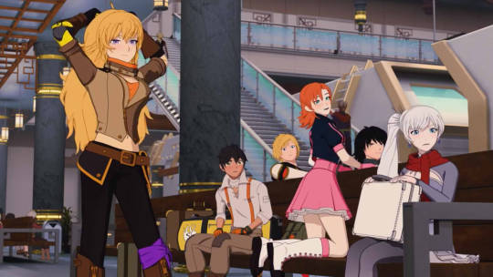
#I’ve done one for every character just for expression practice without the palettes
Explore tagged Tumblr posts
Visit Tumblr Blog
Explore Tumblr blogs with no restrictions, modern design and the best experience.
Last Seen Tumblr Blogs


Fun Fact
Tumblr has been providing a Korean-language service since 2013.
Note
Heyhey Night! I have a buncha questions after seeing all your animations and they're just so cool so! I hope this is ok!! Can u animate normally too, or only pixel? Not that that's bad, just wondering! What's ur preferred kinda animation? Do u prefer lipflaps or lipsyncs? What's the hardest part of the animation process?? What's ur favorite?? Any part u don't like? What's a thing people don't see that u put a lotta time into? Do u have a fave animation u've done? Thank u btw for all ur art!!
Oh stars, okay, yeah- I’m happy to answer all these!! I’ll break them up so it’s easier to read X) And awww geez thank you so much for your support, sweet anon! It really makes my day when people say they like anything I’ve made, and stars knows it’s all the more true with the sweet sweet time sink that is animation (´•̥̥̥\\ヮ\\•̥̥̥` )
I’ll also put this under a cut since it gets a bit long :)
Can u animate normally too, or only pixel?
This one cracks me up a little, don’t worry about it XD I totally can! In fact I enjoy it a lot - and... gods, animation software is a nightmare and a half, to be honest. That’s the biggest hurdle.
I do just straight up love pixel art and the aesthetic I can achieve with it, but I do at times miss ‘normal’ (non pixel?) animation, heh. Especially sound-syncing! I do all my pixel art in Asesprite which imo is the best pixel art program, not to mention made by an actual pixel artist - buuuut it doesn’t have a sound file option. Which makes sense! Er, frankly, most pixel artists wouldn’t... use it to animate like I do? More for games, or for looping gifs? So I can’t complain much, it makes a lot of sense that it’s a low dev priority.
Now, when it comes to other animation programs... I’ve tried a lot. Unfortunately, the ones that are preferable for the feel I like are either way out of budget (stares at TVPaint in the distance) or... well, have too high a learning curve for my single-person workflow, really. (OpenToonz, sigh...) And a lot of the free programs are good for getting a start in animation, but once you get to a certain point you really feel the limitations (whether it’s workflow, sound import, exports, trying to make something more finished than a rough...).
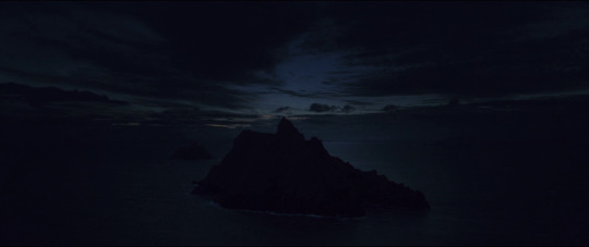
Then... there’s animation programs I just don’t like, and a lot of those are angled towards bone-style animations (nothing wrong with those, they just don’t fit my style? and are too much time investment for a single artist to output more quickly...), or are, well, freakin’ Adobe Animate.
I... gods, I do not like Animate (formerly Flash). And I made a whole 2 minute+ animation in it a couple years ago! (It’s very rough and bad and doesn’t make sense, pfff, not gonna link it XD) It’s... clunky, and vector oriented, and freaking lines don’t go where I want them too, and it tries to predict too much?? It’s hard to put to words, gah. For me, my animation style would be much more... raster oriented. Flow, hand drawn inbetweens, yaddayadda. Animate’s great for... plenty of things, but not for that kind of animation. There are far better animators than I who make it work with freakin’ aplomb though! So really, it’s just my taste, haha.
.... Er, that got long! I’ll cut off more rambling about animation software and tl;dr boil it down to “I love animating period, but turnaround is something I have to keep in mind as a freelancer, as well as budget, and my current focus is pixel animations for a number of reasons.” X)
What's ur preferred kinda animation?
I’m not exactly sure what this one means! Between pixel and non-pixel? Er, they both have their pros and cons, so I couldn’t say! But if I have to break down my current animations into categories, I’d say I have cutscenes, loop environments, and the broad game-like animations...
The first would be something like this animation feat. teasing Edge, the second would be something like this one with skesgo’s Starlan and Cinnamon, and the third is... everything else! From headsprite loops to ‘small’ characters running and so on.
Honestly, they’re all a lot of fun for different reasons! Cutscenes are generally the most challenging, but they give me the chance to push my limits and try and pull off something cool, whether I’m having to conserve frames (to keep the cost of a commission down) or whether I’m going more all out (which is a pricey commission, or a fun personal project, lol).
Loop environments are their own challenge - it may not look like it, but I put a lot of thought into how to make them look as natural as possible! From timing of talking characters, to where to place a blink, to exactly how many frames it’ll take to ‘soften’ a motion (so people aren’t just snapping between major poses) and so on - it takes... a lot of time to animate even simple scenes well, so I do a lot of mental math on how I can keep things affordable when someone approaches me for a commission. And frankly, I totally undercharge;; but I do my best!
Game-like animations are just fun. They range, they’re silly, to intense (I’ve animated fight animations before for game concepts), to indulgent, and beyond! Headsprites are always a delight, especially if I get to push the expression X) and I love tiny things (I mean... I am a pixel artist...) so getting to make lil tiny babs even just walking can be fun - and also, a lot more time consuming than you might thing, esp if you wanna make it smooth, like this lil Frisk I did last month or so:
Do u prefer lipflaps or lipsyncs?
oTL
B... both??
Okay, lipsyncing basically is very time consuming. AND, I freakin’ love it. I love puzzles, and when it boils down to it, that’s what super fun & expressive lip syncing is (some Ghibli animations are the heckin’ best for this)...
and, I’m a pixel artist, without sound-syncing capabilities in her main art program oTL Yeah, I can export frames and line them up and check but... gods, it’s so time consuming. I’ve tried it out of desperation - but for even five seconds of sound (sayyyyy a lil Vine...) that’s hours upon hours of transferring back and forth just to check.
So even though I love lipsyncs, they’re too time-consuming (and ergo, if I’m being commissioned, often too expensive) to do often! Someday I’d like to get back to doing them more often, but for now, practically I stick to/’prefer’, in the loosest terms, to do lipflaps. For the layman, this is that ‘two frame’ (maybe three) open-closed style of animating mouths- however, I’m working on ways to keep that style, but make it more expressive! It depends on the project - and in commissions, I’ll pretty much always prioritize giving the client a little more body animation than mouth animation, unless it’d really fit what they’ve requested.
What's the hardest part of the animation process??
.... damn, this is a tough one! Sometimes I’d say it’s the initial concept work - but it depends on what I have to work with. Sometimes that parts a breeze - and honestly freeing, bc I can take the time to try and push what I’ll do with it!
Roughing is one of my favorite parts, tbh. It can be tricky, sure, but getting to go from keyframes to in-betweens & smears to adding the flairs of secondary motion (think hair swishing, or coats flaring, etc) is so exciting and satisfying.
From there it’s all refining, and tweaking...
Hm. Honestly, the hardest is probably the initial cleanup and lining. It’s cool to see it come together, but it feels so much slower, and it can drag - and then you find bits that actually don’t translate well from the rough stage, so you have to go back and rework, and oof it can just drag in this phase, heh. Plus, I’m always tempted to add more frames, but it’s not always realistic - I’m a perfectionist, to say the least, so I’m constantly having to leash myself back so I don’t turn a project into a half-a-year undertaking, pff.
What's ur favorite??
Probably gave myself away talking about the roughing stage X) It’s just loose and fun and free! But seeing it all come together is also damn satisfying too, so that’s not to say I don’t like the refining portions either...
Outside of that, I also really like the beginning of the color stage! .... Before having to translate shadows/highlights to each and every frame *shudders*. That gets tedious, but it’s so critical! Anyways, though, I heckin’ love colors. I always have a rough palette in mind at the start of the process, but I go ham and play with it as a little break and a true test when I get to actual slap together a full frame with full color, highlights/shadows included! It’s exciting, like a preview of the finished product, basically :D
Any part u don't like?
Heh, by the time I get to shadows/highlights, I tend to be getting impatient, I suppose. It’s not that I don’t like it - I definitely highly value it, and if it was the only thing I was working on in an animation that’d be different, but as a one-woman team I’m just raring to be done at that point; it’s very nearly the last thing I do, after all, so it’s a struggle to focus. X)
I suppose one that always gets me is more complicated backgrounds. It’s a work in progress, as I’m getting better and finding the fun in them for sure! But I’m still not where I want to be in translating ‘background concept’ to ‘finished background’ - it feels more stiff than my animations, I guess. So it’s a frustrating part... but hey, it’s part of it! And learning to embrace the challenge is a big help.
... I just always have to make sure I have a big cup of coffee and a good jam playlist going when I sit down to do ‘em, in the meantime.(=▿= ||||)
What's a thing people don't see that u put a lotta time into?
Definitely the coloring. This goes for both backgrounds and the animated characters themselves. It’s... never as simple as it looks? It’s time consuming, and while some parts of frames can be copy-pasted, I also put subtle work into the animations that mean that some pixels are off so it ends up being marginally faster to just recolor, but then there’s shadows, and working in pixels means that if I miss one then there’s a flickering pixel mid-animation, and sometimes there’s an unconnected line and then you bucket fill the whole damn thing, and gods know I’ve got colored lines so I have to be exacting with keeping the same ratios highlighted vs darker in shifting frames...
*deep breath*
... Yeah, basically the coloring is super time consuming. And balancing bg coloring with animated elements in the image itself is a whole extra challenge on top of that. For 99% of my animations, I can damn near guarantee I’ve spent at least twice as much time coloring it as I have animating it.
Do u have a fave animation u've done?
*looks at my goblin hoard of animations in horror like I’ve been asked to choose a favorite child*
... Stars above, I can’t choose! I love them all, and at this point a good portion of them are commissions- it wouldn’t feel right to choose!
*...carefully covers the hoard’s metaphorical ears*
... also, that said, I can admit a soft spot for any of them that involve humor. I tend to get to do extremely expressive faces and action there, even if I have to ration the frames, so it turns out really fun X)
And though rough and I’ve definitely done stuff I’m more proud of, I still crack up at this one I did a while back of the nonsense ‘ass’ joke between Red & Stretch... their faces were too much fun XD I’ve gotten waybetter since then though, Big Oof, I see so many things I can fix; might go back and redo it someday.
Honestly, though, I just freakin’ love animating! They all have their ups and downs andI always put a lot of love into them and find a way to have fun with it and try to push any emotion/theme (when applicable). I like to think it shows, but idk, that’s something I have to leave up to you guys X)
#night answers#about animating#phew there were a lot-!#thanks so much for your interest#hope these answers made sense! :D#Anonymous
51 notes
·
View notes
Note
Hey squiggle meister. What're your thoughts on the flood of people on YouTube who are constantly ranting about the series. And how it's dead after Monty died, and how it's so much worst than before. Etc etc
Tobe honest with you Key, I really don't want to answer this question.I mean it's alright that you asked and I'm going to answer you however I'mgetting a strange sense of deja vu here. Wasn't it not too long ago that youasked me to give my opinion on a similar condition that was happening pre-V6?
Thiswas the issue back then and yet here we are again. You may wanna grab yourselfa snack and settle in because this is going to be one long response post. Let’s just say,this squiggle meister had a lot to let off her chest regarding this particulartopic in the FNDM:
Ihave actually had a small listen to some of these critiques on YouTube and toput it bluntly, I couldn't bring myself to finish most of them. I am a RWBY fan whoalways advocates respecting each other’s opinions regardless of whether or notwe share the same sentiments about the series. I am also a RWBY fan whounderstands that the series is not a flawless show and has suffered more than its fairshare of shortcomings throughout its last arc trilogy.
Nevertheless, in spiteof this, I’ve also acknowledged some noteworthy improvements in the quality of the show that honestly deserves more praise.As someone who has been with this series since its humble beginnings, I have beenthere for each transformation the show has undergone and in doing so, I haveseen RWBY evolve.
Whilesome of the show’s changes haven’t entirely been welcomed by its fandom (withits main change being something completely out of the showrunners’ control) I’dbe lying if I said these changes didn’t contribute to the show’s success insome shape or form.
Speakingfor myself, initially RWBY earned my attention because, like most RWBY stans, Iwas a fan of Monty Oum before and when I discovered that he had his own seriesproduced by RoosterTeeth, I was interested. I didn’t care what the story wasabout or what it looked like. All that mattered to be me back then was that itwas something from the creative mind of Monty Oum so I expected somethingepically action-packed.
At the start, I joinedthe RWBY fandom becauseof Monty however as the seriesprogressed, my reasoning for sticking with it and staying loyal to the showtranscended my past loyalty to the franchise as a by-product of anartist/animator I admired so much.
Thisbrings me to my main point. You want my honest thoughts onthe YouTube RWBY Rants, Key? To be frank, I’m tired of it. It is exhausting listeningto the tirades of these proclaimed RWBY YouTube reviewers who do nothing butgripe and express their disdain for everything the show does wrong according totheir standards. I am so fed up of seeing this happen time and time again.
Andwhat’s sad is that I don’t think part of this is even due to the show or theCRWBY’s fault. Do you know you are more likely to find a video shitting on RWBYas opposed to one that genuinely outlines its positive elements or at leastpresents a fair and just constructive argument of the good and bad of the show?Do you know how many RWBY hate videos the YouTube algorithm has recommended to mesince V6 concluded? It’s ridiculous.
ButI also know I can’t do anything to stop it. So long as RWBY exists, there willalways be these so-called ---I guess we can call them the ‘hate parade’ type of fans who wait like vultures to a carcass to pick apartthe show whenever a new season comes out.
Anddo you know what the sadder part about watching these videos is?
Thesevideos try to give the allusion thatthey are coming from a practical standpoint---as if the things they’repointing out in their reviews are genuine problems with theshow and that their personal advice to the showrunners are valid enough torectify these problems they indicated about RWBY.
Herein, lies my personal peeve with these types of reviews. The best kind of criticto me is one who can point out a flaw in something, justify why they believesaid thing is a clear flaw and then use their own understanding to outlinetheir concept for a possible solution to that flaw that they respectfully leaveopen to the creators of said property to take their advice or not.
However,this is not the case with these YouTube RWBY Rants; at least from the few I’veviewed. I’ll admit, there are some genuinely good RWBY Reviewers on YouTube. Ofthe top of my head, Thatkaitodan, MurderofBirds are two and believeit or not, I actually like some of EruptionFang’s reviews from time to time. Imay not always agree 100% with everything he says in his breakdowns but in myopinion, I can’t get too mad at the things he says in his reviews/video essaysbecause he’s able to justify it in a manner that I’m able to see where he’scoming from. Even if that justification comes from a place of unbridled rage.Referring to EF, I know he’s been receiving flak from FNDM members regardinghis recent views on Adam’s conclusion and Bumblebee; however if I’m beingcompletely honest here, I feel some of that bashing is unwarranted.
Inall fairness to EF, at least I’m able stomach his opinions a lot better than thatof other RWBY Youtubers. As I said, EF is able to properly defend his pointswell enough for me to grasp the validity of his statements which is the least Ican say for some of the others I’ve listened to.
Oftenat times, on the adverse side of RWBY YouTube, I find myself listening toYoutubers who spend more time outright bashing everypersonal gripe they have with the show as opposed to presenting a good argumentthan gives hindsight to why these problems are such an issue to them.
Theworst kind are the ones where this Youtubers point out flaws in the show andtry to give solutions to what the showrunners can do to fix these problems. Butmost of the time it’s done so rudely that it comes off more obnoxious thanhelpful. As if these Youtubers are proclaiming to know and understand moreabout the animation production process than the actual people running the showwho have the qualifications and past industry experience
I’llgive you two examples. Not naming names but I recently watched two videos fromtwo RWBY Youtubers---one critiquing the shows character designs while anotherwas a Youtuber’s final video explaining why they were quitting the RWBY FNDMfor good.
Inthe characterdesign critique, the individualexpressed their disappointment in the recent designs for the RWBY girls and thevillains as of the Mistral Arc. They then proceeded to offer their own tips for how the show could have helped to spruce up someof these designs. However rather than attempting to make their own alternatedesigns to the character outfits, this Youtuber just slapped some rather poorlylaid out flat base colours on top of screenshots of the characters in question.Which from a digital art perspective is…admittedly…lazy.
Iunderstand that not everyone in the world is a designer, much less is a characterdesigner or at least knows how to draw. However…if that is the case then whyare you, as the individual who clearly doesn’t appear to have the design skills,commenting on the work of a studio with a full production team of artists whodo have those required skills and experience and can probably rationalize theirreasons for going with the final designs presented in the show. You get whatI’m saying?
Ifone is going to critique the show’s overall character design then the least youcan do is make the effort to back up your claims. Illustrate your own designsfor RWBY character outfits. Create a mock-up 2D/3D screenshot illustration withproper lighting and atmosphere to see how your design ideas holds up againstthose elements of a scene and then compare that to the actual show’s productionwork. This reviewer didn’t even bother to attempt to maketheir own original designs or even redraw the current designs in their ownstyle and test out their suggested colourpalettes to see if it would fit with the overall design aesthetic of thecharacter.
Youmight be asking now: But Squiggles are you saying I need to know how to draw tocomment about RWBY?
To which I say: No.Being an artist is not a requirement that you as a fan need to really have inorder to comment about something you love. HOWEVER, if you are the type of individualwho has the massive chops to try and dictate a production studio with a team ofeducated and/or industry seasoned artists on how they should handle designingtheir characters without you yourself having the design knowledge to supportyour critiques then… you wonder why the CRWBY often get upset with these typesof fans and don’t take their comments seriously?
Contraryto what others might say, I am not a believer that RWBY is dictated by thedesires of its fandom community. That’s a comment I’ve been hearing buzzingabout since V6 ironically in the face of the recent hate crowd to gather fromwhat transpired with the Bumblebee pairing in the recent season.
Iunderstand that there are fans making the argument that the showrunners onlymade this pairing canon because its popular with its shipping community. Thesame can be said about Neo’s return to become Cinder’s protégé.
Admittedlywhile I might find the CRWBY’s decisions to be questionable at times, this still doesn’t prove that they are run by theirFNDM. If something happens in the show, it’s because it’s something theshowrunners and has wanted to do for some time and picked that current volumeto do so. The mere fact that that thing just so happened to correlate withsomething the fans wanted to see is just a matter of coincidence.
Thatbeing said, I will admit that I’ve noticed one or two members of the CRWBY castwho are guilty of encouraging certain ideas without the show itself officially confirming it in its narrative as yet.
In light of that, Iwill admit this. Regardless of whether or not you as a member of the CRWBY teamsupport a particular ship with all your heart, if other fandoms have taught meanything is that as a cast member you should NEVER encourage anything within yourown fan community. It never ends well and I’m seeing this repeated in RWBY. Butthis is not what I’m here to talk about right now. Moving on.
Inrespect to the video from the individual who was leaving the FNDM, I actually didn’tfinish watching their video because the instant they mentioned Monty Oum and their disdain for the CRWBY not living up to hislegacy and all that stuff, I couldn’t.
Ahyes, the classic ‘RWBY Animation hasn’t been the best since Monty passed away and the RWBYAnimation team are terrible because they can’t replicate Monty’s animation’ debate.How many times is this dead horse going to be beaten? According to this RWBY Youtuber, ‘replicatingMonty’s style of animation is easy andit is appalling the RWBY Animation Team can’t replicate Monty’s style afterfour seasons’.
Thiscomment not only annoyed me as a fan but also as someone who has studiedanimation before. Again, how many times will this poor dead horse be dug up tobe bludgeoned? Will these fans everallow Monty’s name to rest peacefully without bringing it up to tarnish theefforts made by the CRWBY to finish the story he started with them?
Iget it. MontyOum was a good animator.He wasn’t the best animator. He wasn’t some genius animation prodigy. He was a creative mind who had his own way of thinking and doing things andfrom that, he established a style about hisanimation that shined through his work. If you were to show me an animatedpiece done by Monty and the same piece animated by another person, I caninstantly tell you which one is Monty’s because Monty had his own style.
That’sthe appeal of Monty’s work, on my opinion. That’s what he became known for by hisfans. However, even though Monty was great at animating fight scenes, his way---hisstyle is NOT the only wayto animate a fight.
Recently,I took the time to go back and count the number of fights that happened overthe volumes. I did this because as of V6, I couldn’t help but feel as if theCRWBY might be shying away including moments where the characters areactually engaged in combat. I omitted the character shorts because onemandatory element of the Character Shorts is a fight scene. I just wanted tohighlight the individual seasons alone.
Someof this numbers might be a little iffy depending on what I counted as a fight,but here’s what I gathered.
THE VALE TRILOGY
RWBY V1C1:2C2:0C3:0C4:0C5:0C6:3C7:0C8:2C9:0C10:1C11:1C12:0C13:0C14:1C15:0C16:2
Totalfights = 12 Fights
RWBY V2:C1:1C2:0C3:0C4:1C5:3C6:0C7:1C8:0C9:4C10:0C11:4C12:4
TotalFights= 18 Fights
RWBY V3:C1:1C2:2C3:1C4:1C5:2C6:1C7:1C8:0C9:1C10:2C11:2C12:2
TotalFights = 16 Fights
THE MISTRALTRILOGY
RWBY V4:C1:1C2:0C3:1C4:0C5:0C6:1C7:1C8:0C9:2C10:0C11:0C12:1
TotalFights = 7 Fights
RWBY V5C1:0C2:1C3:0C4:2C5:0C6:0C7:0C8:0C9:1C10:3C11:5C12:1C13:1C14:0
TotalFights = 14 Fights
RWBY V6:C1:3C2:0C3:0C4:0C5:1C6:0C7:1C8:0C9:0C10:1C11:3C12:1C13:0
TotalFights = 10 Fights
Why I bring this upis throughout V4 and V6’s runtime I’ve seen one or two all-stars inthe new CRWBY animation team. While not all the fight scenes from the MistralArc were the best, there were definitely some good ones that I stood out to me.
OneV4 fight that keeps being overly praised is the Tyrian vs. Qrow dual. Many fanstend to vouch that fight as the best fight of V4. The only reason that fight isso popular is because it was one of the more important fights of thatrespective season.
However,I’m being completely honest, the Qrow vs. Tyrian one on one was good but itwasn’t the only good fight of V4.
PersonallyI took enjoyment in the small sparring match between Yang and Tai Yang.Believe it or not, I felt like that moment, though small, was well animated andI’d actually give props to the animator behind that small scene. There was a nicesense of rhythm to that small fight that I quite liked.
Notmany folks will agree with little ole me regarding that scene but this just goesto show, we all have our own personal preferences with what we consider to be agood fight sequence vs a not so good one.
Often at times, Ifeel really sorry for the series animators cherry picked to handle the combatmoments for the current seasons because I feel like those animators suffer the most pressure and scrutiny in the eyes of the FNDM. I feel like some FNDM members are sofocused on nagging atthe current CRWBY to capture Monty’s old style of animating fights that they aren’t really giving these new animatorswith their own styles a fair chance toshine outside of Monty’s shadow.
Again.I get it. RWBY was Monty’s brainchild. He’s the creator andno matter how far the current CRWBY takes the series, he will always becredited as its creator.
HoweverRWBY has come a long way since Monty’s days. The show haschanged.The overall look and visual style of the series has changed.Even the production pipeline and the software used to animate the series has changed.The CRWBY hasgrown allowing a greater mix of artistslending their talents to breathe life into the series.
Butwhat seems to kind of still be stuck in the past are some members of the FNDMcommunity. The ones who only watch the show because they are waiting to see thecurrent RWBY recapture that essence of Monty thatthey claimed the show lost after he died.
RWBY is dead after Monty passed away? In some ways, this isboth true and false. The truth is that RWBY did die. The old style that the show was being produced on was laid to restafter its creator unfortunately passed. The false is that RWBY didn’t end withMonty because it’s being continued in its current new style by the people whohelped bring it to life in the first place alongside Monty. The same people whoare diligently carrying on Monty’s project in his place. RWBY isn’t dead. It’sstill breathing. Still going. Because a story still needs to be told.
Ratherthan being judged for how well they can interpret a good fight sequence, theseanimators are judged for how well they can replicate Monty’s style. And when theseanimators don’t live up to that expectation, that’s when the shit storm begins.I myself have been found guilty of comparing the past animation to the present.However now I realized that I was wrong in doing that.
Ithink it’s high time some of these fans let go of the past and accept that theaction fight scenes of RWBY are never going to reflect Monty’s style anymore.
Montyis unfortunately not around to guide the current team with this. And they are doingtheir best to find their own style. To some extent, they found it in V6 becausethe fights in this last season were a tremendous improvement from V4 and V5.
Ifeel like there are some genuinely talented animators workingnow on RWBY who know how to create and sell a great fight and if left to theirown devices, they could really dazzle the audience with their own way of doingthings. I feel like since V4, the CRWBY have been experimenting with how they craftout their fights especially in the new Maya pipeline but it wasn’t until V6where I feel they finally found their footing again.
I think most fanscould agree that the fights in V6 were much better compared to theirpredecessors. One of the best one on one fights was the Neo vs Cinder clash. Whoever was the animator responsible for thatscene should honestly be given more opportunities like thatwhere their work can shine through because that fight was well done. Thesame can be said for the Maria vs. Tok oneon one fight despite how short it was. But the thing is, none of those fightsfelt like Monty’s style to me. It didn’t feel like someone was trying to copyMonty but rather it was someone who probably took a little inspiration Monty’soriginal work and the rest was them bringing their own unique spin to it.
Ifthe CRWBY have been trying to replicatethat Monty style in their fights for the past arc then I’m starting to thinkthat that is what’s been holding them back ratherthan aiding them to move forward.
Thisis why I find the whole point about replicating Monty’s style being easy to be ludicrous. Replicating someone else’s style,depending on the medium is not something you can just do on a fly. It’s noteven something you can perfect in a matter of years. It’s something that takes adeep understanding of the art form you’re using (in this case being animation),time, strict discipline and most importantly of all, guidance and critique from theperson who’s style your copying or someone else who is a master of said style and/orhas a great understanding of it themselves.
That’swhy sometimes you might hear behind the scenes tales about animation studiostaking sometime during their production pipeline to train theiranimators on the style or quality of animation they are trying to emulate in acurrent project. DidMonty do that with the CRWBY? Did Montyget the chance to pass his knowledge and technique onto otheranimators? Did Monty even get to see his story grow to what it is now?
Sadly,no. Monty was a creator who didn’t evenlive long enough to see his own idea flourish for the six seasons it’s beenrunning; now moving onto its seventh season. As far as I know, Monty passedaway as early as V2. Most people don’t even get the chance to see their ideascome to life but Monty was among those fortunate few who was given the shot tomake his idea a reality.
RoosterTeethgave Monty that chance after he worked with them on some of their otherprojects like RvB. He had made himself a household name within their companyand among that, he had made friends and had formed an in-house family with thecolleagues he worked with both on RvB and RWBY.
Saywhat you will about RoosterTeeth and the CRWBY. The original CRWBY who workedwith Monty between V1 and V2 were the people who knew Montythe most. They were his friends. His family. This is all the more reason why itdoesn’t give us, as fans looking in from the outside, the right to use Monty’sname to disrespect the people who knew him better.
Imay not always like what the CRWBY Writers do with the story but I respect themboth as writers. I respect Miles and Kerry because they are the showrunners. RWBY’s plotstarted with Monty, Miles and Kerry.
TheRWBY hate parade need to stop acting as if RWBY was made by Monty alone.Monty did not make RWBY by himself. Shit, he didn’t even create the plot byhimself.
Montyis credited as its creator because RWBY was his brain child and he will foreverbe remembered as the man who conceptualized this idea. But Monty did not writethe story of RWBY himself. He wrote this story with Miles and Kerry.
Whatfolks seems to be misunderstanding or downrightneglecting is that Miles and Kerryhave been with RWBY since its start. They are the two people who worked withMonty in developing the story of RWBY
Itis depressing that Monty only got to live long enough to see two seasons of hisbrainchild come to life.
Insteadof honouring Monty’s legacy by showing support to the people who worked with himto make RWBY happen, folks instead use Monty’s name to slander the CRWBY.
Tothe people who are guilty of this, how can you call yourself a fan? Howcan you call yourself decent human beings witha legit conscience by using a dead man’s name to disrespect the people who werehis colleagues and friends just because you were displeased with something theychose for the show? How is mouthing off the CRWBY and claiming that Montywouldn’t have consented to the direction they’re taking RWBY in a definition ofyour loyalty to Monty?
Howwould you know what Monty would have consented to? How would you know whatMonty would have wanted in general?
Didyou know him personally? I doubt any of you did. So why claim that in yourhateful comments?
RWBYis not the Monty Oum show. I've mentioned this before and I will say it again. RWBY is acollaborative effort. Monty may have conceived RWBY on his own buthe birthed this series through cooperation with RoosterTeeth and the talentedpeople who formed the creative team that made this show with him.
Andit’s those same people who are busting their asses volume after volume to keepthe show going. The CRWBY could have easily cancelled RWBYafter V2. It’s not the first time RoosterTeeth has cancelled a series undertheir name. They could have hung up the towel after V2 and called it quits. Butthey didn’t because they wanted tocontinue the show. They wanted to keep moving forward and finish the story theymade together with their friend Monty.
RWBY’sproduction takes time,thought, passion and effort. If the RWBY YouTube Critics community wishto be the type of people who want to tell the showrunners how to properlyhandle their IP, then at least back up your points with the same level of time,thought, passion and effort that is put into the show.
Andbefore anyone jumps at me and is all like, Squiggles, do you know how long it takes to makea YouTube video essay on my own time? To which I answer with, do you know howlong it takes to produce a full season of an animated production on a studiobudget and a strict deadline within a studio that is juggling multiple IPs?
Anyone can point out a flaw insomething or rather what they perceive to be a flaw in something. But it takes morework to point out that flaw, justify why it’s a flaw by your standards and thentake the time to suggest how it could be improved while throwing in your own workto help boast your claims. But no RWBY Youtuber Critics, at least from the onesI’ve seen, wants to do that. They just want to run their mouths and what’sunfortunate is that they will gather an audience of individuals who do the samewhen it comes to the series.
It’salright if you give your opinion but where it crosses a line is when a fantries to tell the showrunners how they should run their show. It’s even worsewhen they try to do it WITHOUT backing up their claims. You want to downplaythe effort and thought that someone else made without producing your own toargue against theirs?
You want totell the CRWBY how they should write the show? Where are your own retellingsof the show? Where are your own plot breakdowns? Your own scripts possibly accompaniedby storyboards and/or animatics to give others a taste of how your ideas wouldplay out?
You want totell the CRWBY that their character designs are terrible and need rework? Where your own conceptsheets containing dozens about dozens of drafts of redesigns that could betaken?
You want totell the CRWBY that their animation is terrible, that animating like Monty iseasy and the animation of CRWBY would look 100x better if they did x, y, z and123?
WellSkippy, why don’t you prove it? Where is your rendered animation that youpersonally modelled, rigged, textured and animated in your own spare time to backup your proclaimed assessments.
Youmight be telling yourselves, Squiggles why do all of that? That sounds like a whole lotof extra work just to prove points for a critique where I’m trying to tell theCRWBY what to do?
Towhich my response will be, EXACTLY.
Ifthe RWBY Hate Parade wish to make a mockery of the extra efforts the CRWBYmembers put into RWBY, then where is their extra effort? If they at least dothat then maybe I can respect them a little more as people who know whatthey’re talking about because they have the skills and knowledge to back uptheir arguments.
But how am I as the outsider listening in on some of theseYouTube rants supposed to take any of these people seriously when all they’redoing is making lengthy diatribes slandering the work of others and trying topass off as someone who knows more about animation and how it’s done thansomeone who does.
Dothese fans believe that makes them seem witty?It doesn’t. It makes them seem very disrespectful.
Idon’t understand the fans that are like this and I’m not sure if I want tounderstand. I don’t even wish to discuss them furthermore because at the end ofthe day, I can’t speak for these fans. I can only speak for myself and I knowwhere I stand as a fan of RWBY. If there is one advice I can give to my fellow FNDMfam is that weneed to stop drawing attention to the hate parade. Too often do Ihear more about the negative side of the RWBY community and their opinions ofthe series than the actual good that show and its FNDM has spawned.
Weas the people who still love RWBY and are willing to accept and stand by it andits showrunners, flaws and all, need to become more vocal aboutshedding light on the positives of RWBY
Eitherthat or just ignorethe haters. Seriously, we need to stop giving these guys anaudience. Similar to how the RWBY Hate Parade spend their time mostly pointingout the negative in the show, we the FNDM often at times draw too much attentionto these folks.
Ina sad way, we’re kind of sending traffic over to them. Giving them moreattention that they don’t deserve.
Thesetypes of fans can talk but we don’t need to listen to them. Because for all theflak they give the series and its showrunners, the RWBY train is still moving;strong and unaffected.
Why?Because I’d like to believe the CRWBY don’t pay attention to the hate paradebut more focus on what they wish to do with the series while looking out to thesmiling fans who help spread good word about their show. And really, isn’t thegood still that’s very much there all that really matters?
Soto conclude finally, this answer took me way too long to write. Sorry to haveyou wait so long Key. This answer took me some time to put together. Apologiesif it’s a very long-winded answer. I really don’t like discussing any negativestuff in the FNDM.
I acknowledge that it exists and it’s pretty much alwaysgoing to be there but that doesn’t mean I should give it any attention. But forwhat it’s worth, I hope I said enough to make my full peace with this topic.Cheerios!
~LittleMissSquiggles(2019)
#squiggles answers: rwby#rwby#oscar pine#ruby rose#weiss schnee#blake belladonna#yang xiao long#monty oum#crwby#roosterteeth#keyenuta
140 notes
·
View notes
Text
Thriller Night
Characters/Pairing: Kobayashi Rindou, Tsukasa Eishi, Tsukasa Hi’en (OC), Tsukasa Chouko (OC)/EiRin
Type: Canon-divergent AU, Post-series, Peerless-verse, Freestyle
Word Count: 4022
A/N #01: Tsukasa!Family shenanigans: Halloween Special! It’s the spookiest time of the year and the whole family gets ready for a frightful night out!
“Rindou, I need help-”
The redhead lifted her head by the dresser where she had been putting on the final touches for her makeup, just in time to see Eishi wander into their bedroom, fussing over the rather unusual design of his bowtie. Like her, he had already changed into his costume for the evening, and in his case, he was dressed smartly in a black pinstriped suit with a snowy white dress shirt, that which subtly emphasized his long, graceful limbs, his masculine, whipcord lean build.
He was fiddling distractedly with the black, bat shaped cravat with the long, elaborate, spindly wings as he wandered over to her, bewilderedly trying to figure out how to wear the elaborate accessory, hopefully without poking someone’s eye out in the process. Rindou set down her makeup brush after filling in the last of the details on her face…her blue face. Eishi paused briefly and did a double take once he glimpsed of her amused, impish features…that beloved, familiar expression presented in a way he had never seen before.
She stood up and did a quick, prancing pirouette for him, preening mischievously and showing off the full effect of her cheery patchwork dress and the intricate detail of her costume makeup.
“How do I look~?”
He gazed at the black needlepoint ‘stitches’ that she had penciled and shaded in along the seams of her rose tinted lips across half her cheeks as well as down one side of her face, from forehead to jaw. There were even lines of the faux amateur sutures circling the circumference of her slender neck and stretching across her slender clavicles, before disappearing down the modest neckline of her charmingly simple ragdoll dress. Dramatic black eyeshadow smudged her twinkling gold eyes and made them glow in a mesmerizing, near preternatural shade, and a coat of dark mascara over her dense lashes further accentuated that dramatic doll-like effect. Her long crimson hair fell in lustrous waves down her back. She was also powder blue from head to toe, in the spirit of keeping as true to the character that she had chosen to portray this year. More haphazard lines of needlework drawn over her arms and legs with black body paint completed the rest of her appearance, further adding to the illusion of a true ragdoll.
“…Very spooky,” he solemnly gave his verdict at last.
She grinned at his stamp of approval.
“Good! ‘Coz I’m done, so now’s your turn. Ah, don’t bother with the bow tie yet, Tsukasa! I gotta put on your face paint first~”
He mentally resigned himself for what was to come ahead. But Halloween was a once a year event, so they usually went all out and in the process he was always roped into joining the festivities. Nobody actually asked him if he wanted to be in it or not; he was just automatically included, for a very obvious, redheaded reason. He didn’t dislike all the fuss, though. Rindou always made it fun or at the very least quite entertaining. There was always something different to look forward to every year…and this time was no different.
She pulled him to sit down on the edge of the bed, and then she turned briefly back to the dresser to prepare her concoction of paints from all her little colorful pots and palettes that a visual makeup artist friend had recommended, and he got ready to become her living canvas. His only consolation was that he wasn’t the only one. The other two had turned out decently enough…though they probably wouldn’t mind too much even if she doodled prolifically all over their little faces.
“I leave myself in your capable hands.”
She snickered with a maniacal glee that wasn’t really very confidence inspiring. “Yes, please do~” She turned back to him brandishing a small tub of white paint and a clean brush.
“Now, close your eyes and be still!”
Fifteen minutes later, she finally set down her brush, took a step back, and surveyed her handiwork with satisfaction. She sighed happily.
“I’ve got the most handsome husband in the world.”
He opened his eyes cautiously and gazed upon her pleased expression. Even now, after all these years together, her easygoing, random praises still had the ability to make his heart beat a little faster.
“Why are you saying that after you painted all over my face, though.”
She smirked at his mildly exasperated query.
“’Coz you’re still the most handsome even after I’ve drawn a giant wiener on your forehead~! I’ll gladly look at this gorgeous mug for the rest of my life even if the ink never rubs away-”
“…What.”
Dawning horror quickly replaced vague bemusement, and then he moved so quickly to the mirror to verify the authenticity of her statement, he practically teleported. She burst into laughter at that priceless expression on his face. She also hadn’t seen him move that fast ever since that time Chouko suddenly professed the urge to potty when they were at the beach and the nearest restroom was a good half a kilometer away.
There were no wieners to be found, however.
She peeped over from his shoulder, appearing in the mirror innocuously beside his reflection, mirth reflected in her bright gaze. “Trick or treat!” she chirped, laughter still evident in the lilt of her voice. He met her eyes through the mirror with chagrin.
“Rindou…”
There were no penile-shaped anything drawn on his bone white face… No, literally – his lean, angular face was now bone white. Eishi blinked. He paused again to study himself. His new eerily alabaster complexion extended all the way down past the neckline of his equally white shirt. The only other contrasting color on his pallid appearance were the black face paint that were carefully smudged over the hollows of his lavender eyes. A grotesque, jagged line of black also ran across the seam of his pale lips and over half the length of his cheeks, painting a faint, ghostly smile on his face.
He looked grimly…dashing…in a ghoulish, macabre sort of way. Even his hair seemed to compliment his entire appearance.
She poked his shoulder with one finger to regain his attention, grinning faintly. “Now we fix your bow tie and then we’re ready to get this party started.”
XxXxXxXxXxXxXxXxXxXx
“Adorable offspring, time to go~!”
Rindou stood with her arms akimbo and hollered cheerily down the hallway. It didn’t take long before she heard the muffled response from the two youngest ones in the family.
“Coming!!”
“‘Kay-”
She turned back to the living room where Eishi was just tugging on a pair of gloves to complete his costume. The articles in question made his graceful, adroit hands look downright skeletal – the back of the black gloves were embedded with pieces of faux finger bones for a creepily authentic 3D effect.
Pitter pattering footsteps thumped down the hallway not too long after.
“Chou, please don’t run,” the little girl’s father rebuked absently just as she popped into view. Chouko skidded comically to a stop when she saw her male parent, her lavender eyes wide, her mouth falling open with amazement at his cool, debonair appearance.
“Papa…?”
The seven year old still looked visibly surprised by her stunning discovery, as if she had just learned something new and bewilderingly unexpected. “…Papa is…handsome?”
Rindou snickered at her daughter’s innocent proclamation, whereas Eishi was trying not to sigh. Next time anyone remarked upon his ‘astonishingly modest and down-to-earth’ character, he would be sure to give due credit to his family, namely his wife and daughter in particular for their exceptional ego-deflating ability.
His only other ally in this family plodded into view then, as usual looking like he had just been disturbed from a nap, even when Eishi knew that was not the case. Like his sister, he, too, paused briefly when he saw his father. Slit pupiled gold eyes gleamed with interest and appreciation.
“Awesome costume, tou-chan,” the younger redhead remarked. The nine year old was at the age where things like the undead, zombies and skeletons were extremely exciting subjects to explore and think about.
Meanwhile, Chouko had wandered up to him and was tugging at his pants. When Eishi looked down, she raised her arms expectantly, wanting to be picked up. She was starting to become a bit too big to be carried around, but no one seemed to have shared that memo with her doting papa, who unhesitatingly lifted her and held her in his arms readily enough. If anything, Eishi was acutely aware that it would not be too long now before Chouko herself would no longer want to be coddled like that ever again, so he might as well make the most of it until that time inevitable crept upon them.
Small hands patted his cheeks affectionately, and lavender eyes the exact shade as his own peered at him. “Papa is sooo cool,” Chouko declared with a firm nod after a solemn inspection of his newly upgraded features. It was amazing what a bit of (costume) makeup could do, isn’t it. Eishi could not help but feel his chest puff up a little at his mini lookalike’s heartfelt praise. In a few years’ time, Chouko might likely revise her opinion when it came to her parent’s level of ‘coolness,’ but for now her father was more than happy to take that compliment.
“Thank you, Chou.”
“Is Chou-chan not afraid of papa when he looks like this?” Rindou asked, grinning. Chouko shook her head loyally.
“Papa is papa! Chouko’s not scared at all! Papa’s only scary at work; Izumi-nii says so!”
…What was his sous chef telling his daughter now, Eishi wondered exasperatedly. Rindou was less reserved; she burst into laughter again.
“That Kenjiru always was a funny one, huh,” she chortled merrily. “No wonder you like him so much, Tsukasa.”
“…I never said that.”
“No, of course you didn’t~” But she could tell all the same, when he found people he genuinely enjoyed working with. He was more reserved now when it came to letting people in too close, compared to back when they were still in Tootsuki, in the sobering aftermath of all that went down with Central and Nakiri Azami. There was a distinct line between professional respect and friendship, and Eishi was careful never to mistake one for the other again.
As such, anyone in the same field who could exasperate Eishi to the point of breaking that glass wall by sheer personality alone was perfectly alright in her books. Heaven knew that Eishi certainly needed more interesting characters to spice up his daily life.
Hi’en pressed into Rindou’s side, content to be silent and let his family’s conversation flow over him like a warm, fuzzy blanket. Sometimes, it seemed like he wasn’t paying attention to anything at all, but his gaze was clear and alert as he eyed his parents and sister, and he observed all of their interactions with an astuteness and a level of comprehension that was uncannily mature for his age. Rindou rested her hand on the top of her son’s crimson hair and affectionately combed through the tousled strands. Predictably, he leaned into her touch more, and she gently ruffled his hair some more.
“Don’t fall asleep yet, puppy,” she remarked fondly. “We still need your cute face to go trick or treatin’.”
Chouko gasped loudly at the highly likely possibility of her nii-chan drooping off. She swiveled in Eishi’s arms to frown down at the older boy.
“Nii-chan, you promised no nappy until we finished trick or treatin’!” she reminded him with as much fierceness as her current gaptoothed appearance could let her. Her front center teeth had recently fallen out, making way for the adult set to grow in. She was a bit self-conscious after being teased about her missing two front teeth in class, but it was her parents’ completely unbiased opinion that her shy, lopsided smile was cute as all heck. “We’re goin’ home wit’a mountain of candy this time!”
Rindou cheered at Chouko’s ambitious agenda. “Yep, we’re gonna conquer the neighborhood and come back with the largest bounty ever!! Awesome House of Tsukasa, let’s do our best!”
“Yeahh!!!” Chouko rallied enthusiastically, wiggling to be let back down now. Her amused papa obliged. His youngest child scooched off to her brother’s side and bounced antsily on the back of her heels, eager to start.
“Let’s do the roll call before we head off!” Rindou declared. “Tsukasa family, who are we this year?”
Chouko’s hand shot up. “Me, me!! I wanna go first!” the white haired girl was more than eager to introduce her character and show off her costume.
Like her papa, her cherubic face was painted to look like a skull. Unlike Eishi, her design was less austerely gothic and more sweet and colorful, like a sugar skull. The bone white background were interspersed with bursts of flowery lavenders and dark pinks that complemented her big eyes. Cheerful, stylistic lines and curves bordered her forehead and danced across the bridge of her button nose in graceful inked outlines that randomly bloomed into florets and ferns, and tiny little black butterflies fluttered across her cheeks whimsically. A pretty ring of flowers sat upon the crown of her fluffy white hair, and she wore black tights with prints of a skeleton’s legs underneath her pastel lavender tulle princess dress with a poofy chiffon skirt.
Despite that cute cotton candy appearance, she made a comically aggressive pose. It was coincidentally the same pose that their sensei in Aikido class had taught her for throwing people.
“I’m the Pumpkin Princess, defender of Halloween! Hyahh! I float like a butterfly, sting like a bee!! Whoever tries to take Halloween away, I, the Pumpkin Princess, will beat up with no mercy!”
Rindou had whipped out her phone and was happily snapping photos every which way. Chouko was also more than willing to oblige her mama, gleefully making various poses to show off her costume, pleased that her attire was being thoroughly appreciated.
“Way to go, Pumpkin Princess!!” she cheered. “Beat ‘em all up!”
Eishi gazed at his beaming wife and daughter. Usually, ‘beat ‘em all up’ was the last thing he wanted to hear when it came to his daughter’s upbringing, but in this case, it seemed appropriate. Questionably appropriate.
“Do your best tonight, Pumpkin Princess,” he added, and Chouko was so happy she was practically glowing.
“Haiii, Chouko will~!”
“You’re up next, favorite firstborn!” Rindou called.
“I’m your only firstborn, kaa-chan,” Hi’en pointed out.
“Yeah, but you’re also my most favorite firstborn~” Rindou insisted with cheeky smile.
Hi’en wanted to sigh at his mother’s noisy boisterousness, but his lips was twitching upwards on their own somehow. As per the Halloween tradition of the Tsukasa family, he started to introduce his character.
“I’m the Pumpkin Prince. I like candy and people with common sense. I dislike trouble. If you give me a treat, I’ll let you keep your brains,” he uttered calmly.
“Nii-chan, you’re so boring. You gotta be more exciting than that!” Chouko rebuked, poking her sibling in the side. Hi’en poked her back immediately, eliciting an indignant squeal of laughter from the younger girl as she danced away out of his reach.
“I’m a zombie. Have you seen energetic zombies?” he retorted. His sister stuck her tongue out at him.
The nine year old wore a black leather jacket unzipped over a tattered white shirt that had been stained with fake blood. His blue jeans were ripped and dusted with chalk at some places to give it a dirtier look. His face was pale from the white face paint and there were even darkening purplish blue bruises on there to emulate stages of decomposition. Red were smudged liberally on his chin and pallid lips to imitate blood, and there were even bits of material that had been soaked in dark crimson dye stuck to his cheek and around his mouth that looked startlingly like flecks of raw human flesh.
Hi’en had made all the costume modifications himself after searching for all the related information online, and had even insisted on carefully applying the visual makeup on his own. He was rather pleased with the overall grisly effect. Next year, he would like to try an even more challenging style.
Kaa-chan was always very encouraging and enthusiastic when it came to helping him with his exploratory projects. He had been interested in the topic of death and decomposition lately so his cool kaa-chan had brought home an actual flying fox skeleton when she came back from one of her travels the other day, and they had learned to identify the anatomy of all the parts together. That skeleton was currently mounted on his wall inside a special frame, and it was his most treasured possession at the moment. All the boys in his class were envious of his luck – they would never be allowed to bring this sort of macabre things into their houses.
When he mentioned to his parents in passing that he thought that it was interesting to study dead things, tou-chan had taken him and Chou to the natural history museum to view all the amazing exhibits and fossils displayed there one day after school. Kaa-chan had wanted to go too but she had work, and besides, random strangers sometimes liked to stop them to talk to kaa-chan and take photos with her when they all went out together, so maybe it was just as well she wasn’t able to tag along. The three of them had spent the entire afternoon wandering through the halls of the museum until closing time, exploring all the treasures and secret knowledge that the building guarded, telling of stories and factoids derived from the remains of beings that had once lived a very long, long time ago. Even Chouko who tended not to find old, dead things fascinating (unless she could eat them), had been captivated and had made tou-chan read every exhibit signage they came across aloud and explain what each meant.
His friends were wrong. He wasn’t just lucky. He also had the best parents in the world.
“I’m so proud; my ‘lil brain muncher is growing up so fast,” Rindou was saying. “I remember just not too long ago when you wouldn’t go to bed without your favorite stinky pillow and cried up a storm when your tou-chan could not take it anymore and snuck it away to wash-”
“Kaa-chan. Stop.”
Chouko was giggling so hard at her nii-chan’s quietly aghast expression that she was snorting like a little piglet. Nii-chan was usually always so laidback so it was funny to see mama ruffling his feathers so easily.
“Kaa-chan, are you recording?”
“But of course! I’ve got all the videos of you and Chou-chan in your Halloween costumes from the years you were born till present,” Rindou chirped, beaming from behind her phone and looking very proud of herself for this achievement, considering how busy both Eishi and her work schedules were. “Do you know; you were ‘bout six months old when you attended your first Halloween party? We swaddled you up real nice and snug and placed the cutest little sunflower beanie on your little head. Your tou-chan carried you around against his chest in a baby carrier. You were such a huge hit at the party – most popular baby ever…and you slept through the whole thing!”
Hi’en silently eyed his father with weary accusation at the embarrassing recollection which he had absolutely no memory of, but Eishi only shrugged. “Your mother’s idea.”
“It’s ‘coz you’re our precious little sun, En-chan!”
Hi’en could not help but feel his cheeks flushing at his mother’s happy words. He had never met anyone more openly loving than kaa-chan, and could only admit defeat before her boundless affection.
“…”
Eishi rested his hand on Hi’en’s shoulder, and squeezed subtly. He recognized that flustered expression – it showed on his own face often enough, after all.
“Mama, what ‘bout Chouko?” the seven year old demanded to know next, not to be outdone when it came to being loved by their parents. “If nii-chan is the sun, then is Chouko mama and papa’s precious little moon?”
“Yes, Chou-chan. You’re our sweet little moon~ The cutest one!”
Hi’en took his mother’s phone from her and directed the camera right back at her. It was a little embarrassing to be fussed over so much by their parents. “It’s tou-chan and your turn to do the introductions.”
His parents glanced at each other. Rindou’s lips lifted. Eishi’s head tipped to the side. It was as if the two of them were having an entire conversation even without having to speak.
Then, Eishi moved first. He sketched a slow, elegant bow before the beautiful ragdoll.
“Good evening. Jack Skellington, at your service.”
Rindou was trying not to smile at his solemnness. She lifted the skirt of her patchwork dress to her knees and returned his greeting with a proper curtsey.
“Good evening to you too, Pumpkin King.”
He straighten from his bow and met her eyes. He lifted one gloved hand towards her, quietly seeking her favor.
“…My dearest friend… my dearest Sally, if you don't mind... I'd like to join you by your side. Where we can gaze into the stars...”
A delighted grin grew on her face at his recital of a very familiar quote. She stepped towards him and took his hand, allowing him to draw her close. Their fingers entwined, and he cradled her palm against his chest. Eyes shining, she joined him to finish the rest of those words.
“…And sit together, now and forever. For it is plain, as anyone can see. We're simply meant to be.”
Chouko clapped her hands to her mouth, her shoulders quivering as she tried to contain her giggles at her parents’ acting.
“Whaddya think, kiddos? Think we can win the ‘Papa and Mama Best Couple Costume’ competition like that?” Rindou asked, still grinning, cuddled up happily against their father. The siblings exchanged a glance.
“Papa should also princess dip mama at the end!”
Eishi broke character and looked briefly dubious. “…Dip your mother? Did that happen in the movie?”
Rindou concurred. “No, I don’t think so. ‘Sides, I’m not too sure ‘bout your papa’s dipping skills…”
Eishi was vaguely offended by that. “My dipping skills are not that bad…”
“The only thing you’ve been dippin’ a lot all this time is meat in marinate, I reckon,” Rindou teased back, which of course naturally incited his competitive nature. His arm tightened around her waist.
“I’ll show you a great dip-” Without warning, he tipped her right over, as low as he could go, much to her startled shriek of laughter. She of course ended up grabbing at him for dear life, and she pulled at him so hard they ended up overcompensating-
Eishi’s eyes widened. “Rindou, stop-”
They went down in a messy tangle of limbs; Eishi barely had time to cup his palm over the back of Rindou’s head before they hit the ground. Not that she seemed to have registered his efforts to save her from a concussion; she was so amused by his spontaneity that she was still cackling her head off.
“You really suck at this dipping thing,” she was telling him in between chortles. “You need to dip me more often.”
Chouko’s cherubic face popped up on the corner of the phone screen amidst the chaos. “Nii-chan, still filming?”
“Yes…”
The graphics on the phone blurred briefly as Hi’en shifted and turned the camera around until the entire family could be seen; he and Chouko in the foreground, their parents still halfheartedly untangling themselves at the back. The youngest Tsukasa immediately made peace signs and grinned a friendly gaptoothed grin at the camera while her brother was a picture of bland placidness.
“Tou-chan, kaa-chan look over here-”
Eishi and Rindou lifted their heads just in time for Chouko to start off the countdown, their startled expressions plain as day once they realized what was going on.
“What-”
“Wait, wait-”
“One, two, three!”
“Happy Halloween!!”
XxXxXxXxXxXxXxXxXxXx
A/N #02: Soooo hard to think up another canon otp with EiRin’s coloring, but I settled on Jack and Sally from Nightmare Before Christmas in the end because if you think about it, their story is very similar to EiRin’s! The Pumpkin King who’s weary of doing the same thing over and over again and wants to experience a ‘new world,’ as well as the sweet, brave ragdoll who’s worried about her dear friend and wants to save him from his unhappiness - he recognizes her efforts and her feelings in the end, and they grow even closer together...it’s a perfect choice!! <33
Hi’en and Chouko are growing up so fast too - I feel like a nostalgic grandma all over again, lol.
#Food Wars: Shokugeki no Souma#Shokugeki no Soma#Tsukasa Eishi#Kobayashi Rindou#eirin#EiRin: Peerless AU#my fics#freestyle
38 notes
·
View notes
Text
TIME TO GUSH ABOUT TLJ cause I was looking through screenshots and here’s a bunch of things I might not have mentioned before and a few that I have
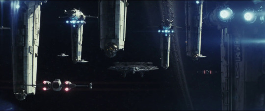
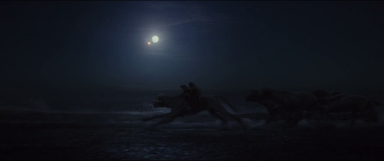
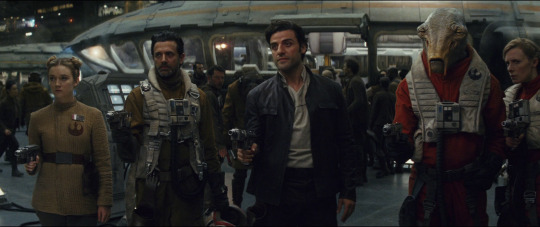
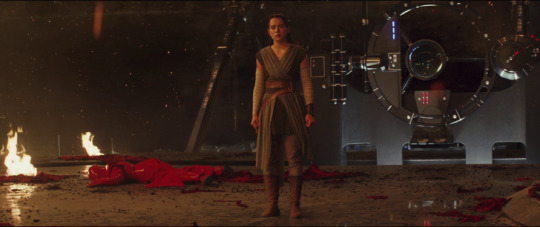
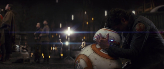
1) Paige Tico!!!! PAIGE TICO! her entire time in the spotlight is such a perfectly crafted, perfectly tense scene
2) UM THE OPENING SPACE BATTLE IS SICK the bombers have such striking silhouettes and this is used for some amazing shots
3) PAIGE’S DEATH BEING PRESENTED AS TRAGEDY (and not being softened heavily with the promise of being part of something meaningful the way R1′s deaths are)
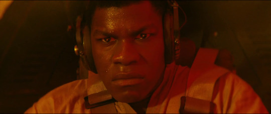
4) Captain Candy Crush’s death is given gravity too and I stan this, he’s not made sympathetic and still there’s nothing triumphant about people being blown up. war is not good
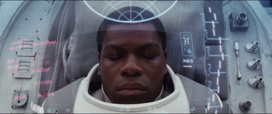
5) Finn’s pod is very flattering and angelic even though his water suit is silly. he basically has a halo and no filmmaker would accidentally give a character a halo so jot that down
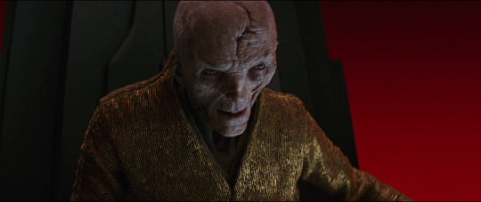
6) Snoke’s throne room being utilitarian AND extravagant at the same time is impressive. also I still love the way that Snoke’s real form was made to be this exaggeratedly WASPy old man with the skin texture and wrinkles and pale tufty eyebrow hair, and you know what else? the fact that the camera favors showing the undamaged side of his face. I fucking stan the fact that Johnson took another disfigured villain and played up his old caucasian grandpa looks and made his disfigurement blend into his age. Snoke is a caricature of horrid old white men, possibly the first successful caricature of whiteness in speculative fiction. he looks like Henry Kissinger
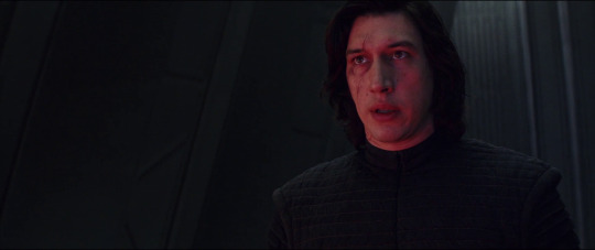
7) Kylo Ren’s bandaid has a pattern on it. we ask ourselves. why. did he get to pick out the pattern. are there multiple patterns. are they all edgy and black. I’m now completely invested in whoever decided that they would have patterned bandaids but not make them TOO fun
8) the movie is so pretty im just. the fuckign. aesthetic. all of it. the palette seems to have been taken from a thunderstorm and it’s perfect. the use of gray is a reason I happen to think people didn’t like the film. they were like what the fuck is all this gray in star wars. star wars shouldn’t be gray. but it’s so unique, it’s not the gray of lazy color grading, it’s the gray of someone who knew that the feeling of haze and uncertainty needed some gray and rolled it in like a fog. I’m going to have to post more screenshots
9) I like the fact that the puppet porgs, as opposed to the CGI porgs, are actually kinda ugly cute
10) everything mark hamill does is perfect. every line, every facial expression, every pose. every moment from luke in tlj is unbelievably iconic. alec guinness would be so jealous
11) Luke perking up and genuinely smiling when he sees R2D2 is the purest moment I have to just
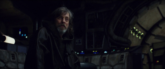
my eyes are moist
12) the architecture and set design is so amazing too? I love this shot introducing Rose, the harsh contrast that draws your eye away from her, the way she’s fading into her corner of brownish-gray, it’s so good for evoking... idk, just how the world seems too bright and too stark and made of shapes, after someone you love dies
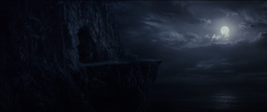
13) I really love how much time we spend on Ahch-To, and how none of it has any campy space action. you’d expect to see some training there, but a lot of people were clearly hoping that Luke and Rey would leave the planet. but we linger so much on the setting, a setting which wholly embodies Luke’s state of mind
14) old luke is a handsome gent. i don’t see enough people with the hots for old luke. this is a big mistake
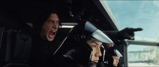
15) this shot foreshadows Kylo Ren becoming the Supreme Leader IMO. we see him surveying the war machine, watching the instruments of death be constructed, set apart from everyone -- a glimpse into Kylo’s desire for absolute power without anything being direct. maybe he’s contemplating his isolated existence, how much he doesn’t belong in the Order. or maybe he sees an allure to all this. this is what he wants to possess. it’s probably a mixture of both
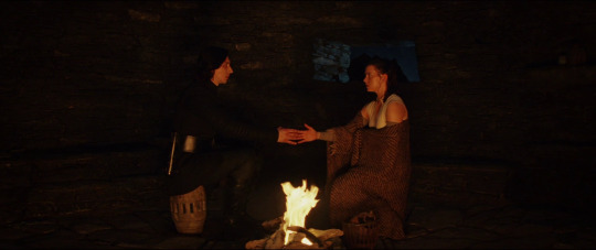
16) Rey and Luke!!!!!!! everything about how the film frames them develops their relationship!! even as Luke is testy with her, we get shots like these where they’re sharing a warm sunset light and having deep heart to hearts.
and you know what you know what what what
the fact that Rey starts asking WHO her parents are after meeting Luke is uhh clearly suggesting that she’s wondering if maybe Luke is her dad. I love in this one shot how he’s slumped and she’s sitting up straighter, making him the vulnerable one. I love how the sunset light highlights Rey’s buns. I love that she keeps her buns for a while. I love that people have headcanoned she kept the buns so that her parents would recognize her, and she has the buns in the whole time she’s trying to get Luke to act like the hero she believes in. like she’s trying to get him to recognize her
Rey adopts Luke as her dad and it’s beautiful get out of my face
17) ye there’s a lot of dead children but also I hadn’t really thought about the fact that R2 watched this as well? and R2 was powered off for so long, until the end of TFA? R2 was traumatized and grieving too, and he’s seen this before, he remembers all the way back to when it was Anakin
18) hors!!!!!!!
19) what the SHIT is this why is this movie a fucking painting why does it keep outdoing itself in paintingness argh the way this film uses the day-night cycle is unbelievable, having Rey and Finn’s stories be connected by having the same time
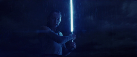
THE HCKING MOON THOUGH
20) Ok we could talk about how the cold blue moonlight of uncertainty has become the warm orange light of companionship but we can’t forget what firelight also represents re: Kylo cough burning temple nice little double meaning, is Rey making a new friend or is she being tempted, is he going to warm her or burn her
but also I haven’t thought about how fucking awkward Kylo looks!! is he sitting on that barrel?? like since he’s not there is he just sort of compositing himself into the scene? using a convenient barrel
21) see what I mean about blue being cold. blue = asceticism, red = indulgence, the two extremes
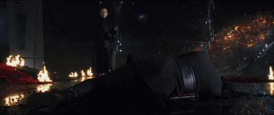
22) Luke sinks into darkness
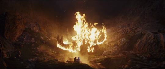
23) BUT HE DOES ONE THING! the thing that breaks him out of his depression. he takes the fire -- which represents the burned temple, represents Ben Solo, represents the humanity of the Dark Side -- into his own hands. we see the fire symbolizing destruction, then intimacy, then change, in such short succession
fire represents light-dark, something that is both at once. we’ll get back to this
24) you could say that balance is about making your own light in the darkness
also this is why Poe’s line about being the spark that will burn the First Order down isn’t ~too violent~ cause fire has become a symbol of change, of destruction reclaimed as something restorative, thank you very much
25) can we talk about the fact that between this being like a coffin and the way Rey is holding the saber, this actually has the heaviest resemblance to the way medieval knights were depicted atop their sarcophagi. I don’t even know what it means but maybe it hints that Rey sees herself as a martyr and a crusader in this quest to redeem Kylo and prove her valor
26) the fact that Poe isn’t the only one who gets in on the coup. because the Resistance isn’t a real military it’s a few thousand antifas gathered from all around the galaxy and their numbers are dwindling fast. people kind of put it all on Poe but Connix and Finn and Rose and this woman and this man and this alien were part of it too, and they could have told Poe to cut it out. I like how the blonde woman seems like she’s not sure what’s going on, she’s evaluating the situation
27) you know what I stan? I continue to stan aspects of how Snoke is portrayed. I stan the fact that he gets all close up in Rey’s face and grabs her cheek and it kind of mirrors the way Kylo gets in her personal space in TFA but even less so than in TFA, Rey is not framed in the way girls often are when they’re restrained and in distress. when she’s being tortured, we’re not given any tantalizing views of her body. Snoke floating her around the room has her stiff and awkward, and the close-up of her screaming in pain puts the camera behind her head so we see this from her POV, we’re not voyeuristically staring at her, we’re experiencing this indignity with her
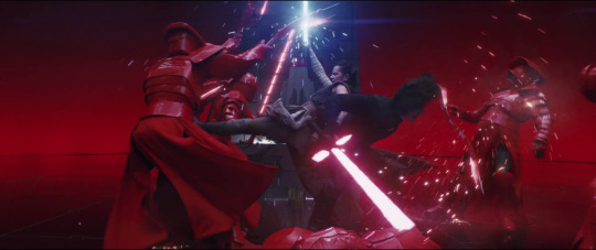
28) Kylo Ren killing Snoke has the exact same light on his face as when he killed Han Solo. this is very very interesting
here I am in my corner of Kylo having twisted affection for Snoke as well
29) I wish I could ship this more cause I don’t need all this talk of fairy tale weddings and force pregnancies when here they are slicing up lobster boys with laser swords
30) oh but this is where he makes Rey look sad and thats where!!! you know hes gonna have to pay!!! basically everything about the scene where Kylo tears Rey’s heart out and stomps on it and then asks her to be grateful is extremely well done and it did its intended job of making me Big Mad At Kylo
also look the fire is back its Symbolic
31) you know what I can’t show in this post? the FUCKING SOUND THAT COMES AFTER THE HYPERSPEED RAM. that sound is the most glorious sound I’ve heard come out of a movie. it’s like a massive metal whale’s death scream. Star Wars has always run on sound design but literally that sound (along with the scene it’s attached to) outdoes everything that has come before it holy wow
32) Finn WHACKING Phasma. he didn’t use a lightsaber in this film, but he uses the baton he picked up the same way he used the lightsaber, and it even glows blue for good measure. and we can’t forget that this movie shows a boy holding a broom like a lightsaber, and Rey practicing saberplay with her staff, so -- objects that are not lightsabers symbolizing lightsabers is a thing
33) I didn’t think about the fact that the Supreme Leader’s throne room is designed to display a view of the outside, or be cloaked in red. possibly it could display anything it pleases. this is great fun for imagining First Order characters making it display things they want to see, like beautiful vistas, or holofilms. possibly it can recreate whole scenes, like a Star Trek holodeck
34) I don’t have to talk about how Leia is framed by the dawn on Crait do I? we already got the picture when it comes to the day-night cycle and how beautiful it is
35) BABY 8 I can’t believe this droid gets belly scritches and nuzzles from Poe
36) fucking love when Kylo finally snaps and starts throwing petty tantrums again at the end of the film like he holds back his brattiness for 12 hours and then here comes the screaming and foot stamping and flailing
I have thrown too many temper tantrums in my life to not want to see one on the big screen in its full glory. no one has pushed him to the point where he’s just ugly crying on the floor, spewing snot and tearing at his hair
I got vicarious pleasure out of Poe’s outburst on the bridge too. people being angry and not being in the right. it’s something I need for catharsis
37) miniaturized Death Star technology aka BIGGEST LIGHTSABER. Kylo stop compensating
but AU where a ginormous person uses the cannon as an actual saber
38) I’VE TALKED ABOUT HOW FINN’S MOMENT IS IN MY TOP TWO FEELS MOMENTS (top one is the hyperslice) but basically if you don’t think he was affected by seeing the slave kids on Canto Bight, what do you think he’s so angry about here, what do you think has him in a blinding rage?
why do movies have to spell everything out for people in exhaustive detail? the only new thing Finn gets from his experience with Rose, is seeing how the First Order isn’t this isolated enclave of evil. the most powerful people in the galaxy have been supporting it all along. he stops trying to run away because he realizes there is nowhere he can run that won’t have injustice. and he’s seen villagers being massacred, he’s seen the Order attack people he cares about, he’s been personally threatened and had one-on-one duels, but on his trip with Rose he sees children being beaten into submission with electric whips
can’t believe people think Finn wasn’t affected by that when it’s the one thing motivating his character growth
every time he sees civilians getting hurt -- children and families -- he sees himself and the family he’ll never know in them, and is so overwhelmed that he does something brash and radical and self-endangering every time, and his arc is about learning to live with that anger. he runs away from feeling and his angst is so beautiful
and I’m still in the camp of Finn having had a Zuko-like arc when he was a teenager because that boiling frustration at not being able to express his natural empathy is what drove Zuko to angst so hard
FINN IS THE SOLIDARITY KING! HE CARES SO FUCKING MUCH
39) fire. Luke facing his demons involves him walking through a gate of flame, out of the darkness, into the light
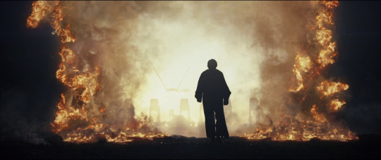
I will say that this is also very Buddhist imagery -- the flaming sword symbolizes wisdom, which cuts through the veil of illusion, specifically the illusion of duality
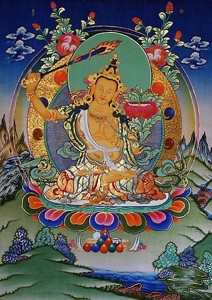
“Mañjuśrī is depicted as a male bodhisattva wielding a flaming sword in his right hand, representing the realization of transcendent wisdom which cuts down ignorance and duality”
and of course fire being the bridge between light and dark has come up before in the film. the veil is visibly burning here, Luke having fully reclaimed the image of fire, which was earlier in the film held by Kylo Ren
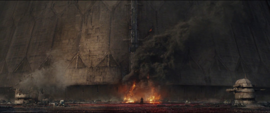
I mean. just. YOOOOOOOOOOOOOOOOOOOO
40) something about this shot is extra special. everything that’s going on on the salt flats is like on this higher dimension, this spiritual plane
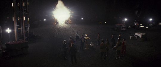
41) for a moment it looks like Luke and the First Order are standing against Kylo. gives you a glimpse into Kylo’s state of mind. is the Order his weapon, or his enemy? it’s both, and he’s absolutely terrified of it
also I’ve talked about how Palpatine’s Contingency plan is about getting revenge on his Empire because he hates its power as much as he revels in it, and he dedicates a good deal of time plotting ways to kill it, because he needs to prove that he is more powerful than it
being the Emperor or Supreme Leader carries with it the distinct horror of knowing that you can never be more powerful than the thing that has empowered you
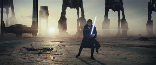
42)
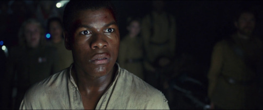
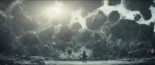
43) Luke achieving 100% maximum Buddhist allegory
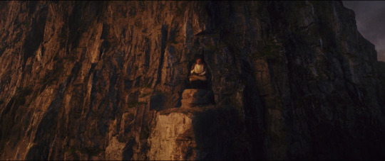
44) the slope of the floor is the slope of the opening crawl of a Star Wars film
all right that’s all folks
#my post#star wars sequel trilogy#the last jedi#kind of a rewatch#rey of jakku#rebel finn#kylo ren#luke skywalker#finnrey#cw reylo#cw anti reylo#villain kylo#things I don't focus on as much#poe's arc (have talked about Holdo a lot)#rose (have talked about her a lot)
28 notes
·
View notes
Text
My Opinions on the CCS Clear Card Hen Anime
I FINALLY GOT THE TIME TO SIT DOWN AND WATCH THE NEW CCS ANIME!!!! Okay I’ve been waiting for this sequel ever since the clear card manga has released (2016 if i’m not wrong) and I had very high expectations for the anime as ya know its a clamp series, the 90s version was well done and its ANIMATED BY MADHOUSE WHO PRODUCES AMAZING ANIMATION AND DIRECTING! I’ve watched the first 2 episodes and will watch the 3rd one soon but I needa rest cause I’m not feeling well but I want to post my comments on the new series.
I’ll address what I enjoyed from both the first the second episode~
What I enjoyed:
1. The opening and ending were animated really beautifully! The opening gave me a lot of feels cause there were parallels to the 90s anime opening 1 and 3! It was very amazing and bold of Madhouse to animate Sakura wearing that SUPER DETAILED OUTFIT LIKE DAMN SERIOUSLY IT WAS SMOOTH AF THE OUTFIT LOOKED GREAT IN THE FRAMES!!! The animation for the ending was really smooth and full of life and energy! The songs for both the opening and ending were really catchy I especially enjoy listening to the opening “Clear”
2. The colours are really soft and express the soft and lighthearted mood the CCS manga is. Compared to the 90s anime, I strongly much prefer this colour palette
3. They still use the same soundtrack in the 90s anime!! I’m glad they continued to use it (they did add new soundtracks which are nice too!) because the music is just so good!
4. Kept the eye catch (shown in the half of an episode)
5. The characters aren’t out of character they still feel the same as the ones in the 90s anime
6. ANIMATION IS SO GOOD I DIDN’T SEE ANY BAD FRAME WITH DIS PROPORTIONS OR ANYTHING! (good job Madhouse) The dream staff is really detailed so I know animating that is seriously difficult to the point I thought Madhouse would use 3D animation to animated the staff but I’m glad they stuck to use 2D animation to animated the staff~ The card are 3D animated to look 2D animated which works well! Overall the anime is just beautifully animated
Okay onto my Cons of the anime that I noticed. Just to let you know I am studying Animation in College so I am just judging based on what i have learned in college and what I just feel that don’t work well for the anime.
What I didn’t enjoy:
1. The first episode was too rushed for me. The 2nd one was fine for me but I felt the 1st episode was too rushed for me. I read the clear card manga so lemme talk about the pacing in the anime for a bit. The 1st episodes covers the first 3 chapters of the manga and squeezing that much into one (especially the first episode) episode is too much to digest especially for new viewers. There was no pause for any sort of atmosphere to build up (when Sakura goes into her dream mode it just happens INSTANTLY she wasn’t given much time to digest and think about things). Situation after situation just happens one after another without any sort of pause or stillness to balance with all the action. No room for the viewer to breathe and take in what just happened
2. The overuse of still frames (the ones that shows a character with FLOWERS EVERYWHERE) Animation is a form of storytelling where you are able to make the character express their thoughts, feelings and intentions through animating their change of expression and movements. I know it is a shojou genre of anime but the 90s anime rarely used this technique. I found it a bit lazy coming from a studio like Madhouse
3. The character’s eyes and emotions don’t really change (I noticed that for Tomoyo especially) It’s always the soft eyes and I feel that they rely too much on the voice acting to express what the characters are feeling. The 90s anime executed this point well whereas I feel the new series didn’t. Hopefully this changes as more episodes come out but I have a feeling it won’t. As I said before, a character’s facial expressions are very important in animation as it expresses what a character is feeling without having them open their mouth or even having a monologue
Overall I’ll give the new series a 8/10! It is certainly better than Sailor Moon Crystal =____= jeezus Crystal was hard to watch for me especially the first 2 seasons. I’m really enjoying the new series and I should probably lower my expectations but can’t really help it since I study animation and practically animate stuff every week
4 notes
·
View notes
Text
How to Become an Author
Today we look at what your options are when writing and editing a book, and the bigger picture of how to become an author. These endeavors – the journey of book writing and the resulting life of an author – are among the most cherished and rewarding of all. I make a point of emphasizing that to aspiring authors because so many find the process of sorting through all the options, the decision-making, and the work of actually writing WELL WORTH IT.
WRITING SERVICES
Full-service companies offer authors everything from collaborative book writing to ghostwriting, editing and more. For example, Writer Services accepts inquiries about any and all aspects of writing a book. We work with aspiring and established authors and entrepreneurs alike to determine which of our services will best achieve our clients’ goals.
Our services include:
Ghostwriting – You simply tell us what you want, and we take care of everything else. As explained in further detail below, your name (and your name only) appears on the cover of your book as author. In other words, your writer remains anonymous.
Collaborative book writing – With this service, we work with you one-on-one through every step of the book writing journey. If you’d like to be more involved in the process of writing than what’s available through a ghostwriting service, this might be the perfect choice for you. You get to be involved as much or as little as you want.
Developmental editing – A more engaged, ongoing editing relationship throughout your book writing process is available through this particular service.
To most authors, this is an invaluable service because of the camaraderie between you and your editor. You have someone to rely on and trust in who will be very honest with you about the quality of your work and the effectiveness of your writing. Any doubts or reservations about your book are resolved.
You can look at this service as more collaboration than in ghostwriting and regular line editing, but less than in collaborative book writing.
Line Editing/Copy Editing – This is a high-quality editing service provided in a more traditional writer-editor relationship. Your material is checked for grammar and sentence structure.
Proofreading – We provide a service that puts the final polish on your work. S/he checks your manuscript for spelling, consistency of the use of punctiation marks and many other things these unsung heros do to make you look like a true professional.
Social media and traditional marketing As a full-service firm, we also offer marketing of your book(s) using our social media and traditional marketing resources. Our marketing services are available at several price points to fit your budget and goals.

GHOSTWRITING DEFINITION
Ghostwriting is a writing service where a hired professional book writer, who remains unnamed, writes your book—using ideas and concepts provided by the hiring party—which is then credited to the payer/author.
WRITING MENTOR
A writing mentor works closely with you, offering their vast experience and unique insight. Every aspect of being a book writer and being an author is real to your mentor, because s/he is a seasoned book writer and experienced author.
You may find that you learn quite a lot just by working with them, such as their writing habits, theories, and even style, which is okay because those inevitably give way to your own preferences as you grow as an author.
To give you a clearer picture of writer/mentor dynamics, you might have a look at one or two unique depictions of the relationship in film.
The Only Living Boy in New York (2017) stars Jeff Bridges as a successful author who stumbles into the mentorship of a young man who is his neighbor.
Adult World (2013) stars John Cusack as the reluctant mentor of a young woman who admires him greatly.
Although these portrayals aren’t typical, they offer a sense of the personal interactions that create the mentor-author bond.
youtube
Video Transcript:
“The life of an author is often portrayed as strictly independent – a one-person show. But, did you know that working with a mentor is one of the best gifts you can give your own writing? Even the great philosopher Plato had a mentor in Socrates. Plato, in turn, mentored Aristotle. Great minds seek other great minds to improve their work.”
WRITING COACH / WRITER COACH
Writing coaches (or writer coaches) differ from writing mentors in the type of relationship they offer to the author.
The writing coach is not necessarily an author themselves, and their role is more like that of a motivator. They’re not the same as a life coach, though, in that they usually have some experience with editing and/or another facet of writing.
Accountability, inspiration and motivation are the tools of the writing coach’s trade. You might find that the interactions with your writing coach are less personal and deep than those with a mentor. Still, without question, to have someone to answer to is better than having no one at all.
WRITING LESSONS
There are a great variety of writing lessons and classes available online and off. These, of course, can be taken alone or as part of a coaching or mentoring program. They might come in the form of:
1. Writing prompts – Prompts are challenges and/or ideas you can use to jump-start your daily writing practice.
2. Creative writing classes – Just about every university, community college, and adult continuing education program offers a course on creative writing. Almost all of them also offer the course(s) virtually.
3. Membership websites – With the recent boom in online learning due to the pandemic, we may begin to see more membership training sites showing up. Though there aren’t many out there to date, we are extremely proud to announce our own membership website for authors! You can get more information about how you can have on-going guidance for literally just pennies a day. It’s called Author Utopia. See it by clicking the following link: https://www.authorutopia.com
4. Vocabulary expansion – Words are the endless variety of colors available to squeeze onto your writer’s palette. The greater your vocabulary, the better you will do at expressing your ideas in compelling and varied language.
Reading is one great way to expand your knowledge of words, but there are dozens of other ways, too. Online tools such as dictionaries and thesauruses provide vast opportunities for learning. You might also try a quick search for “vocabulary expander” and/or “vocabulary tests”.
5. Reading for writing – In my own experience, I find reading an excellent lubricant for writing. The published word has a certain power to condition an author’s mind towards better writing. As you read, you learn the music of well-written phrases. Like a catchy tune, this music stays with you as you write. You write more and more, eventually finding your own unique voice and your own “songs.”
Also, reading improves your vocabulary. This is proven. Some wise writers keep a list of words they don’t know and look them up after a session of reading. In these ways, reading is one of the best activities to improve your own writing.
6. Journaling prompts – In journals, you’re writing the true story of your life as you experience it or shortly thereafter. You can see how this practice can help you develop your own authentic voice as an author. As with creative writing prompts, there exist many sites that offer prompts for journaling.

6. Editing classes – Editing isn’t just a task, it’s an art. Writer and editors (especially), must look at manuscripts with a critical eye. Is a phrase redundant? Delete it. Can a different word provide pleasant alliteration? Use that word instead. Clarity, efficiency, inventiveness – all these and more are the goals of excellent editing.
7. Grammar and punctuation – A good writer is never done learning and relearning the rules of writing. Just as a jazz musician must learn their basic scales before launching into improvisation, an author must know the rules thoroughly before they break them.
8. Journalism and blogging – These two types of writing have ethics and rules of their own. It’s worthwhile to familiarize yourself with these, even if they’re not your specialties. It’s likely that some of the practices and skills involved in journalism and/or blogging will translate to an aspect of your future writing processes.
9. Research and writing – Research is another rewarding endeavor for writers. When researching a topic – any topic at all – you might gain all types of ideas and inspiration for your book. Depending on what you’re writing, research could account for a large percentage of your time working. For example, non-fiction books generally require extensive research into the real people and actual events you’re writing about.
10. Poetry workshops – Here’s a double-power tool for improving your work. Writing poetry hones your senses of efficiency, rhythm, and tone, as well as aiding your creativity and inventiveness. Workshops offer contact and interaction with other writers, and everyone usually emerges from them better editors.
11. Character creation and development – Classes are also available for specific aspects of the fiction-writing process. Think of the value of well-developed, three-dimensional characters to a good novel. Learning this skill can go a long way in making you an effective writer.
12. Fiction for beginners – On the other hand, you might not be ready to dive into in-depth classes on specific techniques. Fiction lessons for beginners are great ways to dip your toe in the water and get a feel for the process and promise of a professional writing career. Make all the mistakes you want! In beginners classes, you’re free from the pressures you might feel elsewhere. In the meantime, you’re getting solid footing for the next steps towards authorship of a book.
13. Advanced writing – Maybe you’ve already taken many of the classes I’ve listed above. Maybe you’ve even written a book or two. Your learning isn’t done! Advanced classes offer learning opportunities to authors who are ready to accept the next higher challenge.

BOOK EDITING SERVICES
“Writing is editing,” is an old adage that holds true today. Editing affords your work a reader, among other benefits. A reader/editor who is not the author often facilitates the best results. Writing is communication, and communication is always a two-way street. You want to make sure that what you’re writing is as close as possible – in clarity, meaning, and tone – to what the reader perceives.
We often think of editing as work done exclusively after a book is written. That isn’t the case at all. In fact, editing often begins in earnest at the beginning of your second draft. So, it’s useful to think of editing as much more than polishing a completed draft.
Working with a developmental editor, for instance, is a fantastic way to refine ideas as you go along. You might find that this type of editing service helps put you on the writing path that you were seeking all along.
Working with a developmental editor means having a working relationship, including dynamics both personal and professional, with an experienced author with whom you feel comfortable. This type of editor guides you towards not only improving your writing but also clarifying and defining your message. Think of this person as just one step shy of a mentor. In fact, a developmental editor can become your mentor under certain circumstances. The definitions are not set in stone, but usually a mentor is more invested in you as a writer. This makes sense because the relationship with a mentor can last a lifetime while a developmental editor is usually on board for one of your book projects at a time.
All these resources, services, and tools can be mixed and matched to fit your goals and needs. I hope that with this article I’ve given you a clearer picture of some of the pathways and work-ways available to burgeoning and established writers. Now it’s up to you to choose the first (or next) step in your journey as an author.
youtube
Video Transcript:
“Mark Twain once said, ‘Writing is easy. All you have to do is cross out the wrong words.’ And with that, the great American humorist leaves us back at square one. In a way, he was talking about editing. A subject so broad that a good author is almost always studying it. Fortunately, the resources available to you are also almost endless.”
The post How to Become an Author appeared first on Writer Services.
0 notes
Text
Smashing Podcast Episode 5 With Jason Pamental: What Are Variable Fonts?
Smashing Podcast Episode 5 With Jason Pamental: What Are Variable Fonts?
Drew McLellan
2019-12-17T05:00:00+00:002019-12-17T07:36:22+00:00
In this episode of the Smashing Podcast, we’re talking about variable fonts. What are they, how do they differ from regular fonts, and how can they help in the design and performance of our websites? Drew McLellan talks to a font of knowledge on the matter, Jason Pamental.
Show Notes
Weekly update:
Brand Illustration Systems: Drawing A Strong Visual Identity
Struggling To Get A Handle On Traffic Surges
Building A CSS Layout: Live Stream With Rachel Andrew
Web Design And Development Advent Roundup For 2019
Should Your Portfolio Site Be A PWA?
Variable Fonts
Find Jason on the web at rwt.io
Web Typography News newsletter
Variable Fonts: What web authors need to know
Ellen Lupton’s book Thinking with Type
Erik Spiekermann’s book Stop Stealing Sheep & Find Out how Type Works
Transcript
Drew McLellan: He’s a design strategist, UX leader, technologist, expert in web typography, and invited expert on the W3C Web Fonts Working Group. He writes, speaks, and works with teams and brand owners on how to set type better on digital platforms. He’s spoken with organizations like Adobe, Audible, Condé Nast, GoDaddy, IBM, and given presentations and workshops and conferences all over the world. His newsletter, Web Typography News, is popular with those wanting latest updates and tips on typography on the web. He’s clearly an expert in web typography. But did you know he represented Sweden at Lawn Croquet in the 1984 Olympic Games? My smashing friends, please welcome Jason Pamental. Hello, Jason. How are you?
Jason Pamental:I’m smashing. Especially after that intro.
Drew: I wanted to talk with you today obviously about web typography because that’s really your thing. You are a real expert with web typography. About that in general, but in particular, talk a little bit about variable fonts. I’ll be the first to admit I’m no typography expert. I mean, please consider me as uninformed as anyone listening. You cannot patronize me with any information about typography. I guess we’ve had usable web fonts on the web for probably about a decade now. Is that right?
Jason:Yeah. Actually, wasn’t it you that started something on Twitter a couple days ago? It was like November 9th in 2009. It’s like 10 year in two days since Typekit launched. I know Font Deck was right in the same time frame. Then Google Fonts and Monotype Service not long after. I had a beta invite that was given to me by my friend, John Cianci, who is actually now still a colleague of my wife’s at the agency where she works to Typekit sometime in 2009. That was a complete reinvention of my interest in the web. I mean, it was nothing short of a revolution for me. I mean, I’d always loved typography when I’d studied it in school, but we couldn’t do anything with it on the web for 15 years. That was pretty amazing.
Drew: There must be designers working on the web now having had web fonts for 10 years plus potentially. There are designers working on the web now who have never designed a site without the ability to select from a huge range of typefaces.
Jason:Yeah, it’s true. Nobody without that experience had to push the pixels uphill in both directions like we did growing up. We’re not some cranky old men shaking their fists at the sky. But yeah, it is kind of amazing just with all of the things that have changed on the web, the idea that some people never experienced in any other way is remarkable.
Drew: By the time we got web fonts, that was a massive shift in how we started to use typography on the web because we could really start to use typography on the web. There were obviously things that we could do with web safe fonts, but we were pretty limited to a very restricted palette. But there’s potentially now another big shift almost as significant perhaps with variable fonts. I mean, what are variable fonts? What do they do for us? Where do we begin?
Jason:I always try and start with giving people a frame of reference. So when we think about using fonts on the web, the thing we have to remember is that currently with “traditional” fonts, every font is an individual width, weight, slant, variant of that typeface. For every one we want to use on the web, we have to load a file. For a typical website where you’re using it for body copy, you’re loading, usually, four fonts: the regular, bold, italic, and bold italic. All of those things have to get loaded. Each one of those is a little bit of data that has to be downloaded and processed and rendered.
Jason:So typically, what we’ve done over the years is constrain ourselves to using that very small number of fonts, which is actually not particularly great typography practice. It’s much more common in graphic design to use a much broader range. You might use eight or 10 different weights and variants of a typeface in a given design. On the web, we’ve been very constrained because of performance. The big difference in a variable font is all of those permutations, those variations are contained in a single file. That format is really efficient because what it’s doing is storing the regular shape of that character and then what are called the deltas of where the points along those curves would move to render it as bold or thin or wide or narrow.
Jason:So by only storing the differences, you don’t have to store the whole outline. It’s a much more efficient format. While it’s not as small as a single font file, it’s still much smaller than all of the individual ones taken separately. If you look at something like Plex Sans from IBM, all of those separate files might be nearly a megabyte where two variable font files that contain all the widths and weights in the upright in one file, the italics in the other is like 230K. That’s for really, really complete character sets. Most people could use a subset of that and get it even smaller. I’ve generally been seeing those file sizes around 50 to 100K for a typical Western language website need. That’s not that different from loading… Once you load three or four individual font files, you’re probably loading more data than that. It’s an interesting win for performance, but it also then opens up the whole range of the typeface for us to use on the web through CSS.
Drew: So it’s almost like delivering the recipe rather than the meal. Rather than here’s the italic version, here’s the bold version. It’s like, “Here’s the regular version and to make it italic, you would do this, to make it bold, you would do that.” That reduces the file size that goes down over the wire.
Jason:Yeah. Well, in a way, it’s giving you all the ingredients and then you can make any recipe you want. Because you could really go everywhere from… To go back to the Plex example, from 100 to 700 weight where 700 is sort of the typical bold, 400 would be kind of a normal weight. But then you have much lighter. So you could do really big and really fine line headings or block quotes or different items or like emphasis, and then be able to kind of modulate what you want bold to be at different sizes. There’s all kinds of different things that you can do for better typography, better user experience, all the while getting better performance. That’s the gatekeeper.
Drew: So there’s almost an infinite number of tweaks of steps between what we would think of today as regular and bold? You actually got the ability to go anywhere along that axis to tweak between the two?
Jason:Right. What I think is really exciting to me as somebody that studied graphic design and has looked fairly closely at print design for many years, the idea of what bold is really should change based on the size of the text that you’re rendering. So by default, that 400 and 700 for normal and bold is kind of what the web defaults to. But in truth, the only reason you’re calling out bold is you want some emphasis, you want something to stand out. But the heavier the font gets out of small size, the harder it is to read. It kind of fills in the little open spaces. Instead of using 700 for body copy when it’s set at that roughly 16 pixel size or whatever we’re using there, you use maybe 550, 575 where you get enough emphasis but the letter forms are still more open. Then as it gets bigger, you might use a heavier weight.
Jason:But again, it’s sort of your choice at that point. By modulating that for getting the right level of emphasis, but still maintaining really good legibility, we have so much more flexibility. I’m really hoping that as these become more popular and more widely used, that we can start to teach people to be a little bit more nuanced with the way they use that range and actually get more expressive and also more readable at the same time.
Drew: One thing I’ve noticed implementing designs as a front end and implementing designs that I’ve been given is that different color contrast combinations and light text on a dark background versus dark text on light background, the weights can look completely different. So presumably, this would help to even out and sort of finesse the visual and the reading experience based on changes like that?
Jason:Absolutely. That’s one of the things that I usually will showcase in workshops and talks is adding in support for that light mode media query. You can flip that contrast but then you do want to do it in kind of a nuanced way. Depending on the typeface, it can end up looking really heavy or kind of spindly with a serif typeface. Sometimes you want to go a little heavier or a little lighter, but you then also tend to need to space the lettering out when you have it on a dark background or else the letter forms kind of bleed together. There’s little things that you can adjust in the typography. The media query is dropped dead simple. I mean, it’s like two lines of code to add that to your site. Then it’s what you do with that. It’s not necessarily just inverting the colors. Sometimes you need to adjust for contrast, but also tweak the type itself for better legibility.
Drew: So presumably, it’s not just weight that can be varied in a variable font. There are other ways we can change our font as displayed?
Jason:Yeah. It’s completely up to the type designer. I think it’s really good to reinforce that this is not a free for all in the browser. The browser can only render what has been enabled in the font. Ultimately, it’s the type designer who says the weight ranges this to this. You might have a width axis. It would get a little bit narrower or a little bit wider, but there’s also the ability to have what are called registered axes. There’s width, weight, slant, italic, and optical size. Those are all sort of core things that are mapped to CSS properties. Slant allows an angle in between one and another, so upright and I’ve actually seen ones with a reverse slant as well as a forward slant. That’s totally open. Italic is generally on or off but not necessarily. You can actually have… Well, there are type designers that have experimented with changing the letter forms over gradually as you shift from normal to italic, and sort of substituting letters along the way. That’s kind of an interesting thing.
Jason:But then there’s the ability to have custom axes. The type designer can define whatever custom axes they want to vary. You’ve seen ones that add sort of a gravity spread drippiness and all kinds of fun twisting shapes, or extending serifs, changing the height of the ascenders and descenders. On the lowercase letter forms, changing whether or not they are serifs or not. There’s all kinds of things that you can do. It’s really up to the imagination of a type designer. I think we’re only scratching the surface as to what could realistically happen with all those things. It’s all accessible through CSS.
Drew: Yeah. All of these properties can be tweaked just through the normal CSS that you’re delivering with the rest of your design. What sort of things can we do in CSS to sort of trigger those changes? Is it just like we would do with a responsive layout where we have media queries to trigger that?
Jason:There’s all kinds of ways you can do it. There’s a small change that you have to make. I’m assuming that we’ll provide a bunch of links to some stuff that will help people kind of play around with this stuff. I mean, I’ve written a bunch. Hopefully, that will help people out. Then on the use side, the font weight axis is just mapped to font weight. Instead of saying regular bold, you just supply a number. You can change that with media queries. You can change it with JavaScript. You can kind of do it whatever you want with that. I’ve been using a technique called CSS Locks that I learned from Tim Brown to basically use math. CSS custom properties and calculations to scale it from, once you hit a small break point up to a large break point, it kind of smoothly scales the font size and line height.
Jason:Then you can also use a little bit of JavaScript to do the same thing with their weight if you want to. The weight axis maps to font weight, the CSS property. The width axis in the font will map to font stretch, and that’s just expressed as a percentage. I should note that many type designers are not necessarily thinking through how this is expressed so you might see weight ranges that do weird things like go from 400 to 650. You still have to express it as a percent, but it works. It’s fine. You just need to know what normal is and all the fonts are documented. Then with anything other than those two, currently, there’s a little bit uneven support in the implementation for slant and italic. A lot of those things you sort of need to fall back to using font variation settings and then you can supply several things at once. It’s kind of like font feature settings. It’s sort of a lower level syntax where you can supply a comma separated list of this four letter axis and the value, the next one, the next one.
Jason:The one thing that people need to keep in mind is that when you use font variation settings, you lose all the semantic understanding of that and you lose the fallback. Font weight and font stretch are universally supported in all the browsers. You should definitely use those attributes. For anything else, you might use font variation settings. But the advantage to using font weight the way you normally would is if the variable font doesn’t load, the browser can still do something with that. Whereas if it doesn’t understand variable fonts, or it doesn’t load, if everything is in font variation settings, then you lose all of the styling information. That’s just a little side note there just in terms of what is supported where. But I should also say that it is supported in all the shipping browsers that you’re likely to encounter in most circumstances. I-11 doesn’t work, but you can deliver static web fonts, and then use ad supports in your CSS to change over to the variable fonts. Then you’ll avoid any duplicate downloads of assets and it works really well. I have that in production on several sites already.
Drew: I think like many of the sort of more modern web technologies you’re seeing, if there’s a variable font that has been bubbling away quietly for a while, and is only when it sort of finally boils over and we get support in browsers and people like yourself making noise about it and letting everyone know that it’s there. It can almost feel to the standard designer or developer who’s just day-to-day getting on with their job and not tracking all the latest downloads. It can seem like it’s come out of nowhere. But I guess this has been bubbling away for quite… I mean, you mentioned the two slightly different implementations that we’re now dealing with. There’s a sort of older and a newer standard for implementing?
Jason:Well, it’s actually not older and newer. They’re both very intentional. I’ll come back to that in a second because it is really worth kind of understanding what the difference is with those. But you’re right. The format was introduced just over three years ago, was in September of 2016. We actually had the first working implementation in the nightly build of Safari three weeks later. It was pretty remarkably quick that we had working browser. Safari was the first one to ship full support for it. I think it was when High Sierra came out. I don’t know, it was like Safari 12 or something like that.
Jason:But not that long after, we ended up getting support shipped in Firefox, Edge, and Chrome. We’ve actually had browser support for almost two years. But there weren’t a ton of fonts. There’s been this sort of steady evolution. The support for using them on the web has actually been there longer than anywhere else. I mean, technically, this format works on desktop OS as well. So if you have a TTF format, you can install it in your desktop OS on Windows or Mac, and you can use it in any application. You can’t always get to vary the axes the way you might want to play with them kind of infinitely, but there are this notion of named instances embedded in that font file that map it back to what we’re used to.
Jason:In Keynote, for example, there’s not explicit support for variable fonts, but the format does work if there are things like in Tech Sense, again, condensed, light. You’ll have those normal, regular, regular bold, narrow, etc, all would be available in a drop down menu just like installing the whole family. Then if you’re in Illustrator or Photoshop or now InDesign that just shipped last week or Sketch that shipped a couple weeks ago, they all support variable fonts now, so that you can then access all of the different axes and play with it to your heart’s content. But in the browser, that’s where we’ve had a lot more to work with. Taking a cue from your wife, I have been kind of beating this drum for a while trying to get people to be more aware of it. Then thanks to the work that the Firefox team has done in creating developer tools. With Jen Simmons kind of pushing that along, we have incredible tools to work with on the browser that help us understand what the fonts are capable of.
Drew: You mentioned type designers and the font capabilities. There are lots of fonts that are available?
Jason:Well, a lot of people are doing it now. Probably the best and most comprehensive place to go look for them is Nick Sherman’s site, v-fonts.com, v-fonts.com. That’s just a catalog site. It’s rapidly becoming really, really big. There’s more variable fonts coming out all the time now. There’s not a huge number of open source ones, but if you search on GitHub for variable fonts, you actually will find a whole bunch of projects there. But Google has launched a beta of their new API with about a dozen variable fonts available there. There’s more coming from them. They just released Recursive at recursive.design, which is a fantastic new typeface from Stephen Nixon. The Plex variable, one is available, that’s open source. Then there’s tons of commercial ones.
Jason:The cool thing about that is Monotype has released some pretty big ones. But it’s lots of smaller foundries and individual designers that are just kind of leading the way in experimenting with this format. I think that’s really great for design and great for the web that we’re seeing all of these new designs from new designers or smaller designers that are kind of breaking this new ground. Because I like to see them succeed with this because they’ve really taken the initiative to kind of put some great stuff out there.
Drew: Are we seeing any updating of existing fonts to be variable fonts to have families replaced by a single variable font? Is that happening at all?
Jason:It is. The ones that Monotype released are updates to some really classic typefaces. FF Meta was one that I helped them launch by designing the demo for that last year. They’ve got that. Univers, Frutiger, Avenir, I think those are the ones that they’ve released so far, those four. Those are really kind of core classic brand typefaces. They’re working on more. I know they have at least another half dozen or so that are kind of in various stages of production. I know that Dalton Maag which does a ton of custom typeface work for large corporations has several really nice variable fonts. I’ve been doing some work with TypeTogether. They also have several really great typefaces. I know that one…
Jason:I’ve shown at some of the conferences where I’ve spoken about these things that Adidas has their own too that they’ve been using for all of their brand work in print for almost two years now. Which is really, really remarkable stuff. But also Mark Simonson is working on a variable version of Proxima Nova. That’s kind of a big deal. That’s been one of the best selling web fonts of all time. It’s happening. It’s happening in bits and pieces kind of all up and down the scale. But even something as simple as subscribing to David Jonathan Ross, Font of the Month Club, will get you a variable font almost every month. I mean, he’s been really incredible on the stuff that he’s been putting out. It’s like $72 for the year or something like that. He’s been putting out all kinds of really beautiful stuff.
Drew: It is quite interesting then, because obviously, with the capabilities of variable fonts, you could create new designs that make use of these. But potentially, there could be sites that are in production where there are variable font versions now available where somebody could go back, revisit that, and replace out multiple font files with a new implementation based on a new variable font version.
Jason:Yeah, absolutely. That’s some of the questions that I get fairly regularly. Recently, I was looking at a pretty large sports broadcasting website that the development team asked me about that same question. I looked, and sure enough, for two of the typefaces they’re using, there are variable fonts available. A quick bit of research showed us that we could replace four instances of one typeface and three of the other with two variable font files and take over 70% of the file size away in five requests. I mean, it would be a question win from a performance standpoint. For really large scale site, when you look at removing almost 300K of data download across millions of users, that actually adds up to real dollar savings and bandwidth cost. Even from that purely practical standpoint without rewriting any of their CSS, just replacing those fonts, it’s already going to be a significant win for them in performance, in page render time and then in actual bandwidth costs for them.
Drew: In practical terms, is it as simple as it sounds, just swapping one out for the other?
Jason:It can be. I think the perfect example of that is something that Google sort of casually let slip at ATypI in September that they have started doing that with Oswald to the tune of 150 million times a day. They made a variable font version of it, and they just started surfing it on websites that were using enough instances where it would yield a significant benefit. They didn’t tell anybody. They didn’t tell the site owners. Nobody had to do a thing. Because it had the right mapping of the weight axis so the defaults would just work. 150 million times a day is a lot of font serving. That’s starting to give them some better insights into what would this landscape look like for them if they could start to switch over the top five web fonts that they serve? I’m assuming Open Sans is probably one of those. I know Lato is probably in there, Roboto.
Jason:So if you look at those and look at what optimized versions of those might look like, then you can see that there are some very clear reasons why Google would be interested in that. Then if you look on the other side, just the design space and how much truer to a brand voice a company could be if they’re working with the whole range of their own brand typeface rather than having to swap in different ones or be more limited in their palette. So there’s really interesting things to learn and explore on kind of both ends of that spectrum.
Drew: It sounds like an exciting brave new world of typography and opportunities for doing type in a more sort of sensitive and potentially more creative way on the web than we’ve had been able to do before.
Jason:Well, that’s certainly what I hope. I think that one of the biggest barriers to adoption with fonts on the web at all stages has been performance. So what happens? How long does it take to load? What does that mean to the render time on the page? We’ve got those issues of that sort of flash of invisible text or unstyled text. Grappling with all those things, really, it comes back to how long does it take everything to get there? How does the browser react to that? There’s lots of things we can do to mitigate some of those issues. But it really comes down to if we have a better font and a better way to serve it, then all of those issues become much less significant. So having that in place, then we get to be way more expressive. We can really try and push the design end of this and try and be a little more creative.
Drew: Because you’ve written lately sort of expressing the feeling that perhaps the web has drifted into a bit of a trap of designing an article template per site maybe with some variations for a few different types of content. But everyone’s sort of drifting towards this medium.com style of single column of text very readable to my eyes. Nicely typeset. Is that such a bad thing?
Jason:I don’t think it’s bad. I just think it’s going to get boring. I mean, when Medium came out, that was pretty novel. I mean, I think that one column of… Like you say, it was pretty nicely typeset copy. It has nice an area. It wasn’t crowded. It wasn’t cramped and sidebars and all this other stuff. There’s always going to be questions of business model and what will support that. That’s why a really beautiful redesign of, I think, it was the Seattle Times that Mike Monteiro for Mule Design did a few years ago. Absolutely gorgeous until it launched. Then they had these massive banners down either side of the column and it just kind of took away all that whitespace. It was a real shame.
Jason:I understand that companies have to make money. There are ramifications to that. So it would be wonderful to have that be one option. To have that nice clean layout. But it shouldn’t be the only one. We have all these capabilities in CSS that allow us to do really interesting things with margins and layout. I mean, it’s not even just the fact that we have grid now. But the fact that we can do calculations in the browser in CSS allows us to do a lot more interesting stuff. You layer in with that, the ability to be much more expressive with type, then we could start to look at what they do in magazines. Vanity Fair doesn’t have one article template. They have six or seven or eight. If you really look at how they lay those things out, there’s a tremendous amount of variability but it is playing within a system.
Jason:So when we create a design system for our website, instead of stopping at just one layout, we have a relatively easy way to build some switches into our content management systems. Most of them support a fair amount of flexibility. There’s no reason why we couldn’t give people a choice. I want to use layout one, two, three, four, five, six. That’s going to introduce different margins, different offsets. Maybe introducing the ability to create some columns. There’s lots of different things that we could do that would make for a much more interesting web. I think that type can play a really big part in that.
Drew: Is type our savior when it comes to adding a bit more personality back to the web?
Jason:Well, I think it can be. I think we’ve had this long evolution on the web towards better usability. But I think that one of the casualties there is when all we’re ever concerned about is that utilitarian, is it usable approach? That tends to beat out personality. Then when every single website is… Again, we had web fonts come along and that created a new level of expressiveness that we didn’t have before. Then all of a sudden, we could… Displays got better. So serifs came back into the mix. We could use those again on the web. These things added some life. Then we’ve kind of optimized back to everybody using one or two San-serifs. It’s Open Sans or it’s Roboto or Oswald or whatever. We’re kind of back to the same thing where there are tons of really good, really readable typefaces. We haven’t really taught this current generation of UX designers who are often the ones driving a lot of this anything about typography. Anything about how expressive it can be, how much it can alter the mood and the tone.
Jason:So we have a huge number of people that are dictating the design direction of things on the web who have ideas about type that are perhaps not as well-informed as somebody who studied graphic design and those notions of readability. We need to bring those things together. It’s not one or the other. It’s an and. It needs to be.
Drew: Especially when we talk about personality and about tone and mood. From a business point of view or from what we’re talking about is aspects of a brand. So in making everything look the same, are we losing the ability to communicate a brand to customers?
Jason:Absolutely. Not to dive into politics, but I think the whole… One of the major issues that we certainly experienced in the US, and I’m sure it’s not that different from what happened in the UK over the last few years. When all the news is consumed through a single platform, and everything looks the same, there’s no distinction of voice. So it’s something like 75% of adults in the US say that they get a significant portion of their news from Facebook. I mean, let’s set aside just how generally horrifying that is. But given that everything is presented uniformly, there’s no difference between an article from The Guardian, to New York Times, The Wall Street Journal, The Washington Post, and Joe’s right wing news. It’s all presented exactly the same.
Jason:When we see that logo, that type style, the Guardian is so characteristic. The Wall Street Journal is so characteristic. We recognize instantly when we see it, even just a headline. We know where that came from. Then there’s this automatic association with that brand and that authenticity. When you strip all of that away, you’re left with, “Okay, I’m going to evaluate this on a headline. Then it’s on, who wrote a better headline? That’s not a lot to go on. So I think that we have lost a tremendous amount. If you look at what Apple News Plus is trying to do, there are some efforts on a part of a few companies to try and reintroduce that. Blundell did a really interesting job of that in Europe. They launched in the US, but I’m not really sure they’re ever really that successful. That was a platform that would allow you to subscribe and see content from all these different top level newspapers and publications. It would always be in their own design. So that was really kind of an interesting approach there. It was always preserving the brand voice, that authenticity and that authority that would go along with that news. It really helped provide some cues for you as a reader to kind of evaluate what you’re reading.
Jason:I think that’s important. I think it’s not something to be taken lightly.
Drew: Thinking back to RSS readers in days gone past, the same sort of problems we were seeing then where everyone’s content was being just distributed via RSS and appearing in a reader in identical format, identical layout. I think you do lose something of the personality and the voice.
Jason:Yeah. It’s true. I don’t think that’s an entirely solvable problem. I think if you can imagine an RSS reader with a different typeface for every headline, it would be crazy. There’s a reason why that that doesn’t work that well, but there has to be some middle ground. Type does play a role in that. Then certainly, once you get back to the website, there is that sort of instant recognizability that will help that experience stand apart from seeing it anywhere else.
Drew: So say I’m a designer. I’m working in a small agency. I’m turning out designs for all sorts of different clients. I look at my work. I think, “This is all good. This is readable, but it’s got no personality in it.” Where do I start to actually put back some interest, some excitement, and not just lean on this sort of uniform UX driven layout that I’ve sort of conditioned myself to use?
Jason:Well, I think the thing to do is if you’ve never studied typography, you haven’t necessarily kind of trained your eyes to see what the differences are in one typeface to another. Even when you have studied graphic design, you have to remind yourself of these things all the time. So I think oftentimes that I’ll recommend, and actually, I wrote about this a few weeks ago because I kept getting asked like, “Where do you start?” I made a list of books that I think are really helpful. So something like Ellen Lupton’s book, Thinking with Type is a fantastic introduction to looking at type and seeing it. Erik Spiekermann’s book, Stop Stealing Sheep is a great one although I think at the moment, it’s out of print. I think that he might be working on another edition but that’s so… If you find that one, that’s a good one as well.
Jason:Those will help introduce you to the terminology and understanding what the differences are between the different styles of text. Then once you have that basic introduction, it gives you a better frame of reference when you look at other websites. Getting a sense of like, why does this one feel warmer than that one? What are the combinations of type? What are the characteristics? As a web developer often does or web designer often does, you inspect an element, see what the typeface is that’s being used there, and that can start to help build a palette of ones that you become familiar with. Very often, designers do hone in on a few that they get to know well and they tend to use them on a lot of different projects. That’s not necessarily a bad thing. It’s certainly better now if you’re working with a variable font and you can be that much more varied.
Jason:So you can decide that on this website, this is what I want to call normal. This is the width that I want to use and the other aspects of it. So even using the same typeface across websites because you have access to the full range of characteristics, it could still look quite different.
Drew: So I think there’s a lot of reading to be done. I’m sure we’ll add some links to the show notes of all the excellent articles you’ve written up and some references to these books and what have you. Because I think there’s so much to learn. I think we’ve always got to be learning with these things. The learning never ends.
Jason:It’s true. It is true. That is something that I’ve enjoyed immensely when I started writing this newsletter. Every week when I’m writing it, I’m reading more of the specs. I’m reading more of what other people have discovered and written. There’s tremendously knowledgeable folks out there. Rich Rutter, for instance, from Clearleft, wrote a fantastic book called Web Typography. He was one of the founders of Font Deck, which was one of the very first services to launch. He’s always been kind of the most scholarly of authors about this stuff. I mean, he’s really tremendously thoughtful in the way he puts those things together. But there’s a bunch of people doing really interesting stuff. That has kind of forced me to kind of keep up with what other people are doing all the time, which is really fantastic.
Drew: Is there anything in particular that you’ve been learning lately?
Jason:The stuff that I’ve been learning the most is actually the corners of the specs. I think it’s something that… I mean, again, probably the biggest influence for me on that is probably Rachel [Andrew]. That she’s always talking about like, “Well, if you actually read what’s written here, there’s actually really good stuff to know.” So in reading exactly what the specs are, there’s a tremendous amount of great typographic control that is available to us. Then layering into that different things like mix blend modes and CSS and learning more about different size units and how they interact together and learning how to use and where you can use CSS custom properties. I keep reading little bits more and more and then kind of compare that to what the browsers are doing. It really has been a tremendous experience for me in what I’ve been learning every week. Even having been doing this stuff for 25 years, there’s still like a new gem every time I dig into one of these things.
Drew: That’s fantastic. Thank you. So if you dear listener would like to hear more from Jason or perhaps hire him to work with you on your web typographic challenges, you can follow him on Twitter where he’s @jpamental, or find his website at rwt.io where you can also find the web typography newsletter to sign up to. So thanks for talking to us today, Jason. Do you have any parting words?
Jason:Yeah, experiment. I mean, there’s lots of open source stuff to play with. I think once people get this in their hands and get familiar with it, that I think they’ll start to see more and more how much fun they can have with this stuff and how much more expressive they can be. I think I was talking to the design director at The Wall Street Journal actually on Friday. I was then talking to their design team. We were talking about it’s great that you have a design system that standardizes things, but it’s then like any good design where you break that rule. That’s where the exciting things really happen. So we’ve gotten this necessary evolution of like getting really good at the system. Now we’ve got to break it some. That’s when we can get excited again. Break the rules. That’s my best advice, I think.

(dm, ra, il)
0 notes
Text
Cycle 7 - WEEK 6 Results
Here we are, we have come to the end of Cycle 7 of Eorzea’s Next Top Model! That said, look for information about Cycle 8, in August!! I will leak one thing about it, ex-model or new – everyone can apply for Cycle 8, so be on the look out! :3
If you have not yet, you’re welcome to join the ENTM community on our discord server: https://discord.gg/Bdf9cWD
First a few thank you’s!
Model’s: Thank you for the awesome job y’all did this cycle! It’s not easy to put yourself out there and be judged, even for fun, and all of you did an amazing job this cycle! No matter who wins (cuz I don’t even know at this point lol – math time!) I hope you are all proud of the job you did, because I am! Congrats to all of my Cycle 7 models for being wonderful!
Judges: Just as it’s not easy to put yourself out there to be judged, it’s not easy to be the one doing the judging. I’ve been a model and a judge, so I know both are hard in different ways. To have to be fair, and analyze each image, sometimes having to nitpick because all of them are just so good! Y’all have a hard job and I thank you for doing it and making it look so easy! Thank you, Cycle 7 judges, you’re amazing!
Community: Thank you to all of you as well, if we didn’t have you spreading the word and voting, ENTM wouldn’t even exist! I am the 3rd person to take up this mantel and run ENTM, and I’m still amazing by the kindness and support that we get cycle after cycle. Thank you all of you!
That said – let’s see who this week’s top model is, remember this is this WEEKS top model and not the overall winner. That will be in a separate post once I’ve got the math done. Yes, you gotta wait just a little longer!
The top model for Week #6 is:
Kusuh Valentione
Congratulations for having the top score for week 6, but is it enough to make you the overall champion?
EVERYONE WILL FIND OUT SOON!
Judges Reviews:
Flare
Kusuh Valentione: This is a pretty spot on take of Takaya. The color filter and screen effect work nicely together and the pose and angle do work in your favor. The background looks wonderful in this picture and actually sets the mood for your whole entire set. All in all this looks like in belongs in the world of Persona. I've really enjoyed looking at your photos this cycle and have seen how much you have grown and you took the judge critiques and used them to your advantage.
Doki Kodoki: I remember being a teen when the first .hack// game came out and I loved every minute of it. Sadly that's my only really knowledge of the franchise but I've always been drawn to the art style and overall feel of the series. Without even glancing at who you were cosplaying, your picture instantly reminded me of .hack and I was happy you brought two "MMO" worlds together. I wouldn't have thought of this outfit and it works so well! The background and the staff give me a stronger vibe more than anything else.
Rivienne Cotrlaint: I have to admit I haven't ever heard of this character nor the anime. But you worked it out and made the picture your own. The songbird outfit works well for the outfit your trying to capture in the picture and the dark background gives that extra eeriness. I think my favorite part of the whole picture would have to be the lanterns in the background. I'm instantly drawn to them and the background.
Noesis Phobos: So while this was not trying to be an exact replica, you make it your own and it looks totally awesome! I love the shadows and the mystery of the picture. The brightly lite background complements the red shade and the shadowy figure rushing off. This is creating a unique but also staying true to the original type of work.
Stephen Fairbrook: It's a case of who wore it better, but I have to say you both rocked these photos. The Joker pictures were two of my favorite because while they are both of the same character, the bring their own unique looks and feels to them. I'm loving the ledge shot with all the people down on the lower floor. Makes the photo look busy with minimal effort on your part.
WoW Wie: Harley is one of my favorite DC comic characters. While at first, I didn't like this photo that much it grew on me and you can see Harley and Joker's dysfunctional relationship in this picture. I really like the outfit and thought you did a wonderful job.
Nadede Lasalle: Nice to see a King of Fighter fan. This is a really accurate depiction of Leona and I'm glad this hairstyle just came out so you could use it for her. The Miqo starting top looks really nice as well. Awesome fighting pose and background to tie the photo in with.
Gangly
Kusuh Valentione
Despite the differences in body size, I think you pulled Takaya off quite well! The hair (even the forehead band!) and your outfit are accurate to your reference picture, and the green lighting mimics the eerie lighting while giving your shot a different twist! I’m liking the brilliant 1 effect; it adds some texture to your background and doesn’t stand out too much. The screen tilt along with the background adds to the eeriness mentioned before, and you even captured Takaya’s smug grin! The only thing I find a bit odd is your left hand; at first, I thought it was only your right hand up with your left hand by your side, but then I noticed your other hand and it looked somewhat out of place. I still think the angle and pose of your shot is fitting for the character!
Your shots had different and unique stories being told, and I really enjoyed reading them as I looked over your shots! I still can’t stop laughing at your beach shot hahaha! (It was definitely not expected but still very fitting for the theme!)
Doki Kodoki
The background in combination with the lighting is interesting! One half of the shot is brighter than the other, but it works well because the white of your staff balances the darkness out. Everything about your outfit is spot on with your reference picture, and the lighting on you helps you stand out while creating shadow on your face, giving your shot a more serious mood. Your expression in combination with the shadows on your face give you a worried but determined look, and looking towards the darker side of your shot helps to not wash you out. While I do like the screen tilt, I don’t like how it cut off your feet. Zooming out just a bit more would make some of the creeping darkness to the right more visible, which I think would add some intensity to the more serious mood of the shot!
You consistently came out with strong shots every week, and I was excited to see what your next shot would be for each week! I was entranced by your waterfall shot!
Rivienne Cotrlaint
This is a great use of the screen tilt! While it’s not too much, it gives the viewer a sense of uneasiness, and the dark lighting makes your background ominous. The lighting on you helps you stand out very nicely in contrast to the background, and the background itself practically wraps around you to draw the viewer’s attention straight to you. I am liking the combined outfit, but it doesn’t seem to stay true to the character. I feel the Songbird dress appears a bit too carefree in comparison to the more modest outfit displayed in your reference picture. However, I think the contrast of the black and white in your outfit is quite nice, separating the darker parts of your outfit while helping you pop out!
I loved the strong, yet gentle elegance you exhibited in your shots! I think your snow themed shot was the perfect balance of such!
Noesis Phobos
This shot has some nice action going on! The saturated linework gives the shot a layer of intensity in combination with the screen tilt. The red lighting outlining your back is just like your reference picture, and that is quite impressive! No doubt you’re Joker with your outfit, and I’m loving the mosaics in the Gold Saucer mimicking the windows in your reference picture. I understand that your pose is supposed to appear as if you’re running, but it looks like you had a mega sneeze and are using your elbow to catch it. Nonetheless, I feel the shot has a fun and fast-paced vibe to it with the lights and surroundings of the Gold Saucer!
I love the aesthetic of your character and how you managed to create such interesting concepts that helped your character shine through! I adored your waterfall shot; I would love to go on an adventure like that!
Stephen Fairbrook
I love how clear this shot is! The saturated linework is just barely visible around the edges of the shot to give it a nice focusing effect while not appearing cartoony. Your location in the shot gives you a nice distance between the others on the lower level, and I feel your character is incredibly cunning perched on such a high ledge. Your outfit remains true to Joker, and the hint of your smile under the mask is just great! The screen tilt gives the shot a nice energetic feel, but I think you are too far to the right. Of course, you wouldn’t be able to see the others down below if you moved over to the left, but you’re facing down to the right which makes the shot feel unbalanced. I’m just itching to see a confident smirk directed right at the camera!
The colors of your shots are one thing I won’t forget, and the simple but meaningful concepts for each theme were executed well! I am absolutely in love with your beach shot!
Wow Wie
The background you chose is perfect for Harley Quinn! The lighting gives the shot an animated quality and helps you stand out. Your outfit screams Harley Quinn with the color palette, and your friend in the back is a nice addition to the morbid theme you have going on! The lighting on the spiked rollers really catches my eye, and makes them look dangerous. I like your pose as it is playful, but your expression reads differently to me. You look too worried to be having a fun or casual conversation with your partner. I do like what the screen tilt does for the shot though; it adds to the crazy, bizarre mood of the shot!
You had such fun and playful concepts, whether alone or with friends, and each shot was something new but completely fitting for your bubbly character! I loved the confidence and playfulness of your raidin’ tombs shot!
Nadede Lasalle
Watch out, Nadede’s coming through! I’m loving the intensity of your expression, and you look like you’re not only flexing your muscles, but you’re about to beat someone up with your pose! The lighting on you is nice; I can still see some undertones of green light, but the rest of the light appears whiter which helps you stand out against your background. I think your current distance from the camera is nice, but I also would have liked to see just a bit more of your body to have a better context of the background. With that said, your proximity to the lighting creates some nice shadows, giving your body a more toned look!
Your shots were so adventurous and exciting, and I was always curious what your next one would be! Your snow themed shot was a beautiful and calming respite to your adventures!
Katarh
When I was unfamiliar with a character, I gave them a Google image search so I could make sure I got the appropriate "mood" and feeling for the character. Because of in game limitations, I didn't judge the outfits to be exact, just that the feeling of the character seemed right.
Kusuh Valentione - One of your strongest shots yet with this cosplay. I love how you managed to find pants with almost the exact belt! The character is lean and powerful and the angled back shot you chose with your highlander manages to capture that mood despite being a bit heftier. I'm trying to place where the background is... the incredible use of the filters obscures it, but I think it's Gridanian? I love it. You've transformed the location into something else entirely.
Doki - The original MMO anime always brings a smile to my face. I think you did a fabulous job matching the feel of the character here, especially with the clever use of make-up and that wonderful staff. Strengthened effects and the location feel lifted straight out of the series. The usage of the camera tilt is appropriate, and the entire composition actually made me start humming the theme song in my head.
Wow Wie - Harley Quinn - with a bonus joker! I really like the background choices here. The Joker extra laughing manically in the background, her timid pose, with the extreme camera tilt and the obvious torture device, really drives home Harley's unstable mindset. You captured the essence of Harley incredibly well, and did a pretty darn good job getting her outfit depicted within the game's limitations.
Noesis - One of our two Jokers. I love the way you managed to get the red outline of the character shot you chose. The line work and camera tilt add the appropriate action to the shot. The outfit is a great match as well. I would have liked to have seen a bit more of that mask, but since I'm unfamiliar with this character... maybe he does the face hidden thing a lot? But it definitely adds to the mystery of this character.
Riviene - Homura is one of my absolute favorite anime characters. The embodiment of a strong, powerful female character who has grown through trials and hardships (and many redos from the save point, so to speak.) Your outfit selection is very good, and conveys her sense of elegance and pride. You've done well matching the background to the shot, but considering who the character is and what she represents, I wonder if a more action oriented shot might have been more appropriate, especially with a colorful and ... shall we say, witchy background.
Stephen Fairbrook - One of our two Jokers. I've experimented with railing shots in the Gold Saucer myself, and I must save you pull it off far better than I managed to! The linework and camera tilt add the appropriate action to the shot. I really love the perfect red gloves. Even the lighting on the hair is a great match.
Nadede - Your Leona is spot on! I really like the clever usage of the Miqo top here, to make it an outfit that no other race could even pull off as well. Great choice for hair, too. I think I get what you were going for with the background, since she's often depicted in front of swirling purple things, but I wonder if an explodey or actioney background might have suited the character better.
#entm#entm cycle 7#eorzea's next top model#Eorzea's next top model cycle 7#cycle 7#entm results#weekly results
10 notes
·
View notes
Text
Lessons in Fearlessness from Morocco
I’ve been feeling for a while now that something has been lacking from my street photography. I seem to have settled into a “style” or “way of seeing” that features themes of solitude and isolation, monotone color palettes, and generally bland scenes – in line with my descriptions of “New-Wave Street Photography”.
I want for my photography in general, as well as my street work, to feature a little more emotion, which to me means interesting characters, eye contact, action and interaction between two or more figures in the scene, and unique, surreal situations.
It has been very difficult to transition my workflow and to tune my vision to these kinds of images. It is simply too easy for me to shoot in the previous style as that is what I have been working on for the longest amount of time in my photography journey. I’ve struggled with trying techniques like close-up candid portraiture, Bruce Gilden style, as it simply doesn’t fit with my attitudes. I’ve tried for more photojournalistic approaches, but these just turn into genuine long-term projects, which make it difficult to justify actually sharing my work. My street photography needs to remain distinct and separate from my other work, telling its own story with its own themes.
Travel has always been a way for me to help re-contextualize my philosophies and approach, and after a so-so trip to Iceland in January I was hoping that my week in Morocco would provide something. I wasn’t quite sure what, but I wanted to make sure I kept an open mind to whatever might happen – and this definitely paid off.
Shooting street photography in Morocco was unlike anything I have ever experienced, and if I hadn’t specifically been looking for a mindset shift I think I would have taken away only negativity from the experience. When I arrived in the country I was initially wary of the locals based on warnings I’d read online, but nothing could have prepared me for the sheer aggression I would have to deal with, not only as a foreigner but as a photographer as well.
After landing and dropping off my luggage at my hotel I headed directly for the Souk, as marketplaces tend to be very lively and therefore good spots for street photography. Almost instantly I was targeted by a seemingly unending group of people trying to sell me various knick-knacks which is nothing new for me except for one thing: they didn’t know how to take “no” for an answer.
I hadn’t even had time to get my bearings and review the scene without bringing the camera to my eye and I was already having to deal with more stress than I’d ever encountered in my time shooting around London – or anywhere else I’d traveled to for that matter. When I did see something interesting and thought to take a photo it became worse, as people would come over and demand money for taking their photo – even if I hadn’t pointed the camera at them!
This is very unlike the attitude I face in London where at worst someone will swear at me, or ask me to delete something. They don’t ask for something in return and are less aware of cameras in general. In Marrakech however, my camera connoted a paycheque to anyone who thought I would be an easy target. I was both an outsider and a photographer, and I received negativity for both.
As I moved through the streets this behavior did not let up, and I was grabbed at, shouted at a lot, asked for money simply for existing in the same space as them with a camera. I’ve never been a confrontational person, so having to face this attitude, especially with the amount of physical contact involved.
Everyone I encountered had an agenda, usually involving money from me, and even when they seemed to approach with kindness it was an aggressive kindness with nothing “real” behind the eyes beyond wanting to seem like my friend, or a tour guide, or simply a friendly local, in order to fleece me. I had to deal with what seemed like whole communities geared towards hassling tourists and felt true conspiratorialism from others who seemed genuinely spontaneous in their decision to see if they could part me with my money for any arbitrary reason.
This caused me a lot of stress, and I felt constantly drained by their persistence even after I had asked them to leave me alone. I know I missed shots because of this attention, and although I’m mostly happy with the images I produced during my time there overall I still feel like I should have done more at the time to adapt to the situation.
As time went on during the trip I realized I had a choice for how to deal with this. I have always advocated reframing problems in different ways in order to reveal potential solutions through lateral thinking. Reframing my attitude towards this aggression was tricky but I managed to decide that while candid scenes may be difficult they could not be possible – after all, I have seen a lot of excellent street photography from this area of the world and if they could do it so could I.
I adjusted my shooting style, attempting more shots from the hip, using my 90mm almost exclusively and reserving my 50 for traveling on trains. Although I trust my ability to frame these focal lengths on a rangefinder from intense practice with my digital cameras I still wasted some frames shooting this style.
I loaded mostly in daylight so the majority of my best images were shot on Slide film (the recently re-released Ektachrome) – perfect for the intense bright sunlight, which meant I spent as little time as possible in the shade. I also adjusted my attitude towards people who would approach me, becoming more abrupt and stern with my requests to be left alone.
Although I was never aggressive in action I changed my body language to be a little more assertive and confident, whereas in London I usually remain a little more discreet and timid-seeming. I also bought some new clothes in order to try and seem less like a tourist. My usual approach to travel, which is to dress for comfort, and pretend to be an “out of my depth” tourist (which is a great approach for my street photography at home) did not seem to be working at all, so changing the way I presented myself as much as possible made the most sense.
I have now been shooting back in London for a few weeks now and feel like my time in Morocco helped me to both overcome a few mental blocks and also to desensitize me (to an extent) to confrontations. I have been thinking about and mentally reframing my perspective on aggression, both from the perspective of a photographer and a subject, which now help me while seeking out potential street photography opportunities.
Morocco feels like almost a “crash course” in experiences of rejection, being treated with hostility, and general negativity towards the presence of a camera. By the end of it, I was numb to these confrontations and had shed any politeness I had originally been countering their advances with.
Realistically there has never been anything “real” preventing me from making the kind of images I want to. I have the technical skill, so what I’ve lacked has been a combination of boldness and vision. I’ve “learned” a certain way to see, and my images so far have had a certain style, so I need to spend longer learning how to find the situations I’d rather be shooting.
The boldness comes into play once I’ve identified such a scene, and relies on me valuing the potential image more than any self-consciousness that comes with carrying a camera with purpose.
However, I’ve felt a definite mental shift in the way I feel I can treat London as a place to shoot since my time in Morocco. I feel less afraid and bolder; situations I deal with in London pose far less risk both physically and mentally to me.
You can tell from my images throughout this article that this mentality did not simply come into existence while I was out there. There is still a distance and lack of intimacy in my shots, and no portraits whatsoever (although I prefer to distance portrait photography from my street photography on the best of days!).
Compared to my other travel projects my takeaway from Morocco has been a slow burn of contemplation, criticizing myself for not dealing with this environment in a better way straightaway, rather than allowing it to be a mindset I’ve brought back with me. For a while now I’ve been dissatisfied with my “New Wave” Street Photography shooting style, and have wanted to direct myself towards more classical ideas.
I want to be focusing around people and moments of behavior rather than simple interaction with light, or moments involving temporary light. This means a more proactive and direct response when I see something interesting.
I think that fear is one of the biggest hurdles in street photography regardless of how close and intimate you choose to be. There are only so many compromises you can make before this fear starts to affect the quality of your work, and even whether you are making this work in the first place.
As always, respect plays a large role – respecting yourself and knowing your rights when it comes to photographing in public, and also respecting not only your subject but also anyone around you.
Before Morocco, I feel that I would sometimes spend quite some time deliberating every click of my shutter, and that would often result in a poor image compared to the moment I had seen. Part of my new approach means that as soon as I know I have seen something worthwhile I will press the shutter.
I will follow through on this unless something happens to physically stop me – I won’t have second thoughts based on people’s reactions or expressions, or anything that would have previously made me pause. I think I can get so caught up in not wanting to cause a fuss that I read too much into the faces of the people around me.
While writing this piece I had a discussion with another photographer, who drew a parallel between the way that the hustlers and street traders acted and the behavior of some street photographers themselves. Ideas of harassment, and not taking “no” for an answer, as well as seeing people as opportunities for exploitation are definitely attributes that some street photographers possess.
Although I don’t think that any of these apply to me I am still careful to conduct myself in a respectful way, as mentioned before. There are some tools which are useful for this which I think some street photographers overlook, like reading body language, discretion, understanding boundaries and consent with close-quarters portraiture, and so on.
If you do choose to shoot aggressively and disrespectfully then I do have some advice I think is important: make those images the absolute best you can. The ends must justify the means when it comes to adopting an attitude of feeling like everyone on the street is there for your benefit as a photographer. If you are producing mediocre photos and making people miserable as a result then practice and practice until one of those things is no longer happening. Do not share mediocre results; simply improve.
Looking back I’m overall quite happy and comfortable with the experience, regardless of how I might have felt in the moment. The images and, most importantly, this new perspective on the way I interact and may be perceived by those around me, is invaluable to my photographic journey. Perhaps I was naïve before, as I’ve dealt with similar in Rome, Paris, and even London, although never as focused or frequent.
Although it will take some time to truly realize what effect this has on my photography after shooting in London again I do feel liberated to an extent. In London, the worst that will happen is I’ll be shouted at, but rarely will there be a blow thrown – I’ve always felt safe in London but have never really exploited that safety. I could probably be ten times as assertive in London and not receive the same amount of attention in a decade as I did in the week I was in Morocco.
My time in Morocco has really helped me to work through some of the issues I have been dealing with not only in terms of the scope of my street photography but also in my general outlook and life attitudes. I look forward to seeing how my work and interaction with others changes as a result of this, and of course I stay open to seeing how these opinions and attitudes may change and develop over time as a result of reacting to the world in a different way!
About the author: Simon King is a London based photographer and photojournalist, currently working on a number of long-term documentary and street photography projects. The opinions expressed in this article are solely those of the author. You can follow his work on Instagram and you can read more of his thoughts on photography day-to-day over on his personal blog. Simon also teaches a short course in Street Photography at UAL, which can be read about here.
source https://petapixel.com/2019/03/04/lessons-in-fearlessness-from-morocco/
0 notes
Text
Lessons in Fearlessness from Morocco
I’ve been feeling for a while now that something has been lacking from my street photography. I seem to have settled into a “style” or “way of seeing” that features themes of solitude and isolation, monotone color palettes, and generally bland scenes – in line with my descriptions of “New-Wave Street Photography”.
I want for my photography in general, as well as my street work, to feature a little more emotion, which to me means interesting characters, eye contact, action and interaction between two or more figures in the scene, and unique, surreal situations.
It has been very difficult to transition my workflow and to tune my vision to these kinds of images. It is simply too easy for me to shoot in the previous style as that is what I have been working on for the longest amount of time in my photography journey. I’ve struggled with trying techniques like close-up candid portraiture, Bruce Gilden style, as it simply doesn’t fit with my attitudes. I’ve tried for more photojournalistic approaches, but these just turn into genuine long-term projects, which make it difficult to justify actually sharing my work. My street photography needs to remain distinct and separate from my other work, telling its own story with its own themes.
Travel has always been a way for me to help re-contextualize my philosophies and approach, and after a so-so trip to Iceland in January I was hoping that my week in Morocco would provide something. I wasn’t quite sure what, but I wanted to make sure I kept an open mind to whatever might happen – and this definitely paid off.
Shooting street photography in Morocco was unlike anything I have ever experienced, and if I hadn’t specifically been looking for a mindset shift I think I would have taken away only negativity from the experience. When I arrived in the country I was initially wary of the locals based on warnings I’d read online, but nothing could have prepared me for the sheer aggression I would have to deal with, not only as a foreigner but as a photographer as well.
After landing and dropping off my luggage at my hotel I headed directly for the Souk, as marketplaces tend to be very lively and therefore good spots for street photography. Almost instantly I was targeted by a seemingly unending group of people trying to sell me various knick-knacks which is nothing new for me except for one thing: they didn’t know how to take “no” for an answer.
I hadn’t even had time to get my bearings and review the scene without bringing the camera to my eye and I was already having to deal with more stress than I’d ever encountered in my time shooting around London – or anywhere else I’d traveled to for that matter. When I did see something interesting and thought to take a photo it became worse, as people would come over and demand money for taking their photo – even if I hadn’t pointed the camera at them!
This is very unlike the attitude I face in London where at worst someone will swear at me, or ask me to delete something. They don’t ask for something in return and are less aware of cameras in general. In Marrakech however, my camera connoted a paycheque to anyone who thought I would be an easy target. I was both an outsider and a photographer, and I received negativity for both.
As I moved through the streets this behavior did not let up, and I was grabbed at, shouted at a lot, asked for money simply for existing in the same space as them with a camera. I’ve never been a confrontational person, so having to face this attitude, especially with the amount of physical contact involved.
Everyone I encountered had an agenda, usually involving money from me, and even when they seemed to approach with kindness it was an aggressive kindness with nothing “real” behind the eyes beyond wanting to seem like my friend, or a tour guide, or simply a friendly local, in order to fleece me. I had to deal with what seemed like whole communities geared towards hassling tourists and felt true conspiratorialism from others who seemed genuinely spontaneous in their decision to see if they could part me with my money for any arbitrary reason.
This caused me a lot of stress, and I felt constantly drained by their persistence even after I had asked them to leave me alone. I know I missed shots because of this attention, and although I’m mostly happy with the images I produced during my time there overall I still feel like I should have done more at the time to adapt to the situation.
As time went on during the trip I realized I had a choice for how to deal with this. I have always advocated reframing problems in different ways in order to reveal potential solutions through lateral thinking. Reframing my attitude towards this aggression was tricky but I managed to decide that while candid scenes may be difficult they could not be possible – after all, I have seen a lot of excellent street photography from this area of the world and if they could do it so could I.
I adjusted my shooting style, attempting more shots from the hip, using my 90mm almost exclusively and reserving my 50 for traveling on trains. Although I trust my ability to frame these focal lengths on a rangefinder from intense practice with my digital cameras I still wasted some frames shooting this style.
I loaded mostly in daylight so the majority of my best images were shot on Slide film (the recently re-released Ektachrome) – perfect for the intense bright sunlight, which meant I spent as little time as possible in the shade. I also adjusted my attitude towards people who would approach me, becoming more abrupt and stern with my requests to be left alone.
Although I was never aggressive in action I changed my body language to be a little more assertive and confident, whereas in London I usually remain a little more discreet and timid-seeming. I also bought some new clothes in order to try and seem less like a tourist. My usual approach to travel, which is to dress for comfort, and pretend to be an “out of my depth” tourist (which is a great approach for my street photography at home) did not seem to be working at all, so changing the way I presented myself as much as possible made the most sense.
I have now been shooting back in London for a few weeks now and feel like my time in Morocco helped me to both overcome a few mental blocks and also to desensitize me (to an extent) to confrontations. I have been thinking about and mentally reframing my perspective on aggression, both from the perspective of a photographer and a subject, which now help me while seeking out potential street photography opportunities.
Morocco feels like almost a “crash course” in experiences of rejection, being treated with hostility, and general negativity towards the presence of a camera. By the end of it, I was numb to these confrontations and had shed any politeness I had originally been countering their advances with.
Realistically there has never been anything “real” preventing me from making the kind of images I want to. I have the technical skill, so what I’ve lacked has been a combination of boldness and vision. I’ve “learned” a certain way to see, and my images so far have had a certain style, so I need to spend longer learning how to find the situations I’d rather be shooting.
The boldness comes into play once I’ve identified such a scene, and relies on me valuing the potential image more than any self-consciousness that comes with carrying a camera with purpose.
However, I’ve felt a definite mental shift in the way I feel I can treat London as a place to shoot since my time in Morocco. I feel less afraid and bolder; situations I deal with in London pose far less risk both physically and mentally to me.
You can tell from my images throughout this article that this mentality did not simply come into existence while I was out there. There is still a distance and lack of intimacy in my shots, and no portraits whatsoever (although I prefer to distance portrait photography from my street photography on the best of days!).
Compared to my other travel projects my takeaway from Morocco has been a slow burn of contemplation, criticizing myself for not dealing with this environment in a better way straightaway, rather than allowing it to be a mindset I’ve brought back with me. For a while now I’ve been dissatisfied with my “New Wave” Street Photography shooting style, and have wanted to direct myself towards more classical ideas.
I want to be focusing around people and moments of behavior rather than simple interaction with light, or moments involving temporary light. This means a more proactive and direct response when I see something interesting.
I think that fear is one of the biggest hurdles in street photography regardless of how close and intimate you choose to be. There are only so many compromises you can make before this fear starts to affect the quality of your work, and even whether you are making this work in the first place.
As always, respect plays a large role – respecting yourself and knowing your rights when it comes to photographing in public, and also respecting not only your subject but also anyone around you.
Before Morocco, I feel that I would sometimes spend quite some time deliberating every click of my shutter, and that would often result in a poor image compared to the moment I had seen. Part of my new approach means that as soon as I know I have seen something worthwhile I will press the shutter.
I will follow through on this unless something happens to physically stop me – I won’t have second thoughts based on people’s reactions or expressions, or anything that would have previously made me pause. I think I can get so caught up in not wanting to cause a fuss that I read too much into the faces of the people around me.
While writing this piece I had a discussion with another photographer, who drew a parallel between the way that the hustlers and street traders acted and the behavior of some street photographers themselves. Ideas of harassment, and not taking “no” for an answer, as well as seeing people as opportunities for exploitation are definitely attributes that some street photographers possess.
Although I don’t think that any of these apply to me I am still careful to conduct myself in a respectful way, as mentioned before. There are some tools which are useful for this which I think some street photographers overlook, like reading body language, discretion, understanding boundaries and consent with close-quarters portraiture, and so on.
If you do choose to shoot aggressively and disrespectfully then I do have some advice I think is important: make those images the absolute best you can. The ends must justify the means when it comes to adopting an attitude of feeling like everyone on the street is there for your benefit as a photographer. If you are producing mediocre photos and making people miserable as a result then practice and practice until one of those things is no longer happening. Do not share mediocre results; simply improve.
Looking back I’m overall quite happy and comfortable with the experience, regardless of how I might have felt in the moment. The images and, most importantly, this new perspective on the way I interact and may be perceived by those around me, is invaluable to my photographic journey. Perhaps I was naïve before, as I’ve dealt with similar in Rome, Paris, and even London, although never as focused or frequent.
Although it will take some time to truly realize what effect this has on my photography after shooting in London again I do feel liberated to an extent. In London, the worst that will happen is I’ll be shouted at, but rarely will there be a blow thrown – I’ve always felt safe in London but have never really exploited that safety. I could probably be ten times as assertive in London and not receive the same amount of attention in a decade as I did in the week I was in Morocco.
My time in Morocco has really helped me to work through some of the issues I have been dealing with not only in terms of the scope of my street photography but also in my general outlook and life attitudes. I look forward to seeing how my work and interaction with others changes as a result of this, and of course I stay open to seeing how these opinions and attitudes may change and develop over time as a result of reacting to the world in a different way!
About the author: Simon King is a London based photographer and photojournalist, currently working on a number of long-term documentary and street photography projects. The opinions expressed in this article are solely those of the author. You can follow his work on Instagram and you can read more of his thoughts on photography day-to-day over on his personal blog. Simon also teaches a short course in Street Photography at UAL, which can be read about here.
from Photography News https://petapixel.com/2019/03/04/lessons-in-fearlessness-from-morocco/
0 notes
Text
Adventures in Digital #2
The Theory and Practice of Podcast Opera : part 2 (of 3)
An expanded transcript of a Composer Commentary podcast, by Martin Ward, exploring the creation of the digital opera serial Road Memoir.
Whilst changing the Road Memoir podcasting schedule from two to twelve weeks meant that each episode would need to be longer (a choice which afforded the opportunity to explore a secondary character narrative) it also meant that, from originally planning to complete all the writing, recording and mixing before the series began, I would now create and record the opera whilst it was running. I had four episodes written and recorded (but not mixed) before the podcasting began on July 24th and from then on I spent twelve weeks juggling the three jobs of writing, recording and mixing, whilst having to meet the weekly podcasting deadline. This was also the school summer holidays, which put a family camping holiday in the middle of the series, meaning the podcasting of two episodes had to be managed, along with website updates and social media, from my mobile phone (I was determined to leave the laptop at home) on a French campsite with very patchy wifi. They were a couple of stressful days.
In advance, I had made a detailed multi-colour spreadsheet planning the three months work. This changed a little but not much during the creative process and over time the production of each episode settled down into a basic routine that went like this ...
1. Write the libretto.
2. Compose the music.
3. Input into Cubase and edit at the same time, just using piano sounds for now and finalise the tempi.
4. Create Vocal Score in Sibelius.
5. Email VS and an mp3 to Billie Robson, the singer. Giving her as much notice as possible, ideally at least 5 days.
6. Recording session with Billie (in which she sang with the Cubase file and a click).
7. Vocal editing session, sorting through the different takes.
8. Designing and placing the sound effects.
9. Arranging and "orchestrating" the musical accompaniment.
10. Mixing.
11. Mastering (via 3 sets of headphones of differing types, price points and qualities).
12. Mixdown and Data Stamp the mp3 metadata to iTunes standards.
13. Upload and Publish Podcast in Blubrry.
14. Make a pdf of the episode libretto and text.
15. Update my website with podcast widget and libretto pdf.
16. Social Media and email promotion.
This timetable, duplicated twelve times, was organised to dove-tail so that on any one day I might be working on three different aspects of three different episodes. By the midway point it had become second nature as to what was needed and what came next and the spread sheet was more or less redundant.
Planning work flow like that is important to just get the job done but I think it's as important to plan the artistic and creative goals and methods before you begin. As an inexperienced librettist, I'd devised a four-point method for the libretto (the sung words) of each episode, which I hoped would bring balance to the content and allow for poetic character insight - which is essential and unique to opera - whilst keeping the story moving forward. To that end, this is the checklist I printed at the top of each scene as I was writing...
Every episode should contain each of these in some small part :
1. STORY : move the development of the story forward.
2. MEMORY : contrast present experience with past experience (as the story is set in the near future, remember that character "past experience" is "everyday experience" for the audience – play on that).
3. REFLECTION : allow time for pause and poetic musing on changes in predicament and/or surroundings.
4. ACTION : character must take action that moves her story forward.
And in a further note :
Also bear in mind that each of these narrative elements should also occupy a slightly different sound and music world, with unique palettes of sound and music for each – helping the audience in navigating different types of story-telling at a subconscious level.
In retrospect I'm pretty pleased with how the libretto plan turned out and that each episode does demonstrate elements of each of the four forms. It keeps moving forward through the characters actions, with a speed that ebbs and flows (which I like) and there are also moments for poetry and reflection, which, as I've said, I believe is an important aspect of any work that calls itself "opera".
My musical plans ended up taking a slightly different course though. Whilst I made certain to mark the changes of purpose in the text with changes of tone or tempo or colour in the music, my plan to accompany the four types of text with four different, defined sound and music worlds didn't really play out. I think that this was largely due to the addition of the spoken Investigator text, which required a very different sound world to the sung sections. That meant that those sung sections required less contrast within them. Also, once I got into the nuts and bolts I decided that I wanted each episode to explore different groups of sounds, with the piano as the constant instrumental voice. This was a decision in reaction to the sometimes confined musical palette of live chamber opera (where budget always restricts performer numbers). I wanted to explore the far wider range of colours that might be possible with a work such as this. This is clearly the opposite of what my initial plan suggested but it also reflects the conclusion that I came to whilst working on the piece, that what was most important at those moments of change in the text : from Story, to Memory, to Reflection or to Action, was that there was simply a coordinated change in the sound and music. What the sound or music changed to was not actually that important in the grand scheme of things and a freer approach in fact allowed the music to keep moving forward into new ground, as the story and the main character evolved and did the same. I did identify some musical motifs early on but without making explicit connections between them and character or narrative. Instead I used their occasional returns to loosely bind the accompanying material together. With this approach, rather than by recycling a coded palette – which the audience may, or (more probably) may not pick up on – I believe the piece feels more creatively fertile.
Throughout the creative process I entirely avoided listening back to podcast episodes and in fact I didn't re-listen to anything until two weeks after the work was complete. This was primarily because I wanted the music to keep moving forward and I wanted to avoid past musical ideas invading my current thoughts. The story itself is about making decisions in the moment, living with them and moving on. I'm quite into the idea of exploring ways of mirroring story elements in the creative processes I use, so it seemed an apt approach to try to reflect that constant forward story movement in my methodology. Truthfully, I was also a little bit scared I might not like everything I'd done and I couldn't afford to be worrying about that whilst I was writing - with any other piece I would have had the chance to go back and re-write or edit but with this one, once I'd clicked on "publish podcast" it was out there and there was no going back.
By moving away from traditional opera methods it was easy to feel like I was breaking new ground but contemporary culture exists in so many forms that no sooner have I stepped out of "opera" than I'm tripping into another existing genre or artform. With an aural serial like Road Memoir comparisons with radio plays are obvious but, though there are definite similarities, I feel that Road Memoir is a freer artistic expression and I'm particularly glad not to have had a specified episode duration to work to, as would certainly be the case with a radio play.
I really didn't concern myself with episode durations when I was creating and it's pretty clear to see as the episodes range between 5'39 and 14'05 in length (although the latter was an intentional double-episode rather than a massive over-run) and most episodes are between 6 and 9 minutes long. It was my intention from the start to make the most dramatically important episodes, at the beginning and the end of the series, double-episodes. The first episode had to establish the two voices, both in themselves and in how they fit together; it had to do the same with the sound and music; it also had to explain the Real World history and relevance of mobile phone evidence, the facts of which underpin the whole story; it then had to establish the woman's character and starting position in the narrative before throwing her headlong into the jeopardy which would begin her journey; and it had to finish with a cliffhanger which would hopefully leave the audience wanting to come back for episode two. Listing all that, I'm exceptionally pleased that it was only 10 minutes long.
Meanwhile, I knew from early on that I wanted the final episode to be more like an epilogue, set some time after the rest of the series and tying up at least the question of the woman's survival, if nothing else. Therefore, the penultimate episode had to be the story climax and it also had to finish with a final cliff-hanging point of jeopardy. I liked the idea that the episode would start with a misleading period of calm - the lull before the storm - putting the audience on the wrong foot, before spiralling into a confusing and noisy chaos of words and sound - to really take the listener on a journey within the one episode and hopefully leave them struggling with the weight and quantity of what they'd just heard. In order to achieve all that was going to take time and even without the first 4 minute song, which could almost stand alone as an episode, the following scene, which unifies the two narratives and characters geographically on the beach and in the same dramatic moment (even if they are actually years apart in time) doesn't feel long at 10 minutes given the amount of information and story it holds. There's about thirty tracks of sound effects alone in that sequence. It was a pretty intense week, arranging and mixing all of that.
In the final episode, the main part of which is just for voice and piano, I hope that the use of the piano throughout the series kind of comes into focus. I see the piano as a part of her character, almost on a par with her voice, a constant that remains at the end - as the danger and fear ebb away - and that last episode maybe hints at one of the ways I'd like to imagine the opera working in the future: as a live event, for solo soprano and piano, with recorded sound, music and spoken text. As self-contradictory as that idea might sound, given my earlier insistence on conceiving and writing a work purely for digital media, I can't help finding myself now, after sharing the final episode, wondering what lies ahead for the piece.
In my next “Adventures in Digital” blog I'll explore what that future might be for this work and draw some conclusions from my experiences in creating it.
0 notes
Link
The following blog post, unless otherwise noted, was written by a member of Gamasutra’s community. The thoughts and opinions expressed are those of the writer and not Gamasutra or its parent company.
Despite being a fairly mediocre artist, I get a lot of comments and compliments on the artwork and visual design in Ikenfell. This makes me very happy, of course. Obviously, those who dislike it are much less likely to say so to me personally, but I love that lots of people are very receptive to the look and style of the game. I’ve been asked several times to talk about my approach to the pixel art, and what kinds of rules, palettes, and inspirations I use for the game. So this will be a large, orderless, and rambling post about all of that!
About Ikenfell
Perspective
Inspiration
Colours
Process
Characters
Portraits & Dialogue
Battles
Ikenfell is a heartwarming turn-based RPG about a school of magic and its troublesome students. It is currently in active development, and we're aiming for a 2018 release on Steam and the Humble Store. Humble Bundle Inc. is publishing the game.
Official Website / Official Press Kit
If you write about the game in a blog or article, please use assets from the official press kit!
A note about "good" pixel art
As with most art styles, there is a lot of contention about what good pixel art is and what best practices should be. I follow some general guidelines, but most of what I do is from just repeatedly doing lots of pixel art and tweaking my style until I get the results I desire. A lot of amazing pixel artists produce work that is far beyond my capabilities, but I do the best I can within my limits.
This overview is not about how to make good or popular pixel art, it is about my design decisions regarding my own game, my inspiration, and my reasoning behind them.
Now, let’s begin!
Ikenfell’s camera, like a lot of 2D games (especially RPGs), has a birds-eye view of the game world.
The camera is looking down at the world, if you imagined it in 3D, at about ~60 degrees (this is a rough estimate, in this screenshot alone you can see I am very liberal with the actual angle of objects). The projection is orthographic, meaning that as objects get further away from the camera, they do not actually look smaller (as in real life), they are “flattened” onto the screen.
Often game developers will just make 2D games and take all this for granted, and just draw the art, but I like to think about camera and perspective a lot, as it’s one of the key relationships in the game between the player and the world itself. Knowing the details of this relationship can make the difference sometime when you’re making a visual design decision, as even technical details can help you highlight where and when it’s most important to break these rules.
Ikenfell’s visual design is inspired by several games. I found a screenshot from each game that was relatively similar to the Ikenfell screenshot I posted above, so you can easily see where I drew ideas from each!
Link's Awakening
I love Link's Awakening’s extremely reserved use of tiles, and efficiency with space. Every room has an interesting shape, the background tiles use a very minimal amount of antialiasing to occasionally introduce interesting shapes and curves, and rooms are often reduced to their very basic ideas. But you don’t want multiple rooms to feel the exact same, and Link’s Awakening does this wonderfully. Here’s a simple 4-screen graveyard in the game:
This simple area is wonderful. You get an off-purple colour and haunted trees to give you a sense of unease (ghosts will pop out of graves and attack you, but the visuals make you ready for it). The little rubble tiles and weedy overgrowth convey that this is an old, run-down graveyard, not well-kept. The cliff in the bottom screens gives you a sense of location (the graveyard is on a raised-up plateau, giving some sense of the burial rites of whoever owned these graves). The exits to the left and top have different terrain types, indicating that this graveyard is a bridge from one area to another, so we know we’re leaving our previous location. And, finally, despite the 4-rooms containing all the same elements, they are each differently shaped and detailed. You have multiple paths to walk through each room, so there is no correct path, just a strange haunting area to navigate through (while avoiding mean ghosts).
I could talk this much about every single screen in Link’s Awakening, so I’ll stop now, but this kind of overthinking is what drives a lot of Ikenfell’s inspiration. What a gorgeous game.
Pokemon Ruby/Sapphire
While I am not particularly fond of the character designs (or the pixel art in general) of Pokemon Ruby/Sapphire, I do like their buildings and interiors a lot, so they served as inspiration for a lot of Ikenfell’s architecture.
I like how, to create the least amount of view-obstructing details, these games often just eliminate the side and bottom walls of interiors. In this screenshot, there’s some subtle shadows on the side to give a sense of the ceiling’s height, and the bare minimum amount of details scattered about to give a sense of this character’s lifestyle:
Interiors were often cramped, but so many buildings in this game have completely unique artwork, which was very inspiring. When a building or a house looked completely different from others, I was always inspired to search it, and it was always pleasing to explore its interior with its wonderful new details. This bike shop, with its tiled floor, yellow/orange highlights, thin interior walls, and details scattered about was such a cool looking little area:
This game inspired me to research dozens and dozens of building styles and designs, and always to try to make new houses, buildings, and interiors look and feel distinct.
Mother 3
The simple lines, bold flat blocks of color, and almost childish flat look of Mother 3 wonderfully disguises its immense cleverness and wonderful use of space. I thought this game was a huge step-up visually from Earthbound, and if, after playing, you go back and just look at a few rooms, you start to see how nicely arranged a lot of them truly are.
Just like in the above screenshot, this screenshot below shows another night-time scene. Rather than use a real lighting system (difficult on a small system like the GBA), the game uses beautiful blue/purple palettes for dark areas.
The game just has this wonderful way of breaking up monotony as well. In the next screenshot, it’s a simple room with a stairway leading up to a door. But the building is run-down, so they create little 3D indents in the walls, break off pieces of the siding, carpet the stairs, stain the walls, and just create a series of interesting edges that turn a room that would look very boring into a very visually appealing place to walk through. All you have to do here is hold right, but somehow it feels like so much more, this place has a history and you can feel it down to its very skeleton.
The dark outlines around characters and objects in Ikenfell is very inspired by Mother 3, as well as the bold colours and inner-edge lighting. If you look at this side-by-side comparison (Mother 3 on the left, Ikenfell on the right), you can see how solid objects have dark outlines at their edges, but edges inside the sprite use a highlight colour instead, rather than another dark line cutting across them.
I really like how minimal this is, makes objects seem whole, and gives a strong sense of shape and body to things without cluttering them up with detail. If all the edges of an object use dark line, even in their interior, they tend to look really messy and ugly when done at such a low resolution.
Minish Cap
This game is so utterly gorgeous, I wish I could do it any justice by saying I’m very inspired by its visuals, but I can’t really. I often look at dungeons, buildings, forests, and mountains of this game when creating artwork for Ikenfell, but rarely can I even come close to making it look even remotely as good.
When colouring, I like to look at this game, because it does a wonderful job of ramps. The way these trees darken closer to their base is just beautiful, and the little way so much detail is suggested rather than shown is expertly done. Notice how the grass is mostly flat, but there are just a few tufts here and there?
Minish Cap, like Mother 3, also makes tremendous use of huge bodies of flat colour. Detail is often suggested with little bits, like the clouds in the screenshot above. It also serves a helpful gameplay purpose: very often, flat coloured areas are places you can walk, and highly textured objects and tiles are solid. I take great inspiration from this when pixelling Ikenfell's scenery.
Ikenfell actually does the inverse of this. Often, floors and the ground are textured, but objects like furniture and walls are flat, so they look like big obstructing blocks of colour, and you know you cannot pass them. If we highlight all the large flat blocks of colour in this room, we can see a very clear shape, making the room very easy to read, despite being cluttered with a lot of details and characters.
So while I take a lot of inspiration from the games above, and it is very clear how they inspired me, I quite often will deviate from their rules where I feel it works best for my game. By doing so, I have a huge amount of other screenshots and locations from those games I can look at for reference, but I’ve managed to give the game its own unique look and feel, despite having very strong influences.
I find colouring very difficult, and it often takes me a ton of experimentation to end up with something I’m happy with. In Ikenfell, lots of the areas will still probably be changed and re-coloured a lot before the game is done, but I still have a few patterns I find myself repeating.
Most areas of Ikenfell can be divided into two colour groups: a base and a highlight. There is usually one or two base colors, and one or two highlights. Here are a few screenshots and their respective main colour pairings:
Here’s an image that shows my general process when creating environment tiles for a new area. I usually pixel a room, and then break it up into tiles after I know what I want it to look like. Then I can use those tiles to piece together new rooms.
Here is an animated version of that same image, so you can see how each step improves the look:
This example environment doesn’t really have much colour. Sometimes I colour it right away, other times I’ll just work with values (like the above example) and then colour it after. It depends how I’m feeling, and how complex the tiles are.
Since the entire game occurs in a single place, the titular school of magic itself, it’s quite a contained story. This makes character design really fun, because I don’t have sprawling cities or huge towns to worry about. There are probably only about 30–40 characters in Ikenfell, and each has a unique design. There is no character template I use, I pixel each one from scratch, and usually have a couple others next to it for reference so I can make sure it fits in the game.
Here you can see twelve of the game’s characters and their respective silhouettes. The legs are the only thing that they really all have in common, and looks kinda templated. If I was able to start the game from scratch again, I think I would like to play around with size more (make kids shorter, have fatter characters be fatter, and taller characters be taller, muscular/etc.) With so few characters, though, they’re all very identifiable, so I’m pretty happy with them like this.
Not much else to say here. You’ll notice that most characters also follow a two/three-colour scheme. The choice to leave out eyes was because their sprites are too small: eyes ended up just looking the same on all characters (which I didn’t like), or they were comically large. Since the game has portraits during conversations, I felt like it was more important to emphasize their faces and expressions there.
Speaking of which…
For a good several months of development, Ikenfell actually didn’t have portraits for dialogue. The sprites would just move around and have conversations, and that was it. I didn’t have confidence to draw large character portraits (I am terrible at drawing humans and anatomy), and I already felt like the game was becoming too large for me to handle.
But, on a whim one day, I drew little portraits for each of the main characters in my notepad, with a pencil. I loved how these little drawings looked, so I drew them again with a few expressions, and I couldn’t unsee them. I decided that it’d be a lot easier to pixel them if I drew them in pencil first, then translated that to pixel art, which is how I’ve done most of the character portraits now.
Here are a few and their respective silhouettes. Notice that every single character is asymmetrical. I learned early on that if a character’s left/right side is a mirror-image, they look really creepy and strange. This is probably normal art school stuff, but I learned it the hard way.
I’m very happy I did this. I think the characters come alive so much more when you see them talking and expressing themselves like this, and now I can’t even imagine the game without it.
Here you can see how they look in action. The portrait and the textbox slide in, but there is no text immediately. Your eye goes to their face, so you first see their expression. Then the text prints out, and your eye naturally moves to follow it. I pushed the face down into the textbox, instead of on top of it, to reduce how much screen space the dialogue took up as much as possible.
Characters can only speak in short sentences this way, longer sentences being broken into multiple chunks, but this allows me to shift between micro-expressions while they talk. Here you can see Maritte’s anger transition into more of a general frustration, which is a lot easier to notice than if it only had the text.
When I originally was working on the game, it was actually an action RPG, more like Link’s Awakening. It was quite a few months into development before I had some issues with this, and transitioned the game into a turn-based tactical RPG instead.
The reason for this was that I didn’t like how, because the gameplay took place in the school itself, all the rooms had to be designed for fighting and maximum movement. Interesting room shapes and cramped spaces suddenly weren’t viable when I wanted them to be, because real-time fighting wasn’t very fun or interesting in those kinds of rooms.
So I moved battles into a completely separate screen, which allows me to design them however I want, while also designing the overworld to be whatever shape I want as well. The battles are much different than the overworld. Suddenly the graphics are huge and details, and the characters are much more animated and alive!
These battles are 12 x 3 tiles, so they are much more horizontal than vertical. Because of this, characters can also only face left and right. This means I can flip animations, greatly reducing my workload. You’ll also notice that the battlefield is skewed as well, but why?
If we remove the skew, it becomes readily apparent:
Without the skew, we have a problem with occlusion: characters on a tile immediately above another character are almost completely covered if the sprite is large. As soon as we skew the battlefield, though…
We no longer have this problem, since characters can only ever be vertically aligned if they are two tiles apart, and most sprites aren’t tall enough for that to be an issue. I also think it simply makes battles look more dynamic and exciting anyway.
I hope you enjoyed reading this! There’s a lot more to talk about, but this is a simple overview to explain a lot of my graphical choices while designing the game. I might do some smaller posts talking a bit more about the technical details of how I approach the pixel art, but this was a good introduction.
I can’t wait until you can all play this game! I’m having so much fun working on it, I hope you enjoy it when it is released. Please email me if you have questions about anything, my inbox is always open.
@ChevyRay / [email protected]
Artwork by Darcy Dee
0 notes