#INDESIGN
Text
ADOBE IS DISCONTINUING CREATIVE CLOUD SYNCED FILES ON FEBRUARY 1ST OF 2024
DOWNLOAD ANY IF NOT ALL FILES YOU HAVE STORED
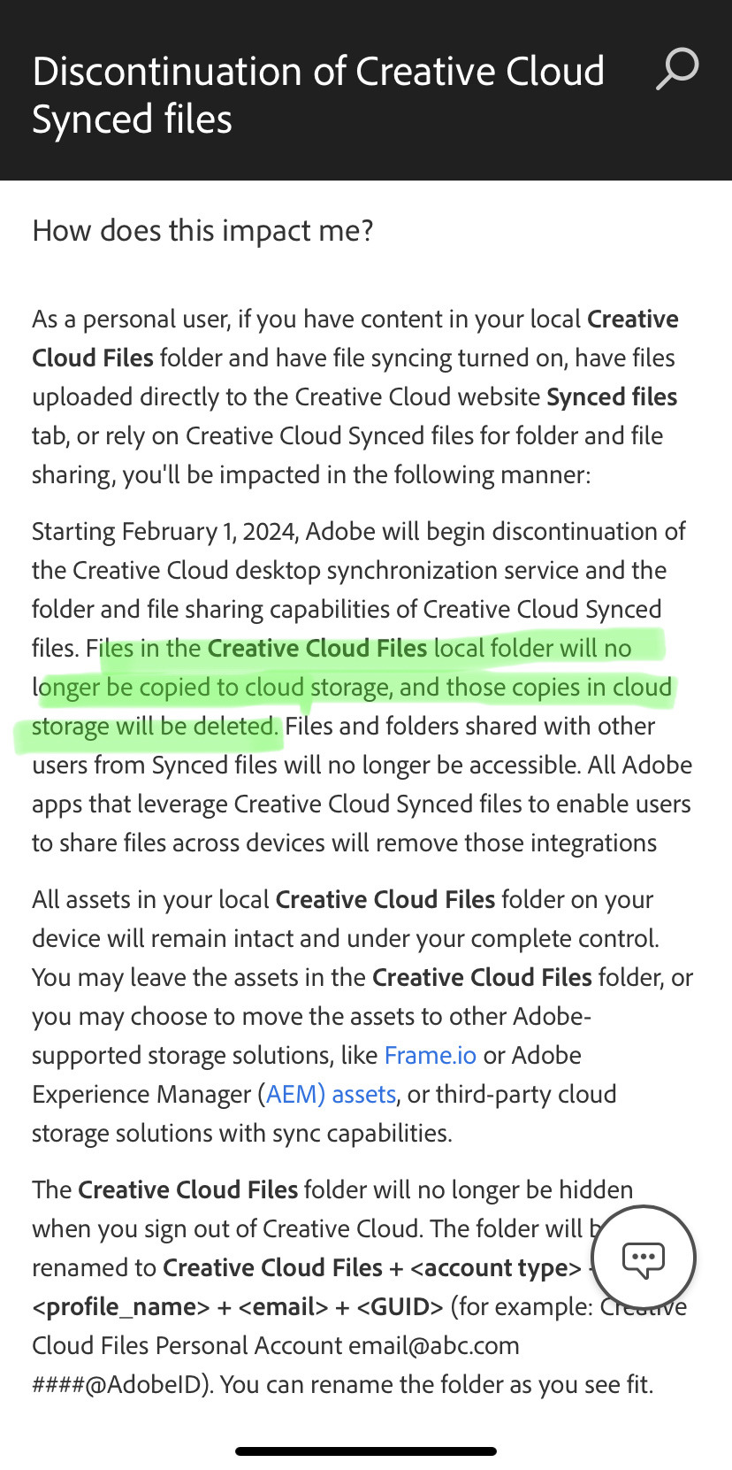
Full article here
#yep#art tip#adobe#creative cloud#photoshop#illustrator#adobe illustrator#adobe photoshop#premier pro#adobe after effects#adobe lightroom#indesign#adobe indesign#adobe acrobat
10K notes
·
View notes
Text
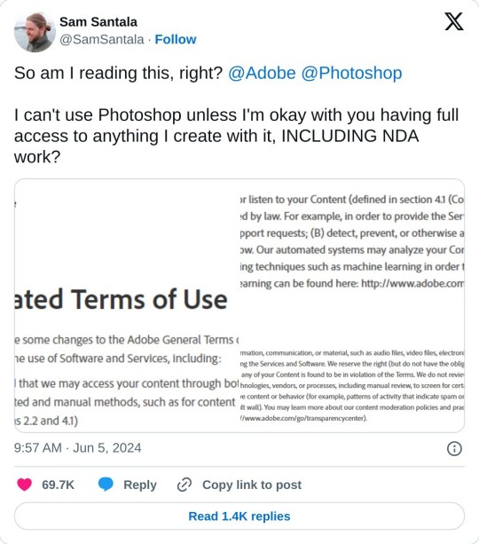
In case y'all haven't heard, Adobe has officially lost its damn mind.
Not only have they added, in no uncertain terms, giving themselves any and all possible rights to anything you create with their software, they made it so you have to accept these updated terms before you can access support (to clarify/ask questions) or cancel your subscription. :)
554 notes
·
View notes
Text
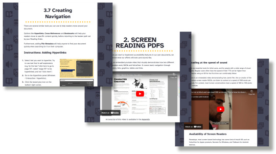
VAST Guides are here!
By using VAST, you can learn how to add accessibility tags for screen readers to your PDFs, by using Adobe InDesign and Adobe Acrobat.
I'm super excited to release a brand new publishing community resource: VAST (or Visual Accessibility Skills Toolkit).
>> WWW.VAST.GUIDE <<
VAST is a collection of short articles aiming to spread awareness about what visual impairments are, and how folks in the small press industry can accommodate them.
The guides are split into four sections:
Visual Impairment 101 explores what visual impairments are, how visually impaired people navigate digital content, and introduces some current language and definitions (circa 2023).
Screen reading PDFs explores the basics of how screen readers navigate through digital content. Includes video examples!
Using InDesign introduces different tools that designers can use to make their documents more accessible.
Putting Into Practice presents case studies of common structures in roleplaying games, and how they could be given accessibility tags using tools covered in section 3. (Coming soon!)
VAST was developed by Brian Tyrrell (me!), and disability advocate and accessibility consultant Yubi Coates. Visually impaired consultants and InDesign experts were brought in to corroborate the guides.
All of the information in the guides is up to date, and we’re committed to reviewing and updating the guides in 2024 and 2025.
This project was completed using a small pot of funding provided by Creative Scotland’s Create: Inclusion program in 2022.
#ttrpg design#indie ttrpg#tabletop rpg#publishing#visual accessibility#screen reader#visually impaired#blindness#accessibility#pdf#indesign#acrobat#adobe#free resources#I always get anxious when releasing stuff#brb going to sit in a corner now#hope you like it!
512 notes
·
View notes
Text

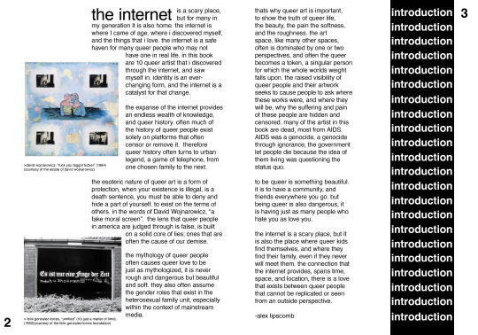

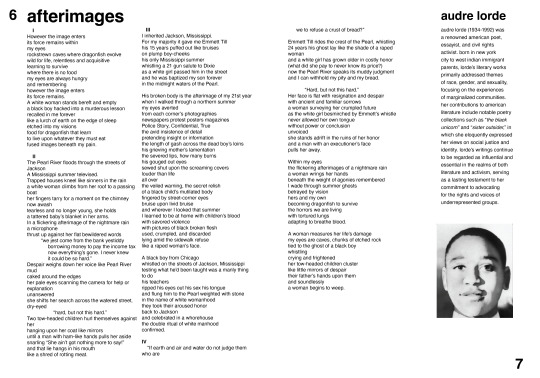
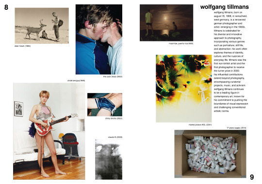

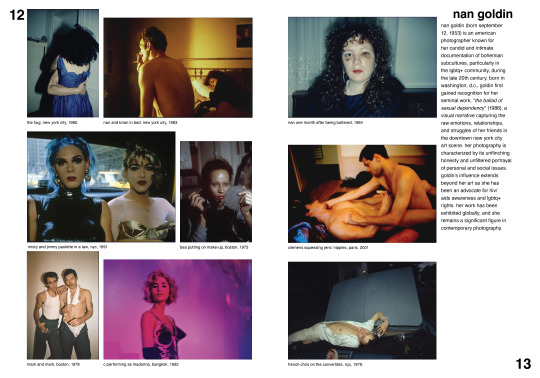

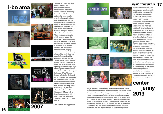
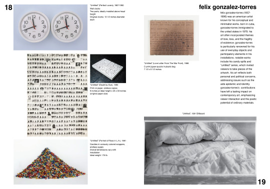
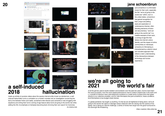


queer art book, 2023, digital
#communications design#fashion institute of technology#graphic design#graphic designer#book design#book#Gregg araki#Ryan trecartin#layout design#layout#indesign#queer art#nan goldin#david wojnarowicz#ocean voung#jane schoenbrun#richard silken#felix gonzalez torres#audre lorde#Wolfgang tillmans#queer artist
73 notes
·
View notes
Text
remember, if you change Indesign preferences, you have to exit the program abnormally using the "exit" command instead of letting it exit through the normal process of crashing for the changes to stick!
125 notes
·
View notes
Text
Typesetting with Adobe InDesign
I am going to teach myself to typeset with InDesign, and I will try to chronicle the process!
Starting point: I know there is a program called InDesign.
Step 1: Acquire InDesign.

Success!
50 notes
·
View notes
Text

Download a Striking CV/Resume Template for Digital Presentations
Download here.
Follow WE AND THE COLOR on:
Facebook I Twitter I Pinterest I YouTube I Instagram I Reddit
#resume#cv#presentation#curriculum vitae#design#graphic design#template#templates#job application#adobe stock#adobe indesign#indesign
39 notes
·
View notes
Text
An Interview with @echoprojectstruggletweets
57 notes
·
View notes
Text
I have finished another project for my digital design class!! It was to make a fake yearbook page and I used horror characters!! I think it turned out great!
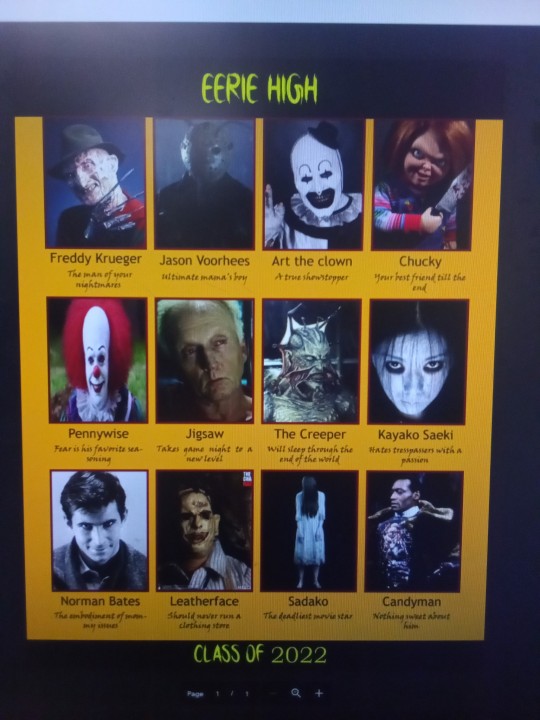
#digital art#horror#indesign#freddy krueger#jason voorhees#art the clown#chucky doll#pennywise#jigsaw#jeepers creepers#the grudge#norman bates#leatherface#the ring movie#candyman
61 notes
·
View notes
Text
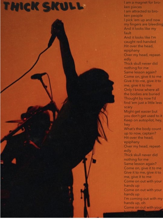
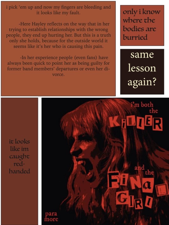
#paramore#hayley williams#thick skull#thick skull hayley williams#indesign#graphic design#graphic art
47 notes
·
View notes
Text
For one of my final projects for a subject in my semester, we had to make a brochure on any topic that interests us. So I made one of Touhou ofc :-)!
Sorry for english-speakers, since this one is fullt in spanish bc' im from México


#touhou project#touhou#東方project#touhou fanzine#fanzine#indesign#adobe illustrator#i fucking hate using these two even if I only used them fully for this
21 notes
·
View notes
Text


Today, I learned about Optical Margins. Can you spot the difference?
Optical margins are basically 'hanging punctuations' made by pulling the punctuation marks outside the margins, pushing the letters flush to the text frame, and thus creating an illusion of straight text. The image on the left is without optical alignment, and on the right, with. I literally just printed 2 copies of my typeset and now I'm tempted to reprint them just for this new addition LOL
This article better expounds on this feature and its contribution to book design.
120 notes
·
View notes
Text
Adobe Alternatives
Adding on to my previous post with a post from Cohost in the case anybody still on the Adobe train decides they want off.

#adobe#adobe alternatives#photoshop#photoshop alternitives#adobe illustrator#adobe illustrator alternatives#adobe animate#adobe animate alternatives#Adobe InDesign#indesign#adobe indesign alternatives#indesign alternatives#adobe substance#adobe stubstance alternatives#lightroom#adobe lightroom#adobe lightroom alternatives#adobe xd#adobe xd alternatives#Adobe Audition#adobe audition alternatives#adobe premiere#adobe premiere alternatives#adobe acrobat#adobe acrobat alternatives#adobe dreamweaver#adobe dreamweaver alternatives#adobe bridge#adobe bridge alternatives#adobe after effects
268 notes
·
View notes
Text
OH HERE ARE MY STUPID GRAPHIC DESIGN THINGS I MADE FOR MY PORTFOLIO and for my journal huehuehuehue

the first one i ever made was for reina idk why i thought she would be interesting subject matter for my first ever indesign project so yes it looks quite shabby and incomplete (in the video)

THIS one, yeah. idk where the idea came from but hey it was fun working with different textures and different coloring modes. plus evo vegas happening gave some fun headlines PLUS PLEASE WHEN I SAW THE TRAILER FIRST THING AT 5 AM, EMINEM WAS BLASTING IN MY HEAD LOL
i also tried to incorporate the red beads and tiger skin motifs for him, with filters to make em red and stand out against a black background? yeeeeeah.....
anyway heres a flipthrough of both, first reina, then heihachi :3
#tekken 8#tekken#heihachi mishima#reina mishima#magazine#journal#graphic design#photoshop#indesign#i hate adobe sm but like their ui is nice i guess?#yeah#ANYWAY TEKKENNNNNNN#ok ill stop
11 notes
·
View notes
Text
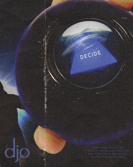
djo poster in honor of new djo post
#graphic design#poster design#djo#joe keery#gd#adobe#illustrator#indesign#student artist#student work#graphics#music poster
24 notes
·
View notes
Photo
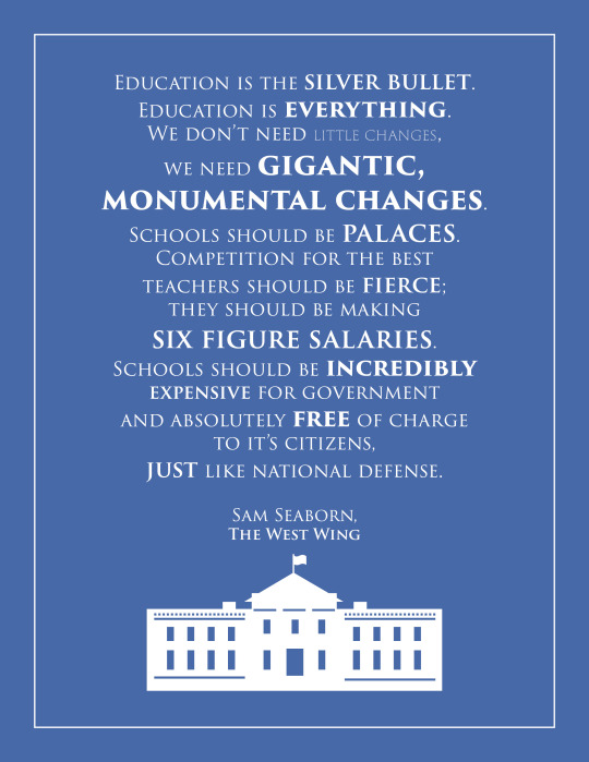
I’ve been rewatching the West Wing lately. Had to make a thing out of one of my favourite Sam speeches.
#sam seaborn#word art#the west wing#education#indesign#poster#aaron sorkin quotes#aaron sorkin#rob lowe
138 notes
·
View notes
Last Seen Blogs