#Inkflow
Explore tagged Tumblr posts
Visit Tumblr Blog
Explore Tumblr blogs with no restrictions, modern design and the best experience.
Last Seen Tumblr Blogs


Fun Fact
Tumblr posted its first advertisements in May 2012 and subsequently earned $13M in revenue.
Text

#Abstract#Brushstroke#Monochrome#Emotion#Silhouettes#Unity#Contrast#Expression#Duality#Mystery#Intimacy#Connection#Minimalism#Fluidity#Faces#Artistic#Grayscale#Surreal#Dreamlike#Whispers#Shadowplay#Merge#Essence#Inkflow#Impression#Subtlety#Gesture#Silence#Ethereal
2 notes
·
View notes
Text
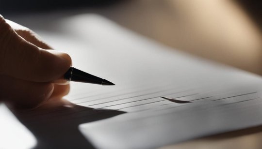
Calligraphy Ink Control: Master the Flow

Calligraphy Ink Control Secrets Revealed: Become a Master of Flow in No Time!
Welcome to our comprehensive guide on calligraphy ink control. If you're a calligraphy artist looking to enhance your skills and create stunning pieces, mastering the flow of ink is essential. In this article, we will delve into various techniques and tips to help you perfect your ink flow in calligraphy. Get ready to take your artwork to the next level! Key Takeaways: - Understanding the different types of calligraphy pens and their ink flow requirements - Proper preparation and cleaning of nibs for optimal ink flow - Adjusting ink viscosity to achieve the desired consistency - Preventing feathering and bleeding in your calligraphy by using the right paper - Techniques for achieving stroke variation and smooth nib movement
Understanding Ink Flow in Calligraphy

In calligraphy, achieving optimal ink flow is essential for creating smooth and consistent lines in your artwork. Different types of calligraphy pens, such as dip pens and brush pens, require specific techniques to manage ink flow effectively. In this section, we will explore various ink consistency techniques, dip pen ink flow, brush pen ink management, and the usage of waterproof ink. When it comes to ink consistency, finding the right balance is crucial. Ink that is too thin can lead to ink pooling or smudging, while ink that is too thick can result in clogged nibs and uneven lines. Experimenting with different ink dilutions, such as adding distilled water or gum arabic, can help you achieve the desired consistency for optimal ink flow. Understanding the dynamics of dip pen ink flow and brush pen ink management is vital for calligraphers. Dip pens require regular dipping to replenish the ink supply, while brush pens need to be periodically squeezed to control the amount of ink flowing onto the bristles. By mastering these techniques, you can maintain a steady flow of ink and execute your calligraphy with precision. Table: Ink Consistency Techniques Technique Effect Adding distilled water Thins the ink for smoother flow Adding gum arabic Increases viscosity to prevent feathering Experimenting with ink dilutions Allows for customization of ink consistency Using waterproof ink is another important consideration, especially if you plan to apply watercolor or other wet mediums to your calligraphy. Waterproof ink ensures that your delicate letterforms won't smudge or bleed when exposed to moisture. It's essential to choose a waterproof ink that is compatible with your preferred calligraphy tools and paper. Next, we will explore the process of preparing and cleaning nibs for optimal ink flow, which is crucial for maintaining consistent calligraphy lines.
Preparing and Cleaning Nibs for Optimal Ink Flow

Properly preparing and cleaning your nibs is crucial for achieving optimal ink flow in your calligraphy. By following these steps, you can ensure that your nibs are in prime condition for creating beautiful artwork. Preparing Nibs When you purchase a new nib, it usually comes with a protective coating that needs to be removed before use. Gently clean the nib using warm water and a mild soap to remove any residue. This will allow the ink to flow smoothly onto the paper. Once the nib is clean, you can further enhance its performance by "priming" it. Dip the nib in ink and let it sit for a few minutes to allow the ink to saturate the metal. Wipe off any excess ink before you start writing to prevent blobs or smudges on your paper. Cleaning Nibs Regularly cleaning your nibs is essential to prevent clogging and maintain consistent ink flow. After each use, rinse the nib with warm water to remove any dried ink. Use a soft toothbrush or nib cleaning tool to gently scrub away any stubborn residues. Avoid using harsh chemicals or abrasive materials that could damage the nib. If your nib becomes clogged with dried ink, you can soak it in a mild ammonia solution overnight to loosen the debris. After soaking, rinse the nib thoroughly and gently dry it with a soft cloth or paper towel. Keeping your nibs clean and well-maintained will ensure that they perform at their best, allowing you to create smooth and flawless calligraphy. Nib Cleaning Techniques Description Warm Water Rinse After each use, rinse the nib with warm water to remove dried ink residue. Nib Cleaning Tool Use a soft toothbrush or nib cleaning tool to gently scrub away stubborn residues. Ammonia Soak If your nib becomes clogged, soak it in a mild ammonia solution overnight to loosen the debris.
Adjusting Ink Viscosity for Better Flow
When it comes to calligraphy, achieving optimal ink flow is essential for creating smooth and consistent lines. One factor that significantly affects ink flow is the viscosity of the ink. Ink that is too thin can lead to frequent re-dipping, while ink that is too thick may cause the nib to stick and result in uneven flow. In this section, we will explore the techniques and methods to adjust ink viscosity and ensure better flow in your calligraphy. Understanding Ink Viscosity Ink viscosity refers to the thickness or consistency of the ink. Each type of ink has its own viscosity, which can be affected by factors such as the pigmentation and additives used in its formulation. Adjusting the viscosity allows you to find the perfect balance for your specific calligraphy style and tools. Techniques to Adjust Ink Viscosity There are several methods you can use to adjust the viscosity of your ink: - Adding Gum Arabic: Gum arabic is a natural binder often used in calligraphy to adjust ink flow. By adding a small amount of gum arabic to your ink, you can increase its viscosity and achieve a smoother flow. - Thinning with Distilled Water: If your ink is too thick, you can gradually thin it by adding small amounts of distilled water. This allows you to control the viscosity and ensure a consistent flow. - Experimenting with Ink Brands: Different ink brands have varying viscosities. Exploring different brands and formulations can help you find an ink that naturally flows well with your calligraphy tools. By adjusting the viscosity of your ink, you can achieve a better flow that suits your calligraphy style and preferences. Remember to experiment with different techniques and find what works best for you. Pros Cons - Allows for a smoother and more consistent ink flow - Enhances control over lettering and strokes - Can be tailored to suit individual calligraphy styles - Requires experimentation to find the perfect viscosity - Mistakes in adjusting viscosity can affect ink performance - May require additional materials like gum arabic Remember, adjusting ink viscosity is a personal process, and what works for one calligrapher may not work for another. Practice and experimentation are key to finding the right balance for your ink flow. With time and dedication, you'll be able to achieve the perfect viscosity and create stunning calligraphy pieces.
Ink feathering control and ink bleeding prevention

When practicing calligraphy, it's essential to prevent ink feathering and bleeding to ensure clean and precise letterforms. Feathering occurs when ink spreads along the paper fibers, resulting in fuzzy lines and a loss of clarity in your calligraphy. Bleeding, on the other hand, happens when ink soaks through the paper, causing smudging and smearing. To overcome these common challenges, there are various techniques and paper options you can explore. Choosing the right paper The type of paper you use plays a significant role in controlling ink feathering and bleeding. Smooth watercolor paper and bleed-proof marker paper are excellent choices for calligraphy. These papers have a dense surface that prevents ink from seeping into the fibers, resulting in sharp and crisp lines. When selecting paper, consider its weight as well. Heavier paper tends to be more resistant to ink feathering and bleeding. Using thicker inks Another way to mitigate ink feathering and bleeding is by using thicker inks. Thicker inks tend to have a higher pigment concentration, which helps them stay within the intended writing area and minimizes the chances of spreading. Experiment with different ink brands and formulas to find one that suits your calligraphy style and produces the desired results. Paper Type Ink Feathering Ink Bleeding Smooth watercolor paper Minimal feathering Minimal bleeding Bleed-proof marker paper No feathering No bleeding Remember, the right combination of paper and ink can make all the difference in achieving precise and flawless calligraphy. By using the right paper and ink, you can control ink feathering and bleeding, resulting in clean and professional-looking calligraphy. Remember to test different paper and ink combinations to find the ones that work best for you. With practice and attention to detail, you'll be able to create stunning calligraphy pieces with minimal feathering and bleeding. Key Takeaways: - Choose smooth watercolor paper or bleed-proof marker paper to minimize ink feathering and bleeding. - Consider using thicker inks with higher pigment concentration to control ink spreading. - Experiment with different paper and ink combinations to find the ones that work best for you.
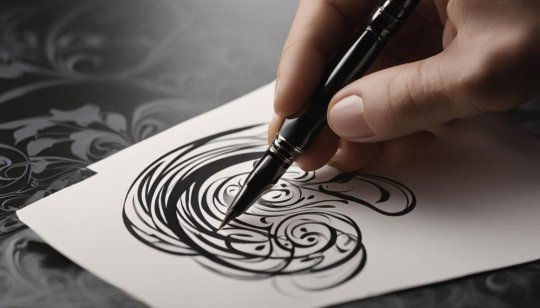
Achieving Stroke Variation in Calligraphy

Stroke variation is an essential technique for elevating your calligraphy and adding visual interest to your letterforms. By mastering stroke variation, you can create dynamic and expressive artworks that captivate the viewer's eye. Here, we will explore various stroke variation techniques that you can incorporate into your calligraphy practice. One technique for achieving stroke variation is using a more flexible nib. A nib with more flexibility allows you to apply varying pressure, resulting in thicker and thinner strokes. Experiment with different nibs to find one that offers the level of flexibility you desire for your calligraphy style. Another technique is to rotate your arm while writing to exert more or less pressure on the pen. By adjusting the angle of your arm, you can create thicker downstrokes and finer upstrokes, adding a sense of movement and dimension to your letterforms. Remember to practice this technique to develop control over the pressure you apply. Adjusting your grip can also help achieve stroke variation. Loosen your grip slightly to allow the pen to pivot in your hand, naturally creating thicker and thinner lines as you write. Experiment with different grip positions to find the most comfortable and effective one for achieving the desired stroke variation in your calligraphy. "Stroke variation is the key to bringing life and personality to your calligraphy. It adds depth and character to your letterforms and makes your work truly unique." - Calligraphy Master Remember, achieving stroke variation takes practice and experimentation. Don't be afraid to explore different techniques, nibs, and grips to find what works best for you. With time and dedication, you can master stroke variation and take your calligraphy to new artistic heights.
Ensuring Smooth Nib Movement and Avoiding Scratchiness
In calligraphy, achieving smooth nib movement is essential for a satisfying writing experience. Scratchy nibs can be frustrating and can disrupt the flow of your ink, resulting in inconsistent letterforms. To avoid these issues and maintain a smooth nib movement, consider the following tips and techniques: 1. Light Touch and Shallow Angle When writing with a calligraphy pen, use a light touch to avoid putting excessive pressure on the nib. Applying too much force can cause the nib to catch on the paper, leading to scratchiness. Additionally, holding your pen at a shallow angle can help prevent the nib from digging into the paper, ensuring smoother movement. 2. Choosing the Right Nib The choice of the nib plays a significant role in achieving smooth nib movement. Nibs come in different flexibilities and tip shapes. Consider using less flexible nibs, such as firm or stiff nibs, as they tend to glide more smoothly on the paper. It's also a good idea to select nibs with rounded tips rather than sharp ones, as they are less likely to catch on the paper. Pro tip: Experiment with different nibs to find the one that offers the smoothest writing experience for you. Each calligrapher has their own preference when it comes to nibs, so don't be afraid to try out different options. 3. Proper Cleaning and Maintenance Regularly cleaning your nibs is essential for ensuring smooth nib movement. Ink residue or debris can accumulate between the tines of the nib, causing it to scratch on the paper. To clean your nibs, rinse them under warm water and gently rub them with a soft cloth or toothbrush. This will remove any ink or debris and keep your nibs in optimal condition. By following these tips and techniques, you can achieve smooth nib movement in your calligraphy and prevent scratchiness. Remember to practice regularly and take your time to create beautiful and flowing letterforms.
Dealing with Fibers and Threads in Nibs
https://www.youtube.com/watch?v=qfPp-B7r8Ig When it comes to calligraphy, achieving clean and smooth ink flow is crucial for creating beautiful letterforms. However, fibers and threads can often find their way into the nib, causing unsightly lines and blotches in your artwork. Fortunately, there are effective techniques to deal with this issue and maintain optimal ink flow. To prevent fibers from catching in the tines of your nib, it's important to choose the right paper. Smooth paper, such as high-quality calligraphy paper or smooth watercolor paper, can minimize the presence of fibers and threads. By using the proper paper, you can significantly reduce the chances of these particles interfering with your ink flow. In addition to selecting the right paper, it's also crucial to regularly clean your nibs. Cleaning your nibs removes any accumulated fibers or residue that might hinder the flow of ink. You can do this by gently wiping the nib with a soft cloth or using a nib cleaner specifically designed for calligraphy nibs. Table: Tips for Dealing with Fibers and Threads in Nibs Technique Description Choose smooth paper Opt for high-quality calligraphy paper or smooth watercolor paper to minimize the presence of fibers and threads. Regularly clean your nibs Gently wipe your nibs with a soft cloth or use a nib cleaner to remove any accumulated fibers or residue. By implementing these tips and techniques, you can effectively deal with fibers and threads in your nibs, ensuring a clean and smooth ink flow in your calligraphy. Remember to regularly inspect your nibs for any obstructions, and don't hesitate to clean them whenever necessary. With care and attention, you can maintain optimal ink flow and create stunning calligraphy artwork.
The Importance of Good Lighting in Calligraphy
Dedicated calligraphers understand the crucial role that good lighting plays in their artistic practice. Adequate lighting not only enhances the visibility of intricate letterforms but also ensures consistent ink flow on the page. When it comes to calligraphy, proper lighting is key to achieving precision and capturing the nuanced details of your work. Proper lighting conditions can help reduce eye strain and fatigue, allowing you to focus on your calligraphy without interruptions. Natural light is ideal, as it provides a balanced illumination that brings out the true colors of your ink and paper. If natural light is unavailable, consider using a daylight-simulating bulb to replicate the brightness and clarity of sunlight. Position your workspace near a window or light source, ensuring that the light falls directly onto your work surface. Avoid shadows or glares that can distort your perception of ink flow. Experiment with different angles and intensities of light to find the optimal setup that suits your needs. Investing in a high-quality desk lamp with adjustable brightness and color temperature can make a significant difference in your calligraphy practice. Look for a lamp that provides a warm white light, which closely mimics natural daylight. Adjustable features will allow you to customize the lighting conditions according to your preferences and the specific requirements of your projects. Remember to consider the overall ambiance of your workspace as well. A clutter-free and well-organized area will aid in creating a calm and focused environment for your calligraphy practice. Avoid harsh or distracting background lighting that can interfere with your concentration.
Conclusion
Mastering calligraphy ink control is an ongoing journey that requires practice, patience, and attention to detail. By implementing the techniques and tips discussed in this article, you can effectively control the flow of ink in your calligraphy and create stunning artworks. Remember, experimenting with different pens, nibs, and inks is key to finding what works best for you. Every artist has their own unique preferences and style, so don't be afraid to explore and discover what resonates with your artistic vision. With dedication and perseverance, you can elevate your calligraphy skills and unlock your full creative potential. Embrace the joy of lettering, embrace the fluidity of ink, and let your imagination flow through each stroke. Happy calligraphing!
FAQ
What is calligraphy ink control? Calligraphy ink control refers to the skill of managing the flow of ink in calligraphy. It involves techniques to achieve smooth and consistent lines in your artwork. Why is ink flow important in calligraphy? Ink flow is crucial in calligraphy as it determines the quality of your lines. Smooth and consistent ink flow is essential for creating stunning calligraphy pieces. What techniques are involved in managing ink flow? Techniques such as ink consistency, dip pen ink flow, brush pen ink management, and the usage of waterproof ink are all important aspects of achieving optimal ink flow in calligraphy. How do I prepare and clean nibs for optimal ink flow? Properly preparing nibs before use and regularly cleaning them are essential steps in ensuring optimal ink flow. Read the full article
0 notes
Text


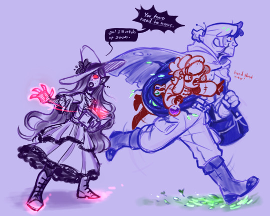


been meaning to post my fantasy au scraps, kept forgetting
#tips hat to liko who started it all by saying “hey. Grimoire but. Big creature”#and then whoever said werewolf grim#because then I felt like I had to make Sally a design to match#and then I went what about my favorite trio what about my favorite guys what if I put them in here#anyway#tangle tower fanart#tangle tower#detective grimoire#sally spears#fitz fellow#poppy pointer#fifi fellow#emery inkflow#myart#razzart
54 notes
·
View notes
Text


Plant of the Day
Thursday 20 July 2023
In this terraced hotel garden, on Shetland, the flowers of oriental poppies were providing colourful splashes of red and pink. The single, bowl-shaped, salmon-pink flowers were Papaver (Oriental Group) 'Prinzessin Victoria Louise' (oriental poppy) which is a vigorous clump forming perennial. These poppies are summer deciduous after flowering.
Jill Raggett
#Papaver#orientalpoppy#poppy#herbaceousperennial#herbaceous#pinkflowers#plants#horticulture#gardens#garden#gardenterrace#shetland
171 notes
·
View notes
Text


Some sketches i made!
#greenflame#ninjago#kai ninjago#lloyd garmadon#fanart#dandys world fanart#dandys world#bendy the dancing demon#inkflower#dandy x bendy#bendy x dandy#sketches#genderbend#shelly dandys world
9 notes
·
View notes
Text
Dandy x Blot should be called Inkpetals. Its basic but I need to be the one to make their ship name.
#dandys world#blot x dandy#inkpetals#or maybe inkflowers if youre feeling devious enough#its just twitter is down so im forced to speak my shit here#theres not enough info on blot to form a better ship name so inkpetals it is!
2 notes
·
View notes
Text
that i cannot outrun the setting sun, that tomorrow is waiting outside my front door with a crowbar, that i’ll never know you the way they did back when i was first shepherded into your house in 2016: you should have seen the way i held my bitter tongue when i saw them bouncing on their heels to the music, cramming you into their ribs. sorry that i laughed at you, mouth full of acid, sorry that i could only picture you as an ugly, wretched thing.
all this to say: i was twelve when i wanted to grow up faster and twenty-three when i wanted to stop. my hands have dug too many graves - i know the gentleness of the soil after rain, so soft it’s sweet, but i still don’t know you the same way. is it too late? i want to see you in the gems of light splashed across the ocean’s skin, in the pyramids of overripe fruit at the grocery store, in the forgiving slope of a lover’s neck. if i dig far enough, will i find you? if i dig long enough, will you come?
i hold yesterday in my palms and i cannot forgive it. which is to say - imagine a pack of wild dogs, imagine a man with a gun; loving you seems a violent, corrosive thing, but i am too envious of the faithful. I’ll find you, i’ll split you open with my teeth, i’ll empty my stomach out, i’ll shift my bones around, i’ll make room for you. i see you here now: moss in a city puddle, mushrooms in a dormitory bathroom. life for life’s sake, in every possible way, sick rising to my throat. but i’ll try to look past it if you can, i’ll keep my hands soft, i’ll make room for you.
-(j)
#spilled ink#poets on tumblr#inkflows#poetry#spilled words#poems on tumblr#first piece in a looooong time its so good to be back#this is about god btw
7 notes
·
View notes
Text

#showtimesketches#dandy x bendy#i am aware that the ship name is inkflower but i think that includes living toon dandy#so i made this one with the distinction of it being not that#theyre so cute x3#im posting these as i draw them
1 note
·
View note
Text
InkFlow AI Review: Turn Any Video Into Multilingual Content in 60 Seconds BY [Dr. Amit and Atul Pareek]

Introduction: InkFlow AI Welcome to my InkFlow AI Review. InkFlow AI is a copy-write free UGC content writing tool that feels human, & creates SEO-optimized blogs, viral social media posts, ads, & sales copy effortlessly in 60 seconds in any language. Dr. Amit and Atul Pareek launched an AI-powered tool, the InkFlow AI app. It works in 3 simple steps. The agency wants to enter your selected URL or Word, and InkFlow AI automatically generates content for blogs, social media, and emails—in just a few seconds. An audience can write unlimited smart blogs, rank higher, & convert more with the AI tool. Write SEO-friendly content without hassle that helps you dominate blogs, social media, YouTube, etc. The InkFlow AI is a passive income machine that magically turns any URL, YouTube video, or just a keyword into UGC content—in 60 seconds. Where doesn`t need any tech skills, experience, or monthly payment, and InkFlow AI review agency gives a 30-day money-back guarantee and a free commercial license. I think InkFlow AI is the world's first revolutionary AI app. You say goodbye to ChatGPT, DeepSeek, Rytr, and Jasper.
Visit Here>>
Overview: InkFlow AI Review Author/vendor: Dr. Amit and Atul Pareek Product: InkFlow AI Launce date: 11/03/25 Official website: VISITE HERE Front-end price: $37 Business: ok Write UGC content—highly recommended Instantly Create Text Into High-Quality 4K HD Video Watch/Create Video—Any Language Social Media Marketing: Number One passive income—ok Recurring System: OK Payment: One Time Local Business: High Recommend Money-Back: 30 Days Money-Back Guarantee Funnel/Tool: Automated & Done-For-You Support: Effective Niche: Any Niche of your choice
How does InkFlow AI work?
Step-1 Paste URL or Keyword: First choose a URL or keyword and select your content type—email, blog, ad, or eBook.
Step 2: Customize: Customize a blog, article, ad, or eBook, like tone or template. Or the style and fine UGC content for better engagement.
Step 3: Discloser & Earn: Publish high-quality UGC content, blog, ads, video scripts, sales copy, and email. Get a free commercial license and a 30-day money-back guarantee.
Visit Here>>
Money-back guarantee: InkFlow AI A 30-day money-back guarantee could be a customer-friendly approach that permits buyers to ask for a full discount within 30 days of buying in case they are unsatisfied with an item or benefit. This approach builds belief and certainty, empowering potential clients to buy with negligible hazards. It illustrates the seller's commitment to quality and client fulfillment. To claim a discount, clients ordinarily ought to return the item in its unique condition or cancel the benefit within the desired period. This ensures it is commonly utilized in businesses like computer programs, e-commerce, and membership administrations. While it can increment deals, businesses must guarantee clear terms to anticipate manhandling. By and large, it's a win-win, advertising clients peace of intellect and businesses a competitive benefit.
Start With: InkFlow AI UGC content business: Sell high-converting content to clients. eBook Agency: Publish and sell eBooks, leads, and reports. Make Offers: Create offers for SEO optimization. Instant Viral Content: Write high-quality content and go instant viral on social media with only one click. Affiliate Marketing: Now too popular, affiliate marketing requires the creation of unique content for an engaged audience. The app agency works on your behalf. Ready-Made System: where there are 15+ million templates and images. Take and go to profits.
Make the Right Decision: InkFlow AI Review Why invest in InkFlow AI & how to get benefits inside? This is a massive question for entrepreneurs. Now I explain why invest in the app. Create marketing content like email, eBook, blog, and social media posts. Turn any URL or keywords into UGC-label human-like content in a few seconds. Open email rate 100% that is direct in one click. You can publish any content with just one click on social media and marketing sites. The app writes human-like content and ensures originality & readability. Generate multiple language contents and publish multiple sites at a time. The app publishes auto-post and uses powerful tags on your behalf. Expertly provide repurposed content and turn any video into multiple blogs. Provide an audience outline for SEO content instantly. InkFlow helps you rank on Google's first page. Use 15+ million ready-made AI images. Customize tone, style, and template with AI. Provide 100% flawless content every time and check grammar accuracy. InkFlow AI provides support for plagiarism & citation. Globally support 100+ languages. Rewrite and optimize the content of audience choice. Boos your content and lead generation 10x with AI. Stop wasting time and start a new journey with AI. Doesn't need any tech skills and experience. Free commercial and UGC license.
Visit Here>>
Winning and Losing Side: InkFlow AI
Winning side: InkFlow AI Review UGC content priority Turn any URL into content Multi-lingual content service Multiple Publish capability Instant viral on social media SEO optimize system Google Analytics system Create business agency Generate eBook, blog, and product review Unlimited content and passive income priority 24/7 support Doesn't require experience and tech skill 30-day money-back guarantee Free commercial license Step-by-step training Customize font and template
Losing side: InkFlow AI Review
Depends on internet connection Limited time offer Make right decision
OTO & Pricing: InkFlow AI Front-End Price: Inkflow Commercial ( $ 32 to $ 47 )
OTO-1 Inkflow Fastpass ( $ 230 )
OTO-2 Inkflow Mega Suite ( $ 127 )
OTO-3 Inkflow Agency ( $97 )
OTO-4 Inkflow Enterprise ( $67 )
OTO-5 Inkflow Elite ($97)
10 Free Bonus
BONUS-1 Step-by-Step Training: The agency learns how to write UGC-level content and earn $10,000 per month
Bonus-2: How to Sell AI Content: Unlock AI Agency and Boost Your Earn 10x.
BONUS-3 Automating Content Creation: Hand-free proven system and Learn how to automate blogs, ads, sales copy, and social media content for businesses using AI.
BONUS-4 Guide to Launch of a 24/7: Built automated guide system and 24/7-day support.
BONUS-5 Create Product Descriptions & Sales Copy: The agency teaches how to create compelling product pages, landing pages, and ad copy that drive sales effortlessly.
Bonus-6 Secrets to Run a Lead Generation: Learn how to use AI-generated content to attract, qualify, and convert high-value leads for businesses with AI agencies.
Bonus-7 Copywriting & Ad Content: Create high-converting copy for businesses and sell your services per project & copywrite free license.
Bonus-8 Leads & Recurring Income: The InkFlow AI agency provides how to earn and generate in a few seconds.
Bonus-9 Multilingual Content Agency: Learn how to package and price your services, scale your agency, and generate recurring income by serving businesses worldwide.
Bonus-10 Cash in on Custom Video Scripts: Turn AI-generated video scripts into a high-paying service! Learn how to sell scripts to content creators, businesses, and marketers, and package your services.
Final Opinion: InkFlow AI Review I think the app is best for the current world and trends in 1 place. An audience can create videos into multilingual posts and publish them on social media. You can customize the template, font, color, and image. Get a copyrighted article and a free license. Generate and turn video into any multi-language content. So InkFlow is the world's first writing app. You make high-converting leads and sell.
Affiliate disclaimer
Thank you for perusing my genuine audit. My fair conclusion is shared within the survey.
An affiliate disclaimer may be an explanation to advise gatherings of people that a company or person may gain a commission or other emolument on the off chance that they buy items or administrations through joins on their site, web journal, social media, or different stages. This disclaimer is basic for keeping up straightforwardness and complying with legitimate requirements, such as those set by the Government Exchange Commission (FTC) within the Joined Together States. It guarantees perusers or watchers know of any potential predisposition or budgetary motivating force behind proposals.
Ordinarily, the disclaimer is set noticeably at the start or conclusion of substance and clearly states the nature of the partner relationship. For illustration, "This post may contain partner joins, meaning I win a commission if you buy through my joins at no additional cost." This builds belief with the group of onlookers while ensuring the substance
0 notes
Text
youtube
0 notes
Text
Calligraphy Pen Holding Guide: The Correct Way
Calligraphy Pen Holding Guide: Master the Art in Minutes with These Simple Steps!
Mastering the art of calligraphy starts with holding the pen correctly. Whether you're a beginner or looking to refine your technique, understanding the correct way to hold a calligraphy pen is essential. Proper pen grip not only enhances the beauty of your lettering but also ensures optimal ink flow and comfort during long writing sessions. In this guide, we'll explore the correct techniques for holding a calligraphy pen, covering grip, pen angle positioning, finger placement, wrist movement, and more. Key Takeaways: - Holding a calligraphy pen correctly is crucial for achieving precise lettering. - Proper grip technique involves a relaxed grip with a slight bend in the index finger. - The pen should be held between the thumb, index, and middle fingers for better control. - The angle at which you hold the pen affects stroke consistency and ink flow. - Utilize arm and wrist movements for smooth and controlled strokes. Now that you understand the importance of holding a calligraphy pen correctly, let's dive deeper into each aspect to help you master the art of calligraphy.
The Importance of Proper Grip Technique
When it comes to calligraphy, holding your pen correctly is vital for achieving optimal results. The way you grip the calligraphy pen can greatly impact your control, comfort, and the quality of your lettering. A proper grip technique ensures smooth ink flow and precise strokes, allowing you to create beautiful and consistent letterforms. The traditional curled grip used for regular pens is not suitable for calligraphy. Instead, adopt a relaxed grip with a slight bend in your index finger. The pen should be supported by your thumb, index, and middle fingers, rather than controlled by them. This grip applies to both right-handed and left-handed individuals. By holding the calligraphy pen correctly, you'll be able to achieve better control, smoother ink flow, and more precise lettering. Proper grip technique not only enhances your writing experience but also prevents discomfort or pain that can arise from an incorrect grip. It allows you to focus on the fluidity of your strokes and the overall design of your calligraphy. Take the time to practice and find the grip that feels most natural and comfortable for you. Benefits of Proper Grip Technique: Consequences of Improper Grip Technique: - Enhanced control - Ink flow issues - Smooth ink flow - Discomfort or pain - Precise and consistent strokes - Inconsistent lettering Remember, finding the right grip technique is an essential foundation for your journey into calligraphy. It sets the stage for mastering other aspects of this art form, such as pen angle positioning, finger placement, wrist movement, and pressure control.
Achieving the Correct Pen Angle Positioning
When it comes to calligraphy, the angle at which you hold your pen plays a crucial role in the outcome of your lettering. The correct pen angle allows for consistent and controlled strokes, resulting in beautiful and professional-looking script. To achieve the optimal pen angle positioning, hold your calligraphy pen at a slight angle to the writing surface. This angle allows for better ink flow and control, enabling you to create smooth and even lines. Experiment with different angles to find what works best for you and the style of calligraphy you're aiming to achieve. Remember, the pen angle positioning may vary depending on the type of calligraphy pen you're using. Dip pens, brush pens, and fountain pens may require slight adjustments in the angle to accommodate their specific nib designs. Take the time to familiarize yourself with each pen and adapt your grip accordingly. Possible Pen Angles Effect on Lettering Slight Angle Produces consistent strokes with optimal ink flow. Steep Angle Creates bold and heavy lines, suitable for certain calligraphy styles. Shallow Angle Results in delicate and fine lines for intricate details. Remember that practice is key when it comes to achieving the correct pen angle positioning. Experiment with different angles, observe the effects on your lettering, and adjust accordingly. With time and practice, you'll develop the muscle memory needed to hold the pen at the optimal angle effortlessly.
Finger Placement for Perfect Calligraphy Pen Grip
Mastering the art of calligraphy requires not only the right tools but also the correct finger placement on the calligraphy pen. The way you position your fingers can greatly affect your control, precision, and overall writing experience. Here are some tips to help you achieve the perfect finger placement for a comfortable and controlled grip: 1. Index Finger Bend The index finger plays a crucial role in your calligraphy pen grip. It should have a slight bend, allowing for fluid movement and control. Avoid pressing too hard with the index finger, as it can restrict the pen's movement and result in uneven strokes. 2. Thumb, Index, and Middle Finger Support The calligraphy pen should be held between the thumb, index, and middle fingers. These fingers provide the main support and control for the pen. Find a balance between a firm enough grip to control the pen and a relaxed enough grip to ensure comfort during long writing sessions. Remember, the goal is to achieve a grip that allows you to write with ease and precision while minimizing strain on your hand and fingers. Experiment with different finger placements to find what works best for you. By mastering the proper finger placement for your calligraphy pen grip, you'll be well on your way to creating beautiful lettering and unlocking your full creative potential.
Utilizing Wrist Movement in Calligraphy
Mastering the art of calligraphy goes beyond mastering the correct pen hold. It also involves utilizing proper wrist movement to create fluid and controlled strokes. By incorporating wrist movement into your calligraphy practice, you can achieve beautiful and expressive lettering. When writing in calligraphy, the majority of movement should come from your arm and wrist rather than your fingers. This allows for smoother and more consistent strokes. To practice utilizing wrist movement, hold the calligraphy pen with a relaxed grip, allowing your wrist to move freely. Avoid excessive finger movement, as it can result in shaky lines. Experiment with different wrist movements to create varying stroke widths and styles. By adjusting the angle and direction of your wrist, you can add unique flair to your calligraphy. Remember to maintain a comfortable and relaxed grip to avoid strain or fatigue. Benefits of Wrist Movement in Calligraphy - Increased control and precision in strokes - Ability to create varying line widths and styles - Fluid and graceful letterforms - Reduced strain and fatigue "Wrist movement is like a dance, guiding the pen across the page with grace and precision." - Calligraphy Master By incorporating wrist movement into your calligraphy practice, you can elevate your skills and express your creativity with confidence. Practice regularly and explore different techniques to discover your own unique style.
Ergonomic Pen Holding for Comfort and Longevity
When it comes to calligraphy, the way you hold your pen can greatly impact your comfort and the longevity of your writing sessions. By adopting an ergonomic pen holding technique, you can ensure that you can write for extended periods without fatigue or discomfort. One key aspect of ergonomic pen holding is maintaining a relaxed grip. Avoid gripping the pen too tightly, as this can cause tension in your hand and fingers. Instead, hold the pen lightly, allowing for flexibility and ease of movement. Another important factor is to focus on utilizing arm and wrist movements rather than relying solely on your fingers. This helps to distribute the workload and prevent strain on specific muscles. Practice using smooth and fluid movements from your arm and wrist to create consistent and controlled strokes. It's also essential to ensure that the weight of the pen is evenly distributed. This can be achieved by finding a pen that feels comfortable in your hand and has a balanced design. Consider using ergonomic calligraphy pens or grip aids that are specifically designed to provide additional comfort and support. By adopting proper ergonomic pen holding techniques, you can enjoy a more comfortable and enjoyable calligraphy experience. Remember to practice regularly and listen to your body to avoid any potential discomfort or strain. With the right pen hold, you'll be able to create beautiful lettering and enjoy the art of calligraphy to its fullest.
Nib Alignment for Optimal Writing Experience
When it comes to calligraphy, the alignment of the nib is crucial for achieving smooth ink flow and consistent strokes. Proper nib alignment ensures that both tines of the nib remain evenly on the paper, allowing for better stroke contrast and preventing the pen from digging into the surface. To ensure optimal nib alignment, follow these simple steps: - Hold the calligraphy pen at a slight angle to the writing surface. - Position the nib so that both tines are parallel to the baseline of your writing. - Avoid tilting the nib too far in any direction, as this can cause ink flow issues. By maintaining the correct nib alignment, you'll be able to create beautiful lettering with consistent strokes and smooth ink flow. Practice this technique regularly to enhance your calligraphy skills and achieve the best writing experience. "Proper nib alignment ensures smooth ink flow and consistent strokes, allowing for better stroke contrast and preventing the pen from digging into the surface." Table: Common Nib Alignment Mistakes and Solutions Mistake Solution Nib slanted too much to the left or right. Adjust the pen angle to ensure the nib remains parallel to the baseline. Nib tilted too far forward or backward. Hold the pen at a consistent angle to maintain proper nib alignment. Nib pressing too hard into the paper. Lighten your grip and adjust the angle to achieve a smoother ink flow. Nib not making full contact with the paper. Ensure both tines of the nib touch the surface for consistent ink flow. Remember, the right nib alignment is essential for achieving the best results in calligraphy. It may take some practice to find the perfect balance, but once you do, your lettering will flow effortlessly across the page, creating beautiful and elegant designs.
Controlling Pressure for Versatility in Writing
Mastering the art of calligraphy not only requires precision in pen holding, but also the ability to control pressure for creating varying line thicknesses. By understanding and practicing pressure control techniques, you can add depth and dimension to your lettering, allowing for versatility in your calligraphy style. Why Pressure Control Matters Pressure control is crucial in calligraphy as it determines the width and intensity of each stroke. By applying different levels of pressure on the nib, you can achieve thin and delicate lines or bold and expressive strokes. This skill is particularly important when creating flourishing, adding emphasis to specific parts of your lettering, or achieving contrast between different letterforms. "Pressure control is the key to unlocking the full potential of your calligraphy. It allows you to create visually captivating compositions and convey a wide range of emotions through your lettering." To develop your pressure control technique, start by practicing with a light touch. Apply minimal pressure on the nib to create thin lines, gradually increasing the pressure to achieve thicker strokes. Experiment with different pressure levels to understand the impact it has on the ink flow and the overall visual effect of your calligraphy. Tips for Effective Pressure Control Here are some tips to help you master pressure control in your calligraphy: - Relax your grip: Avoid gripping the pen too tightly, as this restricts your ability to apply varying levels of pressure. Opt for a relaxed grip that allows for nuanced control of the pen. - Practice gradual pressure changes: Start with light pressure and gradually increase it as you move along the stroke. This technique helps create smooth transitions between thin and thick lines. - Focus on consistency: Aim for consistent pressure throughout each stroke to maintain a uniform line width. Inconsistent pressure can result in uneven ink flow and disrupt the overall visual harmony of your calligraphy. Table: Pressure Control Techniques for Different Line Variations Line Variation Pressure Thin Lines Light pressure Thick Lines Increased pressure Gradual Thickening Gradual increase in pressure Variable Width Lines Alternating pressure levels Remember, developing control over pressure takes practice and patience. Dedicate time to honing this skill, experimenting with different techniques, and observing the effects on your calligraphy. With time, you'll be able to confidently create captivating letterforms with varying line widths and express your artistic style.
Handling Different Types of Calligraphy Pens
In the world of calligraphy, there are various types of pens that require different handling techniques to achieve optimal results. Whether you're using a dip pen or a brush pen, mastering the grip and balance of each type is essential for artistic expression. Let's explore the key considerations for handling different calligraphy pens. Dip Pen Handling A dip pen is a traditional tool that involves dipping the nib into an inkwell before each stroke. When handling a dip pen, it's important to hold it with a relaxed grip. This allows for greater control and ease of movement. The angle at which you hold the pen can vary depending on personal preference and the desired effect of your lettering. Experiment with different angles to find what works best for you. Brush Pen Grip Brush pens have a flexible tip and are ideal for creating bold, expressive strokes. When holding a brush pen, apply light pressure and focus on using flexible wrist movements. This will allow you to achieve varying line widths and add artistic flair to your calligraphy. Practice controlling the pressure and movement of the brush pen to create the desired effect. Calligraphy Pen Balance Regardless of the type of calligraphy pen you're using, achieving a balanced grip is crucial for optimal control and comfort. The weight distribution should be even between your fingers and the pen. This will prevent hand fatigue and allow for smooth, uninterrupted strokes. Experiment with different pen sizes and shapes to find what feels most comfortable in your hand. Mastering the handling of different calligraphy pens requires practice and experimentation. Each type of pen offers unique possibilities for artistic expression. By understanding the specific techniques required for dip pens, brush pens, and maintaining a balanced grip, you'll be well on your way to creating stunning calligraphy pieces. Type of Pen Handling Technique Dip Pen Hold with a relaxed grip and dip the nib in ink before each stroke. Experiment with varying angles for desired effects. Brush Pen Apply light pressure and use flexible wrist movements to create varying line widths. Practice controlling the pressure and movement for desired effects. Calligraphy Pen Achieve a balanced grip for optimal control and comfort. Experiment with different pen sizes and shapes to find what feels most comfortable.
Maintaining a Proper Writing Posture
https://www.youtube.com/watch?v=M-m83y54070 When practicing calligraphy, it's important to pay attention to your writing posture. Maintaining a correct posture not only helps you write more comfortably but also enhances your control over the calligraphy pen. Here are some tips to help you maintain a proper writing posture: - Sit up straight: Avoid hunching over the writing surface as it can lead to back and breathing problems. Sit with your back upright and aligned with the chair. - Relax your shoulders: Tension in your shoulders can restrict your movement and affect your pen strokes. Keep your shoulders relaxed and avoid any unnecessary stiffness. - Keep both feet on the ground: Ensure that both your feet are firmly planted on the ground. This provides a stable base and helps you maintain balance while writing. - Position your arms and elbows: Rest your forearms on the table or writing surface, with your elbows slightly bent. This allows for smooth movement and reduces strain on your arms. - Align your head and neck: Keep your head and neck in alignment with your body. Avoid tilting your head forward or backward, as it can cause strain on your neck muscles. Maintaining a proper writing posture not only improves your calligraphy skills but also ensures a comfortable and enjoyable writing experience. Remember to take breaks and stretch your muscles periodically to prevent any stiffness or fatigue.
Conclusion - Calligraphy Pen Holding Guide
Mastering the art of calligraphy begins with holding the pen correctly. By following the tips in this comprehensive calligraphy pen holding guide, you can achieve the proper grip technique, pen angle positioning, finger placement, and wrist movement. Regular practice and patience will be key as you develop your calligraphy skills. Remember, the correct pen hold is essential for achieving beautiful and precise lettering. Improper grip can lead to ink flow issues, discomfort, and even pain. Whether you're right-handed or left-handed, the tips provided in this guide will help you hold a calligraphy pen the right way for optimal results. With the right pen hold, you'll be able to create stunning lettering and express your creativity with confidence. So, grab your calligraphy pen and start practicing today! Keep refining your technique and exploring new styles to further enhance your skills. Happy calligraphy writing! Read the full article
0 notes
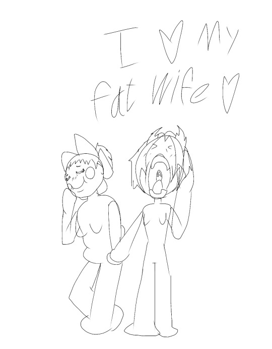
Text


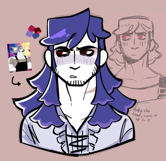
“maybe it’s not as bad as I thought.”
(him and poppy went shopping and she got it for him, plus the hat)
ain’t he pretty? (internally thanking poppy for her service)
#detective grimoire#tangle tower#tangle tower fanart#fitz fellow#emery inkflow#tangle tower oc#oc x canon#fitz experimenting makes me strong no one talk to me /lh#this will happen again#with poppy included mayhaps I want to draw her in something punk#their all my barbie dolls/hj#razzart#myart
24 notes
·
View notes
Text
Move people, Nuala's president, coming through to fix it.
All Nuala ships end on "flower" because it's a very easy way for this one mod (me) to keep track of all Nuala content across all platforms.
Here are some of the main Nuala centric ship names:
SandFlower - m!Morpheus x Nuala (immovable force of a ship name, I slayed that one and the 120 people who voted for it on Twitter a year ago)
ImmortalFlower - Hob x Nuala (this one is with Sandflower, has existed for a year)
SapphicFlower - f!Morpheus x Nuala (it's close to sandflower, and it rings easy)
InkFlower - Lucien/Lucienne x Nuala (books, letters and all written is in ink, bookflower sounded stupid and I hated it, inkflower is pretty)
FairyFlower - Gault x Nuala (because Morpheus has canonically given them both fairy appearances in the eyes of the dreamers, so they are the fairies in love)
If the mods have any Nuala related inquiries of any kind, I urge them to DM me, and I would be more than happy to assist.
Love,
Li 🪷🩷
Ship Name for Gault/Nuala
Hey everyone! The mod team is still hashing out potential ship names for some of these pairings, since most of them are rarepairs to high heaven and back lol. We're currently considering Gaultuala for Gault/Nuala, but we'd love to hear from y'all if you have other ideas!
--Mods Sunbreak and Honey
#nuala#nuala the sandman#nuala of the faerie#sandflower#sapphicflower#immortalflower#inkflower#fairyflower
18 notes
·
View notes
Note
So I came up with a whole bunch of ship names for Blot :3 Hope you like them! (I'm the same anon who sent in Mimeory/Grayscale Memories for Blot x Flyte).
Inksweater, Inkbauble for Blot x Bobette Inklight, Inklamp, Inkshade for Blot x Brightney Haunted Ink, Inkfade for Blot x Connie Grayscale Sprinkles for Blot x Cosmo Inkwater, Squid Ink for Blot x Finn Inkbug, Silent Mime for Blot x Flutter Inkthief, Inkgamble, Inkcapsule for Blot x Gigi Inkmirror, Grayscale Mirror, Perfect Mime for Blot x Glisten Inkbubble, Inkpop for Blot x Poppy Inkcase, Mimecase for Blot x Rodger Inkdeer, Inkglow for Blot x Rudie Inkshell, Inkfossil for Blot x Shelly Inkshrimp, Grayscale Shrimp, Gray Shrimp for Blot x Shrimpo Inkcup, Inktea for Blot x Teagan Inkclean, Inkmop, Never-Ending Cleaning for Blot x Tisha Inkbox for Blot x Boxten InkCookie for Blot x Ginger Inkbunny for Blot x Cocoa Inkbasket for Bassie x Blot Inkmoon for Astro x Blot Inkflower, Inkbloom, Inkblossom, Rainbow Ink for Blot x Dandy Inkberry for Blot x Sprout Inkhugs, Inkyhugs, Inkfluff, Fluffyink for Blot x Goob Inkcat, Inkpaper for Blot x Scraps Inktears, Inktragedy for Blot x Dazzle Inksmile, Inkcomedy for Blot x Razzle Inkparty, Inkcandy for Blot x Yatta Inkclown, Inkfunny for Blot x Looey
oo heloo I like InkShade (how have I not thought of using the word Shade for Brightney shipss!), SpuidInk, PerfectMime, InkBubble, InkPop, Never-Ending Cleaning (I would like to hea r the meaning of this one!/nf), SilentMime, InkFlower, RainbowInk, InkBerry and InkTears !!
13 notes
·
View notes
Text
a scene from a book made me cry today. it was not particularly extraordinary, or earth-shattering, and i was surprised to feel the familiar drop in my stomach, the twinge in my chest, the tingle in my nose.
ive realised as ive gotten older the way the list of things that make me cry grows longer with each passing heartbreak. (the death of a pet. the sacrifices of a parent. the loss of a friend. the betrayal of a lover.) the way my body has collected each and every one, tucked them into the crevices of my being. hidden, but never forgotten. ever-growing.
#inkflows#spilled ink#poets on tumblr#its been so long ive forgotten how to tag my writing#but oh how ive missed this#frankly ive been robbing myself of opportunities to write because it meant confronting my feelings#and ive had many big feelings for a while now#but it might be time for me to return to the ring
1 note
·
View note