#Italicscript
Explore tagged Tumblr posts
Visit Tumblr Blog
Explore Tumblr blogs with no restrictions, modern design and the best experience.
Last Seen Tumblr Blogs


Fun Fact
In Q3 of 2020, 31% of US users access the Tumblr app daily.
Photo

Polarity is a vintage-inspired serif font with classic charm, featuring two styles that complement each other perfectly: bold and modern roman, and elegant refined italic.
Link: https://l.dailyfont.com/YWh5T
#aff#vintage#seriffont#classiccharm#modernroman#elegantrefined#italicscript#typography#design#graphics#fontlover#fashionablefonts#retrofuturism#oldworldglamour#textileart#fontdesign#stationerylove#papermania
1 note
·
View note
Text
Italic Script Calligraphy: Elegance in Every Stroke

Italic Script Calligraphy: Discover the Elegance in Every Stroke!
Italic script calligraphy is a stylish and elegant form of decorative writing that originated in Italy. It is commonly used for quotations, wedding invitations, and art calligraphy. This script showcases distinctive shapes, elegant branching strokes, long ascenders and descenders, and a slight slant to the right. It is characterized by a cursive, running quality and a contrast between heavier pressure on the downstrokes and lighter pressure on the upstrokes. Key Takeaways: - Italic calligraphy is a form of decorative writing with distinctive shapes and elegant strokes. - It originated in Italy and is commonly used for quotations, wedding invitations, and art calligraphy. - Italic script features cursive, running quality with a slant to the right. - Downstrokes require heavier pressure while upstrokes use lighter pressure. - Italic calligraphy adds elegance and sophistication to various projects.
The Basics of Italic Calligraphy

Italic calligraphy is a beautiful and expressive form of decorative writing that showcases the elegance of letterforms. It is a family of scripts that share similar characteristics, such as a lozenge shape in certain letters, branching strokes, and a slight slant to the right. Mastering the basics of italic calligraphy involves understanding the italic alphabet, pen angle, and nib-widths. The italic alphabet consists of letterforms that are cursive and flowing, with distinctive shapes and long ascenders and descenders. Practicing the italic alphabet can be done through exercises such as writing rows of "m"s and "n"s to develop a sense of rhythm and consistency. Additionally, focusing on individual letters like the letter "a" helps refine the technique and control of the pen. When practicing italic calligraphy, it is important to consider the pen angle and nib-widths. The pen should be held at a 45-degree angle to the writing surface, allowing for the proper formation of the letterforms and achieving the desired slant. Nib-widths refer to the width of the calligraphy pen's tip, which helps create the variation in line thickness, characteristic of italic calligraphy. Table: Italic Calligraphy Basics Aspect Details Italic Alphabet Cursive and flowing letterforms with unique shapes Pen Angle 45-degree angle to the writing surface Nib-Widths Varying calligraphy pen tip widths for contrast in line thickness Mastering the basics of italic calligraphy sets the foundation for creating beautiful and elegant lettering. By understanding the italic alphabet, pen angle, and nib-widths, you can begin to develop your skills in this art form. With practice and dedication, you'll be able to create stunning pieces of calligraphic art that showcase the elegance and beauty of the italic script.
Spacing and Proportions in Italic Calligraphy

When it comes to italic calligraphy, spacing and proportions play a crucial role in creating a visually pleasing and balanced script. It's not just about having equal spaces between letters; it also involves considering the width of the letters in relation to their height. The proper spacing and proportions contribute to the overall elegance and readability of the script. Italic letterforms have a unique shape and size of white space inside the letters, known as the counter. This white space adds to the aesthetic appeal and clarity of each character. It's important to strike the right balance between the width of the letters and the spacing between them to ensure their harmonious arrangement on the page. When practicing italic calligraphy, paying attention to spacing and proportions will help you achieve consistent and visually pleasing results. By carefully considering the width of the letters and leaving enough white space, your script will have a balanced and elegant appearance. Let's look at an example of how spacing and proportions can affect the overall look of italic calligraphy: Incorrect Spacing and Proportions Correct Spacing and Proportions

In the example above, the script on the left has uneven spacing between the letters and inconsistent proportions, making it appear cluttered and unbalanced. On the other hand, the script on the right demonstrates proper spacing and proportions, resulting in a clean and harmonious composition.
Techniques for Writing Good Italic Calligraphy

Mastering the art of italic calligraphy requires dedication and practice. By incorporating specific techniques into your practice routine, you can improve your skills and create beautiful, flowing scripts. Here are some key techniques to consider: Warm-Up Exercises Before starting your calligraphy session, it's important to warm up your hand, arm, shoulder, and eyes. This helps to relax your muscles and enhance your coordination. Simple warm-up exercises include stretching your fingers, rotating your wrists, and doing some light hand exercises. Taking a few minutes to warm up before each practice session can make a significant difference in the quality of your calligraphy. Focusing on Rhythm Rhythm is a crucial aspect of italic calligraphy. It involves maintaining a consistent speed and flow throughout your strokes. By developing a steady rhythm, you can achieve a sense of harmony in your letterforms. Pay attention to the rhythm of your downstrokes, ensuring they have a smooth and controlled flow. Practicing drills that emphasize rhythm, such as writing loops or curves with varying widths, can help you refine your calligraphic technique. Hand Movements and Coordination When writing italic calligraphy, it's important to engage your whole hand, rather than just relying on your fingers. Use controlled movements from your shoulder, arm, and wrist to create smooth, graceful strokes. Experiment with different pen grips and find one that feels comfortable and allows for optimal control. Practice exercises that focus on specific letterforms, such as 'a' and 'o', can help you develop the necessary hand movements and coordination for italic calligraphy. Technique Description Warm-Up Exercises Stretch and warm up your hand, arm, shoulder, and eyes before each practice session to improve coordination and relaxation. Rhythm Develop a consistent and flowing rhythm in your calligraphy by maintaining a steady speed and flow throughout your strokes. Hand Movements and Coordination Engage your whole hand, including your shoulder, arm, and wrist, to create smooth and graceful strokes. Practice specific letterforms to refine your technique.
The Origins of Calligraphy
https://www.youtube.com/watch?v=1SMlUs9Wijs Calligraphy has a long and rich history, spanning across different cultures and continents. It is a celebration of the beauty of handwriting and the artistry involved in creating intricate scripts. Let's explore the origins of calligraphy, starting with its roots in Asia, the Middle East, and Europe. Asian Calligraphy Asian calligraphy dates back thousands of years and has deep cultural significance in countries like China, Japan, and Korea. It evolved from ancient pictographic scripts to more stylized and expressive forms of writing. Chinese calligraphy, in particular, is regarded as one of the highest forms of artistic expression. Middle Eastern Calligraphy The Middle East has a rich tradition of calligraphy, intertwined with Islamic art and culture. Arabic calligraphy is considered a visual representation of the Quranic verses and is highly revered. Persian calligraphy, known for its elegance and fluidity, has also made significant contributions to the art form. European Calligraphy European calligraphy emerged during the medieval period, influenced by the writings of ancient Rome and Greece. It encompassed various historical scripts such as Gothic and Carolingian, characterized by their intricate letterforms and decorative elements. Calligraphy played a crucial role in the dissemination of knowledge and information during that time. Region Key Features Asia Evolution from pictographic scripts, high cultural significance Middle East Interwoven with Islamic art, visual representation of Quranic verses Europe Influenced by ancient Rome and Greece, various historical scripts These different forms of calligraphy showcase the diversity and beauty of handwriting across the world. From the delicate brushstrokes of Asian calligraphy to the intricate letterforms of Middle Eastern scripts and the decorative elements of European calligraphy, each style has its unique characteristics and cultural significance. Through centuries of craftsmanship and artistic exploration, calligraphy has evolved into a cherished art form, attracting enthusiasts and practitioners around the globe. Its rich historical roots continue to inspire contemporary artists who seek to merge tradition with modernity.
The Transition to Print
The invention of the printing press in the 15th century revolutionized the production of texts, replacing the manual process of hand-copying with mass production. The early typefaces were modeled after the manuscript lettering of the Middle Ages, known as blackletter or Gothic script. These typefaces preserved the aesthetic qualities of calligraphy in printed form but were not always easy to read due to their dense texture and intricate letterforms. Table: Typeface Characteristics Blackletter Dense texture, intricate letterforms, Gothic script Italic Slanted letters, flowing and cursive forms Roman Upright letters, clear and legible "The transition to print allowed for the production of books and documents on a larger scale, making them more accessible to a wider audience," said calligraphy expert John Smith. "However, the legibility of early typefaces like blackletter was a challenge, especially for readers who were not familiar with this script." As printing technology advanced, type designers sought to create more legible and aesthetically pleasing typefaces that mimicked the fluidity and expressiveness of hand-drawn calligraphy. One influential calligraphic typeface was the Italic type introduced by Aldus Manutius in the late 15th century. It was based on the handwriting of Italian scholars and featured slanted letters with flowing, cursive forms. Calligraphic typefaces continued to evolve, drawing inspiration from different handwriting styles. In summary, the transition from handwritten calligraphy to printed typefaces was a significant development in the history of writing. While early typefaces like blackletter were visually striking, they posed challenges in terms of legibility. The introduction of calligraphic typefaces, such as Italic, allowed for the creation of more readable and aesthetically pleasing printed text. This marked the beginning of a new era in typography, where the artistry of calligraphy could be adapted and refined for mass production.
The Emergence of Calligraphic Typefaces
As printing technology advanced, type designers sought to create more legible and aesthetically pleasing typefaces that mimicked the fluidity and expressiveness of hand-drawn calligraphy. The result was the emergence of calligraphic typefaces, which combined the beauty of handwriting styles with the precision of digital design. One influential calligraphic typeface that emerged in the late 15th century was Italic type, introduced by Aldus Manutius. Italic type was based on the handwriting of Italian scholars and featured slanted letters with flowing, cursive forms. This typeface was widely adopted and set the stage for the development of other calligraphic typefaces. Calligraphic typefaces continued to evolve over the years, drawing inspiration from various handwriting styles. Designers explored different techniques to capture the essence of calligraphy in their typefaces, focusing on factors such as letter spacing, stroke weight, and overall aesthetic appeal. By carefully studying historical scripts and analyzing their forms, structures, and rhythms, they were able to create typefaces that embodied the artistry and elegance of calligraphy. "Calligraphic typefaces are a testament to the enduring beauty and versatility of handwriting styles. They offer designers the ability to add a touch of elegance and artistry to their projects, while still maintaining readability and legibility." Italic Type: A Revolutionary Calligraphic Typeface Aldus Manutius, a prominent Italian printer and publisher, played a pivotal role in popularizing Italic type. In addition to its aesthetic qualities, Italic type offered practical advantages as well. The slanted letters and flowing cursive forms allowed for a more efficient use of space on the printed page, making it an ideal choice for books and other printed materials. Italic type quickly gained popularity and became widely used throughout Europe, influencing subsequent calligraphic typefaces and leaving a lasting impact on the world of typography. Typeface Characteristics Italic Type Slanted letters, flowing cursive forms Brush Script Emulates the effect of a brush stroke Scriptina Elongated and flourished letterforms English Roundhand Based on the handwriting of English scribes Today, calligraphic typefaces continue to be widely used in a variety of applications, ranging from branding and advertising to web design and print media. They offer a unique blend of legibility and aesthetics, allowing designers to create visually appealing and engaging typography. Calligraphic typefaces are a testament to the enduring beauty and versatility of handwriting styles, and their continued evolution showcases the ongoing impact of calligraphy on the world of design.
Digital Transformation of Calligraphic Typefaces
With the advent of digital technology, calligraphic typefaces have undergone a significant transformation. Designers now have the ability to create detailed and precise typefaces that capture the essence of traditional calligraphy in a digital format. This versatility has allowed for the reinterpretation and exploration of different calligraphic styles in ways that were not possible before. Whether it's the fluidity of brush strokes or the delicate curves of a pointed pen, digital technology has enabled designers to push the boundaries of what is achievable in calligraphic typefaces. One of the key advantages of digital calligraphic typefaces is their versatility. They can be scaled, manipulated, and customized to suit any design project, from web and mobile interfaces to print materials. This flexibility allows designers to experiment with different styles, weights, and proportions, ultimately creating typefaces that are unique and tailored to a specific aesthetic or brand identity. The reinterpretation of calligraphy in a digital context has opened up new possibilities for expressing creativity and capturing the elegance of handwritten text. “Digital technology has revolutionized the way calligraphic typefaces are created, providing designers with tools that were unimaginable in the past. It has allowed for the precise detailing of each letter, ensuring that the intricacies of calligraphy are faithfully reproduced in a digital form.” The Craftsmanship of Digital Calligraphy The process of designing digital calligraphic typefaces requires a meticulous attention to detail. Designers must carefully study and analyze historical scripts, understanding the nuances of their letterforms, structures, and rhythms. From there, they sketch and iterate on letterforms, experimenting with different styles and compositions. The digital environment allows for precise adjustments in weight, proportion, and spacing, ensuring that each character harmonizes with the overall design. It is a delicate balance of artistry and technical skill, resulting in typefaces that embody the craftsmanship of calligraphy. Overall, the digital transformation of calligraphic typefaces has ushered in a new era of design possibilities. It has allowed for the reinterpretation of traditional calligraphy, pushing the boundaries of what is possible in terms of detail and precision. Whether it's capturing the elegance of a brush stroke or the fluidity of a pointed pen, digital calligraphic typefaces continue to inspire and delight designers and typographers alike.
The Craftsmanship of Calligraphic Typefaces
Creating a calligraphic typeface requires a deep understanding of both calligraphy and type design. Designers study historical scripts, analyzing their forms, structures, and rhythms to inform their work. They meticulously sketch letterforms, experimenting with different styles and compositions. In the digital environment, designers have the opportunity to refine each character with precision and attention to detail. They adjust the weight, proportion, and spacing to ensure harmony and legibility. Calligraphic typefaces combine the beauty of calligraphy with the functionality of type, showcasing the artistry and craftsmanship involved in their creation. Letterforms in calligraphic typefaces are inspired by the flowing strokes and intricate details of historical scripts. The refinement process in the digital realm allows for the preservation and reinterpretation of these traditional forms, transforming them into versatile and visually appealing typefaces that can be used in a variety of contexts. Aspect Description Historical Scripts Inspiration is drawn from historical scripts, such as Gothic, Copperplate, and Spencerian, to inform the design of letterforms in calligraphic typefaces. Sketching and Experimentation Designers sketch and experiment with different styles and compositions to create unique and visually appealing letterforms that capture the essence of calligraphy. Digital Refinement The digital environment allows designers to meticulously refine each character, adjusting the weight, proportion, and spacing to ensure harmony and legibility. Preservation and Reinterpretation Calligraphic typefaces preserve the beauty and artistry of traditional calligraphy, while also reinterpreting it for the digital age, resulting in versatile and visually stunning typefaces. Calligraphic Typefaces: The Intersection of Art and Design Calligraphic typefaces embody the meticulous craftsmanship and artistry of both calligraphy and type design. Read the full article
0 notes
Text

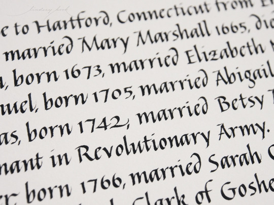

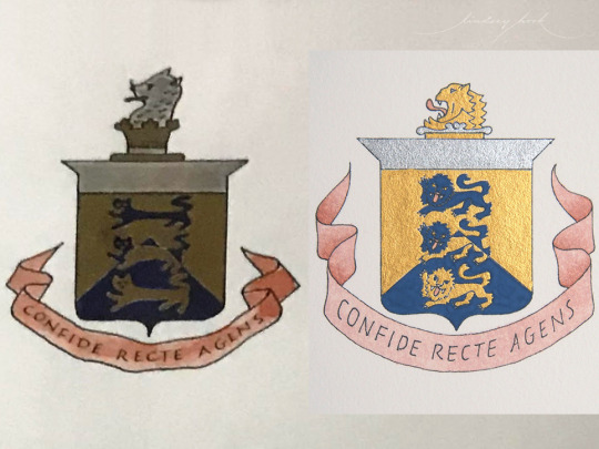
One of side effects of covid season has been having the time to take on projects I might have had to turn down in past years. This piece was for a lovely couple who wanted to recreate a gift they received on the occasion of their wedding to give to their daughter on the occasion of her wedding. We tweaked the crest a bit (swipe to see a side-by-side with the original). Aside from that they wanted to reproduce the existing document as closely as possible, so I matched the size, script and line spacing as closely as I could. Mimicking another calligrapher’s italic was an interesting (and fun) challenge. I think the hardest part was having to totally break away from the pointed pen muscle memory that I can usually let come through a bit when I’m just doing my own basic italic. I think one of my goals is to get really comfortable with broad edge nibs again, and totally separate out the different types of movement in my head/hand. Doing the bit of painting for the crest was also a really nice flashback. It felt good to have a brush in my hand again 😊
I used gouache for everything except the line work in the crest, which was done with platinum carbon black ink using a 3776 pen with a uef nib (huge thanks to Gordon (@pen.swordsman) for the uef, it’s perfect for things like this where I don’t want any line variation 🙏
#italiccalligraphy#italicscript#calligraphy#chicagocalligrapher#wedding gift#weddinginspo#familyhistory#genealogy#lineage#familycrest
12 notes
·
View notes
Photo
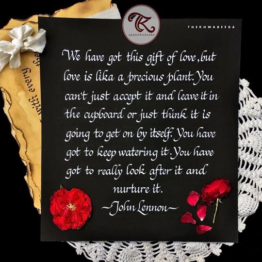
We've got this gift of love, but love is like a precious plant. You can't just accept it and leave it in the cupboard or just think it's going to get on by itself. You've got to keep watering it. You've got to really look after it and nurture it. -John Lennon . Script- Italics . . . . . . . . . #thekhwabeeda_ #frameshade #typeofindia #theuncommonbox #italicscript #italiccalligraphy #letteringpractice #calligraphyhub #fearlessflourishing #kaligrafi #calligraphersinindia #indianpenmanship #letteringleague #calligraphylove #calligraphyaddict #thedailycalligraphy #typographyinspired #powertothepen @calligraphy_supreme @indianpenmanship #lettering_daily #calligraphymasters #potpourriofartists #thegoodtype #indiancalligraphers #handmadefont #letteringcommunity #calligritype #fireinme #youaredoinggreat #huffpostgram #copperplatecalligrapy https://www.instagram.com/p/CBj-LteDv5j/?igshid=756muilgjxsu
#thekhwabeeda_#frameshade#typeofindia#theuncommonbox#italicscript#italiccalligraphy#letteringpractice#calligraphyhub#fearlessflourishing#kaligrafi#calligraphersinindia#indianpenmanship#letteringleague#calligraphylove#calligraphyaddict#thedailycalligraphy#typographyinspired#powertothepen#lettering_daily#calligraphymasters#potpourriofartists#thegoodtype#indiancalligraphers#handmadefont#letteringcommunity#calligritype#fireinme#youaredoinggreat#huffpostgram#copperplatecalligrapy
1 note
·
View note
Photo

Even though 4K is the real deal these days 😄. Happy New Year people . #newyear #happynewyear #2018 #italic #italicscript #calligrafia #calligraphy #pilotpen #pilotparallelpen #pilotparallel #calligraphymasters #differentype #typography #typism #thedailytype #designspiration #typegang #typeriot #typeyeah #instatype #handwriting #handlettering #Falligraphy (at Budapest, Hungary)
#newyear#differentype#typeriot#calligraphy#handwriting#thedailytype#pilotparallel#instatype#designspiration#falligraphy#2018#typeyeah#calligrafia#happynewyear#typegang#calligraphymasters#italicscript#handlettering#italic#typography#pilotparallelpen#typism#pilotpen
11 notes
·
View notes
Photo

Glory Our greatest glory is not in never falling, but in rising every time we fall. . . Script : Gothicized Italic Material used :- -Tape nib 4mm -140 GSM Textured paper -Photo colour Camlin Ink . . For more calligraphy @zahidakram99 . #zahidcalligraphy #zahidartsandcalligraphy #theartisticrevolution #calligraphy #indiancalligraphy #italicscript #50words #calligraphymasters #handlettering #handletteringpractice #calligraphypractice #calligraphyvideo #typography #calligraphygang #letteringart #calligraffti #lettering #kaligrafi #artistsoninstagram #gothisizeditalic #handmadefont #italiccalligraphy #gothiccalligraphy #handtype #globallettering #indianpenmanship #oldenglish #calligraphyindia #artoftype #hyderabadartists . . @calligraphymasters @calligraphy_daily_ @calligraphygang @thecalligraphyhub @lettering_daily @calligraphyvideo @type.gang @typematters @typespire @typespot @crafts.feed @artistocratia @typetopia @designspiration @ligaturecollective @surelysimplechallenge @goodtype @type_matters @typeyeah @typism @theinkpotfiles @50wordsongrey (at Hyderabad, Telangana, India) https://www.instagram.com/p/CCUDfY2l74A/?igshid=tzss6vhu7je2
#zahidcalligraphy#zahidartsandcalligraphy#theartisticrevolution#calligraphy#indiancalligraphy#italicscript#50words#calligraphymasters#handlettering#handletteringpractice#calligraphypractice#calligraphyvideo#typography#calligraphygang#letteringart#calligraffti#lettering#kaligrafi#artistsoninstagram#gothisizeditalic#handmadefont#italiccalligraphy#gothiccalligraphy#handtype#globallettering#indianpenmanship#oldenglish#calligraphyindia#artoftype#hyderabadartists
0 notes
Video
instagram
#calligraphy #caligrafia #italic #handwriting #italicscript #italichand (em Porto, Portugal)
3 notes
·
View notes
Photo

Calligraphy practice and bemoaning my lack of electricity... If it doesn't come back on soon I'm going to have to go to Starbucks just to stay warm. The good news I didn't start laundry this morning so my sweatshirts aren't trapped in a soggy washing machine waiting for electric salvation. #calligraphy #calligrapher #italicscript #ink #nib #poweroutage #coldoutside #firstworldproblems #ZaydaliciousDesigns #Zaydalicious #pnwartist #itsnowedyesterday
#calligraphy#itsnowedyesterday#calligrapher#poweroutage#nib#pnwartist#zaydaliciousdesigns#zaydalicious#coldoutside#firstworldproblems#ink#italicscript
9 notes
·
View notes
Photo

Glimpse from the beautiful Italics Calligraphy Workshop at Urja Studio Cafe over the weekend #italicscript #calligraphyartist #learncalligraphy #whatsuppune #artistinpune #calligraphypune #whatshotinpune (at Urja Studio Cafe) https://www.instagram.com/p/B0wBPsCJZRJ/?igshid=1egdw2cdiov5o
#italicscript#calligraphyartist#learncalligraphy#whatsuppune#artistinpune#calligraphypune#whatshotinpune
0 notes
Photo

#calligraphyvietnam #calligraphy #italicscript #italicmixcopperplate #gianhuminhdungyeunhau #giánhưmìnhđừngyêunhau (tại Cao Lãnh) https://www.instagram.com/p/B0FH3tVnLJP/?igshid=mf83avc51jvr
#calligraphyvietnam#calligraphy#italicscript#italicmixcopperplate#gianhuminhdungyeunhau#giánhưmìnhđừngyêunhau
0 notes
Photo

I upgraded my study today. Couldn't believe this huge desk actually fit 😁🖋🖋 will it be any more tidy? Probably not lol . . . . . . #office #officedecor #study #calligraphylove #calligraphy #copperplate #fountainpen #workspace #whisky #whiskey #desksetup #pointedpen #pointedpencalligraphy #italicscript #italics #alreadymessy (at Wodonga, Victoria) https://www.instagram.com/p/ByMXjAJFALQ/?igshid=1gvqzyr1ch03y
#office#officedecor#study#calligraphylove#calligraphy#copperplate#fountainpen#workspace#whisky#whiskey#desksetup#pointedpen#pointedpencalligraphy#italicscript#italics#alreadymessy
0 notes
Photo

Colors playing #italicscript #calligraphy #italic #dippen #handwriting #lettering #西洋書法 #英文書法 #義大利體 #手寫字 #書字漫
9 notes
·
View notes
Photo

Weloveitaly 3 Napoli #italico #italicscript #italic #cancelleresca #calligrafia #calligraphy #calligraphygang #calligraphymasters #keepwriting #calligraphyitalia (presso Rome, Italy)
#keepwriting#italic#calligraphygang#calligraphymasters#calligraphyitalia#calligraphy#cancelleresca#calligrafia#italico#italicscript
0 notes
Text


Italic script on more @craneandco #lettra envelopes in pearl white with @kuretakezig_usa sumi ink. It’s always fun doing envelopes that will travel across oceans to far off destinations ✉️ 📮🛫🌊🛬📬😊
That raking sunlight tho...🌞
Seriously love the sparkle of that gummy sumi sitting up on top of the paper fibers 🖤
#calligraphy#italiccalligraphy#italicscript#chicagocalligrapher#weddinginspiration#weddingcalligraphy#envelopes#envelopecalligraphy#outerenvelopes#weddingwednesday#destinationwedding#dailydoseofpaper#chicagowedding#weddingdetails#weddinginvites#luxurywedding#craneandco#lettra#kuretake#sumiink
24 notes
·
View notes
Photo
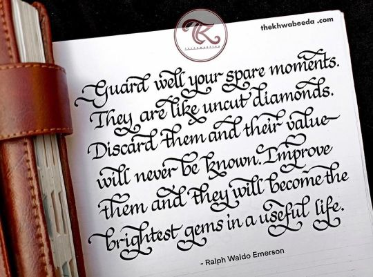
Guard well your spare moments. They are like uncut diamonds. Discard them and their value will never be known. Improve them and they will become the brightest gems in a useful life. - Ralph Waldo Emerson . Italic Calligraphy with Flourishes✨ . I have recently started practicing this style of Italics. And I am already in love with this. I hope you all like it too as much as I do! . Have a good evening ✨😊 . . . . . . . #thekhwabeeda_ #flourishlettering #flourishpositivity #flourishing #flourishforum #flourishconfidently #flourishes #italiccalligraphy #italic #italicscript #italics #italicflourish #calligraphylettering #calligraphyart #artoftheday #artistsoninstagram #artphotography #artstagram #artista https://www.instagram.com/p/CHSnx97HzSt/?igshid=15dcnqw2ca82a
#thekhwabeeda_#flourishlettering#flourishpositivity#flourishing#flourishforum#flourishconfidently#flourishes#italiccalligraphy#italic#italicscript#italics#italicflourish#calligraphylettering#calligraphyart#artoftheday#artistsoninstagram#artphotography#artstagram#artista
0 notes
Photo

Ain’t nobody got time for that . #italic #italicscript #calligrafia #calligraphy #pilotpen #pilotparallelpen #pilotparallel #where #calligraphymasters #differentype #typography #typism #thedailytype #designspiration #typegang #typeriot #typeyeah #instatype #handwriting #handlettering #Falligraphy
#italic#typography#pilotparallelpen#handlettering#calligraphy#italicscript#pilotpen#calligraphymasters#typegang#typeriot#falligraphy#differentype#pilotparallel#typism#where#typeyeah#thedailytype#calligrafia#designspiration#handwriting#instatype
20 notes
·
View notes