#LessIsMore
Explore tagged Tumblr posts
Visit Tumblr Blog
Explore Tumblr blogs with no restrictions, modern design and the best experience.
Last Seen Tumblr Blogs


Fun Fact
Users from the US are the majority of Tumblr visitors.
Text

November 2023
#noseysilverfox#photography#minimalism#nature#tree#pine trees#naturecore#mountains#field#autumn themed#autumn#landscape photography#landscape#love nature#nature photography#autumn photography#sunsetlovers#beautiful views#naturelovers#minimal photography#lessismore#photooftheday#природа#фотоблог#турумбочка#пейзаж#минимализм#осенний пейзаж#осень#фотографии природы
109 notes
·
View notes
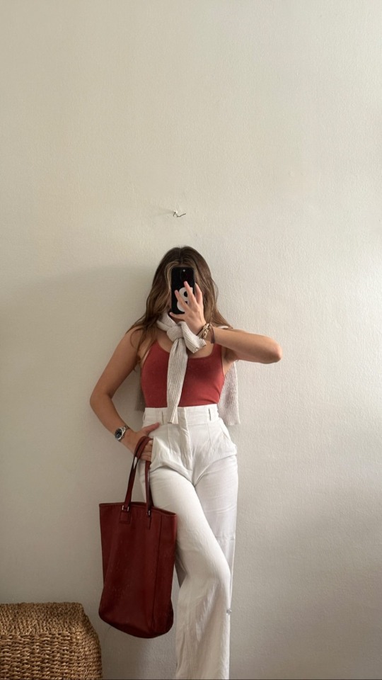
Text
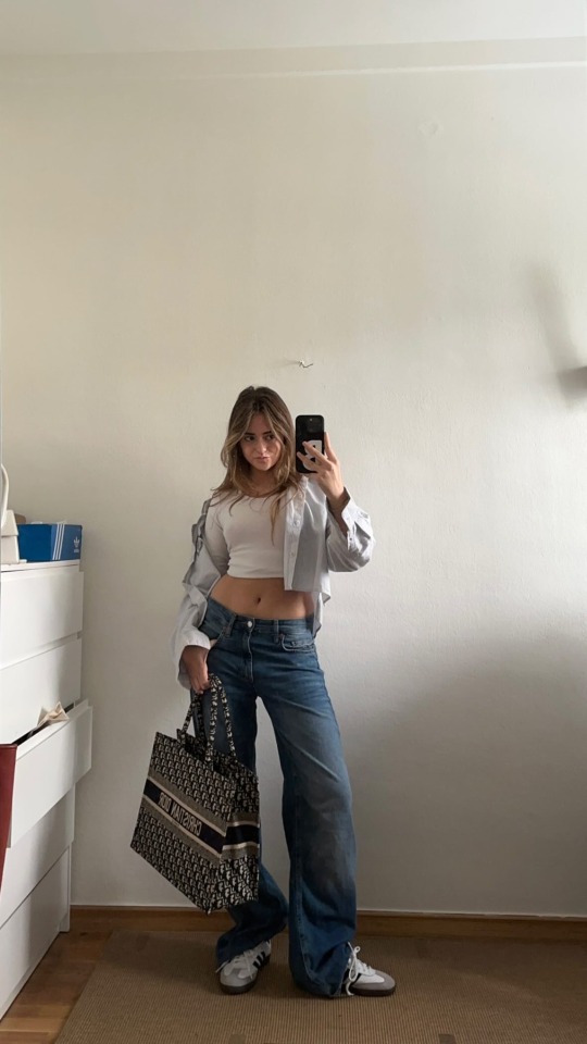
Quick (fall) outfit
#capsulewardrobe#ootd#slowfashion#sustainablefashion#fashion#capsulecloset#style#minimalstyle#minimalism#k#ethicalfashion#outfitoftheday#outfitinspiration#fashionblogger#minimalfashion#discoverunder#personalstylist#outfitinspo#neutralstyle#minimalist#smallbusiness#styleinspo#fashionstyle#capsule#outfitideas#streetstyle#lessismore#minimaliststyle#minimalistwardrobe#shopsmall
9 notes
·
View notes
Text
Find 140 short beauty captions for Instagram—perfect for selfies, glow-ups, and glam moments in just a few flawless words.

View On WordPress
#BeautyEdit#BeautyInSimplicity#BeautyMood#BeautyPop#EffortlessBeauty#FaceOfTheDay#FlawlessAndFab#FOTD#GlamInWords#GlowGoals#GlowUpVibes#InstaBeauty#LessIsMore#MakeupMoments#QuickCaptions#RadiantLook#SelfieGame#ShortBeautyCaptions#SkinGoals
3 notes
·
View notes
Text
Minimalist Jewelry: Less Is More ✨💎

In the world of jewelry, sometimes less truly is more. Minimalist jewelry has become a favorite for many, offering sleek, elegant designs that make a statement without being overwhelming. It’s all about clean lines, subtle details, and timeless beauty. Here’s why minimalist jewelry should be a staple in every jewelry collection. Is sterling silver real🌿
1. Effortlessly Chic 🌟
Minimalist jewelry embraces simplicity while still making an impact. A delicate necklace, dainty rings, or a pair of small hoop earrings can complete any look with ease. Whether you’re dressing for a casual day or a formal event, minimalist pieces add that perfect touch of sophistication without taking the spotlight. 💖
2. Versatile for Every Occasion 🗓️
One of the best things about minimalist jewelry is its versatility. These subtle, elegant pieces can be worn every day, and they never feel out of place. Whether you’re wearing a work outfit, heading to brunch with friends, or going to a formal evening event, minimalist jewelry complements your look effortlessly. It’s the perfect balance of elegance and simplicity. 💫
3. Easy to Layer and Stack 🌀
Minimalist jewelry is perfect for layering and stacking. A simple gold chain can be paired with a few delicate rings or stacked bracelets for a more personalized look. The beauty of minimalist pieces lies in their ability to be mixed and matched, creating a unique style that feels all your own. 🌸
4. Timeless and Elegant ⏳
Unlike trends that fade, minimalist jewelry never goes out of style. Its timeless designs make it the perfect investment for your jewelry collection. A simple bar necklace, tiny studs, or a thin band ring will always be in fashion, ensuring your pieces can be worn for years to come without ever feeling outdated. ✨
5. Sustainable and Thoughtful 🌍
Minimalist jewelry often uses high-quality materials that last, which means you're investing in pieces that will stand the test of time. Many minimalist designers also focus on sustainability, using ethically sourced materials and reducing waste, making these pieces both beautiful and eco-friendly. 🌱
Minimalist jewelry proves that you don’t need to go over the top to make a statement. With its timeless elegance, versatility, and simple beauty, it’s the perfect choice for anyone who loves a clean, sophisticated look. Sometimes, less truly is more. ✨
#MinimalistJewelry#LessIsMore#ElegantSimplicity#TimelessStyle#JewelryLovers#MinimalStyle#EffortlessChic#JewelryGoals#SimpleElegance#SustainableJewelry
3 notes
·
View notes
Text
There’s a reason you stop reading halfway through most emails. Our brains crave simplicity, not clutter. This article dives into the psychology of effective email writing—and how using less can actually say more.
2 notes
·
View notes
Text
Silence is better than explaining.
#actionsnotwords#somethingsarebetterleftunsaid#speakthroughactions#meaningfulsilence#comfortablesilence#contemplativesilence#silentwisdom#innerpeace#introvert#pensive#mysterious#cryptic#enigmatic#readingbetweenthelines#stopoverexplaining#lessismore#showdonttell#liveauthentically#quietconfidence#stoic#philosophical#mindful#reflective#meditative
34 notes
·
View notes
Video

flickr
#grain#grainisgood#scape#seascape#surf#sea#sky#horizon#sunrise#abstract#abstraction#less#lessismore#minimal#minimalistic#serenity#tranquility#vastness#vast#void#stillness#calmness#mood#flickr
3 notes
·
View notes
Text

Discover the power of Minimalist Design with MyBrandE Logo Maker! Less is more—create logos that speak volumes with simplicity and precision. Elevate your brand with clean, impactful designs that leave a lasting impression. ✨🎨
#minimalistdesign#lessismore#LogoPerfection#mybrande#simplicityindesign#minimalistlogo#creativebranding#modernlogos#ElegantDesign#brandidentity#cleandesign#designinspiration#VisualImpact#branding#entrepreneurship#logodesigner#logo#logomaker#brand#entrepreneur#smallbusinessbigdreams#business#startup
2 notes
·
View notes
Text


Minimalist Fashion Design Ideas
In the fast-paced fashion world, where trends often come and go, minimalism has carved out a niche that transcends seasonal fads. Characterized by simplicity, clean lines, and neutral colors, minimalist fashion focuses on "less is more," delivering timeless, functional, and aesthetically pleasing designs. However, while minimalist fashion may appear effortless, it requires a strategic approach to branding and communication—enter graphic design. In this post, we’ll delve into minimalist fashion design, explore how graphic design can elevate minimalist fashion, and provide actionable insights for both fashion and graphic designers.
The Rise of Minimalist Fashion Design
Minimalist fashion is all about stripping away excess and focusing on what truly matters: simplicity, quality, and functionality. Over the years, it has become synonymous with timeless style, as minimalism avoids passing trends in favor of versatile, long-lasting designs. This movement is particularly popular among consumers who seek to declutter their wardrobes and invest in fewer, higher-quality pieces.
Let's Dive into the details of Minimalist Fashion
#minimalistfashion#FashionDesign#TimelessStyle#LessIsMore#NeutralPalette#SustainableFashion#CleanDesign#MinimalistStyle#ChicAndSimple#CapsuleWardrobe#WardrobeEssentials#GraphicDesign#EffortlessStyle#FashionInspiration#QualityOverQuantity#ModernDesign
2 notes
·
View notes
Text
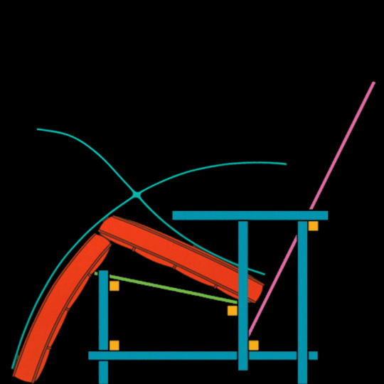
Contrasting Comfort: The Ideological Chairs of Mies van der Rohe and Gerrit Rietveld
Mies van der Rohe and Gerrit Rietveld were influential architects whose philosophies and designs epitomize contrasting ideologies within modernist architecture. While both sought simplicity and functionality in their work, their approaches diverged in their interpretation of comfort, aesthetics, and the relationship between architecture and the individual.
Mies van der Rohe, known for his famous Barcelona Chair, embraced the mantra of "less is more" and prioritized clean lines, open spaces, and industrial materials. His designs, influenced by the principles of Russian Constructivism, aimed for efficiency and minimalism. The Barcelona Chair, with its sleek lines and luxurious comfort, embodies Mies' philosophy of modernism, where form follows function, and every element serves a purpose. It reflects his belief that true comfort arises from simplicity and clarity in design.
On the other hand, Gerrit Rietveld, exemplified by his Red and Blue Chair, challenged conventional notions of comfort and aesthetics. As a member of the De Stijl movement, Rietveld advocated for pure abstraction and universality in design, reducing compositions to geometric forms and primary colors. The Red and Blue Chair, with its hard surfaces and bold colors, defied traditional notions of comfort, inviting the sitter to engage with space, color, and form. Rietveld's philosophy emphasized the awakening of consciousness and the integration of art into everyday life.
In comparing the two chairs, the Barcelona Chair represents a sleek and luxurious approach to comfort, prioritizing relaxation and ease, while the Red and Blue Chair challenges the sitter to be alert and engaged, emphasizing the relationship between the individual and the environment. Mies' philosophy of "less is more" contrasts with Rietveld's belief in the dynamic equilibrium of opposites, reflecting differing attitudes towards simplicity, comfort, and the role of architecture in shaping human experience.
Overall, the ideologies of Mies van der Rohe and Gerrit Rietveld manifest in their respective chairs, showcasing contrasting approaches to modernist design. While both architects sought to create meaningful and functional spaces, their interpretations of comfort and aesthetics diverged, reflecting broader debates within the architectural discourse about the purpose and meaning of design in the modern world.
#ArchitecturalChairs#DesignPhilosophy#ModernismVsDeStijl#RietveldVsMies#ComfortInDesign#AestheticRealism#DeStijlMovement#LessIsMore#BarcelonaChair#RedAndBlueChair#architecturalideologies#architecture#berlin#area#london#acme#chicago#puzzle#edwin lutyens#massimoscolari#oma
3 notes
·
View notes
Text
Every Day is Earth Day 🌎


#reduceyourcarbonfootprint#earthday#protectmotherearth#lessismore#thriftshopping#saynotoplastic#reusabletotes#detroit#midtowndetroit#nature#carfree#walkingdetroit
5 notes
·
View notes
Text
Capsule wardrobe
#capsulewardrobe#ootd#slowfashion#sustainablefashion#fashion#capsulecloset#style#minimalstyle#minimalism#k#ethicalfashion#outfitoftheday#outfitinspiration#fashionblogger#minimalfashion#discoverunder#personalstylist#outfitinspo#neutralstyle#minimalist#smallbusiness#styleinspo#fashionstyle#capsule#outfitideas#streetstyle#lessismore#minimaliststyle#minimalistwardrobe#shopsmall
8 notes
·
View notes
Text

Unclutter your sanctuary with these exquisite 5 items you simply don't need adorning your divine abode. Embrace simplicity and let your home's true beauty flourish.
0 notes
Text
The Unspoken Advantage: Why Choosing Fewer Words Can Say More
In a world that often feels saturated with noise, where opinions fly fast and the pressure to speak up is constant, I’ve found myself embarking on a rather counter-cultural journey: learning the profound value of silence and the quiet grace of humility. It’s an intentional shift, a conscious decision to not always fill the airwaves, but instead, to listen more intently to the world and, perhaps…
#ChooseYourWords#ConsciousLiving#Humility#InnerPeace#IntrovertPower#LessIsMore#ListenMore#mindfulness#MindfulSpeaking#PersonalGrowth#PowerOfSilence#QuietStrength#SelfReflection#SilentObserver#ThoughtfulCommunication
0 notes
Text
Exploring the Beauty of Black and Grey Realism Tattoo Art 🖤🩶
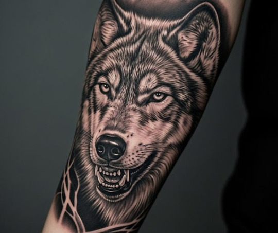
Ever seen a tattoo that just... stops you? No bright colors screaming for attention, no flashy designs. Just pure, undeniable realism, etched in shades of black and grey. That, my friends, is the silent power of black and grey realism.
Most people think "no color" means "less." Less drama, less effort. Cute. 😉
The truth is, black and grey realism isn't about lacking color; it's about not needing it. It's an optical illusion that takes surgical precision and ice-cold control to pull off. No bright hues to hide behind. No shortcuts. Just shadow, skin, and one chance to make it breathe. And oh, does it breathe.
Why are these pieces so captivating?
Imagine a portrait where every pore, every wrinkle, every emotion is captured with breathtaking accuracy. Or a wildlife piece where you can almost feel the texture of fur or the gleam in an animal's eye. That's the magic. Realism tattoos aim for precision so intense, it makes you blink twice. It's about making something look like it could literally exhale.
These aren't your typical illustrative tattoos with bold outlines and simplified forms. Black and grey realism replicates. It's less "cool design, what does it mean?" and more "holy sh*t, is that a photograph?!" 🤯
A Quick Dip into History (and Why It's So Dope):
Believe it or not, this hyper-precise style was born out of restriction. Think East LA, 1970s. Tattoo machines cobbled together from typewriter motors. Ink improvised from whatever was available – mostly black. To get "grey," artists just diluted it with water. Raw. Resourceful. And from those humble beginnings came a visual language built on contrast, shape, and pure soul. Talk about making something epic out of nothing!
What makes a truly next-level black and grey realism tattoo?
Obsessive Detail: Every single dot, every subtle fold of skin, every glint in an eye. It all matters.
Shading is Structure: This isn't just about soft gradients. It's about believable dimension – muscle, bone, gravity.
Surface Imitation: Whether it's fur, rusted chrome, or shattered glass, it should feel like you could reach out and touch it.
(Another eye-catching image/GIF of a healed black and grey realism tattoo, perhaps showing texture)
The Longevity Factor:
Let's be real, color tattoos fade over time. It's just how pigment works. But black and grey? These inks hold up like champs. They mellow naturally, looking intentional even years down the line. If you want timeless, this is your jam.
Choosing Your Artist: No Shortcuts Here!
This is HUGE. Don't just pick anyone who says they "do realism." Look for a specialist. Someone whose portfolio is packed with examples of stunning, healed black and grey realism. They should be able to show close-ups and demonstrate consistent light sources and true likeness.
A great artist won't just say "yes" to everything. They'll push back, ask questions, explain what works and what doesn't. That's how you know you're getting a customized tattoo experience that's truly worth it.
Black and grey realism tattoos aren't trying to grab attention. They earn it. Quietly. With precision, mood, and a restraint that somehow says more than a dozen colors ever could.
Thinking of getting one? Dive deep, do your research, and find an artist who speaks this incredible visual language fluently. You won't regret it.
This article is first published on Here!
#blackandgreyrealism#tattooart#realismtattoo#inked#tattooinspiration#artistspotlight#lessismore#tattooideas#blackwork#customtattoo#bodyart#burnedheartstattoo#ink#ohiotattoo#ohiotattooshop#tattoo#tattooinspo
0 notes
Text
People aren’t ignoring your pitch because they’re not interested. They’re ignoring it because it asks too much. TDZ Pro makes every message lighter.
#TDZPro#clientbehavior#emailpsychology#salesfix#lessismore#smartemailing#salesconversion#messagingthatworks#inboxstrategy
1 note
·
View note