#PB16
Text
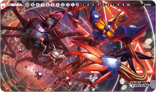
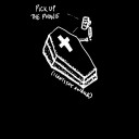
Tamer Goods Set Diaboromon [PB16] Playmat by Spareribs


Armageddemon BT5-085 and Diaboromon Ace P-114 Alternative Arts by Spareribs from PB-16 Tamer Goods Set Diaboromon

Diaboromon Token by sasasi from the PB-16 Tamer Goods Set Diaboromon
#digimon#digimon tcg#digimon card game#digisafe#digica#デジカ#Diaboromon#Aramgeddomon#Spareribs#sasasi#PB16#digimon card#token#Lv6#color: white#color: black#ace digimon#AA#type: unknown#trait: unidentified#num: 03
71 notes
·
View notes
Text
Colors!
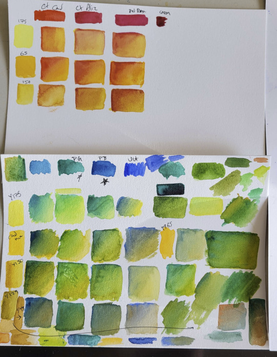
My thumb's been fucked up by a steroid shot to the point where I can't hold a pen to draw, but the light touch of a watercolor brush is mostly okay, and I had dot cards for Daniel Smith and DaVinci paints, so I've spent the last few weeks unleashing my manic color goblin.
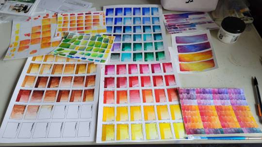
Friends, I've painted so many happy little rectangles. And it has been a journey.
I've found that one of the most-referenced sources for pigment lightfastness is a hard-coded website straight out of the 90s that also talks about UFOs and human evolution. (I don't know what the guy says about human evolution, because I'm afraid to find out, but it makes me very happy that a site like that still exists).
I've learned you can make lovely purples with a cool red and phthalo green, which actually MAKES SENSE, I GUESS, but is still a bit weird and awesome even though I understand the color theory.
I've painted with the Danger Colors.
(Cobalt, manganese, chromium, and cadmium. DO NOT LICK).
I've finally spelled phthalo often enough that I can remember it!
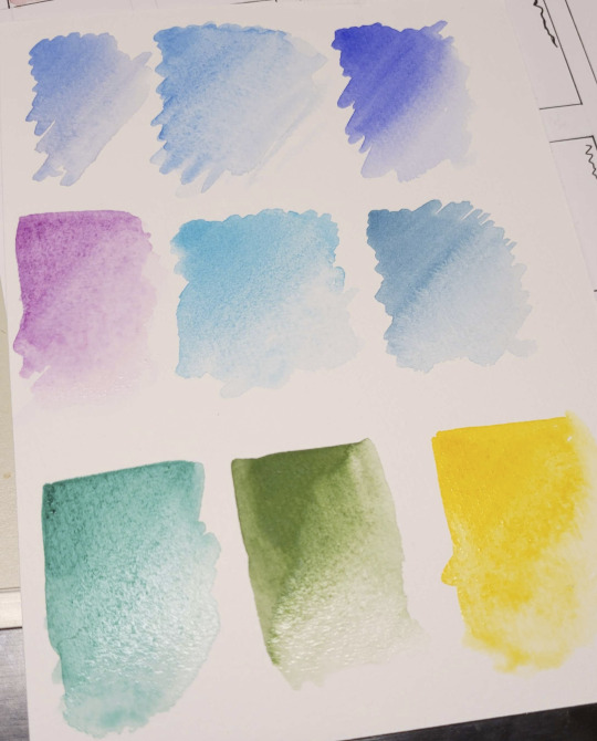
And I've fallen deeply, desperately in love, then had my heart broken.
It's name was DaVinci Phthalo Turquoise (pigment code PB16). When I painted it out it was beautiful; smoothly flowing into a perfect fade, the deepest, most inviting pool of cool, saturated perfect teal. I burst into song. A choir of angels descended to sing backup vocals. I never used to believe in love at first sight, but I was wrong.
...then it dried.
It dulled so much. It was still fine. Nothing special, but fine. Whatever. I'm over it. I am a strong, independent artist. I don't need that kind of negativity in my life.
There's still all the other colors. Colors that didn't betray me. Much.
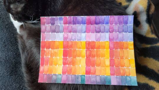
Here, Monkey is helping model the last swatch tests, which helped me choose which cool red to buy. The phone doesn't capture all the nuance, but they also started out fairly close. (I went with column 3, DaVinci's PV19 quinacridone rose madder).
So... if you're one of those tenacious, patient people who follows my fic, and you've been wondering why I haven't posted, I suppose I really just have one thing to say:
Colors go brrrrrrrrrrrrrr.
#watercolor#pigments#painting#color swatches#so many colors#so satisfying to line them up in rows#colors go brrrrr#Shades makes art#?#traditional art#danger colors#mmmm cobalt
31 notes
·
View notes
Note
What are the most important colours in a watercolour case? (Feel free to infodump beyond this question, please)
Hello, that all depends on your subject matter and how you like to paint! Are you going to be painting portraits so need some easy ways to mix a wide range of skin tones? Are you a landscape painter who enjoys having a few convenience greens and browns on their palette? Do you like your paints to granulate, or be easily liftable, or be excellent at glazing/staining? And when will you be using the palette - is it a small travel-sized one where you've got to be quite economical with the paints you choose, or is it a larger palette for use at the studio or at home? Is lightfastness a concern for you?
When I'm building a palette though, I base it around a split-primary palette — so a warm and cool version of each colour. This plus at least one earth colour (burnt sienna or burnt umber) and one convenience neutral (paynes gray or neutral tint) are probably the most important things to have in your watercolour collection in my opinion, especially if you're wanting to focus on colour mixing!
So my basic 8-colour palette would be something like:
cool (greenish) yellow: maybe hansa yellow light, or if like me you're not a big fan of regular yellows, a PY129 (often called green gold or rich green gold) is almost green in masstone but diluted to a lovely and functional cool yellow
warm (orangey) yellow: my favourite would be a quinacridone gold hue - either Schmincke (PR101 + PY150) or Daniel Smith or Roman Szmal (both PY150 + PO48) since they're a slightly earthier but vibrant orangey-yellow, but any warm yellow will do! Other common alternatives are new gamboge, hansa yellow medium, etc
warm (orangey) red: my absolute favourite currently is a PR255 (Daniel Smith pyrrol scarlet or Schmincke vermillion), but other common alternatives include cadmium red light (or cad red light hue), or any slightly orange-leaning red you can get your hands on
cool (purpley) red: a common choice here is a quinacridone rose PR122 or PV19, particularly if you'd be doing botanical painting, but my favourite is a PR254 pyrrol red - a postbox or fire engine red, so not particularly cool, but I really enjoy it with the quin gold in skintone mixes. Another option could be to have a middle red such as this AND a cool pinky-red on your palette.
warm (purpley) blue: the obvious choice for this one is an ultramarine PB29, a colour I think pretty much every watercolourist owns. This is a granulating pigment, but some brands such as Schmincke also offer a less-granulating version (Schmincke ultramarine finest) if you're wanting a smoother colour, or a French ultramarine for heavy granulation. I have both on my palette for different purposes.
cool (greenish) blue: the most common choice is a phthalo blue green shade PB15:3, but I much prefer the slightly cooler phthalo turquoise PB16 (Schmincke helio turquoise) - partly because I enjoy the colour and partly because it neutralises with my warm red PR255 beautifully. If you've gone for a cadmium red light as your warm red, try a cerulean as your cool blue to neutralise and match the cadmium's softness.
brown earth colour: I use this to neutralise with ultramarine and make a beautiful soft black, so my choice would be burnt umber, but burnt sienna works just as well (and is possibly more versatile)! Try and get either of these as a PBr7 pigment if you haven't already, as they tend to have the richest colours and cleanest mixes. Other options could be a quinacridone burnt orange PO48 (which I also have on my palette) , or an Indian/Venetian/English Red PR101, but see which neutralises best with your warm blue. A brown earth is also very useful for mixing darker skin tones, so bear that in mind when choosing.
neutral colour: this is a convenience (multiple-pigment, ready mixed) dark neutral colour that can be used to darken other mixes and in place of black. It's also great for monochromatic studies! Sure you can mix your own with ultramarine and burnt sienna/umber, but I get through a Lot of it so it makes sense for me to have a ready mixed version. Common options are paynes grey (a blue-leaning dark grey), or neutral tint (more neutral of course), but on my main palette I just mixed ultramarine finest and burnt umber together in one well to get my own custom mix. A thing to decide here is if you'd like your neutral dark colour to granulate or not!
These are my personal palette essentials, but everyone is different, so the best thing is to test things out and see what works.
Other resources:
I have a short (but continually growing) YouTube playlist on palette building that could be useful too, and Kim Crick has a great feature on essential colours on her pigment database here which I find very useful.
I hope this is of at least a little use!
#long post#art tips#watercolour tips#not art#ask#supplies#thank you for asking! this is only scratching the surface tbh
15 notes
·
View notes
Photo
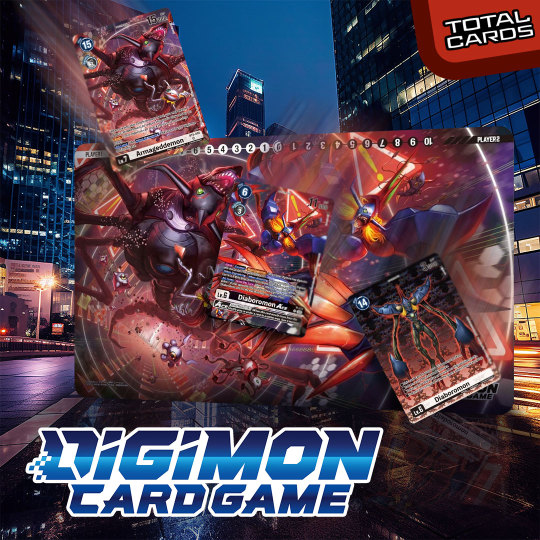
Digi-volve your accessories with this epic Tamers Goods Set featuring the awesome Diaboromon! Place your order now on our site! #digimon #digimoncardgame https://www.totalcards.net/digimon-card-game-tamers-goods-set-diaboromon-pb16?utm_source=tumblr&utm_medium=organic+social
0 notes
Text
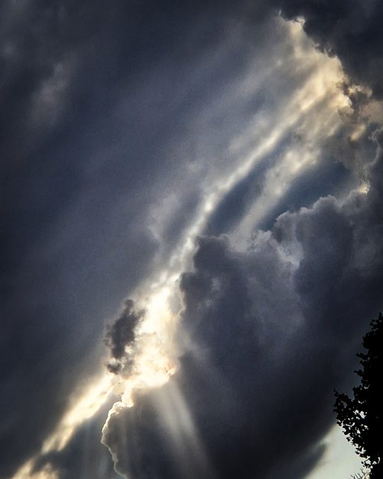
#CloudWriter #Cloudshapes. Day Sixteen. What shapes can you see? What stories are developing in these cloud photos by Julian Day, Gaynor Kane and I? You may contribute your own cloud photos and/or videos as inspiration. Writers and artworkers have been fascinated by clouds and what they see in them for centuries. This challenge features three different cloud shapes a day for thirty days. You may respond to one, two or all three photos. Could you write on the day you saw the photos and email your drafts to me, with a short, third person bio?
#CloudWriter #Cloudshapes. Day Sixteen. What shapes can you see? What stories are developing in these cloud photos by Julian Day, Gaynor Kane and I? You may contribute your own cloud photos and/or videos as inspiration. Writers and artworkers have been fascinated by clouds and what they see in them for centuries. This challenge features three different cloud shapes a day for thirty days. You may respond to one, two or all three photos. Could you write on the day you saw the photos and email your drafts to me, with a short, third person bio?
JD16
Kane16
PB16
View On WordPress
0 notes
Text
Yo solo espero el día en que vuelvas para mirarte a los ojos y decirte que ya no te quiero.
-SEL
43 notes
·
View notes
Photo

Today’s color of pigment fact Friday, full on my feed! PB16 aka Phthalo Blue turquoise! Also soon availible in my shop! #handmadewatercolors #handmadeartsupplies #artsupplies #handmadepaint #makingcolors #handmade #watercolor #art #paint #artistquality #pure #color #pb16 #bright #turqoise #deep #phthaloblue #lightfast #pruissian #beautiful #artisan #etsy #watercolorpainting #gumarabic #granulatingwatercolor #watercolorlove #watercolorpalette #watercolor_daily #pigment (bij Dirty Blue) https://www.instagram.com/p/CQQ5uwdrKR_/?utm_medium=tumblr
#handmadewatercolors#handmadeartsupplies#artsupplies#handmadepaint#makingcolors#handmade#watercolor#art#paint#artistquality#pure#color#pb16#bright#turqoise#deep#phthaloblue#lightfast#pruissian#beautiful#artisan#etsy#watercolorpainting#gumarabic#granulatingwatercolor#watercolorlove#watercolorpalette#watercolor_daily#pigment
0 notes
Text
My “personal palette” - Gouache Experiments
I bought a limited "personal palette" of gouache paints. Here's how it went!
Grackle nest with three eggs: Gouache on Paper
A couple of months ago, I finally took the plunge and bought myself some gouache paints. Although in general I love the delicacy and glazing properties of transparent watercolour, there are some subjects where the opacity and flatter finish of gouache (opaque watercolour) are preferable. I decided to use this opportunity of starting in a new…
View On WordPress
#color mixing#color palette#gamut mapping#Gouache#indian yellow#limited palette#muted color#muted colours#opaque watercolor#opaque watercolour#painting#PB16#personal palette#phthalo turquoise#pigments#PR122#purple magenta#py153#review#schmincke horadam
1 note
·
View note

Text
god im really hoping this will not be the case, but pb16 Might be a couple of days late... combo of Really Bad Period Cramps and Stupidly Long Migraines have knocked me OUT the past week or two and im 😒😒😒 about it >:C
13 notes
·
View notes

Text
Abbaye Neumunster in Luxembourg. Painted with PY150, PR122 and PB16. #virtualsketch #googlestreetview #uskluxembourg #luxembourg #watercolour #sketch #schminckewatercolor
6 notes
·
View notes
Text
Creative Funny Plastic Boxing Pen for Children TK-BP16
Have fun when you are writing!
Animal shaped plastic boxing pen, very funny for children.
These pens are very hot sale as promotional gift.
visit:https://www.tskygifts.com/pen/creative-funny-plastic-boxing-pen-for-children-tk-pb16

1 note
·
View note
Photo

best ab stimulator on amazon : ComfyMed® Posture Corrector Clavicle Support Brace CM-PB16 Medical Device to Improve Bad Posture, Thoracic Kyphosis, Shoulder Alignment, Upper Back Pain Relief for Men and Women (LGE 41″ to 47″ Chest) https://ift.tt/31sEopI
0 notes
Link
I just added this listing on Poshmark: Dr Martens Classic Brown Leather Oxfords Womens 8.
0 notes
Photo

Riversong Wireless Powerbank Gravity 8 PB16. Click below to own this now!https://shopbeta.com.gh/riversong-wireless-powerbank-gravity-8-pb16/ Key Features Compact Size with 8000 mAh Battery – Polymer Battery Input – Dc 5V/2AOutput – Dc 5V/2.1A (max) Port – Micro + USB A*2 Size – 68.0 x 129.0 x 15mm #powebank #shopbeta #shoponlineinghana https://www.instagram.com/p/B9qtGoLJYB6/?igshid=nc58v0lr7psx
0 notes
Last Seen Blogs

elfreallightfeather
Jarro Lightfeather

tjr91
Tommy
theretrohentai
Inactive

angelunderflower
@Angel_Grey
savedfromthevoid
poems where im salty at the world