#lightfast
Explore tagged Tumblr posts
Visit Tumblr Blog
Explore Tumblr blogs with no restrictions, modern design and the best experience.
Last Seen Tumblr Blogs


Fun Fact
Tumblr has a 66 index score for customer satisfaction in the US.
Note
I went to a lot of comic cons in college. My impression was that most of the creators were… creatives. People that spend long hours in front of a drawing board or a typewriter, building worlds out of the aether that is their brain(s). That’s illustration to me. Physically manifesting the metaphysical, moment by moment. Picking the best moments for each beat of the story.
I -flat out- went to school to be a comic book artist. I just cannot fathom feeding my wife and my boys by manifesting the images in my head into a monthly income. But hey, that’s me. Your work is a continuous source of inspiration and joy for me.
My eldest son loves the power rangers. He he drew the green ranger in pencil on a canvas. He then painted the drawing with acrylic. He had a full-on meltdown when the painting didn’t look as good as he wanted it to look.
I sat with him and explained the process of creating comic book artwork. From blueline to publication. I spoke with him about the value of perseverance, and the value of using mixed media. He waited a day and then outlined his painting with Sharpie. He BEAMED with pride when he showed me the final product. Made me so, so happy.
Rodin was a hack. Dude had no deadlines, and no narrative outline.
Keep being awesome. You are an inspiration to me, to my boys, and to generations to come.
I am so glad you are encouraging your son to make art and enjoy it, and it is great that you find so much to appreciate in comic art and have so much respect for those who make it. We all truly appreciate it.
A few thoughts, if I may.
If you want your son to understand and appreciate mixed media, you might want to move him away from using markers like Sharpies.
If you are concerned about the longevity of the original art, I regret to inform you alcohol based markers such as Sharpies and Copics are not lightfast. That is to say, they fade on exposure to UV light. They do not use pigmented inks, they use dyes.
The fading may not happen today, it may not happen tomorrow, but it will happen sooner than you would like. Many well-known cartoonists who used Sharpies on their original comic pages, or did commissions sketches using them, have seen the art fade markedly (pun intended) over time.
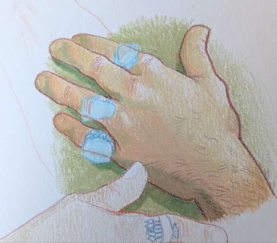
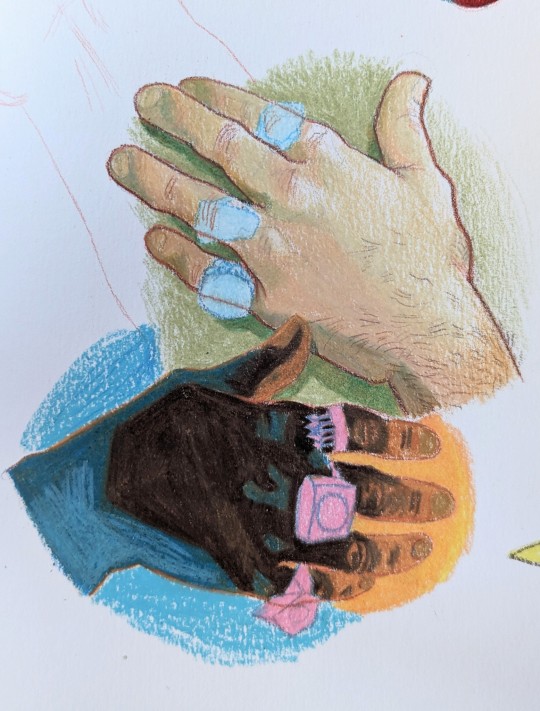
Here's what that looks like.

This Klaus Janson commission has just about gone home to Jesus.
Try to switch to pigment based markers, such as those from Faber Castell, or go wild and learn to use a crow quill.
Also, while I truly appreciate your kind compliments, it's not necessary to do that at another artist's expense.
Rodin was the complete opposite of the definition of "hack".
A hack is a term originally used for one who works on tight deadlines to publisher specifications, and produces poor quality work.
That's not Rodin.
Rodin was a spectacular talent who earned his place in the canon. He came from humble beginnings and spent the first two decades of his career sculpting decorative architectural elements. He obtained his place as a fine artist after many years of struggle.
And even then, a fine artist often works to deadline, as there are salons and exhibit specs that must be met, as well as the requirements of patrons and clients, to say nothing of the grueling formal training aspiring artists were subjected to in the ateliers.
His work often contains strong narrative elements as well, as evidenced by his design for The Gates of Hell.
In fact, for most of the history of modern art, narrative elements were considered anti-art. As someone who prefers 19th century genre art, this attitude is bummerific.
The term "hack" comes from the 17th century term "Grub Street Hacks".
Back in the day writers did not get royalties. Bookstores usually published books and paid writers a flat fee and never another penny, which resulted in a lot of very broke writers, or writers who came from wealthy families who could afford to scorn the sordid topic of coin.
Grub Street was located in London where a lot of book publishers were housed next to brothels and flophouses. It's now known as Milton Street. This area was the location of the lowliest of the low publishing joints.
The great Samuel Johnson was once a Grub Street Hack.
I've just read the most wonderful book about Samuel Johnson which has many amazing details about the development of publishing. The Club: Johnson, Boswell and The Friends Who Shaped an Age. My highest recommendation, though some will be very upset by attitudes and behaviors toward the women in these men's lives.
Johnson, despite many years of poverty, was able to escape after his work eventually earned him a royal pension. When well-thought of creative people couldn't make royalties, they were supported by wealthy patrons and the royal pension system.
While I don't have a formal education, I spent many years doing research for auction catalogues and ghost writing articles about art history, which is why I am annoyingly pedantic about it all to this day.
63 notes
·
View notes
Text


Any of you recognize this person? 👀
#my art#caran d'ache luminance#Derwent lightfast#prismacolor#but also a set of Prisma from 20 years ago#i cranked this one out in three days im very happy with myself#i love the final piece i dont want anyone to get me confused#but i hate how as of posting i can see where i could've done more UGH but again i still love her#lol
433 notes
·
View notes
Text
A PSA about art materials and longevity: If you intend your art to last, you should use archival lightfast art materials made for artists, NOT paints or markers made for hobbyists or designers (Looking at you, Copic markers). Know your materials!
Whether it’s old fashioned gouache paints or modern markers, designer’s art materials WILL fade and change or even destroy your artworks, no matter how strong or bright their colors may look at first.

An example: This is the cover of the “New Yorker” magazine dated March 12, 1938, made from a color photograph of a gouache painting by illustrator Garrett Price.

(The pale greyish splotches on the 1938 magazine cover are age spots on the paper and not part of the original artwork.
This is called "foxing" in the antiquarian book collecting world.)
This is a photo of Garrett Price's original gouache painting — in the condition it was in at a 1999 auction.

Haunting!
What happened? Over the years daylight or maybe just even time passing faded the colors of the gouache paint Price used … Because designers’ gouache paint is not a permanent artist’s material. It’s not MADE to last.
When you put the two images side by side it’s even more stark. The central woman's deep rose pink dress has faded to a barely-there ghost-beige.

The rich green cornucopia looks completely different.

Most of the blue ribbons and pink flowers are completely gone, leaving the purple parts as faint mauve ghosts hanging in the air.
Even the nice black outlines are gone. Black should be a permanent color!

The pretzels have faded to a pale doughy mass.

Gouache paints are made to be bright for ephemeral advertising art and posters. They really are not suitable for any art that is meant to last. Any artist interested in the longevity of their hard work should use archival materials such as artist’s watercolors or professional acrylic paints instead of designers' gouache or markers, no matter how attractive the colors.

And don't think that because this was from 1938 things have changed that much. They were still selling designer gouache with fugitive pigments when I was an art student and art supply stores are still selling them now. And those markers are modern.
Know your materials!
#lightfastness#archival#art materials#history of illustration#New Yorker#1938#Garrett Price#that did not age well
28 notes
·
View notes
Text

old painting that my dear friend uses as a lampshade
#anomalocaris#painting#watercolour#wow i love lightfastness i sure wish there was a way to obliterate the painting a little bit slower
9 notes
·
View notes
Text


#elfen lied#lucy#keade#watercolor painting#art#illustration#artists on tumblr#watercolor#painting#gelly roll pens were an overrated trend and now i have like 4 of them i want to get rid of#theyre not lightfast nor do some colors look good after a while#i saw some artist many years ago use and gatekeep them cuz everytime someone asked for the name they got mad until i found a comment saying#what brand it was#but now i kinda wished i just let them gatekeep these shits were a waste of money in the end#oh well i lived and i learned
9 notes
·
View notes
Text
Honestly I think the reason I haven’t drawn as much in the last few years is due to the simple fact that my last sketchbook had shitty paper
#it really makes all the difference sketching on like a bristol vellum or pen and ink sketcher paper#coarse sketching paper will fucking ruin you sometimes#anyways happy to report that fringe sketchbooks are legit I even tested them with my old lightfast inks#nice and smooth paper it’s like a fuckin dream#is the upcharge for an aesthetically pleasing hardcover a bit much? yes but at least the paper inside is decent#like a good replacement for my old bee paper pen sketcher pads that I used to draw in but literally no shop near me has carried them for#at least five years and they weren’t even on amazon#might go pick up a second tomorrow honestly like damn
8 notes
·
View notes
Text
crunchy girls just want to marry the kind of man who will say "Certainly we can try to culture a spirulina pond in the backyard, my beloved."
#I may have watched one mini doc too many#and all because I googled whether the algae in my brita was dangerous#'am I getting protein or cyanotoxins'#what to tag this#homestead#? sure#x#but here's what I really want to know: can I use spirulina as a paint pigment#I CAN#it's not lightfast though :/
5 notes
·
View notes
Text
me: 3/4 libreoffice: did you mean ¾? me: no, I did not mean that libreoffice: see, I think you did mean ¾ me: I can assure you I did not libreoffice: ah, then you must mean 03/04/2025 me: no, it's just plain text. "3 or 4" libreoffice: oh, I understand now! me: do you? libreoffice: yes! me: what do I mean, then? libreoffice: me: libreoffice: 45355.00
#i figured out how to format this correctly but. like. ffs#subbyp's precious little life#making (the open-source equivalent of) excel spreadsheets because I'm tired of accidentally buying redundant art supplies#and because it's me I'm also including things like pigment content munsell indexing and lightfastness ratings
3 notes
·
View notes
Text


#art#drawing#sketchbook#traditional art#colored pencil#Derwent Lightfast#Holbein colored pencils#caran d'ache
33 notes
·
View notes
Text
I didn’t end up painting today but I did do some major clean up in my studio, fixed my beige wall problem, and read a bunch of forum posts about alizarin crimson
#m#my post#I knew it was controversial but some people absolutely despise it#personally I enjoy it every now and again#and the lightfastness issues are mainly for watercolour and don’t really apply to oil#I’m just really into low opacity shades I like working with them
4 notes
·
View notes
Text


2014 vs 2023... to be loved truly is to be changed 😔💖
#prismacolor markers apparently have fucking shit suck lightfastness i guess#this was a gift for my sister and it was born into this world during the witching hour and she did not want it#i like. kind of want to remake it in a more permanent form but also i feel like that would take away from the Essence#i still want to put it in a gold frame tho#if i had to pick a favorite piece of art out of everything ive ever done it's this one#i peaked and everything after this has never even come close to succeeding it#im kidding maybe#i might not be tho#doo-doo(dles)
14 notes
·
View notes
Text
eye twitching if i see another instagram artist say everyone should just use cheap acrylic paint bc its basically the same as expensive paints im gonna start killing
#you know nothing and u should not be giving advice#like yeah sure!!! if u want ur paintings to last 6 months!!!!! please learn abt lightfastness and archival standards i am BEGGGING#u dont have to be using super high end stuff like jojosona and atelier will do the job. but yt better off buying large quantites of artist#grade primaries than u r buying an entire range of student quality paints if u want ur works to last
5 notes
·
View notes
Text


Haven't done a portrait since last November but I think I still got it 😀 the challenge I gave myself this time was to use the 5 different brands of Derwent pencils I own, three of which I've never used before even after having them for years. Some were more fun to use than others but I think they gave me a good final result! Whaddya think!
#my art#derwent procolour#derwent coloursoft#derwent lightfast#derwent chromaflow#derwent inktense#and i had to do a big brain moment bc i had given this man jaundice at one point#but a light layer of blue all over the skin helped a bunch
225 notes
·
View notes
Text

Custom designed with a vent clip 🚗 Mostly made with cotton yarn which isn't lightfast...but looks so cute 😺 Would look great as an ornament/ charm 😈
#scarameow#crochet#car accessories#cute#amigurumi#genshin fanart#kitten#is any yarn lightfast??#scaramouche#cat
7 notes
·
View notes
Note
Congratulations on pulling that guy twice
thank you anon. i had actually lost faith in ever getting him so i ended up buying some singles from a local store about two months ago, i was kind of amazed i got two in one sitting.
i also got this

which is going straight into my binder
#if i get a second one i will display it because its beautiful but teal is generally not very lightfast#and the room i wanna put it in is quite bright
3 notes
·
View notes
Note
top 5 fav colours to use in prints
HOT PINK
LIME GREEN
NEON YELLOW
ELECTRIC BLUE
black
#unfortunately i DONT know where to get those colors as washable oil base!! otherwise ALL my shit would be NEONS BABY!!!!#neons are tho unforch usually not very lightfast. idk about riso tho bc completely different ink makeup but for block printing at least#usually those ones have bad lightfastedness. and also seem to only come water base. which is HORRIBLe for me#i DO really wanna do more riso bc it's a much bigger color range#also i hope to god to one day be able to SCREENPRINT again!!! GREAT colors over there. one day.............#chatpost#asks#smolbeeez#my night weed kicked in whoops
4 notes
·
View notes