#PSD Background Designs
Text
#Ajith Birthday Flex Design#Ajith kumar Birthday Flex Design#Ajith Birthday Flex Banner Design#Ajith Birthday Poster Template#Ajith Birthday Flex#Ajith Birthday Design#Ajith Birthday Banner Design#Actor Ajith Kumar Birthday Flex Design#Ultimate Star Ajith Birthday Flex Design#Ajith#Ajith Birthday#Thala Birthday Flex Design#Thala Birthday#Thala Birthday Flex#Thala Birthday Banner#PSD Templates#PSD Background Designs
0 notes
Text
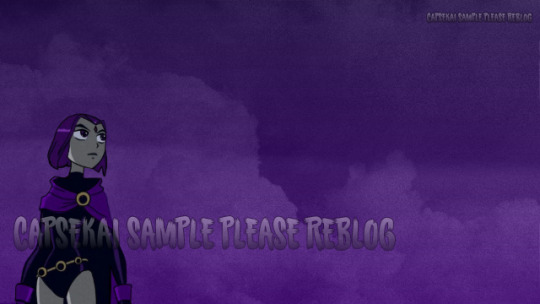
We've hand created a wallpaper!
Raven wallpaper for RP resource uses!
Please CREDIT & REBLOG if using.
Please credit if you REMIX this into a new format!
Why? Because i just spent four-six hours hand doing this and well -- Sharing is caring!
Folder where the files are
IF YOU REALLY LIKE US PLEASE CHECK OUR KO-FI!
dont' worry the NON watermarked version is on the drive :)
This was part of a commission for @wretched-hero / @earthnicity
Which just basically (in jest) means that capsekai is "U BUSY? CAN YOU MAKE ME SOMETHIN" :P
However while we don't have SET COMMISSION PRICES feel free to ask us and we shall see!
#capsekai#capsekai resources#rp resources#psd#carrd resources#rentry resources#icon#rp icons#wallpaper#tumblr icons#artists on tumblr#background#roleplay resources#graphic design#art#free rp resources#resources#resource#art ref
1 note
·
View note
Text

Download PSD Template
#background#art#photography#wallpaper#brand#stars#digital#paint#nature#digitalart#photo#space#deep#wide#illustration#assets#psd#pdf#photoshop#design#beautiful#image#artist#drawing#cute#edits#wallpapers#style#photoshoot#artwork
0 notes
Link
#beginners#graphic design#logo#gaming logo#cover#stationary#brand all stationary product#mockup#brand#brand mockup#cloth brand mockup#background#geometric#geometric background#graphizy#psd#stock photos#free vectors#virtual reality images
0 notes
Text
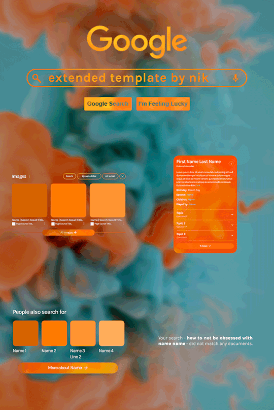
Hi! I've been asked for a tutorial on my new Google layout, originally seen here and here. So, to make it easy, here are FOUR free templates! All I ask is that you give me proper credit in your caption if you use my template or take inspo from my design. Enjoy! :)
Get the NEW Google templates free via ko-fi! (Donations appreciated but not required <3) Includes PSD templates with pre-made layer masks, shapes, and animations, plus tips for the following designs:
– Image search results
– Biography
– Related searches
– Animated "no search results"
Additional resources:
– My original animated Google search overlay tutorial & template
– Karla Google Font (this is the only font used)
– Background via Unsplash

#gif tutorial#completeresources#usershreyu#usernanda#useryoshi#userzaynab#userrobin#usersalty#userhella#alielook#tuserabbie#useraish#userabs#mialook#resource*#gfx*#google*
541 notes
·
View notes
Text
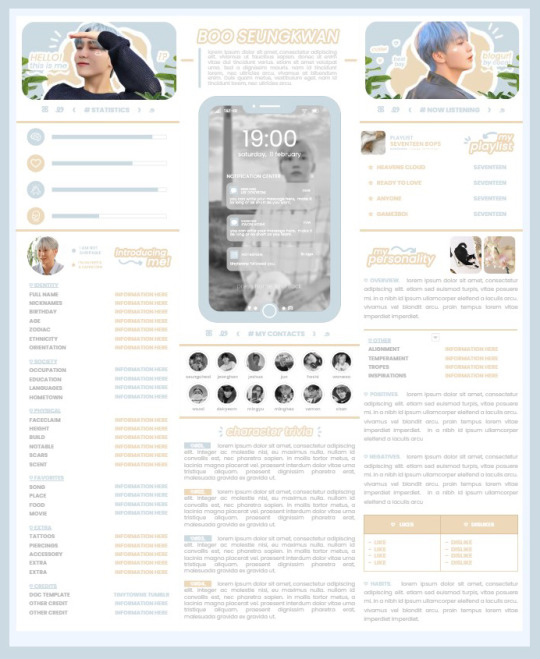
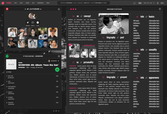
* ( ❀ ˆ꒳ˆ˵ ) ♡ Ꮺ 𝗧𝗜𝗡𝗬𝗧𝗢𝗪𝗡𝗦 — 𝟩𝖯𝖬 ੭

— introducing 7pm , the latest original google doc from tinytowns ! this document is designed to display the basics of a single - muse in one page &. captures a fun & youthful vibe with the inclusion of simplistic yet busy design , bright colours &. doodles ! features statistics , a playlist , basic info section along with character trivia & personality info ❀ the contacts section can be used as an exclusives section if desired ! space is left at the end of the doc so you can adjust easily & not have any of those annoying blank pages but it would be wise to take note of image positions as they are prone to moving. this doc can be considered moderate to difficult to edit due to the amount of edits that you will need to make in photoshop or photopea - but if you don't mind that then the document should be relatively simple to edit ❀ you can find the document link in the source code or under the cut , along with a known position issue + how to fix it , psd temps provided for this document , a video tutorial for adding your gif into a circle &. icon credits ! ( ˘͈ ᵕ ˘͈ ♡) ~
❀ PSD DOWNLOADS ( REQUIRED ! )
GIF CIRCLE - HERE
PHONE TEMPLATE - HERE
TOP IMAGES - HERE
♡ note : you will need to download the title cards to change the color , but if you don't mind the color then you don't need to - also , for full transparency on my end , i did need to touch up a few of the pngs after saving because the top text overlapped with the bottom text. be aware of that ! fonts used are poppins &. sant joan despi !
NAME TITLE - HERE
TRIVIA TITLE - HERE
INTRO TITLE - HERE
PLAYLIST TITLE - HERE
PERSONALITY TITLE - HERE
♡ note : you must change the color via layer style -> stroke for the title cards &. then save as png after deleting the background layer .
❀ KNOWN ISSUES
01. as a gdocs creator i use an external add-on called page resizer which is helpful for customizing the sizing of my canvas , as docs limits us with pre - set sizes. while this is nice to use , i'm aware that it can specifically cause an issue when you change the color of your background page. to fix this you must actually download the page resizer add-on through extensions -> add-ons -> get add-ons &. you should search for page sizer & download the one by nat burns. then you can access the sizer through extensions -> page sizer -> set page size &. what should be set for this document is a width of 9 &. a height of 12 !
this should fix the document , but i also know that sometimes , for what ever reason , the height &. width will flip. if that happens just make the height &. width opposite; so instead of a width of 9 , put 12 & for height , put 9 instead of 12.
02. i cropped the title cards in the document so that you wouldn't be trying to click something &. accidentally click on the titles ! however this means that when you replace image on the title cards they might go off center &. crop halfway through the word. just double click the title card that's bugging out & drag it to about the center of the black box. then it's fixed !
❀ DOCUMENT DOWNLOAD
7PM - HERE !
do not remove the credit , redistribute or profit off of my work.
❀ TUTORIAL
#01. go to file -> make a copy , in order to edit .
#02. to change the top two images double click on them &. a window should appear - in there you're going to click on it once &. hit replace image. the psd for this has been provided so it should be sized correctly !
#03. to change the title cards ( ex. boo seungkwan , my playlist , introducing me etc. ) you just need to click on them once &. hit replace image - please refer to #2 in the known issues section above this if you're going to do this though !! many thanks.
#04. to change the phone you're going to download the psd provided above &. when you've finished editing it you will click on the phone in the doc one time &. hit replace image !
#05. to change the thin color lines around seungkwan's name card you will press them once &. click edit - from there a window should open up &. you will click on it again & find the bucket tool which has a small yellow ( or blue if you clicked the long one ) line under it. that is where you change the color !
#06. the statistics represent intelligence , empathy , friendliness &. fighting skill ; to adjust the levels or colour you're going to double click &. a window will appear. from there you can either change colors with the bucket &. pencil tool ( pencil = outline color ) or you can shift the bars by clicking on the coloured parts of them and literally just dragging them.
#07. to change the playlist cover &. title you'll double click &. adjust inside the window by replacing image &. renaming things. the actual songs on the playlist can be typed normally !
#08. to change the gif circle , personality , &. contact images you again just double click &. replace image inside those windows. for the gif circle you must use the psd.
#09. to change the little bulletpoints beside the gif circle you will double click &. edit the text inside the window.
❀ VIDEO TUTORIAL 4 GIF CIRCLE
watch the tutorial right HERE !
make sure your timeline is checked ( the first thing i showed )
ignore the mistake i made while trying to show you where to end your gif LMFAOOO . . . im clumsy <3
to highlight all of your layers / frames click on the first one , then press shift + click on the last layer.
to bring up the list of options ( when i click convert into smart object ) you just right click.
❀ CREDITS
brain icon - Brain icons created by Vitaly Gorbachev - Flaticon
heart icon - Heart icons created by Chanut - Flaticon
support icon - Sport team icons created by Freepik - Flaticon
boxing icon - Boxing icons created by Freepik - Flaticon
plant png - josh ca.la.brese on unsplash
battery icon - Battery icons created by Stockio - Flaticon
wifi icon - Wifi icons created by Uniconlabs - Flaticon
signal icon - Signal icons created by Freepik - Flaticon
speech icon - Comment icons created by Freepik - Flaticon
close icon - Close icons created by ariefstudio - Flaticon
instagram icon - Instagram icons created by Prosymbols Premium - Flaticon
camera icon - Photo camera icons created by Kiranshastry - Flaticon
torch icon - Ui icons created by yaicon - Flaticon
#google docs#template#supportcontentcreators#gdocs#rph#google docs template#oc template#rpc#free rph#free rpc#docs#roleplay template#oc sheet#rp template#free#muse template#tinytowns#m: gdocs#m: original
1K notes
·
View notes
Text
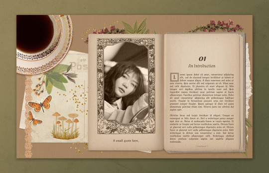
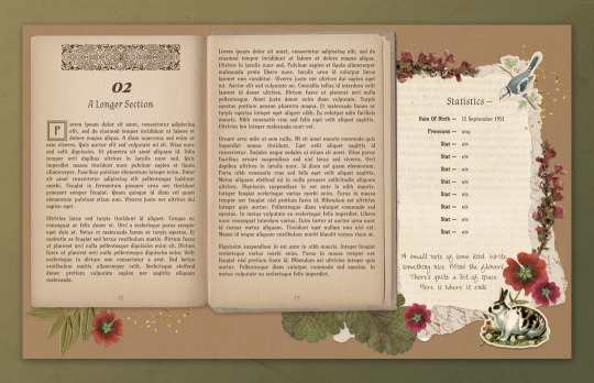
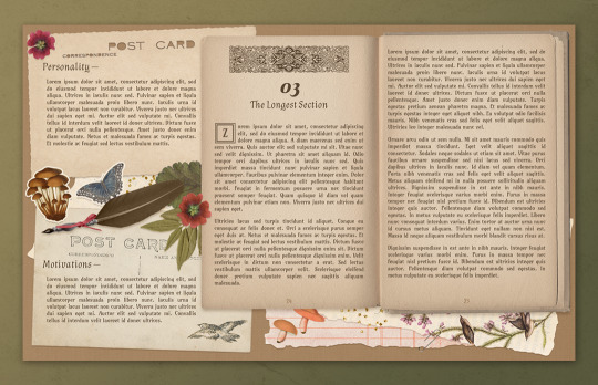
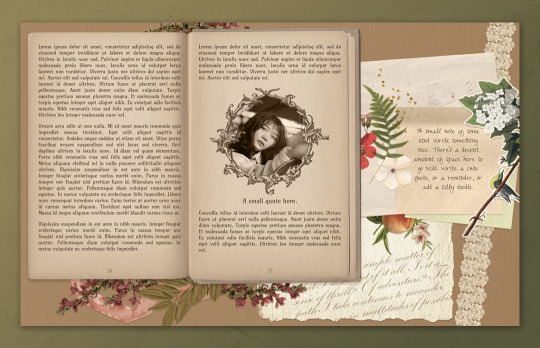
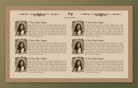
— introducing 008: COFFEE TALK + [ link ]
a cozy cottagecore google doc template inspired by fairytales and old books. this has a wonderfully comforting feeling to it from its warm colours and collage-like elements around the page, and is perfect for all sorts of muses — from bookworms, to forest lovers. it would also be perfect for fantasy and fairytale rps!
this premium template can be found in the link above or in the source link.
features:
5 unique 14" x 8.5" pages with 4 carefully crafted full-page background images, featuring spaces for quotes or small notes, short sections, and one space for an extra long section
a connections/muses page that can be easily duplicated for more
3 PSD templates for you to edit your images into beautiful, public domain illustrated frames that give a fairytale-esque aesthetic
terms of use:
you may edit to your heart’s desire. Change the colours, replace, add or remove elements and images etc.
you may remix pages with pages from my other templates.
you may not remove the credit from the templates.
you may not copy, sell or redistribute my templates whether wholesale, in part (i.e. taking out certain pages) or remixed (i.e. modified).
you will also receive an additional guide with images on how to use and edit google doc templates! if you have any problems or issues, feel free to leave an ask or join our discord server.
this theme was immensely difficult to work with for me — I had to scrap a few initial drafts and attempts at this before I finally found my momentum when working on this rendition. I absolutely adore the public domain illustrations all over this design which heavily lean into (what I think) are stereotypical fairytale elements, and I hope you do too!
once again, thank you for your likes + reblogs, every little interaction helps me out and motivates me to do more. ♡
#google doc template#google docs template#rp doc template#rp template#rp resource#muse template#m#fave#m pr
309 notes
·
View notes
Photo
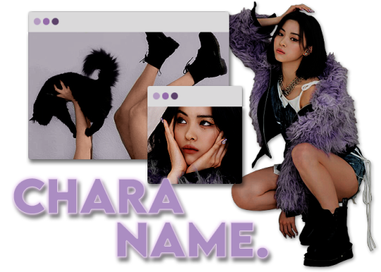
CHESHIRE. A CHARACTER INTRO PSD.
by clicking the source, you'll find a free template designed for character introductions and a complementary text banner. these were created with discord (dark mode) in mind, but you can tweak to make it suitable for tumblr, twitter, etc.
— font used: lemon milk (bold)
— dimensions: 700x500 (full) / 372x201 (big browser) / 177x144 (small browser)
— tip: change the glow & stroke hue to better match the text color.
— transparent, but you can add a background.
— includes a "test bg" to show how it'll appear on discord.
— do not redistribute, claim as your own, or use to make a new psd.
— credit isn't necessary, but likes and/or reblogs never hurt anyone.
if you have any questions, my ask is open. if you're not familiar with discord rps or how to format your designated channel/threads, the drive folder includes screenshots of how i personally lay out my character sections.
#rph#rpc#character psd#graphic psd#oc psd#rp psd#character template#graphic template#oc template#rp template#discord rp#supportcontentcreators#sorb psd#template#i am OBSESSED with this song rn
1K notes
·
View notes
Text


HELLO, NUO! — flip phone accessory
a low quality product for your high quality sims! a poor attempt with a nonsense design.
⭐ INFO
base game compatible (bgc).
9 swatches (but i want to add more in the future).
406 polys (low poly accessory).
compatible from teen to elder.
available in RINGS section (middle ring category).
compatible with pose creation.
disabled for random.
all lods.
⭐ NOTES
you can recolor the screen, choose the background, battery percentage and time. you can find the psd click in the link ahead (download link). important: the texture is mirrored, because i messed up with the uv map.
credits: icons by icons8.
⭐ DOWNLOAD
simfileshare (free)
any problems, PLEASE tell me.
feel free to tag me if you use it, i will love to see it!
@maxismatchccworld / @s4library
⭐ PREVIEWS (below the cut)
create-a-sim (CAS)


in-game (high settings)

in-game (middle-low settings)

192 notes
·
View notes
Text
#Free PSD VISITING CARD DESIGN TEMPLATES#VISITING CARD DESIGN TEMPLATES#BUSINESS CARD#VISITING CARD#VISITING CARD BACKGROUND#BUSINESS CARD BACKGROUND#BUSINESS#INVITE CARD BACKGROUND
0 notes
Text

contrast - why it is important in editing
contrast is an element in any sort of design, from edits to artwork, and its importance doesn't waver regardless of what kind of design you are creating.
so why exactly is it important? it helps to not only organize the elements in your edit, but also to help distinguish the different parts. contrast helps draw your eyes to the more important aspects of the edit (typically the character). if everything blends together, then the edit stands out less.
its also important to note that contrast isn't *only* created using differing colors, however i will be explaining color contrast and how it can affect your edits in this post. contrast can also be created using size, texture, shape, etc.
the color contrast in different edits will differ depending on the theme you are going for, however no matter the theme of your edit you still want to be able to differ the focus point (your character) and your background. that tends to be harder in lower contrast edits because there is less of a difference in color values.
there is also issues when a lack of color contrast in an edit prevents visually impaired people from properly being able to see what you are creating.
so how can we go about implementing more contrast in lower contrast colorings? there are a few simple ways to do it. i'll be using kasumi as an example
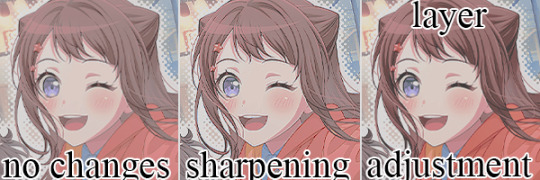
i've created a very low contrast psd and slapped it on kasumi. as you can see with the no changes version, the colors blend together very much because of the lack of color contrast.
the easiest way to fix this (and without changing the colors) would be to sharpen the image. this creates bolder lines on the character and helps kasumi stand out a bit more from the background.
another option would be to simply adjust the layers. on the third kasumi all i did was add two adjustment layers and i created a bit more contrast.
so whats the best solution to fixing the problem? well in my opinion, it'd be both sharpening *and* adjusting the layers.
it maintains that low color contrast look, while also still making it so you can see kasumi.
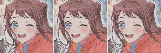
there are multiple ways to add contrast using new adjustment layers, here's an example of three i could think of off the top of my head. curves, b/c (brightness/contrast), and levels.
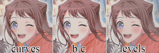
using curves can be either quite complicated or quite easy depending on your goal and understanding of it. for creating (or removing) contrast, its pretty easy!

by dragging the top pin to the left, you can easily create more contrast
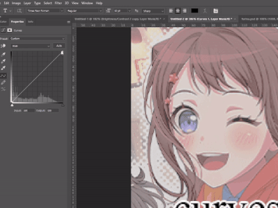
by dragging the top pin down, you can remove contrast

by doing it in the middle you can create a sort of mix of both.
brightness/contrast is pretty straightforward, just up the contrast value using the contrast bar. usually when i up the contrast i tend to turn the brightness down a little bit as well.
using levels is also relatively straightforward! by adjusting this bar you can easily add or remove color contrast.

you can use just one of these methods, a new method, or mix them! anything works! experimentation is a part of editing, it helps you to learn what works best for you. my guide is not an end-all fact book for how you *need* to do things, but rather advice and tips to help you get better and to make your designs look more appealing.
remember that it's all in good fun! if you have any questions or comments about my post, feel free to send me an ask or toss it in the reblogs and i will answer the best i can. happy creating!
36 notes
·
View notes
Text


O5 - ARCTURUS | Stargazing Design - DOWNLOAD HERE
3... 2 … 1… Launching to… Arcturus! 🚀
This doc is a single muse template, inspired by Dark Academia aesthetic, the most voted option on the poll that I made some weeks ago. Most of the elements are editable, so you can customize it however you like. I hope you guys like it as much as I enjoyed creating it!
✦ How to Use
After purchasing, you will receive a link to the live template. Just click on it, select “file” and then “make a copy”.
You can and you should edit anything you like, but please:
✦ Don’t remove my credits and the link to my tumblr
✦ Don’t allow others to make a copy of your copy
✦ Don’t share the link that you received for this doc
✦ How to Edit
↳ To replace the images, right-click on it and then click “replace image”. Don’t copy and paste images directly on the doc because they won’t keep the original design. Just replace it and it will be perfect.
↳ I don’t recommend exceeding the text limits, since it will break the design. There’s no problem in writing less, the tables should automatically adjust, but maybe some elements will move from their original place.
↳ This doc has drawings! To edit them just double click on it, replace the text or image to anything you like and then save.
↳ Resizing images or drawings may cause some elements to move or be hidden, so pay attention when you’re editing that.
✦ Tip
↳ To keep the design of the picture on the first page, you can use www.remove.bg or any tool you like to remove the background of your face claim picture, and then replace it.
The pictures are of Timothée Chalamet, colorized in Photoshop with the psd Paris from the amazing TigerEdits, which I'm a huge fan, everything she does is incredible! Go show her some love! 🧡
Also, if you have any doubts or need help to edit, feel free to contact me, I’ll be happy to help!
Likes and reblogs are appreciated!
Thank you so much for your support! ✨
#google doc template#docs template#templates#rp resources#google docs#indie rp#roleplay#rp#rp template#rp doc template#google docs template#muse template#single muse template#google doc#discord rp#character template#dark academia#discord rp template#doc template#gdocs template
1K notes
·
View notes
Link
#virtual reality images#free vectors#stock photos#psd#graphizy#geometric background#geometric#background#cloth brand mockup#brand mockup#brand#mockup#brand all stationary product#stationary#cover#gaming logo#logo#graphic design#beginners
0 notes
Text
HAZBIN HOTEL CHARACTER BANNER
PSD TEMPLATE + AFFINITY (FONTS NOT INCLUDED)


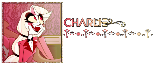
DOWNLOAD LINK (FREE+)
Requirements: Reblog, Credit.
If you DO edit and feel the need to re upload, make sure you credit where you got your PSD from.
Key & Apple render by @earthnicity (luff joo squish)
NO AI RESOURCES ARE USED in these templates.
For clarity: outside of tumblr RP, we do work in AI industry. 99% of our resources will NOT have AI included. If it ever does, we will MARK it properly, and we will "SPOILER TAG" it for your safety. We ourselves have a design degree, and have art background. Sometimes you do have to pull a devil move and get money when you're unable to work elsewhere ;).
Hazbin images were mooched from Amino, we don't have personal caps of Hazbin.
#movie screengrabs#capsekai#graphic design#my screengrabs#art#screencaps#plural system#screen caps#caps#my screenshots#alastor hazbin hotel#hazbin#hazbin hotel#hazbin alastor#hazbin art#charlie morningstar#free rp resources#rp resources#icons with psd#psd coloring#psd#icons sem psd#rp psd#psd download#coloring psd#icon psd#hazbin hotel resource#radio demon#alastor the radio demon#alastor altruist
44 notes
·
View notes
Text
ପ( ໊๑˃̶͈⌔˂̶͈)੭ ❀⠀𝒔𝒉𝒂𝒅𝒐𝒘⠀!

introducing shadow , a muse - info version of my google doc dazzling light of which can be found here ! lots of space has been left so that you can write comfortably . this document is large , single - paged & should be relatively easy to edit , though a mini tutorial is under the read more along with an additional link to copy this document ( main link is in the source code ) you should probably have some gdocs knowledge to comfortably adjust the document beyond basic editing. the gif window psd can be found here & is actually just the original version of my psd template snapshoot ! this must be edited in either photoshop or photopea .
❀ CREDITS.
exit icon - cross icons created by Ilham Fitrotul Hayat - Flaticon
the city background was found on unsplash & it is by andre benz.
sparkle icon adjusted - Sparkle icons created by SeyfDesigner - Flaticon
folder icon - Folder icons created by Smashicons - Flaticon
check icon - Tick icons created by Alfredo Hernandez - Flaticon
❀ LINK.
document - click
video player - just in case you missed it ! click
additional tutorial for the background - click
❀ TUTORIAL.
#01. go to file -> make a copy, in order to edit.
#02. do not utilise the page colour in page layout , it might break the document's custom sizing. instead , you should click on the background and hit replace image !
#03. to change the character images , double click the design and it should take you to a google drawings window. from there , just hit replace image on most things.
#google docs#template#gdocs#supportcontentcreators#rpc#rph#free#free rpc#free rph#google docs template#muse template#oc template#docs#free template#tinytowns#m: gdocs#m: site based#dazzling light: adjusted#this has been in my drafts for a Hot minute.#wasn't even sure i was gonna release it#because holy heck the right side STUMPED me#whatever have fun blerghh ..
615 notes
·
View notes
Note
hey:) i noticed lowave records using dnpg logo that you drew in their image and it looks photoshopped on the edges. although, not from the youtube icon. https://www.instagram.com/p/C5VSqycMOa1/
i wanted to ask, do dnp even have it in layers to use the letters without the background? (curiosity from a designer pov)
yeah it looks like they airbrushed the edges a lil bit but it doesn't look bad from far. (most people just look at posts for half a second anyway)
i gave them psd files for everything i designed with them but maybe lawave hasn't reached out for the original files and took the picture from google instead.
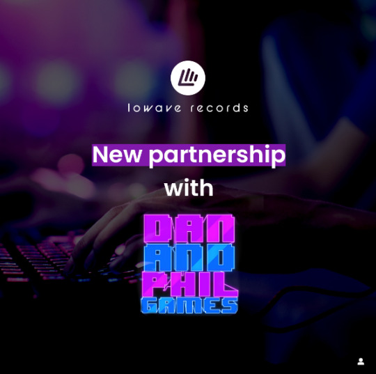
anyways this looks super cool and im so honored to be a part of this project uwu <3
27 notes
·
View notes
Last Seen Blogs

thisplaceabouttoblowfish-blog
yo where my hoes at

trans-basculin
what if basculin was heterophobic
their-vitriol
we lucky few

jetsetorange
Jet Set Orange

hotstuffz1234512
HotStuffz