#Pantone Formula Guide
Explore tagged Tumblr posts
Text
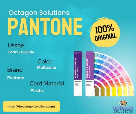
We are reckoned entity of this domain indulged in providing an enhanced quality Pantone Shade Guide.
#2157#Multicolor Pantone Shade Card#Multicolor Pantone Shade Card - Colored#Multicolor Pantone Shade Guide#Pantone Formula Guide#Pantone Metallics Coated Guide#Pantone Premium Metallics Coated Fan#The Plus
1 note
·
View note
Text
Ideias de Presentes - edição especial para artistas

View On WordPress
#adesivos#Artes#artistas brasileiros#botton#cactus sketchbook#camisetas divertidas#camisetas fofas#caneca#cavalete de pintura#desenho#deskpad#diário#diário de arte#empreendedores brasileiros#Faber Castell#femingos#flordemim#formula guide pantone#hippie artesanatos#ideia para artistas#ideias de presente#kworin#livro de colorir#maleta cavalete de pintura#marcadores ohuhu#mesa digitalizadora#ohuhu#Papelaria#pin#pintura
0 notes
Text
I am grudgingly investing in a set of Pantone color formula guides for current and future merch projects, and god I’m so mad about it.
7 notes
·
View notes
Text
hey wait ! SAINT, right? welcome to daisy apartments ! let me help you with the boxes since you need to move in within eight hours. 🌼 (ryan destiny is now taken)

( ryan destiny. she/her. twenty four ) welcome to daisy apartments, saint anderson! we heard you’re a photographer working at golden glamour who is originally from richmond, va and have been living here in the apartment for 6 months, you’re settling fine in sanfran aren’t you ? hope everything’s going smoothly around the fourth floor because we have been getting some complaints about water leaks and what not but hey at least rent is cheap ! the landlord has seen you garden quite often so it seems like it’s one of your main interests, your neighbors have also mentioned how dramatic & dynamic you tend to be which makes perfect sense for a libra ! let me take note of that because we do love celebrating birthdays around here. btw, your package of shears, summer friday lip dupe and a pantone formula guide has been sitting in the mail for a few days now, you better pick that up before someone claims it ! ( tam, she/her and est )
0 notes
Text
The Ultimate Guide to Color Swatches: Your Gateway to Mastering Color Palettes
Color is an essential part of design, art, and branding. Whether you're an interior designer, an artist, or a brand manager, understanding and choosing the right colors can make or break your project. One of the most valuable tools in this process is the color swatch—a collection of standardized colors used to maintain consistency across different materials and applications. In this guide, we'll explore a variety of popular color swatch collections from around the world and how you can use them to elevate your design projects.
What are Color Swatches?
Color swatches are physical or digital samples that show specific shades, tints, and tones. They help designers and manufacturers communicate color consistently across different media and materials. Swatches often belong to specific color systems, such as Pantone, RAL, or Munsell, ensuring uniformity in colors across products and applications.
Popular Color Swatch Systems
Pantone Color Systems
Pantone is one of the most well-known color systems in the world. It provides precise color identification and communication. You can explore various Pantone collections such as:
Pantone Bridge C
Pantone Bridge U
Pantone CMYK C
Pantone CMYK U
Pantone Formula C
Pantone Formula U
Pantone Metallics
Pantone Neons & Pastels
Pantone SkinTone
RAL Color Systems
The RAL system is widely used in Europe, especially in architecture, construction, and engineering industries. Each RAL color has a unique number, making it easy to identify and apply. Explore the RAL collections here:
RAL Classic
RAL Design
RAL Effect
RAL Plastics P1
RAL Plastics P2
Munsell Color System
The Munsell system focuses on organizing colors based on three attributes: hue, value (lightness), and chroma (color purity). It’s popular in industries like agriculture, geology, and forestry. You can view the Munsell collection here:
Munsell Color System
NCS (Natural Color System)
NCS is based on human perception of color, offering a scientifically grounded approach. It’s widely used in Scandinavia and across Europe. Learn more about NCS here:
NCS Color System
Other Global Color Systems
Many other color systems are available for specific industries and regions:
DIC China
HKS E Process
Toyo Ink
Paint Brands and Their Color Swatches
In addition to standardized color systems, many paint brands have their own swatch collections. These help consumers choose the right paint for homes, offices, and other spaces. Some of the leading brands include:
Behr
Benjamin Moore
Dulux Australia
Sherwin-Williams
Valspar
You can also check out other global brands like Asian Paints, Jotun, Nerolac, and Tikkurila.
Conclusion
Choosing the right colors is an art, but it’s also a science. Using color swatches from trusted systems like Pantone, RAL, Munsell, or brands like Behr and Benjamin Moore ensures accuracy and consistency in your projects. Whether you're designing a product, decorating a home, or branding a business, color swatches are your best friend. For more information on the various swatch collections available, check out ColorsWiki for a comprehensive guide.
0 notes
Text
Guía Completa para Comprar tu Pantonera Ideal
Si trabajas en diseño gráfico, impresión o cualquier área relacionada con el color, sabes la importancia de tener una pantonera comprar. Una pantonera, o guía de colores Pantone, es una herramienta indispensable que te permite seleccionar colores con precisión y asegurar la consistencia en tus proyectos. En este post, te ayudaremos a entender cómo elegir la pantonera perfecta para ti y por qué Controlgraf es tu mejor opción para adquirirla.
¿Qué es una Pantonera?
Una pantonera es una guía de colores estandarizada. Pantone, la empresa que las fabrica, ha creado un sistema universal de identificación y comunicación del color. Cada color en una pantonera tiene un código único, lo que facilita su identificación y reproducción en cualquier parte del mundo.
¿Por Qué Necesitas una Pantonera?
Precisión de Color: Garantiza que los colores sean exactos y consistentes en todos los medios.
Comunicación Efectiva: Facilita la comunicación de colores entre diseñadores, clientes y proveedores.
Estandarización: Asegura que todos los implicados en un proyecto trabajen con las mismas referencias de color.
Tipos de Pantoneras
Existen varios tipos de pantoneras según tus necesidades. Aquí algunos ejemplos:
Pantone Solid Coated & Uncoated: Ideal para diseño gráfico, ofrece colores sólidos en papel con y sin recubrimiento.
Pantone Formula Guide: Perfecta para mezclas de tinta, incluye fórmulas para crear colores específicos.
Pantone CMYK: Utiliza el sistema de impresión en cuatricromía, adecuado para impresiones estándar.
Pantone Fashion, Home + Interiors: Diseñada para textiles y productos de consumo, con colores en algodón y papel.
Factores a Considerar al Comprar una Pantonera
Tipo de Proyecto
Elige una pantonera que se adapte a los materiales y técnicas que utilizarás. Por ejemplo, si trabajas en moda, la pantonera Fashion, Home + Interiors es la elección adecuada.
Actualización de Colores
Pantone actualiza sus guías regularmente. Asegúrate de comprar la versión más reciente para acceder a la gama completa de colores disponibles.
Presupuesto
Las pantoneras pueden ser una inversión considerable. Evalúa tu presupuesto y considera la relación costo-beneficio a largo plazo.
¿Dónde Comprar tu Pantonera?
Recomendamos adquirir tu pantonera en Controlgraf. Esta empresa ofrece una amplia gama de pantoneras y otros servicios relacionados con el color. Aquí te explicamos por qué Controlgraf es la mejor opción.
Variedad de Productos
Controlgraf ofrece una selección completa de pantoneras. No importa qué tipo de proyecto tengas, encontrarás la guía perfecta para tus necesidades.
Asesoría Especializada
El equipo de Controlgraf está compuesto por expertos en color. Te ayudarán a elegir la pantonera que mejor se adapte a tus proyectos.
Productos Originales
Al comprar en Controlgraf, tienes la garantía de adquirir productos Pantone originales. Esto asegura la precisión y calidad que esperas de tus herramientas de color.
Servicio Postventa
Controlgraf no solo vende pantoneras. También ofrece servicios adicionales como calibración de monitores y consultoría en gestión del color. Esto garantiza que siempre obtendrás el mejor rendimiento de tus herramientas.
Cómo Comprar en Controlgraf
Comprar en Controlgraf es sencillo y seguro. Sigue estos pasos:
Visita su Sitio Web: Ingresa a Controlgraf y explora su catálogo de pantoneras.
Selecciona tu Pantonera: Elige la guía de colores que mejor se adapte a tus necesidades.
Realiza tu Compra: Sigue los pasos del proceso de compra y espera tu pedido en la comodidad de tu hogar u oficina.
Una pantonera es una herramienta esencial para cualquier profesional del diseño. Te permite asegurar la precisión y consistencia del color en todos tus proyectos. Al considerar la compra de una pantonera, ten en cuenta el tipo de proyecto, la actualización de colores y tu presupuesto.
Para asegurarte de obtener un producto de calidad y contar con asesoría especializada, compra tu pantonera en Controlgraf. Con su amplia variedad de productos, asesoría experta y servicios postventa, Controlgraf es tu mejor opción para adquirir herramientas de color confiables y de alta calidad.
No esperes más, visita Controlgraf y encuentra la pantonera perfecta para llevar tus proyectos al siguiente nivel.
0 notes
Text
Tagging: @milfspiggy @nemo-in-slumberland @catboygirljoker @rainbirdart @typhra @web-pets @reuniclus @wheatlev
and everyone else who wants to do it :3c
I got tagged in a thing! I'm starting a new post tho because it was getting really long oops
tag game: pick stuff from your room and have people vote on which one they want to take home.
I was tagged by @dewprisms !
I don't really have a room that's mine rn so I'll just go with things that used to be in my room lmao
As for tagging people- anyone else who wants to do this should, it's fun seeing what kind of Neat Stuff™ people have lmao
#I'm taking the Cybunny thank you#mintmoth your collection seems like it was pretty cool#and i hope you get a place you can call your own soon.#tag game#poll#Loupolls
55 notes
·
View notes
Text
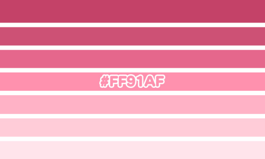

bakermillerpinkic
a gender related to the color baker miller pink;; a gender for day 25 of @mogai-sunflowers' month long coining event!
this gender can relate to feelings of calm, decreased hostility, positivity, or feeling the opposite of the colors supposed effects
term and flag coined by me;; credit isnt required but it is preferred!

#from the heart 🦇#baker miller pink#bakermillerpinkic#gender#gender coining#xenogender#xenogender coining#mogai#mogai coining#neolabel#queer#lgbt#lgbtq#trans#transgender#nonbinary#pink#color#pantone#pantone formula guide
26 notes
·
View notes
Text
Choosing Color for Injection Molding
Picking the right color code is an indispensable part of the Injection Molding process. Picking a shade can be for numerous reasons; as an example, it can be for security or for attraction. It does not only separate the item from its rival however it can additionally change a client's mind from just considering it to actually buying it. Specific shade strengthens the credibility in the eyes of customer and amalgamates the branding strategy, which ultimately makes the item and business name a lot more attractive to consumers. Cosmetics, shade can additionally distinguish the functional objective of the product. Safety gear ought to be vibrantly tinted so that it is clearly noticeable; or essential parts of electronic devices may have shade demands that are distinct according to their function. Some components can be spray painted after their manufacturing if you do not like the all-natural tones. It adds significant quantity of time to the manufacturing, while increasing expenses. The most frequently made use of treatment to change the color of the component is to add dye pallets right into the plastic prior to it is melted. It costs a considerable amount of money and time to do the procedure over again, which has actually been known to take place when the wrong shade is picked. It's critical that individuals be careful when picking the color. Changing the dull pallets into rainbow shades needs the enhancement of colorant, which can be a complicated approach. The intricacy depends upon just how precise you have to do with the product's color.If a consumer has an internet shade and also want to match it to a Pantone shade, we suggest them to utilize Pantone's shade finder device. The color you see on your monitor is never ever the like what you see on a published sheet or on plastics. It is not uncommon that the color of a certain product in one part of the world is different in an additional part of world. The shade of "Red" shade of Coca Cola container cap is not the same as the "Red" color shade of a Coca Cola bottle cap in China. Although precise, the PMS Plus Series Formula example book is not the only color standardization system, yet it is the most generic and also understandable across the Injection Molding globe. Consequently, when maker of your item, it is important that you select the right color code for your product using the PMS plus collection formula guide.
1 note
·
View note
Text
halloween costume ideas for nerds
science nerds: dark matter, a caffeine molecule, a pH color chart (and you go up to people and tell them they're basic), a volumetric flask, snap circuits, any weird animal, flat earth math nerds: your trusty TI-84, the quadratic formula, a ~cute~ angle uwu, a cubic function but you can't move your arms, a rotational solid, delta history nerds: a guy who didn't sign the declaration of independence, alexander the great's dad, rasputin, a guillotine, lao tzu but as a butterfly, sobek, prometheus (glue birds to your stomach), sappho literature nerds: a generic spooky witch but you tell people it's from macbeth, the narrator of a modest proposal (you have to stay in character all night), ponyboy and you paint yourself gold, nick carroway artsy nerds: the rule of thirds, wear nothing but a top hat and say you're a half rest, a pantone color guide, the mona lisa but with instagram eyebrows, the shredded banksy piece (fringed t-shirt)
22 notes
·
View notes
Text
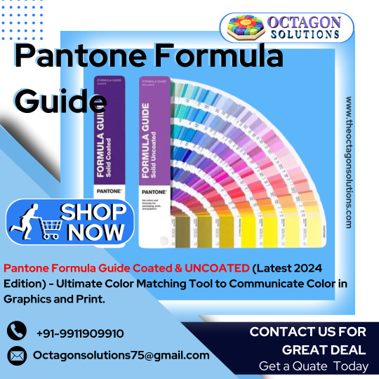
Pantone Formula Guide
Buy Now Pantone Formula Guide Solid Coated and Uncoated. The Pantone Formula Guide is a universal color matching tool that includes 1800+ market-driven spot colors in two compact fan decks. Buy Now.
#PantoneFormulaGuide#PrintingIndustries#ColorMatching#GraphicDesign#Printers#ColorSwatches#CMYK#PMS#ColorAccuracy#ColorConsistency#PrintedMaterials#ColorPalette#Designers#ColorTheory#ColorPrinting#InkColors#ColorCharts#ColorInspiration#ColorCommunication#ColorPerfection
1 note
·
View note
Text
Which Industry is Pantone Formula Guide Used in?
New Post has been published on https://www.designinfo.in/blog/color-management-solution/2018/which-industry-is-pantone-formula-guide-used-in/529
Which Industry is Pantone Formula Guide Used in?

I am sure many of you might me wondering where the social media fanatic like me who used to puff out her lungs almost every day on her blog has vanished; well my new home which is getting ready is keeping me on my toes, peeps. Earnestly I have been dreaming of its interiors, colour schemes and overall soothing ambiance day in and day out and it is extremely satiating to do the nuances all by yourself. I have never been able to take out this much time for our abode for all the years I have been working and now hubby darling has happily rested the responsibility on my tiny shoulders and that undoubtedly leaves me elated because I am a painter myself though haven’t had a ball with paints and canvas for over a decade.
I am a truly a sucker of peaceful pastel colours but at the same time, I also love keeping pace with the newest and best colour trends both in town as well as internationally. The idea is to pick the Top 10 colours and then zero it down room by room with the family. Thus, the best I could think of is to grab the latest Pantone Colour Guide from Design Info who’s often less than 24 hours delivery and great discounts have both surprised and pleased me.
1. Woah, the latest Pantone Fashion, Home+Interiors TPG Colour Guide FHIP110N has a total of 2100 plus 210 New Colours for me to choose from. These colours are arranged in a fan-shaped hard cover book and the colours are arranged chromatically for easy reference. Each of the colors also had a unique name and number which aids me to place the right shade order while choosing curtains or say sofa fabric or some exclusive limited editions ceramic potteries. In fact, this book is the most indispensable tool in the hands of designers in textiles and home/ interiors. One of my friends who is a leading interior designer in the nation recommended me to take a peep into this awesome guide and I am so glad I did. You can know more about it here on Designinfo.in
I have other plans too concealed in my heart. I want to get back to my artistic instincts and being a designer only acts as an icing on the cake. I want to create a few masterpieces to stylise my new home and that too by my own hands and to enhance my creativity and reach the perfect shades I have ordered a….
Pantone Formula Guide whose new Plus Series GP1601N
Version boasts of as many as 1867 colours divided into two guides of the coated and uncoated(solid) versions.
Pantone Color Manager Software which has all the colour combinations and formulas is included with the Pantone Formula Guide Set for me to enhance my creativity by playing around with the shades and even create some brand new ones. This series also finds great application in areas like
· Logos and Branding
· Color Sampling
· Graphic Designing
· Painting
· Spot Color Painting
· Packaging of Goods
You can grab one for yourself too from one of the most trusted websites for the same Design Info – Pantone Formula Guide Dealer and let your creative juices ooze out in full and satiate your instincts or take your professional ambitions to a different level altogether if you work in any of these fields. I will sure love to share the shades I chose for my home sweet home in some of the forthcoming blog posts.
#colors#guides#industry#pantone formula guide#pantone review#products#usage#Color Management Solution#Pantone#Product Report
0 notes
Text
hey wait ! **NAME, right? welcome to daisy apartments ! let me help you with the boxes since you need to move in within eight hours. 🌼 (ryan destiny is now taken) **please send us a new name the one you've applied for is taken

( ryan destiny. she/her. twenty four ) welcome to daisy apartments, **name st. clair ! we heard you’re a photographer working at golden glamour who is originally from richmond, va and have been living here in the apartment for 6 months, you’re settling fine in sanfran aren’t you ? hope everything’s going smoothly around the first floor because we have been getting some complaints about water leaks and what not but hey at least rent is cheap ! the landlord has seen you garden quite often so it seems like it’s one of your main interests, your neighbors have also mentioned how dramatic & dynamic you tend to be which makes perfect sense for a libra ! let me take note of that because we do love celebrating birthdays around here. btw, your package of shears, summer friday lip dupe and a pantone formula guide has been sitting in the mail for a few days now, you better pick that up before someone claims it ! ( tam, she/her and est )
0 notes
Text
A Comprehensive Guide to Pantone Color Systems: Elevate Your Design Game
When it comes to professional design, Pantone color systems are indispensable. These systems provide designers with a standardized palette to ensure consistency and precision across various mediums and materials. Whether you're working on print, digital, textiles, or packaging, Pantone has a specialized color system tailored to meet your needs. Below, we explore the different Pantone color systems and their unique applications, guiding you through the essentials that will elevate your design projects to the next level.
Pantone Bridge
Pantone Bridge C
For designers bridging the gap between digital and print, the Pantone Bridge C is essential. This guide shows how Pantone Spot colors can be reproduced in CMYK, providing a side-by-side comparison to ensure color accuracy across both formats.
Pantone Bridge U
Similarly, the Pantone Bridge U serves the same purpose for uncoated paper. It’s perfect for projects where the final print medium is uncoated, such as letterheads or stationery.
Pantone CMYK
Pantone CMYK C
The Pantone CMYK C is tailored for coated papers, offering a vast range of CMYK colors for vibrant and sharp prints, ideal for brochures and high-quality marketing materials.
Pantone CMYK U
For those working with uncoated stock, the Pantone CMYK U provides an extensive palette of CMYK colors optimized for a more matte finish.
Pantone Formula Guide
Pantone Formula C
The Pantone Formula C is a cornerstone for any designer working with coated papers. It includes over 1,000 spot colors and their precise ink formulations.
Pantone Formula U
For projects requiring uncoated paper, the Pantone Formula U offers the same spot colors, adjusted for the characteristics of uncoated stock.
Pantone Metallics
When your design calls for a touch of luxury, the Pantone Metallics guide provides metallic spot colors that add shimmer and elegance to any project.
Pantone Neons & Pastels
Brighten your designs with the Pantone Neons & Pastels. This guide offers vibrant neons and soft pastels, perfect for eye-catching and whimsical designs.
Pantone Skintone
The Pantone Skintone guide is an essential tool for projects requiring accurate skin tone representation, such as in fashion, cosmetics, and character design.
Pantone Fashion, Home + Interiors
Pantone TCX
The Pantone TCX system is a textile color guide offering a wide array of colors used in fabric design. It's crucial for designers in the fashion and home decor industries.
Pantone TN
For nylon-specific designs, the Pantone TN guide provides a curated selection of colors optimized for nylon materials.
Pantone TPG
The Pantone TPG guide is a plastic version of the TPX guide, ensuring that colors used in textile design can be matched with plastic materials accurately.
Pantone TPM
The Pantone TPM offers a specialized color guide for metallic finishes in the textile industry, ensuring metallic designs are reproduced accurately.
Pantone TSX
The Pantone TSX guide is the latest in the Pantone Textile Color System, providing a broader spectrum of colors for more comprehensive design needs.
Conclusion
Pantone’s extensive range of color systems provides designers with the tools needed to achieve color precision and consistency across various media. By utilizing these guides, you can ensure that your designs look exactly as intended, regardless of the material or medium. For more detailed information on each system, explore the provided links and discover how Pantone can transform your creative process.
Enhance your design workflow with Pantone, the global standard in color communication. Whether you're a graphic designer, fashion designer, or involved in product development, Pantone has the perfect solution to meet your needs. Start exploring today and elevate your designs to new heights!
Feel free to visit the individual Pantone guides for more detailed information and to find the right color solutions for your next project.
0 notes
Photo

The current trend among the best brands puts more focus over the color combinations than ever. Understanding the fact, that a perfect color combination is enough to impact the impulsive decisions making process, it becomes crucial to know about the top color and art trends.
“Be it fashion clothing, accessorizing or even hair styling,
choosing a correct color can entice, inspire or excite anyone”
1# Color psychology matters a ton
Choosing a new paint for the wall isn’t just about selecting a color, rather it’s more about what the color symbolizes. Every color has a different psychological effect on the mind of the viewer. From inspiring energetic environment to productive surroundings, it’s important to keep track of what color you will choose.
So select your base color wisely from this Pantone Formula Guide Solid Coated & Uncoated shades, as the year to customizing moods is here.
2# The power to heal
Almost everyone is affected by the stressed filled lifestyle that dictates our lives in the modern world. Be it the workload at your place of work or the stress to balance your personal lives, there is a lot that your mind has to go through and your highly digitally governed lifestyle certainly adds to the cause.
Studies substantiate that a precise selection of a color theme has the strength to heal your mind and address this imbalance created by your lifestyle? Check out the Pantone guides and Design info to see how these skilled designers are working on products that can create a soothing and warm effect on your mind. The idea is to yield the energetic vibes to counter the stress formed in your lifestyle.
3# 2017 the year of Rawness
The year is expected to see rawness as an integral part of our engineered aesthetics. From home wares to accessories, the demand and desire for such textures are high. The rock patterns for wallpapers, charcoal texture tiles and furniture, and accessories for the kitchen are all expected to give a touch of excellence to your interiors.
4# Black “Defining elegance”
Be it party outfit or a professional attire, the temptation that a classy black matte finish creates is just unparalleled. Not only what you wear but the color has a significant impact on your surroundings too. Introducing a touch of black (not all black) in your office accessories or your bedroom and kitchen appliances can create a whole new definition of elegance altogether.
5# Touch of nature in home wares “the trend of green”
Officially declared as the color of the year for 2017 by Pantone, the trend for tropical green color has seen a significant spike. But what’s so cool about this color that it gets a high place in every design info guide?
So the answer to this folks is the energetic environment it evokes recreating a calming surroundings. Be it the positive vibes from the colors of nature or the soothing effect to eyes and mind, our health is proven to yield numerous benefits from exposure to nature. The digital lifestyle we have been part of hasn’t allowed us to yield these benefits anymore.
Taking the same issue into considerations a number of designers and experts have been working out on synthetic solutions to the same in form of Botanic or nature green wallpaper, home accessories and furniture. From kitchen accessories to household furniture a number of shades of green can be seen everywhere.
6# The power of gradients
The rules for colors are not defined, so if you feel bored with the existing set of colors and patterns you can always head out to create a new set of your own with the help of “gradients”. Refer to the Pantone guides and design info to explore the wide range of color palettes you can play with.
7# Material designs and colors aren’t going anywhere
The intentional white spaces, end to end imagery and deliberate color choices in material design become quite a trend a couple of years back when Google introduced this visual language. Since then the trend has picked the great pace and has emerged as an overall choice for the majority of design formats.
The material designs have come a long way from being a mobile app design format to a global preference and aren’t going anywhere for next year or so.
8# Royal hues:
The year 2017 has seen a great hike in the use of oceanic beauty “blue”. The wide nuances of blue hues add a royal value to your homes. You have classical options in form of powder blue and periwinkle to refresh your home.
9# The year of imaginations:
Colors, arts, and trends have no rules to bound your horses of imagination, so let your imagination fly with a variety of colors, arts, and textures and see where that leads you, who knows you might find or develop a new trend of your own. So be it an outfit made of Khaki or repainted old and wasted fabric, it’s all about imaginations going strong.
10# Natural finishes
Another hot trend currently in action is the use of natural resources like wood and rocks for texture paints to give a finish that defines elegance and class in your home accessories. So be it a wallpaper or a kitchen accessory, you always have a feeling of hand crafted art in your possession.
If you want to explore more about this domain of creativity, elegance, and styling you can always direct yourself to the Textile design studio, where you can find a variety of color tips and textures to experiment with. So, folks let our imagination fly.
http://www.yourmotivationguru.com/colours-art-inspiration-2017/
#Color psychology#creativity#elegance#energetic environment#imagination#inspiring#Pantone Formula Guide#productive surrounding#Professional
0 notes
Text
Fashion books i've been using to study
As someone who knows nothing jack shit about fashion before researching 😅
fabric for fashion the swatch book
fabric for fashion the complete guide
dk eyewitness fashion new edition
101 things I learned in fashion school
100 years of fashion
100 years on menswear
the fashion design course
the ultimate book of outfit formulas
pantone on fashion the history of color
textiles from guatemala, fabric folios, ann hecht
Modern Fashion Illustration by Holly Nichols
Color Forecasting for fashion
1 note
·
View note