#Rectangular filter case
Explore tagged Tumblr posts
Visit Tumblr Blog
Explore Tumblr blogs with no restrictions, modern design and the best experience.
Last Seen Tumblr Blogs


Fun Fact
Premium Tumblr themes are available from anywhere between $9 to $49.
Text
Recensione PGYTECH: La Custodia Rigida per Filtri che Garantisce Protezione e Organizzazione
Se sei un appassionato di fotografia e utilizzi filtri per migliorare i tuoi scatti, saprai quanto sia importante conservarli in modo sicuro e organizzato. La custodia rigida per filtri PGYTECH si presenta come una soluzione pratica e affidabile, progettata per proteggere i tuoi filtri e facilitarne il trasporto. Custodia Rigida per Filtri che Garantisce Protezione e Organizzazione Design e…
#accessori fotografia#Accessori videografia#attrezzatura fotografica#Borsa filtri#Camera filter case#Camera filter organization#Custodia filtri fotografici#Custodia filtri PGYTECH#Custodia filtri rettangolari#Custodia filtri rotondi#Custodia rigida filtri#Custodia trasporto filtri#Filter carrying case#Hard filter case#PGYTECH filters#PGYTECH filtri#photography accessories#Rectangular filter case#Round filter case#Unboxing PGYTECH
0 notes
Text

When I was a kid, there was a hill overlooking our little town with a mysterious concrete structure at the top. To get there you had to go over the old canal, through the abandoned quarry filled with unidentifiable rusted-out equipment scattered around, and then past the creepy broken-down barn where some comedy genius had written "INSERT DICK HERE" next to a suspiciously-positioned hole in the wall.
The whole place was forested over thickly enough to muffle most sounds, and every so often you'd tread hollowly on discarded shotgun cartridges from farmers and/or farmers' mums sneaking out to shoot rabbits at night.
It was also haunted by the ghost of a drunk horseman, but being drunk we decided his actual ability to inflict harm on us would be fairly limited.
In any case, having avoided tetanus, gunshot wounds and catastrophic dick chafing, you'd reach a small sunlit clearing right at the top of the hill. The views were truly spectacular - to the north, fields. To the east, fields. To the south, fields. To the west, fields. The benefits of a rural childhood.
Right in the middle of the clearing was a kind of rectangular metal hatchway set low into the ground. Looking at it you could tell it had been opened up and filled in with concrete at some stage, and needless to say our little minds ran rampant trying to guess what was down there. For about fifteen minutes anyway, and then we'd wander off and smack the shit out of each other with tree branches - we were only kids after all.
The main theory, settled on with all the gravitas and judiciousness we could muster, was that it was some kind of Cold War era nuclear bunker. Not that we really knew much of what that meant, all being members of the first post-Soviet generation who didn't have to grow up with ideas like the four-minute warning or Protect & Survive knocking about inside our heads.
Somebody remembered seeing War Games on Channel 4 one weekend afternoon so we based our mental image on that and conjured up a miniature Scottish version of NORAD sitting empty under our feet, all big maps and flashing lights drowned forever in grey concrete.
And then we grew up a bit and thought, nahh, there's no way it was a bunker. It was a radio tower platform or a power substation or something, right?

But it was a bunker though. I looked it up years later and it was a two-person Royal Observer Corps fallout monitoring station to be used for keeping track of the devastation of our closest city, about 20 miles away. The entirety of the UK is hoaching with these things and I can guarantee you if you grew up anywhere in Britain you were much, much closer to them than you might expect.
Not just close to the bunkers but to the people who would have crewed them in the event of armageddon. That's the thing about the ROC, as I've found out since - it was a voluntary service operated by people living nearby.
So who, I wonder, were the unsung unknown uncalled-upon heroes who'd be there when the end came? Who in my sleepy little village with one school, one church and one main street would have had to leave their families to their fate and spend their next, and probably last, two weeks of life in that tiny concrete cell eating strictly rationed food, breathing strictly filtered air, and working out just how many kilotons had been expended on our little corner of the world?
I have my suspicions, but it's not the kind of thing you can just ask your old neighbour out of nowhere. Would they even have gone if they had to? I wouldn't blame them for a second if they chose to stay home instead. I imagine it was something they all had to decide for themselves and no one, least of all the happy beneficiaries of a better world than the one they lived in, has any right to judge.
I feel as though I'm dragging myself to a Meaningful Conclusion here. Oh boy. The past is always closer than you might think, I suppose. Just around the corner, just out of reach, but always there wherever we happen to be.
This post was mainly motivated by reading the excellent Attack Warning Red: How Britain Prepared for Nuclear War by Julie McDowall, who also does the Atomic Hobo podcast which is well worth a listen if you have any interest in this kind of thing. Don't have nightmares.

#also go and watch threads#then go through the recovery process from watching threads#a baptismal antisacred realisation of horror suffusing us like oxygen from which there was never any escape beyond the ignorance we lost#history#cold war#scotland#uk#nuclear war#attack warning red#atomic hobo#farmers' mums#no luck identifying them bunkers then?#it's just the one bunker actually
8 notes
·
View notes
Text

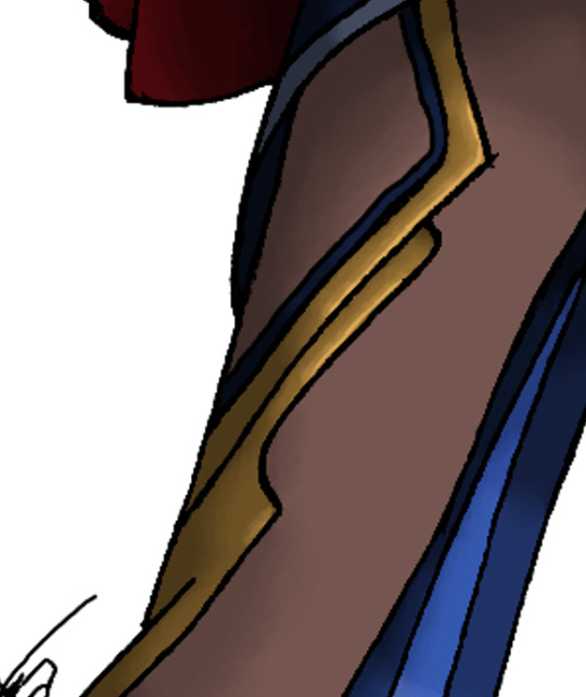
VAUTRIN - DESIGN BREAKDOWN
bc i said i'd do this & he's still scratching at the walls in my brain so...
gonna be a long, image heavy post, so i'll pop the majority under a cut, but first, a reminder of his design post-primordial sea swim:

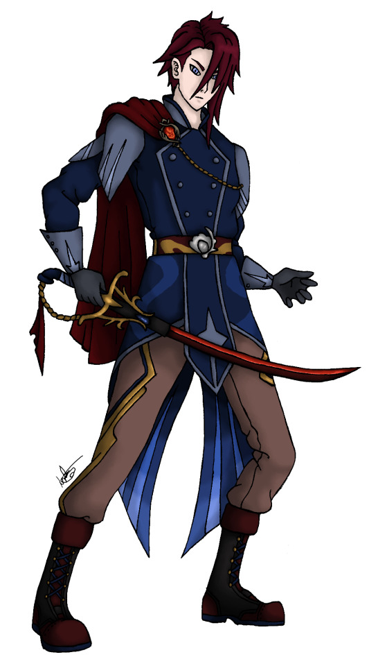
COLOUR SCHEME
the biggest inspiration for this design is, of course, his original uniform. that's an integral part of who he is and whilst he no longer actively serves in his current timeline verse (though he will help out where he can), i wanted to keep that in his design because it will be familiar to him.
colour scheme wise, this obviously made it difficult for a pyro character - we all know hyv likes to stick to certain themes and palettes with specific elements. there are some exceptions, but the majority of characters are colour-coded in some way to the element they can wield. and... the f.ontaine uniforms are blue.
luckily, my decision to make him a redhead helped here. from there, it was easy enough to carry similar tones throughout the design - adding the cape, and tweaking the belt & boots. his trousers, too, have a red base to the colour. browns are quite common on other pyro designs, but i didn't want something too dark, so opted for a lighter pinkish-brown shade.
then it was just a case of tying the two colour schemes together: the red was already present across his full design, but the blue was largely upper body only - hence the small details on his trousers & boots to balance everything out.
and now it's time to start focusing on specific details-
THE UNIFORM
since, according to the flashbacks in neuvi's story quest, f.ontaine's uniforms haven't changed in appearance in four hundred years, we can assume that vautrin's uniform would follow the same colour scheme as the current ones, were he not covered with Ye Olde Filter:

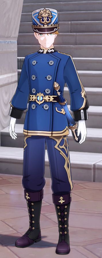
so i wanted to keep a few design elements from said uniform in his new look, as a nod to that uniform, but i also wanted to make some changes: i opted for a darker blue to further separate it from the existing uniform, and removed some features, such as the pockets, the shape & design of the sleeves, and the decoration to the collar. i removed the black features & opted, instead, for a greyish-blue.
the biggest change, obviously, is the shape of the jacket itself. i made the front panel less rectangular and more angled, and lengthened it so it extended beyond the side panels (at the front). i'll go more into this when i discuss the design elements involved, but on a similar note, i also opted to give the jacket tails.
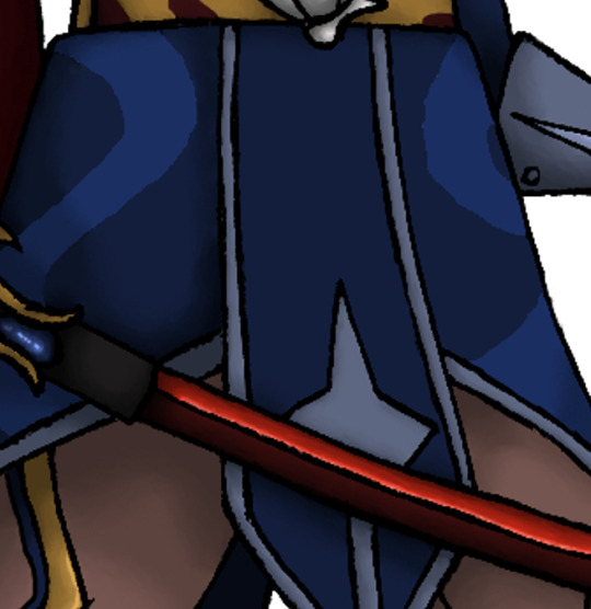

i love a good tailcoat, especially those from more historical periods, and it felt fitting for him. obviously, it's not a typical tailcoat, but again, there's a specific reason for the style and shape of these tails.
the boots and gloves i kept, though with changes to the colour scheme and with less of the ornamentation on the boots. the decision to swap from purple to red on the boots is purely down to a desire to reflect his pyro element (and also... it looks better, in my opinion-), but the gloves are a different story.
the gloves for the original uniform are white. there is a very good reason why vautrin would feel uncomfortable wearing gloves in a colour often used to represent innocence and cleanliness: his hands are not clean, and he is not innocent. add to that his need to wear gloves (so as not to look upon the primordial shimmer on his skin), it required a different colour. i opted for grey, as he is... well, morally grey.
now, onto the individual aspects:
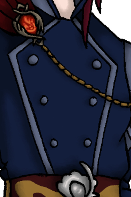
THE BELT
this was one of the elements of the original uniform design that i wanted to change. as much as i like the (vaguely anchor-shaped) design of the buckle, it would be too similar to the garde uniform and i wanted to move away from too many shared elements. but, it needed a belt, and a belt needs a buckle.
what else is important to vautrin, then? well... his Medal of Peace, of course. thus, a perfect belt buckle design was staring me right in the face:


what are those golden lines, i hear you ask. well. more on that later-
THE CUFFS
there isn't much to say on this, but there's a specific element to them that i've lifted from the original garde uniform. the cuffs on the original uniform are very different, and my decision to make vautrin's that particular style is simply bc... i have a great love for "pirate" styles and i love an oversized sleeve cuff for that reason. and, given that sailor / pirate designs are dotted around f.ontaine's npcs, it made sense to lean into that a little.
now, the design element i lifted from the original uniform isn't actually anything to do with the cuffs, but rather the weapon the gardes carry. since vautrin won't be carrying this weapon himself, i wanted a subtle tie-in on his design. and there's this handy little shape that's a perfect fit-


i wanted some simple decoration on the cuff, and this was just sitting there - nice and simple, nothing too flashy.
THE TROUSERS
it's obvious from the pictures that the original uniform has a flashy design on the outer legs - this seems to be implied to be a raised design, possibly of some sturdier material, and could even be a kind of light armour (though the placement would make movement... interesting, so perhaps not). whilst i was going to lift the entire design onto vautrin, i wanted another nod to the original uniform. hence, the much more subtle and far less complex addition of these details:

in vautrin's case, these are not raised, and are actually embroidered (which... technically, would be raised, but not in the same way-). the addition of the blue was both a nod to the original uniform colour, and to help tie the colour scheme together by balancing the blue tones with the red.
OCEANID ELEMENTS
now, at last, i can get to the little details all over his jacket design that i've skipped over previously, because... yes, they are all linked to him being, technically, part-oceanid.
again, that's a big part of his character and his story, and i wanted that to be reflected in his design. so, let's talk about those details! first of all, the tails. this is one of the biggest nods to the oceanid on his design - they are, in fact, inspired by the oceanid's fins.

this is the reason for their specific shape and for the pattern of lines on the inside. the gradient of colour is also a nod to the oceanid, but also to the original uniform, which has its own gradient of blues in the design.
those lighter lines, too, are featured on the upper sleeves of his jacket. similarily, the design of these sleeves is also inspired by the oceanid's fins:


the other major nod to the oceanid is the design upon the longer front panel of the uniform. this is taken from the body of the oceanid itself - again, this shape was just perfect to slot into the design.


and, finally, the last two elements i included from the design of an oceanid are the swirling patterns on the upper parts of the fins. these can be seen here, on the lower half of his jacket:

and here, on his belt:

yep. i'm really hammering in the fact that he's an oceanid.
THE SWORD
to finish off, i just wanted to touch on the decisions behind his weapon's design. i initially wanted him to have a rifle / sword combination, but with c.hevreuse in existence, i wanted to avoid being too similar. so, whilst he is able to use a rifle, he sticks with just a sword instead.

given that f.ontaine is largely inspired by france, i chose to go with a french n.apoleonic officer's sword as the base for his weapon. something from french history just made sense, given that this man is now over 400 years old.
the blue gem decoration is a nod, again, to him being an oceanid and possessing of (minor) hydro abilities, but also to him being a guardian of the hydro nation itself. the colour decisions behind the blue of the grip and the red cloth were just to tie the weapon to his design.
so you might assume the red blade is for the same purpose, and whilst there's an element of that in there, the reason for the two-tone colour is actually to do with some nice, dark lore: the blade is red because of the blood he spilled in his previous life.
CONCLUSION
and that's it for the design breakdown! the only element i haven't discussed at length is the little cape - this was added entirely to give his design something special and steer him away from the plainer npc designs, but also, such adornments are typically given to those of higher ranks or of noteworthy position, and it felt right that vautrin should have something of that nature to denote his years of service
and it was a great spot to display his vision, and add some of that much needed pyro-red to his upper design.
honestly, if you've read all this... well done. i hope you enjoyed my rambles over this silly little oceanid man who lives in my head rent free.
#;here we go again i will not give in (about; vautrin)#( i meant to do this before i got sucked into his game mechanics but. here we are at last )#( maybe if i finish all of these posts he'll stop rattling his cage )
7 notes
·
View notes
Text
Using Colored Gels in Studio Flash Photography
Colored gels — transparent color filters placed in front of studio flashes — are a hidden weapon in every creative photographer’s toolkit. They don’t just add color; they inject mood, depth, and storytelling into your images in a way that post-processing alone can never truly replicate.

What Are Colored Gels and Why Should You Use Them?
Gels are sheets of colored plastic (usually heat-resistant polyester) that modify the color temperature or hue of your flash. Whether you’re aiming to create a dramatic cyberpunk portrait or mimic the warmth of a sunset indoors, gels can make it happen.
Here’s what they’re great for:
Setting a specific mood or atmosphere
Separating subjects from backgrounds
Creating visual effects without Photoshop
Adding color contrast and narrative depth
Still unsure? Check out this studio photography page to see how lighting shapes the final image.
Types of Gels and Their Practical Uses
CTO Gels (Color Temperature Orange) Warm up your lighting to simulate late afternoon light or add a sun-kissed glow to your subject. Great for skin tones and cozy vibes.
CTB Gels (Color Temperature Blue) Cool down your scene to mimic shade or nighttime. Use them when going for mystery, tension, or futuristic aesthetics.
Effect Gels: Red, Purple, Green & More Designed for pure creative impact. Whether you’re going for sci-fi, surreal, or just something bold, these are your friends.
ND Gels (Neutral Density) Reduce light intensity without changing its color. Perfect for balancing multiple light sources when one is overpowering.
Choosing the Right Gel Pack — What to Look For
Compatibility with Your Studio Equipment Make sure your gels fit your flashes — whether it’s round-head magnetic flashes like Profoto A1 or rectangular studio strobes.
Color Palette and Variety Look for packs that offer both essentials (CTO, CTB) and creative options. A good starter pack includes orange, blue, red, green, and purple.
Durability and Attachment Methods Prefer gels with magnetic or adhesive mounting. Cheap gels can melt or distort under heat and ruin your shot.
What Each Light Does
The blue background light separates the subject from the backdrop
The CTO gel adds a natural warmth to the skin tone
The purple rim light gives a cinematic edge
Balance is key. Always adjust your light levels to avoid overpowering your scene with too much color.
Creative Use Cases for Gels
Contrasting Colors in Portraiture Pair complementary colors like blue and orange to create visual tension and energy.
Faking the Golden Hour Indoors Use strong CTO gels with neutral flashes to simulate a warm sunset glow — anytime, anywhere.
Fitness and Sports Photography Drama Blue or red edge lights can highlight muscle tone and create a high-impact look — perfect for action shots.
Want more inspo? Browse some real-world gel photography in action on our model photography page.
Night Photography with Gels — Painting the Darkness
At night, gels become paintbrushes. Combine an off-camera flash with a gel and “paint” the darkness with vivid light.
Popular nighttime styles:
Cyberpunk urban vibes with blue, pink, and purple
Romantic tones using soft oranges or reds
Fantasy moods with fog + green or turquoise gels
Pro Tips for Effective Gel Use
Always use manual white balance — auto mode neutralizes your creative color work
Pre-test light angles and power — small tweaks make huge differences
Add fog or haze — gels shine through atmospheric elements beautifully
Combine gels with snoots or softboxes for light shaping
Experiment and Document — Learn by Doing
Don’t just shoot — study your results. Record which gels, modifiers, and camera settings you used. Build your own color recipe book so you can recreate magic when needed.
Conclusion: Gels Unlock a New Dimension of Creativity
Colored gels are more than accessories — they’re storytellers. They bring emotion, contrast, and dimension to your photography in ways that go beyond technical mastery. Whether you’re capturing an athlete’s power, a model’s mood, or the surreal glow of an urban night, gels can elevate your work to new heights.
So go ahead — experiment boldly. Color outside the lines.
Frequently Asked Questions
Q1: Can I use gels with any type of flash? Yes, but make sure you have the right mounting system. Some gels are magnetic, while others use Velcro or clips.
Q2: Do gels affect exposure? They can. Some colors (like deep red or blue) absorb more light, so you may need to adjust your power or ISO.
Q3: How do I prevent gels from melting? Use high-quality, heat-resistant gels from reputable brands. Avoid placing them too close to hot bulbs.
Q4: Can I stack multiple gels? Absolutely. Layering gels creates new hues and effects but be mindful of how much light gets blocked.
Q5: Should I color-correct gels in post? Generally, no. The whole idea is to create color effects in-camera. Just tweak contrast and clarity if needed.
#Studio Flash Photography#photography#valokuvaaja#valokuvaaja lappeenranta#portrait#color gels photography#flash photography#studio lights#how to#tips for photography
0 notes
Text
Why there are so many diverse Tube Screamers?

Recently, I realized that I had never built a Tube Screamer before. This gap must be filled. It also makes sense to figure out which Tube Screamer I need and which is better for you. After all, if you play an electric guitar, then you probably need it in your life!
The Tube Screamer is probably the most popular of all guitar pedals. Especially if you count in numerous clones, mods, and pedals built based on the Tube Screamer circuit.
The scheme has proven to be so fitting that it suits most styles of guitar music, from light rock and blues to the heaviest styles with eight-string, low-tuned guitars.
The Tube Screamer has a nice-sounding overdrive of its own, ready for the clean channel of a pedal platform. It can also help to overdrive a vintage amp.
Or it can make the sound of a modern high-gain amplifier more focused by emphasizing the desired frequencies and preventing the amplifier from choking and squealing due to an excess of unwanted frequencies. And ensure the notes are legible while maintaining the warmth of the solo.
The legendary green pedal with a rectangular button and the number 808 in the name entered the market in 1979. Its name did not contain the phrase "Tube Screamer." It was produced not by Ibanez but by another Japanese company, Maxon. It continued to make the OD-808 and OD-9 for Ibanez and under its own brand.

Maxon employee Susumu Tamura not only developed the circuit and case for the Overdrive OD808 but also came up with the name Tube Screamer Overdrive Pro, which is already for the Ibanez TS808.

Today, early examples of the Maxon OD808 and Ibanez TS808 are highly collectible. This screenshot from Reverb shows the prices that are considered not that high. However, there's always a chance to find it in a pawn shop or local market.
Like most guitar pedals and amps, the Tube Screamer's circuit was not designed from scratch. Enthusiasts of guitar electronics and analog synthesis love to disassemble the products of their colleagues and improve or rearrange something in them to create unique devices based on what they have learned.
In 1977, the Roland BOSS Corporation, also from Japan, released the OD-1 overdrive pedal. Let's look at its diagram, starting from the power stage in the lower left corner.

The power socket is connected through diode D4 and resistor R15. Together with capacitors C11 and C8, R15 forms a U-shaped power filter.
Why is diode D4 needed? To protect against reverse polarity, the circuit has a Zener diode D5. It also protects the pedal from overvoltage above 11 volts. Diode D4 does not act as a rectifier either since the pedal is designed to be powered by a DC adapter.
In the post about the legendary BOSS DS-1 distortion, we've already seen precisely this power supply circuit. And we have found out that this is not just a filter or additional protection but also an analog simulation of the voltage drop of a 9-volt molten-salt battery. This stage is found in many early BOSS pedals, improving the tone.
We will not show the bypass JFET circuit since we discussed it in the same article. It's precisely the same, and many enthusiasts don't like it, preferring true bypass instead.
True bypass with LED indication can be implemented using a 3PDT foot switch. You can get by with DPDT if you use the Millennium bypass indicator circuit described in the post on Brown Sound in a box.
The virtual ground, indicated in the diagram by a diamond, is formed by resistors R7 and R8. They have equal resistance values and divide the supply voltage in half. Capacitor C3 grounds the virtual ground for alternating current.
The input and output buffers on transistors Q1 and Q2 are the usual emitter followers.
An overdrive section is built on the operational amplifier U1A, and an active filter is made on U1B. Most of the first BOSS OD-1 pedals used Raytheon's RC3403ADB quad op-amps.
But sometimes, you can find a copy with the uPC4741C chip from the Japanese company NEC. This is neither a counterfeit item nor a refurbished pedal, but a genuinely original BOSS OD-1. Known examples with uPC4741C were produced in 1978.
Roland/BOSS then stopped using the quad op-amp as a dual op-amp, and later pedals contained the 4558 IC with different indexes.
What does the 1977 BOSS OD-1 have to do with it when we're talking about the 1979 Maxon OD808, you might ask? Just have a look at the OD808 diagram.

As you can see, these two schemes have a lot in common! Several components have been swapped for different values compared to the BOSS OD-1. Capacitors C5 and C6 have been added; C9 has been removed.
The D3 diode was also excluded, so clipping became symmetrical instead of asymmetrical. And most importantly, the R14 tone control has been added. It started as a pedal with two knobs; now it has three.
This time, BOSS studied Maxon's overdrive and, in 1981, released the SD-1 Super Overdrive! Here is its diagram.

Some call this practice stealing ideas, but BOSS, Maxon, and Ibanez ultimately benefited from it, as did the guitarists and listeners. The more different pedals with different nuances, the better!
Next came the TS9 and many other Tube Screamers and overdrives from various manufacturers. My pick is the MXR ZW44 circuit.

This is a Zakk Wylde signature pedal; at its core, it is still the same Tube Screamer. Or rather, SD-1 Super Overdrive because the limitation here is asymmetrical.
I enjoy the range of tone, gain adjustments, and how Tube Screamer's volume control affects the amp's overdrive. You can get a lot of different sounds and fine-tune their shades.
Without Tube Screamer, the amp responds to the gain knob input differently because it is the overdrive pedal that determines the frequency bands that will be emphasized. And this is the primary purpose of the pedal.
0 notes
Text
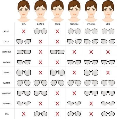
Need Help Selecting Eyeglasses? Here Are a Few Helpful Tips!
A guide to buying your first pair of eyeglasses

Choosing the right pair of eyeglasses is an important decision that affects both your vision and personal style. If you are unsure of the type of glasses you want to purchase, here are a few tips to help you select the best pair as per your needs.
Vision screening and correct prescription
The first thing to do to get yourself the right pair of prescription glasses is to make sure the prescription is correct. Over time, the acuity of our eyesight varies. Before shopping for new eyeglasses, visit your optometrist and get a fresh vision screening done for an up-to-date prescription. This way, the lenses of your new eyeglasses will provide correct vision correction.
Try multiple styles and sizes
Different face shapes work better with certain frame styles. For example, oval faces look good in almost any frame shape but square or rectangular frames can add definition to the face making it more attractive. Round faces are complemented by angular frames. Square faces look great with round or oval frames which helps soften their sharp angles and heart-shaped faces often pair well with frames that are wider at the bottom, such as cat-eye frames.
Take assistance from your optician and try as many eyeglass frames as you can to check which style of frame, size and colour look the best on your face shape.
Picking the material for eyeglass frame
Eyeglass frames come in various materials with plastic and metal being the most common types. Plastic eyeglass frames being lightweight and cost-friendly are more in demand. They come in many colours and styles and are strong and impact resistant, making them a good option for everyday wear. Metal frames are durable and offer a sleek, minimalist and sophisticated look. They are typically more expensive than plastic but are also durable and long-lasting. Only caution you need to take with metal frames is to ensure that they are hypoallergenic in case you have sensitive skin.
Get the fitting right
The fit of your eyeglasses is crucial for comfort as you will be using them every day for long hours. Ensure the frame sits comfortably on your nose and ears without pinching. The arms of the glasses should rest gently against your temples and the lenses should align with your eyes. Your spectacle dispensing service provider will offer adjustments for a custom fit that offers comfortable and clear vision.
Match your style and personal taste
Today, eyeglasses are also seen as an accessory that reflects your personality and taste in fashion. Choose eyeglass frames that align with your style, whether you prefer classic, bold, funky, sophisticated or minimalist.
Lifestyle and functionality
If you lead an active lifestyle, go for durable materials and features like non-slip nose pads. You can also get specialized lenses such as blue light filtering, transition lenses, or polarized lenses as added functionality.
These tips will guide you in your decision when choosing new eyeglasses, so you find a pair that improves your vision, offers comfort and enhances your overall look.
0 notes
Text
Optimizing Operating Room Airflow and Filtration Systems: A Look at Utopia's Solutions

Operating rooms, also known as surgical rooms, are critical environments in hospitals where precise control of air quality, sterility, and airflow is vital to the success of surgical procedures. The stringent requirements for maintaining a clean environment in the operating room are essential to prevent infections and ensure patient safety. Utopia, a leading innovator in air control and filtration technology, has developed advanced solutions that not only optimize these conditions but also make them more efficient and cost-effective.
Importance of Airflow in Operating Rooms
The primary goal of air management in operating rooms is to minimize the risk of contamination and maintain sterile conditions. Airborne particles, such as dust, bacteria, and viruses, can compromise the sterile environment necessary for surgeries. Proper airflow systems are essential to control and eliminate these particles effectively.
A unidirectional airflow ceiling, also known as a laminar airflow system, is a common solution in modern operating rooms. This system ensures a continuous flow of clean, filtered air over the surgical site and prevents contaminated air from entering. However, maintaining such a system can be costly, as it requires a large surface area to operate efficiently.
Utopia’s Innovative Octagonal Ceiling Design
Utopia offers a novel approach to reduce the cost of operating room airflow systems without compromising their efficiency. Traditional laminar airflow systems often use square ceilings, which include coverage over areas where airflow is not essential, such as the corners of the room. To address this inefficiency, Utopia has developed an octagonal-shaped ceiling design.
The octagonal design reduces the total surface area of the ceiling by approximately 20%, leading to significant savings in airflow requirements. For example, instead of requiring a high-volume air system to support a square ceiling, Utopia’s octagonal design reduces the necessary airflow to around 7,200 m³/h. This reduction not only decreases operational costs but also enhances the overall efficiency of the system by focusing the airflow where it is needed most — over the critical surgical zone.
Advanced Filtration with Trapezoidal Filters
Air filtration is another essential component of maintaining a clean environment in operating rooms. The filters used in airflow systems must be highly efficient to capture microscopic particles, including bacteria and viruses. Utopia has introduced an innovative trapezoidal filter design to improve both filtration efficiency and coverage.
Utopia’s laminar ceilings feature eight H14-efficiency filters, each with a trapezoidal shape. These filters are designed to cover a larger area compared to traditional rectangular filters — about 20% more, to be exact. The increased coverage ensures that more air is filtered, further reducing the presence of contaminants in the operating room.
In addition, Utopia’s trapezoidal filters have a unique double-density feature. The filter density is greater in the center of the ceiling, where the need for expelling contamination is highest. This design ensures that air moves at a higher speed through the central part of the ceiling, helping to expel contaminants more effectively from the aseptic zone.
Plenum for Optimized Air Distribution
To complement its advanced filtration systems, Utopia has designed an optimized air distribution system using a specialized plenum. The plenum, constructed from galvanized steel (or stainless steel as an optional upgrade), ensures the even distribution of both primary air from the air conditioner and recirculated air from the ceiling. This distribution system plays a key role in maintaining a sterile operating room environment.
The trapezoidal filters are equipped with a system that ensures air drops in a circular crown around the filters, in case of any leakage from the gaskets surrounding the filtration section. Utopia addresses this potential issue by using re-suction fans to create a depression around the filters, allowing any bypassed air to be evacuated before it can contaminate the sterile environment.
This innovative system prevents air leakage from compromising the sterile environment by ensuring that any bypassed air is captured and evacuated. The plenum guarantees optimal air distribution, ensuring that the right amount of clean air reaches every part of the operating room. The filters are also fitted with a micro-holed tissue lamination system, which is perfectly sterilizable to maintain cleanliness.
Centralized Lighting Connection
At the heart of Utopia’s octagonal ceiling is a centralized connection point for the scialitic lamp, the surgical lighting system crucial to providing optimal visibility during procedures. This thoughtful integration further enhances the efficiency and functionality of the operating room by streamlining lighting and air filtration needs.
Why Choose Utopia for Operating Room Airflow Solutions?
Utopia’s solutions for operating room airflow and filtration systems provide several clear advantages over traditional designs:
Cost Efficiency: The octagonal ceiling design reduces the total surface area by 20%, cutting down on the required airflow and leading to significant cost savings.
Increased Filter Efficiency: The trapezoidal filters provide 20% more coverage than standard rectangular filters, ensuring better air filtration.
Optimized Air Distribution: The advanced plenum system ensures optimal air circulation and prevents air leakage, guaranteeing that only clean, filtered air enters the operating room.
Sterilizable Components: The use of micro-holed tissue lamination under the filters allows for easy sterilization, maintaining cleanliness over time.
Centralized Lighting: The scialitic lamp connection at the center of the ceiling enhances functionality without disrupting airflow or filtration.
By focusing on innovative designs and highly efficient systems, Utopia continues to set new standards in operating room air management. These advancements ensure that hospitals can maintain the highest levels of sterility and safety in their surgical environments while also benefiting from reduced costs and improved efficiency. Utopia’s commitment to innovation makes them a trusted partner in the healthcare industry, delivering solutions that meet the unique needs of modern operating rooms.
In Order To Find Out More Details On Operating Room/ Surgical Room Please Be Touch With Us Today Onwards..!
#Operating Room/ Surgical Room#Operating Room/ Surgical Room Singapore#Cleanroom Products#Cleanroom Products Singapore#Cleanroom Construction Materials#Infection Control#Infection Control Singapore
0 notes
Text
The Evolution of Men's Glasses: A Journey from Function to Fashion
Eyewear has transcended its primary function of vision correction to become a key fashion accessory for men. This article explores the modern trends in men's glasses, emphasizing the stylish designs available on Vooglam, and provides insights into choosing the right pair to enhance one's personal style.

The Rise of Fashion Glasses in Men's Wardrobe
Fashion glasses have gained a significant place in men’s accessories, merging practicality with aesthetic appeal. This fusion has encouraged many to express their personality and style through their choice of eyewear.
2020-2024: A Look at the Evolving Trends
Bold Frames: Larger and bolder frames have made a comeback, making a statement that stands out in both casual and professional settings.
Vintage Revival: Classic styles from the '80s and '90s, such as aviators and round glasses, have resurfaced with a modern twist.
Innovative Materials: The use of sustainable and advanced materials like bamboo and lightweight alloys is on the rise, offering durability without sacrificing style.
How to Choose the Right Glasses for Your Face Shape
Selecting the right frame that complements your face shape is crucial. Here’s a quick guide:
Oval Faces: Virtually any frame shape works, but geometric shapes can add a striking contrast.
Round Faces: Rectangular frames help elongate the face, providing a flattering balance.
Square Faces: Oval or round glasses soften the angular features typically found in square faces.
The Impact of Technology on Men's Eyewear
Technological advancements have not only improved the quality and comfort of glasses but have also introduced features like blue light filtering, which is essential for those spending considerable time on digital devices.
Why Vooglam Stands Out in the Contemporary Eyewear Market
Vooglam’s commitment to blending style with functionality is evident in their diverse range of men's glasses. They offer designs that cater to every preference, from minimalist to eclectic styles, ensuring that every individual finds their perfect match.
Case Study: Transforming Looks with Vooglam
A detailed case study on how different styles from Vooglam have helped individuals in various professions enhance their look and confidence.
Expert Tips on Maintaining Your Glasses
Proper care extends the life of your glasses. Here are some expert tips:
Regular cleaning with the right solutions
Storing in a protective case
Handling with care to avoid scratches and damage
Conclusion: The Future of Men's Fashion Glasses
The future looks bright for men’s fashion glasses as they continue to evolve. The blend of innovative designs with classic styles ensures that eyewear will remain an essential part of men’s fashion.
Explore More on Vooglam
Stylish Affordable Glasses Online
How to Pick the Right Sunglasses for Your Face Shape
Trends in Eyewear: What's New in 2024?
0 notes
Text
New gear for 2024: KL-Aeolus is the one
Transparent cases have been prevailed for years with it stunning panoramic view through their tempered glass side panels. These cases look appealing to so many RGB lighting lovers.

But most of the transparent cases in the market are focusing on their appearance instead of on their utilization.So high-performance hardware can’t be adopted as a result of the limited space inside the cases. This stops users from buying the cases. However, this awkward situation in the DIY industry has been solved by Segotep’s new case KL-Aeolus, presenting an exquisite transparent case with both aesthetics and expandability.
As shown in the photos, this is the white version of KL-Aeolus, which is the mostly welcomed by users. When putting this case on a simple and white desk, you will certainly associate it with an exquisite life.

Measuring 476mm*230mm*497mm, KL-Aeolus is standard mid-tower case. It is a good choice for users who can only provide limited room for their cases on or beneath their desks, especially students.

With an overall rectangular design, KL-Aeolus is built with 3 window as its front panels who can be opened to an angle of up to 10 degree,bringing more air for heat dissipation inside. This is why this case was given the name of Aeolus. More air intake will certainly help lower the temperature of the hardware inside the case. And if you need the computer to work quietly, you just need to shut all the windows.

After removing the front panel, there is a dust filter inside. With snap-fit locks for easy attaching/detaching, the filter effectively prevents the case from dust that may cause damage to the hardware.


The TG glass left panel can be easily handled without tools. What’s more, shock pads on the rims of the panel just ensure the glass will not be broken by over-force.
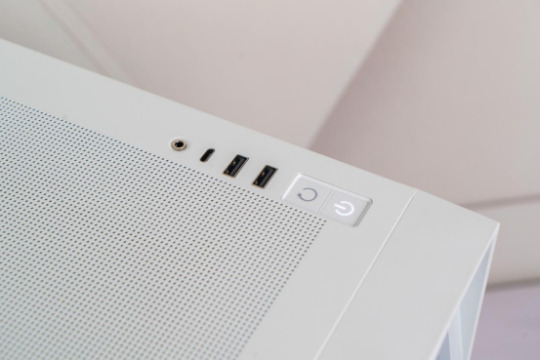
The I/O panel provides 2pcs of USDB 3.0, 1pcs of 3.5mm Audio jack and a Type-C connector with a maximum speed of 10Gbps. These connectors cover all our daily use with wired or wireless devices.

KL-Aeolus supports ATX, M-ATX and ITX motherboards. When assembled with an M-ATX motherboard, the space inside the case is still quite ample. Users don’t have to worry about the room for other hardware even if they get an ATX motherboard.

The case is compatible with many kinds of liquid coolers. You can even fit in a 360mm AIO for the CPU and a 360mm closed loop AIO for the GPU at the same time.It depends on your requirements. And we are going to build a system as a way of demonstration. In order to make the case look amazing while ensuring its heat dissipation, we have adopted a powerful white KL-360 AIO which belongs to Kunlun family, a high-end series by Segotep.


As a mid-tower case, KL-Aeolus provides a large space for the GPU. Even a RTX4090(not founder’s edition) of 4 PCIe slots can be easily fit into the case with 7 slots.There is a GPU bracket included to help avoid any bending of the mobo by the heavy GPU. If you want to mount the GPU vertically, you can buy an extra PCIe 4.0 adapter.


PSU installation is always a headache for starters. If the PSU housing is too small, two awkward situations would happen: it’s difficult to fit the PSU with all cables connected into the bottom of the case, or difficult to connect cables onto the PSU which is already fastened on the bottom of the case. But KL-Aeolus successfully solves these problems with a detachable PSU bracket in its rear panel.


After removing the right panel, we can find the ample routing space for cables even this case is not so wide. Slots in the plates will certainly facilitate the routing of fan cables.


As the debossed marking suggests, a drive can be mounted vertically onto the internal plate. But the FAN legend means it also supports a placement of a 12mm fan which is to lower the temperature behind the PCB.
Many users can’t help ask: how is the heat dissipation capability of such a big case? Well, we can going to build a system with 12700KF and RTX 4070 to find out.

Firstly, we tested the system with AID64. As we can heard,the cooling system was at its full speed when the system was fully loaded with the PCU temperature around 70 to 80℃. This welcoming result was delivered by the vents design of the case.
Secondly, the pc was tested with Furmark. The core temperature of GPU red 56 to 66℃, without any clock frequency lowering.

When it comes to the noise, we tested with 3 games because we knew that on one builds a system just to run AID64 and Furmark. During the gaming test, the noise generated by the cooling system was low even you put your ear against the case panels. So gamers will not be disturbed by the noise even they put their computer on the desk.
In a word, KL-Aeolus is a well-designed case for even picky users. It provides solutions for difficulties users will encounter during the building process, for examples, tool-less panels for easy hardware upgrade and ample space for clean cable routing. As an experienced hardware manufacturer, Segotep has made the best us of this mid-tower case. What’s more, RGB lovers can enjoy the panoramic view of the hardware they built inside the case. If you are looking for a beautiful and useful case, KL-Aeolus is the one!
0 notes
Text
5 DETERMINING FACTORS WHEN DESIGNING YOUR POOL
The design and construction should always be done by a specialist, it is important to have the following factors clear before getting to work:
DIMENSIONS Depending on the use that will be given to the pool, they may have certain properties for practicing swimming as a sport, in which the dimensions will be larger and it must have a rectangular shape. If the pool is used for recreation, the pool can be designed in an irregular shape, of different shapes and sizes buy pool plans. It is important to review the regulations that determine its dimensions.
LOCATION The importance of the location of the pool depends directly on where the sun's rays fall for the longest time. Specialists must also determine the location in relation to maintenance, to avoid places with many plants or where there is a tendency to accumulate leaves or insects since they make filtering difficult and can damage the water purification and renewal system.
DECOR In recent years, more pools have been installed for recreational purposes, areas with waterfalls, fountains, whirlpools, slides, a range of options for relaxation where swimming itself is a complementary activity.
DEPTH The deeper the water, the more volume of water will be used. When designing the pool it is very important to determine the use. In recent years, the majority of pools installed do not exceed 2 meters in height, which is the perfect height for recreational functions and swimming practices. It is important to consider that the deeper the depth, the more maintenance and cleaning products will be needed. If you want to save on maintenance and water consumption you should seriously consider this point.
LIGHTNING The latest trend for swimming pools is the use of lights both inside and outside the pools. Placing the Luminaires is done with the advice of specialists, who in most cases use LED lights, very popular for energy savings. Another widely used option is the use of fiber optics, which tend to be safer, since they do not involve the installation of any electrical device near the pool. INDOOR AND OUTDOOR
Both inside the glass and outside on the crowning stone and beach of the pool, the most common and used for years has been the famous tile, these small colored squares that give that touch to our pool, but nowadays it increasingly has more strength the tiles to beautify your pool, whether you opt for tile or tile to install your pool will depend on your style as well as that of your pool and the area in which it is going to be placed. We leave you an example of stoneware and tiles used in the construction of our pools.
0 notes
Text


Alva Noto & Ryuichi Sakamoto - This cover is interesting for its use of negative space and framing, simple color palette, and minimal drawings in the center.
Ryoji Ikeda - Similarly to the previous artwork, Ikeda's album cover reflects the aesthetics of his body of work within the field of new media art. Composed of tight textures of digits and an angular blue frame, the artwork presents a black and blue sans-serif typeface indicating the title of the album and the artist's name. These two textual elements stand out from the chaotic numeric background thanks to a white rectangular frame beneath them, and also because they are surrounded by more negative space compared to the digits in the background.
Ludwig Göransson ft. Travis Scott - This artwork relates to the previous ones with its usage of empty space, in this case a dark red background, against which a cropped image of a falling man, manipulated with a light blue filter, and a black uppercase typeface emerge.
1 note
·
View note
Text


design notes: we are going to document how it is done, I think that is useful, first we have cut the section that we need from the central block and positioned it on a large canvas
the width of the cooling case and rear motors is set, what we need to obtain now is the height of this case
and we are going to state that the height of the cooling case that by extension sets the height of the rear motor is equal to the half the height of our rear wheels
where it is installed either 50/50 or 1/4th below and above the floor of the vehicle, meaning that below and above this case we would have an additional 2 halves that corresponds to height of rear wheels
first we have to obtain the view of this rectangular case and after that we are going to fill and resize our canvas
we did a lot of scrolling but we have the height of the wheels, 720mm
yes but we already have a size for the car, true but we are not touching the widths of the car that are already set, only its height which so far is not set, and that is going to depend on the height of the cooling case in the rear and in front
so this our case, 896Wx360H
we have refreshed it under paint because resizing caused it to be a bit blurry
could it be it, it's totally it if the case of the motor exceeds the height of the cooling case, so the block is not flat on top and below like we had considered
the reality of it because we have to stay well above ground is that it's the motor case that is less above and below
ie minus the copper plates
so these are the fundamentals, the rest is drawing it, with 2 views, the cover and the inside
these are straightforward it is the communicating vents for the block with the filters in darker grey
and in light grey would be the axis of our rotor, it's a crosshair for now we will leave it as such for when we install the motor casing, which basically is a truncated circle, now the rotor axis is a fraction of that circle
to be continued
bearings in red, important ventilation slits communicating with the filters which should be less when we implement the motor casing
0 notes
Link
Check out this listing I just added to my Poshmark closet: New Gucci Black Rectangular Square Sunglasses GG0811S-001 Gold GG Grey Lens.
0 notes
Text
How To Clean The Washing Machine Filter.

The washing machine is one of the most used household appliances. Its function is to keep the clothes of all family members and the different fabrics in the home clean, treating each type of garment with the delicacy that it deserves with different washing programs. To guarantee its performance and keep it in good condition, it is important to clean the filter that contains and in which remains of dirt accumulate.
WASHING MACHINE SERVICE IN COIMBATORE
Washing machine filters are one of the most sensitive parts of the machine and, at the same time, essential to fulfill their functions. Therefore, it is necessary that you know the best method to preserve it in an optimal state. Discover how to clean the washing machine filter , the consequences of neglecting its maintenance and more details about it by reading this.
Where Is the washing Machine Filter
The area in which the washing machine filter is located changes depending on the type of machine, that is, if you have a front-loading or top-loading one, and even sometimes it also changes depending on the model. Therefore, it is vital to read the manual that comes with the appliance.
LG WASHING MACHINE SERVICE IN COIMBATORE
In a generic way, we can indicate that in the case of front-loading washing machines, the filter is located in the lower area of the front . Look closely to find a long panel, called a technical or service hatch, or a rectangular or square lid located in a corner of this front. Once you place it, open it easily by following these steps:
SAMSUNG WASHING MACHINE SERVICE IN COIMBATORE
If it does not have its own tab to be able to put your finger and pry it open, with the help of a screwdriver, pry one edge.
Press down on the latches to make them open.
Remove the lid and you will have access to the filter to clean it.
On the other hand, if you have a top-loading washer, it may have the filter in the same place as a front-loader , or you may need to open the washer door to find the filter . Then, to remove the filter from the washing machine, do the following:
BOSCH WASHING MACHINE SERVICE IN COIMBATORE
Open the drum and at the bottom you will find a plastic box that will be hidden behind the door.
Stick your finger into the hole in the box.
Manipulate the latch to pop out the filter.
If you find that you can't remove the filter plug from your top-loading washer, it's probably because you've inadvertently turned the drum with the flaps open. In this way, a collapse is caused that is difficult to solve without the help of a technician.
What is needed to clean the washing machine filter
You need to have the following materials and products to clean the washing machine filter :
1.A plate or a flat tray.
2.Microfiber cloths, more absorbent and with a greater capacity to remove dirt and dust compared to traditional ones.
3.Toothbrush or similar.
4.Ammonia.
5.Detergent.
How to clean the filter of the front load washing machine
To clean the filter of front-loading washing machines, at One HOWTO we recommend that you follow these instructions :
SIEMENS WASHING MACHINE SERVICE IN COIMBATORE
Tilt the machine back slightly if leaving it straight you don't have enough room to maneuver the bottom of it.
Remove the container from the washer to collect water from the bottom of the drain hole, covering the area with several rags.
Open the lid of the filter area of the washing machine and first remove the water from the drain with the drain hose, located very close to the filter, placing a container to collect the water. When you have the container in place, open the plug on the hose and let it drain until no more water comes out and plug the hose again. This hose is usually black, red or orange in color.
Now move on to cleaning the filter. Unscrew the filter cap by turning counterclockwise until the basket-shaped filter comes out completely.
Clean the surface, removing accumulated dirt and rust. You can use water, a brush and a universal cleaner.
When finished, put the filter back in its place and screw the lid on completely, then also put the well-clogged hose in its place and, finally, close the lid of this area of the washing machine.
WHIRLPOOL WASHING MACHINE SERVICE IN COIMBATORE
How to clean the top load washing machine filter
Before detailing the process of cleaning the filter of the top-loading washing machine, it is important to clarify that some machines of this type have the filter located in the same area as the front-loading ones. Therefore, in these cases the method is very similar.
On the other hand, for top-loading washing machines with the filter located inside the drum , cleaning is much easier: it is only necessary to remove the filter, remove all the accumulated dirt and rinse with pressurized water, let it dry, put it back and cover it again.
How often do you have to clean the washing machine filter?
Every 2-3 months you should clean the washing machine filter . Although there is no specific period of time, this interval is enough for the machine to work without giving any problems.
Besides, when you go to wash very dirty clothes, it is necessary that you clean the filter of the washing machine after hanging the clothes. The piece will have accumulated too much dirt and the machine will work harder during subsequent washes.
What happens if the washing machine filter is not cleaned
If you don't clean the washing machine filter, your clothes will be affected both in color and in smell . To avoid this, it is vital to keep track of the cleaning of the washing machine filter, as well as being very positive for the operation of the machine. These are the consequences of a dirty washing machine filter :
Clothes smell bad after washing. Despite using the best detergent and fabric softener, the dirt accumulated in the filter will counteract its effect and give the clothes an unpleasant aroma.
Clogged drain or machine drain.
The washer fails to fill with water or does not take enough to carry out the programmed cycle.
In the end, the machinery is constantly forced and suffers, until it breaks down completely, so the life of the appliance is shortened.
IFB WASHING MACHINE SERVICE IN COIMBATORE
How often do you have to change the washing machine filter?
After discovering how to clean the washing machine filter in different types of machines, it should also be noted that it is inevitable to change the washing machine filter from time to time. Despite cleaning it correctly, it is necessary to replace it so that the appliance works for many years, as it wears out with frequent use and washing.
Although the quality of the water is a determining factor, you must carry out the replacement of the filter of the washing machine in periods of 6 to 12 months . This is the estimated time, but by maintaining correct cleaning you can speed up to a year or a year and a half. However, it is always a good idea to read the manual that comes with the appliance to find out the specific characteristics of the brand and model.
0 notes
Note
Your art is so cool!! Can you share you digital art process sometime?
Ask and ye shall receive:
(Also thank you!!😭)
Aight so I have A Few digital art processes due to me being inconsistent and not being able to commit to one thing (I prefer calling it ✨having a creative and curious mind✨ but eh) so my processes are subject to change, but here are my more recent methods of drawing digitally.
First of all, my art software of choice in the last couple of years has been Procreate, with some of my most commonly used brushes being these:

Spectra is my brush of choice when it comes to sketching, I really like the texture and it has a nice feel when it comes to both size and opacity based on pressure.


Next up is lineart, what brushes I use in this stage goes hand in hand with what type of colouring process I'll use. When it comes to drawings with more flat shading (such as cellshading) I'll usually use Narinder Pencil. Again, nice texture, and I like it for situations where I want thinner lines with less variety in line-thickness.

When I use a colouring and shading process that's more complex/fully rendered of whatever tf you call it, I tend to use the Niko Rull or Eaglehawk (first drawing is the Niko Rull, second is Eaglehawk)


They are also the brushes I use for the actual rendering process of this particular colouring style (yeah guess we're going into to colouring stage now)
I have no idea how to describe my actual process on how I render my drawings lmao sorry I guess?? I kinda just improvise and hope it ends up looking decent haha. As you might be able to guess though, I am HEAVILY inspired by Arcane's art style (that show Awakened something in my istg) so uhhhhh go watch other people's tutorials on how to emulate the Arcane art style or smthn I dunno.
I will say though, the rendering process and the final look of the piece ends up being slightly different depending on which brush I use.
Niko Rull is rectangular as a base shape, and it doesn't really shade that easily on it's own. Because of that it takes a while to make the shading look good (trust the process!!) but I really like the end result (textureeeeee)

Eaglehawk is easier to blend and shade with (as in it takes a shorter amount of time) which leads to the end result being more smooth

Back to the drawings that use mainly flat shading! Here I will often use Eaglehawk to add that sweet sweet texture I keep going on about, basically I will just colour the areas that are either darker and/or more saturated (for example the cheeks, nose and ears in the latter case) with what is usually a warmer tone on a layer set to multiply, then I adjust the opacity to my liking.
Then I'll just cellshade using the Medium Hard Airbrush. I like using a cooler tone like blue often (like I did here in this example) but that changes a lot depending on what I think'll fit the art piece. Draw that on a layer set to multiply and again adjust the opacity to whatever looks good.
In the final stages of the drawing process I'll just add a bunch of filters until it looks good lmao. I am Bad At Colour Theory™, even though I KNOW the theory part of it, I have such a hard time actually using it practically. Basically, making the colour palette look good is HARD so I'll just CHEAT by using layers that's filled with a colour (whatever fits) and set it to like multiply or overlay or something like that and lower the opacity a bunch and BOOM people will think I know what I'm doing. One of my favorite is covering the entire drawing with a layer filled with a light blue colour, set that layer to Difference and lower the opacity to like 5%. The effect is subtle, but I like it.
Also, MORE TEXTURE!! Static texture!! Well, in procreate it's called "Noise" but it basically adds this static like texture to your selected layer. Use it on a layer that's filled with gray, set it to overlay lower the opacity a bunch and it gives this really nice grainy feel to your art. The colour filters I tend to use on all my coloured drawings, but the noise texture I mostly use the art with flat shading.
So yeah, sketching - lineart - colour flats - shading/rendering - add a bunch of filters - finished art piece, nothing really unusual there.
And lastly, some extra things I do:
In the lineart stage, I'll colour the sketch like red or something to differentiate between the sketch and lineart more easily.
I'll also lower the opacity of the sketch layer to help avoid accidentally drawing the lines on the same layer as the sketch (iykyk)
When filling in the flats, I'll first use a deep, saturated red or blue, and when I'm done filling in a section then I'll change the colour in that area to what it's actually supposed to be. This makes it easier to notice if there's a spot you missed to fill in because it'll contrast more!
I tend to prefer lineart that isn't pure black in my illustrations. With thinner lines I'll colour them a dark brown, blue, green etc, while with thicker lines I'll do the same but also lower the opacity slightly so that the colour underneath effects the lines colour as well.
You know how some people draw everything on like 1-3 layers? Yeah I'm the opposite, ONE MILLION LAYERS BABEYYYY you can never have too many!! (actually you can there's a limit but eh)
Sometimes, when I need to come up with a pose, I'll try posing in different ways myself to get ideas. I wont take any reference pics of myself tho because yikes
That's all I can think of for now! There's quite a lot to go into when it comes to art processes and I'm not great at explaining things, so if anyone has any questions just ask! :,)
22 notes
·
View notes
Note
Hiiiiii how did you do your character page it's so so so cool! Is the appearance customizable at all? Like can the rectangles containing the character portraits be a rounded rectangle or a different shape entirely? Have a great rest of your day!!
Hello! Thanks for asking!
So, I used two existing page codes for the base of my page. You can find those here and here. Like all tumblr pages (and web pages in general), they're based on html, and as such are highly customizable.
For example, I changed some of the icons in the individual character pages, as well as the size of the text boxes and images to make things fit better. (It's kind of hard to tell based on just the image on the post, but if you look at the preview compared to mine, you can tell.) Additionally, I totally changed the colors of the everyone page, along with redoing the filters to make them fit my needs. Also, if I remember correctly, I had to change the text box size when you click on it to make it fit the right number of lines without looking weird? I think??? Could be wrong.
html is a very wonderful coding language, and you don't even need any formal training to start learning it. 95% of what I know about html coding for visual purposes (like tumblr pages) I've learned through trial and error and examining existing codes. (Note: I know nothing about JavaScript and html to make different functionalities, so I'm useless in that department.)
If you are interested in learning more, there's lots and lots of websites dedicated to teaching code, including html and JS.
I'll talk about your question about shapes under the cut, cause this is already super long.
In html, you define the shape and size of the image using width and height in pixels. My limited experience involves only circles/ellipses and rectangles/square.
If I remember correctly, there is some amount of code that you can use to make rounded edges to images (I don't know what it is, but I'm aware that it's possible), but it might be relatively easy to also just round the edges in photoshop. So long as the overall image meets the same width and height as displayed in the html, you shouldn't run into any issues. (Unless the image has a frame on it in the code, in which case you would have to change the frame if you wanted it to also be rounded.)
(A google search of "how to make rounded corners in html" should be helpful. I'm typing this right before going to dinner, so I'm slightly short on time.)
There is also a section of coding that can allow images to be auto-resized to fit the space specified in the code. However, this relies on the images still having the right crop ratio to prevent the image getting "squished".
Also, in a similar vein to what I mentioned above, you can use a "square" or "rectangular" image that is transparent outside of the funky shape you want to use and place it in a square or rectangular space in code.
Okay, I think that's all I have to say on the topic! Thanks for the ask! <3
10 notes
·
View notes