#SellSheet
Explore tagged Tumblr posts
Visit Tumblr Blog
Explore Tumblr blogs with no restrictions, modern design and the best experience.
Last Seen Tumblr Blogs


Fun Fact
The average Tumblr user visits about 67 pages every month.
Text
Finalized Sell-sheet and One-page for personal platformer project
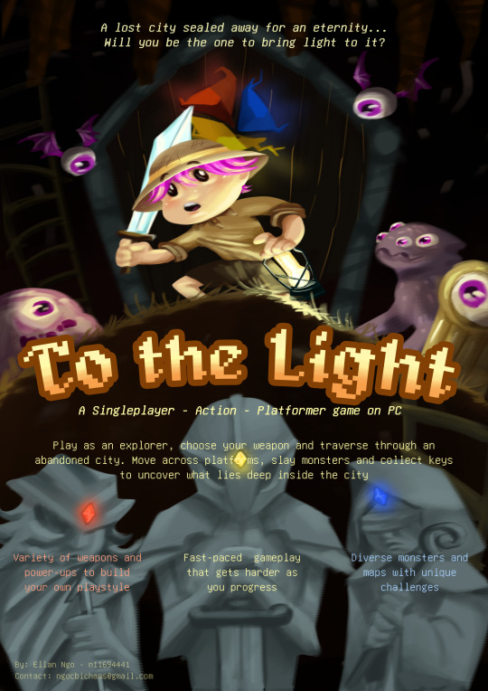
(Illustrated by me:])
The platformer project ive been working on from the very beginning of the semester now has a detailed sell-sheet and one-page. While making these, I had the opportunity to reflect on my own game design and expand on the original ideas i envisioned for the game.
It's a simple extension on the classic platformer game, but with enough new implementations to keep the moment-to-moment gameplay engaging. I tried to combine different types of resources management together to create an original game experience (as suggested by prof. Fullerton in chapter 3, p92 from her book: Game Design Workshop) and hope it can turn out to be a well-crafted prototype.
1 note
·
View note
Text
Assignment 2 Sell Sheet Development
For assignment 2 I'm going to create a A4 sell-sheet pitch document and a one-page development document.
I've really wanted to make a roguelike since the start of this unit, and this is my chance. I started out finding the perfect assets. I found some royalty-free assets and started designing my sell-sheet.

The sell sheet has a eye-catching header with the name of the game, "Critter Combat". By its side you can see the main character. Next up you can see four unique selling points (USP) for this game alongside some of the enemies you will have to defeat. Just below you can find three short sentences explaining a bit more what you can expect when playing the game, followed by picture illustrating how you're going to shoot enemies to kill them. At the bottom there is a small picture showing the controls for the game.
I've also added contact info at the bottom and a little more information about the game at the top, just above the header.
I'm really happy with the colorscheme. The header have the same color as the main character's bandana. The next text have the color of the trunk-enemy. Followed by some more text with the color of the mushroom stem. At the bottom the header above the game controls, have the color of the game control picture. The info above the header is supposed to be a color that wouldn't draw your attention from the rest as it's not that important. Thats why its green on green.
I used canva.com to create this and am really happy with how it turned out! I'll post another update when I get some progress on the development document.
0 notes
Text
A step-by-step walkthrough of how to make a sellsheet to help you pitch your board game to publishers (video):
part 1: https://www.youtube.com/watch?v=b6pEm3QnS10&t=12s
part 2: https://www.youtube.com/watch?v=uWw5RPPiVZo
0 notes
Text
Assessment 2 Progress
Prototype Choice and Alterations
I have decided to use the “Get Gone” prototype as the basis for my Sell Sheet and One Page. I will tweak the idea slightly, however, with the power-up system being changed into a card based system; allowing for a more real world equivalent for the players to draw connections to. Aside from that, the prototype will not change much; with only additional levels and a more in depth difficulty curve being possible additions.
Progress on Overall Content
So far I have created a 3D Render to place in the background and planned out all of the content for the Sell Sheet and One Page and sketched out basic design ideas.
Here is the 3D Render:
1 note
·
View note
Photo

#voyager#star trek ccg#sellsheet#collectable card game#ccg#star trek#star trek voyager#star trek picard#star trek tng#star trek deep space nine#ds9
1 note
·
View note
Text
Assignment 2. Final
I finished both the sell sheet and one page documents. I think the aesthetic is pretty clear through the art and logo I made, as well as the little features I added like the dust and sticker, that indicate its a retro asteroid-like game.

I tried to make the sell sheet look like some sort of game cover and I think I managed to cram a surprising amount of information in a limited space, including the controls, main gameplay and themes.
With the one page, I think I got pretty much all of the core mechanics and ideas I had listed out and I finished the visual representation of the mockup so that each layer or aspect of the gameplay can be more easily seen.
0 notes
Photo

We’re excited to have made it through the first round of the contest by The Board Game Lab with our game, Medieval Challengers. This is the sell sheet we entered. Now we’re busy perfecting our instructions and creating a new video. It’s all fun and games! #games #gamedev #gamedevelopment #gamedesign #sellsheet #tabletopgaming #tabletopgames #lightstrategygame #itdgames #kurtkeller #graphicdesign #logodesign #productdesign #3D #contest #cardgame #tricktakinggame #tricktaking
#productdesign#cardgame#logodesign#tabletopgames#gamedesign#lightstrategygame#itdgames#tricktakinggame#tricktaking#gamedevelopment#graphicdesign#3d#games#contest#tabletopgaming#sellsheet#gamedev#kurtkeller
2 notes
·
View notes
Text
Sell Sheet/One Page Postmortem
This assignment had a lot of ups and downs, mainly downs. Throughout the whole project I was confused and unsure if I was even on the right path. In the end I have uploaded what I think is as close to what the aim was as possible but am overall not impressed with how it turned out overall.
0 notes
Text
Week 8a - Sell Sheet: Unicorns Rage
As part of assessment 2 for IGB220, we were required to select one of our three design sprint games and establish a potential sell sheet.
The purpose of the sell sheet is to be an informative single A4 poster, aimed at garnering potential developers in assisting to build the game.
Key elements of this document included;
The Game Title
X-Statement (Razor Statement and a Slogan)
Defining Details (Players, Genre, Platform)
Unique Selling Points
Game Art
Point of Contact (Email, Phone)
Game Description (Typically left out when X Statements are firm and precise)
Over the course of two weeks, a number of iterations and style peices were drawn together and after collaborative discussion amongst many of my classmates, Version 1.2 (Below) was the winner.

Version 1.0

Version 1.1

Version 1.2
Many other iterations and styles were developed prior to testing eye appeal with others, the above however were shared and expanded upon as completed copies.
In Closing
Overall I was quite impressed with the completed products above, I feel I included slight quirky humour to the design to attract eyes for a second glance.
0 notes
Link

0 notes
Text
FLUX Sell Sheet

Here’s our FLUX Revised sell sheet, the colours come across quite overly saturated on Screens but that’s to accommodate for the reduction that happens due to printing. Now just to give it to some industry professionals and see what they say!
#SellSheet#Presentation#Marketing#Design#FLUX#Presenting#GameDev#GameDesign#Student#Learning#Melbourne#AIE
47 notes
·
View notes
Text
Really Selling It
Part of the Industry panel presentation is creating and printing a sell sheet for the game we are making, so this is just a quick show off post for what the team has put together.
Front:

Back:

And be sure to follow us over on Twitter at https://twitter.com/silvathegame for some more bite-sized project updates!
21 notes
·
View notes
Link
I offer graphic design professional services. I work on-line by written communication, you can contact me for information or a free quote. I have experience mostly on design for print, I'm available to design catalogs, T-shirt, brochures, flyers, sell sheets, labels, boxes, hang tags, logo, tech sheets, images for web, image to vector conversion and other customized works.
Go There -> https://goo.gl/CgYCx3
#Graphicdesigner#designer#logo#newproduct#newlogo2018#moderngraphic#catalogsdesign#tshirtdesign#brochuresdesign#brochures#flyersdesign#sellsheets#labels#hangtagsdesign#techsheets#imagetovector
2 notes
·
View notes
Text
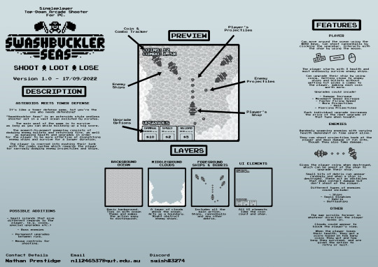
Assigment 2. Progress
I began work on assignment 2, the one page and sell sheet. I decided to use my asteroids prototype, "Swashbuckler Seas" as the main basis for the game design concepts. I created a simple features page and a gameplay mockup based on a new aesthetic and style, as well as creating a logo.
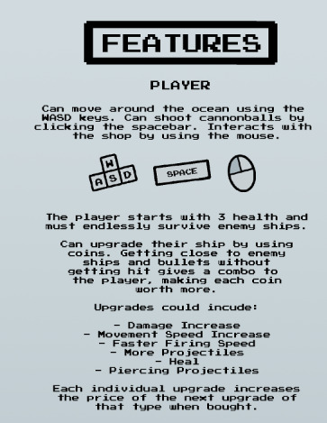
I think aesthetics go a long way in presenting the feel of a game, and hopefully the concept will be interesting to some.

0 notes
Text
Sell Sheet/One Page Development
With this Assignment I find myself very confused as to the scope of the project I am trying to create. I understand that there should predominantly be whitespace for future writings on the one page, and that I should also show off aspects of the game I created such as enemies, health system and such, but due to not having fully developed the game I have limited resources available to mention and don’t have a particular idea of the future of the game in mind.
0 notes
Photo

Recently, I finally had the chance to do something I felt I needed to do since I started designing Hatsumode: find someone native to Japan to review the game and make sure I was culturally correct and not a dumb white guy. At Maker Faire Orlando, we were lucky enough to be tabled next to a Japanese woman who agreed to help. So I sent her the pictures, the rules, and the sellsheet for her review. Today, I got her response... She corrected my spelling on two of the Shinto temples, and complimented the research I had done. That's it. Major checkpoint (to me) taken care of. #bluefoolgames #hatsumode #shinto #japanese #boardgame https://www.instagram.com/p/B5D-La2hdc-/?igshid=oddqk0ziq5yj
0 notes