#TypeTuesday
Explore tagged Tumblr posts
Visit Tumblr Blog
Explore Tumblr blogs with no restrictions, modern design and the best experience.
Last Seen Tumblr Blogs


coachiphone5caseocelotls-blog
Coach iphone 5 case ocelot - Coach outlet usa pantip chalermthai
2 posts

Fun Fact
Tumblr is used by 21% of adults online aged 18-29 years.
Text


Typography Tuesday
Here are some pages from Flowers & Flourishes by the noted British book designer John Ryder (1917-2001), published in London by The Bodley Head for Mackays of Chatham and printed at Mackays in 1976. The book displays all the decorative flowers, ornaments, rules, and typefaces held at the printing house of Mackays, prepared to mark the centenary of their foundation in 1875. Since 1999, Mackays has been part of the CPI Group of printers. The type display pages were designed by the eminent wood engraver and illustrator Yvonne Skargon (1931-2010).
View some wood engravings by Yvonne Skargon.
View other type specimen books.
View more Typography Tuesday posts.
#Typography Tuesday#typetuesday#typefaces#type ornaments#Mackays#Mackays of Chatham#Flowers & Flourishes#John Ryder#The Bodley Head#Yvonne Skargon#typography#Type display books#type specimen books#type specimens#20th century type
180 notes
·
View notes
Photo

Fantasy serif type with abundant alternate characters toggleable via Caps Lock; rough style may be taxing on setups, use with caution.
Link: https://l.dailyfont.com/k5F4h
#aff#Love#Instagood#LifeHacks#MotivationMonday#FontsForDays#TypographyIsMyJam#DesignInspiration#FantasyFonts#FontLover#TypeTuesday#ArtisticExpression#DigitalDelights#DesignGoals#CreativeCorner#PixelPerfect#GraphicGoodness
0 notes
Text
Typography Tuesday
We learned yesterday that the Providence Public Library (PPL) offers a competitive college student type design award called the Updike Prize (named after Merrymount Press proprietor David Berkeley Updike, 1860-1941). This year's deadline is September 5. This is so great!!
We further learned that the Daniel Berkeley Updike Collection at PPL, which opened to the public in 1937, was begun in 1910 at Updike's suggestion with the purchase of over a thousand duplicate books from the St. Bride Library in London, with Updike contributing generously to the fund drive that enabled the library to make the purchase. After his death, Updike bequeathed his personal collection of books on printing to the library.
Today the collection contains, among other things, over 7,500 volumes, with hundreds of type specimen books from the 16th century to the present, and a set of punches and two sets of matrices for Updike's Montallegro and Merrymount types. WOW!
We present below just a few of the previous design winners and their winning designs.

2023 Updike winner: Clara Cayosa, Montallegro (Revival). A page from The Life of Michelagnolo Buonarroti, a book set in Updike's Montallegro, compared with Clara Cayosa’s digital revival of the metal type.

2021 Updike winner: Corinne Ang, Fluoral.

2017 Updike winner: Erica Carras, Raleigh Condensed.

2016 Updike winner: June Shin, Ithaka.

2016 Updike winner: Sandra Carrera, Picara.
Design students: get your applications in!
View our posts on other women type designers.
View more Typography Tuesday posts.
Updike Prize Reminder
Our first Updike Prize news is that it took a while, but our 2023 prize winner Clara Cayosa is finally in possession of the trophy. Clara was out of town for the award ceremony, but we made the handoff at an unofficial award presentation recently. If you’d like to be the next person receiving the trophy, now is the time to be working on your typeface. The deadline for submissions is September…

View On WordPress
#Typography Tuesday#typetuesday#Women's History Month#type design#design#design students#women type designers#Clara Cayosa#Corinne Ang#Erica Carras#June Shin#Sandra Carrera#Updike Prize#Updike Prize for Student Type Design#Providence Public Library#David Berkeley Updike#Daniel Berkeley Updike Collection
23 notes
·
View notes
Text

From: The decorator and furnisher. New York : E. W. Bullinger, 1882-1898
NK1700 .D5 Dec. 1886
#interiordecoration#window#artglass#vases#woodwork#wallpaper#velour#pattern#1880s#late19thcentury#typography#typographytuesday#typetuesday#rarebooks#specialcollections#libraryofva
89 notes
·
View notes
Text
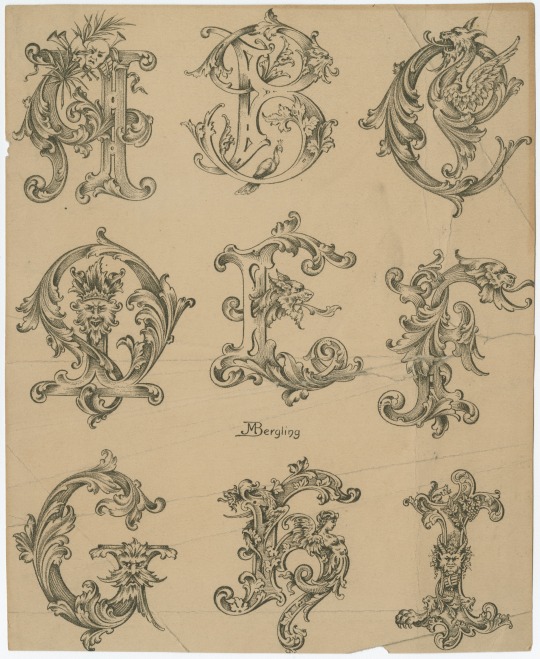

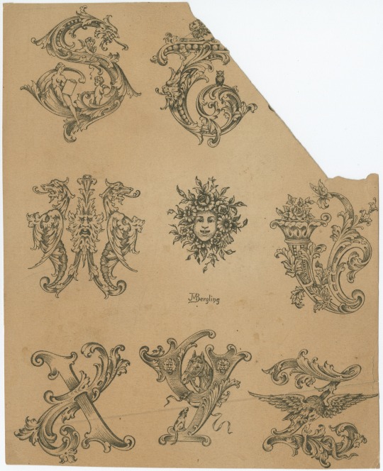
Which letter are you today?
We're kinda feeling like that 'W'...
From a Collection of designs for letters and monograms, by J.M. Bergling.
101 notes
·
View notes
Photo


Argesta by Atipo Foundry / @atipostudio
Argesta is a powerful neoclassical serif font family with high contrast. The ideas for this font has a wide range of reference, from vintage, classic, until the modern era, making it the perfect typeface for an understated, modern, sophisticated look. Stylistically, Argesta is directly inspired by haute couture and it is well-suited to classy branding identity, magazine design, or for luxury product packaging design.
-
Download — http://bit.ly/3749XFZ
-
#literepedegeaba#font#fontforfree#fontfriday#freebie#freedownload#freefont#goodtype#type#typedesign#typeface#typefaceforfree#typegang#typematters#typetuesday#typography#atipofoundry#serif#neoclassical#highcontrast
3 notes
·
View notes
Photo


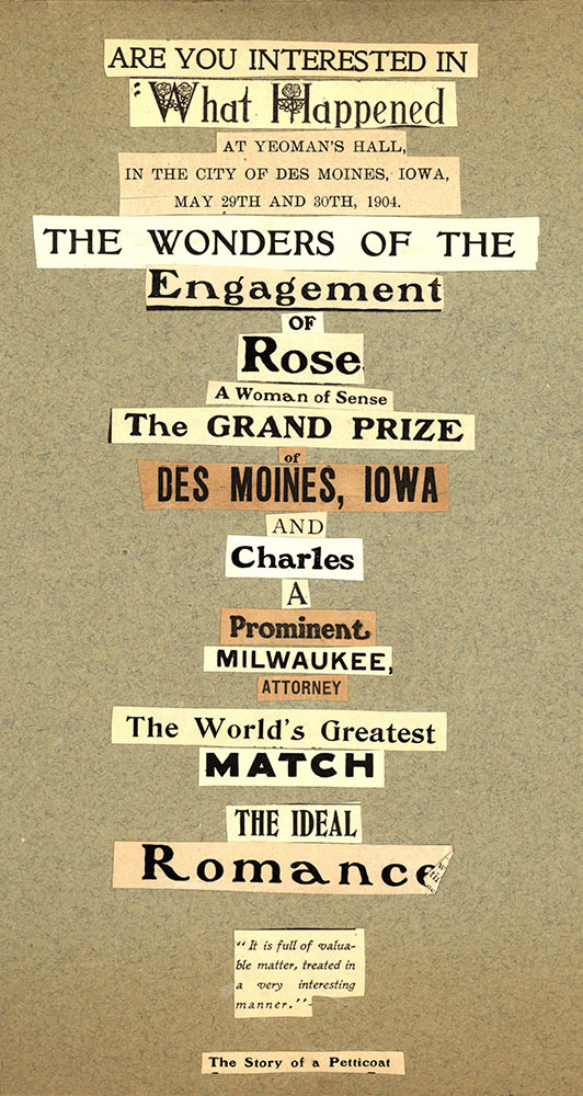

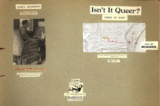


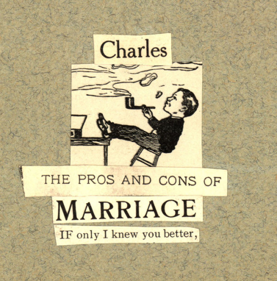
Typography Tuesday: A Love Story
Today begins the first installment of A Love Story. This scrapbook tells of the courtship, engagement, and wedding of Rose Sheuerman of Des Moines, Iowa and Charles Aarons of Milwaukee, Wisconsin. The couple were married in 1905.
We hope you will enjoy this thoughtful scrapbook and the early 20th-century typography and illustrations that help to tell the tale. Keep watching for next week’s installment where we learn about the hardships of sustaining a long distance relationship by post.
#uwm archives#typography tuesday#scrapbook#1900s#love story#keepsake#wedding#marriage#courtship#engagement#archives#artifact#typetuesday#Milwaukee#train#owl#manicule#printer's fist
170 notes
·
View notes
Photo
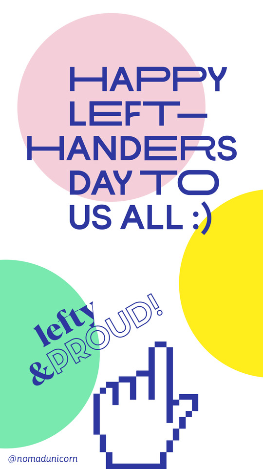
Happy left handers day to us, fellow lefties! :) © @nomadunicorn
#lefthanded#lefthanders#lefthandersday#lefty#lefty mancini#lefties#type#typetopia#typetoday#typetuesday#typographylove#ilovetypography#graphicdesigner#itsnicethat#eyeondesign#typedirectorsclub#zurdos#adobeillustrator#typedaily
1 note
·
View note
Photo
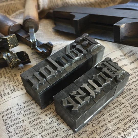
Lead type in black letter font for #typetuesday.👌🏼 #type #letterpress #blackletter #font #antique #handtools #toolsofthetrade #stilllifephotography #nofilter #photography #bookish #inspiration #eidolonhouse
#eidolonhouse#photography#antique#blackletter#type#letterpress#font#inspiration#stilllifephotography#toolsofthetrade#bookish#nofilter#handtools#typetuesday
59 notes
·
View notes

Text


Typography Tuesday
GIOVANNI BAPTISTA VERINI
Sometime between 1526 and 1527, Italian calligrapher and writer Giovanni Baptista Verini published his noted 4-part handwriting manual, Liber Elementorum Litterarum, probably at Toscolano on Lake Garda. This very rare book stands between the great manuals of Albrecht Dürer's Four Books on Measurement (1525) and Geoffroy Tory's Champfleury (1529).
The images shown here are from a 1947 printing of the third part of Varini's manual, published as Luminario or the Third Chapter of the Liber Elementorum Litterarum on the Construction of Roman Capitals, with an English translation by English librarian and typography expert Alfred F. Johnson (1884-1972) and an introduction by the master type historian and designer Stanley Morison (1889-1967). It was published in Cambridge by Harvard College Library and in Chicago by the Newberry Library, and printed in London by the Office of The Times in an edition of 510 copies.
Next to nothing is known about Verini himself. In his introduction, Morison writes:
The meagre details concerning the career of Giovanni Baptista Verini provide material for few positive statements. He was young, he was a citizen of Florence, . . . and a bookseller there. . . . If Verini's "Luminario" . . . was not reprinted, if was a disappointment he was prepared for, as witness the text he chose to place on the title page of part three, here reprinted after four hundred and score years: OMNIA LABUNTUR SED VIRTUS SOLA VIRESCIT [Everything slips away, but only virtue remains verdant].

View a post on Albrecht Dürer's manual.
View a post on Geoffroy Tory's Champfleury.
View more Typography Tuesday posts.
#Typography Tuesday#typetuesday#Giovanni Baptista Verini#Liber Elementorum Litterarum#lettering manuals#writing manuals#Alfred F. Johnson#Stanley Morison#Harvard College Library#Newberry Library#The Times#The Times of London#Roman letters#Roman capitals#16th century type
428 notes
·
View notes
Photo
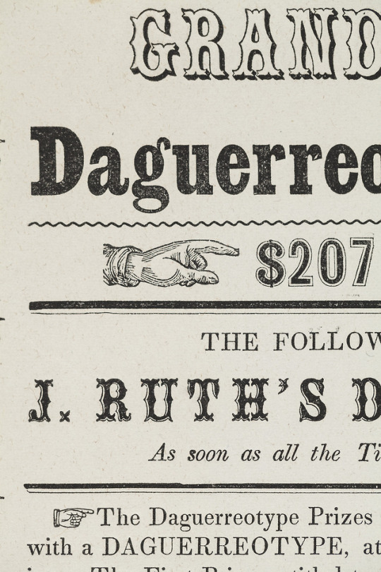
It’s #TypeTuesday again! We’re featuring another image from our current exhibit, Designed, Displayed, & Discarded: Ephemeral Printing in Alton, Illinois, 1835-1855. This advertisement for daguerreotypes includes printed hands, oftentimes called an index or a manicule, which point to and emphasize certain parts of the text. Hand-written manicules gained popularity around the Renaissance, when readers would draw hands pointing to parts of the text they wanted to highlight. Today, the index symbol is considered a standard typographical feature. Come see these manicules, currently on display at the RBML until May 31, 2018.
8 notes
·
View notes
Photo

#TypographyTuesday: Nicolas Jenson's roman types are among the most influential typefaces ever produced. This example shows the blank space left for the addition of an ornamental initial by hand.⠀ ⠀ PA4373 .V6 1478⠀ ⠀ #nicolasjenson #romantype #typography #incunabula #bibliophile #bookstagram #booklover #rarebooks #specialcollections #librariesofinstagram #iglibraries #mizzou #universityofmissouri #ellislibrary #ifttt
#bookhistory#special collections#rare books#mizzou#libraries#books#history#instagram#typography#design#typographytuesday#typetuesday
64 notes
·
View notes
Text
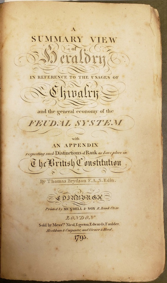
From: Brydson, Thomas. A summary view of heraldry. Edinburgh : Printed by Mundell & Son, 1795
#titlepage#scottish#1790s#late18thcentury#typography#type#typeface#typetuesday#typographytuesday#titlepagetuesday#rarebooks#specialcollections#libraryofva
40 notes
·
View notes
Photo

These embossed letter specimens are examples of Boston Line Type. Boston Line Type was developed in 1835 by Samuel Gridley Howe as a raised letter system of printing for the blind. Reading it tactilely, however, was difficult and the embossed alphabet was eventually abandoned for a simpler dot system.
commontouch.librarycompany.org
[Collection of samples of raised-letter line types for printing for the blind]
13 notes
·
View notes
Photo

Playing with gradients tone color🎶🎵 . . . . . . . . . . . . . . . . . #balibillydesign #youaretypography #typosters #typegoodness #typematters #typefacedesign #typographyinspired #ampersand #type #typography #typedesign #typeface #typographyinspired #typetuesday #typographyinspiration #thedailytype #graphicdesign #graphicdesigner #design #designer #font #fonts #fontdesign #fontfoundry #goodtype #creative #typespire #typegang #typematters #letters (at Bali) https://www.instagram.com/p/CLyr_aFHA2k/?igshid=alywn93io3vd
#balibillydesign#youaretypography#typosters#typegoodness#typematters#typefacedesign#typographyinspired#ampersand#type#typography#typedesign#typeface#typetuesday#typographyinspiration#thedailytype#graphicdesign#graphicdesigner#design#designer#font#fonts#fontdesign#fontfoundry#goodtype#creative#typespire#typegang#letters
0 notes