#With pages that are easy to navigate and find that are in order with pagination
Explore tagged Tumblr posts
Visit Tumblr Blog
Explore Tumblr blogs with no restrictions, modern design and the best experience.
Last Seen Tumblr Blogs


Fun Fact
The most popular pages on Tumblr are about Minecraft, GIFs, and David J. Peterson.
Text
Kind of funny kind of sad that I'm the most capable I've ever been in my life of starting and maintaining a web comic like I've wanted to do since I was a preteen, but with the least amount of motivation to do it during the worst time for web comics to succeed. 🙃
#Like genuinely where the hell would I even post a webcomic#If I wanted to just post one without restrictions of what kind of content it can have in it#With pages that are easy to navigate and find that are in order with pagination#And isn't being scraped by AI#And doesn't require hosting fees that I can't afford#Like???#Jesus fuck it's dire if you want to be an artist on the internet#But somehow it gets worse when you want to make a comic (Even casually)
0 notes
Text
What is Pagination and Why to Use Them?
It is not possible for websites to restrict all of their information to a single Web page. That is why sites use multiple pages, each dedicated to a certain piece or type of information. This also makes it easier for visitors to navigate the website and access the information they need. This kind of structured approach results in enhanced user experience, a better understanding of personas and the ability to streamline the buyer’s journey.
All of these things can be achieved through pagination. Pagination is key to streamlining the pages on a website so that visitors through search engines can access them easily. Presenting ordered results on search engines, directing users to pages that contain the information that they searched for, and making it easier for the users to navigate between multiple pages are all part of pagination. So, what is pagination and how can it help you in your search engine optimization (SEO) endeavours? Let us find out.
What is Pagination?
Pagination is a process whereby a huge data set is distributed into several sub-category pages. Pagination makes website navigation smooth and makes information relevant to their specific search query available in one go. This process is implemented by websites on search engines, to yield organic results for each page on a website.
Pagination also allows users to access information like the total number of pages in a website, the page they are currently on, the history i.e. previously opened pages, and much more. This adds to user awareness, making it easy for them to access multiple pages based on their user journey. For instance, quick control buttons on websites such as the previous page, next page, first page, and so on, can contribute to pagination and save a lot of time for the users. This guides them in their journey, as they would know which pages to visit next. This is a defining trait of a refined and rewarding user interface for websites.
How does pagination work?
Pagination in SEO works by splitting a single piece of content across a series of Web pages. It is usually done so that exhaustive chunks of content become easily digestible. It best serves websites that sell multiple products or those that deal with long lists of articles.
Pagination distributes content across multiple URLs. You have the option of scrolling to previous or subsequent URLs. If you use pagination to break down a single piece of content and present it on multiple pages, you must make an effort to notify search engines that the specific URL has a multi-page document. You must also make an effort to inform search engine bots about the order of the pages; that is, which ones appear first and which appear later.
Examples of Websites Using Pagination
1. Myntra
Myntra not only offers next page and previous page options to their website visitors while they are searching for something on the page, they also offer category pages with unique filters to ensure that users see the exact type of products they are looking for.
2. Search Engine Journal (SEJ)
SEJ offers users the option to explore any category based on their preference. The website offers a “More Resources” section on each of its blog pages with related content for users along with a “Suggested Articles” section. This gives the users access to tons of content from a single page, which they can explore based on their liking.
3. Slideshare
Slideshare is a platform that aggregates across a huge number of categories, and the best way to offer the users a seamless experience is to segregate their content with pagination. The site provides pagination to the users alphabetically or numerically.
4. Search engines
Google implements pagination in a very simple and accessible way for the users. The search result pages on Google present the users with alternate search terms at the end of the page if they do not find relevant results on the first page. This takes the user experience up a few notches and makes it easier for users to find the exact results they are looking for.
0 notes
Text
The Tumblr Beta Version: an objective analysis
I was tempted to just type “it sucks.” And while that is an objective analysis, it’s not exactly helpful. I’ve sent several requests to @staff and @support to restore my account to the old tumblr dashboard format, and received the same automated reply twice now. I’ll copy/paste it here so everyone is on the same page:
(lol, I had to go back and edit this, because apparently the beta version doesn’t display block quotes on the dash. So I’ve also put the block quotes in italics... hopefully it’ll display properly... note after editing: nope, it doesn’t display italics either... how the heck am I supposed to differentiate quoted text? I’ll start each quoted bit with an asterisk, I guess...)
*Thanks for reaching out about the beta dashboard.
*We're currently testing it out, and your account seems to have been selected to take part in the test. Thanks for your patience while we work on it! At this time there is not a way to opt out of testing. You may see your Tumblr experience return to normal as we continue testing.
WE CAN ONLY HOPE.
*In the meantime, check out some of the new features available only in the beta dashboard:
OKAY TUMBLR, IF YOU INSIST, though I would MUCH rather have back all the functionality I personally invested into this website through xkit... you know... making the site ACTUALLY FUNCTIONAL. Let’s see what this beta version has given me instead of functionality:
*Change Palettes: Go to the person icon, then click "Change Palette." You'll find the classic Tumblr blue, dark mode, and a few other color palettes for your dash.
So I tried out all the color palettes. In addition to the ones mentioned here, there’s one that’s trying to look like a green screen terminal that gives me flashbacks to the early 80′s. There’s a reason we stopped using green screen terminals... Another one is “canary yellow.” It’s very yellow. The “classic tumblr” isn’t actually classic tumblr... all the post boxes are dark blue with grey type, not white with black type. And all the other colors are the insanely bright fluorescent of the new Dark Blue standard tumblr scheme. Which means links are practically invisible unless I highlight them. It’s migraine inducing. The one theme with a light colored background is called “Concrete” or “Cement” or something like that and even that only works for about half an hour before the migraine aura really kicks in. I just want my Old Blue via xkit back. You know, what tumblr actually used to look like. I don’t want any of these horrible color palettes. None of them work for me.
*The new "meatballs" menu: This is where you can copy the post link, unfollow the Tumblr who made or reblogged the post, or report a violation to our Community Guidelines.
I could do all of this from the user menus with xkit, too. I don’t regularly report violations or have the urge to block people I have chosen to follow. Why on earth would I want to do any of this? And why would I want these features located directly beside the post link copy feature?
You know what I do miss? I miss the xkit timestamps feature. I didn’t have to hover dangerously close to the KILL IT WITH FIRE meatballs menu in order to see when a post was made, and in this era of disinformation and misinformation spreading around this site faster than Covid-19, being able to see when a post was ORIGINALLY created is a far more useful feature than an easier way to block people. For reference: I currently have three blogs blocked. Two of them are pornbots. One is a nazi. If I don’t want someone’s content on my dash, I don’t follow them. This “feature” is entirely useless to me.
*A quick note: Pagination is not supported in this beta test, but we're collecting feedback to send to our engineers.
THIS IS THE ABSOLUTE WORST. This beta test might actually be tolerable if I wasn’t trapped into endless scrolling. If I could page through my dash, refreshing it every ten posts or so. You know why? Because once I scroll about 30 posts down my dash, tumblr starts overheating my laptop under the load of ALL THOSE POSTS. Things start malfunctioning-- it takes longer and longer to load new posts the farther I scroll. And the keyboard navigation (both page down and hitting J to advance to the next post, and even just using the down arrow to scroll as I read a long post) freeze and stop functioning. One of my laptop fans has actually begun to malfunction.
You know why this wasn’t a problem on the old version? If the data load got to heavy, I could open a post in a new tab, click view on dash with xkit, and voila! Brand new tab! I could close the malfunctioning tab and everything would be refreshed to normal! But without pagination, THAT IS IMPOSSIBLE.
Also, after reblogging a few posts, the beta version of this site breaks, and doesn’t open a post tab to add commentary or even tags. It just... reblogs the untagged post with no warning whatsoever. You know... that’s really really not cool. I tag EVERYTHING. Well, almost everything. The tags are the only way to keep track of the 40k+ posts on my blog. And warn people that I am posting potential spoilers, or other specific content. It’s REALLY inconvenient to have to either immediately go to my blog to edit the post and add tags, or even comments. The alternative is to scroll up to open individual posts I want to reblog in a new tab, and then reblog directly there. Ironically enough, THOSE pages actually open with xkit installed, and everything (surprise!) functions perfectly there.
It’s perfectly reasonable to understand why this specific issue has limited the number of posts I reblog. Reblogging content should not be this much of a hassle. Creators have been complaining for a while that reblogs have drastically slowed down, and I think making it even more annoying and difficult to reblog posts will not help this problem.
Also, with xkit enabled, there’s a function that auto-loads images as you scroll, so the images are always visible BEFORE they appear on screen. I don’t have to look at the colored boxes and wonder if this is a post I’ve already seen or something I should sit and wait for. Don’t even think about watching tumblr videos. Loading priority is given to the ads that you cannot pause or dismiss, so that video loads and plays in choppy two second bursts instead of being given priority. Since that’s the content I am actually here to consume, it kinda makes me want to do the opposite of patronizing anyone who advertises here with graphically intense ads. And then when you scroll away, with xkit, gifs and videos you’ve scrolled past STOP loading and playing, which I think might be contributing to the intensity of the resource hogging that’s literally melting down my laptop.
And for reference, I have a pretty decent little gaming laptop. A blogging platform shouldn’t be driving it to the brink of frying itself. I didn’t realize just how much xkit worked to streamline this and provide basic functionality to this site.
*And lastly, if you're an XKit user, know that the XKit team is working hard to update things on their end to make it compatible with the beta dashboard.
And this doesn’t even begin to scratch the surface of what I’ve lost without xkit. And this is a really REALLY garbage response to user complaints. “Oh, yeah, sorry we made our site suck even worse, but those nice people who do our jobs for free will surely fix our garbage soon!”
Dear wonderful people at @new-xkit-extension, I love you, and I miss you, and while I wish xkit worked with this beta version I’ve been forced into living with, I truly feel for y’all who are trying to deal with this nonsense on behalf of all of us.
And to the folks at Tumblr... maybe try to just... make your site actually more like xkit. You know, actually functional. None of these special new features are useful or functional to me. I respectfully request for a fourth time to be removed from this inane beta test.
Give us OPTIONS. Let us display ALL THE TAGS without having to click a button. Let me have back my Activity+ that actually allowed me to interact with people from my dash! That showed me real-time inline notifications in a way that I could reply to with a single click! Bring me back to my column of open messaging conversation icons so I have easy access to the people I talk with throughout the day instead of closing them all every time I refresh the page. I already feel socially isolated in freaking quarantine, please stop shutting off all my avenues of communication!
Let us have pagination! I mean, maybe it wasn’t the best idea to force heavy users of this site into a beta version that doesn’t allow us to opt out until your engineers had actually figured out how to make it work in a very basic way.
*Let me know if there's anything else I can help you with!
YES. PLEASE REMOVE ME FROM THIS BETA TEST NOW. I have let you know exactly what I want from this site. I just want it to ACTUALLY WORK. For someone who spends 12+ hours a day on this site, this beta test version is NONFUNCTIONAL. PLEASE ALLOW ME TO OPT OUT. I AM LITERALLY BEGGING YOU. I WILL ACTUALLY PAY YOU CASH MONEY TO ALLOW ME TO OPT OUT OF THIS AND GO BACK TO HAVING A FUNCTIONAL BLOG AGAIN. WHAT MORE DO YOU WANT FROM ME?!
PLEASE!
I AM OFFICIALLY AT THE END OF MY PATIENCE FOR ENDURING THIS NIGHTMARE.
(one final quick note... I’ve only been back on my dash long enough to make the parenthetical edits-- i.e. adding italics that don’t display and then adding the asterisks at the beginning of each section of quoted text, and already my laptop is overheating again. For reference, I originally typed this entire post from within my tumblr inbox page-- which still functions normally with xkit-- and spent over an hour on it. My laptop was fine the entire time. Clearly the issue is this beta version of the website. I will never forgive tumblr if y’all fry my literal only portal to the outside world at this time. PUT ME BACK TO NORMAL NOW. THIS IS ABSOLUTELY INFURIATING AND ENTIRELY UNACCEPTABLE. Thanks)
(oops apparently i lied... when the asterisks and the previous final note failed to display, I thought that seemed suspicious, and realized that I literally needed to refresh my entire dash in order to see edited changes. Funny how xkit enabled me to do that in real time, which is just another bit of functionality I’ve lost with this beta program. Please guys, this is really, really not working for me at all, just put it back.)
#tumblr problems#staff#support#xkit#was this good enough for you? because I am totally done with this if that wasn't completely obvious#please end my suffering
130 notes
·
View notes
Text
Errors to avoid for flawless M-commerce App Development
According to a detailed report on ‘E-commerce in the United States’, about 82% of Internet users prefer a mobile device to shop online. The report also confirms that the conversion rates from M-commerce applications are three times higher, with twice as much spending, as compared to E-commerce websites.
Moreover, E-commerce expenditures in the United States shot exponentially from 207.2 bn USD in 2018 to 338 bn USD in 2020. Experts estimate that the numbers will eclipse up to 420 bn USD.
The numbers are evidence that E-commerce applications are changing the way people shop. Unlike earlier times, users wanted their purchases quickly. As a subsequent series of events, E-commerce businesses were pushed to develop their mobile applications.
“Mobile Commerce” or “M-Commerce” came up out of nowhere, as a natural progression of E-commerce. These applications became the new ‘go-to’ for purchases. People are willing to wait for their purchases to get delivered, which wasn’t the case in earlier times.
What became important for retail businesses to sustain in the hypercompetitive industry was to ensure standing out from the crowd, however, even after multiple attempts and numerous design iterations, businesses battle with low engagement and retention in their apps.
The reasons could range dramatically from improper planning to failure in the user-friendliness in the application. However, mostly, the reasons are some common mistakes developers make while building a goldmine for E-commerce businesses.
In this article, we cover some of these mistakes that you can avoid while developing your M-commerce application.
11 Common Mistakes You Can Avoid When Developing a Mobile App For Your Business:
Here are some common mistakes you can avoid to give a competitive edge to your business.
1. Developers not Respecting the Medium
One of the major aspects you can focus on, is to respect the medium you’re using. Treating your M-commerce application as a miniature version of the E-commerce website only leads to a decline in user experience. This means unnecessary trade-offs and a significant impact on sales.
Consider Amazon. With over 100,000,000 downloads, Amazon became the number 1 app on Google Play. The fact that Amazon ensured an optimum mobile version of its business makes it stand out in the crowd. Features like quick search, million reviews, product details, and easy navigation make customers choose it over other apps.
2. Lack of Personalization:
Another common but critical mistake you can do is to not personalize your M-commerce application for your customers. You need to build a connection with the user and create a seamless user journey model. Irrelevant engagement lowers your conversation rate, and thus affects your business as a whole.
Features that remember your previous searches suggest your products based on those and offer easy navigation are something you should focus on. In addition to these, highly personalized mobile notifications and emails are crucial for increased engagement response.
3. Low-Quality Product Images:
Another common mistake you can do while developing your M-commerce application is to not invest in a high-quality photoshoot. Product photos have a significant impact on the overall user experience, which directly impacts the conversion rate.
We suggest you go with HD quality pictures with white background, clicked in multiple angles along with a zoom feature embedded in your app. Also, you can supplement your product photos with creative photos of the product in use.
Note – While you include HD quality pictures, you need to be mindful of your response time.
According to research from Google, bounce rates on mobile sites increase to 32% as page loading times go from one second to three seconds. The probability of a user bouncing to another app/site increases by 90% if that loading time reaches five seconds and 106% from one second to six seconds. You need to minimize the response time of your application by keeping the resolution of your photos in check.
4. Making The Home Page Cluttered With Too Many Features:
A cluttered home page with many features acts as barriers to browsing. Your focus should be highlighting the critical elements for your E-commerce business and pushing the ones that are just occupying space. Here are some features that need most of your attention:
a. Signup walls (lack of guest checkout): It can be highly problematic for your app engagement, in case your users can’t purchase a product without creating an account. b. Limited payment options: A limited number of payment options can be another problem for your sales. c. Shipping and billing information: Redundant information, or typing shipping and billing information twice before checkout increases interaction cost. d. Infinite scrolling: Using endless scrolling instead of pagination on the product list page can affect user experience. Users should be able to save a current position in their scroll and continue the journey on another platform.
5. Turdy/ Difficult Checkout Process:
Your main goal while developing an easy-going M-commerce application should be to reduce function, assuage doubt, and reassure the customer of their choices. Complicated checkout processes or multiple checkpoints to place an order makes customers not want to order at all.
Making the checkout process easy for your customer (even the guest users) involves the following steps:
a. Don’t show your checkout process all at once: The golden rule is only to showcase the features relevant to the user at the moment. Roll up everything else, and make the process of reaching the next step very natural. b. Do not hide what’s in the customer’s cart: Make sure your users can see what they want to buy. Allow users to change the quantity of each product right there at the checkout.
6. Essential functions out of thumb’s reach
Larger screens of the latest mobile phones dictate the way users navigate their phones. An increased manipulation of the screens with one hand makes it harder to access areas further out of your thumb range. You need to bring the search down closer to the thumb for most apps.
7. Ineffective search feature
Another common mistake is developers not paying particular attention to the search feature. Its impact on conversions is often underestimated. Ask yourself questions like- is your search feature enabling users to discover new products? Is the auto-fill working correctly? Does it allow users to find what they are looking for quickly?
8. Lack of intuitiveness:
Lack of intuitiveness in your M-commerce application leads to inconsistency in user experience. Simply put, you need to make your navigation easy enough for a three-year-old to take at least one action from your app.
9. Setting an unrealistic budget:
Setting a non-realistic budget is another common mistake that people often make. An ideal M-commerce application requires you to hire a team of developers, designers, and marketing experts. Thus, expenses involved in the development process need to be in line with your requirements. Make sure to discuss your first features, business logic, and objectives with the team of developers before finalizing the budget.
10. Not developing a cross-platform strategy
Advancements in technology make it imperative for businesses to use a cross-platform strategy. Developers use cross-platform app development tools to deploy a single source code on multiple platforms. Be mindful of the drawbacks of developing a cross-platform mobile application, and you’ll be good to go.
11. Lack of a marketing strategy
A lot of M-commerce applications battle with low user engagement despite thousands of dollars spent on its development. Not taking out enough time on your marketing strategy is another common mistake you can do. There’s massive competition in the app stores. With thousands of apps getting released every day, it’s difficult for your app to make a mark without a thoroughly thought-out marketing plan.
All in all, an M-commerce app can turn out to be a goldmine for a business. The process of development is thereby going to be one of the most significant investments for your company. You must partner with industry experts to develop a trustworthy and top-notch product. Ensure that your app development company has an in-depth understanding of the business logic, and you’re all set!
Source https://bit.ly/32tGJNE
2 notes
·
View notes
Text
Key Elements of a Responsive Website
Web Development
Web development is growing and expanding its periphery. From automating web interfaces to developing mission-critical applications, web development is turning dreams into realities.
It's an utmost requirement for a web developer to have proficiency on a wide range of platforms, development skills. They have to update and revive their skills on systematic basis.
Development lovers from all over the world are called to get services from our online platforms for Website Design and Development
Key Elements of a Responsive Website
Innovations in the technology and the advent of CSS3 and HTML5.0 have turned the dust of traditional website design and placed the red carpet for responsive website designing. Although designers use all available tools and technologies to make a robust and perfect website, there are a number of points that need quick attention. In order to execute and implement smart design decisions you need to fix these problems from approachable websites.
1. Clickable Areas
The hyperlinks on the website have a purpose to execute navigation in a proper manner. It is therefore important to make it visible on the site. You should also ensure that users face no hassles in clicking it. I have experienced it at various occasions that the visibility quotient of hyperlinks is very poor on the responsive sites that leads to ambiguous clicks on the page.
Web Design and Development Company give Service experts must understand that a large clickable area gives good space to users to hover the mouse cursor over the link. Manage your clickable area on your best website and escape a situation where you click link1 accidentally instead of link2.
2. Pagination
Pagination serves a purpose to split the content of an individual page into several pages together. Since displaying long list or service on a single page leads to serious complication. It doesn't only clutter the page but impacts the page load time adversely. On some blogs or websites, pagination is done to bifurcate the piece of content not to turn it more readable but increase the page views.
If you are developing a approachable website, perform pagination to split the pages only for better visibility.
3. Page Meta
The titles made for every page are equally important. If you prepare a generic title and use the same for all the pages across the website, pause this idea as it has more bottlenecks than benefits. A good and unique title holds the key for communication.
If users find your title unique and attractive, they will connect with you in a very particular style. These unique titles play very substantial role in getting top results in search engine results pages and more to Web Serviceability. While designing a reactive website keep the page titles in mind.
4. Content
Content placement and positioning is another aspect you must keep in the mind while delivering web designing solutions irrespective of its nature. To make sure that your approachable website is usable made sure that all the content posted on the website is useful, attention gripping and easy to scan. Your readers want to read a piece of text that help them to process transaction further.
Don't ever assume that your readers will read all the text you have posted. All they will do is a quick scan of the text if interesting. While posting then content quiz your Content Writing Services expert to place the information in order to ensure its essence.
5. Call-To-Action:
Finally comes the user engagement, an important aspect of the best website design. A user may have a number of concerns and issues with your services. A perfect responsive Web Design Methodology says there should be clearly visible approach for the user connect. Create call-to-action buttons on your web page as per user requirements so that users can connect to you easily using a mobile device.
6. User Interface
Website redesigning isn't an easy process but a complex, time consuming and costly as well. This is why I suggest you not to go into the process just for doing it. Make sure that your website needs it badly. Let me explain you in detail. You have a certain group of users who visit your website regularly in search of some content, text, graphics, image or moreover to hire a service.
They are quite conscious about a number of procedures available on your website such as primary pages, navigation theme and other vital links. Once you restructure the website, you will for sure change a few of the archives already there. It will leave your users agonized and betrayed. So, don't go for the redesigning until it becomes mandatory.
7. User Experience
This is the second step of website restructuring where we must involve the user base who use your website. This direct involvement with users helps you to understand the current look and feel of the website and any redesigning need if required. Getting feedback and suggestions from the users will always be beneficial from the website designing point of view.
To get the insight of your users you can make a few alterations in your website. Your audience will certainly respond to the changes. If they respond in the positive manner, you can go ahead with the beta version of the changes else postpone the party for some other day.
8: Usability Testing
If you are thinking to go ahead with the website redesigning process, giving a considerate thought to website maintenance and website testing is pretty mandatory. But the testing yields more results. This time not only your users but also invites the peers in the company to participate in the survey.
Keep in the mind that you are not going to redesign the website for yourself but for the end users. Allow users to send you site feedback through forms or a survey and keep track of them. It will give you an opportunity to get focused on the changes more prominently.
9. Website Update
Most social media websites follow the suite. Once they change the layout of the website, they retain the older version of the website for a considerable period of time. They do believe that users will take good time to get familiar with the website. You should also allow your end users to play with both new and older versions of the website. Facebook is probably the best example of this phenomenon.
10. User Engagement
If you have made major changes in your website layout, design, and navigation, offer users a complete and inclusive picture of the changes using a PPT presentation, slide or tutorial video. It will be highly helpful and innovative for the users. The tutorial will help them to adapt the changes with a faster pace and infuse a thought that you care for them. All the above-mentioned points are the major factors that sustain due prominence while the process of website redesigning.
We are offering best services of Development. World Innovative Solutions.com is the most reliable source to get best development services.
1 note
·
View note
Text
The A - Z Of White Pages
Ahead of the advent of the internet, people searched phone books to obtain phone numbers or addresses of folks or businesses. In those days, you would must find the proper group inside the phone book plus look for matches. In some countries, phone publications still exist but are usually printed and distributed just on request.
In modern times, the two white pages and Yellowpages are called directories. Someday you will end up being forced to register in a or both. It is usually important to understand the distinction between them. However, both are the result of a long history, a civilization, and the evolution of technology.
Yellow Pages
The Yellow Pages are phone web directories of companies and are structured by category. The name and concept of "yellow pages" came into presence in 1883. The very first official yellow pages directory site was created by Reuben Donnelley in 1886.
In recent times, the word Yellowpages is now commonly employed in both English-speaking plus non-English speaking countries about the world. The Yellowpages are called the Golden Pages in nations around the world like Israel, Czech Republic, Slovakia, Netherlands, Belgium, Romania, and the Republic regarding Ireland. They are known as Gelbe Selten in Germany and Austria, and as Gula Sidorna within Sweden. Gelben Selten plus Gula Sidorna mean Yellowpages. Yellow pages imply Pages Jaunes in France and francophone Canada. These people are referred to as Pagine gialle in Italy and Italian language Switzerland. They are called City Page in Japan.
Yellowpages directories are released annually and distributed with regard to free to residences in addition to businesses in a certain area. The publishers typically make profits by selling spaces for adverts.
The particular main yellow pages in america are DEX One's DEX, the AT&T Real Yp, Yellowbook and the Verizon Superpages. The yellow PAGES give use of phone directories of businesses and companies. The traditional term "yellow pages" is now likewise applied to online directories associated with businesses. Listings in the yellow pages are grouped. For example, medical physicians are categorized under typically the medical doctor heading and all nurses are categorized below nurses. Subgroups often exist in larger categories. For instance , there will be entries for different kinds of dishes under the restaurant group for convenience. It allows to narrow down or group the restaurants that offer Chinese foods, Photography equipment dishes etc. Sometimes, businesses and organizations are grouped by location. Many businesses and organizations advertise many and services using yellow pages. These people also include brief info and pictures of their own business. Web business directories are usually branded as Internet YellowPages (IYP). You can find business oriented and consumer oriented varieties. Internet Yp give small businesses the possibility to advertise locally and target their audience using familiar categories.
In 2010, the search term "yellow pages" was in the top 5 highest revenue generator of most search conditions. According to a record by Experian in January 2011, it was likewise one of the many searched terms across all search engines like google in the planet.
White Pages
The WHITE pages are directories regarding residential listings. White PAGES are arranged alphabetically in addition to contain phone numbers of individuals or non-commercial entities. Those who have opted to be listed in the device book are usually included in the WHITE pages in alphabetical buy.
White pages also typically list name, telephone number, street addresses and SCOOT codes. The white PAGES usually include a whole list of people living in a city or a physical area. The list is arranged in alphabetical purchase. Several phone companies about in the world constantly update the list within white pages. The tern "White Pages" was 1st mentioned in the United States. Before WHITE pages became popular or they will were being used, directories were already in presence however, not in this form. An America company created White pages in 1997, which is now popular and widely used inside about 91 countries on the planet. However, the service of white pages is called different names in various countries. It really is called phone directory in the UK. In typically the beginning, only a few people subscribed to the particular telephone network. The listing was in paper form, a book which users were required to flipped its PAGES to get what they had been looking for. Soon the amount of users skyrocketed. Over period, subscribers found it hard to flip through typically the white pages as it got a lot of period getting the results. Right now, it is easier in order to set up an automatic plus faster approach to directory upon the internet thanks to technology. Unlike the standard version, this technique is more efficient, the results are usually immediate and the info is updated every 12 months.
Annuaires pagesblanches remains typically the best white and Yellowpages in France, and is also the most widely utilized directory in the world. This services makes it easy to find and access telephone quantity of individuals you are seeking for as long because they have subscribed to the directory. Although, it truly is easier to search online, you still have to know just how to do it especially if you are not extremely at navigating. There are a couple of search options. The initial alternative is search. With this choice, you need to load fields. You need to fill the first discipline with the name and surname of the particular person whose residence or phone number you are seeking for. Area where upon the other hand must indicate an index that allows the directory to provide us with the exact address of typically the person. You can also perform a detailed search that will likely give you more correct results. For this choice, you should also indicate the field that simply by the name and 1st name in the person. About the other hand, in the field where, a person should refine your lookup by providing more details about the subscriber's locality by simply informing for example typically the department or the location where it really is located.
The results of searches in the white pages will indicate, in addition to the address and all the subscriber's coordinates, a map, but also an aerial view of the locality where the subscriber is located.
https://annuairespagesblanches.com/
1 note
·
View note
Text
Best Methods to SaaS Product Design in 2021
What are the main factors that have led to this success for Salesforce and other large companies with a huge number of users? From strong backend programming to the goal that the company serves, motives to be successful are numerous. However, the main factor is the design philosophy they employ. Are you looking to create the winning look and feel for your SaaS application? This article will help you learn all the information you need about SaaS product design in order to make sure that your app will be a great success.
Premium SaaS UX UI design practices are the difference between winning an audience or failing to create a powerful impression. It will help you make a mark in a competitive market and make a connection with your prospective customers.
A quick overview of SaaS
SaaS (Software-as-a-Service) model is at the front of programming plan in the current situation. It's not surprising since these features are revolutionary to the IT industry in addition, the SaaS market is expected to grow to $307.3 billion in 2026. It is predicted to grow at a rate of 11.7 percent between 2020 and 2026.
The advantages that come with SaaS against other model of delivery include -
More flexibility and lower overall costs
Space requirements are not as high.
Accessible and intuitive features
Improved UI/UX Design for AI due to the cloud computing technique
Many SaaS applications are currently implementing cloud computing effectively. Consider Microsoft Office 365, for instance. The application extends its capabilities far beyond the standard Word or Excel applications. Users can access and edit content on any device or device in real-time.

Best UX UI design For SaaS
2021 is the year of the millennials. SaaS trends in design tend to favor using dark modes and three-dimensional elements, artificial intelligence along with unique micro-interactions. However, the most effective practices in design cannot be overlooked in order to keep up with the new trends. Instead, they should cooperate to ensure that your SaaS project for product design is a hit in terms of style and functionality.
Check out the best practices for UI/UX design which shouldn't be ignored in your next SaaS product development.
1. Fuss-free registration procedure
A long list of pages to sign-up or sign up can be exhausting and exhausting. This is why making sure that it's easy to registration is among the most essential methods when it comes to SaaS development.
A simple registration process can draw customers in and encourage users to sign up for the application. However any overly complicated registration process can turn customers away.
If you are refining the process for registration, be sure to take into consideration CTAs (calls to actions). A clearly written CTA will attract potential users in and provide them with a vivid sign-up button will make it easier for users to register.
Google Apps could be an excellent example, as they have a whole page to assist users in getting started.
2. Simple, intuitive navigation
A simple and intuitive navigation system is one of the important things to think about when creating the navigation of a SaaS application. The home page should display all the essential information, and can even contain links to pages for products so that customers don't have to spend time looking to find what they're to find.
The navigation needs to be simple and easy. Hootsuite, for instance, offers the ability to navigate across all sites. It's hidden from view and can be extended whenever users are concerned that they've lost what the icon represents or have gone further than they expected.
3. Diversify pagination
Have you got multiple databases that have pagination on your site? If so, you'll prefer to make them more diverse to ensure that users don't get confused by multiple pages. If users are unable to determine what page is part of which database, or find it difficult for them to grasp all the information it is likely that they'll quit the program.
To ensure that users aren't able to leave your app Make sure that you have different pagination layouts that represent different information.
4. Create dynamic sorting in order to make searching easy
It's not the best thing to search for an item of information only to find that the search result included lots of information which is completely irrelevant to the search you're trying to find. This is a problem that dynamic sorting is able to solve.
This feature of dynamic sorting can refine searches to ensure that users see only the results they require.
In this case it is best to place the search bar at the upper portion of the screen so that people can see it quickly. Alternately, you could place it in a drop-down bar, but you don't want your interface to look too crowded.
A good example of how to implement active sorting can be seen at BuzzSumo. Search options allow users to find precise data. Users can also determine the duration of the search and the kind of information they're looking for (for instance, what is the social network platform that data comes from, and so on).
5. Create it easy to design the UI design simple
As you're aware of, the programming of SaaS products is complex and complex. This could cause some issues, including complicated UX UI design, and it could significantly impact the performance of your SaaS application.
If the user finds the interface difficult or do not comprehend what the SaaS application has to offer the user, they'll leave the app. Thus, even though it isn't easy to make an easy UI style, you must to work together with UX UI design experts to come up with ways to overcome it.
Adhering to simple design principles is the best way to draw customers. However, you should be sure that all aspects that are part of SaaS architecture are addressed.
A great example of the accessibility and ease of use is Dropbox.
6. Streamline Information Architecture
The information structure that is part of this SaaS product is among the main ways users will locate what they are looking for. This is the reason it has to be easy, intuitive and easily understood.
The systems should be displayed in a more comprehensive manner in order for users to swiftly become familiar with the application's capabilities.
7. Reduce the time to board
Users may be interested in knowing numerous things to ensure they can gain all-round value. Inflating the amount of information is tempting, but it is important not give in to that urge.
Like the sign-up process The best experience for onboarding will be easy and effortless.
The process of onboarding can begin by asking users to provide the necessary information about themselves in order to get started using the application. The whole process shouldn't last longer than a time of about a minute. To make it easier for users it is possible to give customers the possibility of filling out all of the information, or just skipping certain ones later. If you offer choices to your users when they sign up it makes them feel confident at using your application.
It lets them immediately begin using the application.
Other onboarding strategies you might consider using include videos and coach marks so that the whole procedure is made easier.
Remember that the main objective in onboarding is familiarize users with the fundamental aspects of the application and help users to finish their tasks.
8. Inform and engage using dashboards
When users log in to an SaaS application UX Design, the first thing they are presented with is their dashboard. This is the reason you should take time to perfect the design of your dashboard and user experience, since it will ensure a great return on investment.
This dashboard from Klipfolio is a fantastic model to learn from. The dashboard displays numerous KPIs such as the time to respond, load duration, number of follower as well as other indicators. Additionally maps, bar graphs charts, graphs as well as other visual indicators can help break up the data to facilitate scanning.
Some of the queries that can be answered instantly with the availability of a dashboard comprise those -
Recent activities that users have been engaged in
The present situation of users
The numerous issues users must be aware of while using the application
The most effective ways to begin working on the most important tasks is by being aware of how users are doing
9. Incorporate AI-driven chatbots
Chatbots play a significant role of our lives. users engage with chatbots both often, whether they are aware of it or not. For instance, when you're using the online banking app or Facebook services.
Chatbots' human interaction has grown to the point it is predicted to grow to $2,485.7 million in 2028. Therefore, you can estimate that around 85percent of interactions with customers will be completed without the need for human interaction.
Chatbots powered by AI can meet the needs of users to be more personalized and enhance the experience for users of your app. Users can find the answers they're looking for, without the need to wait until a person can provide customer service executive.
Furthermore, the addition of chatbots will mean you can delegate repetitive routine tasks to chatbots, and even conduct tests in real-time.
10. Simple and easy to understand illustrations
As mentioned earlier, SaaS apps and products aren't the easiest to comprehend. How will your intended audience be taught about the amazing features that are available through your application? It is imperative to inform them about it.
Naturally, writing lengthy paragraphs or providing large chunks of content isn't going to aid. The average user doesn't have time or ability to read through a number of paragraphs of text. The best solution to this is to use engaging and easily understood illustrations.
Illustrations are a great way to put across your message. This can help create a visually appealing design and a simple navigation.

In the end take it all in one sentence, you should look for easy navigation and patterns that are easily understood in the design of for your SaaS UX. For new offerings, people tend to tend to prefer services they're familiar with. Even if you're using AI or bots, it's not a bad idea to provide support to individuals for more difficult queries.
The style that you design for the design of your SaaS UX should be minimalistic and easy to use. By incorporating easy-to-understand and simple phrases, you'll be able to catch the attention of users. It is recommended to make the interface for users of the SaaS application as simple as possible, but when that's not possible include short videos on onboarding to provide a brief explanation of the way things work.
The last thing to mention is don't underestimate SaaS UI design elements and the significance to UX design. It is essential to find an equilibrium between these two elements to finish your project in a timely manner as well as within the budget.
It is possible to begin by creating an initial model of the SaaS application, and be sure that you follow the guidelines for UI/UX design mentioned previously. It will make your application interesting, enjoyable to use and user-friendly.
0 notes
Text
10 Best Pagination Plugins in WordPress
Does your blog have a huge load of content? If you’re nodding in agreement, you should seriously consider numbering your blog pages to make it easier for readers to browse. In fact, pagination is a part of WordPress’ core features – WordPress automatically adds “Next Post” or to the “Previous Post” at the end of each post, so readers can easily move from one post to another. In this post, we’ll look at a few WordPress pagination plugins that help to number your pages and posts.
When you add pagination, readers need not search through tons of content. Instead, they can click directly on the page they want.
Why You Should Use WordPress Pagination Plugins
There’s more than one reason why you should add pagination to your blog pages
It make your blog user friendly, helping readers find pages easily
All your pages may not load at the same time, making your website a tad faster
You can also use pagination to split up a long post into many parts. This can help your display more ads per post
Many WordPress themes too include a feature for pagination. But if you want to control the numbering of your posts, style the numbering without having to use code, WordPress pagination plugins may be a better option.
The WordPress plugin repository contains a number of free plugins that help to paginate your WordPress. Some even help you with styling the links or displaying page numbers in a slider. But before we dive into these plugins, you should know that you can also paginate your pages by adding some code to your theme files.Disclaimer: WPExplorer is an affiliate for one or more products listed below. If you click a link and complete a purchase we could make a commission.
1. WP-PageNavi

INFO & DOWNLOADVIEW THE DEMO
With close to a million active installs, it’s natural that WP-PageNavi should figure at the top of this list of WordPress pagination plugins. It generates the template tag wp_pagenavi() with which you can replace the default WordPress navigation. It helps you to create fancy pagination links for your blog.
The plugin adds a new tab under Settings. By clicking on this tab, you can fix the number of pages to display and choose the text for the current, first and last pages. A dropdown reveals options available to make changes to the default style of pagination. You’ll be able to customize the indicators for the Next and Previous pages, and set the number of pages to display.
And if your blog is really huge, readers will be glad that you can set the serial numbers to display in multiples, for example as 5, 10, 15 20…. Moreover, if you wish to align the pagination in line with your blog’s theme, that’s possible too.
To change the pagination style, you’ll need to copy the CSS files from the plugin directory, paste it into your theme and make desired changes there. That way, you’ll not lose the modifications when you update the plugin.
2. WP-Paginate

INFO & DOWNLOADVIEW THE DEMO
WP-Paginate is another plugin that’s popular with WordPress users. It claims to improve SEO by providing more links to your content. Besides, it allows you to add some cool navigation features on your website.
There’s a CSS tab in the plugin settings page from where you can customize your pagination links. You’ll be able to customize the pagination labels as well as the Previous and Next post links. On activating the plugin, it’ll be necessary to replace some code in your theme files.
If your site is hit with loads of comments, you’ll be particularly happy that the plugin can paginate comment pages too. You also get to choose the number of links to display before and after the current page. A pro version supports multisites, includes eleven ready made layouts and a customizer to get your text and buttons looking the way you want.
3. Pagination by BestWebSoft

INFO & DOWNLOADVIEW THE DEMO
You can use Pagination by BestWebSoft to add custom pagination not only to your posts but to your tags, categories, search results and author pages as well. The plugin is compatible with BestWebSoft’s Portfolio and Gallery plugins as well, so you can easily enable pagination for galleries and portfolios too. You’ll also be able to display Next and Previous arrows and customize them. And, if you want to skip pagination for select pages, that’s possible too.
From the settings, you can change and customize the pagination type. The numbering can appear on top or below the content and be aligned to left, right or center. Two display types are possible – the long display version that lists every page number consecutively, and the short display version that displays page numbers in multiples. The Pro version adds Load More buttons and Infinite Scroll.
4. Advanced Post Pagination

INFO & DOWNLOADVIEW THE DEMO
The Advanced Post Pagination helps to split up long posts into a number of smaller pages. It doesn’t simply add pagination, it allows you to add buttons, and then insert text and images into them. Five different button layouts and different content loading types are available and you can use them on a per page or per post basis. You can place the buttons at the top or bottom of the post, or at both places. You also get to customize the buttons via the WordPress dashboard.
The plugin supports shortcodes, and helps break the content of long posts into multiple pages. You can choose between simple and Ajax pagination. (Ajax is faster as the page need not reload each time a user refreshes the page). It adds a special button icon on post TinyMCE editor to split content to many pages.
The plugin fully integrates and is compatible with Visual Composer. If you wish you can display pagination buttons on a slider.

It’s also possible to automatically turn the default Next Page into a button. But to do that, you’ll need to purchase the premium version. This version also inserts page title and description into the pagination buttons.
5. Storefront Product Pagination
INFO & DOWNLOAD
As you may guess, the Storefront Product Pagination is intended to display pagination on product pages. However, it needs you to have the Storefront theme as well as the WooCommerce plugin.
It adds a Next and Previous link on single product pages. But that’s not all, it also allows you to add a product thumbnail to the links. The title appears on hover over the thumbnail. A customizer helps to modify the display to your liking.
With 30000+ active installs, this plugin is quite popular with WooCommerce store owners.
6. Next Post Fly Box

INFO & DOWNLOADVIEW THE DEMO
Next Post Fly Box is a little different from the other WordPress pagination plugins on this list. It allows readers to navigate to the Next or Previous post by clicking on a floating box. It catches the reader’s attention by popping up as a floating box, even as the reader scrolls down. The box can appear on the left or right side of the window depending on the conditions selected in the options panel of the plugin.
This jQuery powered plugin supports custom post types and post categories. The plugin settings allow you to sort post settings and adjust dimensions of the box.
7. Easy Pagination

To get your pages and posts to display as beautiful slideshows, you can try Easy Pagination. All that you need to do is insert a few tags and click a few options. Easy Pagination supports auto play, and is mobile-friendly.
Three animation styles are possible while moving from one slide to another – vertical, horizontal and fade. But that’s not all, the first two can be combined with 32 jQuery easing effects. Six navigation templates help you get started, and you can customize all of them. If you wish, you can create a footer that repeats on all slides. The navigation arrows can be styled in four different ways. Thumbnail navigation options are available both at the top and bottom.
You’ll be able to use a page divider tag to divide your page or post into many sections as well as create a header that can be shown on all slides. The plugin accesses the first heading tag and the first image in each section to create your slides.
And, you needn’t worry if your slides extend beyond the visible area. The plugin automatically calculates the height and width of the viewport. The Scroll to Top option will prove helpful.
A few Additional WordPress Pagination Plugins
If you’re looking for any specific feature, these WordPress pagination plugins may be suitable:
Alphabetic Pagination helps to filter pages, posts, WooCommerce products, media, authors or anything in your content and displays search results in a single page or post in an alphabetical order. This plugin can work well for music websites, book stores or eCommerce websites, or to list users or manage member profiles.
Ajax Pagination and Infinite Scroll offers you three pagination types to choose from – normal pagination, infinite scroll and Load More (using Ajax). You can use it on posts, pages, search, custom post types and WooCommerce.
Page-Links Plus offers a single page option for web content, allowing readers to view the article in a single page. The Pro version uses Ajax to improve user experience and SEO.
The post 10 Best Pagination Plugins in WordPress appeared first on The Coding Bus.
from WordPress https://ift.tt/37rZh4Y via IFTTT
0 notes
Text
7 Best WordPress Search Plugins
The post 7 Best WordPress Search Plugins appeared first on HostGator Blog.
Website navigation is a critical part of your online presence. When visitors land on your site, they want to quickly locate specific information.
A custom search function is one of the best solutions to help your visitors. By simply typing in a few keywords, they can find relevant content on your site. Search logs also can offer your small business actionable data to produce similar content to boost your site traffic.
With the help of plugins, you can add a search function to your website. Experiment with the seven WordPress search plugins below.

1. Ajax Search Lite
You can fine-tune your visitors’ experience with Ajax Search Lite. This live search plugin for WordPress websites offers a user-friendly Ajax powered search engine.

Live search allows your visitors to search results without redirecting to a results page. David Karlins, a contributor at Dummies, explains the necessity of search functions:
“The role of a navigation system is not simply to anticipate and respond to what a user might be looking for: It is to ‘lead’ visitors through your site. In that context, a search box provides an alternative way for people to find things on your site.”
Ajax Search Lite filters results based on category and post types. There’s even a Google autocomplete feature to provide your visitors with keyword suggestions. After a simple installation, you can build a more efficient search engine for your website.
2. Swiftype Site Search
Research shows that 38% of people will leave a website if it fails to produce attractive content or layout. Navigational design matters when it comes to maintaining visitors’ attention. So, you need a reliable, customizable search function to match the demands of your small business.
Swiftype Site Search fits that criteria with its built-in advanced search algorithm for complicated queries. Enter your website’s address and the plugin will index your site and create your search engine in real-time. Plus, it doesn’t require any coding from your team, but developers can use the API for additional control.

The best part is this tool can serve multiple purposes for your business. Swiftype Site Search can help your visitors find relevant site content, get the right answer in a knowledge base, and select specific products in an eCommerce store.
3. Relevanssi
Let’s say you sell sports apparel on your website. Sports clothing can be divided into multiple categories, like basketball shoes or baseball gloves. So, thousands of purchasing options exist for potential buyers. It would take a long time for a visitor to manually find what they want.
Website navigation is an essential element of a good website user experience. It can either help your visitors find what they’re looking for quickly, or make it harder for them.
That’s why you need a search function like Relevanssi. This WordPress search plugin provides search results sorted in the order of relevance and helps your visitors find results matching either just one search term or a required set of words. It also highlights search terms in the documents when a visitor clicks through the search results.

4. SearchWP
A study uncovered that 85% of issues related to UX can be detected by performing a usability test on a group of five users. Test your website’s search function to ensure it benefits your visitors. That’s easy if you use a plugin.
SearchWP is a turnkey solution for your small business’s website. You can configure individual search engines—each with their own specific settings. The tool can index any piece of content with a post ID, including everything in your media library.

Are you curious about what visitors search for? SearchWP offers a dashboard with statistics and insights for all your search logs. The tool also integrates with major eCommerce product search plugins.
5. IvorySearch
Next up is Ivory Search, a plugin to improve content visibility on your website. With this tool, your visitors can search for images, audio files, videos, and documents. These files can be searched based on their title, caption, and description.

When creating your search function, be mindful of how the experience will impact the visitor.
Ivory Search displays search results in ascending or descending order. Also, you can move sticky posts to the start of the search results page to improve the visitor experience.
6. FacetWP
Too few brands offer personalized recommendations on their websites. A search function gives your visitors a tailored experience to find pertinent content. You can then use that search data to help your visitors with personalized filters and product suggestions.
FacetWP has a smart filtering feature for your visitors to find what they’re looking for faster. The plugin also seamlessly integrates with your design with UI elements, like checkboxes, maps, and sliders.

The UI filtering controls adjust to visitor input and prevent “No results found” screens. Also, you can add the search function on any page using shortcodes. Other built-in features include pagination, sorting, and user selections.
7. Advanced Woo Search
We’ll round out this list with Advanced Woo Search, a powerful live search plugin for WooCommerce. This tool makes it easier for visitors to search for your products on your site. That way, they can locate what they need to make a purchase.
“Usability is a product of user-centered design. When the design process is centered on the needs and expectations of the user, you can address many of the user’s pain points,” writes Arne Hendricks, a developer and contributor at Userbrain.
However, usability isn’t a one-time action; it’s a continuous process that you must improve after each cycle. Advanced Woo Search offers a user-friendly settings page and stop words support to exclude certain words from searches.

Build Custom Search Navigation with WordPress Search Plugins
Website visitors want to easily navigate through your site. With a custom search function, your visitors can find the exact content they need. So, install one of these search plugins today to enhance your visitor experience.
Find the post on the HostGator Blog
from HostGator Blog https://www.hostgator.com/blog/best-wordpress-search-plugins/
0 notes
Text
SEO guide: Content and Search engine ranking factors
Search engine optimization plays a crucial role in the online success of a brand bolstering its business. The aim of SEO is to attract organic traffic from diverse sources and get repeated visitors as well. Almost 68% of online experience begin with search engines. 92.96% of global traffic comes from Google. 53.3% of all website traffic comes from organic searches. These statistics point to the importance of ranking for generating traffic with a successful content and SEO. The higher the ranking, more are the closest clicks and customer acquisition.
On page Content and Search engine ranking factors

Content
Content Quality
High quality adds more value to the content encouraging the readers to spend more time on the website. It builds a sense of familiarity and trust which compels the readers to go through the entire piece.
To ensure excellent quality-
· Artistic content must be unique, original conveying a high degree of skill.
· Any information from pre published contents should be well cited and accurate.
· Information should be comprehensive and professionally presented.
· The content should resonate with the brand.
According to a study though content marketing was up to 300% by 2016 engagement was only 5%. On top of that, people tend to spend only 37 seconds on a page which is why quality is important to attract as well as retain the readers.
Keyword Research
Keyword research is at the fundamental of creating good content. A proper keyword research helps to understand the language that customers are commonly using for searching particular products and services. It provides an insight into the audience’s pain points such as the informational, navigational or transactional needs that help create the perfect content for customer acquisition.
Keywords also help the search engines link search queries to the published contents. Effective choice of keywords as well as distribution boosts SEO ranking which is very important for brand awareness and customer acquisition. According to a study 90.63%of pages fail to receive any organic search traffic from Google due to low ranking in the search results.
Wording
The choice of words within the continent should be simple and appropriate to the topic. Just adhering to keywords for better ranking will be detrimental for the SEO health. The keywords or keyword phrases can be varied and synonyms appropriate to the contents can be used for more relevance as well as better optimization.
Freshness
Readers are more attracted to fresh or new contents. It doesn't mean minor updates or continuously churning out low quality pages for a freshness boost.
Contents age with time and they can be updated or the obsolete and expired ones can be remove. This will make the site more useful to readers and also point to the search that the site is well maintained. Since long enough Google has applied quality deserved freshness or QDF as a ranking factor for contents regarding certain types of queries.It is true for featured snippets as well.
Harnessing the power of freshness boost will help increase the brand visibility on the search engine results page by creating content relevant to popular trends, news, upcoming events etc. Caution must be taken for the fact that a QDF related boost subsides overtime and the page may get shuffled deeper within the search results.
Vertical Search
All the other ranking factors cover the web page content within the search engines.But only these are not enough; web page listings also hold vertical results. Having a hold particularly over this area through video, images or news will make the content show up in the special sections of the search results page.
Content length
The length of the content is also a factor for search engine optimization. Though it is not advisable to write more words just for stretching the length, content should have sufficient depth if the subject requires so. According to a research, contents with over 2000 words usually make it to the top ten positions in search engine rankings such as Google as depicted in the graph below.
This is not a concrete rule and there are obviously exceptions. But in general, a piece of content should be around 2000 words or more to be competitive on the SERP. Besides contents with such a length also attract more links and shares which contribute to the optimization efforts.

The above graph shows the relationship between the rank and length of the content. It can be seen that the first one typically has 2416 words while the 10th one has 2032 words. This points to the fact that Google prefers content rich sites and none of the content fall below 2000 words.
Direct Answers
Direct answers boost the trust factor which later proves fruitful for other inquiries. Besides, concerns come in evidence, so direct answers tend to drive the traffic.
It is often experienced that search results pop up before searching for a particular thing. These are meant to provide direct answers as to what one might need. It is all about results which are trending licensed or gathered by search engines.
Architecture
Crawl
Search engines crawl the websites. They shift from one website to another very quick. Sometimes they even store the pictures after getting copies of them. This is how contents are stored like a web book that is very easy to access along with a vast collection on the web. This data store activates whenever someone inputs a search query. The search engines cross check it with index for finding out relevant pages and put them forth.
This forwards conform to a sequence of appropriation. So this crawling works only when the content exists in index. Conversely the index will contain them only when crawled. It’s like a continuous cycle which can be taken advantage of if a published content is on the list first.
A common issues with crawls is-
· They have a budget and everything works in an order. Besides there is also time limit along with every crawl etc.
Crawls can be improved by-
· Properly using the internal link structure.
· An idea about particular URL based pages which have not been crawled etc.
· Properly using Robots. TXT
· For avoidance as well as betterment, sitemaps are considerable. HTML and XML both can be brought to consideration for sorting the issues and improving the crawls.
Mobile friendly
A study has shown that more searches happen on mobile approximately accounting for 52% of the searches online. A mobile friendly content refers to such a content that is optimized for the readers who use smart phones. The site should be designed in such a way that these users are also able to access everything the desktop users can.
Simply having a mobile site is not enough. Caution must be taken to avoid common mistakes such as faulty redirects, unplayable content, interestitials, blocked JavaScript, CSS or images, incorrect view port, small font size and touch elements at anunusable proximity.
User experience is an important part of SEO and so optimization for mobile is a must so that users leave with a joyful experience.
Duplication
As Google maintains the index,often it becomes a case that the index becomes a mess. Every flip leads to the same content as an issue occurs regarding which page shows up in the search results. Besides, issues also arise when the same page is linked to different versions. This leads to a distortion in results lowering the value of the page.
A duplicate version can exist with or without www. Rather than redirecting, they act like an existence creep. It is to be noted that, there could be indexation of pages in search engines by the e commerce sites. The page will lack a proper appearance. This is because everyone searches for a content with the URL, not a particular page.
Addressing this issue through proper implementation and results become possible when-
· URL parameters are managed.
· 301 redirects are implemented.
· There are effective and better Pagination Strategies, etc.
· There are rel=canonical tags.
Speed
Google is always aiming for a faster web and a heightened user experience. This is why speedy sites get a small ranking advantage over the slower rivals. But then, just a faster speed is not enough for ranking, it just bolsters it.
Another SEO advantage is the fact that speed is intertwined with user experience. A speedy site reduces the rate of bouncing by potential customers and improves the engagement and conversation rates as well. There are many tools available for identifying areas of improvement of a site like Google's page speed insights.
URLs
URLs are not a major ranking factor but it’s useful to use descriptive words in the page's URLs for the users and search engines. As the URLs appear on the search engines, an easy to understand URL helps searcher have a better idea as to what’s on the other end. Some easy tips to follow are-
· Name the pages with words that describe the content.
· Include keywords within the URL; use hyphens for separating the words.
· Utilize directions for organizing the pages. Directories describe the content as well as the site’s architecture.
· Care should be taken to avoid over stuffing the URL with keywords and incomprehensible strings of numbers and characters in the page address. Besides, for evergreen contents, dates should be avoided within the URL.
HTTPS
Google is always striving for a secure experience and that is why it has pushed websites for migrating to HTTPS servers so that a better security can be provided to the users. Typically, Google will index HTTPS over HTTP. If both are present and there’s no canonical, HTTPS will be chosen when it can.
HTML
HTML tags send cue to the search engines about a published content and enables it to render quickly.
Titles
It is the most important HTML signal that search engines use to understand the content. Titles should be accurate and concise to reflect the content and only the keywords that one wishes to rank should be featured. It should be noted that keyword stuffing is a toxin.
Descriptions
The meta description tag can be used for suggesting how one would like the pages to be described on the search results. Though technically it is not a ranking factor, a well crafted description helps to entice the readers into clicking the result.
Structure
Search engines get a better understanding of the content on a page due to structured data; for users it’s like an eye candy. Structured data talks to the search engines in their own language. Specific schema markup makes it easier for search engines to understand and digest the page structure along with the content. A properly structured data is translated by Google as a rich snippet which is more useful and attractive to the users.
Headings
They are a hierarchical way of organizing and identifying key sections of a content. Typically any page has a headline. In the HTML code behind the scenes, the headline has an H1 tag, the sub headings have H2 tags. Caution must be taken to not spam the headings with keywords. The ultimate goal is to make the content easy for searchers as well as search engines to navigate.
AMP
AMP gives super fast pages. It stands for accelerated mobile pages. As the importance of speed and mobile friendly content has been discussed before, AMP is necessary for the content to get a privilege on the page which ultimately increases engagement and mobile conversions.
Emerging verticals
Search engines are continuously upgrading with new features. The emerging verticals in SEO factors that affect content and SEO success are videos, images, local and voice. These do not require a special set of SEO skills but need to be kept in mind for optimization.
Off page success factors
Off page ranking factors are out of the creator’s direct influence. Search engines evaluate the backlinks, reputation, location, authority etc. for delivering the most relevant results. These need to be taken into account while optimizing a site for search.
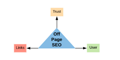
Thus, off page SEO and content ranking factors are Trust, Links and Users.
Why are we the best content writing company for you?
Content writing and SEO are the key determinants of the online success of your business which initiates customer interaction that help to connect them to the sales funnel after acquisition. We, Inteliqo Research and Services, are a professional content writing agency catering to international clients for their success online for years. Our content writers are hired based on their excellence and regularly trained by experts to be always a step ahead of the changes in the market trends and search engine intelligence. We have cost effective solutions for content writing services and SEO for companies of all sizes.
Want the best content writing services and SEO writing agency to harness the power of search engines for boosting your brand? You are at the right place so don’t delay any longer and contact our customer success agents at +61488871422(Australia), +917002941316(India) or email at [email protected].
#content creation#content marketing#content writing#Seo Content#seo ranking#best content writing company#best content writing services#SEO writing#content writer#professional content writers#professional content writing agency#content writing services#professional content writing services
0 notes
Photo

16 Best Tab and Accordion Widget Plugins for WordPress
Your website's content should be organized and beautiful. By adding a tab or accordion widget plugin to your WordPress website, you will be able to display your website's content in an elegant way.
An interactive accordion and tab plugin can tidy up the design and readability of your webpages.
One of the many fully customizable WordPress tab & accordion plugins and widgets on CodeCanyon
Accordions and tabs are great ways to communicate text-heavy information in a stylish and condensed way. Keeping your website clutter-free and interactive should be the main priority for your website and accordions and tabs help you accomplish this.
At CodeCanyon, you will be able to choose from a library of premium plugins available and find a tab & accordion plugin and widget that will fit your website's theme and allow you display your website's information without crowding your page's designs.
The Best WordPress Tab and Accordion Plugins on CodeCanyon
Discover CodeCanyon's extensive library of the best tab and accordion WordPress widgets and plugins ever created. With a cheap one-time payment, you can purchase these high-quality WordPress widgets and plugins and draw in more traffic to your website.
Here are a few of the best-selling tab and accordion WordPress widgets available on CodeCanyon for 2020.
Best-selling tab and accordion widgets and plugins available on CodeCanyon
These powerful tab and accordion plugins allow you to display your website's text and media in a systematic order that fits your particular website. These widgets and plugins come with plenty of features that can enhance your website including:
pagination
animated layers
customizable columns and rows
touch-enabled mobile functionality
lightboxes
Head on over to CodeCanyon and choose from the premium tab and accordion plugins available now!
11 Best Tab and Accordion WordPress Widgets for 2020
Here are 11 of the top-rated WordPress tab and accordion widgets and plugins that are available for you to download on CodeCanyon:
1. Accordion Slider—Responsive WordPress Plugin
The Accordion Slider plugin combines two great functions in one handy plugin. First it functions as an accordion, and secondly it functions as a slider.
Best features:
add as many panels as you want without worrying about screen space
touch-enabled to work well with mobile screens
loads images and content from posts, galleries, and Flickr
accordions are automatically cached to improve the load time
can be placed anywhere: in posts/pages, template PHP code, or widgets
Accordion Slider—Responsive WordPress Plugin is a great two-in-one plugin that will appeal to those looking for a great way to present images or text.
2. Grid Accordion—Responsive WordPress Plugin
One of the best-looking accordions out there, Grid Accordion adds a fresh feel to your site by offering a feature not found in other plugins: an accordion that works in two directions. While most plugins let you open and close tabs or similar UI elements either horizontally or vertically, with this plugin, you can do both. Not only does it handle text content well within its accordion grid, but you can even fill your content areas with images and other media for a more stunning effect.
Make sure to check out the demo for Grid Accordion here.
This plugin also comes with a host of other features, such as:
a fully responsive and touch-enabled design
support for dynamic content from posts and galleries
available hooks for actions and filters
JavaScript API endpoints for maximum customization
3. WP Responsive FAQ With Category
The WP Responsive FAQ with Category plugin is specifically designed for users who have or want to add a Frequently Asked Questions area to their site and don’t want their visitors to have to scroll through an endless stream of text to get to the questions and answers that are relevant to them.
Best features:
FAQs can be arranged by category
15 customizable different designs to choose from
compatible with Visual Composer page builder and WooCommerce
two types of FAQ toggle icons: arrow or plus sign
There’s no question that WP Responsive FAQ with Category is the answer to all your FAQ needs.
4. WooCommerce Category Accordion
The WooCommerce Category Accordion is designed specifically for WooCommerce users. It can be used as a widget or shortcode to list product categories and subcategories.
Best features:
supports unlimited categories and subcategories
14 Font Awesome Icons included
ability to highlight current category option
sort by ascending or descending order
WooCommerce Category Accordion is ideal for users who want to organize their products or services into categories and subcategories to make it easier for customers to navigate their site.
5. Responsive Searchable 3 Level Accordion
Responsive Searchable 3 Level Accordion is a simple plugin that can be used anywhere on your WordPress site. It will appeal to users who are looking to arrange content in accordion style within a post, sidebar, footer, etc.
Best features:
can be used as a widget or shortcode
three nesting levels available
five readymade styling options
allows users to type in searched phrase
Responsive Searchable 3 Level Accordion For WordPress is a low-fuss plugin, and its standout features like three-level support and searchable content really set it apart.
6. Accordion FAQ WordPress Plugin
FAQ pages are an important part of almost any website, and with this plugin, you can fit a mountain of text behind a sleek and easily digestible display. This accordion plugin focuses on doing one thing, creating FAQ-style content easily, and it does it well.
Here’s what you can expect to get with this plugin:
ability to quickly add multiple FAQ accordions throughout your site
easy drag-and-drop interface for reordering
color, icon, and font customization
built-in generator for creating shortcodes
If you’re looking to add a FAQ section to your existing design, then the Accordion FAQ WordPress Plugin has you covered.
7. WordPress Tabs and Accordions DZS
WordPress Tabs and Accordions DZS is another plugin that gives users access to both tab and accordion functions.
Best features:
full skins to fit every brand
WYSIWYG editor
unlimited color options for customization
iPhone, iPad, and Android optimized
and more
So if StackTabs doesn’t appeal, WordPress Tabs and Accordions DZS is another great two-for-one option.
8. Side Tabs—Layered Popups Add-on
A little different than most of the plugins on this list, Side Tabs delivers the features you’d expect from a tab plugin, but instead of existing within your site’s content, they live at the edge of your screen. This unique presentation creates a number of unusual uses.
One of the most interesting ways you can use Side Tabs is to present a constant access point to content throughout an entire page (or several pages). Besides that, it also makes a great tool for offering Calls to Action and similar content without being too intrusive.
With a ton of customization and animation options available out of the box, this plugin works brilliantly for anyone looking to add a fresh way of presenting information to their site.
9. WooCommerce Tabs Pro: Extra Tabs for Product Page
If you have a WooCommerce site, the WooCommerce Tab Pro plugin will allow you to create and manage 11 different types of tabs to display your products.
Best features:
ability to add unlimited tabs to a single product page
WYSIWYG editor for editing custom content
ability to enable or disable tabs
ability to create a global tab that can be used with all products
When you have an eCommerce site, making improvements to your layout can really boost sales. With WooCommerce Tabs Pro: Extra Tabs for Product Page, the tills will soon be ringing.
10. Elegant Tabs for Visual Composer
Elegant Tabs for Visual Composer is an add-on for the WPBakery WordPress plugin (formerly Visual Composer). It lets you add any shortcode to multiple tabs and offers loads of customisation like different colours, icons and backgrounds for different sections or tabs.
Best features:
vertical tabs
drag and drop any WPBakery elements inside the tab content
supports deep linking
ten different styles of tabs and unlimited variations
and more
Elegant Tabs is also available for Fusion Builder, WooCommerce, Cornerstone, and Beaver Builder.
11. PullOut Widgets for WordPress
Like the Social Network Tabs for WordPress, the PullOut Widgets is a different take on tabs. It is specifically designed to turn any widget on your site into a pullout tab.
Best features:
289 icons for pullout tabs
32 sliding animation effects
unlimited pullout widget positioning on top, right, bottom or left side
unlimited widget colours
The most successful websites are interactive, and PullOut Widgets for WordPress gives your visitors plenty of chances to engage with your content.
5 Free Tab and Accordion WordPress Widgets and Plugins for Download in 2020
The best features and most beautiful interfaces are found in the premium plugins from CodeCanyon. But, if you're on a budget or just want something simple, check out these free tab and accordion plugins for WordPress.
1. Arconix Shortcodes
Arconix Shortcodes is a very versatile plugin and is a must-have if you cannot afford any of the premium plugins. With this plugin, you can add not only accordions but styled boxes, buttons, tabs, unordered lists, columns and much more.
2. Easy Accordion
Easy Accordion is a responsive drag and drop accordion builder that will help you to display multiple accordions into your WordPress website. No coding is necessary to add the accordions to your website as everything is added through shortcodes.
3. Accordion
This Accordion plugin can help you create different sections of your website including but not limited to FAQs, a knowledge base, and a question & answer section. You can change colors, font size, and icons for each accordion.
4. Squelch Tabs and Accordions Shortcodes
With the use of shortcodes, you can add horizontal accordions, vertical accordions, and tabs. This free plugin will help you save space on your webpages, make your website look more professional, and add an interactive component to your website.
5. Shortcodes Ultimate
Shortcodes Ultimate allows you to add many tools to your website. You can easily create tabs, buttons, boxes, sliders and carousels, and responsive videos. The plugin comes with over fifty shortcodes for you to implement.
How to Add an FAQ Accordion to Your Website
In this example, we are going to create an FAQ section for our online store. First we need to create a category for our FAQ accordion so the plugin knows what content to add to each specific accordion. Once you have installed the Accordion FAQ WordPress plugin, head on over to WP Dashboard > FAQ > Categories. In the name field, we will type in "Online Store" and click the Add New Category button.
Next, we will click on WP Dashboard > FAQ > Add New. We will add in our three FAQ entries this way. We will include the question in the title and the answer in the text editor.
For each of our entries, we will make sure to click the checkbox next to the category, Online Store that we created to make sure we group the entries together.
Once we have added our three FAQ entries for our online store, it is time to add the accordion widget to a page. On an existing or new page or post, click on the Add Shortcode button on the top of the text editor. Choose Insert FAQs from the Select a Shortcode drop-down menu. From here we will be given a basic set of setting for us to change. We will choose the "Online Store" category from the Faq Category option and change the Icon Background Color to blue.
Click the Insert Shortcode button and the shortcode will be added to the text editor. The FAQ accordion will now be displayed on your webpage for all your users to see!
Install a Tab or Accordion WordPress Widget Now!
By adding a premium tab or accordion plugin to your website, you will be able to simplify your web page's design and display your text and media in an easy-to-understand way.
These handy widgets and plugins allow you to integrate interactive displays for your website's content that can be styled to fit your website's theme.
In addition to all the high-quality tab and accordion widgets available, there are also thousands of other high-quality WordPress plugins on CodeCanyon that can help enhance your website. Take look through this massive collection of plugins and you will find all types of plugins including gallery, newsletter, eCommerce, and marketing plugins.
by Daniel Strongin via Envato Tuts+ Code https://ift.tt/3cxChRI
0 notes
Photo

7 Basic Rules for Button Design
I came across a beneficial article on UX Planet, which helped me revise over the design for buttons for my app. Since I've been redesigning the majority of my screens, it's definitely helpful.
1) Make Buttons look like buttons
Obvious statement but users need to be able to differentiate instantly from what is 'clickable, and what's not. But how do users understand whether a specific element is interactive or not? They use previous experience and visual signifiers to clarify the meaning of the UI object. That's why it so important to use appropriate visual signifiers (such as size, shape, colour, shadow, etc.) to make the element look like a button. Visual signifiers hold an essential information value — they help to create affordances in the interface.
Don't assume that something in your UI is obvious for your users
In many cases, designers intentionally don't identify buttons as interactive elements because they presume the interactive features are evident for users. When designing an interface, you should always keep in mind the following rule:
Your ability to interpret clickability signifiers aren’t the same as your users’ because you know what each element in your own design is intended to do.
Use familiar designs for your buttons
Here are a few examples of buttons that are familiar to most users:

Filled button with square borders
Filled button with rounded corners
Filled button with shadows
Ghost button
Don't forget about the whitespace
Not only the visual properties of the button itself are essential. The amount of whitespace near the button makes it easier (or harder) for users to understand whether it's an interactive element or not. In the example, below some users might confuse the ghost button with an information box.
2). Put buttons where users expect to find them
Buttons should be located in places where users can easily find them or expect to see. Don't make users hunt for buttons. If users can't find a button, they won't know that it exists.
Use traditional layouts and standard UI patterns as much as possible
Conventional placement for buttons improves discoverability. With a standard layout, users will quickly understand the purpose of each element — even it's a button without strong signifiers. Combining a standard layout with clean visual design and ample whitespace makes the plan more understandable.
Don't play hunt-the-button game with your users
Test your design on discoverability. When users first navigate to a page that contains some actions that you want them to take, it should be easy to spot an appropriate button for the user.
This is something I'll definitely be focusing on when carrying out the user testing for Bookmark within the week.
3). Label buttons with what they do
Buttons with generic or misleading labels can be a significant source of frustrations for your users. Write button labels that clearly explain what each button does. Ideally, the button's label should clearly describe its action.
Users should clearly understand what happens when they click on a button.
A bad example

It's not clear what does 'OK' and 'Cancel' represent in this dialogue. Most users will ask themselves "What happens when I click on 'Cancel'?"
Never designed a dialog box or form that consisted solely of the two buttons ‘OK’ and ‘Cancel’.
The Correct Example
Instead of using the 'OK' label, it's better to use 'Remove.' This will make it clear what this button does for the user. Also, if 'Delete' is a potentially dangerous operation, you can use red colour to state this fact.

'Remove' makes it clear what button does for users.
4). Properly size your buttons
Button size should reflect the priority of this element on the screen. Large button means more critical action.
Prioritize buttons
Make the most important button look like it's the most important one. Always try to make the primary action button more prominent. Increase its size (by making a button bigger you make it look more important for users) and use a contrasting colour to capture user attention.
Make buttons finger-friendly for mobile users
In many mobile apps, buttons are too small. This often leads to the situation when users mistype.

MIT Touch Lab study found that averages for finger pads are between 10–14mm and fingertips are 8–10mm. This makes 10mm x 10mm the right minimum touch target size.

5). Mind the order
The order for buttons should reflect the nature of a conversation between the user and the system. Ask yourself, what order users expect to have on this screen and design accordingly.
User interface is a conversation with your users
For example, how to order 'Previous/Next' buttons in pagination? Logically, a button that moves you forward should be on the right, and a button which moves you back should be on the left.
6). Avoid using too many buttons
This is a common problem for many apps and websites. When you provide too many options, your users end up doing nothing.

When designing pages in your app or website, think about the most important actions you want your users to take.
7. Provide visual or audio feedback on interaction
When users click or tap on the button, they expect that the user interface will respond with appropriate feedback. Based on the type of operation, this might be either visual or audio feedback. When users don't have any feedback, they might consider that the system didn't receive their command and will repeat the action. Such behaviour often causes multiple unnecessary operations.
Why is this happening? As humans, we expect some feedback after we interact with an object. It might be visual, audio or tactile feedback — anything that acknowledges the fact that interaction was registered.

User interface provides visual feedback that a press has registered.
Summary
Although buttons are a common element of interaction design, it's worth putting a lot of attention to make this element as good as possible. Button UX design should always be about recognition and clarity.
So refocusing my button design is crucial to ensure my users can easily find them on each of my app screens.
0 notes
Text
Rewriting the Beginner's Guide to SEO
Posted by BritneyMuller
(function($) { // code using $ as alias to jQuery $(function() { // Hide the hypotext content. $('.hypotext-content').hide(); // When a hypotext link is clicked. $('a.hypotext.closed').click(function (e) { // custom handling here e.preventDefault(); // Create the class reference from the rel value. var id = '.' + $(this).attr('rel'); // If the content is hidden, show it now. if ( $(id).css('display') == 'none' ) { $(id).show('slow'); if (jQuery.ui) { // UI loaded $(id).effect("highlight", {}, 1000); } } // If the content is shown, hide it now. else { $(id).hide('slow'); } }); // If we have a hash value in the url. if (window.location.hash) { // If the anchor is within a hypotext block, expand it, by clicking the // relevant link. console.log(window.location.hash); var anchor = $(window.location.hash); var hypotextLink = $('#' + anchor.parents('.hypotext-content').attr('rel')); console.log(hypotextLink); hypotextLink.click(); // Wait until the content has expanded before jumping to anchor. //$.delay(1000); setTimeout(function(){ scrollToAnchor(window.location.hash); }, 1000); } }); function scrollToAnchor(id) { var anchor = $(id); $('html,body').animate({scrollTop: anchor.offset().top},'slow'); } })(jQuery); .hypotext-content { position: relative; padding: 10px; margin: 10px 0; border-right: 5px solid; } a.hypotext { border-bottom: 1px solid; } .hypotext-content .close:before { content: "close"; font-size: 0.7em; margin-right: 5px; border-bottom: 1px solid; } a.hypotext.close { display: block; position: absolute; right: 0; top: 0; line-height: 1em; border: none; }
Many of you reading likely cut your teeth on Moz’s Beginner’s Guide to SEO. Since it was launched, it's easily been our top-performing piece of content:
Most months see 100k+ views (the reverse plateau in 2013 is when we changed domains).
While Moz’s Beginner's Guide to SEO still gets well over 100k views a month, the current guide itself is fairly outdated. This big update has been on my personal to-do list since I started at Moz, and we need to get it right because — let’s get real — you all deserve a bad-ass SEO 101 resource!
However, updating the guide is no easy feat. Thankfully, I have the help of my fellow Mozzers. Our content team has been a collective voice of reason, wisdom, and organization throughout this process and has kept this train on its tracks.
Despite the effort we've put into this already, it felt like something was missing: your input! We're writing this guide to be a go-to resource for all of you (and everyone who follows in your footsteps), and want to make sure that we're including everything that today's SEOs need to know. You all have a better sense of that than anyone else.
So, in order to deliver the best possible update, I'm seeking your help.
This is similar to the way Rand did it back in 2007. And upon re-reading your many "more examples" requests, we’ve continued to integrate more examples throughout.
The plan:
Over the next 6–8 weeks, I’ll be updating sections of the Beginner's Guide and posting them, one by one, on the blog.
I'll solicit feedback from you incredible people and implement top suggestions.
The guide will be reformatted/redesigned, and I'll 301 all of the blog entries that will be created over the next few weeks to the final version.
It's going to remain 100% free to everyone — no registration required, no premium membership necessary.
To kick things off, here’s the revised outline for the Beginner’s Guide to SEO:
Click each chapter's description to expand the section for more detail.
Chapter 1: SEO 101
What is it, and why is it important? ↓
What is SEO?
Why invest in SEO?
Do I really need SEO?
Should I hire an SEO professional, consultant, or agency?
Search engine basics:
Google Webmaster Guidelines basic principles
Bing Webmaster Guidelines basic principles
Guidelines for representing your business on Google
Fulfilling user intent
Know your SEO goals
Chapter 2: Crawlers & Indexing
First, you need to show up. ↓
How do search engines work?
Crawling & indexing
Determining relevance
Links
Personalization
How search engines make an index
Googlebot
Indexable content
Crawlable link structure
Links
Alt text
Types of media that Google crawls
Local business listings
Common crawling and indexing problems
Online forms
Blocking crawlers
Search forms
Duplicate content
Non-text content
Tools to ensure proper crawl & indexing
Google Search Console
Moz Pro Site Crawl
Screaming Frog
Deep Crawl
How search engines order results
200+ ranking factors
RankBrain
Inbound links
On-page content: Fulfilling a searcher’s query
PageRank
Domain Authority
Structured markup: Schema
Engagement
Domain, subdomain, & page-level signals
Content relevance
Searcher proximity
Reviews
Business citation spread and consistency
SERP features
Rich snippets
Paid results
Universal results
Featured snippets
People Also Ask boxes
Knowledge Graph
Local Pack
Carousels
Chapter 3: Keyword Research
Next, know what to say and how to say it. ↓
How to judge the value of a keyword
The search demand curve
Fat head
Chunky middle
Long tail
Four types of searches:
Transactional queries
Informational queries
Navigational queries
Commercial investigation
Fulfilling user intent
Keyword research tools:
Google Keyword Planner
Moz Keyword Explorer
Google Trends
AnswerThePublic
SpyFu
SEMRush
Keyword difficulty
Keyword abuse
Content strategy {link to the Beginner’s Guide to Content Marketing}
Chapter 4: On-Page SEO
Next, structure your message to resonate and get it published. ↓
Keyword usage and targeting
Keyword stuffing
Page titles:
Unique to each page
Accurate
Be mindful of length
Naturally include keywords
Include branding
Meta data/Head section:
Meta title
Meta description
Meta keywords tag
No longer a ranking signal
Meta robots
Meta descriptions:
Unique to each page
Accurate
Compelling
Naturally include keywords
Heading tags:
Subtitles
Summary
Accurate
Use in order
Call-to-action (CTA)
Clear CTAs on all primary pages
Help guide visitors through your conversion funnels
Image optimization
Compress file size
File names
Alt attribute
Image titles
Captioning
Avoid text in an image
Video optimization
Transcription
Thumbnail
Length
"~3mo to YouTube" method
Anchor text
Descriptive
Succinct
Helps readers
URL best practices
Shorter is better
Unique and accurate
Naturally include keywords
Go static
Use hyphens
Avoid unsafe characters
Structured data
Microdata
RFDa
JSON-LD
Schema
Social markup
Twitter Cards markup
Facebook Open Graph tags
Pinterest Rich Pins
Structured data types
Breadcrumbs
Reviews
Events
Business information
People
Mobile apps
Recipes
Media content
Contact data
Email markup
Mobile usability
Beyond responsive design
Accelerated Mobile Pages (AMP)
Progressive Web Apps (PWAs)
Google mobile-friendly test
Bing mobile-friendly test
Local SEO
Business citations
Entity authority
Local relevance
Complete NAP on primary pages
Low-value pages
Chapter 5: Technical SEO
Next, translate your site into Google's language. ↓
Internal linking
Link positioning
Anchor links
Common search engine protocols
Sitemaps
Mobile
News
Image
Video
XML
RSS
TXT
Robots
Robots.txt
Disallow
Sitemap
Crawl Delay
X-robots
Meta robots
Index/noindex
Follow/nofollow
Noimageindex
None
Noarchive
Nocache
No archive
No snippet
Noodp/noydir
Log file analysis
Site speed
HTTP/2
Crawl errors
Duplicate content
Canonicalization
Pagination
What is the DOM?
Critical rendering path
Help robots find the most important code first
Hreflang/Targeting multiple languages
Chrome DevTools
Technical site audit checklist
Chapter 6: Establishing Authority
Finally, turn up the volume. ↓
Link signals
Global popularity
Local/topic-specific popularity
Freshness
Social sharing
Anchor text
Trustworthiness
Trust Rank
Number of links on a page
Domain Authority
Page Authority
MozRank
Competitive backlinks
Backlink analysis
The power of social sharing
Tapping into influencers
Expanding your reach
Types of link building
Natural link building
Manual link building
Self-created
Six popular link building strategies
Create content that inspires sharing and natural links
Ego-bait influencers
Broken link building
Refurbish valuable content on external platforms
Get your customers/partners to link to you
Local community involvement
Manipulative link building
Reciprocal link exchanges
Link schemes
Paid links
Low-quality directory links
Tiered link building
Negative SEO
Disavow
Reviews
Establishing trust
Asking for reviews
Managing reviews
Avoiding spam practices
Chapter 7: Measuring and Tracking SEO
Pivot based on what's working. ↓
KPIs
Conversions
Event goals
Signups
Engagement
GMB Insights:
Click-to-call
Click-for-directions
Beacons
Which pages have the highest exit percentage? Why?
Which referrals are sending you the most qualified traffic?
Pivot!
Search engine tools:
Google Search Console
Bing Webmaster Tools
GMB Insights
Appendix A: Glossary of Terms
Appendix B: List of Additional Resources
Appendix C: Contributors & Credits
What did you struggle with most when you were first learning about SEO? What would you have benefited from understanding from the get-go?
Are we missing anything? Any section you wish wouldn't be included in the updated Beginner's Guide?
Thanks in advance for contributing.
Sign up for The Moz Top 10, a semimonthly mailer updating you on the top ten hottest pieces of SEO news, tips, and rad links uncovered by the Moz team. Think of it as your exclusive digest of stuff you don't have time to hunt down but want to read!
from The Moz Blog http://ift.tt/2AIAGpW via IFTTT
2 notes
·
View notes
Text
Using Python to recover SEO site traffic (Part two)


Automating the process of narrowing down site traffic issues with Python gives you the opportunity to help your clients recover fast. This is the second part of a three-part series. In part one, I introduced our approach to nail down the pages losing traffic. We call it the “winners vs losers” analysis. If you have a big site, reviewing individual pages losing traffic as we did on part one might not give you a good sense of what the problem is. So, in part two we will create manual page groups using regular expressions. If you stick around to read part three, I will show you how to group pages automatically using machine learning. You can find the code used in part one, two and three in this Google Colab notebook. Let’s walk over part two and learn some Python.
Incorporating redirects
As the site our analyzing moved from one platform to another, the URLs changed, and a decent number of redirects were put in place. In order to track winners and losers more accurately, we want to follow the redirects from the first set of pages. We were not really comparing apples to apples in part one. If we want to get a fully accurate look at the winners and losers, we’ll have to try to discover where the source pages are redirecting to, then repeat the comparison. 1. Python requests We’ll use the requests library which simplifies web scraping, to send an HTTP HEAD request to each URL in our Google Analytics data set, and if it returns a 3xx redirect, we’ll record the ultimate destination and re-run our winners and losers analysis with the correct, final URLs. HTTP HEAD requests speed up the process and save bandwidth as the web server only returns headers, not full HTML responses. Below are two functions we’ll use to do this. The first function takes in a single URL and returns the status code and any resulting redirect location (or None if there isn’t a redirect.) The second function takes in a list of URLs and runs the first function on each of them, saving all the results in a list. View the code on Gist. This process might take a while (depending on the number of URLs). Please note that we introduce a delay between requests because we don’t want to overload the server with our requests and potentially cause it to crash. We also only check for valid redirect status codes 301, 302, 307. It is not wise to check the full range as for example 304 means the page didn’t change. Once we have the redirects, however, we can repeat the winners and losers analysis exactly as before. 2. Using combine_first In part one we learned about different join types. We first need to do a left merge/join to append the redirect information to our original Google Analytics data frame while keeping the data for rows with no URLs in common. To make sure that we use either the original URL or the redirect URL if it exists, we use another data frame method called combine_first() to create a true_url column. For more information on exactly how this method works, see the combine_first documentation. We also extract the path from the URLs and format the dates to Python DateTime objects. View the code on Gist. 3. Computing totals before and after the switch View the code on Gist. 4. Recalculating winners vs losers View the code on Gist. 5. Sanity check View the code on Gist. This is what the output looks like.
Using regular expressions to group pages
Many websites have well-structured URLs that make their page types easy to parse. For example, a page with any one of the following paths given below is pretty clearly a paginated category page. /category/toys?page=1 /c/childrens-toys/3/ Meanwhile, a path structure like the paths given below might be a product page. /category/toys/basketball-product-1.html /category/toys/p/action-figure.html We need a way to categorize these pages based on the structure of the text contained in the URL. Luckily this type of problem (that is, examining structured text) can be tackled very easily with a “Domain Specific Language” known as Regular Expressions or “regex.” Regex expressions can be extremely complicated, or extremely simple. For example, the following regex query (written in python) would allow you to find the exact phrase “find me” in a string of text. regex = r"find me" Let’s try it out real quick. text = "If you can find me in this string of text, you win! But if you can't find me, you lose" regex = r"find me" print("Match index", "tMatch text") for match in re.finditer(regex, text): print(match.start(), "tt", match.group()) The output should be: Match index Match text 11 find me 69 find me Grouping by URL Now we make use of a slightly more advanced regex expression that contains a negative lookahead. Fully understanding the following regex expressions is left as an exercise for the reader, but suffice it to say we’re looking for “Collection” (aka “category”) pages and “Product” pages. We create a new column called “group” where we label any rows whose true_url match our regex string accordingly. Finally, we simply re-run our winners and losers’ analysis but instead of grouping by individual URLs like we did before, we group by the page type we found using regex. View the code on Gist. The output looks like this:
Plotting the results
Finally, we’ll plot the results of our regex-based analysis, to get a feel for which groups are doing better or worse. We’re going to use an open source plotting library called Plotly to do so. In our first set of charts, we’ll define 3 bar charts that will go on the same plot, corresponding to the traffic differences, data from before, and data from after our cutoff point respectively. We then tell Plotly to save an HTML file containing our interactive plot, and then we’ll display the HTML within the notebook environment. Notice that Plotly has grouped together our bar charts based on the “group” variable that we passed to all the bar charts on the x-axis, so now we can see that the “collections” group very clearly has had the biggest difference between our two time periods. View the code on Gist. We get this nice plot which you can interact within the Jupyter notebook!
Next up we’ll plot a line graph showing the traffic over time for all of our groups. Similar to the one above, we’ll create three separate lines that will go on the same chart. This time, however, we do it dynamically with a “for loop”. After we create the line graph, we can add some annotations using the Layout parameter when creating the Plotly figure. View the code on Gist. This produces this painful to see, but valuable chart.
Results
From the bar chart and our line graph, we can see two separate events occurred with the “Collections” type pages which caused a loss in traffic. Unlike the uncategorized pages or the product pages, something has gone wrong with collections pages in particular. From here we can take off our programmer hats, and put on our SEO hats and go digging for the cause of this traffic loss, now that we know that it’s the “Collections” pages which were affected the most. During further work with this client, we narrowed down the issue to massive consolidation of category pages during the move. We helped them recreate them from the old site and linked them from a new HTML sitemap with all the pages, as they didn’t want these old pages in the main navigation. Manually grouping pages is a valuable technique, but a lot of work if you need to work with many brands. In part three, the final part of the series, I will discuss a clever technique to group pages automatically using machine learning. Hamlet Batista is the CEO and founder of RankSense, an agile SEO platform for online retailers and manufacturers. He can be found on Twitter @hamletbatista. The post Using Python to recover SEO site traffic (Part two) appeared first on Search Engine Watch. Read the full article
0 notes
Text
Everest Timeline - Responsive WordPress Timeline Plugin (Utilities)
Everest Timeline – Responsive WordPress Timeline Plugin
Everest Timeline is a responsive WordPress timeline plugin that comes with 50+ stunning pre-designed templates. It is an ultimate WP plugin to showcase your story timeline in the best way. The plugin comprises vertical timeline layout, horizontal timeline layout, one side layout, Facebook layout, Twitter layout and much more. Each layout comes along with various styling options and customization possibilities.
The plugin supports media like images, slider, YouTube video, Vimeo video, HTML video and soundcloud on your timeline. You can also integrate filter feature, social media and share button, Facebook/Twitter feed, lightbox functionality and make your website stand out with stunning timeline.
It is a shortcode ready and widget ready WordPress plugin that allows you to design a creative story/event timeline in no time.
Advanced Features List
50+ pre designed beautiful templates ready to use.
Lots of configuration option to filter post from all possible wp queries condition.
Show story/event timeline from all possible taxonomies or categories queries of wp.
Show story/event timeline associated with a certain custom fields which can be either single or multiple custom fields.
Show story/event timeline based on a search keyword.
Show popular story/event timeline from view or comments.
Show story/event timeline post associated with certain status.
Various media type support. Implement Image,Video(Youtube,Vimeo,HTML Video),Souldcloud audio and slider media types on any layout’s templates for each timeline post.
5 different layout types to show the timeline in different styles.
18 pre designed beautiful,responsive vertical timeline templates ready to use.
5 pre designed one side timeline template. Manage right or left image position.
21 pre designed beautiful,responsive horizontal slider timeline templates ready to use with single and multiple column templates.
Showcase facebook feed in 3 different ready to use timeline templates.Enable or disable like count ,comment count and share count to show in frontend.
Showcase twitter feed in 3 different ready to use timeline templates.
5 stunning navigation bar template to introduce your timeline posts in a unique way.
13 animation effects to show timeline in unique way
Showcase the timeline post with fontawesome or dashicon fonts.
5 stunning image filters templates to introduce your timeline posts in a unique way.
Order your timeline’s posts with easy pagination options.Standard,load more and infinite scroll pagination.5 each templates for standard and load more pagination.
16 avaliable loader images to show load more and infinite scroll pagination.
Feature to preview in backend – test with ease before going live.
Enable or disable the share link of post in different social media.
Enable/Disable the meta data of posts i.e categories,tags,author, comment count and date.
14 different date format to choose from.
Show the post detail page from post link or custom link.
Show full length or excerpt length of post content.
Automatically generated shortcode which can be added to any post,page or templates.
Supports various mobile devices so it will be no issue to view in any desktop and mobile devices.
Lifetime Dedicated Support
- You can find us anytime when you have some queries, problems or with any valuable suggestions for plugin or us. You can find us through following ways:
Forum Support From here.
Dedicated Support Forum – You can contact us through our support forum through http://ift.tt/2bxZwQv
Online Chat Support
Constant Free Upgrades
- Not fixed on dates, but we assure you to provide you new updates and feature upgrade in the plugin at regular basis.
Check out our other great plugins
AccessPress Anonymous Post PRO
AccessPress Social Icons Pro
AccessPress Social Pro
AccessPress Twitter Feed Pro
AccessPress Pinterest Pro
AccessPress Social Auto Post
AccessPress Social Login
WP Ultimate Social
AccessPress Instagram Feed Pro
Ultimate Form Builder
AP – Custom Testimonials for WordPress
WP Floating Menu Pro – One page navigator, sticky menu for WordPress
WP1 Slider Pro – WordPress Responsive Touch Slider for a Layman
WP Mega Menu Pro – Responsive Mega Menu Plugin for WordPress
AP Pricing Tables – Responsive Pricing Table Builder Plugin for WordPress
Apex Notification Bar – Responsive Notification Bar Plugin for WordPress
Ultimate Author Box – Responsive Post/Article Author Section Plugin for WordPress
WP Popup Banners Pro – Ultimate popup plugin for WordPress
Everest Gallery – Responsive WordPress Gallery Plugin
WP Media Manager – The Easiest WordPress Media Manager Plugin
from CodeCanyon new items http://ift.tt/2hmxTxO via IFTTT https://goo.gl/zxKHwc
0 notes
Text
Mixone - WordPress Music Magazine with Ajax and Continuous Playback
New Post has been published on https://intramate.com/wordpress-themes/mixone-wordpress-music-magazine-with-ajax-and-continuous-playback/
Mixone - WordPress Music Magazine with Ajax and Continuous Playback
LIVE PREVIEWGet it now for only $59
Mixone is a WordPress music magazine theme – discover what you are capable of with Mixone, drag & drop page building, almost unlimited page layouts, AJAX continuous music playback and more.
Mixone theme concept built precisely for music industry…and other individual creative folks. Mixone was made using AJAX – now you can be sure that music won’t stop playing during page browsing. Theme comes with super fast page builder for easily managing your content and limitless layout options. If you are searching for innovative, modern and clean design, Mixone is definitely for you…
Music Publishing Made Easy
With the powerful and ultra flexible Muttley Framework combined with WordPress, your new music website is going to overpower the competition with features, performance and sound. Designed with the music industry in mind you will find a raft of features to create almost any kind of music magazine website; DJ Magazine, Live Band Blog, Performers Blog, Music Agency Blog, Artist Blog, Recording Magazine, Vocalist Magazine – it all awaits your customization and requires no coding on your part.
What are you waiting for? Check it out!
Continuous Music Playback
AJAX or Asynchronous Javascript and XML, is a group of techniques used in web development which allows a web page to communicate with a server without reloading the page.
This makes it awesome for playing music! You know when you select a track to play then click a link to a different page and the music stops? Not with Mixone.
Browse multiple pages and keep the music in the background that acts as an overlay allowing users to play, pause, FFW etc. and doesn’t need to reload with page content, it’s slick, fast and easy to use across multiple device types.
Theme works by fetching HTML from your server via ajax and replacing the content of a container element on your page with the loaded HTML. It then updates the current URL in the browser using pushState. This results in faster page. No page resources (JS, CSS) get re-executed or re-applied
Light, Fast and Stunning Visual Page Builder
Take your music website to the top of the charts with Mixone and your bundled copy of the fastest Drag & Drop Page Builder
Create layouts and any web element you can think with drag & drop simplicity using a simple visual interface that doesn’t require any coding on your part – huzzah! Mixone plus the #1 top fastest Page Builder for WordPress = design gold
One Click Demo Import
Chose a demo, upload your zip file and unpack it, click install. It’s that simple! Everything you see in the Demo of your choice gets installed along with your new WordPress site.
We have made this as simple and as complete as possible so that you can be up and running with your new website and all the features you fell in love with in as little time as possible.
Stunning Advanced Headers
A beautifully designed Header can be the difference between losing a customer and keep one! Your Header is the first thing users have to interact with and even though it is often overlooked, we haven’t forgotten about the beauty of a well developed header and navigation system.
This applies to the music industry especially as you may want to make a huge impact, interact strongly with your users as they hit your first page, so we have created advanced header designs that can include elements like titles, images, sliders, videos and even maps in your header section!
Display on each page, post or portfolio and customize to your heart’s content.
Scamp Music Player
Scamp Music Player is the industry standard music player for a fully responsive design that scales automatically to suit any device, features lightning fast load times yet stays lightweight.
With full SoundCloud API support so you can add tracks directly to it, dynamically load content to the player playlist and includes funky covers for individual tracks!
Earn money with ads
Mixone takes a full control your ad units, it include more than 8+ responsive ad spots, 6 predefined (Header, Footer, Article Top, Article Bottom, Sidebar, Tracklist Inline) and 3 custom spots.
Sell Your Music
The most customizable eCommerce platform for building your online business. Mixone includes full support for the WooCommerce e-commerce plugin, which means you can easily sell your music, add products, affiliate goods, coupon codes and more. WooCommerce can scale with you as you grow your business. From selling one product to thousands, and from your first order to your millionth, WooCommerce will be able to scale and ride the wave with you.
Complete List of Features
All the blocks – Please select your block from page builder or page options. You can mix and match the ones you like. All of the content blocks support advanced filters (including slides and carousels).
Super fast and easy-to-use Frontend Page Builder for WordPress will save you tons of time working on the site content. Now you’ll be able to create complex layouts within minutes!
No coding knowledge required
Built in Review System
Music Player With Continuous Playback with drag drop Tracks Manager
3 Pagination methods (next/prev buttons, load more, infinity)
9 Posts blocks with filterable options.
Different layouts, modules and paginations for pages: category, tags, archive, author page, search.
3 Pagination methods (next/prev buttons, load more, infinity)
7 Beautiful Post Styles designed to give the perfect shape to your story.
4 Pages layout (wide, narrow, left sidebar, right sidebar)
5 Header styles.
Built in related posts based on tags or category.
Sticky sidebar.
Responsive ads support.
Google AdSense or other ads.
Modular blog page.
Featured sections (magazine blocks)
Extra page builder modules: Posts Carousel, Tracklist, AD Spot, Posts Block, Posts Slider… and much more
Live customizer with many options.
One click demo import.
Music player, with drag drop playlist. Easily add self hosted MP3, hosted MP3, shotcast streaming, SoundCloud tracks, playlist, favorite tracks etc, with autoplay (optional)
Custom Widgets:
Recent posts.
Instagram widget.
Ad box – AD Box allows you to select an ad spot (you define the responsive ad spots in theme panel)
WooCommerce Integration – Mixone is 100% compatible with WooCommerce and allows it to integrate seamlessly with the theme.
Contact Form 7 Integration
Integrated comments from DISQUS. You can turn them off in admin panel.
MailChimp List SignUp Integration
Hide / show most post elements.
Responsive Layout.
Retina Ready.
Translation Ready (Include .po, .mo and .pot files)
Clean, well-commented, and organized code and files.
5 Star Ultimate Support
At Rascals we value our customers more than anything else and if you become one, you get the same top quality 5 Star Rated Support that we offer to everyone who joins our community.
We offer everyone a full solution Support Center and ticketing system that you simply create a user account with and let us know what your problem is. We offer technical support for our Themes 8:00AM to 4:00PM (GMT +1) and work Monday to Friday.
We even offer customization service now if you want to tweak something specific for your needs. Contact us here.
Changelog
==> v2.6.0 (Toolkit v1.1.0) - Mar 19, 2019 * Fixed: Author query in filter post module. * Fixed: Small bugs. * Updated: One CLick Importer. * Updated: Framework. ==> v2.5.1 (Toolkit v1.0.1) - Oct 31, 2019 * Fixed: Small PHP bugs. * Fixed: DISQUS protocol bug. * Fixed: Language files. * Fixed: Author box options. * Fixed: Related posts box options. * Fixed: Redirect page after theme activate. * Updated: Demo content. ==> v2.5.0 (Toolkit v1.0.0) - Jul 28, 2019 * IMPORTANT: This update includes a new Toolkit plugin and Kirki plugin fro customization settings. Ensure that you've installed and activated it. If your widgets disappear, find them in the "Inactive Widgets" pane and re-add them into the sidebar(s) of the theme. These changes are necessary to meet the latest ThemeForest requirements. * Added: New Rascals framework. * Added: Snapchat icon to social media modules. * Fixed: "Open Player After Click" option. * Fixed: Music play events after ajax actions. * Fixed: Small PHP bugs. * Updated: Music Player v. 4.1.3.4 * Removed: Google Plus button from share module (is no longer supported) ==> v2.1.0 (Plugin v2.1.0) - March 22, 2019 * Added: Custom sidebars in metabox options. * Fixed: "Open Player After Click" option. * Fixed: Music player on Safari 10. * Fixed: Translate Extensions Plugin. There was a problem with loading the .po translation file. * Fixed: Small PHP bugs. * Fixed: Small CSS bugs. * Updated: Music Player v. 4.1.3.2 ==> v2.0.0 (Plugin v2.0.0) - March 09, 2019 * Added: New Framework (Theme Panel, Importer, Metaboxes, Customizer) compatible with new WP standards. * Added: Theme settings link to top admin bar. * Added: King Composer module to display Revolution Slider (if installed) * Added: Music tracks URL protection. * Added: New Music options to theme panel. Autoload and Base64 link protection.. * Fixed: Small bugs. * Updated: Scamp Music Player v. 4.1.2 * Updated: Ajax loader. ==> v1.2.0 (Plugin v1.2.0) - Dec 12, 2018 * Added: Default post layout in customizer options. * Fixed: Instagram bug. * Fixed: Gutenberg improvements. * Fixed: "lastpage" bug in AJAX pagination. * Fixed: Array bug in metaboxes. * Fixed: Pagination on category pages. * Fixed: Small bugs. ==> v1.1.0 (Plugin v1.1.0) - Sept, 27 2018 * Added: Support for Gutenbegr plugin * Fixed: Tracklist buttons in King Composer module. * Fixed: Small bugs. * Updated: King Composer Pro v. 1.9.4 ==> v.1.0.0 - 2018 * Initial released ver. 1.0.0
Please Note
WooCommerce pages are not fully ajaxed, because plugin is not compatible with this technology. The player uses the session storage so you can be sure that you don’t lose tracks when you refresh browser.
Follow Us
LIVE PREVIEWGet it now for only $59
0 notes