#buttondesign
Photo
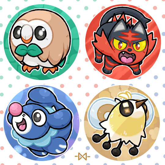
🌟 Pokémon Buttons - Alola Edition!!🌟
Alola = Done!! Now only Galar and we got them all, the starters, that is!
Let's hope I can get that done before Comiccon Holland; my next big con at the end of this month .w.;;;;
I also added Cutiefly because I just really dig it, usually I'm not big on the color yellow, but the Bee-fly design is charming enough to negate that~!! Also Rowlet being my unofficial mascot because of our matching bowties, Grass has always been my type~!!
I do have the sketches done for the next set, Y'all will most likely see them in 2 weeks. First I got a print and another buttonset to finish >:3
111 notes
·
View notes
Text
Crafting Buttons with HTML and CSS: A Complete Guide

Introduction
Welcome to the world of crafting visually appealing and interactive buttons using HTML and CSS. In this comprehensive guide, we'll explore the art of button design, understanding the crucial role that HTML and CSS play in shaping the user interface of a website. Buttons are not just functional elements; they serve as a gateway for user interaction and can significantly impact the overall user experience.
Whether you're a beginner eager to learn the basics or an experienced developer looking to enhance your button design skills, this guide has something for everyone. Let's dive into the fundamentals of HTML and CSS to create buttons that not only look great but also provide a seamless and engaging user experience.
Understanding HTML for Buttons

HTML, the backbone of web content, plays a pivotal role in crafting effective and accessible buttons. To create buttons, we need to harness the power of specific HTML elements that define the structure and behavior of these interactive components.
Let's delve into the key HTML elements essential for crafting buttons:
- Element: The primary HTML element for creating buttons. It allows you to define a button that users can interact with. You can include text, images, or other HTML elements within the button tags.
- Element (Anchor Tag): While commonly used for creating hyperlinks, the anchor tag can also be styled as a button. This is achieved by applying CSS styles to simulate a button appearance. This approach is useful when you need a button that links to another page.
- Element: The input element, especially of type "submit" or "button," is commonly used within forms to create submit buttons. These buttons trigger the form submission when clicked.
- Custom Elements: In modern web development, custom elements (created using the or elements) are often styled as buttons. These are enriched with event listeners through JavaScript to mimic button behavior.
Here's a simple example of a button created using the element:
HTMLClick me
CSS Styling Fundamentals
Now that we've established the foundation with HTML, let's turn our attention to CSS, the creative force that brings buttons to life. Understanding CSS styling fundamentals is crucial for achieving visually appealing and cohesive button designs. Here, we'll explore key principles and techniques:
- Box Model: The box model is the cornerstone of CSS layout. Each HTML element, including buttons, is treated as a box with content, padding, borders, and margins. Mastering the box model allows precise control over the size and spacing of buttons.
- Text Styling: Effective button design involves careful consideration of text. CSS provides a range of properties to control font size, style, weight, and color. Bold text, italics, and text alignment contribute to the overall aesthetics of the button.
- Color and Background: Choosing the right color scheme for buttons is crucial. CSS allows you to set background colors, gradients, and apply transparency. This enhances the visual appeal and ensures buttons align with the overall design theme.
- Border and Border-radius: Borders define the outline of a button, and the border-radius property adds rounded corners for a modern look. Careful adjustment of these properties contributes to the button's visual balance.
- Hover Effects and Transitions: Adding interactive elements to buttons enhances the user experience. CSS pseudo-classes, such as :hover, enable you to apply specific styles when users interact with the button. Transitions create smooth animations for a polished effect.
To illustrate these concepts, consider the following CSS snippet:
CSSbutton {
padding: 10px 20px;
font-size: 16px;
color: #ffffff;
background-color: #3498db;
border: 2px solid #2980b9;
border-radius: 5px;
transition: background-color 0.3s ease-in-out;
}
button:hover {
background-color: #2c3e50;
}
Creating Button Variations
See the Pen
Candy Color Button Animation by Yuhomyan (@yuhomyan)
on CodePen.
Now that we have a solid understanding of HTML and CSS fundamentals, let's explore the exciting realm of creating diverse button variations. Crafting buttons that stand out and adapt to different contexts involves experimenting with styles, effects, and interactive elements. Here's a guide to creating button variations:
- Text and Icon Combinations: Enhance the visual appeal of buttons by combining text with icons. Use the or elements to include icons, and style them alongside button text. This is particularly effective for call-to-action buttons.
- Gradient Backgrounds: Add depth and modernity to buttons by incorporating gradient backgrounds. CSS gradients enable a smooth transition between colors, providing a sleek and dynamic appearance.
- Button States: Buttons can have different states such as active, disabled, or focused. Style each state to provide visual feedback to users. For instance, a disabled button can have a distinct color to indicate its inactive status.
- Animated Buttons: Introduce subtle animations to buttons using CSS transitions or keyframes. This could include changing colors, scaling, or other creative effects that engage users without being overly distracting.
- Transparent Buttons: For a minimalist and modern look, consider creating transparent buttons. Set the background-color to transparent and adjust borders and text color accordingly. This style is effective when layered on images or vibrant backgrounds.
For a quick reference, here's a table showcasing different button variations and their corresponding HTML and CSS:
Button TypeHTMLCSSText and IconShop Now/* CSS Styles for text and icon */
Responsive Design for Buttons
In the ever-evolving landscape of web design, responsiveness is a key factor in ensuring a seamless user experience across various devices. Crafting buttons that adapt to different screen sizes and orientations is essential for modern websites. Let's delve into the principles of responsive design for buttons:
- Media Queries: Media queries are a fundamental tool for implementing responsive design. By using CSS media queries, you can apply specific styles to buttons based on the characteristics of the user's device, such as screen width, height, or orientation.
- Fluid Grids: Implementing a fluid grid layout ensures that buttons proportionally adjust to the screen size. This involves using percentage-based widths instead of fixed pixel values, allowing for flexibility across devices.
- Flexible Images: Just as with grids, images within buttons should be flexible. Use CSS properties like max-width: 100% to ensure that images scale appropriately on smaller screens without losing clarity.
- Viewport Units: Utilize viewport units (vw, vh, vmin, vmax) to define button dimensions relative to the viewport size. This ensures that buttons scale proportionally, providing a consistent and visually appealing experience.
Consider the following example of a responsive button style using media queries:
CSSbutton {
padding: 10px 20px;
font-size: 16px;
color: #ffffff;
background-color: #3498db;
border: 2px solid #2980b9;
border-radius: 5px;
transition: background-color 0.3s ease-in-out;
}
@media (max-width: 600px) {
button {
font-size: 14px;
padding: 8px 16px;
}
}
Accessibility Considerations
Creating buttons that are accessible to users of all abilities is a fundamental aspect of web development. Web accessibility ensures that everyone, including those with disabilities, can perceive, understand, navigate, and interact with web content. Let's explore key considerations for making buttons accessible:
- Semantic HTML: Use semantic HTML elements like , , or with appropriate attributes. These elements convey the purpose and function of buttons to assistive technologies, making them more understandable for users.
- Focus Styles: Ensure that buttons are visibly distinguishable when they receive focus. Applying a clear and prominent focus style, such as a border or background change, helps users who navigate using keyboard or assistive technologies to understand where they are on the page.
- Descriptive Text: Include descriptive text within buttons. This text should concisely convey the button's action or purpose. Screen readers rely on this text to provide information to users with visual impairments.
- Color Contrast: Ensure there is sufficient color contrast between the button text and background. This benefits users with low vision or color blindness, allowing them to easily distinguish and read the button content.
- ARIA Attributes: Leverage ARIA (Accessible Rich Internet Applications) attributes to enhance accessibility. ARIA attributes such as role, aria-label, and aria-labelledby provide additional information to assistive technologies about the role and purpose of buttons.
Here's an example of a button with accessibility considerations:
HTML
Optimizing Performance
While crafting visually appealing and accessible buttons is crucial, optimizing their performance ensures a seamless and efficient user experience. Users today expect fast-loading websites, and buttons play a significant role in influencing the overall performance. Let's delve into strategies for optimizing the performance of buttons:
- Minimize HTTP Requests: Each button, especially those with images or external resources, contributes to the total number of HTTP requests. Reduce these requests by using CSS sprites for multiple images or incorporating icon fonts to minimize the load on the server.
- Compress and Minify: Compressing images and minifying CSS and JavaScript files reduces their file sizes, leading to quicker load times. Utilize tools to automatically compress and minify your code, optimizing the performance of button-related assets.
- Leverage Browser Caching: Set appropriate caching headers to allow browsers to store button-related assets locally. This reduces the need to download resources on subsequent visits, improving overall page load speed.
- Lazy Loading: Implement lazy loading for images within buttons. This technique delays the loading of images until they are about to enter the user's viewport, reducing initial page load times.
- Responsive Images: Provide different image sizes for various screen resolutions. Use the srcset attribute to specify multiple sources, allowing browsers to choose the most appropriate image based on the user's device.
Consider the following example of a performance-optimized button with responsive images:
HTML
Click me
FAQ
Here are answers to some common questions about crafting buttons with HTML and CSS:
Q: What's the best HTML element for creating buttons?
A: The element is widely used for creating buttons. It provides semantic meaning and accessibility benefits.
Q: Can buttons include both text and icons?
A: Yes, buttons can incorporate both text and icons. Use the appropriate HTML elements and CSS styles to achieve a harmonious combination.
Q: How can I make my buttons responsive?
A: Implement responsive design principles using media queries, fluid grids, and viewport units in your CSS to ensure buttons adapt to various screen sizes. Q: Why is accessibility important for buttons?
A: Accessibility ensures that buttons can be used by everyone, including those with disabilities. Using semantic HTML, focus styles, and descriptive text enhances usability for all users.
Q: What are some performance optimization tips for buttons?
A: Minimize HTTP requests, compress and minify assets, leverage browser caching, implement lazy loading for images, and use responsive images to optimize button performance.
These FAQs cover a range of topics related to button creation, from the choice of HTML elements to considerations for responsiveness, accessibility, and performance optimization.
Conclusion
Congratulations on completing this comprehensive guide to crafting buttons with HTML and CSS. We've covered a wide array of topics, from the fundamentals of HTML and CSS styling to creating diverse button variations, ensuring responsiveness, addressing accessibility considerations, and optimizing performance. Let's recap the key takeaways:
- Foundation: Understanding HTML and CSS fundamentals is crucial for creating well-structured and visually appealing buttons.
- Variety: Experiment with different button variations, including text and icon combinations, gradient backgrounds, button states, animated buttons, and transparent buttons.
- Responsiveness: Implement responsive design principles using media queries, fluid grids, flexible images, and viewport units to ensure buttons adapt to diverse devices.
- Accessibility: Prioritize accessibility by using semantic HTML, focus styles, descriptive text, color contrast, and ARIA attributes to make buttons usable for all users.
- Performance Optimization: Optimize button performance by minimizing HTTP requests, compressing and minifying assets, leveraging browser caching, implementing lazy loading, and using responsive images.
As you continue refining your button design skills, remember to balance creativity with user experience. Buttons serve as gateways to interaction, and by following best practices, you contribute to a web environment that is both visually appealing and user-friendly. Now, go ahead and apply these principles to create buttons that elevate the user experience on your websites!
Read the full article
0 notes
Text
The Power of CTAs: How to Increase Lead Conversions with Compelling Calls-to-Action
Calls-to-action (CTAs) are a crucial element of any online marketing campaign. To increase lead conversions, businesses need to create compelling messaging that encourages visitors to take action. The design of CTA buttons and the layout of landing pages also play a crucial role in converting visitors into leads.
0 notes
Video
youtube
Divi Pro Secrets: Create Stunning Custom Buttons for Any Text Based Module!
Unlock the full potential of your Divi Theme with this comprehensive guide on how to create your own custom buttons for any text-based module. In this video, we’ll walk you through the process of designing unique and eye-catching buttons using simple CSS code. Whether you’re working with text modules, blurbs, or any other text-based content, this tutorial will show you how to enhance your website's interactivity and visual appeal. Perfect for both beginners and seasoned Divi users, these tips will help you take your web design skills to the next level.
0 notes
Text

Apartments in Odai is a minimal apartment located in Tokyo, Japan, designed by Buttondesign. The renovation seamlessly connects various living spaces while embracing an open garden, allowing both human and canine occupants to coexist harmoniously. The entire floor, from the entrance to the dining room and onward to the garden, is adorned with the same tiles, creating a unified, earthy atmosphere that blurs the lines between indoors and outdoors.
61 notes
·
View notes
Text
Here's a preview of my new Pride button designs! These will debut for sale at Cosplay Snow Festival at Rochester Institute of Technology on Saturday, January 21!
#buttons #pride #buttondesign #lgbtq🌈 #pansexual #lgbtqpridebuttons #wip #jobnothobby
instagram
0 notes
Photo

春に引き渡し終わったマンションリノベーションの写真。 設計・デザインは同じ早稲田鶴巻町の Buttondesign @buttondesign.tokyo 。僕たちは素材選びと家具・照明・建具などのセレクトを担当させて頂きました。 住宅や店舗などの内装もお気軽にご相談ください。 #Repost @buttondesign.tokyo with @use.repost ・・・ House in Asao/2022 designed by Buttondesign photo by Masaki Komatsu lnterior styling by on the shore https://www.instagram.com/p/CmgasmYva9k/?igshid=NGJjMDIxMWI=
0 notes
Photo

My new button really is a nice little pop of color on my hat. #digitaldrawing #digitalart #digiyalillustration #selfpromotion #buttondesign #buttons #button #art #hat (at Vine) https://www.instagram.com/p/CWHBO5rvdnx/?utm_medium=tumblr
2 notes
·
View notes
Photo

I've been working on some new button designs for the past month, so far I made some pokemon buttons which were going to be sold at Ani-me Con 9.0, but its been postponed til May, this gives me more time to work on more designs. Hope to see y'all in May! xwx #buttons #buttondesign #digitalart #pokemon #wooloo #mimikyu #ghosttypepokemon #gengar #ghastly #myartwork #pokemonswordshield #pokemonswordandshield #pokemonart https://www.instagram.com/p/B9snn6bB68U/?igshid=1y2mdrwe3d4zo
#buttons#buttondesign#digitalart#pokemon#wooloo#mimikyu#ghosttypepokemon#gengar#ghastly#myartwork#pokemonswordshield#pokemonswordandshield#pokemonart
2 notes
·
View notes
Photo

🌟 Pokémon Buttons - Galar Edition!!🌟
I did finish all of them in time for CCH .w.!! And now I got buttons for every single starter in the Pokemon Mainline Games .w.!! Now to go on and redo Sinnoh and Paldea (after a while, got some new plans for projects >wo!!)
The extra Pokémon this time is Snom!! I still got stickers from the first batch, but it was time to give him a new appearance on the button front .w.!! Might do more Bug and Grass-types for buttons in the futures, they just work for some reason .w.!!
Next weekend will be Made in Asia (Netherlands version) and after that I'll probably take a break from button art for a while -w-~!!
27 notes
·
View notes
Text
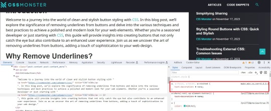
Removing Underlines from Buttons with CSS: Clean Styling
Introduction
Welcome to a journey into the world of clean and stylish button styling with CSS. In this blog post, we'll explore the significance of removing underlines from buttons and delve into the various techniques and best practices to achieve a polished and modern look for your web elements. Whether you're a seasoned developer or just starting with CSS, this guide will provide insights into creating buttons that not only catch the eye but also contribute to an enhanced user experience. Join us as we uncover the art of removing underlines from buttons, adding a touch of sophistication to your web design.
Why Remove Underlines?
Understanding the rationale behind the decision to remove underlines from buttons is crucial for crafting a visually appealing and user-friendly web interface. Let's explore the reasons driving this design choice:
- Enhanced Aesthetics: Removing underlines from buttons contributes to a cleaner and more modern visual appearance. This aesthetic refinement aligns with contemporary design trends, providing a sleek and professional look to your website.
- Reduced Visual Clutter: Underlines, though conventionally associated with links, can introduce unnecessary visual noise to buttons. By eliminating underlines, you declutter the visual space, allowing users to focus on the essential elements of your interface.
- Consistency Across Elements: Achieving a consistent design language is essential for a harmonious user experience. Removing underlines from buttons aligns them visually with other non-link elements, promoting a cohesive and unified design language throughout your website.
- Improved User Experience: Buttons without underlines present a more intuitive and user-friendly interface. Users can quickly identify actionable elements without the distraction of underlines, streamlining the navigation and interaction process.
- Modern Design Trends: Following current design trends often involves breaking away from traditional styling conventions. Many contemporary websites opt for a minimalist and sleek appearance, and removing underlines from buttons aligns with this evolving design ethos.
Beyond these key considerations, it's essential to recognize that the decision to remove underlines should be made thoughtfully, taking into account the overall design goals and user expectations. By doing so, you can create a visually appealing and user-friendly web environment that resonates with modern design principles.
CSS Basics
Before diving into the techniques for removing underlines from buttons, it's essential to revisit some fundamental CSS concepts. Familiarizing yourself with these basics will lay a solid foundation for effective button styling:
- Selectors: Understanding CSS selectors is crucial for targeting specific HTML elements. Whether using class, ID, or tag selectors, choosing the right selector is the first step in styling buttons.
- Properties and Values: CSS properties dictate the visual aspects of an element, such as color, size, and font. Familiarize yourself with common properties related to button styling, including background-color, border, and padding.
- Box Model: The box model describes how elements are structured in terms of content, padding, border, and margin. Understanding this model is crucial for precise control over the sizing and spacing of buttons.
- CSS Resets: Dealing with browser-specific styles can be challenging. CSS resets help standardize default styles across different browsers, providing a consistent starting point for your button styling.
Once these basics are clear, you can proceed to explore more advanced techniques for removing underlines. One effective approach involves using the text-decoration property and setting it to none for buttons. Additionally, understanding the :hover and :active pseudo-classes allows you to create interactive and responsive button styles.
Concept
Description
Selectors
Identifiers used to target HTML elements for styling purposes.
Properties and Values
Attributes that define the appearance and behavior of CSS elements.
Box Model
Framework for understanding the layout of elements, including content, padding, border, and margin.
CSS Resets
Techniques to standardize default styles across different browsers.
By mastering these CSS basics and exploring their application in button styling, you'll be well-equipped to implement underlines removal with precision and style.
Methods for Removing Underlines
When it comes to achieving a clean and stylish appearance by removing underlines from buttons, several methods are at your disposal. Each method offers its own set of advantages and considerations, allowing you to choose the approach that best aligns with your design goals. Let's explore these methods in detail:
- Using the text-decoration Property: One of the most straightforward methods involves utilizing the text-decoration property in CSS. Setting this property to none effectively removes underlines from buttons. This method provides simplicity and ease of implementation.
- Utilizing Class or ID Selectors: Applying the text-decoration property selectively through class or ID selectors allows for a more targeted approach. This method is advantageous when you want to remove underlines from specific buttons while leaving others unaffected.
- Creating Custom Styles: Going beyond the basics, you can create custom styles for your buttons using advanced CSS techniques. This involves specifying properties such as border, background-color, and padding to achieve a tailored appearance without underlines.
- Using Pseudo-classes: Employing pseudo-classes like :hover and :focus allows you to add interactivity to your buttons. These classes can be utilized to change the appearance of buttons when users hover over or focus on them, enhancing the user experience.
Consider the nature of your website and the desired user interaction when selecting a method for removing underlines. Additionally, it's crucial to test your chosen method across various browsers to ensure consistent and reliable results.
Method
Description
text-decoration Property
Directly removes underlines by setting the text-decoration property to none.
Class or ID Selectors
Applies the text-decoration property selectively to specific buttons through class or ID selectors.
Custom Styles
Allows for the creation of unique button styles using a combination of CSS properties.
Pseudo-classes
Enhances interactivity by modifying button styles on user interaction, such as hovering or focusing.
Experimenting with these methods will empower you to find the most suitable approach for achieving a polished and underline-free button styling on your website.
Best Practices
As you embark on the journey of removing underlines from buttons in CSS, adhering to best practices ensures a seamless and effective implementation. Consider the following guidelines to achieve clean and polished button styling:
- Consistency is Key: Maintain a consistent design language across your website. Whether removing underlines from all buttons or specific ones, consistency enhances the overall user experience and fosters a cohesive visual identity.
- Responsive Design: Ensure that your chosen method for removing underlines accommodates various screen sizes and devices. Responsive design principles help create a user-friendly experience on desktops, tablets, and smartphones.
- Accessibility Matters: Prioritize accessibility by considering users with different abilities. Ensure that buttons remain distinguishable and interactive for users who rely on assistive technologies such as screen readers.
- Test Across Browsers: Perform thorough testing across different web browsers to confirm the consistent application of your chosen styling method. This helps prevent unexpected visual discrepancies.
- Optimize Performance: While focusing on aesthetics, be mindful of performance. Streamline your CSS code and consider the impact of your styling choices on page load times to create a smooth user experience.
Additionally, incorporating user feedback and conducting usability testing can provide valuable insights into the effectiveness of your button styling. Remember that the ultimate goal is to create an intuitive and visually appealing interface that resonates with your target audience.
Practice
Description
Consistency is Key
Maintain a uniform design language throughout the website for a cohesive visual identity.
Responsive Design
Ensure that button styling remains effective across various screen sizes and devices.
Accessibility Matters
Prioritize the accessibility of buttons for users with different abilities, considering assistive technologies.
Test Across Browsers
Conduct thorough testing to ensure consistent styling across different web browsers.
Optimize Performance
Streamline CSS code and consider the performance implications of styling choices for improved page load times.
By incorporating these best practices, you'll not only achieve a visually appealing design but also contribute to a positive user experience on your website.
Case Studies
Examining real-world examples of buttons without underlines provides valuable insights into the impact of this styling choice on different websites. Let's delve into a few case studies that showcase the effectiveness of removing underlines:
- E-commerce Checkout Buttons: In the e-commerce sector, streamlined and clean checkout buttons play a pivotal role in guiding users through the purchase process. Removing underlines from these buttons creates a visually uncluttered interface, reducing distractions and enhancing the focus on completing the transaction.
- Social Media Sharing Buttons: On social media platforms, the design of sharing buttons is crucial for encouraging user engagement. Many platforms opt for underlines-free buttons to maintain a sleek and modern appearance, aligning with the visual trends of contemporary web design.
- Call-to-Action Buttons on Landing Pages: Landing pages often feature prominent call-to-action buttons to encourage user interaction. By removing underlines from these buttons, designers can draw attention to the action they want users to take, creating a visually compelling and persuasive design.
- Mobile App Navigation Buttons: Mobile app interfaces prioritize simplicity and ease of use. Navigation buttons without underlines contribute to a clean and intuitive mobile experience, facilitating smooth navigation for users on various devices.
Examining these case studies highlights that the decision to remove underlines is context-dependent and should align with the specific goals and design principles of each website. It's essential to consider the user journey, the nature of the content, and the overall aesthetic when implementing underlines removal.
Case Study
Observations
E-commerce Checkout Buttons
Streamlined checkout buttons without underlines enhance the focus on completing transactions in e-commerce scenarios.
Social Media Sharing Buttons
Underlines-free buttons on social media platforms contribute to a sleek and modern appearance, encouraging user engagement.
Call-to-Action Buttons on Landing Pages
Removing underlines from call-to-action buttons on landing pages draws attention to desired user actions, fostering interaction.
Mobile App Navigation Buttons
Navigation buttons without underlines contribute to a clean and intuitive mobile app interface, prioritizing simplicity.
These case studies demonstrate the versatility of underlines removal and emphasize the impact it can have on user engagement and visual appeal across different website contexts.
Common Challenges
While the decision to remove underlines from buttons can enhance the visual appeal and user experience, it's essential to be aware of common challenges that may arise during the implementation. Understanding and addressing these challenges will help you navigate potential issues seamlessly:
- Loss of Visual Cues: Removing underlines can result in a loss of traditional visual cues that indicate a clickable element. It's crucial to compensate for this by incorporating alternative design elements such as color changes, hover effects, or iconography to maintain interactivity.
- Accessibility Concerns: Users with visual impairments may rely on underlines to identify links and interactive elements. Ensuring that your styling choices are accessible and considering alternative methods, such as using contrasting colors, helps address accessibility concerns.
- Browser Compatibility: Different browsers may interpret CSS styles differently. Testing your underlines removal method across various browsers is essential to ensure a consistent and reliable user experience.
- Impact on User Expectations: Users may have established expectations regarding the appearance of clickable elements. Deviating too far from these expectations can lead to confusion. Carefully balancing innovation with adherence to user expectations is key.
Addressing these challenges requires a thoughtful approach to button styling. Consider incorporating subtle visual cues, leveraging ARIA roles for accessibility, and conducting thorough testing to mitigate potential issues.
Challenge
Considerations
Loss of Visual Cues
Compensate for the absence of underlines with alternative design elements like color changes, hover effects, or icons.
Accessibility Concerns
Ensure accessibility by considering the needs of users with visual impairments and using alternative methods such as color contrast.
Browser Compatibility
Test your underlines removal method across various browsers to ensure a consistent user experience.
Impact on User Expectations
Balance innovative design choices with adherence to established user expectations for clickable elements.
By proactively addressing these common challenges, you can confidently implement underlines removal, creating a visually appealing and user-friendly button styling while mitigating potential issues that may arise.
Backend developers after writing CSS for 20 minutes: pic.twitter.com/CzIvYuSQNK
— Marko Denic (@denicmarko) November 13, 2023
FAQ
Explore answers to frequently asked questions about removing underlines from buttons in CSS to enhance your understanding of this styling choice:
Q: Why should I remove underlines from buttons?
Removing underlines from buttons offers a cleaner and more modern visual appearance, contributing to a polished design. It reduces visual clutter, enhances aesthetics, and aligns with contemporary design trends.
Q: Will removing underlines affect accessibility?
It can impact users with visual impairments who rely on underlines to identify clickable elements. To address accessibility concerns, consider alternative design cues, maintain color contrast, and test with assistive technologies.
Q: What is the impact on user expectations?
Users may have established expectations regarding the appearance of clickable elements. While removing underlines can offer a modern look, it's important to balance innovation with adherence to user expectations to avoid confusion.
Q: How can I ensure a consistent experience across browsers?
Testing your underlines removal method across various browsers is crucial to ensure a consistent user experience. Different browsers may interpret CSS styles differently, and thorough testing helps identify and address compatibility issues.
Q: Are there alternative visual cues for clickable buttons?
Yes, alternative visual cues such as color changes, hover effects, or iconography can compensate for the absence of underlines. Experiment with these elements to maintain interactivity and guide users to clickable buttons.
These frequently asked questions provide valuable insights into the considerations and implications of removing underlines from buttons. Consider these answers as you navigate the process of implementing this styling choice on your website.
Conclusion
In conclusion, the decision to remove underlines from buttons in CSS is a design choice that can significantly impact the visual appeal and user experience of your website. By following the outlined methods, best practices, and considering real-world case studies, you can create a polished and modern interface that aligns with contemporary design trends.
However, it's crucial to navigate the challenges associated with underlines removal, such as potential accessibility concerns, browser compatibility, and user expectations. Addressing these challenges with thoughtful solutions ensures that your design choices contribute positively to both aesthetics and usability.
As you embark on the journey of styling buttons without underlines, keep in mind the importance of consistency, responsiveness, and accessibility. Test your chosen methods across various browsers and devices to guarantee a seamless user experience for all visitors to your website.
By incorporating the insights from this blog post, you can confidently implement underlines removal, enhancing the overall look and feel of your website's buttons while maintaining a user-friendly and accessible design.
Read the full article
0 notes
Photo

Look at these beauties... every pre-order for “Juliana Hatfield Sings The Police” includes this 1” pin + a 3” decal in the same design. Pre-order at ALR-Music.com. Lots of the label-exclusive items have already sold-out. Only a couple of dozen *signed* CD’s left. Do it!! #julianahatfield #daykampcreative #midwestbuttons #merchdesign #buttons #indieswag #swag #preorderusa #pins #pindesign #buttondesign #indierecordlabel https://www.instagram.com/p/B0_Yes2J830/?igshid=123ty9oaoc953
#julianahatfield#daykampcreative#midwestbuttons#merchdesign#buttons#indieswag#swag#preorderusa#pins#pindesign#buttondesign#indierecordlabel
1 note
·
View note
Video
youtube
(via Divi: Craft a Dynamic Button with Mesmerizing Color Pulsations!)
Welcome back, fellow Divi enthusiasts! I'm thrilled to have you join me for another exciting journey into the world of web design. Today, we're going to delve deep into the art of creating captivating buttons that not only catch the eye but also engage users on a whole new level. Whether you're a seasoned designer or a newcomer to the Divi platform, this tutorial is packed with valuable insights and step-by-step instructions to help you master the craft of button design. So, without further ado, let's roll up our sleeves and dive right in.
0 notes
Photo

Button ideas from today! Hoping I can actually make these to sell~ --- #pencildoodle #pencildrawing #pencilsketch #buttondesign #designpractice https://www.instagram.com/p/BxoRwiJndoe/?igshid=oca1l2pe9y6i
1 note
·
View note
Last Seen Blogs

gingerlead
GingerLead Dog Slings


akirascrybaby
pieck's wife

hushigisan-tumbler
ママチャリロングライダーのたんぶらぁ

rthuisworld
Unbetitelt