#also rereading this i hate how i write i sound so peppy and prescriptive these r just my two cents!! sorry its so long
Note
sorry in advance if you've already answered a question like this but i just wanted to ask, how do you improve on drawing?? i think especially for things like coloring, shading, and lighting , its been difficult for me to be happy with how it looks because compared to the sketch (that i think already looks nice) the colors just seem sort of flat and muddy and i feel like i dont have a good grip on what colors to put where and how to make it look unflatt if that makes sense! just curious on maybe what kinds of practices and studying you do for this(if any))<33 obv you dont have to answer if you dont want to, and thank you for being one of my inspirations, love youu<33333
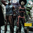
hihi!! for simply shading/lighting, i would suggest you only work in black and white until you're totally comfortable with developing values. why? marco bucci explains it really nicely in this video but basically if you have good values u can have absolutely garbage nonsense colors and it will still make sense aka when i did this lol:
i'm guessing you're more interested in colored artwork though since black and white drawings can't be "flat and muddy" bc theyre in grayscale lol. for coloring, this is so tough for me too so i thought about this for a day or so and i came up with 3 tips that might help^^ 1) getting colors directly from photo reference or color reference, 2) manually adding filters/color harmony, and 3) studying color theory
i always work from photo reference so it informs a lot of my coloring/shading/lighting and often when i don't understand what color I'm looking at i directly just eye drop it and realize that what i thought was purple was actually just a gray-red. working from an actual picture helps make sure my colors don't look strange and while i used to think eye-dropping felt like "cheating" when i worked digitally honestly i've learned a lot from it and honestly if i stare at a color long enough i can get it pretty accurately now but i'm just too lazy so eye-dropping just speeds up my workflow (plus i hate digital color pickers anyways they r not built for artists and i wrote an entire paper on it in college once lmao) anyways here's an example of a color study i did by directly eye-dropping from a gif with @quokki's incredible coloring (love u ale <3)

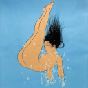
if you're not working from a picture directly, you can still use other pictures or artwork as a "color reference" which I used to do a lot. i like to look at art from other ppl with pretty colors and create a color palette to use in my own drawings. for example, the color palette for this felix painting came from a piece (idr which) by Simón Prades on instagram but this palette is really easy to use since it's linear values it's like working in black and white but comes out looking cooler LOL

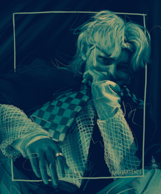
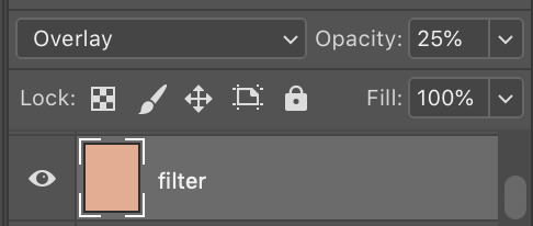
Recently for my lee know kiki's delivery service drawing i felt that the colors seemed a little flat n muddy to me because it was in an animated flat coloring style (lol) so I added a filter layer (just a flat apricot color set to overlay at 25% on photoshop) that livened up the whole thing and made it feel more cohesive. It's a pretty subtle difference to other people but made a world of difference to me :) it helped take the muddiness out of the shadows of his face and the glass reflection and took the painting from gloomy rainy day with stale bread to warm sunny day with fresh bread :]

and finally if u are interested in actually studying colors and lighting and shading and stuff these r some of the youtube videos and channels that i think do a great job explaining these very cool concepts:
pre-realism vs post-realism is a cool video about the difference between the mentality of how beginners draw vs how experts draw and kinda blew my mind tbh i think the big color takeaway from this video is that something that kids would color (like green grass) might actually be a totally different color to an artist's eye (dark yellow, red gray, even a super desaturated purple) depending on a realistic lighting situation
nathan fowkes did a 3-part guest talk series on understanding color temperature and relationships: (1) (2) (3) also not coloring but i love his video on value massing
this lecture on what charles bernard calls "the mother color principle" takes the "filtering" tip that i mentioned earlier to a much more developed level (it's an hour long so just skip through it.. u get the gist of what he's saying in a few min but the whole demo is also cool too)
i mentioned him earlier but marco bucci has many 10 min digestable videos about color on his channel that i like :) (also this lighting/value video is great too)
sorry i don't really know exactly how basic or advanced i should cater my advice but i hope this helps some anon^^ lmk if u have questions or if u ever want feedback my inbox and dms r always open
#ask#anon#my questionable advice#damn this makes me want to go back to art school i remember this time last year i was watching so many of these videos and actually studyin#n now ive just been so lazy n only doing black n white again LOL#also rereading this i hate how i write i sound so peppy and prescriptive these r just my two cents!! sorry its so long#its just all the vertical media
25 notes
·
View notes
Last Seen Blogs

meridiangrimm
Meri's Corner

back-to-junko
Also like. hi
vxnta
inactive
lurkin-dworkin
work in progress feminist

clearly-control-energy-least
Untitled