#also this would help me figure out how to print books to bookbind them myself! i really want that
Text
It's late and I'm here (only 2 am but I'm actually trying to sleep) lying awake trying to figure out how to design a planner so that when I print it for bookbinding it doesn't mess up the order of days and months but my math and logic aren't computing right now. I kind of feel like the answer is super obvious but I just can't visualise it working and I'm making a mess out of myself.
Does someone here have the answer? I tried googling and watching videos but I just don't find them or don't get it. And I do really have to get up early tomorrow to study and clean my house.
I really don't want to waste paper on trial and error (I don't get along with my printer good enough and there'll be plenty of mistakes even if I knew how not to mess up the order of the days).
#help#bookbinding#bookbinding tips#also this would help me figure out how to print books to bookbind them myself! i really want that#i have a friend whos a writer and id love to gift her her own novel bookbinded by myself so that its a hardcover and handmade#and with some fabric that reminds me of her book
3 notes
·
View notes
Text
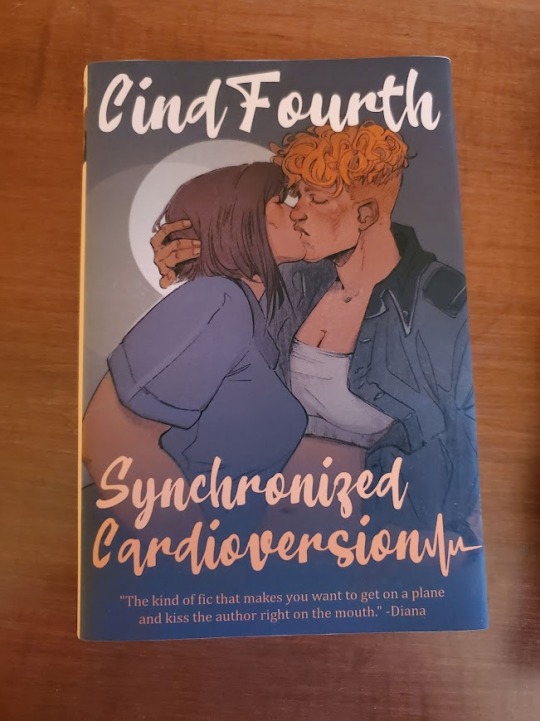
Hey guys what's up I learned bookbinding to make @cindthia a physical copy of Synchronized Cardioversion for our anniversary :3
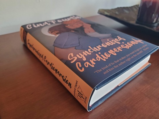
Pics and process documentation below!
I used the following resources:
How to Make a Book by ArmoredSuperHeavy
Bookbinding Resources Master List by Renegade Bindery
r/Fanbinding
the fanbinding tag on AO3 - shoutout to r3zuri's fanbinding of a FFVII fic for their extremely informative cliff's notes version of the process
the Intro to Hand Bookbinding class at the Minnesota Center for Book Arts, an incredible resource for anyone in or near Minneapolis interested in learning how to bind their own books.
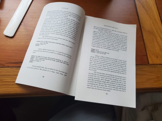
First, I typeset the fanfic. I did this by downloading it from AO3, trying to figure it out myself, checking How to Make a Book for help with a problem I was having, and realizing that I should have just used it from the beginning in the first place. I used Microsoft Word 2013.
Fonts: Palatino Linotype, Helvetica (for the characters' text messages), Beatline (for titles)
Margins: .88" top, 1" bottom, .75" inside, .75" outside, .25" gutter
Front matter:
- Title page with only the title
- "Praise for Synchronized Cardioversion" with comments from the fic
- Title page with title, author name, and a colophon I made
- Copyright page with fic copyright, fic URL, TLT series copyright, disclaimer, AO3 fic summary, first chapter author's notes, copyright for in-text art, book design credit, font info
Back matter:
- Acknowledgments (from the fic)
- "Also by CindFourth" with all their TLT fic separated into Synchronized Cardioversion Extended Universe (might make another book of this at some point); Other Camgideon, Campal, and Team 69; and Other Locked Tomb
I set the page layout to "book fold" with 16-page signatures. As for the art, one of Cind's requests in last year's TLT Holiday Exchange was for art of this fic and they got not only a fantastic one-page comic from their assigned creator, our friend @anaeolist (who also did a sketch of Cam and Gideon kissing - we'll come back to that later), but also a lovely piece as a treat from our friend @kat-hikari. I got permission from both artists to include their work in the book.
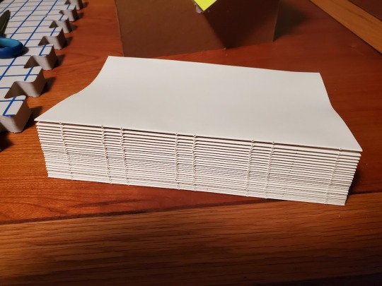
The finished file was 408 pages, so I added four blank pages (two sheets) to the beginning and the end to make 26 signatures even.
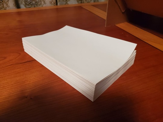
Next, I printed the pages. I used my Brother DCP-L2550DW and Hammermill 11x8.5 24/60 lb. cream bookbinding paper from Church Paper. I'd read that sometimes using short-grain paper in a regular printer could cause it to jam, but it went fine. The cream color made the pages look so professional.

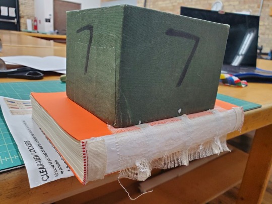
I folded the pages into signatures and then pressed them overnight. Since I don't have a book press, I sandwiched them between two sheets of bookboard and put a heavy box on top, and that worked well.
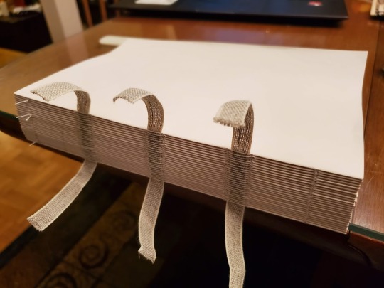
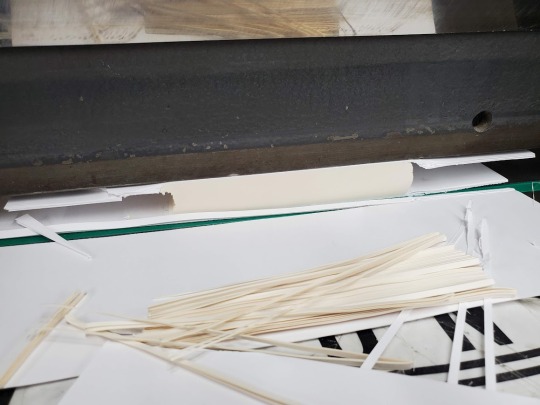
The next step, punching holes and sewing, was my favorite. I'd made a punching cradle using instructions I got in my bookbinding class. It was a lot easier than I thought it would be, and it only used bookboard and PVA glue, so I didn't even need to buy anything I hadn't already bought for the project.
I used three pieces of tape and sewed them on using a kettle stitch.
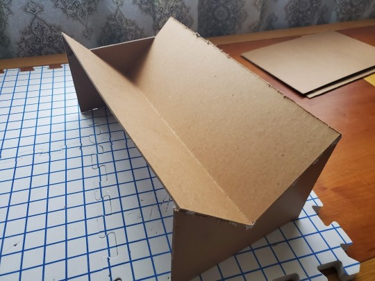
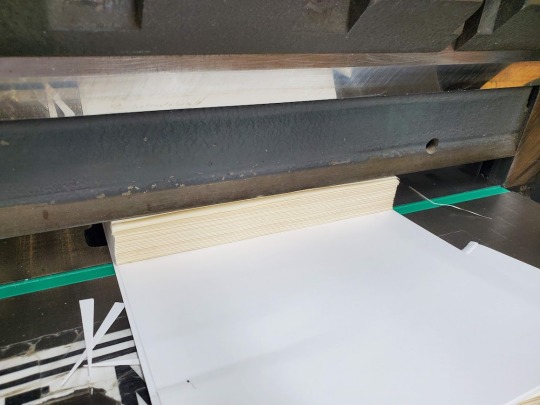
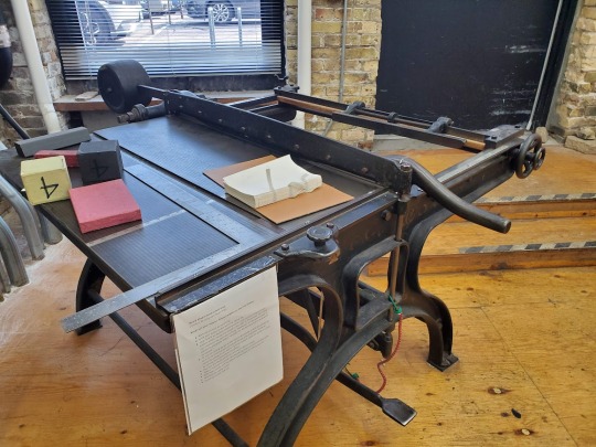
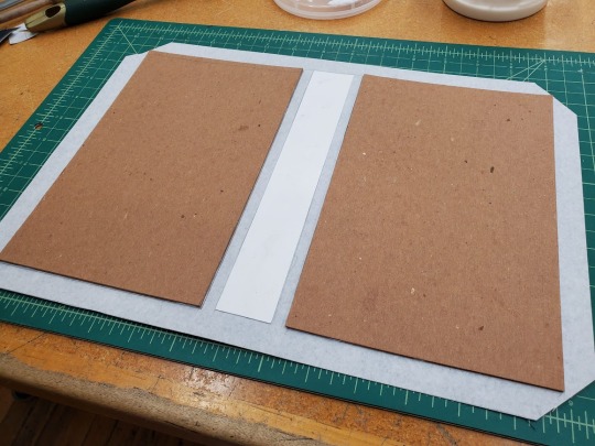
Then I went to MCBA to use their guillotine on the text block and their board shear to cut boards for the cover.
I chose orange cardstock for the endpaper, and because I am a novice making novice mistakes I unfortunately forgot to get a size of cardstock that would let me fold it on the grain, but anyway. I trimmed it to the exact size of the pages and glued it to the text block. Next I glued the spine of the text block, rounded it a bit (not the way an expert would; you learn that in Intermediate Hand Bookbinding), added a strip of super mull and headbands at either end, and sat it under a weight to dry while I made the cover.
The Bristol board I cut for the spine was probably 1/8" too wide, which makes a bigger difference than you would think. Next time I'm going to err on the side of slightly too narrow when I'm already giving myself three board widths of a buffer on either side.
Aside from that, the cover turned out great! I could have done a better job lining up the endpaper when I glued it in, but that's the kind of thing you practice I guess.
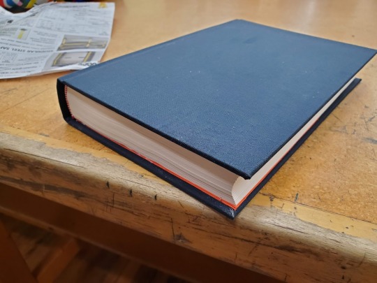
I love the way the navy blue bookcloth looks with the cream paper, the orange endpaper, and the red and white headbands.
Now that I had the exact dimensions of the book, I could finally design the dust jacket. Remember that sketch of Cam and Gideon kissing that anaeolist did for the holiday exchange? I commissioned them to turn it into a finished piece for the cover, and boy did they ever deliver. I also asked some of our other friends who had read the fic to give me blurbs for the back cover, and they delivered too. Cind's and my relationship wouldn't have been possible without the wonderful community we met in and I wanted this gift to reflect that.

I created the jacket in GIMP at a print resolution of 300ppi and saved it as a pdf. The final step was to get it printed, which I was nervous about because it was the only part of the process that I had no control over at all. Long story short, I ended up with something I was very happy with done by a small chain print shop where I had to go in and talk to a human about what I needed.
I also posted this to AO3!
110 notes
·
View notes
Text
“Should I use InDesign to lay out my books?” - A Passionate Guide
Ok, if you are like me, you recently stumbled upon @armoredsuperheavy‘s brilliant blog about bookbinding and fanfiction, and now you are excited to throw yourself head-first into bookbinding.
This also means that you are about to invest a fair amount of time into figuring out how exactly to lay out books. What you end up getting comfortable with will most likely be what you end up using long term, so it is worthwhile giving it some thought. The question really comes down to this: who's name will you be cursing for the foreseeable future? Adobe? Or Microsoft?
Full disclosure: I only started using InDesign because I was forced to. I worked as an editor at a newspaper, and that was what we used. The beginning was hell. I won’t sugar coat it, it sucks. In the end it was worth it. Once you figure it out, InDesign’s potential far outstrips Microsoft Word (in my opinion).
That encouragement means very little when you open this treacherous program for the first time and see THIS:
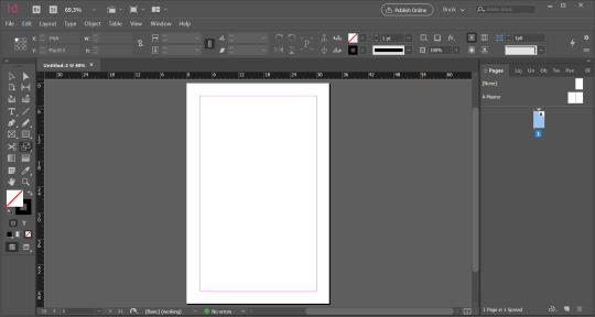
“What?! I will literally give you $100 if you guess what all the buttons on the left are for. How the fuck do I make the margins disappear!?”
So, if using InDesign means figuring out what at least one third of the tools on the left are for, lets talk pros and cons.
Let’s get the cons out of the way.
It is expensive.
Adobe is not fucking around. This puppy costs 20 bucks a month (Canadian) to RENT.
If this is out of your price range, do you still have options? Yes. Do they range in legality? Also yes.
I think I could potentially get in trouble for telling you to find your friendly neighborhood torrenting site and steal this software. I will say, outright, that no one should steal software ever. Got it? I would be very upset if someone were to message me for specifics.
As you naturally wish to be law-abiding, there is also the quasi-legal option of repeating the 14-day free trial. My friend works at a professional print studio in Russia, and this is the tactic they use: every 14 days they uninstall all of the software from all of the computers, and reinstall it with a new trial. Every 14 days! At a professional operation! My friend hates working there.
It is not initially intuitive.
I’ve covered this, but it bears repeating because it is a serious hurdle. Keep in mind, that with time, InDesign becomes more helpful than other software. Now when I use Word I find myself reaching for keyboard shortcuts automatically, and feeling bereft at the lack of my favorite tools. Nonetheless, expect a time commitment up front learning how to harness this glorious and confusing computer program.
It can run kinda slowly, depending on your computer.
Up until two months ago, I had the world’s most precarious laptop. I bought it for $200 in 2015. It once took half an hour to restart. Inexplicably, when it got stressed, it would switch to Spanish. It was literally and figuratively falling apart. And yet, it ran InDesign.
Granted, it worked slowly. If I asked it to process too many images at once it would panic (again with the Spanish), but for the most part, it worked. If you have a slow computer and are patient, then InDesign will probably work fine on your computer. If you are not willing to suffer, stick to Word.
You will also need Photoshop (sometimes).
Part of what makes InDesign glorious is that it is professional software that is designed specifically to work with print and anything text-heavy. I love that about it. It even manages to do some handy things with images! But, inevitably, you will need to learn some Photoshop to punch up your graphics.
I have, admittedly, only learned the bare minimum Photoshop in order to feed my InDesign addiction. It was a pain in the butt. For example, inexplicably, Adobe has not standardized keyboard shortcuts across the suite. As with InDesign, now that I’ve learned the tricks, I adore it. But you should go into this knowing that with Adobe, the fun never ends.
Printing signatures is the WORST.
Adobe, please explain to me, in front of God and everyone, why the hell you would make this software specifically for laying out books etc. and not include a method of printing signatures?! I’m livid. This is absolutely where Word wins the day. It is almost worth using Word just to print the signatures so nicely and easily. I’m not kidding. Me—a person who has used InDesign professionally—almost wanted to switch software entirely just because of this. Hands down, InDesign’s biggest goof.
Despite this crime against bookbinders everywhere, you have options. You can export your design to a PDF and literally print each signature separately (I am fucking livid) or you can complain enough to your friends that they offer to buy you a lovely program called BookletCreator for your birthday. It costs $20 bucks USD and it was worth every penny.
However, Adobe, FOR THE AMOUNT THAT YOU CHARGE FOR YOUR PROGRAM, I SHOULD NOT HAVE TO PURCHASE ANY ADDITIONAL SOFTWARE IN ORDER TO PRINT MY BOOK. Did I mention that I am livid?!
But InDesign must be worth something, right?! Otherwise why would I be writing a long post encouraging people to use it? Let’s talk pros:
The horsepower on this baby will blow your mind.
Forget what I just said about printing signatures; imagine using software that was literally made for this. You wanna do a thing? InDesign has got you. Are you a perfectionist? This software was designed by people as pedantic and obsessive as yourself. It gets you. Dream it, google how to do it, and InDesign will deliver. This is really the main reason to use InDesign; it is the professional standard for a reason.
There are so SO many resources available to help you learn.
Almost everything I’ve learned about InDesign I learned from Google or YouTube. Honestly, if you have a question, I promise that other people have already asked and answered it. The advantage is that because this software is specifically for laying out books, there is lots of information available specifically about how to do what you want to do. (This may also be true for Word, but I’ll be honest, I only used Word for a book layout once, so I can’t say for certain either way.)
Once you figure it out, InDesign will give you back hours of your life.
Things like master page spreads, clipping paths, tint, the eyedropper tool, and the one-hundred-percent adjustable text are just... lifesavers. My experience with Word is limited, so my frustration using it was probably due to my own ineptitude, but honestly, when putting together my thesis, the tears I cried trying to get page numbers to format correctly were some of the most bitter text-related tears I have ever shed. I can take care of the whole operation in InDesign in a matter of minutes.
Hours. Of. My. Life. Saved.
This is an actual marketable skill.
Ok, bear with me here.
I have used InDesign for every single job I have had since I worked at the newspaper. That includes working as a bookkeeper and a kindergarten teacher. Hell, I even made my resume to get those jobs in InDesign. There is no job that I forsee in my future that doesn’t include some form of text-based design. Even when my work has absolutely nothing to do with layout (see: kindergarten teacher) I still found some way to use it. My previous boss was actually so thrilled about my InDesign skills that she had me run a 101 seminar for the other employees. (Did any of them end up using it? I suspect not. Did they look at me strangely for being so enthusiastic about design software? Absolutely.) I’ve even managed to use InDesign to branch out from freelance editing to take on design projects as well.
In short: if you learn how to use InDesign, put in on your resume. You will be surprised at how much mileage you get out of it.
With Adobe, the fun never ends.
I know I joked about it before, but really, I love seeing what this program has in store for me next. For example, thanks to bookbinding, I discovered that InDesign will do a lot of things that I had previously assumed were the domain of Word, such as spell check. I literally stumbled onto a measuring tool today that I wish existed irl to help me glue my covers together. Part of the beauty of this software being so intricate is that there is always something new you can do. I love learning how to harness a new feature, and then watch my design improve over time.
Using this program you really get the feeling that the sky is the limit. Look, just the fact that I’ve now resorted to saccharine platitudes about computer software tells you that InDesign is remarkable. Considering that this program has made me suffer so significantly, I have either seen the face of God, or I have Stockholm syndrome. Take your pick.
TL;DR, at long last:
How complicated would you like to go? Either way, for bookbinding you’ve got to learn to use software in a new way.
Do you just want to get your book laid out reliably with little fuss? Word is for you!
Are you interested in delving into the details? Do you have the patience of a saint? Try InDesign!
Both work. Both are good. But you can pry InDesign from my cold dead hands because I adore it.
#Honestly#No shame towards Word or anyone that uses it seriously#Like I said I have little experience actually using it for laying out books#But InDesign is very good.#Bookbinding#fic#fic binding#If people want I can start putting together tutorials about how to do all of this stuff#And all of y'all can learn from my mistakes and hopefully learn faster than I did.#Аня есть что нибудь здесь про тебя#заметишь?#InDesign
176 notes
·
View notes
Note
Ahhhh, your self bound books just look really beautiful? All the color choices and the layout just look soooo good together. And that's such a beautiful gift? I have not read primium non nocere, as I haven't watched Charité but if it is worthy of such a tribute I am definitely giving it a shot anyway. I'd also be really interested of your creative process and choices with the binding, if you're willing to talk about that
hi omg! thank you so much <3<3 Primum Non Nocere is a very good story, and I'd say even if you haven't seen the show, give it a shot anyway, if you're interested? I mean, by all means, try the show as well, season 2 is on Netflix w english subs afaik and it's also really, really good (not perfect, but leagues better than the stuff this country usually makes abt the nazi regime). It's a retelling of canon events from a character's perspective who isn't a focal character in the show - there's probably one or two points at which it skips canon events or may seem a little jumpy, but overall, it's more of a companion piece to canon than a classic fanfic. It's very well researched and detailed; it expands on canon in beautiful ways and honestly, fits with it seamlessly; it might as well be an official novelization (although its focuses are a little different than the og)
as for the bookbinding, I'm really flattered you're interested in my process! I'm still very much a beginner, but I'm slowly figuring out something that works for me.
Also, I don't really know what information you're looking for, so I'm just gonna share some things that come to mind. This isn't really a step-by-step how-to but if you're interested in that, I can try to take some pictures next time I make a book and make a better reference post.
Typesetting
I typeset in OpenOffice because that's my office suite of choice & I'm old; I have never used google docs and I don't plan on starting. I download the fic in html, and then just copy/paste the text chapter by chapter; that's easiest for me. As for fonts, I wanted it to look vintage but I definitely didn't want it to have Nazi aesthetics. I went with Baskerville for the main text (which is such a beautiful font, it might become my go-to) (Garamond is what is most commonly used in books I think, but it almost looks too professional for me. I love that Baskerville has this very distinct, vintage feel to it.) and an Art Deco font for the title and chapter headings. Overall I think it looks more 1920's which, considering that the Nazis really hated the Weimar republic, seems fitting. I'm happy with how it turned out and I hope the author is, too :) As for the rest, it's set in 16pt, 120% line spacing and the margins could be a little larger, tbh, but it works and I'm a little stingy with the paper XD
OpenOffice also lets you draw simple graphics directly onto the document which is what I did for the title page and the little ornaments at the beginning of the chapters.
To make signatures, I use Quantum Elephant Bookbinder. It does what it's supposed to, the only thing that doesn't quite work is the flyleaf option, but I can just add that in the og pdf.
Book construction
I print on copying paper, 80gsqm. It's recycling, 55CIE which is really quite grey; I like it, because white is uncomfortable for me to look at. As for grain, I cut my sheets from A3. The grain is also wrong there, so I ended up wasting half the paper. Whatever; I think it's worth it. Having the grain in the right direction (parallel to the spine) makes it feel so much more like an actual book and not just a stack of copying paper stapled together. I honestly believe it's more important than having fancy paper.
After folding, I do not use a model and an ale for punching holes; instead I put all the signatures together in my makeshift press (2 old cutting boards and 2 bar clamps), I draw some guidelines and then I use a fine saw to cut them all at once.
I sew the signatures on tapes for stability; it makes keeping consistent tension easier. I use linen bookbinder's thread (worth it) and cotton tapes from the craft store (they do their job, and linen sewing tapes are hard to source & expensive). I do not have a sewing frame; but what I do is, I tape the tapes to the underside of my cutting mat, place the signature on top (fold aligned with the edge of the mat) and use a weight to keep it in place. It works okay.
After sewing, I round the spine with this method, which works surprisingly well. I do not trim the edges (I know myself well enough to know that it would not end well) & instead tap the short sides & spine to the table to align the signatures as perfectly as possible.
The rest is done as in pretty much any other tutorial. No backing, because I don't have equipment for that. I like to sand down the edges of the cover boards a little, so they're a bit rounded; I think it makes for nicer haptics.
Decorations
I like to make as much of the book myself as possible. There's several reasons for that; first of all, fancy handmarbled or printed paper, headbands, bookmarks etc are expensive. Second, I have a crafting addiction & what's the point of projects like this when you buy everything you could make yourself, right? But thirdly (most importantly) it's simply that my book blocks look pretty shitty (that's, untrimmed and uneven). But that's okay; you gotta embrace the "amateurishly handmade" look & just have to amateurishly handmake everything. Adding just one or two perfect, machine-produced details looks kinda jarring.
Paper decoration - mix water soluble paint and wallpaper paste and go wild (videos are in German, sorry, idk if this is a thing that's really done in the anglophone world? But I think they're pretty easy to follow even if you don't understand the instructions). I like to use this for covers, mainly, I'm also experimenting with decorating endpapers this way. The paste makes the paper really rough and horrible to the touch; as the very last step, I wax the cover (with a beeswax-based furniture polish. Floor wax works as well, it just doesn't smell very nice). Be careful not to get any on the bookcloth, it will cause stains & ruin everything at the last second.
Headbands - I found this tutorial very helpful.
Bookmarks - this gave me so much trouble. Most amateur bookbinders seem to use cotton, polyester or satin ribbons, which is fine, I guess. I don't particularly like either option. At first I thought I could weave my own; that didn't work out, because weaving tiny bands is harder than it looks (& also the resulting ribbon was much too stiff). But! Bookmarks in professionally made books aren't woven at all; they're braided. Seven-stranded braids work pretty well (tutorial is for 5 strands, but 7 strands work the same). As for the headbands, embroidery floss is best imho (silk would, of course, be traditional but come on). Mercerised cotton crochet thread works as well but isn't quite as nice.
this turned out way too long lol. Sorry. Hopefully the answer you were looking for is in there somewhere. Again, thank you and have a lovely evening!
#also feel free to ask if theres anything more youd like to know#<3#hoard of fanfiction#anonymaus#message
6 notes
·
View notes
Text
Interview with Heather Wetzel
MM: I noticed you attended the Visual Studies Workshop, and was wondering if you wouldn't mind talking a little about your experience there and how that colors your work today. I'm thinking I'm drawing parallels between the VSW curriculum (on their website, they talk about 'combining disciplines and techniques') and an interview of yours where you discussed your attraction towards combining the historic processes with newer digital processes. Even if that's off base, I'm still interested to know how your time there affected your skill sets and creative development, and if, or how sharply, it affects your contemporary work.
HW: I think my inclination to cross disciplines goes back into my childhood. I was fortunate enough to have very supportive parents, and I grew up taking ceramics, painting, and drawing classes at a local arts center. This interest in various mediums continued through undergrad, where I began school thinking I would be a ceramics major; I ended up majoring in metals and jewelry, while taking every printmaking class offered. I didn't take my first photo class until the spring semester of my senior year. I previously had no interest in photography, but the newly hired photography professor, Judith Taylor, introduced the class to large format cameras and early photographic processes. (Not that we did any historic photo processes in our classes, but just the introduction of these objects and knowing that photography wasn't always the film we were accustomed to at the time, and that images were made on all sorts of different materials, was enough to get me hooked.)
I worked as a jeweler for a few years after graduating with my bachelors degree, and then decided to go back to school for my Master's in Art Ed and, concurrently, my Master's in Humanities. I quickly dropped the Art Ed - I just didn't connect with the program. But I was very interested in the Humanities program - loved it! - and continued to study art and the humanities while as many photo classes as I could. Once I graduated, I was employed by a non-profit arts center outside of Philadelphia. There was a ceramics, painting and drawing focus there, so I continued to explore and mix media. (I had, by this time, set up my own darkroom in my house.) I even took a hand papermaking workshop while there.
It was because of this interest in cross disciplinary work that I chose to attend VSW for my MFA. (That, and it operated as a non-profit as well.) I liked that the program was very small and intimate, that it focussed on three related media - photo, books, and film - and that it was located in a place rich with photographic history. The more independent nature of the program also appealed to me, having been through one Master's program already, and having an, albeit young, studio practice, I was drawn to the opportunity to have more of a say in the direction of my studies, as compared to some other programs that are a bit more structured. I was very fortunate to be in the right place at the right time, working part time at the Eastman Museum, to be able to work with the Osterman's, as France's assistant, for the duration of my degree program. Also, being at the Eastman Museum afforded ample access to the collections and library, people, and exhibitions, which was tantamount to my interests and growth as an artist.
For example, when I came to VSW, I had been attempting to make images on thing hand-made porcelain tiles I had made before leaving Philadelphia. The liquid emulsion I was experimenting with was not providing the results I desired. My boss in the museum shop suggested I speak with Grant Romer, who in turn, pointed me towards, Mark Osterman. It was he who suggested I explore wet plate, and informed me his wife was looking for an assistant, which I became and worked with her and Mark for the duration of my MFA. That is how my journey into wet plate and other historic process began.
Of course, I also became interested in books and book structures while at VSW. Joan Lyons was a great influence - not only did she introduce me to books, but she had worked extensively with a variety of historic processes in the 60s and 70s. Not to mention, all the amazing artists who would come through VSW teaching workshops, like Scott McCarney and Keith Smith (who actually live in Rochester). Douglas Buebe was very influential in my interest in the book as object and sculptural form. Learning from other artists, like Judy Natal, and of course, Nathan Lyons, has also helped formed the way I think about images and object.
I continued to work at Eastman Museum full time after graduating until I was offered a full time temporary teaching position at Edinboro University of PA. Here, I was afforded the opportunity to take classes at not charge other than the studio fee, so I took the wood furniture class, since I had already been delving into building structures to house images and create interactive experiences for viewers. I also took advantage of my time at the Penland Artist and Educators retreat in 2011 to work primarily in the woodshop there, continuing my interest in working with wood.
In 2008, when the financial collapse occurred, my course load was reduced and I took the opportunity to apply to the University of Iowa Center for the Book after meeting Julie Leonard while we were both teaching at Penland School of Crafts that summer. She encouraged me to apply to the program, I was very interested, so I did. I was accepted and was awarded a stipend to attend. I relocated to Iowa City in January of 2009 and began a more intense study of all things book related - bookbinding, structures, printing, history, and another love, hand papermaking. Again, being in the right place at the right time, I was fortunate enough to work for and study under Timothy Barrett, gaining a very strong understanding (though not compared to him!) of both eastern and western styles of papermaking.
After finishing the certificate program with 45 credits, I was awarded the Fergus Family Post MFA Fellowship in Photography here at OSU and moved to Columbus in 2011. Since being here, I have continued my exploration of melding different media and techniques in my work. In fact, I am currently beginning research and tests incorporating wet plate collodion and enameled surfaces, an old process not commonly used in the late 19th C. Of course, I continue to work with paper, book structure, photographic processes, wood - really whatever material is going to best allow me to convey my ideas.
I am very much drawn to working with my hands. The sounds, textures, smells - all the senses that are engaged when working with materials is, in tandem with wanting to share something with the world, what keeps me working. I do incorporate digital media in the working process when it seems to be appropriate, and I am interested in finding more ways in which I can engage with these newer platforms in my personal work. The honest truth is, however, that I find it very difficult to spend many hours at the computer and find the work there to be personally unfulfilling thus far. I am still seeking an avenue in which I perhaps I will find a more satisfactory experience working digitally, but I very much doubt that will become my main method of working. I do feel strongly that there is some import to keeping traditional and historic processes alive and working in today's technological society, something rather wonderful about slowing down to work at a different pace, especially now, when we are becoming so accustomed to nearly instant access to information. It is, at the very least, a good reminder for me.
MM: I was interested to know what your initial exploration process is for yourself when you embark on learning a new discipline. Do you decide to work on one specific one, or do you just know you want to learn something new?
HW: Oh, this can be motivated in many different ways. Sometimes I am interested in a certain process, material, or technique and that inspires me to go about learning it, which leads to conceptual ideas that incorporate that process, material or technique. Other times, it is the other way around. I have an idea, and need to learn a new process, material or technique in order to have it come to be the way I envision it. And sometimes, it is just because I want to learn something new and whatever it is has caught my interest somehow!
MM: Do you stumble upon them, or is it conscious?
HW: It is definitely a mix of both. Sometimes I am inspired by a visiting artist at the University, or something I see in a museum, or a class that is offered at the Cultural Arts Center, where I also teach. Or it may be something I see or someone I meet while teaching at Penland. Or a friend may introduce me to someone or someone's work that they think I would find interesting. And sometimes it is from reading or browsing though old publications or books. Or simply playing around in my studio.
MM: And once you decide on a new discipline, when you don't have a mentee (or get to work as an assistant) for the discipline, how do you go about that self-education? Do you have a process for that type of thing, or is it different for you every time? I guess this is in reference to your 'research and tests' comment, both on a conceptual level but also on a practical level.
HW: I would say it is different every time and depends on the circumstances and process. If it is a new photographic process, I now feel well experienced to explore and figure it out myself. I love taking workshops, so if there is one that appeals to me and is supportive of either process, technique, or will support a concept I have for a piece - and I can afford to take it, and make it work in my schedule, then I will take a workshop to get my feet wet. For example, a few summers ago, I applied for a Greater Columbus Arts Council professional development grant so that I could go take a two week, off the grid workshop with Jim Croft on old ways of book making. While I have book binding, paper making, and tool making skills, this was a wonderful opportunity to work with Jim, and deepen my understanding and appreciation of old techniques, from start to finish. I learned new skills there too, like processing and spinning flax for thread and cord. And, since being at the Cultural Art Center, I have taken advantage of a few of the classes there too. Like enameling, where I then have easy access to the materials and kilns, that wouldn't be as easy to set up at home at the moment. This way, I can continue my exploration, with the added bonus of having someone well versed in the medium there to answer any questions about the enameling side of things. Sometimes it is simply talking to people I know who have experience in whatever it is I am learning, just asking for tips and pointers. To summarize, it is really different every time, depending on circumstances, but involves a variety of approaches - self learning and experimentation, classes, and workshops.
MM: Also I'm interested in how the different disciplines you work with speak to you - do you feel they tend to stick to conceptual themes across your work, or do they take on different applications and meanings from work to work?
HW: Different disciplines speak to me on multiple levels - the feel of the material, the tools that are used, the smell or sound of working with them, and of course, how the use of those materials supports any conceptual ideas, which certainly takes on different meanings from work to work. Here's an example of how all these pieces fit together for a specific work. In Salvage, I use recycled can lids to create camera-less ferrotypes to talk about the environment. (I believe you read the SRO interview about that work.) Since that interview, there is another component of Salvage, a grid of 3" square photo litho plates. These are a repeating series of 30 images that were digitally captured. I turned those digital images into fine half-tone screens and output the film using an imagesetter (something used in the letterpress print world to make films for photopolymer plates.) I then contact printed these on the aluminum photo litho plates.I liked the connection between the history of the medium I am using and the parallels that can be made to our farming practices. Specifically, photo litho is a process historically used to easily replicate an image many times and disseminate to the public more easily. The halftone screen references images in newspapers, something that is also used to disseminate information to large numbers of people for mass consumption. Using the same 30 images repeatedly to make up this large grid that represents big ag farming practices, where we farm one product (in this case, corn) on mass scale, and consume corn in so many ways - feed for animal feed lots, fuel, food filler, high fructose corn syrup that finds its way into everything - makes a nice connection between the history of the processes I am using and the issue at hand. These plates contrast in color and shape to the ferrotypes. First, they are made on recycled materials. Each one is unique, even when using the same botanical specimens as the image source. The materials used in making ferrotypes come from the earth - metal for the lids; asphaltum, mineral spirits, canada balsam for the japanning lacquer; collodion is made from cotton; developer is an iron developer; varnish is made from the gum of the sandarac tree, grain alcohol, and oil of lavender. Where those two contrasting shapes intermingle in the installation, the image on the ferrotypes is disappearing, indicating big ag and GMO's propensity for crowding out the indigenous flora and fauna.In another body of work, Mapping | Mending | Missing Memory, the process of making the work is supportive of the concept. Like I write in my statement:Memories are fragile, fleeting, incomplete, inaccurate. Like this broken glass, memories are held together by delicate threads while other aspects are hazy and indecipherable. Easily broken and sometimes irretrievable, memories become fragmented with time. We seek to fill in the missing pieces with fabricated information, working to keep those fragments together, to keep our memories whole. In an effort to put the pieces back together, maps must be made, so we can know how the remnants fit back together as we go about mending them and filling in the holes. Perhaps the missing pieces are there, simply inaccessible, stored in some other part of the brain with no pathways to connect and make them complete once again.
This is as much about mending memories as it is about mending broken relationships.These images are made using old family slides taken by my grandparents. Every summer, my granddaddy would put on a slide show for my sister and I after some enthusiastic nagging. All of the images depict my sister and I. We had been going through a rough patch in our relationship and and weren't on the greatest of terms. The act of smashing the glass and then tenderly mapping it out, drilling thousands of holes, making the images in each fragmented piece one at a time, painstakingly hand tinting each one, sewing it back together and knitting patches using sewing needles in place of knitting needles, was symbolic of what was going on between the two of us, and I think, something many people can relate to. I could go on and talk about Gravity, or (in)security & exchange, or Impractical Library, but I think you get the idea. I do think through the materials, process, and techniques, and how they connect to the concept of the work.
http://www.heatherfwetzel.com
0 notes
Last Seen Blogs