#and one of them the capture tape was tinted and textured in such a way that made me think oh hey that scarfs lookin T a s t y...
Photo

bnha AU where everything is the same but aizawa’s capture weapon is made of extremely durable bubblegum tape
#bubblegum aizawa au#aizawa#aizawa shouta#shouta aizawa#melonstuff#the different coloured rolls either have different lengths and additional effects#or they were just cheaper at the store that day#red was on special last week so he switches to red flavour idk its logical#its also edible in a pinch so he always has emergency snacks#and instead of a knife he can just bite the weapon if he needs to trim it#its so rational my dudes#yeah i fell down the rabbithole of looking up datamined ultra impact img/sprites yesterday#and one of them the capture tape was tinted and textured in such a way that made me think oh hey that scarfs lookin T a s t y...#like a bubblegum strip... so this happened.
193 notes
·
View notes
Text
It's an Honour to Eclipse | {New WIP} |

[image description: a storefront during midday with the sunlight bleaching giving the photo an orange tint. the glass door has a 'yes we are open sign' on it but the door and windows are behind iron bars. a rainbow is painted on the front of the building, on an angle white text in bold Garamond font reads, 'It's an Honour to Eclipse' beneath it in smaller font, 'A novella' is typed over the image. /end id]
Genre: LGBT +, Young Adult, Mild Mystery
Setting: Wellington, capital city of New Zealand
P.O.V: Third Person, Omniscient
Synopsis: Neveah after leaving university and moving into her first apartment is reinventing herself, discovering the city she lives in, finding the short-cuts, the cheapest restaurants, shaking her head. But when her estranged ex-boyfriend Oka disappears, no one seems invested in his disappearance, no one seems to be looking for the boy she stopped loving and yet his name keeps appearing, turning up in the margins of her life and Neveah is forced to confront the twisted history and secret life of the boy she intended to leave behind.
CW: Religion, drug use, smoking, police violence

[image description: a skyline at dawn, the bottom of the image is cluttered with the tops of colourful houses, hotels, stores and apartment buildings, the sun brings out warm tones hidden in the paint. Above the tops of the buildings, a great blue sky stretches upward and clouds tinged with the yellow of a rising sun. Over the clouds in the centre of the images words in white bold Garamond font that read, 'WIP Beginnings' /end id.]
Frequently my subconscious approaches me with a set of storylines, a character name and a set of random scenes, It's An Honour To Eclipse was a small series of ideas that naturally grew the more I thought about them. I suppose this story came as the result of me moving into a boarding facility in the middle of the city and having to adapt to the fast-paced individualistic world of the great city. My own fear of the housing crisis and the crime rate of a busy city translated neatly into my main character whose whole life surrounds her trying to perfect some form of self-preservation.
The main drive of this story is her relationship or now lack thereof with Oka, a mysterious unfinished boy who drifts in and out of the story. I still don't know where this novella might leave, maybe Oka's captured by an underground secret society of 'face stealers' or people that replace talented local artists. I honestly have no clue but for now, I'm putting it under the vague category of 'mild mystery'. Often, when writing I don't have a firm understanding of my characters or of the ending that is about to surface I follow the flow of expectations and allow my characters personalities and ambitions to drive the story toward its conclusion. Right now Oka takes over the passages, slips into chapters not intended to be given to him, simply because he is a mystery to me and I want to figure out why this boy disappeared and the clues in his behaviour, in the known parts of him.
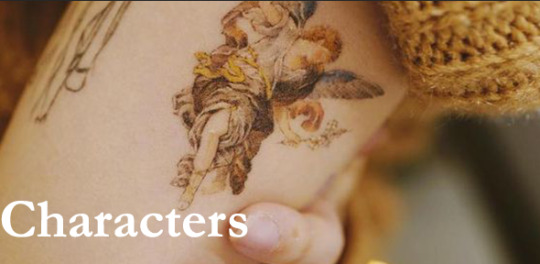
[image description: a pale arm is turned toward the camera, the cuff of a chunky knit mustard coloured sweater can be seen at the top right-hand corner of the image. At the centre of the image is a coloured tattoo, a renaissance angel holding a branch of baby's breath and wearing a brown and creme-tone cloth himation. In the bottom left-hand corner of the image white bold Garamond text reads, 'Characters' /end id.]

[image description: two images are collaged together, one portion of the image is a close up of a women face she has dark skin and brown eyes, the other portion of the image is another woman on public transit adjacent to a window showing a brick apartment passing by. Slightly central is text in bold white Garamond font that reads, 'Neveah' /end id.]
Neveah, the main character, Spanish and the first female in her family to graduate from university. She's stuck in a cramped apartment and her style consists of what she finds for free on the sidewalk and the brightest clothing at the second-hand opportunity shops. Committed the relationship sin of getting matching tattoos with a boyfriend she couldn't introduce to her parents, a tattoo of the window of their shared apartments in Neveah's there is a sunset in Oka's it's a night full of stars. Neveah is cautious and constantly conscious of how she can improve her situation and herself and tries to best facilitate her own growth.
More points:
Loves sparkling peach and mango juice
Deals with her problems mainly by listening to audiobooks all night and visiting the aquarium to feed the manta rays and stare at fish for hours, at least their coping mechanisms that aren't too harmful.
Neveah has an obligatory shrine to Jesus with the little framed photo...well painting of the son of God sent to her by her parents.
Dangly earrings and platform sneakers are her ish.

[image description: an overexposed photograph of two people, a girl and a boy in a lounge. The girl is sitting up on the couch, a blanket piled over her, one bare leg is extended in front of her. A boy leans against the couch, shirtless and with curly brown hair he looks off into the distance a pillow balanced in his lap. There is a pot plant on a small coffee table in the upper right-hand corner of the image and the ends of some pale curtains fall in the frame at the top of the image. On the bottom left-hand corner text in white bold Garamond font reads, 'Oka', there is texture on the image as though some tape had been laid over the left edge or a rip has been repaired. /end id.]
Oka is a mess, a boy reliant on Neveah's help to get dressed, make the bed, do the groceries. He's tall with brown hair he dyes grey and when he first meets Neveah he's almost quit smoking but crashes back into his addiction when they start dating and every week picks up a bulk box of discontinued unfiltered cigarettes. His dealer likes Neveah and gives her chocolate as a part of the deal and Oka made his living by picking up odd artistic jobs, being a nude model every Thursday, volunteering at an art club and working as a waiter at a local bar. Absolutely hates his Art history degree and will fight their landlord if the rent rises.
More brief points:
Thinks he's super cool for owning a white zippo.
Unironically owns two cowboy hats.
Is actually a pretty good artist but rarely finishes a piece.
Likes ginger drinks and strawberry milk.
Is temporarily nocturnal.

[image description: a wall of framed photographs and paintings, they are organised together in a way that is both scattered and organized. In the bottom right-hand corner there are two lit candles and on the right of an image, a monstera plant is in the corner of the cream-coloured walls. Someone holds a mug in the bottom right-hand corner. In the centre of the image text in bold white Garamond font reads, 'Planning Excerpts. /end id.]
A set of opening lines;

[image description: Over a dark image of pale pink roses growing against a white concrete wall. White text over the image reads, 'For two months all I could think about was diluting detergent- She took the time to change herself, paint thick lines around her eyes and contour muscles she didn't have. She remembered, however, the intricate way that he took up space-" /end id.]
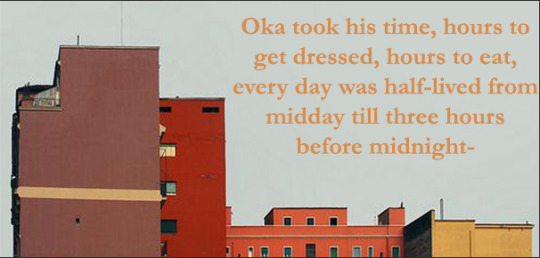
[image description: A city skyline against a greyish blue sky, the building are in tones of brown, red, orange and yellow. In the upper right-hand corner orange text in Garamond font reads, 'Oka took his time, hours to get dressed, hours to eat, every day was half-lived from midday till three hours before midnight.' /end.id]
I see this story changing and developing the more time I put into it but for now, it is made up of its central characters, the colours I associate with the grand city and the mysterious implications of finding someone yourself.
That's an Honour To Eclipse in its rough beginning stages, I'm looking forward to sharing its progress.

-E
#wip intro#wip excerpt#amwriting#writeblr#writingcommunity#novella#ya novels#novel#character analysis#my characters
2 notes
·
View notes
Text
[section_title title=Introduction and Specifications]
Cases with rotated motherboards are still a bit of a rarity, despite not really being a new design anymore. Because of that, we were intrigued when darkFlash reached out to us about their V22 ATX mid tower case, their take on the rotated motherboard layout. darkFlash has been developing a new design language for their cases, moving away from the glass and RGB formula of their earlier products to a more refined styling more in line with the likes of Fractal Design and NZXT. The V22 is their first ATX case to feature this new styling, alongside the MATX DLM21 and DLM22. darkFlash offers the V22 in white, black, mint green, and pink. Offering two pastel colors is a bold move from darkFlash, and it sets their cases apart from the vast numbers of black cases on the market. Is the combination of a new style and an uncommon layout a winner, or has darkFlash missed the mark? Let’s dive in and find out.
[sc name=”sponsor” sponsor=”darkFlash” product_link=”https://darkflashtech.com/collections/gaming-case/products/darkflash-case-v22-white” product_name=”darkFlash V22 Mid Tower ATX Case” ]
Specifications
Material Steel, tempered glass Front Panel Steel with plastic venting Left Side Panel Steel Right Side Panel Hinged tempered glass, lightly tinted Top Panel Steel with plastic dust filter Front Ports 2x USB 3.0
2x Front Audio
Weight 15.67 lbs / 7.11 kg Dimensions 17.3″ (H) x 8.4″ x 17.5″ (D)
440 mm (H) x 215 mm x 443 mm (D)
Compatibility
Motherboard Compatibility ATX, MATX, DTX, ITX CPU Cooler Clearance 6.5″ / 165 mm Maximum GPU length 12.5″ / 318 mm
11.5″ / 293 mm above drive cage
Power Supply Type ATX Maximum Power Supply Length 7.9″ / 200 mm Storage Drive Bays 2x 2.5″ behind motherboard tray
1x 3.5″ in drive cage
1x 2.5″ or 3.5″ on top of drive cage
Expansion Slots 7 Fans Supported Up to 5x 120 mm
Up to 2x 140 mm
Front Fans 3x 120 mm
or
2x 140 mm
Rear Fans 2x 120 mm Radiator Support 2x 120 mm (rear) Dust Filters Front, top, power supply
Included Accessories
Cleaning Microfiber cloth Dust Protection Front I/O dust covers
[section_title title=Unboxing and a First Look]
Unboxing
The V22 comes in a printed brown cardboard box, which is pretty typical of modern cases. The front and rear of the box both feature a picture of the V22, along with some small images depicting various features of the case. The front of the box also has a few lines of text which were likely translated for English speaking markets.
The side of the V22’s box has a basic specifications sheet printed on it. Interestingly, the numbers on this sheet do not quite match up with the numbers listed on the case’s official Amazon page. Unfortunately, it seems that darkFlash doesn’t really have their English language documentation fully sorted out yet since not only do their spec sheets not fully match up, their official product page for the case is still full of sample text months after the case launched. This isn’t a particularly encouraging sign, but it isn’t the worst I’ve seen. If you look in enough places you can find all of the relevant information.
Inside the box is where things really start to get exciting. The V22 is protected by large blocks of soft closed cell foam, including a block that protects the glass side panel from damage and prevents it from opening in transit. The case itself comes wrapped in a plastic bag, the glass panel is covered in plastic film on both sides, and the panel is taped shut to add an extra layer of protection. darkFlash did an excellent job here. Also in the box is a small, but well thought out manual that explains all of the case’s features at a good level of detail.
A Closer Look at the darkFlash V22
Our review sample is the white version of the V22, a refreshing break from the monotony of all black cases. Both the metal and plastic panels have a satin feel to them and don’t pick up fingerprints. Color and texture matching between panels is excellent. The front edges of the case have a thick black stripe that covers the front vents and a bit of the panel underneath them. The feet of the case, the expansion slot covers, and the hinges are also black.
On the right side of the case, we can see that the glass side panel does not extend all the way to the bottom of the case. Instead, there’s a steel panel that covers the part of the case where the power supply and hard drives go.
#gallery-0-25 { margin: auto; } #gallery-0-25 .gallery-item { float: left; margin-top: 10px; text-align: center; width: 50%; } #gallery-0-25 img { border: 2px solid #cfcfcf; } #gallery-0-25 .gallery-caption { margin-left: 0; } /* see gallery_shortcode() in wp-includes/media.php */
The left side of the case is a simple one-piece steel side panel with captured thumb screws.
#gallery-0-26 { margin: auto; } #gallery-0-26 .gallery-item { float: left; margin-top: 10px; text-align: center; width: 50%; } #gallery-0-26 img { border: 2px solid #cfcfcf; } #gallery-0-26 .gallery-caption { margin-left: 0; } /* see gallery_shortcode() in wp-includes/media.php */
Because the V22 has a rotated motherboard, the back of the case is very different from the back panels of most ATX cases. Much of the panel is taken up by the two 120 mm fan mounts. The remaining panel houses a power supply cutout, a large cable grommet, and a pair of cable management loops for securing any cables that run down the back of the case.
The top of the case contains all of the case’s I/O ports. The front I/O is mounted at the leading edge of the case and consists of power and reset buttons, two USB 3.0 ports, and a pair of audio ports. Behind the front I/O is a large plastic dust filter that covers the expansion slots and rear I/O panel.
#gallery-0-27 { margin: auto; } #gallery-0-27 .gallery-item { float: left; margin-top: 10px; text-align: center; width: 50%; } #gallery-0-27 img { border: 2px solid #cfcfcf; } #gallery-0-27 .gallery-caption { margin-left: 0; } /* see gallery_shortcode() in wp-includes/media.php */
The bottom of the case is largely featureless aside from a set of rubber soled plastic feet and a sturdy plastic dust filter for the power supply.
[section_title title=An Inside Look at the V22]
An Inside Look at the V22
Opening up the V22 immediately presents you with all kinds of delightful features. To start with, the right side panel is magnetic and opens with a simple fabric pull tab. It’s a clever solution, and much more elegant than the fastening methods used on most cases with glass panels. The magnets run down the entire left side of the panel and hold it firmly in place, preventing it from accidentally swinging open under most circumstances. The other side of the panel is mounted on a pair of hinges that can be disassembled so the panel can be removed. The glass is on the thinner side and quite light, so the risk of accidentally dropping it is low.
The motherboard area is spacious and has large access holes at both the top and bottom of the board, a promising sign for the case’s usability. The bottom edge of the motherboard tray is several inches above the bottom of the case and there is no conventional power supply shroud, so access to the right edge of the board is completely unfettered.
The V22’s hard drive cage is mounted directly to the bottom of the case with enough space on both sides for the front fans and the power supply to fit in uncontested. There are holes to mount one drive inside the cage and one on top, and the top face of the cage is marked with a little arrow to show which way the connectors on the drives should face, since the cage can be removed to make installing drives easier. Little touches like this go a long way towards a good user experience.
#gallery-0-28 { margin: auto; } #gallery-0-28 .gallery-item { float: left; margin-top: 10px; text-align: center; width: 50%; } #gallery-0-28 img { border: 2px solid #cfcfcf; } #gallery-0-28 .gallery-caption { margin-left: 0; } /* see gallery_shortcode() in wp-includes/media.php */
The left side panel of the case is a traditional steel panel held in place by two captured thumb screws.
Taking off the panel, you’re greeted by two 2.5″ drive trays, a CPU socket cutout, and an abundance of cable management hard points. The drive cages feature the same directional arrows as the drive cage and are elevated away from the back of the motherboard tray to give clearance for daisy-chained SATA power connectors which require extra space for their wires. The large CPU socket cutout should give excellent access to the socket area of most motherboards, for those who want to install or swap coolers after their motherboard is mounted in the case. Each cable routing hole in the motherboard has a corresponding cable management hard point, and there are four hard points below the two drive trays and one directly above the power supply. The placement of these hard points seems well thought out and there are no areas that are significantly lacking in cable management options.
The front panel of the case is mounted with traditional plastic clips and is a little difficult to remove. A more modern mounting system would have been better, since the panel has to be removed in order to clean the front dust filter, but it is functional enough. Underneath the front panel, the dust filter is mounted to the case with a pair of tabs and two magnets. To remove the filter, you simply swing the filter away from the body of the case and pull the tabs out of their slots. This is yet another clever use of magnets on the V22, and one of the better dust filter mounting systems currently on the market.
#gallery-0-29 { margin: auto; } #gallery-0-29 .gallery-item { float: left; margin-top: 10px; text-align: center; width: 50%; } #gallery-0-29 img { border: 2px solid #cfcfcf; } #gallery-0-29 .gallery-caption { margin-left: 0; } /* see gallery_shortcode() in wp-includes/media.php */
The top of the case houses the expansion slots and motherboard I/O in a chamber that is covered by a sturdy plastic dust filter. While the filter feels sturdy and is relatively easy to remove and replace, it is held on with plastic clips instead of magnets which feels like a missed opportunity given how well the mounting system for the front dust filter works. Under the dust filter you’ll find ample space for cables, along with a locking cable clamp to assist in routing cables out the back of the case. The I/O chamber is not entirely closed, and includes a cutout that can be used to access the top corner screws on a rear mounted radiator if necessary. This cutout is also useful for the handful of devices that require passing a cable from an expansion slot into the case.
#gallery-0-30 { margin: auto; } #gallery-0-30 .gallery-item { float: left; margin-top: 10px; text-align: center; width: 50%; } #gallery-0-30 img { border: 2px solid #cfcfcf; } #gallery-0-30 .gallery-caption { margin-left: 0; } /* see gallery_shortcode() in wp-includes/media.php */
[section_title title=Building in the V22]
Building in the V22
To test the build experience of the V22 I used my standard ATX test bench, which consists of the following parts:
Motherboard MSI X370 Gaming M7 Processor AMD Ryzen 5 2600 Cooler Silverstone PF120 AIO Graphics Card 1 Nvidia GTX 1070 FE Graphics Card 2 EVGA GTX 980 K|NGP|N Storage 2x XPG SX950U Power Supply Corsair CX750M
Building in the V22 is about as simple as it gets. The glass side panel comes off by simply lifting it off its hinges and the captured thumb screws on the other side panel reduce the number of loose screws you have to keep track of. The motherboard tray is incredibly spacious considering the size of the case, so mounting the board and plugging in the front I/O cables are very easy. The power supply can be mounted through either side of the case, thanks to the unusual skirt style shroud design. Many mid tower cases suffer from poor cable management around the top edge of the motherboard due to its close proximity to the top case fans. The V22’s rotated layout basically nullifies that problem. The large cutouts around the motherboard tray give ample room for power cables and accessory cables. The 24 pin power cable simply tucks away at the bottom of the case.
I did run into a minor issue when trying to mount my CPU cooler. I had initially planned to use a 480 mm AIO, but the front of the case only has space for fans, and not a full radiator. This is actually mentioned in the documentation for the case, so this issue was all on me. Sometimes you just have to read the manual. I decided to go with the PF120 120 mm AIO instead, which fit just fine in the back of the case. I installed two 140 mm fans in the front for the case’s intake and a 120 mm fan below the AIO as an exhaust.
Mounting graphics cards in the V22 is about as simple as it gets. The rear I/O covers are far away from the edges of the case, which makes them very easy to remove. My two cards fit in the case easily despite their large size and their cables tucked away neatly at the bottom of the case.
#gallery-0-31 { margin: auto; } #gallery-0-31 .gallery-item { float: left; margin-top: 10px; text-align: center; width: 50%; } #gallery-0-31 img { border: 2px solid #cfcfcf; } #gallery-0-31 .gallery-caption { margin-left: 0; } /* see gallery_shortcode() in wp-includes/media.php */
The raised drive sleds made mounting and plugging in the drives a breeze. Because I also use the test bench as a VR system when I am not reviewing cases, I also added a USB card in the bottom expansion slot of the motherboard. The routing holes around the motherboard are easily large enough to pass a SATA power cable through to power the card.
Tidying up cables in the V22 is surprisingly easy considering the lack of a fully enclosed power supply shroud. The skirt panel at the bottom of the case does a good job of hiding the power supply and cables without getting in the way while building. You can still see the cables if you look down into the case at an angle, but they don’t look particularly messy. On the back of the case, the cable management hard points offer plenty of places to tie off loose cables. I had no issues fitting the rear panel back on the case and securing it in place. At the top of the case, there’s plenty of room for routing cables, though you may have some issues routing out the back of the case if you’re using a huge number of cables. My full complement of VR headset and peripheral cables fit just fine, so for most people, this shouldn’t be an issue. Cables as large as DVI can pass through the rear cable grommet.
#gallery-0-32 { margin: auto; } #gallery-0-32 .gallery-item { float: left; margin-top: 10px; text-align: center; width: 50%; } #gallery-0-32 img { border: 2px solid #cfcfcf; } #gallery-0-32 .gallery-caption { margin-left: 0; } /* see gallery_shortcode() in wp-includes/media.php */
[section_title title=Final Thoughts and Conclusion]
Final Thoughts
It was clear right from the moment that I opened the box that darkFlash was doing things right. The packing job was impeccable, the case looked clean and elegant, and all of the panels were properly matched in both color and texture. While darkFlash still needs to work on their online documentation, but their design work is top notch. I found myself frequently marveling at design touches like the hinge and magnets panel and dust filter mounting and wondering why they aren’t used in more cases. The magnets eliminate the stiffness of plastic clips, while the hinges eliminate the common issue with magnetic filters sliding around. It’s an elegant solution to a common problem. And the thoughtful design details don’t stop there. All throughout the case I found little details that showed that darkFlash’s designers had taken the time to think through and test every little piece of the case. Even things that you normally wouldn’t think about, like external cable management, are carefully considered and implemented on the V22. The case even comes with a cleaning cloth and I/O dust covers. To come back to that text on the front of the box, darkFlash calls the V22 a “Luxury Middle Tower”. After working with this case, it’s clear that the V22 is going for luxury the old fashioned way. Not by packing in gimmicks, and not by trying to do everything at once. The V22 is luxurious in that it is elegant, refined, and intuitive. Sometimes, that’s the best kind of luxury.
Pros Cons Rotated layout makes building in the V22 easy Not designed for custom water cooling Clever tool-less side panel and front dust filter Online documentation needs improvement Excellent cable management Front panel is a little tricky to remove Split side panel hides cables and power supply without compromising ease of building No internal cable grommets Classy exterior design Top dust filter could have been magnetic External cable management Space for 80mm fan at top of case, but no mounting holes Metal and plastic elements have excellent color matching Drive cage and trays are designed with right angle SATA power connectors in mind Packaging is superb
So who is this case for? If you are looking for a dedicated water cooling case, the V22 might not be what you need. While the V22 can comfortably support up to a 240mm radiator and even a full pump/reservoir combo if you are creative, custom water cooling isn’t really its forte. However, if you don’t plan to go all out on water cooling, the V22 is definitely worth taking a good look at. darkFlash has done an excellent job designing this case, and I highly recommend considering it for your next build. It’s an all around well designed case that offers an exceptional build experience and manages to be classy without being boring. It looks like darkFlash is serious about competing with the best of the best, and I expect that we’ll be hearing a lot more about them in the near future.
[sc name=”editors_choice_award” ]
darkFlash V22 White Mid Tower ATX Case Review Cases with rotated motherboards are still a bit of a rarity, despite not really being a new design anymore.
1 note
·
View note
Text
Composites in the Contemporary Practices
The third week of class we were introduced to composite images where an image or print is broken down into composites using technology and joined again physically using papers to make a bigger picture.

(The Arrival of Spring in Woldgate, East Yorkshire, David Hockney, 2011)
This artwork was produced by David Hockney who pushed the boundaries of contemporary art by going back to nature yet utilizing technology at the same time as this painting was produced digitally using his IPad. This work consisted of 50 large-scale iPad drawings printed on paper which captured nature’s miniature glories. This was a huge landscape drawing that enabled the viewer to zoom in on even the tiniest details of nature within larger landscapes. He was embracing the how the IPad could instantiate the sharing of his works to his friends over the internet.

(Horses 85-86, Mike and Doug Starn, 1985-1986)
Doug and Mike Starn’s diverse conceptual practice which includes their conceptual photography practice fascinates me because I have never seen anything like this before. They incorporate a variety of deconstructive techniques such as décollage and appropriation that results in a work like the Horses 85-86 which shows us a chopped picture of a horse’s head. At first glance, we might think that the way they cut and join horse’s head is random but if you actually look, it’s quite intriguing because you can really appreciate the magnificent features of the horse’s head and the way they combine the cut parts actually makes sense. I also love how it looks so vintage with the Sepia photography and the scratches on the surface which adds to the texture of the photograph.

So we were assigned to make our own composite work by taking a picture of a work we did, and with the advice of my teacher, i chose one of the image of my readymade line that i made before. We had to use Photoshop to split it using the split tool to 9 parts equally then save to web the split files then afterwards print it ourselves in the printer downstairs. After printing it, we had to cut out the white borders using a cutter and ruler so it would be straight.

Next, all we had to do was joining it but it took me quite a while because 6/9 images of mine were just of the studio floor where i took the photograph, but after looking closely, good thing that each of the floor images had a bit of a mark/flaw/dirt in it so i was able to distinguish which is which. I laid it out in order in the floor but i had to join it from the back using masking tape and i couldnt just simply flip the picture and tape it together because it wouldnt be the right order so i had to redo the order from the back then i carefully taped them so it would all be joined perfectly into a poster that if one didnt look closely, would think that its just a huge poster paper when it’s not.

The next task would be to place the finished work on different backgrounds and take a picture of it--to see what it would look like on different surfaces. First, i utilized the window because i thought it would be nice to have the light through it but turns out what the light did was just expose where the masking tapes were placed, but it did still look nice because the overall picture has a blue tint on it from the sky, the background, and radiated towards the image itself which had a blue tint yet with a grey background which was the floor.

So i turned on my flash to take a picture of this, and i think its much better as it showed the object clearly. It made the image stood out more than the background and also hid the masking tape because it spotlighted whats in the picture rather than whats behind it.

Afterwards, i decided to go basic and placed my composite image on the white wall of the studio and i think it looks really nice because it somehow looked like a real canvas placed on a white exhibition wall--which actually stayed on the studio wall for some time.

I used the flash to take a picture to see if it made any difference to the picture, but all it did was whitewash the picture and even the flash was reflected on the surface of the photograph as the print surface is glossy.
0 notes
Last Seen Blogs