#anyways messing around with lasso fill tool
Text
Nonsensical Ramblings and Perpetual Loneliness.
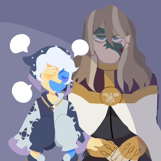
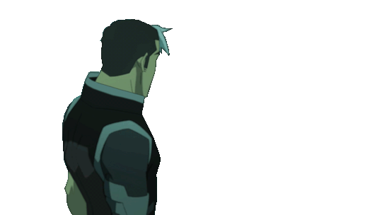
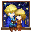
#the owl house#toh#the collector#collector toh#emperor belos#philip wittebane#belos toh#philip toh#toh fanart#collector fanart#belos fanart#i was gonna draw a forest in the bg but persoective didnt work#idk what this pose is supposed to be LMFAO#anyways messing around with lasso fill tool#they look cute tbh#anywats belos looks so emo GAHAGAG
232 notes
·
View notes
Note
my friend may i ask what brushes you use 👁
sure! i use procreate and most of my brushes are super customized but i can describe them enough to recreate in any program (hopefully). this is gonna be a little bit long because i'm bored and i love talking about this stuff soooo
the brush i use most often is a medium hard airbrush. with lots of size pressure but very little opacity pressure. it's super versatile and i usually use it to sketch digitally (which i only do sometimes, most of the time i just scan in pencil drawings or go straight to paint)
my main brush for painting is a rectangle brush with a stamp hue jitter and a bit of texture on the sides. i love square brushes for blocking out shapes and it's good for making a base you can put more detail on top of, but it works on it own as well. the main thing with square brushes is i never turn on pressure settings for anything, i find they get in the way when working on the base of a painting so i keep the brush a consistent size and full opacity. the stranger painting only uses the hard airbrush and this square brush:
i also like using it to fill in space in more line-art heavy drawings
for lineart i sometimes use a very hard pencil brush with heavy line weight and no opacity settings. i'm not exactly sure how to make them but pencil brushes are really easy to find online for csp/photoshop/krita/etc. just grab any one and turn on a little bit of smudging and mess with the settings until it feels right. i use it to give my lineart a bit of texture, especially when there's not much else in the artwork for fill that role. here's an example where i used this pencil brush for most of the lineart, particularly on the figure:
the rest of it was either filled in with the lasso selection tool or a version of the square brush i mentioned earlier, you can see it pretty clearly on the border and around the speech bubbles.
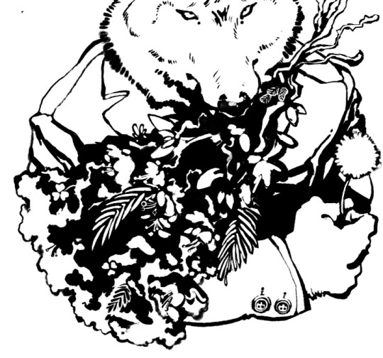
this isn't really about a brush in particular but more about how i use them (i always got frustrated with brush packs that couldn't replicate what the artist did and i couldn't figure out why so i'm including this aside to try and avoid that because younger me would kill me if i didn't). i approach lineart more like painting: i first lay down a base layer which is usually overdone and then carve out my lines using an eraser with the same texture as my line brush. i've found when you do that it makes it easier to experiment and allows you to use textures in a more interesting way, as well as mess around with textures that might not be feasible with one-pass-lineart. nothing against it ofc but once i started doing this digital art fully clicked for me. the best example i can think of is this bouquet from my werewolf kiss drawing where i first went in with the black silhouette and then drew in some detail with white, then again went and refined the form with black
speaking of i have another lineart brush i used in the drawing above. it's called mercury on procreate and i don't really know how exactly it works but it's like a very hard airbrush with a lot of texture on the edge and i turned the size pressure settings to the max. it's a little similar to a watercolor brush with no opacity settings. i use it for drawings where i want a more rounded form on the lines and for details in my paintings sometimes
anyway the only other brush i use is just called "oil paint" on procreate. it's a little hard to describe but i'm fairly sure most art programs have a version of it. it's a heavily textured brush with a ton of smudge on it but very little opacity settings. in my paintings i like to lay down a base using an airbrush, build up texture and color using my square brush, and then finish everything off with the oil paint brush. here's a speedpaint that shows it
11 notes
·
View notes
Note
Hello! Could you share some psds, our tips etc that you use to edit? :0 Thanks in advance!
hi!! i’d be happy to share some tips!! this might be a bit long, i think i went a bit overboard…… i hope it helps a bit though… !!! also im assuming you have access to a program that can open psd files. and i use photoshop so i’m not sure this will be very helpful unless you have access to it or a program with similar capabilities..
i’ve made up a few examples (using the so what mv bc i just edited that) of how i usually go about editing, you can find the file here but i’ll explain a bit here as well!
0 : psd & general stuff
i feel kinda weird about this but i’ve included my psd in the attached file... if you’re going to use it i dont mind but please don’t say that you made it yourself, and a credit would be nice but i guess it’s not strictly necessary.
first of all, i pretty much always use the same psd with very minor adjustments. i do this to try to maintain a similar look to all of my edits & because i like this psd (i’ve been evolving it with minor adjustments every so often for years…). i always edit below the psd (as in the psd is applied over all the layers of my editing) and i usually edit with the psd on (i used to edit and then put the psd on after and that took so much longer because i couldnt see how the psd was affecting the way the image looked as i was working..)
this is basically how all of the psd files for my graphics look (usually with more descriptive names rather than numbers though), where each of the numbered groups is a graphic panel...

1 : colour correction
i basically start off by trying to normalise(?) the image as much as possible (trying to return the colours to what they would be naturally, without colour correction/filtering…)
first i use curves!!! curves are a lifesaver for me. most images/screencaps will have some kind of colour correction / filtering, i use curves to (somewhat) remove those effects. if you go here, i use the method described as “remove colour cast using auto colour” (except i basically ignore the steps 4/5)! sometimes this works, sometimes it doesnt… if the result isnt quite right i lower the opacity on the curves layer until it looks right to my eye.
if the image is still too bright/dark i add another curves layer with auto set to enhance brightness and contrast! and i again use opacity to make this look more natural!
if the image is still looking unnatural (usually this occurs on especially dark images, and the problem areas are usually on faces…) i use colour fill layers set to soft light or colour balance layers to adjust the colours until the image looks more natural? you can see this in group 8. yves face has a blue discolouration on it (if you untick the colour fill & balance layers you should see what im talking about), to counteract this i added a yellow/red layer and set it to soft light & then added a colour balance layer to make the image a bit more yellow/green. overall the image doesnt look exactly natural, but the colours are more smooth and i’d probably lean into the yellow/green tinge if i was making a graphic with this image!
2 : selecting subjects
there are so so so many ways to extract people or objects from images. i vary the method i use depending on the image in question and the effect im going for. i’m not going to explain every method because you can google “how to cut out an image in photoshop” and get some pretty good tutorials on how to do it in lots of different ways.
recently i’ve been using “select subject” (described here). you’ll likely have to clean up the selection using other tools such as lasso & selection tools, and it helps if you cut out a smaller square/area around the subject before trying to use the select subject tool. theres an example of this in group 9.
another method i use is selecting a range of colours from an image using “colour range” (described here). i use this to both change colours in an image and to remove backgrounds that are of a (relatively) uniform colour. you can see an example of this in group 10, i isolated the fire from the dark background by selecting the shadows & then inverting the selection but because olivia hye was also quite dark i had to select her separately.
theres no real easy or quick way to cut out things, it takes time and effort if you want it to look neat. but it really depends on how you want it to look and basically just practicing is the most important thing… over time it will get more straightforward and you will understand how to cut out different things depending on the image..
3 : colours & textures
probably my favourite part of editing! the fun bit!!
i’m not going to explain much of this right now bc i’m exhausted & i’m not sure how detailed this should be. but if you have specific questions i’ll be happy to try to answer them!!
anyway here are some basic notes on my editing style:
if i’m editing a music video i try to use other caps as textures, you can see this in groups 11, 14 & 15.
i like to layer different caps as seen in group 12
i use colour fill layers set to different blending modes (i mainly use soft light, color/hue, screen and multiply) as seen in basically all of the examples
i havent really put in any examples of this here but i use selective colour & hue/saturation adjustment layers to change/enhance specific colours
i have this one texture that i put on basically all of my edits, i’m not sure why but i like the way it looks... its in the “PSD + TXT” folder and its set to soft light & i put it on top of the psd bc otherwise the psd messes with the smoothness of the texture
(fyi,,, i shrunk the image size just so the file size wouldnt be too big and so the sitting kimlip is bigger than the cap it came from bc of that; the mv was in 4k so the caps were HUGE)
4 : other tips/notes......?
don’t get discouraged if you find it difficult at first
i’ve been editing for years and i’m still not that great and i find it hard sometimes but i do it for fun. i make probably 3 times as many things as i end up posting because i enjoy it and because i use it as an artistic outlet.
i hope someone found this useful? i think i went way overboard but i thought it was better to be thorough !! anyway i hope you have fun editing ! its always great to have more creators in the tumblr community!
8 notes
·
View notes
Note
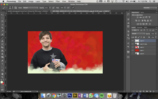
not to be annoying but did you make your header picture of louis ?? if so could you do a tutorial for that too? i suck at photoshop lol but i wanna make stuff thank you!!
definitely not annoying!! i feel honoured that u want my advice sdfghsjgs
anyway this ones longer and i go into more info on actually cutting a figure out of an image the proper way or how i do it normally but im gonna use the pic in my icon again just bc its faster
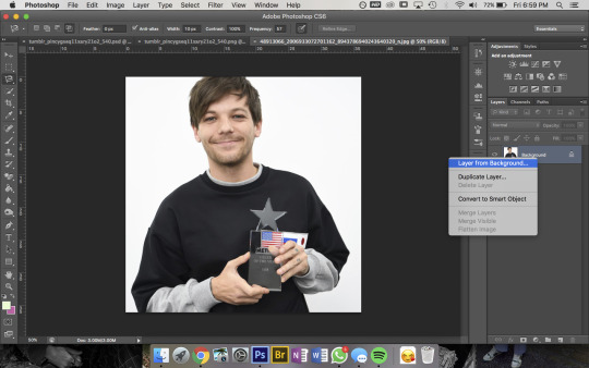
so get ur sister up and make sure shes a normal layer not the bg layer by right-clicking on it bc otherwise you’ll go through all sorts of hell
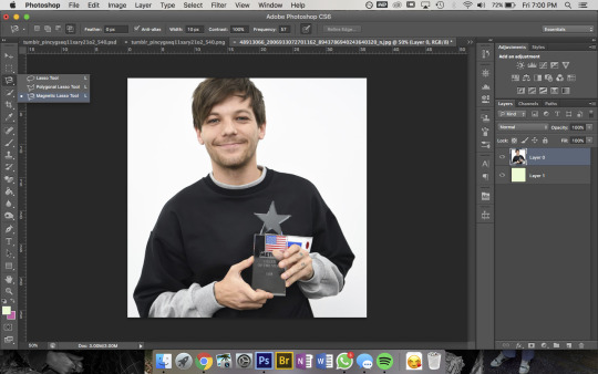
then u wanna use the magnetic lasso tool that i highlighted to remove the background

then to use this u kinda just click on the pic and trace around the area you want to select and the computer will try to automatically latch onto whatever you’re outlining. you can also click somewhere to set a point manually- its obvi based on colour values so thats why its way easier for me to do this image than the one in my actual header. im pretty sure i spent a good hour or more doing this piece by piece with that so i recommend doing it on simple backgrounds or being prepared to be one patient motherfucker

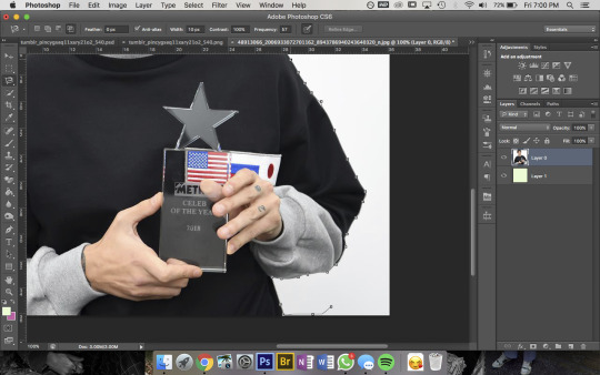
then i use the quick selection tool to add/remove any bits that the computer missed- eg. at the top of the pic you can see not all of louis’ hair is selected so i went and added that, then had to remove some bits near his jumper etc etc. this part was Very Extensive with my current header
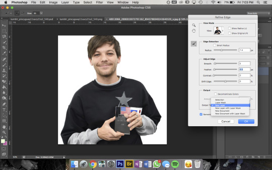
then when sis is looking all pretty u wanna right-click -> Refine Edge and that little box will pop up- thats the settings i had for this pic but it was a really large file so you’ll normally have the radius at abt 2-3px not 7. also if you’re doing a pic where the hair is Super Fluffy then you’re gonna want to focus on the feathering (third slider bar) a lot more
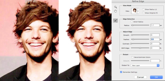
eg. these are my settings when i was doing JUST his hair in this pic. obvi mess around with it yourself to figure out what works for you but a lot of the time i do his hair seperate to the rest of the image bc otherwise its unbearable to look at
anyway make sure you set the output to a new layer itll make a new layer with the selection w/ a transparent bg and itll leave the original layer too
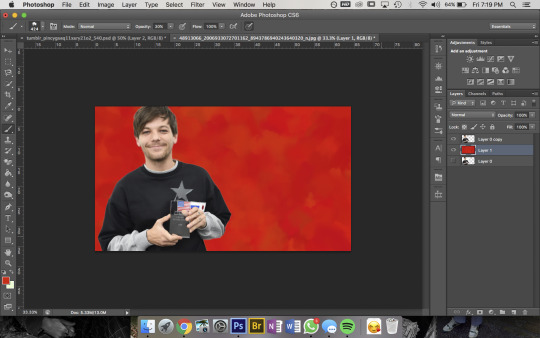
now the fun bit- i picked the colour i want the bg to be and filled it with that solid colour then using this brush pack from deviantart (just click download in the top right corner and it should automatically go into photoshop once u open the downloaded file) i used Texture Brush #2 in the preset size to colour over the top of the bg. that brush changes colour/shape slightly as you draw so thats how i got the mottled kind of effect
then bc im here for the aesthetic i made a new layer on top and used a slightly different shade of red & a smaller brush size to colour a bit around louis to add some ~dimension~
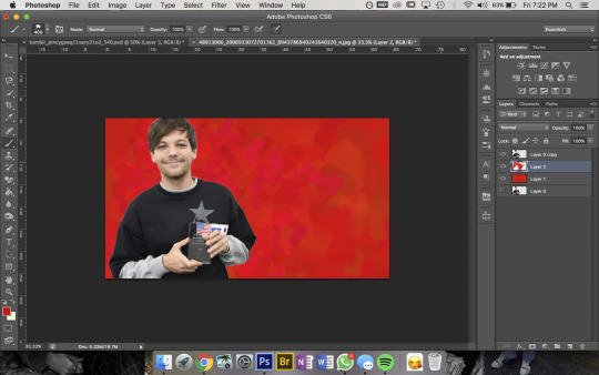
then pick a colour you want for the bottom bit and for this bit i use a mix between Cloud Brush #1 and #2 from the same brush pack. at first you wanna go over the very bottom with 100% opacity to make sure it’ll blend into your blog background
then go over again at a lower opacity to blend it up a bit and just mess around until you think it looks good and sis thats it done!!!
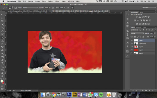
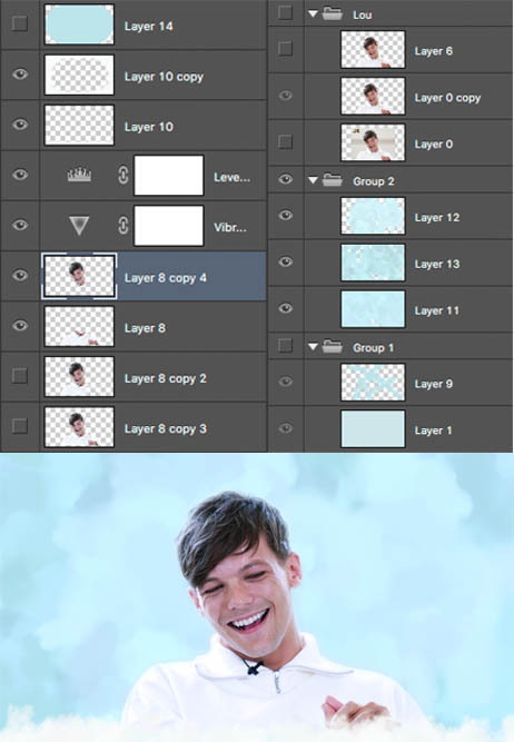
but because im overly thorough here are my layers for my current header file
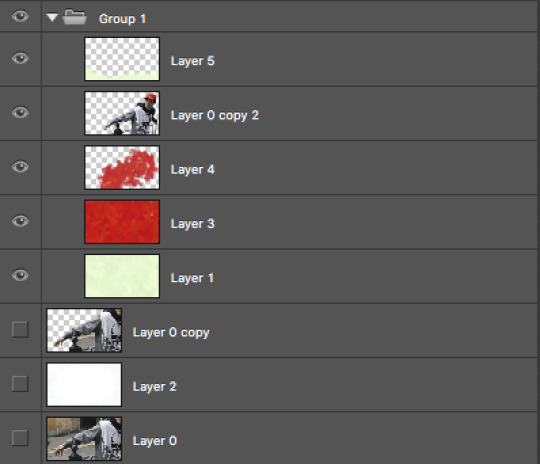
and these are for my last header- here you can see that i cut his head out seperate to his body, did a bunch of layers and experimenting for the background and also am a total layer hoarder who doesn’t know when to let go 😬
#i hope this is helpful and makes sense nonny!#and sorry if the pics dont match the text at any points ive had to fuck with it so much so tungl will let me post it all#but ur defo not annoying and if u want further clarification on anything feel free to ask#also if anyone uhhh wants an icon or header made or smthn pls hit me up im always looking for reasons to mess around on photoshop i love tha#that bitch#ask#anon
9 notes
·
View notes
Note
Hey! Love your edits. I was wondering if you could take us through how you make your edits? And any tips on how to start with editing?
I COULD try and livestream the whole process because one single edit I post is quite literally, a combination of different edits, some parts are even completely redrawn based of canon material and references.
I think the best thing to do is to just show you in rough lines how I created my last edit:
Also seems like the perfect time to post all my wips and bonuses! which isn’t much but… yeah
1. BACKGROUND
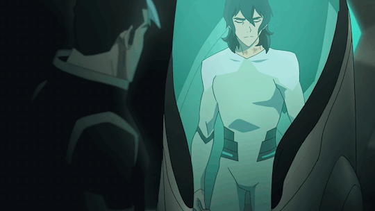
So first I searched for a healing pod for Keith to sit in.
So I headed to an episode of Voltron which featured a lot of empty healing pods :S1 EP9: Crystal Venom. Eventually I found this screencap:
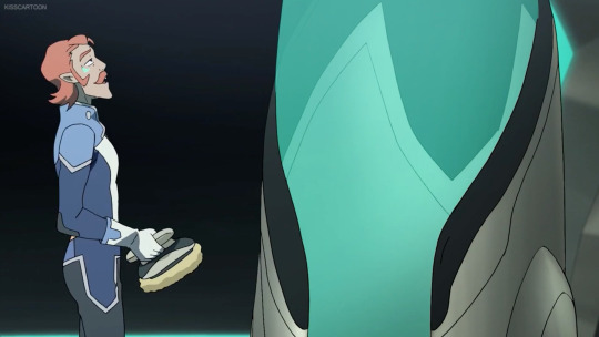
So I edited Coran (+ the annoying watermark) out and voila:

I’ve made a canvas where I could drop the rest of my photoshop shenanigans in later on!
2. KEITH IN THE POD OUTFIT
Okay, this one is a lot trickier. To recreate Keith wearing the outfit I used the following images:
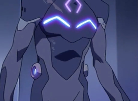
Keith’s body came from this screencap:

Keith’s head came from this screencap:
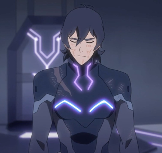
I redrew Keith’s entire pod outfit onto Keith’s body more or less?
I used a couple of screencaps of Lance wearing the outfit for design + color reference, pretty much how actual artists do it when they have to draw things from the show!
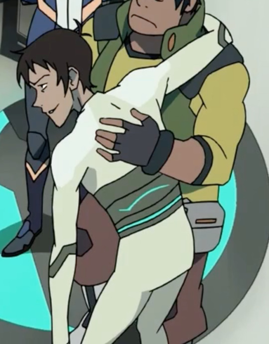
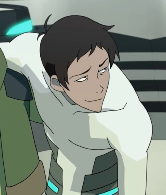
This image came in really handy because there I could also color pick the shadows on Lance’s chest & shoulders.
Now, to actually start DRAWING, the following tools will be your life savior:
1.

The brush tool to create lineart, which you’re going to draw right on top of Keith’s body. Since the pod outfit is really basic and the animation of the show is literally just black lines, you can make a really basic outfit from just…well.. lines.
Also to make sure your lines are anti-aliased, exactly like in the animation, use these settings:
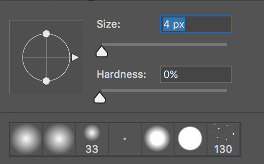
Since your brush is really small (from 3 to 4 px in diameter), your hardness has to be at 0% (that’s what she never said). It’s the softest (and most anti-aliased) you can get.
2.

The color picker to take samples of the colors of the pod outfit (including shadows!). You’re going to use this A LOT to take samples from the outfit on Lance himself.
3.

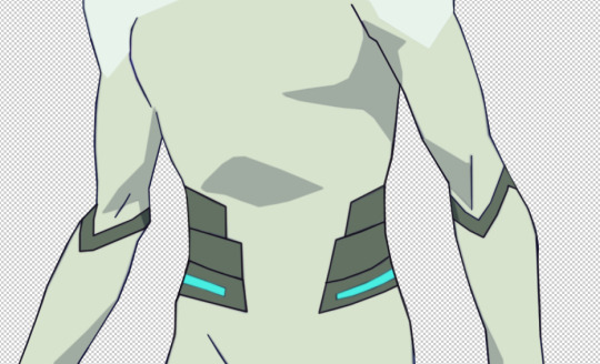
The polygonal lasso tool to select areas on Keith’s body to so you can fill in entire areas. With this tool you’re going to color your lineart (on top of Keith’s actual BOM suit, lmao)
For the shadows, I’ve used the shadows that were already on Keith’s body.
It should give you this result:
(also yeah I flipped the canvas because my POD is headed in a different direction)
If you still notice some imperfections, you can always fill them in again with the brush tool, or if you’re unsatisfied with how the shadow looks you can always fix it up with the polygonal lasso tool as well!
For the next step I’ve selected out Keith’s head from the first screencap, pasted it onto Keith’s body, messed around with the colors a bit, to make it match the color scheme (I always use Color Balance & Selective Color for this)
Since Keith was still hunched forwards to much IMO, I’ve used Liquify (Filter > Liquify) to straighten him up and I’ve copy pasted Keith’s left arm onto his next one so that his joint is pointing inwards, so his arm isn’t sticking out as well.
which gave me this result:
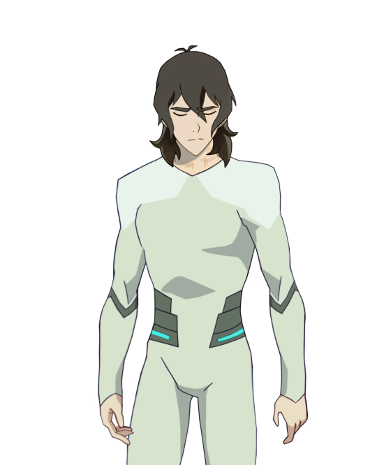
As you can see I’ve also kinda remastered his hands, and I’ve also removed the knife from his fingers. And I’ve also made Keith’s hair longer (because I wanted to, for the angst), all redrawn the same way as the pod outfit.
(I’m so sorry this is so hard to explain but my editing process is literally just and endless repeat of drawing, coloring and shifting until everything is exactly how I wanted to be ;; the more time you spend on photoshop the better you get at seeing details that are easy to patch up. It really comes with practice. ORZ)
3. SHIRO
For the upset Shiro, I’ve made a transparent gif. The Shiro I’ve used comes from this scene from S1EP9: Crystal Venom

But since it’s OLD SHIRO, not Kuron, I had to edit his entire outfit + hair so that it looks a bit more like Kuron in s3. And yes, this also means, redrawing every frame, because in this particular scene, Shiro is turning his head. Luckily his outfit isn’t that much different. He just has an… obnoxious white collar.
For his bare arm and Shiro’s hair I used the same coloring technique for Keith’s pod outfit, although the lineart won’t be really necessary here (since Shiro’s already kinda blurry looking anyway)
This is the raw transparent version
(I know his white tuft is normally cut shorter but… just a dumb detail jhegz, nobody noticed anyway)
I extended the time of the first and last frame to 1 second, the 2 in between are 0,1 seconds.
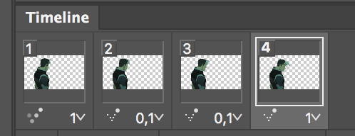
the frames have also been reversed. Since in the episode, Shiro sighs at Keith & Lance first and then looked over to Pidge and Coran in that moment.
But in my edit, we want Shiro to look at Keith first, so yeah, I manipulated that a little by reversing it.
3. ASSIMILATION
So now that I’ve both got my Shiro/Kuron and my Keith I’m gonna slap them onto “the scene” aka that screencap I’ve edited.
Here’s a quick GIF of all the actions I’ve underwent to finish the scene up. Since it’s the just the finished psd of my edit I’m just making a recording of me selecting all my layers again :’D I didn’t… actually record myself making it because that’s would have taken me a WHOLE DAY.
Before this I’ve also cut out some parts of keith’s body because he’s IN the healing pod, he’s not chilling out on top of it.
To give Shiro that blue-ish glow I’ve used blending mode -> outer glow with opacity 14%
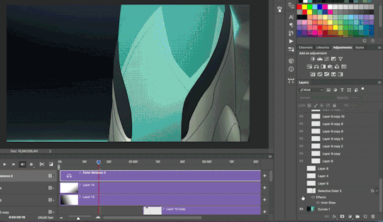
Also, GOLDEN TIP:
Adding shadow really make a scene 500% more dramatic
To add shadow I’ve made a new layer, and used a black & white gradient with the gradient tool.

For this edit I’ve added 2 shadow-layers.
I’ve done plently more animations on this edit after I was done with actual editing. But for now I’m gonna skip this part because it’s just all very basic GIF making. Also my ADHD is kicking in ^^’
I hope this explained it a little? I apologize that I didn’t go into detail, but it would’ve taken SO MUCH time otherwise. Again, making such an edit takes me a full day to make because 70% of the time I spend my time drawing or cleaning up details.
If you’re interested in a doing livestream of some kind, LMK!
698 notes
·
View notes
Last Seen Blogs
badlydrawnronpa
i won't hesitate to sore wa chigau yo bitch

prila13-blog
PRiLA13's Rants


govage-blog
GovAge
tea--thyme
☆*: .。. o(≧▽≦)o .。.:*☆