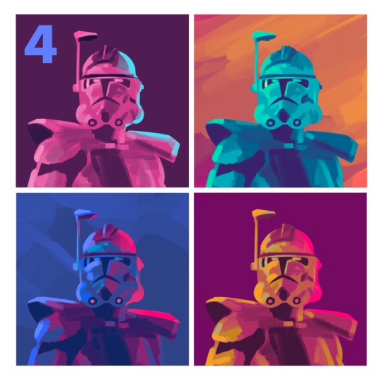
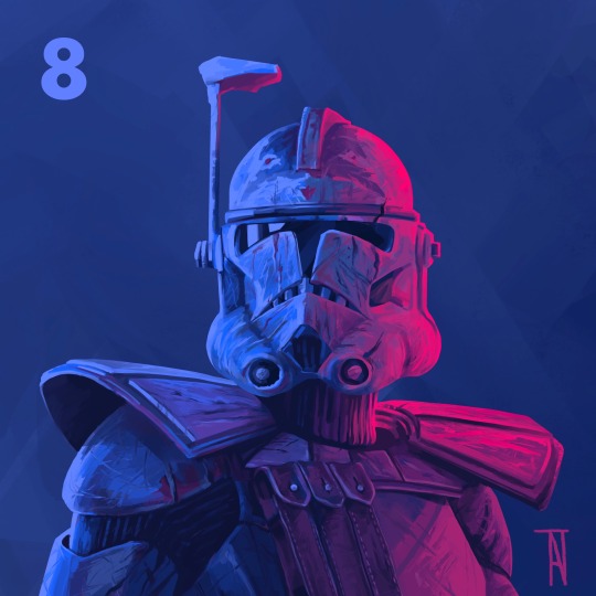
#been trying some new techniques for flats by using more gradients and things
Explore tagged Tumblr posts
Visit Tumblr Blog
Explore Tumblr blogs with no restrictions, modern design and the best experience.
Last Seen Tumblr Blogs


Fun Fact
130K people were victims of a chain letter scam that affected Tumblr in May 2011.
Text

A soft-bees ko-fi roulette request for @notoftheskaal! Happy (belated) birthday my friend! Thank you very much for the support <3
(My links and my ko-fi, should you wish!)
#really dig how this one turned out!#been trying some new techniques for flats by using more gradients and things#been really liking the results thus far! thank you to whatever concept art speedpaint I watched that gave me the idea lmao#Viz if Yang gives Blake her purple bandana in v10 I WILL pass away#Or like vice versa but the orange bandana is so iconic ok like#just let them be in LOVE PL E A SE#*ahem*#anyway#enjoy these soft snuggling bees!#rwby#bumbleby#yang xiao long#blake belladonna#kofi request#rwby fanart#artist on kofi#temp tats art
72 notes
·
View notes
Text
I was getting some questions about my process in procreate, so I just put this together. More under the cut!
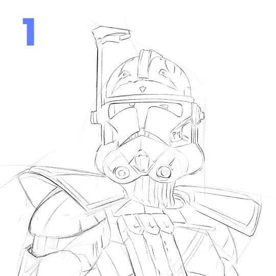
1. Start with a rough sketch! It just has to be clear enough, so that when I start painting, I know where things are supposed to go. I use references throughout the whole process, but especially now! If I get something wrong here, it'll be a pain to fix later after I start adding in values and color and all the fun details.
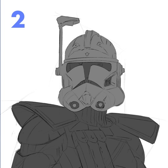
2. I make 2 layers, one for the body and one for the helmet, just painting in the basic shapes. Then, I make 2 clipping mask layers, one for each of those. I could have more, but for a painting like this, it's not really necessary.
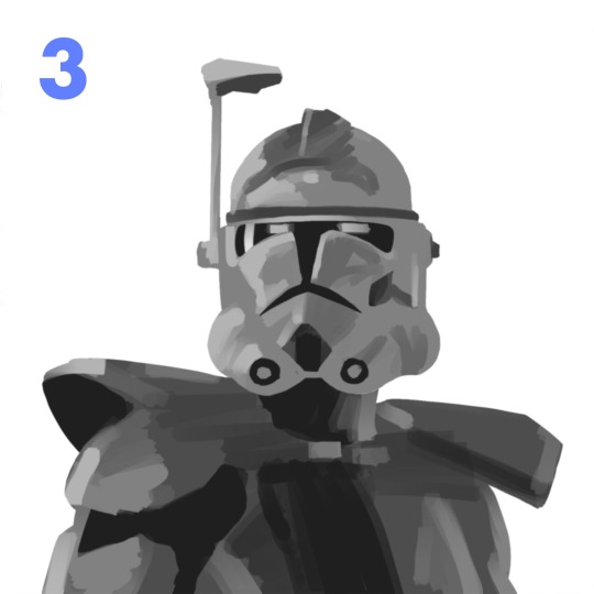
3. I start to lay in some values on the clipping mask layers with the flat brush. For this particular painting, I wasn't sure what colors I wanted yet, so I stuck to greyscale. Whenever you're making anything, whether it's with graphite or an apple pencil, the pressure you use is super important. Constantly pressing really hard gives you less control over your stroke. Another helpful thing to remember is painting big to small. At this point, I'm not thinking about the little scratches on his armor (at least I shouldn't be). Right now, I'm using a bigger size for my brush and later I can zoom in with a smaller one.
4. Then I made a copy of my work so far and duplicated it a couple times in a new canvas. I played around with the gradient map tool and color drop to try to quickly find something that stands out! Something I learned just recently is that you can adjust the reach a color drop has. Super helpful!
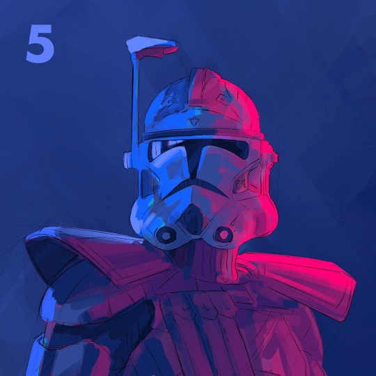
5. After finding a palette I liked, I go back to my first canvas and used the same method again to get those colors. This is a bit convoluted and only cause I don't like to work without having a clear direction in mind. If I know my colors right away, I'd probably skip the greyscale and color comps, and go straight to this step.
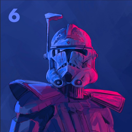
6. This is where the fun begins! Still looking at my references, I begin to render the form. I use a combination of the flat brush and smudge tool to build in the values. Once the basic values are there, I started to give the armor some texture. I used the dry brush and oil brush to add nicks and scratches. I also used some from the comics MaxPack set.
7. After finishing the helmet, I start to focus more on the body, using the same technique. I use the flat brush to define the large shadows on the pockets and bring it to a teeny size to add the stitches. I try to always keep the basic light logic principles in mind.
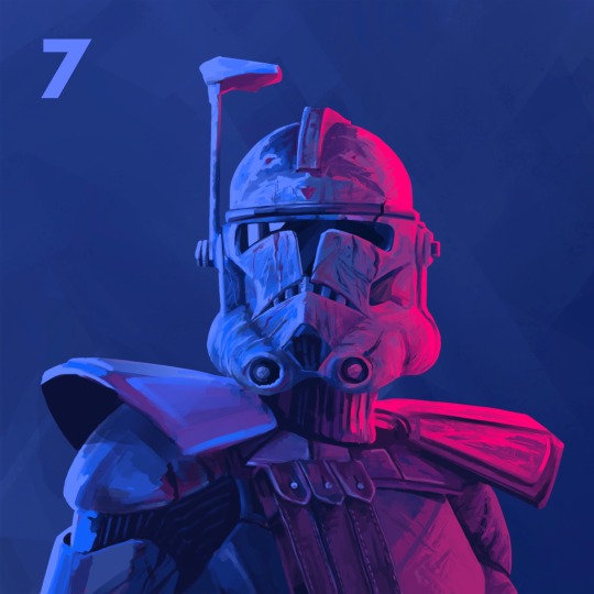
8. Last step is to take a break! I've been looking at this thing for too long, and if there's anything wrong I can't tell. I come back to look at it later and give itty bitty finishing touches. Maybe a highlight gets too bright, or an edge isn't as defined as I would like. Then I call it done!
Thanks for reading! I want to say I'm definitely still learning about painting digitally and I'm no professional! This isn't the best way to work, but it's my method. Hopefully this rambling mess was helpful to some of you!! If there's any questions I can do my best to answer :)
105 notes
·
View notes
Text
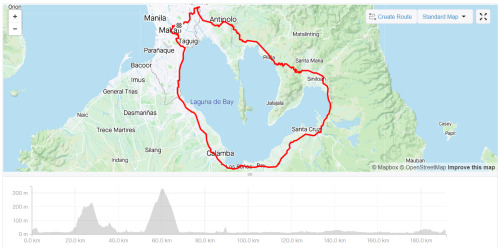
10 + 1 Grand Fondo Bike Rides in Seven Months
Hello people, my name is James. I am neither a pro cyclist nor a barista, so don’t take my opinions on either subject too seriously. I just love brewing/drinking coffee and riding my bike; I think the two are a match made in heaven. Not surprisingly, a lot of people think so too.
To start things off, allow me to chronologically share 100-km bike routes I’ve taken within the past seven months of cycling.
1. Lower Antipolo, Caloocan, North Caloocan. 101 km.

This was my first metric century ride, a month into cycling. I had planned a coffee delivery route and a schedule and was fully expecting to make it to each stop in good time. On paper, it didn’t seem that hard. How naïve I was. What the map doesn’t tell you is how horrible the roads are, how hot the weather is, or how crowded with trucks some streets are. Add to that the fact that Komoot is not a good on-the-fly navigation tool, and I was on the fast lane to disaster. Getting lost in a totally janky area on the bumpiest roads was not fun at all.
I was dying, but I kept at it. I was a noob who refused to admit defeat. After getting out of the sticks known as North Caloocan, I hit the mythical wall and bonked. As I thought that things couldn’t get any worse, it rained. Thankfully I was close to a Jollibee so I refueled and let the rain pass. Later that day, I did laps close to home just to complete 100 km since I was just a couple of km short.
4/10. It was totally my fault for being unprepared, but this ride sucked. I’d give it a 3/10 but there’s a bonus point since it was my first long ride.
2. Tagaytay via Daang Hari and Paliparan. 140 km.
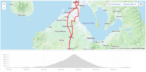
Tagaytay seems to be a test of courage or rite of passage that every budding cyclist has to undertake. And it is quite an undertaking. However which way you slice the cake, you’ll have to climb. If gradients aren’t your thing, you’d quickly question why you’re doing this in the first place.
Like every long ride (I know this now), it requires adequate preparation, i.e. time, weather conditions, road and traffic conditions, hydration and snacks, and physical fitness. I was more prepared than I was the first century ride, but we started late and therefore finished late.
I had good company during this ride and being with them made the exhaustion bearable. It was hot on the way up and the traffic was dreadful on the way back, but we survived thanks to Pocari Sweat and Choco Mucho.
7/10. This was a good “beta test” for me. Could’ve easily been an 8/10 but the Mang Inasal at the roundabout ran out of inasal. I got the last piece, but Jilson and Dan had to settle for something else.
3. Pililia Windmills via Binangonan. 114 km.
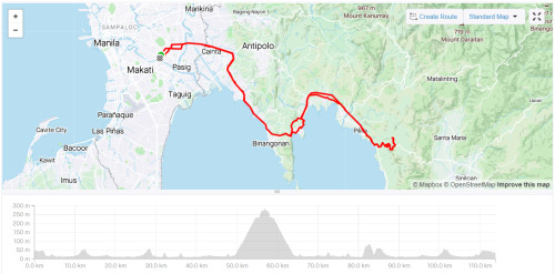
This was my first time riding with a large group. There were seven of us. As this was in the same week as my ride to Tagaytay, I came into this fairly confident and with high morale (aside from the fact that I was the seventh wheel). It slowly got lower as mishap after mishap occurred; a flat tire, a broken chain, another flat tire...
On this ride, I learned that it’s essential to have an idea of each person’s capabilities so you can set the right pace and adjust where and when necessary. We all had different types of bikes, different fitness levels, and different experiences biking on the road. It couldn’t be helped that some were dropped and others had to wait. In this regard, it was a tough and long day and toward the end of it, I was itching to be home.
6/10. At the time, climbing Pililia felt like treading through mud, but making it to the top was very rewarding. Good food and good conversation made up for aching legs.
4. San Jose Del Monte (Fake Eiffel Tower) via McArthur Highway. 111 km.
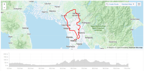
This started out as an easy ride on flats. We were all prepared and even the traffic and heat didn’t hamper our confidence. Once we were out of the highway and passing through barangays, the views became nicer. There was less pollution too. We saw the fake Eiffel Tower and met a couple of lolos who were still going strong. It was a good day that was only made better by a tasty, cheap, meal.
By this time, my fitness level and technique were steadily improving, and I was starting to enjoy climbing more. The way back was hilly, but it was no trouble for me. The cause of stress was, as usual, the traffic on the way back. If you can help it, don’t ever pass through Caloocan! It’s the worst. Commonwealth is also a horrible place to ride a bike.
7/10. Good times with good friends! The stop-and-go, clip-and-unclip traffic was a bummer. AG cramped up, but proud of him for powering through it and clocking in his first 100-km ride.
5. Tagaytay via Nuvali and Cardiac Hill. 136 km.
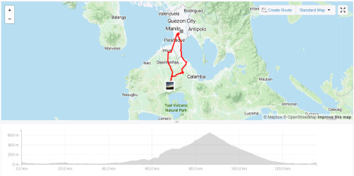
Second time riding to Tagaytay. This time, we rode out early. Iver and I met up in Makati and rode straight to Nuvali where we were to meet the rest of the guys. All was going well and we were maintaining a steady pace, till we made a mistake and met an accident.
Instead of making a right to Greenfield, we went straight to CALAX. We were none the wiser, so it felt strange when workers started screaming at us. While Iver was looking at them, one of the security personnel near the toll gate stepped in front of me. I had to stop and since Iver was still looking at the guys yelling at us, his front wheel hit my rear and he went over the bars. When I felt the impact, I looked back and I kid you not, I saw him go over in slow motion! He landed on his shoulder and he burst an eyebrow; thank God for helmets!
As he sat with his blood dripping on the pavement, I was torn between taking a photo and making sure he was okay. I went with the latter, but later on, he told me that I should’ve snapped the photo. What a guy!
Cardiac Hill was a bit of a challenge. In fact, it was the hardest part of the way to Leslie’s. I stopped at the base of the hill for a moment just to steel myself and went up the hill without stopping. Slowly, but surely.
8/10. As usual, the traffic was the worst. Sorelle was in so much pain that going all the way back to Manila on two wheels was out of the question. It was getting late too, so we decided to stop in Bacoor and take a Transportify back to manila. The first and only time (so far) I did the forbidden technique, but it was the smart thing to do.
6. Pisong Kape via Sumulong and Teresa. 103 km.

One of those rides where we didn’t have a fixed destination. We just wanted to go up Antipolo and down Teresa and back, and maybe climb to the windmills if we felt like it.
A fairly easy ride up Sumulong Highway and a fun time descending to Teresa. It wasn’t all good vibes though, since one of the guys punctured a tire on a descent, which we think caused his crash. He was okay, but his brand new cycling jersey wasn’t.
We made it all the way to Tanay and had breakfast silog there, and decided to head to Pisong Kape at the base of Pililia. When it showed signs of rain, we decided to turn back. More mishaps. Someone got a flat, and another one dropped a chain and had FD issues on the way to the climb to Antipolo from Teresa. We got split up at some point too.
5/10. This is what’s referred to as a bad juju ride. Hot, traffic, and a ton of things we’d rather not experience on the road. I stopped and waited for a good half hour at Decathlon Masinag, but left and rushed home since I needed to poop, lol.
7. Nuvali via a straight and narrow road through barangays and National Highway. 102 km.

It was the day before heading to Baguio for the holidays and I made brunch plans in Alabang with Elle. I was really excited to bike to her but more so to see her. If I left the house late, it would be hot and traffic would be terrible, so I decided to leave at dawn and make a long ride out of it and go all the way to Nuvali.
I didn’t want to take the service road like last time, so I followed the map through I don’t even know what road this is. All I know is that it was straight and narrow and clogged with tricycles. It spanned several barangays in Pasig, Taguig, Pateros, Sucat, Alabang, etc., and eventually led me to the National Highway.
It was all flat and this was my first ride on carbon wheels. I was riding solo, so I could go as fast or as slow as I wanted. I made it to Nuvali in 2:20. After resting for half an hour, I took the same route to Alabang and was there in 1:30. On the way back, I took the service road.
ELLEven/10. The route sucked both ways but it was a good day with Elle. What else can I say?
8. Macabebe Beach via Obando. 175 km.
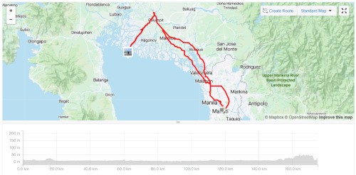
The flattest route I’ve taken, both literally and figuratively. Levi and I rode out from the Mandaluyong circle at 3:30 AM and cut through Manila to get to Monumento. From there, we opted to avoid McArthur Highway and instead took the more scenic, Obando way. I say scenic, but in reality, all we saw was black. We only stopped to buy pandesal and to navigate. As the sun rose, we found ourselves getting closer to the longest 24 km of my life.
It was a hard left turn from the highway about a km from the arc of Pampanga. The streets were narrow, and we passed through about four barangays. There were a lot of cars on the road, which was quite irritating because we had to stop when they did. The straights never seemed to end; in fact, I went “Look Ma, no hands!” for about what seemed like a couple of km. As we neared the beach though, we were rewarded by breathtaking views on both sides. The beach itself was mediocre and we stayed only for half an hour to eat our pandesal.
The way back was more difficult. You guessed it, it was due to the heat and the traffic and the horrendous roads in Bulakan. We stopped for coffee and to shield ourselves from the burning sun a few times, but overall we kept a steady, okay let’s be honest, frantic pace. We got to Makati a little over 1:00 PM. Levi and I made it in less than 10 hours. With stops. I was spent.
9/10. This was quite an experience. I always wanted to try a purely flat ride, so I did. It was boring. I’m not saying it was easy -- far from it. Being on flats takes a certain type of mindset and discipline, not to mention you have to be strong. The effort it takes to get from point A to B in a specific time is the same back and forth. Unlike climbing, there’s no descending that comes after. You can’t freewheel down the mountain and recover. I learned a lot on this ride, one of the things being that I like gradients more than watts.
9. Tagaytay via RevPal, Sungay, and Sampaloc. 110 km.
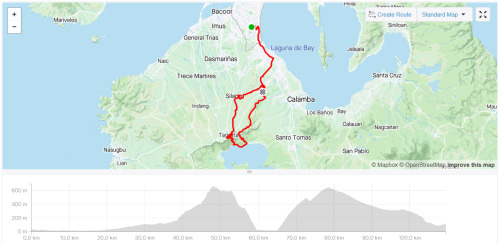
Tagaytay take three, route three. This time, we drove to Alabang and started there. What we should have done is start in Nuvali. But Luz insisted on starting in Alabang. This was not a good idea, lol. I want to preface this with the statement that as it was, the planned route was a killer. It didn’t help that I had little sleep and had a hard workout the day before. Another bad idea.
Let me give you a TL;DR: We climbed up RevPal from Nuvali, went down to Taal via Sungay, and climbed back up to Tagaytay proper via Sampaloc. From there, we went back down to Nuvali via Cardiac Hill.
Easy on paper, not so much in action. RevPal is steep, but not impossibly difficult. Part of the difficulty is avoiding all the other cyclists occupying the road, weaving their way up (known as nag tatahi) while staying out of the way of cars. At some point, my right knee started acting up, adding to the difficulty level of the ascent.
What was unexpected though was how scary the descent on Sungay was. I won’t get into detail, but suffice it to say that we should have taken it as a sign when we saw that other riders were dismounting so they could walk down... That said, what an adrenaline rush!
The climb up Sampaloc was tough with an aching knee (which by the way has no ACL), but thankfully there were a lot of trees and cover. Not my best performance, but I still made it up without stopping. The descent from Tagaytay proper was meh. From Nuvali, we rode with our friends who had the brilliant idea to park there. I slept on the way home.
9/10. I officially dubbed our group Mountain Goats after this ride. We have a lot of rides that are less than 100 km, but we often reach over 1000 meters of elevation gain. On this outing, we hit 1,640. I wonder how I’ll fair if I do this again in good condition.
10. Sierra Madre Loop via Teresa. 118 km.
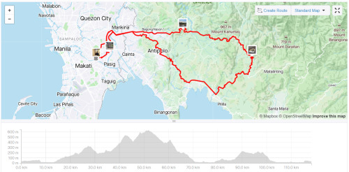
I think this is the most fun Grand Fondo I’ve done. It’s the highest I’ve climbed in the fastest time. 1740 m in 5:43:28. Arguably the most fun I’ve had on a bike. The climbs could kill you if you don’t pace yourself, but the descents were so rewarding.
The only sucky part about this ride was motorcyclists who go up on their underbone bikes and bank the corners like they own the place. They don’t signal when they turn. They take sudden U-turns. They overtake you, swerve, and suddenly stop in front of you. They are a danger to themselves and others. In fact, Levi mentioned that when she was there, a guy on a Mio overshot a corner and he and his bike went under the guard rail onto the cliff. Thank God he was alive.
10/10. The chicsilog was made even more delicious by the view from the top of the mountain.
10 + 1. Laguna Loop. 192 km.
Laguna Loop is fun they said. You should try it, they said.
Well, I did. And I hated it. THEY LIED. This is by far the worst Fondo I’ve done. It was fun climbing Antipolo via Cabrera Road. It was fun going down Teresa. It was fun going up Pililia (which was so much easier than the first time). It was fun going down Mabitac. And that’s where the fun ended.
From that point, it was flat. It was hot. It was traffic. And the drivers were so bad. By bad, I mean jempoy bad. By jempoy bad, I mean trying to ride you off the road and driving at your side with their window down to argue with you. It was not fun. Have I said that it wasn’t fun?
2/10. Not gonna lie, I don’t even consider this ride as a Grand Fondo (which is why it’s a +1 and not a solid 11); the only part of the ride that counts is the first part with the ascents and descents. The rest was just really getting it over with. One point for that first part and another for the good company. WILL NEVER DO THIS AGAIN.
Okay, that’s it. It’s quite a long post but it should be okay since it’s the first one? I hope you enjoyed my unedited reviews of my 100-km rides. Again I’m not a pro so don’t take these scores seriously. Ride the routes yourself if you can and let me know what you think!
1 note
·
View note
Text
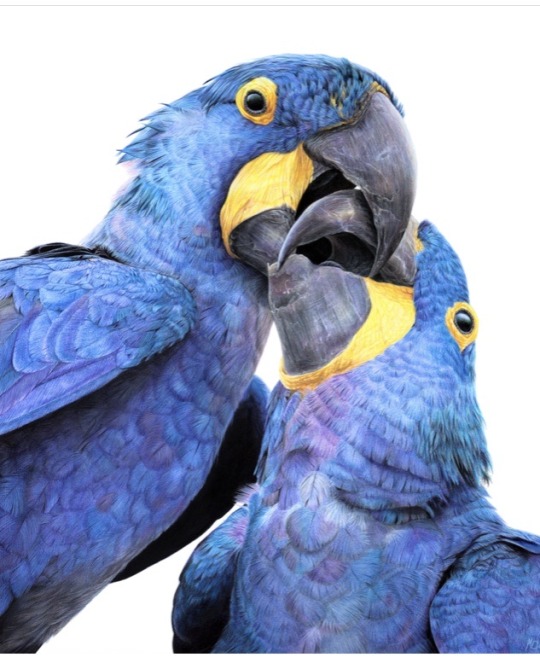
Congratulations to Monique Castellani-Kraan for winning Best in Show at the UKCPS Keswick Exhibition 2021.
Monique has kindly share some background information on her wonderful piece Kisses in Blue.
I drew my first hyacinth macaw back in 2015, and it was wonderful being able to revisit the same subject again with “Kisses in Blue”. Parrots are honestly such a delight to draw. Their colours are bright and happy, and they have so much character. I will also always jump at the chance to get out my blue coloured pencils!
I started work on this piece back in January. After a long spate of only making miniature pet commissions over the Christmas period, which was slowly sending me into a spiral of madness, I decided to overcompensate by starting my largest drawing to date, at 40 x 50cm (16 x 20 inches approx).
As someone with a background in digital painting, I like to do all of my sketches and compositions digitally nowadays to transfer to paper. That way my expensive watercolour paper stays free of eraser marks and errant sketch lines. It saves a lot of time in the long run, and if I mess up I can very easily just print out the sketch again to start over. I don't know what I'd do without my iPad!
This drawing proved to be a little intimidating because of the size I was working at. I ended up setting it aside for a few months. You know that famous "fear of the blank canvas" we've all experienced? This one hit me hard. I got a tiny section of the eye and surrounding feathers done and then proceeded to swiftly run away, back to the safety of drawing miniatures! A few months later, I finally decided to stop hiding and to give this piece a proper go. As I got into the rhythm of it I quickly felt myself being sucked into that "zone" of intense focus - where time just slips away until it's suddenly dark outside and you've skipped a meal!
Now that I had finally got my toes wet, I was gaining confidence. Art is a bit like exercise - it takes effort and routine to get into the swing of it - but once I do, I feel like I'm flying! With every new drawing I'm reminded of just how much I adore coloured pencils and how fun the process is.
Translating the reference photo’s feathers on the left macaw’s cheek was proving to be a bit of a challenge. I could only stare for so long at the complicated mess of shadows without going cross-eyed - so I decided to treat myself to tackling the beak first instead. If ever you find yourself in a rut with a painting, look for the deepest, darkest shadows in your reference, and block those in first. You will have a much easier time once they're there. Here, the darkest shadows were the inside of the macaws' mouths, so I put my much-loved Polychromos black to work, blending with paint thinner in between each layer and tinting it with Luminance Dark Indigo to get it nice and deep. Now that the darkest shadows were blocked in, I would have a much easier time in the areas surrounding it. That shadow became my reference point for judging the values for the beak, skin and feathers nearby.
I used Daler Rowney Low Odour Thinner to blend my pencils in between layers, with a flat taklon brush. I primarily used it in the first few layers of the underpainting. The yellow skin on the beak was a tricky customer with this - my blending brushes had to be impeccably clean, or else I would end up turning it green with the blues being so close by. In addition, I didn't want the very pale yellows getting contaminated by the oranges that are in the shadows. I made sure to carefully wipe my brush off thoroughly on some paper towel before blending in small areas at a time.
Beaks are so much fun to draw! They have a lot going on, from subtle colour shifts, to chips and cracks and ridges. The texture is a treat for the eyes! Here, I started by creating a gradient of soft earthy purples, greys and creams in the underpainting. At this stage I used mostly a mix of Luminance and Polychromos pencils. For underpaintings, I like to go darker than what the final result will be - though some would say I go a little TOO dark (coloured pencil is technically a light to dark workflow because they are mostly transparent).
After blending it with OMS, and making sure it's still a little damp, I go in with my pale tones from the Derwent Lightfast, Caran d'Ache Luminance and Holbein lines. These brands are soft and have more wax than oil in them, making them very creamy and more opaque than brands like Polychromos. Because the paper is still saturated with paint thinner, the pencil melts as it makes contact with the paper, making it go on super thick, even though I'm only pressing gently. This is my dirty little secret for how I work from dark to light in all of my coloured pencil pieces. The paper you're using, of course, is paramount for this technique too. If you're not using a good paper, you're going to run out of tooth extremely quickly using this technique. This piece was drawn on Saunders Waterford Hot Pressed 300gsm- and I wholeheartedly recommend it!
However, I just want to add that if you have an area or texture you want to keep REALLY light, for example a large white crack in the beak, you should draw that in first before doing anything else. That way, when you put your underpainting over it and blend with paint thinner, the white detail you added first will show through, clear as day! (This is great for whiskers on cats and dogs for example) You can also use a ceramic cutter to do this afterwards instead, though personally I have yet to use one myself.
After finishing the beaks, it was time to face the feathers on the birds’ bodies head-on. As always, I block in my darkest shadows first and then my underpainting, giving it a good blend out with plenty of OMS. This is so that I don't get lost in a sea of repeating shapes. Without doing this, I find it's very easy for your artwork to end up all the same value with not enough contrast between the highlights and shadows. I also rough in where I want each contour feather to be on the bird’s chest with a dark blue, though I only very gently line them in with my pencil so I can still move things around if needed while I build on the textures and detail.
Once the underpainting is done I am free to start pulling out those details. I went feather-by-feather, preferring to go in with my lighter coloured pencils first, gently pulling out each feather’s barbs. After that, staying mindful of how the lighting is hitting each feather, I used my mid tone and darker pencils to work in between each barb, gradually building up shadows. I also glazed in shadows over this with a very gentle hand to give the overall shape of the feather form and depth.
It can be tempting to rush through areas like this where there is lots of uniform texture, but it’s important to stay patient and take your time. Body feathers especially can become indecipherable after a certain point, because they all overlap and merge into each other. Sometimes even though the reference photo is sharp as a tack and super clear, there is just so much going on that it wouldn't 'read' well as an artwork. So I used my reference to help me with the general structure and composition, and to inform me on how the shapes and textures should look. But I didn’t stress about getting it exact.
Once you have good knowledge of a subject, after doing study sketches and looking at lots of different references, you can be a lot freer with how you approach your final artwork. A lot of the colours, textures and feather placement in ‘Kisses in Blue’ were not there in the reference. I opted to go for a much warmer, cheerful blue. The reference I was using was also fairly flat as it was taken on an overcast day, meaning the lighting was quite diffused. I made my artwork brighter than my reference material, pushing the overall contrast between the midtones and the deepest shadows. I also found myself intermingling soft lilac hues and subtle teal with my Polychromos and Luminance pencils, almost over-exaggerating the birds’ vibrancy. I tried not to stress too much about feathers either - while getting the shape and placement of feathers right on wings can be paramount to a realistic piece, the same does not apply for contour feathers and down feathers. As long as you stick to the right shapes and sizes, paying attention to the bird’s form, you don’t need to get it looking exactly like your reference.
I try my best to bring myself out of my comfort zone with each new drawing. This piece was my biggest challenge yet – quite literally. I’m glad I pushed myself to draw larger than I am used to and I can see why a lot of coloured pencil artists like working at this size – while it is more time-consuming, you have much more room to breathe and fit details in, that would normally get lost in a smaller piece. With my choice of composition and lighting, I wanted to convey a feeling of intimacy and closeness with the birds that I don’t think I would have been able to achieve were this drawing smaller.
1 note
·
View note
Text
Latest 12 Ultra Modern UI/UX Design Trends to Influence in 2021

Users use the website every day in their normal life, and show additional creativity to get their attention to businesses. Entrepreneurs focus on visual appeal and usability of their web solutions so that users stay there.
In addition, they monitor the latest UI trends to stay in the game. Let us now explore in detail the leading UI / UX design trends of 2021 and see how popular brands implement them successfully.
1. Skeuomorphism
Skeuomorphism UI stands proudly amid the latest UI trends and is not going to lose ground. Everyday people come in various advertisements. They watch discount advertisements and receive constant notifications. In addition, consumers interact with various interfaces that are overwhelmed with information. To avoid such overload, Mobile App Designers are always finding new ways to simplify graphic elements which keep limiting the number of colors and make different proportions and composition.
Nowadays, the functionality of the elements plays a paramount role. It is important to properly highlight the best qualities of a product and use it to convey the right feelings to customers. Components that designers use for decorative purposes are only used irrelevantly.
2. Go Bright & Bold, Colorful Background
The trend with various styles of using gradients was popular in the past and remains a relevant UI trend to date. Now the gradients are getting lighter, but at the same time, they look a lot more complex. The thing is that earlier, designers used about 2-3 colors in linear colors. Now the number of colors can be increased to 10. In addition, an overlay can be used.
Such gradients cause a temperamental outbreak because they are so colorful. This is why designers of many well-known companies like Stripe or MyMind enjoy using them.
3. Uninterrupted UX
You should not complicate interfaces in 2021 and force users to take additional action. Try to reduce the number of elements and areas that customers should fill. Uninterrupted registration and signing became one of the latest UX trends. For example, when entering their market account, users can enter their phone number. They no longer need to remember another password.
Thus, Apple followed this recent UX trend and created a custom button that helps avoid additional registration steps. By clicking the button, you choose whether or not you want a website to see your email. One moment and you are already logged in.
4. Especial & Incoherent Illustration Animation
Illustration user interfaces remain at the top of the trend like they did last year. However, they are less common than before. Earlier, web designers followed minimalism when pictures arrived. In this way, they tried to make web pages less overloaded and more sensible for users.
Nowadays designers mostly experiment with unusual angles, proportions and story. They are using muted pastel colors, bright or vice versa. The parables are getting bigotry and creating a bigger commotion than ever before. We suggest that SVG format should be used for pictures. The quality of images in PNG, GIF and JPEG formats is deteriorating as screen resolution increases. This is not a problem with SVG because the vector format can be extended and there is no loss in quality
5. Crayon Color
Since today is the day of minimalism and simple web design, designers use crayon colors in their works. In this way, they highlight the lightness and humility of the design. Such colors fit very well into various concepts. They set the right tone and environment for various websites, for example, e-commerce platforms etc.
6. Voice User Interface (VUI)
The widespread adoption of UX / UI design in conjunction with the voice user interface has again resulted in one of the UX trends. It has been clear for a long time that design does not have to be visual to work properly. The voice interface is an internal interface. It is more with context and data synthesis than with actual design. Nevertheless, designers are trying to keep pace with the latest user experience trends and provide users with more and more frequent voice interfaces.
For example, today we can see dozens of apps where you can translate a word or sentence into another language. It works in the following way. You click a button, then the device will start recording your voice and will start translating your speech into the language you want. In this way, you can communicate easily with people who do not know your language.
7 .Glass Morphism
According to research last year neomorphism was widely used in web design practices. It represents a combination of two general approaches to building user-interfaces. They are called skeuomorphism and flat design. These UI trends are quite different from each other and are often considered to be the exact opposite.
In 2021, web designers got a new passion, called glass morphism. This trend comes from the blur effect or the so-called blurred background. When people see such an element, it is as if they are looking through the glass.
8 .Enlightenment
Enlightenment is a brief introduction to the product that helps you find information in an application. Also, its key functions make it easy to understand. Whatever it is, onboarding became a major UX trend that should not be overlooked. An opinion exists that onboarding is a sign of poor design. They say that if you need to explain how a product works, then there is something serious with its design or description. Furthermore, you can see your users through these screens and force them to take unnecessary action.
In fact, modern onboarding comprises the most important screens of mobile applications. Due to them, users get better information about this app. We recommend that you keep it simple. Pay attention to the text, make it short and easy to read. Use beautiful high-resolution images and photos. You need to use all this information to explain the value of your product and to create interesting content.
9 .Symbols
Symbols make the job easier as an efficient tool for visual communication of customers. The simple minimalist icon is considered a powerful UX trend. It is about their ability to convey meaning in less space than all words. For this reason, many businesses place special emphasis on icons. For example, in 2020, big companies such as Apple and Sketch have complied with the latest user experience trends and thought to redesign all their system symbols. We recommend choosing icons from the same family. Their size and dimensions should be the same. This type of consistency will show your level of skill and emphasize the integrity of your website
10 . Mobile First Perspective
Today, about half of search queries come from mobile devices. People use their smartphones to find cafes for dinner or to book movie tickets, browse travel marketplaces to book holiday trips, and so on. These days, web designers are trying to make the design of your website or the desktop version of the app look good. For this reason, the mobile-first approach became an important UX trend. Web designers see this as a great way to improve customer interaction.
At Winklix, we develop a PWA application for each project. We convert websites into convenient cross-platform applications. Users can download them right from the website page on their device's home screen. Find a minute to learn more about PWA for insurance startups that have recently been added to our case studies.
11. Huge Typography
Every designer considers it necessary to choose the right font for the website, product or application. Customers often associate a particular font with a larger brand. Nobody would have used Roboto if it hadn't been for Google. Internet giants had taken the responsibility of creating this front and tried to show it to the whole world. People prefer scanning more than reading on the Internet. In such a situation, they get information that is important to them. For this reason, experimentation with fonts became one of the notable UI design trends. Today web designers use complex typography. They try to uncover the most important information and convey it to the customers.
These days we can often see websites that are completely built on typography. They look very fresh and entertaining. Speaking of fonts in general, their combination is an important part of design for any web solution. Understand the UI guidelines created for the online collaboration marketplace by the Winklix team of Mobile App Designing Company.
12. Virtual Reality
The world is not standing still. The 3D design field is evolving rapidly. However, the main drawbacks of this technique went nowhere. The more complex the 3D graphic, the more weight it puts on users' computers.
In 2021, 3D elements will become even more popular due to the high demand for AR and VR technologies. For example, in a new update from Apple, MacOS Big Sur, many icons were changed. The designers added elements of three-dimensional graphics to some of them.
Wrap up
In 2021, design trends are a mix of Skeuomorphism, Uninterrupted UX, Crayon Colors, Huge Typography, and Virtual Reality. To be successful in creating a unique and attractive user interface, try to select and combine multiple trends. If you are looking for a UI / UX design agency to implement all your needs and requirements, then hire UI designers from Winklix. Our team will be happy to create a custom software product for your business according to best industry practices.
At Winklix, we strongly believe that the main goal of UI / UX design is to help users achieve their goals. For this purpose, we track the latest UI and UX trends when building our products, be it a multi-vendor vehicle marketplace or a housing search website.
If you are looking for a UI / UX design agency to implement all your needs and requirements, then hire Mobile App UI / UX Designer from Winklix. Our team will be happy to create a custom software product for your business according to best industry practices. Contact us to get a free quote and turn your idea into a reality. In addition, you can check out our web application portfolio where we share our expertise in programming and design.
0 notes
Text
Our Knit Picks Staff Dream Projects!
Our staff is passionate about knitting, but there is always some project waiting in our queues that we’d love to have the time or skills to make.
You’re invited to post a comment below and share your own dream projects with us, too. We’d love to see what you aspire to accomplish!
Here are some of the knitting dream projects that we’d like to pursue.
Kate, Administrative Assistant
Gradience Shawl in Stroll Gradient
My goal is to knit my first shawl before the beginning of summer. What I love about the Gradience Shawl is the opportunity to use a brilliant pop of color to accentuate the geometric lines of the piece. The basic lace technique required to make this shawl will be a great test of my ever-developing skills as a knitter. Hopefully, by June I will be frolicking on the coast in my very own Gradience Shawl, feeling accomplished and winning at life!
Hillary, Graphic Designer
Castleton Scarf in Wool of the Andes Bulky
I have only used basic knit stitches to make simple cowls and hats. I think this is a great next project for me to learn some new stitches and techniques. I love the diagonal edges and fun fringe. What also draws me to this project is the wearability. It is warm but not too bulky and will match plenty of my favorite Winter outfits.
Allison, Administrative Assistant
The Mighty Rainbow Blanket in Mighty Stitch Worsted
I am a terrified, but ridiculously excited beginning knitter who’s got the knit stitch down, and my next adventure is going to be a variation of The Mighty Rainbow Blanket by Knit Pick’s own Alison Backus. My four-year-old niece is wild about rainbows and I’ll be using almost all of the colors of our Soft Rainbow Mighty Stitch Sampler and Rainbow Mighty Stitch Sampler together to make what I’m tentatively calling the Mighty Double Rainbow Blanket.
I plan on adding just a little bit more colorwork to transition the colors together (similar to the Crochet Rainbow Blanket seen here, by The Crafty Mummy, which I saw and fell in love with!).
The size of the project makes it feel a little ambitious for a newbie like me, but I’ve been using some junk yarn to practice my technique on a mini version for my cat Gus and it’s going great. I’m hoping that since it’s for my adorable niece Juni, that I will have it ready before her 5th birthday in November!!!
Hannah, Catalog Director
Perfect Harmony Shawl in 100% silk Luminance Lace
From the moment I laid eyes on the In Perfect Harmony shawl it’s held a special “aspirational” space in my queue. I’m not a huge lace knitter (all those charts!) but this shawl has caught my eye and my heart. In addition to the chart intimidation, this beauty is knit in 100% silk Luminance which is a whole other combination of awesome and nerve-wracking. I love the sheen and drape, but there’s no illusion about how fine this yarn is.
One day I’ll push through the jitters, wind a hank of Luminance and actually tackle this magical unicorn project. Until then, I’ll keep it at the top of my Ravelry queue where it will give me a friendly little reminding nudge every time I go through my list.
Daniel, Amazon Director
Eide Pullover in Wool of the Andes
I’ve been coveting the Eide Pullover since it came out when I first started at Knit Picks. I love a good surplice-style collar, and I really want a cabled sweater, but I am just getting to the point where I feel my sweater knitting should be up to it. I’ll probably go for Wool of the Andes in Onyx Heather. Maybe Midnight Heather or Aurora Heather if I’m feeling extravagant.
Stacey, Outreach Director
Chromatic Sweater in Chroma Fingering
A pattern I’ve long wanted to tackle is Chromatic Sweater, but a couple of things have stopped me. First, it’s in Chroma fingering weight and I have a hard enough time finishing sweaters in larger weight yarns! Second, I can decide on the colors I want to use – there are way too many options, even more if I opt to substitute my beloved Hawthorne yarn. So I will gaze fondly at this cute stripey sweater and wait for the perfect time to tackle (and finish) this project.
Jennifer, Brand Director
Wayfarer Mitts
I am a confident beginner, and have yet to try colorwork. I’m dying to make a pair of Wayfarer Mitts, designed by Erica Hauser. (To be honest, I love all of her patterns!) Although I often just jump into the deep end with new techniques, I have decided to hold off on making these until I try a less complicated colorwork project first so I don’t frustrate myself!
Brooke, Graphic Designer
Zig Sweater in Palette
I’m not a super experienced knitter. I’m fabulous at knitting straight flat pieces like scarves or dishcloths, but something complicated like a sweater really intimidates me. I saw the Zig Sweater in Renew (one of our new pattern collections!) and decided I had to dream bigger. With its wide boatneck and big comfy batwing shaped body, this sweater looks like exactly the kind of thing I like to wear when I’m going for a slouchy-but-still-really-cute look. I absolutely adore the lace shoulder panels and think this would be perfect for the breezy springtime weather.
I’m a big fan of how bright and cute the pink and white look together, but I’m not sure how well it goes with the rest of my wardrobe. Since it’s knit in Palette yarn, however, I know that I’ll be able to find the perfect colors to match anything I’d like when I finally acquire the skills to knit it. (Currently working on a knitting a little herringbone pouch in Diadem and learning to knit in the round, so I’m getting closer!)
The post Our Knit Picks Staff Dream Projects! appeared first on KnitPicks Staff Knitting Blog.
from KnitPicks Staff Knitting Blog https://ift.tt/2J5ulc8 via IFTTT
6 notes
·
View notes
Text

The CYCLE of Life
Surprised?
2 blogs within 24 hours?
Me too!
As in my previous post, I mentioned that during isolation, I have been trying to teach myself how to ride a bike. It’s been a tumultuous three week journey, and I’d love to tell you that I am an A Level, Tour-De-France level cyclist, but alas, I really, really suck.
You might be wondering how this cycling hobby came about?
Well, my boyfriend is a lycra-wearing, road bike obsessed cycling fiend. He wakes up at 5 o’clock in the morning, smashes a banana, gives me a sleepy kiss on the forehead before facing the world with two wheels and a helmet, and usually his siblings. Yes, the whole family can cycle for hours on end. I, on the other hand, have not touched a bike since I was about 12, and can barely pedal in a straight line. Perhaps you can understand my hesitance to get on a bike and ride through busy Sydney to centennial park at 5 o’clock on a Monday morning?
Beloved boyfriend has been trying to get me on a bike since before we started dating. I remember the first time he took his bike out with me. I was doing a walk around the harbour with my friends, and he met us down there with his bike, Tracey.
After a lot of encouragement (and probably a bit of peer pressure too), I found myself clambering on to Tracey and slowly beginning to pedal. Tracey was a pretty streamlined road bike. Nothing like the clunky fixed-gear bright-pink-streamer-clad bike I was used to from when I was 12.
And so I did a dumb thing. I got excited about being able to pedal in a straight line, turned my head around to boyfriend with a “LOOK AT ME! I’M DOING IT” face, and then proceeded to crash into a bush. Smooth Bella. Smooth.
The second time boyfriend tried to get me on a bike was about another 6 months later (I think he was a bit shell shocked from the bush-crashing episode). He had just bought a new bike and he wanted to teach me some riding techniques (like gear changing, which is probably the most basic bike thing ever and I DIDN’T KNOW HOW TO DO IT!).
We were riding up and down a long, hilly driveway, and I was really getting the hang of things.
I think now would probably be a good time to mention that boyfriend is an ENTIRE FOOT taller than me. The bike I was riding was also made for someone who is an entire foot taller than me. So try your best to visualise me sprawled across a bike frame, stretching forward to reach the handle bars and pedals at the same time. Also try to visualise the fact that I was incredibly unfit and struggled to pedal up and down the driveway even once…
ANYHOW, there I was, zooming down the hill, when I went to change to a lower gear. I reached up to change the gear, and instead squeezed the brake, leaving me to skid, topple, and crash into a bush. Yet again.
Since then, I have been incredibly hesitant to hop back on a bike. There’s only so much embarrassment a gal can take. But, nothing would delight me more than to have the ability to wake up, go for a casual ride with boyf to some place pretty and have a morning coffee after. So I vowed to myself that I would get myself a bike. And teach myself to ride it. And boy, is that so much easier said than done.
My brother-in-law lent me his bike at the beginning of quarantine. It’s a flat bar mountain bike, but it gets the job done. Or it has since I’ve figured out how to use the gears. After my first ride, I insisted it was broken because I found it hard to push my way up the hill on my street. Nope, turns out bike riding is just hard.
I am yet to exceed 5km/h and I can’t really ride for more than half an hour at a time. I have a newfound hatred for up hill slopes, even at the slightest gradient, but I have to admit that there is a rush of excitement that comes from zooming down a hill with the wind in your face.
And so, I’m going to try my best to keep at it. I don’t know how long it will last for. At this rate, I don’t think I’ll ever be fast enough to match boyfriend’s slow-level pace. But the fact of the matter is that I’m trying. And if I can’t ride a bike with him to some place pretty, I guess I’ll just meet him at the coffee shop.
0 notes
Text
3 Essential Design Trends, March 2020

Two of these three trends comes with some usability concerns but are a lot of fun to look at and play with. Would you take the risk of trying one of these design techniques? The third trend (up first in this list) is a new take on bold color palettes that shifts from some of the colors that have been overwhelmingly popular for a while.
Here’s what’s trending in design this month.
Warm Colors, Especially Reds
Warm colors – especially red tones – are back in!
As a point of reference, warm colors are vivid and bold and can sometimes be overwhelming because they can occupy and fill space will a feeling of fullness. Warm colors include reds, oranges, and yellows. They are all on the same part of the color wheel, which can be divided into warm and cool colors (blues, greens, and purples).
The nice thing about these warm colors is that they are bold without the same levels of brightness that have been popular for a while. They aren’t as overpowering as brights on smaller and darker screens and really set a different tone for the design that’s a little more serious.
Each of the examples below uses a warm (red) color palette in a different way.
Skull & Roses uses a red and purple (warm and cool) palette to create contrast and fun gradients and color.

Amanda Braga uses a full red monotone color palette for the about page of her portfolio site. It’s bold, in-your-face, and demanding of attention. Even the photo has a red color cast on it.

Catalyst uses pops of red with gradients to draw you into the 3D geo shape in the hero image. It creates a sense of motion and excitement for the event.

Full-Screen Heroes
An oversized hero image is nothing new. But hero headers that occupy the entire home screen are.
The trend also seems to come with another new element — no obvious navigation or need to scroll (although it’s often there). The result is a trend with super clean designs, with the possibility for design or usability challenges.
This trend works for one reason: Thanks to mobile usage, people are getting more accustomed to (or trained) to scroll. Small screens make it a way of life and this trend is relying on that to work.
But, will users know what to do and get past the homepage?
Can you find the visual cues in these examples?
The Island has a fun full-screen video loop and has a right-hand scroll bar as a visual cue and a tucked in scroll icon on some screen sizes. A hamburger navigation menu can also help you find what you are looking for in this clean design.

Wayout looks cool, but doesn’t have a scroll feature on screen. The phrase “And there’s more” is all you get to encourage looking further into the design. (There’s no navigation menu either.)

Ubisoft uses a full screen video that you get a glimpse of within text elements. There are no obvious scroll cues (and there is a scroll), but the hamburger icon is a visual cue that there’s more to the site than just a homepage.

Neumorphism
This trend is one that is a mash up of popular web and app design techniques that’s starting to show up most commonly in app concepts.
Neumorphism (or new skeuomorphism) can be traced to an analysis by Michal Malewicz of Hype4 who did a nice deep dive into what this trend is (and isn’t) and how it works for designers. Neumorphism seems to be most popular when designing card-style interfaces.
The style can be identified by use of inner- and outer shadows to create an illusion of softer shapes that seem to lift off the background canvas.
Here’s how Malewicz describes it:
A Modern / Material (upgraded) card usually is a surface floating on top of our perceived background and casting a shadow onto it. The shadow both gives it depth and also in many cases defines the shape itself — as it’s quite often borderless.
While this trend has a cool, fresh look, it does come with some challenges. Primarily those issues deal with accessibility and contrast.
Either way, it’s a fun take on moving away from completely flat concepts to something with more depth, particularly for app-based interfaces. Time will tell if this trend really lifts off or not, since it is still in its infancy.
Want to play with neimorphism on your own? You can try this fun little CSS generator.


Conclusion
Of this month’s trends, the return of warm colors is especially nice. Red tones are inviting and interesting and a good shift from the super brights that have been so popular.
The other trends each present their own usability challenges, but have high visual interest. Could you see yourself using them in projects? (A portfolio, maybe?)
What trends are you loving (or hating) right now? I’d love to see some of the websites that you are fascinated with.
Source from Webdesigner Depot https://ift.tt/38bQe57 from Blogger https://ift.tt/3coNggR
0 notes
Text
EVALUATION
The aim of the brief was to explore the relationship between the viewer and the artwork I create. In this project we were asked to produce 6 illustrated frames from a chosen film that showed a range of techniques and processes. The context of the assignment was to develop an understanding of the relationship between art and film and the link between still and moving images. When we received the brief we straight away looked at Edward Hopper. We used this a case study to research a artist known for the cinematic quality of his artwork. Before this project i hadn’t looked at any of his artwork, what i found interesting was the way he communicated the story of the character through his paintings and drawings. This would then become more relevant as then we would explore some of his techniques to develop our own ideas. I found working from a case study quite challenging as some of the techniques and processes are out of my comfort zone. We have been introduced to artists such as Edward Hopper, Jean-Michel Basquiet, Paul Rand and Saul Bass, however I feel The artist that most inspires me is Paul Rand because he is a logo designer and he uses simple and solid colours to still symbolise meaning, he has designed logos for ABC, NEXT, UPS and IBM, these are all well know logos and still used to this day, I use his technique because I think if something can be simple but communicate a complex meaning then that makes it just as successful as a complex graphic that only tells its audience one meaning or no meaning at all. the value of this research helped me understand the basics of how to send a message using simplification as a primary graphic technique.
His use of solid colours have influenced me to work with digital processes and experiment more with colour and techniques In my illustrations, so that I can create effective pieces of work. For example in one of my developments I made a simple illustration using Adobe Illustrator to create a cartooned version of Sarah Connor, the protagonist of the terminator (1984). I drew round the image of Sarah Connor using the pen tool and added a stroke, I then used the colour picker to pick just one solid colour to be applied to the different shapes e.g. her face and hair. The overall effect of the image was quite flat and the use of solid colours made the the image quite boring, I then wondered how I could implement this with a analogue process. I found that mixing inks in over the top of a print out still created quite a dull, boring piece of art, but the process allowed me to test and prove that I could mix the two processes to possibly create a communicative piece of artwork.
Edward Hopper has also inspired me to try more analogue processes that I wasn’t confident in before, for example dry point. When we started dry pointing I wasn’t confident but seeing his work and seeing what effect it communicates and the message it gives and also the texture it has, seeing his work do this has made me want to push myself out of my comfort zone and try more techniques and give my work the same effect and meaning. I think I was quite experimental with visual language within my work for example I used ‘line’ in my work by adding strokes to images, this gives the effect that whatever is using a stroke is something that you want the audience to focus on. I’ve used ‘tone’ by using drawing ink on tracing paper to paint all the dark tonal points within the frame, after I then scanned it in and manipulated it because I could then change what ever I wanted about the image so it was more understandable to the audience.
I’ve used ‘texture’ also in my artwork by making my own textures using processing such as marbling and using water colours this will add vibrancy to my work and add life to frame of my chosen film.
In my work I have used materials such as cartridge paper, tracing paper, watercolour, drawing ink and oil based ink, the effect of using these materials is I can create a natural looking piece of work using ink, paper or watercolours, in my work I have used dry point, mono printing, painting, carbon transferring and also I have used tracing, the effect you get from using these is that because they’re all analogue processes you cant control what happens so it allows you create an effect thats works but you didn’t mean to make it, this makes it more unique, I also used drawing ink with a quill and traced my close up of terminator and when the ink bonded with itself it created a dark and light separation and a gradient effect.
I have used a collection of processes, analogue and digital these are both successful ways, because with analogue sometimes you cant control the effect it gives, however with digital you can scan the analog process in and change it using hue, saturation, levels. Therefore it affected my creative decisions because before trying out all these different analogue processes I wanted to do just do digital, but now I’ve tried these new processes I will use them more often within my work. Also all these materials and techniques I will also use within my work.
I selected both digital and analogue processes because they can both be used to create one outcome for example in one of my developments I made a rough simplified version of Sarah Connor from terminator and printed her onto cartridge paper, then I used the process known as marbling to make the background, however on my next development I did the opposite of what I did on the simplified image, for this one I used drawing ink and quill to draw all the dark toned places on the image then I used carbon transfer to draw outlines and go over the dark points on the image, I then photocopied the image I was working from and put a red overlay onto from the printer, after I did this I scanned everything I done into photoshop and multiplied each layer this allowed all of them to overlap and I put them together and it came out really well, because I used both analogue and digital processed to create the outcome. My work has effective qualities because it uses a mixture of visual language such as on my latest frame design the effect it gives to the audience is that because the image is separated using triangles it reflects a robotic and futuristic style this links to ‘shape’ out of the visual language elements, also it links to ‘colour’ because the triangles use the average colour of the image this shows that because they’re all solid colours they build up a complicated image but also builds up ‘tone’, ’texture’ which are also visual language elements.
In my work i’d like improve my range of techniques within digital, i’d like to learn new things on photoshop and illustrated such as double exposure, to use within my work to make it as effective as possible.
2 notes
·
View notes
Text
Beauty Basics - Blush
Blush, also known as rouge, or blusher, has been a long-favored part of makeup that has existed for a lot of years. Like, twelve years at least. This article by Lauren Maas via Into the Gloss gives a fascinating glimpse of the origins and evolution of blush through the ages starting in ancient Egypt and continuing through Europe. Sadly I haven’t been able to find a piece on blush throughout Asia and other cultures. If you’re reading this and know of a good link, share below!
Simply put, blush is used to mimic a natural flush in the cheeks, which has long been attributed to youth and health. There are many schools of thought on how to use blush, which inevitably varies between different subcultures and styles, but for the novice makeup user just looking for a place to start, there are a few basic guidelines and goof-proof methods of applying blush to achieve that fresh, flattering glow.
Pick Your Color
While there are really no rules on what color you choose for your blush, certain skin tones may find they like certain shades better than others. According to Allure, the most flattering blush shades for each skin tone are as follows:
Fair skin - baby pink, peach, sheer plum
Medium skin - apricot, mauve, berry
Olive skin - orangey peach, rose, bronze
Deep skin - raisin, brick, tangerine
Is this helpful? Yes? Maybe? Not at all? Another method of finding the ideal blush shade is considering your skin’s undertone. Makeup Geek’s Marlena Stell did an in depth video last year on how you can determine what your skin’s undertone is, meaning whether you’re warm-toned or cool-toned, and she even talks about what shades of blushes would work best for each (warm colors for cool-toned, cool colors for warm-toned).
There are also finishes to consider. Many prefer a matte finish if they’re using shimmery makeup elsewhere on the face, and they don’t want to overdo it. That said, if you’re going for a fresh, natural look, having a bit of shimmer can give you that “glow from within” that is very flattering. So basically, if you’re going over the top elsewhere, choose a matte, if you’re not doing all that much, a shimmery blush is fine.
If this still doesn’t help you with your pursuit of a good blush, my own trick is called the Nars’s Orgasm method. It goes like this: just go with the Nars blush in the shade Orgasm, or any shade like it (which there are many, many dupes out there). Pretty simple, yes? This shade is among the most popular in existence due to its ability to flatter any and every skin tone. The description on Sephora is a peachy-pink with shimmer. I use Milani’s Dolce Pink baked blush, which some consider a decent dupe, and I like it a lot. Then as you experiment with other colors to find which ones you like, you have a trusty backup if all goes wrong.
Pick a Formula
Your first perusal through the blushes sold at places like Sephora and Ulta can be a little scary. There are basically as many different types of blushes as there are foundations, making it seem nearly impossible to find the right one for you. One thing to remember is that ultimately, almost every formula, if used correct, will achieve the same goal.
As far as application goes, there are only two or three methods you should need to know about, depending on whether you’re using a dry formula like pressed powder or loose mineral powder, or a wet formula like cream, liquid or stain.
The basic rule of thumb is this, dry products blend better on top of dry products, whereas wet products blend better on top of wet products. A dry, pressed powder blush will apply better AFTER you’ve applied setting powder to your face. On the other hand, a wet, creamy blush would apply better on freshly applied foundation and concealer, BEFORE you apply setting powder. You don’t want to apply foundation, set it with powder, then apply a cream blush on top of a layer of powder, as it can cause the setting powder to clump up where you’ve applied it, leaving a patchy, uneven finish.
Likewise, foundation before you set it with powder is sticky, so applying a dry blush to a sticky surface can result in some areas being far more pigmented than intended, because the blush sticks to a concentrated area and will fight you trying to blend it out.
To really see what I mean, dust your hands with flour and then spritz a little water on it. If you rub your fingers together you’ll see clumps of dough begin to form. This is kinda sorta the risk you take when you try to blend a wet product on top of a dry product or vise versa. Setting powder itself is the exception to the rule since it’s usually milled extremely fine and dusted over a much larger area, and you don’t need to fuss as much with blending or worry about the colors getting muddied, especially if you use translucent powder.
Some super concentrated blush formulas, like a stain, may be best applied before you put on any foundation at all. While you might look crazy at first having super bright stained cheeks, once you apply foundation and concealer it will tone down the intensity and blend everything out.
Generally, pressed powder is a little easier to work with than a liquid or cream blush formula, so if you’re new to makeup you can’t really go wrong with this old standard.
Pick a Spot on Your Cheek
This concept has a bit of a more unanimous opinion, at least in western society. In general, you can’t go wrong applying blush along the cheekbones (not above or below, but along), starting two finger-widths away from either side of your nose and going back towards the top of the ear. This video by Howcast demonstrates what I’m talking about.
The general consensus is that putting blush too low on your cheeks visually drags down your face, essentially making you look older, whereas keeping it higher lifts the face which is usually more flattering. I’ve even learned that Korean and Japanese fads can take it a step further and use blush even higher up on the cheeks, usually to achieve that more “sweet, innocent” look.
It’s a mixed bag on whether to put blush on the apples of the cheeks. Many beauty experts swear against it, but then you’ve got Charlotte Tilbury and her ‘swish and pop‘ technique, where you use a more muted tone along the cheekbone and put a “pop” of bright color right on the apples. Play! Experiment! If you start out with a light hand and build up color you can stop well before you get into Ziggy Stardust territory, unless of course that’s the look you’re going for.
Pick a Tool
In my previous post about Tools of the Beauty Trade, I described a myriad of tools you can use to apply base face makeup like foundation and concealer. Many of those tips and tricks are perfectly transferable to other makeup like blush.
In order to make an educated decision on what tool to use, you should know what kind of look you’re going for. We’ve already gone over where blush can be applied to the cheeks, but how that should look is another story.
For blush in particular, most people subscribe to the less is more philosophy. Think of it like a gradient, you want the color to softly transition from your skin to blush and back to skin without there being any visible line of demarcation (Big word! It just means dividing line). Blush should be a soft accent to your makeup, not the star of the show (leave that for lips and eyes). Use a tool that allows you dispense color just where you want it and be able to softly blend it outward. A brush that is too large, for instance, might dispense blush over too large an area, overpowering your cheeks. Too small a brush might make it more difficult to blend seamlessly.
Though you can make blush work with almost any medium sized brush, the popular choice is either an angled blush brush or a fluffy dome or tapered brush. Either of these would work fine for powder blush, but I think it might be tricky for a wet formula.
A kabuki-style flat topped or a stippling brush can also be used to apply blush, and may work well with most cream or liquid formulas. Likewise, a dampened blender sponge will also do a great job blending out cream blush in the same way it does concealer and foundation. In fact, if you ever go too heavy on the blush, you can dab at it a bunch with a blender sponge to tone it down. Bear in mind, it’s always easier to add blush if you need more than it is taking it away if you’ve gone too strong.
Your fingers are another option for blush application, and a viable one for a low maintenance, slap-on-some-color-and-go look. Generally, it’s easier to blend cream blush with your fingers than a dry, pressed powder.
Bonus Tip: Many wet blushes double as a lip color, and even if it doesn’t say so you can probably get away with it. By the same token, many lip colors can double as a blush, but only if it’s a blendable formula. Liquid lipsticks, for example, dry quickly and don’t lend themselves to be very blendable.
3 notes
·
View notes
Text
Top Web Design Trends 2019
With continuously evolving trends and tech, there has never been a more exciting time to be a designer.
If 2018 showed us anything, it’s that designers are not afraid to explore the unknown. We witnessed an array of new experiences that pushed the limits of what is possible on the web:
grid-breaking layouts;
colorful gradients;
captivating motion;
and unique illustrations.
One thing we know for sure is that brands aren’t looking to fit in, but to stand out.
So what are top designer doing to make that happen?
Our team of expert designers took a look at the top 10 design trends taking over the web.
Website Design Trends 2019:-
Bright and vibrant colours
For a while, soft tones and monotone had taken over design. However, it seems like this trend is fading away.
This year, users are craving high contrast and vibrant colors.
Take a look at the latest collections in fashion design: bright neons, metallics and angular shapes have made a comeback.
Now more than ever, companies are using bold bright colors to better represent the company brand.
Pro tip: Warmer tones such as purple, blue, golden yellow, and green can help evoke emotion.
Although there was quite the buzz around cinemagraphs in 2018, that trend has slowed down.
As with colors, 2019 videos are bolder and more eye-catching than ever. The key is finding the right balance so your written copy and videos don’t compete for user's attention.
Functionally, videos are more product-focused to help your website visitors understand how your product works and how it will benefit them.
Pro tip: The best videos hook the user in the first few seconds and don’t require sound to be efficient. Use time-lapse videos or sequencing techniques to make your product appear easy to use.
Because of outside influence, we are often asked to add more than we’d like to a design, and our instincts tend to guide our layout into symmetrical grids.
In design though, less is often more and asymmetry can be powerful and eye-catching.
This is precisely why minimalistic asymmetrical layouts are among the most difficult design styles to execute.
Although challenging, the process of eliminating non-essential elements results in a cleaner, more focused design. A firm understanding of layering, proportion, and whitespace is key to this technique.
Pro tip: Achieving this look will require you to work with an experienced developer or use a WYSIWYG website builder like PageCloud. This technique works best for landing pages or smaller websites under 25 pages.
Transitions
Even simple transitions can serve to elevate your design.
Designers are exploring a variety of section-based transitions that can be vertical or horizontal. Plus, with advanced parallax effects, it’s becoming easier for designers to make specific elements or copy stand out on the page.
Pro tip: Regardless of the transition technique, the website must remain intuitive and the user should always feel in control. Your transitions should never distract from the core content.
Micro interactions
User experience experts agree that micro interactions play an important role in user engagement and usability. Taking the time to understand and fine tune very specific interactions can make your website feel alive.
Typically, micro interactions are used on clickable elements like buttons and navigation. However, experienced designers can go far beyond what is shown in the examples above.
The key is to not over-design these effects. Your intention should be to augment the user experience, not making it more complex.
Pro tip: Make a list of the most common interactions on your website and think about how an animation could improve the experience (e.g. Filling out a form)
New ways of displaying website copy
Designers know that a wall of text won’t help visitor engagement.
For years, designers have been using whitespace, line spacing, and contrasting fonts to help users digest the message displayed on a website.
In 2019, designers are playing an even bigger role when it comes to communicating online by:
Working with copywriters and marketers to reduce the amount of text;
Adding visuals to help support fewer words;
Using fonts, layout, style, formatting, and animations to help legibility.
The biggest challenge is getting multiple stakeholders to agree on copy. The easiest way to get concise and powerful copy is by writing more and then reducing down to the essentials, instead of trying to come up with something perfect right away.
Pro tip: When building a template or mockup, we’d recommend adding actual copy in your headlines. If you’re using Lorem Ipsum, the design could fall flat.
Authentic tones and textures
Consumers want to stand behind authentic brands. Period.
In a recent study: “86 percent of consumers said authenticity is important when deciding what brands they like and support”.
Although this isn’t a new trend per se, its pervasiveness in web design is definitely increasing. Incorporating this trend into your designs might be easier than you think.
Here are a few tips:
Use images of real lifestyle occurrences, natural textures, and colours that we find in our everyday lives;
Use the flat lay technique to help visitors see things through your perspective;
Take your own photographs - avoid generic stock images.
Curated visuals
A powerful illustration can communicate volumes and is more versatile than a photograph. Often when teams debate the choice of an image, certain members might favor lifestyle shots while other favor product shots. Illustrations can be a happy medium.
Here are a few additional benefits of curated visuals:
Unique and authentic;
Make abstract concepts easier to understand (like software);
Help reduce the prominence of gender and race when illustrating people;
Avoid showcasing unrelated brands (cars, computers, buildings);
Can quickly portray powerful emotions.
Pro tip: The more you know about your audience and the message you’re trying to convey, the easier it is for your team to curate the proper visual.
Retro / Outline type
Retro vibes have been slowly creeping back into the world of design.
Retro and outlined typography will be one of the most dominant web design trends of 2019. When well-executed, the outlines act as shapes, meaning the type plays a role in boosting your visual composition.
Often times, you will see the outlines interact with other elements of the page such as the background, images, or a simple hover effect.
Pro tip: Although it might be harder from a technical point of view, avoid adding any copy as an image as this will affect your SEO. Use CSS and Javascript to create your styling and effects.
Geometric and organic shapes
Colorful shapes are being used on more and more of the top designed sites this year.
With continued improvements in web design technology, it’s become easier for designers to step outside the grid to express brand identity. Many designers are using circles, triangles, and rotated squares to draw users’ attention and communicate subtle messages about the brand.
Pro tip: Make sure to use shapes that represent your brand. For example, at PageCloud, we use circles for two reasons: 1. We don’t believe in being locked into a grid, typically represented by “squares”. 2. Circles represent the collaboration between designers, developers, and business owners.
Final thoughts
In the end, trends come and go. Some last for decades, while others are simply a flash in the pan. What matters is that you stay true to the brand that you design for.
Choose the trends that best align with company values. If something is said to be “on-trend”, it doesn’t mean that you have to adopt it. You need to choose the trends that are useful for making your designs more effective and impactful.
0 notes
Text
What Is your Specialism?
The specialisms that I am passionate about and enjoy doing are graphic and a little bit of illustration. I am not very good at drawing or digital art but it is something that I enjoy doing and I feel like I have never really given digital illustration a proper go so I would like to try and learn more about digital art and illustration. Within graphic design I really enjoy and mainly make things like posters and cover art for things as branding and advertising is definitely a route I would like to go down with graphic design.
Are there common materials and techniques involved in the practice of specialisms?
With graphic design lots of work is usually made digitally with digital software such as Photoshop or illustrator. Graphic designers might also use more traditional methods like sketching and experimenting with colors and materials to influence there work. Techniques used within graphic design are things like color, gradients and composition. With illustration both digital and traditional methods are heavily used because illustrators could be using a variety of pens and pencils onto different papers or textures but then lots of it is all done digitally with drawing software and tools like digital drawing pads.
How long has this specialism been practiced ?
Graphic design has been around for ages some say it started in the 15th century and this is because graphic design is not all digital but modern design really started around the 1919 with things like the Bauhaus school creating posters and typography work. For illustration people have been drawing forever which you can see with cave paintings, there is also lots of different types of illustration such as scientific and fine art but digital illustration started around 1985 with artist like Andy Warhol using the Commodore Amiga and software called Pro paint making imagery with pixels. There are lots of influential illustrators like David Hockney and Butcher Billy but one of my favorite illustrators that I follow is a smaller artist called lumps who is a illustrator from Cardiff and creates work that’s unusual, grotesque and wacky.

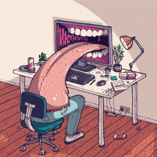
Lumps always enjoyed drawing and started by doing it on the side for fun whilst he was at university but he gained client work and became a full time illustrator. His preferred techniques are drawing with pens like fine liners and markers onto paper but he also does digital illustration with a iPad and adobe draw. He usualy goes to instergram and other social media platfroms for inspiration but he says he is influced by artist Alex Gamsu Jenkins and Pollynor
Pollynor
Alex Gamsu
Lumps makes his money by doing freelance client work and using Instagram to sell prints of his work and promote his website. I really like his artwork and am drawn to how dark but funny his peaces and characters.
Neck Face
Neck Face is a anonymous graffiti artist and illustrator and is know for his more dark and grungy work which is also commonly comedic. He was born in California in 1984 where his work is featured on the streets but also in art galleries around the world, his first gallery show was when he was 18-years-old and was sponsored by Rich Jacobs and held at New Image Art gallery in West Hollywood, California. His drawing style is said to be rough and scratchy with bloody violent themes attached to his work. His first skateboard design was for krooked skateboards creating a pro model for skater Mark Gonzales. Neck face uses lots of mediums from marker pens spray paints and pencils but sharp metal masks, felt installations, and sculptures have been featured in his work.

Christoph Niemann
Christoph is an illustrator, graphic designer and author of several books but out of these things he is mainly known for his illustrations. He was born in 1970 in Waiblingen in west Germany. He studied in Germany and developed his art but his career really took off when he moved to New York in america in 1997 and worked on and created many covers for the popular magazines and news papers such as the new Yorker, Atlantic monthly and the new York times. His work follows lots of different styles as he uses lots of things to create his work from pencils to paints and painting with coffee.

I do really like his illustrations and I think the reason why there so good is because of how creative and abstract some of the ideas are. He does things to help his imagination go wild and to help him create interesting ideas, for example he has multiple sketchbooks with one shape on the front and then he will fill the hole sketchbook with drawings incorporating the shape. One of the things he does to help his work be as creative as possible is that he says when things are going well you should always pick another direction allowing him to really experiment and create complex ideas.
The reason I am looking into this illustrator is because I watched a Netflix documentary and I really like the way he works.
His design process.
He usually does all his work in his office as he says he cant do it anywhere els and he will work from nine in the morning to six at night. He has everything he needs with him before he starts working allowing him to just start and create something. the thing that I like about his approach is that he doesn’t plan or wait for inspiration to hit him he will just start drawing and let the ideas come to him, he says “you haft to trust that crazy things happen”. He dose not like to put words or titles to his work as he feels that the illustration should explain itself and represent the contents its associated with. When he works to deadlines he dose not allow himself to experiment to much and he will just jump right in by putting pen to paper. He says that its not about waiting around for hours waiting for inspiration to arrive its about turning up and starting because once you start creating something creations and ideas take place and this is something that I really like the idea of and would like to try in my work.
After looking into artists and how they work within there specialisms I started creating ideas using idea generation techniques.
I set my self the task of coming up with 5 ideas and then I would narrow that idea down to one that would be ready to pitch or be approved to go forward with.
The main thing I did to come up with ideas was just let things and ideas come to my head randomly much like Christoph Niemann would, but the one thing I need to keep in mind is that with this project I want to step out of my comfort zone and try something new or tackle a project using new techniques or styles that I haven't used before.
I mainly used mind maps to help me build ideas.
The first mind map was titled buildings and this is because I really like modernist architecture and would like to learn more about perspective and making illustrations look more 3d and less flat.

This mind map is me thinking about the things I could lean and try like isometric architecture or designing floor plans but I also had the idea to create a set of building designs with a variety of buildings that shows different wealth levels so you could have run down houses for poor people and then some designs for middle class people and then luxury and billionaires.

Beluga creative is a creative agencies that is being made so I thought I could make different advertisements such as social media ads and banners. Its my brothers company and he is a cinematographer and there is a model maker/animator and another artist involved, I already created the logo but more collateral would be helpful to help launch the project so that Is something I could do.
The next idea was logo design just because I have only really created a very small amount of logos and haven't really tried using different styles like negative space or custom hand drawn typography, also I really struggle to make simple design look good and a lot of logo design is very minimal so making some sort of logofolio I might get better at minimalism and logo design. Also there is a very high demand for logos to be made for short freelance project and If I get good at logo design I might be able to get some small logo design jobs.
Another idea that I explored was creating a clothing brand as it is something I have always wanted to do and I enjoy street ware but I feel like lots of it is to simplistic and lots of it looks the same so I would like to create a brand and garment using my designs. With this project I could explore lots of new things such as making a brand identity, putting graphics onto clothing and possibly doing some model making.
The next thing I thought about was tattoos because I am currently very interested in tattooing and all the styles so I thought I could look into different tattoo styles like traditional, realism and new school and try and design tattoos and could experiment with drawing or painting on people or projecting something onto someone and then inking over it.
one of the ways I came up with these ideas is a technique called crazy eights and the concept is to come up with 8 ideas in 8 minutes forcing yourself to think quickly and come up with ideas off the top of your head.
The eight ideas I came up with were, logo design, character design, food branding, illustrations of dogs and there experiences on walks, animate a staring contest that goes on for hours, coffe shop interior art, animated drawings, a leader board of animals that mark there territory the most and which areas they own.
After doing all this idea generation I came up with five ideas:
1 - set of buildings showing different levels of wealth.
2 - looking into tattoo styles and creating tattoo designs.
3 - create a clothing brand and garment design.
4 - create advertising and collateral for beluga creative.
5 - design logos working on things like minimalism and create a logo folio.
From these five ideas the two that I liked most are the building designs and clothing brand. The next thing I did was create mood boards for each one looking at others peoples work to see which topic inspires me most.
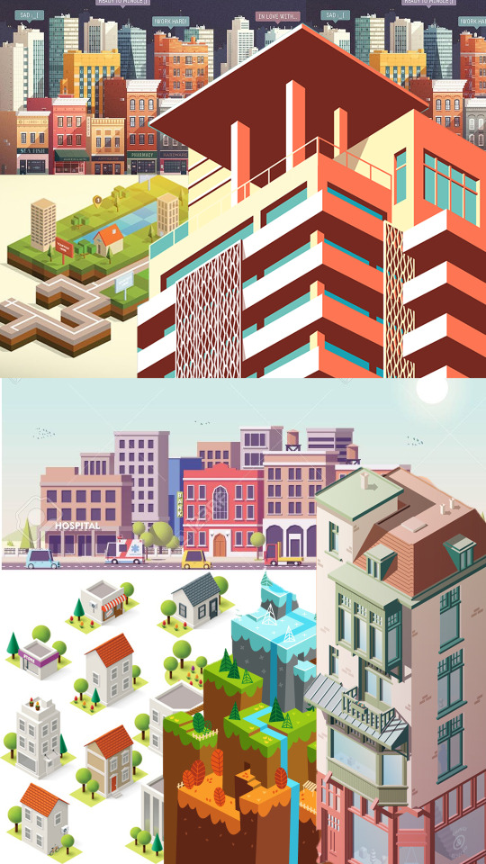
I have decided that the idea that I am going to go with is the idea of creating a verity of buildings that people might live in at different levels of wealth. I am picking this because I really like modernist architecture and like the idea of creating buildings but one of the main reasons I picked this is because of all the different techniques I can use to create the buildings for example I really struggle with perspective drawing and 3d drawing as I cant wrap my head round it so I would like to possible try and make some flat designs not look as flat. There is also software where I could create 3d models of buildings and I would also like to bring things back to basics and learn more about simple geometry and form as that is a big park of modernist architecture, i’m still not sure if I want to do my final piece in illustrator or Photoshop or something else but hopefully after this project I will have learnt more about drawing and will try some new things out.

I went onto Behance to look at other artists work of buildings and here is was I found.
Oumomo - https://www.behance.net/gallery/24416351/building-illustration-and-motion-practice
This work is by a designer called oumomo who is based in china, I really like the work in this project because I looks great but also shows very simplistic techniques using simple geometric shapes to construct the buildings. I really like the soft color pallet used and my personal favorite building is the barber shop as I think it has a really cool old possibly western feel to it and I think oumomo work is impressive because of nice his buildings look just by using a few shapes like squares and rectangles.
Anna Kajda - https://www.behance.net/gallery/16479195/3d-city
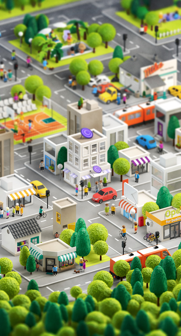

Anna Kajda is a 3d artist and illustrator from Germany. I looked at a project where she has created a 3d city and I really like how it looks. All the models have a very toy like feel and I think the people look a little like the old playmobeal toys. I really like all the shops and how fun the hole city looks with the vibrant colors and large shop signs like the large envelope on the top of the post office.
Rafael Varona - https://www.behance.net/gallery/16854501/Self-Promotional-Work?tracking_source=search%257Cbuildings&fbclid=IwAR1Xs9NIVsmgAbFcWK-o3YKaycbAHsgRQ79MZVqe9QI1jlNjtlirgwxB7wo


Rafael Varona is a illustrator and animater based in Berlin and Amsterdam. I really like this project because I think all the buildings and illustrations come together really well as one big scene, you can see in the buildings that they use simple geometric shapes but the main thing that I like about this project is a really like the pastel color pallet with the pink and blues but also the noisy dotted texture which makes the illustrations have a bit more depth with mild gradients.
lots of buildings today use simple geometric shapes and this comes from art movements such as the influentially art school the Bauhaus who helped pioneer modernist architecture. I have previously done a project on modernist architecture looking at movements such as the Bauhaus and Russian constructavism where I created museum in some game design software.
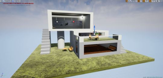
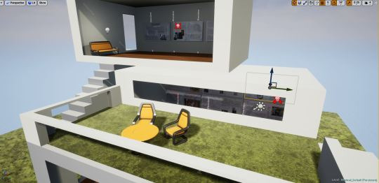
What is modernist architecture?
modernist architecture came around when the technology in material advanced for construction so more industrial materials came back and were used in sleek simplistic building designs. Materials That were heavily used were glass, steal and concrete. The main concept is that form should follow function and minimalism was modernism. The general building design within modernist architecture uses strong geometric shapes like squares and ovals and commonly use lots of glass like large windows and balconies, There general look of a building can look sleak and simplistic as large elements of structures are made of rectangles and squares. This style of architecture came around in the first half of the 20th century and is now heavily used for large buildings for banks and office buildings.
What are the key design elements of modernist architecture that will help you design your Museum.
If you look at buildings around places in London like kings cross or Liverpool street were there is lots of banks you can see theirs lots of examples of modernist architecture. The use of glass is heavily used as buildings have large windows either in separate squares but you also see very big large strips of glass that are windows which can wrap around buildings. Concrete is heavily used in buildings within this style and you will sometimes see large concrete rectangles layered on top of each other for floors or levels to a house. Its also about whats inside the building in terms of decoration, now this is going a little more into interior design but modern interior design follows the same principles and uses large amounts of geometry and minimal color pallet in furniture and wall paintings.
Modernist architecture mood board.
The Bauhaus.
The Bauhaus was founded in 1919 in the city of Weimar by German architect Walter Gropius. It was around this time when the first world war ended so the economy was being rebuilt. Technology is always on the rise but it was around this time that large factories were built and were appearing making the process to build things quicker as large factories would now start mass producing things. The Bauhaus was created because the creators though art and design was fading away and one of the reasons was because of all this industry mass producing things making things less personal and more generic and they wanted to step away from this and merge lots of different elements of design together to bring back more freedom within the art world and less mass produced items making more personal pieces of art.
Design theories.
the Bauhaus’s main deign theory was that form follows function. The school educated there student on basic design and focused on composition and color theory to help the students follow this design theory making sure that a design also relates to how something works.
Production.
One of the reasons the Bauhaus was such a influential school was because they taught so many different things and tried to merge as much as possible together. Students of the Bauhaus were creating all sorts of art pieces from large installations made out of metal and clay or posters and advertisements using more traditional techniques like paint and different types of papers and fabrics to create textures. Because computers were not around everything was mainly hands on.
use of science and new technologies.
When the Bauhaus opened in 1919 art technology was very basic and most techniques and procedures were very traditional so like a said in terms of materials a lot of it was collage work/Photo montage pieces which were created by using fine blades and scalpels, papers and inks. Lots more technologies were being improved on like bottle making and Pyrex and clothing technology was advancing like the use of zippers on clothing items so there was lots of metal work, glass work and fabric being used to create.
Influence:
Photography
Graphic Design
Product Design
Architectural
Fine art
ceramics
metal work
interior design
fashion
sculpting
Function:
The Bauhaus wanted to open up a variety of subjects and different mediums to students and this is why they didn’t keep everything on one subject they gave students the opportunity to dabble in a variety of subjects and materials which is why it was so revolutionary with large amounts of work being produced that would change and inspire the design industry. The Bauhaus is well know for teaching with the concept of form over function meaning that what every look and design something is it should relate back to the form or function of the object or building. Looks are important but if one is not put with the other you could have bad design that is why you need to think how a look or design will affect the purpose of an item like a kettle for example.
Design Characteristics.
If you look at the Bauhaus and how it influenced architecture, art and design you can see recurring themes and styles. You can see a heavy use of geometry in furniture, buildings and art. composition and layout was heavily thought about as students made collages and posters. If you look at buildings that were possibly inspired by the movement you could possibly see sharp edges and geometric shapes like rectangles and oval elements within the construction and a large amount of glass from big windows and lots of smaller rectangular ones.
I went ahead and tried to do some perspecive drawing and just tried to work with simple geometric shapes.
I found it really hard to get my head around how to make thin look more 3d and drawing things at different angles. I think I will really strugle to make my perspective drawings look good so I don’t think perspective drawing is for me so instead I will try working with a more 2d flat design but also try and make it look a little more 3D.
I started trying to work out how I want to make my building designs and what software I wanted to use so I thought the best way would be to test them.
The first specialism that I wanted to try and use for this project was illustration so I went into Photoshop and gave my self the challenge of drawing both a old run down abandoned house and a more wealthy modern looking house. I tried to go into this like the artist Christoph Niemann and he says that you should just start and let the ideas come to you, so I went into these drawings doing no sketches or tests I just started drawing and sure enough ideas came to me of things like where to place windows and the shapes I wanted to involve in the buildings designs. Here are my illustrations.
I really like the illustrations but I think the abandoned house looks better than the modern house, It might be cause I did it in a more rough scratchy style which makes it look like theirs more detail.
I am now going to try and create a building in illustrator and then compare the two specialisms to see which one I want to use.
Digital Drawing VS Vector Art.
I think both specialisms can come out with different looks but I think with digital drawing its easier to make things look a certain style and I feel like a lot of the time vector work in illustrator can often look very similar and just like one style bu with drawing you I think its possibly easier to create if you have the drawing skills. With vector work you can get exact shapes and make everything extremely precise with aligning things and tools but if your drawing it might be harder to get things lined up perfectly or create perfect curves and shapes. But I personally find it harder to get started when working with illustrator and it takes my longer to work out the sizes of shapes and color but this is possibly because its so easy to change the size of things and manipulate the vectors so I spend to long doing that but with digital drawing I tend to work quicker and spend less time manipulating things and just start sketching and drawing. I have only started digital drawing and am enjoying it but with my skill set of digital drawing and vector work my vectors can look very clean and professional whilst my drawings are rough and have a more scratchy look to them but I enjoy both but for this project I want to keep things looking clean and sleek so I think I might stick to illustrator rather than hand drawing in Photoshop.
I like the 2d vector art i have created and then I tried to used shadows gradients and opacity variants to try and bring some depth to the building and make it look a little more 3d. Because I wanted to experiment further into 3d I learnt some new things in illustrator about mapping pre made vector graphics to the perspective grid. I tried to place my flat house design on two sides of the grid to see what it looked like and here it is.
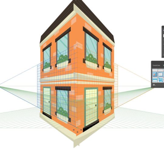
I did this by opening up my symbols panel and draged the building design into it turning it into a symbol, I then took the perspective selection tool and draged the new house symbol onto the grid and illustrator mapped it on.
I think this does show perspective and you can tell its a house but I think I would really struggle to use this technique and make it look clean and not tacky so I am most likely going to use a more common graphic design 2d style for my buildings and then use thought out shadows to give them more depth.
Before I 100% decide to make my buildings as flat vectors in illustrator I want to try and create some isometric buildings to see how difficult it is and if I like it.
I have created some isometric artwork before using the extrude and bevel options within illustrator to make 2d shapes 3d.
But I want to try a different way and make my own isometric grid using equilateral triangles and then I will used the pen tool to create shapes that will make a building.
I made the grid by taking the line tool and making a large row of long lines, I then grouped the lines and duplicated them and rotated the duplication 60 degrees with the rotation tool. I then duplicated that and reflected it creating my isometric grid. I then used the pen tool and tried to use perspective to build some sort of simple isometric building.
Here is the small building I made.

I found it really tricky to make my isometric design look good and I really struggled to get my head around trying to make things look more 3d, I am glad I tried it but it took a look of time to create something that dose not look that profession so I don’t think isometric design is for me.
I am starting the building designs now I know what specialist techniques I am going to use. I also want to try and choose color pallets for the buildings and I could possibly make 2 buildings for each custom color pallet I make. I will be making the color pallets using a custom pallet site on google.
Now that I have started designing I thought it might look nice to put the buildings on a circular backdrop making them almost look like icons.
but this became a slight problem as the original idea was to create buildings at different price point so I wanted to create some large houses but when I took a large house and put it into the circular border it wouldn't look good next to the other buildings and there was too much space left in the circle.
so to fix this I will keep all the houses smaller so they fit in the circle which you can see here as I made the bigger house smaller.
Because of this I am going to try and use techniques used in modernist architecture like large windows and more common geometric forms related to luxury housing so you can distinguish a house being more expensive not by the size but by how it looks.
for example here the houses are similar sizes but hopefully the house on the right looks more expensive than the one on the left.

I also intend on putting the houses in a layout of price order making it more obvious which are the more expensive and less expensive houses.
I Was told that the Icon look that I was creating was a little dated by the way the buildings have this big dark shadow coming off it so I came up with another border which was by making the circle smaller so the building is overlapping out of it and then the circle consists of two colors for each half to the circle.

I also created roofs for two of my buildings but I got rid of them because it made the buildings with roofs not fit with the others when you look at perspective.


Now that I have made a couple buildings trying to make them look at different price points I need to think about how I am going to present them, I could make one large poster or present them on a road in price order. I could make an advertisement selling the houses or an info graphic piece.
I made a quick poster showcasing one of the buildings to help me work out how I want to present my designs.
Here is the poster I made in a vintage style.

I wanted to put some text on the poster so I thought I would try and do some custom typography, I have created type before bey drawing it on paper, scanning it in and turning it into a vector but I wondered if I would be able to use a wacom pen and tablet and just draw the word so I gave it a try in Photoshop.
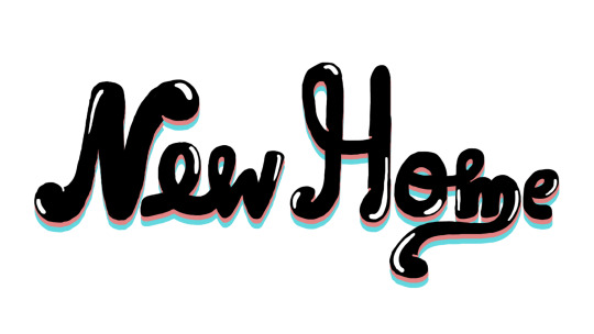
It dose not look terrible but it looks very rough and not like a clean vector. I tried adding it to the poster but I think It didn't work and made it look bad.
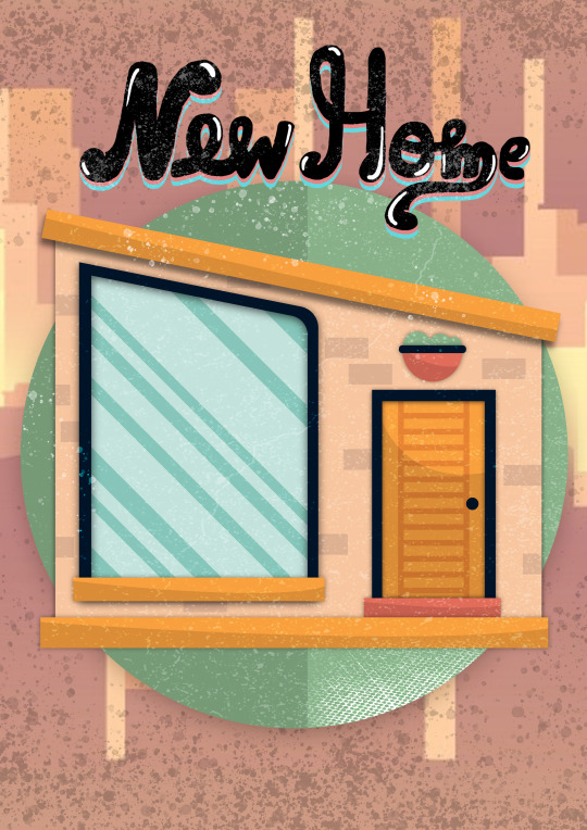
After making this poster I do like the idea of creating some sort of set of vintage posters advertising a house for sale and I could possibly use unrealistic prices like 50 pence for a home. I could also split the houses into 3 or 4 categories variation in price so I could create 4 backgrounds for the houses to go on.
I could also just have a few posters for my buildings and then a generic info graphic piece displaying all the houses and prices.
I really like the idea of having a new York looking skyline as a background so I made this simple skyline by using a minimal color pallet and mainly rectangles and squares to create a geometric clean new York looking skyline.
In the quick poster design I did I used the brush tool to paint on some textures that made it look a little dirty and aged, I also used to images which made it look aged and I like the vintage retro look it had at the end so this is an angle that I might want to take with my work, so I am going to look at some a vintage house advertisements as this is a road I might go down. So essentially the final piece could be an advertisement that an estate agent might put on show showing the variety of houses I have created at different price points.

I worked in illustrator to create all the buildings taking influence from modernist architecture and buildings. I created lots of custom color pallets and used less high saturated colors because I think pastel colors are a little easier on the eyes but also when it comes to print if i was using high contrast web colors when you print it, it will look less contrasted or faded. The lighter less saturated colors also work well with the vintage style I am trying to portray.
I also created lots of designs for the houses experimenting with form and thinking about how I would portray modernism in my work. I also looked at the designs both with shadows and as flat vectors.
Whilst I was creating my buildings I was constantly getting inspiration form google and looking and different buildings and focusing on different elements of the buildings like looking at the angles of the roofs, different windows and doors, wood paneling and concrete highlighting parts of a building and other things like balconies and plants.

Because I was exploring modernist architecture I wanted to create some more complex shapes in illustrator whilst keeping it looking geometric. If you look at expensive buildings some have less square like shapes and sometimes involve more curves and rounded edges.
I learnt a new thing in illustrator which allowed me to round the edges of corners separately by simply double clicking the small section of a shape which you would drag to round a shape and this let me create more complex shapes for the buildings that were meant to look more expensive.
I then placed the buildings on the background and put them in different sizes and they look like floating bubbles.
one thing that I want to do is add the prices and because I am going to add some vintage textures to the design and I have a new York style skyline background I thought I could add unrealistic pricing and make the buildings 50 cent or 25 cent like you would see in old ice cream advertisements.
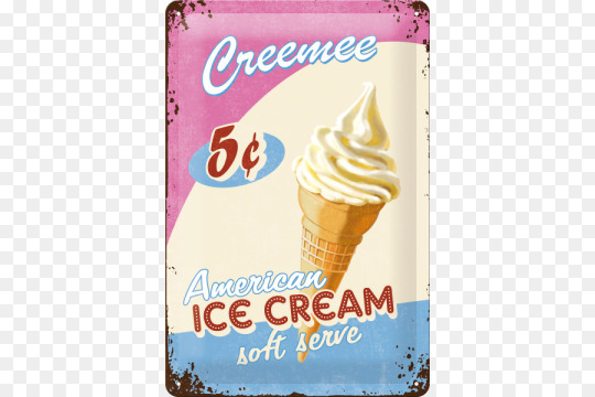
But I will still represent the value of the cheap and more expensive houses by making the cheaper ones 15 or 20 cent and then the expensive house 99 cent for example.

It was suggested to me that my work looked possibly too staged and that I should try and experiment and make buildings overlap and come of the page, but my problem with this is that I think when its coming off the page it looks it doesn't look right and because this is going to displayed for the end of year show I want to display my graphics and not make them look cut up also people might think the printer as messed up or I have done a dodgy crop, basically I am not a huge fan of this idea and will go on with my other layout displaying my work.
Now that I have the design work in illustrator finished I went into Photoshop so finish by drawing some custom textures using dots and scatter brushes and then changing the blending modes and opacity so it works as a texture and dose not change the colors or vibrancy of the image.
Here is my final piece.
Here it is on Behance.
https://www.behance.net/gallery/81269061/Buildings-Project
Evaluation:
Whats the final idea,
The final idea was to create an advertisement advertising a variety of buildings at different price points in a retro/vintage style. The buildings should express value by its architecture and size and the prices of the buildings will be inaccurate and will be done in cent to represent old american vintage advertisements for things like ice cream and candy.
How did you arrive at these Ideas.
To arrive at my final idea I looked into lots of specialisms and focused on elements of graphic design I enjoy. I tried lots of things out and after lots of mind mapping and idea generation like creating ideas in short amounts of time forcing myself to come up with quick good and bad ideas on different topics that I want to explore in graphic design as well as bouncing off words and looking into artists and getting inspiration.
what specific approaches did you practice?
I this project I wanted to try lots of different things until I truly knew how I wanted to create my final piece, I practiced digital drawing and vector illustration as well as trying to learn more about perspective drawing grids, and isometric artwork. But the finalized approach would be that I use adobe illustrator to create vector illustrations and would try and use simple geometric form and modernist architecture to influence my building designs as well as using gradients and shadows to try and give my flat 2d designs more depth instead of heavily relying on perspective.
What issues did I encounter?
When I was experimenting with perspective I tried to put a flat building design on the perspective grid so I could make sides and It didn't work, I was also struggling to curve edges and create complex shapes in illustrator.
How did you over come these issues?
I turned my building into a symbol and then made sure it didn't have any affects on it so it when locked onto the grid and I also learnt that I could click on section of a shape like a rectangle and curve individual corners instead of curving the whole shape, and with this simple new technique I was able to create more complex shapes with curves rectangles and ovals.
what have you learnt during this project?
I used the perspective grid in illustrator for the first time and learnt how to map pre made graphics onto it. I also learnt how to set up an isometric grid and create isometric vector art in illustrator. After doing research into modernist architecture and just looking at buildings I learnt lots about the different forms and shapes used to create windows and doors.
What do you like
I really like some of the buildings that I created especially once I designed for the higher price point as I enjoyed coming up with concepts for houses and designing them. I am also a fan of all the custom color pallets a created and then used for the buildings thinking about which colors would work well for the windows plants and other elements of the buildings. I also really like the simple new York city style skyline I created for my background as I basically used just squares and rectangles and I nice color pallet to create the skyline and I think it looks nice and works as a background complementing the building designs on top of it.
What do you not like.
Personally its a bit confusing what the final piece is or what its purpose is for and I think I could of fixed this by possibly creating a logo for an estate agents or created some custom text that said something like houses for sale. The price tags do make it understandable that its an advertisement for houses for sale but I think I could of possible communicated that better within my design. Also I am not a massive fan of all the buildings for example there are one or two that I just don’t think look as good as the other ones and I could of kept them out of the final piece and I have learnt you don’t have to use everything you create. Lastly the composition could be improved on as it looks possibly a little crammed.

0 notes
Text
Walking for weight loss: 8 tips to burn fat
New Post has been published on https://weightlosshtiw.com/walking-for-weight-loss-8-tips-to-burn-fat/
Walking for weight loss: 8 tips to burn fat
Table of contents
Picking up the pace
Weighted vests
Walking uphill
Form and posture
Resistance training
Power walking
Three shorter daily
More steps daily
Summary
Doctors widely agree that inactivity is a potential cause for many preventable conditions, such as heart disease and obesity.
For example, a study in the Journal of Exercise Nutrition and Biochemistry showed the positive effects that walking could have on burning fat and reducing waist circumference in obese females. The women walked between 50-70 minutes 3 days per week for a total of 12 weeks. After the study, they found that the study participants lost an average of 1.5% body fat and 1.1 inches around their waists.
Although any increase in activity level will bring benefits, there are some things a person can do to increase the amount of fat they burn while walking. Tips include:
1. Picking up the pace
Walking regularly can help aid weight loss and improve fitness levels.
As with running, swimming, and other forms of aerobic exercise, pace makes a difference. A person burns more calories walking at a brisk pace compared to walking more slowly.
A study published in Medicine & Science in Sports and Exercise showed that when people increased their pace to a run, they burned more calories. This study also showed that the group of runners weighed less overall than the walkers, suggesting that speed directly affects the number of calories a person burns while exercising.
However, increasing the pace does not mean a person has to run. Instead, walking briskly will burn extra calories to help with weight loss.
2. Wearing a weighted vest
Adding extra weight to a workout will burn more calories.
Heavier people burn more calories because their bodies require more energy to perform the same task than someone who is not as heavy; wearing a weighted vest while walking encourages a person’s body to work harder during a walk.
One study concluded that individuals who walked at 2.5 miles per hour (mph) on a flat surface while wearing a weighted vest that weighed 15% of their weight, burned 12% more calories than a person who did not wear a vest.
A person wearing a weighted vest that represented 10% of their body weight and who walked at the same pace on a 5-10% gradient burned an average of 13% more calories.
Though a weighted vest may help burn extra calories, a person should avoid wearing ankle or wrist weights or carrying weights in their hands. Both practices can lead to muscle imbalance and injury.
However, a person should always use caution when wearing a weighted vest. As with any new exercise, a person should speak to their doctor before using a weighted vest. People with back or neck problems should not use a weighted vest.
People who can safely wear a weighted vest will likely see improvements in the number of calories they burn.
3. Walking uphill
To help increase calorie burn, a person should walk uphill regularly.
For some, this may mean increasing the treadmill gradient, while others may want to incorporate more hills into their outdoor walking routine.
A person should aim to walk up hills, stairs, or inclines two to three times a week.
4. Focusing on form and posture
When it comes to walking, it is important to maintain form and posture.
A person should walk so that they are looking ahead at all times as this helps increase the speed a person can walk as well as lengthen their stride. While walking, a person should also focus on tightening their abdominal muscles and glutes. People can do this during the entire walk or for short intervals.
This technique can help a person build strength and keep them injury free so that they can continue their walking program.
5. Incorporating resistance training intervals
Adding resistance training, such as tricep dips, can make walks more beneficial.
To help burn more calories and increase the growth of new muscle, a person can try adding in resistance training during their walk.
Some exercises to try include:
Short exercise intervals can help increase a person’s heart rate and build muscle. They can also help make the walking routine more interesting.
6. Power walking in intervals
Power walking in intervals can be an effective way for a person to increase the number of calories they burn while walking.
To try power walking in intervals, a person should first walk for about 5 to 10 minutes to warm up. Then increase the pace and continue at an uncomfortable but sustainable pace for 10 to 15 seconds before returning to a normal walking pace. A person can repeat this throughout the walk or for as long as they can manage it.
A person may want to start with 5 minutes of interval work per walk and incorporate more power walking intervals into their walks over time.
7. Doing three shorter walks a day
Though long walks are good, shorter, more frequent walks can also provide benefits.
Some people may find it easier to maintain their daily exercise by doing shorter walks throughout the day instead of taking a much longer walk once a day. Experts believe that taking a walk after each meal also brings benefits.
According to one study on inactive people over 60 years old, walking for 15 minutes three times a day after meals can help control blood sugar levels better than walking once a day for 45 minutes.
8. Aiming for more steps each day
Taking the stairs when possible can increase daily step counts.
Popular fitness trackers and pedometers encourage people to take 10,000 steps per day, and one 2016 study agrees that 10,000 steps are ideal. This works out to roughly 5 miles of walking.
People interested in walking for weight loss should consistently hit at least 10,000 steps each day. Some people may even want to increase their total number of steps beyond this amount. However, any steps that a person takes beyond their normal daily step count can help them lose weight.
Fitness trackers that count steps are an excellent incentive to help people take more steps each day. Even if a person cannot reach 10,000 steps a day, they should set a reasonable step goal and work to achieve that.
People can increase the number of steps they take each day by changing some of their daily movement patterns. Tips for doing this include:
Before adding weight or increasing intensity either through speed or incline, a person should speak to their doctor or other healthcare professional.
A person should aim to increase the regularity of their walking, as well as the number of miles or steps they take each day. Try adding in some intensity a few days a week with faster walks or increased inclines.
This content was originally published here.
0 notes
Link
In this Adobe Illustrator Advanced course we’ll learn Advanced techniques for graphic design, logo design & illustration
What you’ll learn
You will be able to earn more using these new Illustrator skills.
You will create multiple images for you to use in your Portfolio.
You will be able to add ‘Advanced Illustrator User’ to your CV.
53 Lectures 4+ hours of content
Speed up your productivity & workflow
Advanced anchor point & pen tool tricks
You will build your own animated gifs.
Mastering lines & strokes
Depth & perspective
Set permanent defaults for fonts, colours
Be able to turn hyphenation off once and for all
Make beautiful charts & graphs.
You will learn to make quick colour adjustments, gradients meshs & how to blend it all together
Your creativity will be doubled once you finish the transform, distort & blending section of the course
Know how to speed up your personal workflow & how to speed up Illustrator
Create your own custom icons.
You’ll draw various animals to explore the fastest ways to create them.
You’ll create your own custom lettering using swirls, whips & flourishes.
Take hand drawn lettering and vectorize it in Illustrator.
You’ll create 3D icons for a website.
You’ll create UI designs for an app & website.
You’ll create paper cut effects inside of text.
You’ll make a pie chart, line chart & bar graph.
You’ll blend real images together to create cool instagram style filters.
You’ll create a post card with advanced color & prepress tricks.
Adjust all the colors in your illustrator at once, making it easy to re-color & test color combinations.
Warp text so that if fits inside of shapes.
Create a 3D style ribbon.
Make 3D text & logos.
Create lots of blended lines for exciting linear effects.
Create linocut flowers.
Create duotones.
Build a half tone image.
Fill shapes with text.
Requirements
Any version of Adobe Photoshop, preferably the CC (Creative Cloud) version.
Basic knowledge of Illustrator is required. I recommend watching my Illustrator Essentials course before this course.
If you know how to draw simple icons & you already know what an anchor point is. Then this course if for you.
Description
Do you know you’re only using 50% of Illustrator’s capabilities? Ready upgrade yourself? Then this course will take to you the top level of Illustrator mastery.
Hi there, welcome to this Adobe Illustrator advanced tutorial.
My name is Dan. I’m an ACI & ACE for Illustrator. This course is a more advanced look at Illustrator. It’s not designed for people who are brand new to Illustrator.
This course is for people who can already understand the fundamentals of Illustrator. If you already know what an anchor point is and how to adjust it this course is for you.
Giovanni: “I started learning graphic design on youtube, and after 6 weeks I had already learned the basics of color, logo design, typography, and the basics of illustrator. But after a while I felt stuck, my workflow wasn’t improving, and I still could not materialize all the details that I imagined for an artwork. So I saw your course and after two or three lessons I already knew that I made a gold-value purchase. The teacher’s explanation is crystal clear and to the point, while also considering alterative scenarios where a student might get stuck. Really good attention to detail and every minute of this course brings value to me and enriches my imagination with the power of Illustrator. This course is all you need to get from being an ok user of illustrator to being an expert with unlimited possibilities. Highly recommended.”
This course will speed up your productivity & workflow. It is project based, so you will learn the tools & tricks to create some really beautiful current design styles.
Even if you consider yourself an experienced user, I promise there will be things in here that will blow your Illustrator mind.
You’ll learn advanced anchor point & pen tool tricks. There is a really fun section on mastering lines & strokes. You’ll learn the quick way to take hand drawn sketches and vectorize & color them.
George: “I really enjoyed this course Dan, I finished it in 3 days because my intention was to go through it rather quickly. But the content of the course is amazing for someone who has been self-taught and has more or less followed their instinct thus far. You gave me a new perspective on tools that I was already using and opened my horizon by teaching some tools that I always looked at and thought “what the heck” is that for? – All around awesome!”
You’ll master depth & perspective in Illustrator, creating semi-flat presentations. We’ll set permanent defaults for fonts, colours & learn how to turn hyphenation off once and for all. You’ll learn advanced logo design & graphic design techniques.
We’ll make beautiful charts & graphs for your indesign documents. There is a colour mastery section where you will learn to make quick colour adjustments, gradients meshs & how to blend it all together.
Your creativity will be doubled once you finish the transform, distort & blending section of the course.
Jamie: This course was the perfect way for me to brush up on skills I haven’t used in a while and also learn some really neat ways to save time. My company puts a big emphasis on working smart and doing things efficiently, and this course seriously helped me out in that department. I’ve always been pretty proficient in Illustrator, and have even gotten several comments about how fast I work, but this course is helping me take that to the next level. Thanks Dan! I truly enjoyed it!
There is an entire section dedicated to learning how to speed up your personal workflow & how to speed up Illustrator and get it running super fast.
If you’re ok in Illustrator but you know there is so much more in there to be unlocked then please join me and become an Illustrator super hero.
Who this course is for:
This course is for people who already know Illustrator and want to take their skills and speed to the maximum level.
This is an advanced Illustrator course, so you’ll need basic Illustrator skills to find this course useful.
If you a completely new to Illustrator try my Illustrator Essentials course before starting this one.
Created by Daniel Walter Scott, Instructor HQ Last updated 11/2018 English English [Auto-generated]
Size: 5.18 GB
Download Now
https://ift.tt/2E20Usn.
The post Adobe Illustrator CC – Advanced Training Course appeared first on Free Course Lab.
0 notes
Text
14 Stunning examples of auburn hair
Auburn hair is a combination of the boldness and warmth of red and the natural tones of brown. This rich blend of sexy colors creates a hue that is not too heavy and dark and totally revives a look! The special feature of this chocolaty shade is its shine, which turns any hair, whether textured or smooth, automatically into a multi-dimensional hair, so it's super easy to style!
Maroon hair color tips
Zendaya, Ashley Graham and Miranda Kerr have all been seen at various gala events that rocked this sexy hue and that makes it very hard not to fall in love with him! Balayage artist Macy of Color & Co. The beauty salon in Florida proves just how versatile this shade is with its chart creations on IG!
Your undertone says a lot if you are looking for the most flattering chestnut hair umbrella for you. As a rule of thumb, opposites complement each other – warm undertones go great with cool reddish-brown tones and vice versa. Opt for a massive auburn hair for a natural-looking and shiny finish, or try highlights or an ombre that adds even more definition to your look!
You'll be surprised how much you can do with this appealing hue, and this updated album of chestnut hair will make you fall in love with him!
Golden chestnut
How would you describe this look?
What I like about this color is its subtle soft demotion, which is also very technical.
After using an L'Oreal Pro French Balayage, I applied a Diarichesse toner in S24 that gives the style a hot / cold look. Then I continued to style the hair with waves that were achieved with a Babyliss per styling stick for a soft, natural look.
Any advice for someone considering it?
My beauty tip to achieving this highlighted maroon look is to start with hair that has a medium brown base.
This is a look for all women who are demanding or casual in their daily lives.
To get this look at home, I recommend the brand Reflection by Kerastase. Continuous care leads to healthy hair growth!
Medium maroon
How would you describe this look?
This is a lively chestnut hair color. My favorite thing about Kendyll's tone-on-tone hair is that it looks natural and effortless, even though she spent hours in my chair! Many brunettes tend to fall flat and have no depth, but with a simple balayage and glaze they too can have a beautiful multidimensional color. I gave her a simple round hair blower to emphasize her layers and the style I gave her.
Any advice for someone considering it?
Here we go! It is low maintenance and easy! For occasional regrowth Balayage must be maintained only a few times a year. It's still a professional look without being boring!
As far as the haircut is concerned, daily care is entirely up to the customer. A little surf spray and textured cream are ideal for a wash and go look – especially in the hot summer months when hair dryers are out of the question. Because if you want it jooj or a polished look, I reach for a voluminous mousse, a dry cream, a round brush and off you go!
Ash chestnut brown
How would you describe this look?
This shade is inspired by one of the top ten colors that characterize New York Fashion Week 2019, Spring Summer Collections – Toffee. However, I made some slight adjustments by raising the ash content and bringing it closer to a chestnut hue to eliminate the impudence that prevails in my client's hair. To give it more depth and gradient, I have balayed the hair before toning with Goldwell Silk Lift Lightener. This also creates the illusion of a fuller hair.
My favorite thing about this hair color is that it's neither too cool nor too warm. This means that it is an extremely safe and neutral hair color as it complements almost every skin type and color. Besides, the maintenance is easy. Just use an ash shampoo (blue) and let it work for 5 minutes daily.
Any advice for someone considering it?
This is a classic and timeless hair color that will never go wrong, regardless of job, personality and style. The 2 skin types that should avoid chestnut hairs are almond and chestnut skin tone. Choosing a hair color that is extremely close to your skin tone and shade will make you look dull and tired. It will not complement your functions in any way.
After all, always remember to combine your eyebrow colors with your new maroon hair color.
Dark chestnut with blond highlights
How would you describe this look?
This look is a warm, rich maroon color with caramel highlights. I was inspired by the fascinating brown tones of the woody chestnut tree. The highlights that result from the imitation of the wood grain. She has long mixed and minimal layers. I styled it with waves with a flat iron and combed it lightly to merge and reinforce all the colors. I love the shine and the warm brown hair shines throughout!
Any advice for someone considering it?
This warm, shiny, maroon hair color looks great on olive and warm skin, but can be completely modified to give it a cooler tone that will match your complexion. This would complement any eye color or face shape. If your natural color comes close to it, it can be very easy and easy to care for. The highlights are lower and more ombré, giving it a vivid and natural look. This will allow more time between hair dyeings. This look is perfect for those who want a natural but effortlessly polished hairstyle!
Maroon with highlights
A waxed brown on wavy, long hair is the combination for every woman who wants to make an appearance.
Bright chestnut hair color
A bronzed look like this is a sight for sore eyes. Of course, and yet out there, try it and see how you shine in toasted hair color.
Deep chocolate brown hair with chestnut highlights
Dark brown hair is extravagant, but in combination with almond highlights it makes the look all the more appealing.
Dark hair with bright chestnut highlights
Brown lights match every hair color and length. Such a dark hair like this would certainly show a deep bronze accent.
Balayage of chestnuts and blonde
The contrast of this color is stunning! Ideal for multi-layered hair like this asymmetrical bob.
dark chestnut
Seems like it was just roasted fresh on open fire. This luxurious color with these big waves is your ticket to a great night out.
Warm golden chestnut
This full fringe and asymmetrical bob is ideal for ladies with a rounder face shape. This look will frame your face and enhance your beautiful facial features.
Red-brown chestnut
At home, experiment with Box Hair Dye or experiment with a professional in the salon. Either way, this frequent favorite will make you look crackling.
Dark to light chestnut almond flavor
A typical brunette color with a shiny touch. Big waves on long hair make this hairstyle a 10 out of 10.
Chestnut hair with balayage
Look at this beautiful cherry chocolate color! The staining technique used contained the colors to give this reddish brown offspring.
14 Stunning examples of auburn hair
0 notes
Text
14 Stunning examples of auburn hair
New Post has been published on https://www.easypromhairstyles.com/14-stunning-examples-of-auburn-hair.html
14 Stunning examples of auburn hair
Auburn hair is a combination of the boldness and warmth of red and the natural tones of brown. This rich blend of sexy colors creates a hue that is not too heavy and dark and totally revives a look! The special feature of this chocolaty shade is its shine, which turns any hair, whether textured or smooth, automatically into a multi-dimensional hair, so it's super easy to style!
Maroon hair color tips
Zendaya, Ashley Graham and Miranda Kerr have all been seen at various gala events that rocked this sexy hue and that makes it very hard not to fall in love with him! Balayage artist Macy of Color & Co. The beauty salon in Florida proves just how versatile this shade is with its chart creations on IG!
Your undertone says a lot if you are looking for the most flattering chestnut hair umbrella for you. As a rule of thumb, opposites complement each other – warm undertones go great with cool reddish-brown tones and vice versa. Opt for a massive auburn hair for a natural-looking and shiny finish, or try highlights or an ombre that adds even more definition to your look!
You'll be surprised how much you can do with this appealing hue, and this updated album of chestnut hair will make you fall in love with him!
Golden chestnut
How would you describe this look?
What I like about this color is its subtle soft demotion, which is also very technical.
After using an L'Oreal Pro French Balayage, I applied a Diarichesse toner in S24 that gives the style a hot / cold look. Then I continued to style the hair with waves that were achieved with a Babyliss per styling stick for a soft, natural look.
Any advice for someone considering it?
My beauty tip to achieving this highlighted maroon look is to start with hair that has a medium brown base.
This is a look for all women who are demanding or casual in their daily lives.
To get this look at home, I recommend the brand Reflection by Kerastase. Continuous care leads to healthy hair growth!
Medium maroon
How would you describe this look?
This is a lively chestnut hair color. My favorite thing about Kendyll's tone-on-tone hair is that it looks natural and effortless, even though she spent hours in my chair! Many brunettes tend to fall flat and have no depth, but with a simple balayage and glaze they too can have a beautiful multidimensional color. I gave her a simple round hair blower to emphasize her layers and the style I gave her.
Any advice for someone considering it?
Here we go! It is low maintenance and easy! For occasional regrowth Balayage must be maintained only a few times a year. It's still a professional look without being boring!
As far as the haircut is concerned, daily care is entirely up to the customer. A little surf spray and textured cream are ideal for a wash and go look – especially in the hot summer months when hair dryers are out of the question. Because if you want it jooj or a polished look, I reach for a voluminous mousse, a dry cream, a round brush and off you go!
Ash chestnut brown
How would you describe this look?
This shade is inspired by one of the top ten colors that characterize New York Fashion Week 2019, Spring Summer Collections – Toffee. However, I made some slight adjustments by raising the ash content and bringing it closer to a chestnut hue to eliminate the impudence that prevails in my client's hair. To give it more depth and gradient, I have balayed the hair before toning with Goldwell Silk Lift Lightener. This also creates the illusion of a fuller hair.
My favorite thing about this hair color is that it's neither too cool nor too warm. This means that it is an extremely safe and neutral hair color as it complements almost every skin type and color. Besides, the maintenance is easy. Just use an ash shampoo (blue) and let it work for 5 minutes daily.
Any advice for someone considering it?
This is a classic and timeless hair color that will never go wrong, regardless of job, personality and style. The 2 skin types that should avoid chestnut hairs are almond and chestnut skin tone. Choosing a hair color that is extremely close to your skin tone and shade will make you look dull and tired. It will not complement your functions in any way.
After all, always remember to combine your eyebrow colors with your new maroon hair color.
Dark chestnut with blond highlights
How would you describe this look?
This look is a warm, rich maroon color with caramel highlights. I was inspired by the fascinating brown tones of the woody chestnut tree. The highlights that result from the imitation of the wood grain. She has long mixed and minimal layers. I styled it with waves with a flat iron and combed it lightly to merge and reinforce all the colors. I love the shine and the warm brown hair shines throughout!
Any advice for someone considering it?
This warm, shiny, maroon hair color looks great on olive and warm skin, but can be completely modified to give it a cooler tone that will match your complexion. This would complement any eye color or face shape. If your natural color comes close to it, it can be very easy and easy to care for. The highlights are lower and more ombré, giving it a vivid and natural look. This will allow more time between hair dyeings. This look is perfect for those who want a natural but effortlessly polished hairstyle!
Maroon with highlights
A waxed brown on wavy, long hair is the combination for every woman who wants to make an appearance.
Bright chestnut hair color
A bronzed look like this is a sight for sore eyes. Of course, and yet out there, try it and see how you shine in toasted hair color.
Deep chocolate brown hair with chestnut highlights
Dark brown hair is extravagant, but in combination with almond highlights it makes the look all the more appealing.
Dark hair with bright chestnut highlights
Brown lights match every hair color and length. Such a dark hair like this would certainly show a deep bronze accent.
Balayage of chestnuts and blonde
The contrast of this color is stunning! Ideal for multi-layered hair like this asymmetrical bob.
dark chestnut
Seems like it was just roasted fresh on open fire. This luxurious color with these big waves is your ticket to a great night out.
Warm golden chestnut
This full fringe and asymmetrical bob is ideal for ladies with a rounder face shape. This look will frame your face and enhance your beautiful facial features.
Red-brown chestnut
At home, experiment with Box Hair Dye or experiment with a professional in the salon. Either way, this frequent favorite will make you look crackling.
Dark to light chestnut almond flavor
A typical brunette color with a shiny touch. Big waves on long hair make this hairstyle a 10 out of 10.
Chestnut hair with balayage
Look at this beautiful cherry chocolate color! The staining technique used contained the colors to give this reddish brown offspring.
0 notes