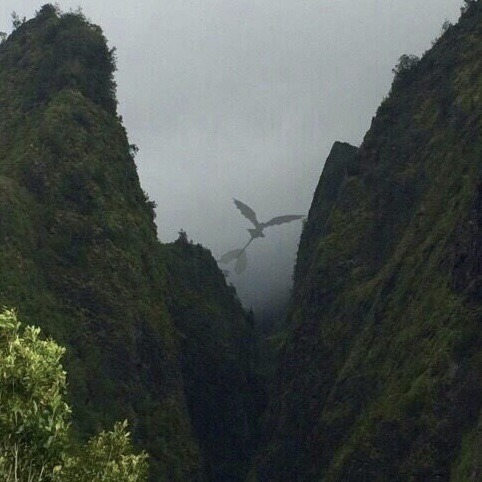
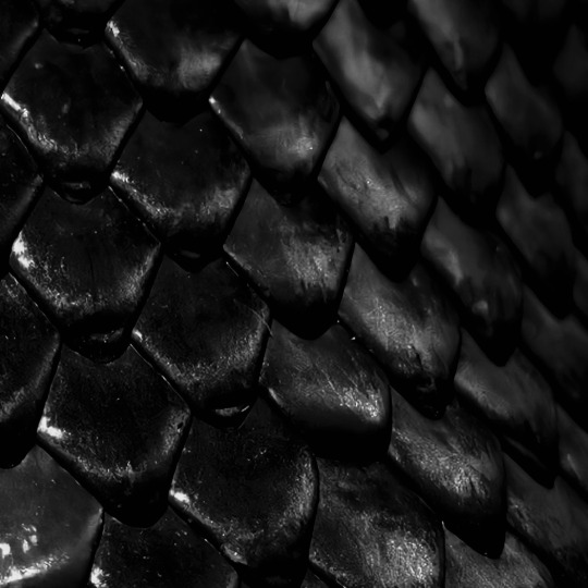
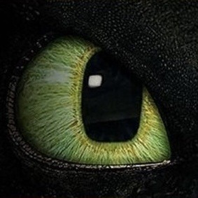
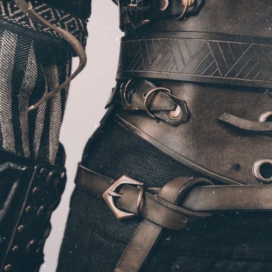
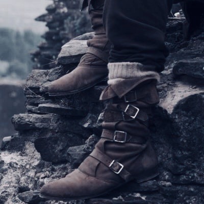
#berk aesthetic
Text

isle of berk / welcome to the hairy hooligan tribe
#cove’s moodboard#hiccup#hiccup haddock#hiccup horrendous haddock lll#hiccup haddock aesthetic#toothless#berk#berk aesthetic#hairy hooligan tribe#httyd#how to train your dragon#httyd aesthetic#how to train your dragon aesthetic#the cove#httyd moodboard#berk moodboard#hiccup kin#hiccup haddock kin#hiccup horrendous haddock iii kin#hiccup horrendous haddock iii aesthetic#how to train your dragon kin#httydkin#isle of berk#island of berk
281 notes
·
View notes
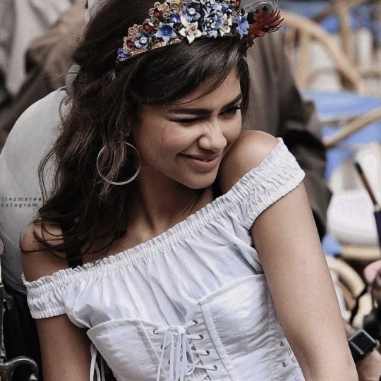
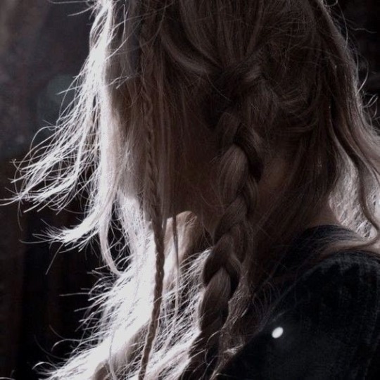
Text

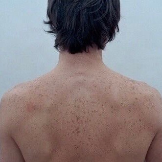


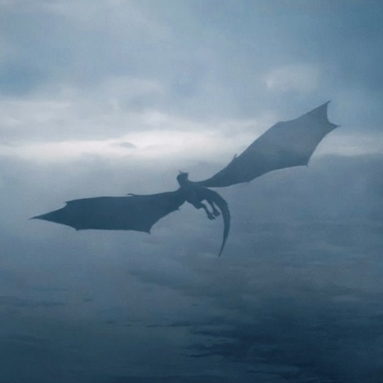
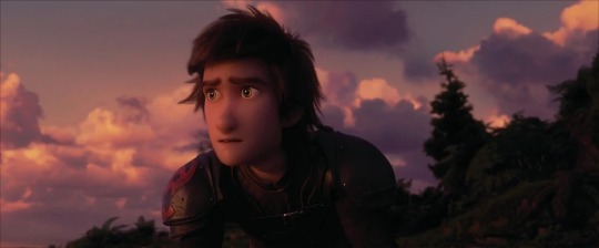
how to train your dragon aesthetics: 1/?
Hiccup Horrendous Haddock III
🐉 🔧 📜 🔥
“They're not what we think they are. We don't have to kill them.”
#hiccup#hiccup haddock#hiccup horrendous haddock iii#hiccup haddock aesthetic#how to train your dragon#httyd#httyd hiccup#httyd aesthetic#httyd moodboard#hiccup x astrid#hiccstrid#hiccup and toothless#viking#vikings#viking aesthetic#dreamworks#dreamworks dragons#riders of berk#defenders of berk#httyd rtte#httyd race to the edge#dragons race to the edge#jay baruchel#my moodboards
223 notes
·
View notes
Text


Hiccup Aesthetic ✨️
Astrid Fishlegs Snotlout Tuffnut Ruffnut
#how to train your dragon#httyd#hiccup#hiccup horrendous haddock iii#aesthetic#moodboard#httyd aesthetic#dragons#berk#httyd live action#how to train your dragon live action
173 notes
·
View notes
Text


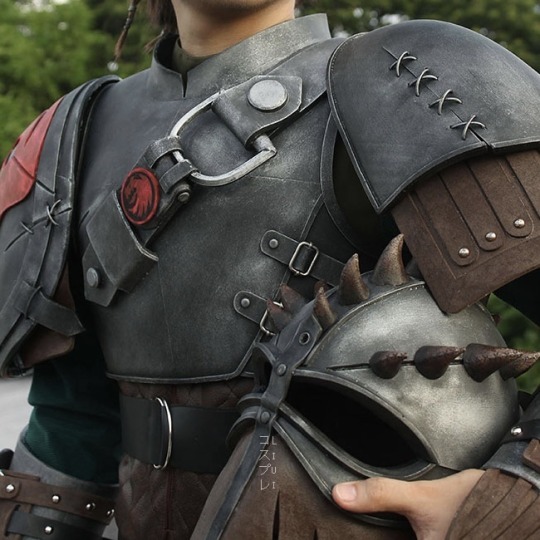
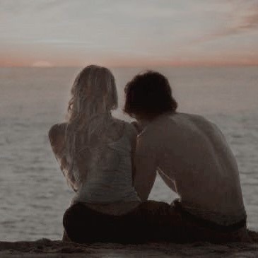
Carwheeler + How To Train Your Dragon Aesthetic
#carwheeler aesthetic#carwheeler#Anne wheeler#zendaya#zendaya Coleman#Phillip Carlyle#Zac Efron#hiccup#hiccup haddock#astrid hofferson#httyd#how to train your dragon#Vikings#berk#hiccstrid#moodboard#the greatest showman#tgs#greatest showman
31 notes
·
View notes
Text


(☞゚ヮ゚)☞ click on the source link of this post to find #150 gifs of berk cankat from episodes 6-7 of the television series aslında özgürsün (2022), as well as the rules you must abide by in order to use them. all gifs included were made by me and are size 268 x 170. content warnings include: smoking, kissing, sexual content, eating/drinking, partial nudity. an alternative zipped file download can be found on the page. ☜(゚ヮ゚☜)
NOTE: this fc is turkish, please name them accordingly or don’t use my gifs.
#berk cankat#berk cankat gif pack#gif pack#turkish fc#turkishfcs#gifsociety#fcxdirectory#tessgifs#user-dee#userdevon#mgp*#*#i dont love this aesthetic but im just glad hes acting again#this may be updated if hes in further episodes
151 notes
·
View notes
Text
Herkes beni bencil sanarken ben dile bile alamayacağım fedakarlıklar yaptım
3 notes
·
View notes
Text
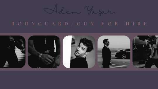
#psa: tag dump post#ch. adem yaşar#ref: adem's background#ref: adem's starters#ref: adem's musings#ref: adem's aesthetic#ref: adem's wishlist#ref: yaşar family#gifs: adem yaşar#fc; berk cankat
0 notes
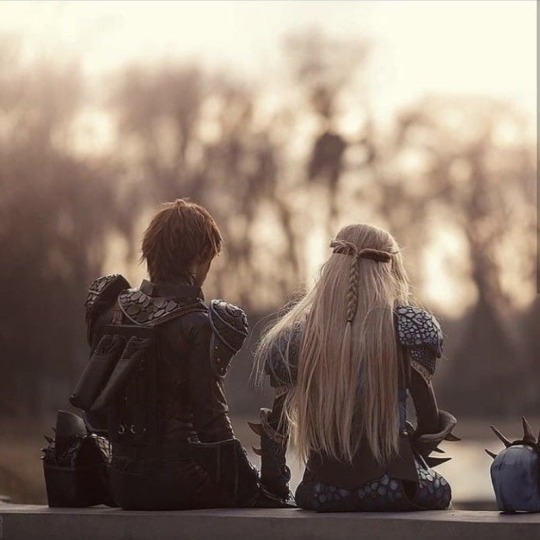
Text

snapshots / who i want to be
#cove’s moodboard#hiccup#hiccup haddock#hiccup horrendous haddock lll#hiccup haddock aesthetic#toothless#berk#httyd#how to train your dragon#httyd aesthetic#how to train your dragon aesthetic#the cove#httyd moodboard#moodboard#hiccup kin#hiccup haddock kin#hiccup horrendous haddock iii aesthetic#how to train your dragon kin#httydkin
344 notes
·
View notes
Text


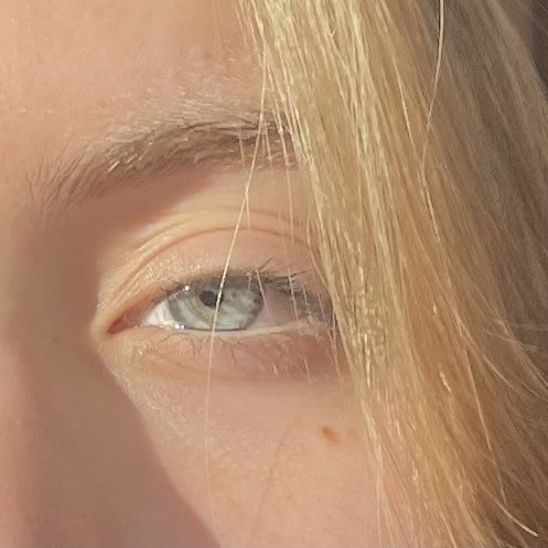
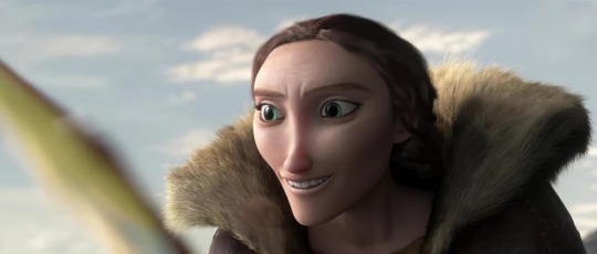
how to train your dragon aesthetics: 2/?
Astrid Hofferson
🪓 ⛈️ ⛓️💥 🩵
“Yeah, it's only fun if you get a scar out of it."
#astrid hofferson#astrid hofferson aesthetic#how to train your dragon#httyd#httyd astrid#httyd aesthetic#httyd moodboard#hiccup x astrid#hiccstrid#astrid and stormfly#stormfly#viking#vikings#viking aesthetic#dreamworks#dreamworks dragons#riders of berk#defenders of berk#httyd race to the edge#httyd rtte#dragons race to the edge#america ferrera#my moodboards
148 notes
·
View notes
Text
Ahh fuck I permanently locked myself out of my old fandom blog
RIP @berks-dragon-trainer I guess lol ¯\_(ツ)_/¯
#berks-dragon-trainer#berks dragon trainer#httyd#follow this blog instead if you want#I don’t post here very often and it’s an aesthetic/personal blog anyway
0 notes
Text
I love it how in the movies and shows, it is never explicitly mentioned that Hiccup and Snotlout are cousins but it is shown throughout the franchise in little moments so accurately that when you tell a fan they are cousins, there is zero doubt. Their whole dynamic screams cousins, whether it be them trying to freaking destroy the other in the funniest ways or caring about the other while still throwing around insults.
That aside, what I really wanted to point out is how similar some of their skills are. A proof they are cousins is that they share some very specific talents that most people on Berk don't have, talents that match in almost a familial manner.
You guys all know Hiccup's perks and personality and talents right? Well, lemme point out some of Snotlout's and see how they match his cousin's.
A strange combination of Loyal to a fault and Rebellious to a fault. This perk doesn't just apply on Snotlout, Hiccup is like this too but in his own way. It depends on the situation and person and their mood most importantly. Hiccup would sneak out to hunt for trolls and go into forest or try and train dragons or sneak out to go on flights when he's not supposed to etc. And Snotlout would trust and listen and have his team's and leader's back even if he doesn't seem to like it at points. He cares about his friends so much (seriously, go watch the entirety of the DreamWorks Dragons series)
Inventive and artistic. Snotlout works at the armoury at the beginning of RTTE, he also invented the sheep launcher. He's also pretty good at stitching. And I'm preeeetty sure he's able to forge his own weapons and armor now same as Hiccup.
Amateur writers who're actually pretty good. Hiccup's narrations are always fun to listen to and they also indicate that he has a knack for being a writer. In an episode of RTTE, Snotlout wrote a book that the gang found to be pretty good. And while Hiccup has artistic skills in drawing and painting and sketching, Snotlout is good at designing and aesthetics.
They both have a strange tendency to go and get hit on the head by lightning. Actually, lightning really seems to love these two.
Interestingly enough, Snotlout is also shown to be pretty persuasive and encouraging to others when needed, whether it be giving a scared kid a peptalk or talking some sense into someone who's being reckless and stubborn.
Tendency to plan something extremely reckless and crazy when there's a time crunch and those plans surprisingly work. Yes, both Hiccup and Snotlout do that quite often.
They love dragons! And yes, I'm aware that by now, the whole gang loves dragons but Hiccup loves them even more. He is obsessed with them and wants to keep them safe, he cares about these creatures so so much! While the other riders love their dragons more than anybody else but not as much as Hiccup, Snotlout cares about dragons almost in a similar way to how Hiccup and Valka do. He sings lullabies to baby fireworms and is so gentle with them. In The Eel Effect, he went into Hiccup mode with a terrible terror (just before he shook the poor guy but that besides the point) and was giving a speech to start a dragon revolution because he appreciates these creatures and genuinely believes they should be treated with full respect
That is all to say, even if it isn't directly told in the movie-verse, it is shown throughout that Hiccup and Snotlout are cousins and both even have some traits and talents in common
#httyd#hiccup horrendous haddock iii#hiccup haddock#snotlout jorgenson#httyd hiccup#httyd snotlout#how to train your dragon#dreamworks dragons#riders of berk#defenders of berk#rob/dob#rtte#race to the edge
381 notes
·
View notes
Text


To see even more Keyblades, check out @KeybladeForge and the discord! https://discord.gg/JV6NFtTA4c
SWAMP GAS -
A Keyblade modeled after the world of DreamWork's Shrek! This keyblade makes your Fire spells a higher tear! The handle and hilt of the Keyblade is designed after Shrek's swamp home, with it's green aesthetic. The shaft of the blade is designed after Fiona's tower where she was held, with the very top having the top of Duloc's castle. The teeth of the blade is formed by Dragon. The token is the iconic Shrek "S".
The World Logo is designed after Shrek's home, his favorite place in the world. The name comes from the plot centering around Shrek's swamp, as well as his gassy nature.
QUANTONIUM-
This Keyblade is designed after the sci-fi nature of DreamWorks' Monsters vs Aliens. This keyblade is designed to increase the damage of combo finishers! The hilt guard of this blade is designed after the containment cells of the government facility housing the monsters. The shaft and teeth of the Keyblade is designed after the meteor contianing the Quantonium flying through space, with a bit of the comet tail forming Insectosaurous' wing. The keychain is designed after BOB, with the token being Insectosaurous.
The World Logo is that of Susan's home town of Modesto. The name comes from the energy that provides Susan her giant form.
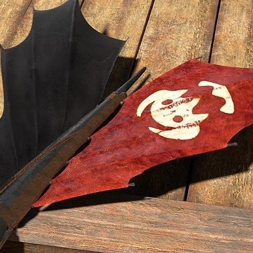
FURY OF THE NIGHT-
A Keyblade designed after the viking style of DreamWorks' How to Train Your Dragon. This Keyblade is designed to give protection against any lightning and fire attacks. The entire Keyblade is inspired by a Vikings' ship with Toothless designs. The top of the Keyblade has the helmet given to Hiccup from his father. The teeth of the Keyblade is designed after Toothless' tail fin. The token is the symbol of that of the Vikings of Berk.
The World logo is the central isles of Berk. The name comes from Toothless' species name: Nightfury.
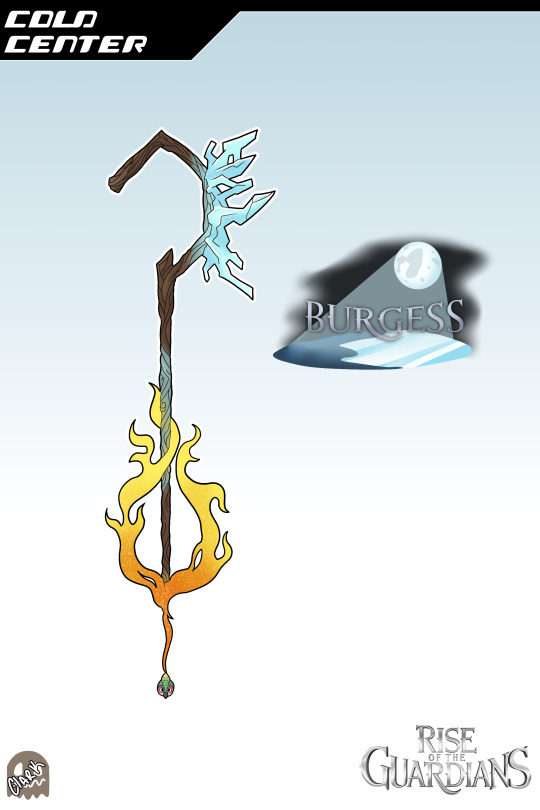
COLD CENTER-
A simple keyblade designed afte the dreams and iciness of DreamWorks' Rise of the Guardians. This keyblade is designed to have high blizzard damage. The shaft and handle of the Keyblade is designed after Jack Frost's staff. The hilt and keychain is designed after Sandman's magical sand. The teeth of the blade is designed after Jack's ice abilities. The token is that of Baby Tooth.
The world logo is that of Burgess, where Jack Frost is from. The name comes from North urging Jack to find his center, as well as Jack being a spirit of Winter.
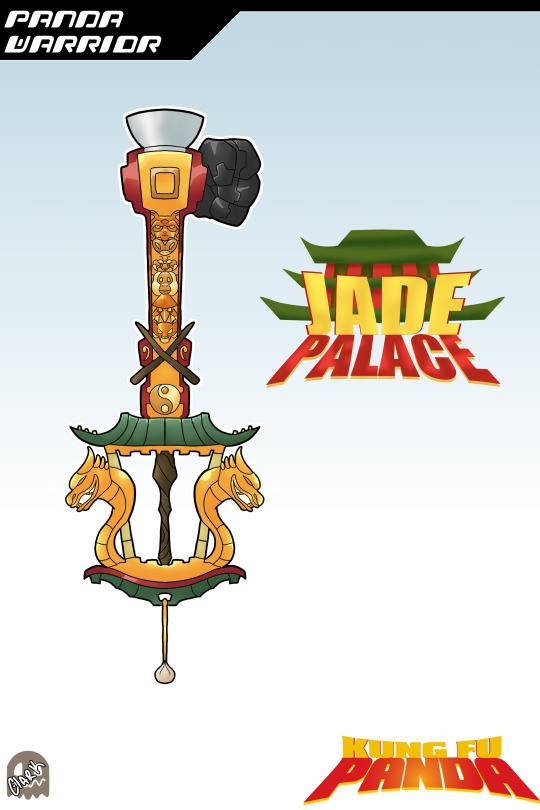
PANDA WARRIOR-
A Keyblade designed after the Jade Palace of DreamWorks' Kung Fu Panda. This keyblade is designed to have high combos and greater effects from food. The hiltguard of the blade is designed after the Jade Palace, with the handle being inspired by Oogway's staff. The shaft of the blade is designed to have the Furious Five designs through it. The teeth is a stylized version of a panda fist. The token is that of a dumpling, Po's motivation.
The World Logo is that of where the Furious Five train and call home. The name is a combination of Dragon Warrior and Po being a Panda.
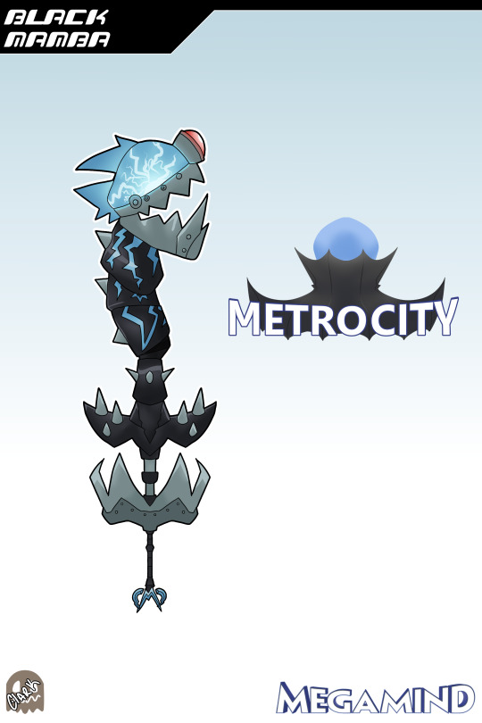
BLACK MAMBA-
A Keyblade designed after the mechanical mind of DreamWorks' Megamind! This keyblade is designed to have high thunder damage. The bottom half of the hilt and teeth of the blade is designed after Megamind's Brainbots, his self-made minions. The top half of the hilt is designed after Megamind's Black Mamba's suit. The shaft is designed after the robot suit of the Black Mamba. The token is that of Megamind's logo.
The World Logo is that of Metro City (or Metrocity), the central city of the movie. The name comes from the special suit that Minion had designed.
#Kingdom Hearts#Keyblades#Crossovers#Shrek#Monsters vs Aliens#HTTYD#Rise of the Guardians#Kung Fu Panda#Megamind
473 notes
·
View notes
Note
Honestly, having HTTYD take place in a post-apocalyptic future makes a lot of sense, it would help explain virtually all of the continuity and historical errors in HTTYD. The style, aesthetic, the fact that the Vikings of Berk seemingly have no idea what's beyond the island despite landing on it less than 200 years ago. Perfect A.U!
YEAH YOU GET IT!! That was one of my reasonings for making this au, LOL!
Also, they're used to it snowing 9 months out of the year and hailing the other three. Hmm. Long winters? The remnants of nuclear winters, mayhaps...? (((thats probably not very accurate tbh LMAO but it's just fun to theorize and conceptualize.)))
83 notes
·
View notes
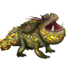
Text
Rating the gang's dragon's mates (as shown by the Rise of Berk game I'm p sure) bc someone has to (also I'm sorry if the images look a lil weird I'm dragging them in bc it's just easier rn and idk what that'll do to them lol)
Okay up first, Stormfly's mate
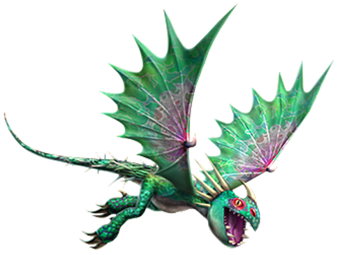
6/10
He's hardly the worst out of all of them, but I'm just not that big a fan of him being so green idk. I like the green and pink together, but I'm honestly not that sure how his colors look w Stormfly's just aesthetically
Hookfang's mate
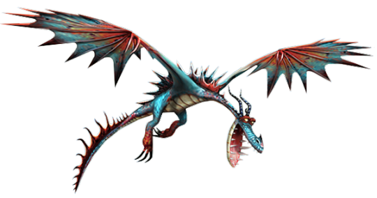
7.5/10 maybe? POTENTIALLY an 8 idk
I bounce between liking and hating the colors, but either way they look nice together. She's making a kinda derpy face but that's a postitive honestly. (Also I doubt this is true bc I'm p sure they have one Monstrous Nightmare model/drawing (depending on whether you're seeing a drawing or a model lol) that they use in game, but the fins on her back look spikier than Hooky's to me and her horns look smaller?)
Barf and Belch's mate(s?)
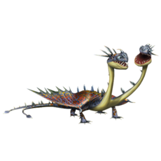
(WHY IS THE PIC SO SMALL???)
5/10
I kinda like their colors, or,, I would if it weren't for the greyish silver that's just kinda everywhere. Idk I kinda associate zipplebacks w brighter colors and I just don't like the shade lol. Also the 'spikes' on their heads just don't work for me (not a huge fan of the spikes on their necks and back being so spaced out and also silver just meh). The little scales on their wings fading from red to orange to yellow is a nice touch though I like that a lot.
Also I just discovered that Barf and Belch are a boy through their mate's fandom wiki?? I was curious bc I've never been sure, so I checked to see what was up w these one's and they're female, so I was like ohhh Barf and Belch must be male, and I went over to their wiki and yeah they are. I just feel like there were easier ways for me to figure that out lol.
Meatlug's mate
3/10
I hate him I hate him I hate him I HATE HIM. I hate that he's like, a greyish green and bright yellow. (I love Meatlug's color pallete, I love how soft and warm it is, this is NOT that) His ear things seem longer too, which I HATE. Also the bumps on his face and tail (which are few and far between for me) just being ORANGE is kinda gross. (I'm not gonna comment too mucch on the texture and stuff of them bc the game isn't THAT detailed and that's FINE, but in the picture they look like,,, pussy???) (Meatlug's, at least in the shows, are more textured and not straight up purrple and shiny idk)
Toothless' mate
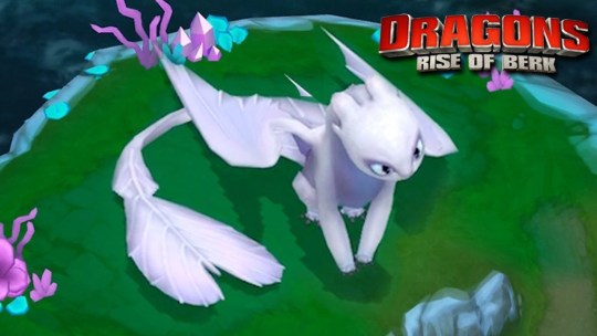
Like 4/10?
I like her tail fin being a different shape, but her ear thingies are too round and short, and I feel like all of her proportions are to softened you know?. Also she looks like she's wearing eye shadow which,,,, :/ (could just be the shadows but idk that's what it looks like) (also, her feet and the way she's sitting she just looks like they're trying to make her very feminine, which is okay, but like paired w the proportions and stuff idk it just feels wrong to me
(I'm joking around and wtv but honestly I like her so much more in the Rise of Berk art style, she's just a little more angular, and it cuts the sparkles and stuff, and she just feels a LITTLE more like what she should've been.)
#stormfly's mate#hookfang's mate#barf and belch's mate#meatlug's mate#toothless' mate#how to train your dragon#rise of berk#httyd#rosie's httyd brainrot
66 notes
·
View notes
Text
The Hidden World Was Aesthetically Disconnected from the Other HTTYD Films: an essay no one asked for
Ok ok I know this is an art blog and I’m going off the rails a bit with this but I think it must be said: HTTYD The Hidden World was not animated in the same style as the other two films, and it has bothered me for a long time. We have all talked at length about the slow but significant dog-ification of Toothless that accompanied his dying character and personality (rip wild catlike Toothless), but I want to discuss the aesthetics of the films as a whole, discounting most changes to character designs themselves (except for one at the end because the light fury is to blame for all of this actually).
But angorith, you may very well ask, how can you say the animation is worse than the previous films when we got such breathtaking scenery as the hidden world and New Berk? To that I reply, the animation isn’t worse, its just not fitting in with the rest of the films.
Let’s take, for example, the first film. The animation style was thoroughly textured and gritty (partially due to technical limitations of CGI in the early 2000s but the animators leaned into it and I think it worked in their benefit due to the fact that they were animating gritty things like dragons and Vikings), creating a stylized but believable world of outdoorsy people and wild dragons. The dragons, specifically, were beautifully and realistically textured, with rough, detailed scales that made them feel believable despite being stylized in the manner of the film. The fur textures on the characters’ clothes were rough, resembling the fur that remains on tanned hides. The wood grain is old and worn, the weapons have nicks and scratches; you can tell the animators worked hard to make everything seem realistic despite technical drawbacks. And that’s not even to mention the beauty and depth in the outdoor scenery.
The second movie continues this trend. You can tell that the textures are more lifelike and that the animation has improved- especially when looking at the hair textures and fluid character movements- but it’s still textured and not over-polished. They aren’t afraid to show wear on objects or characters, they don’t shy away from giving Stoik, Gobber, and Valka age lines, they showcase the effects of riding on the leather equipment, the scars on the human and dragon characters are clearly visible without being too in-your-face, its a stunning and beautifully made piece of animation. But, in my opinion, most importantly, the characters are distinct from their backgrounds. This is seen in both of the first two films, where the distance between characters in the foreground and the scenery in the background is distinct. When silhouetted against the sky, the characters stand out from it instead of fading in to look flat and airbrushed against the scenery. This is largely due to the lighting and shadows being strictly defined throughout the movie. It allows for distinct shapes and clear definitions of character features. I’m no expert and may be speaking a bit from nostalgia, but I think the second film has the best animation of all three.
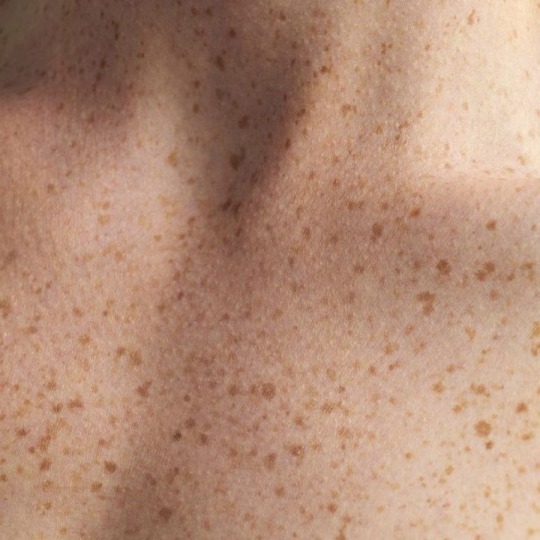
The Hidden World breaks this mold in a way that I found detrimental to the overall style of the film. Characters like Valka, who were once so convincingly animated to look their age, look fifteen years younger and airbrushed into smooth lines. Hiccup’s freckles are less prominent despite his outdoor lifestyle, and overall, despite the beauty of the scenery and the artful composition of many of the shots, the characters don’t have as much weight to them. The beautiful backgrounds in this movie seem like they’re swallowing the characters whole instead of remaining in the background, and I attribute this to what I call ‘the airbrushing effect.’ The shadows on the characters themselves and the boundaries between characters and backgrounds in this film are blurred, which takes away that depth that was so present in the first two movies. It looks like the characters are smushed into the background at times, leaving blurred expressions and less-defined features and boundaries. This isn’t the case in every scene, but it is in many of them, and it has bothered me since I first saw the film in theaters. Some of the textures look amazing, like the armor and dragon scales, but then you look at a character’s face and they look all fuzzy and indistinct, like they’re wearing makeup and dissolving around the edges. THW follows the growing trend of overly-blended animation, which isn’t necessarily bad in and of itself, but when an aesthetic precedent is set for your movies and then the third installment breaks the established rules, it can make that film fit in poorly with the rest of the franchise in a visual manner (not to mention the story incongruities but that’s a talk for another day).
Here are some examples:
In the second film, the boundary between Astrid and the background is distinct, despite her being farther away. Her face shape is more well defined, less round and fuzzy looking. Look at the boundaries around her face and head in the third film. There’s stil a foreground and background, but she looks like she’s blended a little too much into the background. Stormfly’s horns on the left are more jagged-looking, mimicking the texture of a realistic antler or horn, while on the right they’re smoother despite being in closer view.


Similar shots from 2 and THW here, see how much more defined the lines are between hiccup and the background on the left? Even just the features of his face are less clear; the bridge of his nose looks flattened.


Similar lighting from HTTYD 1and THW. The definition here is a bit better, but look at the skin textures. Hiccup looks like he’s wearing foundation in THW. For comparison, look at him from HTTYD 1! He’s got freckles! Don’t take away his freckles!!
Moving back to Berk means Valka must have gotten ahold of some de-aging cream, right?
I can’t add any more photos but hopefully y’all get the idea.
Now the reasons behind this stylistic change surprised me, and then really pissed me off. Its’s this thing’s fault:

I read an article a while back that said that in order for the crew to be able to animate the light fury, they had to devise new animation software for the third film (if anyone can find the article that would be a huge help, I can’t remember where I found it). She simply didn’t work in the established program, so they had to create a different software to accommodate the lighting effects of her sparkles and whatnot. Since the lighting seems to be one of the things that bother me most in this movie, this causes me some (slightly irrational) frustration, and brings me back to the question of why?
Why would you integrate a character whose design is so off-base from the other characters that you had to make new software just to make it work, to the detriment of the entire look of the movie? Wouldn’t that be one of the most clear signs that the character itself does. Not. Fit. The aesthetic of the film? this pisses me off so much. I know I’m irrationally angry about a movie that came out years ago, but from a visual, storytelling, and personal standpoint, I hate the way this turned out.
I’m not saying I hate the the third movie, or that if you like it you’re wrong. There’s so much about the film that I liked, but all the positives are outweighed by my disappointment.
TL;DR: the way that the crew made the light fury not only ruined the storytelling and conclusion to the franchise, but messed with the animation style too, which to me is an unforgivable sin.
Thank you for coming to my bitchy TedTalk
#httyd#httyd 2#httyd the hidden world#thw salt#thw criticism#light fury#httyd thw#toothless#hiccup httyd
242 notes
·
View notes
Text
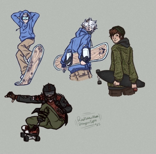
Modern Sk8-inspired AU where American snowboarder Jack moves to a dinky little Canadian town called Berk & meets a reckless, longboard racing Hiccup. Hic ends up getting him into skateboarding & racing, & Jack ends up teaching him to snowboard. They’re both big adrenaline junkies & reckless as hell, but they have fun.
I thought it’d make more sense to make Hiccup Canadian even tho he’s not the Langa parallel, cause his VA is Canadian & I’m far more familiar with Canadian small town vibes lol. Especially mountainous, winter tourism small towns. I also plan to add in Hiccups whole friend group as his racing team & give them a kinda punk aesthetic. Let’s be honest, they’re all little punks, and I’m gonna lean into that, fer sure.
#my art#casually puts Hiccup in my own clothing#the jacket is mine w/ a few patches added#& that particular sweater + a hoodie has been my comfort outfit for the past like 3 weeks#also considering painting the bottom of my longboard to cosplay this 😳#I wish I was good enough to race but I can barely make it 5 blocks before my legs hurt#also both Hic & Roughnut are trans cause I say so#I wanna use this AU to draw little comic snippets and get better at comic things#might write smth? idk it’s been ages since I’ve fpwritten actual fanfic#httyd#hiccup#hijack#au#modern au#jack frost#rotg#coloured sketch#sketch#digital art#frostcup#how to train your dragon#rise of the guardians#fanart#sk8 au#hiccup haddock
233 notes
·
View notes
Last Seen Blogs

lil-sestra
will you ever stop running

blo06
Eye's catchers

plexusi
stars, when you shine

punkerskinhead
Punkerskinhead
blo06
Eye's catchers