#bootstrap sidebar menu
Explore tagged Tumblr posts
Visit Tumblr Blog
Explore Tumblr blogs with no restrictions, modern design and the best experience.
Last Seen Tumblr Blogs


Fun Fact
Tumblr was attacked by a cross-site scripting worm deployed by the Internet troll group GNAA on Dec 3, 2012.
Text
it might have taken upwards of 4 hours between yesterday and today, but I finally got toyhouse to give me functional on-hover dropdown menus <3 exciting times!
#.txt#web dev stuff#<- kinda#i got on-click bootstrap dropdowns working Fairly quickly but what I didn't realise#was that you can't use the bootstrap menus with the hover.#most bootstrap hover menus seem to use jquery or javascript and because i'm working Within toyhouse i can't do that#so that made things a little more complicated ;u;#it also made trying to figure out how other people do things VERY complicated. jesus christ. staring into the abyss.#After ALL of this i think i'm gonna make a collection of snippets. just so other people don't have to deal with this fucking bullshit.#like how to move the sidebar and stuff. because i couldn't find any one place for it and it was really frustrating.#the horrors of working within someone else's spaghetti code are very very real and working with classes and containers you didn't make feel#bad.#i don't enjoy it.#but i am nothing if not hell bent on making things more complicated than they need to be <33333 so we persist!!#this is a lot of effort for a site i don't regularly use and never enjoyed using but like. it's a fun exercise i guess
1 note
·
View note
Text
Perfex CRM Office Theme Nulled Script 1.2.6

Unlock the Power of Your CRM with Perfex CRM Office Theme Nulled Script Are you looking to elevate your Perfex CRM interface to new levels of professionalism and user-friendliness? The Perfex CRM Office Theme Nulled Script is your perfect solution. Designed for businesses and freelancers alike, this stunning theme transforms your default Perfex CRM dashboard into an intuitive, sleek, and highly efficient workspace — all at zero cost. What is the Perfex CRM Office Theme Nulled Script? The Perfex CRM Office Theme Nulled Script is a premium add-on that revamps the user interface of your Perfex CRM system. With a fully responsive layout, clean design elements, and user-centric features, this nulled theme enhances usability and aesthetics without compromising functionality. Whether you're managing sales, leads, clients, or support tickets, this theme adds a polished, office-grade experience that makes daily CRM usage more enjoyable and efficient. Why Choose the Perfex CRM Office Theme Nulled Script? Unlike standard CRM dashboards, this nulled script offers an enriched UI experience that closely mimics professional office software. From its visually appealing sidebar to color-coded statuses and smooth navigation, the theme significantly improves your CRM workflow. Best of all, you can download it for free from our platform without any hidden costs. Technical Specifications Compatibility: Fully compatible with the latest version of Perfex CRM Responsive Design: Optimized for desktops, tablets, and smartphones Framework: Built on Bootstrap for high performance Easy Installation: Plug-and-play integration with Perfex CRM Customization: Minimal coding required for personalization Outstanding Features and Benefits Modern Dashboard Layout: Clean interface design for enhanced readability and navigation Time-Saving Navigation: Quick access menus to important modules Optimized for Speed: Reduces clutter and boosts CRM loading time Custom Icons and Typography: Add a premium touch to your dashboard aesthetics Multi-Language Support: Ideal for global teams and international businesses Use Cases: Who Should Use This Nulled Theme? The Perfex CRM Office Theme Nulled Script is ideal for: Startups looking to create a professional image from day one Freelancers who want a clean and organized client dashboard Agencies managing multiple clients through a robust CRM SMBs aiming to streamline their operations and impress stakeholders Whether you're tracking invoices, generating reports, or managing support tickets, this theme ensures that everything looks great and performs even better. How to Install the Perfex CRM Office Theme Nulled Script Installing the theme is quick and effortless: Download the Perfex CRM Office Theme from our website. Navigate to your Perfex CRM admin panel. Go to the “Themes” section and upload the theme ZIP file. Activate the theme, and you're all set! Need extra flair for your website visuals? Check out our Slider Revolution NULLED plugin — perfect for creating responsive sliders, carousels, and hero sections with ease. Frequently Asked Questions Is the Perfex CRM Office Theme Nulled Script safe to use? Absolutely! All our scripts are scanned for vulnerabilities and malware. Plus, they're updated regularly to keep up with the latest security practices. Can I use this theme on multiple CRM installations? Yes, you can install the theme on unlimited instances of Perfex CRM without restrictions. Will this theme slow down my CRM performance? Not at all. In fact, it’s designed to optimize your dashboard for better speed and responsiveness. Can I customize the theme to fit my brand? Yes, the theme is built with flexibility in mind. You can easily adjust colors, fonts, and layout structures to align with your branding. Is there support available? While this is a nulled version, our community forum offers extensive guides and peer support to help you with any issues. Take your CRM experience to the next level with the Perfex CRM Office Theme .
Download it today and enjoy a high-end CRM interface without spending a dime. Also, don't miss out on optimizing your site with WP-Optimize Premium nulled — a must-have tool for performance enthusiasts.
0 notes
Text
Why is responsive design necessary for your website, and what does it mean?
Numerous devices, such as cell phones, tablets, laptops, and desktop computers, are used to view websites in today's digital environment. This diversity has made responsive design necessary for any website aiming to provide a seamless user experience. In this article, we’ll explore responsive design, how it works, and why it’s essential for modern websites.
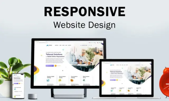
What Is Responsive Design?
The information and style of a website are guaranteed to adjust to the screen size and resolution of the device being used through a web design method called responsive design. Creating a uniform and optimum user experience across all devices is the main objective of responsive design.
Key Features of Responsive Design:
Fluid Grids: Make use of adaptable designs that adjust proportionately to various screen sizes. Flexible Images: Images adjust dynamically to avoid being too large or small on any device. Media Queries: CSS rules that enable specific styles based on screen dimensions and device characteristics.
How Does Responsive Design Work?
Responsive design relies on three core principles:
Scalable Layouts: Websites use percentage-based widths rather than fixed measurements like pixels. For example, a sidebar that takes up 25% of the page will scale proportionally as the screen size changes.
Media Queries: Developers can apply different styles depending on the screen size, resolution, or orientation (landscape vs. portrait) of the device by using media queries, which are CSS techniques.
Flexible Content: Content elements like images, videos, and text are designed to resize or reorganize based on the viewport dimensions.
Why Does Your Website Need Responsive Design?
1. Mobile-First Era: Mobile devices currently account for over 60% of all web traffic. A non-responsive website can lead to poor usability, driving visitors away and reducing engagement.
2. Improved User Experience: Responsive design ensures that users have a seamless experience, whether they’re browsing on a smartphone, tablet, or desktop. Scrolling, panning, and zooming are less necessary. 3. SEO Benefits: Google prioritizes mobile-friendly websites in search results. Responsive design helps you comply with Google’s mobile-first indexing, improving your site’s visibility and rankings.
4. Cost Efficiency: It is less expensive to maintain a single responsive website rather than to create and manage separate desktop and mobile versions.
5. Future-Proofing Your Website: With the growing variety of screen sizes and devices, responsive design ensures that your website remains functional and visually appealing across current and future technologies.
6. Higher Conversion Rates: A website that’s easy to navigate and looks great on any device reduces bounce rates and encourages visitors to take desired actions, such as purchasing a product or signing up for a newsletter.
Examples of Responsive Design in Action
Navigation Menus: Collapsible menus or hamburger icons for smaller screens. Dynamic Grids: A grid-based layout that reorganizes elements to fit smaller viewports. Responsive Images: Images resize or crop automatically to maintain quality and relevance.
How to Implement Responsive Design?
Adopt a Mobile-First Approach: Start designing for smaller screens and progressively add features for larger screens. Use a Responsive Framework: Tools like Bootstrap or Foundation simplify the process with pre-built responsive components. Test Across Devices: Use tools like BrowserStack or Google’s Mobile-Friendly Test to ensure your site looks and functions well on various devices.
Conclusion
These days, responsive design is an essential component of contemporary web development. By ensuring your website adapts seamlessly to different devices, you can enhance user satisfaction, boost your SEO rankings, and future-proof your online presence. Investing in responsive design is not just about keeping up with trends; it’s about creating a functional, engaging, and user-friendly website that caters to the needs of your audience.
0 notes
Text
Avas Theme Multi-Purpose Elementor WordPress Theme v6.6.3
https://themesfores.com/product/avas-theme-multi-purpose-elementor-wordpress-theme/ Avas Theme – Multi-Purpose Elementor WordPress Theme Avas theme is a multi-purpose responsive WordPress theme with lightweight and fewer plugins. Ready to use for any purpose such as Business, Finance, Corporate, Agency, Portfolio, App, Real Estate, News, Blog, Magazine, Cleaning services, Construction, Designs, Freelancer, Wedding, Restaurant, Education, Charity, Shop, Mechanic, Moving, Covid-19 Coronavirus, Resume, Startup, Creative, Architecture, Consultant, Kindergarten, Travel, Insurance, Lawyer, Medical, Hosting, Fitness, Gym, Spa, SEO, Pinterest Style, ICO Cryptocurrency, Crypto News, Photographer, Website Builder, Website Solution, Barber Shop, Driving School, Nice & Clean, Music Band, Chef, Tattoo Parlour and many more. Avas has 48 different demos ready with one click demo install supported so you can choose any of the demos according to your niche. Avas templates are built with a super-fast lightweight Elementor page builder with a drag and drop function so your website will not load heavily. We have added lots of options in the theme options panel with the Redux framework so you don’t need any coding knowledge. AVAS GPL Theme Features (Demo) Built with Redux Framework for easy customization and endless options. Built with Twitter Bootstrap. Elementor Page Builder included is the best lightweight page builder that won’t make your page slow. It has many ready-made templates. You can create a nicer page within minutes. SEO optimized for search engine recognizably. 100% responsive, performs beautifully on all devices. Smooth parallax effect. Beautiful portfolio galleries, optimized for desktop, laptop, tablet, and mobile devices. Google Font, Font Awesome, Flaticon, and Icomoon font icon integrated. Fully integrated Contact Form 7 with CSS Style ready. Responsive sticky header with a menu. Left – Right Sidebar blog layouts. Filterable portfolio layouts to choose of three columns grid, four columns grid, and pagination. Translation Ready – You can translate the theme to your own Language. WPML Ready WordPress theme Customizer support. Custom widgets included. One-click demo install. Mega Menu(no plugin required). Side Menu RTL supported Cookie notice bar without plugin Dark Mode support Server Minimum Requirements: PHP version 7.4 or greater. MySQL version 5.6 or greater OR MariaDB version 10.1 or greater. WP Memory: 256 MB or greater PHP max input variables 10000 max_execution_time: 120 (This needs to be increased if your server is slow and cannot import data.) PHP Post Max Size: 64 MB or greater Avas Theme Change Version 6.6.3 – August 20, 2024 – New: Avas Switcher widget created. – Fixed: The Avas Heading widget alignment option is not working on the responsive view. Version 6.6.2 – August 10, 2024 – New: Immigration Visa Consulting demo released. https://tinyurl.com/avas-immigrationvisaconsulting – Tweak: Sticky Section content width added % option to fix the responsive layout issue. – Fixed: PHP Fatal error: Uncaught Error: Undefined constant “TX_CSS”. – Fixed: Tiktok url doesn’t work. – Fixed: get_page_by_title() deprecated. – Integrated: Fontawesome v6.6.0. – Updated: Twitter new icon X. Version 6.6.1 – August 1, 2024 – New: Avas Grid Elementor widget created. – New: Avas Carousel Elemenetor widget created. – Updated: Redux Framework. https://themesfores.com/product/avas-theme-multi-purpose-elementor-wordpress-theme/ #Multi-PurposeThemes #WordpressTheme
0 notes
Text
15+ Shopping Cart Template HTML and CSS(Free Demo+Code)
Shopping Cart Template HTML and CSS
Hello Coder! Welcome to Codewithrandom with a new blog. Today We will share the Top 15 Shopping Cart Templates using HTML and CSS.
What is a shopping cart HTML template?
A shopping cart is an essential part of any E-commerce or retailer’s website or online platform store, which provides all its services under one roof right from browsing products to placing orders to the payment gateway.
Shopping Carts are used by clients/customer to shortlist their favorite products and lead them or proceed with them.
Related Article – 50+ HTML, CSS, and JavaScript Projects With Source Code
15+ Awesome Bootstrap Sidebar Menu Templates
Here today we will learn to design our own Bootstrap Shopping Cart UI comprising of a payment button along with items shortlisted displayed efficiently.
Training for web developers and IT Trainees to create a dynamic shopping cart interface.
Happy exploring and learning!
Below are the Shopping Cart Template HTML CSS example collections with Free Source code.
1. Bootstrap 4 shopping bag checkout with the order summary
Here You Can See How The Above Bootstrap Shopping Cart Project Depicts The Bootstrap 4 shopping bag checkout with the order summary Implemented Using HTML And CSS.
In The Above-Displayed Bootstrap Shopping Cart Project, We Have For you a Bootstrap 4 e-commerce shopping cart with item summary Using HTML, And CSS.
3. Bootstrap 4 e-commerce shopping cart with plus minus icons
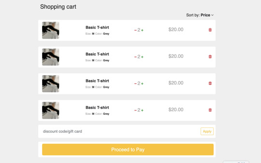
Here You Can See How The Above Bootstrap Shopping Cart Project Depicts a Bootstrap 4 e-commerce shopping cart with plus-minus icons Implemented Using HTML And CSS.
Read also: 100+ JavaScript Projects With Source Code ( Beginners to Advanced)
read complete article and get full source code freely
0 notes
Text
Responsive React Sidebar Navigation
Responsive React Sidebar Navigation
Responsive React Sidebar Navigation Responsive React Sidebar Navigation is a React-based Vertical Navigation with customizing options. It can be used for all types of web applications like custom admin panel, project management system, admin dashboard, backend application. It’s lightweight and compatible with almost all major browsers and devices Features Built on pure React JS,JQuery not…

View On WordPress
#asidebar menu#asidebar navigation#bootstrap dropdown menu#bootstrap navigation#bootstrap sidebar menu#dropdown menu#dropdown menu react#mobile menu#Navigation#react dropdown menu#react navbar#React Navigation#react navigation bar#react sidebar menu#reactjs#sidebar menu
0 notes
Text
Responsive Sidebar Navigation For Bootstrap 5
Responsive Sidebar Navigation For Bootstrap 5
An extension to Bootstrap 5 that lets you create a responsive sidebar navigation (also called drawer navigation, off-canvas menu) on your next Bootstrap project. How to use it: 1. Create the HTML for the sidebar navigation. <div class="side-navbar active-nav d-flex justify-content-between flex-wrap flex-column" id="sidebar"> <ul class="nav flex-column text-white w-100"> <a href="#"…
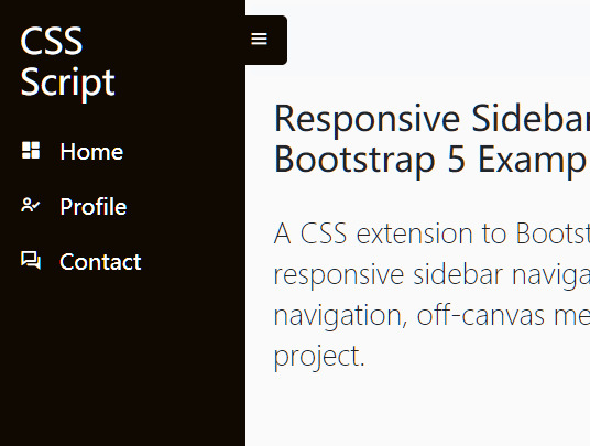
View On WordPress
2 notes
·
View notes
Photo

Responsive Bootstrap 4 Mega Dropdown Menu (RTL Supported)
The standard Bootstrap 4 navigation bar has been expanded with many functions in this responsive Bootstrap 4 mega dropdown menu with RTL support and can be used or replaced for your existing Bootstrap 4 project. You can quickly activate or deactivate functions in the settings.scss file.
Whether a dropdown menu, a dropdown submenu, a full-page menu or a sidebar navigation, this mega menu leaves nothing to be desired.
You can easily integrate pictures, galleries, videos, maps and much more. The mega menu can not only be used extensively on a desktop pc, also you can use it completely on tablets and mobile devices - fully automatically.
Live Preview: Responsive Bootstrap 4 Mega Dropdown Menu (RTL Supported)
0 notes
Text
Fixed Bootstrap 4 Vertical Sidebar Navigation
This is a Bootstrap vertical nav script that helps you build a fixed sidebar navigation using Bootstrap 4 navigation and media objects.
Demo
Download

0 notes
Link
Cartmarket – Electronics, Organics, Shoes, Glasses, Tools, Fashion & Affiliates WooCommerce Theme is our answer to new trends in full resolution designs. Clean, smart, robust and flexible multi-demo & electronics store WordPress WooCommerce theme with vertical and horizontal menu variants – ideal for any type of eCommerce Shop. This theme is brought to you by the same team that developed Electro – Electronics Store WooCommerce Theme, MediaCenter – Electronics Store WooCommerce Theme, Pizzaro – Fast Food & Restaurant WooCommerce Theme and MyBag – Single Product WooCommerce Theme.
Statistics says that much more potential customers are browsing websites in 1920px wide resolution now. In that way using old 1170 or even 980 grid system only, we are losing so much space we could use to show more products on for the user.
Cartmarket – Electronics, Organics, Shoes, Glasses, Tools, Fashion & Affiliates WooCommerce Theme, concept idea is to use as much space in very clean and user-friendly way to show lot of products in various ways.
You can find 7 different shop demos, 8 different Home Page styles, 2 Landing Pages and lot of shop pages to choose your favourite. Any content from each single Homepage or shop page can be transferred into another one very easily.
The design is well suited for Electronics Store, organics stores, retail stores, shoes store, garden tools store, glass store, vendor based marketplaces using plugins like Dokan, WC Vendors or WC Marketplace and affiliate websites using plugins like Prosociate or WooZone. It is built and comes bundled with most of the advanced features available in most popular eCommerce websites like amazon, flipkart, snapdeal, walmart, alibaba, aliexpress, souq, jadopado etc. So if you are an amazon affiliate or want a multi-vendor marketplace for your niche market or a store owner, this theme is for you.
The theme is built on top of Underscores framework. The code is lean and extensible. This will allow developers to easily add functionality to your side via child theme and/or custom plugin(s).
It features deep integration with WooCommerce core plus several of the most popular extensions:
King Composer
Visual Composer ( not included with the theme )
Slider Revolution
YITH WooCommerce Wishlist
YITH WooCompare
Dokan – Multivendor Marketplace
WC Vendors – Multi-vendor plugin for WooCommerce
WC Marketplace
WooZone
WCFM Marketplace – WooCommerce Multivendor Marketplace
Cartmarket – Frequently Asked Questions
I have a silly ( or basic or simple ) question related to Cartmarket, Can …
Please don’t worry about asking any type of questions related to our theme. We are happy to answer them all. Please reach us from the support tab.
How do I update the theme ?
We release updates on need basis. You can check our changelog to see our release history. Please use Themeatlas plugin (included in the theme) to update the theme. We have documented the steps to update the theme here : Updating a Themeatlas Theme
Can I trial your theme before purchase ?
We strongly recommend you to trial our theme before purchase and ask as many as questions you may have before purchase. Please request a trial along with any plugins you wish to test the theme with and we’ll setup a trial for you.
More questions answered here : FAQ
Trial & Dummy Data
If you’d like to try out the theme before purchasing, please email our support and we’ll setup a trial website for you.
Also a word about the Dummy Data. Once you import the dummy data provided with the download package, you will get a website.
This is with placeholders and default WooCommerce products. If you are looking for dummy data similar to demo, please email our support and we’ll provide you with our dummy data.
Please note that the demo has lot of images and it would take sometime to import all images. You need to have higher PHP execution time. However you can simply skip the images if you don’t want images. If your importer stops in the middle it is more like due to execution time out. In that case you will simply have to re-import it again ( don’t worry it will not duplicate ).
Cartmarket Extensions
To take your stores to the next level we have bundled this theme with the Cartmarket Extensions plugin which provides advanced features like :
Advanced Live Search
Youtube like Page loader
Advanced Vertical Menu
Megamenu Dropdown
Products Carousel
Products Carousel Tabs
Products Carousel Tabs with featured product
Products Isotope
Products Tab
Products Card Carousl with Gallery
Deals Carousel with countdown timer
Products Cards Carousel
Product Deals
Products categories filter
Products categories carousel
Advanced Reviews
Accessories Management
Advanced Product Specifications
Store Directory
Cartmarket Features
GENERAL
Easy One click Installation and Setup
Free Updates and one-to-one support
Comes with importable dummy data
Built on Bootstrap 4
Cross-browser compatible
Built with SASS – All SASS files included
7 Shop Demos
8 Different types of home pages
2 Different types of Landing pages
Responsive Megamenu
Supports various post formats and post thumbnails feature.
Includes 17 widgets
WPML Compatible
Youtube like page loader
WOOCOMMERCE FEATURES
Advanced Products Live Search
3 Different layouts for Single Product Pages.
Advanced Reviews
Advanced Specifications tab
Accessories for Products like in amazon
Catalog Mode available.
Shop Page Jumbotron.
Wishlist and Compare from YITH
Brands Carousel
Products Carousel
Ability to display products in 2, 3, 4, 5, 6, 7 and 8 columns
Custom Product Comparison page.
BLOG OPTIONS
3 Different types of layout : Classic, List View, Grid View
Choose from Right Sidebar, Left Sidebar or Full-width layouts
Enable placeholder images
OTHER CUSTOMIZATION OPTIONS
Integrated with Google Fonts
Can choose from FontAwesome icons
Integrated with Social Media
Can paste custom CSS easily.
Import/Export customization options
Demo Pages
Shop Demos
Bright Eye
Bow Market
Garden Deals
Organic Deals
Sports Market
NewLook Market
Home & Landing Pages
Home v1
Home v2
Home v3
Home v4
Home v5
Home v6
Home v7
Home v8
Landing v1
Landing v2
Shop Pages
Categories
Categories 7 Column
Shop Grid 5 Column Extended
Shop Grid 5 Column
Shop Grid 6 Column
Shop Grid 7 Column
Shop Listing Large
Shop Listing
Shop Listing Small with Product Sidebar
Shop Listing with Product Sidebar
Shop Right Sidebar
Shop Full Width
Shop List View Small
Single Product Pages
Single Product Extended
Single Product Fullwidth
Single Product Sidebar
WooCommerce Pages
Shop
Cart
Checkout
My Account
Track your Order
Wishlist
Compare
Blog Pages
Blog v1
Blog v2
Blog v3
Blog Full Width
Single Blog Post
Other Pages
About Us
Contact v1
Contact v2
FAQ
Store Directory
Terms and Conditions
404
Refund Policy We strongly recommend you to trial our theme before purchase and ask as many as questions you may have before purchase. Being a digital product there is a stringent refund policy. Please read about our refund policy here.
1 note
·
View note
Note
I'm not logged into my tumblr account right now but I am an evolutionary virologist who can help with phylogenies! I usually use a program called Geneious but it's pretty expensive so I have some online alternatives that I've tried to link here. What you want to do is take those fastas and make an alignment (mafft(.)cbrc(.)jp/alignment/server/); just upload a .fasta file with all your sequences. Should look like:
>sequence1
ACTATCTGGATC
>sequence2
GTAGGCTTAGC
etc.
Once you have that alignment, use IQTree (iqtree(.)cibiv.univie(.)ac().at) to build your phylogenetic tree, just upload that alignment file from before. You can use Auto-detect for the Sequence type, or change it to DNA/protein/whatever your sequence type is. I think leave the Substitution model as Auto. I also recommend setting bootstrap analysis to "No" and SH-aLRT to "Yes" with 1000 replicates (faster than SH-aLRT).
Then when it's done you need to download it and convert it into Newick format. Again, I do this in Geneious but I found an online conversion tool phylogeny(.)lirmm(.)fr/phylo_cgi/data_converter(.)cgi, just upload your .treefile and click convert to Newick. Copy the result to a basic text editor and save that as yourfilename.tree.
Then you need to visualise it! FigTree is a great tree visualiser, download that for free online, then you can open up your .tree file in FigTree and midpoint root it (ctrl+M or command+M on a Mac works for me, but just dropdown the "Tree" menu in the toolbar and the option is there too). If you like, you can click on the Node Labels option in the sidebar and change Display to value or label (the last option in the dropdown probably), that'll show you the SH-aLRT support we set up earlier (basically shows the percentage of replicates that had that configuration of branches, closer to 100 means you can really trust it's right, be a little wary of lower values, they might be less certain).
I got a bit carried away there, sorry!! For your actual assignment of node distances, the scale bar at the bottom will show you how many nucleotide substitutions per site. Meaning, if the label says 0.5, that length on a branch means there are 0.5 nucleotide substitutions over that distance. Simply, long branches mean those sequences are very different, super short branches mean those sequences are really similar.
I hope this was somewhat helpful, I do phylogenies daily as part of my PhD and this is the method I use so I'm confident in it. If you need any more help, I'd be more than happy to share my email address with you and we can have a chat about it. Am just a very passionate virologist who loves her trees lmao. Good luck!!
Oh that’s what bio python was talking about with the file names 😂 I have to use python but those file names were wild and I was unsure when I was on the bio python cite how to convert but now that I know I can do all the steps
1 note
·
View note
Text
Bootstrap builder versus responsive foundation framer

Bootstrap builder versus responsive foundation framer how to#
Bootstrap builder versus responsive foundation framer update#
Bootstrap builder versus responsive foundation framer code#
Next, select Copy in the Copy Dependent Files dialog box to copy the dependent files necessary for this design into your site. Replace the default File name with index.html. Next, on the Welcome Screen, select the Create tab, then select Bootstrap-Agency under the Starter Templates column. Select Dreamweaver Site in the New Column on the Create Welcome Screen, then define a new site using the folder you just created as the Local Site Folder. Use your File management program to create a new folder. Before you create a new page, however, it’s a good idea to create a folder to store the new page and its related files, such as images or cascading style sheet files then to define a site using this folder as the site folder. You can use either the Welcome Screen or the File menu to create a new page. If you don’t see it, check your preferences and verify that the option Show Welcome Screen is checked, or close any open files and select Help > Welcome. You see the Welcome Screen each time you open Dreamweaver. What do I need?ĭownload the following files: botswana_sunset.psd Step 1 of 8 Create a new page from a Bootstrap template
Bootstrap builder versus responsive foundation framer how to#
This tutorial will show you how to create a page based on a Bootstrap Template. These templates are divided into two categories: Bootstrap Templates and Responsive Starters. Learn how to use Dreamweaver’s built-in templates to create responsive contentĭreamweaver now has several Starter Templates to give you a jump start toward creating web pages that will look great on any size device. Modify the exact output of the topnav.js file to match the markup expected in your particular CSS.Build Responsive Websites with Built-in Bootstrap Templates in Dreamweaver
Bootstrap builder versus responsive foundation framer code#
Write JavaScript code to traverse the site structure information and generate the navigation code, then include the JavaScript code on the layouts, for example: Responsive part) and the hard-coded page navigation for the other pages. Navigation’ parts for the ‘Hamburger’ menu when the page is too narrow (the This is a typical header section, with the logo, the ‘Toggle Hard-coded navigation that would have to be removed from a typical Bootstrap Remove the hard-coded navigation code from the layouts. Update the navigation to replace the hard-coded code in the Bootstrap theme withĭynamically generated code from the site hierarchy.Įdit your local synchronized copies of the theme files. Hierarchy because of the hard-coded navigation in the layout from the Bootstrap When you look at the navigation in the site preview, it doesn’t match the current
Bootstrap builder versus responsive foundation framer update#
You can continue working in the current update or create new updates if needed. Save to save your changes to the current update. The number and type of page layouts depends on the theme associated with your site. Go to the Page Layout field and select a different layout from the menu. To change the layout associated with a page, choose the page in the site tree and click to display the page settings. You can reposition the page in the site tree by dragging and dropping it. To remove a page you don’t want, select the page and click. To edit a particular page, choose the page using the site tree in the sidebar or using the site’s own navigation. To make changes or to use the navigation options in the sidebar, make sure that the Edit switch is set to Edit. If you already have updates to the site, select an update from the list and click. If you enter a space, it’s automatically replaced with a hyphen. Select the site and choose Open in the right-click menu orĮnter a name for the update and an optional description, then click Create.įor the update name you can use letters, numbers, underscores (_), and hyphens (-). You can delete the pages you don’t want and switch the layout on the pages you want to keep to one of the new layouts. When you open the site in Site Builder, you’ll initially see the pages that are in the default site.
0 notes
Text
Dropdown Sidebar Menu Responsive Bootstrap Navigation
Dropdown Sidebar Menu Responsive Bootstrap Navigation
LIVE PREVIEWBUY FOR $10 Dropdown Sidebar Menu Responsive Bootstrap Navigation Scoop Navigation Menu Consist of both Horizontal and Vertical navigation with customize options and themes. It can be used for all type of web applications like custom admin panel, project management system, admin dashboard, application backend, CMS or CRM. Its lightweight and compatible with almost all major browsers…

View On WordPress
0 notes
Text
Responsive Sidebar Using Bootstrap 5 Offcanvas
Responsive Sidebar Using Bootstrap 5 Offcanvas
This is a responsive and mobile-first off-canvas sidebar navigation built using Bootstrap 5’s offcanvas component. How to use it: 1. Load the necessary Bootstrap 5 framework and Bootstrap Icons. <link rel=”stylesheet” href=”/path/to/cdn/bootstrap.min.css” /> <link rel=”stylesheet” href=”/path/to/cdn/bootstrap-icons.min.css” /> <script src=”/path/to/cdn/bootstrap.min.js”></script> 2. The HTML…

View On WordPress
0 notes
Text
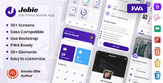
Jobie - Job Portal Mobile Template & PWA
Jobie – Job Portal Mobile Template & PWA
LIVE PREVIEWشراء مباشر$24 Template Features Use Bootstrap PWA Ready 30+ Inner Pages 20+ Elements Google Fonts Sidebar Menu User Profile Easy to customize You will get HTML Files JavaScript Files CSS And Sass Files Proper Documentation Font “Poppins”,sans-serif Support Send your queries on https://support.w3itexperts.com for any issues or problem you are facing regarding this…
View On WordPress
0 notes
Link
Last Update 12 July 17 Created 1 June 17 High Resolution Yes Widget Ready Yes Compatible Browsers IE11, Firefox, Safari, Opera, Chrome, Edge Compatible With WPML, WooCommerce 3.0.x, Bootstrap 3.x Software Version WordPress 4.7.x, WordPress 4.6.1, WordPress 4.6, WordPress 4.5.x, WordPress 4.5.2, WordPress 4.5.1, WordPress 4.5 ThemeForest Files Included PHP Files, CSS Files, JS Files Columns 4+ Documentation Well Documented Layout Responsive Tags blog, cafe, cuisine, custom-colors, custom-header, custom-menu, elegant, pizza, post-formats, recipe, responsive, restaurant, right-sidebar, sticky-post, translation-ready
0 notes