#caslon
Text
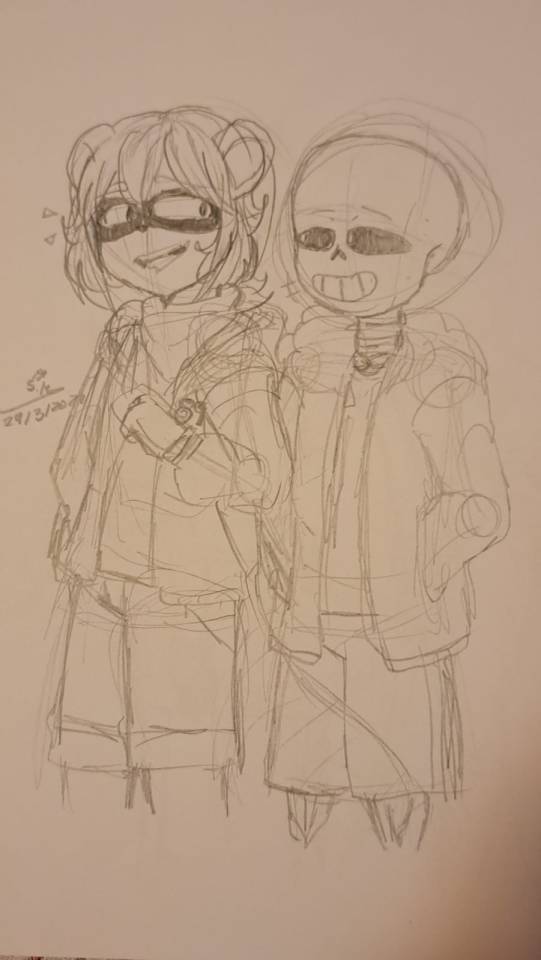
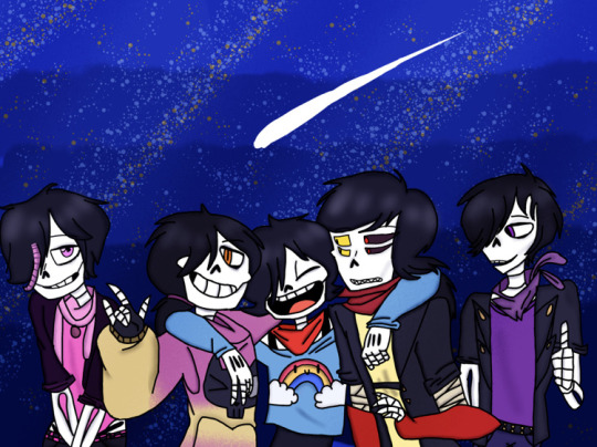
Doing a remake of my undertale OC and Sans the Skeleton BECAUSE I CAN 😡😡💥💥💥
The first picture is from this year, and the second is the old one from 2022. I love their friendship 😭💗

(The blush is out of embarrassment cause Sans told a bad joke, so bad that it made both of them embarrassed yeah yeah, they're homies)
#2023#undertale#sans#sanstheskeleton#undertaleoc#oc#caslon#caslontheraccoon#doodle#drawing#sketch#chile#duo#support#undertale sans#stellita_uwu#support artists
13 notes
·
View notes
Text


—Bitsie Tulloch as Lois Lane wearing this Caslon Plaid Tunic (in Navy/Pink; Sold Out), Superman and Lois, “Of Sound Mind”
#Lois Lane#Superman and Lois Wardrobe#Lois' Closet#Caslon#3.06 Of Sound Mind#Bitsie Tulloch#Superman & Lois
10 notes
·
View notes
Text
/ooc
Hello! I'm choosing to revive the papyton kiddos! Impact, calibri, Trajan, and also caslon! As well a my OC Amor, I'll be making character sheets for all of them that I'll post on here.
I've noticed that ever since madhattey quit tumblr the papyton kiddos have died out, so here I am reviving them!
Send asks! Asks for things you wanna ask the papyton kiddos, or things you wanna ask me!
All art is not mine unless specified, the original idea for this au credits go to Madhattey.
#papyton#papytonkids#undertale au#undertale#underswap#swapfell#underfell#underlust#calibri#impact#trajan#caslon#Amor
30 notes
·
View notes
Text
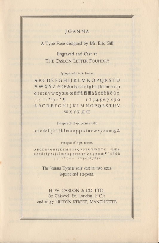
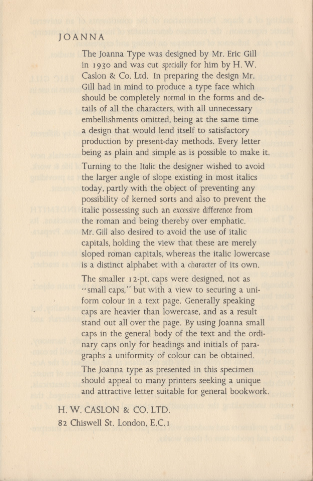
gill’s joanna
named for eric gill’s 2nd daughter, joanna (more often called joan), gill designed the joanna types in 1930, & had them cut by caslon in 1931, for use at hague & gill—printing office of eric gill & son-in-law rené hague (married to joan)—in two sizes, 8 & 12 pt (1st image). joanna is interesting for having lightly-sloped italic lower case that shares a single fount of lower-cap-height capitals with the lower case roman; this configuration is reminiscent of venetian renaissance practice—both scribal & printerly. in 12pt, gill provided a set of capitals fuller in height for display. first showing of joanna was gill’s An Essay on Typography [sheed & ward, london, 1931]—vide ‹eric gill on typography›. as indicated at the specimen close (lower, 2nd image), caslon offered joanna for sale to other printing offices, as well. monotype adapted joanna in 1937 in a range of sizes [uk monotype 478].
images are front & back of the folded single-sheet joanna specimen, issued by h.w. caslon co., london; n.d. but presumably 1931.
for examples of gill’s vision with joanna vide ‹work & property› & ‹gill’s trousers›. for comparison with digital joanna vide ‹life drawing›.
1 note
·
View note
Text
Carol Twombly
Carol Twombly is an American designer who worked at Adobe Systems designing fonts for them. She contributed to the design of some of the most popular typefaces still in use today such as Myriad, Adobe Caslon and Trajan.
Below are a few examples of her font designs:

0 notes
Text
You made me ink!
View On WordPress
1 note
·
View note
Text

FYI the new fonts used for TTPD are as follows:
Big Caslon CC (for the title)
Nitti Typewriter (for the font used on the website/preorder)
Just in case you're a font-head like me!
376 notes
·
View notes
Text


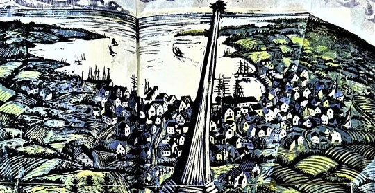
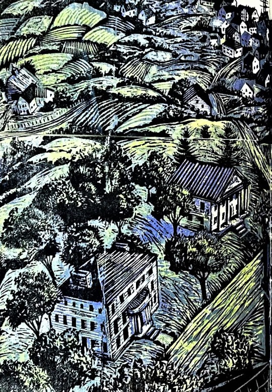

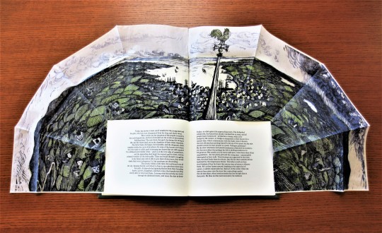


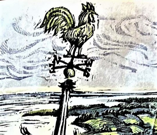
It's Fine Press Friday!
This Friday we turn once again to our recent donation from the estate of artist and book collector Dennis Bayuzick with an edition of Nataniel Hawthorne's 1837 short story from Twice-Told Tales, Sights from a Steeple, printed here by Ronald Keller in 1988 at his Red Angel Press in Bremen, Maine, with an original 38 x 18-inch color wood engraving by Keller, printed in an edition of 100 copies signed by the artist/printer.
The engraving sits folded above the text, but can unfold and surround the text when opened. Hawthorne writes as an observer sitting in his lofty perch of a steeple in a New England seaport, presumably Salem, where he describes the surrounding countryside, distant sea, and gathering storm clouds. The text was printed in hand-set Plantin type, with Caslon titling, on Frankfurt paper, with the wood engraving printed in green, blue, and black on Sekishu paper.
View other books from the collection of Dennis Bayuzick.
View more Fine Press Friday Posts.
#Fine Press Friday#fine press fridays#fine press books#fine press printing#wood engravings#color wood engravings#Nataniel Hawthorne#Sights from a Steeple#Ronald Keller#Red Angel Press#Plantin type#Caslon type#Franfurt Zerkall paper#Sekishu paper#Dennis Bayuzick
57 notes
·
View notes
Text

Norm Architects
#Norm Architects#architecture#design#studio#Copenhagen#minimal#minimalist#wood#interiors#products#portfolio#typography#type#typeface#font#Euclid Circular B#Adobe Caslon Pro#2024#Week 11#website#web design#inspire#inspiration#happywebdesign
17 notes
·
View notes
Text

Thank you to @emilybeemartin and @thekenobee for this delightful idea to live rent free in my head forever <3
(does anyone else want this on a t-shirt or sticker? i do my own laundry no one can stop me from wearing this)
13 notes
·
View notes
Text
I made a hand written font last night and got it downloaded into my Word processing software and I'm so happy with it. Now I can make so many more zines without exacerbating my tendonitis!!!!
#yayyyy#improvise adapt overcome#i called it BK Hand Caslon#because its basically my handwritten impression of antique caslon font#zines#art#typography kinda#live from the musain
8 notes
·
View notes
Text
sometimes you just have to accept the kind of person that you are (woman who thought “wow I really like this font! looks like Adobe Caslon Pro!” while reading a book and then specifically looked it up and realized that she was exactly right about what font it was and felt very self-satisfied)
#adobe caslon pro supremacy actually#it’s a peak font#but also I’ve never felt lamer than recognizing my favorite font in a book#and feeling pride that I was right about it#loser font nerd <- me
11 notes
·
View notes
Text
In character page for Zizi and Taron. The box is open. Feel free to send asks!
3 notes
·
View notes
Text
just wasted 3 hours digging through fonts trying to find a match for a typeface used by a french publishing house in 1898 in a particular manuscript and came up with zilch
#the garamonds are too wide#amsterdam garamot is closer but not quite#the caslons have the wrong capitals#Dante was briefly promising but alas Also Wrong#it's definitely an old-style typeface but probably one that was never digitized#nobody has the sexy capital P and D that this typeface has
5 notes
·
View notes
Text
how come you don't get to use fun fonts in cover letters
6 notes
·
View notes
Last Seen Blogs

bleepity-blooper
Yellowfang enthusiast

girlwholovesturtles
The Armada of Love

godivaomoruyi
GODIVA OMORUYI

boatmediatourney
boat media tournament!