#cel-shade
Text
Teehee~ <3

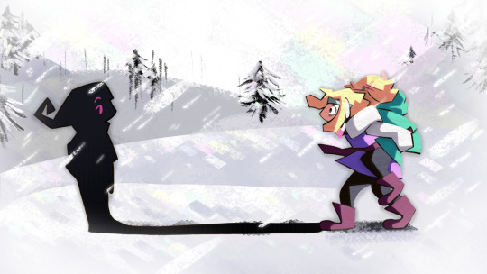
Cel-Shading commission for MJJ4Mayor 🍑-- thank you!! ✨
teehee ~❤️
#commission#cel-shade#digitalart#gay art#gayart#male art#bara art#muscle#muscle art#male muscle#muscular#beefcake#hunk#furry#anthropomorphic#anthro#bara furry#furry art#anthro art#werebeast#charr#guildwars2#serve
8 notes
·
View notes
Text

korrasami
#korrasami#avatar korra#korra#legend of korra#asami sato#the legend of korra#lok#cel shade kinda bc im lazy
3K notes
·
View notes
Text

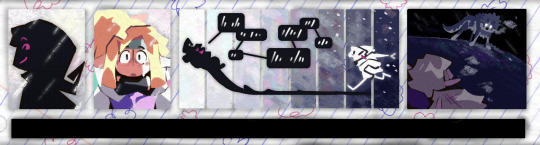
can you guys come get this yaoi before i get shy
#omniscient reader's viewpoint#orv#kim dokja#yoo joonghyuk#joongdok#trying to get better at drawing ship art.... waaaaa#also i wanted to do lineart bc i havent messed around with lineart/cel shading in super long#lineart is smth i do actually find fun but simpler cel shading is smth i also wanna work on soo#anyways... runs away
2K notes
·
View notes
Text
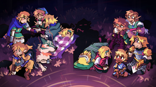
did a piece in the LU server's gift exchange ! something of survival and reunions and smug little shadowguys
#LU5thGiftX#linked universe#lu#shadow lu#four lu#vio lu#green lu#wolfie lu#twilight lu#warriors lu#wild lu#legend lu#blue lu#red lu#wind lu#hyrule lu#sky lu#time lu#dragon doodles#I really hope my giftee ends up liking it! this was my first exchange and I was somewhat stressed but I'm pretty happy with the end result#ended up doing several art things I haven't done in ages AND tried several new art things. was a pretty good experience! :D#why did I decide to manually cel-shade those patterned blankets though. something's wrong with me LOL#next day bonus fun fact this was initially conceptualized as an animated short. this obviously didn't work out xD but the heart's there
2K notes
·
View notes
Text
Cel-shading that I use for robots
if you have bad color sense like me and want to trick ppl into thinking that you know what you're doing.
1-2 : Base and Shadow

3 : Highlights
4-5 : Reflective Light & Contrast/Flow

note: every detail should come together nicely and lead your eyes to the main focus :)
6 : Touchups

Continue refining the shadows/highlights. Add interesting textures/ artistic effects.
I personally love duplicating the lineart, put it on overlay (with color) and move it slightly off-center it creates nice highlights on areas with seams when you don't want chromatic abberation.
1K notes
·
View notes
Text
The Evolution of Style in 3D Film
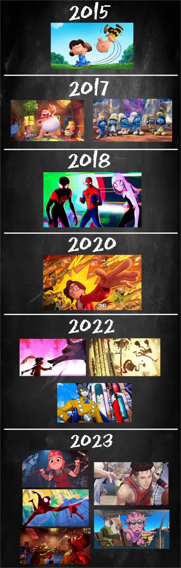
I wanted to show how much theatrical animation has changed in the last few years. Incorporating 2D elements has always been attempted but was rare and went unnoticed. That’s not the case anymore with more adopting it, anime too!
#animation#Sony animation#blue sky#dreamworld#nickelodeon#the peanuts#captain underpants#the smurfs#into the spider verse#spider-verse#the mitchells vs the machines#puss in boots#the bad guys#dbs super hero#nimona#spider-man: across the spider-verse#tmnt mutant mayhem#the first slam dunk#sandland#cel-shaded#art direction
6K notes
·
View notes
Text

A bit of a coloring experiment after my friends sat me down to watch Hazbin Hotel with them. I really wanted to use similar style I used for backgrounds of my thesis film - object heads, evil shadow dwellers and slight 60's liminality included, haha!
#hazbin hotel#hazbin alastor#hazbin vox#radiostatic#staticradio#I'm way used to cel shading these days hah#but these two gave me visual vibes I had to try out
1K notes
·
View notes
Text
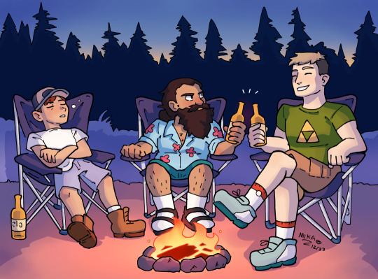
I don't care what Ryoko Kui says, this is my modern AU
Once again continuing my tradition of biting off more than I can chew and still swallowing, I've returned from my pre-holiday slump with a 3-character scene and no remaining fear of God.
I'll be honest, this was a huge struggle. Partially because I have no idea how to draw camp chairs, partially because for whatever reason I just couldn't seem to get the colors right. I can still see a few mistakes here that I'm really kicking myself over. But I had fun, and that's the most important part.
#dungeon meshi#dungeon meshi modern au#dunmeshi#delicious in dungeon#laius touden#chilchuck tims#senshi#dungeon meshi fanart#my art#digital art#soft cel shading#artists on tumblr
1K notes
·
View notes
Text

Another sticker for DexChillViber - the water was fun to work on!
#DexChillViber#DexterLion#Dexter#lion#anthro#anthropomorphic#furry#feline#inked#colored#cel shaded#commission#sticker#hot tub#flirting#flirty#grin#grinning#smiling#digital art#my art#mane
305 notes
·
View notes
Text
Comm - Beanz (Cel-Shaded)

encore commission for Beanz -- Thank you✨
plump 🍑 in color \o/
#commission#cel-shade#digitalart#gay art#gayart#male art#bara art#muscle#muscle art#male muscle#muscular#beefcake#hunk#furry#anthropomorphic#anthro#bara furry#furry art#anthro art#werebeast#charr#guild wars 2
16 notes
·
View notes
Text
post before i temporarily lose consciousness


#pokemon#anonslash’s once in a blue moon outings#pokemon oc#dusknoir#i gave up on the first one#I don't rly like the second one tbh#Cel shading isnt my thing#still fun doing the lineart tho#art#my art#am I tagging right#sorry for the inconsistencies#I am in dire need of rest#might ramble on his lore when I wake up#deoends if I wake up on the right side of the bed
264 notes
·
View notes
Text

mansplain✨manslaughter✨manwhore✨
#literally cannot remember the last time i did any cel shading... so here we are. he's thinkin' about stuffz#art#assassin's creed#ac2#ezio auditore#m1nty fresh hall of fame
361 notes
·
View notes
Text

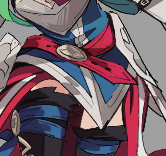
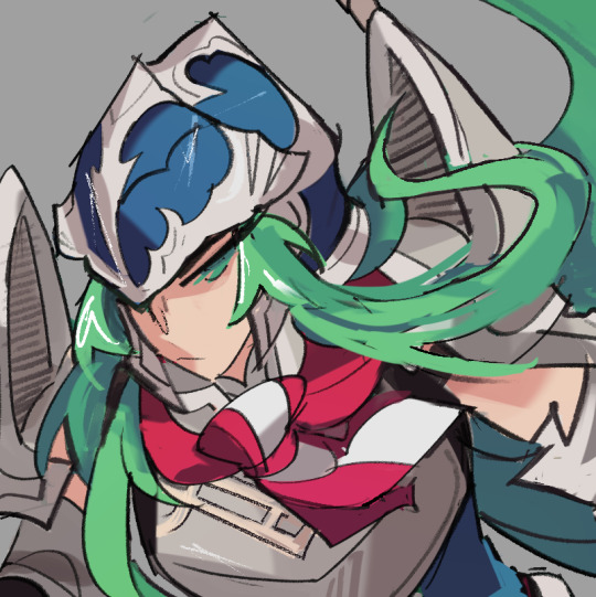

If I was a princess of Jötunheimr, I guess I'd be pretty huge, huh? Stronger too. Neat.
A spin on Nephenee's new resplendent, but as her Halberdier class from FE10! thank you to @labmemb3r for commissioning another Nephenee!!
#me too nephenee#art#artists on tumblr#illustration#tellius#nephenee#fire emblem#commissions#fan art#cel shaded#radiant dawn#fe10#fe9#labmemb3r
2K notes
·
View notes
Text

I needed a new icon for myself so I did a quick flustered cel shade portrait of Taco hat Copia 😂💖
Because that’s my all time fave outfit hehe
#the band ghost#ghost band#ghost band fanart#ghost bc#ghost band fandom#popia copia#papa copia#cardinal copia#copia art#papa emeritus fanart#papa emeritus 4#papa emeritus iv#papa terzo#terzo#papa emeritus lll#tasshart#tobias forge#cel shading
1K notes
·
View notes
Text
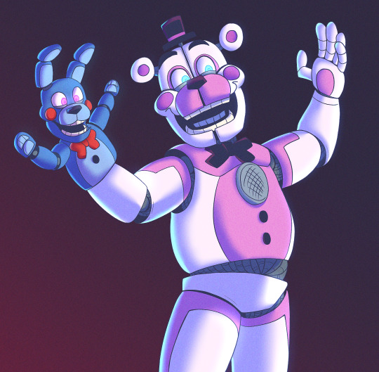
in honour of help wanted 2 releasing i had to draw the best silly duo!
#finally rendered a drawing....havent done it in months KJSDGFG#am sort of proud of it!#i like doing soft cel-shading#BRING ON THE CLOWN MUSIC#have actually listened to the carnival minigame theme while drawing them....it fits them so well#art#fnaf#help wanted 2 spoilers#fnaf help wanted 2#fnaf sister location#funtime freddy#fnaf bonbon
920 notes
·
View notes


Last Seen Blogs

honey-bees-and-thunder-storm
Untitled

vassil1
Без названия

mx-mayura
🦚Mayura🦚

centalaw
Centalaw

mvanderkoelen
Mitchell´s meestal mooie dingen