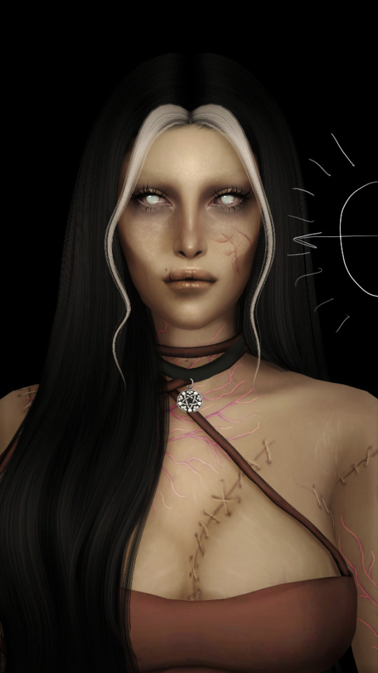
#change the hair color to black and voilà
Text
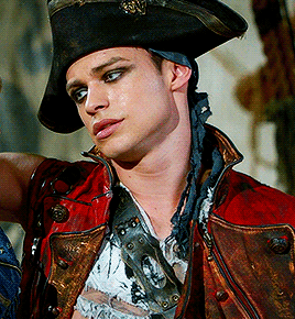
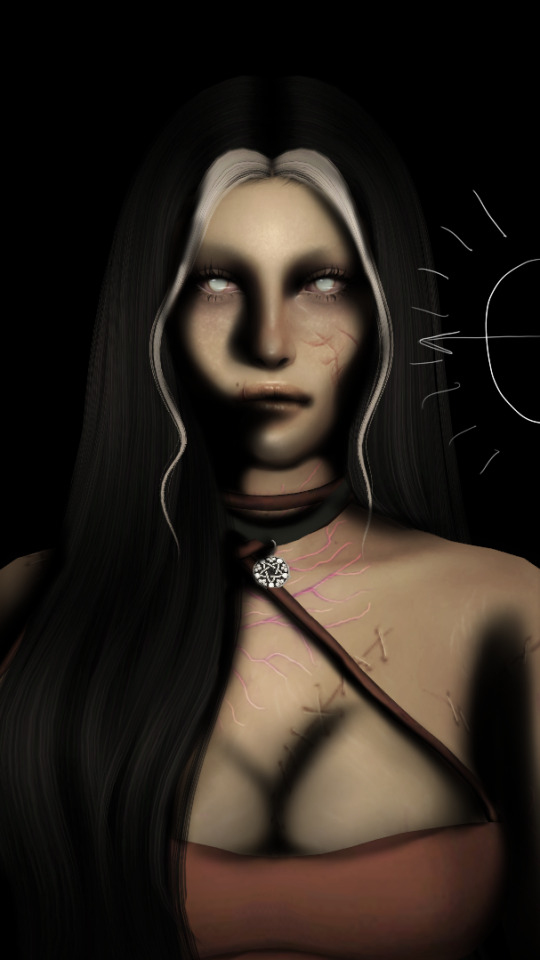
Tell me that this isn’t Lady Dimitrescu

#excuse me for the bad editing#but that’s beside the point#change the hair color to black and voilà#larissa weems#gwendoline christie#brienne of tarth#principal weems#lady dimitrescu#alcina dimitrescu#re8 village
585 notes
·
View notes
Text
The Hook & The Flame
Harry Hook x Male Reader
After Dizzy styled Y/N's hair with blue and red dye in the sink, modeling the colors after his dads Hades and Chernabog, she painted his fingernails light blue with skeleton designs. At last, Dizzy spun his chair around so Y/N could see the finished product. He got out of his chair as he peered into the broken fragments of the mirror on the wall.
The top of his hair was colored blue to look like flames, matching his dad's own literal fire of blue hair. The sides were red as blood like Chernabog's eyes, but mixed in with his own natural hair color. Before he wasn't sure if he was his parents' kid anymore, but now there was no denying that he was a villain through and through.
Dizzy smiled at him. Admiring her work as she eagerly awaited his comment on whether or not she did a good job.
Y/N looks at his reflection and winks. "Hey, there I am."
"Voilà!" Dizzy cried in excitement. She threw her hands out to emphasize how excited she was.
"Voilà." Y/N reached into his pocket, pulling out a couple of dollars for her.
She looks at the money in disbelief as she looks at Y/N, astonishment on her face. "For me?"
Y/N nods. "Yeah, you earned it."
Dizzy takes the money and giggles in excitement as she walks towards the cash register. Her sense of accomplishment and peace didn't last very long. A swashbuckling young man named Harry Hook, son of Captain Hook, entered the salon. He held a glinting silver hook in his left hand. Harry wore a black hat, a long leather red coat, black pants, and a grayish wife beater underneath the red coat. He made other pirates shiver in their timber's, with a handsome face and beautiful blue eyes that were just as blue as the ocean. That made him both dangerous and beautiful at the same time.
"Fork it ower ye runt." Dizzy froze as Harry grinned down at her, hand outstretched for the money. The young girl begrudgingly handed over the money she had just earned to the Scottish sounding pirate.
Harry looks down at the old car hood that acts as a desk for the cash register as he taps it with his hook. "And the rest of it." He demands. Harry had yet to notice Y/N, too busy robbing Dizzy Tremaine of all the salon's money.
Dizzy goes and opens up the cash register as Harry puts her money that he took in between his lips and teeth, holding it tight as she gives him everything inside. "Hmm… Thank you." Harry turned to leave.
"Give that money back, Hook." Y/N said.
Harry stopped, whirled around and grinned when he saw Y/N. "Well, well, well, what a nice surprise."
"Hi, Harry." Y/N told him. "Still running errands for Uma like a good dog, or does she actually let you off your leash and let you keep what you steal?"
Harry strolled towards him, flashing a dangerous smile and waved his hook around. "Just wait until Uma hears you're back. She is never going to give you back your territory." He looks Y/N up and down, licking his lips like a hungry cat. The pervert.
"Oh, well, that's okay. Because I will be taking it back. Preferably from her cold dead fishy bitch fingers." Y/N grins.
Harry grins too as his hook brushes against Y/N's collar bone. "You know, I cuid hurt ye." He promised in a whisper as he continued to tease Y/N with his silver hook. The son of Hades and Chernabog grabbed his wrist and spit out the gum he had been chewing and stuck it on the tip of Harry's hook. "Not without her permission I'll bet." Harry chuckled as he placed the tip of the hook to his lips and opened up his mouth as he stuck the piece of gum inside.
"You know that I prefer princes now to dirty pirates, right?"
"Ahh, yes. You and Prince Beasty."
"I am going to need Dizzy's money back."
Harry gets closer to him and smiles down at him. "Why dinnae ye come ane get it?"
It was an unspoken challenge. To see if Y/N was still a child of the Isle or if Auradon had changed him in more ways than one. He got close to Harry. So close, that he could see the blues of his eyes shiny like the sun reflecting on the water in the morning. "If you insist."
He pulled Harry down by his coat and connected their lips together. It wasn't a sweet kiss like with Ben. He tasted like chocolate chip cookies and innocence. Harry was different. He was salty and just a bit of seaweed slime. It was familiar territory between them. Two Isles boys who were more about lust and fucking than love and passion.
Harry pulled back and grinned. "A knew ye still found me hot."
He held out his hand for Harry. "Pay up."
The pirate looked at his outstretched hand and smiled once again. "Now A have tae pay for yer services?" He hands him the money. "Best thin A iver spend."
"Go on. Go fetch."
Harry chuckled, walked towards the door and knocked the knick knacks off the register and bowed to Y/N. "Until next time, Duckling." Y/N handed Dizzy back her money as she sighed.
"Great, more sweeping."
#x male reader#male reader insert#male x male#descendants#harry hook#harry hook x male reader#thomas doherty#Thomas Doherty x male reader#villian kid reader
448 notes
·
View notes
Text
shading and lighting tutorial!
this was requested by an anon. a little before we start! i use procreate on my ipad pro with an apple pencil. unfortunately procreate is the only program i know but i imagine similar features exist in other programs as well. i feel like i need to say that i am in no way an expert on shading and i know it's not always accurate. also if you end up using this tutorial in some of your edits please feel free to tag me, i would love to see it! if i've missed something or if i explained something badly don't be afraid to ask me about it. okay long post ahead!
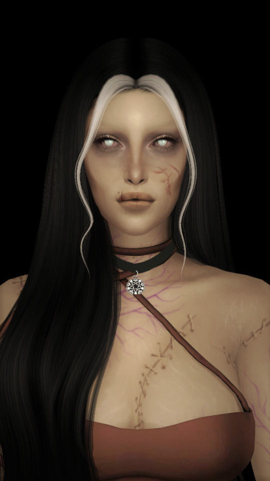
so i'm going to just make a little simple edit of my girl. this is a screenshot taken from cas that has the sunscreen filter on it from the built in windows photo editor on 20% intensity.
now i've added my normal little touch ups that i usually do, eyelashes, catch lights and highlights as well as touching up her scars. everything is painted with the soft airbrush except for some highlights that are painted with the 2B compressed charcoal brush. before adding highlights however you should figure out where you want the light to come from. i've drawn a little ugly sun for you to see where i've placed my light.
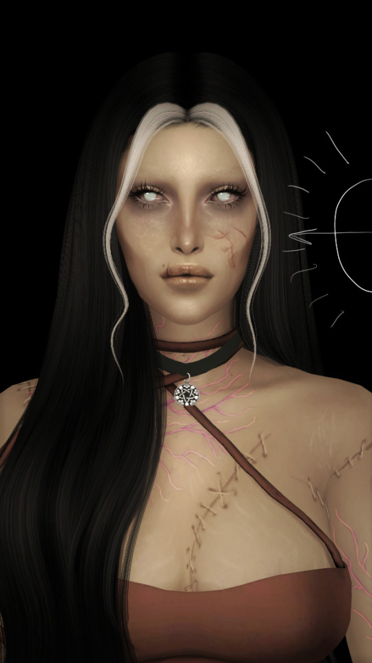
now i use the soft airbrush and paint with black where the shadows would be. if i would have fixed up the hair (which i didn't for this one because it's my least favorite part and i didn't have the energy) i would have made sure to make the shadow layer behind the hair ones since i think it looks better if the hair isn't shaded the way the face is. then i blend all of the black out with the smudge tool with the soft airbrush so it looks a little softer.
then change the layer to soft light and change the opacity to 60% and voilà! you have soft shadows! if some shadows still look to harsh for your liking just go back in with the smudge tool a little more.


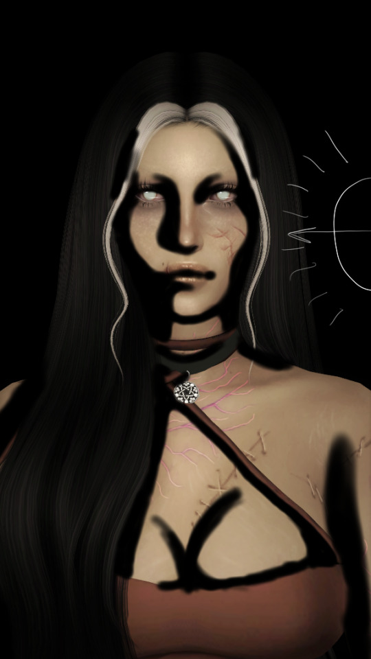
now do a layer on top of everything and kind of circle the part you want lit up the most with black again, smudge it and set the layer to soft light at 60% opacity.


this step is not a must, i don't do it very often anymore but if you want some extra color or light you can do this. choose a color you want your light source to be. i tend to feel like intense colors look the best. paint it where you want the light to come from, then use the gaussian blur tool until your satisfied.
now you can leave it in the normal layer setting or play around a bit with different ones until you find something that you feel fits. for this one i decided on using the difference layer setting on 70% opacity.


a step i always almost forget is shading the eyes! to do that you just repeat the normal shadow process. paint it black, smudge and put the layer to soft light on 60% opacity. it adds so much, i highly recommend this step! now you're done with the first part. now save it as an image and start a new canvas with that image.


if you want to use gaussian, motion or perspective blur now would be the time. i didn't for this one but i almost always do. this next step is also totally optional. we are going to use chromatic aberration in the displace setting on 90% opacity and slightly pull it to the side. then use the normal chromatic aberration between 5-10%. it just adds a lot of fun and weird color that i just love and makes the edit look so much more alive. then use sharpen, i usually do 10-15%. and after that use bloom. my edits are almost always dark so i use a lot of it. i think i did 35% for this one to give it a little glow. then use noise. my go to is 3% on max octaves. then go into hue, saturation, brightness and change the saturation to 55% (you can do however much you want but these are my go to's) and brightness to 49%.

now go into curves and play around. i always make the gamma brighter but the colors i play around with so much.

completely optional again but i've recently started to add a gradient map, especially instant or noir. for this one i used noir on 20%. and that's it, we are done!
before/after.
hopefully this is understandable and helpful. have fun!!
128 notes
·
View notes
Text
replica dior scarf 20
Replica Dior Scarves On The Market
They had been minimize and formed like architecture, on strong foundations that molded women and “freed them from nature,” Dior stated. Rather than rationing, his ladies wanted reams of cloth and 19-inch waists enforced by wire corsets, and the style world concurred. The following is the final introduction about these imitated Dior scarves. They are made of excessive quality material, and the sample and styles are trendy sufficient, making them virtually similar as the real variations. Ms Kelly – who has the same measurement feet because the Queen – wears within the monarch’s handmade new footwear beforehand to ensure they are comfortable when first used.
Lovely silk scarf by Christian Dior in pink and orange colours that includes geometric design print. On 1stDibs, discover an exquisite range of vintage Christian Dior clothes, jewelry, handbags and different items. Most individuals put on a scarf or scarf when winters arrive and temperatures begin to drop to maintain themselves heat. The stunning Dior scarves and shawls are stunning style equipment which not solely look elegant but attract all consideration towards the outfit.
The large shearlings at Alyx and 4SDesigns are certain to gain traction, as will the queer stylings of GmbH and Fendi. The style audience is altering, and the individuals who analyze it and encourage it have to change too. Let’s see what carries into the womenswear season this month. Be inspired by our collection of books from design, fashion, images and our world renowned exhibition catalogues.
The monarch’s neatly curled hair, pristine black or white gloves, black patent Anello & Davide loafers and her trusty black Launer purses have remained staple elements of her look. Our Dior Scarves, are available at the best wholesale prices and in an enormous variety of types, sizes and designs. Choose from the epic leather-based collection to the beautiful monogrammed canvas.
With years of expertise in making Dior ... Shop our extensive vary of designer footwear, we now have one thing for everyone. All gadgets on REBELLE are checked to make sure their authenticity and high quality.
Christian Dior and Dior are the identical. replica dior scarf The former refers to the founding designer of his namesake style home, Dior. For days if you need your accessory to present your type, this Christian Dior stole is perfect. It comes with a display of the brand's coveted monogram. Dior’s assortment definitively declared that opulence, luxurious and femininity had been in. His skirts may have 40-meter-circumference hems, and outfits could weigh up to 60 kilos.
On REBELLE, quite a few model merchandise can be found including the beautiful Christian Dior gloves. I posted that Christion Dior scarf on Ebay at a beginning bid of $48.00 and instantly received a lot of attention however only one person bid on it. I thought that was strange however wasn't too nervous about it.
Signatures or logos additionally add value and if you don't have a tag then you could have the brand and that helps a lot. However, it's pretty simple to print a brand or signature on one thing when you have the instruments. The Dior brand consists of a fairly simple font so if somebody wanted to copy it they could achieve this quite easily.
Dior has no standard designs for scarves and cloths but rather many different patterns with quite so much of colors. One such design is known as the "Mitza”. This is a silk scarf within the type of a ribbon. Another design, Carré, is a square cloth. One of those ways is sporting it as a bow which could be seen commonly on actual trendsetters, fashion bloggers and celebrities. The scarf is folded till it is straight. Then the headband is wrapped around the neck and the same is finished with the laces. Voilà, any scarf wearer immediately look fashionable.
After he happy his parents by studying to become a diplomat, he invested all of his time working in a gallery. Later he was requested to work with a quantity of well-known style designers however Christian had his personal imaginative and prescient. wikipedia scarf In 1946, he launched his personal label, which to this day remains to be loved by millions.
0 notes
Text
My yearly list of Eurovision songs after the first impression (I mean, for like, half of them. I heard snippets of some songs.). Judged on music videos, because...if I only listen to the songs on Spotify, my eyes get bored. :’)
(oh, and don’t talk to me about iceland’s placement, I know this might be unpopular)
X. Belarus
Fuck Belarus, all my homies hate Belarus. Not even going to grace them with a rating.
Norway (TIX – Fallen Angel)
...no. :( And it’s not even because Keiino didn’t win, I just wholeheartetly hate this song. And I’m kinda sorry to TIX, because he seems like a cool dude and his stage outfit is absolutely hilarious, but oh my god do I hate this song with an absolute burning passion.
Poland (RAFAL – The Ride)
eye emoji mouth emoji eye emoji – well, this is a non-qualifier if I’ve ever seen one. Can we just...skip this?
Belgium (Hooverphonic – The Wrong Place)
Nap time! This song annoys me. I cannot explain it, but it gives me a headache and my whole body is revolting against this song. I am not kidding. Objectively, I don’t even hate it, but there’s just something about it...that makes me go...hnghgng…
North Macedonia (Vasil – Here I Stand)
eye emoji mouth emoji eye emoji ver. 2 – I am not trying to sound mean, but does North Macedonia do any music that is not dramatic power ballads? I’m serious. (And I don’t like it, sorry. :((...except for the high notes, I like them. When he can hit them live.)
Estonia (Uku Suviste – The Lucky One)
This (the music video)...is soft porn. I am slightly scared of Uku. I don’t know why. But, uh...this is better than last year’s song? Still, it wouldn’t qualify under my watch, whoops.
Georgia (Tornike Kipiani – You)
He stopped yelling angrily at the microphone. :((( Nah, but this isn’t my thing. It’s great that they are doing their own thing, it’s just not really my thing...it also reminds me of a song I know, damn.
Austria (Vincent Bueno - Amen)
He looks like a german youtuber. I don’t know hich one, but he looks like one. I also canot tell if he’s 18 or 38, lol. (For some reason he also reminds me of Alex Albon, which is even weirder.)...oh, uh, the song? Idk, I don’t care for I. It’s fine.
Spain (Blas Cantó – Voy A Querdarme)
Confession: I’m probably the only person who actually doesn’t like the sound of Spanish all that much. Whoops. Apart from that though, I’m not the biggest fan of this song. Can’t really say more about that. Meh.
The Netherlands (Jeangu Macrooy – Birth Of A New Age)
Listen: I really like the tone of this voice. It’s great. I am not a fan of the song. There’s something just very off about the loud percussions (?) in the background that make me go absolutely crazy when listening to this. My sensory-overload-prone ears hate it, and I’m sorry...the part before the last chorus on the other hand I love. The whole song could have sounded like that and I would have loved it. (...and I can’t unhear “You are my broccoli – You know my broccoli!” ;-;)
Azerbaijan (Efendi – Mata Hari)
Whenever I see Efendi, my brain still goes “Cleopatrrrrra!”, oof. This song sounds like a song I know. Which...is super unprecice, but I genuinely don’t know which one. I do like that they kept the weird pre-chorus thing from Cleopatra (and reference the song later on), but I must say that I liked Cleopatra more...but it’s a party song, so I think it will be fun on stage!
Romania (ROXEN - Amnesia)
I didn’t like her song last year, I don’t enjoy this all too much and I’m kinda sorry but also...I don’t want to apologize for my taste in music, lmao. I want her hair though. Give me her hair.
Denkmark (Fyr & Flamme – Ove Os Pa Hinanden)
Ring ding ding, native language bonus. This is also way more fun than I thought it would be, hah. VERY retro, but I don’t hate that? :D (this and sweden really aren’t any different in terms of how much I like them)
Portugal (The Black Mama – Love Is On My Side)
I can appreciate this. I just wish it was in Portuguese, honestly. I don’t really know if I like the English for this song. That being said, I don’t know if you can make these very specific tones (you know what I mean) in portuguese without it sounding super off, so…
Ireland (Lesley Roy – Maps)
Okay, you do you Ireland. :D
Israel (Eden Alene – Set Me Free)
This exists. :D
Cyprus (Elena Tsagrinou – El Diablo)
Cyprus came to party, and I can’t be mad at that. I just don’t know why everybody in the YouTube comments loves this SO MUCH that they are sure that it will win if it gets the jury votes. I don’t think it’s as good as Fuego or She Got Me were, but maybe I just have no taste in party music. I don’t party. (Only if you got a 2000s playlist and some iced tea.)
France (Barbara Pravi – Voilà)
FRANCE sending a BALLAD? In MY Eurovision? It’s more likely than you think. It’s good, objectively. Personally, I don’t really care for it all that much and feel like I already know it.
United Kingdom (Embers – James Newman)
A good, modern song? In my british eurovision song? What happened on the Isles over quarantine? Are you guys okay? Did you find yourself? Have you taken your last breath (breath!) and looked at your past results? I’m impressed enough to put this relatively high, wow.
Serbia (Hurricane – LOCO LOCO)
*adore delano voice* party! Oh, and native language bonus...for a party song! I’m...impressed, actually. I cannot decide wheter I prefer this or Hasta La Vista, but I think it’s this one? The flows smoother, if that means literally anything.
Bulgaria (VICTORIA – Growing Up Is Getting Old)
*shrugs* I think a lot of people will like this. And I get that. I think I even understand it...yeah. I didn’t like her song last year either. It’s just personal preference, I think. I just want to have fun during Eurovision, hah.
Finland (Blind Channel – Dark Side)
Finland: FUCK YOU!!!
Germany: Fuck you. <3
That’s all I’ll say, we know how the Finnish are, this is not surprising, lmao. (And I’m one of those children that grew up on Rammstein, so I legally cannot dislike this.)
Croatia (Albina - Tick-Tock)
Tick-tock, can you hear me go tick-tock? My heart is like a clock, I'm steady like a rock-...oh wait, wrong tick-tock! Still, really enjoy this song’s chorus – I actually enjoy it so much that it makes up for the utter loss of interest I experience once it’s over, chrm.
Sweden (Tusse – Voices)
I mean...let’s be honest, it’s a generic swedish pop song. It sounds like every other Swedish entry, and I think that bothers me. I know, that sounds kind of...weird, looking at my choices higher up in the list, but...meh. I think this will easily qualify for the Final and place high, and I am totally okay with that. It’s just not...what I wanted, I guess? :D (and i’m sorry but as a german-speaker I cannot get over the name “tusse”) (oh, and tusse seems to be super cool)
Albania (Anxhela Peristeri - Karma)
Oh, we’re going to war in 130 A.D.? Fine, let me just pack my spear and- oh, Albania has already sent a singer? Ah, well, might as well give up and just vibe.
Czech Republic (Benny Cristo - omaga)
This sounds fun. Not a winner or anything, but fun. I’ll probably still be on Twitter when he’s performing, whoops.
Slovenia (Ana Sklic - Amen)
Wait, there’s TWO songs called Amen? And why do I actually kinda like this? Oh well, might as well just accept it. (Her voice though...mhmmhmhm…yes please)
Iceland (Dadi og Gagnamagnid – 10 Years)
We just vibin’. I liked Think About Things more, but I’m very much biased here...because I’ve known that song for a year now. But this is still very good, and very on brand. (And I understand like...half of the lyrics, but I am okay with that.)
Australia (Montaigne - Technicolour)
not australia flexing at all of europe that they can hold big gatherings! D: oh, but I like this way more than last years song. I feel like Montaigne can show her GREAT voice way better in this song. (Even though her outfit and the sound of the song reminds me of the UK song that had...a dude run on the stage. I can’t think of the word for it right now.)
Malta (Destiny – Je Me Casse)
Destiny’s voice is just….wow. This is very different than All My Love, but it’s fun. The topic of the lyrics kinda remind me of Toy, and I like that…..I don’t really like the music video (especially the dancers in the colorful dresses? idk), but I’ll just ignore that.
Germany (I Don’t Feel Hate - Germany)
Confession time: I actually actively enjoy this song. Everybod is shitting on it, but it’s FUN and it has a good message, and Jendrik seems like the nicest dude ever and...it doesn’t deserve all the hate it’s getting? It’s completely self-produced and just fun. Stop being mean. :(
(...also someone on youtube said “pewdiepie” and I can’t unsee that now so fuck you >:((...no, no I don’t feel hate, just rethink your life choices)
Moldova (Natalia Gordienko - SUGAR)
What in the “Eis.de ist in der Kiste” is this music video? And I thought I would absolutely hate this song, but I actually don’t mind it all that much. It’s actually fun. Oh no, I’m splipping, someone catch me, aaaaaahhhhh….(and that poor cake dude. Is this song about cannibalism? Does she want to eat him?)
San Marino (Senhit – Adrenalina)
Catch me hum the chorus of this song at least once a day...but honestly, without any malicious intent: what the actual FUCK san marino? This is so much better than Freaky, and even though I do not believe for one second that this will win, the simple outragiousness of bringing Flo Rida to Eurovision deserves attention. (Bringing someone like Flo Rida to ESC sounds more like Scandinavia/Bulgaria, doesn’t it?)
Russia (Manizha – Russian Woman)
Not gonna lie, I miss Little Big, but at least they are sending something that’s at least as weird. I love that. Russian Rap is cool as fuck anyway, so I’m fully here for this...but I’m glas this song doesn’t have a music video, this just has to be a live performance. (Oh, and another strong woman!)
Ukraine (Go_A – SHUM)
I’m SO glad Go_A are back. But, let me be completely honest: I know why they had to change the lyrics, but I still liked the first version better. BUT I feel like the new one will grow and me and it will climb one or two places, because the Instrumental just slaps SO HARD. (Makes me feel like putting on a Cybergoth outfit and start dancing at a German industrial park, lmao.)
Latvia (Samanta Tina – The Moon Is Rising)
Does this count as my guilty pleasure this year? I loved her song last year, and this sounds similar, so...I like this too. It sounds modern as fuck (well, for Europe, you know) and I can definitely...”vibe” with that. I genuinely really enjoy this, and I don’t know why. (Even though I prefer last years drop.) A lot of “strong, independent women”-songs this year, and I’m not complaining.
Switzerland (Gjon’s Tears – Tout l’Univers)
Just so we’re clear, this and Italy share the exact same spot. I just cannot compare them at all. Gjon’s voice just takes me hostage throughout this whole song and won’t let me go. And everything that isn’t english/is in the countries offical language immediately gets plus points from me. As if this song needed them anyway.
Lithuania (The Roop – Discoteque)
Aaaaaand...dance break! Good, I just love them so much, it’s not even funny anymore. And I’ve been singing this song randomly since it came out. I can’t stop. It has burned itself into my brain. Let’s dis-co-teque right at my home! *waves arms around with no sign of coordination*
(and does anyone else feel like he’s serhat, just with a different alignment? Like, they are both chaotic, but serhat is chaotic neutral and he’s either chaotic good or chaotic bad, it really depends on the way he looks at the camera)
Italy (Maneskin – Zitti E Buoni)
Italy delivers, as they do every year. Not only do I really like this song (it is very much my genre), THIS is an aesthetic I can get behind! Knowing Eurovision, I doubt it will win, but damn if it won’t be super fun! (I am so glad this won Sanremo, hah.)
16 notes
·
View notes
Note
your gifsets for outer banks are amazing! would you ever be willing to share your coloring for it? it looks so beautiful and natural for such a terribly hard to color show!
Thank you so much! Well since my original account was deleted, you can’t see but I used to gif a ton of a show called “From Dusk Till Dawn” that was extremely yellow, so I have a lot of practice. I don’t have any of my psds saved since I color every set from scratch which I would totally recommend! I used to use a base psd a lot back in the day (like 3 years ago wow I’m old), but coloring your sets every time from scratch will help you improve so much faster. I included some tips below and included some things I don’t normally do that other gif makers usually do.
Coloring a yellow scene is pretty similar to how you’d color anything else. Before trying to adjust the yellow, go ahead and brighten the gif and apply contrast to your liking. I know a lot of gifmakers use the auto tool on curves, I honestly normally don’t. It rarely makes things easier or look nicer for me, and if I do use it, I use it on an already pretty neutral scene.
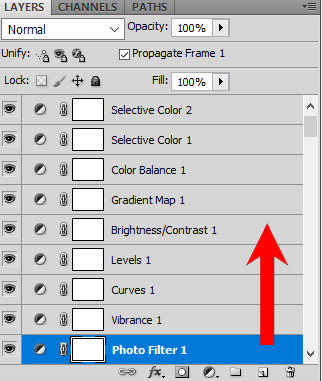
I’ll color a gif along with my tips, to show you how I color things. i start off every gif with a vibrance layer on the bottom (don’t know why, but makes sense to me? LOL), curves, levels, brightness/contrast, gradient map. Almost always in that order. Another thing personal to how I color is I usually take away from the contrast of the gift with the brightness/contrast level.


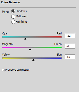
Then I go ahead and add color adjustments, and I start off with a color balance. Color balance is going to do the most work. As I mentioned above, edit the highlights first. This is how the gif looks before I’ve even touched midtones or shadows, and as you can see, it already looks much better. For yellow scenes always move towards he cyan and towards the blue, and again don’t be afraid to push these adjustments pretty far.

After I work on the shadows first, and edit the midtones last. Here are my settings for this particular gif. Usually when I get to midtones I’m trying to make sure things haven’t gotten too blue.
After color balance I recommend the gif be almost to your liking. Don’t rely on selective color, as I’ve found to get better results with color balance. Next I add a new selective color layer and adjust the neutrals. I honestly keep these adjustments around -15 through +15, and I don’t ever touch the blacks.


I’m pretty much finished with this gif at this stage. Lastly I’ll add a new selective colors layer and adjust individual colors, like if I want his shirt more blue, or his hair to stand out more, if it’s a female you can adjust magenta to make the lips appear more pink, etc. This honestly changes every gif and is up to how you want it to look. But one thing I always do is change the whites to add more blue. I have this setting on almost every gif I make regardless if it’s a yellow scene of not.


Here’s the gif after I’ve adjusted the rest of the colors and voilà, the gif is complete. I truly hate coloring this scene, so I picked this on purpose LOL.

“My gif still looks like shit, help?” If you’ve done everything above and you still think the scenes to yellow, you can add a photo filter at the bottom of your adjustment layers.
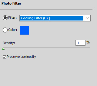
I think this gif looks fine without it, but keep the adjustments between 0 and 25%. I use this as a last resort but it can sometimes help. I find photo filters to work better with adding warmth to cool toned scenes though. Also, remember to always put your adjustment layers on top of one another. Here’s what mine looked like for this gif.
If you have any more specific questions, I can always try and help you, just send them my way. Also remember this is just how I like to color my gifs, everything is a personal preference. There's no right or wrong way to color anything.
8 notes
·
View notes
Text
everything has changed part 2
Summary: (Y/N) working on a mission with Steve Rogers, Bucky Barnes, and Natasha Romanoff.
Warnings: There is a bit of French used in this, but I translated it for you.
Pairing: Steve Rogers x Reader
Word count: 2,215
A/N: Sorry if this one is shit, my mind was kind of all over the place writing this one, but I hope that it is good to you guys. Let me know what you think. Also, this is the last part of this, so what happens next will be left up to your imagination 😉
Part 1
The next morning you woke up, feeling a little off. You weren’t sure where the strange feeling was coming from, but something deep down inside of you felt weird. You were sitting on your bed, staring off in thought, trying to figure out what it was that made you feel weird. It wasn’t until there was a loud knock on your door that you tried to shake the feeling away. “Come in.” You offer. “Hey, can we go over the mission really quick? I’m not going to make it to the briefing meeting, something came up.” Nat said walking in. “Yeah, of course.” You nod your head. You trusted that Nat would be back and ready, in her disguise, by 6. You gave her the run-down of the mission, making sure she knew that she needed to be in disguise and that she had to match Bucky, as he was her date. She nodded when you finished, understanding everything, having done missions similar to this many times before. “You okay?” Nat asked when you finished, “You seem off.” “Honestly, I don’t know, I feel really weird right now,” you admitted. “Like how?” Nat asked, putting a hand to your forehead to make sure you weren’t catching something. “Not physically, I just have this odd feeling, like I forgot something or something tonight is going to go wrong. Maybe I should cancel the mission and we should go after this guy another day.” you shrug. “No, don’t doubt yourself. You’ve been working on this mission for months, no one knows it better than you. It’s not that… are you sure you’re not nervous about being Steve’s date? Even if it is fake?” Nat was always in on trying to set you two up with Bucky, but she was never as forward as Bucky was about it. “Well, last night something weird did happen. When I was at the gym, he came up to talk to me and I mentioned that Bucky wanted me to go out with a friend of his. I, of course, didn’t mention a name. But instead of really saying anything he just went back to the punching bag, then not even 10 minutes later he punched it clean off. Maybe I’m worried that Steve is in the wrong mindset right now and that he’ll blow our cover?” Nat shook her head, “It’s obvious that he was jealous. You didn’t say who, he probably didn’t think it was him, and he got jealous. He’ll probably be fine today.” “Jealous? I doubt it, Nat. Anyway, hopefully, this feeling goes away.” You shake your body like you had chills, trying to get the feeling out of your body.
After the briefing meeting, all of you went into a different conference room where the stylist had set up. “(Y/N), sweetie! It’s so good to see you! Tony didn’t tell me you’d be one of my clients today.” She came over to hug you. “Hey Angelica, I didn’t realize you’d be helping us today!” You smile at her as you pull away from her. “What can I do for you guys today?” She asks, looking over what she has to work with. “This is Bucky,” You motion to him, “We need a haircut, like this…” You pull up a picture on your phone. “And a clean shave, that should make him almost unrecognizable.” You smirk. “As for Steve here… do you have any like 24-hour hair dye, we could dye it a darker color like black or brown. Then maybe some hair gel and fake glasses.” You shrug, not really sure what to do to make Captain America less recognizable. “Then me, I trust you to work your magic.” You wink. “I have just the thing for you, sweetie,” Angelica said to you.
It was about 5 o’clock when all three of you got done with your complete makeovers. Bucky now had hair like he did back in the ’40s, had a clean shave and was in a sleek black tux. Steve had a brown temporary dye in his hair, it was styled similar to Bucky’s with some gel, with a pair of thick-rimmed black glasses and a sleek black tux. As for you, you had gone from having (your hair length) (your hair color) to having hair down to your butt with bleach blonde and caramel highlights throughout it. She had put loads of hair extensions in your hair with the different streaks of color in it. She did a light face of makeup, making it complement your features nicely. You were in a beautiful floor length blue, sparkly gown. She had given you a dress with a slit in the leg, knowing you’d want to have a gun strapped to your leg. It was a perfect disguise. All of them were perfect, you barely recognized the lot of you. “Wow, you look… amazing” Steve says to you when Angelica finished up with you. You blush, feeling it quickly spread from your cheeks to your ears and neck. “Thanks, you do too. Barely recognize you.” You say. He really did look amazing. The dark hair contrasted his baby blues beautifully. Looking at him alone made butterflies burst in your stomach, but him telling you that, made everything in you feel like it was on fire. Bucky cleared his throat, bringing your attention to him. “Oh. my. gosh. Bucky! You look amazing!” You say running over to him and lightly touching his hair, as to not mess it up. “Thanks (Y/N)” He blushed a little. “Wow, look at us.” You say looking around at the three of you, “We all look so different. You did amazing Angelica, I expected nothing less. Thank you.” You give her a quick hug goodbye and you all head to the weapons room to load up on items that you could easily conceal in your not exactly mission friendly outfits.
There was something off with Steve, and you hadn’t failed to notice. He became very quiet after you guys left the conference room where Angelica had set up. “Hey (Y/N), can I talk to you for a second?” Bucky said, pulling you to the side. “What’s up?” you asked, working on putting your gun holster on your leg. “Steve’s jealous,” Bucky said without a hint of doubt in the statement. “What do you mean he’s jealous? Jealous over what?” You asked confused. “The way you reacted to my disguise compared to his.” Bucky shrugged. You scoffed at the idea, “You know this is the second time someone has told me today that he is jealous. Why would he be jealous?” “Because he likes you! You’re way too blind to see it apparently, but it’s there. It’s also really obvious that you like him too, so just do something about it already.” “I do not!” your voice rises an octave when you try to defend yourself. “Nat told me that you felt weird this morning, you were clearly nervous because you have to act like you’re dating Steve tonight. You like him. Someone who didn’t have a crush on him wouldn’t care.” Bucky shrugged, saying it like it was the most obvious thing in the world. However, you stayed strong to your word. “I do not like him as any more than a friend, end. of. discussion. Barnes.” you stomp off to finish putting your weapons on.
Nat had arrived right before you guys had gotten on the plane, ready to go with weapons and disguise. You all went through the fight with little conversation other than talking about the mission that Nat just got back from. When you arrived, you landed the plane at a track a good distance away and drove the rest. You went in two separate cars, goings strictly as couples, not as a group. Steve and you didn’t talk at first in the car, sitting in a sort of awkward silence. “Hey, Steve… If something happens tonight, I just wanted to let you know that…” You were trying to find the words to tell him. While you didn’t want to admit it to Bucky or Nat because you couldn’t stand to see the smug looks on their faces as they say I told you so, you owed it to yourself and Steve to admit it to the both of you. “We’re here.” The driver said, cutting off your thought. “Thank you,” Steve nodded, getting out of the car and holding his hand out, to help you out. He then sticks out his elbow to allow you to wrap your arm around his. You gladly do so, it feeling almost natural to be that close. “Bonjour, Monsieur et Madame” (”Hello, sir and madame”) The man standing in the entranceway greets. Steve froze because he didn’t really know French, luckily you knew enough to get you through the night. “Bonjour” (”Hello”) you reply, faking the best French accent you could. “Avez-vous vos invitations?” (”Do you have your invitations?”) He asks. You smile, look over at Steve and whisper, while still smiling at him “Invitations” Steve nodded and smiled to the man, pulling the invitations from his jacket and handing them over. “Je vous remercie” (”Thank you”) The man thanks Steve, looks them over and says “Vous pouvez entrer, profiter de votre nuit M. et Mme Rogers.” (”You can come in, enjoy your night Mr. and Mrs. Rogers”) motioning you in the doorway. Him calling you Mrs. Rogers, bringing a big smile to your face. You liked the sound of that. “Merci, vous aussi” (”Thank you, you too.”) You smile at the man, entering with Steve. “I didn’t know you spoke French.” Steve looked at you, impressed. “I took some in high school and have practiced it here and there. I hopefully know enough to get us through the night without raising suspicion. Another reason why I chose myself and Nat, we both speak a little French.” You smiled. You guys head to the bar to get drinks. “Bonjour, que puis-je avoir pour vous ce soir?” (”Hello, what can I get for you tonight?”) the bartender asks when you guys sit down. “un peu d'eau pour nous deux s'il vous plaît, ce sera tout” (”Some water for both of us please, that will be all”) You say, trying your best to keep up that French accent. “à venir” (”Coming right up”) She says as she pulls out two glasses and pours you guys some water. “vous voilà” (”Here you are”) She says, sliding them over. “Merci beaucoup” (”Thank you, very much.”) you smile and tip her a few euros for her time. “That’s oddly attractive.” Steve sort of blurts out, but immediately looks like he regrets it when he realizes he said it out loud. You laugh a little “Merci beaucoup” (”Thank you, very much”) you say to him as you pat his leg, assuring him that it was okay for him to say.
The night went by pretty quickly and you were easily able to find your guy. At the end of the night, he made his purchase and left the gala. “Steve and I are going to pursue the guy. You guys stay here, but be ready to leave if we need back-up.” You whisper into the little speaker you were wearing. You stand up from your seat and hold out your hand for Steve, who gladly takes it. The two of you walk out of the gala, keeping a good distance from the man who you were now following. You remained holding hands, in case he did happen to turn around, it would just look like a couple on a stroll. Your skin was on fire where it touched his. You hoped that your hands weren’t becoming clammy and grossing Steve out. You hoped that Steve felt just as nervous as you did. When you rounded a corner, the man was gone. “Where’d he go?” You whispered to Steve, but he had just as good of a guess as you. Not even a minute later he walked out of the shop that you guys were standing next to. You panicked, only thinking about the fact that he’ll know you’ve been following him if he sees that you’re stopped. So you quickly throw Steve against the wall and pull his head down to yours and connect your lips. You felt the man look at you, but he quickly looked away once he saw the PDA, letting go of any suspicion he might have had. You continued to kiss Steve until the man was a couple feet away. When you pulled away, both of you were out of breath. “So…um… yeah, let’s keep going.” You say, flushed and confused as to why that was the first thought that came to mind. Steve nods and you head on. “That doesn’t count you know,” Steve says quietly. “What do you mean?” You ask, looking at him confused. “That doesn’t count as our first kiss. When we get back, I’m going to take you on a real date. Then, if you’ll let me, I’ll kiss you. That will be our first kiss.” Steve smiled at you, blushing like crazy. “J'aimerais beaucoup ça. I’d like that very much.” You say, adding a little wink.
Taglist: @keepyourdreamsalive @theonelittleone @denzmallows
Find more of my work here.
My work is exclusively posted on Tumblr by me, on this blog. If you see my work posted elsewhere, please reach out to me.
Thank you, xx.
#Steve Rogers#steve rogers fanfiction#steve rodgers imagine#steve rodgers x reader#steve rogers x you#captain america#captain america imagine#captain america x reader#natasha romanoff#Black Widow#Bucky Barnes#the winter solider#winter solider#tony stark#hydra
26 notes
·
View notes
Text
Make a Trendy Double Exposure Effect in Adobe Photoshop
What You'll Be Creating
You’ve probably seen this interesting effect of two or more overlapping photos on the covers of music albums, in modern magazines and in advertisements. In this tutorial we’ll create a trendy double exposure effect in Adobe Photoshop with the help of Blending Modes and Clipping Masks in a few steps.
In photography and cinematography, multiple exposure is a combination of two or more exposures to create a single image. Initially, this is a technique in which the camera shutter is opened more than once to expose the film multiple times, usually to different images. However, with our modern software, we can easily recreate a similar effect in Adobe Photoshop.
Follow along with us over on our Envato Tuts+ YouTube channel:
You may also like our free course on making a double exposure effect in Photoshop. Try it out!
Graphic Design
How to Make a Double Exposure in Photoshop
Melody Nieves
Looking for a Quick Solution?
If you want to create a double exposure effect with just a few clicks, try this amazing Double Exposure Photoshop Action on Envato Elements. With it, you can create a wonderful double exposure effect to your own image in just a few seconds. After the action has finished, you can add a color tone or gradient to your composition, and voilà, your effect is complete!
Double Exposure Photoshop Action on Envato Elements
Using a ready-made action can save you time, but in this tutorial you'll learn how to create a double exposure effect from scratch—giving you maximum flexibility and creative control. Let’s get to it!
Find out all the extra benefits and amazing Photoshop Actions we recommend over in our post on Super Awesome Adobe Photoshop Actions on Envato Elements:
Photoshop Actions
100 Super Awesome Adobe Photoshop Actions From Envato Elements
Melody Nieves
Tutorial Assets
If you want to follow the tutorial one-to-one, here are the photos I used:
Man
Background
1. Prepare the Main Photo
Step 1
For the base of our image, we’ll be using the following photo of a young man from Stockvault.net. You can use any photo to your liking, for example, from your personal archive. However, make sure that the background of your photo is more or less neutral, without noisy elements such as grass or foliage, to make it easier to work with.
Let’s take the Crop Tool (C) and make the photo less wide by deleting its side parts.
Step 2
Now we need to make it much brighter and add contrast. Go to Image > Adjustments > Levels or press Control-L to call the pop-up Levels menu. Move the lightest slider to the left, making our photo brighter, and add contrast by moving the left black slider to the right. Otherwise, you can just set the particular values in the spaces below: 7 for the shades of black, 1.15 for greys and 197 for whites. Click the OK button to apply the adjustments.
Step 3
Let’s fix the guy’s ear with the Spot Healing Brush Tool (I). Just click and move your mouse, drawing above the area you wish to fix and—voila!—the marked area is clean and flawless. This is a very handy tool for photo retouching, when you need to get rid of some minor flaws and bumps on the skin.
Step 4
Now we need to get rid of the background. This is a piece of cake, as we’re using a photo with a clean background. Take the Magic Wand Tool (W) and click anywhere on the background to select it. Then go to Select > Inverse in order to make the man selected.
Step 5
While you are still armed with the Magic Wand Tool (W), find the Refine Edge button in the control panel above to reveal the Refine Edge options window. Here you can change the View of your photo in the View Modes, placing the selected element on white, black, transparent and other backgrounds, making it more visible and convenient to edit.
Slightly increase the Radius value in the Edge Detection, setting it to 1.5, making the edges less rigid and thus revealing minor details, such as separate hairs. Set the Output To in the Output section of the options window to New Layer with Layer Mask. This will automatically create a copy of your initial image with the background hidden by the Clipping Mask.
You can play with other Refine Edge options as well, making the edge smoother or more blurred. This would be handy if you’re cutting out the element that is surrounded by other elements, or the image has some more complex background and the edges of the main object are messy. In our case, these minor adjustments are enough to continue creating the desired effect.
Step 6
Create a New Layer below the cut-out portrait and fill it with a neutral greyish color (#dcdbd9) using the Paint Bucket Tool (G).
2. Create the Double Exposure Effect by Combining Two Images
Step 1
Let’s select the second photo for our composition. This can be some nice flower shot or cityscape, or anything abstract and intricate. For this tutorial, we’ll use this monochromatic nature scene of a forest by Samuel Rohl, which you can find at Unsplash.com.
Step 2
Place the image of the forest above the man’s portrait. Keeping the forest layer selected, press the Control key and click on the Layer Clipping Mask of the layer below (the one with the portrait). You will see the marching ants selection of the man’s silhouette on the forest layer.
Step 3
Press the Add vector mask button at the bottom of the Layers panel to hide the unneeded parts of the forest image. If you click on the chain icon between the image thumbnail and the mask thumbnail in the Layers panel, this will unlink the layer and its mask, so that you can move and rotate the image inside the mask without moving the whole layer.
In our case, let’s put the forest image upside down, so that the dark reflection of the trees is placed in the head area of the silhouette, as shown in the screenshot below.
Step 4
Select the layer which contains the cutout portrait with a clipping mask. Make a copy (Control-J) and drag and drop it above the forest layer.
Let’s make the portrait monochromatic to fit the forest image color palette. Keeping the portrait layer selected, move to Image > Adjustments > Desaturate or just press Shift-Control-U, converting our image to grayscale.
Step 5
Open the Levels (Control-L) options window and make the image much darker by moving the black slider to the right side or manually setting its value to 117.
Apply the effect and go to Image > Adjustments > Hue/Saturation. Tick the Colorize checkbox in the bottom right corner of the options window to change the whole range of colors of our image. Set the Hue value to 212, moving the slider to the right, thus adding tints of blue. Set the Saturation level to 10, decreasing the vividness of the photo, and click OK to apply the created effect.
Step 6
Right-click on the portrait layer mask and we can Apply Layer Mask in the dropdown menu. Change the Blending Mode of the portrait layer to Screen in the Layers panel. We can already see that the desired double exposure effect appears! Only a few minor tweaks left, so let’s move on!
Step 7
Let’s make the image more surrealistic by editing the head of the portrait. Take the Brush Tool (B) and select the Airbrush Soft Round 17 from the standard Round Brushes with Size set (you can find it in the drop-down brushes menu if you click the right mouse button or in the Brushes (F5) panel).
Select the Layer Mask of the forest layer, set the Fill color to black and paint softly over the upper part of the head area, thus erasing the unwanted parts of the head and adding some air in the top part of the image. This makes the image look as if the trees are growing directly from the man’s head.
Step 8
Some parts of the image look too noisy at this step—for example, the eyes area, where the trees from the forest image create a distracting effect. Let’s get rid of this and make these parts more clear and contrast.
Create a New Layer beneath the desaturated portrait layer, take the Brush Tool (B) again and switch the Fill color to dark blue (#2f2c35), which you can pick directly from the hair part of the portrait with the Eyedropper Tool (I).
Start painting over the eyes area, making it more distinct. For more convenience, you can Control-click on the layer mask of the portrait layer to create a marching ants selection, which allows you to draw inside the selected area, without crossing its boundaries.
Step 9
Let’s add a finishing touch to our image. Select the desaturated portrait layer and Add Layer Mask by clicking the mask icon in the bottom part of the Layers panel. Take the Brush Tool (B) and switch the Fill color to black. Since our Layer mask is white by default, the black color will help us to erase the unwanted parts of the image. Paint over the neck area of the man, creating an illusion of his face popping out from the trees.
Double Exposure Photoshop Actions
Double Exposure Action
If you want to achieve the same effect faster, you can use a Photoshop action like this one. Your job is only to prepare the photos and run the action. The whole process will be done for you in seconds!
Double Exposure Action With Special Effects
This pack contains more than a simple double exposure effect—it includes 235 light effects, 33 textures, as well as chromatic distortion effect and a depth of field effect. You can create a real work of art with it!
Double Exposure Kit
This pack of actions contains dozens of variants of the double exposure effect. Apply them all with a single click, and then pick the best version. As a bonus, the pack includes 30 high-resolution textures and 10 gradients.
Double Color Exposure
This action doesn't only combine two photos, but also gives them contrasting colors to instantly create an eye-catching artwork. Choose from seven color styles, each including a pair of complementary colors.
Double Exposure Glow Photoshop Action
If a classic double exposure effect looks boring to you, this action makes it unique by adding a modern glow to your photos. And you still don't have to do anything to get this extra effect—everything is done with a single click!
Great Job! Our Trendy Portrait Is Finished!
Congratulations! These simple steps helped us to create a stylish double exposure portrait by combining two images and creating an interesting surrealistic effect. I hope you’ve found some handy tips and tricks, which will help you to make more interesting combinations and photo manipulations. Good luck!
Looking for more photo effects and filter tutorials? Check out the following articles:
Photoshop Actions
How to Create a Vintage Photo Filter With Photoshop in 60 Seconds
Melody Nieves
Photoshop Actions
50 Amazing & Cool Photoshop Action Tutorials
Monika Zagrobelna
Photo Effects
How to Make a Photoshop Action to Create a Photo Art Effect
Anderson Luiz
Adobe Photoshop
How to Apply a Photo Filter or Effect in Photoshop
Monika Zagrobelna
Photo Effects
How to Create Instagram Photo Filters in Photoshop
Marko Kožokar
from Envato Tuts+ Design & Illustration https://ift.tt/2avIAYJ via http://www.webmasterforum.ws/rankwyz-discount-code-2015-coupons/
0 notes
Note
Hey, I was wondering if you wouldn't mind talking abt how you do your colouring atm?
Hi anon ^^
To be honest, I’ve been working with the same technique for years. Basically, I sketch, block the colors, work on a first series of details, do some color adjustments, add shadows, add highlights, add more details, rework the skin texture and…voilà roughly!
In order to show you my coloring process, I did what people have been asking me to do for a long long time, I took screen shots of my work as I was working (see gif below). As you can see, there are a lot of comes and goes, “yes…but no…but yes…but shit…that was better before”. Sometimes I’m not satisfied so I change a whole part of the drawing, like for instance the color of the sheets (from white to blue) or Bucky’s right hand (the first one was awful). I also use the “Liquify” and the “free transform” tools to fix things I’m not satisfied with (here: the eyes that were not centered properly). However, don’t get me wrong, I know where I’m going when it comes to colors, compositions, textures, etc…What I change are just minor adjustments. I also work on the hair at the end because for me, it’s the cherry at the top of the Sunday. When I can leave it as the last step, I do it. You see, for instance here, I used as a reference a picture of Sebastian Stan with short hair. I just drew the basic shape of the hair in black and drew the long hair and all the details when the art was almost done. (I started to draw long strands at the beginning, but finally no, I stepped back)
When it comes to the palette itself, sometimes I keep a palette close to the reference picture because I find it interesting or beautiful, sometimes I create my own palette and go wild when it comes to colors but at a moment or a another, I do some color adjustments. Choosing my palette comes rather naturally, it’s a question of habits too but I never strick to a restricted palette. I love it when it’s flamboyant and shinny. :)
Tools of the trade: Photoshop CS6. I use the Photoshop Default set and also the Mar-Ka brush set. Here is a gif that includes all the steps of a color artwork I did for this tut:
Voilà! I hope that now my way of coloring an artwork is less obscure. Thanks a lot anon ♥
234 notes
·
View notes
Link
It’s no secret that human touch is powerful. Babies need touch in order to live, and touch is reassuring, energizing, and—many believe—healing.
Michele Herling, a licensed massage therapist (LMT) for twenty-three years, is still amazed by the power of touch. During a recent trip to Bosnia, Herling was able to bring smiles to the faces of children being terrorized by war. She regards human touch as a “seed of humanity.” Through her private practice, Compassionate Touch in Santa Fe, New Mexico, Herling focuses primarily on affecting the lives of people and children through the experience of “conscious, safe touch.”
“As a society we have a fear of hostile and sexual touch, so we have decided not to touch at all. By teaching gentle, safe touch, we can reconnect as human beings,” she says.
Psychologically, massage relaxes the mind along with the body. This mind-body connection can be further strengthened by the addition of herbal remedies. Many massage therapists use oils scented with plant essences. Others use herbs in traditionally medicinal ways, including teas, infused oils, and plasters. Ettia, a LMT and registered nurse with training in Asian medicine, feels that the various disciplines of massage need to be used in conjunction with internal and topically applied herbal remedies to suit the needs of each individual.
“Based on the dysfunction each person has, I perform an energy and diagnostic massage to correct the imbalance throughout the body,” says Ettia, who founded a massage clinic in New York City. “I act as a facilitator to clear the body of problems throughout. This method has effects that last for weeks because it involves treating the entire person. It is more in-depth than just Swedish or surface stimulation.”
Here are some herb and essential oil recipes to try at home. Share them with your massage therapist or use them to massage yourself or a loved one at home.
Teas that Assist with Massage:
White willow bark contains a compound chemically related to aspirin and may mildly relieve pain. A strong cup of the tea will do wonders for inflammation and joint pain, according to Sari Harrar in her book, The Women’s Book of Healing Herbs (Rodale, 1999). To make the tea, steep 1 teaspoon of bark per cup of boiling water. Boil in a covered pot for 20 minutes, strain out the bark and drink.
Burdock and dandelion support the liver. According to herbal folklore, improving liver function helps with stiffness and arthritic conditions. For tea, boil 1 teaspoon each of dandelion root and dried burdock root per 3 cups of water. Boil for only 5 minutes then strain. Sip throughout the day.
Pain-Relieving infused Oils:
Black cohosh leaves were traditionally used by Native Americans to treat rheumatism. The American colonists also used a poultice of cohosh roots to relieve back pain.
St. John’s wort can also be used externally for aches and pains.
To make 2 cups of infused oil from either herb, use 2 cups of dried herbs and 4 cups of olive oil. Fill the bottom half of a double boiler about 3/4 of the way with water. Place the herbs and the oil in the top pan, then cover with a lid. Set over very low heat until the oil simmers. Allow the oil to simmer for 3 hours, then strain and bottle. Store away from light.
The infused black cohosh or St. John’s wort oil may be added to your favorite massage lotion or oil. Use 1/2 tablespoon per 4 oz. of base cream or oil. Two tablespoons of either oil may also be added to your bath.
Quick Mineral Baths:
Salts have been used for centuries to ease pain, swelling, and discomfort. The most popular types for this purpose are Dead Sea salts from Israel and Epsom salts.
For quick relief, use 1/4 cup of either salt in a bath. Combine with the above infused oils or with 8 drops of one of the following essential oils.
Massage-Friendly Essential Oils: (external use only)
Here are several classic essential oils for massage. To be safe, dilute all of these oils in a carrier oil and use them externally only.
Clary sage is known as a cell regenerator for aged skin. It’s thought to regulate seborrhea to relieve dryness. It also reputedly stimulates hair growth, soothes inflamed skin, and imparts a feeling of euphoria.
Cypress stimulates circulation and is great for all kinds of massage.
Eucalyptus is thought to stimulate the mind and spirit when inhaled and also clears the head. It’s recognized as a decongestant and an analgesic for muscular aches.
Geranium has a fresh, sweet, slightly floral note and blends well with all citrus oils and basil. It’s an antiseptic and astringent, so it’s thought to be good for acne and aged skin. It’s also used for relieving PMS and menopausal tension and acts as a stimulant and antidepressant.
Peppermint is stimulating and uplifting. It’s thought to be a memory enhancer and to stimulate creative thinking. Avoid it in the evenings, unless you want to stay awake. It’s excellent for foot massage.
Wintergreen is purported to be a good treatment for warts. It’s also good for sore muscles and aching joints.
Wormwood is used in perfume blends and can help relieve muscular aches and pains.
Massage Basics:
The practice of massage is as old as civilization itself. Hieroglyphs demonstrate that cave dwellers practiced a sort of kneading therapy all over the body. In fact, every corner of the world has some type of traditional massage that precedes the written word. During World War I, massage was used extensively in the treatment of nerve injury and shell shock. Today massage is used for everything from relaxation to psychotherapy; its pleasures and benefits are available to everyone.
Massage feels great, but what does it do? Classical Swedish/American neuromuscular massage affects the interaction between the control of muscles by the nervous system and the response of the muscles to these nerve systems. Muscles are stimulated via nerve cells to contract and relax. Specialized nerve receptors called proprioceptors receive and transmit information to monitor and protect the soft muscle tissue. Functions like degree of stretch, joint positioning, rate of movement, and muscle tension are all channeled through these receptor sites. Muscle and connective tissue dysfunction is almost always accompanied by proprioceptor hyperactivity that causes the muscle to tense up or become spastic. Opposing muscle groups become involved and, finally, a tight muscle results in a weakened muscle and vice versa.
Our muscles are like stubborn mules that repeat the same old movements every day for good or bad. Massage is introduced to the body to re-educate the muscles. Manipulating the muscles into new movements, increasing the muscles’ range of motion, softening the tissue, and lengthening and stretching muscles and connective tissue all change the biomechanical memory of the muscles involved. Overuse or injury to muscle and connective tissue can cause “knots” or tension clusters. These areas can be slowly released through deep tissue massage.
Besides the basic muscular benefits, massage is an overhaul for the entire body. Circulation is improved, which encourages nutrients, oxygen, and arterial blood components to visit the area being manipulated. Improved filtration and elimination of carbon dioxide helps the body’s structures to better support normal functioning. Lymphatic drainage techniques can allow the body’s toxins to exit in a more rapid and thorough fashion. As a consequence, skin tone can improve in a matter of hours.
At the Beauty Kliniek in San Diego, massage is seen as an integral part of stress management. “As the body relaxes it goes from a sympathetic to a more sleepful parasympathetic state,” says Susan Norris, a certified massage therapist and holistic practitioner who utilizes Ayurvedic massage and Manual Lymph Drainage in her practice. “This takes the body from fight-or-flight mode to a more relaxed state. As this happens, neurotransmitters are releasing endorphins as a result of the manipulation of muscle tissue. The endorphins released allow for a feeling of well-being,” she says.
To make a massage oil, simply combine one of the carrier oils below with your favorite essential oil. The mixture ratio is 3 drops of essential oil to each ounce of carrier oil. Bottle your creation, label it, and voilà!
Sweet Almond Oil: A pale yellow oil obtained from the kernel of almonds. Almond oil contains glucosides, minerals, vitamins, and is rich in protein. It may be used on all skin types. When used regularly, this oil helps to relieve itching, soreness, dryness, and inflammation. It may also be utilized as a carrier oil for any fragrance or essential oil blend.
Jojoba Oil: A beautiful golden oil that is taken from the bean. Great for inflamed skin, psoriasis, eczema, acne, or hair care. Containing protein and minerals, this oil includes components that mimic collagen. Highly penetrative, jojoba can be used on all skin types.
Apricot Kernel Oil: A very light yellow oil from the kernel of the apricot fruit. Rich in minerals and vitamins, this oil is wonderful for all skin types. Prematurely aged, sensitive, inflamed, and dry skin receive the most benefit from this oil. Apricot kernel oil also makes a perfect carrier for fragrance or aromatherapy blends.
Avocado Oil: A dark green oil from the avocado fruit. Loaded with vitamins, minerals, lecithin, and fatty acids. Especially good for dry and dehydrated skin and for eczema. It can, however, be used on all skin types. May be blended with a more stable carrier oil when used as a base for fragrance or essential oils.
Grapeseed Oil: This green oil is light and delicate, making it a favorite for massage and body applications. It may be used on any type of skin. Grapeseed oil contains vitamins, minerals, and proteins.
Olive Oil: Deep green in color and packed with protein, minerals, and vitamins, olive oil is good for rheumatic conditions, hair care, and cosmetics. This is very good for soothing irritated skin.

9 notes
·
View notes
Text
This summer, Get Tanned Without Leaving Home with Photoshop
Now summer comes and, with it, the photos in the pool , on the beach ... The heat squeezes and the clothes let you see more skin. And of course there will always be a funny friend who reminds you how white you are. But not everyone is lucky to be able to get brown in summer . Some because they work, others because they go directly from the nuclear white to the red shrimp ... The fact is that getting brown is not always easy. Until now!
With Photoshop we can easily change the tone of our skin to simulate a beautiful summer tan. Do you want to know how to get it? Let's see it step by step.
I will use as an example to illustrate this process the following photograph of a beautiful couple walking on the beach. As you can see, neither is too dark, so it will be great to practice this technique.
1. Select the Skin
The first thing we should do is select the skin. It is not necessary that you make a hurried selection, since then we will fade its edge a bit. In addition you can always improve areas that have not been well by editing the mask that will be created along with the adjustment layer; Then we will see how.
To easily select the skin you can use the Quick Selection or the Magic Wand . In this case I have used the Quick Selection. Remember that if you press Alt while selecting, you can subtract parts of that selection, to get the best possible leave. If you don't know how to use the selections, I recommend that you go through our article " Discover What Selections are in Photoshop and How to Use the Most Basic. please follow the link for getting a service clipping path service.
2. Switch to Color Lab Mode
To darken the skin and simulate a beautiful summer tan we will use a Level adjustment layer. As you know, you can apply it from the Layer / New adjustment layer menu or from the quick button that you will find below the layers window. As soon as you add the adjustment layer with the active selection, the associated layer mask will adopt this selection, leaving the selected part blank and everything else black, so that the adjustment layer only affects this selected area (in this case, to the skin).
However, as soon as you start touching the level adjustment you will notice a problem: not only will it affect the brightness but the colors will begin to saturate and become very unreal. How do we solve this?
The simplest way to avoid this problem is to change the color mode in which we are working. By default we edit all our photos in RGB color mode. But if we want to forget about retouching the color and want to focus solely on the brightness (as is the case), it will be much better to work in Color Lab mode . You can change it from the Image / Mode / Color Lab menu .
If you enter the Channels tab (next to the Layers window) you will see the difference between the two modes. Just as in RGB mode we find the 3 color channels separately, in Color Lab mode what we find is a Brightness channel (which is what we are going to work on) and two more channels (a and b) that are the ones that contain Image color information.
3. Darken the Skin with a Level Adjustment Layer
If now, in Color Lab mode, we add the level adjustment layer again, you will see that all the changes that you add no longer alter the color of the image. This is because, if you look, in the drop-down that used to put RGB, now what it says is Luminosity. So, we are not working on a channel that contains color information and, therefore, we only alter the brightness of the image.
What we have done to darken the skin of our beach couple is to move the triangle of the blacks (the left) and that of the halftones (the central one) to the right to darken these tones, and move the triangle of the high lights ( the right) a tad to the left to gain some contrast.
Then, on the other hand, we have moved to the left the triangle of the level of exit of the targets to darken a little also the high lights of the skin. As you can see, both have acquired a somewhat more brown tone than in the original photograph, and most importantly, the colors of their skin have not been saturated or distorted .
If you double-click the mask associated with the adjustment layer , the Mask Properties will be displayed . We are going to give it about 3 pixels of fading so that the cut of the selection is not so hard and is more natural.
4. Hurry the Mask of the Adjustment Layer
Now let's take advantage to improve the mask. Apart from softening it, it will also be interesting to correct some areas that have not been well. In this particular case we had two significant problems:
Small pieces of the background that had been selected by mistake had darkened.
Having no hair selected, the change between the face and hair of the two portrayed was too abrupt, and it felt unnatural even with the small fade of the mask.
Correcting them was quite simple.
On the one hand, with a black brush with 80% hardness I painted on the layer mask the bottom areas that should not be affected by the adjustment layer. So I managed to hurry the selection without complicating life too much. Many times it is easier to arrange the selection so fight with the selection tools at the beginning.
And on the other hand, I painted with a white brush and very diffuse the hair of both so that the Level adjustment layer also affected the hair. However, now it was too dark and contrasted. How to solve it? Easy.
Instead of using the white and diffuse brush at 100% opacity, I lowered the opacity to 20% and gave several strokes, so that the mask became whiter around the face and more gray in the hair, making this abrupt cut that was generated now will be much more natural. I used this same technique to soften the cut between the girl's arm and the long hair that falls on him.
5. Use a Brightness / Contrast Adjustment Layer
If you want to get an even more pronounced brown, you can add other adjustment layers. Of course, keep in mind that the darker the skin, the more it will cost you to be realistic. A subtle touch up will always give you better results. Remember, the best touch up is the one that doesn't show .
But well, let's give this happy couple a little more tan, to illustrate the example completely. To add a new adjustment layer we need to have skin selection active again. But don't worry, we won't have to do it again. Simply press Control + Click on the mask of the Level adjustment layer from before and it will become a new selection. In addition, it will not be the original selection, but the improvements we have made before painting on the mask with the brush will be applied.
Now, with this selection active, add a Brightness / Contrast adjustment layer , from the Layer / New adjustment layer menu or from the quick button that you will find below the layers window. Lower the brightness to darken the skin more and increase the contrast so that the lighter areas are not too dull.
If you look, the girl has been a little whiter than the boy. From the beginning she was much more white, so when applying exactly the same settings, she has not been so dark. So, let's now darken it a little more alone to her.
To do this, make Control + Click again on any of the two masks to activate the skin selection again, and use the Lasso to deselect the boy. Remember that to deselect you must draw the selection by pressing and holding the Alt key . I have simply drawn a circle keeping the Alt key pressed, and I have cut the selection at the height of the couple's hands.
Now that we have selected only the girl, we can add another adjustment layer of Levels or Brightness / Contrast, to give a greater tan only to her. I, in this case, have chosen to use a new Brightness / Contrast adjustment layer. And voilà! We already have our beach couple with a nice tan. for learning more about cliping path, please visit https://helpx.adobe.com/photoshop-elements/using/clipping-masks.html
6. Improve Color
Now we can finish giving the final adjustments to the picture in general. However, as we are in Color Lab we will not be able to use practically any adjustment that affects the color of the shot, nor the Camera Raw Filter.
So the simplest thing will be to attach the image from the Layer / Attach image menu and change the mode to RGB Color again from the Image / Mode menu .
Now we will be able to improve the color of the photograph in the usual way. Personally, I really like to use the Camera Raw filter to improve the color of the shot, specifically from the HSL Panel . To get to this panel go to the Filter / Filter menu of Camera Raw and go to the fourth tab called HSL Settings .
Here you can change the hue, saturation and luminance of each color separately, which gives you great freedom to adjust all the tones of the shot to taste. In this case I have modified the tones and saturation of the colors red, orange and yellow to give the skin a more natural shade. In addition, I have also saturated the blues and aquamarines a little to give the sea and the sky a little more presence.
I have also touched the sliders of the first tab called Basic , to improve the white balance , the contrast, the levels of shadows and highlights and the intensity of the colors in the photo.
Then I clicked the OK button to apply all these settings and return to the Photoshop interface.
Finally, I would also like to show you another adjustment layer that can be useful to improve the tones of your photography, especially if the tan colors have not been as natural as you would like. This is the Selective Correction adjustment layer . You know, you can add it from the Layer / New adjustment layer menu or from the quick button that you will find under the layers window.
Here you can choose each of the basic colors and modify the amount of cyan, magenta and yellow they contain, to vary their tone slightly. You can also vary the amount of black they contain to lighten or darken them. It is a subtle setting but it will help you get exactly the skin tone that you like the most , modifying the red, yellow and sometimes magenta tones.
And ready! We already have our beach couple much more brunette. Here you have the "before" and "after" photos so you can appreciate the difference.
Do you dare to tan digitally with Photoshop? Now you know how it is done!
0 notes
Link
In Céline Dion’s new ad for Célinununu, her gender-neutral clothing line with the children’s retailer Nununu, the songstress sneaks into a hospital nursery and finds the baby girls predictably wearing pink and the baby boys wearing blue. Determined to upend these gendered stereotypes, Dion blows fairy dust and, voilà, the newborns appear in stylish black-and-white ensembles. One infant’s onesie features the words “New World Order” to underscore that the time has come to shift how society imposes rigid gender standards on children.
The time is ripe for the type of products Célinununu offers. Parents are skirting norms by raising children without a gender designation or allowing kids to determine their own gender. The fight for transgender rights has never had more visibility. And brands are taking notice by launching gender-neutral clothing lines for adults and kids alike.
In recent years, major retailers like Target and Abercrombie & Fitch Kids have offered such collections, as have indie retailers Izzy & Ash and Wild Ivy. Last year, the marketing firm Mintel found that 20 percent of parents of children under age 12 who had bought kids’ clothing in the past year supported gender-neutral clothing options.
Celine Dion has teamed up with Nununu on a gender-neutral clothing line for kids called Celinununu. Courtesy of Nununu
For Nununu founders Iris Adler and Tali Milchberg of Tel Aviv, Israel, the effort to change conventions in children’s fashion started a decade ago, making their company one of the first to take part in this burgeoning trend. They formed the brand, they told Vox, because they couldn’t find clothes for their kids outside the pink-blue binary and found the underlying messages clothes sent to their children about gender unsettling.
“It was very boyish and girly, very blue and pink, football and flowers,” Milchberg said. “The clothes were divided into two sections, and we were concerned about the emotional aspect.”
To counter this, they founded Nununu in 2009; it offers gender-neutral clothes in a neutral color palette that sets it apart from more traditional children’s clothing. And many of the items would look just fine on adults. That’s by design, Adler explained; she and Milchberg believe children’s fashion doesn’t have to be silly, fussy, or frilly.
Clothes from the brand are available at Nordstrom, Bloomingdales, Saks Fifth Avenue, and other retailers, as well as from the Nununu website. (“Nununu,” by the way, is what Israeli parents say to naughty children, Adler and Milchberg explained.) Nununu has earned a celebrity following, including Gwen Stefani, Steph Curry, and Kourtney Kardashian, all of whom have dressed their kids in Nununu apparel. Dion, who has become a fashion influencer and last year launched the Céline Dion Collection at Nordstrom, is, of course, a Nununu fan too.
“I’ve always loved Nununu and what they represent,” she tweeted. “Partnering with them to encourage a dialogue of equality and possibility makes so much sense.”
But not everyone gets or agrees with the concept. While thousands of Dion’s fans retweeted her Nununu ad campaign, others declared that they’d lost respect for her. Critics have dogged Nununu from the outset, according to Adler and Milchberg, because the brand focuses on changing clothing concepts as well as attitudes about children and gender.
The idea that baby girls and boys should wear pink and blue, respectively, is relatively new. For centuries, it was standard practice for children in the West to wear white dresses until age 6. In the United States, the baby boomers (born between 1946 and 1964) were the first generation to wear gender-specific clothing, according to Smithsonian.com. In the mid-1800s, pastel colors, including pink and blue, were linked to baby clothes but not directly to gender.
In fact, a century ago, some retailers promoted the idea that boys should wear pink, as they regarded it as a “stronger color,” and blue as more “delicate and dainty” and “prettier for the girl.” Others suggested that hair color or eye color should determine what shade of clothing babies wore. It took until the 1940s before the “pink for girls, blue for boys” dress custom began to cement itself.
“What was once a matter of practicality — you dress your baby in white dresses and diapers; white cotton can be bleached — became a matter of ‘Oh my God, if I dress my baby in the wrong thing, they’ll grow up perverted,’” Jo B. Paoletti, author of Pink and Blue: Telling the Girls From the Boys in America, told Smithsonian in 2011.
A baby wearing Célinununu clothing. Courtesy of Nununu
In the 1970s, gender-neutral baby wear took hold once again, thanks to the women’s movement; feminists didn’t want boys and girls to be raised or treated differently, and women themselves began to dress in ways considered to be more “masculine” as they entered the workforce in larger numbers.
The next decade, that trend reversed itself as ultrasound technology allowed parents to learn the sex of their babies in utero and businesses pounced on the marketing possibilities of this medical advancement, offering everything from diapers to strollers to crib sheets in blue and pink, as well as clothing. And the messages these products sent about gender narrowed.
“All of a sudden it wasn’t just a blue overall; it was a blue overall with a teddy bear holding a football,” Paoletti recalled to Smithsonian.
For Adler and Milchberg, the implied gender norms of these kids’ clothes were concerning; Milchberg said she didn’t want children growing up to think that they had to either play football or play with Barbie dolls.
So she and Adler, who have backgrounds in advertising, decided to launch their own children’s line. But when they told friends about their plans for unisex kids clothes, they faced ridicule.
“When we started, friends and people we know said, ‘What? Are you guys out of your minds — unisex clothes for kids?’” Milchberg said. “‘You will lose your money and your career.’ But we felt strongly about it.”
“The whole concept form Nununu from the beginning, the monochromatic colors — that’s how we dressed,” she said. “Some said we dressed ‘more manly.’ We dressed as ourselves. Why should the kids be different?”
Dion, according to Adler and Milchberg, felt the same way. The duo said she became a Nununu fan five years ago after buying some of their products for her children.
The Célinununu line made its debut this week. Courtesy of Nununu
A year ago, she reached out about collaborating on a clothing line with Nununu, the founders said. They decided to use an unconventional ad campaign to market Célinununu, to match the company’s unconventional ethos. The ad was uploaded to YouTube Tuesday and as of Friday has garnered more than 412,000 views.
“We decided this is the one where we’re going all the way out,” Milchberg said of the commercial. “We love it. We believe in it, and it has really put our message out in such an effortless way.”
Because Célinununu has opened up a discussion about the role of gender in children’s clothing, Adler said partnering with Dion has given their cause greater visibility.
“We knew it has to do with more than just clothes,” Adler said. “It was such a great opportunity to join Céline and get out this message for equality.”
Want more stories from The Goods by Vox? Sign up for our newsletter here.
Original Source -> Céline Dion has a new gender-neutral clothing line for kids
via The Conservative Brief
0 notes
Photo

‘Vacation Vibes’ 23.11.2017 andy.omo | While in Hawaii I picked up a bunch of cool new jewelry including rings, bracelets, necklaces, socks, and other cool things. It can be so hard to find perfect little pieces that can add so much more to an outfit while still giving off that minimal and simplistic vibe. From the beginning of the year my style has changed so much and yet has still managed to always come back to minimal color schemes and patterns. I love color lately, hell I have blue hair for goodness sake, but there’s something so clean about pairing black with grays and grays with white. Add a pop of color and voilà, you got a clean and simple stylish outfit for the day! ❤️🤘🏾 | I want your opinion if you’ve managed to read this far down. As you know, I recently just got a camera (finally) and I have been taking and scheduling so many photo shoots and photos with people and yet I have no where to showcase the photos because they don’t fit in with my feed. So I was thinking, should I start a separate account just for my photos? Let me know what you think about that, id love to know what you think! (at Oahu)
0 notes
Text
Floral Tricks To Decorate Your Home
Let Cosmopolitan.com in on some of her floral tricks to make decorating your house/apartment/dorm room with beautiful flowers easy and simple.
1. Cut the stems of your flowers at a 45-degree angle one inch from the bottom.
This instantly increases the surface area for water intake, so your flowers will be well hydrated.
2. Use a teacup as a vase.
Don't trash flowers with shorter stems. Instead display them in a teacup. Keep the stems together using a clear hair tie, like Goody Ouchless Mini Elastics, so they don't separate in the teacup, which also makes it easier to change the water.
3. Open closed buds quickly by putting them in warm water first, then cold water.
After cutting flower stems as described in No. 1, put flowers in a glass filled with warm water. After a minute, move flowers to a vase filled with cold water and leave them for 20 minutes. Flowers will open up to their maximum size.
4. Create a vodka + teaspoon of sugar concoction to keep your flowers looking flawless longer.
Before putting your flowers in a vase, add several drops of vodka and a teaspoon of white sugar, which delays wilting. When your flowers eventually do start to die (sad face), add a shot of vodka into the water and the stems will stand up straight again for a day or two.
5. Display succulents in pretty dessert bowls.
Dessert bowls make chic pots for a succulent! Simply fill to the brim with potting soil, which you can find at Home Depot, spritz the soil with tap water to moisten it, and then nestle the succulent into the top layer of the soil. Over time, it will begin to grow roots. Just be sure to spray them once a week with the spray bottle until the top of the soil looks wet.
6. Water your orchid with an ice cube, since it's the perfect amount of hydration.
First, repot your orchid into a vase using potting soil, if it isn't already in a vase, and then water the orchid with one ice cube a week. For larger orchids, use two ice cubes a week. The ice cube melts slowly and gives the orchid a slow drip of hydration, so that it doesn't drown it.
7. Create a grid with transparent tape to keep your flowers in place when using a shallow vase.
To keep short flowers from falling out of shallow vases, make a grid with clear water-resistant floral tape (or thin transparent Scotch tape) to hold flowers in place.
Insert fuller flowers first at an angle since they'll take up most of the vase/bowl. Next, use medium-size flowers to fill in the remaining holes in the arrangement, and then use the smallest florals as your accent flowers to finish the design.
8. Stack a vase within a vase in order to layer fruit slices along the inside.
Find a vase that fits inside another vase with half an inch of room between them. Fill the space between the two vases up most of the way with water before slipping in sliced lemons. Pop your accent flowers in the center vase, and voilà!
9. Dry flowers by hanging them upside down in a cool space.
Whether it's a flower crown of a bouquet that you want to save, the best way to dry flowers is by tying the ends of the stems with a ribbon and hanging them from a nail, the corner of a picture frame, or a key rack, where they'll serve as decoration.
10. Drop a penny in your vase to keep your flower water fresh longer.
The copper in pennies works as an acidifier, which helps prevent fungus or bacteria from growing. Note: Marshall suggests looking for pennies minted before 1982, since they contain more copper and will keep your arrangement look amazing a couple of days longer.
11. If you live with your man and your apartment is decorated in neutral colors, try decorating with darker flowers.
To create a unisex-y arrangement that transcends gender, try darker flowers, like the black calla lilies, thistle, scabiosa pods, viburnum berries that were used here. They'll look lovely in a pretty birch-covered vase.
12. Twist off the head of a rose to easily access its petals.
The best way to de-petal a rose without bruising or ripping them is to hold the stem still and gently twist the rose head away from you.
For a fabulous bath, place the petals in a tub filled with warm water and rose bath oil, which is naturally hydrating and will make your skin feel extra-soft. The gorgeous flowers will instantly lighten your mood!
13. Organize a rainbow arrangement easily by choosing your flowers first, laying them out in the order you want them to appear, and then building a bouquet from there.
The trick to creating a rainbow arrangement is first laying out all the flowers by color, cutting the stems at an angle, and then placing each stem in your vase at an angle. You want to make sure you insert the larger flowers first to lay the foundation of the arrangement, followed by the medium-size flowers, and finishing with the smaller blooms. And, you're done!
14. Make a rose twist bouquet by stacking each stem over one another.
To create a rose twist bouquet with pretty crisscrossing stems, start by inserting your first stem into the vase, and then place the next stem across it and continue crossing each new stem over the last one until the glass is full.
15. Dress up a plain glass vase with twine, ribbon, or lace to give it some character.
Use twine to doll up an otherwise plain glass vase, tying it in an "X" formation and twisting it in the back.
from https://www.fabulousflowers.co.za/blogs/blog/floral-tricks-to-decorate-your-home by https://www.fabulousflowers.co.za
0 notes
Text
Make a Trendy Double Exposure Effect in Adobe Photoshop
What You'll Be Creating
You’ve probably seen this interesting effect of two or more overlapping photos on the covers of music albums, in modern magazines and in advertisements. In this tutorial we’ll create a trendy double exposure effect in Adobe Photoshop with the help of Blending Modes and Clipping Masks in a few steps.
In photography and cinematography, multiple exposure is a combination of two or more exposures to create a single image. Initially, this is a technique in which the camera shutter is opened more than once to expose the film multiple times, usually to different images. However, with our modern software, we can easily recreate a similar effect in Adobe Photoshop.
Looking for a Quick Solution?
If you want to create a double exposure effect with just a few clicks, try this amazing Double Exposure Photoshop Action on Envato Elements. With it, you can create a wonderful double exposure effect to your own image in just a few seconds. After the action has finished, you can add a color tone or gradient to your composition, and voilà, your effect is complete!
Double Exposure Photoshop Action on Envato Elements
Using a ready-made action can save you time, but in this tutorial you'll learn how to create a double exposure effect from scratch—giving you maximum flexibility and creative control. Let’s get to it!
Find out all the extra benefits and amazing Photoshop Actions we recommend over in our post on Super Awesome Adobe Photoshop Actions on Envato Elements:
Photoshop Actions
50 Super Awesome Adobe Photoshop Actions from Envato Elements
Melody Nieves
1. Prepare the Main Photo
Step 1
For the base of our image, we’ll be using the following photo of a young man from Stockvault.net. You can use any photo to your liking, for example, from your personal archive. However, make sure that the background of your photo is more or less neutral, without noisy elements such as grass or foliage, to make it easier to work with.
Let’s take the Crop Tool (C) and make the photo less wide by deleting its side parts.
Step 2
Now we need to make it much brighter and add contrast. Go to Image > Adjustments > Levels or press Control-L to call the pop-up Levels menu. Move the lightest slider to the left, making our photo brighter, and add contrast by moving the left black slider to the right. Otherwise, you can just set the particular values in the spaces below: 7 for the shades of black, 1.15 for greys and 197 for whites. Click the OK button to apply the adjustments.
Step 3
Let’s fix the guy’s ear with the Spot Healing Brush Tool (I). Just click and move your mouse, drawing above the area you wish to fix and—voila!—the marked area is clean and flawless. This is a very handy tool for photo retouching, when you need to get rid of some minor flaws and bumps on the skin.
Step 4
Now we need to get rid of the background. This is a piece of cake, as we’re using a photo with a clean background. Take the Magic Wand Tool (W) and click anywhere on the background to select it. Then go to Select > Inverse in order to make the man selected.
Step 5
While you are still armed with the Magic Wand Tool (W), find the Refine Edge button in the control panel above to reveal the Refine Edge options window. Here you can change the View of your photo in the View Modes, placing the selected element on white, black, transparent and other backgrounds, making it more visible and convenient to edit.
Slightly increase the Radius value in the Edge Detection, setting it to 1.5, making the edges less rigid and thus revealing minor details, such as separate hairs. Set the Output To in the Output section of the options window to New Layer with Layer Mask. This will automatically create a copy of your initial image with the background hidden by the Clipping Mask.
You can play with other Refine Edge options as well, making the edge smoother or more blurred. This would be handy if you’re cutting out the element that is surrounded by other elements, or the image has some more complex background and the edges of the main object are messy. In our case, these minor adjustments are enough to continue creating the desired effect.
Step 6
Create a New Layer below the cut-out portrait and fill it with neutral greyish color (#dcdbd9) using the Paint Bucket Tool (G).
2. Create the Double Exposure Effect by Combining Two Images
Step 1
Let’s select the second photo for our composition. This can be some nice flower shot or cityscape, or anything abstract and intricate. For this tutorial, we’ll use this monochromatic nature scene of a forest by Samuel Rohl, which you can find at Unsplash.com.
Step 2
Place the image of the forest above the man’s portrait. Keeping the forest layer selected, press the Control key and click on the Layer Clipping Mask of the layer below (the one with the portrait). You will see the marching ants selection of the man’s silhouette on the forest layer.
Step 3
Press the Add vector mask button in the bottom of the Layers panel to hide the unneeded parts of the forest image. If you click on the chain icon between the image thumbnail and the mask thumbnail in the Layers panel, this will unlink the layer and its mask, so that you can move and rotate the image inside the mask without moving the whole layer.
In our case, let’s put the forest image upside down, so that the dark reflection of the trees is placed in the head area of the silhouette, as shown in the screenshot below.
Step 4
Select the layer which contains the cutout portrait with Clipping mask. Make a copy (Control-J) and drag and drop it above the forest layer.
Let’s make the portrait monochromatic to fit the forest image color palette. Keeping the portrait layer selected, move to Image > Adjustments > Desaturate or just press Shift-Control-U, converting our image to grayscale.
Step 5
Open the Levels (Control-L) options window and make the image much darker by moving the black slider to the right side or manually setting its value to 117.
Apply the effect and go to Image > Adjustments > Hue/Saturation. Tick the Colorize checkbox in the bottom right corner of the options window to change the whole range of colors of our image. Set the Hue value to 212, moving the slider to the right, thus adding tints of blue. Set the Saturation level to 10, decreasing the vividness of the photo, and click OK to apply the created effect.
Step 6
Right-click on the portrait layer mask and we can Apply Layer Mask in the dropdown menu. Change the Blending Mode of the portrait layer to Screen in the Layers panel. We can already see that the desired double exposure effect appears! Only a few minor tweaks left, so let’s move on!
Step 7
Let’s make the image more surrealistic by editing the head of the portrait. Take the Brush Tool (B) and select the Airbrush Soft Round 17 from the standard Round Brushes with Size set (you can find it in the drop down brushes menu if you click the right mouse button or in the Brushes (F5) panel).
Select the Layer Mask of the forest layer, set the Fill color to white and paint softly over the upper part of the head area (marked with red in the screenshot), thus erasing the unwanted parts of the head and adding some air in the top part of the image. This makes the image look as if the trees are growing directly from the man’s head.
Step 8
Some parts of the image look too noisy at this step—for example, the eyes area, where the trees from the forest image create a distracting effect. Let’s get rid of this and make these parts more clear and contrast.
Create a New Layer beneath the desaturated portrait layer, take the Brush Tool (B) again and switch the Fill color to dark blue (#2f2c35), which you can pick directly from the hair part of the portrait with the Eyedropper Tool (I).
Start painting over the eyes area, making it more distinct. For more convenience, you can Control-click on the layer mask of the portrait layer to create a marching ants selection, which allows you to draw inside the selected area, without crossing its boundaries.
Step 9
Let’s add a finishing touch to our image. Select the desaturated portrait layer and Add Layer Mask by clicking the mask icon in the bottom part of the Layers panel. Take the Brush Tool (B) and switch the Fill color to black. Since our Layer mask is white by default, the black color will help us to erase the unwanted parts of the image. Paint over the neck area of the man, creating an illusion of his face popping out from the trees.
Great Job! Our Trendy Portrait Is Finished!
Congratulations! These simple steps helped us to create a stylish double exposure portrait by combining two images and creating an interesting surrealistic effect. I hope you’ve found some handy tips and tricks, which will help you to make more interesting combinations and photo manipulations. Good luck!
Looking for more photo effects and filter tutorials? Check out the following articles:
Photoshop Actions
How to Create a Vintage Photo Filter With Photoshop in 60 Seconds
Melody Nieves
Photoshop Actions
50 Amazing & Cool Photoshop Action Tutorials
Monika Zagrobelna
Photo Effects
How to Make a Photoshop Action to Create a Photo Art Effect
Anderson Luiz
Adobe Photoshop
How to Apply a Photo Filter or Effect in Photoshop
Monika Zagrobelna
Photo Effects
How to Create Instagram Photo Filters in Photoshop
Marko Kožokar
from Envato Tuts+ Design & Illustration http://bit.ly/2avIAYJ via http://www.webmasterforum.ws/rankwyz-discount-code-2015-coupons/
0 notes
Last Seen Blogs

letmis
Brain Barf and Art abound

rhosyne
hey, don't cry. even hell, it seems, contains soup.
softbean
it hurts to become

idealgeo2020
Ideal Geo Services
hperson4
Peminat Fantasi