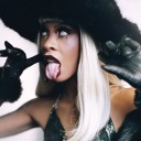
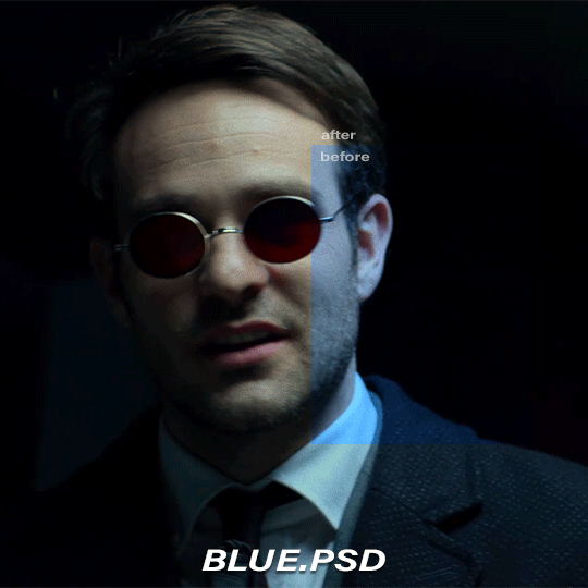
#color correction psd
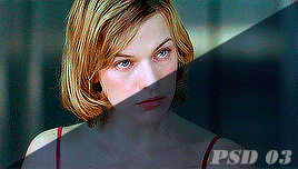
Photo

BLUE BE GONE
ABOUT THE PSD:
- the psd is free to use
- the psd was designed to remove / deminish the effects of heavy blue filters (primarily tested on outer banks screencaps, but should work on others)
- can be used alone or under the psd of your choice
REMINDERS:
- give credit when using. do not repost / claim as your own ! (even when using on other platforms such as twitter or instagram)
- do not use for paid commissions !
- do not use whitewash ! if my adjustments aren’t working for you, feel free to make any of your own in order to avoid whitewashing.
the psd file is free to download on my PAYHIP !
LIKE OR REBLOG IF YOU SAVE OR USE!
37 notes
·
View notes
Text
001. | # SAWCONBLUE.
by clicking HERE you can download a free small, simple blue color correction PSD specifically created for the awful coloring of the 2004 film "SAW".
₁. please like or reblog if you use. credit on your blog is otherwise not required but appreciated.
9 notes
·
View notes
Text


before vs after correcting this lighting bc i am clearly amazing
#the silvery white hair and red eyes were important . to me personally .#faerun's least impressed bark bark .#its so inconsistent ... save me cool psd and color balance correction . save me .
8 notes
·
View notes
Text


{ made myself a new much more fitting PSD as a treat }
#. rewind || { ooc. }#scopohobia tw#{ just in case of that first icon }#{ thank you photopea for existing }#{ im still bad at making color correcting PSDS though lmao especially for a character like sadako }#{ who is almost always in low light and whose only two colors are stark black and pure white }
7 notes
·
View notes
Text


i'm remarkable at color correcting. i'm actually fantastic and nobody can tell me otherwise. i'm amazing and great and this is not at all my trying to hype myself up bc color correcting takes forever at all
#these are my specific color correctings that i made if u couldnt tell#bc i KNOW ppl like venus have INCREDIBLE color correcting psds that are a zillion times better than mine#bc mine are made to the scenes#but#yeah#im fine this is fine this didnt take ages at all#i used past examples i actually saved as a gif too i didnt save that as a gif bc the full one is the gif and idc#im tired shush
2 notes
·
View notes
Text
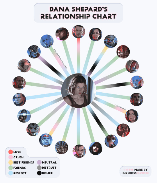
they r all friends :] (psd used)
(inspired by these templates done by @trashwarden 4ever ago!!)
#i could've done a lot w this but idk it's probably best this simple ??#sorry for the mass effect archives artwork i wanted uniformity 😩#if anyone is interested i could turn this into a psd or transparent template !!#mass effect#edit*#ch: dana shepard#it's difficult using just gradient to describe some of these but some are really funny#like for garrus it goes from dislike to respect then jumps over friends to become best friends#but i also find it rlly interesting who she gravitates to more#u can see this need for something familial with liara and grunt and samara#i wish i had something in between friends and close friends for some of these but then there would be too many colors#like she spent a lot of time with mordin maybe not always listening but the chatter was a comfort#there's a deep bond she has with both jack and wrex but it wouldn't be correct to call them besties#and then kaidan liara and miranda are definitely her most complex relationships#couldn't rlly fit kaidan's distrust n all that on there without it looking like shit#but the other two feel mostly accurate. miranda's feelings for her were a bit frankensteinian in a way#and with liara.. dana pretty much cuts her off after the shadow broker dlc and it breaks liara and me3 is very tense for a while#i have paragraphs abt that in my notes app hdhjdsdfnjhnds#i could ramble abt each of these tbh#ANYWAYSSSS#also as u could tell dana was very confused romantically after horizon
16 notes
·
View notes
Text
the hyperfixation is bad when I save a PSD file with specific colorings I know work for each scene.......

2 notes
·
View notes
Text
We offer a wide range of car photo editing services, including:
Background removal
Color correction
Image enhancement
Vehicle modification
Shadow and reflection removal
And more!
Our team of experienced photo editors can help you make your car look its best, so you can sell it faster and for more money. We work quickly and efficiently, and we always deliver high-quality results.
We offer a free quote for all of our services. To get started, simply upload your photos to our website or send us an email. We'll get back to you with a quote within 24 hours.
eccommerce #photoediting #backgroundremove #multipath #transparent #mdishakrahmanmd #layermask #neckjoint #colorchange #shadow #masking #photoretouching #modelretouching #backgroundretouch #hairmasking #wrinkleremoval #backgrounddesign #ecommercephotography #mdishakrahman #eishaqrahman
photoedit #photoshopedit #imagemasking #photooftheday #carbackgroundremoval #carimageediting #carimageeditingservices
#mdishakrahman#imageediting#photography#clipping path#shadow#graphicdesign#photo retouching#neckjoint#ghostmannequin#background#color correction#coloring pages#color palette#women of color#colors#psd coloring#mdishak rahman#removebackground#neckjointphotoshop#neckjointservice#office chairs#outdoor chairs#chair draws#wooden chairs#sofa#door#couch#image retouch#image description in alt#image processing
1 note
·
View note
Text
Update on the colour CSP problem! It seems like if I create my files in PS, set them to the correct colour profiles and then open them in CSP (instead of messing with the "preview" settings in CSP) I can eyedrop colours within CSP okay...
NOW my issue is that when I export back to PSD, to try to preserve the CMYK colours I've added, I can't seem to export with the correct colour profile.

"japan color 2001 coated" is not the correct ICC profile, and yes, exporting like this further degrades the colours...
I will take a break to eat dinner, do some googling and then report back. Thank you so so much everyone who's helped me problem solve this!!!! If anyone has a tip for paint bucket-ing, or just generally adding flat colours to open lines in PS so I don't have to bother w CSP I'll be forever in your debt, but unfortunately I don't think that's a possibility...
177 notes
·
View notes
Text

COLOR CORRECTION BASE PSD PACK
please reblog if you plan to use!
credit is super appreciated but not required:)
don't repost/claim as your own
optional: tag me in your creations with #usercam!!!
download here (mediafire) | more gif help
more info + instructions under the cut
these are base PSDs which each include two adjustment layers for color correcting scenes with various oversaturated colored lighting. the gifs above have additionally been brightened and sharpened.
you will still need to play around with all the adjustments to make your gifs look perfect! these are just meant to get you started:) please send me an ask if you have any questions. if you use these psds and choose to give credit (thank you!) please add a link to this post!
Instructions for use:
1. Save the PSD files to your computer
2. Open your gif in photoshop. In a separate tab open the PSD file
3. CTRL + click or right click on the adjustment layers folder (titled: group 1) in the “layers” box. Click duplicate folder, and choose your gif as the destination for the duplicate.
4. Finish editing your gif and save!
#this is my 2k celebration post btw. thank u ily guys#psd pack#photoshop#my psds#🪐#gif help#psdresources#psd coloring#usergif#pshelp#completeresources#gifmakerresource#tv psd#ajlook#alielook#athenagranted#tuserdaria#icecreampotluck#gonna reblog with more tags later probably
434 notes
·
View notes
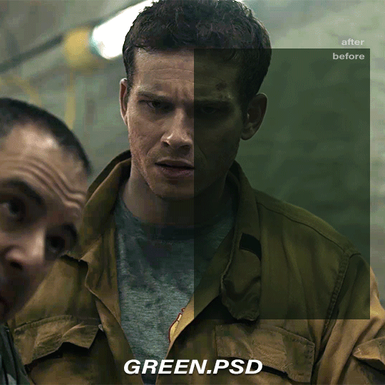
Photo

YELLOW YEET
ABOUT THE PSD:
- the psd is free to use
- the psd was designed to remove / deminish the effects of heavy yellow filters (primarily tested on outer banks screencaps, but should work on others)
- can be used alone or under the psd of your choice
REMINDERS:
- give credit when using. do not repost / claim as your own ! (even when using on other platforms such as twitter or instagram)
- do not use for paid commissions !
- do not use whitewash ! if my adjustments aren’t working for you, feel free to make any of your own in order to avoid whitewashing.
the psd file is free to download on my PAYHIP !
LIKE OR REBLOG IF YOU SAVE OR USE!
21 notes
·
View notes
Text
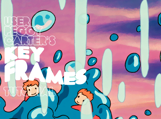
i was requested by anon to make a tutorial for this gifset and here it is!
DIFFICULTY intermediate/difficult. basic giffing knowledge is definitely required.
while my gifset has a fair amount of animation, the only handmade animations can be found in the second and fifth gif. the rest are assets (the checkmarks, the sharpie circles) (either gifs or videos) i found on the internet and pasted over my gif.
THE BASICS OF TIMELINE GIFFING
if you gif with frames, you will need to use a timeline for the animation to work (keyframes). i’m a timeline giffer anyway so this was another Tuesday for me. if you never used that method of giffing, however, it can be confusing, especially if you never used a video editing software before (the timeline works like video editing).
so, here’s a breakdown of what is the timeline:
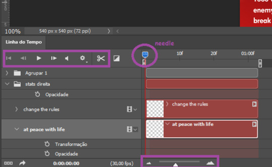
the player icons work like any video/music player in existence. ignore the volume icon.
the gear icon indicates the quality of the reproduction while editing it, not the quality of the end product. think like it’s Youtube reproduction settings on a video in order to save your 4G data, but with RAM power instead. this is very useful if your computer isn’t very powerful to begin with and gifs with VFX are very heavy to handle.
i always click the loop option inside the gear panel because i like to see how the gif will be viewed by the public, i find watching to play only once isn’t very productive. you can stop and restart the reproduction by pressing the space bar on your keyboard.
every layer of your PSD file will have its own bar. the length of the bar means the duration of the gif, so a longer bar means a longer gif and a shorter one, a shorter gif. for everything that isn’t your gif/screencap-based (ie, coloring, typography, lightning, shapes, etc) can be dragged by the extremities as much as you want, making the asset last as long as you want. the only layer that is limited by its maximum duration is naturally your gif, but you can also drag it to make it shorter.
you can also drag a whole layer bar by clicking it and dragging it, making the start and finishing point different from the rest. be careful while doing that otherwise you will end up with blank frames, messing up the looping of your gif completely.
there’s a needle you can drag across the timeline and it works just like on a vinyl disc, the moment the needle drops, it’s the moment/frame Photoshop will show you.
you can also trim your stuff by cutting and deleting snippets of the bar. for that, you will drag your needle to the desired moment, use the scissor tool and then press delete to erase the unwanted bit.
it’s important to point out that the timeline only allows 0.03x or 0.07px speed, no matter what the speed the gif was before converting to that method. if the original speed is closer to 0.03x, then PS will define the new speed as 0.03x. if it’s closer to 0.07x, then it’s 0.07x. i always change the speed to 0.03x before converting to timeline for the sake of not screwing stuff up, which means i see my gif looping while editing in a faster way than Tumblr users will see when the gifset is posted. this takes a while to adjust to if you’re new to timeline giffing, but eventually you don’t think it’s jarring anymore.
that also means you will need to correct the speed after your gif is completely finished. to do that, i use this action.
you can zoom in and zoom out using the little mountain sliding bar. this will be useful later in the tutorial.
if you zoom to the max, you will see all the numbers above your layer bar. these are time marks. the thing is, they seem a bit weird at first. the bigger numbers indicate SECONDS (01:00f, 02:00f, 03:00f, etc), while the smaller and repetitive numbers indicate frames (5f, 10f, 15f, 25f). that means that the smallest drag of your needle possible (from point A to point B) refers to an interval of 1 frame. you will need to take this into consideration while animating stuff.
you can color code your layers, if you think that makes it easier for you to see what you are doing. this is something i do, not only in Photoshop but every Adobe product with a timeline. to change the color of a layer bar (the default is purple), you can right-click on your layer in the layer panel and click the color you want. the colors are the very last thing in the list when you right-click it.
another organization tip is the use of folders. if you create a folder in the layers panel, a folder is created inside the timeline and any layer inside of that folder will disappear from the panel until you click the little arrow next to the name of the folder in the timeline panel. you can color code your folder as well, making every layer inside of it the same color or even different colors.
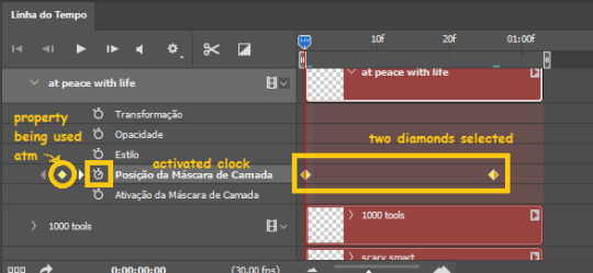
THE BASICS OF KEYFRAMES
every change related to any property selected (transformation, opacity, style, text warp, position of the layer mask, activation of the layer mask) will be computed in the exact moment in the gif you change it. if that doesn’t happen, you can force Photoshop to do it by clicking the small diamond next to the property name.
let’s say you want an animation to start 0.5 seconds after the gif starts, so you will drag your “needle” to 0.5 seconds and then make the change (making a text bigger, moving a shape, etc).
Photoshop will automatically bridge the gap between the state of the gif at 0 seconds and 0.5 seconds, thus animating your gif.
to start animating, you will need to click the little clock next to the property you want to animate. make sure you click the clock while your needle is at the exact beginning of the gif.
every change (keyframe) will be marked with a small diamond under the layer bar, at the exact moment you changed it. that means if you make jarring changes in a short amount of time/frames, the animation will be quick and abrupt. if the interval is very long, the animation will be slow and smooth.
the selected(s) keyframe(s) will have their diamond painted yellow, while the unselected ones will be grayed out.
you can right-click the diamonds to delete or copy them. if you have many diamonds and want to delete them all, you can click and drag to form a square and select all of them just like when you do to select many files at once on a PC folder. there’s also the option “select all” under the right-click panel.
you can also drag them and change their timing that way. if you have more than one diamond selected, if you drag them, their interval will remain the same, but the starting and finishing point of those two diamonds will change.
THE SQUARES BAR
the easiest of the two animations. this one doesn’t require keyframe animation, but i put this in the last bit of the tutorial for the sake of its flow.
first, i added the empty squares. they last as long as the gif lasts. after 6 frames, i added the first colored square and made that square last until the end of the gif. i repeated this in a staggered manner (+2 frames delay each colored square) so the colored squares appear at equal intervals.
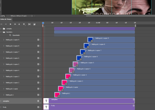
THE STATS BAR
the most difficult of the two, but don’t worry, you got this.
first, you will need to structure your stats, ie, add the text, the dividing line and the pointed lines. that is, if you want to follow the exact design i used in my gif, but you don’t have to if you don’t want to.
next, you will create rectangles that fill the entire stat bars. you will add a layer mask to each one of them and with a layer mask selected, select a rectangle about the size of your original rectangle, then paint it black. you will notice the original rectangle will disappear. if you delete the layer mask, the original rectangle will appear again. that is because you didn’t delete the original rectangle, you just hid it by using a layer mask.
there’s a chain icon between the layer and the layer mask in the layers panel, click it to unlink them.
click the clock next to “layer mask position” with your needle at 0 seconds/frames. drag your needle to the moment you want the stats to end and use the arrow keys to move the layer mask. you will notice the original rectangle will slowly be revealed by you moving the layer mask. you will also notice that a small diamond will appear in the “layer mask position” line in the timeline. you created a keyframe!
if you press play, you will see the animation from the bar going from null to full!
FURTHER READING/VIEWING
this tutorial uses layer mask animation to reveal text too!
a video tutorial for better visualization!
another keyframe tutorial, this time focusing on coloring!
if you still have any questions, feel free to contact me!
and if you (or anyone) else want, i can go in depth in animating each property, i just did a quick overview + explained the stats animation.
#*#*tutorials#completeresources#usergif#useralien#uservivaldi#usereme#userbess#userelio#usershreyu#userisaiah#useraljoscha#usersanshou#usermona#tuserju#userjaelyn#userabs#tusermalina#userbuckleys#tusermimi#tuserlucie#tusermira
210 notes
·
View notes
Text
ꗃ ╰ 𝐔𝐍𝐋𝐎𝐂𝐊𝐄𝐃 ⸻ PSD COLORINGS #01


# jovovich psd pack — by calie (gwldcnz) !
by clicking the source link (deviantart) you’ll find a pack with #04 colorings psds which basically corrects the blue, yellow and green tone of scenes / images. it is very likely that they will require adjustment when used. all of these psds were made by me from scratch. please, like & reblog this post if you find this useful in any way !
#psd#gif psd#free psd#coloring#psd coloring#rph#rpc#rpt#userdevon#usermina#dailypsd#mine.#colorings.#m: colorings.#others.
219 notes
·
View notes
Text
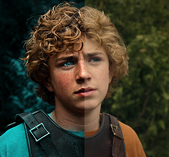
The silent art of gif making
The gif above has 32 layers plus 6 that aren't shown because this is part of a larger edit. I wanted to share it to give everyone a glimpse of the art of gif making and how long it usually takes for me to make something like this. This one took me about an hour and a half but only because I couldn't get the shade of blue right.
I use Adobe Photoshop 2021 and my computer doesn't have a large memory space (I don't know what to call it) so usually most of psds get deleted because I'm too lazy to get a hard drive. It doesn't really bother me that much because I like the art so when it's done, it's done. Off to somewhere else it goes.
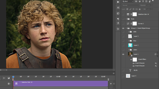
Here are the layers:

Everything is neat and organized in folders because I like it that way. I prefer to edit it in timeline but others edit each frame. There's a layer not shown (Layer 4 is not visible) and it's the vector art. Here it is:
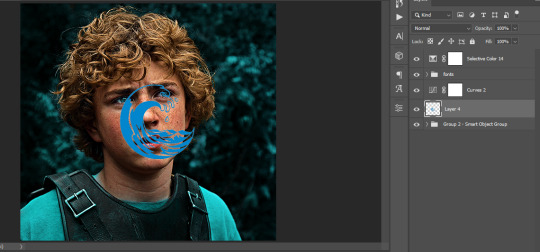
Now it is visible. I don't plan to make this a tutorial, but if you're interested I'd love to share a few tricks about it. I'm pretty new to the colors in gifmaking but the rest is simple to understand. Here, I just want to show how much work it takes to make it.
I opened Group 2 and here's the base gif. I already sharpened and sized it correctly but that's about it. Let's open the base coloring next.
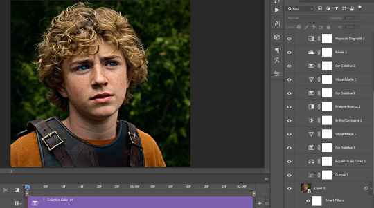
Yay! Now it looks pretty! The edits are in Portuguese but it doesn't matter. There's a silent art of adding layers depending on how you want the gif to look but you get used to it. The order matters and you can add multiple layers of the same thing (for eg. multiple layers of levels or curves or exposure).
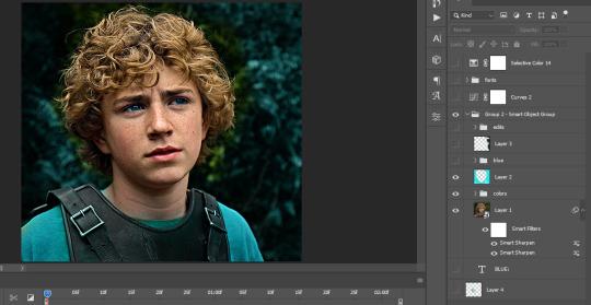
This was pretty much my first experiment with coloring so I don't know what I'm doing (this happens a lot with any art form but gifmaking exceeds in DIYing your way to the finished product) but I didn't want to mess up his hair, that's why the blue color is like that. Blue is easy to work with because there's little on the skin (different from red and yellow but that's color theory). I painted the layers like that and put it on screen, now let's correct how the rest looks.
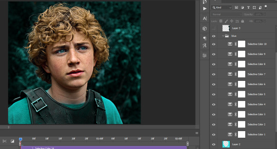
I was stuck trying to get the right teal shade of blue so yes, those are 10 layers of selective color mostly on cyan blue. We fixed his hair (yay!) we could've probably fixed the blue on his neck too but I was lazy. This is close to what I wanted so let's roll with that.
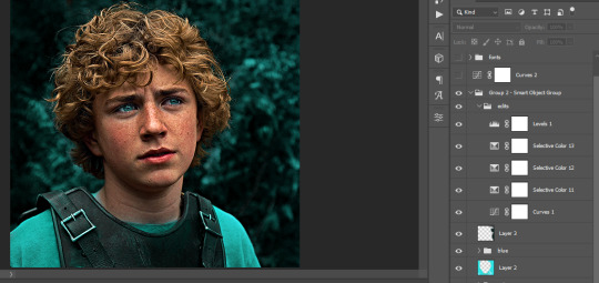
BUT I wanted his freckles to show, so let's edit a little bit more. Now his hair is more vibrant and his skin has red tones, which accentuates the blues and his eyes (exactly what I wanted!). That lost Layer 2 was me trying to fix some shadows in the background but in the end, it didn't make such a difference.
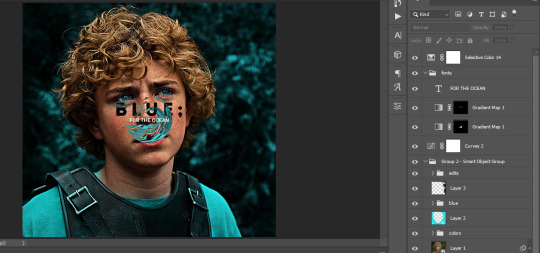
This was part of an edit, so let's add the graphics and also edit them so they're the right shade of blue and the correct size. A few gradient maps and a dozen font tests later, it appears to be done! Here it is:
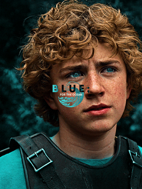
Please reblog gifsets on tumblr. We gifmakers really enjoy doing what we do (otherwise we wouldn't be here) but it takes so long, you wouldn't imagine. Tumblr is the main website used for gif making and honestly, we have nowhere to go but share our art here. This was only to show how long it takes but if you're new and want to get into the art of gif making, there are a lot of really cool resource blogs in here. And my ask box is always open! Sending gifmakers all my love.
#gif making#gif tutorial#resources#completeresources#y'know what that post yesterday got me into this#i love creativity so i send all my love to gifmakers#this is HARD#my tutorials#tutorials
385 notes
·
View notes
Text

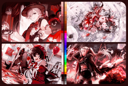
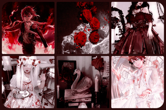
◞🩸⊰ Bloodstained Veil PSD ♡ 〞✧


Like, reblog and credit when using it somewhere. Like and reblogs aren't obligatory, however, credit is. ^^
Made in photopea for use there. Can't guarantee whether it will work or not on other editing apps (photoshop etc)
Okay to alter and change certain layers to fit your taste (if another color is still seeping in etc.) or use for inspiration as long as the credit is still somewhere!
PSD mostly affects red, white and black tones. Recommended use is for images within those hues, even if i color corrected most colors to stay within those shades!
more examples under the cut! have fun ♡

#psd#psd coloring#photopea psd#red psd#white psd#black psd#coloring psd#psd download#anime psd#i still dont know how to tag psds. hi. hope yall like this one ♡#‹🩷//: edits#‹💒//: psds#‹🪷//: ame favorites
157 notes
·
View notes
Note
your icons are soooooo so cute honestly!!! i wanted to ask if there's any way you can make a tutorial on how to make them? of course if you want, if you don't want to, that's okay :)
Hi! I really appreciate that you like my icons, thank you so much! 💖💖💖🥹
It's been a long time since I've done a tutorial so I hope I can explain it well haha
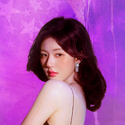
So I will explain how i go from the original picture and the final icon below:
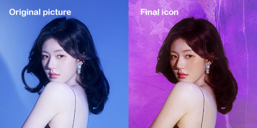
I'm using Adobe Photoshop 2024 but you can use other versions too!
First, I create a 250x250px document and apply a random color fill layer to be the background color of the icon, you can do it by going on Layer > New Layer Fill > Solid color (the color in this moment doesn't matter because I change them later according to the picture I choose to edit).
Then I place the picture I want, adjust the size to make the subject on the center and apply some smart sharpen:
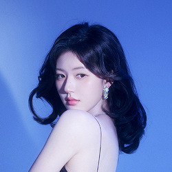
I apply some adjustments to try to color correct if the original picture using Levels, Selective Color and Color Balance to get something like this:
If you want to know the exact adjustments settings I used on this picture you can download the psd here.
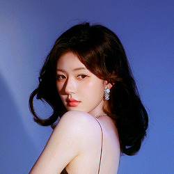
To remove the background, I do the hack where I go to the Properties panel (Window > Properties) and click on the "Remove background" option. It's not always that I will get a perfect result but I think it makes easier for me to adjust the little details such as hair and accessories, etc. And I do that using the Lasso tool (shortcut L).
Now, with the background removed I pick a color that I think will match the icon in the Color Fill layer that I created before. To make the background more "fun" I like to add a Gradient Fill layer (Layer > New Layer Fill > Gradient) with a color that might go well with the one I picked earlier to make a smooth and light gradient.
My result until now:
Now it comes the fun: adding textures! I like to add some textures to make the icon more lively and I usually download them on deviantart or on resources websites. You can download some cool textures here, here and here. On this part I really test a lot of textures with different Layer blending. There are a lot of different blending options so you can try as much as you want.
Other thing I like to do is add a clipping mask above the subject layer when I want to color something specific in my picture such as the hair, the clothes or even applying some "fake" blush on the cheeks. I do this adding a new layer, then using the shortcut option (or alt) + command (or ctrl) + g to make it a clipping mask and then using the Brush layer to color what I want. For the blending mode I usually use Soft Light and sometimes Color if I want the color to really stand out.
And in the end I will have something like this:
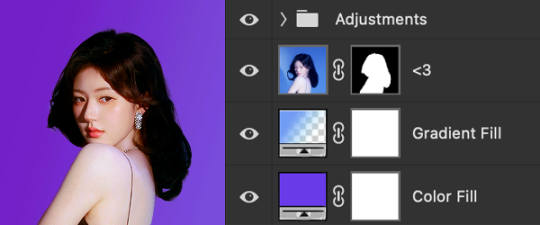
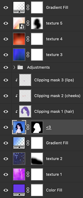
And my layer tab will be like this:
For using on the dashboard I usually resize it to 100x100 to make it look more sharper and defined but it's really a choice, you can already start making your icon using the size you want, I just prefer doing on 250x250px because i'm used to.
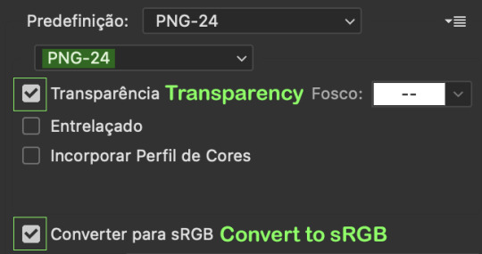
To save it I use the shortcut shift + option (alt) + command (ctrl) + s to save it for web with these settings:
And that's it! Sorry for not going to deep in each step but I guess you can get the feeling when you try making your own icons! Is really about trying different methods and things until you became satisfied with your result.
82 notes
·
View notes
Last Seen Blogs