#color use
Text


Health care center in Beverwaard, the Netherlands, by Tuns + Horsting.
Scan
78 notes
·
View notes
Text
I got into a debate with my mom regarding the color yellow. Personally, I love this color and the challenge it presents when sewing with yellow fabric. She hates it and finds yellow to be ugly except in specific settings (like flowers).
For context, my mom and I are both quilters and the discussion regarding yellow started when I brought up how very little yellow fabric I have in my fabric stash.
PLEASE REBLOG!!!
Here are some of the things I've made with yellow. It's such a fun and challenging color, and it makes my adhd purr.


Please share the things you've made using yellow.
Thank you!
38 notes
·
View notes
Text
Peace and love
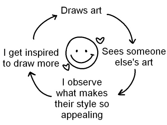
#pink posts#i saw a tweet that was like “i see other people's art” --> i get discouraged#i understand that seeing art that is prettier than yours can be discouraging but why not twist that a bit?#why does it look prettier to you? is it the colors#is it the textures they used? the brushes?#study them and try to put your spin on it#and maybe you'll find your art beautiful as well
93K notes
·
View notes
Text

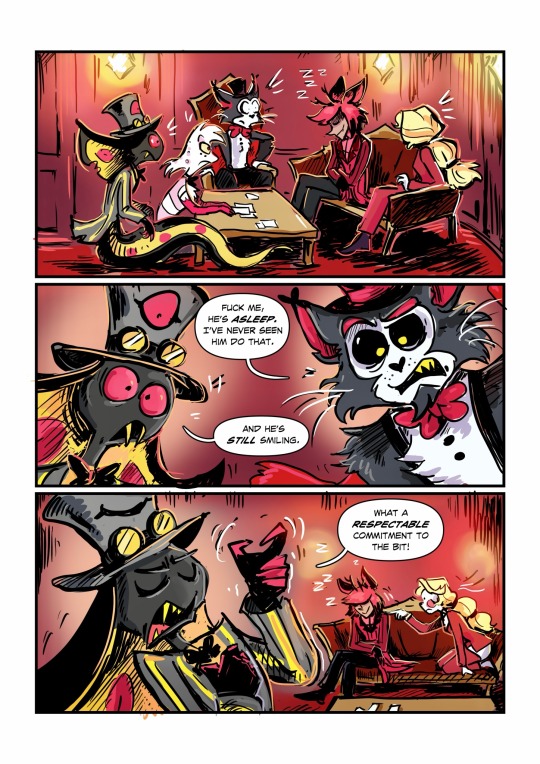
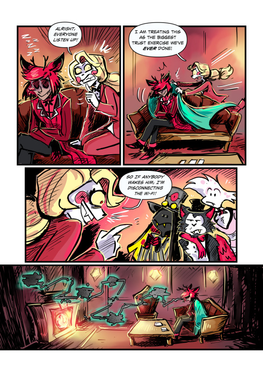
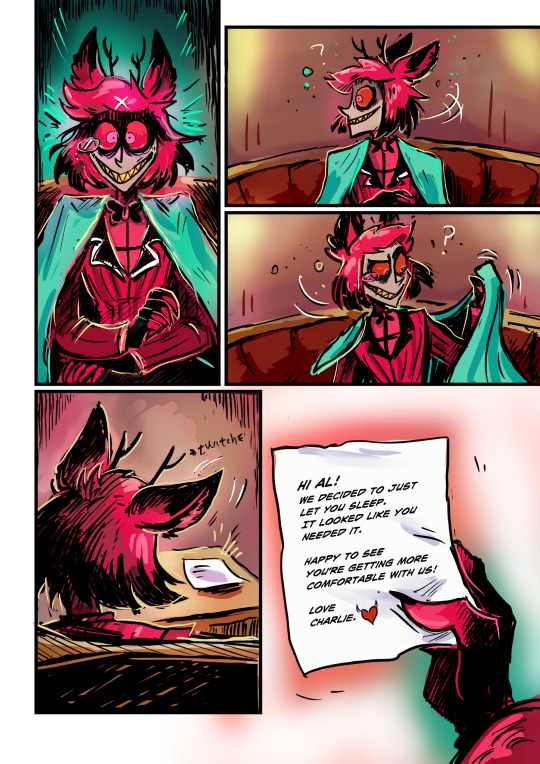
Imagine spending all your energy being cool and mysterious 24/7.
What an idiot have I mentioned I love him?
Idea came from a cool post @nouverx made about Alastor’s possible sleeping habits. 💕
#grey art#hazbin hotel#hazbin hotel fanart#hazbin hotel comic#Oh I am DONE coloring stuff for a while! it’s so boring!#I mean it looks great but I haaaaaate spending time on it!#get used to grayscale stuff for a while#also coloring multiple characters is stupid! no no no.#angel dust#husker#sir pentious#alastor#charlie morningstar#hazbin husker#hazbin alastor#god I’m glad to be done with this one
46K notes
·
View notes
Photo
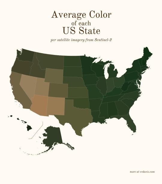
Average color of US states based on satellite imaging.
96K notes
·
View notes
Text
What Does It All Mean?
The night.
Today I’d like to talk about color symbolism.
Not to worry, I’m only going to talk about a few selected colors. Any more than that and you’ll fall asleep.
Ready? Here we go.
Red is considered to be a color of intense emotions, and its color meaning ranges from anger, sacrifice, danger, and heat, through to passion, and sexuality. Used in branding, it can deliver an impactful punch…
#Art#Color#Color Meaning#color photography#Color Theory#Color use#Dusk#Learning#New Orleans#Photography#Post Production#Ray Laskowitz
0 notes
Text

you’ll never guess who i got into (redraw of screenshot from the casual mv) (psst my comms are open)
#mermaid toxic yuri...#the lesbian situationship comes for us all#REALLY enjoyed the colors on this#chappell roan#casual#casual music video#mermaid#lmao happy mermay#lesbian#pride#art#my art#kiss#underwater#idk;#midwest princess#the rise and fall of a midwest princess#chappel roan fanart#chappell roan casual
11K notes
·
View notes
Text
gilbert baker designed his flag with the express purpose of it including every single queer person. baker was so dedicated to making sure his flag was inclusive that he added another stripe in 2017, lavender, to represent diversity. the concept that it’s for white gay men came around later and needs to be changed.
can we please go back to associating the original flag, and ideally the modern rainbow flag, with inherent inclusion of every single queer person? instead of deciding that the original wasn’t good enough? personalized flags are important for representing those who have typically been excluded from the queer community, but reclaiming the original flag as a symbol of inclusion is important too.
#i use the bi flag because it fits better with my icon colors. i would really like to have the original flag everywhere else but you just#can’t find it on anything including things made by independent queer creators#idk it just seems like an important piece of queer history that’s been twisted and lost and it makes me sad#sterling speaks
12K notes
·
View notes
Text


I have some questions about karaoke night, Alex Hirsch. Very Important Questions. Which I will happily scream at a poor hapless baby triangle who can have no answers for me, and possibly also does not have object permanence yet.
Follow-up that is I guess suggestive, but let's be real here, Bill's a fucking triangle:


Dude slipped right into his birthday suit, lmao
this is so stupid :D
Anyway, I don't care what anyone says, this brilliant individual knows what's up - Bill is absolutely way more of a monsterfucker than Ford could or ever will be, full stop.
#fanart#billford#bill cipher#stanford pines#gravity falls#book of bill#i watched gravity falls because i was curious about all the Toxic Old Man Yaoi on my dash and wanted context#turns out most of the context was in the book of bill tho lmao#look they either banged or married or both while drunk and i will accept no other possibilities#you don't use the phrase 'and one thing led to another' in a PRIVATE JOURNAL if what happened wasn't salacious in some way#i mean - ford didn't exactly grow up in The Most Inclusive Time Period???#dude was probably like 'gotta use this wording for plausible deniability - NO ONE can know i boinked the talking triangle'#in other news - i must bully the baby billy#don't know how much more GF stuff i'll toss up here but i have a few other little scribbles in the works. probably won't color them tho lol#also don't ask me why bill's bowtie stays where it is despite his “pants” being under it. just. just fucking don't ok???#EDIT: oh and since i see this a lot in this fandom for some reason: DO NOT REPOST THIS PLZ K THX :D
8K notes
·
View notes
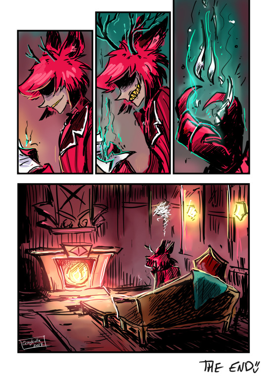
Text
I'd like to think Bill was projecting in the paragraph on hibernation.
(fun fact! every color in bill's clothes, breakup recovery objects, and furniture were color picked from ford's body! yes bill did get a leather couch the same color as ford's flesh!)
#(except the ice cream. that's the color the show uses for blood. I'm taking it for granted that Ford has the same blood color as Dipper.)#bill cipher#billford#the book of bill#thisisnotawebsitedotcom#gravity falls#gravity falls fanart#fanart#my art#(love that it's canon that bill handles relationships falling apart by getting sobbing-at-the-fast-food-cashier drunk)#(and eating an irresponsible amount of food. and then he makes fun of that behavior on the website. who r u fooling.)
6K notes
·
View notes
Text
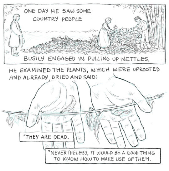


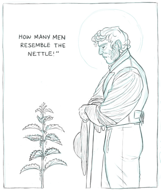
He added, after a pause: “Remember this, my friends: there are no such things as bad plants or bad men. There are only bad cultivators.”
Les Misérables, Volume I / Book V / Chapter III, trans. Hapgood
#is this anything? idk I've been looking at it too long to tell. anyways I just really liked this passage#^ the text here is a little abridged tbc bc i couldn't draw all the uses of nettles he lists etc#I think I might also color that last panel separately bc I'm really pleased with it tbh#thoughts#my art#les mis#jean valjean
49K notes
·
View notes
Text
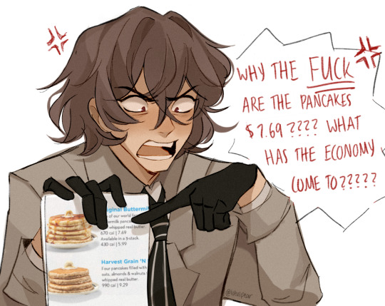
ok gayboy
#LOTUS PERSONA ART LETS GOOOOOOOO IT ONLY TOOK ME FIVE FUCKING MONTHS#this is for the three ppl that follow me and know about persona eat up my loves 😍#i love narcissistic bastards who are doomed by the narrative he's a keeper fs#(idk anything abt akechi except hes a gayass detective and loves pancakes and is a tsundere /JJJJJJJ)#he has this sopping wet quality about him that i adore very much. it's the homosexuality i think#persona 5#persona 5 royal#p5#p5r#akechi goro#goro akechi#lotus draws#bro why is his hair so fucking hard to draw it's like chuuya's but if he used a straightening iron#speaking of him this is the hair color i wish he had :(((( my fav hair color frfr it exceeds every other one#the light desaturated brown with hints of russet MWAH MWAH#anyway it's three on a school night i think i should sleep ig😔
5K notes
·
View notes
Note
Could you please explain the greyscale/color thing you were referring to in your reblog of that WW quilt? I'm awful when it comes to color things and I'd love some insights!
Okay, so when I choose colors, I like to make it balanced. This plays a HUGE role in how it will look once finished. I lay thr fabrics next to each other and see if the colors look nice. If they do, I switch to my phone's camera and slide over to greyscale. This removes the color. Think black and white movies. Greyscale shows thr volume of the color. If you have a quilt with neon colors, they pop...unless it's all neon. In greyscale, it all looks the same. This goes double for prints.
I have an example of this here:
The first pic is in color. Slide to the second. That's greyscale. High volume would be the black on top and bottom of the spools, as well as all thr prints that appear dark. Low volume is the background fabric and all other prints that appear lighter.
It took several rounds of arranging the blocks before I was satisfied with how it looked in color as well as in greyscale. It's very pleasantly balanced.
Here's another:
The blue is a high volume, pink is medium, and the yellow and green are low volume. Slide to the second picture and you can see how greyscle reveals this.
Using this little trick will save you time and a potential dose of disappointment avoided.
This quilt is all high volume:
I had to break it up with a white border in order to balance it. Otherwise, it wouldn't stand out, and end up looking messy. That white border is as low volume as you can get, being a solid white. With all the black and intense colors (yes, the yellow is high volume), the white was needed, but just a little bit.
Apply this to anything you make using color, including painting. Not everyone can see color, so using this trick actually helps make things more accessible. They cam see and appreciate the arrangement of the colors, the iverall design, and not get a visual mess, as was explained to me by someone who is double colorblind. To them, a lot of quilts are just noise. Finding the sort of quilts that apply more use on volume arrangements is difficult, but that makes them all the more valued.
12 notes
·
View notes
Text


adrinette exes & marichat! part 3!
(part 1 / part 2)
#earlier tonight my brother saw me coloring this#and then he wanted to know what it was about and i asked if he wanted to read it#and he said ‘yes. i’ll be marinette’#and then he made me read it aloud with him and he was reading the dialogue like it was an anime english dub#anyway. adrinette exes marichat be upon ye#i’ve been pretty regular with updating once a week ish with this but don’t🫶get used to it🫶#love and light#ml#miraculous#miraculous ladybug#chat noir#marinette dupain cheng#marichat#my art#the fact that adrien and marinette are just gonna try to ignore everything that happened in elation. haunts me
6K notes
·
View notes
Text

Oh Tara, we’re really in it now….
#art#my art#fanart#gale of waterdeep#gale dekarios#bg3#balders gate 3#idk if I like this tbh I haven’t actually colored anything in too long#have to post cringe to improve I guess#I haven’t met tara in my game yet btw#I used little reference bc I didn’t want spoilers#my apolocheese#Gale has sadboy swag#kissing him kissing him kissing him#baldur's gate 3
13K notes
·
View notes
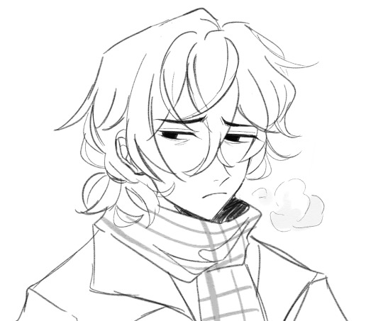
Text

redrawing an old wip
#sonic the hedgehog#sketch#jiiniixart#doodle#sonic#I´ll be using this for my flat colored comissions sketches
5K notes
·
View notes
Last Seen Blogs
killuallukalluto
isolated and weird

artistic-cannibal
Cigarettes on the Rooftop

mytwiztedmind
My Twisted World

susteee
Sustee

killakoji
desirxd