#css flexbox footer
Explore tagged Tumblr posts
Visit Tumblr Blog
Explore Tumblr blogs with no restrictions, modern design and the best experience.
Last Seen Tumblr Blogs


Fun Fact
Tumblr has 4 main sources of revenue.
Text

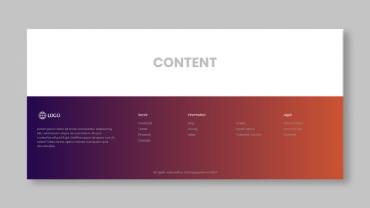
CSS Flexbox Responsive Footer
#css flexbox layout#css flexbox footer#codingflicks#html css#frontend#css#html#css3#frontenddevelopment#code#css tricks#responsive footer design#webdesign
0 notes
Text
Choosing Between Flexbox and Grid for Your Basic Layout Structure

Introduction
Beyond the aesthetics of web design, the choice of layout structure forms the backbone of a project's responsiveness and adaptability. At the heart of this decision lie two powerful CSS tools: Flexbox and Grid. These elements are more than mere design choices; they dictate how a webpage responds to different screen sizes and user interactions, impacting usability and visual appeal.
Understanding the Basics

Flexbox: Flexbox is a one-dimensional layout model best suited for organizing items within a container, offering flexibility in managing space distribution, alignment, and order. Its strength lies in its ability to handle complex layouts while maintaining simplicity in code structure. Grid: Grid is a two-dimensional layout system that creates a grid-based design, allowing precise placement and alignment of elements in rows and columns. Its advantages include fine control over both the rows and columns, making it ideal for overall page structure and layout alignment. Both Flexbox and Grid can be effectively utilized for basic layouts by structuring a header, main content area, and footer with distinct approaches tailored to their strengths.
Comparative Analysis

Flexbox Pros: - Efficient for arranging elements in a single direction, vertically or horizontally. - Great for small-scale layouts like navigation menus or individual components within a page. - Simplified syntax and intuitive approach make it easier to learn and use. Cons: - Complex layouts might require nested flex containers, leading to potential complications. - Challenges in controlling the alignment of both rows and columns simultaneously. Suitable Scenarios: Ideal for smaller, simpler layouts or for organizing elements in one direction, such as in menus or single-axis content layouts. Grid Pros: - Perfect for managing both rows and columns simultaneously, enabling more precise layouts. - Best for complex and multi-dimensional layouts, especially entire page structures. - Offers fine control over placement, making it suitable for responsive designs. Cons: - Complexity in understanding and implementing for beginners due to its comprehensive grid structure. - Not as effective for single-axis layouts compared to Flexbox. Suitable Scenarios: Best suited for larger-scale layouts or designs that demand strict control over both rows and columns, like entire webpage structures or responsive grid systems.
Usage Scenarios

Flexbox Scenarios Where Flexbox Shines: - Small-Scale Components: Flexbox excels in organizing smaller elements within a webpage, like menus, buttons, or individual sections. - Single-Direction Layouts: It's perfect for arranging elements in a single direction, simplifying the structure for one-dimensional layouts. - Mobile-First Designs: Ideal for mobile-responsive designs where content needs to adapt to smaller screens with straightforward layout adjustments. Grid Scenarios Distinct Advantages of Grid: - Full-Page Layouts: Grid is optimal for structuring entire pages, managing complex alignments in multiple directions (rows and columns). - Multi-Dimensional Layouts: Perfect for designs that require precision in both row and column placement, ensuring a cohesive and responsive layout. - Responsive Grid Systems: Offers extensive control for building responsive grid systems that adapt seamlessly across various screen sizes.
Responsiveness and Adaptability
Flexbox and Responsiveness Catering to Responsive Design: Flexbox simplifies responsiveness by allowing elements to adjust based on available space and container size. It facilitates flexible resizing of components within a single direction, aiding in responsive designs. Adaptability in Viewport Sizes: Flexbox is particularly suitable for smaller devices where elements need to flexibly adjust in a single axis, making it easier to adapt content to varying viewport sizes. Grid and Responsiveness Catering to Responsive Design: Grid systems provide a more comprehensive approach to responsiveness by allowing precise control over both rows and columns, enabling intricate adjustments for various screen sizes. Adaptability in Viewport Sizes: Grid excels in handling complex layouts across different viewport sizes, ensuring elements maintain their specified placement and alignment in both axes, enhancing adaptability in various screen sizes.
Best Practices and Recommendations
Choosing Between Flexbox and Grid When to Choose Flexbox: Opt for Flexbox when dealing with simpler, single-direction layouts or smaller components within a webpage. It's ideal for basic layouts requiring flexibility in one axis. When to Choose Grid: Prefer Grid for more complex, multi-dimensional layouts or when structuring entire pages. Choose it when precise control over both rows and columns is necessary. Combining Flexbox and Grid Effective Combination: Consider using Flexbox within specific sections or components within a grid-based layout. For instance, employing Flexbox to organize elements within grid-defined areas can harness the strengths of both techniques. Hybrid Approach: Experiment with combining both Flexbox and Grid to achieve optimal results. For instance, using Flexbox for header and footer elements while implementing Grid for the main content area can leverage the strengths of each method within a single layout.
Real-world Application
Flexbox in Real Projects Project Example: Portfolio Website In a portfolio website, Flexbox was utilized to arrange sections within the main content area. Each project section was organized in a single direction, allowing for easy adaptation to various screen sizes. This choice enhanced responsiveness, especially for mobile devices, providing a seamless browsing experience. Grid in Real Projects Project Example: E-commerce Platform An e-commerce platform used Grid to structure its product listings and category sections. The complex layout demanded precise alignment in both rows and columns, ensuring scalability across different viewport sizes. This choice significantly improved the scalability and responsiveness of the platform, offering a consistent and visually appealing layout.
Conclusion
Flexbox and Grid stand as powerful tools in the realm of web design, each offering distinct advantages based on the nature of the layout and design requirements. Distinguishing Factors: Flexbox excels in simpler, single-direction layouts and smaller components, offering flexibility and ease of use. On the other hand, Grid shines in complex, multi-dimensional layouts, providing precise control over both rows and columns. Significance of Choosing the Right Layout: The choice of layout structure forms the foundation of a project's scalability and responsiveness. A well-thought-out decision between Flexbox and Grid, or a strategic combination of both, is pivotal in ensuring a website's adaptability across various devices and screen sizes. Read the full article
2 notes
·
View notes
Text
4 Practical Use Cases for CSS Grids in Modern Web Design
CSS Grid is a powerful layout system that has transformed the way web designers structure and style websites. It provides a flexible, two-dimensional grid-based approach, making it easier to create complex layouts without the need for excessive code or tricky workarounds.

Download Infographic
Building Stunning Image Galleries

Image galleries are a staple in modern web design, and CSS Grid is an ideal tool for creating them. Unlike traditional layout methods, CSS Grid allows you to define precise rows and columns, making it easy to align images without breaking the overall design.
Why Use CSS Grid for Image Galleries?
Flexible Layouts: Easily control the number of columns and rows based on screen size.
Gap Control: Use the grid-gap or gap property for perfect spacing.
Responsive Design: Adjust column sizes and row heights without breaking the layout.
Layering and Positioning: Position images in creative ways, including overlapping elements.
Basic Image Gallery Example
<div class=”gallery”> <img src=”image1.jpg” alt=”Image 1″> <img src=”image2.jpg” alt=”Image 2″> <img src=”image3.jpg” alt=”Image 3″> <img src=”image4.jpg” alt=”Image 4″> <img src=”image5.jpg” alt=”Image 5″> </div>
.gallery { display: grid; grid-template-columns: repeat(auto-fill, minmax(200px, 1fr)); gap: 16px; } .gallery img { width: 100%; display: block; border-radius: 8px;
Advanced Image Gallery Layouts
Experienced web designers can also create more intricate layouts by spanning images across multiple rows or columns using the grid-column and grid-row properties, giving your galleries a more dynamic and polished look.
In this infographic blog post, we’ll explore four practical use cases for CSS Grids that can elevate your web design projects.
Try CSS Grid Generator
Creating Main Website Layouts

CSS Grid shines when it comes to designing the main structure of a website. Whether you’re building a blog, portfolio, or business website, grids provide the framework for responsive and organised layouts.
Why Use CSS Grid for Main Layouts?
Clear Structure: Define headers, sidebars, content areas, and footers precisely.
Responsive Design: Create layouts that adapt effortlessly to different screen sizes.
Efficient Code: Reduce the need for excessive wrapper divs and floats.
Complex Designs: Easily create overlapping sections and layered effects.
Basic Main Layout Example
<div class=”main-layout”> <header>Header</header> <nav>Navigation</nav> <main>Main Content</main> <aside>Sidebar</aside> <footer>Footer</footer> </div>
.main-layout { display: grid; grid-template-areas: “header header header” “nav main sidebar” “footer footer footer”; grid-template-columns: 1fr 2fr 1fr; gap: 20px; } header { grid-area: header; } nav { grid-area: nav; } main { grid-area: main; } aside { grid-area: sidebar; } footer { grid-area: footer; }
Advanced Main Layouts
For more complex designs, consider using CSS Grid in combination with Flexbox for greater flexibility and control over nested elements.
Designing Attention-Grabbing Banners

Banners are crucial for grabbing user attention, and CSS Grid makes it easy to create stunning, multi-layered designs without relying on complex positioning hacks.
Why Use CSS Grid for Banners?
Flexible Positioning: Easily place text, images, and buttons exactly where you want them.
Responsive Design: Maintain structure across different devices.
Layer Control: Use grid layers to create engaging, multi-dimensional designs.
Basic Banner Example
<div class=”banner”> <div class=”overlay”></div> <h1>Welcome to Our Website</h1> <p>Discover our range of services.</p> <button>Learn More</button> </div>
.banner { display: grid; grid-template-areas: “overlay”; position: relative; background-image: url(‘banner.jpg’); background-size: cover; background-position: center; height: 300px; color: #fff; text-align: center; } .overlay { grid-area: overlay; background-color: rgba(0, 0, 0, 0.6); position: absolute; top: 0; left: 0; right: 0; bottom: 0; z-index: 1; } .banner h1, .banner p, .banner button { position: relative; z-index: 2; }
Perfectly Centring Items

Centred layouts are a common design choice, and CSS Grid provides a simple way to centre content without relying on margin hacks or flexbox tricks.
Why Use CSS Grid for Centring?
Simplicity: One line of code can achieve perfect centring.
Cross-Browser Support: Reliable centring across all major browsers.
Versatility: Works for both single items and entire sections.
Basic Centring Example
<div class=”centre”> <h2>Centred Content</h2> </div>
.centre { display: grid; place-items: center; height: 300px; background-color: #f4f4f4; }
Conclusion
CSS Grid is an incredibly versatile tool that can streamline your web design workflow, reduce code complexity, and enhance the overall user experience.
Whether you’re building image galleries, main layouts, banners, or perfectly centred designs, CSS Grid offers a flexible and powerful solution.
Experiment with these practical use cases to unlock the full potential of CSS Grid in your projects.
0 notes
Text
WordPress Theme Development: A Complete Guide
WordPress theme development is an essential skill for developers looking to create custom, high-performance websites. Whether you're building a theme for personal use, client projects, or to sell on marketplaces, understanding the fundamentals is crucial.
This guide covers everything from the basics to advanced techniques, helping you master WordPress theme development.
1. What is a WordPress Theme?
A WordPress theme is a collection of files that define the appearance and functionality of a website. It includes:
PHP Files – Control the structure and content.
CSS Stylesheets – Define the website’s look and feel.
JavaScript Files – Add interactivity and animations.
Template Files – Manage different parts of the website, such as headers, footers, and sidebars.
Themes can be either classic themes (built using PHP) or block themes (based on the WordPress block editor).
2. Tools Required for Theme Development
Before you start, set up a proper development environment. Here’s what you need:
Local Development Server: Install Local by Flywheel, XAMPP, or MAMP to test your theme locally.
Code Editor: Use Visual Studio Code or Sublime Text for writing clean code.
Version Control: Use Git for tracking changes and collaborating with teams.
Browser DevTools: Inspect and debug CSS, JavaScript, and responsive design.
3. Setting Up a Basic WordPress Theme
To create a custom theme, follow these steps:
Step 1: Create a Theme Folder
Navigate to wp-content/themes/ and create a new folder (e.g., mytheme).
Step 2: Add Essential Theme Files
Inside your theme folder, create the following files:
style.css (Main stylesheet)
index.php (Main template file)
functions.php (Handles theme functions)
4. Understanding WordPress Template Hierarchy
WordPress uses a hierarchy to determine which template file to load. Some important templates include:
index.php – Default template (fallback for all pages).
header.php & footer.php – Used for the site's header and footer.
single.php – Displays single blog posts.
page.php – Used for static pages.
archive.php – Displays category, tag, and author archives.
Understanding this hierarchy helps you create a structured theme.
5. Adding Dynamic Features with functions.php
The functions.php file is crucial for adding features like menus, widgets, and theme support.
Registering a Navigation Menu
6. Creating Custom Page Templates
To create a unique page design, you can build a custom template.
Example: Custom About Page Template
Now, when creating a new page in WordPress, you can select "About Page" from the Page Attributes section.
7. Making Your Theme Responsive
Use CSS media queries to ensure your theme works on all devices.
Additionally, using Flexbox and CSS Grid can help create a more flexible layout.
8. SEO & Performance Optimization
Optimize Code and Assets
Minify CSS & JavaScript using plugins like Autoptimize.
Load scripts asynchronously to improve speed.
SEO Best Practices
Use semantic HTML5 tags (<header>, <article>, <footer>).
Optimize images using WebP format for faster load times.
Install an SEO plugin like Yoast SEO to manage metadata and sitemaps.
9. Testing & Debugging Your Theme
Before deploying, ensure your theme is error-free.
Enable Debugging: Add this to wp-config.php: phpCopyEditdefine('WP_DEBUG', true); define('WP_DEBUG_LOG', true);
Use Theme Check Plugin: Install the Theme Check plugin to ensure your theme follows WordPress coding standards.
10. Publishing and Selling Your Theme
Once your theme is complete, you can:
Submit it to the WordPress Theme Repository.
Sell it on marketplaces like ThemeForest or TemplateMonster.
Offer premium versions on your own website.
Conclusion
WordPress theme development is an exciting and rewarding skill that allows you to build powerful, customized websites. By mastering the basics, following best practices, and continuously improving your designs, you can create themes that are functional, responsive, and optimized for SEO.
If you’re serious about WordPress development, start building and experimenting with your own themes today!
0 notes
Text
Libre "NeueGeosyndicate", our custom theme pack
(HTML5+CSS3, Markdown+Liquid...)
AFTER
[ WIP commission project with @userbru ... ]
BEFORE (?-2024)

So, before I migrate away my mainline content away from Tumblr, let me revamp my whole CSS blog theme in a way to make the transition towards Jekyll and then Hexo really vibrant yet humble. (Neocities-like perhaps would describe it better?)
Checklist of what to include
Symbolically generated Common LISP tables... (I guess that would be user profile cards for now)
Argdown philosophy argument treescapes... (useful for familial relationships, cladograms & computer filesystem-based hierarchies... )
Custom responsive flexbox layout with floating footer, sidebar user profile cards, articles feed(s?) and navigation left sidebar;
Custom icons, banners & buttons with their hyperlinks...
ActivityPub / copyleft Fediverse integration (Odysee, Mastodon, PeerTube, Lemmy, BookWyrm, Matrix, SourceHut, Funkwhale, NextCloud, Bonfire...)
100Rabbits + Landchad.net components
Neocities indieweb-like wiki
Explorable interactivity components (NickyCase's Joy.JS -like framework with SVGs)
Custom animated page dolls ()
Custom scrolling border marquees (some animated but content-static GIFs & some more dynamic as RSS ticker news headlines updates)
Custom animated tiling scrolling background wallpaper (probably too much to ask thus far)
Custom music with some embedded media player widget (playing on request, so not by default / on initial page load)
Custom animated cursor pack (Gruvbox Light Medium colored)
Custom soundscape & sfx scheme (not doing it here, some custom sound board will suffice once I get there)
Custom nesting threads guestbook & instant messaging shoutbox modules (the two as distinct widgets)
Custom RSS feeds / data logs for distinct virtual agents & factions; (Will come handy to make live updating agents to simulate lives through my in-progress file archive-based worldscape simulation system)
Yeah, sounds like I am and will expand much forth for my constructed world 16^12 Angora "game" setting, almost like a virtual pet site or some social simulacrum; 😉 Mostly through the WikiHow.Life silly computer town page but with my growing technical skills and much inspirations...
1 note
·
View note
Text
Title: The Evolution of Frontend Development: A Comprehensive Guide for Modern Web Developers
Introduction
Frontend development has transformed dramatically over the past decade, becoming one of the most dynamic fields in the tech industry. With user expectations soaring and new technologies emerging, building intuitive, responsive, and user-friendly web interfaces is more crucial than ever. In this article, we’ll dive deep into the core aspects of modern frontend development, the tools and frameworks that shape the industry, and best practices for crafting outstanding user experiences.
What is Frontend Development?
Frontend development, also known as client-side development, refers to the creation of the visual and interactive components of a website or web application. It involves using technologies such as HTML, CSS, and JavaScript to ensure that users can seamlessly interact with a site’s content. Essentially, everything you see and engage with on a website – buttons, text, images, forms, and animations – are the result of frontend development.
The Key Technologies of Frontend Development
1. HTML (HyperText Markup Language)
HTML is the backbone of any website. It structures the content by defining elements such as headings, paragraphs, links, images, and other multimedia. HTML5, the latest version, introduced new elements like <article>, <section>, and <footer>, which have enhanced web accessibility and semantic meaning.
2. CSS (Cascading Style Sheets)
CSS brings HTML to life by defining the visual style of a webpage. From colors and fonts to layouts and animations, CSS allows developers to control how content is presented on different devices. Modern CSS features like Flexbox, Grid, and media queries have made it easier to create responsive designs that adapt to various screen sizes.
3. JavaScript
JavaScript adds interactivity to web pages. Whether it’s creating dynamic content updates, handling user inputs, or adding animations, JavaScript is essential for a responsive and interactive user experience. With the rise of ES6 (ECMAScript 2015) and beyond, JavaScript has become more powerful and easier to work with, especially with features like arrow functions, promises, and async/await.
Modern Frontend Frameworks and Libraries
In today’s development environment, building a web interface purely with vanilla HTML, CSS, and JavaScript is rare. Frameworks and libraries have become indispensable tools for frontend developers, helping streamline workflows, manage complexity, and improve scalability.
1. React
Created by Facebook, React is a JavaScript library for building user interfaces, particularly single-page applications (SPAs). React’s component-based architecture allows developers to break down complex UIs into smaller, reusable pieces. Its virtual DOM efficiently updates only the necessary parts of the UI, resulting in fast rendering performance.
2. Vue.js
Vue.js is a progressive JavaScript framework known for its simplicity and flexibility. It’s ideal for building both SPAs and more traditional multipage applications. Vue’s ecosystem includes tools like Vue Router for routing and Vuex for state management, making it a solid choice for developers looking for a versatile frontend framework.
3. Angular
Angular, maintained by Google, is a comprehensive framework designed for building enterprise-level applications. It provides a full suite of tools, including two-way data binding, dependency injection, and a powerful templating system. Angular is preferred for large-scale applications requiring strict structure and scalability.
4. Svelte
Svelte is a relatively new frontend framework that differs from others by doing most of its work at compile time. Instead of relying on a virtual DOM, Svelte compiles components into highly efficient imperative code that directly manipulates the DOM. This results in faster runtime performance and smaller bundle sizes.
Tools and Platforms Enhancing Frontend Development
1. Figma and Adobe XD
Web design tools like Figma and Adobe XD have become essential for frontend developers. These platforms allow designers and developers to collaborate seamlessly on prototypes and wireframes, ensuring that design vision aligns with the technical execution. They also integrate with AI-driven tools like Locofy and Framer, which convert design assets into code, significantly speeding up the development process.
2. Version Control with Git
Git is a version control system that allows developers to track changes to their codebase, collaborate with other developers, and manage multiple versions of a project. Using platforms like GitHub, GitLab, or Bitbucket, developers can collaborate in teams, review code, and maintain a history of all project changes.
3. Build Tools and Task Runners
Modern frontend development workflows often involve a range of tools that automate repetitive tasks. Tools like Webpack, Gulp, and Parcel help bundle assets, minify JavaScript, compile Sass, and perform live reloading during development. They play a crucial role in optimizing code for production, ensuring faster load times and better user experience.
Best Practices in Frontend Development
1. Responsive Design
With the explosion of mobile device usage, responsive web design is non-negotiable. Using flexible grids, media queries, and fluid images, developers can ensure that websites look great on any device, whether it’s a smartphone, tablet, or desktop.
2. Accessibility
Building websites that are accessible to all users, including those with disabilities, is critical. Following the Web Content Accessibility Guidelines (WCAG), developers should ensure their sites are navigable via keyboard, provide alt text for images, and use semantic HTML to make content readable by screen readers.
3. Performance Optimization
Speed is essential for retaining users and improving search engine rankings. Techniques like lazy loading images, minimizing JavaScript, and using Content Delivery Networks (CDNs) for static assets can drastically improve page load times.
4. Cross-Browser Compatibility
Different browsers may render websites slightly differently. Developers should always test their sites in multiple browsers (e.g., Chrome, Firefox, Safari, Edge) to ensure consistency in appearance and functionality.
Conclusion
Frontend development has evolved into a multifaceted discipline that requires not only technical expertise but also a deep understanding of design principles and user experience. By staying updated with the latest tools, frameworks, and best practices, developers can create stunning, high-performance web interfaces that captivate users and enhance brand engagement. Whether you’re just starting out or are an experienced developer, mastering frontend development is key to building modern, responsive, and accessible web applications.
###blogger.com/blog/post/edit/8905294591021215860/6960074020900498661
1 note
·
View note
Text
What are some best practices for converting Figma designs to HTML?
Converting Figma designs to HTML can be a seamless process with the right approach. Here are some best practices to ensure an effective transition from Figma to HTML:
Prepare Your Design: Before you start coding, ensure your Figma design is clean and well-organized. Use proper layers, naming conventions, and components to make the conversion easier.
Export Assets: Export all necessary assets (images, icons, etc.) from Figma in the appropriate formats. SVGs are great for icons and logos, while PNGs or JPEGs are better for detailed images.
Use a Style Guide: Implement a style guide or design system. Ensure you capture all the typography, color schemes, and spacing in your CSS to maintain design consistency.
Responsive Design: Ensure your HTML and CSS code is responsive. Use media queries to adapt your design for different screen sizes and devices, reflecting the responsive design principles used in Figma.
HTML Structure: Build a semantic HTML structure based on your Figma layout. Use proper HTML5 elements like <header>, <nav>, <main>, and <footer> to enhance accessibility and SEO.
CSS Grid and Flexbox: Utilize CSS Grid and Flexbox to replicate complex layouts and alignments from Figma. These modern layout techniques will help you achieve the design as closely as possible.
Test Across Browsers: Test your HTML output across different browsers and devices to ensure cross-browser compatibility and fix any inconsistencies that arise.
Iterate and Refine: Compare your HTML output with the Figma design and make necessary adjustments. Iteration is key to ensuring the final result matches the design closely.
By following these best practices, you can effectively convert your Figma designs to HTML while maintaining design integrity and functionality.
0 notes
Text
Responsive Footer Design
#flexbox footer design#responsive web design#frontend#html css#css#html#css3#frontenddevelopment#webdesign#neduzone#website footer#css footer#footer html css
9 notes
·
View notes
Text
Sticky Footer with Flexbox CSS
Are you tired of struggling with sticky footers that just won't stay put? Say goodbye to your layout woes as we dive into an easy and elegant solution using Flexbox CSS.
#CSS#CSS3Flexbox#FrontEndDevelopment#StickyFooter#FooterStayBottom#FlexboxFooter#CSSFooterSticky#TechTutorial#UIUX#WebDevelopment#StylingTips#CSSShapes#CodeSnippet
1 note
·
View note
Text
Webflow 101 (LO1)
I researched webflow not only for my final outcome but for my website. Also, it's important as a designer to learn all these necessary terminologies.
The box model for beginners
All content can be expressed in a box. This is why wireframes and rough sketches are often done in box.
The boxes flow like a text document.
It allows control of the document. This allows designers to have a fit structure and not place elements recklessly on the page.
Padding - Space inside the element.
Margin - Space outside the elements.
Intro to HTML (HyperText Markup Language)
HTML - Content
CSS - Style
HTML elements - Heading, paragraph, button, div (boxes that contain other elements together)
Inspect pages to see html and css (right click and inspect) Inspecting allows you change things. Inspecting is temporary and done locally.
Intro to CSS (Cascading Style Sheets)
CSS - Color, font, background image, spacing and layout, 3d perspective, animated transitions on hover.
Selectors - Applies similar style to objects.
Classes - Similar to component group as features are passed down.
Site Build (Part 1)
Content used in Section - Similar to chapters in a book.
Containers - put everything in it as a form of structure to contain things. It follows the box model and has default margins set on it (mostly placed in the center). Like every other element it's often placed in the Section.
Flexbox - In layout (make it vertical) not manually arranging everything.
CSS - Create Color Swatches (It keeps things consistent)
Typography - Select body and child elements will change type instead of manually. (add fonts)
Alt and drag affects the padding on both sides (top and button is different)
Styling a button creates a class
180 degrees is the modern angle for a shadow.
Body > Section > Containers > content (e.g grid, divblock, flexblock, etc)
Website navbar (Part 2 of Site Build)
Add navbar
Navlinks are link blocks with the menu components
Create style class for navlinks by adding features
Comboclass - in selector for contact page as it's a different button (this will bring up the contact page or form which is important for users as that's every designer's end goal)
Website logo section (Part 3)
(Structure) Add section and container for footer.
Add div block and change layout style to grid
Turn on flexbox
CCS grid - switch to grid in CSS - (Add columns and remove rows) align it,
Website cards section (Part 4)
Create heading 2
Add div block within the grid.
Hold Control and drag elements into div so they stack up on each other.
Create card style.
Style manager - to remove unused elements.
Headings don't need class.
Website form (Part 5)
Add section and container
Command + E = to add elements
Add form block which contains field label and text field
Alt + drag in div to duplicate
Remove heading from container
Flexbox on form
Add divs
Settings in the right hand panel to check success and error state for form.
Website footer (Part 6)
Text link
Alt G for copyright logo
Responsiveness (Part 7)
Navbar settings panel shows the hamburger menu and screens it's visible on.
Custom Interactions (Part 8)
Change style on hover in the selector pane.
Transitions can be made in the none or default state
2d and 3d transformations can be done (use child perspective to give a more 3d feel)
Page load animation
Interactions - bolt
Ease in out quart for animation
Control click - select multiple objects
Accessibility review (Part 10)
Alt text for people using a screen reading
Page settings for SEO Search Engine Optimization (Metadescription)
Open graph title (social media)
Publish custom domain
Add domain
Introducing QuickStack
Presets - quickstacks - grids filled with divs. - grids
Flexbox is good for building 1d
CSS grids is for 2d
Grids - good for auto-layout (the disadvantage is you have to manually add divs)
Quick stacks = divs and grids
V flex and h flex = similar.
0 notes
Text
Explore 17+ CSS Footers

Welcome to our refreshed assortment of CSS footers for August 2023, proudly presented by CSS Monster. In this latest compilation, we're excited to introduce five new items meticulously sourced from CodePen, GitHub, and various online platforms. These hand-picked examples are not only free but also seamlessly integrable into your web pages, offering a distinctive and stylish aesthetic. Footers play a pivotal role in the overall design and functionality of a website. Traditionally housing contact information, links to privacy policies, terms of service, social media links, and brief about sections, a well-crafted footer contributes significantly to enhancing the user experience. It serves as a hub of valuable information and additional navigation options. Our CSS footers collection boasts diversity and versatility, accommodating a spectrum of styles and designs to complement various website themes and cater to diverse user preferences. Whether your preference leans towards a sleek minimalist design or a more elaborate layout, our collection is designed to meet your specific needs. In summary, our curated assortment of CSS footers stands as a valuable resource for web developers keen on elevating both the aesthetics and usability of their websites. We invite you to explore this collection, integrating these examples seamlessly into your projects and enhancing the overall user experience. Dive in and discover the perfect CSS footers for your web endeavors. Happy coding! Author Joshua March 12, 2022 Just Get The Demo Link How To Download - Article How To Download - Video Author HTML / CSS EXPANDING FOOTER Compatible browsers: Chrome, Edge, Firefox, Opera, Safari Responsive: no Dependencies: - Author Vincent Durand January 22, 2022 Just Get The Demo Link How To Download - Article How To Download - Video Author HTML / CSS (SCSS) FOOTER Compatible browsers: Chrome, Edge, Firefox, Opera, Safari Responsive: no Dependencies: - Author Swarup Kumar Kuila April 2, 2020 Just Get The Demo Link How To Download - Article How To Download - Video Author HTML / CSS FOOTER DESIGN Compatible browsers: Chrome, Edge, Firefox, Opera, Safari Responsive: no Dependencies: - Author Zed Dash December 28, 2019 Just Get The Demo Link How To Download - Article How To Download - Video Author HTML (Pug) / CSS (SCSS) CSS GOEY FOOTER Compatible browsers: Chrome, Edge, Firefox, Opera, Safari Responsive: no Dependencies: -

Author Ananya Neogi August 13, 2019 Just Get The Demo Link How To Download - Article How To Download - Video Author HTML / CSS FOOTER ALWAYS AT THE BOTTOM - FLEXBOX Compatible browsers: Chrome, Edge, Firefox, Opera, Safari Responsive: no Dependencies: - Author Sheelah Brennan February 8, 2019 Just Get The Demo Link How To Download - Article How To Download - Video Author HTML (Pug) / CSS (SCSS) / JavaScript (Babel) ANIMATED FOOTER TOGGLE Compatible browsers: Chrome, Edge, Firefox, Opera, Safari Responsive: no Dependencies: - Author Jules Forrest January 3, 2019 Just Get The Demo Link How To Download - Article How To Download - Video Author HTML / CSS FOOTER WITH CSS GRID Compatible browsers: Chrome, Edge, Firefox, Opera, Safari Responsive: no Dependencies: -

Author Ryan Mulligan February 24, 2018 Just Get The Demo Link How To Download - Article How To Download - Video Author HTML (Pug) / CSS (SCSS) FLEXBOX STICKY FOOTER Compatible browsers: Chrome, Edge, Firefox, Opera, Safari Responsive: no Dependencies: -
Author Pete Lloyd January 20, 2016 Just Get The Demo Link How To Download - Article How To Download - Video Author HTML ANIMATED MOBILE FOOTER MENU Compatible browsers: Chrome, Edge, Firefox, Opera, Safari Responsive: no Dependencies: -

Author Pete Lloyd January 20, 2016 Just Get The Demo Link How To Download - Article How To Download - Video Author HTML ANIMATED MOBILE FOOTER MENU Compatible browsers: Chrome, Edge, Firefox, Opera, Safari Responsive: no Dependencies: -

Author Pete Lloyd January 20, 2016 Just Get The Demo Link How To Download - Article How To Download - Video Author HTML ANIMATED MOBILE FOOTER MENU Compatible browsers: Chrome, Edge, Firefox, Opera, Safari Responsive: no Dependencies: -

Author Pete Lloyd January 20, 2016 Just Get The Demo Link How To Download - Article How To Download - Video Author HTML ANIMATED MOBILE FOOTER MENU Compatible browsers: Chrome, Edge, Firefox, Opera, Safari Responsive: no Dependencies: -

Simple Fixed Footer Just Get The Demo Link How To Download - Article How To Download - Video
Simple Slide-Out Footer Just Get The Demo Link How To Download - Article How To Download - Video
HTML And CSS Fixed Footer Just Get The Demo Link How To Download - Article How To Download - Video

Pure CSS Classy Footer Just Get The Demo Link How To Download - Article How To Download - Video

Beautiful Aurora Footer Lights Just Get The Demo Link How To Download - Article How To Download - Video
Frequently Asked Questions (FAQ)
Q1: What is CSS Monster? CSS Monster is a curated resource hub for web developers, offering a diverse collection of HTML and CSS code examples to enhance website aesthetics and functionality. Q2: How often is the content updated? Our content is regularly updated, ensuring fresh and relevant examples. Updates, like the August 2023 CSS footers collection, introduce new items for developers. Q3: Why focus on CSS footers? Footers play a crucial role in website design, providing essential information. Our diverse CSS footers collection caters to different themes and preferences. Q4: How can I integrate these examples into my website? All examples are free to use and easily integrable. Simply copy the provided code snippets and incorporate them into your web pages. Q5: What benefits do well-designed footers offer? A well-crafted footer enhances user experience by providing useful information and additional navigation options, contributing to the overall usability of a website. Q6: Can I use these CSS examples for commercial projects? Yes, all examples are free to use, including in commercial projects. Check individual licenses on external platforms for specific usage details. Q7: Any future plans for CSS Monster? CSS Monster continues to grow, with regular updates and new collections. We aim to be a go-to resource for developers seeking inspiration and solutions.
Conclusion
CSS Monster stands as a dynamic and evolving resource, dedicated to providing web developers with valuable tools and inspiration. By consistently updating our collections, like the recent CSS footers, we strive to meet the diverse needs of developers, offering not just code snippets but solutions that enhance the visual appeal and functionality of websites. Explore, experiment, and elevate your web projects with CSS Monster. Happy coding! Read the full article
0 notes
Photo

Responsive Footer Design With Flexbox Check out the video in Divinector YouTube Channel
#CSS FLexbox Tutorial#responsive flexbox footer#flexbox footer#css flexbox examples#css Flexbox#css flexbox layout#html css#html5 css3#webdesign#frontenddevelopment#divinector
0 notes
Text
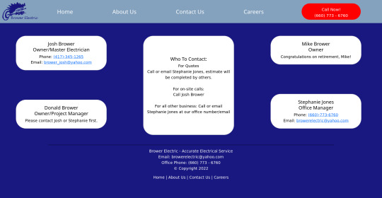
Brower Electric - Commit #6 - Contact Us
This push, I added the Contact Us page.
On Desktop:
On Mobile:

The HTML:
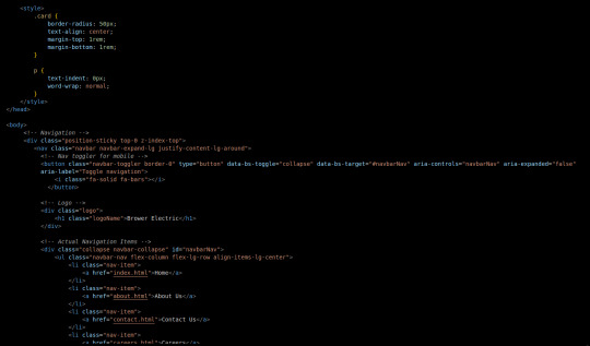
I used some internal CSS in the head tag because I wanted the cards and text on this page to look a little different.
Our nav bar (and this is standard on all pages) is contained in a div that sticks it to the top of the page, even as you scroll. The z-index-top class makes the z index 100 so it overlaps everything.
The rest of the navbar is the same as other pages.
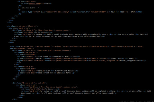
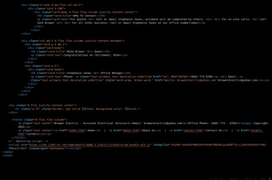
So the first div you see after the nav bar is only visible on medium screens and below. This div contains a card that has been flexed to center it's content. This card is the instruction card for who to contact. On bigger screens, a nearly identical one will appear in the center of the Contact Us grid.
Our Contact Us grid uses Bootstrap rows and cols. The row has a 100% width and a minimum height of 50% of the viewport. It justifies it content to the center of the column on mobile but otherwise it justifies content by the space around in a row. It aligns items center on mobile and stretches them out on other devices. It also has a margin on the top and bottom.
The cols are flex columns that justify their content based on the space between. That's how we get the vertical spacing on desktop.
The cards have some padding and a bottom margin, and the contact links are formatted.
The middle col only contains the who to contact div that reveals on medium devices and up.
The footer is the same as the other pages.
The CSS:
I did not add any external CSS for this page besides the z-index-top class I mentioned earlier. I'm pretty proud of this because it means that I am getting better at utilizing Bootstrap 5 classes.
Conclusion:
I should learn more about Grids. Their responsiveness is powerful because you can manipulate more than one direction at a time but I always find myself using Flexbox tools. Maybe it is because Bootstrap is built on flexbox or more likely because I like my comfort zone. Either way, I need to branch out.
12 notes
·
View notes
Text
Day 18: Accessibility and Element Semantics
Feeling pretty refreshed tackling on a new challenge within my full-stack development: accessibility and element semantics! This is really important because I had worked on a side project that was looking pretty sloppy with TONS of <div> elements. After tonight I can revisit the code and make changes as needed.
Let's get to it!
Learned of element semantics and the things encompassed within that. There are two main categories: primary structure and content indicators.
The alt attribute on img tags (this is used after the url like so: <img src url alt text> is used to provide text to an image should it not load properly for whatever reason.
<h1> - <h6> is used as a way to categorize content and label them as such. Something that was stressed to me is to NOT use them for sizing, that is something CSS can be utilized for.
Learned about different elements to semantically label my content. <main>, <head> (which is not the same as <header>), <section>, <article>, <nav>, and <footer>. Tons of ways, but at the end of the day if they don't fit the bill use a <div>.
Audio accessibility! With text, using an <audio> element can provide for accessibility to any user. The <audio> tags support the control attribute.
The control attribute shows the browser default play, pause, and keyboard functionality controls. It's a boolean attribute, so it does not need a value.
When providing the source tag, use a src attribute and set it to a url similar to an image. Then, using the type attribute will need to be set to audio/mpeg. (at least in my example)
The <figure> element which is used for wrapping a visual representation like charts or images. The <figcaption> tag is used within <figure> tags to provide a caption to the image.
The <label> element used around user responses. It can have a <for> attribute on it to provide information to the user.
Radio buttons can be pretty hectic looking on the developer. Using a <fieldset> tag surrounds the entire grouping of radio buttons. The <legend> attribute can be used as well typically next to the prompt or question the user is responding to.
That was a pretty informative and lengthy section. Tomorrow I will be finishing up Visual Accessability and moving on to principles and Flexbox! Sleepy time.

1 note
·
View note
Text
Web Authoring Blog
10/01/21
The past week I have been working on my assignment through Wordpress. The assignment is to install and build our own wordpress site on the college server. This was a basic enough assignment but I did encounter some problems along the way. Firstly, I had a problem connecting to the college server, which meant I was required to get a new password from IT, and that took up some time.Once I could connect to the server I successfully connected to the server, and uploaded wordpress to filezilla.
I also encountered a problem trying to activate a child theme on my wordpress site. I didn’t realise that my .css file in my wordpress folder had an extra full stop where it shouldn’t have been, and it was breaking my up the code when I tried to activate my child theme on the wordpress site. Once I figured this out (which took some time) I found that I had a lot of fun with this assignment.
It was great to play around with all the various features of wordpress. Somethings I did find a little strange and a bit unintuitive (such as accessing certain editing functions from the front end site) but I I got used to the workflow the more time I spent on it. I do feel like I ran out of time and had to eventually settle with what I had for the assignment but I am keen to continue working on the site I had created in order to improve my skills using Wordpress, and having something good to add to my portfolio.
22/12/20
Last week we covered CMS systems and. It seems like it should be straight forward, however if I have learned anything so far its that sometimes coding can seem straightforward, but due to lack of experience simple problems can be difficult to figure. Wordpress, however, looks great a a system to use.
As soon as we started learning it I could think of difficult examples of blogs and websites that have used Wordpress as a platform to great effect, and I am excited to start using the platform properly. It seems that once you start using Wordpress, and get used to the workflow, you can create really great looking websites with minimal effort.
There are so many different customizations meaning you can be very creative with Wordpress. I am excited to start using some other CMS systems in order to see how they compare against Wordpress anf figure out whether Wordpress is the best option for me as a system to use going forward.
16/12/20
This was our first week covering Wordpress and CMS systems. I had heard from multiple sources regarding the unintuitiveness of WordPress but that definitely was not my initial thought. It potentially could have been outdated by other CMS that came after it, but as a platform it seems very powerful if you know how to use it correctly.
My mind automatically started thinking ahead in terms of how platforms like wordpress could be used by web designers, and myself hopefully when the time comes, to build comprehensive and sophisticated web pages for clients.
We had a reading week so had no class on the 12th of December, but on the 11th we also had to submit assignment 2, which was our personal profile web page. It was a tough task, but I believe I got a good result for my first attempt at creating a web page. One problem I encountered, that I was very satisfied to find a solution for, was aligning an image of the Griffith college logo to the right of the footer. After numerous attempts at finding a solution ( and tearing out a lot of hair) I eventually entered a <p> into the footer and cleared the floats within the style sheet which aligned the image up correctly.
2/12/20
Last week’s lecture covered Flex boxes. I think it may have been the first time we were exposed to any kind of framework that can simplify the building of web pages to some degree. From what I understand, tasks pertaining to the layout of elements on a page can be strenuous in terms of writing the html and css code; but flex boxes are effective in streamlining this process through their own unique set of rules.
I found Flex boxes easy to understand because, to the best of my knowledge, flexbox follows similar cascading and hierarchical principles as are the fundamentals in other parts of coding we have learned. For example, the container is a parent and everything contained within (items) are children; akin to how a <section> element is a parent to a child <p> element contained within that section. I am starting to see how coding language is very complicated, but is designed to try and be as user friendly as is possible; there is a consistent way to think structurally about code that will benefit me and help me to troubleshoot problems I may have down the line.
25/11/20
Last week's lecture we covered color, links, layouts and floats. There was pats that seemed to be as straightforward as our previous lecture, and I found myself easily able to keep up in terms of what we were learning. For example with color, it was easy for me to understand how color can be applied to different elements. Also, I like how there are different ways that things can be applied through CSS, for example there being a choice to apply colour by percentage, or by hex values.
However, there I had two main takeaways from this class. The first, which I was already aware of but hadn’t yet been covered in class, is that CSS isn't just about visuals, parts of the page can be laid out in various ways by applying different rules. Floats do seem complicated, but once I get some experience using them I know it’ll be a massive part of building web pages, so it's something I am eager to get practice in.
The second take away, which I hadn’t pre-empted as a possibility with CSS, is the 5 styles that are applied to links on a web page. This was very interesting, and I was surprised, because I had thought that Javascript was the coding language for integrating interactivity on a web page. However, pertaining to our upcoming assignments, it is somewhat of a relief to know that more basic functions such as the 5 styles for links can be applied through CSS, without having to yet know javascript.
18/11/20
Last Saturday we had our first lecture that introduced CSS. A few things we covered were rules, IDs, classes and the cascading specificity of CSS. From the first introduction it seems to be straight forward enough, however once applied into a practical context I am sure there will be a lot of barriers to overcome in order to get competent with CSS. Seeing the difference between how a basic html page looks, without CSS, and then the possibilities once CSS has been applied was exciting.
I have found html relatively easy thus far, and it is very satisfying once the code does what you intended. However, it doesn't make things look beautiful, so seeing the difference between a page with and without CSS, and what the possibilities can be, was very exciting. Gemma used the example of the Griffith website, with and without the CSS, and the reality of what's possible once I get to using CSS became a reality.
SImilar to writing html, and the application of good practice and bad practice in terms of writing code ; we learned in last week's lecture the difference between inline CSS and stylesheets, and how the latter is the preferred method of applying CSS. Even though it would seem easier to write CSS within the same file as html, I am very conscious now of ensuring that I do not fall into bad habits in terms of I write any coding language as I hope to day be hired based on the quality of the work that I provide, so will avoid developing bad habits at any cost.
10/11/20
Last Saturday 7th November lecture covered semantic html and the structure of web pages. The previous lecture on links, images and tables had demonstrated and actualized for me the building blocks that web developers use across the board for different features of websites. Our most recent lecture built upon that knowledge and made me understand how semantic html is used to break up the different parts/sections of a website so that browsers can digest it and for SEO.
When practicing at home writing the code for articles and sections, which as I understand act as mini web pages within a web page,the muscle memory of writing code is improving physically writing code while also ingraining in me the concept of nesting code, and how hierarchy within that nested code is structured. The analogy of the Russian dolls has been mentioned numerous times and this week it became more applicable than before as a way to look at how you wrap up your code into structured pieces.
The easiest way for me to visualise semantic html in action was looking at online newspapers. Through looking at a few examples I could see how the home pages in particular are structured because they have so much content and articles etc that are irrelevant to each other. It's necessary to use semantic html to give meaning to each bit of content in order to direct internet users to relevant parts of the web page. One thing I never preempted, again in my own naivety/ignorance, was how integrated SEO is with the information contained within html. As a side project I think I will go and read up some more about digital marketing.
We were also required to do some practical exercise on forms this week. One thing of note, I had seen in previous lectures how values can indicate what happens when a user clicks on a link (opening in a new tab etc). Relative to values such as input/emails it’s interesting to see how these values can indicate how a specific entry of information into a data field, such as an email address, is handled. Also, the content we covered briefly touched on empty elements which I was not expecting as they don't follow the same rule set we had previously learned. I had expected there to be some as there are exceptions to rules in any language and html is no different evidently.
03/11/20
Our most recent lecture covered the topics of tables, links, images. As I mentioned in my previous post I was initially happy to be able to keep up with the material and didn't feel too far out of my depth. This week I am happy to say that I am still feeling positive about the decision to move into this new world and potential change of career.
With just two weeks under my belt I could already feel a change in how I will view websites going forward. As a user I had always thought, naively, of websites as eclectic; their features and functions presented as specific to the brand or organisation that they represent. However, during this lab, and particularly regarding the topic of tables, I began to visualize how they are all the same components put together by developers in different ways that serve the same functions.
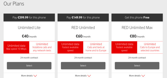
Telecommunication companies websites and how they present their pricing online was one such feature that came to mind. Previously I would have thought that their pricing was just an image integrated within the web page but now I obviously understand that it is built through a specific <table> element that is adjustable by a front end developer.
I had a thought on the topic of images and their applicability in different parts of a web page also. Having worked as an outbound salesman for the last couple of years I looked at a lot of websites to find clients. Obviously, a company's budget has to be considered when considering the quality of a website but from what I observed there are some elements of websites that are perhaps ignored or rushed by developers, are not budget dependent, and can give a website a cheaper or less professional look.
I think the two screenshots below corroborate my point above; B2Bs logo on the home page of their site is slightly pix-elated while Hunt Office’s (one of the biggest office supplies companies in Ireland) logo looks smooth and gives it a cleaner look, which as the first thing a user sees when clicking onto a home page immediately portrays a better level of professionalism than that of B2B.


I am trying not to think too far ahead in terms of the end goal of being in this course, and this module, because I have a long way to go and an extremely vast discipline to cover before any of that will happen. Thinking too far ahead would be daunting for me so its better to sit back and enjoy the process of learning each part as it comes.
27/10/20
This web authoring module is the reason I decided to do this interactive digital media course. I have come from working in sales the last couple of years and wanted to make a complete career change. For that reason it was very important I acquired proper tangible skills that allowed me to make that change and I felt coding was up there with the best of options.
Our first lecture last Saturday was about HTML. From what I understand, we are learning HTML at the best time up to date as its been consolidated into one format that everyone in the western world abides by and is uniform so a lot of complications can be avoided across the board for developers and users alike.
The lecture primarily focused on elements and I was happy, and relieved, that I could keep up with the material and didn’t get too lost as this is all totally new territory for me. I enjoyed the lecture thoroughly as HTML seems logical and if you follow the right steps it does what you want it to do. I am looking forward to starting practice, getting the muscle memory working and moving toward that career change I need.
1 note
·
View note
Photo

Footer Design CSS
#flexbox responsive footer#website footer design#footer#html css#learn to code#code#webdesign#frontend#codingflicks
8 notes
·
View notes