#css flexbox layout
Explore tagged Tumblr posts
Visit Tumblr Blog
Explore Tumblr blogs with no restrictions, modern design and the best experience.
Last Seen Tumblr Blogs


Fun Fact
Kazakhstan’s Minister of Communications and Informatics has blocked the Tumblr site because it contained 60 sites of terrorism, extremism, and pornography in 2015.
Text

Team Section UI Design
#team section design#team section flexbox#codenewbies#html css#html5 css3#webdesign#css flexbox layout#css flexbox#css#team section html css#html css tutorial
4 notes
·
View notes
Text

Flexbox Navigation Menu
#navigation menu#css menu#html css menu#css flexbox layout#html css#learn to code#code#frontend#css#html#css3#css layout#frontenddevelopment#css tricks#navigation bar
6 notes
·
View notes
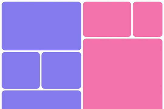
Photo
Responsive Flexbox Layout
#responsive flexbox layout#css flexbox layout#css flexbox examples#learn to code#code#Homepage design#homepage#flexbox homepage#css#html#css3#html5#divinectorweb
2 notes
·
View notes
Text
The Mistakes of CSS
New Post has been published on https://thedigitalinsider.com/the-mistakes-of-css/
The Mistakes of CSS
Surely you have seen a CSS property and thought “Why?” For example:
Why doesn’t z-index work on all elements, and why is it “-index” anyways?
Or:
Why do we need interpolate-size to animate to auto?
You are not alone. CSS was born in 1996 (it can legally order a beer, you know!) and was initially considered a way to style documents; I don’t think anyone imagined everything CSS would be expected to do nearly 30 years later. If we had a time machine, many things would be done differently to match conventions or to make more sense. Heck, even the CSS Working Group admits to wanting a time-traveling contraption… in the specifications!
NOTE: If we had a time machine, this property wouldn’t need to exist.
CSS Values and Units Module Level 5, Section 10.4
If by some stroke of opportunity, I was given free rein to rename some things in CSS, a couple of ideas come to mind, but if you want more, you can find an ongoing list of mistakes made in CSS… by the CSS Working Group! Take, for example, background-repeat:
Not quite a mistake, because it was a reasonable default for the 90s, but it would be more helpful since then if background-repeat defaulted to no-repeat.
Right now, people are questioning if CSS Flexbox and CSS Grid should share more syntax in light of the upcoming CSS Masonry layout specifications.
Why not fix them? Sadly, it isn’t as easy as fixing something. People already built their websites with these quirks in mind, and changing them would break those sites. Consider it technical debt.
This is why I think the CSS Working Group deserves an onslaught of praise. Designing new features that are immutable once shipped has to be a nerve-wracking experience that involves inexact science. It’s not that we haven’t seen the specifications change or evolve in the past — they most certainly have — but the value of getting things right the first time is a beast of burden.
Direct Link →
#background#Born#change#CSS#CSS Flexbox#CSS Grid#css-tricks#csswg#digitalocean#easy#Features#grid#Ideas#immutable#it#layout#Light#Link#links#list#masonry#mind#module#newsletter#Science#specifications#stroke#syntax#technical debt#time
0 notes
Text
La propiedad display en CSS: Desde lo básico a los diseños más avanzados.
La propiedad display determina el tipo de caja que un elemento forma y cómo se comporta dentro del flujo del documento. En otras palabras, indica si un elemento se mostrará como un bloque, una línea o si se ocultará por completo. Valores de la propiedad display La propiedad display admite varios valores, cada uno con un comportamiento específico: Valores básicos: block: Crea un bloque que…
#block#caja#contenedor#CSS#CSS3#desarrollo web frontend#Diseño web#diseño web adaptable#diseño web moderno#elemento#elementos HTML#Flexbox#flujo del documento#Grid#inline#inline-block#layout#maquetación#posicionamiento de elementos#propiedad display#responsive design#tipos de display#valor display
0 notes
Text
Responsive Layouts: Flex, Grid and Multi-Column
Responsive Layouts: Flex, Grid and Multi-Column
Welcome to the book “Responsive Layouts: Flex, Grid and Multi-Column” In this book I explain the three best-known responsive layouts: the Flexbox, the Grid and the Multi-Column layout. Flexbox is a one-dimensional layout that only works in one dimension at a time, either horizontally or vertically. The grid layout is a two-dimensional layout that distributes the elements horizontally and vertically at the same time. The multi-column layout is a special layout for magazines and newspapers, where the text should flow in columns with spacing, rules, etc. I'll explain all the properties and their values and how they affect the distribution of elements on the screen. So let's get started.

#css#css3#flex#gird#flexbox#flexible#responsive design#responsive layout#modern layouts#mobile first
0 notes
Text
knowing the inner workings of css is making me too powerful
#css grid layout my beloved#also flexbox my beloved#<div> i can’t believe i ever feared you#miss twinkleton’s seminary for young ladies
0 notes
Note
hello. Im steepling my hands like an evil villain. Would you happen to know what the restrictions of the 3ds browser are, exactly? Eg, why most sites don’t work on it aside from ao3? I do neocities and have too much free time.
i think it's largely due to the fact that modern browsers simply have more features. the best way to make a website able to work on 3DS would be to avoid using any modern CSS- avoiding things like flexbox and instead use <table> ect ect.
to do a bit more research, i'd recommend looking into the browser that its based on and what things it can render. (which i linked above)
it's also important to keep in mind that the 3DS will automatically resize any text to be readable, so that could mess up layouts ect.
when making a website for 3DS imagine you are making it for a very low resolution phone.

^ once you're done, then you could add this button to your site proudly ^-^
#i believe you can also call a check to see if the person is viewing on their 3DS so that you can force the website to render differently.#many websites do this for mobile#asks#webdev is my hobby lmao
157 notes
·
View notes
Text
YOU MUST MAKE A WEBSITE
Oh wow, look at that! YET ANOTHER post urging you to make a webbed site! What a completely new thing that people haven't made a thousand masterposts for already!!
• Making a website might look scary. It is Not.
At first, I too thought making a website was too much work. It really isn't! It turns out that all you need is
an HTML file,
a web hosting service and
w3schools tutorials,
and that's about it!
This post will point you towards these resources, and others I found useful while figuring out how to make a website.
• VERY QUICK EXPLANATIONS:
What's HTML and CSS?
HTML is the content of your webpage, the skeleton of it. What shows up in a webpage is what's written in the HTML file!
CSS is the way the HTML is styled; the colour of the background and the letters, the size of elements, the font, all that!
Do I absolutely NEED JavaScript for a website?
Not at all! You don't need to worry about learning it before getting started.
• What do I make a website for? What do I put in there?
ANYTHING AND ALMOST EVERYTHING. Here's some ideas for pages from a post of mine were I was very normal about websites:
You can make a page that's only pictures of your pets.
You can make an interactive adventure.
You can make your own academic blog full of your own essays or articles.
You can just post a ton of art or make a full music page.
You can make a blog and infodump eternally, give book reccs and reviews. You can host a thousand virtual pets and nothing else.
Upload entire books in a single html file. Make a wikipedia for your ocs. Make a fake site for a random fictional place (restaurant, hotel, whatever). You can make a thousand fanpages/shrines about your favorite media. You can upload your own webcomic and make it all like a fancy website and shit.
I could keep going but, for the sake of "brevity", I won't.
• WEBSITE EXAMPLES!
If I started listing the websites I know, this post would be bottomless. Here's only seven:
https://publictransit.neocities.org/ - A webbed site, for sure
https://ribo.zone/ - A personal site
https://leusyth.neocities.org/ - An art archive
https://solaria.neocities.org/ - Personal website with A Lot of stuff (it'll come up in a bit, because it offers web making resources)
https://hog.neocities.org/ - The Hogsite
https://thegardenofmadeline.neocities.org/ - Another personal site! It also has a web resources page and has made another masterpost like this one (but better)
https://spiders.neocities.org/ - My own website, which must be weird to see in mobile . sorry
• You've convinced me. I want a webbed site. Where do I start?
https://neocities.org/
FIRST OF ALL: Neocities. It is a free web hosting service, and it's the one I and the sites I linked use!
When I first started, my website was a black page with red letters and a drawing, and nothing else! It was like that for a month, till i started picking up on how to do things.
Here's what helped me get an idea of how to make things work:
https://sadgrl.online/learn/articles/beginners-guide-neocities
An absolute beginners guide to neocities -- while when you make an account there you get a tutorial page from the site, this one's extra support for that.
https://www.w3schools.com/
Learn HTML, CSS, JavaScript and MANY other coding things for free. All the tutorial/reference pages have live testing windows for you to mess with!! helped me a LOT while figuring this stuff out!
https://htmlcheatsheet.com/
https://htmlcheatsheet.com/css/
Cheatsheets for HTML and CSS, respectively. It includes a JavaScript one too!
https://sadgrl.online/webmastery/
Sadgrl's webmastery resources! Also includes the next resource listed here:
https://sadgrl.online/projects/layout-builder/
Sadgrl's layout builder; not a lot of customization at a first glance, but I've seen wildly different websites all using it as a base, plus it works using CSS Flexbox, so it generates a responsive layout!
(basically, a responsive layout is one that translates well in different sized screens)
https://www.tumblr.com/fysa/728086939730919424/wikitable-code?source=share
Tumblr user fysa made this layout imitating a wiki page!
https://brackets.io/
At some point, you might want to do things outside the Neocities code editor and get one outside the site. I recommend Brackets, because my old as fuck computer can run that and absolutely nothing else apparently, and it works wonderfully! Though I recommend either turning off the code autocomplete or using it after a good while of already using the Neocities code editor, so you get used to coding on your own.
http://www.unit-conversion.info/texttools/text-to-html/
Turn your text into HTML code! i use this kind of pages for my lengthy blog entries that I don't feel like formatting myself.
https://imagecompressor.com/
COMPRESS YOUR IMAGES.
The heavier an image is, the more your site weighs and the more time your page will spend loading. You don't want that, specially if your site is heavy on graphics. This might help!
https://solaria.neocities.org/guides
Some CSS, JavaScript and Accessibility guides! Worth checking out!
https://eloquentjavascript.net/
This is a free, interactive book for learning JavaScript! NOTE: It is very intuitive, but JavaScript is HARD!! I still haven't learned much of it, and my website does fine without so don't worry if you end up not doing much with it. It's still useful + the exercises are fun.
And now, accessories!
• Silly stuff for your page :]
https://gifypet.neocities.org/
Make a virtual pet, copy the code and paste it in your HTML file! You'll get a little guy in your webbed site :]
https://www.wikplayer.com/
Music player for your website!
http://www.mf2fm.com/rv/
JavaScript silly effects for your site :]
https://blinkies.neocities.org/geoblinkies
Blinkie search engine!
https://www.cbox.ws/
Add a chatbox to your site!!
https://momg.neocities.org/
Infinite gallery of gifs. i've spent hours in there looking at moving pictures and out of them all, the ONLY gif i actually ended up using on my site was a rotating tomato slice. it is still there. trapped.
https://wrender.neocities.org/tarotinstructions
A widget that gives you a random tarot card!
https://www.websudoku.com/widget.php
Sudoku widget!
That's about it for now! I don't know how to end this!!! Remember to have fun and google everything you don't know :]
569 notes
·
View notes
Text
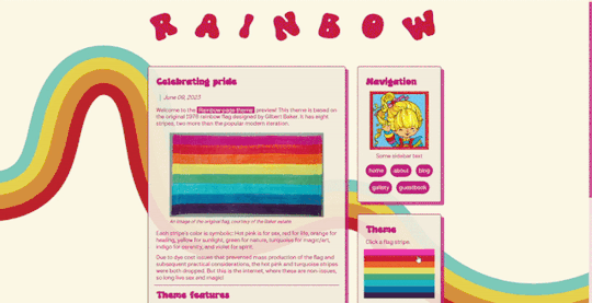

🌈 Rainbow Page Theme 🌈
made a page theme for pride month based on the original 70s rainbow flag! you can click on stripes of the flag to swap color schemes. happy pride!
Features:
Pride flag theme switcher (requires Javascript)
Mobile friendly (built w/ flexbox)
Customizable background & sidebar image
Animated rainbow title (can be changed)
Styled audio player
Responsive image class
…and other cool stuff!
Notes:
You must have javascript enabled for this page theme to work. See this post for instructions.
This theme is intended to be used with custom Tumblr pages (select custom layout rather than standard layout and then copy & paste the raw Gist code)
This can also be used on Neocities or any other host that supports HTML/CSS/JS.
🍃 live preview + code + more info 🍃
1K notes
·
View notes
Text
I feel you, Feli....I feel you
I wanted to move a headline to the lower right of the header. CSS put it everywhere but where I wanted it to be. My entire flex box broke because I wanted to have my headline on the right instead of the left 🥲
you put in css whose sole purpose is "move button to the left", think it works (you are a fool) and once implimented the move button left code somehow started cannibalizing all headlines directly below it
#css be like that#did you use flexbox/ grid?#maybe moving it moved the whole following layout because of this#idk though I made one website for uni this semester and I am so glad its done
9 notes
·
View notes
Text
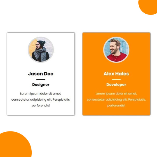
Team Section UI Design
#team section html css#team section flexbox#codenewbies#html css#frontenddevelopment#html5 css3#css#webdesign#css flexbox layout#flexbox snippets
3 notes
·
View notes
Text
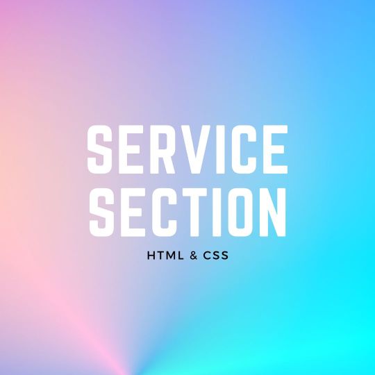
Responsive Neumorphism Service Section
#service section design#dark neumorphism#css neumorphism#responsive web design#html css#codingflicks#learn to code#code#frontend#html#css#css3#frontenddevelopment#webdesign#css flexbox layout#css flexbox grid
5 notes
·
View notes
Text

CSS Flexbox Responsive Login Form
#html css form#responsive form#css flexbox layout#css flexbox examples#responsive form design#flexbox form#flexbox layout#learn to code#html css#code#frontenddevelopment#divinectorweb#webdesign
1 note
·
View note
Text
8 CSS Snippets for Creating Bento Grid Layouts
New Post has been published on https://thedigitalinsider.com/8-css-snippets-for-creating-bento-grid-layouts/
8 CSS Snippets for Creating Bento Grid Layouts
Another day, another design trend! Bento grid layouts are the subject this time around. They’re bold and beautiful. Plus, they satisfy those with a need for symmetry.
So, what exactly is a Bento layout? Think of it as a puzzle. Different-sized containers fit together to create a seamless look. Inspired by Japanese culture, it’s popping up all over the web.
There’s good reason for Bento’s growing popularity. You can use these layouts in a multitude of ways. Everything from listing blog posts to product features is possible. They’re also perfect for dashboard screens.
We should also mention the role that the evolution of CSS has played. Both CSS Grid and Flexbox make these layouts easier to build. No hacks or workarounds are necessary!
With that, here’s a look at 8 beautiful Bento grid layouts.
Complex Bento CSS Grid Layout
CSS Grid packs a lot of power into a tiny bit of code. For example, this complex grid layout requires only 43 lines of CSS. The layout is both efficient and naturally responsive. Therefore, you won’t have to play around with media queries.
See the Pen Complex Bento Layout
Bento-Style Responsive Dashboard
Here’s a gorgeous dashboard layout that benefits from Bento. The layout offers a great way to display relevant content. Everything is neatly organized and easy to follow. The use of photography and color makes this example stand out.
See the Pen Responsive Dashboard | Bento Style by Ecem Gokdogan
Bento Design Concept Layout
This page layout is a different take on the Bento aesthetic. There’s a sidebar featuring in-page navigation. Clicking a button expands it. Meanwhile, the content container maintains a consistent height.
See the Pen bento design concept by Abhishek Bhardwaj
Bento-Box-V1.0.1
Bento layouts also benefit from minimalism. This layout features fewer bells and whistles. Notice the use of white space and legible typography. The animated charts catch your eye without being overwhelming.
See the Pen Bento-Box-V1.0.1 by Gwenaël Guiraud
Sticky Bento on Scroll
This “sticky” presentation adds special effects to the mix. Watch how certain elements stick as you scroll. The idea is that you can go beyond static grids. Bento can be fun, too!
See the Pen Sticky Bento on Scroll ✨ by Jhey
Bento Grid Using CSS Flexbox
Let’s check out another fun example using Flexbox. This grid has a neon look and includes cool hover effects. Bonus points here for maintaining legibility and responsiveness.
See the Pen bento grid – challenge (Chrome +111) by EaterUsr
Card-Based Layout with Gradient Borders
Here’s an example for those wanting to stand out from the crowd. This card-based layout features animated borders, “wipe” effects, and beautiful hover styling. The layout remains clean – even with all those goodies.
See the Pen Cards (gradient border) by Dan
CSS Grid & :has() Grid Layouts
We can achieve a lot with the CSS :has() pseudo-class. This example uses it to adjust the layout as boxes are added and subtracted. Watch as the layout maintains perfect symmetry throughout.
See the Pen Always great grid – CSS grid + :has() + view transitions by Adam Argyle
Use Bento Grids to Keep Your Layout Nice and Tidy
The idea of using Bento aesthetics in web design isn’t new. However, older CSS layout techniques made them difficult to build. That’s no longer the case.
Perhaps the best part is that modern CSS does all the dirty work. We don’t need to compute complex calculations. CSS Grid and Flexbox can do this for us.
That leaves us free to experiment. The examples above demonstrate what is possible. And you can get as creative as you like.
Want to see more Bento grid examples? Check out our CodePen collection!
Related Topics
Top
#amp#Blog#box#challenge#charts#chrome#code#Color#container#Containers#content#CSS#CSS Flexbox#CSS Grid#CSS Layout Snippets#CSS Layouts#CSS Snippets#dashboard#Design#display#easy#effects#Evolution#eye#Features#grid#grids#hover#how#it
1 note
·
View note
Text
Propiedades de las Cajas o Bloques en HTML y su Importancia
En HTML, todos los elementos, desde un simple párrafo hasta una imagen compleja, se representan como cajas. Estas cajas tienen propiedades que nos permiten controlar su tamaño, posición, espaciado y otros aspectos visuales. Comprender estas propiedades es fundamental para crear diseños web personalizados y atractivos. ¿Qué es el Modelo de Caja en CSS? El modelo de caja es una representación…
#CSS#css box model#CSS layout#CSS properties#desarrollo web#diseño responsive#Diseño web#Diseño web personalizado#Flexbox#Grid#Guía CSS#HTML#layout#Modelo de caja CSS#Posicionamiento CSS#propiedades CSS#Tutorial CSS#z-index
1 note
·
View note