#dashboarddesign
Explore tagged Tumblr posts
Visit Tumblr Blog
Explore Tumblr blogs with no restrictions, modern design and the best experience.
Last Seen Tumblr Blogs


Fun Fact
Hackers stole 65M passwords from Tumblr in 2013.
Text
Is your billing dashboard secretly costing you?
A billing dashboard should offer effortless access to calls, usage, and charges. We transformed our client's Open-Source VoIP Billing Dashboard. Here’s how. 1. Confusing Layout ❌ Data hard to scan. ✔ Clear, structured data for better readability. 2. Weak Visuals ❌ Slowed decision-making. ✔ Enhanced data visualization with trend charts. 3. Limited Insights ❌ Users had to dig for key details. ✔ Custom filters & date range options for deeper insights. 4. Outdated UI ❌ Created unnecessary friction. ✔ Modern UI & improved hierarchy for easy scanning. A great UX isn’t just about looking good. It’s about working smarter. What’s the biggest UI/UX issue you’ve faced with dashboards? Let’s discuss below!

#UXDesign#DashboardDesign#VoIP#SaaS#UIDesign#ProductDesign#DataVisualization#BillingSolutions#EnterpriseTech
2 notes
·
View notes
Text

Data Visualization Consulting Services: Transform Data Into Clear, Actionable Insights Unlock the true potential of your data with our Data Visualization Consulting Services. We help businesses turn complex datasets into clear, compelling visuals that drive informed decision-making. From interactive dashboards to custom visual solutions, our experts deliver actionable insights through advanced tools like Tableau, Power BI, and more.
0 notes
Text
Dashboards that do more than just display — they respond.
From real-time mortgage task flows to beautifully navigated list views, we transformed how one lending team operates inside Salesforce.
✨ Automation. 📊 Instant updates. 🚀 Smarter decisions.
#SalesforceExperts#SalesCloud#MortgageTech#FintechCRM#LWC#DashboardDesign#CRMThatWorks#AutomationInFinance
0 notes
Text

Customizable Interface Users can configure their home page and dashboards according to their preferences, enabling a more personalized and efficient user experience.
Unlock actionable insights now! Schedule your demo today! https://calendly.com/fresatechnologies
For more queries please visit below link 👇https://fresatechnologies.com/fresa-gold/
For further inquiries, please contact us : [email protected]
#Fresa#Freightsolutions#Freightforwarding#Import#FresaGold#ERPSoftware#FresaAIChatbot#SmartFreightAssistant#G2Awards#EasyUsability#BestSupport#AutomateYourBusiness#FresaTechnologies#LogisticsSoftware#ERPforLogistics#FreightSolutions#CustomizableInterface#UserDashboard#PersonalizedExperience#EfficientUI#TechInnovation#UserPreferences#DashboardDesign#UserExperience#DigitalCustomization#InterfaceDesign#ModernSolutions
0 notes
Text
How can I download the latest version of Active Intelligence Visualization (AIV)?
To download the latest version of Active Intelligence Visualization (AIV), follow these steps:
Visit the company's official website Go to the AIV website download section.
Download and Install Once you locate the latest version, click the download link to begin. After the download completes, run the installer to upgrade to the newer version. Follow the installation prompts.
License Key You will be required to request a new license for the latest release. You can request a new license key by making a request from the License page under the Administration section.
Backup Existing Configuration Before upgrading, it’s a good practice to back up your existing configuration and data to ensure that any customizations or reports are preserved.

#aivhub#aiv#aivconsultant#aivtraining#aivconsultancy#OneAIV#BusinessGrowth#AIforBusiness#BusinessIntelligence#DataVisualization#DashboardDesign#BusinessTools
0 notes
Text
Struggling with cluttered filters in Power BI?
Say hello to Text Slicer — a simple visual that makes filtering clean, fast, and intuitive. Perfect for dashboards where user-friendly interaction matters.
💡 Learn how to use it in minutes

0 notes
Text
How long does it usually take for QuickAnalytics.pk to deliver a Power BI dashboard for a mid-sized dataset?
For a mid-sized dataset, QuickAnalytics.pk typically delivers a fully functional Power BI dashboard within 5 to 7 business days, depending on data complexity and specific client requirements. Their team is known for combining speed with precision, making them a great choice for businesses that need insights fast without compromising on quality.
If you have clearly structured data and defined KPIs, the turnaround could be even quicker. They also offer consultation to ensure the dashboard is tailored to your needs.
#PowerBI#DataAnalytics#QuickAnalytics#BusinessIntelligence#DashboardDesign#DataVisualization#PakistanTech#BItools
0 notes
Text
Microsoft Power BI
Microsoft Power BI is a powerful business analytics tool that enables organizations to visualize data, share insights, and make informed decisions based on real-time analytics. With its intuitive dashboards, interactive reports, and seamless integration with Microsoft products like Excel and Azure, Power BI simplifies complex data into meaningful visuals that drive smarter business strategies. Whether you're tracking sales performance, customer behavior, or operational efficiency, Power BI makes it easier to uncover trends and opportunities.
From startups to large enterprises, businesses across industries are leveraging Power BI to turn raw data into actionable intelligence. Its cloud-based platform ensures accessibility from anywhere, while its robust security features maintain data integrity. If you're looking to elevate your data strategy with customized Power BI solutions, visit: https://www.intelegain.com/mobile-app-development-services/
#PowerBI#MicrosoftPowerBI#DataAnalytics#BusinessIntelligence#DataVisualization#BItools#AnalyticsSolutions#DataDriven#DashboardDesign#ReportingTools#DataInsights#PowerBIDashboard#DataAnalysis#BusinessData#TechSolutions
0 notes
Text
Key Trends in Data Visualization Consulting Services for 2025
As businesses continue to rely on data-driven strategies, the demand for data visualization consulting services is rapidly evolving. In 2025, emerging technologies and innovative approaches are set to reshape how organizations analyze and interpret their data. From AI-driven automation to immersive visual experiences, staying ahead of these trends is crucial for companies seeking a competitive edge.

1. AI and Machine Learning Integration
One of the biggest trends in data visualization consulting is the growing integration of artificial intelligence (AI) and machine learning (ML). These technologies enhance visualization tools by automatically identifying patterns, generating insights, and even making predictions.
Consultants are leveraging AI-powered analytics to create dynamic dashboards that adapt to user preferences and highlight key trends without manual intervention. This automation not only improves efficiency but also allows businesses to focus on decision-making rather than data processing.
2. Real-Time and Predictive Analytics
Organizations increasingly require real-time data visualization to respond to market changes instantly. In 2025, businesses will prioritize dashboards and visualization platforms that provide live data streams, enabling immediate decision-making.
Beyond real-time analytics, predictive visualization is also gaining traction. By combining historical data with AI-driven forecasting models, businesses can anticipate future trends and make proactive decisions. Data visualization consultants play a crucial role in designing systems that incorporate both real-time and predictive analytics.
3. Interactive and Immersive Visualizations
Static charts and graphs are no longer sufficient. Companies are embracing interactive data visualizations that allow users to explore data dynamically. From drill-down charts to augmented reality (AR) dashboards, interactive elements enhance user engagement and insight discovery.
Additionally, virtual reality (VR) and AR are making their way into data visualization consulting. Businesses in industries like finance, healthcare, and logistics are experimenting with 3D data representations, providing more intuitive ways to analyze complex datasets.
4. Data Storytelling and Narrative-Driven Dashboards
As businesses seek more effective ways to communicate insights, data storytelling is becoming a central focus. Instead of presenting raw numbers, visualization consultants help organizations craft compelling narratives that guide decision-makers through key insights.
Dashboards in 2025 will feature narrative-driven layouts, where AI-generated summaries and annotations provide context alongside data visualizations. This approach ensures that stakeholders at all levels understand the implications of the data without needing deep analytical expertise.
5. Cloud-Based Data Visualization Solutions
With the rise of remote work and distributed teams, cloud-based data visualization platforms are becoming essential. Businesses are moving away from on-premise solutions to cloud-hosted dashboards that offer seamless access from anywhere in the world.
Consulting services are now focused on implementing scalable, secure, and easily integrated cloud visualization tools. Platforms like Tableau, Power BI, and Looker are evolving to offer more cloud-native features, making it easier for organizations to collaborate in real time.
6. Focus on Data Security and Compliance
As data privacy regulations tighten, organizations are prioritizing secure data visualization solutions that comply with frameworks like GDPR, CCPA, and HIPAA. Data visualization consultants must ensure that dashboards and analytics platforms are designed with robust security features, such as role-based access control and encryption.
In 2025, expect a surge in privacy-preserving analytics, where sensitive data is anonymized or protected through advanced cryptographic techniques while still enabling meaningful insights.
7. Customization and Personalization
A one-size-fits-all approach no longer works for businesses handling large and diverse datasets. Companies now seek highly customizable visualization solutions tailored to their specific industry needs.
Consultants are focusing on building personalized dashboards that allow users to customize views, apply industry-specific filters, and receive AI-driven recommendations. This personalization ensures that different departments and teams get the most relevant insights for their roles.
Conclusion
The field of data visualization consulting services is rapidly advancing, with AI, real-time analytics, interactive tools, and security playing a central role in 2025. Businesses that embrace these trends will gain deeper insights, make faster decisions, and stay ahead in an increasingly data-driven world. As technology continues to evolve, the importance of expert consultants in implementing these cutting-edge visualization strategies will only grow.
#DataVisualization#ConsultingServices#HexaviewTech#BusinessIntelligence#DataAnalytics#DataDriven#DashboardDesign#BigData#AIAnalytics#TechConsulting#BI#DataInsights#DigitalTransformation#DataScience
0 notes
Text
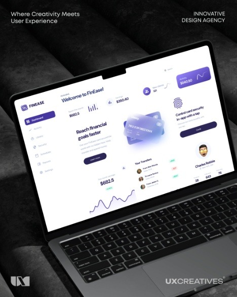
Unlock Insights, Unlock Growth!
Our expert designers at UX Creatives Design Agency crafted a cutting-edge fintech dashboard, empowering users to:
Track financial performance in real-time Analyze market trends with intuitive visuals Make data-driven decisions with confidence
Experience the power of informed decision-making.
#FintechInnovation#DashboardDesign#UIUX#UXDesign#FitnessTech#uiuxdesign#userinterface#webappdesign#uxuidesign#userexperience
0 notes
Text
A project manager dashboard is a crucial tool for effectively overseeing projects, tracking progress, and ensuring tasks are completed on schedule. This dashboard serves as a centralized hub, giving project managers a clear, real-time overview of key performance indicators (KPIs), team updates, and potential bottlenecks. Building a project manager dashboard may seem daunting, but with the right tools and approach, you can create a powerful solution tailored to your needs.
#ProjectManagement#projectdashboard#DashboardDesign#ProductivityTools#DataVisualization#TaskManagement#projectmanager#BusinessSolutions#ProjectTracking#CustomDashboard#DataIntegration#ResourceAllocation#TeamWork#BudgetTracking#ProjectTools#WorkflowManagement
0 notes
Text
Dashboards that do more than just display — they respond. From real-time mortgage task flows to beautifully navigated list views, we transformed how one lending team operates inside Salesforce.
✨ Automation. 📊 Instant updates. 🚀 Smarter decisions.
#SalesforceExperts#SalesCloud#MortgageTech#FintechCRM#LWC#DashboardDesign#CRMThatWorks#AutomationInFinance
0 notes
Text

🎨 Customizable Interface Users can configure their 🏠 home page and 📊 dashboards according to their preferences, enabling a more personalized and efficient user experience 💡✨.
🚀 Ready to transform your logistics journey? Book your FREE demo today! 👉 https://calendly.com/fresatechnologies
🌐 Learn more: https://www.fresatechnologies.com
📧 Got questions? We’re here to help: [email protected]
#Fresa#FresaTechnologies#FresaGoldERP#LogisticsSoftware#FreightForwarding#ShippingSoftware#SupplyChainTech#SmartLogistics#DigitalLogistics#ERPforFreight#FreightTech#SoftwareSolutions#FreightDigitalization#LogisticsERP#FutureOfLogistics#AutomationInLogistics#LogisticsInnovation#AwardWinningSoftware#CustomizableInterface#UserExperience#DashboardDesign#SoftwareFeatures
0 notes
Text

Hello, design enthusiasts! I'm excited to share our latest project on Behance – the UI/UX Design for a PTAAS platform, crafted to enhance vulnerability management through intuitive design and seamless interactions. With a focus on user experience, our design prioritizes efficiency and clarity across various roles, ensuring that users can easily navigate and access crucial information.
Check Case Studies: https://www.behance.net/gallery/211664731/PTAAS-Platform-UIUX-Design-Cyber-Secuirity-SaaS
Project Highlights:
↳ Role-Specific Dashboards ↳ User-Centric Navigation ↳ Clean and Minimalist UI ↳ Robust Branding ↳ Comprehensive Design System
Key Features:
↳ Vulnerability Tracking & Updates ↳ Role-Based Access Control ↳ Collaborative Discussion Threads ↳ Real-Time Reporting ↳ Search & Filter Functions ↳ User-Friendly Input Forms
Outcome: A powerful PTAAS platform that simplifies vulnerability management, making it accessible and effective for all users. It was a rewarding challenge to harmonize user needs with functional requirements.
Got ideas? Let’s connect and collaborate! 📧 [email protected] 📞 WhatsApp: http://wa.me/+8801781907745 🌐 bertobaseit.com
#PTAAS#UIDesign#UXDesign#WebDesign#VulnerabilityManagement#UserExperience#DesignInspiration#MinimalistUI#DashboardDesign#CollaborativeDesign#Behance#WebDevelopment
0 notes
Text

Unlock the potential of creativity with AIVHUB. Learn cutting-edge tactics and game-changing technology that will expand your company's reach, improve efficiency, and prepare it for the digital age.
#aivhub#aiv#aivconsultant#aivconsultancy#aivtraining#DataVisualization#DigitalTransformation#DashboardDesign#BusinessSolutions
0 notes
Text
Designing User-Friendly Dashboards: A Guide to UI Excellence
User Interface and Dashboard Design are crucial aspects to keep in mind while designing a website or an app. While User Interface focuses on enhancing the overall experience of the user while on the site, Dashboard Design’s purpose is to give an overall aesthetic outlook. Be it a website, application, or software platform, both focus on the following key aspects – influencing user behavior, boosting engagement and retention rates, and creating an ultimate actionable presentation of data. User Interface and Dashboard Design play a crucial role in reducing Information saturation by optimizing the overall experience for the user. In this comprehensive guide, we delve into the principles, best practices, and emerging trends in UI and dashboard design to broaden our understanding.
Understanding User Interface Better
A well-designed user interface can boost the brand’s credibility in addition to its aesthetic appeal. The careful use of UI elements, such as colour schemes, typography, and visual components, can reflect a brand’s personality and provide a consistent experience across all platforms.
The interactive and visual components of a digital product that users interact with are included in user interface design. It entails designing a fluid and user-friendly interface that makes it possible for customers to use, engage with, and benefit from the product. The following are some key aspects to remember while designing UI:
Consistency:
Consistency in design elements such as colours, fonts, buttons, and icons throughout the interface must remain the same since consistency fosters overall familiarity with the website/app and helps create distinction of the various functions.
Simplicity:
Cluttering the interface with unnecessary elements can overwhelm users. Whereas focusing on clarity, ease of use, simplicity can attract more users.
Hierarchy:
Establishing a clear hierarchy of information to guide users’ attention through the page is necessary. This can be smoothly administered by using visual cues such as size, colour, and placement to highlight important elements and actions.
Feedback:
Providing instant feedback for any action with UI elements to users can be a brilliant tactic for user interface. Feedback can include various animations, tooltips, or changes in element to indicate the successful completion of an action.
Accessibility:
Ensuring that the UI design is Disabled-friendly. Hence, it is necessary to include considerations such as colour contrast, keyboard navigation, and screen reader compatibility.
Dashboard Design Best Practices
Dashboards give users insights into important metrics, trends, and performance indicators through visual representations of data and information. Achieving a balance between utility and aesthetics is essential for effective dashboard design. The following are some guidelines for creating dashboard designs:

Define Purpose and Audience:
It is necessary to define the purpose and target audience of the dashboard before designing it. Having knowledge of the specific metrics and insights that users need to derive from the dashboard, will help in your design decisions.
Keep it Relevant:
Only certain information that are relevant and actionable need to be displayed for your dashboard design. Cluttering the interface with excessive and irrelevant data and metrics will distract users from key insights.
Use Visualizations Wisely:
Select visualizations such as charts, graphs, and gauges to represent different types of data that effortlessly convey the underlying trends and patterns without confusing users with irrelevant detail.
Provide Interactivity:
Include interactive features that allow visitors to go further into the data, such as drilldowns, tooltips, and filters. Interactivity makes consumers more engaged and gives them the ability to get more in-depth insights out of the dashboard.
Design for Mobile Responsiveness:
Make sure the dashboard is mobile device friendly and optimized. As more people visit dashboards on smartphones and tablets, mobile responsiveness is crucial.
Emerging Trends in UI and Dashboard Design
The field of User Interface and dashboard design is constantly evolving, driven by technological advancements, and changing user expectations. Here are some emerging trends shaping the future of UI and dashboard design:
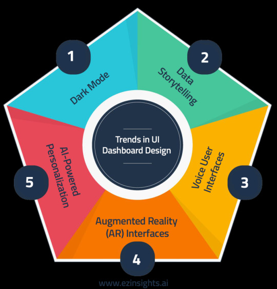
Dark Mode:
Dark mode interfaces, known for dark colour schemes are popular due to their visual appeal and reduced eye strain, especially in dim environments. This way UI designers provide better flexibility and user experience.
Data Storytelling:
Using narrative techniques, data storytelling communicates trends and insights found in the data. Designers may improve user engagement, knowledge, and decision-making by creating an engaging narrative around the data displayed on dashboards.
Voice User Interfaces (VUI):
VUI is becoming more and more important in UI design as voice-activated smart gadgets and virtual assistants proliferate. Hands-free operation is made possible and accessibility for people with mobility disabilities is improved by incorporating voice commands and interactions into user interface designs.
Augmented Reality (AR) Interfaces:
AR interfaces produce immersive user experiences by superimposing digital data and visualizations over the real world. AR interfaces provide creative methods to display data and involve consumers in interactive experiences in sectors including retail, education, and healthcare.
AI-Powered Personalization:
Customized user interfaces are provided by AI-powered personalisation/ customization algorithms that examine user behaviour and preferences. AI-driven interfaces improve user pleasure and engagement by dynamically modifying information, layout, and recommendations based on unique user profiles.
Overcoming Challenges in UI and Dashboard Design
Although having a solid understanding of UI and dashboard design is essential for developing effective digital goods, designers frequently run into a few obstacles. Providing outstanding user experiences requires an understanding of these obstacles and the application of solutions. The following are some typical problems with UI and dashboard design, along with solutions:
Information Overload:
Presenting a lot of information in a clear and understandable way is one of the main difficulties for dashboard design. Prioritize and arrange the most pertinent material in a hierarchical manner to help you cope with information overload. Make advantage of grouping, filtering, and visual hierarchy features to assist users in concentrating on the most crucial insights without being overtaken by too much information.
User Engagement:
Maintaining user engagement with the dashboard information and interface is essential to guaranteeing the efficacy of the design. To make the interface more interesting to use, include interactive features like animations, hover effects, and gamification strategies. To keep users interested over time, update the dashboard material frequently with new perspectives and pertinent data.
Data Visualization Complexity:
It can be difficult to select the best data visualizations and present data in a way that is easy to comprehend, particularly when working with complicated datasets. Work together with domain experts and data analysts to comprehend the context of the data and choose relevant visualizations that clearly convey the most important information. Provide users with contextual explanations, tooltips, and legends to aid in accurately interpreting the visualizations.
The Future of User Interface and Dashboard Design
The future of User Interface and Dashboard Design is full of fascinating possibilities as technology develops more and user expectations change. Designers have never-before-seen chances to innovate and produce game-changing user experiences, from immersive augmented reality interfaces to AI-driven personalization. Designers can influence the direction of user interface and dashboard design and create experiences that thrill and empower users everywhere by embracing emerging technologies, taking user feedback into account, and keeping up with industry trends.
For more related blogs visit: EzInsights AI
0 notes