#datepicker datetime
Explore tagged Tumblr posts
Visit Tumblr Blog
Explore Tumblr blogs with no restrictions, modern design and the best experience.
Last Seen Tumblr Blogs


Fun Fact
In 2020, Tumblr had 29.4 million users in the US.
Text
A persian (farsi) datepicker for flutter
Persian DatePicker & DateTime Manipulation A persian (farsi) datepicker for flutter. to see an example of date conversion and manipulation, refer to DateTime section in this page. Usage A simple example with a TextField which turns into a datepicker main.dart import 'package:flutter/material.dart'; import 'package:persian_datepicker/persian_datepicker.dart'; void main()…

View On WordPress
0 notes
Text
Add a DateTimepicker to your Ruby on Rails app
I just published "Add a DateTimepicker to your Ruby on Rails app" You often use a datetimepicker in your applications. Here is a step-by-step guide to using it on a Ruby on Rails application
We will see how to add a date and time selector to Ruby on Rails. This way, your users will be able to select a date and period from a calendar. In this example, we will use the bootstrap datetimepicker.
That’s what we’re going to get !
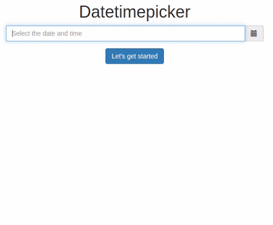
DateTimepicker: Let’s go !
Create a new project with the name of your choice, here “datetimepicker” specifying the use of a PostgreSQL database.
$…
View On WordPress
#bootstrap datepicker#date and time picker javascript#date time picker#date time picker javascript#date time picker js#datepicker datetime#datepicker time#datetime picker#datetime picker jquery#datetimepicker#datetimepicker example#datetimepicker format#datetimepicker javascript#datetimepicker plugin#javascript date and time picker#javascript date time picker#javascriptdatetime picker#jquery date time picker#jquery datetimepicker documentation#js date time picker#time and date picker
0 notes
Text
Feature-rich Datetime Picker Component With JavaScript
Feature-rich Datetime Picker Component With JavaScript
A responsive, multilingual, feature-rich, and easy-to-customize date, time, and date range picker component written in JavaScript. How to use it: 1. Install and download the NPM. # NPM $ npm i date-time-picker-component --save 2. Import the Datetime Picker Component. // using a bundler import 'date-time-picker-component/dist/css/date-time-picker-component.min.css'; import { DatePicker,…
View On WordPress
1 note
·
View note
Photo
A Vue Datepicker, Includes Date, Datetime, Time ☞ https://bit.ly/2WGWmje #vuejs #javascript
1 note
·
View note
Text
How to Display Datepicker When Textformfield is clicked in Flutter?

TextField Widget is used to get data from users and perform the desired operation. sometimes users need to show data that requires showing Date Picker in a mobile application. To Display, the same kind of data Date Picker is used. In today’s article, we will go through How to display date picker when Textformfield is clicked in flutter?
How to Display Datepicker When Textformfield is clicked In Flutter?
It can be done using onTap() property of TextFormField.
TextFormField( onTap: (){ // Below line stops keyboard from appearing FocusScope.of(context).requestFocus(new FocusNode()); // Show Date Picker Here }, )
A simple way of doing it :
Wrap TextFormField Inkwell like the below code snippet.
InkWell( onTap: () { _selectDate(); // Call Function that has showDatePicker() }, child: new TextFormField( decoration: new InputDecoration(hintText: 'DOB'), maxLength: 10, // validator: validateDob, onSaved: (String val) {}, ), ),
You can also try the below way:
TextEditingController dateCtl = TextEditingController(); TextFormField( controller: dateCtl, decoration: InputDecoration( labelText: "Date of birth", hintText: "Ex. Insert your dob",), onTap: () async{ DateTime date = DateTime(1900); FocusScope.of(context).requestFocus(new FocusNode()); date = await showDatePicker( context: context, initialDate:DateTime.now(), firstDate:DateTime(1900), lastDate: DateTime(2100)); dateCtl.text = date.toIso8601String();},)
Users can also try with below code snippet.
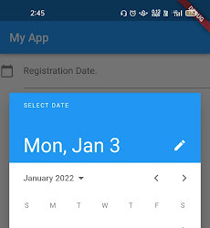
TextEditingController intialdateval = TextEditingController(); Future _selectDate() async { DateTime? picked = await showDatePicker( context: context, initialDate: new DateTime.now(), firstDate: new DateTime(2020), lastDate: new DateTime(2030)); if (picked != null) setState( () => { data.registrationdate = picked.toString(), intialdateval.text = picked.toString() } ); } TextFormField( // focusNode: _focusNode, keyboardType: TextInputType.phone, autocorrect: false, controller: intialdateval, onSaved: (value) { data.registrationdate = value; }, onTap: () { _selectDate(); FocusScope.of(context).requestFocus(new FocusNode()); }, maxLines: 1, //initialValue: 'Aseem Wangoo', validator: (value) { if (value.isEmpty || value.length < 1) { return 'Choose Date'; } }, decoration: InputDecoration( labelText: 'Registration Date.', //filled: true, icon: const Icon(Icons.calendar_today), labelStyle: TextStyle(decorationStyle: TextDecorationStyle.solid), ), ),
Output
Conclusion:
Hope you guys are enjoying our article.
Drop us your suggestion/feedback to serve you much better.
Flutter Agency is an online community dedicated to learning Flutter projects, development tips, issue resolution, news & industry updates. Consult our developer to turn your business idea into an amazing application that grows your business.
0 notes
Text
آشنایی با تگ input | آشنایی با عناصر ورودی در فرم ها | سایت آموزشی سئوشو

فرم ها دارای عناصری هستند که به وسیله آنها کاربر می تواند داده هایی همچون فیلدهای متنی، دکمه های رادیویی و غیره را در آن وارد نماید. فرم HTML، محیطی است که کنترل های مختلفی را درون خود جای می دهد. ابزارهایی در دسترس کاربر هستند که به وسیله آن می توان اطلاعات خود را از طریق کادرهای متنی و غیره وارد فرم کرد و آنها را به مقصد مورد نظر فرستاد. به این ابزارها، کنترل HTML می گویند. یک فرم با برچسب مورد نظر ساخته شده و بقیه کنترل ها درون آن قرار می گیرند. ارسال اطلاعات یک فرم توسط دکمه ای به نام Submit انجام می شود. نیاز است آن را ایجاد کنید تا بتوانید اطلاعات را برای مقصد ارسال نمایید. با ما همراه باشید تا در مقاله آشنایی با تگ input به بررسی موارد مورد نظر بپردازیم. شما همواره می توانید با دنبال کردن مطالب آموزشی سئوشو با بهترین مقالات آشنا شوید. منظور از عنصر ورودی چیست؟ منظور از تگ input چیست؟ چه خاصیت هایی در تگ input وجود دارد؟ در این مقاله میخواهیم به صورت کامل با آشنایی با تگ input ، خاصیت های آن و انواع ورودی بپردازیم.
آشنایی با تگ input
تگ Input مهمترین عنصر هر فرم به حساب میآید، هر فیلد از فیلد متنی تک خطی تا دکمه های رادیویی و چک باکس و… با استفاده از این تگ پیاده سازی میشوند.

نحوه پیاده سازی
مانند نمونه زیر از تگ input استفاده میکنیم. با اینحال در ادامه با انواع ورودی ها آشنا میشویم و برای هرکدام از آنها مثالی خواهیم زد. این مقاله را ادامه بدید که خیلی راه طولانی ای در پیش داریم.
انواع ورودی ها
خب همانطور که گفتیم و از تیتر معلوم است، در این بخش از آموزش قراره در رابطه انواع ورودی ها در input ها صحبت کنیم. برای مشخص کردن نوع ورودی ها از یک خاصیت به نام type استفاده میکنیم. لیست کلی ورودی هایی که تا امروز قرار گرفتند این ها هستند و امروز میخواهیم در رابطه با همشون صحبت کنیم:
نوع Text در input
برای ایجاد فیلد ورودی متنی تک خطی از استفاده میشود. البته اگر در تگ input از هیچ type استفاده نکنید، به صورت پیشفرض نوع text برای فیلد مشخص میشود. مثال: در نمونه زیر دو فیلد تک خطی ایجاد شده است. First name: Last name:
نوع Password در تگ input
خب یکی از مهم ترین نوع ها که به عنوان یک طراح وب حتما باید با آن آشنا باشید. نوع Password یا رمز عبور می باشد. برای پیاده سازی این نوع از استفاده میکنیم.
نوع Submit در input
برای ثبت نهایی فرم و ارسال آن به کنترل کننده فرم از استفاده میکنیم. کنترل کننده فرم به صورت کلی به صفحه ای در سرور ما گفته میشود که با استفاده از اسکریپت هایی اطلاعات درون فرم ما را پردازش می کند. در نمونه زیر کنترل کننده فرم با استفاده از خاصیت Action در تگ Form مشخص شده است. First name: Last name:
نوع Reset در input
نوع Reset برای بازنشانی مقادیر داخل فیلد های فرم به مقدار پیشفرض است که شما به عنوان طراح، مقدار دهی کرده اید. First name: Last name:
نوع Radio در تگ input
دکمه های رادیویی را میتوانید با استفاده از پیاده سازی کنید. دکمه های رادیویی به شما اجازه میدهند که تنها یکی از گزینه های موجود را انتخاب کنید. SEO Content Marketing Other
نوع CheckBox در input
برای ایجاد چک باکس و فیلد های چند انتخابی از استفاده میکنیم. چک باکس ها این امکان را به کاربران میدهند که از صفر تا چندین انتخاب را در فیلدها داشته باشند. SEO Content Marketing Optimization
نوع Button در input
برای ایجاد کلید در فرم ها میتوانید از استفاده کنید. استفاده از این نوع در موارد خاصی هست، برای مثلا نمایش یا عدم نمایش بخشی از فرم ها میتواند استفاده شود.
نوع Color در تگ input
اگر در فیلد هایتان نیاز بود که رنگ انتخاب شود میتوانید از استفاده کنید. این فیلد با توجه به پشتیبانی مرورگر شما یک انتخاب کننده رنگ ( Color Picker ) نمایش میدهد. Select your favorite color:
نوع Date در input
برای نمایش تاریخ در فیلدهایمان از نوعی به شکل استفاده میکنیم. این نوع هم مانند نوع Color طبق پشتیبانی مرورگرتان یک انتخاب کننده تاریخ نمایش میدهد. Birthday:
آشنایی با تگ input
شما میتوانید با استفاده از کتابخانه های مختلف که در اینترنت موجود است، انتخاب کننده های رنگ و تاریخ را شخصی سازی کنید. برای مثال یک نمونه انتخاب کننده تاریخ که یک انتخاب کننده شبیه تم iOS برای شما ایجاد میکند، کتابخانه AnyPicker می باشد. با خاصیت min و max میتوانید حداقل و حداکثر تاریخ را مشخص کنید. برای مثال در نمونه زیر شما در اولین فیلد میتوانید تاریخی قبل از سال ۱۹۸۰ را وارد کنید و در فیلد دوم شما فقط میتوانید تاریخی بیشتر از سال ۲۰۰۰ را وارد کنید. Enter a date before 1980-01-01: Enter a date after 2000-01-01:
نوع Datetime-local در input

با استفاده از نوع Datetime-local میتوانید بدون در نظر گیری منطقه زمانی تاریخ و زمان را مشخص کنید. برای استفاده از آن باید از استفاده کنید. مانند دو نوع گذشته این نوع از فیلد ها هم با توجه به پشتیبانی مرورگر یک انتخاب کننده تاریخ را مشخص میکند. (برای مثال مرورگر Firefox به طور کلی از این نوع پشتیبانی نمیکند) Birthday (date and time):
نوع Email در input
برای قرار دادن فیلدی برای ایمیل میتوانید از استفاده کنید. بسته به پشتیبانی مرورگر، آدرس ایمیل هایی که در این فیلد وارد میشود، به صورت خودکار بعد از کلید بر روی کلید ثبت بررسی و صحت سنجی میشوند. (البته به وجود داشتن @ و دامنه توجه میکنه خیلی صحت سنجی خفنی نیست ولی کار راه اندازه) در بیشتر تلفن های هوشمند امروزی هم این فیلد را شناسایی میکنند و در کیبورد به ما علامت های at (@) و دامنه .com را پیشنهاد میدهند. Enter your email:
نوع File در input
یکی از مهمترین نوع input ها نوع File ها هستند. با استفاده از این نوع میتوانید از کاربر فایل دریافت کنید و به سرور انتقال دهید. پیاده سازی این نوع از input علاوه بر اهمیتش، دشواری خاص خود را نیز دارد. حتما در بخش خاصیت ها در رابطه با خاصیت accept مطالعه کنید تا بتوانید فایل های مورد قبول را محدود سازی کنید. برای پیاده سازی این نوع input از استفاده میکنیم. Select a file:
نوع Month در تگ input
برای ایجاد فیلد با ماه و سال میتوانید از استفاده کنید. بسته به پشتیبانی مرورگر شما، انتخاب کننده تاریخ در این فیلد نمایش داده میشود. (در مرورگر Firefox و Safari این نوع از input پشتیبانی نمیشود) Birthday (month and year):
نوع Number در input
برای فیلد عددی از استفاده میکنیم. شما میتوانید محدودیت هایی برای انتخاب اعداد نیز ایجاد کنید. Quantity:
نوع Range در input
برای ایجاد یک فیلد برای انتخاب یک رنج از اعداد می توانید از استفاده کنید. به صورت پیشفرض این مقدار از ۰ تا ۱۰۰ تعیین شده است ولی شما میتوانید نسبت به استفاده خودتون این رو تغییر بدید. Volume (between 0 and 50):
نوع Search در input
برای ایجاد فیلد سرچ از استفاده میکنیم. Search Google:
نوع Tel در input
برای قرار دادن شماره تلفن از استفاده میکنیم. البته برای استفاده از این نوع input باید حتما یک pattern ایجاد کنید. Enter a phone number: Format: 0912-1234567
نوع Time در input
اگر میخواهیم یک زمان را در فیلد مشخص کنیم، از استفاده میکنیم. (منطقه زمانی اهمیتی ندارد). این فیلد هم از سری فیلد هایی هستش که بسته به مرورگر های مختلف نمایش خاص خود را دارد.
نوع Url در تگ input
برای قرار دادن آدرس اینترنتی در فیلد ها از استفاده میکنیم. با توجه به نوع مروگر شما، به صورت خودکار فیلد را صحت سنجی میکند. در بیشتر تلفن های همراه این فیلد شناسایی میشود و در کیبورد کلید .com را برای سرعت بخشی در تکمیل فرم قرار میدهد. Add your homepage:
نوع Week در تگ input
برای نمایش هفته و سال در فیلد میتوانید از استفاده کنید. این فیلد با توجه به مرورگر شما و پشتیبانی آن نمایش پیدا میکند. Select a week:
خاصیت های اصلی تگ input
خب بعد از یک استراحت کوچیک حالا وقتشه که در مورد خاصیت هایی که در جدول لیست خاصیت ها دیدیم، بیشتر آشنا بشیم. در ادامه خاصیت های اصلی تگ input را با مثال توضیح خواهیم داد.
خاصیت value در تگ input
این خاصیت موجود در تگ input مقدار اولیه عنصر ورودی را تعیین می کند. First name:
خاصیت readonly در تگ input
این خاصیت برای تبدیل فیلد ورودی به یک فیلد فقط خواندنی استفاده می شود. فیلد فقط خواندنی امکان تغییر ندارد در نتیجه هیچ مقدار را در آن نمی توان تغییر داد. First name:
خاصیت disabled در آشنایی با تگ input
این خاصیت برای غیرفعال کردن فیلد ورودی استفاده می شود. یک فیلد غیرفعال شده غیر قابل کلیک و استفاده است که مقدار آن در هنگام ثبت فرم ارسال نمی شود. First name:
خاصیت size
این خاصیت برای تعیین اندازه کاراکتر های فیلد ورودی استفاده می شود. First name: PIN:
خاصیت maxlenght
این خاصیت برای تعیین حداقل طول فیلد ورودی استفاده می شود. هنگامی که یک مقدار برای این خاصیت تعیین شود، فیلد مورد نظر دیگر کاراکتر های بیش از آن مقدار را قبول نخواهد کرد. رسیدن به سقف تعداد کاراکتر تعیین شده هیچ هشداری به کاربر نمی دهد برای تعیین یک هشدار باید از کد جاوا اسکریپت استفاده کنید. First name: نسخه HTML5 خاصیت های جدیدی را در تگ ارائه می دهد که در ادامه آن ها را شرح می دهیم.

خاصیت autocomplete
این خاصیت تعیین می کند آیا تکمیل خودکار فرم یا فیلد ورودی باید خاموش یا روشن باشد. هنگامی که autocomplete روشن باشد، مرورگر به صورت خودکار مقدار های ورودی را برپایه چیز هایی که قبلا وارد کرده است پر می کند. نکته: این امکان وجود دارد که تکمیل خودکار برای فرم روشن باشد و برای یک فیلد ورودی خاص خاموش یا بالعکس. خاصیت autocomplete هم بر روی و هم بر روی مانند text, search, url, tel, email, password, datepickers, range و color است. First name: Last name: E-mail: به یاد داشته باشید شما ممکن است نیاز به فعال کردن قابلیت تکمیل خودکار موجود در مرورگر داشته باشید.
خاصیت novalidate در تگ input
این خاصیت بر روی است. هنگامی که نوشته شود بیانگر این است که اطلاعات داخل فرم نباید در زمان ثبت اعتبار ��نجی شوند. E-mail:
خاصیت autofocus
این خاصیت تعیین می کند پس از بارگیری صفحه، فیلد مورد نظر باید دارای focus باشد. First name:
خاصیت های height و width
این دو خاصیت تعیین کننده طول و عرض عنصر است. همیشه اندازه تصاویر را تعیین کنید، اگر مرورگر اندازه تصویر استفاده شده را نداند صفحه در هنگام بارگیری تصویر خواهد لرزید.
خاصیت list
این خاصیت به عنصر که حاوی option پیش تعیین شده برای تگ است اشاره دارد.
خاصیت min و max
این خواص تعیین کننده حداکثر و حداقل برای خاصیت value موجود در هستند. خواص min و max با فیلد های ورودی number, range, date, datetime-local, month, time و week کار می کند. Enter a date before 1980-01-01: Enter a date after 2000-01-01: Quantity (between 1 and 5):
خاصیت multiple
توسط این خاصیت به کاربر اجازه داده می شود تا در فیلد ورودی بیش از یک مقدار وارد شود. این خاصیت با فیلد های ورودی email و file کار می کند. Select images:
خاصیت pattern
این خاصیت اجازه می دهد مقدار فیلد ورودی توسط عبارات منظم بررسی می شود. این خاصیت برای فیلد های ورودی text, search, url, tel, email, password کار می کند. از خاصیت عمومی title برای توصیف الگو برای کمک به کاربر استفاده کنید. Country code:
خاصیت placeholder
این خاصیت تعیین کننده یک راهنمای کوتاه برای مقدار مورد انتظار از کاربر در فیلد ورودی است(یک مقدار ساده یا شرح کوتاه از فرمت ورودی) این راهنمای کوتاه قبل از ورود اطلاعات توسط کاربر به نمایش در می آید. این خاصیت با فیلد های ورودی text, search, url, tel, email و password کار می کند.
خاصیت required در ورودی ها
این خاصیت تعیین می کند فیلد ورودی مورد نظر قبل از ثبت اطلاعات باید پر شود. این خاصیت با فیلد های ورودی text, search, url, tel, email, password, date pickers, number, checkbox, radio و file کار می کند. Username:
خاصیت step در تگ input
این خاصیت برای ایجاد فاصله در بین اعداد صحیح برای یک فیلد ورودی استفاده می شود. به عنوان مثال اگر مقدار step برابر با 3 باشد، اعداد قانونی می توانند -3 ، 0 ، 3 و غیره باشد. این خاصیت با فیلد های ورودی number, range, date, datetime-local, month, time و week کار می کند.
خاصیت ورودی Form در HTML
��اصیت های ورودی Form خاصیت هایی هستند که شما میتونید با استفاده از آنها از یک input از آن input در یک یا چندین فرم استفاده کنید. همچنین میتوانید خارج از فضای تگ form از input استفاده کنید. از این خاصیت ها برای ثبت نام های چند بخشی استفاده میشود. بریم که با این خاصیت ها آشنا بشیم.
خاصیت form
این خاصیت با تگ متفاوت است. خاصیت form تعیین می کند تگ به یک یا بیشتر از یک فرم تعلق دارد. نکته: برای استفاده بیش از یک id فرم در این خاصیت از یک لیست تفکیک شده توسط فاصله استفاده کنید. First name: Last name:
خاصیت formaction
این خاصیت url یک فایل که باید در فیلد ورودی و در هنگام ثبت فرم تهیه شود را تعیین می کند. خاصیت formaction خاصیت action موجود در را لغو می کند. این خاصیت به همراه type=sumbit و type=image استفاده می شود. First name: Last name: value="Submit as admin">
خاصیت formenctype
این خاصیت تعیین می کند اطلاعات داخل فرم باید چگونه هنگام ارسال انکود شوند. به یاد داشته باشید این خاصیت، خاصیت enctype موجود در را لغو می کند. خاصیت formenctype مانند خاصیت قبل به همراه type=submit و type=image استفاده می شود. First name: value="Submit as Multipart/form-data">
خاصیت formmethod در تگ input
این خاصیت برای تعیین نوع متد http مورد استفاده برای ارسال اطلاعات فرم در url خاصیت action استفاده می شود. این خاصیت، خاصیت method موجود در را لغو می کند. خاصیت formmethod مانند خاصیت قبل به همراه type=submit و type=image استفاده می شود. First name: Last name:
خاصیت formnovalidate در تگ input
این خاصیت برای جلوگیری از اعتبار سنجی اطلاعات در هنگام ارسال اطلاعات استفاده می شود. این خاصیت، خاصیت novalidate موجود در را لغو می کند. خاصیت formnovalidate به همراه type=submit استفاده می شود. E-mail:
خاصیت formtarget در تگ input
این خاصیت تعیین کننده نام یا keyword که بیانگر محل نمایش نتیجه ثبت اطلاعات فرم پس از دریافت نتیجه است. خاصیت formtarget، خاصیت target موجود در را لغو می کند. این خاصیت همراه با type=submit و type=image استفاده می شود. First name: Last name: value="Submit to a new window">
نتیجه گیری
در این مقاله به صورت کامل به آشنایی با تگ input پرداختیم که عنصری از عناصر اصلی تگ فرم است؛ با خاصیت ها و انواع ورودی ها آشنا شدیم که خیلی خیلی در ایجاد یک فرم به ما کمک میکند. امیدوارم از مقاله آشنایی با تگ input استفاده لازم را برده باشید، مقاله خیلی تکمیلی بود. امیدوارم از این مقاله استفاده لازم را برده باشید و به صورت کامل با تگ input و جزئیاتش آشنا شده باشید. Read the full article
0 notes
Link
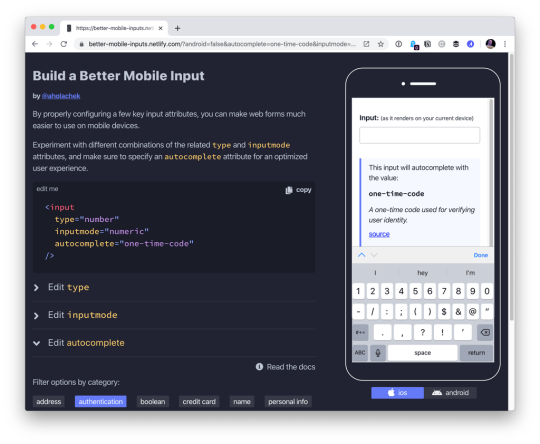
Here’s one simple, practical way to make apps perform better on mobile devices: always configure HTML input fields with the correct type, inputmode, and autocomplete attributes. While these three attributes are often discussed in isolation, they make the most sense in the context of mobile user experience when you think of them as a team.
There’s no question that forms on mobile devices can be time-consuming and tedious to fill in, but by properly configuring inputs, we can ensure that the data entry process is as seamless as possible for our users. Let’s take a look at some examples and best practices we can use to create better user experiences on mobile devices.
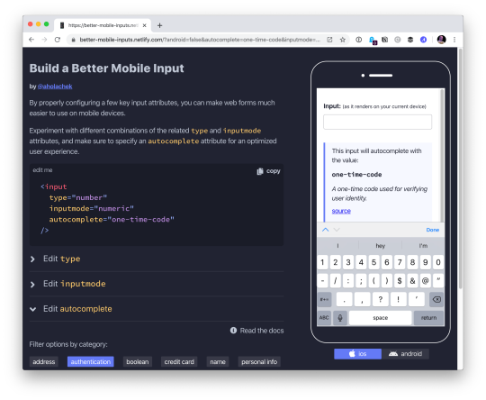
Use this demo to experiment on your own, if you’d like.
Using the correct input type
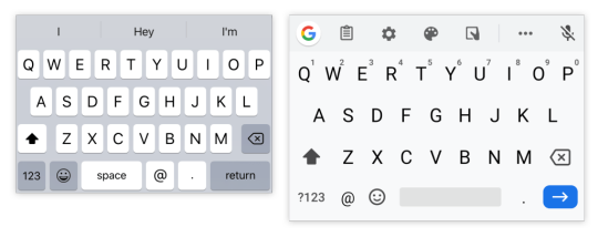
This is the easiest thing to get right. Input types, like email, tel, and url, are well-supported across browsers. While the benefit of using a type, like tel over the more generic text, might be hard to see on desktop browsers, it’s immediately apparent on mobile.
Choosing the appropriate type changes the keyboard that pops up on Android and iOS devices when a user focuses the field. For very little effort, just by using the right type, we will show custom keyboards for email, telephone numbers, URLs, and even search inputs.

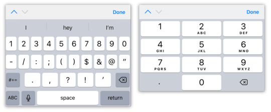
Text input type on iOS (left) and Android (right)

Email input type on iOS (left) and Android (right)
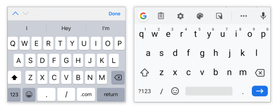
URL input type on iOS (left) and Android (right)

Search input type on iOS (left) and Android (right)
One thing to note is that both input type="email" and input type="url" come with validation functionality, and modern browsers will show an error tooltip if their values do not match the expected formats when the user submits the form. If you’d rather turn this functionality off, you can simply add the novalidate attribute to the containing form.
A quick detour into date types
HTML inputs comprise far more than specialized text inputs — you also have radio buttons, checkboxes, and so on. For the purposes of this discussion, though, I’m mostly talking about the more text-based inputs.
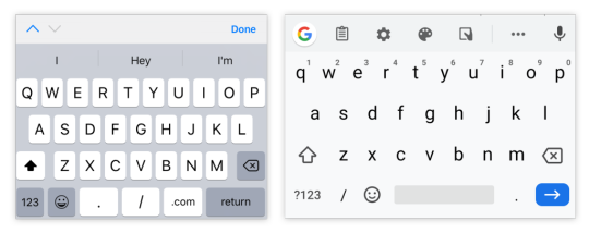
There is a type of input that sits in the liminal space between the more free-form text inputs and input widgets like radio buttons: date. The date input type comes in a variety of flavors that are well-supported on mobile, including date, time, datetime-local, and month. These pop up custom widgets in iOS and Android when they are focused. Instead of triggering a specialized keyboard, they show a select-like interface in iOS, and various different types of widgets on Android (where the date and time selectors are particularly slick).
I was excited to start using native defaults on mobile, until I looked around and realized that most major apps and mobile websites use custom date pickers rather than native date input types. There could be a couple reasons for this. First, I find the native iOS date selector to be less intuitive than a calendar-type widget. Second, even the beautifully-designed Android implementation is fairly limited compared to custom components — there’s no easy way to input a date range rather than a single date, for instance.
Still, the date input types are worth checking out if the custom datepicker you’re using doesn’t perform well on mobile. If you’d like to try out the native input widgets on iOS and Android while making sure that desktop users see a custom widget instead of the default dropdown, this snippet of CSS will hide the calendar dropdown for desktop browsers that implement it:
::-webkit-calendar-picker-indicator { display: none; }

Date input type on iOS (left) and Android (right)

Time input type on iOS (left) and Android (right)
One final thing to note is that date types cannot be overridden by the inputmode attribute, which we’ll discuss next.
Why should I care about inputmode?
The inputmode attribute allows you to override the mobile keyboard specified by the input’s type and directly declare the type of keyboard shown to the user. When I first learned about this attribute, I wasn’t impressed — why not just use the correct type in the first place? But while inputmode is often unnecessary, there are a few places where the attribute can be extremely helpful. The most notable use case that I’ve found for inputmode is building a better number input.
While some HTML5 input types, like url and email, are straightforward, input type="number" is a different matter. It has some accessibility concerns as well as a somewhat awkward UI. For example, desktop browsers, like Chrome, show tiny increment arrows that are easy to trigger accidentally by scrolling.
So here’s a pattern to memorize and use going forwards. For most numeric inputs, instead of using this:
<input type="number" />
…you actually want to use this:
<input type="text" inputmode="decimal" />
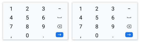
Why not inputmode="numeric" instead of inputmode="decimal" ?
The numeric and decimal attribute values produce identical keyboards on Android. On iOS, however, numeric displays a keyboard that shows both numbers and punctuation, while decimal shows a focused grid of numbers that almost looks exactly like the tel input type, only without extraneous telephone-number focused options. That’s why it’s my preference for most types of number inputs.

iOS numeric input (left) and decimal input (right)
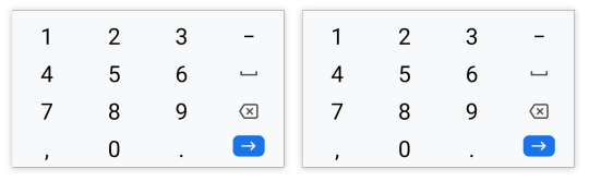
Android numeric input (left) and decimal input (right)
Christian Oliff has written an excellent article dedicated solely to the inputmode attribute.
Don’t forget autocomplete
Even more important than showing the correct mobile keyboard is showing helpful autocomplete suggestions. That can go a long way towards creating a faster and less frustrating user experience on mobile.
While browsers have heuristics for showing autocomplete fields, you cannot rely on them, and should still be sure to add the correct autocomplete attribute. For instance, in iOS Safari, I found that an input type="tel" would only show autocomplete options if I explicitly added a autocomplete="tel" attribute.
You may think that you are familiar with the basic autocomplete options, such as those that help the user fill in credit card numbers or address form fields, but I’d urge you to review them to make sure that you are aware of all of the options. The spec lists over 50 values! Did you know that autocomplete="one-time-code" can make a phone verification user flow super smooth?
Speaking of autocomplete…
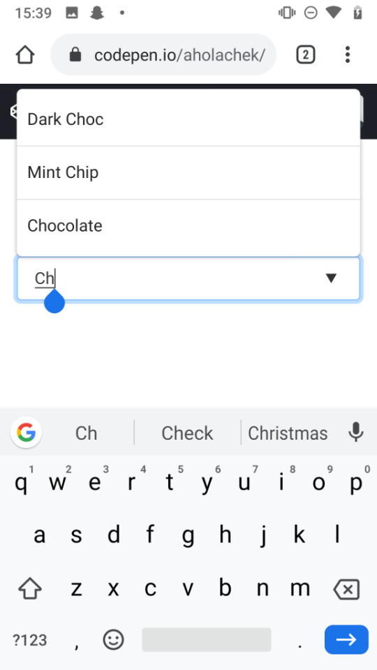
I’d like to mention one final element that allows you to create your own custom autocomplete functionality: datalist. While it creates a serviceable — if somewhat basic — autocomplete experience on desktop Chrome and Safari, it shines on iOS by surfacing suggestions in a convenient row right above the keyboard, where the system autocomplete functionality usually lives. Further, it allows the user to toggle between text and select-style inputs.
On Android, on the other hand, datalist creates a more typical autocomplete dropdown, with the area above the keyboard reserved for the system’s own typeahead functionality. One possible advantage to this style is that the dropdown list is easily scrollable, creating immediate access to all possible options as soon as the field is focused. (In iOS, in order to view more than the top three matches, the user would have to trigger the select picker by pressing the down arrow icon.)

You can use this demo to play around with datalist:
CodePen Embed Fallback
And you can explore all the autocomplete options, as well as input type and inputmode values, using this tool I made to help you quickly preview various input configurations on mobile.
In summary
When I’m building a form, I’m often tempted to focus on perfecting the desktop experience while treating the mobile web as an afterthought. But while it does take a little extra work to ensure forms work well on mobile, it doesn’t have to be too difficult. Hopefully, this article has shown that with a few easy steps, you can make forms much more convenient for your users on mobile devices.
0 notes
Text
Better Form Inputs for Better Mobile User Experiences
Here’s one simple, practical way to make apps perform better on mobile devices: always configure HTML input fields with the correct type, inputmode, and autocomplete attributes. While these three attributes are often discussed in isolation, they make the most sense in the context of mobile user experience when you think of them as a team.
There’s no question that forms on mobile devices can be time-consuming and tedious to fill in, but by properly configuring inputs, we can ensure that the data entry process is as seamless as possible for our users. Let’s take a look at some examples and best practices we can use to create better user experiences on mobile devices.
Use this demo to experiment on your own, if you’d like.
Using the correct input type
This is the easiest thing to get right. Input types, like email, tel, and url, are well-supported across browsers. While the benefit of using a type, like tel over the more generic text, might be hard to see on desktop browsers, it’s immediately apparent on mobile.
Choosing the appropriate type changes the keyboard that pops up on Android and iOS devices when a user focuses the field. For very little effort, just by using the right type, we will show custom keyboards for email, telephone numbers, URLs, and even search inputs.

Text input type on iOS (left) and Android (right)
Email input type on iOS (left) and Android (right)
URL input type on iOS (left) and Android (right)

Search input type on iOS (left) and Android (right)
One thing to note is that both input type="email" and input type="url" come with validation functionality, and modern browsers will show an error tooltip if their values do not match the expected formats when the user submits the form. If you’d rather turn this functionality off, you can simply add the novalidate attribute to the containing form.
A quick detour into date types
HTML inputs comprise far more than specialized text inputs — you also have radio buttons, checkboxes, and so on. For the purposes of this discussion, though, I’m mostly talking about the more text-based inputs.
There is a type of input that sits in the liminal space between the more free-form text inputs and input widgets like radio buttons: date. The date input type comes in a variety of flavors that are well-supported on mobile, including date, time, datetime-local, and month. These pop up custom widgets in iOS and Android when they are focused. Instead of triggering a specialized keyboard, they show a select-like interface in iOS, and various different types of widgets on Android (where the date and time selectors are particularly slick).
I was excited to start using native defaults on mobile, until I looked around and realized that most major apps and mobile websites use custom date pickers rather than native date input types. There could be a couple reasons for this. First, I find the native iOS date selector to be less intuitive than a calendar-type widget. Second, even the beautifully-designed Android implementation is fairly limited compared to custom components — there’s no easy way to input a date range rather than a single date, for instance.
Still, the date input types are worth checking out if the custom datepicker you’re using doesn’t perform well on mobile. If you’d like to try out the native input widgets on iOS and Android while making sure that desktop users see a custom widget instead of the default dropdown, this snippet of CSS will hide the calendar dropdown for desktop browsers that implement it:
::-webkit-calendar-picker-indicator { display: none; }
Date input type on iOS (left) and Android (right)
Time input type on iOS (left) and Android (right)
One final thing to note is that date types cannot be overridden by the inputmode attribute, which we’ll discuss next.
Why should I care about inputmode?
The inputmode attribute allows you to override the mobile keyboard specified by the input’s type and directly declare the type of keyboard shown to the user. When I first learned about this attribute, I wasn’t impressed — why not just use the correct type in the first place? But while inputmode is often unnecessary, there are a few places where the attribute can be extremely helpful. The most notable use case that I’ve found for inputmode is building a better number input.
While some HTML5 input types, like url and email, are straightforward, input type="number" is a different matter. It has some accessibility concerns as well as a somewhat awkward UI. For example, desktop browsers, like Chrome, show tiny increment arrows that are easy to trigger accidentally by scrolling.
So here’s a pattern to memorize and use going forwards. For most numeric inputs, instead of using this:
<input type="number" />
…you actually want to use this:
<input type="text" inputmode="decimal" />
Why not inputmode="numeric" instead of inputmode="decimal" ?
The numeric and decimal attribute values produce identical keyboards on Android. On iOS, however, numeric displays a keyboard that shows both numbers and punctuation, while decimal shows a focused grid of numbers that almost looks exactly like the tel input type, only without extraneous telephone-number focused options. That’s why it’s my preference for most types of number inputs.
iOS numeric input (left) and decimal input (right)
Android numeric input (left) and decimal input (right)
Christian Oliff has written an excellent article dedicated solely to the inputmode attribute.
Don’t forget autocomplete
Even more important than showing the correct mobile keyboard is showing helpful autocomplete suggestions. That can go a long way towards creating a faster and less frustrating user experience on mobile.
While browsers have heuristics for showing autocomplete fields, you cannot rely on them, and should still be sure to add the correct autocomplete attribute. For instance, in iOS Safari, I found that an input type="tel" would only show autocomplete options if I explicitly added a autocomplete="tel" attribute.
You may think that you are familiar with the basic autocomplete options, such as those that help the user fill in credit card numbers or address form fields, but I’d urge you to review them to make sure that you are aware of all of the options. The spec lists over 50 values! Did you know that autocomplete="one-time-code" can make a phone verification user flow super smooth?
Speaking of autocomplete…
I’d like to mention one final element that allows you to create your own custom autocomplete functionality: datalist. While it creates a serviceable — if somewhat basic — autocomplete experience on desktop Chrome and Safari, it shines on iOS by surfacing suggestions in a convenient row right above the keyboard, where the system autocomplete functionality usually lives. Further, it allows the user to toggle between text and select-style inputs.
On Android, on the other hand, datalist creates a more typical autocomplete dropdown, with the area above the keyboard reserved for the system’s own typeahead functionality. One possible advantage to this style is that the dropdown list is easily scrollable, creating immediate access to all possible options as soon as the field is focused. (In iOS, in order to view more than the top three matches, the user would have to trigger the select picker by pressing the down arrow icon.)
You can use this demo to play around with datalist:
CodePen Embed Fallback
And you can explore all the autocomplete options, as well as input type and inputmode values, using this tool I made to help you quickly preview various input configurations on mobile.
In summary
When I’m building a form, I’m often tempted to focus on perfecting the desktop experience while treating the mobile web as an afterthought. But while it does take a little extra work to ensure forms work well on mobile, it doesn’t have to be too difficult. Hopefully, this article has shown that with a few easy steps, you can make forms much more convenient for your users on mobile devices.
The post Better Form Inputs for Better Mobile User Experiences appeared first on CSS-Tricks.
Better Form Inputs for Better Mobile User Experiences published first on https://deskbysnafu.tumblr.com/
0 notes
Photo

vue2-datepicker: A Date / DateTime Picker Component for Vue - https://t.co/CaMmPeS5GB
0 notes
Photo

vue2-datepicker: A Date / DateTime Picker Component for Vue - https://t.co/CaMmPeS5GB
0 notes
Link
Calendars are an important part of our lives. In today’s world, people mostly use the web or mobile calendars. They can be found everywhere, including various software: booking apps, travel software, project management, admin panels, etc. Users may need calendars on websites for several reasons. The user may need to pick a date from the calendar to fill up a form or provide a date while delivering any information. Undoubtedly, this component can be called critical for business applications. Just imagine how much your business can suffer due to a badly tuned and developed calendar. Thus, this component should be given special attention and meticulousness in development. In this article, we will look at criteria for a good calendar in web applications. Also, we will show you the best libraries in different frameworks for building your own solutions based on them. Qualities of a good calendar for web apps We have picked the criteria for a good calendar from our previous article on date-pickers. Obviously, we can adapt these to calendar plugins. We divided our evaluation criteria into 4 blocks. Documentation. It is vital for whatever you’re using to be well-documented in order to learn how to build or reconstruct it. The product with no or lacking documentation does not have a right to exist. Customization. A great library should come with options that can be updated to add or remove certain functionality. This especially applies to open-source software. Compatibility. Who wants to visit a site with a datepicker that only works in recent versions of Chrome and Webkit browsers? Many business apps still work in legacy browsers. User Experience. Ask yourself whether the plugin will be convenient for the needs of your user? Does it fit your product style? The looks and quality of the docs are not that important compared to how the library will actually deal with your task. Top calendar libraries We have included various calendar libraries based on React, Angular, Vue, Bootstrap or jQuery. Some of them are more developed, some are easier to customize. Hope this catalog will help you in your work. Fullcalendar.io GitHub stars: 9400 Price and License: MIT Website/Demo: https://fullcalendar.io/ Github: https://github.com/fullcalendar/fullcalendar Type of installation: NPM, Yarn Frameworks: React, Vue, Angular This is a good choice for those who know what they want. There are no detailed step-by-step guides that describe what to do to get the goal. Only a brief Getting Started Guide and Documentation Page. Lightweight. The library is easily customizable and has many different components. The website, demos, and documentation give the impression of a mature product, which you’re not scared to use. With this, you can plan resources and mark events. Timeline view and various themes are also there. A good asset of this library is the documentation for developing in React, Vue, and Angular. Tui calendar GitHub stars: 7328 Price and License: MIT Website/Demo: http://ui.toast.com/tui-calendar Github: https://github.com/nhn/tui.calendar Type of installation: Via package managers or CDN Frameworks: React, Vue, Angular wrappers Tui is a part of a TUI library. It is built on top or jquery with options of using React, Angular and Vue wrappers. The calendar supports various view types: daily, weekly, monthly(6 weeks, 2 weeks, 3 weeks) and efficient management of milestone and task schedules. You can change the first day of the week, customize the date and schedule information UI(including a header and a footer of grid cell). The product has full documentation and can be installed via package managers of Content Delivery Network. CLNDR GitHub stars: 2760 Price and License: MIT Website/Demo: http://kylestetz.github.io/CLNDR/ Github: https://github.com/kylestetz/CLNDR Type of installation: Via package managers or CDN Frameworks: React, Vue, Angular wrappers CLNDR.js is a jQuery calendar plugin that, unlike most calendar plugins, doesn’t generate markup. Instead, you provide an Underscore.js HTML template, and in return, CLNDR gives you a wealth of data to use within it. HTML templates are well-suited to this task because they allow us the flexibility to specify where we want the data to go in our markup. CLNDR takes your template and injects some data into it. The data contains everything you need to create a calendar. Kendo UI Scheduler GitHub stars: 2160 Price and License: Apache License, $899 – $2199 Website/Demo: https://demos.telerik.com/kendo-ui/scheduler/index Github: – Type of installation: package managers Frameworks: React, Angular, Vue, jQuery Kendo UI is a big and advanced JavaScript framework. It contains tons of widgets and tools. Maybe it’s not a good idea to use its Scheduler Widget if you’re not interested in other components. The Kendo UI documentation is well written, and you can check out a bunch of Scheduler demos supplemented with code examples. Regarding the coding, it won’t take much time to build a basic scheduler and add some features to it. The default view is a little bit plain, but it’s easy to change that. React big calendar GitHub stars: 3254 Price and License: MIT Website/Demo: http://intljusticemission.github.io/react-big-calendar/examples/index.html Github: https://github.com/intljusticemission/react-big-calendar Type of installation: package managers Frameworks: React React big calendar is an event calendar component built for React. It is made for modern browsers (read: IE10+) and uses flexbox over the classic tables-ception approach. React big calendar includes two options for handling the date formatting and culture localization, depending on your preference of DateTime libraries. You can use either the Moment.js or Globalize.js localizers. Out of the box, you can include the compiled CSS files and be up and running. But, sometimes, you may want to style Big Calendar to match your application styling. For this reason, SASS files are included with Big Calendar. SASS implementation provides a file containing color and sizing variables that you can update to fit your application. Mobiscroll responsive calendar GitHub stars: – Price and License: free, $95, $595 Website/Demo: https://mobiscroll.com/responsive-calendar Github: – Type of installation: copy and paste script Frameworks: Angular, Ionic, React, jQuery, plain JS Mobiscroll calendar is a multiframework responsive calendar, which can work in mobile, web and tablet devices. Together with Single and Multiple selection types, users are able to select not just days one by one, but full weeks as well. It also enables users to easily change years and months without consecutive swiping. Mobiscroll helps users visualize two to three months in a row by displaying multiple months. It can provide helpful information in the form of text in day cells. With Mobiscroll you can highlight dates that have a specific meaning to the users. Additionally, you might use icons and text to give it meaning. The product supports localization and multilingual apps. It provides a UI with the correct culture settings. RTL availability also included. Syncfusion react calendar GitHub stars: – Price and License: $2495 – $4995 for all components Website/Demo: https://www.syncfusion.com/react-ui-components/react-calendar Github: – Type of installation: copy and paste script Frameworks: Angular, Blazor, plain JS, Vue, React The Syncfusion calendar is a component to display the date and days of the week. It provides the month, year, and decade view options to quickly navigate to the desired date. It supports minimum dates, maximum dates and disabled dates to restrict the date selection. The product is lightweight and easily configurable. You can choose across four different themes, including Material design. Apart from the standard, built-in theme, the Calendar component provides complete control over its appearance, allowing you to customize the style to suit your application. Angular calendar GitHub stars: 1662 Price and License: MIT Website/Demo: https://mattlewis92.github.io/angular-calendar/#/kitchen-sink Github: https://github.com/mattlewis92/angular-calendar Type of installation: package manager Frameworks: Angular The product is a calendar component for Angular 6.0+ that can display events on a month, week or day view. The template is highly customizable. You can build your own components instead of those not meeting your project specs. Please note that this library is not optimized for mobile. You will need to do it yourself. Bootstrap calendar GitHub stars: 2867 Price and License: MIT Website/Demo: http://bootstrap-calendar.eivissapp.com/ Github: https://github.com/Serhioromano/bootstrap-calendar Type of installation: package manager Frameworks: Bootstrap Full feature calendar based on the most popular HTML framework Twitter Bootstrap. This product is reusable. It means that there is no UI in this calendar. All buttons to switch view or load events are done separately. You will end up with your own unique calendar design. It is also template based – all views including year, month, week or day are based on templates. You can easily change the looks or style, even add a new custom view. If you use this product, it will be easy to adjust and style your calendar with LESS variables file. It uses AJAX to feed calendar with events. You provide URL and just return by this URL JSON list of events. Language files are connected separately with i18n. You can easily translate the calendar into your language. Holidays are also displayed on the calendar according to your language. Vcalendar GitHub stars: 1316 Price and License: MIT Website/Demo: https://vcalendar.io/ Github: https://github.com/nathanreyes/v-calendar Type of installation: package manager Frameworks: Vue V-Calendar is a clean and lightweight plugin for displaying simple, attributed calendars in Vue.js. It uses attributes to decorate the calendar with various visual indicators including highlighted date regions, dots, bars, content styles and popovers for simple tooltips and even custom slot content. Any single attribute may contain one object of each type and can be displayed for single dates, date ranges and even complex date patterns like every other Friday, the 15th of every month or the last Friday of every other month. Dhtmlx calendar GitHub stars: – Price and License: from $599 Website/Demo: https://dhtmlx.com/docs/products/dhtmlxCalendar/ Github: – Type of installation: package manager Frameworks: Vue, Angular, React This is quite a good choice if a calendar is all you want. There is an example of integration with Google maps, so you can extend the basic functionality if needed. The documentation page contains a set of guides that may be useful for beginners. The bunch of containers needed to make this scheduler work may confuse you from the start, but the overall coding process is quite obvious. The product has the following features: Cross-browser compatibility IE11+ support Full control with JavaScript API Ability to set inactive dates Configurable first day of the week Built-in multilingual support 12-hour and 24-hour time format 3 views: calendar, month, year This is quite a good choice if you want to build an enterprise product. The company has good support and flexibility in prices. Recap and conclusion We had a look at both basic and more advanced calendars. If you want a simple solution without support, but still easily customizable, then choose one of the free options. Considering more complex products, we presented paid solutions with good support quality. About Flatlogic At Flatlogic we develop admin dashboard templates and React Native templates. We are listed among Top 20 Web Development companies from Belarus and Lithuania. During the last 6 years, we have successfully completed more than 30 big projects for small startups and large enterprises. As a team, we always have a deep desire to help our clients. You might also like these articles: Originally published at flatlogic.com — React, Angular, Vue, Bootstrap & React Native templates and themes. Text source: Top Javascript Calendar Plugins
0 notes
Photo
V8 v8, the State of JS survey results, and CDNJS lives
#468 — December 20, 2019
Read on the Web
If you're subscribed to any of our other newsletters, you'll have seen we're doing 2019 roundups this week.. but not in JavaScript Weekly! :-) Our 2019 JavaScript roundup will be here on January 3, but today is a normal issue. Happy holidays!
JavaScript Weekly
Tesseract.js 2.0: Pure JavaScript OCR for 100 Languages — A pure JavaScript port of the popular C++ Tesseract library commonly used for visual text recognition purposes by other systems. The homepage has a neat demo where you can drop on images of your own and see how they get processed. v2.0 is now out and here's why the creator has been working on it.
Jerome Wu
V8 Release v8.0 — Yes, that’s v8 of v8 – not confusing at all 😂 Nonetheless, it’s a key step forward for the most widely deployed JavaScript engine, and introduces optional chaining, nullish coalescing, and some significant performance improvements. It’ll be landing in a Chrome and Node near you soon.
Leszek Swirski
Learn the Full Stack with Jem Young, Senior Software Engineer at Netflix — Become a more well rounded engineer by understanding what is happening on the server-side.
Frontend Masters sponsor
Results from the 'State of JavaScript' 2019 Survey — While the methodology is far from perfect (for example, Angular and Angular.js seem to get lumped together as the same thing), this is nonetheless the biggest JavaScript-specific survey. There’s a lot to dig through, so you may prefer The Changelog's 7 insights from the State of JS 2019 roundup post that looks at the most striking results.
Sacha Greif, Raphaël Benitte and Amelia Wattenberger
An Update on CDNJS — CDNJS is a popular content distribution network for JavaScript files but just a couple of months ago its continued development was in doubt. In this significant update we learn more about how CDNJS works and how Cloudflare want to take it forward (and they need our help).
Zack Bloom
Mastering console.log Like A Pro — This isn’t exactly new ground, but if you’re a heavy console.log user, this article deftly covers a variety of extra console methods to keep on your radar.
Harsh Makadia
⚡️ Quick Releases
Node.js 13.5.0
Material UI 4.8 — Popular React components system.
Relay 8.0 — GraphQL client and integration for React apps.
sql.js 1.1 — SQLite, but compiled to JavaScript.
Cash 5.0 — jQuery-style DOM manipulation for modern browsers.
💻 Jobs
Backend Engineering Position 🤘 in Beautiful Norway 🎉 — Passion for JavaScript, GraphQL, Scalability and Performance? Want to move to Norway? Join our fast growing e-commerce service Crystallize.
Crystallize
Find a Job Through Vettery — Make a profile, name your salary, and connect with hiring managers from top employers. Vettery is completely free for job seekers.
Vettery
Technical Content Producer (Interim) at Ably (London, Remote OK) — Ably builds tools and cloud infrastructure for the realtime internet. They need a developer/tech writer on a temporary basis to coordinate, outsource, and review the creation of technical content for a developer audience.
Ably
📘 Articles & Tutorials
What's Coming in Angular 9.0.0 and Ivy Improvements — Angular 9.0 was due to be released this year but is being held back until next year to give the team a break. Nonetheless, it’s going to pack in some key improvements.
Mike Hartington
An Introduction to Controlling the Raspberry Pi 4's GPIO Pins from Node — If you’ve got a Raspberry Pi sat around (I have a few!) and you’re looking to have a play over the holiday season, you could start here.
Uday Hiwarale
Migrating a Distributed System from JavaScript to TypeScript — Learn how to migrate a globally-distributed system written in JavaScript over to TypeScript.
Ably sponsor
Understanding Decorators in JavaScript — Decorators are a first-class concept in some languages that can be used to quickly modify functions or classes by way of a simple directive. The idea is still merely a proposal for JavaScript, but it’s possible to adapt some of the ideas now with Babel.
Mike Green
A Case for Using void in Modern JavaScript? — Some interesting points here. I doubt they’ll take off, but I like the examples.
slikts
Writing JavaScript With Only Six Characters — A fun article like this tends to do the rounds each year and it never ceases to delight me at how quirky JavaScript can be.
Erik Wendel
Const Assertions in Literal Expressions in TypeScript
Marius Schulz
What’s New in Preact X? — Preact is a lightweight React alternative with React API compatibility.
Ogundipe Samuel
Sentiment Analysis of Your Year with TensorFlow.js — Perform sentiment analysis with TensorFlow in JavaScript to determine the positivity of text messages received via Twilio.
Lizzie Siegle
BDD vs Executable Specifications
Gauge sponsor
▶ The Design Principles of Vue 3.0 — A 50 minute talk from the creator of Vue.js, Evan You, on the principles behind the changes coming in Vue 3.0.
Evan You
10 Useful Angular Features You’ve Probably Never Used — Assuming you actually use Angular in the first place, naturally.
Chidume Nnamdi
Why Svelte Won’t 'Kill' React
Kit Isaev
🔧 Code & Tools
A-Frame 1.0 Released: Framework for Building VR Experiences — A-Frame handles the 3D and WebVR boilerplate required to get running across numerous platforms quickly. Version 1 boasts full WebXR support.
A-Frame Team
Introducing Scully: The Angular Static Site Generator — The Angular community now has their very own static site generator.
Netlify
Polly.js 3.0: Record, Replay, and Stub HTTP Interactions — A library from Netflix for recording, replaying and stubbing HTTP interactions via native browser APIs. GitHub repo.
Netflix
▶ From NodeConf EU: What's Being Built and Where Node.js Is Heading
Heroku sponsor
Sarus: A Client-Side Library for WebSockets — Helps you handle situations where connections unexpectedly close.
Anephenix
Alpine.js: A Minimal Framework for Composing Behavior in Your Markup — “Think of it like Tailwind for JavaScript.”
Alpine.js
vue2-datepicker: A Date / DateTime Picker Component for Vue
xiemengxiong
If you're celebrating, we hope you have a happy holiday season and we'll see you in the new year on January 3, 2020.
by via JavaScript Weekly https://ift.tt/2Z90iZH
0 notes
Text
Picking Dates with Elm
Introduction
A frontend developer sometimes just wants to drop a JavaScript widget somebody else made into their application and move on. Maybe that widget is a slider, or a menu, or a progress bar, or a spinner, or a tab, or a tooltip that points in a cool way.. And sometimes that same frontend developer would like to write their application in Elm.. Should this developer wait to use Elm until the widget they want is rewritten in Elm? Should they rewrite everything that they need?
NoRedInk ran into this problem a few years ago with datepickers. Now, there are some Elm datetimepicker options, but at the time we needed prioritize building a datepicker from scratch in Elm against using the JS datepicker library we had been using before. We put building an Elm datepicker on the hackday idea pile and went with the JS datepicker library. Even with the complications of dates and time, using a JS datepicker in an Elm application ended up being a fine experience.
So our frontend developer who wants a JS widget? They can use it.
Readers of this post should have some familiarity with the Elm Architecture and with Elm syntax, but do not need to have made complex apps. This post is a re-exploration of concepts presented in the Elm guide (Introduction to Elm JavaScript interop section) with a more ~timely~ example (that is, we're going to explore dates, datepickers, and Elm ports).
On Dates and Time
The local date isn't just a question of which sliver of the globe on which one is located: time is a consideration of perception of time, measurability, science, and politics.
As individuals, we prefer to leave datetime calculations to our calendars, to our devices, and to whatever tells our devices when exactly they are. As developers, we place our faith in the browser implentations of functions/methods describing dates and times.
To calculate current time, the browser needs to know where the user is. The user's location can then be used to look up the timezone and any additional time-weirdnesses imposed by the government (please read this as side-eyes at daylight saving--I stand with Arizona). When you run new Date() in your browser's JS console, apart from constructing the Date you asked for, you're actually asking for your time as a function of location.
Supposing we now have a Date object that correctly describes the current time, we have the follow-up problem of formatting dates for different users. Our users might have differing expectations for short-hand formats and will have differing expecations for long-hand forms in their language. There's definitely room to make mistakes; outside of programming, I have definitely gotten confused over 12 hour days versus 24 hour days and mm/dd/yyyy versus dd/mm/yyyy.
Okay, so computers need a way to represent time, timezones, daylight savings. We use the distance in seconds from the epoch to keep track of time. (If you read about the history of the Unix epoch, that's not as simple as one might hope or expect either!) Then we need a language for communicating how to format this information for different locales and languages.
We can represent dates in simple and universial formats. We can use semantic and consistent (or close-to semantic and close-to consistent) formatting strings. We can be careful as we parse user input so that we don't mix up month 2 or day 2. But it's still really easy to make mistakes. It's hard to reason about what is going, did go, or will go wrong; sometimes, when deep in investigating a timezone bug, it's hard to tell what's going right!
So suppose we've got ourselves a great spec that involves adding a date input to a pre-existing Elm app. Where do we start? What should we know?
It's worth being aware that the complexity of date/time considerations of the human world haven't been abstracted away in the programming world, and there are at times some additional complications. For example, the JavaScript Date API counts months from zero and days from one. Also worth noting: Dates in Elm actually are JavaScript Date Objects, and date Objects in JavaScript rely on the underlying JavaScript implementation (probably C++).
On Interop
The way that Elm handles interop with JavaScript keeps the world of Elm and the world of JavaScript distinct. All the values from Elm to JS flow through one place, and all the values from JS to Elm flow through one place.
Tradeoffs:
It's possible to break your app
Suppose we have an Elm app that is expecting a user-named item to be passed through a port. Our port is expecting a string, but oops! Due to some unanticipated type coercion, we pass 2015 through the port rather than "2015". Now our app is unhappy--we have a runtime error:
Trying to send an unexpected type of value through port userNamedItem: Expecting a String but instead got: 2015
Your Elm apps have JS code upon which they are reliant
Often, this isn't a big deal. We used to interop with JavaScript in order to focus our cursor on a given text input dynamically (Now, we use Dom.focus). It's a nice UX touch, but our site still works without this behavior. That is, if we decide to load our component on a different page, but fail to bring our jQuery code to the relevant JS files for that page, the user experience degrades, but the basic functionality still works.
Benefits:
We can use JavaScript whenever we want to
If you've got an old JS modal, and you're not ready to rewrite that modal in Elm, you're free to do so. Just send whatever info that modal needs, and then let your Elm app know when the modal closes.
The single most brittle place in your code is easy to find
Elm is safe, JavaScript is not, and translating from one to the other may not work. Even without helpful error messages, it's relatively easy to find the problem. If the app compiles, but fails on page load? Probably it's getting the wrong information.
We keep Elm's guarantees.
We won't have to worry about runtime exceptions within the bulk of our application. We won't have to worry about types being inconsistent anywhere except at the border of our app. We get to feel confident about most of our code.
So.. how do we put a jQuery datepicker in our Elm application?
For this post, we'll be using the jQuery UI datepicker, but the concepts should be the same no matter what datepicker you use. Once the jQuery and jQuery UI libraries are loaded on the page and the basic skeleton of an app is available on the page, it's a small step to having a working datepicker.
Our skeleton:
{- *** API *** -} port module Component exposing (..) import Date import Html exposing (..) import Html.Attributes exposing (..) main : Program Never Model Msg main = Html.program { init = init , view = view , update = update , subscriptions = always Sub.none } init : ( Model, Cmd Msg ) init = ( { date = Nothing }, Cmd.none ) {- *** MODEL *** -} type alias Model = { date : Maybe Date.Date } {- *** VIEW *** -} view : Model -> Html.Html Msg view model = div [ class "date-container" ] [ label [ for "date-input" ] [ img [ alt "Calendar Icon" ] [] ] , input [ name "date-input", id "date-input" ] [] ] {- *** UPDATE *** -} type Msg = NoOp update : Msg -> Model -> ( Model, Cmd Msg ) update msg model = case msg of NoOp -> model ! [ Cmd.none ]
Next up, let's port out to JS. We want to tell JS-land that we want to open a datepicker, and then we also want to change our model when JS-land tells us to.
port module Component exposing (..) import Date import Html exposing (..) import Html.Attributes exposing (..) import Html.Events exposing (..) -- we need Events for the first time main : Program Never Model Msg main = Html.program { init = init , view = view , update = update , subscriptions = subscriptions } init : ( Model, Cmd Msg ) init = ( { date = Nothing }, Cmd.none ) {- *** MODEL *** -} type alias Model = { date : Maybe Date.Date } {- *** VIEW *** -} view : Model -> Html.Html Msg view model = div [ class "date-container" ] [ label [ for "date-input" ] [ img [ alt "Calendar Icon" ] [] ] , input [ name "date-input" , id "date-input" , onFocus OpenDatepicker -- Note that the only change to the view is here ] [] ] {- *** UPDATE *** -} type Msg = NoOp | OpenDatepicker | UpdateDateValue String update : Msg -> Model -> ( Model, Cmd Msg ) update msg model = case msg of NoOp -> model ! [ Cmd.none ] OpenDatepicker -> model ! [ openDatepicker () ] UpdateDateValue dateString -> { model | date = Date.fromString dateString |> Result.toMaybe } ! [] {- *** INTEROP *** -} port openDatepicker : () -> Cmd msg port changeDateValue : (String -> msg) -> Sub msg subscriptions : Model -> Sub Msg subscriptions model = changeDateValue UpdateDateValue
Note that here, we're also carefully handling the string that we're given from JavaScript. If we can't parse the string into a Date, then we just don't change the date value.
Finally, let's actually add our Elm app and datepicker to the page.
$(function() { elmHost = document.getElementById("elm-host") var app = Elm.Component.embed(elmHost); $.datepicker.setDefaults({ showOn: "focus", onSelect: sendDate, }); app.ports.openDatepicker.subscribe(function() { $("#date-input").datepicker().datepicker("show"); }); function sendDate (dateString) { app.ports.changeDateValue.send(dateString) } });
Checking this out in the browser (with a few additional CSS styles thown in):
All we have to do is embed our app, open the datepicker when told to do so, and send values to elm when appropriate! This is the same strategy to follow when working with any JS library.
Fancy Stuff
Storing the final-word on value outside of a UI component (i.e., the datepicker itself) makes it easier to handle complexity. At NoRedInk, engineers have built quite complicated UIs involving datepickers:
NoRedInkers changed the displayed text from a date-like string to "Right away"--and made /right away/i an allowed input
We can check to see if the selected date is the same as now, plus or minus some buffer, and send a string containing that information to Elm. This requires a fair amount of parsing and complicates how dates are stored in the model.
A simplified version of a similar concept follows--we add some enthusiasm to how we're displaying selected dates by adding exclamation marks to the displayed date.
Note that this introduces a new dependency for date formatting (rluiten/elm-date-extra).
... import Date import Date.Extra.Config.Config_en_us import Date.Extra.Format ... viewCalendarInput : Int -> Maybe Date.Date -> Html Msg viewCalendarInput id date = let inputId = "date-input-" ++ toString id dateValue = date |> Maybe.map (Date.Extra.Format.format Date.Extra.Config.Config_en_us.config "%m/%d/%Y!!!") |> Maybe.withDefault "" in div [ class "date-container" ] [ label [ for inputId ] [ viewCalendarIcon ] , input [ name inputId , Html.Attributes.id inputId , value dateValue , onFocus (OpenDatepicker inputId) ] [] ] ...
We can make the value of the input box whatever we want! Including a formatted date string with exclamation marks on the end. Note though that if we make whatever is in our input box un-parseable for the datepicker we're using, we'll have to give it more info if we want it to highlight the date we've selected when we reopen it. Most datepickers have a defaultDate option, and we can use take advantage of that to handle this case.
Note that we've also generalized our viewCalendarInput function. There are some other changes that we need to make to support having multiple date input fields per page--like having more than one date field on the model, and sending some way of determining which date field to update back from JS.
For brevity's sake, we'll exclude the code for supporting multiple date inputs per page, but here's an image of the working functionality:
NoRedInkers created an autofill feature
Leveraging the type system, we can distinguish between user-set and automagically-set dates, and set a series of date steps to be any distance apart from each other by default. The fun here is in determining when to autofill--we shouldn't autofill, for instance, after a user has cleared all but one autofilled field, but we should autofill if a user manually fills exactly one field.
We actually decided that while this was slick, it would create a negative user experience; we scrapped the whole autofill idea before any users saw it. While there was business logic that we needed to rip out in order to yank the feature, we didn't need to change any JavaScript code whatsoever. Writing the autofill functionality was fun, and then pulling out the functionality went really smoothly.
NoRedInkers supported user-set timezone preferences
I recommend rluiten/elm-date-extra, which supports manually passing in a timezone offset value and using the user's browser-determined timezone offset. Thank you to Date-related open source project maintainers and contributors!
Concluding
Someday the Elm community will have a glorious datepicker that developers use by default. For now, there are JavaScript datepickers out there available for use (and some up-and-coming Elm datepicker projects as well!). For now, for developers not ready to switch away from jQuery components, interop with JavaScript can smoothly integrate even very effect-heavy libraries.
There are components that don't exist in Elm yet, but that shouldn't stop us from using them in our Elm applications and it shouldn't stop us from transitioning to Elm. Projects that need those components can still be written in beautiful, easy-to-follow, easy-to-love Elm code. Sure, it would be nice if it were all in Elm--for now, we can use our JavaScript component AND Elm!
Tessa Kelly @t_kelly9 Engineer at NoRedInk
1 note
·
View note
Photo

Native Angular 2/4 Datetime Picker A Native Angular 2/4 date picker component that helps create a custom component selecting and showing dates selected by the user. Styled by Twitter Bootstrap 3 framework. Installation: npm install --save @novalinc/datepicker@latest Preview:
0 notes
Photo

A Vue Datepicker, Includes Date, Datetime, Time ☞ https://bit.ly/2WGWmje #vuejs #javascript
0 notes
Photo

A Vue Datepicker, Includes Date, Datetime, Time ☞ https://bit.ly/2WGWmje #vuejs #javascript
0 notes