#datetimepicker example
Explore tagged Tumblr posts
Visit Tumblr Blog
Explore Tumblr blogs with no restrictions, modern design and the best experience.
Last Seen Tumblr Blogs


Fun Fact
The most popular pages on Tumblr are about Minecraft, GIFs, and David J. Peterson.
Text

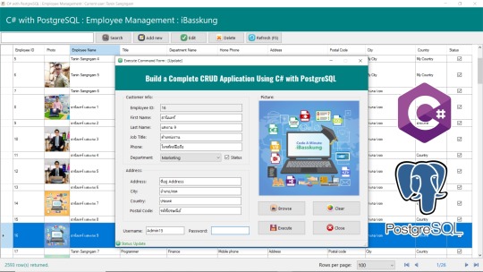
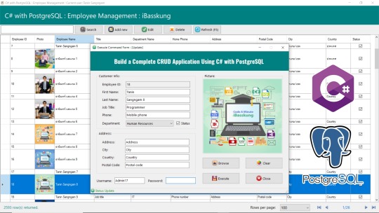
อีกหนึ่งไอเดียสำหรับการทำให้โปรแกรมทำงานได้เร็วขึ้น คือ การกรองข้อมูลจากวัน, เดือน, ปี หรือวันที่เฉพาะเจาะจง เช่น กรองดูเฉพาะข้อมูลของปีปัจจุบัน เป็นต้น อาจประยุกต์ใช้ DateTimePicker ครับ
🚀 Another idea to make the program run faster is to filter data based on specific criteria such as day, month, year, or a specific date. For example, filtering to view only the data from the current year. You can implement this by using a DateTimePicker.
1 note
·
View note
Text
Add a DateTimepicker to your Ruby on Rails app
I just published "Add a DateTimepicker to your Ruby on Rails app" You often use a datetimepicker in your applications. Here is a step-by-step guide to using it on a Ruby on Rails application
We will see how to add a date and time selector to Ruby on Rails. This way, your users will be able to select a date and period from a calendar. In this example, we will use the bootstrap datetimepicker.
That’s what we’re going to get !
DateTimepicker: Let’s go !
Create a new project with the name of your choice, here “datetimepicker” specifying the use of a PostgreSQL database.
$…
View On WordPress
#bootstrap datepicker#date and time picker javascript#date time picker#date time picker javascript#date time picker js#datepicker datetime#datepicker time#datetime picker#datetime picker jquery#datetimepicker#datetimepicker example#datetimepicker format#datetimepicker javascript#datetimepicker plugin#javascript date and time picker#javascript date time picker#javascriptdatetime picker#jquery date time picker#jquery datetimepicker documentation#js date time picker#time and date picker
0 notes
Text
Visual studio 2017 windows forms dot net time picker

VISUAL STUDIO 2017 WINDOWS FORMS DOT NET TIME PICKER CODE
VISUAL STUDIO 2017 WINDOWS FORMS DOT NET TIME PICKER WINDOWS
VISUAL STUDIO 2017 WINDOWS FORMS DOT NET TIME PICKER WINDOWS
For more information, see How to: Display a Date in a Custom Format with the Windows Forms DateTimePicker Control and Custom Date and Time Format Strings. For example, you can display the date as "JFriday" by setting the CustomFormat property to "MMMM dd, yyyy - dddd". The custom format string can be a combination of custom field characters and other literal characters. If the Format property is set to DateTimePickerFormat.Custom, you can create your own format style by setting the CustomFormat property and building a custom format string. For more information, see How to: Display Time with the DateTimePicker Control. If you want the DateTimePicker to appear as a control for picking or editing times instead of dates, set the ShowUpDown property to true and the Format property to Time. The default date Format is DateTimePickerFormat.Long. The values can be displayed in four formats, which are set by the Format property: Long, Short, Time, or Custom. You can limit the dates and times that can be selected by setting the MinDate and MaxDate properties. For more information, see How to: Set and Return Dates with the Windows Forms DateTimePicker Control. You can use the Text property or the appropriate member of Value to get the date and time value. The Value property contains the current date and time the control is set to. The date and time can be adjusted by selecting each element individually and using the up and down buttons to change the value. The calendar will not drop down when the control is selected. To use a spin button control (also known as an up-down control) to adjust the date/time value, set the ShowUpDown property to true. You can change the look of the calendar portion of the control by setting the CalendarForeColor, CalendarFont, CalendarTitleBackColor, CalendarTitleForeColor, CalendarTrailingForeColor, and CalendarMonthBackground properties. For more information about the MonthCalendar control, see MonthCalendar Control Overview. The calendar looks like the MonthCalendar control, which can be used for selecting multiple dates. When used to represent a date, the DateTimePicker control appears in two parts: a drop-down list with a date represented in text, and a calendar that appears when you click the down-arrow next to the list. The DateTimePicker control only supports Gregorian calendars. The DateTimePicker control makes it easy to work with dates and times because it handles a lot of the data validation automatically. The DateTimePicker control is used to allow the user to select a date and time, and to display that date and time in the specified format. ' Show the CheckBox and display the control as an up-down control. ' Create a new DateTimePicker control and initialize it.ĭim dateTimePicker1 As New DateTimePicker()ĭateTimePicker1.MinDate = New DateTime(1985, 6, 20)ĭateTimePicker1.CustomFormat = "MMMM dd, yyyy - dddd"ĭateTimePicker1.Format = DateTimePickerFormat.Custom Show the CheckBox and display the control as an up-down control.ĭateTimePicker dateTimePicker1 = new DateTimePicker() ĭateTimePicker1.MinDate = new DateTime(1985, 6, 20) ĭateTimePicker1.MaxDate = DateTime.Today ĭateTimePicker1.CustomFormat = "MMMM dd, yyyy - dddd" ĭateTimePicker1.Format = DateTimePickerFormat.Custom Create a new DateTimePicker control and initialize it.ĭateTimePicker^ dateTimePicker1 = gcnew DateTimePicker ĭateTimePicker1->MinDate = DateTime(1985,6,20) ĭateTimePicker1->MaxDate = DateTime::Today ĭateTimePicker1->CustomFormat = "MMMM dd, yyyy - dddd" ĭateTimePicker1->Format = DateTimePickerFormat::Custom
VISUAL STUDIO 2017 WINDOWS FORMS DOT NET TIME PICKER CODE
To run this example, paste the following code into a form and call the CreateMyDateTimePicker method in the example form's constructor or Load event handling method. Also, the ShowCheckBox property is set so that the control displays a CheckBox, and the ShowUpDown property is set so that the control is displayed as a spin button control. The control's CustomFormat property is set. The following code example creates an new instance of a DateTimePicker control and initializes it. Inherit Control Public Class DateTimePickerĭefaultBindingPropertyAttribute ClassInterfaceAttribute ComVisibleAttribute Examples Public class DateTimePicker : type DateTimePicker = class In this article public ref class DateTimePicker : System::Windows::Forms::Control public class DateTimePicker : Represents a Windows control that allows the user to select a date and a time and to display the date and time with a specified format.
0 notes
Text
Picking Dates with Elm
Introduction
A frontend developer sometimes just wants to drop a JavaScript widget somebody else made into their application and move on. Maybe that widget is a slider, or a menu, or a progress bar, or a spinner, or a tab, or a tooltip that points in a cool way.. And sometimes that same frontend developer would like to write their application in Elm.. Should this developer wait to use Elm until the widget they want is rewritten in Elm? Should they rewrite everything that they need?
NoRedInk ran into this problem a few years ago with datepickers. Now, there are some Elm datetimepicker options, but at the time we needed prioritize building a datepicker from scratch in Elm against using the JS datepicker library we had been using before. We put building an Elm datepicker on the hackday idea pile and went with the JS datepicker library. Even with the complications of dates and time, using a JS datepicker in an Elm application ended up being a fine experience.
So our frontend developer who wants a JS widget? They can use it.
Readers of this post should have some familiarity with the Elm Architecture and with Elm syntax, but do not need to have made complex apps. This post is a re-exploration of concepts presented in the Elm guide (Introduction to Elm JavaScript interop section) with a more ~timely~ example (that is, we're going to explore dates, datepickers, and Elm ports).
On Dates and Time
The local date isn't just a question of which sliver of the globe on which one is located: time is a consideration of perception of time, measurability, science, and politics.
As individuals, we prefer to leave datetime calculations to our calendars, to our devices, and to whatever tells our devices when exactly they are. As developers, we place our faith in the browser implentations of functions/methods describing dates and times.
To calculate current time, the browser needs to know where the user is. The user's location can then be used to look up the timezone and any additional time-weirdnesses imposed by the government (please read this as side-eyes at daylight saving--I stand with Arizona). When you run new Date() in your browser's JS console, apart from constructing the Date you asked for, you're actually asking for your time as a function of location.
Supposing we now have a Date object that correctly describes the current time, we have the follow-up problem of formatting dates for different users. Our users might have differing expectations for short-hand formats and will have differing expecations for long-hand forms in their language. There's definitely room to make mistakes; outside of programming, I have definitely gotten confused over 12 hour days versus 24 hour days and mm/dd/yyyy versus dd/mm/yyyy.
Okay, so computers need a way to represent time, timezones, daylight savings. We use the distance in seconds from the epoch to keep track of time. (If you read about the history of the Unix epoch, that's not as simple as one might hope or expect either!) Then we need a language for communicating how to format this information for different locales and languages.
We can represent dates in simple and universial formats. We can use semantic and consistent (or close-to semantic and close-to consistent) formatting strings. We can be careful as we parse user input so that we don't mix up month 2 or day 2. But it's still really easy to make mistakes. It's hard to reason about what is going, did go, or will go wrong; sometimes, when deep in investigating a timezone bug, it's hard to tell what's going right!
So suppose we've got ourselves a great spec that involves adding a date input to a pre-existing Elm app. Where do we start? What should we know?
It's worth being aware that the complexity of date/time considerations of the human world haven't been abstracted away in the programming world, and there are at times some additional complications. For example, the JavaScript Date API counts months from zero and days from one. Also worth noting: Dates in Elm actually are JavaScript Date Objects, and date Objects in JavaScript rely on the underlying JavaScript implementation (probably C++).
On Interop
The way that Elm handles interop with JavaScript keeps the world of Elm and the world of JavaScript distinct. All the values from Elm to JS flow through one place, and all the values from JS to Elm flow through one place.
Tradeoffs:
It's possible to break your app
Suppose we have an Elm app that is expecting a user-named item to be passed through a port. Our port is expecting a string, but oops! Due to some unanticipated type coercion, we pass 2015 through the port rather than "2015". Now our app is unhappy--we have a runtime error:
Trying to send an unexpected type of value through port userNamedItem: Expecting a String but instead got: 2015
Your Elm apps have JS code upon which they are reliant
Often, this isn't a big deal. We used to interop with JavaScript in order to focus our cursor on a given text input dynamically (Now, we use Dom.focus). It's a nice UX touch, but our site still works without this behavior. That is, if we decide to load our component on a different page, but fail to bring our jQuery code to the relevant JS files for that page, the user experience degrades, but the basic functionality still works.
Benefits:
We can use JavaScript whenever we want to
If you've got an old JS modal, and you're not ready to rewrite that modal in Elm, you're free to do so. Just send whatever info that modal needs, and then let your Elm app know when the modal closes.
The single most brittle place in your code is easy to find
Elm is safe, JavaScript is not, and translating from one to the other may not work. Even without helpful error messages, it's relatively easy to find the problem. If the app compiles, but fails on page load? Probably it's getting the wrong information.
We keep Elm's guarantees.
We won't have to worry about runtime exceptions within the bulk of our application. We won't have to worry about types being inconsistent anywhere except at the border of our app. We get to feel confident about most of our code.
So.. how do we put a jQuery datepicker in our Elm application?
For this post, we'll be using the jQuery UI datepicker, but the concepts should be the same no matter what datepicker you use. Once the jQuery and jQuery UI libraries are loaded on the page and the basic skeleton of an app is available on the page, it's a small step to having a working datepicker.
Our skeleton:
{- *** API *** -} port module Component exposing (..) import Date import Html exposing (..) import Html.Attributes exposing (..) main : Program Never Model Msg main = Html.program { init = init , view = view , update = update , subscriptions = always Sub.none } init : ( Model, Cmd Msg ) init = ( { date = Nothing }, Cmd.none ) {- *** MODEL *** -} type alias Model = { date : Maybe Date.Date } {- *** VIEW *** -} view : Model -> Html.Html Msg view model = div [ class "date-container" ] [ label [ for "date-input" ] [ img [ alt "Calendar Icon" ] [] ] , input [ name "date-input", id "date-input" ] [] ] {- *** UPDATE *** -} type Msg = NoOp update : Msg -> Model -> ( Model, Cmd Msg ) update msg model = case msg of NoOp -> model ! [ Cmd.none ]
Next up, let's port out to JS. We want to tell JS-land that we want to open a datepicker, and then we also want to change our model when JS-land tells us to.
port module Component exposing (..) import Date import Html exposing (..) import Html.Attributes exposing (..) import Html.Events exposing (..) -- we need Events for the first time main : Program Never Model Msg main = Html.program { init = init , view = view , update = update , subscriptions = subscriptions } init : ( Model, Cmd Msg ) init = ( { date = Nothing }, Cmd.none ) {- *** MODEL *** -} type alias Model = { date : Maybe Date.Date } {- *** VIEW *** -} view : Model -> Html.Html Msg view model = div [ class "date-container" ] [ label [ for "date-input" ] [ img [ alt "Calendar Icon" ] [] ] , input [ name "date-input" , id "date-input" , onFocus OpenDatepicker -- Note that the only change to the view is here ] [] ] {- *** UPDATE *** -} type Msg = NoOp | OpenDatepicker | UpdateDateValue String update : Msg -> Model -> ( Model, Cmd Msg ) update msg model = case msg of NoOp -> model ! [ Cmd.none ] OpenDatepicker -> model ! [ openDatepicker () ] UpdateDateValue dateString -> { model | date = Date.fromString dateString |> Result.toMaybe } ! [] {- *** INTEROP *** -} port openDatepicker : () -> Cmd msg port changeDateValue : (String -> msg) -> Sub msg subscriptions : Model -> Sub Msg subscriptions model = changeDateValue UpdateDateValue
Note that here, we're also carefully handling the string that we're given from JavaScript. If we can't parse the string into a Date, then we just don't change the date value.
Finally, let's actually add our Elm app and datepicker to the page.
$(function() { elmHost = document.getElementById("elm-host") var app = Elm.Component.embed(elmHost); $.datepicker.setDefaults({ showOn: "focus", onSelect: sendDate, }); app.ports.openDatepicker.subscribe(function() { $("#date-input").datepicker().datepicker("show"); }); function sendDate (dateString) { app.ports.changeDateValue.send(dateString) } });
Checking this out in the browser (with a few additional CSS styles thown in):
All we have to do is embed our app, open the datepicker when told to do so, and send values to elm when appropriate! This is the same strategy to follow when working with any JS library.
Fancy Stuff
Storing the final-word on value outside of a UI component (i.e., the datepicker itself) makes it easier to handle complexity. At NoRedInk, engineers have built quite complicated UIs involving datepickers:
NoRedInkers changed the displayed text from a date-like string to "Right away"--and made /right away/i an allowed input
We can check to see if the selected date is the same as now, plus or minus some buffer, and send a string containing that information to Elm. This requires a fair amount of parsing and complicates how dates are stored in the model.
A simplified version of a similar concept follows--we add some enthusiasm to how we're displaying selected dates by adding exclamation marks to the displayed date.
Note that this introduces a new dependency for date formatting (rluiten/elm-date-extra).
... import Date import Date.Extra.Config.Config_en_us import Date.Extra.Format ... viewCalendarInput : Int -> Maybe Date.Date -> Html Msg viewCalendarInput id date = let inputId = "date-input-" ++ toString id dateValue = date |> Maybe.map (Date.Extra.Format.format Date.Extra.Config.Config_en_us.config "%m/%d/%Y!!!") |> Maybe.withDefault "" in div [ class "date-container" ] [ label [ for inputId ] [ viewCalendarIcon ] , input [ name inputId , Html.Attributes.id inputId , value dateValue , onFocus (OpenDatepicker inputId) ] [] ] ...
We can make the value of the input box whatever we want! Including a formatted date string with exclamation marks on the end. Note though that if we make whatever is in our input box un-parseable for the datepicker we're using, we'll have to give it more info if we want it to highlight the date we've selected when we reopen it. Most datepickers have a defaultDate option, and we can use take advantage of that to handle this case.
Note that we've also generalized our viewCalendarInput function. There are some other changes that we need to make to support having multiple date input fields per page--like having more than one date field on the model, and sending some way of determining which date field to update back from JS.
For brevity's sake, we'll exclude the code for supporting multiple date inputs per page, but here's an image of the working functionality:
NoRedInkers created an autofill feature
Leveraging the type system, we can distinguish between user-set and automagically-set dates, and set a series of date steps to be any distance apart from each other by default. The fun here is in determining when to autofill--we shouldn't autofill, for instance, after a user has cleared all but one autofilled field, but we should autofill if a user manually fills exactly one field.
We actually decided that while this was slick, it would create a negative user experience; we scrapped the whole autofill idea before any users saw it. While there was business logic that we needed to rip out in order to yank the feature, we didn't need to change any JavaScript code whatsoever. Writing the autofill functionality was fun, and then pulling out the functionality went really smoothly.
NoRedInkers supported user-set timezone preferences
I recommend rluiten/elm-date-extra, which supports manually passing in a timezone offset value and using the user's browser-determined timezone offset. Thank you to Date-related open source project maintainers and contributors!
Concluding
Someday the Elm community will have a glorious datepicker that developers use by default. For now, there are JavaScript datepickers out there available for use (and some up-and-coming Elm datepicker projects as well!). For now, for developers not ready to switch away from jQuery components, interop with JavaScript can smoothly integrate even very effect-heavy libraries.
There are components that don't exist in Elm yet, but that shouldn't stop us from using them in our Elm applications and it shouldn't stop us from transitioning to Elm. Projects that need those components can still be written in beautiful, easy-to-follow, easy-to-love Elm code. Sure, it would be nice if it were all in Elm--for now, we can use our JavaScript component AND Elm!
Tessa Kelly @t_kelly9 Engineer at NoRedInk
1 note
·
View note
Text
Boostrap DateTimePicker Functions & Example
DateTimePicker with Bootstrap. Today we will show you how to use the datetimepicker boostrap in your html file or views. In boosting this data increase, we will also use a calendar icon with our input box. We also discuss about Corealization DateTimePicker Boostrap and fucntions.
When we create forms with different fields, we need to require multiple fields, date fields, time fields, and time…
View On WordPress
0 notes
Text
Form Framework with Admin Panel - Forms Plus: PHP
New Post has been published on https://intramate.com/php-scripts/form-framework-with-admin-panel-forms-plus-php/
Form Framework with Admin Panel - Forms Plus: PHP
LIVE PREVIEWGet it now for only $22
Froms Plus is a form framework. PHP version includes elements from JS version, plus PHP admin interface and form fields generation based on config files.
Froms Plus has collection of contact, user, ecomerce forms, example of results page and allows you to create forms of any complexity.
Other variations of Forms Plus:
Forms Plus:PHP
Features
40+ Color Themes Each color theme has its own css file, that can be easily modified for creating your own colors.
90+ Form templates A lot of ready to use forms.
13 Designs Contains 13 designs with styled form elements and animation effects.
Calculations Elements can be marked to be a part of the calculations.
AJAX Forms data can be sent with AJAX.
Validation Forms can be prevalidated before submit.
PHP: Admin Interface
PHP: Config Files One config file for form page and admin side.
PHP: Validation Validate data on server side.
PHP: Sender IP Track your customers via IP’s.
PHP: Email Notification Send form data to your email. Autoresponder email message.
PHP: Collected Data Export Export collected form data to HTML (.htm), CSV (.csv), OpenDocument Spreadsheet (.ods), PDF (.pdf), Excel 95 and above (.xls), Excel 2007 and above (.xlsx).
PHP: Database Storing Store received data in MySQL database with MySQLi, MySQL PDO, MySQL.
JS Stepper Fill your forms step by step, with each step validation and submit filled data with AJAX at the end.
Masked Input Inputs can be masked, so your customers will be hinted with value the can fill in.
Datepickers, Sliders, Colorpickers, Autocomplete, Captcha
Smart Checkboxes and Radio Buttons Toggle all checkbox. Autocheck checkbox/radio with input next to it. Checkbox/radio groups with subgroups.
Block actions Show/hide blocks with buttons, checkboxes, radio, selects. Toggle, add, remove css classes when block is shown/hidden. You can also do it with predefined in script tag templates, so no field will be submitted unless shown.
Modern Elements Includes progressive form elements: customized selects, toggles, ratings, picture and block pickers, spinners, image uploaders.
Show/Hide Blocks Blocks that can be shown/hidden on click, plus blocks with accordion-like behaviour.
Bootstrap Forms are powered with Bootstrap – most popular HTML, CSS, and JS framework for developing responsive design.
Font Awesome Complete set of Font Awesome vector icons created by Dave Gandy.
HTML5 and CSS3 Take full advantage of modern web technologies. Semantic HTML markup and standards-compliant CSS.
Responsive Design Size doesn’t matter – a fully responsive layout that adapts to all devices.
Highly Customized Contains a large amount of customized elements: text and file inputs, selects, textareas, radio buttons, checkboxes, etc.
Changelog
22 October 2019 – Version 1.3.2
Added a new value handler for image processing (DEMO).
Fixed a bug with minimal and maximal dates for datetimepicker.
Updated documentation.
29 January 2019 – Version 1.3.1
Fixed a bug with rating datatype in Safari on iOS devices.
11 January 2019 – Version 1.3.0
Added an option to set a custom PHP handler for an email message group.
Added an option to set individual permissions for each user in admin panel (use manager login – DEMO).
Added ignore_hidden option support for datetimepicker and spinner datatypes.
Improved calculation handler for selection datatype.
Added a feature of adding custom pages for admin panel.
Added a feature of importing data in admin panel.
Updated documentation.
29 April 2018 – Version 1.2.1
Added a basic user registration system that includes:
login page (DEMO)
registration page (DEMO)
forgot password page (DEMO)
activation emails
recovery emails
Added a simple interface to edit collected data as a regular text.
Added a language support for admin panel interface with a language switcher between 3 predefined languages: English, Japanese and Brazilian Portuguese.
Made possible to get a collection ID for further work with it.
Added an option to set a custom value handler for any form attribute.
Added an option to set a custom backend validation role handler.
Added an option to show/hide collected attributes selectively in email messages.
Updated styles and scripts for all designs.
Added new forms:
Contact With Recaptcha (DEMO)
Contact With Language Switcher (DEMO)
Sub Selection (DEMO)
Updated documentation.
16 May 2017 – Version 1.2.0
Added 4 new designs: Square, Round, Square dark, Round dark (check livepreview).
Added ability to set js options for blockpicker, colorselector, imagepicker, selection, textarea datatypes.
Added autofocus and readonly attribute support.
Added ability to add/remove a group of fields according to a field value.
Stopped scrolling up a page in tabs on load.
19 January 2017 – Version 1.1.1
Added ability to set validation rules for selection datatype.
Improved MySQL handlers to set correct character set for MySQL client.
Added ability to select default design color.
Added ability to set js options for spinner datatype.
Improved search algorithm.
Added search page in admin panel.
Added system info page in admin panel.
11 July 2016 – Version 1.1.0
Added cloning feature for form attributes – one or several simple attributes (fields) can be dynamically added or removed infinite number of times.
Extended settings for export of collected data.
Added 5 new formats for collected data export:
HTML (.htm)
CSV (.csv)
OpenDocument Spreadsheet (.ods)
PDF (.pdf)
Excel 95 and above (.xls)
Excel 2007 and above (.xlsx)
Added two new forms in collection (they demonstrate the cloning feature):
Website Bug Report (DEMO)
Support Request (DEMO)
Added ability to group cloning attributes in email messages and admin panel.
22 June 2016 – Version 1.0.4
Added RTL support.
Added autocomplete support.
Added Google Places autocomplete.
Added actions.
Added ability to output debug for AJAX requests.
Added ability to set configuration from PHP variable.
Updated documentation.
10 June 2016 – Version 1.0.3
Replaced mysqlnd method by another one to make it more compatible with systems that don’t have this library.
7 June 2016 – Version 1.0.2
Improved interaction with slider on mobile devices.
6 June 2016 – Version 1.0.1
Added new design – pArrow.
Added block toggle (show block).
Added ability to send different email messages for different groups of users including autoresponder email message.
Added automatic detection of available MySQL handler: MySQLi, PDO MySQL, MySQL.
Added additional validation for attribute identifiers to avoid problems with uniqueness of HTML ids.
Improved error handling for config files (YAML syntax errors).
Fixed minor bugs.
Updated documentation.
16 May 2016 – Version 1.0.0
Initial release.
LIVE PREVIEWGet it now for only $22
0 notes
Text
Laravel + Vue.js AdminPanel Generator
News / May 11, 2018
Laravel + Vue.js AdminPanel Generator
Laravel and Vue.js are often used together. With more tools on these technologies are released, here’s one of them – presenting to you Vue+Laravel Admin Panel Generator.
Disclaimer: I’m the founder and one of the developers of this tool, and also Laravel-only generator QuickAdminPanel, but the goal in this article is not only to present you the product, but explain what it generates, and how Vue + Laravel work together. Also, you will find an example project with source available on Github.
How does the generator work?
For those who prefer video, here’s a quick demo:
youtube
Now, let’s look at it with more details.
Step 1. You create your panel without coding, just adding menu items and fields.
Step 2. At any point, you can view the generated code, file by file.
Step 3. Then you download the code and install it – locally or on your remote server, with these commands:
composer install php artisan key:generate php artisan migrate --seed php artisan passport:install
Of course, your .env file should be configured at that point.
And then, on the front-end:
npm install npm run dev
Step 4. That’s it; you have your panel.
Step 5. The most important thing: you can change the code however you want, it’s pure Laravel+Vue, without our generator’s package as a dependency. That’s the main difference from packages like Voyager or Laravel Backpack (which are both excellent, by the way!).
What are we generating – structure of the project
After you download the project, you see something like this:
Generated Code: Back-end Laravel
Let’s first analyze the back-end Laravel part, which serves as API:
Here’s routes/api.php file:
Route::group(['prefix' => '/v1', 'middleware' => ['auth:api'], 'namespace' => 'Api\V1', 'as' => 'api.'], function () { Route::post('change-password', 'ChangePasswordController@changePassword')->name('auth.change_password'); Route::apiResource('roles', 'RolesController'); Route::apiResource('users', 'UsersController'); Route::apiResource('companies', 'CompaniesController'); Route::apiResource('employees', 'EmployeesController'); });
You can see apiResource for every CRUD, and also one separate POST for changing the password.
Controllers are namespaces under Api/V1, so here’s our app/Http/Controllers/Api/V1/CompaniesController.php:
namespace App\Http\Controllers\Api\V1; use App\Company; use App\Http\Controllers\Controller; use App\Http\Resources\Company as CompanyResource; use App\Http\Requests\Admin\StoreCompaniesRequest; use App\Http\Requests\Admin\UpdateCompaniesRequest; use Illuminate\Http\Request; class CompaniesController extends Controller { public function index() { return new CompanyResource(Company::with([])->get()); } public function show($id) { $company = Company::with([])->findOrFail($id); return new CompanyResource($company); } public function store(StoreCompaniesRequest $request) { $company = Company::create($request->all()); return (new CompanyResource($company)) ->response() ->setStatusCode(201); } public function update(UpdateCompaniesRequest $request, $id) { $company = Company::findOrFail($id); $company->update($request->all()); return (new CompanyResource($company)) ->response() ->setStatusCode(202); } public function destroy($id) { $company = Company::findOrFail($id); $company->delete(); return response(null, 204); } }
We have a typical resourceful Controller, with one exception – Resources classes, which have been available since Laravel 5.5.
In our case, every resource is a simple conversion to an array, here’s a file app/Http/Resources/Company.php
namespace App\Http\Resources; use Illuminate\Http\Resources\Json\JsonResource; class Company extends JsonResource { /** * Transform the resource into an array. * * @param \Illuminate\Http\Request $request * @return array */ public function toArray($request) { return parent::toArray($request); } }
But you can extend it, adding your logic on top – see more examples here and here.
Finally, Laravel Passport protects all the routes – when installing the project, you need to run this:
php artisan passport:install
As an overall back-end result, every Controller is responsible for that specific CRUD operations called to the API, from Vue.js front-end.
Generated Code: Front-end Vue.js
Now, let’s take a look at front-end part. The main file for this is resources/client/assets/js/app.js, where we initiate the Vue and some libraries:
// ... window.Vue = require('vue') Vue.prototype.$eventHub = new Vue() import router from './routes' import store from './store' import Datatable from 'vue2-datatable-component' import VueAWN from 'vue-awesome-notifications' import vSelect from 'vue-select' import datePicker from 'vue-bootstrap-datetimepicker' import VueSweetalert2 from 'vue-sweetalert2' import 'eonasdan-bootstrap-datetimepicker/build/css/bootstrap-datetimepicker.css' Vue.use(Datatable) Vue.use(VueAWN, { position: 'top-right' }) Vue.use(datePicker) Vue.use(VueSweetalert2) Vue.component('back-buttton', require('./components/BackButton.vue')) Vue.component('bootstrap-alert', require('./components/Alert.vue')) Vue.component('event-hub', require('./components/EventHub.vue')) Vue.component('vue-button-spinner', require('./components/VueButtonSpinner.vue')) Vue.component('v-select', vSelect) moment.updateLocale(window.app_locale, { week: { dow: 1 } }) const app = new Vue({ data: { relationships: {}, dpconfigDate: { format: window.date_format_moment }, dpconfigTime: { format: window.time_format_moment }, dpconfigDatetime: { format: window.datetime_format_moment, sideBySide: true } }, router, store }).$mount('#app')
Next, every CRUD has its own set of components:
For showing the data table, we’re using vue2-datatable-component – here’s full code of resources/clients/assets/components/cruds/Companies/Index.vue:
<template> <section class="content-wrapper" style="min-height: 960px;"> <section class="content-header"> <h1>Companies</h1> </section> <section class="content"> <div class="row"> <div class="col-xs-12"> <div class="box"> <div class="box-header with-border"> <h3 class="box-title">List</h3> </div> <div class="box-body"> <div class="btn-group"> <router-link :to="{ name: xprops.route + '.create' }" class="btn btn-success btn-sm"> <i class="fa fa-plus"></i> Add new </router-link> <button type="button" class="btn btn-default btn-sm" @click="fetchData"> <i class="fa fa-refresh" :class="{'fa-spin': loading}"></i> Refresh </button> </div> </div> <div class="box-body"> <div class="row" v-if="loading"> <div class="col-xs-4 col-xs-offset-4"> <div class="alert text-center"> <i class="fa fa-spin fa-refresh"></i> Loading </div> </div> </div> <datatable v-if="!loading" :columns="columns" :data="data" :total="total" :query="query" :xprops="xprops" /> </div> </div> </div> </div> </section> </section> </template> <script> import { mapGetters, mapActions } from 'vuex' import DatatableActions from '../../dtmodules/DatatableActions' import DatatableSingle from '../../dtmodules/DatatableSingle' import DatatableList from '../../dtmodules/DatatableList' import DatatableCheckbox from '../../dtmodules/DatatableCheckbox' export default { data() { return { columns: [ { title: '#', field: 'id', sortable: true, colStyle: 'width: 50px;' }, { title: 'Name', field: 'name', sortable: true }, { title: 'Description', field: 'description', sortable: true }, { title: 'Actions', tdComp: DatatableActions, visible: true, thClass: 'text-right', tdClass: 'text-right', colStyle: 'width: 130px;' } ], query: { sort: 'id', order: 'desc' }, xprops: { module: 'CompaniesIndex', route: 'companies' } } }, created() { this.$root.relationships = this.relationships this.fetchData() }, destroyed() { this.resetState() }, computed: { ...mapGetters('CompaniesIndex', ['data', 'total', 'loading', 'relationships']), }, watch: { query: { handler(query) { this.setQuery(query) }, deep: true } }, methods: { ...mapActions('CompaniesIndex', ['fetchData', 'setQuery', 'resetState']), } } </script> <style scoped> </style>
Quite a lot of code, isn’t it? Of course, it could be more straightforward, but we tried to follow the official documentation and best practices, generating code for the cases that could be extended for bigger projects.
Next, we can take a look at Create.vue:
<template> <section class="content-wrapper" style="min-height: 960px;"> <section class="content-header"> <h1>Companies</h1> </section> <section class="content"> <div class="row"> <div class="col-xs-12"> <form @submit.prevent="submitForm"> <div class="box"> <div class="box-header with-border"> <h3 class="box-title">Create</h3> </div> <div class="box-body"> <back-buttton></back-buttton> </div> <bootstrap-alert /> <div class="box-body"> <div class="form-group"> <label for="name">Name</label> <input type="text" class="form-control" name="name" placeholder="Enter Name" :value="item.name" @input="updateName" > </div> <div class="form-group"> <label for="description">Description</label> <textarea rows="3" class="form-control" name="description" placeholder="Enter Description" :value="item.description" @input="updateDescription" > </textarea> </div> </div> <div class="box-footer"> <vue-button-spinner class="btn btn-primary btn-sm" :isLoading="loading" :disabled="loading" > Save </vue-button-spinner> </div> </div> </form> </div> </div> </section> </section> </template> <script> import { mapGetters, mapActions } from 'vuex' export default { data() { return { // Code... } }, computed: { ...mapGetters('CompaniesSingle', ['item', 'loading']) }, created() { // Code ... }, destroyed() { this.resetState() }, methods: { ...mapActions('CompaniesSingle', ['storeData', 'resetState', 'setName', 'setDescription']), updateName(e) { this.setName(e.target.value) }, updateDescription(e) { this.setDescription(e.target.value) }, submitForm() { this.storeData() .then(() => { this.$router.push({ name: 'companies.index' }) this.$eventHub.$emit('create-success') }) .catch((error) => { console.error(error) }) } } } </script> <style scoped> </style>
Edit and Show components for the CRUD are pretty similar, so won’t discuss them here.
In addition to that Vue code, there are many small details and helpers like Sweet Alert, Notifications, Datepickers, and setting/getting relationships data for the forms. I guess I will leave it for you to analyze.
Notice: The choice of Vue.js libraries is pretty subjective, and it was the most challenging part of the project – to choose the Vue libraries to trust. Ecosystem still lacks standards, or 100% trusted open-source – a lot of movement in the market, some libraries are better supported than others. So it’s always hard to guess, and the best libraries will probably change with time, or new ones will appear.
That’s the end of a quick overview of Vue+Laravel QuickAdminPanel, try it out here: https://vue.quickadminpanel.com
Finally, here’s the source of a demo-project with two CRUDs: Companies and Customers.
I hope our generator will not only save you time on writing code but also show you how Vue can work with Laravel. Our way of structuring this code is not the only way, and you can structure your code differently, but we tried our best to stick to standards.
via Laravel News https://ift.tt/2wzPFV6
0 notes
Link
Speckyboy Web Design Magazine http://j.mp/2ggYOKV
Select menus are a common choice for date pickers since they’re easy to set up. But after decades of MM/DD/YY menus, I think our users deserve better.
It’s pretty simple to add a date picker to your form, and most date picker plugins are totally free. Once you learn the basic setup process, you’ll never go back, so it’s really just a matter of finding a good one. I’ve scoured the web in search of the best plugins and organized them all in this post.
You’ll find vanilla JS plugins, jQuery plugins, and even extensions for frameworks like Bootstrap. No matter what you need there’s bound to be a plugin here for you.
1. Flatpickr
The lightweight Flatpickr plugin is easy to use and even easier to setup. It’s designed with simplicity in mind so the default UI should blend into any layout.
If you take a peek at the examples page you’ll notice this datepicker isn’t very complex. But that’s often what users want: a simple interface to input data and move on.
With Flatpickr you can customize the initial date, month, and year along with restrictions on which date(s) can be picked. Plus you can add an optional time parameter using the 12H or 24H clock.
No doubt this is one of the better date picker plugins just for its design, UX, and features.
2. Pickadate.js
Another choice I really like is the Pickadate.js plugin. This is designed to be mobile-friendly and fully responsive so it’s a great solution for all devices.
Pickadate runs on jQuery, so you do need that library as a dependency. However, this file is pretty lightweight, and it doesn’t take much to get it working so even with jQuery you shouldn’t notice any page lags.
This offers both a date and a time selection menu, so it’s a fully-featured option no matter what data you’re collecting.
3. Date Range Picker
Input range pickers are extremely common with scheduling programs and visual data applications. For example Google Analytics uses their own date range picker for visitor data over a specific website.
To recreate this effect try the Date Range Picker. It’s designed to fit into Bootstrap’s CSS stylesheet but can also be used solo.
Plus it supports multi-month pickers, single month pickers, and pre-defined values for common date ranges(past week, past month, etc).
By far the most well-designed JS range selection plugin I’ve ever seen.
4. Datepair.js
To use something a little simpler for range selection try Datepair.js.
This relies on dual input fields for selecting the starting date & ending date of a range. It can also include time ranges too based on your settings and how you configure the plugin.
Is this better than a single date picker UI? That’s up to you(or your client) to decide.
But this is a simple plugin to setup and your visitors may prefer the single field inputs.
5. DateTimePicker
Here’s one of the more unique plugins out there with quite an abnormal interface.
The DateTimePicker plugin has its own responsive dropdown menu that lets the user select their date/time using plus & minus icons.
On the one hand, this is easier to jump around and quickly change the month/year with a few taps. But it’s also not the typical calendar UI so it may take some adjusting from users who aren’t familiar with this interface.
There’s pros & cons to everything, so I say take a peek at the plugin and see what you think. This does support separate date & time inputs, but you can also combine them together making datetime selection just one click away.
6. glDatePicker
For a detailed design and tons of optional features check out the glDatePicker plugin. It’s fairly lightweight considering how much you get and it measures about 7KB when minified.
This runs on top of jQuery, so you have to consider that as well. But it’s one of the few plugins that offers gorgeous theming for calendar date selection screens.
It has a few pre-designed templates, but it also comes with CSS properties that you can restyle yourself. Not to mention all the JS functions have callbacks so if you’re comfortable with coding you can add your own features into the mix.
7. Wickedpicker
While this isn’t technically a datepicker it is one of the better time pickers out there.
Wickedpicker is a jQuery-powered time selection plugin that works on any input field. It supports user input for hours/minutes and the AM/PM setting. You can also run it on a 24h clock with a simple JS option.
Some datepicker plugins have time selection, but it comes as an extra feature. This plugin is designed solely for time inputs, so it’s a nice choice if that’s all you need.
8. Bootstrap Datepicker
Anyone who’s familiar with Bootstrap knows just how useful it is for new projects. If you’re frequently designing sites on Bootstrap then you should keep this Bootstrap Datepicker saved.
It’s one of the few plugins made specifically for BS3 layouts, and it should be compatible with the upcoming Bootstrap 4 release too.
The design includes a section for changing the month & year along with a time selector for altering minutes/hours in your date picker. It blends perfectly into the BS GUI so it’s no doubt a staple for anyone using Bootstrap.
9. Foundation Datepicker
Another popular frontend framework is Foundation and if you’re more into that library you should check out this Foundation datepicker also 100% free.
It also comes with a time picker and options to include the time inside the date selection screen. You can even define dates based on fixed settings(i.e. only certain dates available) and limit those dates to certain times.
You can even restyle the time input with fixed choices like 15-minute intervals.
There’s a lot you can do with this plugin, so it’s a great addition to any Foundation website.
10. FoxRunSoftware DatePicker
This is one of the top plugins on GitHub for jQuery datepickers. It’s simply titled “DatePicker” but to distinguish it from the rest it’s the plugin designed by FoxRunSoftware.
It comes with a clean interface, and by default, it uses a 3-month GUI window for date selection. This feels just like the Google Analytics picker except it’s a bit smaller.
The callbacks are pretty simple to code, and you have a lot of control over how to manage the UX. Certainly a datepicker worth saving if you want to replicate the Analytics GUI.
11. jQ Datepicker
Here’s one more datepicker plugin with the simple title of Datepicker. Again it runs on jQuery but this one’s designed by a Chinese developer Fengyuan Chen.
This Datepicker plugin is phenomenal and it has a ton of documentation for newer JS developers.
The main demo page is great for toying around but check out the GitHub repo if you want to get this plugin setup & running on your website.
And if you’re ever looking for more datepicker plugins try searching GitHub. Web developers release new plugins all the time so you never know what you’ll find.
The post 10 Free Open Source Date Picker Plugins appeared first on Speckyboy Web Design Magazine.
No related posts.
http://j.mp/2ghp4or via Speckyboy Web Design Magazine URL : http://j.mp/2cvndsh
0 notes
Link
Line25 http://j.mp/2rnQxFK
Looking for some amazing date pickers designs? Well, look no further! This article gathers some excellent Javascript libraries that you can download and use right away.
Date pickers resemble a calendar’s design although they have a different functionality. These elements come in handy when you need to select a certain date from a calendar or from a specific time range. They sometimes have a dropdown animation that is enabled when clicked on the specific field.
You can use date pickers in various situations when you need to set a certain date, for instance, plane tickets, booking a vacation, an accommodation, rental, etc.
These designs have highly customizable features that allow you to create everything as you want, according to your style. You can download and integrate them in both websites and mobile applications, depending on your requirements. These date pickers have a responsive behavior and will automatically adapt to perfectly fit any screen size.
Flatpickr
This is a neat date picker with a simple but effective design. Download this flat design item and integrate it in your current or upcoming projects.
DateBox
DateBox is a great jQuery plugin which has a very intuitive design. You can quickly add it to your projects and use its functionalities.
Continuous Calendar
This data picker can be used to select continuous dates from a specific time range. Have a closer look and see if this is useful to your designs.
Material-date time-picker
This is a well-designed date picker that was specially created for web apps. It has a similar design to a calendar but with different functions.
React Infinite Calendar
Here is a stunning infinite date picker that uses infinite scrolling, has a flexible design, customizable characteristics, and other great features.
Rome
This is a beautiful date picker layout which includes menu customizable features. Take a look and see if you can use it in your current projects.
DateTime Picker
Here you have another wonderful date time picker with a fully responsive layout that automatically adapts its content to various sizes.
Tiny Date Picker
This is a lightweight date picker with zero dependencies. It has a clean and simple design that looks amazing on any website or app.
Date Range
This is a great date picker that allows you to select a date range. It also counts and displays the number od days that you’ve selected.
DateTimePicker
Download and use this wonderful date picker and use it in your websites or applications. You can also use the scroll to select the exact day.
glDatePicker
This is a great date picker that you can download and quickly integrate into our projects. This item has a highly customizable design.
Timepicker
This is an amazing date picker which includes multiple hours, minutes, days, pickers. Browse through all and see which ones you require.
Zebra Datepicker
This date picker has a small design with customizable characteristics. Download and add it to your website or app design for amazing results.
Filthypillow
Here you have another amazing date picker that you can download and use in your designs. Have a look and see if this item fits your style.
DatePicker
This is a neat date picker which includes lots of editable features directly from CSS. It has a flat style and can be perfect for various situations.
jQuery UI DateRangePicker
This is a wonderful jQuery UI date picker that you can also use to select a time range from a specific period. This will definitely come in handy at some point.
Simple DateTimePicker
Here you have a great date picker with a simple but effective minimalistic design. You can customize its features until you are happy with the result.
PickMeUp
This date picker functions on a simple but powerful concept that makes it look amazing in multiple projects. Discover its full features and use it in your digital projects.
jCal
You can use this lovely date picker to quickly select a number of days, for example, 4. This item has also lots of customizable features that will help you create the design that you like.
Datepair.js
You can use this date picker to select specific dates from a calendar. This item has an excellent drop-down layout with a highly customizable design.
The post Date Pickers | 20 Javascript Libraries You Can Use appeared first on Line25.
http://j.mp/2roiBIT via Line25 URL : https://line25.com
0 notes