#datetimepicker format
Explore tagged Tumblr posts
Visit Tumblr Blog
Explore Tumblr blogs with no restrictions, modern design and the best experience.
Last Seen Tumblr Blogs


Fun Fact
Tumblr has a low social media market share in South America.
Text
Add a DateTimepicker to your Ruby on Rails app
I just published "Add a DateTimepicker to your Ruby on Rails app" You often use a datetimepicker in your applications. Here is a step-by-step guide to using it on a Ruby on Rails application
We will see how to add a date and time selector to Ruby on Rails. This way, your users will be able to select a date and period from a calendar. In this example, we will use the bootstrap datetimepicker.
That’s what we’re going to get !
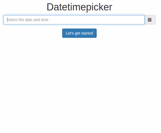
DateTimepicker: Let’s go !
Create a new project with the name of your choice, here “datetimepicker” specifying the use of a PostgreSQL database.
$…
View On WordPress
#bootstrap datepicker#date and time picker javascript#date time picker#date time picker javascript#date time picker js#datepicker datetime#datepicker time#datetime picker#datetime picker jquery#datetimepicker#datetimepicker example#datetimepicker format#datetimepicker javascript#datetimepicker plugin#javascript date and time picker#javascript date time picker#javascriptdatetime picker#jquery date time picker#jquery datetimepicker documentation#js date time picker#time and date picker
0 notes
Text
Visual studio 2017 windows forms dot net time picker

VISUAL STUDIO 2017 WINDOWS FORMS DOT NET TIME PICKER CODE
VISUAL STUDIO 2017 WINDOWS FORMS DOT NET TIME PICKER WINDOWS
VISUAL STUDIO 2017 WINDOWS FORMS DOT NET TIME PICKER WINDOWS
For more information, see How to: Display a Date in a Custom Format with the Windows Forms DateTimePicker Control and Custom Date and Time Format Strings. For example, you can display the date as "JFriday" by setting the CustomFormat property to "MMMM dd, yyyy - dddd". The custom format string can be a combination of custom field characters and other literal characters. If the Format property is set to DateTimePickerFormat.Custom, you can create your own format style by setting the CustomFormat property and building a custom format string. For more information, see How to: Display Time with the DateTimePicker Control. If you want the DateTimePicker to appear as a control for picking or editing times instead of dates, set the ShowUpDown property to true and the Format property to Time. The default date Format is DateTimePickerFormat.Long. The values can be displayed in four formats, which are set by the Format property: Long, Short, Time, or Custom. You can limit the dates and times that can be selected by setting the MinDate and MaxDate properties. For more information, see How to: Set and Return Dates with the Windows Forms DateTimePicker Control. You can use the Text property or the appropriate member of Value to get the date and time value. The Value property contains the current date and time the control is set to. The date and time can be adjusted by selecting each element individually and using the up and down buttons to change the value. The calendar will not drop down when the control is selected. To use a spin button control (also known as an up-down control) to adjust the date/time value, set the ShowUpDown property to true. You can change the look of the calendar portion of the control by setting the CalendarForeColor, CalendarFont, CalendarTitleBackColor, CalendarTitleForeColor, CalendarTrailingForeColor, and CalendarMonthBackground properties. For more information about the MonthCalendar control, see MonthCalendar Control Overview. The calendar looks like the MonthCalendar control, which can be used for selecting multiple dates. When used to represent a date, the DateTimePicker control appears in two parts: a drop-down list with a date represented in text, and a calendar that appears when you click the down-arrow next to the list. The DateTimePicker control only supports Gregorian calendars. The DateTimePicker control makes it easy to work with dates and times because it handles a lot of the data validation automatically. The DateTimePicker control is used to allow the user to select a date and time, and to display that date and time in the specified format. ' Show the CheckBox and display the control as an up-down control. ' Create a new DateTimePicker control and initialize it.ĭim dateTimePicker1 As New DateTimePicker()ĭateTimePicker1.MinDate = New DateTime(1985, 6, 20)ĭateTimePicker1.CustomFormat = "MMMM dd, yyyy - dddd"ĭateTimePicker1.Format = DateTimePickerFormat.Custom Show the CheckBox and display the control as an up-down control.ĭateTimePicker dateTimePicker1 = new DateTimePicker() ĭateTimePicker1.MinDate = new DateTime(1985, 6, 20) ĭateTimePicker1.MaxDate = DateTime.Today ĭateTimePicker1.CustomFormat = "MMMM dd, yyyy - dddd" ĭateTimePicker1.Format = DateTimePickerFormat.Custom Create a new DateTimePicker control and initialize it.ĭateTimePicker^ dateTimePicker1 = gcnew DateTimePicker ĭateTimePicker1->MinDate = DateTime(1985,6,20) ĭateTimePicker1->MaxDate = DateTime::Today ĭateTimePicker1->CustomFormat = "MMMM dd, yyyy - dddd" ĭateTimePicker1->Format = DateTimePickerFormat::Custom
VISUAL STUDIO 2017 WINDOWS FORMS DOT NET TIME PICKER CODE
To run this example, paste the following code into a form and call the CreateMyDateTimePicker method in the example form's constructor or Load event handling method. Also, the ShowCheckBox property is set so that the control displays a CheckBox, and the ShowUpDown property is set so that the control is displayed as a spin button control. The control's CustomFormat property is set. The following code example creates an new instance of a DateTimePicker control and initializes it. Inherit Control Public Class DateTimePickerĭefaultBindingPropertyAttribute ClassInterfaceAttribute ComVisibleAttribute Examples Public class DateTimePicker : type DateTimePicker = class In this article public ref class DateTimePicker : System::Windows::Forms::Control public class DateTimePicker : Represents a Windows control that allows the user to select a date and a time and to display the date and time with a specified format.
0 notes
Text
Picking Dates with Elm
Introduction
A frontend developer sometimes just wants to drop a JavaScript widget somebody else made into their application and move on. Maybe that widget is a slider, or a menu, or a progress bar, or a spinner, or a tab, or a tooltip that points in a cool way.. And sometimes that same frontend developer would like to write their application in Elm.. Should this developer wait to use Elm until the widget they want is rewritten in Elm? Should they rewrite everything that they need?
NoRedInk ran into this problem a few years ago with datepickers. Now, there are some Elm datetimepicker options, but at the time we needed prioritize building a datepicker from scratch in Elm against using the JS datepicker library we had been using before. We put building an Elm datepicker on the hackday idea pile and went with the JS datepicker library. Even with the complications of dates and time, using a JS datepicker in an Elm application ended up being a fine experience.
So our frontend developer who wants a JS widget? They can use it.
Readers of this post should have some familiarity with the Elm Architecture and with Elm syntax, but do not need to have made complex apps. This post is a re-exploration of concepts presented in the Elm guide (Introduction to Elm JavaScript interop section) with a more ~timely~ example (that is, we're going to explore dates, datepickers, and Elm ports).
On Dates and Time
The local date isn't just a question of which sliver of the globe on which one is located: time is a consideration of perception of time, measurability, science, and politics.
As individuals, we prefer to leave datetime calculations to our calendars, to our devices, and to whatever tells our devices when exactly they are. As developers, we place our faith in the browser implentations of functions/methods describing dates and times.
To calculate current time, the browser needs to know where the user is. The user's location can then be used to look up the timezone and any additional time-weirdnesses imposed by the government (please read this as side-eyes at daylight saving--I stand with Arizona). When you run new Date() in your browser's JS console, apart from constructing the Date you asked for, you're actually asking for your time as a function of location.
Supposing we now have a Date object that correctly describes the current time, we have the follow-up problem of formatting dates for different users. Our users might have differing expectations for short-hand formats and will have differing expecations for long-hand forms in their language. There's definitely room to make mistakes; outside of programming, I have definitely gotten confused over 12 hour days versus 24 hour days and mm/dd/yyyy versus dd/mm/yyyy.
Okay, so computers need a way to represent time, timezones, daylight savings. We use the distance in seconds from the epoch to keep track of time. (If you read about the history of the Unix epoch, that's not as simple as one might hope or expect either!) Then we need a language for communicating how to format this information for different locales and languages.
We can represent dates in simple and universial formats. We can use semantic and consistent (or close-to semantic and close-to consistent) formatting strings. We can be careful as we parse user input so that we don't mix up month 2 or day 2. But it's still really easy to make mistakes. It's hard to reason about what is going, did go, or will go wrong; sometimes, when deep in investigating a timezone bug, it's hard to tell what's going right!
So suppose we've got ourselves a great spec that involves adding a date input to a pre-existing Elm app. Where do we start? What should we know?
It's worth being aware that the complexity of date/time considerations of the human world haven't been abstracted away in the programming world, and there are at times some additional complications. For example, the JavaScript Date API counts months from zero and days from one. Also worth noting: Dates in Elm actually are JavaScript Date Objects, and date Objects in JavaScript rely on the underlying JavaScript implementation (probably C++).
On Interop
The way that Elm handles interop with JavaScript keeps the world of Elm and the world of JavaScript distinct. All the values from Elm to JS flow through one place, and all the values from JS to Elm flow through one place.
Tradeoffs:
It's possible to break your app
Suppose we have an Elm app that is expecting a user-named item to be passed through a port. Our port is expecting a string, but oops! Due to some unanticipated type coercion, we pass 2015 through the port rather than "2015". Now our app is unhappy--we have a runtime error:
Trying to send an unexpected type of value through port userNamedItem: Expecting a String but instead got: 2015
Your Elm apps have JS code upon which they are reliant
Often, this isn't a big deal. We used to interop with JavaScript in order to focus our cursor on a given text input dynamically (Now, we use Dom.focus). It's a nice UX touch, but our site still works without this behavior. That is, if we decide to load our component on a different page, but fail to bring our jQuery code to the relevant JS files for that page, the user experience degrades, but the basic functionality still works.
Benefits:
We can use JavaScript whenever we want to
If you've got an old JS modal, and you're not ready to rewrite that modal in Elm, you're free to do so. Just send whatever info that modal needs, and then let your Elm app know when the modal closes.
The single most brittle place in your code is easy to find
Elm is safe, JavaScript is not, and translating from one to the other may not work. Even without helpful error messages, it's relatively easy to find the problem. If the app compiles, but fails on page load? Probably it's getting the wrong information.
We keep Elm's guarantees.
We won't have to worry about runtime exceptions within the bulk of our application. We won't have to worry about types being inconsistent anywhere except at the border of our app. We get to feel confident about most of our code.
So.. how do we put a jQuery datepicker in our Elm application?
For this post, we'll be using the jQuery UI datepicker, but the concepts should be the same no matter what datepicker you use. Once the jQuery and jQuery UI libraries are loaded on the page and the basic skeleton of an app is available on the page, it's a small step to having a working datepicker.
Our skeleton:
{- *** API *** -} port module Component exposing (..) import Date import Html exposing (..) import Html.Attributes exposing (..) main : Program Never Model Msg main = Html.program { init = init , view = view , update = update , subscriptions = always Sub.none } init : ( Model, Cmd Msg ) init = ( { date = Nothing }, Cmd.none ) {- *** MODEL *** -} type alias Model = { date : Maybe Date.Date } {- *** VIEW *** -} view : Model -> Html.Html Msg view model = div [ class "date-container" ] [ label [ for "date-input" ] [ img [ alt "Calendar Icon" ] [] ] , input [ name "date-input", id "date-input" ] [] ] {- *** UPDATE *** -} type Msg = NoOp update : Msg -> Model -> ( Model, Cmd Msg ) update msg model = case msg of NoOp -> model ! [ Cmd.none ]
Next up, let's port out to JS. We want to tell JS-land that we want to open a datepicker, and then we also want to change our model when JS-land tells us to.
port module Component exposing (..) import Date import Html exposing (..) import Html.Attributes exposing (..) import Html.Events exposing (..) -- we need Events for the first time main : Program Never Model Msg main = Html.program { init = init , view = view , update = update , subscriptions = subscriptions } init : ( Model, Cmd Msg ) init = ( { date = Nothing }, Cmd.none ) {- *** MODEL *** -} type alias Model = { date : Maybe Date.Date } {- *** VIEW *** -} view : Model -> Html.Html Msg view model = div [ class "date-container" ] [ label [ for "date-input" ] [ img [ alt "Calendar Icon" ] [] ] , input [ name "date-input" , id "date-input" , onFocus OpenDatepicker -- Note that the only change to the view is here ] [] ] {- *** UPDATE *** -} type Msg = NoOp | OpenDatepicker | UpdateDateValue String update : Msg -> Model -> ( Model, Cmd Msg ) update msg model = case msg of NoOp -> model ! [ Cmd.none ] OpenDatepicker -> model ! [ openDatepicker () ] UpdateDateValue dateString -> { model | date = Date.fromString dateString |> Result.toMaybe } ! [] {- *** INTEROP *** -} port openDatepicker : () -> Cmd msg port changeDateValue : (String -> msg) -> Sub msg subscriptions : Model -> Sub Msg subscriptions model = changeDateValue UpdateDateValue
Note that here, we're also carefully handling the string that we're given from JavaScript. If we can't parse the string into a Date, then we just don't change the date value.
Finally, let's actually add our Elm app and datepicker to the page.
$(function() { elmHost = document.getElementById("elm-host") var app = Elm.Component.embed(elmHost); $.datepicker.setDefaults({ showOn: "focus", onSelect: sendDate, }); app.ports.openDatepicker.subscribe(function() { $("#date-input").datepicker().datepicker("show"); }); function sendDate (dateString) { app.ports.changeDateValue.send(dateString) } });
Checking this out in the browser (with a few additional CSS styles thown in):
All we have to do is embed our app, open the datepicker when told to do so, and send values to elm when appropriate! This is the same strategy to follow when working with any JS library.
Fancy Stuff
Storing the final-word on value outside of a UI component (i.e., the datepicker itself) makes it easier to handle complexity. At NoRedInk, engineers have built quite complicated UIs involving datepickers:
NoRedInkers changed the displayed text from a date-like string to "Right away"--and made /right away/i an allowed input
We can check to see if the selected date is the same as now, plus or minus some buffer, and send a string containing that information to Elm. This requires a fair amount of parsing and complicates how dates are stored in the model.
A simplified version of a similar concept follows--we add some enthusiasm to how we're displaying selected dates by adding exclamation marks to the displayed date.
Note that this introduces a new dependency for date formatting (rluiten/elm-date-extra).
... import Date import Date.Extra.Config.Config_en_us import Date.Extra.Format ... viewCalendarInput : Int -> Maybe Date.Date -> Html Msg viewCalendarInput id date = let inputId = "date-input-" ++ toString id dateValue = date |> Maybe.map (Date.Extra.Format.format Date.Extra.Config.Config_en_us.config "%m/%d/%Y!!!") |> Maybe.withDefault "" in div [ class "date-container" ] [ label [ for inputId ] [ viewCalendarIcon ] , input [ name inputId , Html.Attributes.id inputId , value dateValue , onFocus (OpenDatepicker inputId) ] [] ] ...
We can make the value of the input box whatever we want! Including a formatted date string with exclamation marks on the end. Note though that if we make whatever is in our input box un-parseable for the datepicker we're using, we'll have to give it more info if we want it to highlight the date we've selected when we reopen it. Most datepickers have a defaultDate option, and we can use take advantage of that to handle this case.
Note that we've also generalized our viewCalendarInput function. There are some other changes that we need to make to support having multiple date input fields per page--like having more than one date field on the model, and sending some way of determining which date field to update back from JS.
For brevity's sake, we'll exclude the code for supporting multiple date inputs per page, but here's an image of the working functionality:
NoRedInkers created an autofill feature
Leveraging the type system, we can distinguish between user-set and automagically-set dates, and set a series of date steps to be any distance apart from each other by default. The fun here is in determining when to autofill--we shouldn't autofill, for instance, after a user has cleared all but one autofilled field, but we should autofill if a user manually fills exactly one field.
We actually decided that while this was slick, it would create a negative user experience; we scrapped the whole autofill idea before any users saw it. While there was business logic that we needed to rip out in order to yank the feature, we didn't need to change any JavaScript code whatsoever. Writing the autofill functionality was fun, and then pulling out the functionality went really smoothly.
NoRedInkers supported user-set timezone preferences
I recommend rluiten/elm-date-extra, which supports manually passing in a timezone offset value and using the user's browser-determined timezone offset. Thank you to Date-related open source project maintainers and contributors!
Concluding
Someday the Elm community will have a glorious datepicker that developers use by default. For now, there are JavaScript datepickers out there available for use (and some up-and-coming Elm datepicker projects as well!). For now, for developers not ready to switch away from jQuery components, interop with JavaScript can smoothly integrate even very effect-heavy libraries.
There are components that don't exist in Elm yet, but that shouldn't stop us from using them in our Elm applications and it shouldn't stop us from transitioning to Elm. Projects that need those components can still be written in beautiful, easy-to-follow, easy-to-love Elm code. Sure, it would be nice if it were all in Elm--for now, we can use our JavaScript component AND Elm!
Tessa Kelly @t_kelly9 Engineer at NoRedInk
1 note
·
View note
Text
Form Framework with Admin Panel - Forms Plus: PHP
New Post has been published on https://intramate.com/php-scripts/form-framework-with-admin-panel-forms-plus-php/
Form Framework with Admin Panel - Forms Plus: PHP
LIVE PREVIEWGet it now for only $22
Froms Plus is a form framework. PHP version includes elements from JS version, plus PHP admin interface and form fields generation based on config files.
Froms Plus has collection of contact, user, ecomerce forms, example of results page and allows you to create forms of any complexity.
Other variations of Forms Plus:
Forms Plus:PHP
Features
40+ Color Themes Each color theme has its own css file, that can be easily modified for creating your own colors.
90+ Form templates A lot of ready to use forms.
13 Designs Contains 13 designs with styled form elements and animation effects.
Calculations Elements can be marked to be a part of the calculations.
AJAX Forms data can be sent with AJAX.
Validation Forms can be prevalidated before submit.
PHP: Admin Interface
PHP: Config Files One config file for form page and admin side.
PHP: Validation Validate data on server side.
PHP: Sender IP Track your customers via IP’s.
PHP: Email Notification Send form data to your email. Autoresponder email message.
PHP: Collected Data Export Export collected form data to HTML (.htm), CSV (.csv), OpenDocument Spreadsheet (.ods), PDF (.pdf), Excel 95 and above (.xls), Excel 2007 and above (.xlsx).
PHP: Database Storing Store received data in MySQL database with MySQLi, MySQL PDO, MySQL.
JS Stepper Fill your forms step by step, with each step validation and submit filled data with AJAX at the end.
Masked Input Inputs can be masked, so your customers will be hinted with value the can fill in.
Datepickers, Sliders, Colorpickers, Autocomplete, Captcha
Smart Checkboxes and Radio Buttons Toggle all checkbox. Autocheck checkbox/radio with input next to it. Checkbox/radio groups with subgroups.
Block actions Show/hide blocks with buttons, checkboxes, radio, selects. Toggle, add, remove css classes when block is shown/hidden. You can also do it with predefined in script tag templates, so no field will be submitted unless shown.
Modern Elements Includes progressive form elements: customized selects, toggles, ratings, picture and block pickers, spinners, image uploaders.
Show/Hide Blocks Blocks that can be shown/hidden on click, plus blocks with accordion-like behaviour.
Bootstrap Forms are powered with Bootstrap – most popular HTML, CSS, and JS framework for developing responsive design.
Font Awesome Complete set of Font Awesome vector icons created by Dave Gandy.
HTML5 and CSS3 Take full advantage of modern web technologies. Semantic HTML markup and standards-compliant CSS.
Responsive Design Size doesn’t matter – a fully responsive layout that adapts to all devices.
Highly Customized Contains a large amount of customized elements: text and file inputs, selects, textareas, radio buttons, checkboxes, etc.
Changelog
22 October 2019 – Version 1.3.2
Added a new value handler for image processing (DEMO).
Fixed a bug with minimal and maximal dates for datetimepicker.
Updated documentation.
29 January 2019 – Version 1.3.1
Fixed a bug with rating datatype in Safari on iOS devices.
11 January 2019 – Version 1.3.0
Added an option to set a custom PHP handler for an email message group.
Added an option to set individual permissions for each user in admin panel (use manager login – DEMO).
Added ignore_hidden option support for datetimepicker and spinner datatypes.
Improved calculation handler for selection datatype.
Added a feature of adding custom pages for admin panel.
Added a feature of importing data in admin panel.
Updated documentation.
29 April 2018 – Version 1.2.1
Added a basic user registration system that includes:
login page (DEMO)
registration page (DEMO)
forgot password page (DEMO)
activation emails
recovery emails
Added a simple interface to edit collected data as a regular text.
Added a language support for admin panel interface with a language switcher between 3 predefined languages: English, Japanese and Brazilian Portuguese.
Made possible to get a collection ID for further work with it.
Added an option to set a custom value handler for any form attribute.
Added an option to set a custom backend validation role handler.
Added an option to show/hide collected attributes selectively in email messages.
Updated styles and scripts for all designs.
Added new forms:
Contact With Recaptcha (DEMO)
Contact With Language Switcher (DEMO)
Sub Selection (DEMO)
Updated documentation.
16 May 2017 – Version 1.2.0
Added 4 new designs: Square, Round, Square dark, Round dark (check livepreview).
Added ability to set js options for blockpicker, colorselector, imagepicker, selection, textarea datatypes.
Added autofocus and readonly attribute support.
Added ability to add/remove a group of fields according to a field value.
Stopped scrolling up a page in tabs on load.
19 January 2017 – Version 1.1.1
Added ability to set validation rules for selection datatype.
Improved MySQL handlers to set correct character set for MySQL client.
Added ability to select default design color.
Added ability to set js options for spinner datatype.
Improved search algorithm.
Added search page in admin panel.
Added system info page in admin panel.
11 July 2016 – Version 1.1.0
Added cloning feature for form attributes – one or several simple attributes (fields) can be dynamically added or removed infinite number of times.
Extended settings for export of collected data.
Added 5 new formats for collected data export:
HTML (.htm)
CSV (.csv)
OpenDocument Spreadsheet (.ods)
PDF (.pdf)
Excel 95 and above (.xls)
Excel 2007 and above (.xlsx)
Added two new forms in collection (they demonstrate the cloning feature):
Website Bug Report (DEMO)
Support Request (DEMO)
Added ability to group cloning attributes in email messages and admin panel.
22 June 2016 – Version 1.0.4
Added RTL support.
Added autocomplete support.
Added Google Places autocomplete.
Added actions.
Added ability to output debug for AJAX requests.
Added ability to set configuration from PHP variable.
Updated documentation.
10 June 2016 – Version 1.0.3
Replaced mysqlnd method by another one to make it more compatible with systems that don’t have this library.
7 June 2016 – Version 1.0.2
Improved interaction with slider on mobile devices.
6 June 2016 – Version 1.0.1
Added new design – pArrow.
Added block toggle (show block).
Added ability to send different email messages for different groups of users including autoresponder email message.
Added automatic detection of available MySQL handler: MySQLi, PDO MySQL, MySQL.
Added additional validation for attribute identifiers to avoid problems with uniqueness of HTML ids.
Improved error handling for config files (YAML syntax errors).
Fixed minor bugs.
Updated documentation.
16 May 2016 – Version 1.0.0
Initial release.
LIVE PREVIEWGet it now for only $22
0 notes
Text
Webster - Responsive Multi-purpose HTML5 Template
New Post has been published on https://babesgobananas.com/webster-responsive-multi-purpose-html5-template/
Webster - Responsive Multi-purpose HTML5 Template
HTML website is an economic alternative to consider while building a website from the scratch which can be expensive option for smaller businesses to afford. Webster is one of the responsive and multipurpose HTML5 templates that comes jam-packed with 70+ homepage layouts, 540+ stunning template variations, 50+ shortcode with 600+ reusable UI components and bingo, the free premium plugins.
The bootstrap 4 based template has all the necessary building blocks and pre-built components in place that allow businesses to craft a full-fledged website that thrive the users with elegant designs and fantastic layout without having low-level programming knowledge. It’s all viable with the minimum time and dollar investment. It’s a huge saving.
The lightweight template, which enables engineering the customer-oriented websites that perform to the notch. In the template, at the bottom of the HTML file, only a few scripts get loaded when they are needed due to which the plugins get loaded on the page dynamically, thereby alleviating the need to add the plugins manually. For instance, when you want to use the owl carousel on the home page, then the owl-carousel.min.js file will get loaded dynamically without needing to call it explicitly. On a concluding note, when no plugin is needed, no plugin will get loaded.
The Webster HTML5 template has a well-structured code, eye-catchy layouts and responsive mega menu, which makes it perfect for building various genres of the custom websites such as Corporate, Business, Portfolio, Creative, Marketing agency, Blog, Magazine, Agency, App Landing, E-commerce, Specialty Pages, Personal Portfolio/CV, Portfolio dark, Portfolio light, Portfolio parallax, Band, Cafe, Law, Construction, Bitcoin, Crypto Currency, Juice, Burger, Skateboard, Spa, Barber, Consulting, Gym, Interior Design, Conference, Movie Release, Christmas Landing Page, Fish, Plumber, Book Landing Page, Pizza, Hotel, job Board, listing Directory, wedding card, Product Landing Page, Christmas Coming soon page and One Page site. Besides, the HTML5 responsive template’s building tools and features offer a great length of flexibility, which can be tailored to make the website meet the business-specific needs.
Webster Features:
Based on Bootstrap 4 100% customizable Fully responsive Premium plugins included Google fonts Masonry grid layouts Lightbox galleries Pricing tables SEO optimized Google maps Snizzy maps Mega menu Google search result page Carousel (control with data attributes) Animated typer js Countdown Developer friendly & well commented code Boxed, wide and frame layout option Ajax contact form MailChimp integrated 15+ Widgets Instagram and fliker feeds On load models Retina ready Sticky header and Footer Video background and popup 530+ templates 11 Multi demo with inner pages 60+ HomePages 50 Shortcode 600+ Reusable component 35+ Portfolio pages 30+ blog pages 50+ charts 15+ E-commerce pages 80+ revolution slider hero templates 30+ Sign up and sign in pages 20+ Pre-loaders 30+ header and footer options 20+ Specialty pages 10+ About pages 10+ Service pages Stunning support Lifetime free updates
Notes:
This is a pure HTML5 template, not a WordPress or any other CMS theme
Images and video used in the demo are not included in the Downloaded Package. However, you may purchase it separately. All credits are included in the documentation. We provide placeholder images with recommended image size mentioned on it.
Premium plugins like Revolution Slider included in the template are full featured and work properly right out of the box. New versions will be included in the upcoming updates after compatibility tests. For more information please read Envato Bundled Plugins policy
Webster comes with a detailed documentation. If you have any further questions Contact us We’ll be glad to help you!
Have a pre-purchase question? Need clarification? or any suggestion Feel free to Contact us.
Video tutorials:
How to use different Team Style?
How to use tab and different tab Style?
How to use Accordion and different Accordion Style?
How to use different Carousel setting?
CHANGELOG
Version 4.0 [22 November 18]
Webster 4.0 update is focused on SASS, RTL and Builder beta version compatibility. Added: SASS Files Added: RTL files
Version 3.7 [21 April 18]
Webster 3.7 update is focused on 9 Categories new inner pages and new features. Added: Marketing category homepage with 12 detailed inner page templates Added: Bitcoin: 5 inner page templates Added: Barber: 6 inner page templates Added: Cafe: 4 inner page templates Added: Conference: 4 inner page templates Added: Interior-design: 5 inner page templates Added: Skateboard: 6 inner page templates Added: Spa: 5 inner page templates Added: Tattoo: 5 inner page templates Added: Top bar dark class Added: Sticky sidebar page Added: event-calendar.html template
Version 3.5.1 – 16 April 18
Fixed: Mega menu 2 column responsive offset issue.
Version 3.5 – 14 April 18
Webster 3.5 update is focused on new inner pages and 2 new features. Added: Google custom search Added: Sticky sidebar (check on page-left-sidebar.html) Added: Construction all inner page added - about.html - blog.html - contact.html - projects.html - service.html - team.html Added: Medical all inner page added - about.html - appointment.html - blog.html - contact.html - doctors.html - schedule.html - service.html Fixed: One-page left menu responsive issue.
Version 3.4 – 27 March 18
Webster 3.4 update is focused on new Home pages. We have added 3 new home pages in this update. Added: New Homepage job Board Added: New Homepage listing Directory Added: New Homepage wedding card Added: Menu active color dynamically(Now don't need to add 'active' class manually on all page)
Version 3.3.1 – 08 March 18
Fixed- Minor bug fixes
Version 3.3 – 08 March 18
Webster 3.3 update is focused on new Home page and inner page. We have added 3 new home pages and 3 new inner pages in this update. Added: New Homepage Tattoo Added: New Homepage Spa Added: New Homepage barber Added: process-02 Page Layout Added: Portfolio-single Page Layout Added: case-study Page Layout Fixed: Mega menu item hover shake issue
Version 3.2 – 24 February 18
Webster 3.2 update is focused on new inner pages. We have added 14 new pages in this update. Added: service-05 Page Layout Added: service-06 Page Layout Added: service-04 Page Layout Added: service-07 Page Layout Added: service-detail Page Layout Added: service-detail-01 Page Layout Added: contact-04 Page Layout Added: contact-05 Page Layout Added: testimonials Page Layout Added: search-result Page Layout Added: search-no-result Page Layout Added: cookie Page Layout Added: invoice Page Layout Added: icons Page Layout Added: counter small option
Version 3.0.1 – 15 February 18
Added: Dark overly page title Added: Blank page Updated: animate.css to Latest Version Updated: Bootstrap-datatables plugin to Latest Version Updated: Bootstrap-datetimepicker plugin to Latest Version Updated: isotope plugin to Latest Version Updated: masonry plugin to Latest Version Updated: nicescroll plugin to Latest Version Updated: slick plugin to Latest Version Updated: Calander design update Fixed: Color skins issue Fixed: Minor Responsive issue Fixed: Tab active color issue Fixed: Action box vertical middle issue Fixed: Fancy Newsletter button issue in safari Fixed: revslider-portfolio-viewer.html page border issue
Version 3.0 – 13 February 18
Added: Bootstrap 4 Components Added: 82 Revolution Slider Hero Templates Added: Medical, juice and pizza Homepage slider added in webster revolution slider exported file Added: 82 Revolution Slider Hero Templates added with exported file Added: Popper.js Updated: Bootstrap 3.3.7 to v4.0.0 Stable Updated: jQuery 1.12.4 to v3.3.1 Updated: Revolution slider 5.4.5.2 to 5.4.6.3 Updated: “.progress-bar” code clases change to “.skill-bar” (As bootsrap 4 added .progress-bar class) Updated: One page menu code. Now you can change mega menu and one page with only 1 class. Updated: All shortcode with “.border” class name update with “.shortcode-name-border” (As bootsrap 4 added .border class) Updated: Search code: added button tag Updated: Action box code for responsive UI Updated: Home 8 banner video set in loop Updated: shop-shopping-cart page Updated: Documentation Updated: Code/formatting improvements and fixes in bootsrap 4 affected classed Improved: Set equal height to most of the boxes for better responsive UI Fixed: Revolution slider went black after few minutes Fixed: Background image shakes on scroll (Mozilla Firefox) in one-page-portfolio-parallax Fixed: GYM Revolution slider font issue Fixed: Many CSS errors fixed based on W3c Validator Removed: All border radius 50% (change it to 3px border radius)
Version 2.8.1 – 22 January 18
Fixed: Input style in chart-financial template Fixed: Template color issue Improved: Registration form time and date selection
Version 2.8 – 20 January 18
Added: 50+ Chart pages Templates Added: New Homepage Bitcoin Added: New Homepage Skateboard Added: New Homepage Burger Added: New Homepage Juice Added: data-autospeed to control carousel speed Added: data-smartspeed to control carousel smart speed Fixed: Owl carousel arrow vertical align Update: Improved documentation for One-page menu, Logo height setting, change raindrops color and new carousel control data
Version 2.5 – 13 January 18
Added: New Homepage Hotel Added: New Homepage Fish Added: New Homepage Book landing Added: New Homepage Pizza Added: New Homepage Product Added: New Homepage Plumber Added: Tab nav border top, left and right option Added: Team hover-2, Team Dark, Team Round shadow, Team Round small and Team Round small shadow Fixed: Light header sticky blinking issue Fixed: Tab nav border bottom spacing issue
Version 2.0 – 06 January 18
Added: New Homepage Shop Modern Added: New Homepage Shop Creative Added: New Homepage Shop Minimal Added: New Homepage Shop Classic Added: New Homepage Shop Simple Added: New Homepage Blog Added: New Homepage Blog 02 Added: New Homepage Blog Boxed Added: New Homepage Blog Fashion Added: New Homepage Blog Video Added: New Homepage Magazine Added: New Homepage Magazine 02 Added: New Homepage Magazine 03 Added: no-radius class for accordion Added: New title style (used on magazine page) Update: Minor code/formatting improvements and fixes
If you are looking the old changelog for Webster Please check our documentation to see full changelog. Our updates do not stop here. Many more new amazing features are surely coming soon in future updates.
Source
0 notes
Text
Laravel - TimePicker Menggunakan Bootstrap Datetimepicker
Laravel – TimePicker Menggunakan Bootstrap Datetimepicker
Kali ini saya akan membahas bagaimana cara menggunakan timepicker di laravel. Disini saya menggunakan bootstrap datetimepicker jquery untuk membuat timepicker. Datetimepicker memberikan opsi untuk dapat dikonfigurasi seperti format tanggal atau waktu.
Berikut contoh timepicker di blade laravel.
your.blade.php
Laravel Bootstrap Timepicker
View On WordPress
0 notes
Text
Laravel + Vue.js AdminPanel Generator
News / May 11, 2018
Laravel + Vue.js AdminPanel Generator
Laravel and Vue.js are often used together. With more tools on these technologies are released, here’s one of them – presenting to you Vue+Laravel Admin Panel Generator.
Disclaimer: I’m the founder and one of the developers of this tool, and also Laravel-only generator QuickAdminPanel, but the goal in this article is not only to present you the product, but explain what it generates, and how Vue + Laravel work together. Also, you will find an example project with source available on Github.
How does the generator work?
For those who prefer video, here’s a quick demo:
youtube
Now, let’s look at it with more details.
Step 1. You create your panel without coding, just adding menu items and fields.
Step 2. At any point, you can view the generated code, file by file.
Step 3. Then you download the code and install it – locally or on your remote server, with these commands:
composer install php artisan key:generate php artisan migrate --seed php artisan passport:install
Of course, your .env file should be configured at that point.
And then, on the front-end:
npm install npm run dev
Step 4. That’s it; you have your panel.
Step 5. The most important thing: you can change the code however you want, it’s pure Laravel+Vue, without our generator’s package as a dependency. That’s the main difference from packages like Voyager or Laravel Backpack (which are both excellent, by the way!).
What are we generating – structure of the project
After you download the project, you see something like this:
Generated Code: Back-end Laravel
Let’s first analyze the back-end Laravel part, which serves as API:
Here’s routes/api.php file:
Route::group(['prefix' => '/v1', 'middleware' => ['auth:api'], 'namespace' => 'Api\V1', 'as' => 'api.'], function () { Route::post('change-password', 'ChangePasswordController@changePassword')->name('auth.change_password'); Route::apiResource('roles', 'RolesController'); Route::apiResource('users', 'UsersController'); Route::apiResource('companies', 'CompaniesController'); Route::apiResource('employees', 'EmployeesController'); });
You can see apiResource for every CRUD, and also one separate POST for changing the password.
Controllers are namespaces under Api/V1, so here’s our app/Http/Controllers/Api/V1/CompaniesController.php:
namespace App\Http\Controllers\Api\V1; use App\Company; use App\Http\Controllers\Controller; use App\Http\Resources\Company as CompanyResource; use App\Http\Requests\Admin\StoreCompaniesRequest; use App\Http\Requests\Admin\UpdateCompaniesRequest; use Illuminate\Http\Request; class CompaniesController extends Controller { public function index() { return new CompanyResource(Company::with([])->get()); } public function show($id) { $company = Company::with([])->findOrFail($id); return new CompanyResource($company); } public function store(StoreCompaniesRequest $request) { $company = Company::create($request->all()); return (new CompanyResource($company)) ->response() ->setStatusCode(201); } public function update(UpdateCompaniesRequest $request, $id) { $company = Company::findOrFail($id); $company->update($request->all()); return (new CompanyResource($company)) ->response() ->setStatusCode(202); } public function destroy($id) { $company = Company::findOrFail($id); $company->delete(); return response(null, 204); } }
We have a typical resourceful Controller, with one exception – Resources classes, which have been available since Laravel 5.5.
In our case, every resource is a simple conversion to an array, here’s a file app/Http/Resources/Company.php
namespace App\Http\Resources; use Illuminate\Http\Resources\Json\JsonResource; class Company extends JsonResource { /** * Transform the resource into an array. * * @param \Illuminate\Http\Request $request * @return array */ public function toArray($request) { return parent::toArray($request); } }
But you can extend it, adding your logic on top – see more examples here and here.
Finally, Laravel Passport protects all the routes – when installing the project, you need to run this:
php artisan passport:install
As an overall back-end result, every Controller is responsible for that specific CRUD operations called to the API, from Vue.js front-end.
Generated Code: Front-end Vue.js
Now, let’s take a look at front-end part. The main file for this is resources/client/assets/js/app.js, where we initiate the Vue and some libraries:
// ... window.Vue = require('vue') Vue.prototype.$eventHub = new Vue() import router from './routes' import store from './store' import Datatable from 'vue2-datatable-component' import VueAWN from 'vue-awesome-notifications' import vSelect from 'vue-select' import datePicker from 'vue-bootstrap-datetimepicker' import VueSweetalert2 from 'vue-sweetalert2' import 'eonasdan-bootstrap-datetimepicker/build/css/bootstrap-datetimepicker.css' Vue.use(Datatable) Vue.use(VueAWN, { position: 'top-right' }) Vue.use(datePicker) Vue.use(VueSweetalert2) Vue.component('back-buttton', require('./components/BackButton.vue')) Vue.component('bootstrap-alert', require('./components/Alert.vue')) Vue.component('event-hub', require('./components/EventHub.vue')) Vue.component('vue-button-spinner', require('./components/VueButtonSpinner.vue')) Vue.component('v-select', vSelect) moment.updateLocale(window.app_locale, { week: { dow: 1 } }) const app = new Vue({ data: { relationships: {}, dpconfigDate: { format: window.date_format_moment }, dpconfigTime: { format: window.time_format_moment }, dpconfigDatetime: { format: window.datetime_format_moment, sideBySide: true } }, router, store }).$mount('#app')
Next, every CRUD has its own set of components:
For showing the data table, we’re using vue2-datatable-component – here’s full code of resources/clients/assets/components/cruds/Companies/Index.vue:
<template> <section class="content-wrapper" style="min-height: 960px;"> <section class="content-header"> <h1>Companies</h1> </section> <section class="content"> <div class="row"> <div class="col-xs-12"> <div class="box"> <div class="box-header with-border"> <h3 class="box-title">List</h3> </div> <div class="box-body"> <div class="btn-group"> <router-link :to="{ name: xprops.route + '.create' }" class="btn btn-success btn-sm"> <i class="fa fa-plus"></i> Add new </router-link> <button type="button" class="btn btn-default btn-sm" @click="fetchData"> <i class="fa fa-refresh" :class="{'fa-spin': loading}"></i> Refresh </button> </div> </div> <div class="box-body"> <div class="row" v-if="loading"> <div class="col-xs-4 col-xs-offset-4"> <div class="alert text-center"> <i class="fa fa-spin fa-refresh"></i> Loading </div> </div> </div> <datatable v-if="!loading" :columns="columns" :data="data" :total="total" :query="query" :xprops="xprops" /> </div> </div> </div> </div> </section> </section> </template> <script> import { mapGetters, mapActions } from 'vuex' import DatatableActions from '../../dtmodules/DatatableActions' import DatatableSingle from '../../dtmodules/DatatableSingle' import DatatableList from '../../dtmodules/DatatableList' import DatatableCheckbox from '../../dtmodules/DatatableCheckbox' export default { data() { return { columns: [ { title: '#', field: 'id', sortable: true, colStyle: 'width: 50px;' }, { title: 'Name', field: 'name', sortable: true }, { title: 'Description', field: 'description', sortable: true }, { title: 'Actions', tdComp: DatatableActions, visible: true, thClass: 'text-right', tdClass: 'text-right', colStyle: 'width: 130px;' } ], query: { sort: 'id', order: 'desc' }, xprops: { module: 'CompaniesIndex', route: 'companies' } } }, created() { this.$root.relationships = this.relationships this.fetchData() }, destroyed() { this.resetState() }, computed: { ...mapGetters('CompaniesIndex', ['data', 'total', 'loading', 'relationships']), }, watch: { query: { handler(query) { this.setQuery(query) }, deep: true } }, methods: { ...mapActions('CompaniesIndex', ['fetchData', 'setQuery', 'resetState']), } } </script> <style scoped> </style>
Quite a lot of code, isn’t it? Of course, it could be more straightforward, but we tried to follow the official documentation and best practices, generating code for the cases that could be extended for bigger projects.
Next, we can take a look at Create.vue:
<template> <section class="content-wrapper" style="min-height: 960px;"> <section class="content-header"> <h1>Companies</h1> </section> <section class="content"> <div class="row"> <div class="col-xs-12"> <form @submit.prevent="submitForm"> <div class="box"> <div class="box-header with-border"> <h3 class="box-title">Create</h3> </div> <div class="box-body"> <back-buttton></back-buttton> </div> <bootstrap-alert /> <div class="box-body"> <div class="form-group"> <label for="name">Name</label> <input type="text" class="form-control" name="name" placeholder="Enter Name" :value="item.name" @input="updateName" > </div> <div class="form-group"> <label for="description">Description</label> <textarea rows="3" class="form-control" name="description" placeholder="Enter Description" :value="item.description" @input="updateDescription" > </textarea> </div> </div> <div class="box-footer"> <vue-button-spinner class="btn btn-primary btn-sm" :isLoading="loading" :disabled="loading" > Save </vue-button-spinner> </div> </div> </form> </div> </div> </section> </section> </template> <script> import { mapGetters, mapActions } from 'vuex' export default { data() { return { // Code... } }, computed: { ...mapGetters('CompaniesSingle', ['item', 'loading']) }, created() { // Code ... }, destroyed() { this.resetState() }, methods: { ...mapActions('CompaniesSingle', ['storeData', 'resetState', 'setName', 'setDescription']), updateName(e) { this.setName(e.target.value) }, updateDescription(e) { this.setDescription(e.target.value) }, submitForm() { this.storeData() .then(() => { this.$router.push({ name: 'companies.index' }) this.$eventHub.$emit('create-success') }) .catch((error) => { console.error(error) }) } } } </script> <style scoped> </style>
Edit and Show components for the CRUD are pretty similar, so won’t discuss them here.
In addition to that Vue code, there are many small details and helpers like Sweet Alert, Notifications, Datepickers, and setting/getting relationships data for the forms. I guess I will leave it for you to analyze.
Notice: The choice of Vue.js libraries is pretty subjective, and it was the most challenging part of the project – to choose the Vue libraries to trust. Ecosystem still lacks standards, or 100% trusted open-source – a lot of movement in the market, some libraries are better supported than others. So it’s always hard to guess, and the best libraries will probably change with time, or new ones will appear.
That’s the end of a quick overview of Vue+Laravel QuickAdminPanel, try it out here: https://vue.quickadminpanel.com
Finally, here’s the source of a demo-project with two CRUDs: Companies and Customers.
I hope our generator will not only save you time on writing code but also show you how Vue can work with Laravel. Our way of structuring this code is not the only way, and you can structure your code differently, but we tried our best to stick to standards.
via Laravel News https://ift.tt/2wzPFV6
0 notes
Text
How to disable past time time when the current date is today, enable all time if date is not today?
How to disable past time time when the current date is today, enable all time if date is not today?
I am using bootstrap-datetimepicker by eonasdan. I have two datetimepicker in my page. One is for date of arrival and the other one is for time of arrival.
$('#dateOfArrival').datetimepicker({ format : 'L', minDate : new Date(), keepInvalid : true }); $('#timeOfArrival').datetimepicker({ format : 'LT', minDate : moment() });
I use two datetimepicker because that is the requirement.
I tried to…
View On WordPress
0 notes
Text
SunHouse - Real Estate HTML Template
New Post has been published on http://wpelegant.com/sunhouse-real-estate-html-template/
SunHouse - Real Estate HTML Template
SunHouse – Real Estate HTML Template http://themeforest.net/category/site-templates/corporate/business
We are happy to announce that the WordPress version is available for sale.
Especially, this PSD template is free for all who buy our WordPress Theme.
Introduction
SunHouse is a clean and modern Real Estate HTML Template.
Take easy to promote your real estate project with SunHouse and collect the information from your visitors thanks to conversion centered design of the template.
Use these information to promote and inform about your new projects!
PSD template is available at here
If you like this theme please rate it 5 stars.
Features
6 Homepage Variations
29 html pages
Fully responsive
Clean and Clear Design
High Visual Hierchy / Contrast for easier to read
Google Web Fonts: Lato
Fontawesome Icons
HTML & CSS Validated
Parallax Scrolling Effect
Carousel Slider
CSS Animation
Bootstrap Framework (Grid wide 1170px)
Well-commented
Cross Brower Supports: FireFox, Google Chrome, IE10+, Safari
Clear formatting coding for easier to modify
Template structure
SunHouse comes with 29 HTML Pages:
Home page default
Homepage Header Centered Full Color
Homepage Header Centered Transparent
Homepage Topbar Transparent
Homepage Full Color
Homepage Slider
Agent List
Agent Single
Agencies List
Agency Detail
User Profile
Properties (List/Grid)
Property NonSidebar
Property Masonry
Property Detail
Properties Search
Map Filter
Blog List
Blog Detail
Services
Gallery
About us
Pricing
Sign in
Register
Coming Soon
FAQ
404 Page
Contact
…and more to go
Change Logs:
Version 2.0: Add new 12 exceptional html pages
Version 1.1: Fix Kaspersky Antibanner block some images due to the name of images.
Version 1.0: Initial Creation with 17 html pages.
Credits & Resource
Font
Roboto: https://www.google.com/fonts/specimen/Roboto
Images
Images in demo are for preview purpose only & NOT included in package file.
http://picjumbo.com/
http://unsplash.com/
http://alphacoders.com/
http://freedigitalphoto.net
Plugins
jQuery: http://jquery.com/
Bootstrap: http://getbootstrap.com/
Bootstrap datetimepicker: https://eonasdan.github.io/bootstrap-datetimepicker/
Smooth Scroll: https://github.com/kswedberg/jquery-smooth-scroll
Owl Carousel: http://owlgraphic.com/owlcarousel/
Appear: https://github.com/morr/jquery.appear
Count To: https://github.com/mhuggins/jquery-countTo
WOW JS: https://github.com/matthieua/WOW
Jquery Select Box https://github.com/marcj/jquery-selectBox
NST Slider http://lokku.github.io/jquery-nstslider/
Paralax JS http://pixelcog.github.io/parallax.js/
Slick http://kenwheeler.github.io/slick/
Animate CSS : http://daneden.github.io/animate.css/
Thank you for purchase!
Our Featured Items
BuildPlus – BuildPlus – Building & Construction Business WordPress Theme
GoAhead – Finance & Business WordPress Theme
DirectNews – News & Magazine WordPress Theme
MedicPlus – Health & Medical WordPress Theme
EXPLOORE – Travel, Exploration, Booking WordPress Theme
BigNews – News & Magazine WordPress Theme
SunHouse – Multiconcept Real Estate WordPress Theme
EduGate – Multiconcept Education WordPress Theme
20
Check WordPress Theme
0 notes
Text
MedicPlus - Health & Medical HTML Template
New Post has been published on http://wpelegant.com/medicplus-health-medical-html-template/
MedicPlus - Health & Medical HTML Template
MedicPlus – Health & Medical HTML Template http://themeforest.net/category/site-templates/retail/health-beauty
We are happy to announce that the WordPress version is available for sale.
Especially, this PSD template is free for all who buy our WordPress Theme.
MedicPlus is a HTML template created especially for Health & Medical Related Projects.
MedicPlus comes with 49 handy html pages, 16 homepages options & categories for you to start online presentation about your medical & health services.
The template is built with clean & clear design, comfortable taste and highly customizable so you can freely customize to use for any other appropriate businesses.
There are many more homepages & features will come in the future, please stay tuned!
Template Features:
Clean and Clear Design
High Visual Hierchy / Contrast for easier to read
Google Web Fonts
Fontawesome Icons
HTML & CSS Validated
Carousel Slider
CSS Animation
Bootstrap Framework (Grid wide 1170px)
Well documentation
Cross Brower Supports: Google Chrome, Safari, FireFox, IE10+
Clear formatting coding for easier to modify
List Files:
Home Default
Home Header Center
Home Variant
Home Heart Center
Home Cancer Center
Home Pediatric
Home Vet Clinic
Home Dental Care
Home Dermatology
Home Dr. Nutrition
Home ENT Center
Home Orthopedic
Home Ophthalmology
Home Prenancy
Home Psychology
Home Landing page
Doctors
Doctor Detail
Find A Doctor
Search Result
Service
Service Detail
Pricing
Timetable
Department
Department Detail
Blog
Blog 2 Column Sidebar
Blog 2 Column No Sidebar
Blog 2 Column Variation
Blog 3 Column
Blog Fullwidth
Blog Single
About
Location
Contact
Appointment
Career Recruitment
Career Detail
Patients & Visitors Guide
404 Page
FAQ
Gallery
Gallery 3 Column
Gallery 3 Column Masonry
Gallery 4 Column
Coming Soon 1
Coming Soon 2
Header & Slider Options
…and more to go
Change Logs:
Version 2.0: Add new 13 homepages & 20 new useful pages
Version 1.0: Initial Creation with 16 pages
Credits
Free Google Font Used:
Roboto: https://www.google.com/fonts/specimen/Roboto
Montserrat: https://www.google.com/fonts/specimen/Montserrat
Free Photos Resource:
http://unsplash.com/
http://alphacoders.com/
http://freedigitalphoto.net
Plugins:
jQuery: http://jquery.com/
Bootstrap: http://getbootstrap.com/
Bootstrap datetimepicker: https://eonasdan.github.io/bootstrap-datetimepicker/
Owl Carousel: http://owlgraphic.com/owlcarousel/
Slick carousel: http://kenwheeler.github.io/slick/
Appear: https://github.com/morr/jquery.appear
Count To: https://github.com/mhuggins/jquery-countTo
Animate CSS : http://daneden.github.io/animate.css/
Full calendar:http://http://fullcalendar.io/
Jquery Countdownhttp://keith-wood.name/countdown.html
Jquery Scrollbar:http://manos.malihu.gr/jquery-custom-content-scroller/
Jquery Selectbox:https://github.com/marcj/jquery-selectBox
Please Note: All images are just used for Preview Purpose Only. They are not part of the theme and NOT included in the final purchase files.
Enjoy and don’t forget to rate my template. Thanks so much!!!
Our Featured Items
BuildPlus – BuildPlus – Building & Construction Business WordPress Theme
GoAhead – Finance & Business WordPress Theme
DirectNews – News & Magazine WordPress Theme
MedicPlus – Health & Medical WordPress Theme
EXPLOORE – Travel, Exploration, Booking WordPress Theme
BigNews – News & Magazine WordPress Theme
SunHouse – Multiconcept Real Estate WordPress Theme
EduGate – Multiconcept Education WordPress Theme
20
Check WordPress Theme
0 notes
Text
GoAhead - Finance & Business HTML Template
New Post has been published on http://wpelegant.com/goahead-finance-business-html-template/
GoAhead - Finance & Business HTML Template
GoAhead – Finance & Business HTML Template http://themeforest.net/category/site-templates/corporate/business
We are happy to announce that the WordPress version is available for sale.
Especially, this PSD template is free for all who buy our WordPress Theme.
GoAhead – Finance & Business HTML Template is a clean and modern Template for any finance & business corporation like Finance, Accountant, Consulting Firms, Insurance etc.
It comes with 30 html files, 10 unique homepages, 20 other useful pages such as about, services, blog, contact… and more homepages will be added in the future.
It is also created with modern & interesting interactive animation, beatifully coded in Bootstrap Grid so it is a good start for other business as well.
PSD template is available at here
If you like this theme please rate it.
Template Features:
Clean and Clear Design
High Visual Hierchy / Contrast for easier to read
Google Web Fonts: Roboto
Fontawesome Icons
Flat Icons
HTML & CSS Validated
Slick Slider
CSS Animation
Bootstrap Framework (Grid wide 1170px)
Well-commented
Cross Brower Supports: FireFox, Google Chrome, IE10+, Safari
Clear formatting coding for easier to modify
List Files:
Home page default
Homepage 02
Homepage 03
Homepage Accountant
Homepage Banking
Homepage Consultant
Homepage Financial
Homepage Startup
Homepage Insurance
Homepage Investment
About
Service
Service Blocks
Team
Project
Project single
Project style 01
Project style 02
Project style 03
Project style 04
Project style 05
Blog
Blog Detail
Contact
404 Page
Charts
Headers
Footers
Slider
Titles
…and more to go
Change Logs:
Version 2.2: Fix css – Fix search icon not show in white background
Version 2.1: Add new 2 pages (30 pages totally) – Add new 2 homepage for Insurance, Investment
Version 2.0: Add new 15 pages (28 pages totally) – Add new 5 homepage for Banking, Accounting, Consultant, Financial, Startup – Add new 10 html pages with many options: Charts, Service Block, Titles, Slider, Header, Footer, 5 projects styles.
Version 1.0: Initial Creation with 13pages
Credits
Free Google Font Used:
Roboto: https://www.google.com/fonts/specimen/Roboto
Free Photos Resource:
http://picjumbo.com/
http://unsplash.com/
http://alphacoders.com/
http://freedigitalphoto.net
Plugins:
jQuery: http://jquery.com/
Bootstrap: http://getbootstrap.com/
Bootstrap datetimepicker: https://eonasdan.github.io/bootstrap-datetimepicker/
Smooth Scroll: https://github.com/kswedberg/jquery-smooth-scroll
Count To: https://github.com/mhuggins/jquery-countTo
WOW JS: https://github.com/matthieua/WOW
Fancybox: http://fancybox.net/
Isotope: http://isotope.metafizzy.co/
Slick: http://kenwheeler.github.io/slick/
Animate CSS: http://daneden.github.io/animate.css/
Detect browser: http://davecardwell.co.uk/javascript/jquery/plugins/jquery-browserdetect/
Jquery Jvectormap: http://jvectormap.com/
Chart js: http://www.chartjs.org/
Media element js: http://mediaelementjs.com/
Please Note: All images are just used for Preview Purpose Only. They are not part of the template and NOT included in the final purchase files.
Enjoy and don’t forget to rate my template. Thanks so much!!!
Our Featured Items
BuildPlus – BuildPlus – Building & Construction Business WordPress Theme
GoAhead – Finance & Business WordPress Theme
DirectNews – News & Magazine WordPress Theme
MedicPlus – Health & Medical WordPress Theme
EXPLOORE – Travel, Exploration, Booking WordPress Theme
BigNews – News & Magazine WordPress Theme
SunHouse – Multiconcept Real Estate WordPress Theme
EduGate – Multiconcept Education WordPress Theme
20
Check WordPress Theme
0 notes